© 1998, geoff kuenning the art of graphical presentation types of variables guidelines for good...
TRANSCRIPT

© 1998, Geoff Kuenning
The Art of Graphical Presentation
• Types of Variables• Guidelines for Good Graphics Charts• Common Mistakes in Graphics• Pictorial Games• Special-Purpose Charts

© 1998, Geoff Kuenning
Types of Variables
• Qualitative– Ordered (e.g., modem, Ethernet,
satellite)– Unordered (e.g., CS, math, literature)
• Quantitative– Discrete (e.g., number of terminals)– Continuous (e.g., time)

© 1998, Geoff Kuenning
Charting Based on Variable Types
• Qualitative variables usually work best with bar charts or Kiviat graphs– If ordered, use bar charts to show order
• Quantitative variables work well in X-Y graphs– Use points if discrete, lines if continuous– Bar charts sometimes work well for
discrete

© 1998, Geoff Kuenning
Guidelines for Good Graphics Charts
• Principles of graphical excellence• Principles of good graphics• Specific hints for specific situations• Aesthetics• Friendliness

© 1998, Geoff Kuenning
Principlesof Graphical Excellence
• Graphical excellence is the well-designed presentation of interesting data:– Substance– Statistics– Design

© 1998, Geoff Kuenning
Graphical Excellence (2)
• Complex ideas get communicated with:– Clarity– Precision– Efficiency
© 1998, Geoff Kuenning
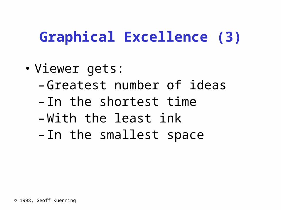
Graphical Excellence (3)
• Viewer gets:– Greatest number of ideas– In the shortest time– With the least ink– In the smallest space

© 1998, Geoff Kuenning
Graphical Excellence (4)
• Is nearly always multivariate• Requires telling truth about data

© 1998, Geoff Kuenning
Principles of Good Graphics
• Above all else show the data• Maximize the data-ink ratio• Erase non-data ink• Erase redundant data ink• Revise and edit

© 1998, Geoff Kuenning
Above All ElseShow the Data
y = 1E-05x + 1.3641
R2 = 0.0033
0
1
2
3
4
5
0 5000 10000 15000File size (bytes)
Tim
e to
fet
ch (
seco
nds) Linear model

© 1998, Geoff Kuenning
Above All ElseShow the Data
y = 1E-05x + 1.3641
R2 = 0.0033
0
1
2
3
4
5
0 5000 10000 15000File size (bytes)
Tim
e to
fet
ch (
seco
nds) Linear model

© 1998, Geoff Kuenning
Maximize theData-Ink Ratio
1st Qtr
3rd Qtr
010203040506070
80
90
East
West
North

© 1998, Geoff Kuenning
Maximize theData-Ink Ratio
0
20
40
60
80
100
1st Qtr 2nd Qtr 3rd Qtr 4th Qtr
East West
North

© 1998, Geoff Kuenning
Erase Non-Data Ink
05
1015202530354045505560657075808590
1st Qtr 2nd Qtr 3rd Qtr 4th Qtr
East
West
North

© 1998, Geoff Kuenning
Erase Non-Data Ink
0
20
40
60
80
1st Qtr 2nd Qtr 3rd Qtr 4th Qtr
Eas
t
Wes
t
Nor
th

© 1998, Geoff Kuenning
Erase Redundant Data Ink
20.4
27.4
90
20.4
38.634.6
31.6
46.9 45 43.9
30.6
45.9
0
20
40
60
80
1st Qtr 2nd Qtr 3rd Qtr 4th Qtr
Eas
t
Wes
t
Nor
th

© 1998, Geoff Kuenning
Erase Redundant Data Ink
0
20
40
60
80
1st Qtr 2nd Qtr 3rd Qtr 4th Qtr
Eas
t
Wes
t
Nor
th
© 1998, Geoff Kuenning
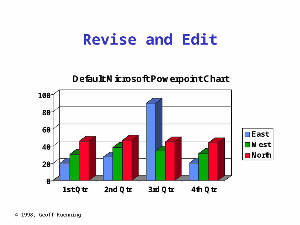
Revise and Edit
1st Qtr 2nd Qtr 3rd Qtr 4th Qtr0
20
40
60
80
100
1st Qtr 2nd Qtr 3rd Qtr 4th Qtr
Default Microsoft Powerpoint Chart
East
West
North

© 1998, Geoff Kuenning
Revise and Edit
Remove Decorative Effects
0102030405060708090
1st Qtr 2nd Qtr 3rd Qtr 4th Qtr
East
West
North

© 1998, Geoff Kuenning
Revise and Edit
Remove Clutter
0102030405060708090
1st Qtr 2nd Qtr 3rd Qtr 4th Qtr
East
West
North

© 1998, Geoff Kuenning
Revise and Edit
Make Legend Simple to Interpret
0102030405060708090
1st Qtr 2nd Qtr 3rd Qtr 4th Qtr
East
West
North

© 1998, Geoff Kuenning
Revise and Edit
Eliminate Superfluous Ink
0
20
40
60
80
100
1st Qtr 2nd Qtr 3rd Qtr 4th Qtr
East
West
North

© 1998, Geoff Kuenning
Revise and Edit
Eliminate Red/Green Distinctions
0
20
40
60
80
100
1st Qtr 2nd Qtr 3rd Qtr 4th Qtr
East
West
North

© 1998, Geoff Kuenning
Specific Things to Do
• Give information the reader needs• Limit complexity and confusion• Have a point• Show statistics graphically• Don’t always use graphics• Discuss it in the text

© 1998, Geoff Kuenning
Give Informationthe Reader Needs
• Show informative axes– Use axes to indicate range
• Label things fully and intelligently• Highlight important points on the graph

© 1998, Geoff Kuenning
Giving Informationthe Reader Needs
0
20
40
60
80
1 2 3 4
E
W
N

© 1998, Geoff Kuenning
Giving Informationthe Reader Needs
0
20
40
60
80
1st Qtr 2nd Qtr 3rd Qtr 4th Qtr
Salesin
Millions
MicrosoftContractSigned
East
North
West

© 1998, Geoff Kuenning
Limit Complexityand Confusion
• Not too many curves• Single scale for all curves• No “extra” curves• No pointless decoration (“ducks”)

© 1998, Geoff Kuenning
0
10
20
30
40
50
60
1st Qtr 2nd Qtr 3rd Qtr 4th Qtr
0102030405060708090100 West
North
Northeast
Southwest
Mexico
Europe
Japan
East
South
International
Limiting Complexityand Confusion

© 1998, Geoff Kuenning
International Sales
0
20
40
60
80
100
1st Qtr 2nd Qtr 3rd Qtr 4th Qtr
Millionsof
Dollars
Japan
Mexico
Europe
Limiting Complexityand Confusion

© 1998, Geoff Kuenning
Have a Point
• Graphs should add information not otherwise available to reader
• Don’t plot data just because you collected it
• Know what you’re trying to show, and make sure the graph shows it

© 1998, Geoff Kuenning
Having a Point
• Sales were up 15% this quarter:
0
20
40
60
80
100
120
1st Qtr 2nd Qtr

© 1998, Geoff Kuenning
Having a Point
User Time of Copy Benchmarks
0
0.01
0.02
0.03
0.04
1 Replica 2 Replicas 3 Replicas 4 Replicas
cp rcp

© 1998, Geoff Kuenning
Having a Point
0
500000
1000000
1500000
2000000
2500000
3000000
3500000
4000000
Modem Ethernet ATM Satellite
Throughput
Latency

© 1998, Geoff Kuenning
Having a Point
1
10
100
1000
10000
100000
1000000
0.01 0.1 1 10 100 1000
Throughput (Kbits/sec)
Latency( s) Ethernet
Modem
ATM
Satellite

© 1998, Geoff Kuenning
Show Statistics Graphically
• Put bars in a reasonable order– Geographical– Best to worst– Even alphabetic
• Make bar widths reflect interval widths– Hard to do with most graphing software
• Show confidence intervals on the graph– Examples will be shown later

© 1998, Geoff Kuenning
Don’t AlwaysUse Graphics
• Tables are best for small sets of numbers– e.g., 20 or fewer
• Also best for certain arrangements of data– e.g., 10 graphs of 3 points each
• Sometimes a simple sentence will do• Always ask whether the chart is the best way
to present the information– And whether it brings out your message

© 1998, Geoff Kuenning
Text Would HaveBeen Better
Dem Rep Indep
Carter
Reagan
Anderson
Lib Mod Cons
LibDems
ModDems
ConsDems
LibInd
ModInd
ConsInd

© 1998, Geoff Kuenning
Discuss It in the Text
• Figures should be self-explanatory– Many people scan papers, just look at
graphs– Good graphs build interest, “hook” readers
• But text should highlight and aid figures– Tell readers when to look at figures– Point out what figure is telling them– Expand on what figure has to say

© 1998, Geoff Kuenning
Aesthetics
• Not everyone is an artist– But figures should be visually
pleasing• Elegance is found in
– Simplicity of design– Complexity of data

© 1998, Geoff Kuenning
Principles of Aesthetics
• Use appropriate format and design• Use words, numbers, drawings together• Reflect balance, proportion, relevant scale• Keep detail and complexity accessible• Have a story about the data (narrative quality)• Do a professional job of drawing• Avoid decoration and chartjunk

© 1998, Geoff Kuenning
Use Words, Numbers, Drawings Together
• Put graphics near or in text that discusses them– Even if you have to murder your word
processor• Integrate text into graphics• Tufte: “Data graphics are paragraphs
about data and should be treated as such”

© 1998, Geoff Kuenning
Reflect Balance, Proportion, Relevant Scale
• Much of this boils down to “artistic sense”• Make sure things are big enough to read
– Tiny type is OK only for young people!• Keep lines thin
– But use heavier lines to indicate important information
• Keep horizontal larger than vertical– About 50% larger works well

© 1998, Geoff Kuenning
Poor Balanceand Proportion
• Sales in the North and West districts were steady through all quarters
• East sales varied widely, significantly outperforming the other districts in the third quarter
0
10
20
30
40
50
60
70
80
90
100
1st Qtr 2nd Qtr 3rd Qtr 4th Qtr

© 1998, Geoff Kuenning
Better Proportion
• Sales in the North and West districts were steady through all quarters
• East sales varied widely, significantly outperforming the other districts in the third quarter
0
50
100
Q1 Q2 Q3 Q4

© 1998, Geoff Kuenning
Keep Detail and Complexity Accessible
Make your graphics friendly:– Avoid abbreviations and encodings– Run words left-to-right– Explain data with little messages– Label graphic, don’t use elaborate
shadings and a complex legend– Avoid red/green distinctions– Use clean, serif fonts in mixed case

© 1998, Geoff Kuenning
An Unfriendly Graph
0
50
100
150
200
250
300
350
400
450
1 REPL 3 5 7
Tim
e
CP
FIND
FINDGREP
GREP
LS
MAB
RCP
RM

© 1998, Geoff Kuenning
A Friendly Version
0
100
200
300
400
1 2 3 4 5 6 7 8
Number of Replicas
Time in Seconds
Copy
Compile
Remove
Note almost no growth incompile/remove times

© 1998, Geoff Kuenning
Even Friendlier
0
100
200
300
400
Copy Compile Remove
Benchmark and Number of Replicas
Time in Seconds
Note slower growth incompile and remove times
1 Replica
8 Replicas(note departurefrom linearity)

© 1998, Geoff Kuenning
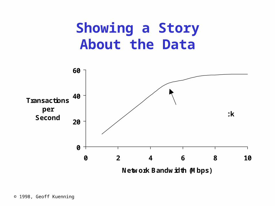
Have a Story About the Data (Narrative Quality)
• May be difficult in technical papers• But think about why you are drawing graph• Example:
– Performance is controlled by network speed
– But it tops out at the high end– And that’s because we hit a CPU
bottleneck
© 1998, Geoff Kuenning
Showing a StoryAbout the Data
0
20
40
60
0 2 4 6 8 10
Network Bandwidth (Mbps)
Transactionsper
Second CPU bottleneckreached

© 1998, Geoff Kuenning
Do a Professional Jobof Drawing
• This is easy with modern tools– But take the time to do it right
• Align things carefully• Check the final version in the format you will
use– I.e., print the Postscript one last time
before submission– Or look at your slides on the projection
screen

© 1998, Geoff Kuenning
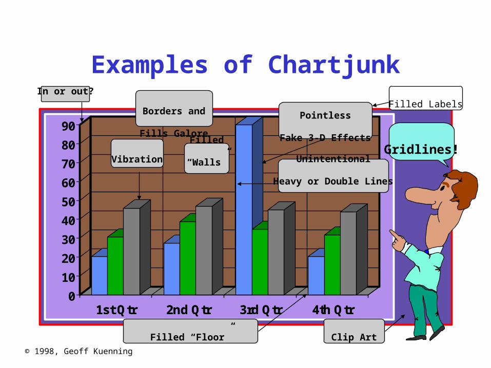
Avoid Decorationand Chartjunk
• Powerpoint, etc. make chartjunk easy• Avoid clip art, automatic backgrounds, etc.• Remember: the data is the story
– Statistics aren’t boring– Uninterested readers aren’t drawn by
cartoons– Interested readers are distracted
• Does removing it change the message?– If not, leave it out
© 1998, Geoff Kuenning
Examples of Chartjunk
1st Qtr 2nd Qtr 3rd Qtr 4th Qtr0
10
20
30
40
50
60
70
80
90
1st Qtr 2nd Qtr 3rd Qtr 4th Qtr
Gridlines!Vibration
Pointless
Fake 3-D Effects
Filled “Floor” Clip Art
In or out?
Filled
“Walls”
Borders and
Fills Galore
Unintentional
Heavy or Double Lines
Filled Labels

© 1998, Geoff Kuenning
Common Mistakes in Graphics
• Excess information• Multiple scales• Using symbols in place of text• Poor scales• Using lines incorrectly

© 1998, Geoff Kuenning
Excess Information
• Sneaky trick to meet length limits• Rules of thumb:
– 6 curves on line chart– 10 bars on bar chart– 8 slices on pie chart
• Extract essence, don’t cram things in

© 1998, Geoff Kuenning
Way Too Much Information
0
100
200
300
400
500
1 REPL 2 3 4 5 6 7 8
Time
cp
find
findgrep
grep
ls
mab
rcp
rm

© 1998, Geoff Kuenning
What’s ImportantAbout That Chart?
• Times for cp and rcp rise with number of replicas
• Most other benchmarks are near constant
• Exactly constant for rm

© 1998, Geoff Kuenning
The Right Amountof Information
0
100
200
300
400
500
0 1 2 3 4 5 6 7 8 9Replicas
Timecp
mab
rm

© 1998, Geoff Kuenning
Multiple Scales
• Another way to meet length limits• Basically, two graphs overlaid on each other• Confuses reader (which line goes with which
scale?)• Misstates relationships
– Implies equality of magnitude that doesn’t exist

© 1998, Geoff Kuenning
Some Especially Bad Multiple Scales
0
5
10
15
20
25
30
35
40
45
1 2 3 4
10
100
1000
Throughput
Response Time

© 1998, Geoff Kuenning
Using Symbolsin Place of Text
• Graphics should be self-explanatory– Remember that the graphs often draw
the reader in• So use explanatory text, not symbols• This means no Greek letters!
– Unless your conference is in Athens...

© 1998, Geoff Kuenning
It’s All Greek To Me...
0
2
4
6
8
10
12
0.1 0.2 0.3 0.4 0.5 0.6 0.7 0.8 0.9
w

© 1998, Geoff Kuenning
Explanation is Easy
Waiting Time asa Function of Offered Load
0
2
4
6
8
10
12
0.1 0.2 0.3 0.4 0.5 0.6 0.7 0.8 0.9
Offered Load
Waiting Time
© 1998, Geoff Kuenning
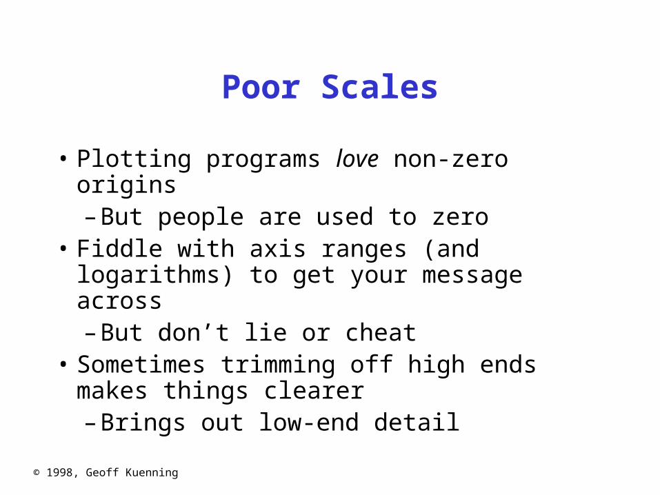
Poor Scales
• Plotting programs love non-zero origins– But people are used to zero
• Fiddle with axis ranges (and logarithms) to get your message across– But don’t lie or cheat
• Sometimes trimming off high ends makes things clearer– Brings out low-end detail

© 1998, Geoff Kuenning
Nonzero Origins(Chosen by Microsoft)
65
70
75
80
85
90
95
1st Qtr 2nd Qtr 3rd Qtr 4th Qtr

© 1998, Geoff Kuenning
Proper Origins
0102030405060708090
100
1st Qtr 2nd Qtr 3rd Qtr 4th Qtr

© 1998, Geoff Kuenning
A Poor Axis Range
0
2000
4000
6000
8000
10000
12000
1 2 3 4

© 1998, Geoff Kuenning
A Logarithmic Range
1
10
100
1000
10000
1 2 3 4

© 1998, Geoff Kuenning
A Truncated Range
0
10
20
30
40
50
60
1 2 3 4
10000

© 1998, Geoff Kuenning
Using Lines Incorrectly
• Don’t connect points unless interpolation is meaningful
• Don’t smooth lines that are based on samples– Exception: fitted non-linear curves

© 1998, Geoff Kuenning
Incorrect Line Usage
0
100
200
300
400
500
0 1 2 3 4 5 6 7 8 9Replicas
Timecp
mab
rm

© 1998, Geoff Kuenning
Pictorial Games
• Non-zero origins and broken scales• Double-whammy graphs• Omitting confidence intervals• Scaling by height, not area• Poor histogram cell size

© 1998, Geoff Kuenning
Non-Zero Originsand Broken Scales
• People expect (0,0) origins– Subconsciously
• So non-zero origins are a great way to lie• More common than not in popular press• Also very common to cheat by omitting
part of scale– “Really, Your Honor, I included (0,0)”

© 1998, Geoff Kuenning
Non-Zero Origins
20
21
22
23
24
25
26
27
1st Qtr 2nd Qtr 3rd Qtr 4th Qtr
UsThem
0
20
40
60
80
100
1st Qtr 2ndQtr
3rdQtr
4th Qtr
ThemUs

© 1998, Geoff Kuenning
The Three-Quarters Rule
• Highest point should be 3/4 of scale or more
0
5
10
15
20
25
30
1st Qtr 2nd Qtr 3rd Qtr 4th Qtr
ThemUs

© 1998, Geoff Kuenning
Double-Whammy Graphs
• Put two related measures on same graph– One is (almost) function of other
• Hits reader twice with same information– And thus overstates impact
0
20
40
60
1st Qtr 2nd Qtr 3rd Qtr 4th Qtr
Sales ($)
Units Shipped

© 1998, Geoff Kuenning
OmittingConfidence Intervals
• Statistical data is inherently fuzzy• But means appear precise• Giving confidence intervals can make it
clear there’s no real difference– So liars and fools leave them out

© 1998, Geoff Kuenning
Graph WithoutConfidence Intervals
0
10
20
30
40
50
60
70
1st Qtr 2nd Qtr 3rd Qtr 4th Qtr

© 1998, Geoff Kuenning
Graph WithConfidence Intervals
0
10
20
30
40
50
60
70
1st Qtr 2nd Qtr 3rd Qtr 4th Qtr
© 1998, Geoff Kuenning
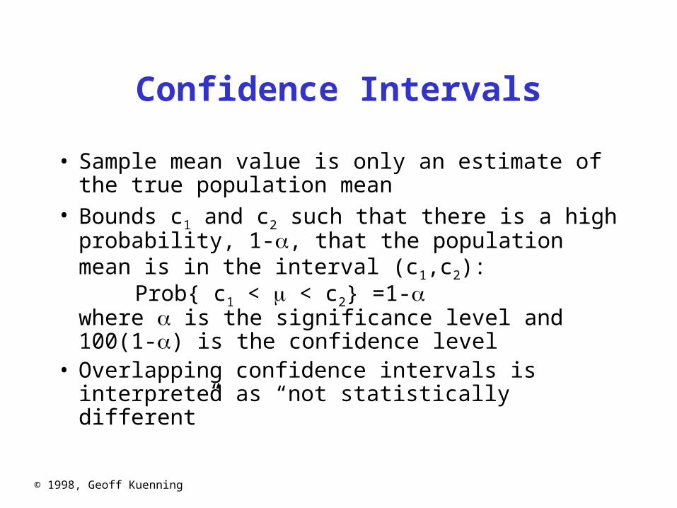
Confidence Intervals
• Sample mean value is only an estimate of the true population mean
• Bounds c1 and c2 such that there is a high probability, 1-, that the population mean is in the interval (c1,c2):
Prob{ c1 < < c2} =1- where is the significance level and100(1-) is the confidence level
• Overlapping confidence intervals is interpreted as “not statistically different”

© 1998, Geoff Kuenning
Graph WithConfidence Intervals
0
10
20
30
40
50
60
70
1st Qtr 2nd Qtr 3rd Qtr 4th Qtr

© 1998, Geoff Kuenning
Scaling by HeightInstead of Area
• Clip art is popular with illustrators:
Women in the Workforce
1960 1980
© 1998, Geoff Kuenning
The Troublewith Height Scaling
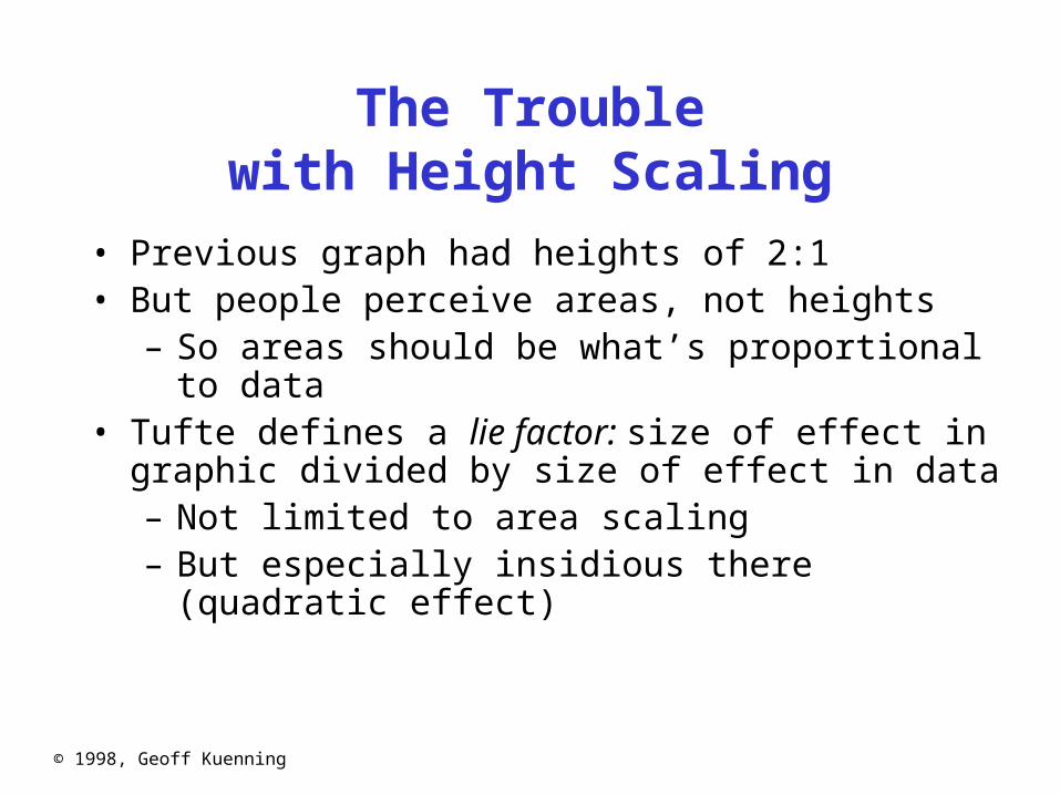
• Previous graph had heights of 2:1• But people perceive areas, not heights
– So areas should be what’s proportional to data• Tufte defines a lie factor: size of effect in graphic
divided by size of effect in data– Not limited to area scaling– But especially insidious there (quadratic effect)

© 1998, Geoff Kuenning
Scaling by Area
• Here’s the same graph with 2:1 area:
Women in the Workforce
1960 1980

© 1998, Geoff Kuenning
Poor Histogram Cell Size
• Picking bucket size is always a problem• Prefer 5 or more observations per bucket• Choice of bucket size can affect results:
02468
1012
5 10 15 20 25 30

© 1998, Geoff Kuenning
Special-Purpose Charts
• Histograms• Scatter plots• Gantt charts• Kiviat graphs

© 1998, Geoff Kuenning
Histograms
0
20
40
60
80
1st Qtr 2nd Qtr 3rd Qtr 4th Qtr

© 1998, Geoff Kuenning
Scatter Plots
• Useful in statistical analysis• Also excellent for huge quantities of data
– Can show patterns otherwise invisible
0
5
10
15
20
25
0 5 10 15

© 1998, Geoff Kuenning
Gantt Charts
• Shows relative duration of Boolean conditions• Arranged to make lines continuous
– Each level after first follows FTTF pattern
0 20 40 60 80 100
CPU
I/O
Network

© 1998, Geoff Kuenning
Kiviat Graphs
• Also called “star charts” or “radar plots”• Useful for looking at balance between HB and
LB metrics

© 1998, Geoff Kuenning
Useful Reference Works
• Edward R. Tufte, The Visual Display of Quantitative Information, Graphics Press, Cheshire, Connecticut, 1983.
• Edward R. Tufte, Envisioning Information, Graphics Press, Cheshire, Connecticut, 1990.
• Edward R. Tufte, Visual Explanations, Graphics Press, Cheshire, Connecticut, 1997.
• Darrell Huff, How to Lie With Statistics, W.W. Norton & Co., New York, 1954