+ chapter 1 exploring data introduction: data analysis: making sense of data 1.1analyzing...
TRANSCRIPT
+Chapter 1Exploring Data
Introduction: Data Analysis: Making Sense of Data
1.1 Analyzing Categorical Data
1.2 Displaying Quantitative Data with Graphs
1.3 Describing Quantitative Data with Numbers

+IntroductionData Analysis: Making Sense of Data
After this section, you should be able to…
DEFINE “Individuals” and “Variables”
DISTINGUISH between “Categorical” and “Quantitative” variables
DEFINE “Distribution”
DESCRIBE the idea behind “Inference”
Learning Objectives
+Data A
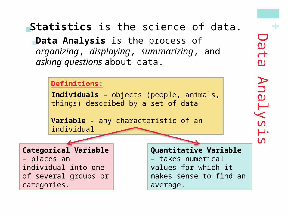
nalysis Statistics is the science of data.
Data Analysis is the process of organizing, displaying, summarizing, and asking questions about data.
Definitions:
Individuals – objects (people, animals, things) described by a set of data
Variable - any characteristic of an individual
Categorical Variable– places an individual into one of several groups or categories.
Quantitative Variable – takes numerical values for which it makes sense to find an average.

+ Read Example : Census at school ( P-3)
Now do Exercise 3 on P- 7
Answers:
a) Individuals: AP Stat students who completed a questionnaire on the first day of class.
b) Categorical: gender, handedness, favorite type of music
Quantitative: height( inches), amount of time the students
expects to spend on HW (mins) , the total value of coin(cents)
c) Female, right-handed, 58 inches tall, spends 60
mins on HW, prefers alternative music, had 76
cents in her pocket.

+ Do Activity : Hiring Discrimination – It just won’t fly ……
Follow the directions on Page 5
Perform 5 repetitions of your simulation.
Turn in your results to your teacher.
(Make Groups of 4)
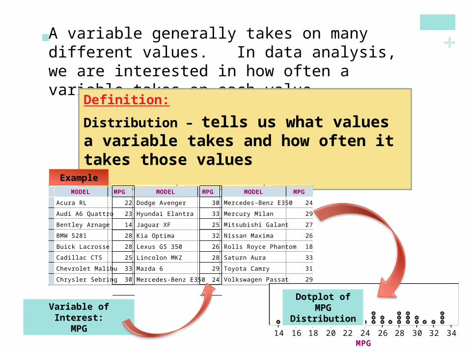
+ A variable generally takes on many different values. In data analysis, we are interested in how often a variable takes on each value.
Definition:
Distribution – tells us what values a variable takes and how often it takes those values
2009 Fuel Economy Guide
MODEL MPG
1
2
3
4
5
6
7
8
9
Acura RL 22
Audi A6 Quattro 23
Bentley Arnage 14
BMW 5281 28
Buick Lacrosse 28
Cadillac CTS 25
Chevrolet Malibu 33
Chrysler Sebring 30
Dodge Avenger 30
2009 Fuel Economy Guide
MODEL MPG <new>
9
10
11
12
13
14
15
16
17
Dodge Avenger 30
Hyundai Elantra 33
Jaguar XF 25
Kia Optima 32
Lexus GS 350 26
Lincolon MKZ 28
Mazda 6 29
Mercedes-Benz E350 24
Mercury Milan 29
2009 Fuel Economy Guide
MODEL MPG <new>
16
17
18
19
20
21
22
23
24
Mercedes-Benz E350 24
Mercury Milan 29
Mitsubishi Galant 27
Nissan Maxima 26
Rolls Royce Phantom 18
Saturn Aura 33
Toyota Camry 31
Volkswagen Passat 29
Volvo S80 25
MPG14 16 18 20 22 24 26 28 30 32 34
2009 Fuel Economy Guide Dot Plot
Variable of Interest:MPG
Dotplot of MPG Distribution
Example

+
MPG14 16 18 20 22 24 26 28 30 32 34
2009 Fuel Economy Guide Dot Plot
2009 Fuel Economy Guide
MODEL MPG <new>
9
10
11
12
13
14
15
16
17
Dodge Avenger 30
Hyundai Elantra 33
Jaguar XF 25
Kia Optima 32
Lexus GS 350 26
Lincolon MKZ 28
Mazda 6 29
Mercedes-Benz E350 24
Mercury Milan 29
2009 Fuel Economy Guide
MODEL MPG <new>
16
17
18
19
20
21
22
23
24
Mercedes-Benz E350 24
Mercury Milan 29
Mitsubishi Galant 27
Nissan Maxima 26
Rolls Royce Phantom 18
Saturn Aura 33
Toyota Camry 31
Volkswagen Passat 29
Volvo S80 25
2009 Fuel Economy Guide
MODEL MPG
1
2
3
4
5
6
7
8
9
Acura RL 22
Audi A6 Quattro 23
Bentley Arnage 14
BMW 5281 28
Buick Lacrosse 28
Cadillac CTS 25
Chevrolet Malibu 33
Chrysler Sebring 30
Dodge Avenger 30
Add numerical summaries
Data A
nalysis
Examine each variable by itself.
Then study relationships among
the variables.
Start with a graph or graphs
How to Explore Data
+Data A
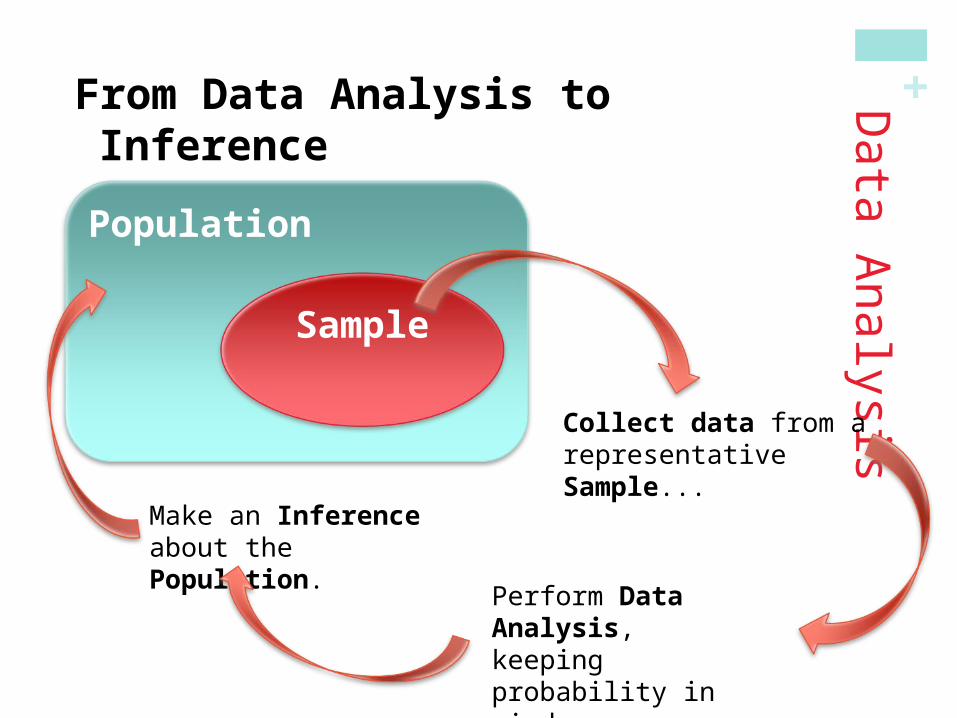
nalysisFrom Data Analysis to Inference
Population
Sample
Collect data from a representative Sample...
Perform Data Analysis, keeping probability in mind…
Make an Inference about the Population.

+Inference:
Inference is the process of making a conclusion about a population based on a sample set of data.

+IntroductionData Analysis: Making Sense of Data
In this section, we learned that…
A dataset contains information on individuals.
For each individual, data give values for one or more variables.
Variables can be categorical or quantitative.
The distribution of a variable describes what values it takes and how often it takes them.
Inference is the process of making a conclusion about a population based on a sample set of data.
Summary

+ Do Notes worksheet : First page
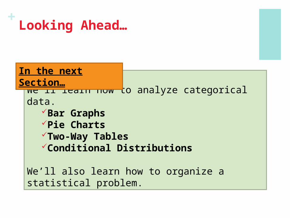
+Looking Ahead…
We’ll learn how to analyze categorical data.Bar GraphsPie ChartsTwo-Way TablesConditional Distributions
We’ll also learn how to organize a statistical problem.
In the next Section…
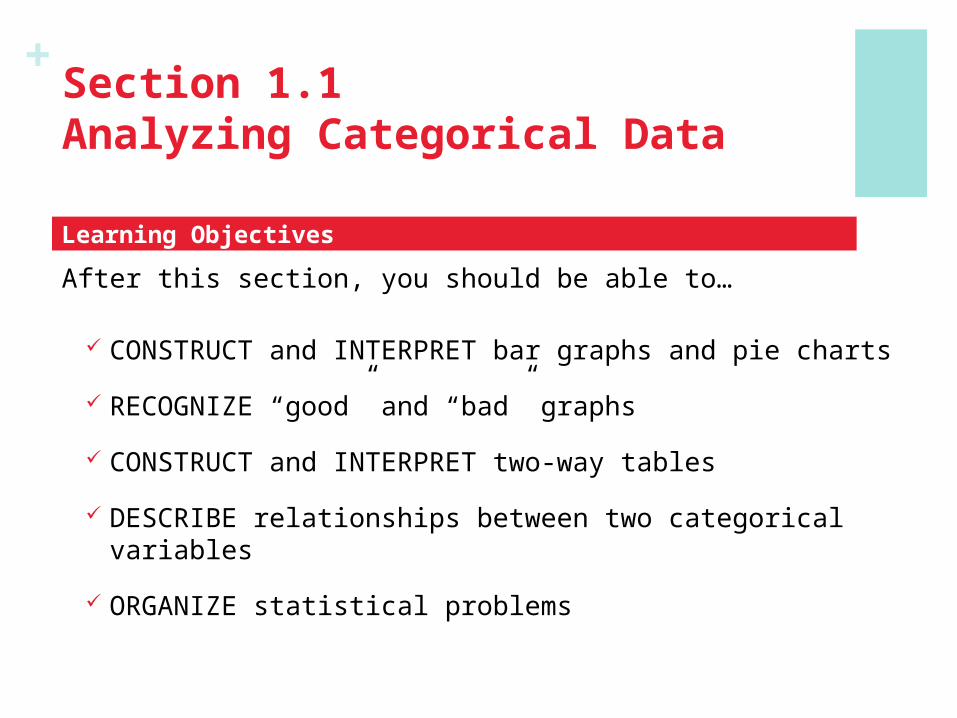
+Section 1.1Analyzing Categorical Data
After this section, you should be able to…
CONSTRUCT and INTERPRET bar graphs and pie charts
RECOGNIZE “good” and “bad” graphs
CONSTRUCT and INTERPRET two-way tables
DESCRIBE relationships between two categorical variables
ORGANIZE statistical problems
Learning Objectives

+Analyzing C
ategorical Data
Categorical Variables place individuals into one of several groups or categories
The values of a categorical variable are labels for the different categories The distribution of a categorical variable lists the count or percent of
individuals who fall into each category.
Frequency Table
Format Count of Stations
Adult Contemporary 1556
Adult Standards 1196
Contemporary Hit 569
Country 2066
News/Talk 2179
Oldies 1060
Religious 2014
Rock 869
Spanish Language 750
Other Formats 1579
Total 13838
Relative Frequency Table
Format Percent of Stations
Adult Contemporary 11.2
Adult Standards 8.6
Contemporary Hit 4.1
Country 14.9
News/Talk 15.7
Oldies 7.7
Religious 14.6
Rock 6.3
Spanish Language 5.4
Other Formats 11.4
Total 99.9
Example, page 8
Count
Percent
Variable
Values

+Analyzing C
ategorical Data
Displaying categorical data
Frequency tables can be difficult to read. Sometimes is is easier to analyze a distribution by displaying it with a bar graph or pie chart.
Frequency Table
Format Count of Stations
Adult Contemporary 1556
Adult Standards 1196
Contemporary Hit 569
Country 2066
News/Talk 2179
Oldies 1060
Religious 2014
Rock 869
Spanish Language 750
Other Formats 1579
Total 13838
Relative Frequency Table
Format Percent of Stations
Adult Contemporary 11.2
Adult Standards 8.6
Contemporary Hit 4.1
Country 14.9
News/Talk 15.7
Oldies 7.7
Religious 14.6
Rock 6.3
Spanish Language 5.4
Other Formats 11.4
Total 99.9
+
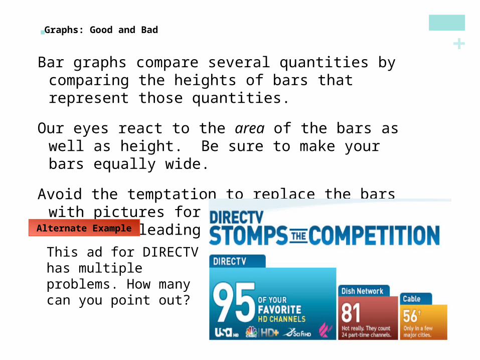
Bar graphs compare several quantities by comparing the heights of bars that represent those quantities.
Our eyes react to the area of the bars as well as height. Be sure to make your bars equally wide.
Avoid the temptation to replace the bars with pictures for greater appeal…this can be misleading!
Graphs: Good and Bad
Alternate Example
This ad for DIRECTV has multiple problems. How many can you point out?

+ Example: Bar graph
What personal media do you own?
Here are the percents of 15-18 year olds who own the following personal media devices.
a) Make a well-labeled bar graph. What do you see?
b) Would it be appropriate to make a pie chart for these data? Why or why not?
Device % who won
Cell Phone 85
MP3 player 83
Handheld Video game player
41
Laptop 38
Portable CD/tape player 20

+Analyzing C
ategorical Data
Two-Way Tables and Marginal Distributions
When a dataset involves two categorical variables, we begin by examining the counts or percents in various categories for one of the variables.
Definition:
Two-way Table – describes two categorical variables, organizing counts according to a row variable and a column variable.
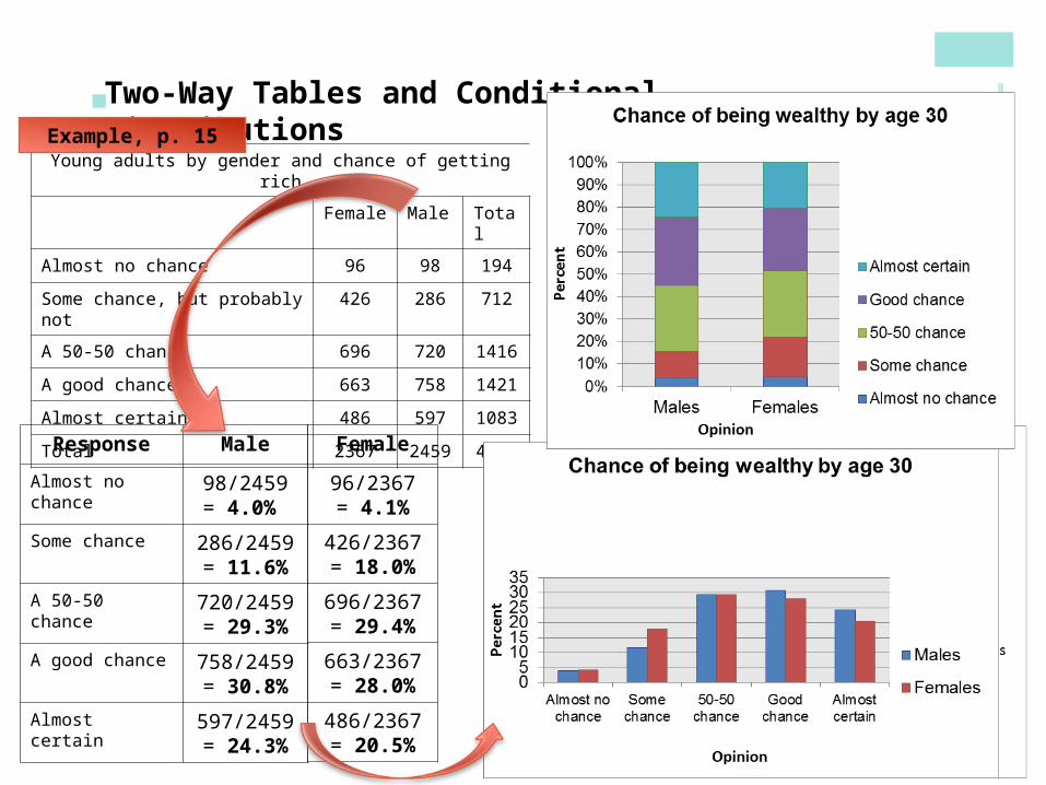
Young adults by gender and chance of getting rich
Female Male Total
Almost no chance 96 98 194
Some chance, but probably not 426 286 712
A 50-50 chance 696 720 1416
A good chance 663 758 1421
Almost certain 486 597 1083
Total 2367 2459 4826
Example, p. 12
What are the variables described by this two-way table?How many young adults were surveyed?

+Analyzing C
ategorical Data
Two-Way Tables and Marginal Distributions
Definition:
The Marginal Distribution of one of the categorical variables in a two-way table of counts is the distribution of values of that variable among all individuals described by the table.
Note: Percents are often more informative than counts, especially when comparing groups of different sizes.
To examine a marginal distribution,1)Use the data in the table to calculate the marginal distribution (in percents) of the row or column totals.2)Make a graph to display the marginal distribution.

+
Young adults by gender and chance of getting rich
Female Male Total
Almost no chance 96 98 194
Some chance, but probably not 426 286 712
A 50-50 chance 696 720 1416
A good chance 663 758 1421
Almost certain 486 597 1083
Total 2367 2459 4826
Two-Way Tables and Marginal Distributions
Response Percent
Almost no chance 194/4826 = 4.0%
Some chance 712/4826 = 14.8%
A 50-50 chance 1416/4826 = 29.3%
A good chance 1421/4826 = 29.4%
Almost certain 1083/4826 = 22.4%
Example, p. 13
Examine the marginal distribution of chance of getting rich.
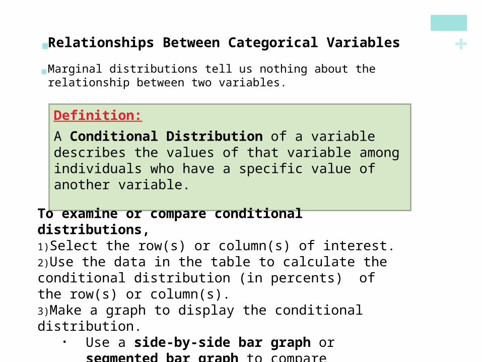
+ Relationships Between Categorical Variables Marginal distributions tell us nothing about the relationship between
two variables.
Definition:
A Conditional Distribution of a variable describes the values of that variable among individuals who have a specific value of another variable.
To examine or compare conditional distributions,1)Select the row(s) or column(s) of interest.2)Use the data in the table to calculate the conditional distribution (in percents) of the row(s) or column(s).3)Make a graph to display the conditional distribution.
• Use a side-by-side bar graph or segmented bar graph to compare distributions.
+
Young adults by gender and chance of getting rich
Female Male Total
Almost no chance 96 98 194
Some chance, but probably not 426 286 712
A 50-50 chance 696 720 1416
A good chance 663 758 1421
Almost certain 486 597 1083
Total 2367 2459 4826
Two-Way Tables and Conditional Distributions
Response Male
Almost no chance 98/2459 = 4.0%
Some chance 286/2459 = 11.6%
A 50-50 chance 720/2459 = 29.3%
A good chance 758/2459 = 30.8%
Almost certain 597/2459 = 24.3%
Example, p. 15
Calculate the conditional distribution of opinion among males.Examine the relationship between gender and opinion.
Female
96/2367 = 4.1%
426/2367 = 18.0%
696/2367 = 29.4%
663/2367 = 28.0%
486/2367 = 20.5%
+Analyzing C
ategorical Data
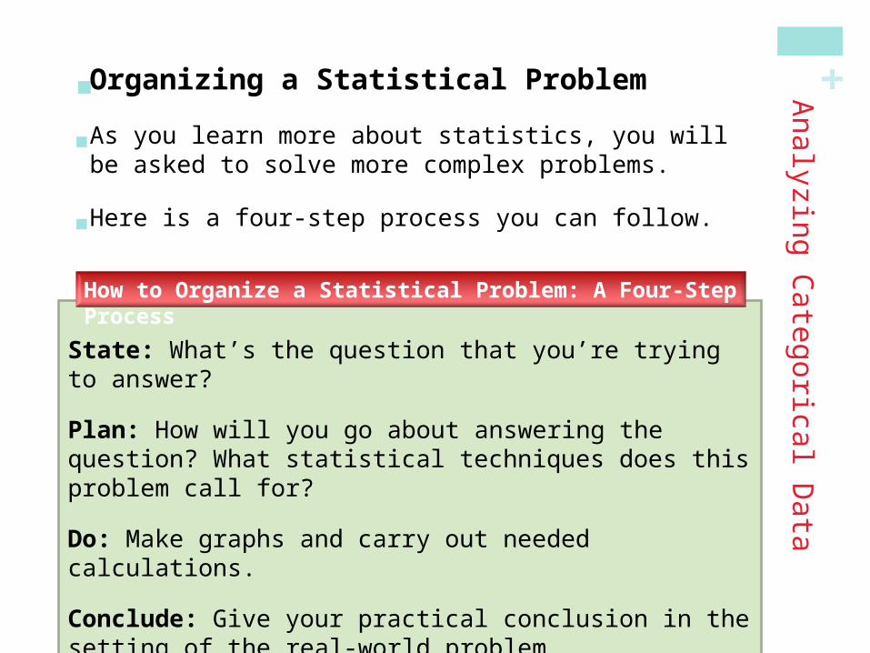
Organizing a Statistical Problem As you learn more about statistics, you will be asked to solve
more complex problems.
Here is a four-step process you can follow.
State: What’s the question that you’re trying to answer?
Plan: How will you go about answering the question? What statistical techniques does this problem call for?
Do: Make graphs and carry out needed calculations.
Conclude: Give your practical conclusion in the setting of the real-world problem.
How to Organize a Statistical Problem: A Four-Step Process
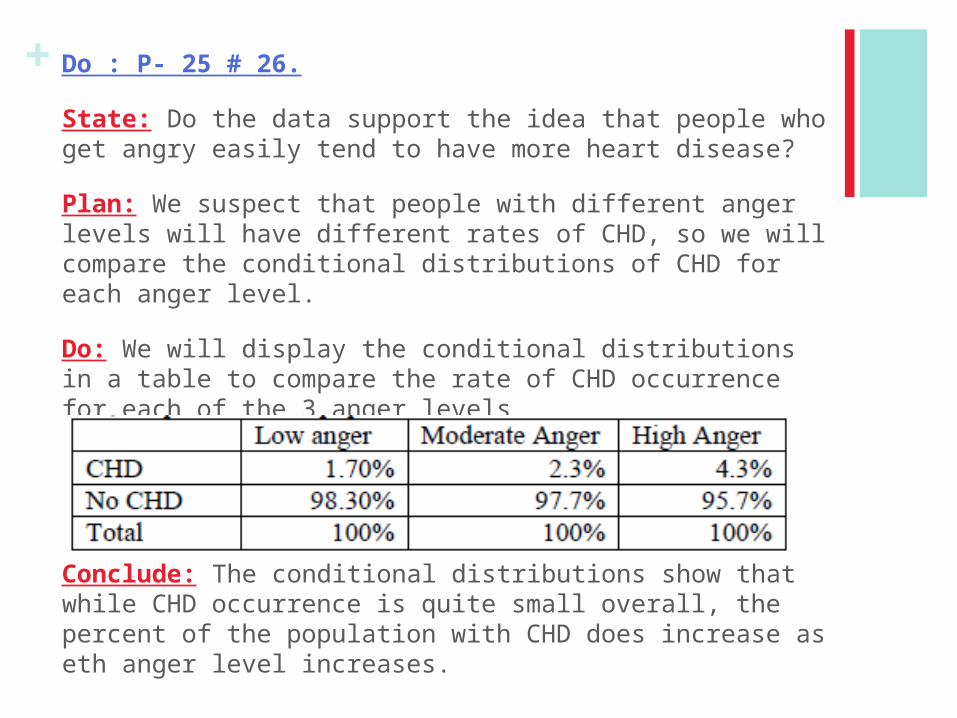
+ Do : P- 25 # 26.
State: Do the data support the idea that people who get angry easily tend to have more heart disease?
Plan: We suspect that people with different anger levels will have different rates of CHD, so we will compare the conditional distributions of CHD for each anger level.
Do: We will display the conditional distributions in a table to compare the rate of CHD occurrence for each of the 3 anger levels
Conclude: The conditional distributions show that while CHD occurrence is quite small overall, the percent of the population with CHD does increase as eth anger level increases.

+Section 1.1Analyzing Categorical Data
In this section, we learned that…
The distribution of a categorical variable lists the categories and gives the count or percent of individuals that fall into each category.
Pie charts and bar graphs display the distribution of a categorical variable.
A two-way table of counts organizes data about two categorical variables.
The row-totals and column-totals in a two-way table give the marginal distributions of the two individual variables.
There are two sets of conditional distributions for a two-way table.
Summary

+Section 1.1Analyzing Categorical Data
In this section, we learned that…
We can use a side-by-side bar graph or a segmented bar graph to display conditional distributions.
To describe the association between the row and column variables, compare an appropriate set of conditional distributions.
Even a strong association between two categorical variables can be influenced by other variables lurking in the background.
You can organize many problems using the four steps state, plan, do, and conclude.
Summary, continued
+Looking Ahead…
We’ll learn how to display quantitative data.DotplotsStemplotsHistograms
We’ll also learn how to describe and compare distributions of quantitative data.
In the next Section…

+Section 1.2Displaying Quantitative Data with Graphs
After this section, you should be able to…
CONSTRUCT and INTERPRET dotplots, stemplots, and histograms
DESCRIBE the shape of a distribution
COMPARE distributions
USE histograms wisely
Learning Objectives

+
1)Draw a horizontal axis (a number line) and label it with the variable name.2)Scale the axis from the minimum to the maximum value.3)Mark a dot above the location on the horizontal axis corresponding to each data value.
Displaying Q
uantitative Data
Dotplots One of the simplest graphs to construct and interpret is a
dotplot. Each data value is shown as a dot above its location on a number line.
How to Make a Dotplot
Number of Goals Scored Per Game by the 2004 US Women’s Soccer Team
3 0 2 7 8 2 4 3 5 1 1 4 5 3 1 1 3
3 3 2 1 2 2 2 4 3 5 6 1 5 5 1 1 5

+ Examining the Distribution of a Quantitative Variable The purpose of a graph is to help us understand the data.
After you make a graph, always ask, “What do I see?”
In any graph, look for the overall pattern and for striking departures from that pattern.
Describe the overall pattern of a distribution by its:
•Shape•Center•Spread•Outliers
Note individual values that fall outside the overall pattern. These departures are called outliers.
How to Examine the Distribution of a Quantitative Variable
Displaying Q
uantitative Data
Don’t forget your SOCS!
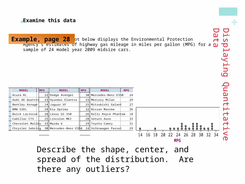
+ Examine this data The table and dotplot below displays the Environmental Protection Agency’s estimates of
highway gas mileage in miles per gallon (MPG) for a sample of 24 model year 2009 midsize cars.
Displaying Q
uantitative Data
Describe the shape, center, and spread of the distribution. Are there any outliers?
2009 Fuel Economy Guide
MODEL MPG
1
2
3
4
5
6
7
8
9
Acura RL 22
Audi A6 Quattro 23
Bentley Arnage 14
BMW 5281 28
Buick Lacrosse 28
Cadillac CTS 25
Chevrolet Malibu 33
Chrysler Sebring 30
Dodge Avenger 30
2009 Fuel Economy Guide
MODEL MPG <new>
9
10
11
12
13
14
15
16
17
Dodge Avenger 30
Hyundai Elantra 33
Jaguar XF 25
Kia Optima 32
Lexus GS 350 26
Lincolon MKZ 28
Mazda 6 29
Mercedes-Benz E350 24
Mercury Milan 29
2009 Fuel Economy Guide
MODEL MPG <new>
16
17
18
19
20
21
22
23
24
Mercedes-Benz E350 24
Mercury Milan 29
Mitsubishi Galant 27
Nissan Maxima 26
Rolls Royce Phantom 18
Saturn Aura 33
Toyota Camry 31
Volkswagen Passat 29
Volvo S80 25
MPG14 16 18 20 22 24 26 28 30 32 34
2009 Fuel Economy Guide Dot Plot
Example, page 28
+Displaying Q
uantitative Data
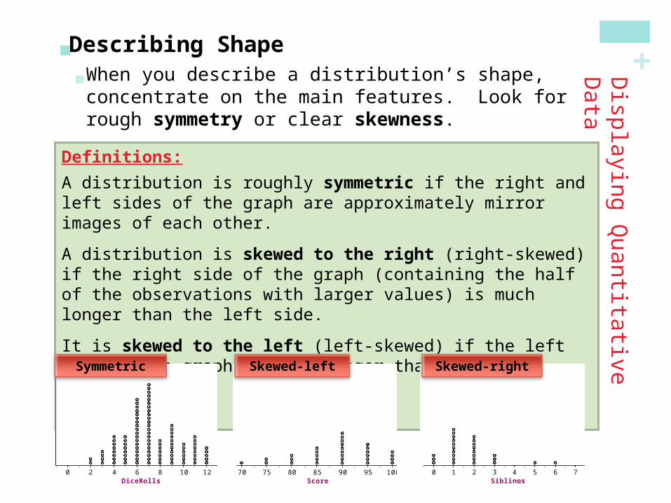
Describing Shape When you describe a distribution’s shape, concentrate on
the main features. Look for rough symmetry or clear skewness.
Definitions:
A distribution is roughly symmetric if the right and left sides of the graph are approximately mirror images of each other.
A distribution is skewed to the right (right-skewed) if the right side of the graph (containing the half of the observations with larger values) is much longer than the left side.
It is skewed to the left (left-skewed) if the left side of the graph is much longer than the right side.
DiceRolls0 2 4 6 8 10 12
Score70 75 80 85 90 95 100
Siblings0 1 2 3 4 5 6 7
Symmetric Skewed-left Skewed-right
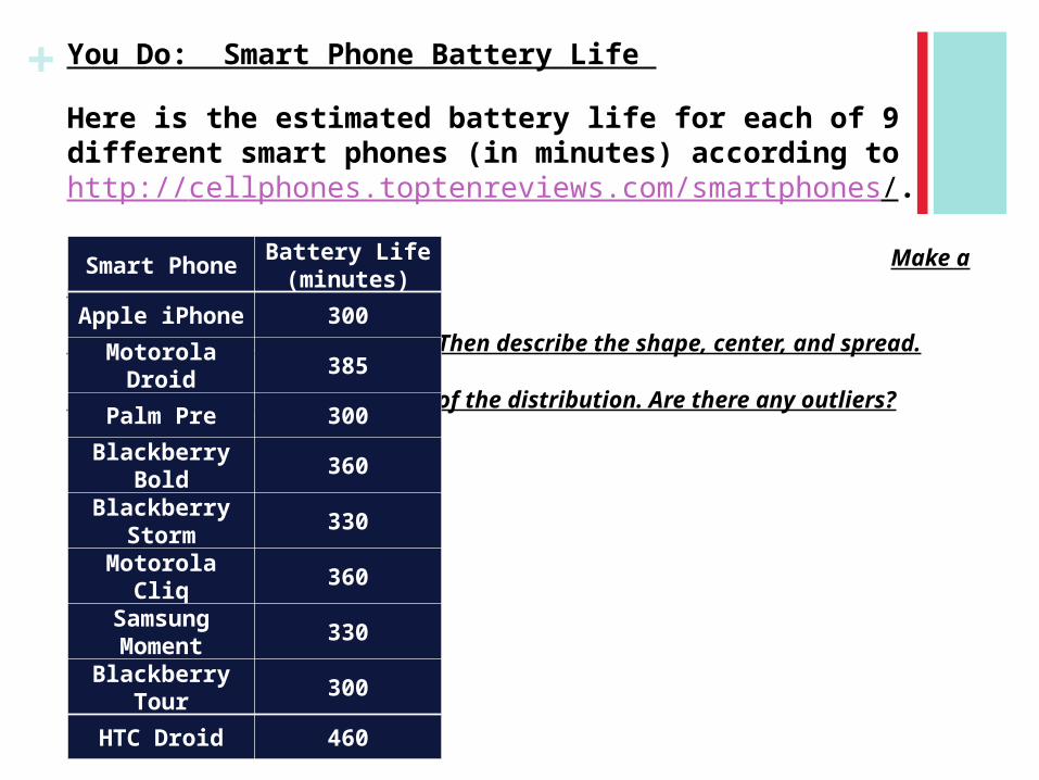
+ You Do: Smart Phone Battery Life
Here is the estimated battery life for each of 9 different smart phones (in minutes) according to http://cellphones.toptenreviews.com/smartphones/.
Make a dot plot.
* Then describe the shape, center, and spread.
of the distribution. Are there any outliers?
Smart PhoneBattery Life (minutes)
Apple iPhone 300
Motorola Droid 385
Palm Pre 300
Blackberry Bold
360
Blackberry Storm
330
Motorola Cliq 360
Samsung Moment
330
Blackberry Tour
300
HTC Droid 460
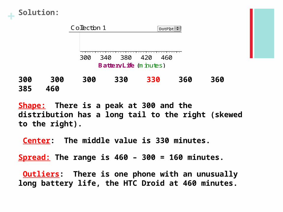
+ Solution:
300 300 300 330 330 360 360 385 460
Shape: There is a peak at 300 and the distribution has a long tail to the right (skewed to the right).
Center: The middle value is 330 minutes.
Spread: The range is 460 – 300 = 160 minutes.
Outliers: There is one phone with an unusually long battery life, the HTC Droid at 460 minutes.
BatteryLife (minutes)300 340 380 420 460
Collection 1 Dot Plot

+
Comparing Distributions
Some of the most interesting statistics questions involve comparing two or more groups.
Always discuss shape, center, spread, and possible outliers whenever you compare distributions of a quantitative variable.
Household_Size0 5 10 15 20 25 30
Household_Size0 5 10 15 20 25 30
Example, page 32
Compare the distributions of household size for these two countries. Don’t forget your SOCS!
( Compare each characteristic)
Pla
ce
U.K
S
ou
th A
fric
a
+
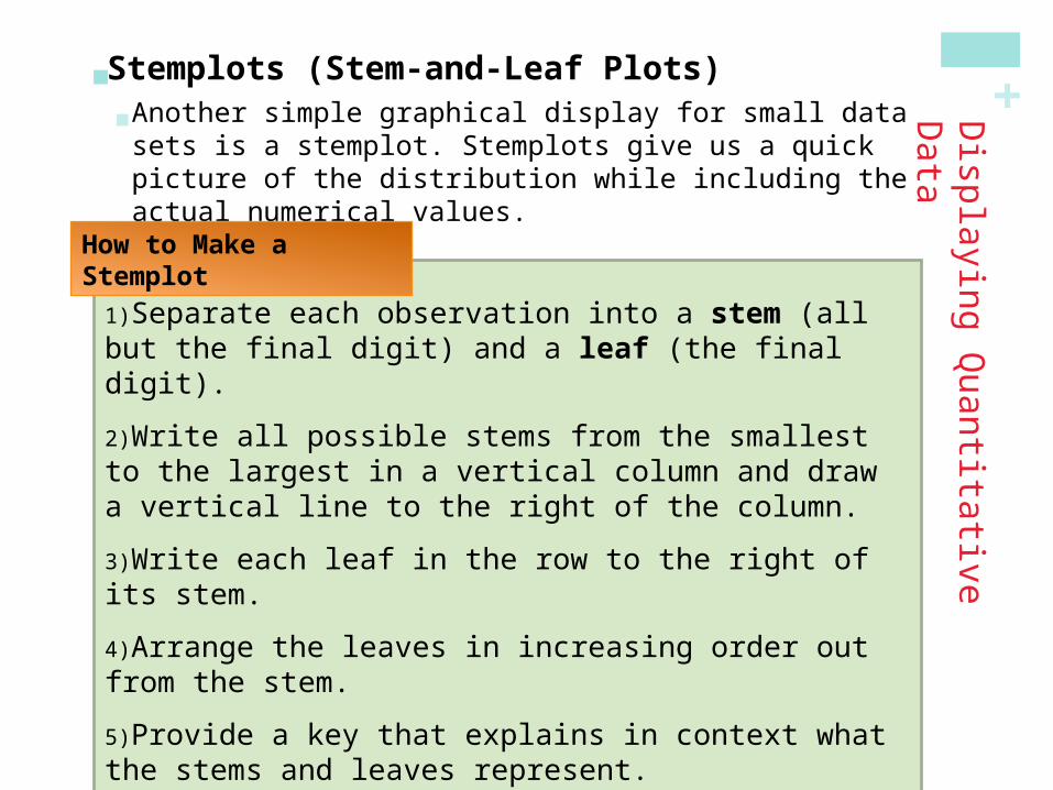
1)Separate each observation into a stem (all but the final digit) and a leaf (the final digit).
2)Write all possible stems from the smallest to the largest in a vertical column and draw a vertical line to the right of the column.
3)Write each leaf in the row to the right of its stem.
4)Arrange the leaves in increasing order out from the stem.
5)Provide a key that explains in context what the stems and leaves represent.
Displaying Q
uantitative Data
Stemplots (Stem-and-Leaf Plots) Another simple graphical display for small data sets is a
stemplot. Stemplots give us a quick picture of the distribution while including the actual numerical values.
How to Make a Stemplot
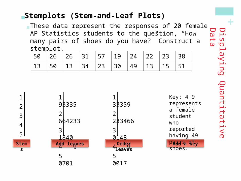
+Displaying Q
uantitative Data
Stemplots (Stem-and-Leaf Plots) These data represent the responses of 20 female AP
Statistics students to the question, “How many pairs of shoes do you have?” Construct a stemplot.
50 26 26 31 57 19 24 22 23 38
13 50 13 34 23 30 49 13 15 51
Stems
1
2
3
4
5
Add leaves
1 93335
2 664233
3 1840
4 9
5 0701 Order leaves
1 33359
2 233466
3 0148
4 9
5 0017 Add a key
Key: 4|9 represents a female student who reported having 49 pairs of shoes.

+ Splitting Stems and Back-to-Back Stemplots When data values are “bunched up”, we can get a better picture of
the distribution by splitting stems. Two distributions of the same quantitative variable can be
compared using a back-to-back stemplot with common stems.
50 26 26 31 57 19 24 22 23 38
13 50 13 34 23 30 49 13 15 51
001122334455
Key: 4|9 represents a student who reported having 49 pairs of shoes.
Females
14 7 6 5 12 38 8 7 10 10
10 11 4 5 22 7 5 10 35 7
Males0 40 5556777781 000012412 2233 584455
Females
33395
433266
4108
9100
7
Males
“split stems”
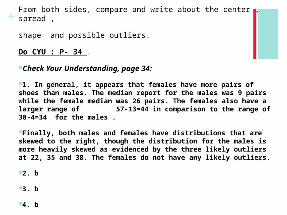
+From both sides, compare and write about the center , spread ,
shape and possible outliers.
Do CYU : P- 34 .
Check Your Understanding, page 34:
1. In general, it appears that females have more pairs of shoes than males. The median report for the males was 9 pairs while the female median was 26 pairs. The females also have a larger range of 57-13=44 in comparison to the range of 38-4=34 for the males .
Finally, both males and females have distributions that are skewed to the right, though the distribution for the males is more heavily skewed as evidenced by the three likely outliers at 22, 35 and 38. The females do not have any likely outliers.
2. b
3. b
4. b

+
1)Divide the range of data into classes of equal width.
2)Find the count (frequency) or percent (relative frequency) of individuals in each class.
3)Label and scale your axes and draw the histogram. The height of the bar equals its frequency. Adjacent bars should touch, unless a class contains no individuals.
Histograms Quantitative variables often take many values. A graph of the
distribution may be clearer if nearby values are grouped together. The most common graph of the distribution of one quantitative
variable is a histogram.
How to Make a Histogram

+ Making a Histogram The table on page 35 presents data on the percent of residents from each state who
were born outside of the U.S.
Displaying Q
uantitative Data
Example, page 35
Frequency Table
Class Count
0 to <5 20
5 to <10 13
10 to <15 9
15 to <20 5
20 to <25 2
25 to <30 1
Total 50 Percent of foreign-born residents
Nu
mb
er o
f S
tate
s
2
4
6
8
10
12
14
16
18
20
22
0 5 10 15 20 25 30
+
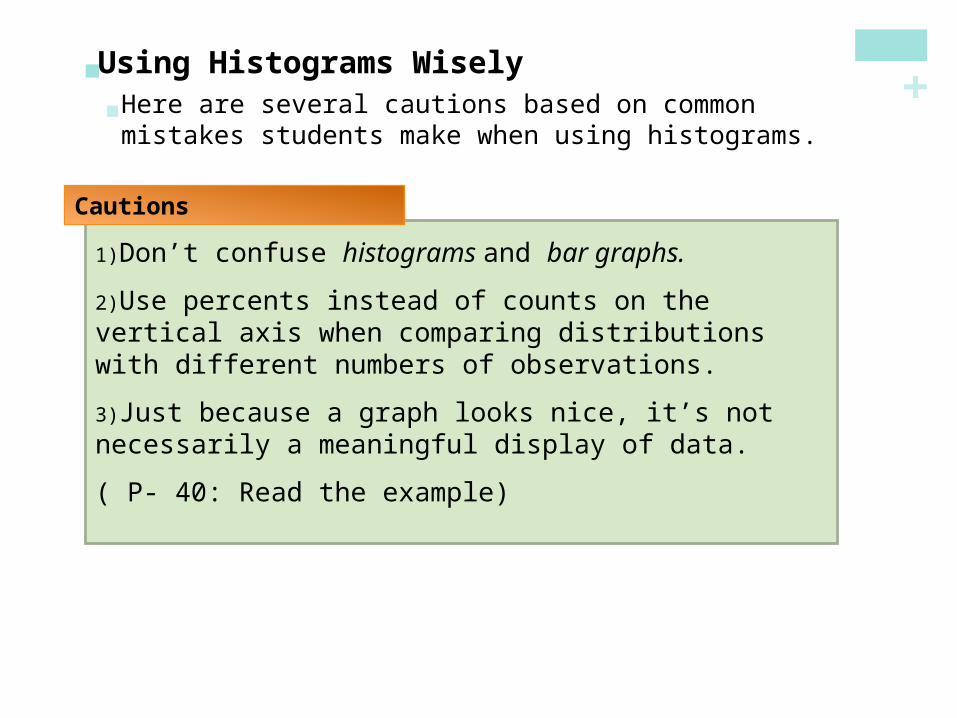
1)Don’t confuse histograms and bar graphs.
2)Use percents instead of counts on the vertical axis when comparing distributions with different numbers of observations.
3)Just because a graph looks nice, it’s not necessarily a meaningful display of data.
( P- 40: Read the example)
Using Histograms Wisely Here are several cautions based on common mistakes
students make when using histograms.
Cautions
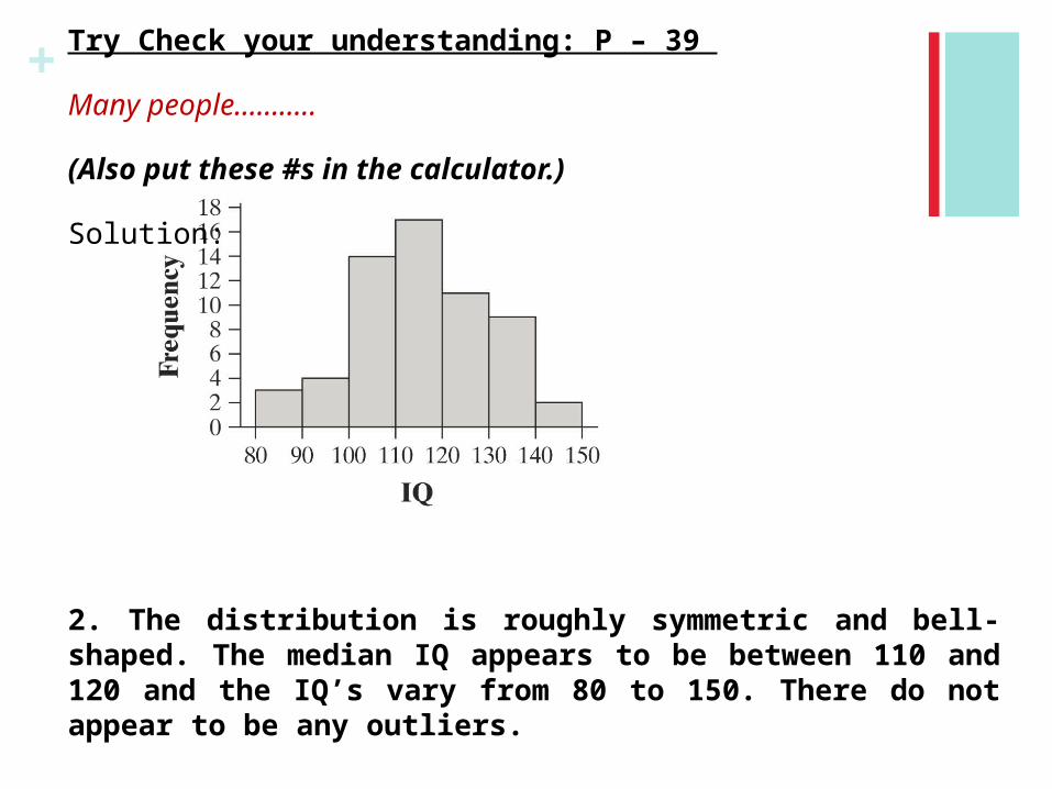
+ Try Check your understanding: P – 39
Many people………..
(Also put these #s in the calculator.)
Solution:
2. The distribution is roughly symmetric and bell-shaped. The median IQ appears to be between 110 and 120 and the IQ’s vary from 80 to 150. There do not appear to be any outliers.
+
In this section, we learned that…
You can use a dotplot, stemplot, or histogram to show the distribution of a quantitative variable.
When examining any graph, look for an overall pattern and for notable departures from that pattern. Describe the shape, center, spread, and any outliers. Don’t forget your SOCS!
Some distributions have simple shapes, such as symmetric or skewed. The number of modes (major peaks) is another aspect of overall shape.
When comparing distributions, be sure to discuss shape, center, spread, and possible outliers.
Histograms are for quantitative data, bar graphs are for categorical data. Use relative frequency histograms when comparing data sets of different sizes.
Summary
Section 1.2Displaying Quantitative Data with Graphs

+ Do # 56 P- 46
+Looking Ahead…
We’ll learn how to describe quantitative data with numbers.
Mean and Standard DeviationMedian and Interquartile RangeFive-number Summary and BoxplotsIdentifying Outliers
We’ll also learn how to calculate numerical summaries with technology and how to choose appropriate measures of center and spread.
In the next Section…

+Section 1.3Describing Quantitative Data with Numbers
After this section, you should be able to…
MEASURE center with the mean and median
MEASURE spread with standard deviation and interquartile range
IDENTIFY outliers
CONSTRUCT a boxplot using the five-number summary
CALCULATE numerical summaries with technology
Learning Objectives

+Describing Q
uantitative Data
Measuring Center: The Mean The most common measure of center is the ordinary
arithmetic average, or mean.
Definition:
To find the mean (pronounced “x-bar”) of a set of observations, add their values and divide by the number of observations. If the n observations are x1, x2, x3, …, xn, their mean is:
x
x sum of observations
n
x1 x2 ... xn
n
In mathematics, the capital Greek letter Σis short for “add them all up.” Therefore, the formula for the mean can be written in more compact notation:
x xi
n
+Describing Q
uantitative Data
Measuring Center: The Median Another common measure of center is the median. In
section 1.2, we learned that the median describes the midpoint of a distribution.
Definition:
The median M is the midpoint of a distribution, the number such that half of the observations are smaller and the other half are larger.
To find the median of a distribution:
1)Arrange all observations from smallest to largest.
2)If the number of observations n is odd, the median M is the center observation in the ordered list.
3)If the number of observations n is even, the median M is the average of the two center observations in the ordered list.

+Describing Q
uantitative Data
Measuring Center Use the data below to calculate the mean and median of
the commuting times (in minutes) of 20 randomly selected New York workers.
Example, page 53
10 30 5 25 40 20 10 15 30 20 15 20 85 15 65 15 60 60 40 45
x 10 30 5 25 ... 40 45
2031.25 minutes
0 51 0055552 00053 004 00556 00578 5
Key: 4|5 represents a New York worker who reported a 45-minute travel time to work.
M 20 25
222.5 minutes

+ Comparing the Mean and the Median The mean and median measure center in different ways, and
both are useful.
Don’t confuse the “average” value of a variable (the mean) with its “typical” value, which we might describe by the median.
The mean and median of a roughly symmetric distribution are close together.
If the distribution is exactly symmetric, the mean and median are exactly the same.
In a skewed distribution, the mean is usually farther out in the long tail than is the median.
Comparing the Mean and the Median
Describing Q
uantitative Data

+Describing Q
uantitative Data
Measuring Spread: The Interquartile Range (IQR) A measure of center alone can be misleading.
A useful numerical description of a distribution requires both a measure of center and a measure of spread.
To calculate the quartiles:
1)Arrange the observations in increasing order and locate the median M.
2)The first quartile Q1 is the median of the observations located to the left of the median in the ordered list.
3)The third quartile Q3 is the median of the observations located to the right of the median in the ordered list.
The interquartile range (IQR) is defined as:
IQR = Q3 – Q1
How to Calculate the Quartiles and the Interquartile Range

+ Do CYU P- 55

+
5 10 10 15 15 15 15 20 20 20 25 30 30 40 40 45 60 60 65 85
Describing Q
uantitative Data
Find and Interpret the IQR
Example, page 57
10 30 5 25 40 20 10 15 30 20 15 20 85 15 65 15 60 60 40 45
Travel times to work for 20 randomly selected New Yorkers
5 10 10 15 15 15 15 20 20 20 25 30 30 40 40 45 60 60 65 85
M = 22.5 Q3= 42.5Q1 = 15
IQR = Q3 – Q1
= 42.5 – 15= 27.5 minutes
Interpretation: The range of the middle half of travel times for the New Yorkers in the sample is 27.5 minutes.

+Describing Q
uantitative Data
Identifying Outliers In addition to serving as a measure of spread, the
interquartile range (IQR) is used as part of a rule of thumb for identifying outliers.
Definition:
The 1.5 x IQR Rule for Outliers
Call an observation an outlier if it falls more than 1.5 x IQR above the third quartile or below the first quartile.
Example, page 57
In the New York travel time data, we found Q1=15 minutes, Q3=42.5 minutes, and IQR=27.5 minutes.
For these data, 1.5 x IQR = 1.5(27.5) = 41.25
Q1 - 1.5 x IQR = 15 – 41.25 = -26.25
Q3+ 1.5 x IQR = 42.5 + 41.25 = 83.75
Any travel time shorter than -26.25 minutes or longer than 83.75 minutes is considered an outlier.
0 51 0055552 00053 004 00556 00578 5
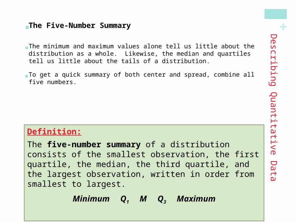
+ The Five-Number Summary The minimum and maximum values alone tell us little about the distribution
as a whole. Likewise, the median and quartiles tell us little about the tails of a distribution.
To get a quick summary of both center and spread, combine all five numbers.
Describ
ing
Qu
antita
tive D
ata
Definition:
The five-number summary of a distribution consists of the smallest observation, the first quartile, the median, the third quartile, and the largest observation, written in order from smallest to largest.
Minimum Q1 M Q3 Maximum

+Calculator:
Command to get 5 number summary:
Put all #s in the list.
Stat -> Edit-> List L1-> Put the numbers
Now, for the command for 5 number summary,
Stat -> Calc -> choose 1:1-VarStats L1
Enter

+ Boxplots (Box-and-Whisker Plots) The five-number summary divides the distribution roughly into
quarters. This leads to a new way to display quantitative data, the boxplot.
•Draw and label a number line that includes the range of the distribution.
•Draw a central box from Q1 to Q3.
•Note the median M inside the box.
•Extend lines (whiskers) from the box out to the minimum and maximum values that are not outliers.
How to Make a Boxplot
Describing Q
uantitative Data

+
TravelTime0 10 20 30 40 50 60 70 80 90
Describing Q
uantitative Data
Construct a Boxplot Consider our NY travel times data. Construct a boxplot.
Example
M = 22.5 Q3= 42.5Q1 = 15Min=5
10 30 5 25 40 20 10 15 30 20 15 20 85 15 65 15 60 60 40 45
5 10 10 15 15 15 15 20 20 20 25 30 30 40 40 45 60 60 65 85
Max=85Recall, this is an outlier by
the 1.5 x IQR rule

+Describing Q
uantitative Data
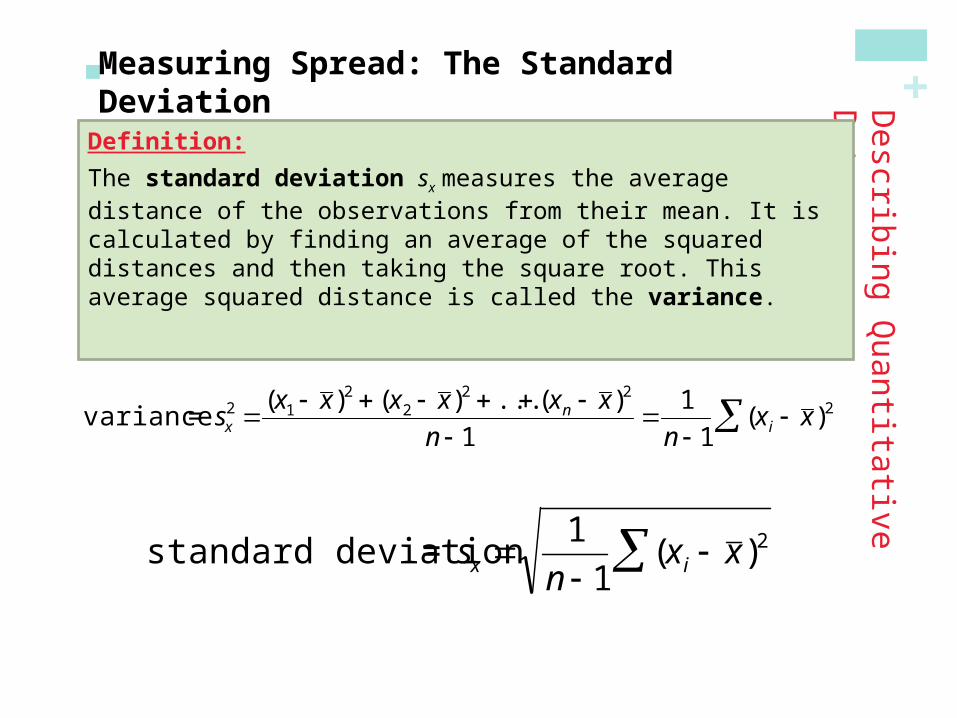
Measuring Spread: The Standard Deviation The most common measure of spread looks at how far each
observation is from the mean. This measure is called the standard deviation. Let’s explore it!
Consider the following data on the number of pets owned by a group of 9 children.
NumberOfPets0 2 4 6 8 10
1) Calculate the mean.
2) Calculate each deviation.deviation = observation – mean
= 5
x
deviation: 1 - 5 = -4
deviation: 8 - 5 = 3

+Describing Q
uantitative Data
Measuring Spread: The Standard Deviation
NumberOfPets0 2 4 6 8 10
xi (xi-mean) (xi-mean)2
1 1 - 5 = -4 (-4)2 = 16
3 3 - 5 = -2 (-2)2 = 4
4 4 - 5 = -1 (-1)2 = 1
4 4 - 5 = -1 (-1)2 = 1
4 4 - 5 = -1 (-1)2 = 1
5 5 - 5 = 0 (0)2 = 0
7 7 - 5 = 2 (2)2 = 4
8 8 - 5 = 3 (3)2 = 9
9 9 - 5 = 4 (4)2 = 16
Sum=? Sum=?
3) Square each deviation.
4) Find the “average” squared deviation. Calculate the sum of the squared deviations divided by (n-1)…this is called the variance.
5) Calculate the square root of the variance…this is the standard deviation.
“average” squared deviation = 52/(9-1) = 6.5 This is the variance.
Standard deviation = square root of variance =
6.5 2.55
+Describing Q
uantitative Data
Measuring Spread: The Standard Deviation
Definition:
The standard deviation sx measures the average distance of the observations from their mean. It is calculated by finding an average of the squared distances and then taking the square root. This average squared distance is called the variance.
variance = sx2
(x1 x )2 (x2 x )2 ... (xn x )2
n 1
1
n 1(x i x )2
standard deviation = sx 1
n 1(x i x )2

+ Choosing Measures of Center and Spread We now have a choice between two descriptions for center
and spread
Mean and Standard Deviation
Median and Interquartile Range
•The median and The median and IQR IQR are usually better than the mean and are usually better than the mean and standard deviation for describing a skewed distribution or standard deviation for describing a skewed distribution or a distribution with outliers.a distribution with outliers.
•Use mean and standard deviation only for reasonably symmetric distributions that don’t have outliers.
•NOTE: Numerical summaries do not fully describe the shape of a distribution. ALWAYS PLOT YOUR DATA!
Choosing Measures of Center and Spread
Describing Q
uantitative Data

+
In this section, we learned that…
A numerical summary of a distribution should report at least its center and spread.
The mean and median describe the center of a distribution in different ways. The mean is the average and the median is the midpoint of the values.
When you use the median to indicate the center of a distribution, describe its spread using the quartiles.
The interquartile range (IQR) is the range of the middle 50% of the observations: IQR = Q3 – Q1.
Summary
Section 1.3Describing Quantitative Data with Numbers
+
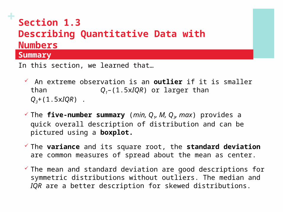
In this section, we learned that…
An extreme observation is an outlier if it is smaller than Q1–(1.5xIQR) or larger than Q3+(1.5xIQR) .
The five-number summary (min, Q1, M, Q3, max) provides a quick overall description of distribution and can be pictured using a boxplot.
The variance and its square root, the standard deviation are common measures of spread about the mean as center.
The mean and standard deviation are good descriptions for symmetric distributions without outliers. The median and IQR are a better description for skewed distributions.
Summary
Section 1.3Describing Quantitative Data with Numbers

+Looking Ahead…
We’ll learn how to model distributions of data…
• Describing Location in a Distribution
• Normal Distributions
In the next Chapter…
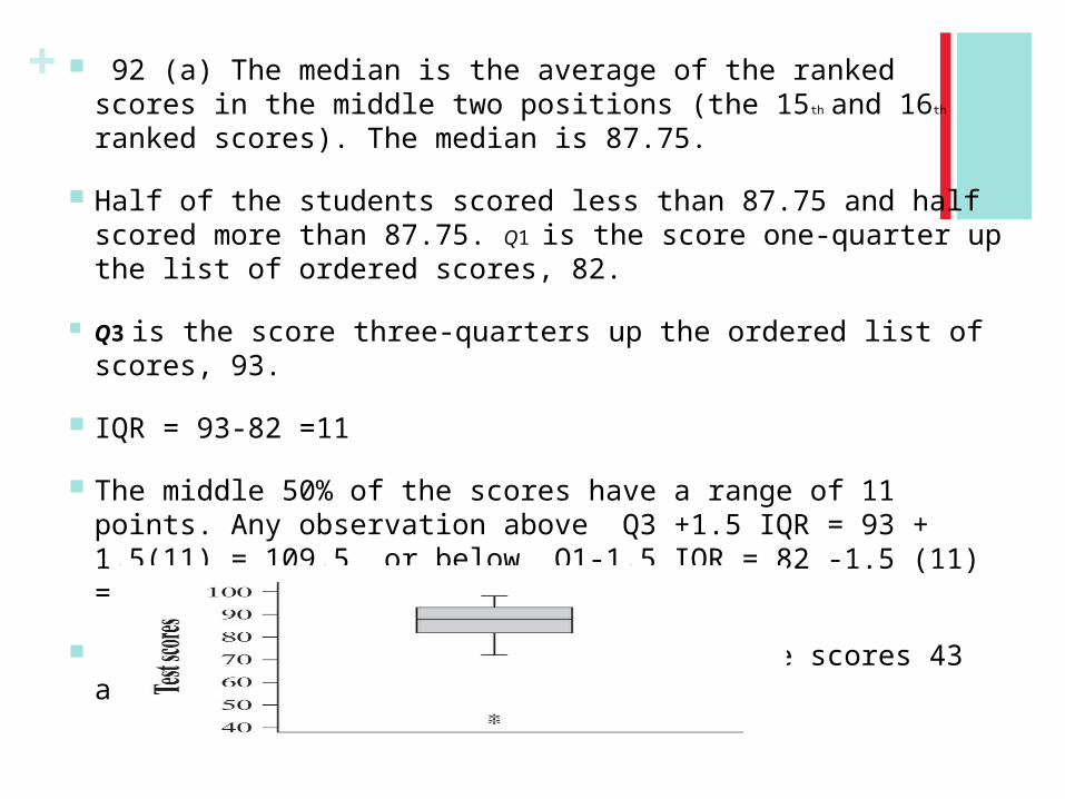
+ 92 (a) The median is the average of the ranked scores in the middle two positions (the 15th and 16th ranked scores). The median is 87.75.
Half of the students scored less than 87.75 and half scored more than 87.75. Q1 is the score one-quarter up the list of ordered scores, 82.
Q3 is the score three-quarters up the ordered list of scores, 93.
IQR = 93-82 =11
The middle 50% of the scores have a range of 11 points. Any observation above Q3 +1.5 IQR = 93 + 1.5(11) = 109.5 or below Q1-1.5 IQR = 82 -1.5 (11) =
65.5 is considered an outlier. Thus, the scores 43 and 45 are outliers.

+