chavanpragatip.files.wordpress.com file · web viewit is one of java’s largest packages. ......
TRANSCRIPT

Chapter 01Introduction the Abstract Window Toolkit (AWT)& Swing
Abstract Window Toolkit:
The AWT contains numerous classes and methods that allow us to create and manage windows. Although the main purpose of the AWT is to support applet windows, it can also be used to create stand-alone windows that run in a GUI environment, such as Windows.
AWT ClassesThe AWT classes are contained in the java.awt package. It is one of Java’s
largest packages. Fortunately, because it is logically organized in a top-down, hierarchical fashion, it is easier to understand and use than you might atfirst believe.AWTEvent Encapsulates AWT events.AWTEventMulticaster Dispatches events to multiple listeners.BorderLayout The border layout manager. Border layouts use five
components: North, South, East, West, and Center.Button Creates a push button control.Canvas A blank, semantics-free window.CardLayout The card layout manager. Card layouts emulate index
cards. Only the one on top is showing.Checkbox Creates a check box control.CheckboxGroup Creates a group of check box controls.CheckboxMenuItem Creates an on/off menu item.Choice Creates a pop-up list.Color Manages colors in a portable, platform-independent
fashion.Component An abstract super-class for various AWT components.Container A subclass of Component that can hold other
components.Cursor Encapsulates a bitmapped cursor.Dialog Creates a dialog window.Dimension Specifies the dimensions of an object. The width is
stored in width, and the height is stored in height.Event Encapsulates events.EventQueue Queues events.FileDialog Creates a window from which a file can be selected.FlowLayout The flow layout manager. Flow layout positions
components left to right, top to bottom.Font Encapsulates a type font.FontMetrics Encapsulates various information related to a font. This
information helps you display text in a window.Frame Creates a standard window that has a title bar, resize
corners, and a menu bar.

Graphics Encapsulates the graphics context. This context is usedby the various output methods to display output in awindow.
GraphicsDevice Describes a graphics device such as a screen or printer.GraphicsEnvironment Describes the collection of available Font and
GraphicsDevice objects.GridBagConstraints Defines various constraints relating to the
GridBagLayout class.GridBagLayout The grid bag layout manager. Grid bag layout displays
components subject to the constraints specified byGridBagConstraints.
GridLayout The grid layout manager. Grid layout displayscomponents in a two-dimensional grid.
Image Encapsulates graphical images.Insets Encapsulates the borders of a container.Label Creates a label that displays a string.List Creates a list from which the user can choose. Similar
to the standard Windows list box.MediaTracker Manages media objects.Menu Creates a pull-down menu.MenuBar Creates a menu bar.MenuComponent An abstract class implemented by various menu classes.MenuItem Creates a menu item.MenuShortcut Encapsulates a keyboard shortcut for a menu item.Panel The simplest concrete subclass of Container.Point Encapsulates a Cartesian coordinate pair, stored in x
and y.Polygon Encapsulates a polygon.PopupMenu Encapsulates a pop-up menu.PrintJob An abstract class that represents a print job.Rectangle Encapsulates a rectangle.Robot Supports automated testing of AWT- based applications.Scrollbar Creates a scroll bar control.ScrollPane A container that provides horizontal and/or vertical
scroll bars for another component.SystemColor Contains the colors of GUI widgets such as windows,
scroll bars, text, and others.TextArea Creates a multiline edit control.TextComponent A superclass for TextArea and TextField.TextField Creates a single-line edit control.Toolkit Abstract class implemented by the AWT.Window Creates a window with no frame, no menu bar,

Window FundamentalsThe AWT defines windows according to a class hierarchy that adds
functionality and specificity with each level. The two most common windows are those derived from Panel, which is used by applets, and those derived from Frame, which creates a standard window. Much of the functionality of these windows is derived from their parent classes. Thus, a description of the class hierarchies relating to these two classes is fundamental to their understanding. Figure below shows the class hierarchy for Panel and Frame.
Component
Container
MenuContainer Window PanelInterface
Frame Applet
ComponentAt the top of the AWT hierarchy is the Component class. Component is an
abstract class that encapsulates all of the attributes of a visual component.All user interface elements that are displayed on the screen and that interact with the user are subclasses of Component. It defines over a hundred public methods that are responsible for managing events, such as mouse and keyboard input, positioning and sizing the window, and repainting. A Component object is responsible for remembering the current foreground and background colors and the currently selected text font.
ContainerThe Container class is a subclass of Component. It has additional methods
that allow other Component objects to be nested within it. Other Container objects can be stored inside of a Container (since they are themselves instances of Component). This makes for a multileveled containment system. A container is responsible for laying out (that is,
positioning) any components that it contains. It does this through the use of various layout managers.
PanelThe Panel class is a concrete subclass of Container. It doesn’t add any
new methods; it simply implements Container. A Panel may be thought of as a recursively nestable, concrete screen component. Panel is the super-class for Applet. When screen output is directed to an applet, it is drawn on the surface of a Panel object. In essence, a Panel is a window that does not contain a title bar, menu bar, or border. This is why we don’t see these items when an applet is run inside a browser. When we run an applet using an applet viewer, the applet viewer provides the title and border. Other components can be added to a Panel object by its add( ) method (inherited from Container). Once these components have been added, we can position and resize them manually using the setLocation( ), setSize( ), or setBounds( ) methods defined by Component.
WindowThe Window class creates a top-level window. A top-level window is not
contained within any other object; it sits directly on the desktop. Generally, we won’t create Window objects directly. Instead, we will use a subclass of Window called Frame.
FrameFrame encapsulates what is commonly thought of as a “window.” It is a
subclass of Window and has a title bar, menu bar, borders, and resizing corners. If we create a Frame object from within an applet, it will contain a warning message, such as “Java Applet Window,” to the user that an applet window has been created. This message warns users that the window they see was started by an applet and not by software running on their computer. When a Frame window is created by a program rather than an applet, a normal window is created.
CanvasCanvas encapsulates a blank window upon which we can draw.
Dimension
This class encapsulates the ‘width’ and ‘height’ of a component (in integer precision) in a single object. The class is associated with certain properties of components. Several methods defined by the Component class and the LayoutManager interface return a Dimension object.
Normally the values of width and height are non-negative integers. The constructors that allow us to create a dimension do not prevent us from setting

a negative value for these properties. If the value of width or height is negative, the behavior of some methods defined by other objects is undefined.
Fields of Dimension:
int height The height dimension; negative values can be used.int width The width dimension; negative values can be used.
Constructors:
Dimension()It creates an instance of Dimension with a width of zero and a height of
zero.
Dimension(Dimension d)It creates an instance of Dimension whose width and height are the
same as for the specified dimension.
Dimension(int width, int height)It constructs a Dimension and initializes it to the specified width and
specified height.
Methods:
boolean equals(Object obj)It checks whether two dimension objects have equal values.
double getHeight()It returns the height of this dimension in double precision.
Dimension getSize()It gets the size of this Dimension object.
double getWidth()It returns the width of this dimension in double precision.
void setSize(Dimension d)It sets the size of this Dimension object to the specified size.
void setSize(double width, double height)It sets the size of this Dimension object to the specified width and height
in double precision.void setSize(int width, int height)
It sets the size of this Dimension object to the specified width and height.
Working with Frame Windows
After the applet, the type of window we will most often create is derived from Frame. We will use it to create child windows within applets, and top-level

or child windows for applications. It creates a standard-style window. Following are two of Frame’s constructors:
Frame( ) Frame(String title)The first form creates a standard window that does not contain a title. The
second form creates a window with the title specified by title. Note that we cannot specify the dimensions of the window. Instead, we must set the size of the window after it has been created.
Setting the Windows Dimensions
The setSize( ) method is used to set the dimensions of the window. Its signature is shown below:
void setSize(int newWidth, int newHeight)
void setSize(Dimension newSize)
The new size of the window is specified by ‘newWidth’ and ‘newHeight’, or by the ‘width’ and ‘height’ fields of the Dimension object passed in ‘newSize’. The dimensions are specified in terms of pixels. The getSize( ) method is used to obtain the current size of a window. Its signature is:
Dimension getSize( )
This method returns the current size of the window contained within the ‘width’ and ‘height’ fields of a Dimension object.
Hiding and showing a Window
After a frame window has been created, it will not be visible until we call setVisible( ). Its signature is:
void setVisible(boolean visibleFlag)
The component is visible if the argument to this method is true. Otherwise, it is hidden.
Setting a Windows Title
We can change the title in a frame window using setTitle( ), which has this general form:
void setTitle(String newTitle)
Here, ‘newTitle’ is the new title for the window.

Closing a Frame Window
When using a frame window, our program must remove that window from the screen when it is closed, by calling setVisible(false). To intercept a window-close event, we must implement the windowClosing( ) method of the WindowListener interface. Inside windowClosing( ), we must remove the window from the screen.
Creating a Frame Window in an Applet
The following applet creates a subclass of Frame called SampleFrame. A window of this subclass is instantiated within the init( ) method of AppletFrame. Note that ‘SampleFrame’ calls Frame’s constructor. This causes a standard frame window to be created with the title passed in title. This example overrides the applet window’s start( ) and stop( ) method s so that they show and hide the child window, respectively. It also causes the child window to be shown when the browser returns to the applet.
/*<applet code="AppletFrame" width=300 height=50> </applet>
*/class SampleFrame extends Frame{
SampleFrame(String title){
super(title);}public void paint(Graphics g){
g.drawString("This is in frame window", 10, 40);}
}public class AppletFrame extends Applet{
Frame f;public void init(){
f = new SampleFrame("A Frame Window"); f.setSize(250, 250); f.setVisible(true);
}public void start(){
f.setVisible(true);}

public void stop(){
f.setVisible(false);}public void paint(Graphics g){
g.drawString("This is in applet window", 10, 20);}
}
Output:
Creating a Windowed Program
Although creating applets is the most common use for Java’s AWT, it is possible to create stand-alone AWT-based applications, too. To do this, simply create an instance of the window or windows we need inside main( ). For example, the following program creates a simple frame window.
public class AppWindow extends Frame{
AppWindow(String title){
super(title);}public void paint(Graphics g){
setForeground(Color.red);setBackground(Color.cyan);
g.drawString("This is my frame", 30, 70);

}public static void main(String args[])
throws Exception{
AppWindow appwin = new AppWindow("Frame window"); appwin.setSize(new Dimension(300, 200)); appwin.setVisible(true);Thread.sleep(5000);appwin.setTitle("An AWT-Based Application"); Thread.sleep(5000);System.exit(0);
}}
Another Program:
public class AppWindow extends Frame{
Font f;static int val=5; AppWindow(String title){
super(title);}public void paint(Graphics g){
setForeground(Color.red);setBackground(Color.cyan);
Integer i = new Integer(val); g.drawString(i.toString(), 30, 70); val--;
}public static void main(String args[])
throws Exception{
AppWindow appwin = new AppWindow("Frame window"); appwin.setSize(new Dimension(300, 200)); appwin.setFont(new Font("Arial",Font.BOLD, 40)); appwin.setVisible(true);Thread.sleep(5000);appwin.setTitle("An AWT-Based Application");
for(int i=0;i<5;i++){
Thread.sleep(1000);appwin.repaint();
}
System.exit(0);}
}

Displaying information within a Window
In the most general sense, a window is a container for information. Although we have already output small amounts of text to a window in the preceding examples, we have not begun to take advantage of a window’s ability to present high-quality text and graphics. Indeed, much of the power of the AWT comes from its support for these items.
Working with Graphics
Working with Color
Java supports color in a portable, device-independent fashion. The AWT color system allows us to specify any color that we want. It then finds the best match for that color, given the limits of the display hardware currently executing our program or applet. Thus, our code does not need to be concerned with the differences in the way color is supported by various hardware devices. Color is encapsulated by the Color class.
Constructors:
Color(int red, int green, int blue)Color(int rgbValue)Color(float red, float green, float blue)
The first constructor takes three integers that specify the color as a mix of red, green, and blue. These values must be between 0 and 255, as in this example:
new Color(255, 100, 100); // light red.
The second color constructor takes a single integer that contains the mix of red, green, and blue packed into an integer. The integer is organized with red in bits 16 to 23, green in bits 8 to 15, and blue in bits 0 to 7. Here is an example of this constructor:
int newRed = (0xff000000 | (0xc0 << 16) | (0x00 << 8) | 0x00); Color darkRed = new Color(newRed);
The final constructor, Color(float, float, float), takes three float values (between 0.0 and 1.0) that specify the relative mix of red, green, and blue. Once we have created a color, we can use it to set the foreground and/orbackground color by using the setForeground( ) and setBackground( ) methods. You can also select it as the current drawing color.
Color MethodsThe Color class defines several methods that help manipulate colors.
Using Hue, Saturation, and Brightness
The hue-saturation-brightness (HSB) color model is an alternative to red-green-blue (RGB) for specifying particular colors. Figuratively, hue is a wheel of

color. The hue is specified with a number between 0.0 and 1.0 (the colors are approximately: red, orange, yellow, green, blue, indigo, and violet). Saturation is another scale ranging from 0.0 to 1.0, representing light pastels to intense hues. Brightness values also range from 0.0 to 1.0, where 1 is bright white and 0 is black. Color supplies two methods that let us convert between RGB and HSB. They are shown here:
static int HSBtoRGB(float hue, float sat, float brightness)
static float[ ] RGBtoHSB(int r, int g, int b, float values[ ])
HSBtoRGB( ) returns a packed RGB value compatible with the Color(int) constructor. RGBtoHSB( ) returns a float array of HSB values corresponding to RGB integers. If values is not null, then this array is given the HSB values and returned. Otherwise, a new array is created and the HSB values are returned in it. In either case, the array contains the hue at index 0, saturation at index 1, and brightness at index 2.
getRed( ), getGreen( ), getBlue( )
We can obtain the red, green, and blue components of a color independently using getRed( ), getGreen( ), and getBlue( ), shown below:
int getRed( ) int getGreen( ) int getBlue( )
Each of these methods returns the RGB color component found in the invoking Color object in the lower 8 bits of an integer.
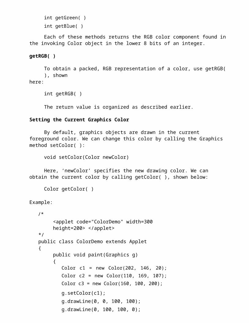
getRGB( )
To obtain a packed, RGB representation of a color, use getRGB( ), shownhere:
int getRGB( )
The return value is organized as described earlier.
Setting the Current Graphics Color
By default, graphics objects are drawn in the current foreground color. We can change this color by calling the Graphics method setColor( ):
void setColor(Color newColor)
Here, ‘newColor’ specifies the new drawing color. We can obtain the current color by calling getColor( ), shown below:
Color getColor( )
Example:

/*<applet code="ColorDemo" width=300 height=200> </applet>
*/public class ColorDemo extends Applet{
public void paint(Graphics g){
Color c1 = new Color(202, 146, 20); Color c2 = new Color(110, 169, 107); Color c3 = new Color(160, 100, 200);
g.setColor(c1); g.drawLine(0, 0, 100, 100); g.drawLine(0, 100, 100, 0);
g.setColor(Color.red);
g.drawLine(40, 25, 250, 180);
g.setColor(c3);
g.drawLine(20, 150, 400, 40);
g.setColor(c2); g.drawOval(10, 10, 50, 50); g.fillOval(70, 90, 140, 100);
}}
Setting the Paint Mode
The paint-mode determines how objects are drawn in a window. By default, new output to a window overwrites any pre-existing contents. However, it is possible to have new objects XORed onto the window by using setXORMode( ), as follows:
void setXORMode(Color xorColor)
Here, ‘xorColor’ specifies the color that will be XORed to the window when an object is drawn. The advantage of XOR mode is that the new object is always guaranteed to be visible no matter what color the object is drawn over. To return to overwrite mode, call setPaintMode( ), shown here:
void setPaintMode( )
In general, we will want to use overwrite mode for normal output, and XOR mode for special purposes. For example, the following program displays cross hairs that track the mouse pointer. The cross hairs are XORed onto the window and are always visible, no matter what the underlying color is.
Working with Fonts

The AWT supports multiple type fonts. It provides flexibility by abstracting font-manipulation operations and allowing for dynamic selection of fonts. In Java, fonts have a family name, a logical font name, and a face name. The family name is the general name of the font, such as Courier. The logical name specifies a category of font, such as Monospaced. The face name specifies a specific font, such as Courier Italic. Fonts are encapsulated by the Font class. Several of the methods defined by Font are listed below.
The Font class defines these variables:Variable MeaningString name Name of the fontfloat pointSize Size of the font in pointsint size Size of the font in pointsint style Font style
Method Description static Font decode(String str) boolean equals(Object FontObj)
String getFamily( )
Returns a font given its name.Returns true if the invoking object contains the same font as that specified by FontObj. Otherwise, it returns false.Returns the name of the font family to which the invoking font belongs.

staticFontgetFont(Stringproperty) Returns the font associated with the systemproperty specified by property. Null isreturned if property does not exist.
staticFontgetFont(Stringproperty, Returns the font associated with the systemFont defaultFont) property specified by property. The font
specified by default Font is returned ifproperty does not exist.
String getFontName() Returns the face name of the invoking font.String getName( ) Returns the logical name of the invoking
font.int getSize( ) Returns the size, in points, of the invoking
font.int getStyle( ) Returns the style values of the invoking
font.int hashCode( ) Returns the hash code associated with the
invoking object.boolean isBold( ) Returns true if the font includes the BOLD
style value. Otherwise, false is returned.boolean isItalic( ) Returns true if the font includes the ITALIC
style value. Otherwise, false is returned.boolean isPlain( ) Returns true if the font includes the PLAIN
style value. Otherwise, false is returned.String toString( ) Returns the string equivalent of the
invoking font.
Determining the Available Fonts
When working with fonts, often we need to know which fonts are available on our machine. To obtain this information, we can use the getAvailableFontFamilyNames( ) method defined by the GraphicsEnvironment class.
It is shown here:
String[ ] getAvailableFontFamilyNames( )
This method returns an array of strings that contains the names of the available font families. In addition, the getAllFonts( ) method is defined by the GraphicsEnvironment class. It is shown here:
Font[ ] getAllFonts( )
This method returns an array of Font objects for all of the available fonts. Since these methods are members of GraphicsEnvironment, we need a GraphicsEnvironment reference to call them. We can obtain this reference byusing the getLocalGraphicsEnvironment( ) static method, which is defined by GraphicsEnvironment. It is shown here:
static GraphicsEnvironment getLocalGraphicsEnvironment( )

Here is an applet that shows how to obtain the names of the available font families:
/*<applet code="ShowFonts" width=550 height=60> </applet>*/import java.applet.*;
import java.awt.*;
public class ShowFonts extends Applet{
public void paint(Graphics g){
String msg = ""; String FontList[];
GraphicsEnvironment ge = GraphicsEnvironment.getLocalGraphicsEnvironment();
FontList = ge.getAvailableFontFamilyNames(); for(int i = 0; i < FontList.length; i++)
msg += FontList[i] + " ";
g.drawString(msg, 4, 16);}
}
Creating and Selecting a Font
In order to select a new font, we must first construct a Font object that describes that font. One Font constructor has this general form:
Font(String fontName, int fontStyle, int pointSize)
Here, ‘fontName’ specifies the name of the desired font. The name can be specified using either the logical or face name. All Java environments will support the following fonts:
• Dialog, • DialogInput, • Sans Serif, • Serif, • Monospaced • Symbol
Dialog is the font used by our system’s dialog boxes. Dialog is also the default if we don’t explicitly set a font. We can also use any other fonts supported by our particular environment, but these other fonts may not be universally available. The style of the font is specified by ‘fontStyle’. It may consist of one or more of these three constants:
Font.PLAIN, Font.BOLD, and Font.ITALIC.For combining styles, we can OR them together.For example, Font.BOLD | Font.ITALIC specifies a bold, italics style.The size, in points, of the font is specified by ‘pointSize’. For using a font

that we have created, we must select it using setFont( ), which is defined by Component. It has this general form:
void setFont(Font fontObj)
Here, fontObj is the object that contains the desired font.
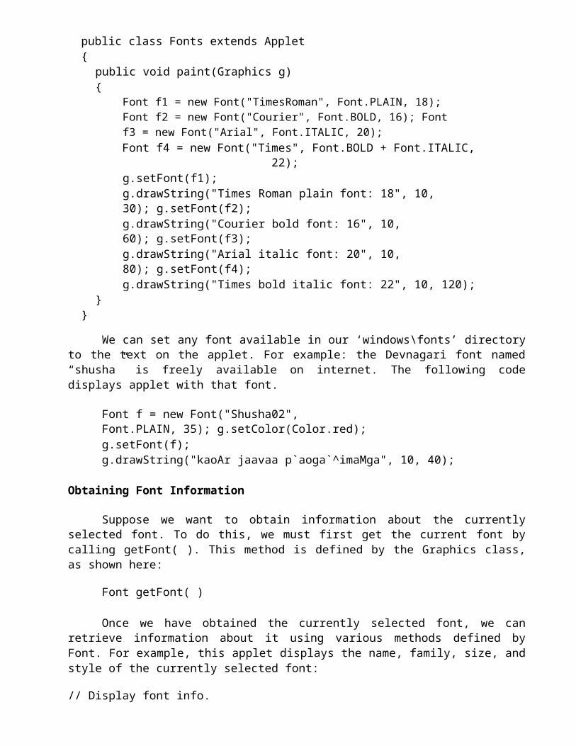
// Displaying different fonts import java.awt.Font;import java.awt.Graphics; import java.applet.Applet; /*<applet code="Fonts" width=300 height=150> </applet>*/public class Fonts extends Applet{
public void paint(Graphics g){
Font f1 = new Font("TimesRoman", Font.PLAIN, 18); Font f2 = new Font("Courier", Font.BOLD, 16); Font f3 = new Font("Arial", Font.ITALIC, 20);Font f4 = new Font("Times", Font.BOLD + Font.ITALIC,
22);g.setFont(f1);g.drawString("Times Roman plain font: 18", 10, 30); g.setFont(f2);g.drawString("Courier bold font: 16", 10, 60); g.setFont(f3);g.drawString("Arial italic font: 20", 10, 80); g.setFont(f4);g.drawString("Times bold italic font: 22", 10, 120);
}}
We can set any font available in our ‘windows\fonts’ directory to the text on the applet. For example: the Devnagari font named “shusha” is freely available on internet. The following code displays applet with that font.
Font f = new Font("Shusha02", Font.PLAIN, 35); g.setColor(Color.red);g.setFont(f);g.drawString("kaoAr jaavaa p`aoga`^imaMga", 10, 40);
Obtaining Font Information
Suppose we want to obtain information about the currently selected font. To do this, we must first get the current font by calling getFont( ). This method is defined by the Graphics class, as shown here:
Font getFont( )
Once we have obtained the currently selected font, we can retrieve
information about it using various methods defined by Font. For example, this applet displays the name, family, size, and style of the currently selected font:
// Display font info.

/*<applet code="FontInfo" width=350 height=60> </applet>*/
public class FontInfo extends Applet{public void paint(Graphics g){
Font f = g.getFont();String fontName = f.getName(); String fontFamily = f.getFamily(); int fontSize = f.getSize();int fontStyle = f.getStyle();
String msg = "Family: " + fontName; msg += ", Font: " + fontFamily;msg += ", Size: " + fontSize + ", Style: "; if((fontStyle & Font.BOLD) == Font.BOLD)msg += "Bold ";
if((fontStyle & Font.ITALIC) == Font.ITALIC) msg += "Italic ";
if((fontStyle & Font.PLAIN) == Font.PLAIN) msg += "Plain ";
g.drawString(msg, 4, 16);}
}
Managing Text Output Using FontMetrics
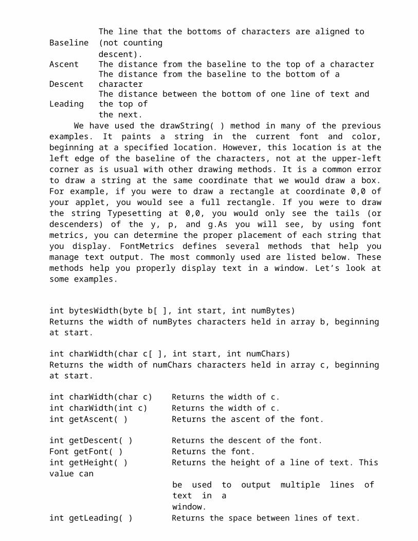
Java supports a number of fonts. For most fonts, characters are not all the same dimension most fonts are proportional. Also, the height of each character, the length of descenders (the hanging parts of letters, such as y), and the amount of space between horizontal lines vary from font to font. Further, the point size of a font can be changed. That these (and other) attributes are variable would not be of too much consequence except that Java demands that the programmer, manually manage virtually all text output. Given that the size of each font may differ and that fonts may be changed while our program is executing, there must be some way to determine the dimensions and various other attributes of the currently selected font. For example, to write one line of text after another implies that we have some way of knowing how tall the font is and how many pixels are needed between lines. To fill this need, the AWT includes the FontMetrics class, which encapsulates various information about a font. Common terminology used when describingfonts: Height
Baseline The line that the bottoms of characters are aligned to (not countingdescent).
Ascent The distance from the baseline to the top of a characterDescent The distance from the baseline to the bottom of a characterLeading The distance between the bottom of one line of text and the top of
the next.We have used the drawString( ) method in many of the previous
examples. It paints a string in the current font and color, beginning at a specified location. However, this location is at the left edge of the baseline of the characters, not at the upper-left corner as is usual with other drawing methods. It is a common error to draw a string at the same coordinate that we would draw a box. For example, if you were to draw a rectangle at coordinate 0,0 of your applet, you would see a full rectangle. If you were to draw the string Typesetting at 0,0, you would only see the tails (or descenders) of the y, p, and g.As you will see, by using font metrics, you can determine the proper placement of each string that you display. FontMetrics defines several methods that help you manage text output. The most commonly used are listed below. These methods help you properly display text in a window. Let’s look at some examples.
int bytesWidth(byte b[ ], int start, int numBytes)Returns the width of numBytes characters held in array b, beginning at start.
int charWidth(char c[ ], int start, int numChars)Returns the width of numChars characters held in array c, beginning at start.
int charWidth(char c) Returns the width of c.int charWidth(int c) Returns the width of c.int getAscent( ) Returns the ascent of the font.
int getDescent( ) Returns the descent of the font.Font getFont( ) Returns the font.int getHeight( ) Returns the height of a line of text. This value can
be used to output multiple lines of text in awindow.
int getLeading( ) Returns the space between lines of text.int getMaxAdvance( ) Returns the width of the widest character. –1 is
returned if this value is not available.int getMaxAscent( ) Returns the maximum ascent.int getMaxDescent( ) Returns the maximum descent.int[ ] getWidths( ) Returns the widths of the first 256 characters.int stringWidth(String str) Returns the width of the string specified by str.String toString( ) Returns the string equivalent of the
invoking object.
Exploring Text and Graphics
Although we have covered the most important attributes and common techniques that we will use when displaying text or graphics, it only scratches the surface of Java’s capabilities. This is an area in which further refinements and enhancements are expected as Java and the computing environment continue to evolve. For example, Java 2 added a subsystem to the AWT called Java 2D. Java 2D supports enhanced control over graphics, including such things as coordinate translations, rotation, and scaling. It also provides advanced imaging features. If advanced graphics handling is of interest to us, then we will definitely want to explore Java 2D in detail.
Using AWT Controls, Layout Managers and Menus
Controls are components that allow a user to interact with his application in various ways—for example; a commonly used control is the push button. A layout manager automatically positions components within a container. Thus, the appearance of a window is determined by a combination of the controls that it contains and the layout manager used to position them. In addition to the controls, a frame window can also include a standard-style menu bar. Each entry in a menu bar activates a drop-down menu of options from which the user can choose. A menu bar is always positioned at the top of a window. Although different in appearance, menu bars are handled in much the same way as are the other controls. While it is possible to manually position components within a window, doing so is quite tedious. The layout manager automates this task.
Control Fundamentals
The AWT supports the following types of controls:■ Labels ■ Push buttons ■ Check boxes ■ Choice lists ■ Lists ■ Scroll bars ■ Text Area ■ Text Field
These controls are subclasses of Component.
Adding and Removing Controls
In order to include a control in a window, we must add it to the window. So, we must first create an instance of the desired control and then add it to a

window by calling add( ), which is defined by Container. The add( ) method has several forms. The following form is the one that is used for the first part of this chapter:
Component add(Component compObj)
Here, compObj is an instance of the control that we want to add. A reference to compObj is returned. Once a control has been added, it will automatically be visible whenever its parent window is displayed. Sometimes we will want to remove a control from a window when the control is no longer needed. For doing this, call remove( ). This method is also defined by Container. It has this general form:
void remove(Component obj)
Here, obj is a reference to the control that we want to remove. We can remove all controls by calling removeAll( ).
Responding to Controls
Except for labels, which are passive controls, all controls generate events when they are accessed by the user. For example, when the user clicks on a push button, an event is sent that identifies the push button. In general, our program simply implements the appropriate interface and then registers an event listener for each control that we need to monitor.
Labels
The easiest control to use is a label. A label is an object of type Label, and it contains a string, which it displays. Labels are passive controls that do not support any interaction with the user. Label defines the following constructors:
Label( )Label(String str)Label(String str, int how)
The first version creates a blank label. The second version creates a label that contains the string specified by str. This string is left-justified. The third version creates a label that contains the string specified by str using the alignment specified by how. The value of how must be one of these three constants: Label.LEFT, Label.RIGHT, or Label.CENTER.
We can set or change the text in a label by using the setText( ) method. We can obtain the current label by calling getText( ). These methods are shown here:

void setText(String str)
String getText( )
For setText( ), str specifies the new label. For getText( ), the current label is returned. You can set the alignment of the string within the label by calling setAlignment( ). To obtain the current alignment, call getAlignment( ). The methods are as follows:
void setAlignment(int
how) int getAlignment( )
Here, how must be one of the alignment constants shown earlier. The following example creates three labels and adds them to an applet:
// Demonstrate Labels import java.awt.*; import java.applet.*; /*<applet code="LabelDemo" width=300 height=200> </applet>*/public class LabelDemo extends Applet{
public void init(){
Label one = new Label("One"); Label two = new Label("Two"); Label three = new Label("Three"); // add labels to applet window add(one);add(two);add(three);
}}
Following is the window created by the LabelDemo applet. Notice that the labels are organized in the window by the default layout manager.
Buttons
The most widely used control is the push button. A push button is a component that contains a label and that generates an event when it is pressed. Push buttons are objects of type Button. Button defines these two constructors:
Button( )Button(String str)
The first version creates an empty button. The second creates a button that contains str as a label. After a button has been created, we can set its label by calling setLabel( ). We can retrieve its label by calling getLabel( ). These methods are as follows:

void setLabel(String str)
String getLabel( )
Here, str becomes the new label for the button.
// Demonstrate Buttons import java.awt.*; import java.applet.*; /*<applet code="ButtonDemo" width=250 height=150> </applet>*/public class ButtonDemo extends Applet{
String msg = "";Button yes, no, maybe; public void init(){
yes = new Button("Yes"); no = new Button("No");maybe = new Button("Undecided"); add(yes);add(no);add(maybe);
}public void paint(Graphics g){
g.drawString(msg, 6, 100);}
}
Check Boxes
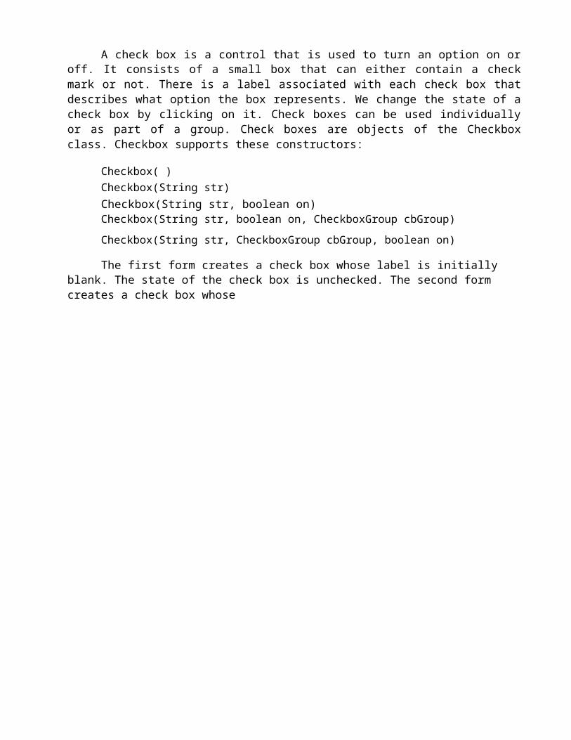
A check box is a control that is used to turn an option on or off. It consists of a small box that can either contain a check mark or not. There is a label associated with each check box that describes what option the box represents. We change the state of a check box by clicking on it. Check boxes can be used individually or as part of a group. Check boxes are objects of the Checkbox class. Checkbox supports these constructors:
Checkbox( ) Checkbox(String str)Checkbox(String str, boolean on)Checkbox(String str, boolean on, CheckboxGroup cbGroup)
Checkbox(String str, CheckboxGroup cbGroup, boolean on)
The first form creates a check box whose label is initially blank. The state of the check box is unchecked. The second form creates a check box whose

label is specified by str. The state of the check box is unchecked. The third form allows us to set the initial state of the check box. If on is true, the check box is initially checked; otherwise, it is cleared. The fourth and fifth forms create a check box whose label is specified by str and whose group is specified by cbGroup. If this check box is not part of a group, then cbGroup must be null. The value of on determines the initial state of the check box.
In order to retrieve the current state of a check box, call getState( ). For setting its state, call setState( ). We can obtain the current label associated with a check box by calling getLabel( ). For setting the label, setLabel( ) is used. These methods are as follows:
boolean getState( )void setState(boolean on) String getLabel( )void setLabel(String str)
Here, if on is true, the box is checked. If it is false, the box is cleared. The string passed in str becomes the new label associated with the invoking check box.
// Demonstrate check boxes. import java.awt.*;import java.applet.*; /*<applet code="CheckboxDemo" width=250 height=200> </applet>*/public class CheckboxDemo extends Applet{
String msg = "";Checkbox Win98, winNT, solaris, mac; public void init(){
Win98 = new Checkbox("Windows 98/XP", null, true); winNT = new Checkbox("Windows NT/2000");solaris = new Checkbox("Solaris"); mac = new Checkbox("MacOS"); add(Win98);add(winNT);add(solaris);add(mac);
}public void paint(Graphics g){}
}
Checkbox Group
It is possible to create a set of mutually exclusive check boxes in which one and only one check box in the group can be checked at any one time. These check boxes are often called radio buttons, because they act like the

station selector on a car radio—only one station can be selected at any one time. For creating a set of mutually exclusive check boxes, we must first define the group to which they will belong and then specify that group when we construct the check boxes. Check box groups are objects of type CheckboxGroup. Only the default constructor is defined, which creates an empty group.
We can determine which check box in a group is currently selected by calling getSelectedCheckbox( ). We can set a check box by calling setSelectedCheckbox( ). These methods are as follows:
Checkbox getSelectedCheckbox( )void setSelectedCheckbox(Checkbox wh)
Here, wh is the check box that we want to be selected. The previously selected check box will be turned off. Here is a program that uses check boxes that are part of a group:
import java.awt.*; import java.applet.*; /*<applet code="CBGroup" width=250 height=200> </applet>*/public class CBGroup extends Applet{
String msg = "";Checkbox Win98, winNT, solaris, mac; CheckboxGroup cbg;public void init(){
cbg = new CheckboxGroup();Win98 = new Checkbox("Windows 98/XP", cbg, true); winNT = new Checkbox("Windows NT/2000", cbg, false); solaris = new Checkbox("Solaris", cbg, false);mac = new Checkbox("MacOS", cbg, false); add(Win98);add(winNT);add(solaris);add(mac);
}public void paint(Graphics g){
msg = "Current selection: ";msg += cbg.getSelectedCheckbox().getLabel(); g.drawString(msg, 6, 100);
}}
Choice Controls
The Choice class is used to create a pop-up list of items from which the user may choose. Thus, a Choice control is a form of menu. When inactive, a Choice component takes up only enough space to show the currently selected item. When the user clicks on it, the whole list of choices pops up, and a new selection can be made. Each item in the list is a string that appears as a left-justified label in the order it is added to the Choice object. Choice only definesthe default constructor, which creates an empty list. In order to add a selection to the list, add( ) is used. It has this general form:
void add(String name)
Here, name is the name of the item being added. Items are added to the list in the order in which calls to add( ) occur. In order to determine which item is currently selected, we may call either any of the following methods:
String getSelectedItem( )
int getSelectedIndex( )
The getSelectedItem( ) method returns a string containing the name of the item. getSelectedIndex( ) returns the index of the item. The first item is at index 0. By default, the first item added to the list is selected. For obtaining the number of items in the list, call getItemCount( ). We can set the currently selected item using the select( ) method with either a zero-based integer index or a string that will match a name in the list. These methods are shown here:
int getItemCount( ) void select(int index) void select(String name)
Given an index, we can obtain the name associated with the item at that index by calling getItem( ), which has this general form:
String getItem(int index)
Here, index specifies the index of the desired item.
// Demonstrate Choice lists. import java.awt.*;import java.applet.*; /*<applet code="ChoiceDemo" width=300 height=180> </applet>*/public class ChoiceDemo extends Applet{
Choice os, browser; String msg = ""; public void init(){
os = new Choice(); browser = new Choice(); os.add("Windows 98/XP");

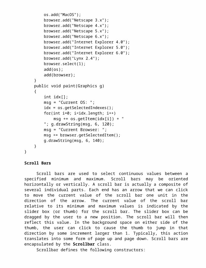
os.add("Windows NT/2000");os.add("Solaris");os.add("MacOS"); browser.add("Netscape 3.x"); browser.add("Netscape 4.x"); browser.add("Netscape 5.x"); browser.add("Netscape 6.x"); browser.add("Internet Explorer 4.0"); browser.add("Internet Explorer 5.0"); browser.add("Internet Explorer 6.0"); browser.add("Lynx 2.4"); browser.select("Netscape 4.x"); add(os);
add(browser);}public void paint(Graphics g){}
}
Lists
The List class provides a compact, multiple-choice, scrolling selection list. Unlike the Choice object, which shows only the single selected item in the menu, a List object can be constructed to show any number of choices in the visible Window. It can also be created to allow multiple selections. List provides these constructors:
List( )List(int numRows)List(int numRows, boolean multipleSelect)
The first version creates a List control that allows only one item to be selected at any one time. In the second form, the value of numRows specifiesthe number of entries in the list that will always be visible (others can be scrolled into view as needed). In the third form, if multipleSelect is true, then the user may select two or more items at a time. If it is false, then only one item may be selected. For adding a selection to the list, we can call add( ). It has the following two forms:
void add(String name)void add(String name, int index)
Here, name is the name of the item added to the list. The first form adds items to the end of the list. The second form adds the item at the index specified by index. Indexing begins at zero. We can specify –1 to add the item to the end of the list. For lists that allow only single selection, we can determine which item is currently selected by calling either getSelectedItem( ) or getSelectedIndex( ). These methods are shown here:
String getSelectedItem( )

int getSelectedIndex( )
The getSelectedItem( ) method returns a string containing the name of the item. If more than one item is selected or if no selection has yet been made, null is returned. getSelectedIndex( ) returns the index of the item. The first item is at index 0. If more than one item is selected, or if no selection has yet been made, –1 is returned. For lists that allow multiple selection, we must use either getSelectedItems( ) or getSelectedIndexes( ), shown here, to determine the current selections:
String[ ] getSelectedItems( )
int[ ] getSelectedIndexes( )
The getSelectedItems( ) returns an array containing the names of the currently selected items. getSelectedIndexes( ) returns an array containing the indexes of the currently selected items. In order to obtain the number of items in the list, call getItemCount( ). We can set the currently selected item by using the select( ) method with a zero-based integer index. These methods are shown here:
int getItemCount( )
void select(int index)
Given an index, we can obtain the name associated with the item at that index by calling getItem( ), which has this general form:
String getItem(int index)
Here, index specifies the index of the desired item.import java.awt.*; import java.applet.*; /*<applet code="ListDemo" width=300 height=180> </applet>*/public class ListDemo extends Applet{
List os, browser; String msg = ""; public void init(){
os = new List(4, true); browser = new List(4, false); os.add("Windows 98/XP"); os.add("Windows NT/2000"); os.add("Solaris"); os.add("MacOS"); browser.add("Netscape 3.x"); browser.add("Netscape 4.x"); browser.add("Netscape 5.x"); browser.add("Netscape 6.x");browser.add("Internet Explorer 4.0"); browser.add("Internet Explorer 5.0");
browser.add("Internet Explorer 6.0"); browser.add("Lynx 2.4"); browser.select(1);add(os);add(browser);
}public void paint(Graphics g){
int idx[];msg = "Current OS: ";idx = os.getSelectedIndexes(); for(int i=0; i<idx.length; i++)
msg += os.getItem(idx[i]) + " "; g.drawString(msg, 6, 120);msg = "Current Browser: ";msg += browser.getSelectedItem(); g.drawString(msg, 6, 140);
}}
Scroll Bars
Scroll bars are used to select continuous values between a specified minimum and maximum. Scroll bars may be oriented horizontally or vertically. A scroll bar is actually a composite of several individual parts. Each end has an arrow that we can click to move the current value of the scroll bar one unit in the direction of the arrow. The current value of the scroll bar relative to its minimum and maximum values is indicated by the slider box (or thumb) for the scroll bar. The slider box can be dragged by the user to a new position. The scroll bar will then reflect this value. In the background space on either side of the thumb, the user can click to cause the thumb to jump in that direction by some increment larger than 1. Typically, this action translates into some form of page up and page down. Scroll bars are encapsulated by the Scrollbar class.
Scrollbar defines the following constructors:Scrollbar( ) Scrollbar(int style)Scrollbar(int style, int iValue, int tSize, int min, int max)
The first form creates a vertical scroll bar. The second and third forms allow us to specify the orientation of the scroll bar. If style is Scrollbar.VERTICAL, a vertical scroll bar is created. If style is Scrollbar.HORIZONTAL, the scroll bar is horizontal. In the third form of the constructor, the initial value of the scroll bar is passed in iValue. The number of units represented by the height of the thumb is passed in tSize. The minimum and maximum values for the scroll bar are specified by min and max. If we construct a scroll bar by using one of the first two constructors, then we need to set its parameters by using setValues( ), shown here, before it can be used:
void setValues(int iValue, int tSize, int min, int max)
The parameters have the same meaning as they have in the third constructor just described. In order to obtain the current value of the scroll bar,

call getValue( ). It returns the current setting. For setting the current value, we can use setValue( ). These methods are as follows:
int getValue( )void setValue(int newValue)
Here, newValue specifies the new value for the scroll bar. When we set a value, the slider box inside the scroll bar will be positioned to reflect the new value. We can also retrieve the minimum and maximum values via getMinimum( ) and getMaximum( ), shown here:
int getMinimum( )
int getMaximum( )
They return the requested quantity. By default, 1 is the increment added to or subtracted from the scroll bar each time it is scrolled up or down one line. We can change this increment by calling setUnitIncrement( ). By default, page-up and page-down increments are 10. You can change this value by calling setBlockIncrement( ). These methods are shown here:
void setUnitIncrement(int newIncr)
void setBlockIncrement(int newIncr)
Example:
import java.awt.*; import java.applet.*; /*<applet code="SBDemo" width=300 height=200> </applet>*/public class SBDemo extends Applet{
String msg = ""; Scrollbar vertSB, horzSB; public void init(){
int width = Integer.parseInt(getParameter("width")); int height = Integer.parseInt(getParameter("height")); vertSB = new Scrollbar(Scrollbar.VERTICAL,
0, 1, 0, height);horzSB = new Scrollbar(Scrollbar.HORIZONTAL,
0, 1, 0, width);add(vertSB);

add(horzSB);}public void paint(Graphics g){
msg = "Vertical: " + vertSB.getValue();msg += ", Horizontal: " + horzSB.getValue(); g.drawString(msg, 6, 160);
}}
TextField
TextComponent
TextArea TextField
The TextField class implements a single-line text-entry area, usually called an edit control. Text fields allow the user to enter strings and to edit the text using the arrow keys, cut and paste keys, and mouse selections. TextField is a subclass of TextComponent. TextField defines the following constructors:
TextField( )TextField(int numChars)TextField(String str)TextField(String str, int numChars)
The first version creates a default text field. The second form creates a text field that is numChars characters wide. The third form initializes the text field with the string contained in str. The fourth form initializes a text field and sets its width. TextField (and its superclass TextComponent) provides several methods that allow us to utilize a text field. In order to obtain the string currently contained in the text field, we can use getText( ). For setting the text, we call setText( ). These methods are as follows:
String getText( )void setText(String str)
Here, str is the new string. The user can select a portion of the text in a text field. Also, we can select a portion of text under program control by using select( ). Our program can obtain the currently selected text by calling the getSelectedText( ). These methods are shown here:
String getSelectedText( )void select(int startIndex, int endIndex)
The getSelectedText( ) returns the selected text. The select( ) method

selects the characters beginning at startIndex and ending at endIndex–1. We can control whether the contents of a text field may be modified by the user by calling setEditable( ). We can determine editability by calling isEditable( ). These methods are shown here:
boolean isEditable( )void setEditable(boolean canEdit)
The isEditable( ) returns true if the text may be changed and false if not. In setEditable( ), if canEdit is true, the text may be changed. If it is false, the text cannot be altered. There may be times when we will want the user to enter text that is not displayed, such as a password. You can disable the echoing of the characters as they are typed by calling setEchoChar( ). This method specifies a single character that the TextField will display when characters are entered (thus, the actual characters typed will not be shown). We can check a text field to see if it is in this mode with the echoCharIsSet( ) method. We can retrieve the echo character by calling the getEchoChar( ) method. These methods are as follows:
void setEchoChar(char ch) boolean echoCharIsSet( ) char getEchoChar( )
Here, ch specifies the character to be echoed.import java.awt.*; import java.applet.*; /*<applet code="TextFieldDemo" width=380 height=150> </applet>*/public class TextFieldDemo extends Applet{
TextField name, pass; public void init(){
Label namep = new Label("Name: ", Label.RIGHT); Label passp = new Label("Password: ", Label.RIGHT); name = new TextField(12);pass = new TextField(8); pass.setEchoChar('?'); add(namep);add(name);add(passp);add(pass);
}public void paint(Graphics g){}
}
TextArea

Sometimes a single line of text input is not enough for a given task. To handle these situations, the AWT includes a simple multiline editor called TextArea. Following are the constructors for TextArea:
TextArea( )TextArea(int numLines, int numChars) TextArea(String str)TextArea(String str, int numLines, int numChars) TextArea(String str, int numLines, int numChars, int sBars)
Here, numLines specifies the height, in lines, of the text area, and numChars specifies its width, in characters. Initial text can be specified by str. In the fifth form we can specify the scroll bars that we want the control to have. sBars must be one of these values:
SCROLLBARS_BOTH SCROLLBARS_NONE SCROLLBARS_HORIZONTAL_ONLY SCROLLBARS_VERTICAL_ONLY
TextArea is a subclass of TextComponent. Therefore, it supports the getText( ), setText( ), getSelectedText( ), select( ), isEditable( ), and setEditable( ) methods described in the preceding section. TextArea adds the following methods:
void append(String str)void insert(String str, int index)void replaceRange(String str, int startIndex, int endIndex)
The append( ) method appends the string specified by str to the end of the current text. The insert( ) inserts the string passed in str at the specified index. In order to replace text, we call replaceRange( ). It replaces the characters from startIndex to endIndex–1, with the replacement text passed in str. Text areas are almost self-contained controls.
import java.awt.*; import java.applet.*; /*<applet code="TextAreaDemo" width=300 height=250> </applet>*/public class TextAreaDemo extends Applet{
public void init(){
String val = "There are two ways of constructing " + "a software design.\n" +"One way is to make it so simple\n" +"that there are obviously no deficiencies.\n" + "And the other way is to make it so complicated\n" + "that there are no obvious deficiencies.\n\n" +" -C.A.R. Hoare\n\n" +"There's an old story about the person who wished\n" + "his computer were as easy to use as his telephone.\n" +

"That wish has come true,\n" +"since I no longer know how to use my telephone.\n\n" + " -Bjarne Stroustrup, AT&T, (inventor of C++)"; TextArea text = new TextArea(val, 10, 30);add(text);
}}
Layout Managers
All of the components that we have shown so far have been positioned by the default layout manager. A layout manager automatically arranges our controls within a window by using some type of algorithm. If we have programmed for other GUI environments, such as Windows, then we are accustomed to laying out our controls by hand. While it is possible to lay out Java controls by hand, too, we generally won’t want to, for two main reasons. First, it is very tedious to manually lay out a large number of components. Second, sometimes the width and height information is not yet available when we need to arrange some control, because the native toolkit components haven’t been realized. This is a chicken-and-egg situation; it is pretty confusing to figure out when it is okay to use the size of a given component to position it relative to another.
Each Container object has a layout manager associated with it. A layout manager is an instance of any class that implements the LayoutManager interface. The layout manager is set by the setLayout( ) method. If no call to setLayout( ) is made, then the default layout manager is used. Whenever acontainer is resized (or sized for the first time), the layout manager is used to position each of the components within it.
The setLayout( ) method has the following general form:
void setLayout(LayoutManager layoutObj)
Here, layoutObj is a reference to the desired layout manager. If we wish to disable the layout manager and position components manually, pass null for layoutObj. If we do this, we will need to determine the shape and position of each component manually, using the setBounds( ) method defined by Component. Normally, we will want to use a layout manager.
Each layout manager keeps track of a list of components that are stored by their names. The layout manager is notified each time we add a component to a container. Whenever the container needs to be resized, the layout manager is consulted via its minimumLayoutSize( ) and preferredLayoutSize( ) methods. Each component that is being managed by a layout manager contains the getPreferredSize( ) and getMinimumSize( ) methods. These return the preferred and minimum size required to display each component. The layout manager will honor these requests if at all possible, while maintaining the integrity of the layout policy. We may override these methods for controls that we subclass. Default values are provided otherwise. Java has several predefined LayoutManager classes, several of which are described next. We can use the layout manager that best fits our application.
FlowLayout

FlowLayout is the default layout manager. This is the layout manager that the preceding examples have used. FlowLayout implements a simple layout style, which is similar to how words flow in a text editor. Components are laid out from the upper-left corner, left to right and top to bottom. When no morecomponents fit on a line, the next one appears on the next line. A small space is left between each component, above and below, as well as left and right. Here are the constructors for FlowLayout:
FlowLayout( )FlowLayout(int how)FlowLayout(int how, int horz, int vert)
The first form creates the default layout, which centers components and leaves five pixels of space between each component. The second form lets us specify how each line is aligned. Valid values for how are as follows:
FlowLayout.LEFTFlowLayout.CENTERFlowLayout.RIGHT
These values specify left, center, and right alignment, respectively. The third form allows us to specify the horizontal and vertical space left between components in horz and vert, respectively. Here is a version of the CheckboxDemo applet shown earlier, modified so that it uses left-aligned flow layout.
public class FlowLayoutDemo extends Applet{
String msg = "";Checkbox Win98, winNT, solaris, mac; public void init(){
Win98 = new Checkbox("Windows 98/XP", null, true); winNT = new Checkbox("Windows NT/2000");solaris = new Checkbox("Solaris"); mac = new Checkbox("MacOS");setLayout(new FlowLayout(FlowLayout.CENTER)); add(Win98);add(winNT);add(solaris);add(mac);
}public void paint(Graphics g){}
}
BorderLayout
The BorderLayout class implements a common layout style for top-level windows. It has four narrow, fixed-width components at the edges and one large area in the center. The four sides are referred to as north, south, east, and

west. The middle area is called the center. Here are the constructors defined by BorderLayout:
BorderLayout( )BorderLayout(int horz, int vert)
The first form creates a default border layout. The second allows us to specify the horizontal and vertical space left between components in horz and vert, respectively. BorderLayout defines the following constants that specify the regions:
BorderLayout.CENTER BorderLayout.SOUTHBorderLayout.EAST BorderLayout.WESTBorderLayout.NORTH
When adding components, we will use these constants with the following form of add( ), which is defined by Container:
void add(Component compObj, Object region);
Here, compObj is the component to be added, and region specifies where the component will be added. Here is an example of a BorderLayout with a component in each layout area:import java.awt.*; import java.applet.*; /*<applet code="BorderLayoutDemo" width=400 height=200> </applet>*/public class BorderLayoutDemo extends Applet{
public void init(){
setLayout(new BorderLayout());add(new Button("This is across the top."),
BorderLayout.NORTH);add(new Label("The footer message might go here."),
BorderLayout.SOUTH);add(new Button("Right"), BorderLayout.EAST); add(new Button("Left"), BorderLayout.WEST); String msg = "The reasonable man adapts " +
"himself to the world;\n" +"the unreasonable one persists in " + "trying to adapt the world to himself.\n" + "Therefore all progress depends " +"on the unreasonable man.\n\n" + " - George Bernard Shaw\n\n";
add(new TextArea(msg), BorderLayout.CENTER);}
}
Insets
Sometimes we will want to leave a small amount of space between the container that holds our components and the window that contains it. For doing this, we have to override the getInsets( ) method that is defined by Container. This function returns an Insets object that contains the top, bottom, left, and right inset to be used when the container is displayed. These values are used by the layout manager to inset the components when it lays out the window. The constructor for Insets is shown here:
Insets(int top, int left, int bottom, int right)
The values passed in top, left, bottom, and right specify the amount of space between the container and its enclosing window. The getInsets( ) method has this general form:
Insets getInsets( )
When overriding one of these methods, we must return a new Insets object that contains the inset spacing we desire. Here is the preceding BorderLayout example modified so that it insets its components ten pixels from each border. The background color has been set to cyan to help make the insets more visible.
public class InsetsDemo extends Applet{
public void init(){
setBackground(Color.cyan); setLayout(new BorderLayout());add(new Button("This is across the top."),
BorderLayout.NORTH);add(new Label("The footer message might go here."),
BorderLayout.SOUTH);add(new Button("Right"), BorderLayout.EAST); add(new Button("Left"), BorderLayout.WEST); String msg = "The reasonable man adapts " +
"himself to the world;\n" +"the unreasonable one persists in " + "trying to adapt the world to himself.\n" + "Therefore all progress depends " +"on the unreasonable man.\n\n" + " - George Bernard Shaw\n\n";
add(new TextArea(msg), BorderLayout.CENTER);}public Insets getInsets(){
return new Insets(10, 10, 10, 10);}

}
GridLayout
GridLayout lays out components in a two-dimensional grid. When we instantiate a GridLayout, we define the number of rows and columns. The constructors supported by GridLayout are shown here:
GridLayout( )GridLayout(int numRows, int numColumns )GridLayout(int numRows, int numColumns, int horz, int vert)
The first form creates a single-column grid layout. The second form creates a grid layout with the specified number of rows and columns. The third form allows us to specify the horizontal and vertical space left between components in horz and vert, respectively. Either numRows or numColumns can be zero. Specifying numRows as zero allows for unlimited-length columns. Specifying numColumns as zero allows for unlimited-length rows. Here is a sample program that creates a 4×4 grid and fills it in with 15 buttons, each labeled with its index:
import java.awt.*; import java.applet.*; /*<applet code="GridLayoutDemo" width=300 height=200> </applet>*/public class GridLayoutDemo extends Applet{
static final int n = 4;public void init(){
setLayout(new GridLayout(n, n));setFont(new Font("SansSerif", Font.BOLD, 24)); for(int i = 0; i < n; i++){
for(int j = 0; j < n; j++){
int k = i * n + j; if(k > 0)add(new Button("" + k));
}}
}}

Menu Bars and Menus
A top-level window can have a menu bar associated with it. A menu bar displays a list of top-level menu choices. Each choice is associated with a drop-down menu. This concept is implemented in Java by the following classes: MenuBar, Menu, and MenuItem. In general, a menu bar contains one or more Menu objects. Each Menu object contains a list of MenuItem objects. Each MenuItem object represents something that can be selected by the user. Since Menu is a subclass of MenuItem, a hierarchy of nested submenus can be created. It is also possible to include checkable menu items. These are menu options of type CheckboxMenuItem and will have a check mark next to them when they are selected. For creating a menu bar, we first create an instance of MenuBar. This class only defines the default constructor. Next, create instances of Menu that will define the selections displayed on the bar.
Create Add Add AddMenuMenuBar MenuItems MenuBarobjectsobject to Menu to Applet
Fig. Creating a menu on Frame
Following are the constructors for Menu:
Menu( )Menu(String optionName)Menu(String optionName, boolean removable)
Here, optionName specifies the name of the menu selection. If removable is true, the pop-up menu can be removed and allowed to float free. Otherwise, it will remain attached to the menu bar. (Removable menus are implementation-dependent.) The first form creates an empty menu. Individual menu items are of type MenuItem. It defines these constructors:
MenuItem( )MenuItem(String itemName)MenuItem(String itemName, MenuShortcut keyAccel)
Here, itemName is the name shown in the menu, and keyAccel is the menu shortcut for this item. We can disable or enable a menu item by using the setEnabled( ) method. Its form is shown here:
void setEnabled(boolean enabledFlag)
If the argument enabledFlag is true, the menu item is enabled. If false, the menu item is disabled. We can determine an item’s status by

calling isEnabled( ). This method is shown here:
boolean isEnabled( )
The isEnabled( ) returns true if the menu item on which it is called is enabled. Otherwise, it returns false. We can change the name of a menu item by calling setLabel( ). We can retrieve the current name by using getLabel( ). These methods are as follows:
void setLabel(String
newName) String
getLabel( )
Here, newName becomes the new name of the invoking menu item. getLabel( ) returns the current name. We can create a checkable menu item byusing a subclass of MenuItem called CheckboxMenuItem. It has these constructors:
CheckboxMenuItem( )CheckboxMenuItem(String itemName)CheckboxMenuItem(String itemName, boolean on)
Here, itemName is the name shown in the menu. Checkable items operate as toggles. Each time one is selected, its state changes. In the first two forms, the checkable entry is unchecked. In the third form, if on is true, the checkable entry is initially checked. Otherwise, it is cleared. We can obtain the status of a checkable item by calling getState( ). We can set it to a known state by using setState( ). These methods are shown here:
boolean getState( )void setState(boolean checked)
If the item is checked, getState( ) returns true. Otherwise, it returns false. For checking an item, pass true to setState( ). To clear an item, pass false. Once we have created a menu item, we must add the item to a Menu object by using add( ), which has the following general form:
MenuItem add(MenuItem item)
Here, item is the item being added. Items are added to a menu in the order in which the calls to add( ) take place. The item is returned. Once we have added all items to a Menu object, we can add that object to the menu bar by using this version of add( ) defined by MenuBar:
Menu add(Menu menu)
Here, menu is the menu being added. The menu is returned. Menus

only generate events when an item of type MenuItem or CheckboxMenuItem is selected. They do not generate events when a menu bar is accessed to display a drop-down menu, for example. Each time a menu item is selected, an ActionEvent object is generated. Each time a check box menu item is checked or unchecked, an ItemEvent object is generated. Thus, we must implement the ActionListener and ItemListener interfaces in order to handle these menu events. The getItem( ) method of ItemEvent returns a reference to the item that generated this event. The general form of this method is shown here:
Object getItem( )
Following is an example that adds a series of nested menus to a pop-up window. The item selected is displayed in the window. The state of the two check box menu items is also displayed.
import java.awt.*; import java.applet.*; /*<applet code="MenuDemo" width=250 height=250> </applet>*/class MenuFrame extends Frame{
String msg = ""; CheckboxMenuItem debug, test; MenuFrame(String title){
super(title);/ create menu bar and add it to frame MenuBar mbar = new MenuBar(); setMenuBar(mbar); / create the menu items Menu file = new Menu("File");MenuItem item1, item2, item3, item4, item5;file.add(item1 = new MenuItem("New..."));file.add(item2 = new MenuItem("Open..."));file.add(item3 = new MenuItem("Close"));file.add(item4 = new MenuItem("-"));file.add(item5 = new MenuItem("Quit..."));mbar.add(file);Menu edit = new Menu("Edit"); MenuItem item6, item7, item8, item9;edit.add(item6 = new MenuItem("Cut")); edit.add(item7 = new MenuItem("Copy")); edit.add(item8 = new

MenuItem("Paste")); edit.add(item9 = new MenuItem("-")); Menu sub = new Menu("Special");MenuItem item10, item11, item12; sub.add(item10 = new MenuItem("First")); sub.add(item11 = new MenuItem("Second")); sub.add(item12 = new MenuItem("Third")); edit.add(sub);// these are checkable menu items debug = new CheckboxMenuItem("Debug"); edit.add(debug);test = new CheckboxMenuItem("Testing"); edit.add(test);mbar.add(edit);
}}public class MenuDemo extends Applet{
Frame f;public void init(){
f = new MenuFrame("Menu Demo"); f.setVisible(true);int width = Integer.parseInt(getParameter("width")); int height = Integer.parseInt(getParameter("height")); setSize(width, height);f.setSize(width, height);
}public void start(){
f.setVisible(true);}public void stop(){
f.setVisible(false);}
}
Dialog Boxes
Often, we will want to use a dialog box to hold a set of related controls. Dialog boxes are primarily used to obtain user input. They are similar to frame windows, except that dialog boxes are always child windows of a top-level window. Also, dialog boxes don’t have menu bars. In other respects, dialog boxes function like frame windows. (We can add

controls to them, for example, in the same way that we add controls to a frame window.) Dialog boxes may bemodal or modeless. When a modal dialog box is active, all input is directed to it until it is closed. This means that we cannot access other parts of our program until we have closed the dialog box. When a modeless dialog box is active, input focus can be directed to another window in our program. Thus, other parts of our program remain active and accessible. Dialog boxes are of type Dialog. Two commonly used constructors are shown here:
Dialog(Frame parentWindow, boolean mode)Dialog(Frame parentWindow, String title, boolean mode)
Here, parentWindow is the owner of the dialog box. If mode is true, the dialog box is modal. Otherwise, it is modeless. The title of the dialog box can be passed in title. Generally, we will subclass Dialog, adding the functionality required by your application.
FileDialog
Java provides a built-in dialog box that lets the user specify a file. To create a file dialog box, instantiate an object of type FileDialog. This causes a file dialog box to be displayed. Usually, this is the standard file dialog box provided by the operating system. FileDialog provides these constructors:
FileDialog(Frame parent, String boxName)FileDialog(Frame parent, String boxName, int how)FileDialog(Frame parent)
Here, parent is the owner of the dialog box, and boxName is the name displayed in the box’s title bar. If boxName is omitted, the title of the dialog box is empty. If how is FileDialog.LOAD, then the box is selecting a file for reading. If how is FileDialog.SAVE, the box is selecting a file for writing. The third constructor creates a dialog box for selecting a file for reading.
FileDialog( ) provides methods that allows us to determine the name of the file and its path as selected by the user. Here are two examples:
String getDirectory( )String getFile( )
These methods return the directory and the filename, respectively. The following program activates the standard file dialog box:
import java.awt.*;class SampleFrame extends Frame{
SampleFrame(String title){
super(title);}
}class FileDialogDemo{
public static void main(String args[]){
Frame f = new SampleFrame("File Dialog Demo"); f.setVisible(true);f.setSize(100, 100);FileDialog fd = new FileDialog(f, "File Dialog"); fd.setVisible(true);
}}