€¦ · web viewlab #4: spatial analysis. matthew david scruggs. [email protected]. part 1....
TRANSCRIPT

Lab #4: Spatial Analysis
Matthew David Scruggs
Part 1
1. Do the points and lines represent the data with the same level of abstraction? Discuss in terms of their representation of the two data layers (cities, roads) that we have added so far, and in terms of other types of data that they might represent.
Single point-features represent data with less abstraction than line-features, since lines span larger areas and are more vulnerable to abstraction. Lines are arrangements of points that depend on other points, so their positioning on the map is *potentially* less geographically absolute and more relative to other layer features.
2. What happens when you use the identify tool? Is the option to change the layer(s) being identified useful?
When you click on the data view using the identify tool, a panel appears showing attributes for the feature(s) upon which you clicked. You can choose to select features from one, all, or some layers from the data frame. This ability is quite useful if you want to look at a specific type of feature.
3. Why do you think the Field Definition requires that you differentiate between text and numeric data types? Why do you need to specify the field width?
In order to know how to manipulate a piece of data, a computer needs to know what kind of data it is presented with. It cannot add two strings in a mathematical way. For example, a computer might treat “Hello” + “world” as “Hello world,” but if Hello and world are variable names that stand for 5 and 8 respectively, Hello + world should return 13. In order to know how to manipulate both string and numerical data in ArcMap, the data must be saved in a way that allows the program to understand which operations it is eligible and ineligible for.
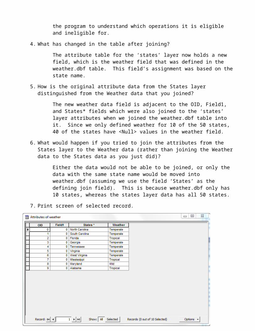
4. What has changed in the table after joining?
The attribute table for the ‘states’ layer now holds a new field, which is the weather field that was defined in the weather.dbf table. This field’s assignment was based on the state name.
5. How is the original attribute data from the States layer distinguished from the Weather data that you joined?
The new weather data field is adjacent to the OID, Field1, and States* fields which were also joined to the ‘states’ layer attributes when we joined the weather.dbf table into it. Since we only defined weather for 10 of the 50 states, 40 of the states have <Null> values in the weather field.
6. What would happen if you tried to join the attributes from the States layer to the Weather data (rather than joining the Weather data to the States data as you just did)?
Either the data would not be able to be joined, or only the data with the same state name would be moved into weather.dbf (assuming we use the field ‘States’ as the defining join field). This is because weather.dbf only has 10 states, whereas the states layer data has all 50 states.
7. Print screen of selected record.
8. Print screen of new attribute table.

Part 2
9. What does the reclassification step in Step 1 accomplish?
The reclassification step took each pixel within the data layer and classified it with an ordinal rank value based on that pixel’s distance from the nearest major road on the map. It did this with the new values which I specified based on the lab instructions, so it reduced the number of ranks that the map used to classify the data. This made areas near the road appear yellow, while areas far away from the map appear blue, brown, purple, or green.
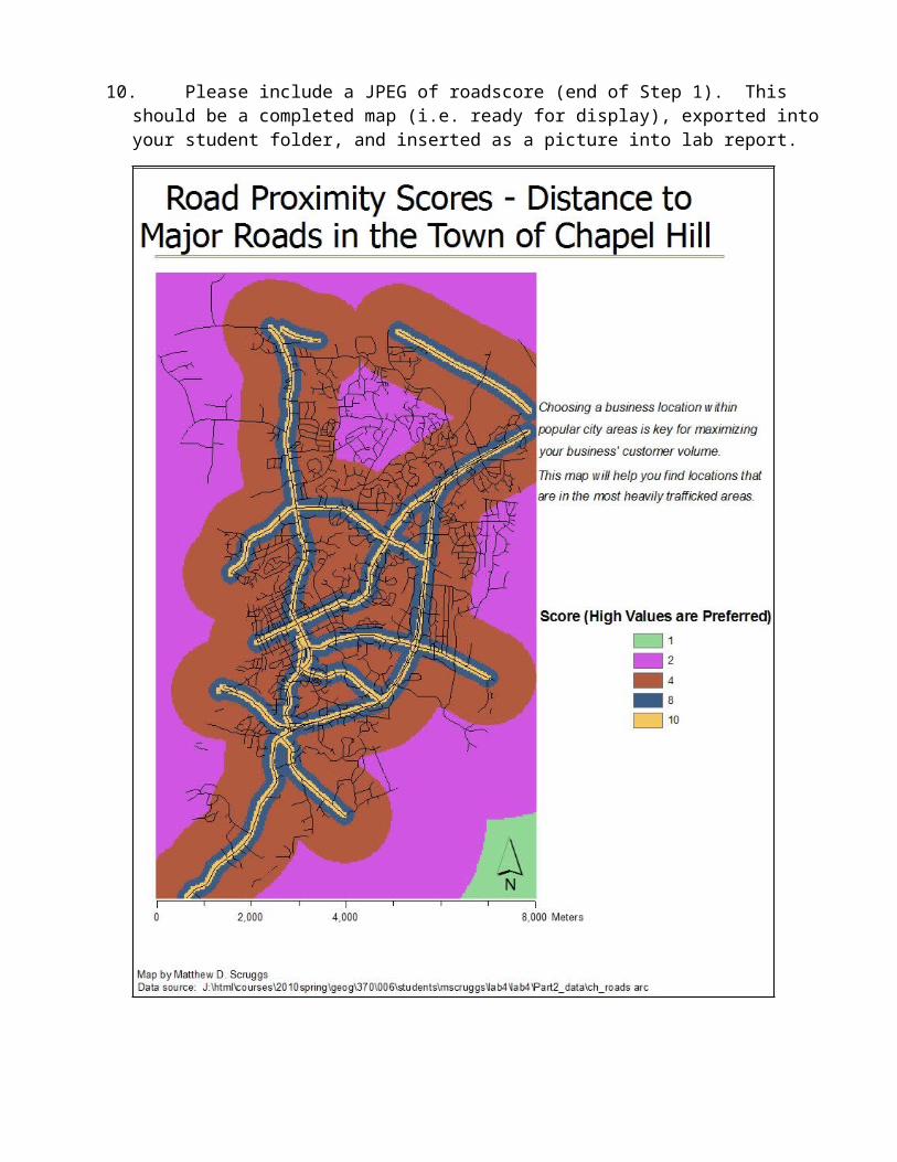
10. Please include a JPEG of roadscore (end of Step 1). This should be a completed map (i.e. ready for display), exported into your student folder, and inserted as a picture into lab report.

11. Please include a JPEG of hydroscore (end of Step 2). This should be a completed map (i.e.ready for display), exported into your student folder, and inserted as a picture into lab report.

12. At the end of Step 3, what does the map tell you in terms of the developer’s office buildingproject? What do the highest scores represent? What do the lowest scores represent?
The map indicates that the best locations are areas near major roads and relatively far from local streams. The highest scores represent areas that match both of these criteria extremely well, while the lowest scores represent areas that strongly fail to meet either. The developer should build in an area with a high score (16 or higher) in order to be satisfied with fulfilling both criteria of their project.
13. What does Step 4 accomplish towards producing the final suitability data layer?
Step 4 allows the client to view potential building sites based on three variables: proximity to roads, distance from streams, and eligibility for office construction. The raster calculation completely nullifies any areas within the map that are not zoned for Office/Institutional or Mixed Use and Office/Institutional construction. Labeling landmarks on the map helps the client get a feel for the orientation and layout of Chapel Hill. More importantly, this step finishes a product that enables the client to make an informed decision about their construction project.
14. Please include a JPEG of final suitability layer (end of Step 4). This should be a completed map (i.e. ready for display), exported into your student folder, and inserted as a picture into lab report.

15. Prepare a brief executive summary (~2 paragraphs) to the developer, summarizing your results. Include a short description of the analysis you performed and indicate the locations you think would be the best choices for her office project.
Dear (Client Name),
After completing a suitability analysis based on the criteria provided, we have located multiple areas that are highly suitable for your office building project. In order to help you make a more informed decision about your project based on the information that we have provided you, please read this short summary about the process that was used to prepare the products you have received from us.
The first step used to prepare our data on the Town of Chapel Hill for an analysis relevant to your project needs was to grade areas within the town based on their distance from the nearest major road. As you can see from the map title “Road Proximity Scores,” each point on the map has received a value score of 1, 2, 4, 8 or 10. Higher scores denote areas of greater preference; i.e., near major roads. Areas of score 10 include offices that are located immediately next to the street front and would be seen by hundreds or thousands of commuters each day. However, these locations also have very high property value. Building in these areas would most likely incur high costs in the form of rent, property taxes and upkeep.
Similarly, our second step involved scoring the Town based on each point’s distance from significant nearby surface waters. Areas near streams received a very low score and should be avoided to prevent possible water damage from flooding.
The final suitability score map was produced by aggregating the scores from the previous two maps. Areas with high scores on this map meet all three criteria: near major roads, far from major streams, and within appropriately zoned districts. Areas that are not within appropriate zoning locations in Chapel Hill were given a score of zero and should not be considered.
A few large areas of interest have been indicated within gray boxes (labeled A through E) on the final map. Please note that a few more potential areas can be found in the top half of the map’s area. The area within Box D contains a few pockets of highly suitable potential office locations if you find proximity both to downtown Chapel Hill and the University appealing. These areas are likely to have the highest property values on the map, however, and would incur extremely high property costs. A more economical choice would be to locate your building in either Box A or Box C, both of which are near heavily trafficked interstate/highway junctions. Box B contains Horace Williams Airport and much of the area shown with a score of 1 – 4 is actually on airport grounds or is forested, but could be worth an investigation if it offers low costs. Box E encompasses a large area but does not experience as much traffic volume as the other highlighted sections.