0808 iat 102 graphic design. 0808 modernism and new typography grid review
TRANSCRIPT

08
IAT 102 Graphic Design

08
Modernism and New Typography
Grid Review

so let's review….

Victorian Era design
elaborate typography, decorative borders, framed image and symmetrical layout
nostalgia for objects of the past
romantic motifs
The illustration style is very typical; romantic, nostalgic and sentimental

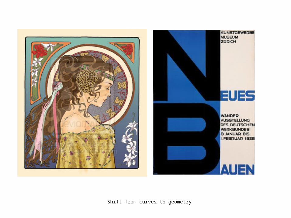
Art Nouveau
Poster by Alfonse Mucha Date: (unknown)

http://gds.parkland.edu/gds/!lectures/history/9000_review/review.html
Shift from curves to geometry
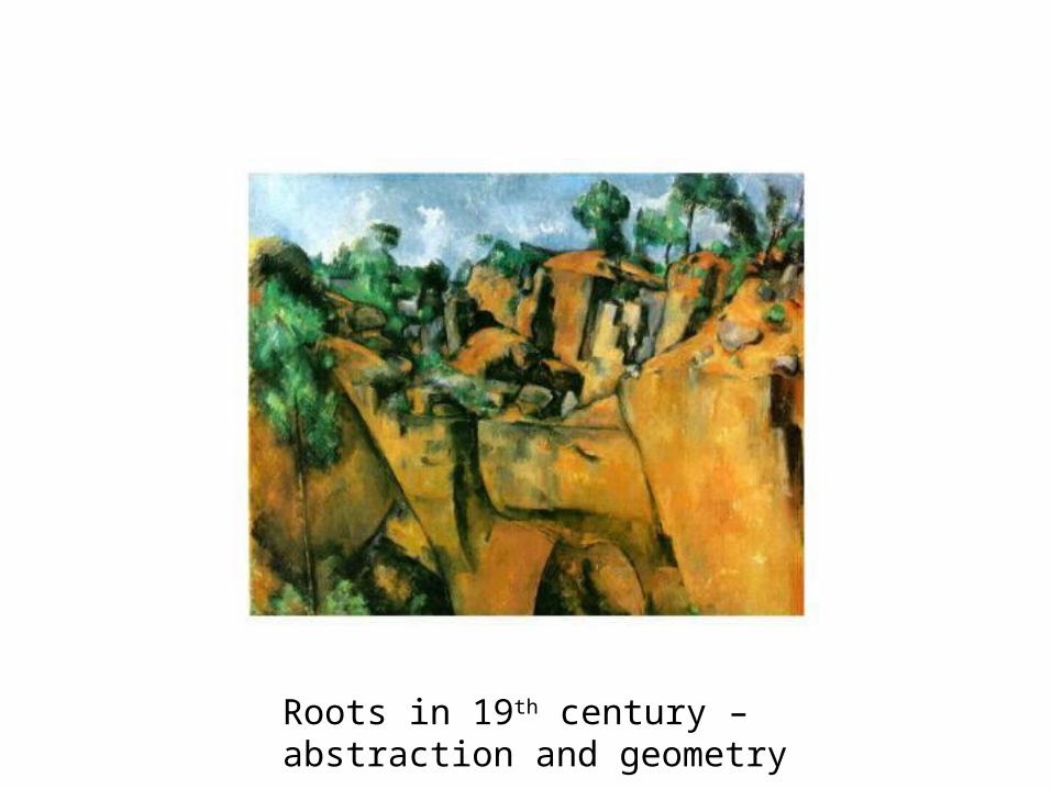
Roots in 19th century – abstraction and geometry

Pablo Picasso made his first cubist paintings based on Cézanne's idea that all depiction of nature can be reduced to three solids: cube, sphere and cone
Pablo Picasso (1881-1973)Left: Head of a Woman, (oil on canvas, 1907) Right: Dan Mask

Futurism – Italy 1909 - 1916
Futurism became a major influence on other art movements. Its violent, revolutionary techniques were adopted by the DAdaist, Constructionist and De Stilj
Futurism - enthusiasm for war, machine age, speed and modern life.Nonlinear compositions.Capture new urban experience.Complete break from the past

Dada – Switzerland 1916 - 1922
Dada used shock, protest and nonsense to mock and defame a society gone insane.

Suprematism Movement – Russian 1915 - 1916
Suprematism (Russian: Супрематизм): was an art movement focused on fundamental geometric forms (in particular the square and circle) which formed in Russia in 1915-1916.
Text source: Wikipedia
Suprematism (Supremus No. 58), Krasnodar Museum of Art (Malevich, 1916)

Malevich: Aeroplane Flying (Russia) 1915
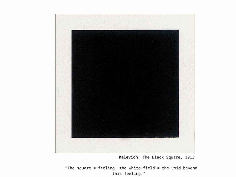
Malevich: The Black Square, 1913
"The square = feeling, the white field = the void beyond this feeling."

Constructivism – Russian 1915 -1930’s
Russian Constructivists absorbed Cubism and Futurism to create a new movement which unifies communist ideology with visual form.
Rejected the idea of autonomous art in favour of art as a practice directed towards social purposes.

Constructivist approach: photomontage, elemental geometric abstraction, titled axis, dominant color scheme is red and black.

El Lissitzky (Russia, Constructivism): "Beat the Whites with the Red Wedge" (1919)
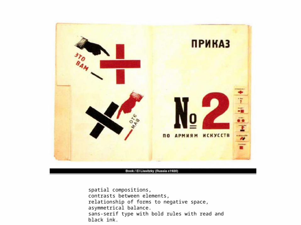
spatial compositions,contrasts between elements,relationship of forms to negative space,asymmetrical balance. sans-serif type with bold rules with read and black ink.

El Lissitzky (Russia, Constructivism): Catalog cover

Constructivism:
- originated in Russia, 1921
- no more “Art for Art’s sake” (l’art pour l’art)
- industrial design, graphic design, poster, books
- many links to De Stijl (NL), Bauhaus (Germany),
Dada (Switzerland / Germany)
- geometric shapes, mathematic proportions
- functional, no ornaments

De Stijl Movement – Holland 1917 to 1931
An art movement advocating pure abstraction and simplicity — form reduced to the rectangle and other geometric shapes, and color to the primary colors, along with black and white.]
Text source: WikipediaComposition with Yellow, Blue, and Red, 1937–42, Piet Mondrian.

De Stijl Movement
Red and Blue Chair designed by
Gerrit Rietveld in 1917.

De Stijl Movement
Page from De Stijl magazine

Mondrian (NL, De Stijl): Composition with Red Blue and Yellow, 1930

Bauhaus – Germany 1919 -1933

New Typography
New typography is defined as a rejection of classical rules of typography and symmetry. Lissitzky traced the roots of New Typography back to Marinetti’s futurist poetry, in an essay he wrote in 1927.

New Typography
Lissitzky is given credit as being the first to absorb the lessons of the modern art movements and successfully apply them to communications. Moholy-Nagy adapted Lissitzky’s basic ideas and applied them to the Bauhaus course.

Constructivist and Bau Haus close collaboration-note titled axis, sans-serif type, bold rules and use of black and red.-love of geometry in design

Jan Tschichold
1902-1979A Swiss national, he was a typographer, book designer, teacher and writer.
Tschichold became a leading advocate of Modernist design: through his most noted work Die neue Typographie (The New Typography)
This book was a manifesto of modern design, in which he condemned all fonts but sans-serif (called 'Grotesk' in Germany).
He also favoured non-centered design (e.g., on title pages), and codified many other Modernist design rules.
Text and image source: Wikipedia

Advocated the use of sans-serfi type, asymmetrical layout and the grid as an underlying structure.
The New Typography- Germany 1928

Typographische Mitteilungen, 1915
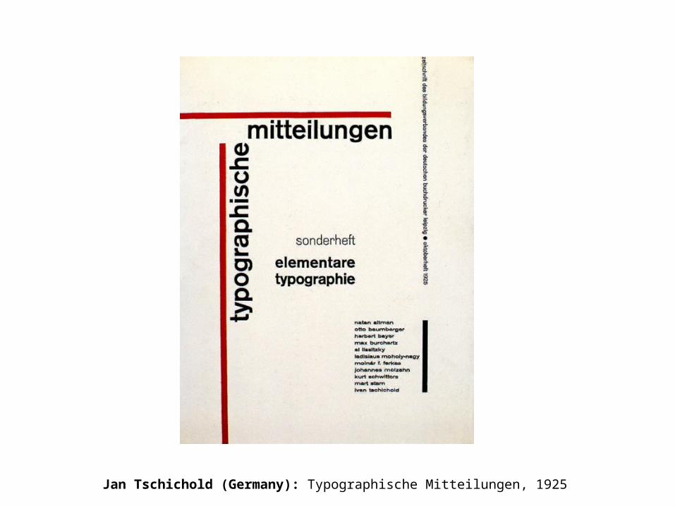
Jan Tschichold (Germany): Typographische Mitteilungen, 1925

Jan Tschichold (Germany)


Jan Tschichold (Germany), late works: traditional typography, humanist tradition

1928 TschicholdNew Typography
50-60ies RuderWhite Space
1961Muller-BrockmannThe Grid

fin