1 a visual analytics framework for identifying topic...
TRANSCRIPT

1
A Visual Analytics Framework for IdentifyingTopic Drivers in Media Events
Yafeng Lu, Member, IEEE, Hong Wang, Steven Landis and Ross Maciejewski, Senior Member, IEEE
Abstract—Media data has been the subject of large scale analysis with applications of text mining being used to provide overviews ofmedia themes and information flows. Such information extracted from media articles has also shown its contextual value of beingintegrated with other data, such as criminal records and stock market pricing. In this work, we explore linking textual media data withcurated secondary textual data sources through user-guided semantic lexical matching for identifying relationships and data links. Inthis manner, critical information can be identified and used to annotate media timelines in order to provide a more detailed overview ofevents that may be driving media topics and frames. These linked events are further analyzed through an application of causalitymodeling to model temporal drivers between the data series. Such causal links are then annotated through automatic entity extractionwhich enables the analyst to explore persons, locations, and organizations that may be pertinent to the media topic of interest. Todemonstrate the proposed framework, two media datasets and an armed conflict event dataset are explored.
Index Terms—Semantic Similarity, Media Annotation, Visual Analytics, Causality Modeling, Social Media.
F
1 INTRODUCTION
A S citizen news reports, micro-blogs and other media outletshave increased, a variety of tools have emerged for ana-
lyzing media data collections. Such tools tend to focus on topicextraction [1], [2], event detection [3], and information flows [4],[5] as a means of quickly assessing the development of ongoingstories. However, recent work often focuses on exploring evolvingmedia discourse in isolation. What is needed are tools and methodsthat can enable analysts to link together multiple data sourcesof interest in order to identify patterns and drivers that existbetween datasets that are not fully captured or represented in anysingle dataset alone. To that end, new technologies have beendeveloped for fusing media data and secondary data sources toprovide contextual information. For example, recent work fromWanner et al. [6] and Hullman et al. [7] explored methods for timeseries analysis to identify text features of interest in conjunctionwith quantitative phenomena observed in stock prices, Liu etal. [8] proposed TextPioneer with a combination of hierarchicaltree visualization and a twisted-ladder-like visualization to presentand analyze the lead-lag patterns in a topic between differentcorpus, and work by Lu et al. [9] explored methods for identifyingintervention points in news media data to cue analysts into theexploration of secondary datasets of interest.
However, fusing datasets and providing means of identifyingand annotating potential temporal drivers is still fraught withchallenges. For example, imagine collecting a corpus of text fromTwitter discussing a sale product (e.g., tennis shoes) as well as acollection of product reviews on tennis shoes from Amazon. Inthis case, an analyst may want to see if discussion on Twitter isdriving ratings and comments in the product reviews. Challengeshere could be that the language used on Twitter and the language
• Yafeng Lu, Hong Wang and Ross Maciejewski, are with Arizona StateUniversity.E-mail: {lyafeng, hxwang, rmacieje}@asu.edu.
• Steven Landis is with University of Nevada, Las VegasE-mail: [email protected]
used on the product review site do not have a one to one matching(e.g., “This shoe is sick” could be counted as a positive review,but the language on the product review site may use less slang).As such, keyword searches to filter the document collections toonly positive reviews may not be able to rely on traditional topicmodeling tools and often need domain expert intervention. Oncea dataset is curated, then further automated analysis to exploredrivers between the datasets must be performed (for example, dopositive tweets about a product proceed positive product reviews?).Annotations of key events in the timeline and key actors in thetext corpora are also relevant and need to be annotated in thehypothesis exploration and analysis phase to help the analystnavigate large document collections and identify key componentsof the event drivers.
As such, this paper proposes a visual analytics framework(Figure 1) that focuses on the exploration, linkage, and annotationof multiple media sources to explore drivers of discourse. First, weapply semantic matching to identify keywords and concepts thatan analyst considers to be related between two datasets. A novelwidget enables domain experts to quickly cluster, split, and mergekeywords from a semantic dictionary to ensure that meaningfulsimilarities are captured through a visual to parametric interfacewhile allowing for analyst-guided language disambiguation. Whilethere are known limitations of keyword searches, by enriching ananalyst’s choice of keywords with semantic meaning, we enable abroader matching that better aligns with the user’s mental model.In this way, we move away from searching on one (or several)keyword(s) and instead search on semantic meanings that embedsthe analyst’s domain knowledge into the search.
Once users are satisfied with the semantic grouping of key-words, filtering is performed and a raw count of semanticallyrelated articles and events per time step can be extracted from eachof the time-oriented textual datasets. Using these time series, asecondary annotation step is performed where causality measuresare applied to the derived time series to extract possible drivers.These causality measures could indicate that past events containedin time series A contain information that can help predict time

2
Fig. 1. Semantic annotation framework exploring the period between Oct.12 and Nov.2, 2014 of the climate change media dataset and theACLED dataset. The Timeline shows annotations of possible drivers of media reports on climate change framed around food insecurity. Keywords“agriculture” and “food” are used for the semantic mapping between the media topic and the text content in the ACLED dataset. The causality modelindicates a goodness of fit R2 ≈ .8 with p-value≤ .05. Actors, locations and descriptive text are annotated on the Timeline.
series B above and beyond the information contained only intime series B. If a causal link is established, the framework thenindicates the temporal lag under which causality was identifiedand provides interactions to further filter and annotate the timeseries based on relationships between locations, actors and otherderived information. Contributions include:
1) A user-guided semantic lexical matching scheme.2) Applied causality metrics for identifying media drivers.3) A causality-driven annotation scheme for exploring po-
tential media drivers.
Thus, our framework enables the development of narratives thatcross beyond the boundaries of a single corpus and enable explo-ration into external events that may serve as drivers to discourse.In order to demonstrate the effectiveness of our work, we havepartnered with experts from political science to explore mediadrivers with respect to armed conflicts. While media streams arethe primary source for annotating conflict events, when extractingtopics, for example climate change or election cycles, the text cor-pus related to a topic will likely be disjoint from topics of armedconflicts. While these topics can be explored in parallel, there isa need to extract, explore and annotate specific events betweenseparate topics in order to formulate and explore hypotheses aboutnarrative drivers. In this work, we frame our discussion on twocase studies: exploring armed conflict events and their relationshipto how the media is framing climate change stories, and; exploringthe plausibility of climate-induced civilian abuse during the 2014Greater Horn of Africa drought. While our case studies are specificto our domain expert’s area, our framework is flexible to allowingestion and semantic annotation between multiple sources ofdata, topics, and events. To apply this framework to general textualdatasets, a preprocessing step that includes topic modeling andword pair similarities is required.
2 RELATED WORK
In this section, we review related work on visual text analytics andannotation to position our contributions.
2.1 Visual Text Analytics
In fields ranging from law to journalism to science, the need toorganize documents and synthesize knowledge has been an un-derlying driver for many text analytics algorithms and systems. Inthe SPIRE system [10], documents are clustered by keywords andprojected to a 2D space through dimension reduction techniquesin order to extract themes. This idea of finding themes, trends,topics and narratives across collections of documents has been anongoing subject of research. ThemeRiver [5] explored the evo-lution of keyword-based topics, visualizing document collectionsas thematically labeled stacked areas over time to reveal trends.More recent work has focused on topic modeling techniques (e.g.Latent Dirichlet Allocation [11]) for document summarization [2],document clustering [1], topic evolution [4], and competitionanalysis [12], [13]. In addition to analyzing themes, work suchas LeadLine [3] has focused on associating topical themes withevents that may be driving changes in discourse. LeadLine appliesevent detection methods to detect “bursts” from topic streamsand further associates such bursts with people and locationsto establish meaningful connections between events and topics.Similar to the work of LeadLine [3], our proposed framework alsofocuses on identifying discourse drivers in time-varying mediacollections. However, instead of detecting events in the same textcollection, as is done in LeadLine, our work focuses on fusingmultiple data sources to provide external context that may notbe captured in the primary data stream. We focus on utilizingsecondary datasets to link contextual information and investigatepossible causality relationships between data sources.

3
While many visual text analytics systems, including thosediscussed above, focus on analyzing documents from a single datasource (e.g., scientific literature collections [14], [15], Wikipediaarticles [16], and social media messages [12], [13], [17]), morerecent approaches have begun exploring the integration of multipledata sources in visual text analytics. For example, Narratives [18]combines keywords from news articles with reactions from socialmedia and visualizes them on a line graph associated with thosekeywords. Work from Wongsuphasawat et al. [19] monitors eventsfrom large-scale logs on Twitter and links them to commercialproducts. Vox Civitas [20] is a visual analytics tool designedto help journalists and media professionals extract news fromlarge-scale aggregations of social media content around broadcastevents. webLyzard [21] is a visual analytics system which aggre-gates news and social media content for interactive explorationand knowledge extraction. Scharl et al. [22] proposed a visualanalytics tool, Westeros Sentinel, which explores the text contentof news media together with four social media platforms in orderto analyze public opinion towards television shows. Their workintegrates topic analysis, sentiment analysis, and content-awaresemantic processing to analyze factual and affective informationfrom the text. Our work builds upon previous work and furtherintroduces causality analysis as a mechanism for framing therelationship between multiple textual data sources to assist theannotation of media topics and ties to potential driving-effects.
Other than combining media and social media data, worksuch as Contexifier [7] has focused on linking news stories tostock prices to detect and highlight events which might causeprice changes. Similar to Contexifier, Wanner et al. [6] developan integrated visual analysis system for stock market data andmedia content to help economists identify text properties in newsarticles that might affect stock prices. Their focus is on time seriespattern identification as a means of identifying potential driversof market fluctuations. Our work is similar in the sense that weare exploring methods of identifying causal drivers of the mediastories from linked secondary events; however, our focus is onlinking media and events based on semantic similarities and thenassessing if drivers between two semantically similar streams exist(as opposed to identifying temporal patterns of interest). This issimilar to Diakopoulos et al.’s work [20], which uses messagesimilarity to filter for related responses to an event; however,we provide new methods for defining semantic relevance as wellas advanced filtering, analysis, and annotation utilizing causalitymetrics to identify potential drivers.
2.2 Annotation
Along with linking secondary datasets and identifying drivers,we also focus on methods for annotating relationships betweenmedia streams. Document annotation has been used in manyvisual analytics systems and has been shown to be an effectiveway to organize information and transform it into knowledge.For example, Zheng et al. [23] proposed a structured annota-tion approach that uses a unified annotation model to recordand organize co-authors’ insights in document revision tasks.Click2Tag [24] and Fingerprint [24] are systems developed tohelp users generate and browse annotations for online documents,and Click2Annotate [25] allows insight externalization and semi-automatic annotation of features such as clusters and outliers.Contextifier [7] provides customized annotations for stock time-line graphs with references to the content in a news article,
and NewsViews [26] is a geo-spatial visualization system thatgenerates interactive, annotated thematic maps for news articles.NewsViews supports trend identification and data comparisonrelevant to a given news article. Similar to our work, the annotationtext in NewsViews [26] is derived not only from media articles butalso from other sources that are geospatially related to the article.Other annotation work includes TimeLineCurator [27], which isan interactive authoring tool that extracts event data and generatesannotated timelines based on temporal information in an article.Our work expands on these with additions of semantic interactionsfor event linkage, providing measures of causality to help directlyidentify statistically significant drivers, and enabling annotationbetween datasets through entity extraction and analysis.
3 FRAMEWORK DESIGN
This framework has been designed for researchers to explore andannotate the underlying driving effects between media datasets(text-based). Methods and techniques utilized in this work weredeveloped based on feedback from our previous work [9] anddiscussions with collaborators from political science and com-munication. The communication experts consist of a professorand a researcher in the university communication school whowere analyzing the relationship between climate change and socialunrest. Our collaborator from political science is one of the authorsof this paper. These domain scientists have text data collected fromnews outlets, social media platforms, and curated event databases.This section introduces the analytic tasks our collaborators haveand the design requirements derived from their tasks.
3.1 Analytic TasksAs an example analysis, we consider a scenario in which a politicalscientist wants to explore the relationship between local conflictsand the 2015 Nigerian election. Prior to the Nigerian election,domain experts had hypothesized that widespread riots and socialunrest would occur as part of the election cycle. The domain expertwanted to analyze social unrest news articles and local conflictevents in Africa during the time leading up to the election toinspect if the election campaign media was a precursor to violence(or vice-versa). First, the data for analysis is collected from twosources (news media and a curated event dataset documentingviolent conflicts in Africa). These datasets are a superset of thedata needed for analysis. Thus, the first task is filtering the datafor relevant text. Once a subset of the media posts and the conflictevent records are curated, the documents need to be checkedfor relevancy, and a temporal aggregation must be performed toenable cause-effect relationship analysis. In this case, the analystis interested in relationships between the subset of media datarelated to the election in Nigeria and the subset of conflict eventsin Africa occurring in Nigeria. As key events, actors and locationsare identified in the data, the analyst also needs to annotate theirfindings in order to explain the events and the news contents andsupport the hypothesis generation and explanation phase.
Given this example analysis task, we generalize the analyst’sworkflow into several key steps for the identification of topicdrivers in media data:
1) Identify topics within the datasets in order to explore theirevolution over time;
2) Link and filter datasets so that the extracted media itemsare relevant to the analysis;
4
3) Identify critical entities within the datasets, and;4) Provide methods for cause-effect identification and iden-
tify potential leading or lagging indicators.
3.2 RequirementsFrom the proposed task workflow, we discussed possible visualanalytics solutions with our domain collaborators and from thesediscussions, we focused on deriving their key analysis needs. Thefunctional requirements from our domain collaborators can besummarized as:
• When exploring multiple media (text) datasets, visualizingmore than co-occurrence is desired. Metrics that detailcause-effect relationships should be prioritized.
• The relationship between event drivers should be temporal.• Raw text should be easy to access for detailed analysis.• Important entities should be highlighted for a quick sum-
mary of events.
Along with requirements from our collaborators, we also haveincorporated principles from the visualization literature into ourframework design.
• Interactions should maintain (when possible) visual co-herency so that smooth updates occur in the visualization.
• Views should be automatically synchronized for linkedexploration and analysis.
• The perception of the meanings embedded in the visualencoding should be intuitive to the domain experts.
We incorporate the functional requirements generated from ourcollaborations with domain experts and visualization design prin-ciples abstracted from literature. The key designs of the proposedframework can be summarized into three main components.Content + Temporal: The textual analysis of multiple sources ofdata requires both content analysis to find shared information andtemporal analysis to identify correlations and causality with leadand lag. The proposed framework links the datasets based ontextual content and posted time and performs causality testing onmultiple different lags.Summary + Detail: A quick summary of the data can facilitate textbrowsing before locating a subset of data for detailed investigation.In addition, the details of the data are also needed to validatean analyst’s hypothesis and reconstruct the story. This frameworkprovides word summaries as well as raw text after an initial searchand filter. In the annotation step, short term entities, icons, andeditable texts are available to represent discovered events.Interactive: Interactions should be enabled directly on the visual-ization and no drastic change of the views should occur whenthe data updates. To enable interactive steering, the proposedframework automatically filters the data and updates the linkedviews after each interaction to minimize the number of requireduser actions while still providing direct and intuitive data accessto the users [28]. The visual encodings are designed to be intuitiveto users, and the design has focused on the color, the icons, andthe linking relationships provided during the analysis results.
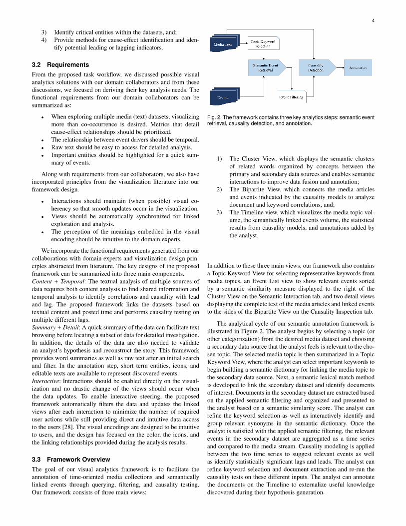
3.3 Framework OverviewThe goal of our visual analytics framework is to facilitate theannotation of time-oriented media collections and semanticallylinked events through querying, filtering, and causality testing.Our framework consists of three main views:
Fig. 2. The framework contains three key analytics steps: semantic eventretrieval, causality detection, and annotation.
1) The Cluster View, which displays the semantic clustersof related words organized by concepts between theprimary and secondary data sources and enables semanticinteractions to improve data fusion and annotation;
2) The Bipartite View, which connects the media articlesand events indicated by the causality models to analyzedocument and keyword correlations, and;
3) The Timeline view, which visualizes the media topic vol-ume, the semantically linked events volume, the statisticalresults from causality models, and annotations added bythe analyst.
In addition to these three main views, our framework also containsa Topic Keyword View for selecting representative keywords frommedia topics, an Event List view to show relevant events sortedby a semantic similarity measure displayed to the right of theCluster View on the Semantic Interaction tab, and two detail viewsdisplaying the complete text of the media articles and linked eventsto the sides of the Bipartite View on the Causality Inspection tab.
The analytical cycle of our semantic annotation framework isillustrated in Figure 2. The analyst begins by selecting a topic (orother categorization) from the desired media dataset and choosinga secondary data source that the analyst feels is relevant to the cho-sen topic. The selected media topic is then summarized in a TopicKeyword View, where the analyst can select important keywords tobegin building a semantic dictionary for linking the media topic tothe secondary data source. Next, a semantic lexical match methodis developed to link the secondary dataset and identify documentsof interest. Documents in the secondary dataset are extracted basedon the applied semantic filtering and organized and presented tothe analyst based on a semantic similarity score. The analyst canrefine the keyword selection as well as interactively identify andgroup relevant synonyms in the semantic dictionary. Once theanalyst is satisfied with the applied semantic filtering, the relevantevents in the secondary dataset are aggregated as a time seriesand compared to the media stream. Causality modeling is appliedbetween the two time series to suggest relevant events as wellas identify statistically significant lags and leads. The analyst canrefine keyword selection and document extraction and re-run thecausality tests on these different inputs. The analyst can annotatethe documents on the Timeline to externalize useful knowledgediscovered during their hypothesis generation.

5
(a) Ordered by frequency (b) Ordered by significance
Fig. 3. The Topic Keyword View shows the 50 most frequent topickeywords for Economy in the social unrest media collection. Keywordsare ordered by their frequency in (a) and by topic significance in (b).Color refers to the other measure not ordered by. The two bars ofeach keyword represents its frequency inside and outside the topicrespectively.
4 SEMANTIC EVENT RETRIEVAL
4.1 Semantic Lexical MatchIn many application areas, the key to successful data analysisand reasoning involves integrating data from different sources,for example, linking financial data with news reports may helpanalysts develop models for predicting stock market responses [6].One critical task in linking multiple datasets is performing textquery matches based on document similarities. This task usuallyleverages information retrieval methods [29]; however, many me-dia posts contain short text messages or other limited informationwhich may not contain the specific query word, restricting theeffectiveness of simple keyword matching. In order to solvethis problem, word semantic similarity measures have been stud-ied [30], [31]. The general idea is to match the word sets fromtext segments by pairing every word in one data collection with itsmost similar word from the other data collection and then calculatea weighted sum of all pairs. Though this method can be used tomeasure the semantic similarity between text segments, there aretwo major challenges in querying for relevant events in media:
1) One dataset under exploration may have a wide wordcoverage which would tend to increase the maximumsimilarity measurements between the two datasets.
2) The knowledge-based word similarity measure returnsthe highest similarity score among all possible wordsenses [32]; however, not all word senses are relevant tothe analyst’s semantic definition. For example, the word“crop” can relate to agriculture or a type of haircut, but ananalyst studying agriculture would likely be uninterestedin articles about hair care.
Topic Keyword View: In order to reduce the issues with wordcoverage, our framework first extracts a list of keywords from theselected media topic. Next, the analyst can explore the uniquenessof these keywords through the Topic Keyword View, Figure 3.In this view, a small multiples bar graph is used to show the 50most frequent keywords. The height of the left bar represents thefrequency of the word with respect to documents that are classifiedinto the selected topic. The height of the right bar represents thefrequency of the word in all other documents in the dataset. Thisview has two options for ordering these keywords, either by theword frequency in this topic or by the significance of this word
with respect to all other topics in the dataset. The significancemeasure of a keyword w to a topic d is defined by:
signi f icance(w,d) =f (w,d)−∑t∈T,t 6=d f (w, t)
∑t∈T f (w, t), (1)
where T denotes the set of all topics extracted from the mediacollection, f (w, t) is the frequency of word w in topic t, and dis the topic under analysis. The range of this metric is [−1,1]where values closer to 1 means the word is more significant in thechosen topic. This measure is also perceptually visible based onthe height of the two bars. If the left bar is taller than the rightbar, the significance value is positive; if the left bar is shorterthan the right bar, the significance value is negative. Analystscan select keywords by clicking on the bar graph and they willbe highlighted by a rectangular box. In Figure 3, the five mostfrequent words in the topic, Economy, have been selected and areshown at the first line by the frequency order (Figure 3(a)). Whenthe view is reordered based on the significance metric, three ofthe five most frequent keywords are also listed as the top fivemost significant keywords while the other two fall into the last tenwords of the list (Figure 3(b)). Using this view, our frameworkprovides a keyword selection reference so that the analysts canchoose representative words for the media topic, thereby injectingdomain knowledge into the semantic annotation pipeline whilereducing the word set chosen for semantic matching.
Similarity Measure: Once keywords are chosen, semantic match-ing to identify relevant links between the datasets is performed.We calculate a semantic similarity score between the selectedkeywords and the documents in the secondary dataset which isthen filtered by this score and the documents that have a highsemantic similarity score are returned for evaluation. The detailedcalculation is introduced as follow.
We use a knowledge-based word semantic similarity metric,Wu and Palmer [33], to first calculate the word-word similaritybetween selected media topic keywords and all words in thesecondary dataset. This metric measures the depth of two givensenses in the WordNet taxonomy [34], along with the depth of theleast common subsumer (LCS). The sense-to-sense similarity iscalculated as follow:
SenseSim =2×depth(LCS)
depth(sense1)+depth(sense2)
This is a sense-to-sense similarity measure, but it can be usedas a word-to-word similarity measure by selecting the highestsimilarity score among all the similarities between the sensesof these two words. Thus, word similarity can be defined asWordSim = Max(SenseSim), which is a score between 0 and 1.
Given a keyword set representing the media topic and theword-to-word similarity measure, a semantic similarity metric canbe developed to measure the relatedness of a document to thismedia topic. The media topic can be described as a set of keywordsK = {k1,k2, . . . ,km} where ki is one of the m keywords. Similarly,the document in the secondary dataset can also be represented by aset of words E = {w1,w2, . . . ,wn} where wi is the word occurringin the document from the secondary dataset. Note that both themedia keywords in K and the words in the secondary dataset Eare preprocessed to remove stop words and are lemmatized usingCoreNLP [35] for consistency. Using the above notations, our

6
similarity score between a topic in dataset one and a documentin dataset two is calculated as follows:
EventSim(E,K) = ∑w,∃ki∈K,
WordSim(ki,w)>θ
δwtfidf(w,E), (2)
where θ is a threshold to filter for semantically similar words (byinspection, θ = 0.8 was a reasonable choice and is used as thethreshold values for all examples in the paper), the tf-idf is used toweight the word’s importance, and 0≤ δ ≤ 1 is a weight for eachsemantically matched word. The value of δ is initially set to be 1for all words, and δ can be changed during the visual to parametricinteraction methods that are described in section 4.2. We use theaugmented frequency for tf(w,E) to prevent a bias towards longerdocuments, where
tfidf(w,E) =(
0.5+0.5× fw,E
max{ fw′,E : w′ ∈ E}
)× id f (w,D)
id f (w,D) = logN
| {E ∈ D : w ∈ E} |,
and w is one word in a document of the secondary datasetE, and the whole secondary data collection is D, the size ofwhich is N. We use the logarithmically scaled inverse documentfrequency for idf(w,D). This approach returns a list of documentsordered by their similarity scores together with the words that aresemantically similar to at least one of the media topic keywords.The semantically matched documents from the secondary datasetare shown in the Event List view (Figure 1) since in our analysiseach document in the secondary dataset describes one event.
4.2 Semantic Similarity UpdateAs previously mentioned, a direct calculation of semantic sim-ilarity from a knowledge base has issues with one keywordsemantically belonging to multiple related concepts, for example,if you look at relationships for “food” in the knowledge base,both “bread” and “education” appear; however, these representtwo very different concepts which may not be the intention of theanalyst. Thus, we have developed a visual to parametric interface,building on the conceptual work of Leman et al. [36], in which theanalyst can cluster the concepts returned from the knowledge baseto better refine the semantic similarity matching. In addition toclustering concept words, the analysts can mark entries returnedfrom the secondary dataset as relevant or irrelevant which willupdate the word similarity weight (δ in Equation 2) therebymodifying the semantic scores and reorganizing the event list.
4.2.1 Semantic Interaction for Concept Word ClusteringAgain, even though a chosen keyword may semantically match aword in the secondary dataset, this matching may not align basedon the contextual concept in which an analyst is working. Forexample, the word “food” has the following three noun senses:
• food#n#1: any substance that can be metabolized by ananimal to give energy and build tissue;
• food#n#2: any solid substance (as opposed to liquid) thatis used as a source of nourishment, and;
• food#n#3: anything that provides mental stimulus.
If an analyst wants to relate concepts of food and agriculture,sense 1 and 2 are likely related to the semantic search; however,sense 3 is unrelated.
Cluster Force Layout: Based upon the interface design ofIN-SPIRE [10] that uses word clusters to represent documentthemes, we have developed a cluster force layout to groupwords in the semantic dictionary based on their word-to-wordsimilarities. Our contributions include methods that enable theanalyst to steer and update this clustering in order to develop anappropriate concept map for semantic annotation. To separatewords by their meaning, we use complete-link agglomerativehierarchical clustering [37], in which the similarity betweentwo clusters is decided by the smallest similarity of all wordpairs between the two clusters. To develop a concept map, ananalyst can interact with the cluster force layout ( Figure 1bottom middle). In the layout, each node represents a word. Thenodes with a solid background represent the selected keywordsfrom the media data, and the nodes without a background colorrepresent the words extracted from the secondary dataset that aresemantically related to the selected keywords. This view uses acategorical color scheme to separate different keyword bubblegroups. Words in the secondary dataset are attracted to theircorresponding keyword in the media data, and words belonging tothe same cluster are further attracted together. Collision detectionis applied to ensure that the nodes do not overlap each other, andnodes in different clusters are separated by a larger margin. As aresult, each keyword and its semantically related words naturallyform a bubble group, along with internal bubble clusters formedby the clusters of the semantically related words. We call theformer the keyword bubble group and the after the bubble cluster.The nodes in each keyword bubble group are colored to matchthe keyword legend on the top right corner. The size of each nodeis proportional to the frequency at which the word appears inthe event records. In the case where a word becomes too smallto see, the analyst can mouse over the nodes to show the wordsin a tooltip. Sometimes the analyst may select many keywordsand the keywords may contain many semantically related words,then we will not have enough space to display all the words inthe view. In practice, a 900×450 space for this view can support4 keyword bubble groups with around 100 semantically similarword bubbles. To enable the capability of analyzing more words,we also allow zooming and panning on the cluster view. Theanalyst can also freely drag the keyword nodes and the clusternodes to adjust their relative position. As the clusters move closeto each other, an attractive/repulsive force will be activated basedon the similarity between the two clusters. This similarity scoreis calculated by taking the average of all word pair similarities.If the similarity between the two clusters is greater than 0.5, theclusters will attract each other, otherwise, they will repel eachother.
Implementation of Cluster Force Layout: We used the forcedirected layout from the d3 library. The clusterings were formedby adding a gravitational force to each of the selected keywordssuch that the keywords would only attract the words that belong totheir clusterings. Then, the clusters were formed by adding a forcebetween words that belong to the same clusters. We also addeda collision detection force to prevent the nodes from overlappingeach other, and the collision detection force will separate nodesin different clusters by a larger space than nodes in the sameclusters. To stabilize the force layout and prevent jittering duringinteraction, we also added a repulsion force between each node toneutralize the other attracting forces when the layout has alreadyformed its shape to prevent the nodes from constantly colliding.

7
Fig. 4. This figure shows an interaction process of steering the clusterforce layout to update the word concept clusters. Each step is markednumerically on the figure. User can drag a word away from all clusters ortowards another cluster. User can drag a group of words to select them.
However, when a cluster moves close to another cluster thatbelongs to a different clustering, the repulsive force would turninto an attractive force toward the nodes between the two clusters.Also, whenever the user drags any clusters on the layout, thestrength of the attractive forces for the cluster will be slightlyincreased to ensure the cluster shape is preserved.
Semantic Interaction: In addition to visualizing word clusters,the cluster layout allows analysts to select sub-clusters and filterout words through semantic interactions [38], [39], [40]. Theunderlying concept is that by allowing users to directly manipulatedata in the visualization space, updates to the positions of dataelements on the screen can be tied back to weights in the analyticmodules on the backend, which can then be translated to the modelupdates. Our cluster force layout supports semantic interactionsfor creating concept clusters. Here, a user can change the numberof clusters by dragging the slider on the top left corner to set thesimilarity threshold in the hierarchical clustering and change thesimilarities between words through drag and drop interactions onthe bubbles. Let k denote the number of clusters shown in onekeyword bubble group and its word set can then be representedby clusters Ci = {wi j}, where i = 1,2, . . . ,k, j = 1,2, . . . ,ni, suchthat cluster Ci contains ni words. An analyst can drag a word,w, from its current cluster Ci to another cluster Ci′ such thatthe similarities between w to all other words in Ci decrease andthe similarities between w to all words in Ci′ increase while thesimilarities between w to the words not in Ci nor Ci′ do not change.The new similarities of word w to other words updates as follows:
sim′(w,w′) =
sim(w,w′)+(1− sim(w,w′))×0.1, w′ ∈Ci′
sim(w,w′)×0.9, w′ ∈Cisim(w,w′), otherwise
Here sim(w,w′) represents the similarity between the word wand w′ before the interaction, and sim′(w,w′) represents the newsimilarity after the interaction. If the analyst finds that there are noclusters that the word w can join, he can try to reduce the similaritybetween this word and all the other words in the keyword bubblegroup. To do this, he can click on any nodes in this keywordbubble group to activate the convex boundary and then drag theword w outside the boundary. Doing so will reduce the similaritybetween the word and other words in this keyword’s group by
Fig. 5. Interaction on the Event List view to update word weight and theevent semantic similarity.
50%. The change of these similarities will trigger an update ofthe hierarchical clustering and the cluster force layout. To hide theboundary, the analyst can click any of the nodes in the bubble.
Once an analyst is satisfied with a concept cluster, he canchoose the words in the cluster to be used for semantic similaritymatching for the event records. The analyst can select the clusterby holding the mouse on any of the nodes in the cluster, and theselected cluster will be highlighted by an orange border. The ana-lyst can then drag this cluster into the container in the bottom rightcorner to select the words, and those selected words will remainin the container and be used for semantic similarity matching.Alternatively, the analyst can also drag any individual words tothe container. Selected words can be removed by dragging themout of the container. An example of these interactions is illustratedin Figure 4 which shows how we can use the cluster force layout toeventually select a subset of words related to “food”. In Figure 4,the analyst is creating a concept map for the keyword “food”.The bubbles contain semantically related words as captured usingthe WordNet similarity. First, the analyst inspects the differentclusters. In step 1, the analyst wants to refine the cluster containing“meal”, “food”, and “water”. The word “treat” is moved into theother cluster within the keyword bubble group and the clusteringupdates. Due to the semantic similarity score between “treat” and“centre”, “centre” is also moved with “treat”. In step 2, the analystwants to remove “media” entirely from the analysis and drags itoutside the convex boundary of the “food” clustering. Then, instep 3, “board” is moved away from “food” but positioned nextto “cut” as the analyst feels those may be conceptually similar.After having a cluster with words “food, water, meal”, the analystnotices that the word “beef” might also relate to the concept offood, so in step 4 “beef” is dragged to the cluster of food. Thisturns into a state where the word “stick” is also clustered togetherwith food and the analyst drags it away as shown in step 5. Finally,step 6, the analyst chooses to use the words in the highlightedcluster for the semantic matching.
4.2.2 Word Weights UpdateIn addition to semantically interacting with the cluster force layoutto refine the concept words, users can also interact with the EventList showing the text details from elements in the secondarydataset (Figure 1 bottom right). Each record in the Event Listview contains the date, similarity score, and the text for an event.The selected semantically similar words are highlighted using thesame color as the related media keywords. For example, the EventList in Figure 1 shows events queried by topic keywords “food”
8
and “agriculture”, which match to qualitative colors “pink” and“blue”. The semantically similar words (e.g. “meal” is related to“food” and “fishing” is related to “agriculture”) are highlighted bythe corresponding color in the Event List. When browsing relatedevents, the analyst can mark an event as relevant or irrelevantby clicking directly on the text. When marked as irrelevant, theword weight δ in Equation 2 will decrease by 0.25 (until reaching0), and δ will increase by 0.25 (until reaching 1.0) if markedas relevant. Through this interaction, the scoring measure of theevents will update while the word similarity cluster does notchange. For example, in Figure 5, we filter a list of events basedon words similar to food, and we notice that the word “beef” inthe first event does not mean the meat for eating but means “tostrengthen”, and we mark this event as irrelevant. The weight ofthe word “beef” then decreased and the rank of this event drops,as shown in the right side list.
4.3 LimitationsGiven the computational demands in the framework, several ofthe features are limited based on the data size. The similaritycalculation time is proportional to the data size. On average,the calculation takes about 20 seconds to process 10,000 pairsof words on a computer with an Intel i7 2.67GHz 8 core CPUand 20GB of RAM. This step is done as preprocessing to enableinteractive exploration. In our use cases, we have three datasetswith 5421 (Climate Change Media), 1820 (Social Unrest Media),and 113297 (ACLED) documents. We calculate the similarity of102,201,615 pairs of words. Pre-processing takes approximately40 hours for all the documents. The other major performancebottleneck is querying for similar words. Similarity searches tookapproximately 28 seconds to return an uncached query.
Along with the computational complexities, the visualizationalso has several limiting factors. Specifically, the force directedlayout can only display a limited number of words. In ourexperiments, a screen size of 900×450 was found to be sufficientfor displaying about 115 words at the initial zoom level. Thisrepresents approximately 4 to 5 clusterings of words.
5 CAUSALITY DETECTION
While the semantic similarity analysis and interactions enablethe analyst to filter and link events between two datasets, thesemethods do not provide any indication of whether or not the eventsidentified in the secondary dataset seem to be driving the mediatopics under analysis. As such, our framework leverages statisticalcausality models to provide a quantitative indicator of significanceunder the hypothesis that the current event series is driving themedia discourse. We formulate the input to the causality modelas two time series. Time series Y (T ) = {y1,y2, . . . ,yt , . . . ,yT}represents the volume per time step of documents in our mediadata classified into the topic of interest. Time series X(T ) ={x1,x2, . . . ,xt , . . . ,xT} represents the volume per time step ofrelated events identified during the semantic matching procedure.Then, we can test for causality between these two time series,where Y is the effect and X is the cause. Here, it is important tonote that there may be other relevant factors in a larger universeto X and Y which cannot be modeled practically, so spuriouscausalities may also be identified; however, these measures arestill able to provide insight and help in the hypothesis generation,testing, and exploration process. While no statistical techniquecan provide a definitive test for causality, a causality test is able
to provide explanations of effects as the results of potential causesand suggest whether a change in the media stream might becorrelated to some local events [41]. Another issue in this testis that the causal effect can be bidirectional, which means X cancause Y and Y may also cause X . In such a situation, a feedbackmechanism should appear. In this application, we focus only onone directional causality, exploring the question of X causes Y .The following assumptions on our dataset are also made:
1) The cause shall appear before of the effect;2) The information in a larger universe not coded in U =
{X ,Y} will be irrelevant, and;3) Both X and Y are stationary series, which means their
means neither change over time nor follow any trends.This should be reasonable for natural events, otherwisethey shall first be transformed to stationary processes.
We apply the Granger causality test [42]. In a simple causalmodel (no instantaneous causality and no feedback mechanism),causality is tested by fitting the following two linear regressionmodels and testing if the prediction variance is statistically signif-icantly improved in the second model.
yt = a0 +m
∑i=1
aiyt−i + εt
yt = a0 +m
∑i=1
aiyt−i +m
∑i=1
aixt−i + εt
Here, εt is an uncorrelated noise series, i.e, E[εtεs] = 0,s 6= t, andm can be any integer in [1,T ].
Let σ2(A|B) be the variance of εt(A|B) which is the error seriesin the prediction model that series A is the response and series Bis the predictor. In our test, given a value of m, we say that XGranger-causes Y at lag m is statistically significant if
σ2(Y |Y −Y (t−m),X−X(t−m))< σ
2(Y |Y −Y (t−m)). (3)
The F-test is used here to test the significance of the incrementof the explanatory power of adding X by comparing the overallfit of the model using only Y and then by using both Y and X . Acorresponding p-value is also used to show the significance level,where the null hypothesis is that the variance has not decreasedby adding X . An R2 value is used to indicate the performanceof the second model by showing how much variance can be fitusing both X and Y . The causality test treats the two timeseriesdata as two arrays of data, the length of time gaps between eachdata point depends on the granularity of the timeseries. Currentlyin our framework, the granularity of our data is in days, butthe causality test will also work for hourly or monthly data.Since the question of “true causality” requires field testing andcontrolled experiments, the applied statistical method should onlybe considered as “predictive” causality which tests whether onetime series is useful in forecasting another [43]. However, this isuseful as an indicator for trends and drivers and can help an analystin exploring hypotheses. This serves as a basis for choosing whichpoints in the Timeline may need further annotation.
6 ANNOTATION
Annotations have been used in visualizations to highlight interest-ing data points, provide context, and display detected events [7],[26], [27], [44]. Our framework allows analysts to annotate mediaarticles and related events, and provides causality modeling indica-tors in the Timeline for correlation discovery and externalization.
9
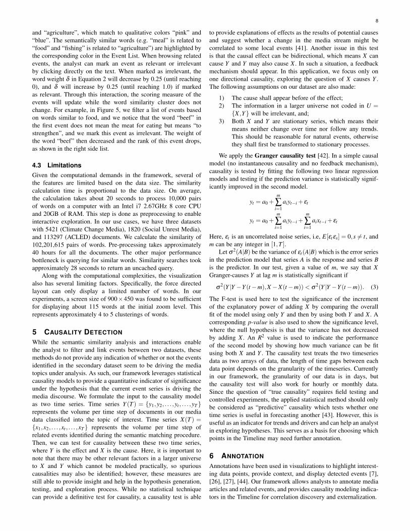
Fig. 6. Initial Causality results without filtering events. The causal arrows are colored based on their significance, and the current result shows nosignificant causality between the current media stream and events, and the best fit model is displayed with R2 ≈ 0.6 and 0.1 < p-value≤ 0.5 at a lagof 4. The height of the area curve represents the amount of variance explained by the model.
6.1 Timeline with Events and Causalities
One of the main views in our framework is the Timeline, Figure 6,which starts from a single line denoting the volume of the mediastream to be augmented gradually by adding relevant events,causalities, and descriptive text annotations. The solid black lineindicates the trend of the percentage volume of the selected mediatopic. The dots in gray on this line represents related events thathappened on a given day, and the size of a gray dot representsthe number of events that happened on that day. The size and theamount of the dots will update after interactions with the TopicKeyword view, the Cluster Force Layout, and the Event List view.
When the analyst is satisfied that the relevant events have beensemantically linked, they can click on the “Causality Test” button(see Figure 1) to run the causality test on the retrieved eventsand the media topic. This causality test returns the statistics forall models with possible lag smaller than 10. For each model,the p-value and R2 are displayed for evaluation. These causalitymodels with different lags are indicated at the top right cornerof the Timeline by a legend consisting of several bars, one foreach model. To the left of each bar, the lag of the model isshown, and the length of the bar indicates the R2 value. Whenone model is selected, a stream area, referred to as the explanatoryarea, is shown below the topic volume line to represent the R2
which denotes how much variance is explained by the model. Forexample, when a model’s R2 = 0.6 the explanatory area will cover60% of the area under the media stream line, Figure 6. The analystcan move the mouse along the timeline to browse the model foreach date, and the identified lags and events will be shown on topof the timeline illustrated with arrows (causal arrows in Figure 6)connecting the possible driving events to the effect date of mediaarticles. The color gradient, in a sequential color scheme, showsthe respective significance levels referring to the p-value colorlegend. For example, in the Figure 6 the color of the causal arrowsare light green which means the causality is only significant at alevel lower than 90%.
For a model with lag m, the media stream is fitted with a linearregression model yt = a0 +∑
mi=1 aiyt−i +∑
mj=1 b jxt− j and only the
past m time steps have been used as predictors. The start pointof each arrow matches the time of the event and the end point(the point with an arrow) matches the time t where the volumeof news articles are being predicted. The width of an arrow’sstarting point corresponds to the amount of events happening thatday. For the purpose of perception and aesthetics, the arrows are
ordered by their length either bottom up or top down, based onthe position of the gray dots which represent the potential causalevents. Our timeline view currently supports only the results fromone causality test on one pair of series, and future work willexplore methods to overcome this limitation.
6.2 Annotating with Text InformationWhen the causality test result is positive, it shows the possibilitythat event series is the cause of the media series, however, to makesuch hypothesis it is necessary to look into the content of themedia articles and the detail information of those events. We useda bipartite view to allow the analysts to navigate through the eventsand media articles, and then the analysts can pick interestingevents and media articles to be annotated on the timeline.
6.2.1 Bipartite ViewThe Bipartite View (Figure 7) displays the connections betweenmedia articles and event records linked by the causal arrow. Thebipartite view updates while the analysts anchor on a date toinvestigate (by moving the mouse on the timeline while holdingthe left key). Initially the bipartite view displays the events andmedia articles on the same day. Once the analyst selects a causalarrow by clicking it, the bipartite view displays the events andmedia articles linked by the arrow. The right side of the Bipar-tite View lists all media articles and the left side lists relevantevents. Both media articles and events are colored accordingto the semantically matched keywords. For media articles, thesemantically matched keywords are the selected media keywordsthat the articles contain. For events, the matched keywords arethe selected media keywords that have some of their semanticallyrelated words contained in the event notes. When the article orevent record has one matched keyword, it will be represented asa rectangle in the color corresponding to the keyword’s legend. Ifmore than one keyword has been matched, this rectangle will use ablended color from all the matched keywords’ colors. Both mediaarticles and events are grouped according to their color, i.e. thesemantically matched keywords. The edges connect the groups bytheir keyword co-occurrence. The edges are colored by the color ofmatched keywords that both of the connected groups contain. Forexample, Figure 7 shows the bipartite view of topic “Election” andkeywords “inec” (Independent National Electoral Commission),“medical”, “electoral”, “health”, and “hospital”. Mousing over anyrectangles on the bipartite view will bring out the tooltip which

10
Fig. 7. Example of the Bipartite view. This view shows the events (leftside) and the media articles (right side) indicated by the causality lagunder analysis and connected by semantically matched keywords.
shows the beginning of the event note/article. For displaying along list of matches, the Bipartite View is scrollable so that theuser can view the details when they do not fit in the area.
6.2.2 Detail List
The detailed information that the rectangles in the Bipartite Viewcontain can be explored in the linked detail view on the sides ofthe Bipartite view. The detail of event records are listed on the leftand the detail of media articles are listed on the right (Figure 9,bottom). Each event record has up to two actors, a location, anda note describing the event. The border color of each entry inthe lists matches the color of its matched keywords. Different tothe color design of the Bipartite View, if there are more than onematched keyword for the entry, there will be multiple borders,each colored by one keyword’s color. The order of entries on bothlists reflects the order of the rectangles on the bipartite view.
6.2.3 Entity Annotations
While exploring the detailed information through the bipartiteview, the analysts can externalize their findings to the timeline bydouble clicking on the media and event rectangles. The selectedevent will be annotated as a record icon using its keyword’scolor. The selected media text will be annotated as a feed icon
using the color of its keyword. To expand the detailed informa-tion of the annotated events and media articles, analysts can clickon an icon and the actors, locations, and text information will beavailable as expanded nodes (Figure 8). From these nodes, theanalyst can choose which event attribute to show on the Timeline.The annotation can help analysts to immediately interact withdata so that one can flag events that can constitute changes inthe underlying equilibrium of these processes.
6.3 Limitations
The proposed media timeline annotation approach has limitedscalability due to the screen space and the dense content andcausal relationships being displayed. In practice, a 1920×1080resolution screen would be able to display annotations of 10to 20 events and media articles without perceptual difficulties.Each application also depends on the actual data and users caneasily expand/collapse icons to optimize the space. Furthermore,the color design in the Bipartite View uses color blending torepresent multiple matching keywords, which could potentiallycause perceptual issues.
(a) Event Annotation (b) Media Article Annotation
Fig. 8. The annotation glyph for event and media articles. The analystcan annotate entities by clicking on the expanded nodes.
7 CASE STUDIES
In this section, we demonstrate our framework through an analysisusing a climate change media collection and a social unrestmedia collection respectively. These datasets will be semanti-cally annotated by the Armed Conflict Event Location Dataset(ACLED) [45] and causal drivers explored. For the case studies,a paired analysis protocol [46] was used in which system featureswere explained and demonstrated to our partners in politicalscience. Our partners discussed their developing hypotheses andinstructed the framework developers driving the system.
7.1 DatasetsACLED: The ACLED dataset (1997 to present) contains informa-tion on the dates and locations of all reported political violenceevents in over 50 developing countries with a focus on Africa.Each event record contains information on the date, location, eventtype and actors involved with approximately 6500 events fromAugust to December 2014.Climate Change Media: The climate change media dataset iscomposed of RSS feeds from 122 English language news outletsand filtered for relevance by matching against a set of 222keywords. From August 2014 to December 2014, this collectioncontains 1245 relevant articles with 9070 sentences which arefurther coded into one (or none) of 25 framing categories. Allarticles have been analyzed through entity recognition to extractpeople, location, and organizations. A more specific descriptioncan be found in our previous work [9].Social Unrest Media: The social unrest media dataset is com-posed of RSS feeds from 128 English language news outletscollected in March 2015. RSS feeds were scanned hourly andthe content of each news article was filtered by a set of 378 socialunrest keywords. The LDA topic modeling algorithm [11] wasrun on these articles and 50 topics were extracted. The following7 topics were selected based on their relatedness to the ACLEDdataset: Election, Economy, Education, Conflicts, Agriculture,Justice, and Energy. All articles have been processed using entityrecognition for annotation.
7.2 Climate-induced Unrest During DroughtThe drought in Africa has attracted the attention of researcherswho want to analyze potential societal impacts that the draughtmay have [47]. Specifically, the draught has caused widespreadagricultural failures and led to famines and political instability.In this case study, the analyst wanted to explore if the GHoA(Great Horn of Africa) drought in 2014 coincided with instancesof political violence. Causal relationships are extremely difficult totest when using observational data, and political scientists debateabout the relationships between climate change and political

11
Fig. 9. Investigating the plausibility of climate-induced civilian abuse during the 2014 GHoA Drought. The link between violence events and socialunrest RSS have been explored although casualty test shows non-significant result.
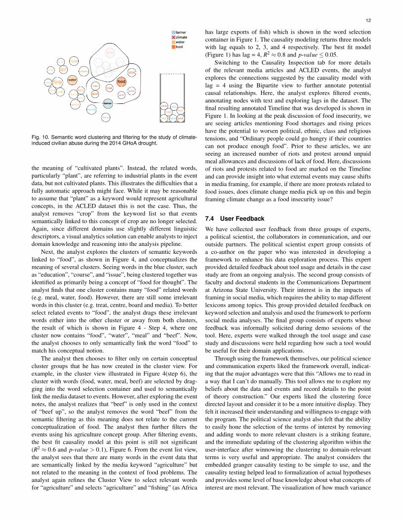
violence [48]. Furthermore, the research that examines the role ofdrought in instances of violent conflict lacks consensus [49], andit remains unclear whether the onset of drought and subsequentobservations of violence could be indicative of broader phenom-ena, such as a governance failure or institutional failure. As such,this case study focuses on the question: Is the 2014 drought in theGHoA linked to reports of social unrest and political violence?To probe this question, the researcher first selected “social unrestRSS”, defined the temporal domain to encompass the month ofMarch 2014, and picked agriculture as the topic to explore. Next,events of “violence against civilians” (which ACLED defines asany armed/violent group that attacks civilians”) is selected toexplore potential drivers between droughts and violence.
To begin, the analyst selected the following words, based onthe significance ordering, as most plausibly being related to theMarch - June 2014 GHoA drought: “water”, “food”, “farmer”, and“climate”. These selections are then used to update the relevantevents and explore the semantic linkages in the clustering bubbleinterface displayed below the event timeline. The clustering resultsreveal that the word “climate”, in this semantic mapping, shareswords/concepts not related to the concept of agriculture. Instead,words such as “way, order, demand, tension, and control” arefound, even after adjusting the similarity threshold to .75. Thus,“climate” is removed and the event list is updated to reflect thechange (see Figure 10). After removing “climate”, the analystremains largely satisfied with the clustering for the remainingterms and now creates clustering within the keyword selectioncontainer. The causality test is performed and returns the followinginsignificant model result: lag=2, R2=0.090 (see Figure 9). Theinsignificant result is not surprising to the analyst since manyother factors are also expected to drive the events. However, healso requested to further explore the details of the events and themedia posts to identify if there were other keywords or factors hemay not have considered. Using the Bipartite View, the analyst
briefly evaluated the links between the keywords and the recordedepisodes of political violence perpetuated against civilians. Hissearch revealed shared associations between terms related todrought and a recorded event of Al Shabaab beheading a civilianfor unstated reasons, (see Figure 9). Based on the exploration, theanalyst concludes that the linkage between resource shortages andcivilian abuse may be less plausible.
7.3 Food Insecurity and Climate Change MediaOur analyst was also interested in exploring potential drivers ofclimate change media discussions with respect to ongoing conflictevents in Africa. He hypothesized that external drivers, such asriots and protests, may be driving the types of framing being usedto discuss climate change. First, the analyst loads the ClimateChange media collection and the ACLED dataset. The analystdecides to focus on the food insecurity frame “ProbThreatFood”,from October 12th to November 3rd, 2014. Next the analystchooses to explore “Riots/Protests” from ACLED to annotate themedia frame. The analyst first selects keywords “food”, “crop”,and “agriculture”. The analyst adjusts the threshold in the ClusterView and discusses the resulting clusters.
First the analyst chooses several topic keywords related to foodinsecurity in the climate change media dataset, selecting “crop”,“food”, and “agriculture”. Events are then automatically selectedthrough the semantic keyword processing, and the analyst runs aninitial causality test which shows no significant causal correlations.The result of this initial model is shown in Figure 6. The problemis that many events that are marked as semantically similar to thesekeywords do not match the analyst’s meaning of “crop”, “food”,and “agriculture”. Thus, the analyst begins using the Cluster Viewto group the words into conceptual groups. As such, the analystexplores semantic keywords related to the selection of “crop”.However, the analyst finds that events in the secondary datasetmatched as semantically similar to “crop” are not embedding
12
Fig. 10. Semantic word clustering and filtering for the study of climate-induced civilian abuse during the 2014 GHoA drought.
the meaning of “cultivated plants”. Instead, the related words,particularly “plant”, are referring to industrial plants in the eventdata, but not cultivated plants. This illustrates the difficulties that afully automatic approach might face. While it may be reasonableto assume that “plant” as a keyword would represent agriculturalconcepts, in the ACLED dataset this is not the case. Thus, theanalyst removes “crop” from the keyword list so that eventssemantically linked to this concept of crop are no longer selected.Again, since different domains use slightly different linguisticdescriptors, a visual analytics solution can enable analysts to injectdomain knowledge and reasoning into the analysis pipeline.
Next, the analyst explores the clusters of semantic keywordslinked to “food”, as shown in Figure 4, and conceptualizes themeaning of several clusters. Seeing words in the blue cluster, suchas “education”, “course”, and “issue”, being clustered together wasidentified as primarily being a concept of “food for thought”. Theanalyst finds that one cluster contains many “food” related words(e.g. meal, water, food). However, there are still some irrelevantwords in this cluster (e.g. treat, centre, board and media). To betterselect related events to “food”, the analyst drags these irrelevantwords either into the other cluster or away from both clusters,the result of which is shown in Figure 4 - Step 4, where onecluster now contains “food”, “water”, “meal” and “beef”. Now,the analyst chooses to only semantically link the word “food” tomatch his conceptual notion.
The analyst then chooses to filter only on certain conceptualcluster groups that he has now created in the cluster view. Forexample, in the cluster view illustrated in Figure 4(step 6), thecluster with words (food, water, meal, beef) are selected by drag-ging into the word selection container and used to semanticallylink the media dataset to events. However, after exploring the eventnotes, the analyst realizes that “beef” is only used in the contextof “beef up”, so the analyst removes the word “beef” from thesemantic filtering as this meaning does not relate to the currentconceptualization of food. The analyst then further filters theevents using his agriculture concept group. After filtering events,the best fit causality model at this point is still not significant(R2 ≈ 0.6 and p-value > 0.1), Figure 6. From the event list view,the analyst sees that there are many words in the event data thatare semantically linked by the media keyword “agriculture” butnot related to the meaning in the context of food problems. Theanalyst again refines the Cluster View to select relevant wordsfor “agriculture” and selects “agriculture” and “fishing” (as Africa
has large exports of fish) which is shown in the word selectioncontainer in Figure 1. The causality modeling returns three modelswith lag equals to 2, 3, and 4 respectively. The best fit model(Figure 1) has lag = 4, R2 ≈ 0.8 and p-value≤ 0.05.
Switching to the Causality Inspection tab for more detailsof the relevant media articles and ACLED events, the analystexplores the connections suggested by the causality model withlag = 4 using the Bipartite view to further annotate potentialcausal relationships. Here, the analyst explores filtered events,annotating nodes with text and exploring lags in the dataset. Thefinal resulting annotated Timeline that was developed is shown inFigure 1. In looking at the peak discussion of food insecurity, weare seeing articles mentioning Food shortages and rising priceshave the potential to worsen political, ethnic, class and religioustensions, and “Ordinary people could go hungry if their countriescan not produce enough food”. Prior to these articles, we areseeing an increased number of riots and protest around unpaidmeal allowances and discussions of lack of food. Here, discussionsof riots and protests related to food are marked on the Timelineand can provide insight into what external events may cause shiftsin media framing, for example, if there are more protests related tofood issues, does climate change media pick up on this and beginframing climate change as a food insecurity issue?
7.4 User Feedback
We have collected user feedback from three groups of experts,a political scientist, the collaborators in communication, and ouroutside partners. The political scientist expert group consists ofa co-author on the paper who was interested in developing aframework to enhance his data exploration process. This expertprovided detailed feedback about tool usage and details in the casestudy are from an ongoing analysis. The second group consists offaculty and doctoral students in the Communications Departmentat Arizona State University. Their interest is in the impacts offraming in social media, which requires the ability to map differentlexicons among topics. This group provided detailed feedback onkeyword selection and analysis and used the framework to performsocial media analyses. The final group consists of experts whosefeedback was informally solicited during demo sessions of thetool. Here, experts were walked through the tool usage and casestudy and discussions were held regarding how such a tool wouldbe useful for their domain applications.
Through using the framework themselves, our political scienceand communication experts liked the framework overall, indicat-ing that the major advantages were that this “Allows me to read ina way that I can’t do manually. This tool allows me to explore mybeliefs about the data and events and record details to the pointof theory construction.” Our experts liked the clustering forcedirected layout and consider it to be a more intuitive display. Theyfelt it increased their understanding and willingness to engage withthe program. The political science analyst also felt that the abilityto easily hone the selection of the terms of interest by removingand adding words to more relevant clusters is a striking feature,and the immediate updating of the clustering algorithm within theuser-interface after winnowing the clustering to domain-relevantterms is very useful and appropriate. The analyst considers theembedded granger causality testing to be simple to use, and thecausality testing helped lead to formalization of actual hypothesesand provides some level of base knowledge about what concepts ofinterest are most relevant. The visualization of how much variance

13
the model explained being represented as a filled area under thecurve was noted as being highly intuitive.
Along with the above detailed feedback, we have also demon-strated our framework to industrial partners. Feedback from thesedemonstrations indicated that users like the interface and theapproach of semantically linking events to media topics. Theythink the visual representation of the clustered keywords are quiteintuitive and the causality test is easy to understand. They alsopointed out some limitations of our work. First, our frameworkneeds the text dataset to be preprocessed, including categoriza-tion (e.g. labeling by domain experts or topic modeling) andword similarity calculation. This limitation currently preventsthis framework from handling streaming text data. Second, ourdemonstrations only showed how to link between media postsand conflict events. However, these demonstrations were given topeople in vastly different domains who indicated a need to analyzeproprietary data sources which may require modifications to thevisual design to support domain specific annotations.
Furthermore, many media sources of interest also containvideo and images, as such, extracting relevant content becomesdifficult. Also, the scalability of the system is a critical issue.In the datasets used by our collaborators for the case studies,scalability was not an issue as some data curating had alreadybeen performed and pre-processing of data could take place priorto interactive analysis. However, a key task of causality analysisis to build predictive models. During our demonstrations, requestsfor real-time model building and updates using streaming data wasdiscussed. Currently, the system is limited by the pre-processingrequirements; however, the workflow proposed by the frameworkis robust to support the causality modeling task but will requirethe addition of a streaming data processing step.
8 CONCLUSIONS AND FUTURE WORK
This paper presents a framework for semantically annotatingmedia topic discourse through linked datasets. To accomplishthis, we have designed a cluster force layout that can facilitatethe development of a concept map of keywords to be used forsemantically filtering linked events. Relationships between theseevents and media trends can be analyzed using causality modeling,and model results are interactively displayed on the Timeline.Though the causality modeling cannot guarantee a true cause-effect relationship, results obtained from such models are ableto help analysts in their knowledge discovery and hypothesisgeneration. Analysts may explore suggested connections betweenmedia articles and linked events, and articles and events that arelinked by multiple concepts are further visualized in the BipartiteView. From the Bipartite View, analysts can annotate events ofinterest on the Timeline to help inform their given hypotheses.
While our examples focused on media and conflicts in Africa,the tools developed are applicable to a variety of domains and data.However, there are several limitations to this framework. First,the semantic match is constrained to a keyword based approach,i.e., the analyst must choose an initial set of keywords fromthe document as a starting point. This can limit the matchingas other words between the corpuses may serve as more appro-priate semantic bridges. Future work will explore new metricsfor organizing the keyword list and providing automatic initialsuggestions. Second, although we have shown that the knowledge-based semantic similarity methods can be leveraged to connecttwo textual datasets, other information retrieval metrics could also
be explored and compared. Future work will focus on devel-oping an ensemble of methods for stronger semantic matchingutilizing links between named entities in the document. Third,the framework has limitations of its scalability and capability ofgeneralizing to streaming data and more complexed data format.The scalability issue exists in both the cluster view and theTimeline as discussed. More advanced techniques in database andsimilarity calculations are needed to generalize this framework forstreaming data and broader datasets.
ACKNOWLEDGMENTS
This work was supported by the U.S. Department of HomelandSecurity’s VACCINE Center, Award 2009-ST-061-CI0001 and theNational Science Foundation, Grant Nos. 1350573 and 1639227.
REFERENCES
[1] H. Lee, J. Kihm, J. Choo, J. Stasko, and H. Park, “ivisclustering: Aninteractive visual document clustering via topic modeling,” in ComputerGraphics Forum, vol. 31, 2012, pp. 1155–1164.
[2] S. Liu, M. X. Zhou, S. Pan, W. Qian, W. Cai, and X. Lian, “Interactive,topic-based visual text summarization and analysis,” in Proceedings ofthe 18th ACM Conference on Information and Knowledge Management.ACM, 2009, pp. 543–552.
[3] W. Dou, X. Wang, D. Skau, W. Ribarsky, and M. X. Zhou, “Leadline:Interactive visual analysis of text data through event identification andexploration,” in IEEE Conference on Visual Analytics Science andTechnology, 2012, pp. 93–102.
[4] W. Cui, S. Liu, Z. Wu, and H. Wei, “How hierarchical topics evolve inlarge text corpora,” IEEE Transactions on Visualization and ComputerGraphics, vol. 20, pp. 2281–2290, 2014.
[5] S. Havre, E. Hetzler, P. Whitney, and L. Nowell, “Themeriver: Visualiz-ing thematic changes in large document collections,” IEEE Transactionson Visualization and Computer Graphics, vol. 8, pp. 9–20, 2002.
[6] F. Wanner, W. Jentner, T. Schreck, A. Stoffel, L. Sharalieva, and D. A.Keim, “Integrated visual analysis of patterns in time series and textdata-workflow and application to financial data analysis,” InformationVisualization, vol. 15, pp. 75–90, 2016.
[7] J. Hullman, N. Diakopoulos, and E. Adar, “Contextifier: Automaticgeneration of annotated stock visualizations,” in Proceedings of theSIGCHI Conference on Human Factors in Computing Systems. ACM,2013, pp. 2707–2716.
[8] S. Liu, Y. Chen, H. Wei, J. Yang, K. Zhou, and S. M. Drucker, “Exploringtopical lead-lag across corpora,” IEEE Transactions on Knowledge andData Engineering, vol. 27, no. 1, pp. 115–129, Jan 2015.
[9] Y. Lu, M. Steptoe, S. Burke, H. Wang, J.-Y. Tsai, H. Davulcu, D. Mont-gomery, S. R. Corman, and R. Maciejewski, “Exploring evolving mediadiscourse through event cueing,” IEEE Transactions on Visualization andComputer Graphics, vol. 22, pp. 220–229, Jan 2016.
[10] J. A. Wise, J. J. Thomas, K. Pennock, D. Lantrip, M. Pottier, A. Schur,and V. Crow, “Visualizing the non-visual: spatial analysis and interactionwith information from text documents,” in Proceedings of InformationVisualization. IEEE, 1995, pp. 51–58.
[11] D. M. Blei, A. Y. Ng, and M. I. Jordan, “Latent dirichlet allocation,” TheJournal of Machine Learning Research, vol. 3, pp. 993–1022, 2003.
[12] G. Sun, Y. Wu, S. Liu, T. Peng, J. Zhu, and R. Liang, “Evoriver: Visualanalysis of topic coopetition on social media,” IEEE Transactions onVisualization and Computer Graphics, vol. 20, pp. 1753–1762, 2014.
[13] P. Xu, Y. Wu, E. Wei, T. Q. Peng, S. Liu, J. J. H. Zhu, and H. Qu, “Visualanalysis of topic competition on social media,” IEEE Transactions onVisualization and Computer Graphics, vol. 19, pp. 2012–2021, 2013.
[14] F. Beck, S. Koch, and D. Weiskopf, “Visual analysis and disseminationof scientific literature collections with survis,” IEEE Transactions onVisualization and Computer Graphics, vol. 22, pp. 180–189, 2016.
[15] F. Heimerl, Q. Han, S. Koch, and T. Ertl, “Citerivers: Visual analyticsof citation patterns,” IEEE Transactions on Visualization and ComputerGraphics, vol. 22, pp. 190–199, 2016.
[16] I. Cho, W. Dou, D. X. Wang, E. Sauda, and W. Ribarsky, “Vairoma: Avisual analytics system for making sense of places, times, and eventsin roman history,” IEEE Transactions on Visualization and ComputerGraphics, vol. 22, pp. 210–219, 2016.

14
[17] W. Ribarsky, D. X. Wang, and W. Dou, “Social media analytics forcompetitive advantage,” Computers & Graphics, vol. 38, pp. 328–331,2014.
[18] D. Fisher, A. Hoff, G. Robertson, and M. Hurst, “Narratives: A visual-ization to track narrative events as they develop,” in IEEE Symposium onVisual Analytics Science and Technology, 2008, pp. 115–122.
[19] K. Wongsuphasawat and J. Lin, “Using visualizations to monitor changesand harvest insights from a global-scale logging infrastructure at twitter,”in IEEE Conference on Visual Analytics Science and Technology, 2014,pp. 113–122.
[20] N. Diakopoulos, M. Naaman, and F. Kivran-Swaine, “Diamonds in therough: Social media visual analytics for journalistic inquiry,” in IEEESymposium on Visual Analytics Science and Technology, 2010, pp. 115–122.
[21] A. Scharl, A. Hubmann-Haidvogel, A. Weichselbraun, G. Wohlgenannt,H.-P. Lang, and M. Sabou, “Extraction and interactive exploration ofknowledge from aggregated news and social media content,” in Proceed-ings of the 4th ACM SIGCHI Symposium on Engineering InteractiveComputing Systems. ACM, 2012, pp. 163–168.
[22] A. Scharl, A. Hubmann-Haidvogel, A. Jones, D. Fischl, R. Kamolov,A. Weichselbraun, and W. Rafelsberger, “Analyzing the public discourseon works of fiction–detection and visualization of emotion in onlinecoverage about hbos game of thrones,” Information Processing & Man-agement, vol. 52, pp. 129–138, 2016.
[23] Q. Zheng, K. Booth, and J. McGrenere, “Co-authoring with structuredannotations,” in Proceedings of the SIGCHI conference on HumanFactors in computing systems. ACM, 2006, pp. 131–140.
[24] L. Hong, E. H. Chi, R. Budiu, P. Pirolli, and L. Nelson, “Spartag. us: Alow cost tagging system for foraging of web content,” in Proceedings ofthe working conference on Advanced visual interfaces. ACM, 2008, pp.65–72.
[25] Y. Chen, S. Barlowe, and J. Yang, “Click2annotate: Automated insightexternalization with rich semantics,” in IEEE Symposium on VisualAnalytics Science and Technology. IEEE, 2010, pp. 155–162.
[26] T. Gao, J. R. Hullman, E. Adar, B. Hecht, and N. Diakopoulos,“Newsviews: An automated pipeline for creating custom geovisualiza-tions for news,” in Proceedings of the SIGCHI Conference on HumanFactors in Computing Systems. ACM, 2014, pp. 3005–3014.
[27] J. Fulda, M. Brehmer, and T. Munzner, “Timelinecurator: Interactiveauthoring of visual timelines from unstructured text,” IEEE Transactionson Visualization and Computer Graphics, vol. 22, pp. 300–309, 2016.
[28] N. Elmqvist, A. V. Moere, H.-C. Jetter, D. Cernea, H. Reiterer, andT. Jankun-Kelly, “Fluid interaction for information visualization,” Infor-mation Visualization, 2011.
[29] R. Baeza-Yates and B. Ribeiro-Neto, Modern information retrieval.ACM press New York, 1999, vol. 463.
[30] D. Metzler, S. Dumais, and C. Meek, Similarity measures for shortsegments of text. Springer, 2007.
[31] R. Mihalcea, C. Corley, and C. Strapparava, “Corpus-based andknowledge-based measures of text semantic similarity,” in AAAI, vol. 6,2006, pp. 775–780.
[32] R. Navigli, “Word sense disambiguation: A survey,” ACM ComputingSurveys, vol. 41, p. 10, 2009.
[33] Z. Wu and M. Palmer, “Verbs semantics and lexical selection,” inProceedings of the annual meeting on Association for ComputationalLinguistics. Association for Computational Linguistics, 1994, pp. 133–138.
[34] G. A. Miller, “Wordnet: a lexical database for english,” Communicationsof the ACM, vol. 38, pp. 39–41, 1995.
[35] C. D. Manning, M. Surdeanu, J. Bauer, J. R. Finkel, S. Bethard, andD. McClosky, “The Stanford CoreNLP Natural Language ProcessingToolkit.” in ACL (System Demonstrations), 2014, pp. 55–60.
[36] S. C. Leman, L. House, D. Maiti, A. Endert, and C. North, “Visual toparametric interaction (v2pi),” PloS one, vol. 8, p. e50474, 2013.
[37] T. Sørensen, “A method of establishing groups of equal amplitude in plantsociology based on similarity of species and its application to analyses ofthe vegetation on danish commons,” Biologiske Skrifter, vol. 5, pp. 1–34,1948.
[38] A. Endert, L. Bradel, and C. North, “Beyond control panels: Directmanipulation for visual analytics,” IEEE Computer Graphics and Ap-plications, vol. 33, pp. 6–13, 2013.
[39] A. Endert, P. Fiaux, and C. North, “Semantic interaction for visual textanalytics,” in Proceedings of the SIGCHI conference on Human factorsin computing systems. ACM, 2012, pp. 473–482.
[40] A. Endert, S. Fox, D. Maiti, and C. North, “The semantics of clustering:analysis of user-generated spatializations of text documents,” in Pro-
ceedings of the International Working Conference on Advanced VisualInterfaces. ACM, 2012, pp. 555–562.
[41] H. B. Asher, Causal modeling. Sage, 1983.[42] C. W. Granger, “Investigating causal relations by econometric models
and cross-spectral methods,” Econometrica: Journal of the EconometricSociety, pp. 424–438, 1969.
[43] F. X. Diebold, Elements of forecasting. South-Western College Publ.,1998.
[44] J. Zhao, M. Glueck, S. Breslav, F. Chevalier, and A. Khan, “Annotationgraphs: A graph-based visualization for meta-analysis of data basedon user-authored annotations,” IEEE Transactions on Visualization andComputer Graphics, vol. PP, pp. 1–1, 2016.
[45] “Armed conflict location & event data project,”http://http://www.acleddata.com/, accessed: 2016-03-17.
[46] R. Arias-Hernandez, L. T. Kaastra, T. M. Green, and B. Fisher, “Pair an-alytics: Capturing reasoning processes in collaborative visual analytics,”in Hawaii International Conference on System Sciences. IEEE, 2011,pp. 1–10.
[47] S. C. Herring, A. Hoell, M. P. Hoerling, J. P. Kossin, C. J. Schreck,and P. A. Stott, “Explaining extreme events of 2015 from a climateperspective,” Bulletin of the American Meteorological Society, vol. 97,p. Sii, 2016.
[48] H. Buhaug, “Climate change and conflict: Taking stock,” Peace Eco-nomics, Peace Science and Public Policy, vol. 22, pp. 331–338, 2016.
[49] O. M. Theisen, H. Holtermann, and H. Buhaug, “Climate wars? assessingthe claim that drought breeds conflict,” MIT Press, 2011.
Yafeng Lu is a Postdoctoral Research Assis-tant in the School of Computing, Informatics andDecision Systems Engineering at Arizona StateUniversity. Her current research interests are insocial media and predictive visual analytics.
Hong Wang is a Ph.D student in the School ofComputing, Informatics and Decision SystemsEngineering Arizona State University. His re-search interests include Data Visualization andHuman Computer Interaction.
Steven Landis is an Assistant Professor of Po-litical Science at the University of Nevada, LasVegas. His research interests are focused onthe intersections of environmental security, eco-nomic development, and political violence.
Ross Meciejewski is an Associate Professor ofComputer Science at Arizona State University.His primary research interests are in the areas ofgeographical visualization, social media mining,and predictive analytics.