1 data analysis i statistics for description gail johnson january 2008
Post on 19-Dec-2015
214 views
TRANSCRIPT

1
Data Analysis IStatistics for Description
Gail Johnson
January 2008
2
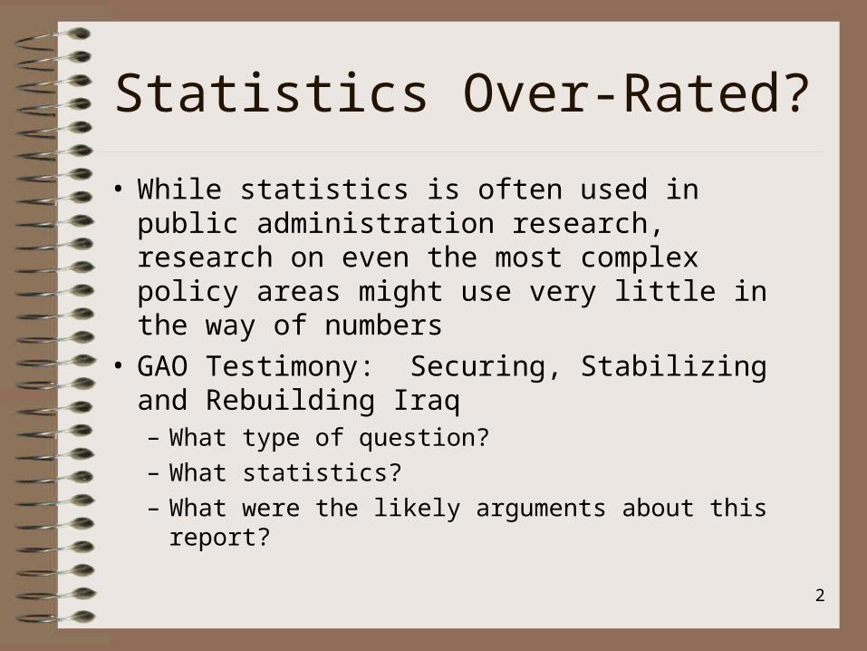
Statistics Over-Rated?
• While statistics is often used in public administration research, research on even the most complex policy areas might use very little in the way of numbers
• GAO Testimony: Securing, Stabilizing and Rebuilding Iraq– What type of question?
– What statistics?
– What were the likely arguments about this report?

3
Statistics
• "Many a statistic is false on its face. It gets by only because the magic of numbers brings out a suspension of common sense." (Huff, p. 138).
• State of the state
• Descriptive vs Inferential

4
Descriptive Statistics
• Frequency Distributions– Number and percents of a single variable
• Parts of a Whole– Percents (75%)and Proportions (.75)
• Ratio: numbers presented in relationship to each other– Student to teacher ratio: 15:1

5
Simple Data
• Handout:
• Budget Surplus and Deficit– What does this analysis tell you?– What questions come to mind?

6
Analysis
• Rates: number of occurrences that are standardized– Deaths of infants per 100,000 births– Crime rates: crimes per 100,000 population
• Teen birth rates– 2006: Handout– Controversy: Public policy choices

7
Analysis
• Rates of change
– Percentage change from one time period to the other
• The budget increased 23% from FY 2002 to FY 2003.
Workbook: Table 9.6
8
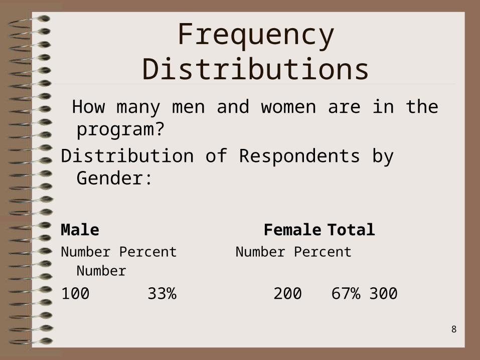
Frequency Distributions
How many men and women are in the program?
Distribution of Respondents by Gender:
Male Female Total
Number Percent Number Percent Number
100 33% 200 67% 300

9
Frequency Distributions
How many men and women are in the program?
Write-up:
Of the 300 people in this program, 67% are women and 33% are men.
10
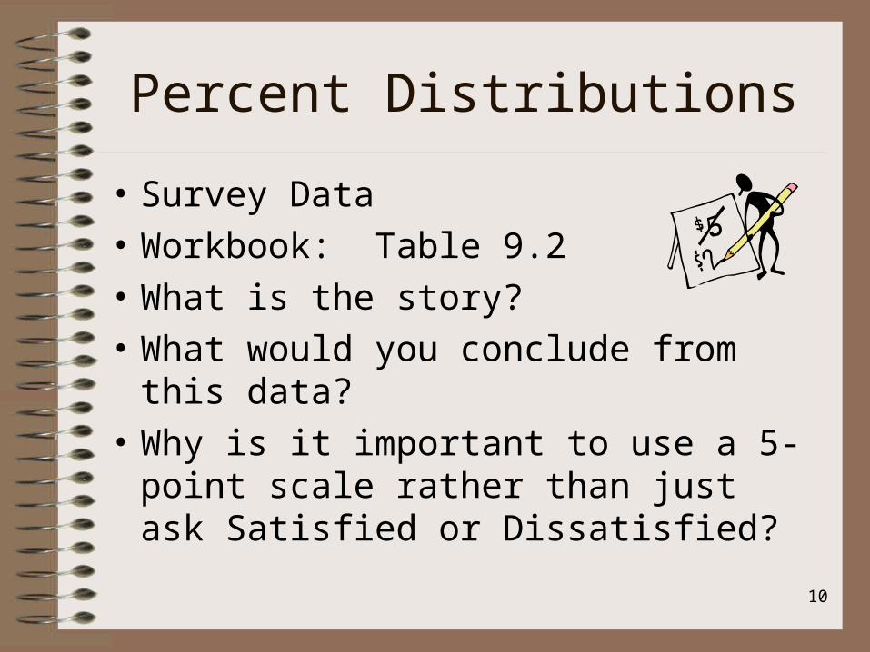
Percent Distributions
• Survey Data
• Workbook: Table 9.2
• What is the story?
• What would you conclude from this data?
• Why is it important to use a 5-point scale rather than just ask Satisfied or Dissatisfied?
11
Telling the Story
• Exercise:
• Workbook: Tables 9.3 and 9.4

12
Measures of Central Tendency
Central tendency: • How similar are the characteristics?
– Example: how similar are the ages of this group of people?
The 3-Ms: Mode, Median, Mode.• Mode: most frequent response. • Median: mid-point of the distribution• Mean: arithmetic average.
13
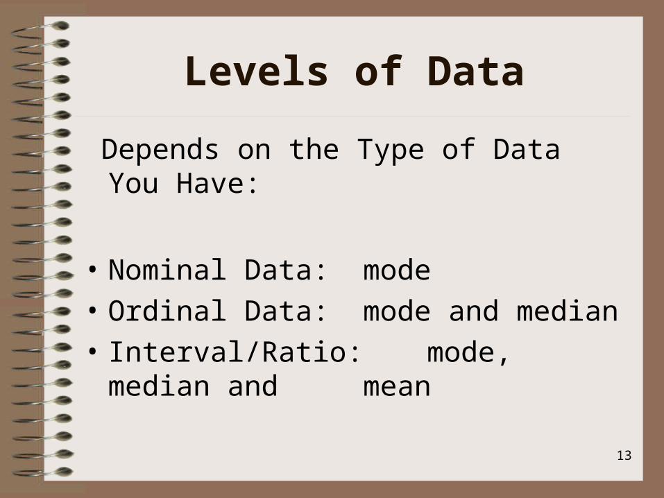
Levels of Data
Depends on the Type of Data You Have:
• Nominal Data: mode
• Ordinal Data: mode and median
• Interval/Ratio: mode, median and mean

14
Central Tendency
• Interval/Ratio Data
• Normal Curve– Bell Shaped– Mean, Median and Mode should align

15
Skewed Data
• Skewed Data:– Positive– Negative– Tests: 0+ normal
» +1/-1 Skewed
• use mean if distribution is normal
• use median if distribution is not normal

16
What to Use?
• Workbook: Table 9.8
• Which would be the best single description of the central tendencies of this distribution? Why?

17
Trade-offs
• You have more options when you collect interval/ratio level data– But sometimes it is better from a data
collection perspective to ask ordinal data: income categories, age categories
• Open for debate: Can you use “means” with ordinal data?

18
No Debate with Nominal Data
• But means should never be used for nominal level variables
• Gender: coded 1 = men, 2 = women• The computer will do a mean if you ask it
to.• It gives you 1.6.• What does that mean?• Nothing
19
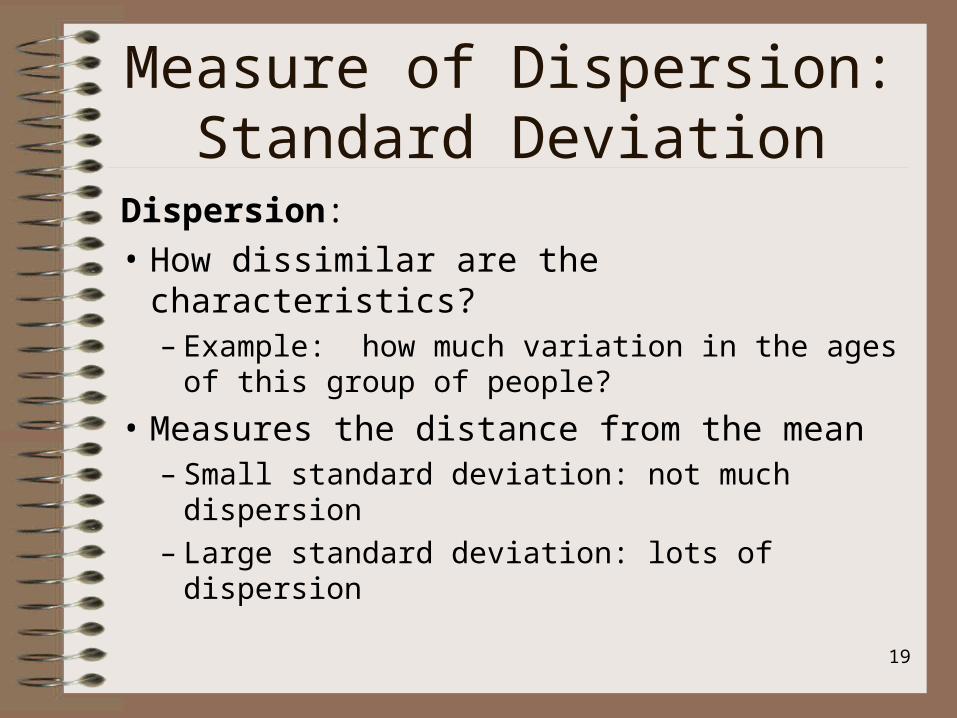
Measure of Dispersion:Standard Deviation
Dispersion:
• How dissimilar are the characteristics?– Example: how much variation in the ages of
this group of people?
• Measures the distance from the mean– Small standard deviation: not much dispersion– Large standard deviation: lots of dispersion

20
Standard Deviation
• Normal Distribution: Bell-shaped curve– 68% of the variation is within 1 standard
deviation of the mean– 95% of the variation is within 2 standard
deviations of the mean

21
Standard Deviation
• Range 60-98• Mean 74• Median 71• Mode 68
• Standard deviation: small
• Range 20-98• Mean 69• Median 71• Mode 68
• Standard deviation: large
• A few very low scores: skew data

22
Applying the Standard Deviation
Average test score= 60.
The standard deviation is 10.
Therefore, 95% of the scores are between 40 and 80.
Calculation:
60+20=80 60-20=40.

23
Working With 2 Variables
Descriptive Statistics
• Cross-tabs
• Comparison of Means

24
Crosstabs: Description
Describe Respondents’ Race and GenderRace Gender: Men Gender: Women Number Percent Number Percent
White 50 21% 72 31%Black 35 15% 25 11%Hispanic 15 6% 14 6%Other 18 8% 4 0%
Workbook 9.10
25
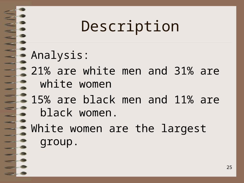
Description
Analysis:
21% are white men and 31% are white women
15% are black men and 11% are black women.
White women are the largest group.

26
Describing Two Variables
• Workbook, Table 9.11
• Participation in Classes by Gender
• In each class, what % are boys and what % are girls?

27
Description
• Polling Data
• Who did men and women vote for in New Hampshire Primary (exit polls)
• Handout:

28
Relationships
The most interesting analysis often involves looking at relationships.
Associations, Explanations, Causal, Correlated

29
Relationships
• Cause-Effect Questions
– Time order
– Co-variation
– Logical Theory
– Elimination of Rival Explanations

30
Independent and Dependent Variables
Independent: – Variable which occurred first and you believe
explains a change in the dependent variable– Program evaluation: the program
• Dependent: – Variable you want to explain– Program evaluation: the outcome measure

31
Identify IV and DV
• As age increases, sickness increases• There are more accident fatalities in areas of
low population density than in areas of high population density
• There are differences in salary based on gender• States with severe penalties for DUI had fewer
accident fatalities than states with weak penalties.
• More guns means reduces murder rates

32
Crosstabs to Explore Relationships
• Used when working with nominal and ordinal data
• Can be used with interval/ratio data that has been categorized into ordinal data.

33
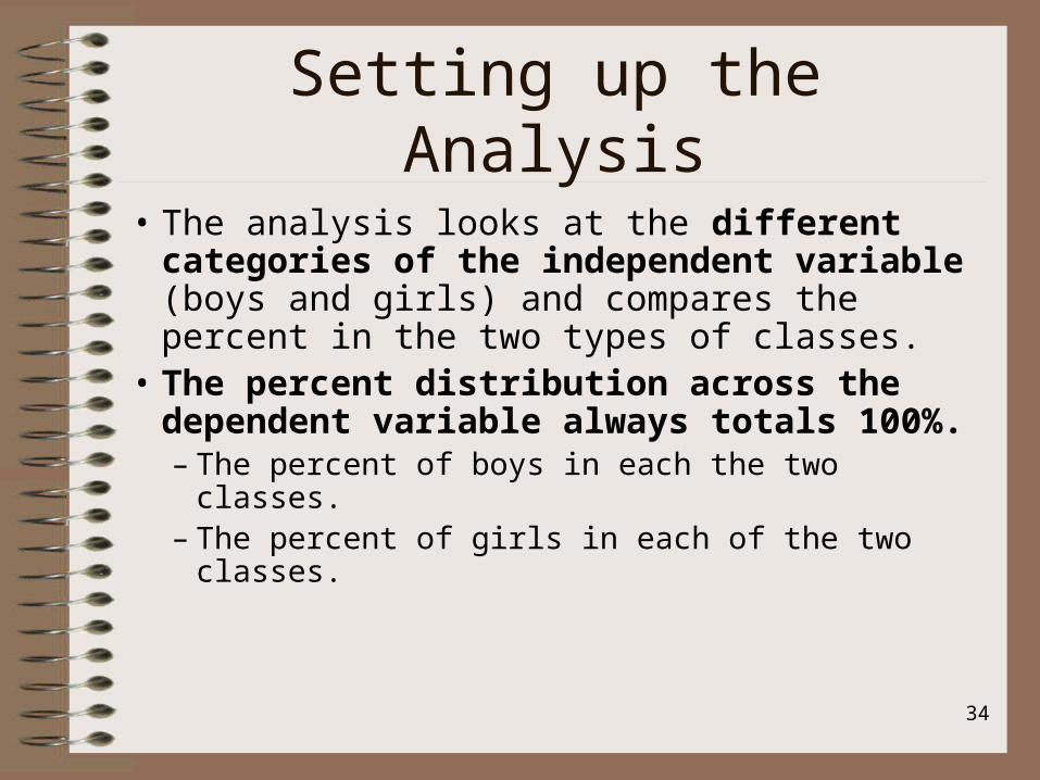
Setting up the Analysis
• Are boys more likely to take hands-on classes than girls?
• We are testing whether there is a difference based on gender.
• The independent variable is gender (boys and girls).
• The dependent variable is the two types of classes.
34
Setting up the Analysis
• The analysis looks at the different categories of the independent variable (boys and girls) and compares the percent in the two types of classes.
• The percent distribution across the dependent variable always totals 100%.– The percent of boys in each the two classes.– The percent of girls in each of the two classes.
35
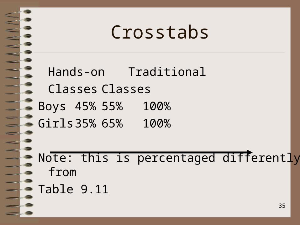
Crosstabs
Hands-on Traditional
Classes Classes
Boys 45% 55% 100%
Girls 35% 65% 100%
Note: this is percentaged differently from
Table 9.11

36
Crosstabs
Interpretation:
Boys are somewhat more likely (45%) to take the hands-on classes as compared to girls (35%).

37
Is There a Relationship Between Income and
Job Satisfaction? Job
Satisfaction
Income
Low Medium High
Low 50% 20% 13%
Medium 30 53 20
High 20 37 67
Total 100%n=200
100%n=150
100%n=75

38
Format
• Independent Variable: Income• Dependent variable: Job Satisfaction• Are people who earn high salaries more satisfied
than those who earn low salaries?• For each category of the independent variable,
what is the percent distributions across the dependent variable?
• Independent variable: Income– Percent distribution Down the Column

39
Income Job Satisfaction Total
Low Medium High
Low 50% 30 20 100%n=200
Medium 20% 53 37 100% n=150
High 13% 20 67 100% n=75
Same data, different format

40
Format
• Independent Variable: Income• Dependent variable: Job Satisfaction• Are people who earn high salaries more satisfied
than those who earn low salaries?• For each category of the independent variable,
what is the percent distributions across the dependent variable?
• Independent variable: Income– Percent distribution ACROSS row

41
Education Level Test Scores
Performance test score
High School or less
More than High school
Low 40% 20%
High 60% 80%
Total 100%
(n=550)
100%
(n=1,000)

42
Format
• Independent Variable: Level of Education• Dependent variable: Test Score• If I know the level of education, can I predict the
test score?• For each category of the independent variable,
what is the percent distributions across the dependent variable?
• Independent variable: Education– Percent distribution down column
43
Percentage is Key
• Workbook:
• Table 10.2 and Table 10.3:

44
Relationships: Statistical Controls
• Relationship remains unchanged when controls are introduced: suggests that ind. Var is associated or related to dep. Var.
• Relationship disappears. Suggests that initial relationship is spurious; the control variable is related to the dep. Var.

45
Relationships: Statistical Controls
• Relationship changes, dependent upon the control variable: interaction. A relationship between three variables is interactive.
• Relationship between ind. and. dep. variable is attenuated but persists. IV and CV are related to the DV.

46
Control Variables
• Statistical controls: to eliminate possible rival explanations.
• Are there differences in Satisfaction with City Services based on race?
• Workbook: 104:– What would you conclude?

47
Control Variables
• Is there anything else that might explain those differences?
• Maybe it is not race—maybe it is really about whether you live in poor or non-poor neighborhoods.
• So, we can run the same cross-tab between race and satisfaction, but this time controlling for Neighborhood Wealth
• (Poor and Not-Poor)

48
Control Variables
• This gives us two cross-tab tables• Workbook Table 10.5
– We see the relationship between race and satisfaction for those in poor neighborhoods
– We see the relationship between race and satisfaction for those in non-poor relationships
– When the relationship disappears as dramatically as this, we will conclude that race has not a factor
– Technical: the initial relationship is spurious

49
One more Example
• Workbook Table 10.6• Views on Social Welfare Bills based on Location• IV: Location (Urban/Rural)• DV: Position (Support/Oppose)• Of the people who live in Urban areas, what %
support?• Of the people who live in Rural areas, what %
support?

50
One More Example
• Now, what happens when we control for Political Party?
• Look at Table 10.7• What do you conclude?• Of course, I am using fake data. It is
unlikely to find anything so extreme.• Look at Table 10.8• What do you conclude?

51
Comparison of Means
• When we are working with a nominal level variable (like Gender) and a ratio level variable, we can compare the means.
• What are the average salaries of men and women?Men $ 45,260Women $ 39,995Is it gender that causes the differences?

52
Controlling for a 3rd variable
• What if it is education that explains differences in salary?
• Workbook: Look at two possible scenarios:
• Table 10.9 and Table 10.10
• What does each table tell you?

53
How strong are these relationships?
• While there is certainly a story that can be told just by looking at the data.
• We can say, for example, in Table 109., that women tend to earn less then men in each category of education.
• Gender would appear to be related to salary.
• Is there another way to measure this?

54
Measure of Association
• What exactly do Measures of Association really mean?
• Conceptual meaning:– Height and Weight Exercise– 10 Volunteers

55
Direction of the Relationship
• Plus sign: Direct Relationship
– both variables change in the same direction
– example: As driving speed increases, death rate goes up

56
Direction of the Relationship
• Minus sign: Inverse Relationship
– both variable change but in the opposite direction
– Example:As age increases, health status decreases
57
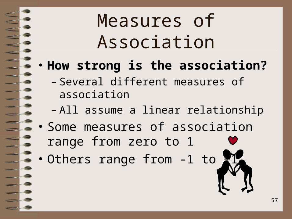
Measures of Association
• How strong is the association?– Several different measures of association– All assume a linear relationship
• Some measures of association range from zero to 1
• Others range from -1 to +1

58
Measures of Association
• At the extremes: interpreted the same way: generally get interpreted in a similar way:
• Perfect Relationship = 1 or -1• No relationship = 0• Handbook: Table 10.11: Patterns
– What a perfect direct, perfect inverse relationship looks like
– What no relationship looks like

59
Measures of Association
• General Agreement:– Closer to 1: stronger the relationship– Closer to 0: weaker the relationship
• However, no agreement on English.5 strong (maybe as good as it
gets)
.3-.4 moderate relationship
.2 weak/slight relationship
60
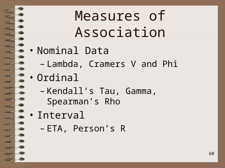
Measures of Association
• Nominal Data– Lambda, Cramers V and Phi
• Ordinal– Kendall’s Tau, Gamma, Spearman’s Rho
• Interval– ETA, Person’s R

61
Measures of Association
• Are there differences in views based on gender?
• Workbook: Table 10.12
• Look at the pattern: What do you see?
• Now look at the measures of association:– How would you interpret it?

62
Measures of Association
Ordinal data:
Does education make a difference about attitudes about spanking?
Workbook: Table 10.12.
Tau B= .109
Tau C= .095
Gamma = .167
63
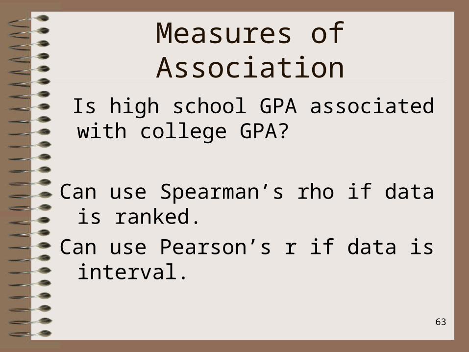
Measures of Association
Is high school GPA associated with college GPA?
Can use Spearman’s rho if data is ranked.
Can use Pearson’s r if data is interval.

64
Working with Ranked Data
• Workbook: Table 10.14
• Does education make a difference in terms of salary?– If you have higher education, then you will
earn more income?– What do you think from looking at the data>– What does the measure of association tell you?

65
More Options
• Let’s take 1st Break