1 subject - univ-lyon2.freric.univ-lyon2.fr/~ricco/tanagra/fichiers/en_tanagra_acm.pdf · 1 subject...
TRANSCRIPT

Tanagra
19 mai 2009 Page 1 sur 9
1 Subject
Implementing the multiple correspondence analysis (MCA) with Tanagra.
The multiple correspondence analysis is a factor analysis approach1. It deals with a tabular dataset
where a set of examples are described by a set of categorical variables. The aim is to map the
dataset in a reduced dimension space (usually two) which allows us to highlight the associations
between the examples and the variables.
In this tutorial, we show how to implement this approach and how to interpret the results with
Tanagra.
2 Dataset
We use the RACES_CANINES_ACM.XLS dataset, from the famous TENENHAUS2 book (Table 1,
page 200). The interest of this dataset is that we can compare our results with those described in
the book (pages 212 to 222). We simply show the sequence of operations and the reading of the
results tables in this tutorial. About the detailed interpretation, it is best to refer to the book.
The data table is the following:
Chien Taille Poids Velocite Intelligence Affect ion Agressiv ite Fonct ionBeauceron Taille+ + Poids+ Veloc+ + Intell+ Affec+ Agress+ ut iliteBasset Taille- Poids- Veloc- Intell- Affec- Agress+ chasseBerger All Taille+ + Poids+ Veloc+ + Intell+ + Affec+ Agress+ ut iliteBoxer Taille+ Poids+ Veloc+ Intell+ Affec+ Agress+ compagnieBull-Dog Taille- Poids- Veloc- Intell+ Affec+ Agress- compagnieBull-Mast if Taille+ + Poids+ + Veloc- Intell+ + Affec- Agress+ ut iliteCaniche Taille- Poids- Veloc+ Intell+ + Affec+ Agress- compagnieChihuahua Taille- Poids- Veloc- Intell- Affec+ Agress- compagnieCocker Taille+ Poids- Veloc- Intell+ Affec+ Agress+ compagnieColley Taille+ + Poids+ Veloc+ + Intell+ Affec+ Agress- compagnieDalmat ien Taille+ Poids+ Veloc+ Intell+ Affec+ Agress- compagnieDoberman Taille+ + Poids+ Veloc+ + Intell+ + Affec- Agress+ ut iliteDogue All Taille+ + Poids+ + Veloc+ + Intell- Affec- Agress+ ut iliteEpag. Breton Taille+ Poids+ Veloc+ Intell+ + Affec+ Agress- chasseEpag. Français Taille+ + Poids+ Veloc+ Intell+ Affec- Agress- chasseFox-Hound Taille+ + Poids+ Veloc+ + Intell- Affec- Agress+ chasseFox-Terrier Taille- Poids- Veloc+ Intell+ Affec+ Agress+ compagnieGd Bleu Gasc Taille+ + Poids+ Veloc+ Intell- Affec- Agress+ chasseLabrador Taille+ Poids+ Veloc+ Intell+ Affec+ Agress- chasseLevrier Taille+ + Poids+ Veloc+ + Intell- Affec- Agress- chasseMast iff Taille+ + Poids+ + Veloc- Intell- Affec- Agress+ ut ilitePekinois Taille- Poids- Veloc- Intell- Affec+ Agress- compagniePointer Taille+ + Poids+ Veloc+ + Intell+ + Affec- Agress- chasseSt-Bernard Taille+ + Poids+ + Veloc- Intell+ Affec- Agress+ ut iliteSet ter Taille+ + Poids+ Veloc+ + Intell+ Affec- Agress- chasseTeckel Taille- Poids- Veloc- Intell+ Affec+ Agress- compagnieTerre-Neuve Taille+ + Poids+ + Veloc- Intell+ Affec- Agress- ut ilite
The first column is the label of the examples. The active variables, used during the computation of
the axes, are in green; the supplementary (illustrative) variables, used only for the interpretation
of the results, are in blue.
1 http://faculty.chass.ncsu.edu/garson/PA765/correspondence.htm 2 M. TENENHAUS, « Méthodes Statistiques en gestion », DUNOD, 1996 (in french).

Tanagra
19 mai 2009 Page 2 sur 9
3 MCA with TANAGRA 3.1 Creating a diagram
We can launch Tanagra from Excel using an add‐on3. We select the range of cells that contains the
dataset. Then we click on the TANAGRA / EXECUTE TANAGRA menu.
A dialog box appears. We click on OK if the selection is right.
3 http://data‐mining‐tutorials.blogspot.com/2008/10/excel‐file‐handling‐using‐add‐in.html; we can also import the XLS data file even if Excel is not installed on our computer, see http://data‐mining‐tutorials.blogspot.com/2008/10/excel‐file‐format‐direct‐importation.html.

Tanagra
19 mai 2009 Page 3 sur 9
TANAGRA is launched. We check that there are 27 examples and 8 variables4.
3.2 MCA
First, we must define the types of variables. We insert the DEFINE STATUS component into the
diagram by clicking the shortcut in the toolbar. We set as INPUT the active variables. We see
below how to use the illustrative variables.
4 Tanagra does not handle the label column. The first column is thus counted as a categorical variable. It is not a problem. Tanagra considers that each label is a value of the variable... but in this case, the number of different values is limited to 255.

Tanagra
19 mai 2009 Page 4 sur 9
Then we add the MULTIPLE CORRESPONDENCE ANALYSIS component (FACTORIAL ANALYSIS
tab). We click on the PARAMETERS menu: we set the number of dimensions to supply (3 axes);
we want to compute the COS2 (contribution of dimensions to points or squared correlations) and
the CTR (contributions of points to dimensions).
We click on the VIEW menu in order to obtain the results.
Eigenvalues. The first table describes the eigenvalues (Tableau 3, p.214; Tenenhaus, 1996). They
reflect the importance of each dimension.
Coordinates and test‐values. The second part of the results described the coordinates of the
categories of the variables on each dimension (Tableau 5, p.216; Tenenhaus, 1996). The test value

Tanagra
19 mai 2009 Page 5 sur 9
is used for highlight strong associations. The cell is in red if test value is higher than a predefined
threshold (the default cut value is 4).
The COS2 and CTR are also supplied.

Tanagra
19 mai 2009 Page 6 sur 9
Mapping the examples in the new representation space. COS² and contributions. TANAGRA
computes the coordinates of the examples on each dimension. The new columns are
automatically added to the current dataset. They are available in the subsequent part of the
diagram. If we want to view the values, we can add the VIEW DATASET component (DATA
VISUALIZATION tab).
TANAGRA uses a scientific format. A simple way to obtain a more convenient presentation is to
copy/paste the values into a spreadsheet (COMPONENT / COPY RESULTS menu) as the follows.
In addition, with the spreadsheet, we have multiple sorting options that allow to highlight the
relevant information.

Tanagra
19 mai 2009 Page 7 sur 9
Graphical representation of the examples. The graphical representations are one of the main
tools of the factorial methods. They allow us to visually evaluate the proximity between
observations and interpret them. In our case, we project the observations in the first two
dimensions. We can associate a label to each point. We insert the SCATTERPLOT WITH LABEL
component (DATA VISUALIZATION tab) into the diagram. We set the first dimension for the
horizontal axis and the second dimension for the vertical one. We note that we can easily modify
the axes.
The points are automatically labeled by their number. We can modify this by clicking on LEGEND /
ATTRIBUTE VALUE option. We select MODELE as reference attribute. We obtain the scatter plot
on the two first dimensions (Figure 1, p.218; Tenenhaus, 1996).
Of course, this option is interesting if the number of points remains reasonable. Beyond of a
certain number of observations, the graph would be unreadable.
In our scatter plot, some points are superposed. In this case, copying the coordinates in a
spreadsheet and ranking the examples according the dimensions is the best way to identify
precisely each example.

Tanagra
19 mai 2009 Page 8 sur 9
We can modify the size of the labels with the shortcuts CTRL + W and CTRL + Q.
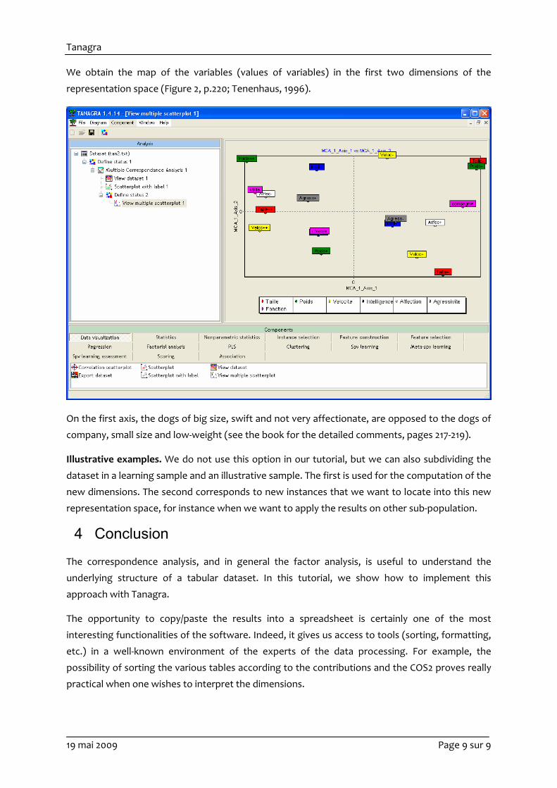
Graphical representation of the variables. We can also depict the variables in the first two (or
other) dimensions. It is very useful when we want to interpret the dimensions and highlight
associations between variables (or categories of variables). In this stage, we can use also the
illustrative variables. Often, this functionality strengthens the interpretation of the dimensions.
We insert the DEFINE STATUS component. We set as TARGET the first two dimensions; as INPUT
all the variables, including the illustrative ones.
Tanagra
19 mai 2009 Page 9 sur 9
We obtain the map of the variables (values of variables) in the first two dimensions of the
representation space (Figure 2, p.220; Tenenhaus, 1996).
On the first axis, the dogs of big size, swift and not very affectionate, are opposed to the dogs of
company, small size and low‐weight (see the book for the detailed comments, pages 217‐219).
Illustrative examples. We do not use this option in our tutorial, but we can also subdividing the
dataset in a learning sample and an illustrative sample. The first is used for the computation of the
new dimensions. The second corresponds to new instances that we want to locate into this new
representation space, for instance when we want to apply the results on other sub‐population.
4 Conclusion
The correspondence analysis, and in general the factor analysis, is useful to understand the
underlying structure of a tabular dataset. In this tutorial, we show how to implement this
approach with Tanagra.
The opportunity to copy/paste the results into a spreadsheet is certainly one of the most
interesting functionalities of the software. Indeed, it gives us access to tools (sorting, formatting,
etc.) in a well‐known environment of the experts of the data processing. For example, the
possibility of sorting the various tables according to the contributions and the COS2 proves really
practical when one wishes to interpret the dimensions.