21. tables, charts, graphs
TRANSCRIPT
Kennesaw State UniversityDigitalCommons@Kennesaw State University
Sexy Technical Communications Open Educational Resources
3-1-2016
21. Tables, Charts, GraphsDavid McMurray
Tamara PowellKennesaw State University, [email protected]
Follow this and additional works at: http://digitalcommons.kennesaw.edu/oertechcomm
Part of the Technical and Professional Writing Commons
This Article is brought to you for free and open access by the Open Educational Resources at DigitalCommons@Kennesaw State University. It has beenaccepted for inclusion in Sexy Technical Communications by an authorized administrator of DigitalCommons@Kennesaw State University. For moreinformation, please contact [email protected].
Recommended CitationMcMurray, David and Powell, Tamara, "21. Tables, Charts, Graphs" (2016). Sexy Technical Communications. 21.http://digitalcommons.kennesaw.edu/oertechcomm/21
brought to you by COREView metadata, citation and similar papers at core.ac.uk
provided by DigitalCommons@Kennesaw State University
Tables, Charts, andGraphs
David McMurray
Sexy Technical Communication Home
Tables, Charts, GraphsOne of the nice things about technical writing courses is that most of the papers havegraphics in them—or at least they should. A lot of professional, technical writing containsgraphics—drawings, diagrams, photographs, illustrations of all sorts, tables, pie charts, barcharts, line graphs, flow charts, and so on. Graphics are important in technicalcommunication. We learn more from a document when graphics are included (Gatlin, 1988).In fact, people learn about 1/3 more from a document with graphics than without (Levie andLentz, 1982). A recent study found that readers learn faster and are better able to use theinformation they learn when the text includes graphics (Große,Jungmann, and Drechsler,2015). That does not, of course, mean that one should place graphics willy-nilly into everyspot possible. On the contrary, graphics should be used carefully and correctly. Theinformation below will help you to make informed decisions regarding graphic creation andplacement that will help to make your documents more effective for your readers.
Chapter Objectives
At the end of this chapter, students will be able to
1. Distinguish among tables, charts, and graphs
2. Identify chief characteristics of tables, charts, and graphs
3. Identify and apply best practices in creating tables, charts, and graphs in technicalcommunication
TablesTables, of course, are those rows and columns of numbers and words, mostly numbers.They permit rapid access to and relatively easy comparison of information. If the data isarranged chronologically (for example, sales figures over a ten-year period), the table can
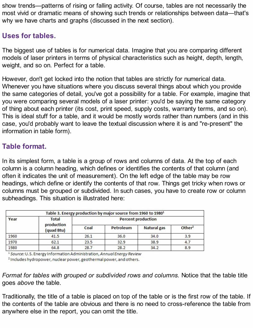
show trends—patterns of rising or falling activity. Of course, tables are not necessarily themost vivid or dramatic means of showing such trends or relationships between data—that'swhy we have charts and graphs (discussed in the next section).
Uses for tables.
The biggest use of tables is for numerical data. Imagine that you are comparing differentmodels of laser printers in terms of physical characteristics such as height, depth, length,weight, and so on. Perfect for a table.
However, don't get locked into the notion that tables are strictly for numerical data.Whenever you have situations where you discuss several things about which you providethe same categories of detail, you've got a possibility for a table. For example, imagine thatyou were comparing several models of a laser printer: you'd be saying the same categoryof thing about each printer (its cost, print speed, supply costs, warranty terms, and so on).This is ideal stuff for a table, and it would be mostly words rather than numbers (and in thiscase, you'd probably want to leave the textual discussion where it is and "re-present" theinformation in table form).
Table format.
In its simplest form, a table is a group of rows and columns of data. At the top of eachcolumn is a column heading, which defines or identifies the contents of that column (andoften it indicates the unit of measurement). On the left edge of the table may be rowheadings, which define or identify the contents of that row. Things get tricky when rows orcolumns must be grouped or subdivided. In such cases, you have to create row or columnsubheadings. This situation is illustrated here:
Format for tables with grouped or subdivided rows and columns. Notice that the table titlegoes above the table.
Traditionally, the title of a table is placed on top of the table or is the first row of the table. Ifthe contents of the table are obvious and there is no need to cross-reference the table fromanywhere else in the report, you can omit the title.

As for specific style and formatting guidelines for tables, keep these in mind:
Refer to the table in the text just preceding the table. Explain the general significance ofthe data in the table; don't expect readers to figure it out entirely for themselves.Don't overwhelm readers with monster 11-column, 30-row tables! Simplify the tabledata down to just that amount of data that illustrates your point—without of coursedistorting that data.Don't put the word or abbreviation for the unit of measurement in every cell of acolumn. For example, in a column of measurements all in millimeters, don't put "mm"after every number. Put the abbreviation in parentheses in the column or row heading.Right- or decimal-align numbers in the columns. If the 123 and 4 were in a column, the4 would be right below the 3, not the 1.Normally, words in columns are left-justified (although you will occasionally see columnsof words all centered).Column headings are centered over the columns of numerical data (forming a T-shape);left-aligned with columns of text. The alignment of column headings to the actualcolumnar data is variable. If you have a column of two- or three-letter words, you'dprobably want to center the column heading over that data, even those it is words notnumbers. (Doing so, avoids an odd-looking L-shaped column.)When there is some special point you need to make about one or more of the items inthe table, use a footnote instead of clogging up the table with the information.
Producing tables.
Normally, you'll be borrowing information in which a good table occurs. If it's a simple tablewithout too many rows and columns, retype it yourself into your own document (butremember to document where you borrowed it from in the figure title). However, if it is a bigtable with lots of data, you're justified in scanning, screen-capturing, or photocopying it andbringing it into your report that way.
If you use OpenOffice, Word, or WordPerfect, get used to using the table-generating tools.You don't have to draw the lines and other formatting details.
Occasionally, in rough-draft technical reports, information is presented in regular running-text form that could be better presented in table (or tabular) form. Be sure and look backover your rough drafts for material that can transformed into tables.

Sexy Technical Communication Home
Charts and GraphsCharts and graphs are actually just another way of presenting the same data that ispresented in tables—although a more dramatic and interesting one. At the same time,however, you get less detail or less precision in a chart or graph than you do in the table.Imagine the difference between a table of sales figures for a ten-year period and a linegraph for that same data. You get a better sense of the overall trend in the graph but notthe precise dollar amount. If you need more information on creating charts in MS Word,click here: https://support.office.com/en-us/article/Create-an-Excel-chart-in-Word-11a7d2f0-

4487-4a9b-bbc6-d50916cd4a57.
Formatting requirements.
When you create charts and graphs, keep these requirements in mind (most of theseelements are illustrated below):
Axis labels—In bar charts and line graphs, don't forget to indicate what the x and yaxes represent. One axis might indicate millions of dollars; the other, five-yearsegments from 1960 to the present.
Keys (legends)—Bar charts, line graphs, and pie charts often use special color,shading, or line style (solid or dashed). Be sure to indicate what these mean; translatethem in a key (a box) in some unused place in the chart or graph.
Example of a graph.
Notice that a figure title is placed beneath the graph.
Figure titles—For most charts and graphs, you'll want to include a title, in many cases,a numbered title. Readers need some way of knowing what they are looking at. Anddon't forget to cite the source of any information you borrowed in order to create thegraphic. The standard rule for when to number figures or tables is this: if you cross-reference the figure or table elsewhere in the text.Cross-references—Whenever you use a chart or graph, don't forget to put a cross-reference to it from the related text. With that cross-reference, provide someexplanation of what is going on in the graphic, how to interpret it, what its basic trendsare, and so on.

Example of a chart. Notice that text above and below the chart calls attention to thechart and briefly indicates its significance.Documentation—When you borrow information to create a graphic, be sure to use thestandard format to indicate the source. It does not matter how you import the graphicinto your report—it is all borrowed information, which some brave and noble soulworked hard to develop and who deserves credit for that effort.
Producing charts and graphs.
As with illustrations, you have these options for creating charts and graphs: screen-capturing, scanning, photocopying, generating your own with software, and drawing yourown. You can find helpful information regarding choosing what type of graph to use here:http://www.tutorial9.net/tutorials/web-tutorials/selecting-the-right-chart-type-for-your-data/
You can find helpful downloads to jumpstart your graph creation here:http://labs.juiceanalytics.com/chartchooser/index.html.
Sexy Technical Communication Home
Documenting Tables, Charts and Graphs: IndicatingSourcesAs mentioned earlier, it's perfectly legal to borrow tables—to copy, photocopy, scan, orextract subsets of data from them. But you're obligated to cite your sources for tables,charts, and graphs just as you are for the words you borrow. Normally, this is done in eitherthe table title or in a footnote just below the table. Check the example in the table shownpreviously.
General Guidelines for Tables, Charts, Graphs: A ReviewThe preceding sections state a number of common guidelines that need to be stated all inone place. These are important!
Watch out for areas in your text where you discuss lots of numeric data in relation totwo or more things—that's ideal for tables or even charts or graphs.Watch out for areas in your text where you define a series of terms—that's ideal fortables.Always discuss tables in preceding text. Don't just throw a table, graph, or chart outthere unexplained. Orient readers to it; explain its basic significance.Make sure your tables, charts, and graphs are appropriate to your audience, subjectmatter, and purpose—don't zap beginners with massive, highly technical constructionsthey can't understand.Use a title unless the table, chart, and graph is very informal. Remember that the titlegoes just above the table; for charts and graphs, below.Left-align words and phrases in table columns (including the column heading). Right-align numeric data in table columns (but center the column heading). A nice touch to puta bit of right margin on this right-aligned data so that it moves out into the center of thecolumn rather than remaining jammed to the right edge.Some believe that it is easier for readers to compare vertically rather than horizontally.If you believe that, format your tables so that your columns contain the information tobe compared. For example, if you were comparing cars, you'd have columns for MPG,
price, and so on.Indicate the source of tables, charts, and graphs you have borrowed either part of orentirety. This can be done in the title or in a footnote.Indicate identifying measurement values in column or row headings—not in each cell.Cross-reference all tables, charts, and graphs from the preceding text. In the cross-reference, give the number (if it is a formal table with title), indicate the subject matterof the table, and provide explanatory information as necessary.
Best Practices for Creating Graphics in Technical Writing:ExamplesWhat are best practices for creating graphics? How can one mess up when adding agraphic to technical communication? This video will show you how to do things correctly andincorrectly.
If you don't see anything above, click here: https://youtu.be/YatGWqmfQGY
For more information and examples on how NOT to create graphs, please look at C.J.Schwarz' "A Short Tour of Bad Graphs, " linked here and shared with permission.
BibliographyGatlin, P.L. (1988). Visuals and prose in manuals: The effective combination. InProceedings of the 35th International Technical Communication Conference (pp. RET 113-115). Arlington, VA: Society for Technical Communication.

Große, C. S., Jungmann, L., & Drechsler, R. (2015). Benefits of illustrations and videos fortechnical documentations. Computers In Human Behavior, 45109-120.doi:10.1016/j.chb.2014.11.095
Levie, W.H., and Lentz, R. (1982). Effects of text illustrations: A review of research. Journalof Educational Psychology, 73, 195-232.

Quiz on Charts and Graphs
Quiz
Answer the following questions with regard to the lecture and your knowledge about this course.
Show all questions
<= =>

Quiz on Tables
Quiz
Answer the following questions with regard to chapter reading.
Show all questions
<= =>