2dartist- issue 02- feb06
DESCRIPTION
ÂTRANSCRIPT

issu
e002
febr
uary
200
6 $4
/ €3
.25
/ £2.
25
concept art, digital & matte painting

www.2dartistmag.com issue002 february 2006 contents
Contents
2
image : waheed nasir
Matte painter and Concept Artist
Tim Warnock‘Low Morale’, ‘Creep’ and the ‘JCB song’ video
Laith BahraniFreelance Artist
Martin AbelDouble Negative Artist Dimitri Delacovias on
2D Digital Matte PaintingWe take a look at the new Photoshop Plug-in
Fluid MaskChristian Scheurer ‘s Unique book
EntropiaThe latest and best 2D from around the world
GalleriesPart 2 of the concept art series by Rich Tilbury
CorridorPhotoshop Tutorial by ‘Abuze’
Using CurvesRichard Tilbury on digitally painting
Elements - ‘Trees’Chris Thunig on digitally painting
Elements - ‘Trees’IBy Kuang Hong a.k.a. ‘Noah’
Making Of ‘ My World’By ‘Abuze’
Making Of ‘Samurai’By Henning Ludvigsen
Making Of ‘Equilibrium’By Andreas Rocha
Making Of ‘Fresh Meat’ win signed Copies of Christian Scheurer ‘s
‘Entropia’
5
14
24
32
30
39
41
49
54
60
64
69
76
81
87
92
INTERVIEW
INTERVIEW
INTERVIEW
ARTICLE
ARTICLE
REVIEW
GALLERIES
TUTORIAL
TUTORIAL
TUTORIAL
TUTORIAL
PROJECT OVERVIEW
PROJECT OVERVIEW
PROJECT OVERVIEW
PROJECT OVERVIEW
COMPETITION
2DARTISTwww.2dartistmag.comEDITORBen Barnes ASSISTNAT EDITORChris Perrins MARKETINGKelly Payne CONTENT MANAGERWarin Pismoke DESIGNERSMatt LewisBobby BrownMartin ShawINTERVIEWSTim WarnockLaith BahraniMartin AbelDmitri Delacovias
TUTORIALSRichard TilburyAbuzeKuang HongHenning LudvigsenAndreas RochaGALLERIESDragos JieanuFahrija Velic Melanie DelonWaheed NasirOlga AntonenkodKerem BeyitKornel RavaditsWen-Xi ChenDaarkenRiana Moller

www.2dartistmag.com issue002 february 2006 editorial
Editorial
3
Welcome
The coming of our second issue brings some
great news, the magazine launch was very
successful bringing in steady flow of interest
throughout January, forums around the net
picked up this new magazine with some
fantastic comments and feedback boosting the
Zoo Publishing team ever forward. Here are a
small collection of some comments :-
“I’ve been buying the full version of the 3D
artist magazine (even though I’m 2D). I bought
the full version of the 2D magazine the other
day, and it is well worth the money you pay.
The content is stunning. Anyway, just thought I
should let you know” - gfxartist User
“4 bucks is pretty darn cheap!! Talk about bang
for the buck. Lots of cool stuff in there. pretty
good tutorials as well.” - CGTalk User
“This is a great magazine and its a bargain
at only $4USD. Its full of the sort of articles
I spend a great deal of time searching the
internet for. I’m definitely going to buy this on a
monthly basis because its exactly what I need”
- gfxartist User
“I gave the 2DArtist “lite” a glancing over, and
it definitely looks very well put together. I hope
I can sit down and give it a more thorough
reading over. I’ll hold off on buying a copy until
the magazine goes to print. My eyes can only
take some much screentime.” - gfxartist User
Reply from Editor - See our survey on page
4, seriously considering going into print as an
option as well as pdf download
Yep, same old story , can’t buy because
Paypal don’t accept pays from Romania....
hate that. - CGTalk User
Reply from Editor -This is annoying we know,
there are many countries Paypal doesn’t
support, if you reside in one and want to buy a
copy please email into support@zoopublishing.
com and we will give you a regular shop/credit
card solution.
This month we have crammed so much quality content in
for you, it wasn’t quite so much of a mad rush
here at Zoo’s studio as last month, so we have
had more time produce (what we regard as)
an amazing issue, with lots features, tutorials
and interviews from well known industry talent,
upcoming students, dedicated freelancers and
inspired hobbyists.
Artist Interviews Cover featured Tim Warnock, details his work
as a matte/concept artist in one of Montréal’s
leading studios ‘Intelligent Creatures’. Laith
Bahrani, gives us a hilarious overview of his
life and works including the music video for
No.1 hit ‘JCB Song’ and Martin Abel tells us
about his freelancing ways whilst showing off
some of his pin up girls! All in all, not a bad
selection!
ArticlesWe are very pleased to have Double Negative
Studio artist Dimitri Delacovias detailing how
2D Digital Mattes are progressing and being
used in the projects taken on by this leading
London studio. We also take a look at new
masking Photoshop plug-in ‘Fluid Mask’.
Tutorials and Making Of’sWhere to begin!? 9 tutorials this month, a
whopping 42 pages created by very talented
digital artists who want to share their secrets
with the community, from project overviews
to in-depth ‘step by steps’ there is more than
enough here to keep you going until our next
March Issue!
ReviewsWe review Christian Scheurer’s ‘Entropia’
A Collection of Unusually Rare Stamps is
a uniquely crafted storybook for all ages.
“Readers are taken on an unforgettable
journey to the fantastic world of, with it’s
unique history, locations and inhabitants.”
Extras!! Competitions and galleries :- Win signed
‘Entropia’ books with personalized dedications
and illustrations from Christian Scheurer and
view this month’s dedicated gallery pages, with
works from many artists. If you would like to
submit to the gallery for future issues please
see here www.2dartistmag.com/gallery
About us Zoo Publishing is a new company comprising
of a small team here in the Midlands UK.
2DArtist is our second magazine project
following the successful 3DCreative
(www.3dcreativemag.com). We are very
grateful for the support of the following CG
sites which have help promote and spread
the word about our publications. As well as
ourselves, all digital artists owe a lot to these
communities for the incredible amount of
work they do for the CG Industry. 3DKingdom,
3DLinks, 3DTotal, 2DValley, 3DM3,
CGUnderground, ChildPlayStudios, DAZ3D,
3DExcellence, Epilogue.net, GFXArtist,
the3DStudio, CGDirectory, MattePainting.org,
Max-Realms and Mediaworks, we look forward
to lasting and successful partnership with
these CG community sites.

Your Views!
for your chance to win both short drawer dvd’s
To fill out the survey please use this link : http://www.surveymonkey.com/s.asp?u=802941752896
3DCreative Magazine is steadily growing each month
and gaining support from more and more online
communities. We are working on improving layouts
and content every month, so please stay with us and
we will endeavour to make your reading and viewing
experience more interesting and inspirational with
every issue!
To help us improve the magazine we need your
feedback! To continue improving and giving you
the content you want we need you to help us by
answering a few questions, please give this a couple
of minutes of your time, it’s quick and easy to fill in
and we are even dangling a couple of ‘out of the hat’
prizes in front on your noses to temp even the busiest
artists!

interview with
Tim WarnockCurrently working with Intelligent Creatures
in Toronto as a matte painter and concept
artist on feature films, Tim spends his down
timerelaxing with his wife Beth and hanging
out with friends. His favourite things to
do when not making movies is watching
movies... ...and reading about making
movies. Can you say “Obsessed”?

www.2dartistmag.com issue002 february 2006 Tim Warnock
Interview
6
ProfileAge : 31 going on 32
Profession : Matte Painter / Concept Artist
E-mail : [email protected]
Homepage : www.thenextside.com
Hi Tim, thanks for taking the time out to
talk to us, can you begin by giving us a little
introduction to yourself?
Hi, well I live and work in Toronto and I am a
matte/concept artist and I have just started
working for a company called ‘Intelligent
Creatures’ www.intelligentcreatures.com who
have recently wrapped up work on ‘Mr and
Mrs Smith’ and ‘The Fountain’. Currently in
production is ‘The Sentinel’ staring Michael
Douglas and Kiefer Sutherland, ‘Stranger Than
Fiction’ staring Will Ferrell, ‘Babel’ staring Brad
Pitt and Cate Blanchett, ‘Silent Hill’ staring
Radha Mitchell and Laurie Holden, and ‘The
Number 23’ staring Jim Carrey. So we are very
busy and very fortunate to be working on so
many excellent films. I’ve been involved on
4 out of 5 of them and am really enjoying the
diversity of the projects.
Tim Warnock

Interview
7www.2dartistmag.com issue002 february 2006 Tim Warnock
Sounds great, before this have you worked
on projects for different sectors of the industry
such as games?
Yes before this I worked for another visual
effects company and before that I spent a year
at a mobile game studio. And what seems like
a whole lifetime ago I worked as a graphic
designer and illustrator. And if you go way back
I was a chicken cook at a certain fried chicken
restaurant. I pray that I never need to do it
again!
Can you tell us how you started out, did you go
to art college?
Yes I started out doing graphic design, I
went to St. Lawrence college in Cornwall
Ontario and whilst I was there I became more
interested in illustration rather than graphic
design. After this I moved to Montreal and went
to Dawson college to follow the illustration
programme there. When I got out of college
my heart was leading me towards being an
illustrator but I found it difficult to find a full
time job. At this time I thought I would like to
be a book illustrator but that’s something that
you pretty much have to do freelance and it’s

www.2dartistmag.com issue002 february 2006 Tim Warnock
Interview
8
Well times certainly have changed for the
young student artist’s today.
Yes It’s amazing how the industry has
transformed, anyone can now put their artwork
online for free and if it is good you will get
much more exposure that one of those $1200
page book adverts generated.
So how did your career lead you into matte
painting?
Well as a kid I didn’t have books such as ‘The
Art of Star Wars’ and I wasn’t really aware of
very much of this side of the industry. I thought
it was cool but back then but I kind of put it on
the same level as being a rock star, more of
a dream then a realistic career aspirations. In
a tough market to break into straight out of
school.
Why is that? Is it because there are so many
others trying to do it?
No it’s not that there are so many others trying
to do it, it just takes a while for you to build up
a name for yourself and unless you have some
savings it’s very hard at first. I went through a
couple of years that were pretty ‘lean’ times, so
I ended up relying more on graphic design jobs
in studios rather than illustration work. It was a
small market in Montreal at the time and as I didn’t
speak French, it was an even smaller market.
So it sounds like trying to establish contacts is
one of the main starting out problems?
Yes, at that time the internet was just starting
to become mainstream so there were not sites
like CGChannel, mattepainting.org etc so this
easy way of getting noticed did not exist so
we had to send out mail shots and advertise
ourselves in creative source books which was
really expensive.

Interview
9www.2dartistmag.com issue002 february 2006 Tim Warnock
college I received an education in traditional
painting and towards the end of my education
I was introduced to illustrator and Photoshop.
My teachers and others around me were
starting to paint digitally but the results were
less than inspiring. The general feeling
seemed to be, “it isn’t really there yet” and in
some cases there was almost some snobbery
regarding digital painting that might make you
think that you shouldn’t even be looking at it
as a medium as you might be compromising
your artistic integrity! This was back then but
about 4 years ago I moved to a design firm
in Oakville. The creative director there ,Dan
Wheaton, who is a good buddy of mine now
said, “you should give digital painting a try” and
I replied, “well I don’t think it is there yet”. He
started to show me some stuff and introduced
me to work from guys such as Craig Mullins
and Ryan Church and I was completely blown
away and at the time just couldn’t believe what
I was seeing was painted digitally.
So has the recent part of your career since this
time been a steep learning curve?
Well I didn’t find the transition to painting
digitally that difficult since I was already fairly
experienced with Photoshop as an image
editing tool. One of the main things I noticed
was that I could paint a lot better and faster
because all of the inhibitions of making
mistakes were completely removed so really
I came a long way in a short time. I think the
steeper learning curve has been on the 3D
side of things and trying to get my head around
all the technical aspects of visual effects.
So back to the present day, you say your
current job is 100% matte painting?
Yes that’s my primary role. I also do concept
work in terms of concepts for matte or

www.2dartistmag.com issue002 february 2006 Tim Warnock
Interview
10
element that takes the place of or extends a
set or location. Essentially you are creating
paintings of what is either to expensive to
build or find in the real world. They can be a
simple static background or a very complex
shot that involves camera moves that simulate
changes in perspective. On the concept side
of things I spend a fair bit of my time doing
“Style Frames” which are basically establishing
the look of the shot. It becomes the guide for
myself and the other artist to follow when we
produce the shot. I really enjoy this aspect of
the job because it gives me the opportunity to
really be creative and try new things.
You mention that you seem to be create
mattes for more moving shots these days, how
do you go about this? Is a series 2D layers
placed further away from the camera each
time?
Well it depends on the shot and just what is
required, if the camera is just moving only
slightly and not really turning or rotating you
can get away with it this way by creating
‘2d cards’. These are 2d layers that create
a parallax effect with the cards closer to the
camera moving more quickly, but these only
really work with smaller camera moves and
with items that are in the distance. If you start
sometimes they are called “Style Frames”.
Ok I see, for our readers who are starting
out can you give a quick explanation of
the difference between concept and matte
painting?
A matte painting is typically a background

Interview
11www.2dartistmag.com issue002 february 2006 Tim Warnock
to do anything like a dramatic push-in or have
the camera moving enough you start to see
a Chang in perspective then the way you can
tackle this is through a method called 2.5D
(two and a half D). You create the 3D geometry
then project your 2D painting on to it. This can
work for slight changes in perspective but if
the camera movement becomes to dramatic
then maybe you have to start to look at a
full 3d solution or a combination of all three
approaches. For “Babel” we are doing a full
CG shot of Japan that involves a very long
camera move. The shot starts in tight on a
building and then pulls back through the city.
So your seeing roof tops and sky scrapers
moving past the camera. It will probably
require a mix of 2D, 2.5D and possibly 3D
solutions to do it effectively.
So when this happens is the job passed to
another artist altogether?
It is always the effort of a number of artists to
pull off shots like this. Currently we are doing
a shot for Silent Hill that requires several
3D artist both modellers and animators,
compositors and texture artists. I have been
involved both on the concept side of things as
well as doing a lot of the texture painting. Lots
of blood and rust!
That’s all very interesting Tim, I’m sure our
readers will totally agree. Moving away from
your employment do you still get to produce
any personal work?
Less and less! I will try to stay fresh by doing
some character work if I’ve been doing a lot of
environment stuff at work and visa versa. I also
really enjoy drawing vehicles and other tech.
There just isn’t enough hours in the day to do
all that I would like to.
Do you find it easy to always stay motivated?
er.....I get tired <laughs> but I find things often
inspire me and I have enough peers in the
industry to keep some healthy competition
going and I guess there’s always a nagging,
‘well if your resting your falling behind’ but I try
to keep a healthy lifestyle too.
What sort of things do you like to do away from
the monitor?
I play guitar, I watch a lot of movies, which is
back to the screen I guess....y’know I have
to be careful not to let my career become all
consuming. I try to exercise regularly, not so
much in the winter but in the summer I like to
go mountain biking.
Yes I hear you guys have got the terrain and
weather for mountain sports, a lot better than
what we have here in the UK, damp and flat
kinda sums up what we have at the moment!
www.2dartistmag.com issue002 february 2006 Tim Warnock
Interview
12
Well right now I think I would take damp and
flat over freezing cold and white!
Well it’s been great chatting with you Tim, to
round off can you give a bit of advice for our
student readers?
Yeah, there’s so much out there for you to
educate yourself, for me one of the greatest
things was the Gnomon training DVDs. They
have a couple of matte painting ones and
lots of concept titles and a ton of 3d stuff; you
could get away with not going to college at all!
I wouldn’t recommend that because college
offers such great opportunities, meeting other
people etc. but I’m just saying its definitely an
amazing supplement for going to school. Even
before college you see high school kids now
posting on these forums and getting training
DVDs and I don’t know if they realize how
much of a leg up they are actually getting.
Yeah it’s such a great early start
Oh they’re getting a good 10 years on me!
Another very important contributing factor
to accelerating my career has been posting
in online communities as there are so many
opportunities to connect with professionals
and one I go to a lot is www.mattepainting.
org. Dylan Cole, Chris Stoski and Alp Altiner

Interview
13www.2dartistmag.com issue002 february 2006 Tim Warnock
who are top guys in the industry posts here.
So you can post your work on here and they
may comment on it which is just something
you would never have had the chance to do
years ago. I am a really strong believer in the
community aspect of the industry and it really
helps everyone improve. The flip side of this
is you have to be prepared to share you work
and tips too and some people may want to
work more in isolation and keeps things to
themselves but I have learned so much from
others I would be a complete hypocrite not to
share in the same way.
So being very open with your work
and skills like others has ultimately
benefited you a great deal.
Absolutely!
Many thanks Tim its been fantastic
talking with you, thank you very
much for your time.
Great talking with you too.
Interview by :
Tom Greenway
The online communities Tim
mentions can be found here
www.cgchannel.com
www.cgtalk.com
www.mattepainting.org
www.conceptart.org
www.threedy.com
Training DVDs
www.gnomon.com
Free Tutorials
www.3dtotal.com/tutorials

>> Monkeehub was founded
in 1979, coincidentally
the same year that Laith
Bahrani, the founder was
found. He was actually
found...curled up in
a pencil case,
sucking on a
rubber...
...Many years
of drawing and
therapy later, Laith
has emerged as a
Hercules-esque
freelancer; ready
to battle with the
most ferocious
creative
projects through
the Monkeehub
brand...>>
Laith Bahrani

Interview
15www.2dartistmag.com issue002 february 2006 Laith Bahrani
Laith Bahrani,
I’m 26 years old and I am an alcoholic.
I’m also an animator. As well as animation
I draw pretty pictures and create websites
that take ages to load, then don’t load at all
because the server starts sulking. I work under
the self-created brand of Monkeehub; a brand
which started as the name for my portfolio site
and is now essentially my company/wife. This
and more I do all on my own from my flat in
Reading, England…totally on my own…..so…..
very…alone.
A bit about your history, when did it all start for
you and did you go to art college of are you
self taught?
It all started from the beginning when I began
to draw before I could walk. Drawing occupied
most of my childhood and I developed a real
passion for cartoons, characters and anything
to do with animation. I was weaned on old
Warner Brothers and Disney cartoons and
would watch them enthralled for hours then
scamper up to my room and disappear into
a frenzy of doodling and thumb-sucking. It
was also during my childhood that I made
the progression from scribbling on wallpaper
with crayons to scribbling on computers with
a mouse. Back in 1805 the Commodore
Amiga personal computer came out, and I
was fortunate enough to be given one by
Santa. The Amiga came packaged with a paint
program called ‘Deluxe Paint’ that allowed
drawing and the creation of rudimentary
animation. I was immediately hooked and
began trying to recreate on the screen what I
could do on paper. Despite being left-handed
with a pencil I strangely learnt to draw on the
computer with my right-hand. This makes me
digitally-ambidextrous which I believe qualifies
as a super-power. I’m actually getting a cape
made. Despite my passion for animation and
superhero abilities I never undertook any
education in the field and thus have never had
any form of training or teaching. I did attempt
to gain a place on an animation course for my
degree, but it required a

www.2dartistmag.com issue002 february 2006 Laith Bahrani
Interview
16
B-grade in A-level maths and I failed. A lot. In
fact I got a U (ungraded). The irony was that
I finished the paper in half an hour and spent
the remaining 2 hours of the exam working
out my mark, concluding that I would pass
by a few points. As a result of this numerical
inadequacy I ended up on a multimedia degree
course at Plymouth University. During the
course however I became introduced to a lot
of the software I use in my work now such as:
Photoshop, Flash, After Effects and Notepad.
Despite the fact the multimedia degree wasn’t
expressly concerned with animation I found
myself constantly trying to steer the software
and assignments towards this area. I also
found myself constantly waking up with a
road sign and/or traffic cone and a vague
recollection of police sirens. After graduating
and then missing my graduation I got my first
job as a web monkee creating site designs,
flash menus and site graphics. I was hired on
the strength of my portfolio (the first version
of Monkeehub.com) and through exposure
gained by some viral flash animations I had
created. The best thing about this job was
that I worked from home and never actually
met my bosses. They ran the company from
up Nottingham whilst I sat in Surrey, in my
pants, chain-smoking and working out of a
cupboard. I finally got to meet my employers
one year later when I went to see them and
quit. It was a great first job and a really helpful,
albeit unconventional, learning ground to
start in the world of work. From there I moved
to a larger multimedia agency and over the
course of 3 years worked my way from junior
designer to creative director. I also worked my
way from wide-eyed naivety to bitter cynicism
about much of the industry and the projects
I was involved with. The work was heavily
presentation orientated and invariably for sales
forces and marketing managers. The websites
we created were subject to the scrutiny of
some of the dumbest people on this planet
(read: clients) and a lot of creativity, innovation
and joy was sucked out of projects long before
they ever saw the light of internet explorer.
Eventually my morale sunk so low that I
began to create personal projects outside my
job to release the creative frustration I felt.

Interview
17www.2dartistmag.com issue002 february 2006 Laith Bahrani
So, I heard on some backwater radio station
about some UK band called Nizlopi and they
have a funny little music video for their new
release - JCB Song, do you know anything
about this?
Niz-who??
So seriously how long did this video take you
to make, how did you make it and how did you
get this gig in the first place?
The JCB video was actually the first official
project I embarked on as a freelancer. The
band got in touch in Jan 05 after seeing
the Creep animation. They loved the piece
and asked if I’d be interested in creating an
animated video for their first single release
‘JCB’. I’d obviously never heard of the band
or the song but I agreed to check it out and
go from there. After being sent the track and
listening to it 7 billion times (I counted), I
enthusiastically agreed to create the video
for JCB. Amongst other things, I felt the song
was fresh, quirky and child-like, yet emotional,
deep and engaging...much like me. What
followed was 5 months of the most intense,
challenging, yet enjoyable and fulfilling work
Low Morale (www.
lowmorale.co.uk)
was one such
project, and the
beginning of
the end…of
the beginning.
This web-series
was borne
directly from
the torment
and anguish
suffered at
the hands
of clueless
clients, soul-
sapping sales
people and an
environment of
banality and blue-
chips.
Low Morale led to ‘Creep’ (www.lowmorale.
co.uk/creep), an un-commissioned music video
to Radiohead’s ‘Creep’. The piece was created
over a period of 3 months, working every
night and weekend after work. The reaction
the piece received once it was complete was
so positive and overwhelming that it gave me
the confidence to leap from the well-trodden,
well-paid lanes of the rat-race to the hedonistic
and poverty-stricken road of freelance. I quit
my full-time job in January 2005 and became
self-employed.

www.2dartistmag.com issue002 february 2006 Laith Bahrani
Interview
18
I have ever experienced. The first main task
was to establish a foundation of concepts and
themes on which to build the video. These
were derived from repeated sonic scrutiny
of the song and deep reflection on the lyrics.
I connected the child-like perspective and
nostalgic over-tones of the song to memories
of childhood (especially mine) and the
unhindered imagination capacity we have as
kids. This led to the idea of doodling as an
expression of this imagination and this in turn
dictated the style of the video, with doodled
characters on lined exercise book style paper.
Having established a main direction and
outline storyboard for the video I began to
create the actual animation. This was achieved
using a combination of Flash, After Effects,
Photoshop and good ol’ fashioned left-handed
drawing. The scenery was drawn in black
biro on paper, scanned in and then cut-out in
Photoshop. These elements were assembled
and layered in After Effects, then animated and
scrolled to create the sense of travelling. All the
characters were drawn and animated in Flash
using the mouse – I’ve never used any graphic
tablets. The characters were then exported
from Flash as .PNG image sequences and
integrated into the After Effects scene to
form the final movie composition. The entire
process of creating the JCB video was quite
organic and this was something I relished.
New ideas were incorporated constantly as the
video took shape and things were tweaked and
re-tweaked to achieve what I wanted. Although
I favour a certain organic/spontaneous
quality in my work I feel it’s a luxury I may not
(understandably) always have to the same
degree as JCB. But for me sometimes the best
ideas are those that arise when I’m sat staring
at the scene on the screen.
How have things changed for you after this
song and video went it at No.1 in the UK
charts?
Things have got pretty crazy since the JCB
campaign and sometimes life can feel a bit
surreal. I try not to devote a lot of thought to
the final outcome and reception of my work;
I immerse myself in the creative process
and try to produce the best I can within
the project constraints. So the success of
JCB; the 1 million plus hits to the website,
the No.1 spot and all the acclaim from
the public is something of a wonderful
shock. The campaign has brought me and
Monkeehub to the greedy attention of lots of
new and wonderful people. I have been truly
overwhelmed by the interest from businesses,
film festivals, production houses, floozies,
distant relatives from the Macheke district
of Zimbabwe wanting to transport 54 Billion
dollars into the country who just need my
bank details, and the Inland Revenue alike.
It’s actually a lot for one person to deal with
at times, therefore I’m looking at ways to start
working closer with other artists and talented
friends in the future to help spread the load
and broaden the ambitions and exposure of
Monkeehub.

Interview
19www.2dartistmag.com issue002 february 2006 Laith Bahrani
Looking at your site www.monkeehub.com we
can see your main project ‘Panda Island’, Can
you tell us some more about this? How did this
one start? Plans for this etc.
Panda Island is a set of digital illustrations
created shortly after completing the JCB video.
The pictures feature a Panda and Bee who
visit a magic island and frolic around. The
characters and concept were originally inspired
by a relationship with a girl (*giggle*) but also
represented a welcome relief from animating
and gave me the opportunity to exercise my
equal passion for illustration. The idea to
package the illustrations in a calendar was
fairly random and spontaneous, but having
now created a proto-type of half a calendar I’m
determined to create a full version for 2007.
Hopefully this will be available for purchase on
Monkeehub towards the end of 2006.
A much more ambitious long-term plan for
Panda Island is to bring it to life as an
animation, possibly in a music video vein.
I’m currently discussing this project with a
very talented friend who helped with the
JCB website and it’s almost certain that
some of the animation would be done in
3D. It would be a massive task though and
would need a lot of preparation and time to
develop but it’s something I’m really eager
to do.

www.2dartistmag.com issue002 february 2006 Laith Bahrani
Interview
20
For the Panda Island images can you tell
us a bit about the process in creating them,
software, techniques etc.
All the elements in the Panda Island
illustrations are hand-draw on paper first and
each object/character is drawn separately. The
sketches are then scanned into Photoshop
and cut-out, then assembled together to form a
main composition. Although I’ll have a general
idea for the layout of each illustration I do play
around a bit with all the various objects to
achieve a final composition.
Once the foundation is done the colouring
process gets underway. This involves using
a wide variety of different brushes that
Photoshop offers to give texture and “material”
to the scenery and characters. Colours are
also toned and graduated to add depth and
form to objects, and Layer ink effects such as
‘multiply’ and ‘overlay’ are employed in abusive
capacity to enhance and strengthen different
parts. It’s a very laborious process, especially
working at 300 DPI, but I feel the details help
keep the images interesting and rich. The
final stage for each picture involves adding
shadows and shading using the lasso tool
with feathering to create areas of darkness.
Lighting and luminance is also introduced
using feathered areas of white or bright
tones that are set to ‘overlay’. These finishing
touches help pull the image together and aim
to create a slightly magical tone to the scene.
Each illustration takes between 3-4 days to
create.
Do you have a dream project that you would
like to work on? How about some more music
videos?
There are so many dream projects for me that
I’d need a coma to do them all. At the rate I’m
going a coma is a distinct possibility. Music
videos are definitely an area I want to work
more in. For many years, long before I went
freelance in fact, I’ve had the ambition to do an
official Radiohead music video. They are still
top of my list in terms of bands I’d like to work

Interview
21www.2dartistmag.com issue002 february 2006 Laith Bahrani
be to visualise words
and narrative and
that’s an ideal creative
field for my brain to run
around in.
How many hours a week would you guess
you spend in front of the screen?
I’m currently working with the
Einstein Institute of Clocks in an effort to
construct a new measure of time to account
for the length I spend in front of these infernal
monitors. In current earth-time though it’s
about 4 years a week. However I do take
chunky breaks when I can, but in order for
me to truly relax I need to actually leave the
country and more importantly my computer.
So I get out to an apartment I have in Portugal
and hide in the sea with the jelly-fish.
Do you have piece of advice for our keen
student readers?
If you want to succeed/get a good job it’s easy.
All you have to do is work harder and longer
than you ever thought possible. Until you cry
in fact. Then some more. This is basically the
only route to improving you skills and nurturing
a talent. Then as your skill starts to grow so
will your work and if you’re passionate about
what you’re doing it will show and
people will notice you. Design/
animation/multimedia is a
visual industry…so show
people what you can do.
Begin a portfolio/website
as early as you can, and
update it and work on
personal projects
to increase it. Even
if you personally
don’t think
some of
your
work
is at
the level
you desire, if you’ve
put in effort
and are
with. The Strokes and Aphex Twin are also
high on the list. Cartoon TV shows is another
area I’d absolutely love to explore. I’ve got a
few ideas and have some contacts so may
pursue this more in 2006. Finally I think I’d
really enjoy illustrating a children’s book. The
creative process I think I have most fun with
is the concept and visualisation stage. The
fundamental brief of illustrating a story would

www.2dartistmag.com issue002 february 2006 Laith Bahrani
Interview
22
passionate about improving this will show.
Finally…for the love of pearl stop sending me
emails asking if I can send you the flash file for
Creep or JCB. Forgive my lack of philanthropy
but IM NOT JUST GONNA SEND YOU A 500
MB FLASH FILE I SPENT 30000 HOURS
ON!!?!?
How about another piece of advice for
our freelancer readers?
Stay off my turf?
Away from the monitor what else do you like
to do?
If I’m away from my monitors it means I’m in
Portugal which means I like to do absolutely
nothing.
If you didn’t do your current career what would
you like to be doing instead?
This is going to sound pretty twisted, but
sometimes I fantasise about being a shelf-
stacker. I actually envy the fact they can
leave their jobs and various cans of tinned
vegetables at a specific time and just forget
about work and switch off . My work is with me
every second of the day, festering away in my
mind…I never get to put my mini-carrots down.
Do you play games? Either video, traditional
card or board games or sport?
I used to play a lot of video games
when I was younger and then
at University but it’s something
that’s just slipped out my life almost
completely now. Along with sleep, nutrition,
mental stability and innocence. I did however
buy a board game a couple of years ago. It
was called ‘Ghettopoly’ and was a ‘gangsta/
ghetto’ version of the popular property game
Monopoly. Me and 3 friends eagerly bust open
the lid and found….a game that looked like
it’d be constructed and printed in someone’s
bedroom by 2 stoned frat boys. After 5 minutes
of play, I quietly put my plastic ‘crack pipe’
counter-piece down on the board, looked at
the others and said “I’m gonna put this game
away now….and let’s never speak of this to
anyone ever again”. I appear to have just
broken that pact.
What is a typical Saturday night for you?
I’m usually answering interview questions and
emails or alternatively on the phone to the
Samaritans.
Is there a question you would have really liked
to have been asked? If so what is it? And
what’s the answer? (great interview technique
this don’t you think Laith!?)
Q: Why is the world in such a gosh darn
mess?
A: Because money is worshipped with a
ubiquity and aggression that no god could ever
hope to achieve, no matter how many bottles
of Shiraz he miracles up. And because we
devote entirely too much time and attention to
the vacuous spasms of jumped-up desperate
Zero-list “celebrities” who prance across the
sets of reality TV shows leaving
behind nothing but wasted headlines and
media black-holes that suck the real talent
from the world.
Many thanks Laith
Interview by :
Tom Greenway

������������������
�����������������������������������������
����������������������������������������������
��������������������
��������������������������������������
����������������������������������
������������������������������
��������������������������������������������
��������������������
����������������
������������������������������������������������
����������������������������������������
����������������������������������������������
������������������������
��������������������
��������������������������������������������
�������������������������������������������
����������������������������������������������������������
�����
�����������������
�����������������������������������������������
�����������������������������������������������
�����������������������������������������������������
����������������������������������������������������
�����������������������������������
��������������������������������������������������������
���������
�����������������
������������������������������������������
����������������������������������
������������������
����������������������������������������������
�����������������������������������������������
����������������������������������������
������������������������������������������������
�������������������
������������������������������������
������������������������������������
�����������������������������������������������
�������������������������������
�����������������
��������������������������������������������������
�������������������������������������������������������������������������������������������
����������������������������������������
����������������
������������������������������������������
�������������������������������������
����������������������������������
�������������������������
������������������������������������������������������������������
�������������������������
�������������������������
������������������������������������������������������������������
�������������������������
�������������������
������������������������������������������
������������������������������
����������������������������������������������
����������������
����������������������������������������������
���������������������������������������������������
�������������������������������������������������������������������
�����������������������������������������������
�����������
3dtotal.com
Permanent Deal from 3DTotal.com:
Buy all 15 CD's and save 25% on individual prices -
US-$641(normally $855)EUR-€473 (normally €630)UK-£326 (normally £435)
Any 1 CD only $57 (Approx. UK £29.00 / EUROPE €42.00)
Plus Savings on ANY 3DTotal shop products
including the Shorts Drawer DVD’s, Training DVD’s and the Digital Art Masters Book:Buy 2 items - save 5%Buy 3 items - save 7%Buy 4 items - save 9%Buy 5 items - save 11%Buy 6 items - save 13%Buy 7 items - save 15%Buy 8 items - save 17%Buy 9 items - save 19%Buy 10 items - save 20%Buy 11 items - save 21%Buy 12 items - save 22%Buy 13 items - save 23%Buy 14 items - save 24%Buy 15 items - save 25%
15 Amazing Hi-res Texture Collections for all 2D and 3D Applicatiions and software.
Covering a wide range of topics and compatible with both PC and Mac. Dont be fooleby the price, these are NOT lesser collections, just take a look at the large companies who use total textures:
Electronic Arts, Rockstar North, Namco co.ltd, Team 17, ESPN Star Sports, Acclaim Studios, Rare Ltd, Sony Pictures Imageworks, Nike plus hundreds more.
15 Amazing Hi-res Texture Collections for all 2D and 3D
Covering a wide range of topics and compatible with both PC and Mac. Dont be fooleby the price, these are NOT lesser collections, just take a look at the large companies who use total textures:
Electronic Arts, Rockstar North, Namco co.ltd, Team 17, ESPN Star Sports, Acclaim Studios, Rare Ltd,

>>Like most artists,
I’ve been drawing
since I was very young.
But thankfully when I
was 13 years old My
family bought our first
computer with a copy
of Adobe Photoshop..
Probably version 5
I’m not sure. But it all
started from there, I self
taught myself the entire
program, and I still use
it to this day for all my
work>>

Interview
25www.2dartistmag.com issue002 february 2006 Martin Abel
>>Like most artists,
I’ve been drawing
since I was very young.
But thankfully when I
was 13 years old My
family bought our first
computer with a copy
of Adobe Photoshop..
Probably version 5
I’m not sure. But it all
started from there, I self
taught myself the entire
program, and I still use
it to this day for all my
work>>
ProfileAge: 22
Occupation: Freelance Illustrator
Approx. Caffeine intake per day: 1 Energy
Drink, 2 Coffees… More if there is an
impending deadline ;)
What are your major influences?
In my early teens I discovered the Comic
Book. In particular, Gen13 When J Scott
Campbell was illustrating it. His beautiful
artwork captured my heart and imagination,
which pushed me forward to learn how to
draw better, and gave me a personal goal of
one day becoming a comic book artist. Since
then my goals have expanded and I work for
magazines, drawing pin-up girls.. all sorts of
illustrations, but recently I am realizing my
initial dream of creating comic books.
What are your chosen tools / programs and
how do these affect your working process?
I use Alias Sketchbook Pro OR the traditional
pencil and paper for my initial sketching.
I then bring it into Photoshop 7, drop the
opacity and digitally ink my sketch with the
hard brush. I use a Wacom Intuos 3 which is
just a great tool to use.. A
life saver for me. Colouring work
is all done in Photoshop, with the
fill bucket tool and then just draw
on the shadows and highlights..
airbrush for special effects,
Its all pretty simple really..
Nothing too fancy ;)
And how big is yours? (the Wacom i mean)
It’s an Intuos 3 A4 9”x12” Just the right size I
think, Not too big, not too small ;)
How do you improve your style / finish for each
new image?
Improving my style and quality of artwork,
usually comes from learning from the previous
illustration. I see what works and doesn’t
work.. And what could be a quicker way of
doing things. Getting feedback from other
artists and the online community in general is
a great way to start improving your work. Such
as getting critiques on Anatomy, Composition,
Design and colour. There are plenty
of great online art communities
such as Deviant art,
GFXartist among
others. Also
trying new
techniques
and
methods/
materials is
a good way
of defining
your style. For
a short time I
dabbled in a digitally painted style using
Photoshop, which was great fun but I
finally realized I was trying to be something

www.2dartistmag.com issue002 february 2006 Martin Abel
Interview
26
that I was not. I also tried a more ‘sketchy’
style, where I took my rough like pencils and
coloured them without any inking. It produced
a nice ‘raw’ look but just like the painted style
I abandoned it and went back to what really
worked for me, which is the clean cell shaded
artwork you see in my art today.
Your favourite Number is 355? What is the
reason?
Kind of a long story, but to cut it short someone
I vaguely knew’s alarm clock went off at
3.55am for no apparent reason which created
many a discussion on the philosophy of the
number 355. One example of many; The 355th
day of the year is December 21st. The Mayan
calendar ends on December 21, 2012. Will
355 herald the END OF THE WORLD? Who
knows.. I just like the number.
Your website is excellent, but very flash heavy,
did you create it yourself as not all ‘digital paint’
artists enjoy the ‘vector’ lifestyle too?
Yes I created my flash website, I in no way
would say I was a web designer, and although
absolutely hair-pullingly annoying I really do
love making flash interfaces. I went through
about 10 different flash designs before landing
the one you see today. And you are right,
it is quite flash heavy, so I’ve decided I will
release a 56k friendly version as soon as I get
a chance!
Follow this link to see the site:
www.martinabel.com
With todays tools, a lot of comic book art is
being turned to animation, has this ever been a
route you would like to take?
Definitely! After I release my first short mini-
series comic book this year I plan to tackle
my creator owned story. Hopefully of which
would work beautifully as an animated movie
or Anime. That would be an absolute dream
come true. As for animating myself, I have had
a limited experience in it, and to be honest it’s
just way too much work for my liking! Gotta
admire those animators!
Interview
27www.2dartistmag.com issue002 february 2006 Martin Abel
up there first title
Dead@17 #1, really
liked it and decided
to email the creator;
Josh Howard. We’ve been
in quite close contact ever
since, and I’ve done a
short story and
quite a few covers
for them. Currently
I’m working on a 4 issue
mini-series debuting this year
hopefully.
So given that you had the enthusiasm to
go and get clients rather than wait for them to
come to you, what advice could you give to
similar artists in that position?
Advice? Go and get your clients!!!!!!! You can’t sit
around waiting for them to come to you, at least
when you are first starting out. My plan of attack
was this: -
Create a professional website portfolio
(preferably a .com or .net etc)
Create a list of ALL the possible Magazines,
They have Red Dwarf in Oz?!?!!?
They do! Fantastic Brit comedy J …
smegheads..
XBox Magazine, Viper Comics... did you pitch
for a job or did they come to you?
Well XBox magazine I contacted them offering
my services, and to my delightful surprise
they loved my work and I’ve been creating
illustrations for them ever since. A great job,
and they are fantastic people who run the
magazine. As for Viper Comics, I picked

www.2dartistmag.com issue002 february 2006 Martin Abel
Interview
28
companies and places you would
LOVE to work for and could see your
work actually being used.
-Find contact Emails for all said
companies, and EMAIL EMAIL
EMAIL.
I cannot stress this enough,
the more emails you send
to different potential clients
the better. Only 3 out of
10 may actually contact
you back, and only 1 or
2 may offer you some work if you are lucky!
SO get the computer booted up!
Dream Job / Assignment / Company to work
for?
Yikes that’s a tough one. At the moment
I’m creating pin-up girls for magazines, and
creating comic books.. Both of which were my
dream jobs. So I’m pretty happy right now.
I would like to get a book out with Image
Comics as I grew up on those guys. Also at
some stage produce concept
art for computer games, or be
a project leader. I have a lot of ideas for
video games I’d love to let loose one day. I’d
also love to write and direct my own movies..
but that one is a long shot ;) Its all just a matter
of time, and like I said I’m pretty content with
where I am right now.
Interview by :
Ben Barnes


www.2dartistmag.com issue002 february 2006 Fluid Mask
Fluid Mask
30
Cut out plug-in for Adobe Photoshop
XChange International announce
release of
Fluid Mask cut out plug-in for
Adobe Photoshop
London, UK XChange
International, the source
for extended technology
worldwide, are pleased to
announce the release of
the Fluid Mask plug-in for
Adobe® Photoshop® v7.0
and higher. Fluid Mask is a
highly advanced software
tool designed to make life
easier for everyone who
creates cut outs. Built as a
plug-in to Adobe Photoshop, Fluid Mask is the
new next-generation cut-out tool and behind
the product is breakthrough technology that
mimics the way the eye, optic-nerve and brain
perform visual processing. It offers an intuitive,
accurate and fast approach to creating cut outs
and professional high-quality masks.
Using Fluid Mask, users apply selections to a
meta-data layer of image information called
the Image Information Layer (IIL). This is made
up of boundary, texture and colour information
pulled from an image. The plug-in differentiates
between hard and soft edges, and edges and
colour transitions are separated smoothly.
Blending and masking are co-synchronous
with no double work, and since there is less
data to work on, the additional speed makes

Fluid Mask
31www.2dartistmag.com issue002 february 2006 Fluid Mask
working with large images no problem.
Users can adjust IIL resolution to work on
hard-to-gauge edges, and the plug-in boasts
real-time, image-derived colour palettes for
colour-based mask selections. Fluid Mask
makes work in progress easy to review,
providing users the ability to fine tune mask
selections at pixel level for maximum
control < users can preserve maximum detail
at the blended transitions.
Fluid Mask provides:
Speed < One-Mask lets users work quickly and
reliably on their cut outs
Opportunity < work with images which could
never be cut out before
Detail < preserve all-important edge
information for a professional quality cut out
Easy to use tool set < create professional cut-
out images in 30 seconds.
One-Mask provides a One-click¹ solution
offering fast and accurate cut outs at the touch
of a button. More control using the Region
Editor < work at levels of detail that until now
have not been possible. Image Information
Layer (ILL) - adjust the Image Information
Layer (IIL) to select hard-to-hit edges or to
loose image noise (e.g. high resolution
transparency scans)
System Requirements:
Adobe® Photoshop®
7.0 or higher, 512MB
RAM, CD-ROM
drive, SVGA monitor
with
24-bit colour display,
Internet connection
Mac - Mac® OS X
10.2.8 or higher,
833Mhz G4 or higher
Windows - Windows
2000® or above,
Processor speed
750Mhz or higher
Fluid Mask is
available now
through XChange
International for
£69.50. To order,
or for more information, users can visit www.
xchangeuk.com, or call on +44(0)20 7490
4455 during UK business hours. Email address
XChange are a leading distributor of
desktop graphic and publishing applications,
QuarkXTension® technology; Adobe
InDesign®, Acrobat® and Photoshop® Plug-
ins® and other design and publishing utilities.
XChange offer extended technology products
from across the world specific to the
graphic design, print and publishing industries
and make them available to an extensive
user base via their printed catalogue or
online at their web site. The company are
headquartered in Central London and also
offer specialist training on many of the
solutions they sell.
Article Courtesy :
Tami Stodgehill

There has been a great deal written in recent
years about visual effects and digital post
production on film blockbusters. There has
even been an attempt to promote the invisible
effects which help enhance a film’s storytelling.
However, one aspect of this digital revolution,
which provides one of the most cost effective
means of adding production value to a film,
has been rather neglected.
That of digital matte painting.
by Dimitri Delacovias

Article
33www.2dartistmag.com issue002 february 2006 2d digital matte painting
The ability to paint high resolution images on
a computer and work directly on a scanned
image of film has equally revolutionized the
old glass shot and traditional matte painting
techniques. With the ability to digitize live
action footage and then combine hi-res 2D
artwork with 3D CG and/or model/motion
control
elements, using digital compositing, tracking
and rotoscoping, a whole new world of image
enhancement is now possible.
Yet you may still hear people who say things
like, “yes, but it’s not really painting in the old
traditional sense”, or that they miss the feel of
painting with brushes and oils or acrylics.
While one can sympathise with certain aspects
of the traditional ways, especially the fabulous
work of the old masters such as Percy ‘‘Poppa’’
Day and Albert Whitlock, or the photo realistic
style of Spencer Bagdatopoulos, (see enclosed
examples) a closer look at past optical and
matte painting effects often reveals less than
convincing results. Which is probably why
there was the old adage that a matte painting
shouldn’t be on screen for more than four
seconds. In today’s highly competitive
industry, it is wise to use whatever tools are
available to provide the most convincing and
cost effective solution to the film’s storytelling
needs.Besides, what can seem initially a ‘good
painting’ can often look ‘phoney’ on screen, as
a matte painting has to assimilate detail not
as the eye sees reality but as it is exposed
on film. When working on a magnified frame
of film, you soon realize it can take on a very
impressionistic quality with a very distinct
texture for each exposed stock and lighting
style.
2d digital
by Dimitri Delacovias

www.2dartistmag.com issue002 february 2006 2d digital matte painting
Article
34
It’s matching that texture with a sense of light
in the painted image which is even more
important than fine architectural detail and
perspective - something the old masters of
matte painting often pointed out.
Image enhancement is not new of course;
even at the turn of the century, George Melius
stunned early cinemagoers with his fantastic
optical trickery on “Voyage to the Moon”. Since
then the ingenious use of mirrors, mattes,
glass painting, front and back projection
screens, as well as various optical printing
techniques, have entertained audiences for the
last hundred years or so. The trouble was, with
the added physical problems of matching light
exposure on the older stocks and the chemical
processing of the day, the combining of images
in many of the optical post productions was
sometimes obvious and even crude.
Unfortunately even today, because of the
‘speed’ and flexibility of digital post production,
or the dreaded “Nah, it’s alright, we’ll fix it later
in post...” you still see digital matte work, CGI
and compositing that betrays the reality of the
live action elements. The main problems with
digital matte painting is pretty much the same
as with traditional painting - overdoing it ,
which gives even more of a flat, laboured look
than traditional painting - or underdoing it, in
which case a lack of detail and substance fails

Article
35www.2dartistmag.com issue002 february 2006 2d digital matte painting
demands of film makers and their audience is
vital to achieve this. And when it is successfully
achieved, it can actually save a production a
lot of money on set and location demands, as
well as image enhancement.
Recent work includes matte paintings and CG
environments for Batman Begins, Kingdom
of Heaven, Bridget Jones 1&2, AvP, Harry
Potter 3&4, Doom, Chronicles of Riddick, Cold
Mountain, League of Extraordinary Gentlemen,
Die Another Day, Below and Enemy at the
Gates.
The latter being an excellent example of the
extensive use of 2D matte painting and CGI
enhancement, particularly the two fly over
shots of war torn Stalingrad. Director Jean
Jaques Annaud and VFX Supervisor Peter
Chiang set out to show the hell of that ruined
city 50 years ago and therefore many of the
location and
studio sets required extensive ‘topping up’.
These examples show to what extent Digital
Matte Painting can enhance a shot and
provide hugely cost effective production value
to a film or TV series. It is this extension of
to convince. When a young colleague recently
asked me what was the secret of good matte
painting, I was reminded of the professor in
the beginning of ‘The Fifth Element’ and half
jokingly replied “Aziz! LIGHT! Much better
Aziz”. At the end of the day the painted
elements have to match the look and feel
of the exposed film, with the same sense of
lighting and not just be a ‘‘good painting’’.
With the latest digital processing, properly
prepared effects work can now be
practically seamless. The creative demands
of the film industry in recent years has
pushed the technology as well as the art
of cinematography to new frontiers of
achievement. Yet it is important to remember
that apart from the obvious
“whizz-bang” special effects, digital
post production also opens up unlimited
opportunities to enhance the story.
Whether it is simply solving technical or
logistical location problems, to recreating old
worlds or creating new ones, there are virtually
no
technical or creative limits; just the age old
problems of time and money.
Yet, and this has to be stressed once again, if
early consultation and proper pre-production is
observed, the cost effectiveness of digital post
production can also be very impressive.
Especially to medium and low budget work
where it is often overlooked because of costly
past experience or the lack of experience with
new digital techniques.
At Double Negative there is a dedicated Digital
Matte Department as opposed to just someone
who uses Photoshop, which is often the case.
There is also an art to providing convincing,
cost effective, digital matte painting and a
dedicated team and approach to the growing

www.2dartistmag.com issue002 february 2006 2d digital matte painting
Article
36
the wide, establishing shots of the sequences,
which initially takes the audience to that time
and place in the story.
We are often told by people who see these
before and after shots, especially having seen
the film, that they just did not realize how much
work had been added to a sequence. That is
the best compliment a digital artist can receive,
because at the end of the day the audience
should be taken in by the drama of the story,
not the wizardry of the effects
‘Enemy at the Gates’ before and after Matte
shots (top).
‘Below’ which involved Hi-res CG submarine,
CG ships, and underwater environments (left)
- a fine example that showed CG and Matte
Paintings can provide a convincing and
highly flexible alternative to miniature work .
Article
37www.2dartistmag.com issue002 february 2006 2d digital matte painting
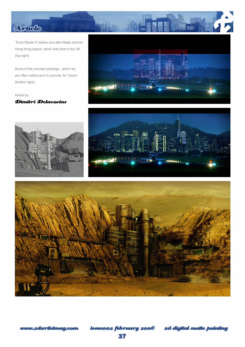
‘Tomb Raider II’ before and after Matte shot for
Hong Kong airport, which was shot in the UK
(top right).
Some of the concept paintings , which we
are often called upon to provide, for ‘Doom’
(bottom right).
Article by :
Dimitri Delacovias

������ ������� ���������������������������� ��� � �� � ������ ���������������� � �� � �������������� ������������������ � �� � ���� �����������������
��������������������
������ ������
������ ���������� ��
������ �����������
������ ������������ ������
������ ������ �������� ������� �������� ��
������ ���������������������� ���������� ��
������ ������������� �����
������ ����������
������ ��������� ����
������ ����������������
������ �������������
������ ������� �����
������ ������������� ����
������ ���������
������ ��������������� ������ ��
������ ������������ ��������
����������� ����������� �������������
�������� �������� �������������������� ���������
�������� ��������� ���������� ���� ������� ������� ���� ������ �������
��������� �������� �������� ���������� ������� ���������� ����� ��������
������ ������� ������� ������ ��� ����� ��� �������������� �������� ����
�������������� ��������������� ������� ������������
��������� ������ ���������� ������� ������������� ����� �������� ������
���� ������ �������� ������� ������ ����������� ����� �������� ��������
������� ������� � ��������� ������ �� �������������� ����������� ��� ��������������������� ������ ���� ��������� ��� ��������� � ������� ������ �������
���������� ����������� ����� ��� ���� ��� ��������� ����� ���� � ����
�������������������
��������� ���������� ��� ����������� ������ ����� ����������� ����������

A Collection of
Unusually Rare
Stamps is a
uniquely crafted
storybook
for all ages.
Through a full
length narrative
accompanied
by 60
beautifully
illustrated
imaginary
stamps,
readers are
taken on an
unforgettable
journey to the
fantastic world
of Entropia,
with it’s
unique history,
locations and
inhabitants.

www.2dartistmag.com issue002 february 2006 Entropia
Review
40
Entropia is rather a strange little book in that
when you first open it you are posed with the
question of whether it is a story book about an
imaginary world with illustrations or indeed a
collection of paintings accompanied by brief
descriptions. Either way it does not really
matter but I think the truth is that the two are
elements are intrinsically linked and part of a
rich world that Christian Scheurer has created
in this charming publication. It is as though
the short textual accounts and illustrations
are there to enhance one another and
provide a mutual insight into the sociopolitical
background behind this imagined planet.
As the title of the book suggests, it is a
compilation of images that appear in the form
of stamps along with the perforated edges,
prices and some even include postage marks.
At the beginning of the book there is a short
introduction detailing the history and population
of the planet alongside a map with the various
geography and islands. Each page in the
book represents a different aspect of Entropia
which either outlines an area of the island and
surrounding sea, a historical event or a facet
of the numerous societies that co-exist there.
The illustrations all appear to be done with an
ink and wash technique and have an economy
and sense of spontaneous freshness about
them that contribute towards the fantastical
vision of Scheurer’s world. They conjure up a
richly textured and diverse universe and are
supported by the text associated with them.
It is evident that the stories and background
history are as important to Scheurer as the
artwork and after an initial look at the book
it is unclear as to which may have evolved
A COLLECTION OF UNUSUALLY RARE STAMPS By CHRISTIAN LORENZ SCHEURER

Review
41www.2dartistmag.com issue002 february 2006 Entropia
first. The text and artwork serve to mutually
illustrate one another in an equal fashion but
one feature that is obvious from the outset
is the attention to detail in both a written
regard as well as an illustrative one. The fact
that all the paintings are presented in stamp
format somehow magnifies the scope and
minutiae of this imagined world and we are
introduced to glimpses of Entropia from
its lush swamps and rain forests to inland
lakes and cities coupled with an array of
characters that populate the world. The
colour schemes and visual language
throughout the book reflect the variety in
the text and the numerous narratives served
up in a short story formats that are used to
convey biographical
information about key
events and their respective characters.
The environments and geography are also
suitably complimented through the use
of line and colour and do a good job of
communicating a comprehensive concept
which seems both very personal and yet
universal in the themes it explores.
Entropia – A Collection of Unusually
Rare Stamps is both a quirky and
alluring book and would make a
welcome addition to ones’ bookshelf
and is appealing to both the casual r
reader and someone interested in
delving more deeply into the world
of Entropia.
www.designstudiopress.com
www.christianlorenzscheurer.com
Entropia is available to order now
from:
http://www.radioentropia.com/
Reviewed by :
Richard Tilbury

Every month 10 of the best digitally
created concept, digital and matte
painting scenes from around the
world

www.2dartistmag.com issue002 february 2006 the Gallery
theGallery
42
‘Would you like to submit your work to the gallery? Details here : http://www.2dartistmag.com/gallery
Rescue on KandharFahrija Velic
http://www.fahrijavelic.com
CastleDragos Jieanu
www.dragos.org

43www.2dartistmag.com issue002 februaruy 2006 the Gallery
theGallery
‘Would you like to submit your work to the gallery? Details here : http://www.2dartistmag.com/gallery
Memory LaneWaheed Nasir
www.waheednasir.com
MermaidRiana Møller
http://fealasy.com

www.2dartistmag.com issue002 february 2006 the Gallery
theGallery
44
‘Would you like to submit your work to the gallery? Details here : http://www.2dartistmag.com/gallery
TendernessOlga Antonenko
http://www.cgpolis.com

45www.2dartistmag.com issue002 februaruy 2006 the Gallery
theGallery
‘Would you like to submit your work to the gallery? Details here : http://www.2dartistmag.com/gallery
CollectionKerem Beyit
http://kerembeyit.gfxartist.com/

www.2dartistmag.com issue002 february 2006 the Gallery
theGallery
46
‘Would you like to submit your work to the gallery? Details here : http://www.2dartistmag.com/gallery
SeheiahMelanie Delon
www.eskarina-circus.com
RocketboxWen-Xi Chen
www.acidlullaby.net

47www.2dartistmag.com issue002 februaruy 2006 the Gallery
theGallery
‘Would you like to submit your work to the gallery? Details here : http://www.2dartistmag.com/gallery
Mounted Daarken
www.daarken.com
Munchausen against wolfKornél Ravadits
http://www.graphitelight.hu/

HAIR is the fi rst fully integrated CINEMA 4D module for the creation of hair, fur and feathers. Breathtakingly fast, this module also distinguishes itself with its intuitive interface.
Beneath the easy-to-use interface lies a complete hair studio – one that would make any stylist green with envy. Hair can be grown using textures or selections, and can be styled freely using any of the numerous tools such as brush, comb, cut or curl. Options such as color, frizz, clump and specularity let you quickly create anything from a fashion model‘s hairstyle to a furry teddy bear.
HAIR dynamics even lets you create an animation worthy of any shampoo commercial. Use the collisions, tension or stiffness settings to add even more life to your animations, while always maintaining complete real time control over the look and feel of HAIR dynamics in the editor view.
Not to mention the enormous rendering speed and the minimal usage of memory that allow you to render millions of hairs on an average computer in minutes.
Visit us at www.maxon.netto download a demo or to discover more exciting details about HAIR and CINEMA 4D.
GOOD HAIR DAY…

>>>For ‘3DCreative
magazine’, Richard tilbury
creatd the ‘Corridor’ series
of tutorials. Each month
for the last 4 months the
tutorials have covered
the modeling, texturing
and lighting of a simple
scene to be able to see
the distinct differences
that can be achieved with
the subtlest of texture
and light changes. Here,
Richard has outlines the
concept artwork behind
the Corridor series.>>>
part 2
www.2dartistmag.com issue002 february 2006 ~Corridor Comcept
Tutorial
50
Corridor Scene Part 2
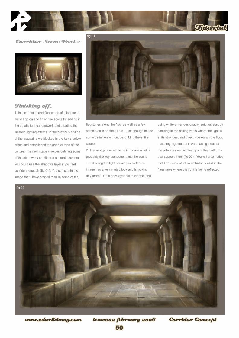
Finishing off.1. In the second and final stage of this tutorial
we will go on and finish the scene by adding in
the details to the stonework and creating the
finished lighting effects. In the previous edition
of the magazine we blocked in the key shadow
areas and established the general tone of the
picture. The next stage involves defining some
of the stonework on either a separate layer or
you could use the shadows layer if you feel
confident enough (fig 01). You can see in the
image that I have started to fill in some of the
flagstones along the floor as well as a few
stone blocks on the pillars – just enough to add
some definition without describing the entire
scene.
2. The next phase will be to introduce what is
probably the key component into the scene
– that being the light source, as so far the
image has a very muted look and is lacking
any drama. On a new layer set to Normal and
using white at various opacity settings start by
blocking in the ceiling vents where the light is
at its strongest and directly below on the floor.
I also highlighted the inward facing sides of
the pillars as well as the tops of the platforms
that support them (fig 02). You will also notice
that I have included some further detail in the
flagstones where the light is being reflected.

Tutorial
51www.2dartistmag.com issue002 february 2006 ~Corridor Comcept
3. With the bones of the scene now starting
to form it is a good time to start fleshing out
some of the finer details and begin refining
the picture. Again on a separate layer start
painting in some of the gaps between the
stonework using a dark brown colour but
concentrate mainly in the foreground where
the details will be more apparent (fig 03). This
has helped give the scene a better sense of
perspective as well as creating some interest
in the foreground and carve out the stonework
a little more.
4. The last stage helped suggest the
stonework in the scene but what it needs now
are some highlights along some of the edges
where the light will be reflected as well as
some lighter grouting along the columns to
help add a sense of scale. On a separate layer
set to Soft Light and using a small airbrush
set to a pale brown (R204 G186 B153) start
painting in grout lines along the columns.
Also use this layer to add in highlights down
the edges of the columns and around the
flagstones as seen in (fig 04).

www.2dartistmag.com issue002 february 2006 ~Corridor Comcept
Tutorial
52
5. With this stage of detail in place the next
thing left to do is emphasize the sunlight
penetrating the dark corridor and create
some atmosphere by showing the sunlight
filtering through the dusty interior. In order
to do this, another layer was made and then
with a selection group made that emanates
downward from the skylight widening as
it descends (fig 05) I simply feathered the
selection so as to soften the edges and then
applied a gradient that blended from a yellow
to a red to help accentuate the dust particles
in the light beams. I then repeated these steps
for the second vent but this time just used a
yellow through to transparent. The layers were
then set to Screen blending mode with the
nearest set at 54% opacity so as not to appear
too bright in the scene (fig 06).
6. All that is really left to do now is add a few
highlights across the floor directly under the
near vent and along the platform edge on the
left as well as on the near left hand side pillar.
This serves to just break up the symmetry
a little and suggest that the light is not
necessarily entering the corridor from directly
above -

Tutorial
53www.2dartistmag.com issue002 february 2006 ~Corridor Comcept
Here is the final version seen in (fig 07). This
about concludes the tutorial and hopefully has
covered all of the main stages involved. I may
well proceed with the painting and polish it by
adding a further layer of detail in the future but
hopefully you will have gained some insight
into achieving the stage we leave it at for the
moment. I hope you have enjoyed following
the tutorial and if interested there is one that
goes alongside this detailing the making of a
3D version in 3D Creative.
Tutorial by :
Richard Tilbury

www.2dartistmag.com issue001 month 2006 Tutorial
Tutorial
54
by Abuze
First of all: this is not a tutorial for complete
Photoshop newbies you have to know what
layers are and how they work and you should
know the basic tools of Photoshop.
I wanted to draw something cowboy like, so I
googled a bit until I found a image that fitted.
After some time of scribbling I got my first idea
of a pose.
Step 1: Outlining
For the ones that use a graphics tablet: so
when you got your pose you can start outlining
- I usually use the 19 brush with sensitivity and
smoothing.
The ones that use a mouse should perhaps
scan a clean sketch.
As you can see my outlines are not very clean
but when you zoom out you won’t see all the
crappy lines. So it’s not that important to draw
perfect lines.
ColouringWith Layers, Masks & Curves.

Tutorial
55www.2dartistmag.com issue001 month 2006 Tutorial
Step 2: Colouring
Ok the fun can begin, I’m not very good at
outlining so colouring is the fun part for me.
Ok here we go, first of all you have to put your
outline layer on “multiply” and on top of all
the other layers.Then you can take the lasso
tool and fill the person with a ground colour. I
picked a brown colour because I thought it fits
as he’s a cowboy.
I’m doing this to get a similar colour scheme
in all parts of his clothes and I think it really
works.
When you’ve finished with filling this part
press strg and click on this layer in the layer
palette, the whole brown layer should be
selected now. After that you have to create a
new layer set (1), click on this set and create a
layer mask (2).
Short explanation: layer masks
It’s pretty easy to work with layer masks, when
you click on your layer mask in the layer
palette a little border will appear that means
that your layer mask is selected. Within a layer
mask you can draw greyscale and do transpar-
ent this way,
White visible, Black invisible, 50% gray; 50%
visible. The advantage of layer masks is they
don’t delete the parts your image that should
be invisible - you can always make them ap-
pear again.
Perhaps you already noticed the little chain
between the layer and your layer mask. When
you click at it, it will disappear this means:
chain visible: when you move your layer
around your layer mask is moved around on
the canvas too.
Chain invisible: you can move layer mask and
layer separated on the canvas.

www.2dartistmag.com issue001 month 2006 Tutorial
Tutorial
56
Now we can start colouring, I’m doing a new
layer for every part of the body and fix all the
transparent pixels ( sorry don’t know the cor-
rect English name.
When you put down the ground colours you
can start doing folds and shadows and so on. I
can’t give you any specific tips here. The only
thing is pick one light source and always work
on that one. Then it’s going to be some kind of
realistic.
So after some minutes hours whatever you’ve
finished the colouring.
All the details were done afterwards, they are
several layers in different layer modes put
above the original clothes layer, you can play
around until you are satisfied. Layer modes I
love using are multiply, overlay, colour and soft
light, but everyone can do as he or she likes
Step 4: Atmosphere
So here we go with the effects, so we click
on our top layer and create a new LAYER>
ADJUSTMENTS LAYER> CURVES. Here you
can play around with the curves until you are
satisfied. I lightened the whole thing and gave
a warm yellow colour.

Tutorial
57www.2dartistmag.com issue001 month 2006 Tutorial
Just try out until you? re satisfied and until you
get the colour you want.
But as you can see your whole image is
brighter now but we only want some parts to
be bright. Here we go with the layer mask, next
to the curves layer it already has a layer mask,
we will fill it with black so it is invisible. After
that you can draw with white on the parts that
you want to be visible / lightened.
mmm ok thats not bad..... but I want some
darkened parts too, so the same thing again.
We create a new adjustment layer but instead
of the warm yellow we pick a darker shade a
blue , green black colour scheme the parts that
shouldn’t be visible get removed the same way
as before.

www.2dartistmag.com issue001 month 2006 Tutorial
Tutorial
58
The final result looked like this.
I hope I could explain the colouring with layer
masks and curves a bit I hope that I have
made everything clear and please enjoy this
tutorial and good luck with your creations!
Tutorial by :
Abuze
Abuze
Adina Krause
Age : 21
Profession : Student - Graphic Design /
Multimedia
abuze.deviantart.com
“I always loved to draw and paint but
i seriously started drawing at the age of 16
when i first discovered photoshop. I was so
impressed because of all the possibilities you
had with that program. And when I saw the
works of all those great artists on the internet I
just had to know how they did those gorgeous
pictures. From that day on the digital media
became my favourite media until today and I`m
constantly trying to learn more and become
better.”

digital painting tutorial series
The ‘elements’ series is a guide to basic 2D Digital
painting and can be followed in most software packages
supporting paintbrushes and layers. Each month 2
or 3 professional artists will cover a specific theme
or ‘element’, resulting in 2 or 3 different styles and
techniques which can be viewed side by side. This month
we move on to Trees.
Subjects:
Last Month : Issue 01 : Jan 06 : part 1 : SkiesThis Month : Issue 02 : Feb 06 : part 2 : Trees
Next Month : Issue 03 : Mar 06 : part 3 : FabricsIssue 04 : Apr 06 : part 4 : Rock & Stone
Issue 05 : May 06 : part 5 : WaterIssue 06 : Jun 06 : part 6 : Fire & Smoke
by R
icha
rd T
ilbur
y

Elements
61www.2dartistmag.com issue002 February 2006 Elements
IntroThe following tutorial will attempt at outlining
an approach to painting trees and hopefully
summarise techniques that can be applied
to the subject as a whole. Off course the
capabilities of creating custom brushes in
Photoshop is very useful with regard to
painting different types of trees and will need
to vary accordingly but overall the principals
explained will remain universal.
Step 1:
The first step is to draw in a rough shape that
represents the trunk and branches of the tree.
I made an initial plain white background and
then using the polygonal lasso tool simply
traced in the shape of the tree and then filled it
with a dark brown colour similar to (fig 01).
Step 2:Then using one of Photoshop’s standard dual
brushes called dry brush which appears in the
default palette and using a mid green (R42
G65 B11) start blocking in some of the main
areas of foliage as seen in (fig 02). Try varying
the size of the brush until you get the scale
right.

www.2dartistmag.com issue002 February 2006 Trees
Elements
62
Continue adding the leaves until you are happy
with the look and have filled out the shape of
the tree (fig 03).
Step 3:Then in order to add some volume and
shadows I duplicated this layer and erased the
upper most portions so that the sun appears to
be shaded from the lower boughs and in
contrast highlighting the highest branches
(fig 04). Then on another new layer I painted
in some lighter green highlights across
the top sections of the foliage to also help
create the volume. In (fig 05) I blacked out
the background so you could more easily
see these areas. You will also notice how I
have included highlights on the branches to
reinforce the sensation of light.

Elements
63www.2dartistmag.com issue002 February 2006 Elements
Step 4:
The next stage is to add some further
highlights on the same or a new layer as well
as some extra branches that appear in front
of the foliage. It is important to remember that
the branches and foliage spread out in every
direction as well as towards the viewer and so
branches disappear behind leaf groupings and
also overlap them at points (fig 06). You can
see the extra highlights when you compare the
picture to the previous image. These represent
the leaves that have really caught the light and
often appear very pale due to their reflective
quality.
Step 5:All that is left to do now is flatten down the
layers of the tree and then using the colour
dodge and colour burn tools enhance some of
the qualities of the light across the branches
and foliage. I also decided to add in the sky
painting from last months Element’s tutorial
and tweaked this using the Colour Balance
and Hue/Saturation values to give it a sunnier
and warmer quality. You can see the final
result in (fg 07).
Tutorial by :
Richard Tilbury

digital painting tutorial series
The ‘elements’ series is a guide to basic 2D Digital painting and can be
followed in most software packages supporting paintbrushes and layers.
Each month 2 or 3 professional artists will cover a specific theme or
‘element’, resulting in 2 or 3 different styles and techniques which can
be viewed side by side. This month we move on to Trees.
Subjects:
Last Month : Issue 01 : Jan 06 : part 1 : SkiesThis Month : Issue 02 : Feb 06 : part 2 : Trees
Next Month : Issue 03 : Mar 06 : part 3 : FabricsIssue 04 : Apr 06 : part 4 : Rock & Stone
Issue 05 : May 06 : part 5 : WaterIssue 06 : Jun 06 : part 6 : Fire & Smoke
by C
hris
Thu
nig

Elements
65www.2dartistmag.com issue002 February 2006 Trees
Intro: This tutorial will attempt to outline a shape-
based approach to painting using a snowy tree
as an example. It is meant to explain a more
graphic as opposed to a fully rendered modus
operanti while limiting oneself to using mainly
contrast and form to create an illustration.
Step 1:
Before actually starting up the computer I
produced a quick ink sketch on aquarelle
paper to lay down some interesting shapes,
find a decent composition and define the
general direction I plan on going into. Besides
the fact that I am able to stay looser when
exploring an idea traditionally before fleshing it
out in Photoshop I find that the paper structure
and ink shapes will give the image a subtle
naturalistic quality that is otherwise difficult
to reproduce digitally. When sketching, even
at this early stage, it may be worth to hint
at perspective and volume by blocking out
some of the inner shapes with a few strokes
instead of solely relying on the outlines as this
will initially give a clearer idea of where the
drawing is headed. (Fig.01)
Step 2:
After scanning the sketch I first of all applied
an overall Brightness/Contrast layer to darken
the image enough to allow me to add both,
darker and lighter values when rendering the
volume of the tree later on. I then roughly filled
the shape of the tree with a base colour in
a multiply-layer using a medium sized chalk
brush. Though the brush itself generates a
solid “coat” of colour the outline of it makes
the smudges look more natural than a normal
round brush would, resembling somewhat of
marker sketch. (Fig.02)
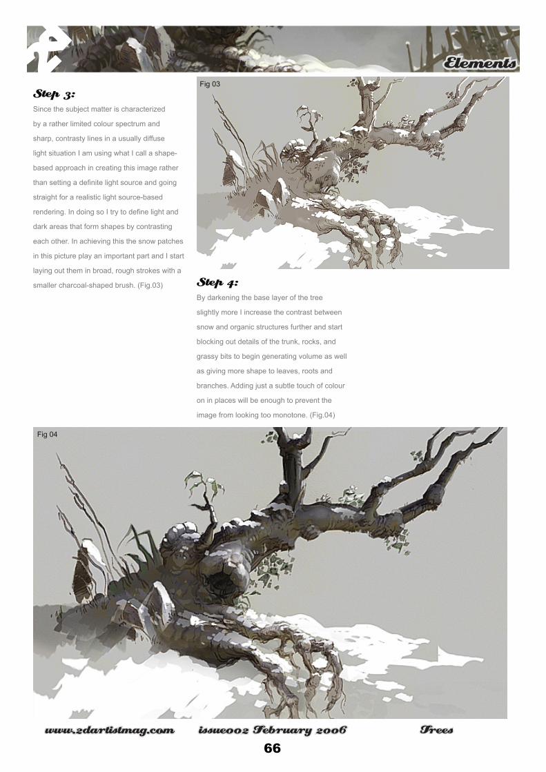
www.2dartistmag.com issue002 February 2006 Trees
Elements
66
Step 3:
Since the subject matter is characterized
by a rather limited colour spectrum and
sharp, contrasty lines in a usually diffuse
light situation I am using what I call a shape-
based approach in creating this image rather
than setting a definite light source and going
straight for a realistic light source-based
rendering. In doing so I try to define light and
dark areas that form shapes by contrasting
each other. In achieving this the snow patches
in this picture play an important part and I start
laying out them in broad, rough strokes with a
smaller charcoal-shaped brush. (Fig.03)
Step 4:
By darkening the base layer of the tree
slightly more I increase the contrast between
snow and organic structures further and start
blocking out details of the trunk, rocks, and
grassy bits to begin generating volume as well
as giving more shape to leaves, roots and
branches. Adding just a subtle touch of colour
on in places will be enough to prevent the
image from looking too monotone. (Fig.04)

Elements
67www.2dartistmag.com issue002 February 2006 Trees
Step 5:
Next, the cleaning up of the yet untreated
areas could begin. In doing so I found it
important to angle the sharp outlines of shapes
of, for instance, the snow patches in interesting
ways to generate appealing compositions and
as such filling white space by relatively simple
means. This ensured that none of the less im
portant areas would become overworked and
the focus stayed firmly on the tree. (Fig.05)
Step 6:
As the detailing continued by fleshing out the
texture of the bark I also took the opportunity
to add small gimmicks such as icicles and tiny
tracks to break up larger shapes and lines
into smaller ones and invoke a touch of lively
playfulness. A slight gradient as a background
not only helped to juxtapose the contrast of
the snow patches on top of the tree further but
also gave a subtle hint at a damp sky. (Fig.06)

www.2dartistmag.com issue002 February 2006 Trees
Elements
68
Step 7:
With the tree painted up and the largest part of
the clean-up work completed I decided to add
some patchiness to the gradient to somewhat
diminish the CG feel. A few more roots peeking
out from under the snow on the left helped the
tree’s perceived stability. I then balanced the
composition on the right by adding a few grass
leaves in the foreground and a fence behind
the tree while the subtle disk of the moon
simply serves as another means of contrasting
shapes against each other and virtually leading
the focal point from the base of the gnarly
trunk over to the right towards the fence. The
comparably young, slender and fragile plant
clasping the batons to the right also serves the
purpose of juxtaposing opposites. (Fig.07)
Conclusion: Breaking up large shapes into smaller ones
while using tonal contrasting to separate
them can be a relatively quick and easy
way to create interesting compositions
while maintaining some form of readability
by detailing mainly the areas of interest
and keeping the surrounding forms simple
and sharp, yet appealing in their layout and
angularity.
Tutorial by :
Chris Thunighttp://www.thunig.com

Mymaking of
Worldby Kuang HongOutstanding illustrations are filled with creativity.
So plan well before you start on your draft. Know
what you want to convey to your audience through
the picture, your ideas, concept, colour, world view.
Don’t let your illustration become to mush like an
anatomy drawing from the biology class, use your
unique ideas to draw the viewers attentions. The
inspiration for ‘My World’ came from an early piece
entitled ‘Butterfly’. Closely studying past works will
sometimes give you a new feeling about it, I felt an
urge to compose an image which can give a new
world to Butterfly, a new definition.

www.2dartistmag.com issue002 february 2006 My World
‘Making of’
70
Sketch
I usually use blue pencils for contouring
and drafting out my works, then with 0.5 2B
mechanical pencil to finalize the outline and
define the finer details before scanning the
drawing into the computer and adjusting the
contrast in Photoshop. Colouring is done solely
in painter.
However, I decided to use a different method,
just sketching from scratch in the computer (it
was the same for Butterfly). The good point of
this is it gives better control over the line art,
shadings and allows adjustments for contrast
in different areas. This image’s composition is
nothing new, just with some personal concepts
and style, like the fish and volcano in the glass
spheres, mechanical limbs and hair of the girl,
and the masked bird etc.
Tool
The only software I used for the My World was
Painter 6.1. Watercolour was used throughout
the process ever since drafting, in this manner
the lines’ edges will create a very dedicate
and subtle touch when colouring because of
the mix of hues. Due to the fact that in Painter
6.1 watercolour’s only a base layer, I do my
colouring only on one as though on paper.
1. Diffusion: gives the medium a certain
amount of wetness, usually use it for the base
colour on big areas as well as to give a blurred
effect at places.
2. Simple water: my most used tool from
watercolour, most colourings are done with
this.
3. Papers: base’s textures, doesn’t really
stand out used with watercolour brushes, but
for rough textures like rocks and machines, I
do increase the percentage, but for skins just
usually not at all.
4. Controls – size: used most frequent during
colouring, shortcut keys are [ and ] on the
keyboard, adjusting the brush sizes from time
to time gives better control over the colour
mixing.
5. Controls – opacity: I usually keep the brush
opacity at 100% because personally I like my
colours a little more opaque, though it does
make using watercolour a little not like it in
some ways.
A tablet is a must, I use a Wacom one. Without
one I’d recommend users to stick to Photoshop
because in my point of view without a tablet it’s
really difficult to work in painter.

‘Making of’
71www.2dartistmag.com issue002 february 2006 My World
Colour
01, 02 - Colouring should always begin with
the background, usual steps are to decide
on the range of basic colours to use, shade
blocks, then go into details. In this picture I
wanted to present something simple and at
will, so in the lighting and colours I didn’t apply
the aforementioned method, instead, directly
into section by section of details.
03, 04 - Behind is a huge robot’s head. After
laying out the base colours, follow the value
and tones to define details. Some cracks and
scratches were added to the surface to give
more texture.
05 - Finishing the background, I started
working on the girl. The face takes a lot of
time to render. Detailing the light pupils and
dark eye rims, the forehead and face’s sides’
textures, all to give her a more industrial feel.

www.2dartistmag.com issue002 february 2006 My World
‘Making of’
72
06 - The colouring of hair is pretty easy going
with the base colour blocks already there. But
extra care is noted making sure the lighting
doesn’t go wrong for the arranged layers.
Slight designs in the front make the hair more
interesting and girl more charming.
07 - The body is coloured according to the
order of arrangements back and forth; paint
the skin first, then the accessories, the chair
before all that, of course. Attention was paid
to the joints and structural proportions; I used
smaller brush size and work slow to keep the
skin smooth, also, not forgetting the shadows
cast by the necklace.

‘Making of’
73www.2dartistmag.com issue002 february 2006 My World
08 - Edges of the necklace was strictly
controlled, the carvings and lines took a lot of
time to detail. Those done colours were laid for
the remaining parts of the image. More hues
were used in this section to make the centre
more colourful and interesting. In detail the left
armrest on the chair was shaped and made
into a twisting stack of CDs.
09 - To bring out the half mechanic half organic
feel in the piece, a trait in Butterfly, the design
of arms were made to look organic yet locked
in a mechanical design. The textures not flesh
but plastic and leather inclined, the right wrist’s
spiral looking thing is a speaker, earphones
directly plugged in for music; and to leave an
impression of difference the phone in her hand
was designed out of the norm, communication
of a different world with another.

www.2dartistmag.com issue002 february 2006 My World
‘Making of’
74
10 - The two spheres are also part of the main
focus, I had wanted to use them to present two
totally different worlds contained within. Final
decision was an erupted volcano and a fish in
water.
11 - Here, other than painting what’s within the
spheres, the texture and shapes themselves
also had to be projected; thus cracks were
painted on the one behind, and the one in
front, weightlessly floating, water spurting out
from the centre.

‘Making of’
75www.2dartistmag.com issue002 february 2006 My World
12 - The last part is the bird at the most
front. This bird was painted casually with no
reference, wearing a mask and giving it a
sharp looking eye is to show that even birds
have thinking in this world. After the colouring
was all done the image was resized to check
on any mistakes or if anything was missed out.
Adjusting of colours was done in Photoshop
because Painter’s colour contrasts are lighter.
Because there was a very clear concept in
mind since the very start, the work flow was
very smooth. Overall the image took about 10
hours without any references.
Tutorial by :
Kuang HongA.K.A Noah Age: 26
Art Director/Concept Artist/Illustrator
www.zemotion.net

sam
ura
ic
olo
ur
ad
just
men
ts
in p
ho
to
sho
p
making of
In this tutorial I will show you how to get more
mood into your pictures. This will be done
in Photoshop via Adjustment Layers and
some other effects. Some basic knowledge in
Photoshop wouldn’t be that bad. You should
know what layer masks are.
by abuze

‘Making of’
77www.2dartistmag.com issue002 february 2006 Samurai
Step 1
In this tutorial we start with our almost finished
picture. Open it in Photoshop and look at it.
Is the mood the one you wanted to be? In my
case it is definitely not. I wanted a more mystic
mood and the colours should be brighter and
more shining. At the moment it looks pretty
dull. Ok lets start and change that.
Step 2
Go to Layers - Adjustment
Layers - Gradient Map
I chose a gradient from dark grey blue to white.
Press ok - your image should look something
like this. When you look at your layers you can
see a new layer (fig 01) appearing - this is your
gradient map layer.
Select the layer and put it to brighten (in my
version its called aufhellen) and put the Opac-
ity to 70% Now duplicate that layer and set it to
soft light (in my version its called weiches licht)
(fig 02)
Your image should look similar to (fig 03) now.
But I wanted the clouds to be really colourful.
So I decided to erase some parts of the Gradi-
ent Map
Just pick a black or grey colour and draw on
our gradient map (fig 04)

www.2dartistmag.com issue002 february 2006 Samurai
‘Making of’
78
Step 3
Ok now we have to push our image into the
direction we want it to be. For this we use
Layer - Adjustment
Layer - Curves
A window looking like this should appear.
You can grab those little points on the edges
and move them around when you click into the
middle of that curve a new point will appear so
that you can move too.

‘Making of’
79www.2dartistmag.com issue002 february 2006 Samurai
Ok I will show you what kind of effect those
changes can have.
RGB
Green
Red
Blue

www.2dartistmag.com issue002 february 2006 Samurai
‘Making of’
80
Combined
When you are satisfied with your colours click
ok.
Now you can make a new layer and add some
sparkles and stuff - until you are satisfied with
your picture. Hope you understood everything
and here is the finished picture.
Tutorial by :
Abuze
‘Abuze’ a.k.a. Adina Krause
Age : 21 Profession : Student - Graphic
Design / Multimedia
abuze.deviantart.com
“I always loved to draw and paint but
i seriously started drawing at the age of 16
when i first discovered photoshop. I was so
impressed because of all the possibilities you
had with that program. And when I saw the
works of all those great artists on the internet I
just had to know how they did those gorgeous
pictures. From that day on the digital media
became my favourite media until today and I`m
constantly trying to learn more and become
better.”

I’ve always been really fond of narrow standing
formats, and this painting will hopefully be the
first in a series of 2 or 3 with the same appear-
ance and dimensions. I want to make a series
that looks nice together, perhaps hanging on
a wall.
This painting took me quite some time, and
the high resolution almost made my gimpy HP
lap-top melt. Please take a look at the close up
details (which is also scaled down quite a bit)
and the step by step process :-)
Painted from scratch in 4-6 evenings using
Photoshop with a Wacom tablet. Reference
used for the girl and the folds.

www.2dartistmag.com issue002 February 2006 Equilibrium
‘Making of’
82
Line art
I’ve always been fascinated by realism, and
because of this it is really important to me that
the base line-art sketch has got proper propor-
tions. I usually use the old trick by putting a
grid on top of a reference photo I’ve shot, and
then I copy the same grid onto a blank canvas
and start drawing grid by grid from what I see
on the reference photo. I make sure to keep
the grid on a separate layer so that I easily can
remove the grid at a later stage, and also keep
the drawing on a separate layer underneath
the grid.
Blocking in, and grey scale shading
Once I have the line art version ready, I delete
the layer with the grid, and then I make anoth-
er layer behind the line art drawing which I fill
with one grey scale colour using a hard brush.
Once this is done, I collapse those two layers
so that I only have the background behind and
the character in a separate layer.
Now I start shading with grey scale tones only
by looking closely at the reference photo. I use
only grey scale tones at this stage only be-
cause I like getting the shape up and running
before having to think about colours. Some
like it the other way around and start out with
colours. However, you should do what comes
natural to you.
Brush usage
Personally I really like using hard edged brush-
es as they resemble the traditional brushes in
both the way of working and when it comes to
the result. To make a simple hard edged brush
in Photoshop, simply follow these settings:
1: Make sure you have the brush tool selected,
and choose a hard edge brush (the ones that
looks like a hard circle.
2: Now open the “brushes tab” (Windows/
brushes). Click the “Brush tip shape” button
and drag the “spacing” slider to 10%. If this is
set too high, the stroke looks like a row of balls
instead of one single stroke, so keeping the
spacing narrow makes the strokes look nice
and smooth.

‘Making of’
83www.2dartistmag.com issue002 February 2006 Equilibrium
Getting the grey scale version up
Using the new hard edged brush, I simply go
over the entire character keeping the flow of
the brush low (2-5%). I colour pick (by pressing
“alt” while using the brush) where I’m painting
for mixing new values directly to get smooth
transitions. For example, if I have a dark grey-
scale tone, and then a brighter one next to
this, I will colour pick one of these tones and
mix it with the other, and then colour pick the
new tone and paint with this one and continue
like this until I have a smooth transition. This
makes the painting look a lot more interesting
and dynamic than using the smooth air-brush
looking brushes.

www.2dartistmag.com issue002 February 2006 Equilibrium
‘Making of’
84
Colours
Having the grey-scale version of the character
in a decent state, I spend some time to find
a colour-palette suitable for the skin tones
I would like this piece to have. Some times
I base this on previous paintings I’ve done,
other times I create completely new ones. This
time I wanted to use cold colours, close to
porcelain values, so I made a palette with skin
tones with quite a bit of blue and purple in it.
Now I turn on the “Lock transparent pixels” but-
ton on the “layers” menu so that I don’t paint
outside the edges of the character, and set the
brush to “colour” mode and start adding rough
colours to the character. This is just to get a
base, and will be changed completely once I
start shading for real. I also added some very
basic green and blue values to the drapes at
this stage.
Once the rough colourized version is ready, I
change the brush mode back to “normal” and
start shading the entire piece all over again,
using the same hard edged brush with low
flow. When doing this, it’s really important to
colour-pick as I go along. Instead of mixing
colours on the side, I like mixing directly as I
paint. I think this makes the result appear more
dynamic and more interesting as you get all
kinds of colour-variations. It also creates some
imperfection which is good in my opinion,
especially when working digitally.
Adding extra elementsAfter spending quite some time shading skin
tones, drapes and hair, the time has come to
add a background and extra elements.
I wanted the background to be simple and
symmetrical, so by framing the narrow piece
by painting some columns seemed natural to
me. Using a background sky with green values
also makes sense to me according to the am-
bient light I wanted the scene to have. I used
green colour in some of the dark places of the
skin tones, the hair, and on the drapes.
The dagger was also added at this stage. I
wanted it to include intricate decorations, and
by looking at some references photos of differ-
ent daggers, this one was the result. As usual,
I started out in grey-tones before adding colour
here as well.

‘Making of’
85www.2dartistmag.com issue002 February 2006 Equilibrium
Finishing the piece
The dagger has now got the colours needed,
and I go over the entire piece checking details
and that ambient colours are right. I always
add a soft glow to the brightest high lights in
the piece by brushing very carefully with a soft
brush with white colour. This makes a differ-
ence in my opinion when used carefully. Too
much glow will kill the piece.
The last thing I do is to add a noise grain on
top of everything. This to make the piece look
less computer painted, and to add some im-
perfection to the values. If you look closely at
a digital photo, you will see that there are not
real clean values, each surface usually has got
some grain to it.
I follow these steps when making a noise
grain:
1: Make a new layer on top of everything.
2: Fill this layer with this value of grey: R=128,
G=128, B=128
3: Set the layer blending option from “Normal”
to “Overlay”. This will make the layer with the
grey scale fill appear 100% transparent.
4: Now add a noise to this layer (Filter/Noise/
Add noise), and set it to 400%, Gaussian.
5: Run filter: “Filter/Brush Strokes/Spatter” a
couple of times to break up the noise patterns.
6: Run filter: “Filter/Blur/Blur”.
7: Set the layer “Opacity” to 5-10%, depending
on what looks best.

www.2dartistmag.com issue002 February 2006 Equilibrium
‘Making of’
86
About The ArtistHenning Ludvigsen
Age: 30
Art Director, Aventurine S.A, Greece. (compu-
ter game development) / Freelance 2D artist.
http://www.henninggludvigsen.com
I grew up in Holmestrand, in Norway. In Nor-
way art school can be joined at quite an early
age, and this is where I learned the basics of
traditional art. This all happened in the time
before digital computer art made its way to
the traditional art schools. Because little more
advanced art education was available, I began
working full time after two years of basic art
school. Since the ad operates within a digital
environment (mostly Macintosh OS), I set
about teaching myself this. This Amiga was the
first computer which opened my eyes to digital
art and I realized the tremendous opportuni-
ties available when working digitally. After ten
years of working my way up through the ranks
of the ad agency industry, I got the opportunity
to use my skills in computer game develop-
ment. With this opportunity, came an invitation
to move to sunny Greece, which I immediately
accepted. It was here in Athens I realized that
I’d been working for ten years without doing
what I really wanted to do in life, paint. Since
2004, I have focused on developing work flow
skills and creating fantasy-related 2D art. I am
currently (enf of now 2005) working as the Art
Director of a Norwegian/Greek computer game
development company in Athens, currently
developing the mmorpg game Darkfall. I spent
my spare time working on personal and com-
missioned projects. Thank you for reading my
tutorial, and for your interest in digital art.

FRESHBY ANDREAS ROCHA
MAKING OF
One day, on my way to work I decided to make a small detour on my way
to the subway and took a walk through one of Lisbon’s most charismatic
parks. It was a cold February morning, no one was in sight and the sound
of morning traffic was subdued by the trees. I was immersed into a natural
environment and it almost seemed magical. Suddenly, I passed by some
trees that really caught my attention (fig 01). They somehow resembled
groping hands and with their scale, they looked threatening. I believe it is
my love for fantasy that made me see the tree like that and not as mere
tree. Several days later I went back and took some photos of these trees
and so started the painting “Fresh Meat”.

www.2dartistmag.com issue002 February 2006 Fresh Meat
‘Making of’
88
At the time I still wasn’t sure what I wanted
to portray. I knew I wanted to have the tree in
a “hand-groping pose”. I asked myself: What
could make the tree even more threatening?
It had to be groping for something innocent,
something delicate: a little girl (which later
turned into a young woman) lured by the
wickedness of the tree. Almost like Old Man
Willow from Tolien. I also wanted to introduce
the classic “Psycho”-type-on-top-of-the-hill-
house to add mood. So now I had the main
ingredients and I was ready to get my hands
dirty, digitally, that is.
My initial sketches were done on plain A4
photocopy paper and they were quite small.
The chosen sketch is actually 2 cm high (fig
02). I scanned it and brought it into Painter
where I applied my first layer of colour. (fig
03) I love Painter mainly for its ability to apply
brush strokes that mix with underlying colours.
This initial painting was done quite quickly
to maintain spontaneity and not to over work
it. I just wanted to find the right colours to go
along with the mood of the painting, which in
this case were autumn colours: yellow greens
FRESH MEAT

‘Making of’
89www.2dartistmag.com issue002 February 2006 Fresh Meat
and orange browns. At this stage I wasn’t
concerned with details, avoiding working on a
particular area of the image for too long. This
was done keeping the tip of the brush quite big
and working quickly.
While I paint, sometimes I flip the canvas to
get a fresh look at what I am working on. (fig
04) I’ve seen countless tutorials that speak of
this technique, but I would like to underline it
once more, because it really helps (although I
forget to do it most of the time). In this case I
ended up liking the flipped version better, and I
kept it. At this stage I also started to introduce
some detail especially on the tree which was
the main subject. I progressively painted
with smaller brushes, constantly changing
opacities.
As I go through the painting process I keep
going switching to Photoshop, because of
its outstanding adjustment tools and ease of
use, especially with layers. Here, (fig 05) I
used Levels and Hue/Saturation adjustments
to fine tune contrast and colour. Sometimes I
use adjustment layers so I can make localized
fine-tuning.
During the process I don’t have a clear idea of
what the final image will be and so it is quite a
sinuous walk until I get to the final painting. As
you can see here (fig 06) I tried to introduce
a cathedral-like building and make the tree
“fuller” with small branches.

www.2dartistmag.com issue002 February 2006 Fresh Meat
‘Making of’
90
Even if you drop these new ideas, there is
always something that is retained (fig 07). That
is one of the things I love about digital painting:
its versatility to experiment various versions of
the same image.
Between these two steps (fig 08 & fig 09) the
main difference is the texture. It can really
make the image more detailed and finished.
However, this step didn’t take so long as it may
look because I made use of a custom hose in
Painter
(I could similarly have done a custom brush
in Photoshop) to do the vegetation. I believe
that if you have the tools to make things easier
(without making it look artificial) use them! It’s
not cheating in my book.
Something that really helps during the whole
process is to seek criticism from the people
around you, be it family, work colleagues or
even your dog! Most of the time they do not
relate to the image the way you do (especially
the dog), and most of the time you are doing
your paintings for other people to see and
not for yourself. So consult the client often!
Other ways to seek opinions are through
online forums in the work in progress sections.
Although it’s rare to get an in depth analysis
of your work, sometimes you get some really
cool tips, like the one to introduce some skulls
in the bushes behind the trees to spice up the
image.

‘Making of’
91www.2dartistmag.com issue002 February 2006 Fresh Meat
While working the background elements,
like the house and the sky I realized that
the vegetation behind the tree wasn’t really
working because the silhouette of the tree was
lost. The vegetation also created a strange
diagonal that didn’t help the composition.
So, I decided to cut away some bushes and
introduce a mountain ridge to balance the
image and add more depth (fig 10).
Back in Photoshop I introduced a warm haze
to hint at a setting sun to the right (fig 11).
A new layer in Photoshop set to the Colour
Dodge blending mode can do wonders
sometimes. For me it is the best and most
interesting way to introduce light into a
painting. This was the image I ended up
posting in the forums in the finished paintings
section.
Another big bonus of digital painting is that an
image is never finished. You can paint over it
as many times as you like because it will never
deteriorate. So, several months later, I picked
it up again and corrected aspects that were
criticized in the previous finished image, mainly
the building in the background and the girl (fig
12). I reworked them and I think the image
improved with these important modifications
based on feed-back.
Tutorial by :
Andreas Rocha
Age: 29
Architect
http://andreasrocha.no.sapo.pt

www.2dartistmag.com issue002 february 2006 Competition
Competition
92
For your chance to win simply answer this question:
What is the correct name for a stamp collector?Email your entry to [email protected] including the words ‘Imaginary’ competition in the subject line. All entries received by 1st
November will be entered into a prize draw. The two winners will be notified by e-mail. Last months winners were: Bogdan LLiesiu & Mark Mapstone
Rules: Zoo Publishing decision is final and there are no cash alternatives. No other correspondence will be entered into. Any entry that is late,
illegible, incomplete or otherwise does not comply with the rules may be deemed invalid at the sole discretion of Zoo Publishing. Your details will be
held on record by Zoo Publishing but will not be passed on to 3rd parties.
‘Entropia’ - A Collection of unusually rare stamps
This is the true story of Queen Pingo the Young and her unwavering pursuit to
end occupation and bring justice to all sentient beings. This is also the
testimony of a country named Entropia, with its traditions, inhabitants,
and historic milestones masterfully documented through a collection of
unusually rare stamps. Welcome to the fascinating world of Entropia. The
author has signed, dedicated and drawn a personalised illustration in each
of the 3 books we have to give away.
For more details please go to
: http://www.radioentropia.com/

in next monthInterviews
Kuang Hong
Matt Dixon
Eduardo Schaal
Dan Wheaton
TutorialsJadeFox by Benita Winckler
Approaches to Colouring Series Part 1 :
Soft Colouring by Dejichan
Fox Fire Tutorial by Jenny Roanchuk
Elements Digital Painting Series Part 3 : Fabrics
by Richard Tilbury & Natasha Roeoesli
Making of’sThe Making of ‘T-Rex’ by Adonihs
‘Many are calling for help in the silence’ by AquaSixio
Gallery ImagesAdonihs
AquaSixio
Benita Winckler
Patrick Jensen
Daarken
Graven Tung
Christophe Vacher
Riana Moller
PlusArticles
Competitions
Reviews
All for only $4! go to www.2dartistmag.com
for full details and to purchase
current, back issues and 6 &
12 month subscriptions

www.2dartistmag.com issue001 january 2006 About
About
94
Zoo Publishing is a new Company, publishing downloadable online magazines. It is based
in the West Midlands in the UK. Zoo currently produces two online downloadable magazines,
3dcreative and 2dartist. Zoo’s intention is to make each issue as full of great articles, images,
reviews, interviews, images and tutorials as possible. If you would like more information on Zoo
Publishing or It’s magazines, or you have a question for our staff, please use the links below.
www.zoopublishing.com > www.3dcreativemag.com > www.2dartistmag.com
Editor > Ben Barnes > [email protected]
Assistant Editor > Chris Perrins > [email protected]
Marketing > Kelly Payne > kelly@zoopublishing
PartnersIf you have a CG Community website, and
would be interested in reselling 2DArtist or
3dcreative magazine please contact
2dartistis supported by: