310-2011: enhancing your output from sas®enterprise guide
TRANSCRIPT

Paper 310-2011
Enhancing Your Output from SAS®Enterprise Guide® –
Creating Something a Little Different.
Brian Bee
The Knowledge Warehouse Limited
Wellington, New Zealand
Abstract
In the enhancement of your report output, you are limited only by your imagination!
SAS®Enterprise Guide® has become a very powerful, yet easy-to-use, reporting tool in your Business
Intelligence applications. In this presentation we will explore some options for enhancing your output,
ranging from applying a simple SAS-supplied format, through to some complex conditional highlighting,
and the use of the Output Delivery System (ODS). Sample code will be included so you can take
advantage of these tools without really having to learn the detail of them if you don’t wish to. We will
also examine some older techniques that are still in common usage, such as Annotate and Data Step
Graphics Interface, and some of the latest techniques that have been included in the new SAS®
Enterprise Guide® 4.3 toolkit .
Introduction
The main purpose of this paper is to explore the many and varied means of enhancing the output you
produce from SAS® Enterprise Guide®. The presentation has been broken into two categories. The first
addresses techniques that can be used without any programming knowledge by using the available
menus from SAS® Enterprise Guide® as it is installed. In the second category, some techniques that
require some programming expertise are addressed.
SAS® Enterprise Guide® Implementation and UsageSAS Global Forum 2011

No Programming Required!
The following techniques require no extra code, and can be achieved by using the available options from
the standard task menus and wizards.
Titles
Most reports need a title! SAS® Enterprise Guide® provides a unique default title for each different task.
In most cases, the default title is the task name, with occasionally an accompanying subtitle. For
example the default title for the Summary Statistics task is “Summary Statistics”! How
exciting/descriptive is that? Fortunately, most tasks also provide an opportunity to define your own
titles. When you click on the Titles option from the selection panel, SAS® Enterprise Guide® will open up
a window that allows you to specify your own Titles and Footnotes (more about footnotes in the next
section). Initially you will see the default title already included in the titles panel. To change that title,
simply click on the Use default text check box, and you can now type in your own text. Use the Enter
key to insert a carriage return and enter a maximum of 10 lines. If you don’t want a title on your report,
simply delete all the text. By default, your title lines will be centred on the page.
SAS® Enterprise Guide® Implementation and UsageSAS Global Forum 2011
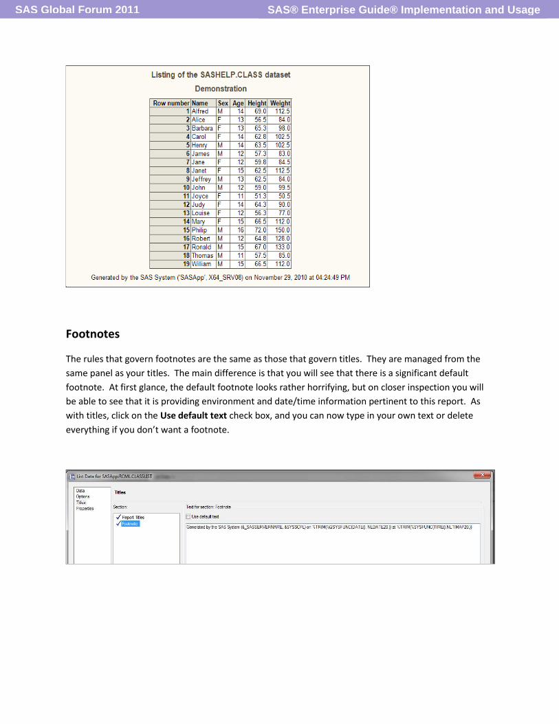
Footnotes
The rules that govern footnotes are the same as those that govern titles. They are managed from the
same panel as your titles. The main difference is that you will see that there is a significant default
footnote. At first glance, the default footnote looks rather horrifying, but on closer inspection you will
be able to see that it is providing environment and date/time information pertinent to this report. As
with titles, click on the Use default text check box, and you can now type in your own text or delete
everything if you don’t want a footnote.
SAS® Enterprise Guide® Implementation and UsageSAS Global Forum 2011

Changing the defaults
From the Tools → Options →Tasks General panel you can specify a default Title and replace the
existing default Footnote. The text you enter here will become the new defaults for your titles and
footnotes and will be used in all output unless you modify them as described above.
Add some Macro
Whenever a SAS session is initiated (including SAS® Enterprise Guide®) a series of macro variables is
created for your use. To see some in use, go to the footnotes window of any task.
SAS® Enterprise Guide® Implementation and UsageSAS Global Forum 2011

The Macro variables in the above footnote resolve to….
Note they include the date and time that your report was produced. You can create your own default
footnote or title from TOOLS → OPTIONS → TASKS GENERAL
.
Some of the default macro variables include….
&systime The time your session began 12:23
&sysdate The date your session began 16NOV10
&sysdate9 the date your session began 16NOV2010
&syslast The name of the most recently
created dataset work.select
In the default footnotes are examples of how these macro variable values can be customized using the
%sysfunc macro function. For example %TRIM(%SYSFUNC(TIME(), NLTIMAP20.) uses the TIME function
to retrieve the current time from the system clock, the NLTIMAP format is applied, then the result is
SAS® Enterprise Guide® Implementation and UsageSAS Global Forum 2011

TRIMed to remove any trailing blanks, leaving us with the current time formatted with AM or PM on the
end.
Change the Report Format
Another simple way to modify the appearance of your report is to change the report format. By default,
SAS® Enterprise Guide® printed output will be presented as a SAS Report . To change this default, go to
TOOLS → OPTIONS →RESULTS GENERAL. There you will be able to choose from SAS Report, HTML, PDF,
RTF or Text File output. By modifying this option, you are setting the default output format for all
printed output.
This ‘global’ default can be overwritten at the Task level. From the Properties window for a Task, select
the Results dialog, and from there you have the option to over-ride the settings set in TOOLS →
OPTIONS →RESULTS GENERAL. Changing the settings for a task will make the effective for just that
task.
SAS® Enterprise Guide® Implementation and UsageSAS Global Forum 2011

Examples
SAS® Enterprise Guide® Implementation and UsageSAS Global Forum 2011
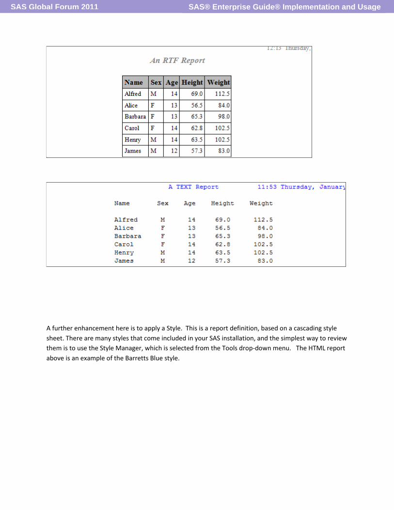
A further enhancement here is to apply a Style. This is a report definition, based on a cascading style
sheet. There are many styles that come included in your SAS installation, and the simplest way to review
them is to use the Style Manager, which is selected from the Tools drop-down menu. The HTML report
above is an example of the Barretts Blue style.
SAS® Enterprise Guide® Implementation and UsageSAS Global Forum 2011

To review the different styles, simply select a style in the left hand panel, and an example will be
displayed in the right hand panel. To customise a style, first create a copy of it by selecting Create a
Copy. The copy will now be included in the left panel and can be selected and edited by clicking the Edit
button. Then to modify, for example, the heading text colour, click on the heading, then select a text
colour.
SAS Supplied Format
Formats allow us to change the appearance of the data. There are dozens of supplied formats that can
be used to change the appearance of both character and numeric data including currency and
date/time data.
SAS® Enterprise Guide® Implementation and UsageSAS Global Forum 2011

The following table illustrates some examples of numeric formats .
Original Value Format Applied Result
1234.56 Dollar12.2 $1,234.56
18628 Date9. 01JAN2011
12345 Z10. 0000012345
-
The following table illustrates some examples of character formats
Original Value Format Applied Result
Two words $Char. Two words *
Two words $quote. ‘ Two words’
Two words $Upcase. TWO WORDS
*includes the two leading blanks
Formats are applied by accessing the properties of a variable and applying the chosen format, and
selecting the overall width and number of decimal places.
SAS® Enterprise Guide® Implementation and UsageSAS Global Forum 2011

User Defined Formats
For those occasions where SAS does not supply a suitable format, the Create Format task (from the Data
selection list) allows you to create a format to your own specifications.
In the OPTIONS panel you need to provide a name, and select a format type. It is important that the
format type matches the type of the variable you wish to apply this format to. ie if you want to apply it
to a character variable, make this a character format.
SAS® Enterprise Guide® Implementation and UsageSAS Global Forum 2011

Optionally you can specify a format width and a fuzz factor (a bit like rounding!) You must check that the
correct server and library are selected, and then advance on to the ‘Define formats’ panel. Now follow
the 5 simple instructions to complete the list of Ranges (what you have in your data set) and Labels
(How you want it to appear in the report).
This technique can also be used to create groupings for numeric ranges. For example you may wish to
summarise salaries into 3 categories:- 0-45000, 45001-75000, and over 75000.
When defining numeric ranges, click the downward pointing arrow beside ‘Discrete’ and select
‘Range’ . Then use the ‘Inclusive’/’Exclusive’ options to make a value inclusive or exclusive as required.
In the Values box, the drop-downs at the right hand end provide 3 special values :-
Low – the lowest possible value
High – the highest possible value
Other – anything else that you haven’t defined
Now run the task. The next time you use the properties window to change or apply a format, there will
be a new ‘User Defined’ category of formats, and your newly created format available for your
selection.
Charts and Plots
Graphics can be a very powerful medium for presenting information – both summarised and detail.
Charts provide the summarised view, while Plots give you the detail view. In both cases, a dash of
imagination, and a pinch of artistic flair can often help you cook up something quite special. SAS®
Enterprise Guide® provides a wizard for both tools to help you get up and running. As with most
wizards, they assist you in building the basic structure, and then allow you to access the more detailed
Advanced (or non-wizard) view to address the finer points.
When you start the Chart wizard, after verifying you have the correct dataset selected, you are asked to
select a variable for the bars. This variable determines how many bars there will be on you chart – there
will be a bar produced for each value of the variable. E.g. if you select GENDER you will end up with two
bars; one each for the Males and Females. Similarly in the Pie chart wizard, you select a ‘Slice’ variable.
SAS® Enterprise Guide® Implementation and UsageSAS Global Forum 2011

The Line Plot wizard is more explicit – it asks you to select a variable for each of the horizontal and
vertical axis of your plot.
Having selected your chart variable, on page three of the wizard you are asked to select a method for
colouring the bars on your chart. The default is to colour all bars the same, while the alternative – Bar
Category – causes the wizard to generate a different colour for each bar.
Once you have completed as much as you can via the wizard, you might want to ‘Open in advanced
view’. This gives you access to the non-wizard version of the task, and usually there are more options
available to you that aren’t accessible via the wizard. To open in advanced view, right click the task,
then Open -> Open in Advanced View. It is important to remember that once you have opened in
advanced view, you cannot then go back and open the task via the wizard!
Maps
A very pictorial way of presenting your information is to generate a map. There are several mapping
options, with map datasets for every country included in your SAS Installation. They are stored in your
Maps library which you can find in the Explorer window. A wizard will guide you through the process,
however you need to build a response dataset first. The response dataset will contain at least two
variables - one to identify the region and a second for the region’s value. In the example below, the
identifying map variable is called ID, as is the identifying variable in the response dataset.
SAS® Enterprise Guide® Implementation and UsageSAS Global Forum 2011

For a description of Names and Identifying numbers, go to
http://support.sas.com/rnd/datavisualization/mapsonline/html/description_of_formats.html
The major advantages of using a map are
Colour
Summarization
Spatial view providing relativity
Colour provides the ability to emphasise and de-emphasise bar or regions on a chart. It also provides
separation between regions.
Summarisation provides the capability to represent many lines of data with a single item on a chart, and
the spatial capability allows us to view geographical areas relative to each other.
A map does not necessarily have to be a geographical region – it can be a floor plan of a building or
display space for example, or any geometrical shape that can be digitized and broken up into internal
areas. There are SAS procedures available that help you digitize a custom area and create a map dataset
from it. Similarly there is a procedure for removing internal boundaries from a map dataset. For
example the USCOUNTY map could be taken and all its internal boundaries removed, leaving just an
outline map of The USA. Alternatively, custom internal boundaries can be digitized and added to an
existing map.
SAS® Enterprise Guide® Implementation and UsageSAS Global Forum 2011

Create a Report
Having created reports from the various tasks in your project, the Report building option allows you to
gather several reports together into a single composite document. Note that this facility can only
combine reports that have been created in the SAS Report format. You can check/confirm this via
TOOLS → OPTIONS → RESULTS → RESULTS GENERAL and make sure that SAS Report box is checked.
To build a composite report, select FILE → NEW → REPORT. The New Report window will open and
show you all your individual reports that have been created in your current process flow.
It now becomes a simple task of dragging and dropping items from the left hand pane into the right
hand pane and arranging them as desired. Once you drop an item into the Report Layout pane, you have
the option to reposition by drag and drop, or resize by selecting the item and dragging on the handles,
or using ALT and the up, down, left or right arrow keys.
SAS® Enterprise Guide® Implementation and UsageSAS Global Forum 2011

Once you have your documents in place, you can preview the final result by selecting an item, and then
use the Show Preview button. When you feel you have everything in place, select OK to close the
window and return to the process flow. Now you can open the report from the process flow window
and make any final alterations. From the tabs at the top of the report you can, for example, remove
page breaks, select which titles and footnotes you want to keep/remove, export the report or email it,
or publish it to a portal. You will also see there are buttons for inserting text and images – you logo for
instance. Images supported include BMP, JPG or GIF files.
An alternative method is to use the document builder. This requires that all your reports have been
created as HTML output only. Go to TOOLS → Create HTML Document Where you can select HTML
output from your tasks into a combined document, and then apply a SAS® Style to the final product.
Add a Little Code!
The following group all require a little code – in fact some require more than a little code.
Formats
Earlier, we looked at some examples of how to use SAS® supplied formats, and also how to build and
apply custom formats. This section looks at some advanced techniques for creating picture formats,
creating formats that apply other formats, and building a format from the contents of a dataset.
SAS® Enterprise Guide® Implementation and UsageSAS Global Forum 2011

Picture formats allow us to create print masks for printing numeric data values. For example – there is
no format that will print a phone number with the STD code in brackets and a hyphen between the third
and fourth digit, nor is there one for printing GST numbers with inserted hyphens. A picture format
addresses both of these. But SAS® Enterprise Guide® does not provide a picture format option, so we
need to roll our sleeves up and get our hands dirty writing a little code to create such a format.
Before writing any code, a format library must be declared, and SAS® Enterprise Guide® told about it! In
the TOOLS → OPTIONS →SAS Programs panel there is an option ‘Submit SAS code when server is
connected’ . Check the box and select the EDIT button to the right . This will open up an editor window
where you can define your format library and declare it in the fmtsearch option.
Once saved, this code will execute whenever a connection is made to a server, and work in a similar
fashion to an autoexec in a non-SAS® Enterprise Guide® session. The fmtsearch option tells SAS in which
library to search for your custom formats.
The format procedure is used to create a picture format. For those familiar with the format procedure, a
picture statement is used instead of a value statement. The picture statement defines the position of all
the editing and non-editing characters. To create a picture format for a phone number use the
following:
PROC FORMAT library=myfmts;
PICTURE PHONE OTHER= ‘ 99) 999-9999’/PREFIX=’(‘;
RUN;
SAS® Enterprise Guide® Implementation and UsageSAS Global Forum 2011

In the picture definition above, 9 is a digit selector and represents a position where a numeric value
must print (you can in fact use any value 1-9), or a 0 can be used to represent a position where a
numeric value might be printed, but will be suppressed if it’s a leading zero. Other non-digits are
message characters, and will print exactly as you list them. Note the use of the prefix= option used to
specify an initial open-bracket.
The following is how you might create a picture format for money amounts:
PROC FORMAT library=myfmts;
PICTURE MONEY LOW-0=’ <0 - Invalid negative value’ (noedit)
Other=’ 000009.99’(prefix=’$’ dig3sep=’,’);
RUN;
The noedit option specifies that numbers in the label are not digit selectors, and the dig3sep option
specifies the character to insert between each group of 3 digits (ie thousands and millions etc). So the
money format would print 25000.50 as $25,000.50, and -23.45 as <0 – Invalid negative value .
In this next example, the mixed format will print -33 as Negative, and 1234.55 as $1,234.55
PROC FORMAT library=myfmts; VALUE MIXED LOW-0='Negative' other=[Dollar12.2];
RUN;
One last trick we can do with the format procedure is to create a format by reading the ranges and
labels from a SAS dataset. Imagine a dataset that has country codes and country names in two separate
variables. After some minor modifications, it can be read directly by PROC FORMAT. The modifications
involve change the names of some variables. The dataset must include variables named FMTNAME
START and LABEL. The first, FMTNAME, will contain the name you want to assign to your format. The
second, START, will contain the country code, and the last, Label, the country name. For example.
SAS® Enterprise Guide® Implementation and UsageSAS Global Forum 2011

C_CODE C_NAME
NZ New Zealand
OZ Australia
US United States of America
CA Canada
The COUNTRY dataset
DATA FORMAT_DATA;
SET COUNTRY(RENAME=(C_CODE=START C_NAME=LABEL));
RETAIN FMTNAME ‘Country’;
RUN;
START LABEL FMTNAME
NZ New Zealand Country
OZ Australia Country
US United States of America Country
CA Canada Country
The FORMAT_DATA dataset
PROC FORMAT CNTLIN=FORMAT_DATA;
RUN;
The data step creates the dataset with the requisite variables, and then the cntlin= option causes the
FORMAT procedure to read the dataset and create the format called COUNTRY.
Traffic lighting
Traffic lighting – otherwise known as conditional highlighting - involves using colour to highlight data
values. This is something that has in the past often been accomplished by exporting the data out to
other reporting software and then going through the report manually modifying the appearance cell by
SAS® Enterprise Guide® Implementation and UsageSAS Global Forum 2011

cell. So step one of the SAS solution is to create a format that defines the ranges or values you want
highlighted, and assign a label that specifies a colour to each range or value. You can use the Create a
Format task, or add the PROC FORMAT code into the next step.
Step two is to generate your report. The List Report task (PROC REPORT) lends itself very nicely to this
application and is very simple to modify. Once the basic report is created and fine tuned, you can modify
the code to implement the traffic-lighting. From the results window, select the CODE tab. This will show
all the code generated by the task, and give you the opportunity to customize it. As you start to type
your changes, you will be asked if you want to create a copy of this code that can be modified – select
YES.
The changes that need to be made involving adding a style statement to the line that defines the
variable you want to apply your traffic-lighting to.
SAS® Enterprise Guide® Implementation and UsageSAS Global Forum 2011
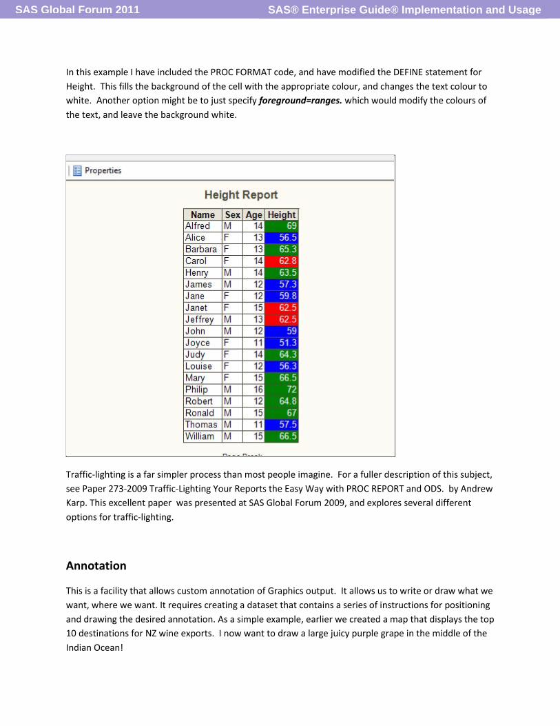
In this example I have included the PROC FORMAT code, and have modified the DEFINE statement for
Height. This fills the background of the cell with the appropriate colour, and changes the text colour to
white. Another option might be to just specify foreground=ranges. which would modify the colours of
the text, and leave the background white.
Traffic-lighting is a far simpler process than most people imagine. For a fuller description of this subject,
see Paper 273-2009 Traffic-Lighting Your Reports the Easy Way with PROC REPORT and ODS. by Andrew
Karp. This excellent paper was presented at SAS Global Forum 2009, and explores several different
options for traffic-lighting.
Annotation
This is a facility that allows custom annotation of Graphics output. It allows us to write or draw what we
want, where we want. It requires creating a dataset that contains a series of instructions for positioning
and drawing the desired annotation. As a simple example, earlier we created a map that displays the top
10 destinations for NZ wine exports. I now want to draw a large juicy purple grape in the middle of the
Indian Ocean!
SAS® Enterprise Guide® Implementation and UsageSAS Global Forum 2011

The code required to create the annotation requires a dataset that contains a series of drawing
instructions.
data rcml.grape;
/* declare variables */
length function style color $ 8 text $ 25;
retain hsys xsys ysys "3";
/* create observation to draw the title */
function="label"; x=35; y=90; position="6";
text="Big Juicy Grape";
style="swissb"; color="green"; size=6;
output;
/* create observations to draw the grape */
function="pie"; x=70; y=40; size=4; line=1;
color="purple"; rotate=360;output;
run;
SAS® Enterprise Guide® Implementation and UsageSAS Global Forum 2011

The Annotated map.
An example with more of a business requirement would be to include a reference line over a bar chart
that highlights the mean value of the response variable. Going back to the class dataset that was used in
earlier examples, we can produce a horizontal bar chart for the different genders:
SAS® Enterprise Guide® Implementation and UsageSAS Global Forum 2011

Now let’s enhance it a little by adding a reference line at the overall average height. So the next
question is, ‘What is the average height?’. The Summary Statistics task can be used to provide this
value, and then the results read into the data step that defines all the annotation. We then need to
modify the code that generates the chart, and tell it that it should include our annotation.
When the Summary Statistics task is run, ensure that the box is checked that requires a SAS dataset to
be created. The dataset can then be read into a data step and used to build the annotate data set.
Below is the process flow to build the un-annotated chart and then calculate the mean of height and
annotate the chart.
SAS® Enterprise Guide® Implementation and UsageSAS Global Forum 2011

The code to create the annotate dataset reads the dataset created by Summary Statistics, and then
generates several more annotate observations.
The final act is to modify the code generated by Bar Chart task, so that it includes the code required to
apply the annotations to the original chart. To add this code, select Modify Task → Preview Code →
Insert Code. The extra code must be inserted on the end of the PROC GCHART statement. So scroll
down until you find the procedure, and then double click on the line that says ‘<double-click to insert
code>’ before the semi-colon that ends the PROC GCHART statement. Then simply type the code
anno=your-dataset-name where your-dataset –name is the name of the dataset that you created that
contains your annotate observations. Now, when the task runs, it will generate the chart, and then
annotate the red dashed line that identifies the overall mean of height.
SAS® Enterprise Guide® Implementation and UsageSAS Global Forum 2011

Job done!
Conclusions
There are a multitude of techniques that can be implemented to improve the appearance of your
output. All the above have been effected from within SAS® Enterprise Guide®, with the last few
examples requiring a small amount of extra code. In all cases, a little creativity can make a significant
difference to the readability and focus of your report.
SAS® Enterprise Guide® Implementation and UsageSAS Global Forum 2011

Author contact
Brian Bee
The Knowledge Warehouse Limited
P.O. Box 10-541
The Terrace
Wellington
New Zealand
+64 21 630075
Copyright
SAS and all other SAS Institute Inc. product or service names are registered trademarks or trademarks of
SAS Institute Inc. in the United States of America and other countries. ® indicates USA registration.
Other brand or product names are registered trademarks of their respective companies.
SAS® Enterprise Guide® Implementation and UsageSAS Global Forum 2011