3rd draft making of... front cover
TRANSCRIPT
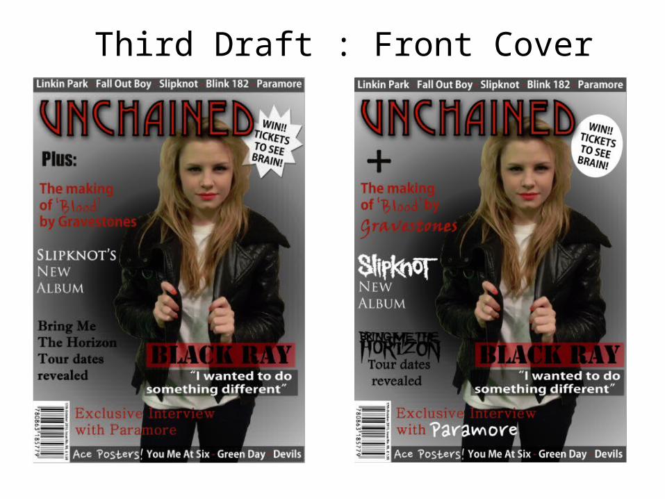
Third Draft : Front Cover
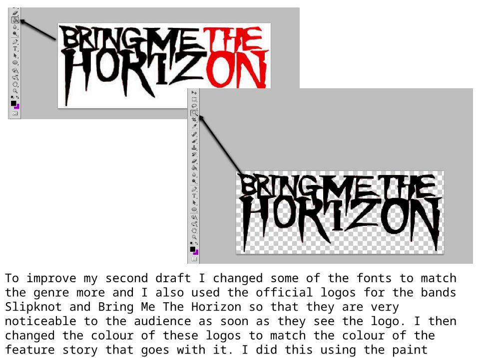
To improve my second draft I changed some of the fonts to match the genre more and I also used the official logos for the bands Slipknot and Bring Me The Horizon so that they are very noticeable to the audience as soon as they see the logo. I then changed the colour of these logos to match the colour of the feature story that goes with it. I did this using the paint bucket tool and clicked on the parts that I wanted to change the colour of and then I used the magic wand tool to get rid of the background.
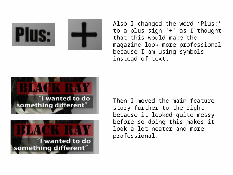
Also I changed the word ‘Plus:’ to a plus sign ’+’ as I thought that this would make the magazine look more professional because I am using symbols instead of text.
Then I moved the main feature story further to the right because it looked quite messy before so doing this makes it look a lot neater and more professional.