571 csaware app process book
DESCRIPTION
Process book for 571TRANSCRIPT

Graduate Studio 571: SiGNS & SymboloGySpriNG 2013 | Whitley r. Kemble
PROJECT 3.1: MOBILE APP ICON


3
CSAware App 4Research 6Matrix 8Sketches 10Iterations 12Semi-Final(s) 14Refinements 16Final Experiments 18Final & Icon in Use 20
CONTENTs

4
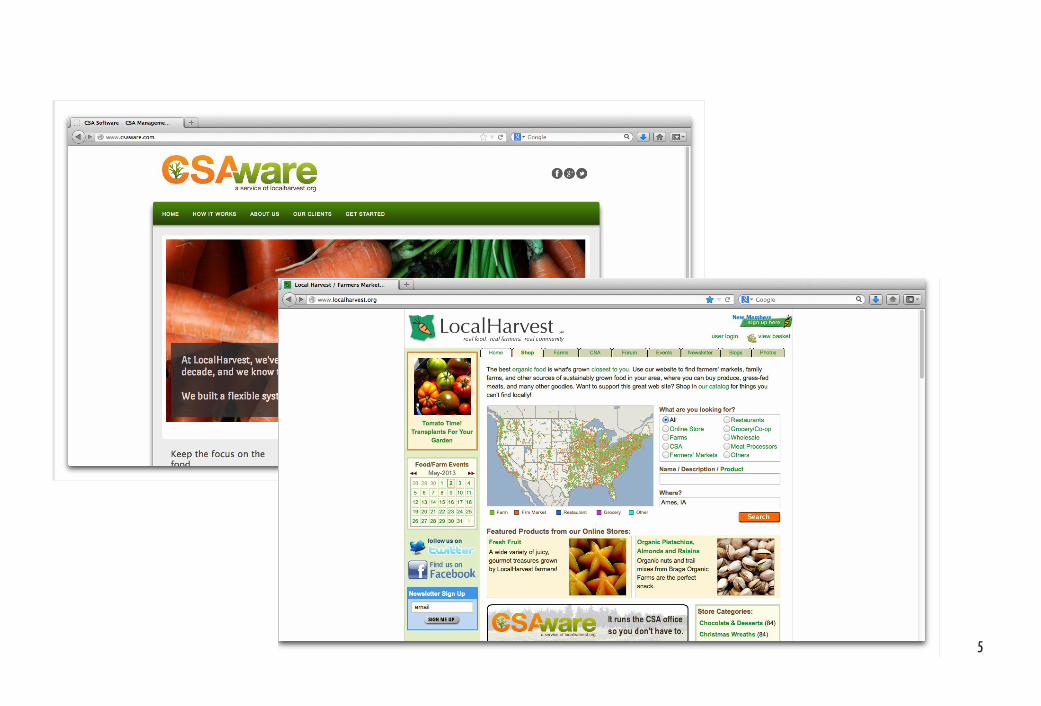
CsAwareCSAware is a Santa Cruz-based service that provides software for managing the administra-tive tasks of running a consumer supported agriculture (CSA) program. It is a subset of Local Harvest, a website that helps connect shoppers with CSA grocers and retailers.
At this time, CSAware and Local Harvest operate independently, and currently neither has a mobile application. This opens up an opportunity. CONCEPT My concept for this project was to create an application that would connect shoppers, CSA grocers, and local growers socially. The app would allow users to list their businesses, recommend or “like” grocers and farm-ers, and form groups much like Facebook.
Group pages, for example, might be a way grocers can show which farmers have produce at their stores, what produce is in season at the store, or even share event or recipe information.
This, I believe, would help foster a greater sense of community while incorporating aspects and connecting users of Local Har-vest and the existing CSAware services.
IMAGES This app would represent two related companies, so cues were taken from both. The websites and logos shared a lot of the same color and concepts, which made blending them easier.
5

6
IMAGES This mind map informed some of the research at right. I looked more closely at produce and on-site iconography for this app.
Bringing these sites together was tricky, but it seemed like a logical next step. Conceptually they represented both sides of the CSA exchange between farmers, grocers, and the community.
Because this would be a social app, as well as a practical app, I felt it was important to look at simple shapes and objects with bright but simple colors. The carrot seemed a very logical choice, as it appeared on both sites, but the concept of a radish was also some-thing that intrigued me in this process.
REsEARCH

7
Photo from CSAWare.com
Photo from CSAWare.com
Photo from CSAWare.com
Personal photo taken at HyVee
Photo from CSAWare.com
Photo from LocalHarvest.org
Photo from CSAWare.com
Personal photo taken at HyVee

IMAGES B fugit ut ma volupta quaspe ni-muscium iumque nessuntia nis aut haribusam repero et esci-maiorum hil magnis natecae.
8
During this phase of the project, it became clear to me how complicated the concept for this app was. It was social, entrepreneurial, agricultural, etc. This made generating attributes easy. Com-ing up with different solutions was not a problem.
Although some worked better than others, I felt that there were a lot of really good representa-tions of what the CSAware would offer. I was es-pecially fond of the abstract symbols in which the plants themselves became people. This, to me, signified growth, growing together as a commu-nity, sustainability, togetherness, and the grass-roots nature of how a lot of these groups begin.
MATRIX
IMAGES For this project, we were asked to create a matrix with attri-butes along one axis and design principles along the other.

9

10
sKETCHEs

11

12

13

14
As you can see here, I did a lot of experi-ments with different vegetables and people. Some, like the radishes shown here, were a little too abstract. The people part of the concept was really important, so unfortu-nately these had to be ruled out. The cab-bage iteration was also very nice, but it seemed to lack representation of exchange.
REFINEMENTs

15

16
IMAGES Many of these iterations were giv-en more depth. The colors were difficult to establish. Notice how the pants and the body parts are lost against certain backgrounds.
The farmer-customer relationship was a strong image for this symbol. Although it ruled out the CSA grocers, it seemed to sig-nify a more direct relationship between shop-pers and farmers, which is integral CSA.
Reference to the social aspect were incorpo-rated subtly in the foliage of the vegetables. Some work better than others, but the double meaning lent itself nicley to the concept.
ITERATIONs

17

18
19
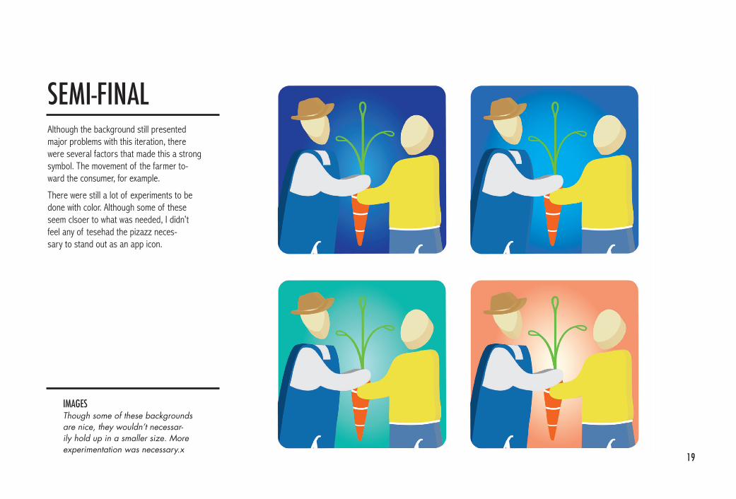
Although the background still presented major problems with this iteration, there were several factors that made this a strong symbol. The movement of the farmer to-ward the consumer, for example.
There were still a lot of experiments to be done with color. Although some of these seem clsoer to what was needed, I didn’t feel any of tesehad the pizazz neces-sary to stand out as an app icon.
IMAGES Though some of these backgrounds are nice, they wouldn’t necessar-ily hold up in a smaller size. More experimentation was necessary.x
sEMI-FINAL

20
FINAL EXPERIMENTs
IMAGES Different color combinations were tested for contrast and clarity.

21

22
IMAGES Changing the background and foliage colors gave this symbol greater contrast. These colors are also brighter and more inviting.
I chose this as my final symbol for several reasons. Firstly, I like that the blue background is representative of the sky, but also that it is a bright and friendly color. It presents a nice contrast against the blues here, too, which was a definite plus. The carrot here changed, too.
The form was simplified by removing the extrusions. The “holes” were taken out of the carrot greenery, and the figures were enlarged to help fill the frame.
FINAL

23
10:00ArtGrA M
