chapterpyzdek.mrooms.net/file.php/1/reading/bb-reading/... · · 2011-05-03chapter 8 process...
TRANSCRIPT
CHAPTER 8 Process Behavior Charts
Control Charts for Variables Data In statistical process control (SPC), the mean, range, and standard deviation are the statistics most often used for analyzing measurement data. Control charts are used to monitor these statistics. An out-of-control point for any of these statistics is an indication that a special cause of variation is present and that an immediate investigation should be made to identify the special cause.
Averages and Ranges Control Charts Averages charts are statistical tools used to evaluate the central tendency of a process over time. Ranges charts are statistical tools used to evaluate the dispersion or spread of a process over time.
Averages charts answer the question: "Has a special cause of variation caused the central tendency of this process to change over the time period observed?" Ranges charts answer the question: "Has a special cause of variation caused the process distribution to become more or less consistent?" Averages and ranges charts can be applied to many continuous variables such as weight, size, response time, etc.
The basis of the control chart is the rational subgroup. Rational subgroups (see "Rational Subgroup Sampling") are composed of items which were produced under essentially the same conditions. The average and range are computed for each subgroup separately, then plotted on the control chart. Each subgroup's statistics are compared to the control limits, and patterns of variation between subgroups are analyzed.
Subgroup Equations for Averages and Ranges Charts
x = sum of subgroup measurements subgroup size
R = largest in subgroup - smallest in subgroup
Control Limit Equations for Averages and Ranges Charts
(8.1)
(8.2)
Control limits for both the averages and the ranges charts are computed such that it is highly unlikely that a subgroup average or range from a stable process would fall outside of the limits. All control limits are set at plus and minus three standard deviations from the center line of the chart. Thus, the control limits for subgroup averages are plus and minus three standard deviations of the mean from the grand average; the control
215
216 C hap te rEi g h t
limits for the subgroup ranges are plus and minus three standard deviations of the range from the average range. These control limits are quite robust with respect to nonnormality in the process distribution.
To facilitate calculations, constants are used in the control limit equations. Appendix 9 provides control chart constants for subgroups of 25 or less. The derivation of the various control chart constants is shown in Burr (1976, pp. 97-105).
Control Limit Equations for Ranges Charts
R = sum of subgroup ranges number of subgroups
LCL= D3R
UCL=D4R
Control Limit Equations for Averages Charts Using Ii X = sum of subgroup averages
number of subgroups
LCL=X-A2R
UCL=X+A2R
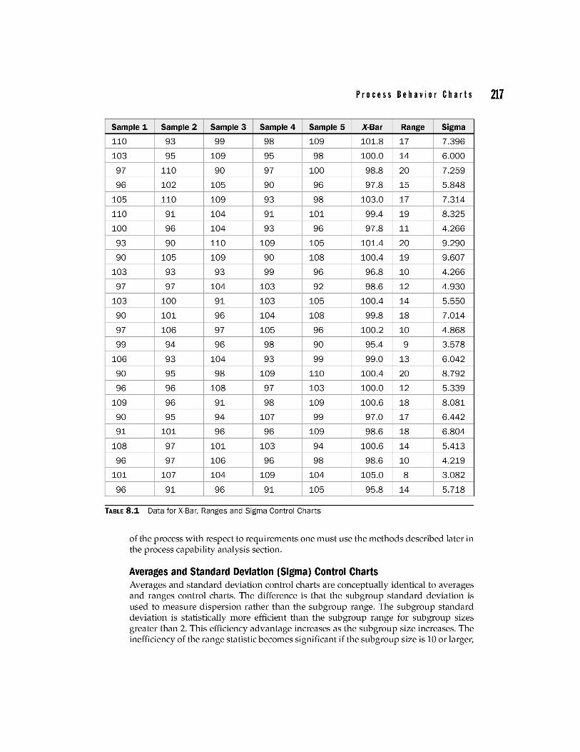
Example of Averages and Ranges Control Charts Table 8.1 contains 25 subgroups of five observations each.
The control limits are calculated from these data as follows:
Ranges control chart example
R = sum of subgroup ranges = 369 = 14.76 number of subgroups 25
LCLR =D3R=Ox14 .76=0
UCLR = D4R = 2.115 x 14.76 = 31.22
(8.3)
(8.4)
(8.5)
(8.6)
(8.7)
(8.8)
Since it is not possible to have a subgroup range less than zero, the LCL is not shown on the control chart for ranges.
Averages control chart example
X = sum of subgroup averages = 2,487.5 = 99 .5 number of subgroups 25
LCL _ = X - A2R = 99 .5- 0.577 x 14.76 = 90 .97 x
UCL _ = X +A2R = 99 .5+0.577 x 14.76 = 108.00 x
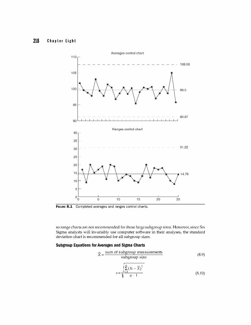
The completed averages and ranges control charts are shown in Fig. 8.1. The charts shown in Fig. 8.3 show a process in statistical control. This merely means
that we can predict the limits of variability for this process. To determine the capability
Pro c e s s Be hay i 0 r C h art s 217
Sample 1 Sample 2 Sample 3 Sample 4 Sample 5 X-Bar Range Sigma
110 93 99 98 109 101.8 17 7.396
103 95 109 95 98 100.0 14 6.000
97 110 90 97 100 98.8 20 7.259
96 102 105 90 96 97.8 15 5.848
105 110 109 93 98 103.0 17 7.314
110 91 104 91 101 99.4 19 8.325
100 96 104 93 96 97.8 11 4.266
93 90 110 109 105 101.4 20 9.290
90 105 109 90 108 100.4 19 9.607
103 93 93 99 96 96.8 10 4.266
97 97 104 103 92 98.6 12 4.930
103 100 91 103 105 100.4 14 5.550
90 101 96 104 108 99.8 18 7.014
97 106 97 105 96 100.2 10 4.868
99 94 96 98 90 95.4 9 3.578
106 93 104 93 99 99.0 13 6.042
90 95 98 109 110 100.4 20 8.792
96 96 108 97 103 100.0 12 5.339
109 96 91 98 109 100.6 18 8.081
90 95 94 107 99 97.0 17 6.442
91 101 96 96 109 98.6 18 6.804
108 97 101 103 94 100.6 14 5.413
96 97 106 96 98 98.6 10 4.219
101 107 104 109 104 105.0 8 3.082
96 91 96 91 105 95.8 14 5.718
TABLE 8.1 Data for X-Bar, Ranges and Sigma Control Charts
of the process with respect to requirements one must use the methods described later in the process capability analysis section.
Averages and Standard Deviation (Sigma) Control Charts Averages and standard deviation control charts are conceptually identical to averages and ranges control charts. The difference is that the subgroup standard deviation is used to measure dispersion rather than the subgroup range. The subgroup standard deviation is statistically more efficient than the subgroup range for subgroup sizes greater than 2. This efficiency advantage increases as the subgroup size increases. The inefficiency of the range statistic becomes significant if the subgroup size is 10 or larger,
218 Chapter Eight
Averages control chart 110
- - - - - - - - - - - - - - - 108.00
99.5
- - - - - - - - - - - - - - - - - - - - 90.97
Ranges control chart 40
35
30 31 .22
25
20
15r-~~~----r+---+---'r------+--r+-----1r----.14.76
10
5
5 10 15 20 25
FIGURE 8.1 Completed averages and ranges control charts.
so range charts are not recommended for these large subgroup sizes. However, since Six Sigma analysts will invariably use computer software in their analyses, the standard deviation chart is recommended for all subgroup sizes.
Subgroup Equations for Averages and Sigma Charts
X = sum of subgroup measurements subgroup size
n - 2 I, (Xi- X)
s= i=l
n-1
(S.9)
(S.10)
Pro c e s s B e hay i 0 r C h art s 219
The standard deviation, s, is computed separately for each subgroup, using the subgroup average rather than the grand average. This is an important point; using the grand average would introduce special cause variation if the process were out of control, thereby underestimating the process capability, perhaps significantly.
Control Limit Equations for Averages and Sigma Charts Control limits for both the averages and the sigma charts are computed such that it is highly unlikely that a subgroup average or sigma from a stable process would fall outside of the limits. All control limits are set at plus and minus three standard deviations from the center line of the chart. Thus, the control limits for subgroup averages are plus and minus three standard deviations of the mean from the grand average. The control limits for the subgroup sigmas are plus and minus three standard deviations of sigma from the average sigma. These control limits are quite robust with respect to non-normality in the process distribution.
To facilitate calculations, constants are used in the control limit equations. Appendix 9 provides control chart constants for subgroups of 25 or less.
Control Limit Equations for Sigma Charts Based Ons S
_ sum of subgroup sigmas s = ------:-----"''----:-''--'''----number of subgroups
LCL=B3s UCL= B4s
Control Limit Equations for Averages Charts Based on s X = sum of subgroup averages
number of subgroups
Example of Averages and Standard Deviation Control Charts
(8.11)
(8.12)
(8.13)
(8.14)
(8.15)
(8.16)
To illustrate the calculations and to compare the range method to the standard deviation results, the data used in the previous example will be reanalyzed using the subgroup standard deviation rather than the subgroup range.
The control limits are calculated from this data as follows: Sigma control chart
s = sum of subgroup sigmas = 155.45 = 6.218 number of subgroups 25
LCLs = B3S = 0 x 6.218 = 0
UCLs = B4s = 2.089 x 6.218 = 12.989
Since it is not possible to have a subgroup sigma less than zero, the LCL is not shown on the control chart for sigma for this example.
220 C hap te rEi g h t
Averages control chart
x = sum of subgroup averages = 2,487.5 = 99 .5 number of subgroups 25
LCLx = X - A3s = 99.5 -1.427 x 6.218 = 90.63
UCLx = X +A3s = 99.5+ 1.427 x 6.218 = 108.37
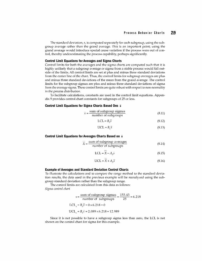
The completed averages and sigma control charts are shown in Fig. 8.2. Note that the control limits for the averages chart are only slightly different than the limits calculated using ranges.
Note that the conclusions reached are the same as when ranges were used.
Averages control chart 110
- - - - - - - - - - - - - - - 108.37
99.5
- - - - - - - - - - - - - - - - - - - - 90.63
Sigma control chart 15
12.99
10
6.218
5
OL-______ -L ________ L-______ -L ________ L-______ ~
o 5 10 15 20 25
FIGURE 8.2 Completed averages and sigma control charts.
Process Behavior Charts 221
Control Charts for Individual Measurements (X Charts) Individuals control charts are statistical tools used to evaluate the central tendency of a process over time. They are also called X charts or moving range charts. Individuals control charts are used when it is not feasible to use averages for process control. There are many possible reasons why averages control charts may not be desirable: observations may be expensive to get (e.g., destructive testing), output may be too homogeneous over short time intervals (e.g., pH of a solution), the production rate may be slow and the interval between successive observations long, etc. Control charts for individuals are often used to monitor batch process, such as chemical processes, where the withinbatch variation is so small relative to between-batch variation that the control limits on a standard X chart would be too close together. Range charts (sometimes called moving range charts in this application) are used to monitor dispersion between the successive individual observations. *
Calculations for Moving Ranges Charts As with averages and ranges charts, the range is computed as shown in previous section,
R = largest in subgroup - smallest in subgroup
Where the subgroup is a consecutive pair of process measurements. The range controllimit is computed as was described for averages and ranges charts, using the D4 constant for subgroups of 2, which is 3.267. That is,
LCL = 0 (for n = 2)
UCL = 3.267 x R-bar
Control Limit Equations for Individuals Charts
x = sum of measurements number of measurements
LCL=X-E)~= X-2.66xR
UCL=X+E2R= X+2.66xR
(S.17)
(S.lS)
(S.19)
yYp.ere E2 = 2.66 is the constant used when individual measurements are plotted, and R is based on subgroups of n = 2.
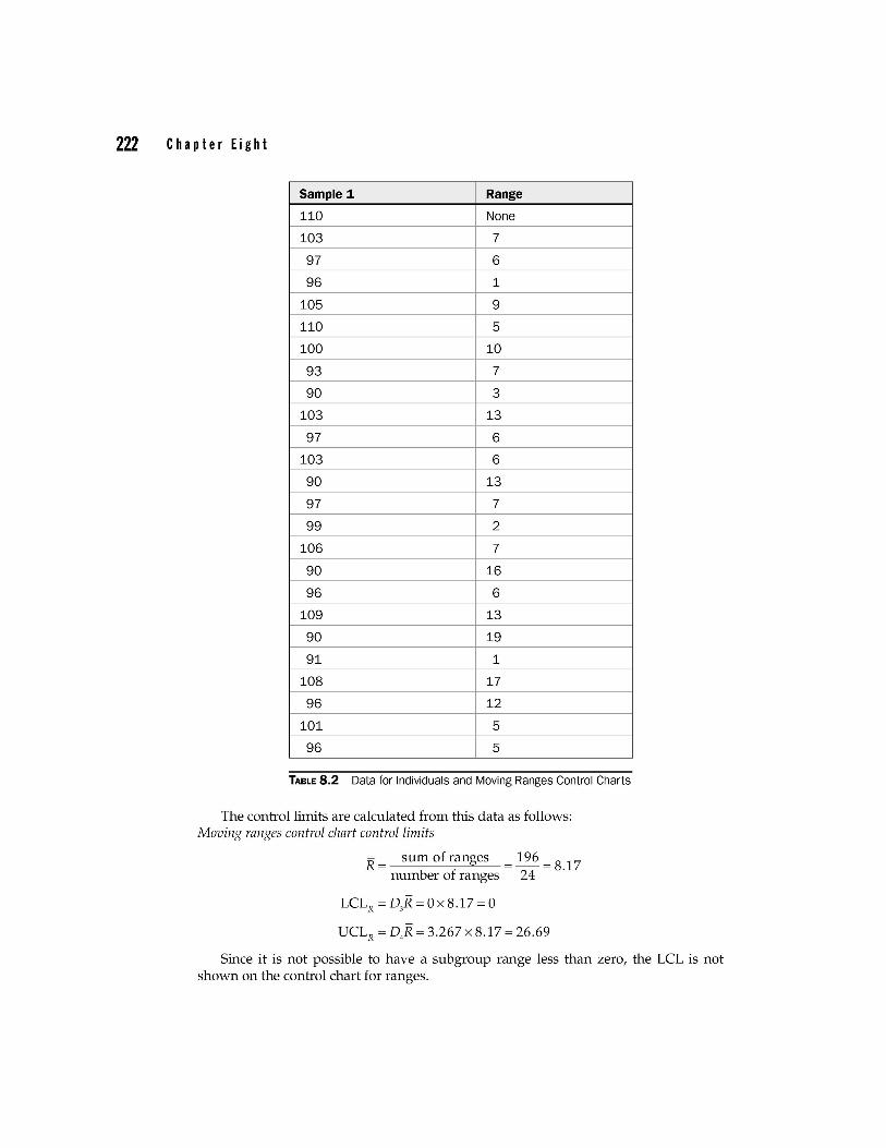
Example of Individuals and Moving Ranges Control Charts Table S.2 contains 25 measurements. To facilitate comparison, the measurements are the first observations in each subgroup used in the previous average/ranges and average/ standard deviation control chart examples.
*There is some debate over the value of moving R charts. Academic researchers have failed to show statistical value in their usage. However, many practitioners contend that moving R charts provide valuable additional information useful in troubleshooting.
222 C hap te rEi g h t
Sample 1 Range
110 None
103 7
97 6
96 1
105 9
110 5
100 10
93 7
90 3
103 13
97 6
103 6
90 13
97 7
99 2
106 7
90 16
96 6
109 13
90 19
91 1
108 17
96 12
101 5
96 5
TABLE 8.2 Data for Individuals and Moving Ranges Control Charts
The control limits are calculated from this data as follows: Moving ranges control chart control limits
R = sum of ranges = 196 = 8.17 number of ranges 24
LCLR =D3R=Ox8.17=O
UCLR = D4R = 3.267 x 8.17 = 26.69
Since it is not possible to have a subgroup range less than zero, the LCL is not shown on the control chart for ranges.
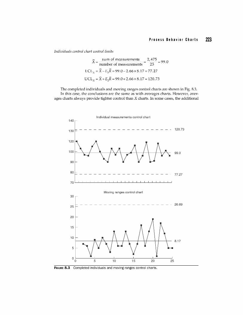
Pro c e s s B e hay i 0 r C h art s 223
Individuals control chart control limits
x = sum of measurements = 2,475 = 99 .0 number of measurements 25
LCLx = X - E2R = 99.0- 2.66 x 8.17 = 77.27
UCLx = X +E2R = 99.0+2.66 x 8.17 = 120.73
The completed individuals and moving ranges control charts are shown in Fig. 8.3. In this case, the conclusions are the same as with averages charts. However, aver
ages charts always provide tighter control than X charts. In some cases, the additional
Individual measurements control chart 140
130 - - - - - - - - - - - - - - - - - - - - 120.73
99.0
80 77.27
Moving ranges control chart 30
25 - - - - - - - - - - - - - - - - - - - . 26.69
20
15
10 8.17
5
0 0 5 10 15 20 25
FIGURE 8.3 Completed individuals and moving ranges control charts.
224 C hap te rEi g h t
sensitivity provided by averages charts may not be justified on either an economic or an engineering basis. When this happens, the use of averages charts will merely lead to wasting money by investigating special causes that are of minor importance.
Control Charts for Attributes Data
Control Charts for Proportion Defective (p Charts) p charts are statistical tools used to evaluate the proportion defective, or proportion nonconforming, produced by a process.
p charts can be applied to any variable where the appropriate performance measure is a unit count. p charts answer the question: "Has a special cause of variation caused the central tendency of this process to produce an abnormally large or small number of defective units over the time period observed?"
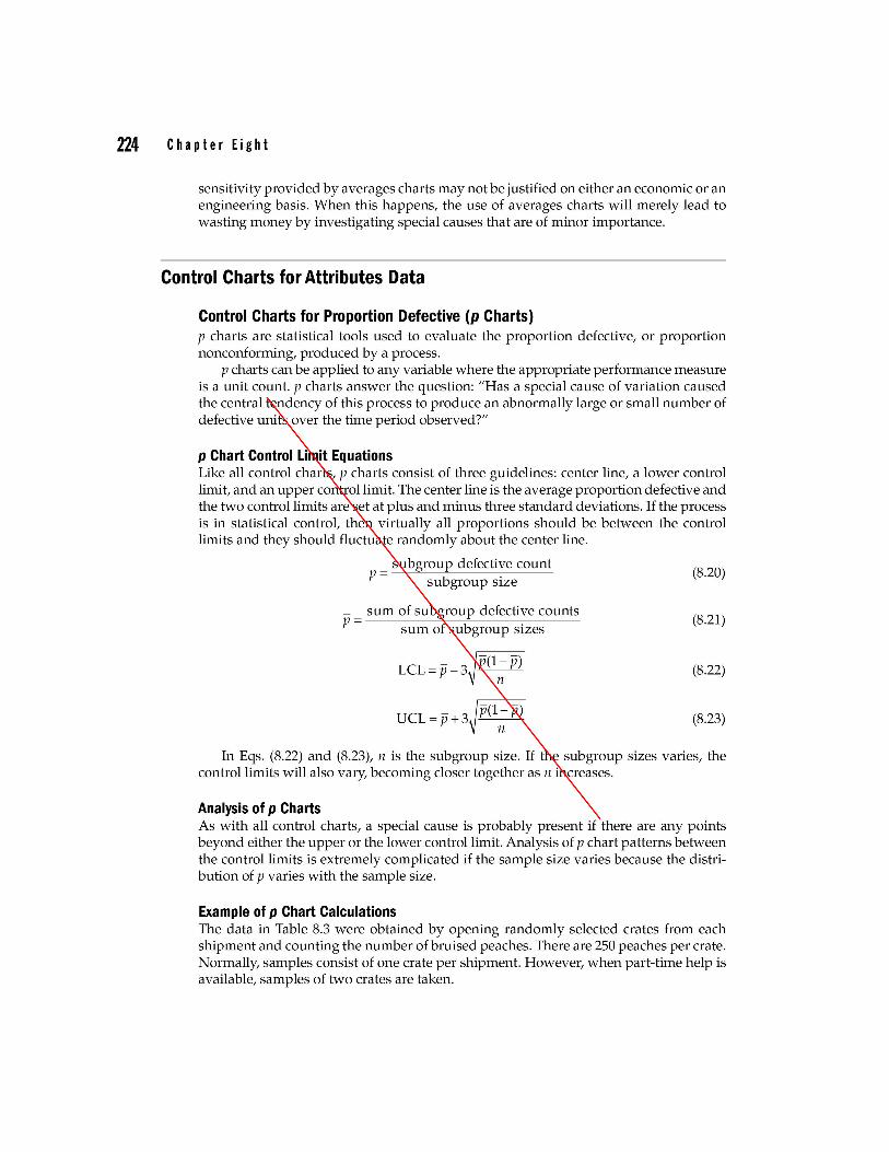
p Chart Control Limit Equations Like all control charts, p charts consist of three guidelines: center line, a lower control limit, and an upper control limit. The center line is the average proportion defective and the two control limits are set at plus and minus three standard deviations. If the process is in statistical control, then virtually all proportions should be between the control limits and they should fluctuate randomly about the center line.
subgroup defective count p = subgroup size
_ sum of subgroup defective counts p = sum of subgroup sizes
LCL = P - 3~P(1; p)
UCL= p +3~P(1; p)
(8.20)
(8.21)
(8.22)
(8.23)
In Eqs. (8.22) and (8.23), n is the subgroup size. If the subgroup sizes varies, the control limits will also vary, becoming closer together as n increases.
Analysis of p Charts As with all control charts, a special cause is probably present if there are any points beyond either the upper or the lower control limit. Analysis of p chart patterns between the control limits is extremely complicated if the sample size varies because the distribution of p varies with the sample size.
Example of p Chart Calculations The data in Table 8.3 were obtained by opening randomly selected crates from each shipment and counting the number of bruised peaches. There are 250 peaches per crate. Normally, samples consist of one crate per shipment. However, when part-time help is available, samples of two crates are taken.