80 informatica economică - ase bucurestirevistaie.ase.ro/content/82/07 dospinescu, strimbei,...
TRANSCRIPT
80 Informatica Economică vol. 21, no. 2/2017
DOI: 10.12948/issn14531305/21.2.2017.07
Adaptive UIX Layer for University Information SOA-BUS
Octavian DOSPINESCU, Cătălin STRÎMBEI, Roxana-Marina STRAINU,
Alexandra NISTOR
Faculty of Economics and Business Administration, AL.I.Cuza University, Iasi
[email protected], [email protected], [email protected],
The user interface (UI) layer is considered one of the key components of software applications
since it connects their end-users to functionalities. Well-engineered and robust software
applications could eventually fail to be adopted due to a weak UI layer. In the current market,
when creating sites, UI designers have to determine how to plan the best interface according
to the devices of the users, namely desktops, laptops, tablets or smartphones. Having this in
mind, the current paper aims to present the adaptive UIX Layer for a University Information
SOA-Bus (UISB) – a topic discussed in previous works [1], [2]. In this respect, we reviewed
the literature on responsive and adaptive web design in order to identify the best front-end
approach to the UISB. According to our findings, there is a strong debate in the academic field
as well in the IT business in what concerns UI design. Recent interests have shown that the new
trend in drafting the front-end layer is choosing between a responsive and an adaptive design.
While arguments provided by both sides have failed to ease the decision makers’ choices on
what type of design to choose, we aim to bring some light on the subject by proposing different
layers for the UISB. Keywords: SOA, User Interface, Responsive, Adaptive
Introduction
The development of User Interfaces (UI)
has been a topic of interest both for academia
and industry since the early 1980s. During the
time a constant evolution has occurred in the
field and such an evolution has been coupled
with a continuous effort to develop new
methods and strategies to create UIs in
effective and efficient ways [3].
UIX (User Interface XML) is a set of
technologies that constitute a framework for
building web applications. The main focus of
UIX is the user presentation layer of an
application, with additional functionality for
managing events and the state of the
application flow. UIX is designed to create
applications with page-based navigation, such
as an online human resources application,
rather than full-featured applications requiring
advanced interaction, such as an integrated
development environment (IDE) [4].
An application can interact with UIX in
predefined places called decision points,
where a decision is made by the operator or a
certain action routine is automatically
triggered. Execution of an action terminates in
a new decision point. The application's
structure is provided to UIX in configuration
files, which can be ASCII files, databases, or
resource files. UIX includes Java class
libraries, APIs, XML languages, and other
technologies for developing different aspects
of web-based applications [5].
2 Responsive Web Design (RWD)
Nowadays, responsive design has become a
major trend in web development due to the
high diversity of devices used for web
browsing. According to [6] applying
responsive design to existing web sites
implies major reengineering due to the
underlying fluid grid process. Likewise,
responsive design is limited to desktop-to-
mobile adaptation.
The expression ‘responsive web design’ has
earned popularity in 2010 when the web
designer and developer Ethan Marcotte wrote
an article on the subject [7]. The same author
considers that the goal of RWD consists in
making a web page look equally good no
matter the screen size of a device. Before the
introduction of responsive web design, web
1

Informatica Economică vol. 21, no. 2/2017 81
DOI: 10.12948/issn14531305/21.2.2017.07
designers and developers created most
websites by following the principles of pixel-
perfect web design. Pixel-perfect web design
treats a web page like a page from a magazine.
In this approach, the mock-up of a web page
is first created in Photoshop, and then a
developer recreates that design to fit a web
browser. The goal of pixel-perfect web design
is to make a web page resemble the original
mock-up as much as possible. But a web page
is not printed on a piece of paper but viewed
in a web browser. Unlike paper, a web
browser is a dynamic medium. It allows a user
to re-size the browser window itself, and users
can also change the size of the font as well.
And when this happens, web pages created
with pixel-perfect web design principles often
break. If a web page was optimized for a 1024
× 768 pixel screen size, for example, that web
page will look quite wrong in a smaller or
bigger screen [8].
As the number of mobile devices that have a
variety of screen sizes grows, pixel-perfect
web design has become problematic.
Responsive web design is an attempt to solve
this problem with the following three tools
[9]:
a flexible, grid-based layout;
flexible images;
media queries.
Flexible grids are created by using percentage
(a relative unit) instead of pixel (an absolute
unit). Media queries make it possible to apply
different cascading style sheets (CSS)
depending on the media type and the
maximum width of the device screen. With
cascading style sheets, one can control images
and other fixed-width elements so that they
stay contained in their container blocks.
Responsive web design makes a web page
adjust itself in response to the screen size of a
device. This means that there is no longer one
fixed layout in which the elements of a web
page are permanently placed. Instead, as the
size of the screen changes, the layout of a web
page adjusts itself and rearranges the elements
of the page.
According to [10] and [11], responsive web
design is used by many digital agencies due to
its specific advantages, namely:
The content stays the same – having this
in mind, using RWD reduces the need to
change or ‘adapt’ the interface website for
different versions. Moreover, the Content
Management System (CMS) remains
unmodified, the need to duplicate content
entry according to different screen types
being eliminated.
It can be easily achieved automatically
– in order to determine the width of the
browser or device there can be used CSS
(cascading style sheets), media queries or
HTML5, the existing content being
adjusted or stacked to fit automatically the
space available [11].
Cost – in comparison with the Adaptable
Web Design the Responsive one is
cheaper and less time consuming.
Although the advantages shown make of
RWD an attractive choice when designing
interfaces, the same author recalls some
limitations as:
Generic not optimized experience –
when accessing a site with RWD
interface, the user does not benefit of a
fully optimized experience in accordance
with the device they are using.
No accounting for users’ behavioral
differences with different mediums. The
evidence indicates that users behave very
differently when using smartphones and
desktops, so ideally a mobile website
should be adapted to these behavioral
changes [11].
Loading time issues. Websites with lots
of HTML code and multimedia take far
longer to load on a mobile device with a
3G connection and a smaller CPU than on
a desktop with broadband. As the content
doesn’t change between environments,
with responsive websites, mobile users are
kept waiting [11].
A responsive design can have multiple
breakpoints, say for a small-screen phone,
then a large-screen phone, then a tablet, then a
laptop/desktop. Many teams try to decide on
breakpoints using average screen sizes.
However, it’s better to look at what the
content and navigation wants to be. By letting
the content and navigation drive the

82 Informatica Economică vol. 21, no. 2/2017
DOI: 10.12948/issn14531305/21.2.2017.07
breakpoints, teams find they can often get
away with fewer screen configurations. For
example, a high-resolution Retina iPad might
easily share the same configuration as a well-
constructed laptop display, while lower
resolution tablets might just need a little
adjustment to that same configuration.
3 Adaptive User Interfaces
Adaptive User Interfaces (AUI) are particular
context-aware systems that aim at generating
user interfaces relevant to the user’s profile,
task and environment [12]. The AUI research
domain comes from the crossover of the
personalization domain (which consists in
allowing the user to manually customize the
interface) and the context-awareness. Hence,
AUI focus on providing a user interface well
suited to the user and its task with as less as
possible user intervention. The main
challenge for AUI is to design their
mechanisms so that the usability is preserved
[8].
Unlike standard context-aware systems, AUI
promote a re-organization or a re-distribution
of a user interface where context-aware
systems associate a unique interface per
service. On the detection of a new context,
AUI may re-arrange the graphical
components (and their properties such as the
size), the available modalities or the type of
visualization to better suit the new context.
The quality of AUI depends on the relevancy
of the adaptation considering the task and on
the intrusiveness of the adaptation. An AUI
that adapt too many times without the user’s
approbation may have a negative impact on
the task.
AUI represent a complex problem addressed
by particular approaches. A notable one is the
“plasticity” approach which originally aimed
at resolving interface adaptation problems
considering an adaptation to the device
(computing context) and to the physical
environment (physical context) [13].
Plasticity employs a Model-Driven
Engineering (MDE) tactic to design interface
having multiple representations (one for each
targeted context) and distributed interfaces
(interfaces capable to display on several
devices) [13]. Plasticity design suggests that
the contexts are known at design time. The
concept evolved to consider the user’s context
and more recent researches on plasticity
introduced the consideration of time context
by using learning systems to depict users’
preferences and habits [14]. Plasticity focuses
on modelling multi-target interfaces,
distributed interfaces, physical environment,
hardware and software capabilities and tasks.
The mechanism of adaptation is commonly
dealt through Service Oriented Architecture
[12] or component based approach.
Another approach to context-aware interfaces
is the USer Interface eXtensible Markup
Language (UsiXML) (Limbourg, 2005).
UsiXML is a user interface description
language that aims at modeling relevant
aspects of the interfaces to support context-
aware application. For this purpose, UsiXML
introduced the “μ7” concept which consists in
the design of “multi-device, multi-platform,
multi-user, multi-linguality / culturality,
multi-organization, multi-context and multi-
modality” enabled interfaces. UsiXML
models are partly based on the works on
plasticity and propose models to enable the
adaptation of the interfaces to the user’s
context.
The commonly adopted alternative to RWD is
AWD – Adaptive Web Design. According to
[11], experts such as Jakob Nielsen have
argued that AWD offers a preferable solution.
The advantages are:
Speed;
Sensory design;
Native app portability.
But AWD also has the following limitations:
The content nightmare;
Too many versions;
Native app ‘transformation’.
4 Combining RWD with AWD
The best solution is often achieved by
combining RWD with AWD, in order to enjoy
the cost and time efficiencies of RWD while
offering the better user mobile experience that
AWD offers in prioritized content areas.

Informatica Economică vol. 21, no. 2/2017 83
DOI: 10.12948/issn14531305/21.2.2017.07
Table 1 summarizes the twelve principles that
define AWD and RWD, comparing each
method of use and implementation.
Table 1. Key principles in AWD and RWD [15]
Principles Adaptive Web Design (AWD) Responsive Web Design
(RWD)
Access Speed Very fast Fast
App Store Available Not necessary
Approval Process Some are mandatory None
Content Versions Multiple URLs/versions for each
page, i.e., content forking
Same content regardless of
device or platform
Development Cost Expensive to very expensive Moderate to reasonable
Features Phone features, location services,
camera, etc...
Limited phone features
Functionality Some functions may be omitted
from the mobile application
All functions of original site
remain
Internet Connection Available offline Required
Monetization Easily monetized Not as easy to monetize
Navigation Interactive user interface Static but responsive user
interface
Optimized to mobile
device
Best Good
User Access After installation and some user
configuration/interaction
Through browser with little to no
user configuration/interaction
According to [11], using RWD as the basis,
there can be included some elements of AWD,
changing some assets, content, or interfaces
depending on whether the site is visited from
a smartphone, tablet, or desktop—thus
making a responsive website appear
‘adaptive’. Similarly, in the AWD approach
there can be embraced the RWD’s
responsiveness so the content and interfaces
degrade gracefully on different size screens
(RWD) until the ‘break point’ where a
different version is applied (AWD).
This route poses two challenges: The
interaction design/information architecture
needs to be designed for both the desktop and
mobile at the same time while considering the
resizing, spatial distribution, and animation (if
required) of elements on desktops, tablets, and
mobile screens. Once this juncture has been
crossed, the developers need to rely on all
available technologies (media queries,
browser sniffing, feature detection, and
network speed analysis) to detect the
multitude of resolutions and device
capabilities while tailoring the end user
experience to each particular device. This
approach is bleeding edge and quite
experimental.
As we can see from Table 1, each of the two
design practices have different advantages
and limitations. While the responsive design
is client-side, meaning the whole page is
delivered to the device browser (the client),
and the browser then changes how the page
appears in relation to the dimensions of the
browser window, the adaptive design is
server-side, meaning before the page is even
delivered, the server (where the site is hosted)
detects the attributes of the device, and loads
a version of the site that is optimized for its
dimensions and native features. Considering
the pros and cons we propose further a front-
end solution for the University Information
SOA-Bus based on the AWD approach.
84 Informatica Economică vol. 21, no. 2/2017
DOI: 10.12948/issn14531305/21.2.2017.07
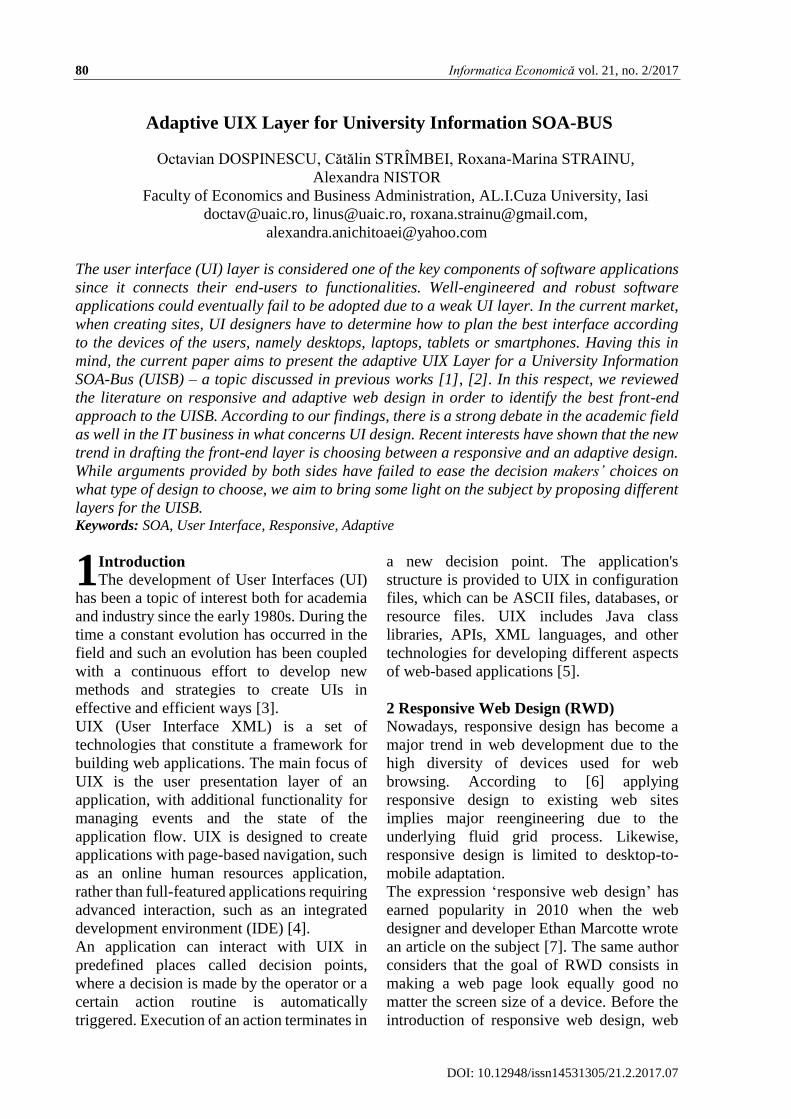
5 Adaptive user interface model for
University Information SOA-Bus (UISB)
As suggested by [16], a typical approach when
developing adaptive interfaces consists in
using a set of models to generate and further
refine a user interface artefact until the final
user interface is adapted to best match the
user’s need, given the constraints set by the
context in which the user operates. In order to
design the UI of the UISB we took into
consideration the Cameleon reference
framework [17] which comprises four
different abstraction layers for adaptive
interfaces (Figure 1).
Fig. 1. Models and artifacts in the adaption process [4].
As shown in Figure 1, the interface adaption
process uses four models, namely: task model,
concept model, context model and user
interface model. Further we present a short
description for each of them.
Task model – when solving problems, the
human being has the habit of decomposing it
in several subproblems. In this regard, the
most used structure for task models is the
hierarchical one. In what concerns the UISB,
we used the ConcurTaskTrees (CTC)
proposed by [18] which contains four types of
tasks:
System tasks, which are completed by the
system alone;
User tasks, which are only allocated to a
user;
Interaction tasks, which take place when
the user relates to the system;
Abstract tasks.
Each of the four tasks can be further divided
in subtasks, the connection between them
being ensured by temporal operators. Using
this notation, we can model the interactions
and deal with the unexpected events which
can occur in the University Information SOA-
Bus system (UISB). For example, if a
professor, who is currently publishing a
document on the Portal is required to evaluate
a paper on the Blackboard, he will suspend the
current activity and will solve the most urgent
task suggested, the Blackboard evaluation.
Concepts model – according to [19], the
concept model details the objects with which
the user interacts through tasks. In the
proposed UISB system we will use specific
university concepts (e.g. admission, grades,
evaluation, timetable, library).
Context model – stores relevant information
collected and/or managed by the system [16].
In the UISB, the context model comprises the
environment (which incorporates information
regarding the environment in which the
process executes), users (which holds
information about the user’s interest, goals
and characteristics), and devices (in which are
described the physical devices and software
Context Model
Task Model
Concepts Model
User Interface
Model
Task/Activity
Abstract User
Interface
Concrete User
Interface
Final User
Interface
Environment
Users
Devices

Informatica Economică vol. 21, no. 2/2017 85
DOI: 10.12948/issn14531305/21.2.2017.07
features of the platform the framework is
running on).
Fig. 2. Phases in the adaption process [17]
User interface model – referred as the Final
User Interface, is rendered by the UI toolkit of
the given platform. In order to create an
adaptive user interface for the UISB system,
several UI versions will be developed in the
design phase, while, at run-time, the proper
changes will be made according to the
adjustment required (see Figure 2).
Depending on the devices, desktop/mobile,
the UI architecture differs in terms of
structure. Further, we make a practical
implementation of a web architecture for the
proposed UISB.
The final goal is to obtain an adaptive user
interface starting from the following class
diagram.
Task-Oriented
Specification
Abstract User
Interface
Concrete User
Interface
Final User
Interface
Current run-time
configuration
New run-time
configuration
Reconfiguration
Domain
Concepts
Tasks
Context of use
User
Platform
Environment
Adaptation
Evolution
Transition
1. Design phase: Developing different UI
versions
Models used both in the
design and run-time phase
2. Run-time phase:
UI adjustment according
to changes

86 Informatica Economică vol. 21, no. 2/2017
DOI: 10.12948/issn14531305/21.2.2017.07
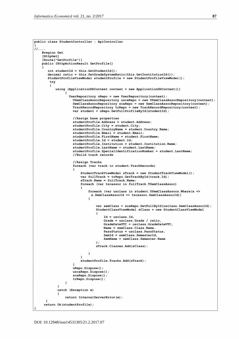
Fig. 3. The class diagram for the proposed system
The diagram contains the classes related to the
education process, including information
about students, classes, grades, track record,
semesters and the associations between all
these entities.
In order to implement the conceptual model,
we used the .NET framework and its
capabilities: entity framework model and
model-view-controller technology. In the
following sequences we present some pieces
of representative code.
The model for StudentProfile is implemented
as follows:
public class StudentProfileViewModel {
public int Id { get; set; }
public string FirstName { get; set; }
public string LastName { get; set; }
public string SpecialIdentificationNumber { get; set; }
public string Email { get; set; }
public string Address { get; set; }
public string City { get; set; }
public string Institution { get; set; }
public string CountryName { get; set; }
public List<StudentTrackViewModel> Tracks { get; set; }
}
The controller implements the public method
GetProfile() which returns a result of
IHttpActionResult type.
Informatica Economică vol. 21, no. 2/2017 87
DOI: 10.12948/issn14531305/21.2.2017.07
public class StudentController : ApiController
{
//……….
#region Get
[HttpGet]
[Route("GetProfile")]
public IHttpActionResult GetProfile()
{
int studentId = this.GetStudentId();
decimal ratio = this.GetGradeSystemRatio(this.GetInstitutionId());
StudentProfileViewModel studentProfile = new StudentProfileViewModel();
try
{
using (ApplicationDbContext context = new ApplicationDbContext())
{
UserRepository uRepo = new UserRepository(context);
USemClassAssocRepository uscaRepo = new USemClassAssocRepository(context);
SemClassAssocRepository scaRepo = new SemClassAssocRepository(context);
TrackRecordRepository trRepo = new TrackRecordRepository(context);
var student = uRepo.GetFullProfileById(studentId);
//Assign base properties
studentProfile.Address = student.Address;
studentProfile.City = student.City;
studentProfile.CountryName = student.Country.Name;
studentProfile.Email = student.Email;
studentProfile.FirstName = student.FirstName;
studentProfile.Id = student.Id;
studentProfile.Institution = student.Institution.Name;
studentProfile.LastName = student.LastName;
studentProfile.SpecialIdentificationNumber = student.LastName;
//Build track records
//Assign Tracks
foreach (var track in student.TrackRecords)
{
StudentTrackViewModel sTrack = new StudentTrackViewModel();
var fullTrack = trRepo.GetTrackById(track.Id);
sTrack.Name = fullTrack.Name;
foreach (var tscassoc in fullTrack.TSemClassAssoc)
{
foreach (var usclass in student.USemClassAssocs.Where(x =>
x.SemClassAssocId == tscassoc.SemClassAssocId))
{
var semClass = scaRepo.GetFullById(usclass.SemClassAssocId);
StudentClassViewModel sClass = new StudentClassViewModel
{
Id = usclass.Id,
Grade = usclass.Grade / ratio,
GradeDateUTC = usclass.GradeDateUTC,
Name = semClass.Class.Name,
PassStatus = usclass.PassStatus,
SemId = semClass.SemesterId,
SemName = semClass.Semester.Name
};
sTrack.Classes.Add(sClass);
}
}
studentProfile.Tracks.Add(sTrack);
}
uRepo.Dispose();
uscaRepo.Dispose();
scaRepo.Dispose();
trRepo.Dispose();
}
}
catch (Exception e)
{
return InternalServerError(e);
}
return Ok(studentProfile);
}

88 Informatica Economică vol. 21, no. 2/2017
DOI: 10.12948/issn14531305/21.2.2017.07
Based on the implemented models and the
controllers we can get an adaptive user
interface, according to the Figure 3 and Figure
4.
Fig. 3. The Adaptive User Interface for a specific track
Fig. 4. The Adaptive User Interface for a specific class of students
The user interface uses the benefits of MVC
(Model-View-Controller) paradigm and it
gets the information offered by the
controllers. The model is implemented in our
prototype by using the entity-framework
capability in .NET platform.
6 Conclusion
The need for a performant UISB has been
addressed in several previous articles [1], [2].
After modelling the University Information
Systems using a BPMN approach, and
transforming the BPMN standard type
services into a Service Oriented Architecture,
in this article we aimed to develop a general

Informatica Economică vol. 21, no. 2/2017 89
DOI: 10.12948/issn14531305/21.2.2017.07
model and a practical implementation on the
.NET platform for the adaptive user interface
(AUI) of the University Information SOA-
BUS system (UISB).
The focus on the UI design revealed several
trends among front-end developers. We refer
mainly to the need to plan the best interface of
an application according to the devices, the
user’s needs, the technologies used, the
resources available to develop the system etc.
In this regard, we noticed that there are two
major designs used when creating the UI,
namely responsive web design (RWD) and
adaptive web design (AWD). While both of
the design practices involve different
requirements, the most used nowadays
remains the Adaptive Web Design due to the
specific optimization available according to
the device from which the user access the
application. Considering the wide spread of
the AWD we proposed an adaptive user
interface model for the UISB. Taking into
account the Cameleon reference framework
and the Model-View-Controller paradigm, we
designed the models and artefacts in the
adaption process, including the phases
covered. As we have seen, there are different
aspects that should be considered when
designing the UI for different devices. More
than that, the technologies used have a direct
impact on the UI components and the way
they are presented to the users.
Acknowledgments:
„This work was supported by a grant of the
Romanian National Authority for Scientific
Research and Innovation, CNCS –
UEFISCDI, project number PN-II-RU-TE-
2014-4-0748”.
References
[1] C. Strîmbei, O. Dospinescu, R. Strainu and
A. Nistor, “Software Architectures-
Present and Visions,” Informatica
Economica, vol. 19, no. 4, p. 13, 2015.
[2] C. Strȋmbei, O. Dospinescu, R. Strainu and
A. Nistor, “The BPMN Approach of the
University Information Systems,”
Ecoforum Journal, vol. 5, no. 2, 2016.
[3] I. Zappia, D. Giuli, F. Paganelli and L.
Chisci, Model and framework for
multimodal and adaptive user interfaces
generation in the context of business
processes development, Firenze:
Universita degli Studi Firenze, 2014.
[4] J. Vogt and A. Meier, “An adaptive user
interface framework for eHealth services
based on UIML,” in Proceedings of the
23rd Bled eConference eTrust:
Implications for the Individual, Enterprises
and Society, Bled, 2010.
[5] S. Bongartz, Y. Jin, F. Paternò, J. Rett, C.
Santoro and L. Spano, “Adaptive user
interfaces for smart environments with the
support of model-based languages,” in
International Joint Conference on Ambient
Intelligence, 2012.
[6] M. Nebeling and M. Norrie, “Responsive
design and development: methods,
technologies and current issues,” in
International Conference on Web
Engineering, 2013.
[7] E. Marcotte, “Responsive Web Design,” 5
2010. [Online]. Available:
https://alistapart.com/article/responsive-
web-design. [Accessed 09 02 2017].
[8] T. Altenburger, A. Guerriero, A. Vagner
and B. Martin, “Toward adaptive context-
aware user interfaces for better usability
and productivity in aec collaborative
tasks,” in Proceedings of the CIB W78
2010: 27th International Conference, 16-18
November, Egypt, Cairo, 2010.
[9] S. Mohorovičić, “Implementing responsive
web design for enhanced web presence,” in
Information & Communication
Technology Electronics &
Microelectronics (MIPRO), 2013.
[10] B. Gardner, “Responsive web design:
Enriching the user experience.” Sigma
Journal: Inside the Digital Ecosystem, vol.
11, no. 1, pp. 13-19, 2011.
[11] D. Bluestone, “Combining Responsive
and Adaptive Strategies to Solve Mobile
Design Challenges,” 2 10 2012. [Online].
Available:
http://uxmag.com/articles/combining-
responsive-and-adaptive-strategies-to-
solve-mobile-design-

90 Informatica Economică vol. 21, no. 2/2017
DOI: 10.12948/issn14531305/21.2.2017.07
challenges?rate=vXJQiJlBnkK7_u2h-i-
ikZIuNOxmXlqtEERci7KF0oQ.
[Accessed 18 3 2017].
[12] J. Coutaz, J. Crowley, S. Dobson and
D. Garlan, “Context is the key,”
Communications of the ACM, vol. 48, no.
3, pp. 49-53, 2005.
[13] G. Calvary, J. Coutaz, D. Thevenin, Q.
Limbourg, L. Bouillon and J.
Vanderdonckt, “A unifying reference
framework for multi-target user
interfaces,” Interacting with computers,
vol. 15, no. 3, pp. 289-308, 2003.
[14] V. Ganneau, G. Calvary and R.
Demumieux, “Learning Key Contexts of
Use in the Wild for Driving Plastic User
Interfaces Engineering,” in Engineering
Interactive Systems 2008 (2nd Conference
on Human-Centred Software Engineering
(HCSE 2008) and 7th International
workshop on TAsk MOdels and DIAgrams
(TAMODIA 2008, Pisa, Italy, 2008.
[15] K. Gajos, K. Everitt, D. Tan, M.
Czerwinski and D. Weld, “Predictability
and accuracy in adaptive user interfaces,”
in Proceedings of the SIGCHI Conference
on Human Factors in Computing Systems,
2008.
[16] V. Jaquero, F. Montero, J. Molina and
P. Gonzalez, “Intelligent User Interfaces:
Past, Present and Future,” Engineering the
User Interface, pp. 1-12, 2009.
[17] L. Balme, A. Demeure, N. Barralon, J.
Coutaz and G. Calvary, “Cameleon-rt: A
software architecture reference model for
distributed, migratable, and plastic user
interfaces.” in European Symposium on
Ambient Intelligence, 2004.
[18] F. Paternò, C. Santoro and L. Spano,
“ConcurTaskTrees,” HIIS Laboratory,
ISTI-C.N.R., Pisa, Italy, 2010.
[19] J. Van den Bergh and K. Coninx,
“Model-based design of context-sensitive
interactive applications: a discussion of
notations,” in TAMODIA '04 Proceedings
of the 3rd annual conference on Task
models and diagrams, Prague, Czech
Republic, 2004.
Octavian DOSPINESCU graduated the Faculty of Economics and Business
Administration in 2000 and the Faculty of Informatics in 2001. He achieved
the PhD in 2009 and he has published as author or co-author over 30 articles.
He is author and co-author of 10 books and teaches as an associate professor
in the Department of Information Systems of the Faculty of Economics and
Business Administration, University Alexandru Ioan Cuza, Iasi. Since 2010
he has been a Microsoft Certified Professional, Dynamics Navision, Trade &
Inventory Module. In 2014 he successfully completed the course “Programming Mobile
Applications for Android Handheld Systems” authorized by Maryland University. He is
interested in mobile devices software, computer programming and decision support systems.
Cătălin STRÎMBEI has graduated the Faculty of Economics and Business
Administration of Al.I.Cuza University of Iaşi in 1997. He holds a PhD
diploma in Cybernetics, Statistics and Business Informatics from 2006 and he
has joined the staff of the Faculty of Economics and Business Administration
as teaching assistant in 1998 and as associate professor in 2013. Currently he
is teaching Object Oriented Programming, Multi-Tier Software Application
Development and Database Design and Administration within the
Department of Business Information Systems, Faculty of Economics and Business
Administration, Al.I.Cuza University of Iaşi. He is the author and co-author of four books and
over 30 journal articles in the field of object oriented development of business applications,
databases and object oriented software engineering.

Informatica Economică vol. 21, no. 2/2017 91
DOI: 10.12948/issn14531305/21.2.2017.07
Roxana-Marina STRAINU graduated in 2014 the Master of Business
Information Systems at the Faculty of Economics and Business
Administration, Alexandru Ioan Cuza University of Iasi. She also graduated
the Faculty of Mathematics in the year 2005. She is interested in developing
smart systems and mobile applications on Android platform. Now she is a PhD
student in the business information systems area.
Alexandra NISTOR graduated the Faculty of Economics and Business
Administration in 2011 and the Master of Business Information Systems at the
Faculty of Economics and Business Administration in 2013. Her research
interests include the use of automated testing in small and medium companies.
Now she is a PhD student in the business information systems area.