a beginner’s guide to creating - visme · a beginner’s guide to creating made with visme. t y p...
TRANSCRIPT
TYPES OF
INFOGRAPHICSPart 2

Information canvisualize in fivedifferent ways
Chronologically
Geographically
Alphabetically
Hierarchically
Categorically
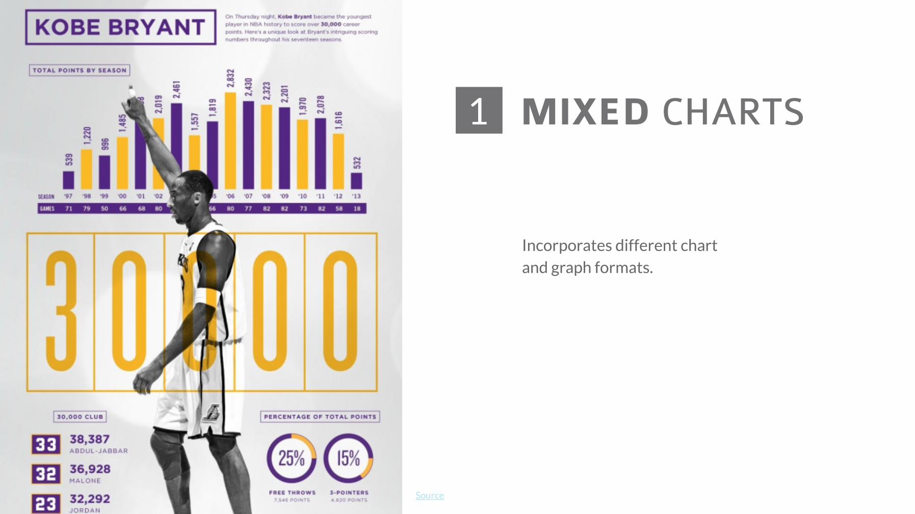
MIXED CHARTS1
Source
Incorporates different chartand graph formats.

INFORMATIONAL/ LIST
2
Source
Composed mostly of text and doesn’trely too much on graphs, charts orother visual elements.
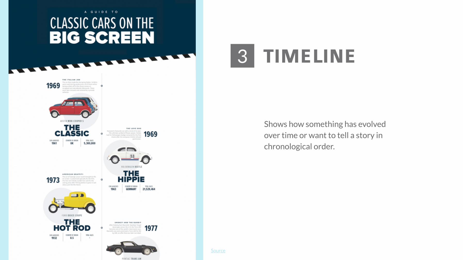
TIMELINE3
Source
Shows how something has evolvedover time or want to tell a story inchronological order.
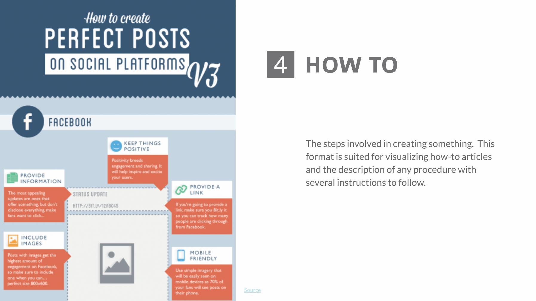
HOW TO4
Source
The steps involved in creating something. Thisformat is suited for visualizing how-to articlesand the description of any procedure withseveral instructions to follow.
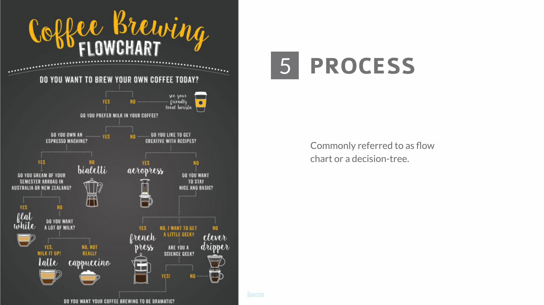
PROCESS5
Source
Commonly referred to as flowchart or a decision-tree.

COMPARISON6
Source
Making comparisons between two products,people, ideas, things, events or places.

LOCATION7
Source
Ideal for comparing regional andglobal statistics on a relevant subjectthat readers care about.

PHOTO-GRAPHIC8
Source
Results from the combination of images andgraphic elements such as simple line charts,icons or text, as seen here.
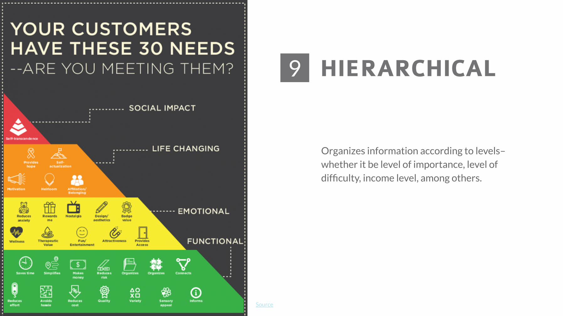
HIERARCHICAL9
Source
Organizes information according to levels–whether it be level of importance, level ofdifficulty, income level, among others.
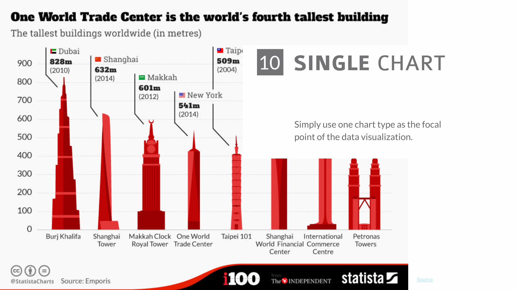
SINGLE CHART10
Source
Simply use one chart type as the focalpoint of the data visualization.
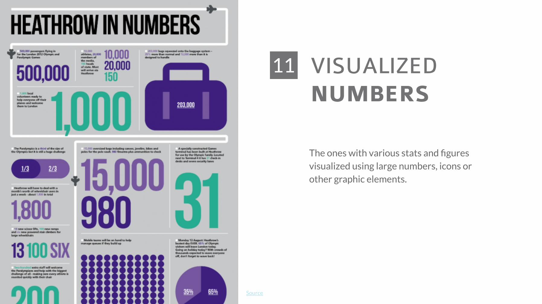
VISUALIZEDNUMBERS
11
Source
The ones with various stats and figuresvisualized using large numbers, icons orother graphic elements.

Uses visual metaphors such as thehuman body to display information.
Alternatively, you can also make use of lessfigurative anatomical infographics by usingrepresentations of objects and displaying theparts that make up their anatomy.
Source
ANATOMICAL 12
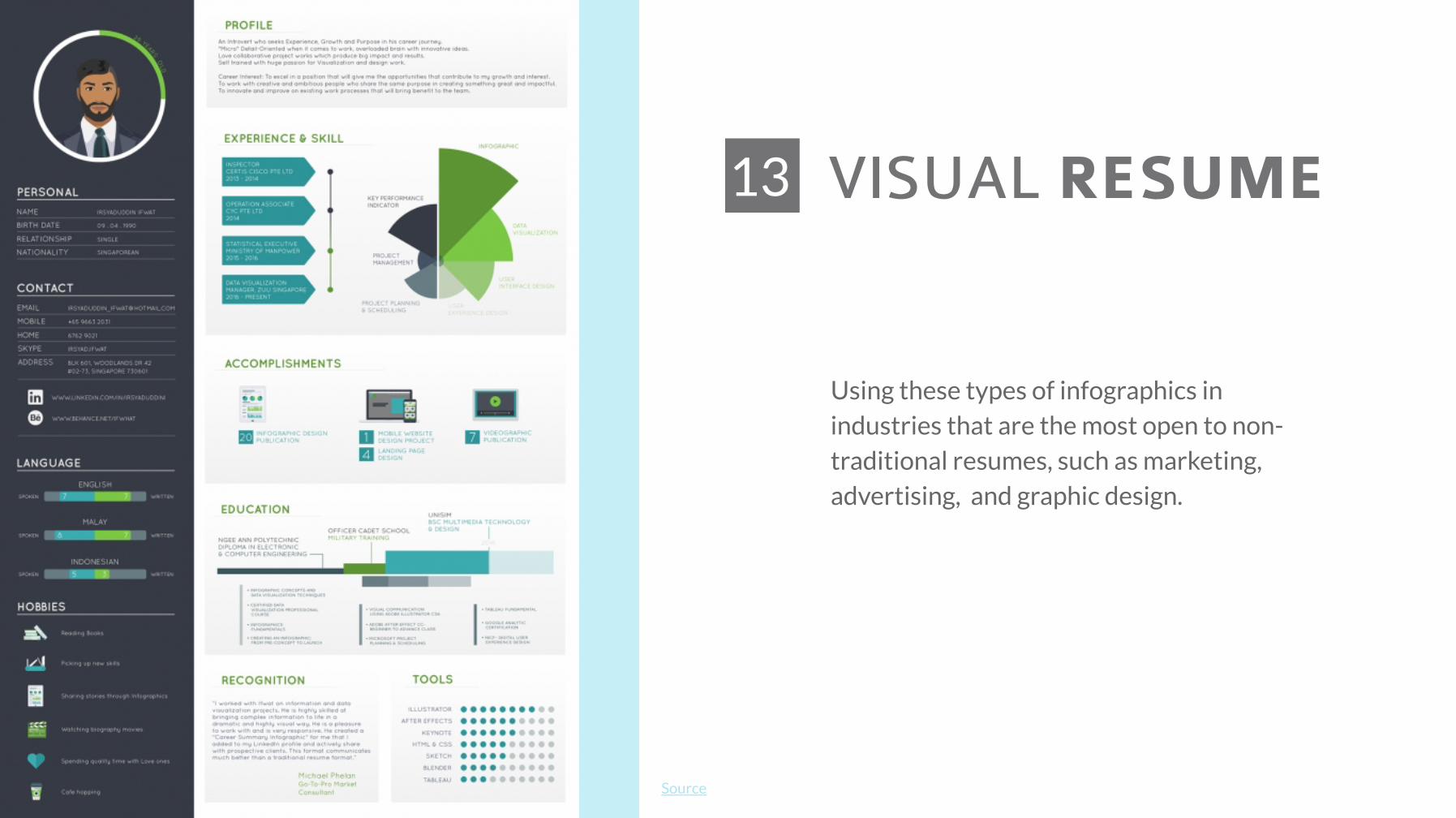
VISUAL RESUME13
Source
Using these types of infographics inindustries that are the most open to non-traditional resumes, such as marketing,advertising, and graphic design.
