a case study color as a visual language: focused on tv
TRANSCRIPT

1
A Case Study Color as a Visual Language:
Focused on TV Commercial
Cindy Muljosumarto
Desain Komunikasi Visual, Fakultas Seni dan Desain,
Universitas Kristen Petra, Surabaya, Indonesia
E-mail: [email protected]
Abstract
Color is an important element of a visual design, it also an essential element in a TV Commercial (TVC).
This paper examined color as a „language‟ to convey the TVC message to the audience, using Kobayashi‟s
Color Image Scale to be the color descriptor combined with psychological colors theory and some data from
professionals. To gain more specific result the data also compared with an experimental method that has
been done with a group of potential target audience of this product. The last step is an analysis and
conclusion. The result will be a new finding about color function in advertising and hopefully could lead
into new creative ideas of TVC ads.
Keywords: Color, visual language, TV commercial.
Introduction
A picture could create visual information through a
combination of line, shape and color in any media.
We use this information using our brain and eyes
to interpret the real world (Messaris, 1997). This
visual information could affect someone behavior,
and color is a part of that visual information.
Kareklas et al. (2013) also mentioned that, “Color
is a dominant visual feature which can affect
consumer perceptions and behavior.”
Color in visual communication
Gorn et al. (1993) mentioned there are basic
independent properties of colors according to color
theorists. Hue is the pigment of color. Chroma is
the richness or deepness of the color (saturation)
which highly saturated colors have a greater
proportion of color pigment in them. Value is the
degree of lightness or darkness of the color relative
to a neutral scale, which extends from pure white
to pure black. They also stated that color is a visual
stimulus. A higher level of chroma (saturation) and
value (lightness) influence the feeling of arousal
and relaxation respectively (in each specific case).
The greater feelings of relaxation that affected by
value, appears to favorably influence the brand
attitude. On the other hand, chroma affected
arousal and makes intuitive sense. The effect of
color in ad could suggest the peripheral route to
persuasion. According to Sherin (2012), hues and
tones could enhance the message while using a
repeated color and elements in a design could
create a unified look and feel. If we look from the
color spectrum, color are associated with two
moods: the warm, active and exciting qualities of
red and its analogues hues; and the cool, passive
and calming qualities of blue, violet and green. The
warm color is suitable for an outwardly integrated
type of people and cold color is suitable for an
inwardly integrated type of people. Therefore the
warm color is better to convey pleasant and
welcomed feelings, which could be used in the ad
message. Color also has psychological effects that
influencing feeling and emotion. Felix Deutsch
proved that color could make changes in blood
pressure, pulse-frequency and rhythm of a person
(as cited in Birren, 2013). Through the research
consumer in psychological aspect, this knowledge is
useful to create an effective message for the target
audience.
Visual Language As mentioned in Malamed, C. (2011), vision is the dominant sense for acquiring perceptual infor-mation. It is easier and faster for brain to collect information through visual experience. Human have a large capacity for picture memory and could remember thousands of images with few errors. We depend on visual language for its efficient and informative value to be able acquiring a lot of information. Although according to Kress and van Leeuwen (2006) (as cited in Botturi, Stubbs, 2008) visual languages are not that transparent and universally understood because they are have a culturally specific meaning. In an interdisciplinary senses, visual language have multiple roles, first is to communicate a message through a visual or functional language, second is, visual language
NIRMANA, Vol. 17, No. 1, Januari 2017, 1-9 DOI: 10.9744/nirmana.17.1.1-9
ISSN 0215-0905
Jurnal Desain Komunikasi Visual Nirmana, Vol. 17, No. 1, Januari 2017: 1-9
2
could portray a synthetic idea, an image or do a metaphor from a complex idea. Thrid, visual language could produce meanings for its use. (Winograd, 1996; Botturi, 2006; Kress & van Leeuwen, 2006; as cited in Botturi, Stubbs, 2008). In order to learn about human behavior, thinking process, learning process to do something, we could observing their cultural aspects which influencing each individual human processes. Visual language is used to interpret and simplify the complex compound ideas about culture so it could be easier to understand. Botturi also mentioned that visual language might develop creativity and enhance communication (Botturi, Stubbs, 2008: 53- 131).
TV Commercial According to Henrik Dahl (as cited in Messaris, 1997) most of the people are not searching for an advertising intentionally. In a contrary, they are developing more skills these days to avoid ads. The rapid advance of technologies, provide them to choose their own need for information. They could filter what they want to see or not. This pheno-menon initiates the advertiser to reverse the trend by using the Internet and other new media (Ali, 2016). According to Ali, to reach and persuade the consumer, a creative ad is necessary to gain their attention. A creative ad should be different and unique but still relevant with the consumer needs. Creative TV ads could effectively create a positive and better ad recall, which can be transferred to the brand. These two aspects are necessary to measure the effectiveness of that ad, whether the audience could respond the ad message or not. Meanwhile the content of the message and the advertising direction should match with the brand needs itself. (p.928 - 929). An effective method to grab audience attention and willingly to expose themselves toward TV commer-cial, is through a visual manipulation such as manipulating a symbol to grab audience‟s atten-
tion. According to a psychologist Roger Shepard, an unusual things or different from our expectation could naturally makes our human perceptual system to pay special attention (Messaris, 1997).
One of the example is surrealism approach that used in an ads, can make audience to decipher the meaning of the ads. This action means, target
audience already involve in the communication
process of the ads. Therefore Messaris described that this surrealism approach is suitable for visual advertising to gain audience attention while conveying the ad message.
Color in TV Commercial
TV commercial is a part of advertising campaign
strategy. Which consist of a lot of visual elements
such as graphic and color, beside that sounds such
as music, dialog, and audio effects. To create a good
quality of TVC an expert in each element is
needed, because of these reason TVC commercial
tends to cost a lot compare to another media.
The important element in video is a visual and an
audio which applicable in TV commercial (TVC).
Visual elements consist of graphic, motion graphic
and color. Color holds an important part in visual
composition, because color will control the unity
and continuity of the designs. Color also has a role
to set the mood or tone for the story. The color
usage will be very crucial during the story to let
audience understand the message. Because of this
fact, there is a professional editor or colorist in
every TVC production, and many of them earn the
most (Amri and Nicholas, 2013).1 The similar
opinion about color usage also stated by Hornung,
that the color used in print ad advertising is for
appealing reason and to help to tell the story
(Hornung, 2012: 127).
It is important to create concept before the shooting
progress. This concept is depends on the product
brand, the message and the target audience.
According to Mr. Avissena Amri (TV Commercial
Director) usually target audience will be a
guidance to determine the TV commercial color
mood. For example a children milk product but the
target market is their mother, so the color usage
doesn‟t have to be a saturated primary color but
desaturated color also could be possible to use.
Nowadays the usage of color spectrum already has
a lot of variation and this also a common things
that we can found in every TV commercial, so
audience already get used to it. Even though we
could find a stereotype color template for certain
product or mood tone, according to Mr. Avissena.
For example, to create the girly and cute mood,
Japanese or Korean looks, they use mostly pastel
color. For the real storytelling they will use earth
color, and for modern look they will use cold color.
Although it is not a necessary rule to obey, but in
advertising some products already have a
requirement or a concept for the brand identity so
it‟s quite difficult to do some experimental things
with color.2
To produce a good and natural color for TV
commercial, the shooting progress is the most
important things such as surrounding ambience,
art properties, wardrobe, lighting (indoor or
1 An interview discussion with professional movie-video
art director and TV commercial Director, Mr. Nicholas
Nicky and Mr. Avissena Amri. 2 Avissena Amri - TV commercial director

Cindy M.: A Case Study Color as a Visual Language
3
outdoor), filter, background and even the clarity of
air. It would be better to create the color during the
shooting progress not in the editing (color grading)
or post editing progress.3 According to Mr.
Avissena, people tend to like desaturated color
because of their pervious experience and preference
with the color in the cinema movie. Another
interesting fact is the volume color effect that we
can found in the process of making TV commercial.
Apparently the settings place, the weather and
light are the factors, which can make one
commercial looks different than the others. For
example, it would produce a different result to
shoot in Indonesia and in Korea even though both
of them using the same equipment, properties and
crew. As Mr. Avissena mentioned in the interview
session, the most beautiful picture will be captured
in the area, which has good sun position and less
polluted air. He also mentioned that this kind of
effect might be not going to happen if we use indoor
location with artificial lighting.
Related work
Some paper which discussed similar topic, such as
Panigyrakis and Kyrousi (2013) in this paper they
reviewing the literature that published since 1985
– 2012 regarding color in advertising and suggest
some direction for the future research. According to
Panigyrakis and Kyrousi (2013) most of the past
research article was anecdotal rather than
systematical and empirical but a little progress has
been made in this past decade. Most of them are
lack of clear directions in their findings and lack of
relevant integrated theory. Also it is not easy to
establish the causal between color as an inde-
pendent variable and consumer responses as the
dependent variable. There is also some conflicting
findings between the extents studies, for example
Lichtlé (2009) said preferred colors increase brand
memory whereas Meyers-Levy and Peracchio
(1995) said black and white ads outperformed
colored ads in terms of recall of ad claims and
products attitudes when high resources demands
and opposite to the low resources demands (as
cited in Panigyrakis and Kyrousi, 2013). Another
recent paper such as Mazhar Ali (2016) which
investigated the advertising effectiveness of crea-
tive TV advertisement for high involvement
products and resulted that creative Ads are better
than control Ads in generating favorable attitude
toward ad and high Ad recall, but not effective to
persuading customer to buy the product. There is
also recent paper Li (2016) which using multi-
modal discourse approach to analyze the inter-
personal meaning in Coca Cola TV Advertisement
3 Nicholas Nicky – video art and movie director
hilltop version. This paper has made an attempt to
investigate the interpersonal meaning is
representated and communicated through multi
modes such as image (color, prespective, distance),
movement (gaze, gesture, facial ex-pression) and
sound (speech, music, accented syllables, sonic
interaction, rhythm group) in coca cola hilltop
jingle. The result, these multiple semiotic modes
generate and communicate the interpersonal
meaning that enacted between the depicted
participants and the audience.
Research Objective
This research objective is to determine that color
could be a „language‟ to convey the TVC message to
the audience, using Kobayashi‟s Color Image Scale
to be the color descriptor combined with
psychological colors theory and some data from
professionals. To gain more specific result the data
also compared with an experimental method that
has been done on potential target audiences. This
study will analyze the audience respond between
the color TV commercial and black and white
version. The last step is an analysis and conclusion.
The result will be a hypothesis that color could be a
language for TVC, which mean to search a
possibility of using only color element to deliver the
message. Hopefully the end result will be a new
finding about color function in TV commercial and
could lead to build fresh and new creative ideas.
Method
This research used Kobayashi‟s Color Image Scale
to understand how color combination can affect
people felling and their psychological emotions. In
this color chart, Kobayashi manage to describe
people emotions in 180 words, which correlated
with the color combination. Kobayashi research
methodology and practical application guidelines
have been widely accepted and used by major
industries in many Asian and Europe countries
and suggest over 1.000 associated color
combination that can be applied in fashion, interior
design, product design and visual media industries
(Yoon et al., 2009). The selection of the TVC is
based on the objective of this research which to
determine color as a visual language to convey the
ads message and IKEA‟s „Bright, shiny colors‟ TVC
is using colors as its main story and message.
IKEA is a home furnishing company that brought
its Scandinavian design to Britain and opened
their first store in Manchester in 1987 (Baker, R.,
2014, November 03, Ikea: a history in ads).
Nowadays, IKEA stores are widespread known in
the world including in Asia. IKEA launch the
„Bright, shiny colors‟ campaign coincides with the

Jurnal Desain Komunikasi Visual Nirmana, Vol. 17, No. 1, Januari 2017: 1-9
4
launch of their 2013 IKEA Catalogue in the UK
and Ireland on September 8, during the „X-Factor‟
on ITV1. Three version durations of the TVC have
been produced including 60” and 30” that run until
October 7 (IKEA Inspires with 'Bright, Shiny
Colours' | LBBOnline. n.d.), but also can be acces-
sed through the Internet and YouTube. Mother an
advertising agency based in London creates the
„Bright Shiny Colours‟ TVC.
These results are later to be compared with the
experimental research using experimental rese-
arch on a group of people. Paningyrakis and
Kyrousi (2013) suggested that experimental rese-
arch is effectively capturing the impact as consu-
mer response of color in advertising context.
Therefore, this research also using the experiment-
tal research to gain more specific data. The selected
TVC was presented to a group of people that
consist of 16 potential participants that never saw
this TVC before. This group was selected through a
different background of nationality, education,
occupation, gender and age, but still considered as
the target audience of this product. The selection
based on the assumption that this TVC might be
accessed worldwide through the Internet. This TV
commercial will be shown to the group in three
stages.
Analysis using Kobayashi’s Color Image
Scale
The TVC tells a story of a woman who goes on a
magical journey through the new IKEA Catalogue.
At first the woman house was seen as white and
beige.
Source: YouTube.com
Picture 1. First scenes
After that she steps through the catalogue into the
IKEA showcase that full of inspiring design items
and furnitures.
Source: YouTube.com
Picture 2. IKEA TVC scenes
She ends her journey when she emerges from the
other side of the catalogue and brings out the
inspiration to transform her home.
Source: YouTube.com
Picture 3. IKEA TVC scenes
To conduct the analysis some scenes are collected
to create the color palette and later be described
using color combination image scale and key word
image scale on the Kobayashi‟s Color Image Scale.
Source: https://s-media-cache-ak0.pinimg.com/564x/2a/87/
55/2a8755f84e4b1075cd34a1823d3114d6.jpg
Picture 4. Color combination image scale
Cindy M.: A Case Study Color as a Visual Language
5
Source: http://thelandofcolor.com/wp-content/uploads/
2010/12/Color-Image-Scale-final-flat.jpg
Picture 5. Key word image scale
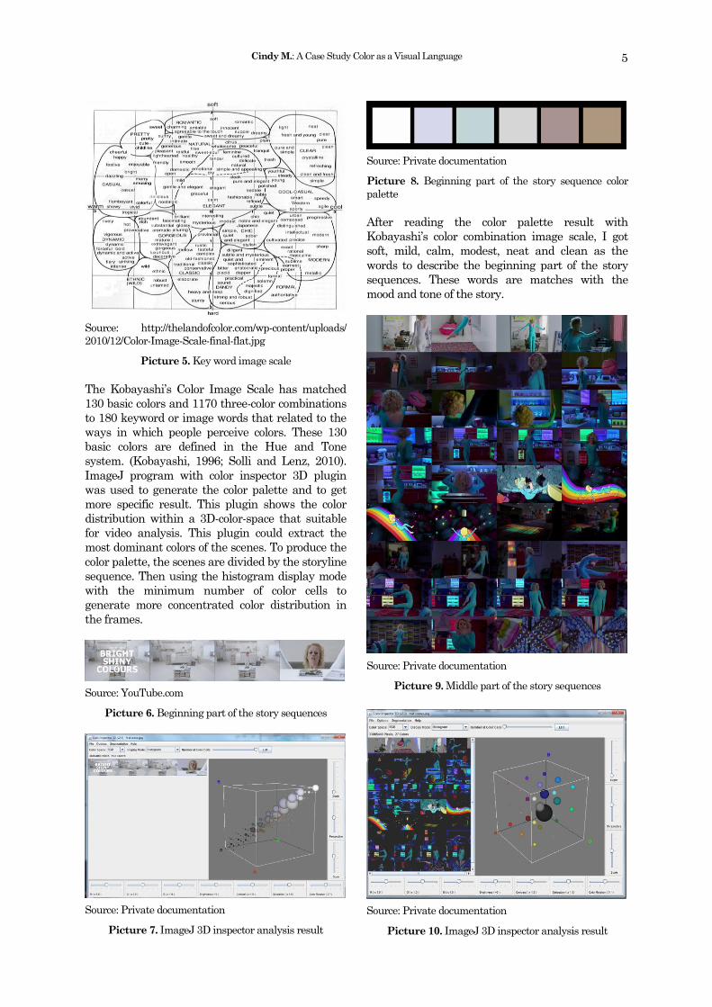
The Kobayashi‟s Color Image Scale has matched
130 basic colors and 1170 three-color combinations
to 180 keyword or image words that related to the
ways in which people perceive colors. These 130
basic colors are defined in the Hue and Tone
system. (Kobayashi, 1996; Solli and Lenz, 2010).
ImageJ program with color inspector 3D plugin
was used to generate the color palette and to get
more specific result. This plugin shows the color
distribution within a 3D-color-space that suitable
for video analysis. This plugin could extract the
most dominant colors of the scenes. To produce the
color palette, the scenes are divided by the storyline
sequence. Then using the histogram display mode
with the minimum number of color cells to
generate more concentrated color distribution in
the frames.
Source: YouTube.com
Picture 6. Beginning part of the story sequences
Source: Private documentation
Picture 7. ImageJ 3D inspector analysis result
Source: Private documentation
Picture 8. Beginning part of the story sequence color
palette
After reading the color palette result with
Kobayashi‟s color combination image scale, I got
soft, mild, calm, modest, neat and clean as the
words to describe the beginning part of the story
sequences. These words are matches with the
mood and tone of the story.
Source: Private documentation
Picture 9. Middle part of the story sequences
Source: Private documentation
Picture 10. ImageJ 3D inspector analysis result
Jurnal Desain Komunikasi Visual Nirmana, Vol. 17, No. 1, Januari 2017: 1-9
6
Source: Private documentation
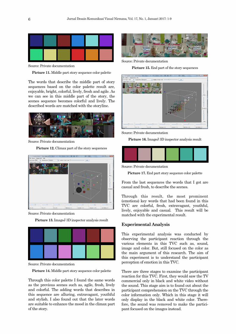
Picture 11. Middle part story sequence color palette
The words that describe the middle part of story
sequences based on the color palette result are,
enjoyable, bright, colorful, lively, fresh and agile. As
we can see in this middle part of the story, the
scenes sequence becomes colorful and lively. The
described words are matched with the storyline.
Source: Private documentation
Picture 12. Climax part of the story sequences
Source: Private documentation
Picture 13. ImageJ 3D inspector analysis result
Source: Private documentation
Picture 14. Middle part story sequence color palette
Through this color palette I found the same words
as the previous scenes such as, agile, fresh, lively
and colorful. The adding words that describes in
this sequence are alluring, extravagant, youthful
and stylish. I also found out that the later words
are suitable to enhance the mood in the climax part
of the story.
Source: Private documentation
Picture 15. End part of the story sequences
Source: Private documentation
Picture 16. ImageJ 3D inspector analysis result
Source: Private documentation
Picture 17. End part story sequence color palette
From the last sequences the words that I got are
casual and fresh, to describe the scenes.
Through this result, the most prominent
(emotions) key words that had been found in this
TVC are colorful, fresh, extravagant, youthful,
lively, enjoyable and casual. This result will be
matched with the experimental result.
Experimental Analysis
This experimental analysis was conducted by
observing the participant reaction through the
various elements in this TVC such as, sound,
image and color. But, still focused on the color as
the main argument of this research. The aim of
this experiment is to understand the participant
perception of emotion in this TVC.
There are three stages to examine the participant
reaction for this TVC. First, they would saw the TV
commercial only in black and white video without
the sound. This stage aim is to found out about the
participant comprehension on the TVC through the
color information only. Which in this stage it will
only display in the black and white color. There-
fore, the sound was removed to make the partici-
pant focused on the images instead.

Cindy M.: A Case Study Color as a Visual Language
7
Stage 1. Black and white video without sound
The first analysis is to find out the participant
comprehension about this video without revealing
any information beforehand.
Table 1. Participant comprehension
On this first stage, most of the participants know
what kind of video and the product, but some of
them still didn‟t know what kind of brand it is. This
result occurred because of the lack information in
the visual. Without the color information, the
IKEA logo on the magazine was blended with the
surrounding colors and easily missed. Meanwhile,
for the rest mislead answer was caused by the lack
of the brand experience and information about this
product. Therefore is hard for them to be aware of
this brand.
The next question is about the emotion that they
feel after watching this video. The result most of
the participant came out with negative emotion
such as boring and confused and lead them to
curiosity about this video instead of the product
itself. There are also some participant who feel this
video is boring and not interesting, these emotions
occurred because the lack information of color and
sound. Despite the majority answer, there are also
some participants who feel the positive feeling such
as, enjoyable, amazed, happy, fun and lively. They
ignored the lack of information in color and sound
and just focused on the image or the visual
movement.
Stage 2. Colored video without sound
In this stage, participant watched the same video
with color element but still without the sound. The
aim of this stage is to find the difference of the
participant reaction from the previous stage and to
find new perception from them with color as the
additional visual element.
Table 2. Participant comprehension
Through this stage, all participants already can
distinguish that this is a TV commercial. They also
could distinguish the product on this video compare
to the previous stages. Although some of them not
mentioning the brand name, but all of them could
mention the same category product. Most of them
said that they gain more information through the
color.
In this stage, all of the participant feel the same
positive emotions toward the video. Most of them
describe the emotion of this TVC are: happy,
interesting because of the color combination,
attractive, fun and comfortable. This stage proved
that the color addition in this TVC could enhance
the TVC message and lead the audience into the
expected mood.
Stage 3. Colored video with sound
In this stage the entire participant already
understand this TVC message and they could
recall the brand already. Most of them described
the same emotions that occurred in this TVC, such
as, happy, enjoyable, cheerful, interesting, likeable
and comfortable. Most of them choose the last
stage as the clearest stage to reveal the TVC
message, because the sound element was pre-
sented and enhance the message. But some of
them already knew the message at the second
stage which color was presented in the video. They
said the color addition help them to understand
this TVC better. Meanwhile, six participants said
they already knew the message since the first stage
because their knowledge of the brand.
Compared Analysis Results
From the Kobayashi‟s method, I managed to
describe the image words through the color, which
are: colorful, fresh, extravagant, youthful, lively,
enjoyable and casual. Afterward, from the experi-
mental research I summarized the participant
description for the emotions in this TVC, such as,
0 2 4 6 8 10
IKEA
Furniture no brand…
lamp
home theatre
video clip
magazine
Participant
What video is this?
0 2 4 6 8 10
IKEA
Furniture
Home decoration
Participant
What video is this?

Jurnal Desain Komunikasi Visual Nirmana, Vol. 17, No. 1, Januari 2017: 1-9
8
happy, enjoyable, cheerful, interesting, likeable
and comfortable. Using the Kobayashi‟s color
combination image scale I found out that the key
words are in the same area and matched with the
color palette results.
Source: Private documentation
Picture 18. Result scale
Conclusion
To produce an effective TV commercial a strong
concept will be needed, but this concept has to be
done with the good support from visual and audio
elements. Although through this experiment some
participant could understand the message only
with black and white image, but most of them
agrees that color image will enhance the product
information and will deliver the message better
than the black and white image. The reason is, in
this experimental the black and white video
actually not really portrayed as a non-colored video
because it still has the value and contrast which
help to distinguish the image. In another case, this
study proofed that color is an important element to
communicate the TV commercial message and it
could be a visual language of TV commercial.
According to Sherin (2012), color is one of the most
powerful tools for designer to communicate the
client‟s message. It can convey the idea, the
meaning, show or emphasis the emotions and has
cultural relevancy. The similar argument also
stated by Goncu-Berk (as cited in DeLong and
Marinson, 2012) that color can convey many
meanings and message at a time and reduce the
span of time to comprehend the message.
Through this research, I found that color could be a
visual language that contributes to convey an idea
or message in an ads, in this case is in TV
Commercial. Another founding is that we can
measure or describe the color image word and
found out the emotion or feeling that associate with
it using the Kobayashi‟s Image Color Scale. With
this information designer could create more
creative ads with an effective message using the
appropriate color combination. Still according to
Sherin (2012), a successful color relationship, not
only to catch and hold viewer‟s attentions but it can
also determine the consumer to buy or consume
the product. Therefore, the perfect color combina-
tions can be used to effectively communicate
information. In fact, if it used effectively color will
communicate the content and ideas quickly
without overwhelm the viewer‟s attention span.
The same argument also mentioned in Chatto-
padhyay and Yi (1993), that color could have
influence towards the ads message which also
relate to brand attitude. Creating a pleasant color
combination that called harmony is important,
because it has more to do with achieving the
intended reaction from audience. Just like in this
IKEA‟s TVC, the color harmony are helping the
audience to understand the visual message.
These uses of color is not only related with com-
position in graphic design but also more complex
consideration that require another aspect of visual
literacy from the designer. Such as how messages
are encoded and decoded by particular audience
with various background, education, culture and
age (Sherin, 2012). Therefore, this research result
is not absolute. Another reason is because the
result will be different and vary for another TVC
depends the message and the concept.
Research Limitation
This research was done with limited time and the
academic ability of the author to do the detail
experiment. It would be very recommended to do a
full and detail experiment with better method and
add more variant sample not only for TVC, for the
future study research.
References
Ali, M. (n.d.). Evaluating Advertising Effectiveness
of Creative Television Advertisements for
High Involvement Products. SSRN Electronic
Journal. doi:10.2139/ssrn.2752965
Gorn, G. J., Chattopadhyay, A., & Yi, T. (1993).
Color in Advertising. SSRN Electronic Jour-
nal. doi:10.2139/ssrn.2179429

Cindy M.: A Case Study Color as a Visual Language
9
Kareklas, I., Brunel, F. F., & Coulter, R. A. (2014).
Judgment is not color blind: The impact of
automatic color preference on product and
advertising preferences. Journal of Consumer
Psychology, 24(1), 87-95. doi:10.1016/j.jcps.
2013.09.005
Li, D. (2016). Multimodal Discourse Analysis of the
Interpersonal Meaning of TV Advertise-
ments. International Journal of Social Science
and Humanity,6(12), 934-938. doi: 10.18178/
ijssh.2016.v6.776
Messaris, P. (1997). Visual persuasion: the role of
images in advertising.
Panigyrakis, G. G., & Kyrousi, A. G. (2015). Color
effects in print advertising: a research update
(1985-2012). Corporate Communications: An
International Journal, 20(3), 233-255. doi:
10.1108/ccij-12-2011-0072
Yeon, Y. S., Tofle, R., Schwarz, B., Oprean, D., &
Young, C. J. (2009). Understanding the Mean-
ing of Color Environments: A Virtual Environ-
ment Exploratory Study. IDEC Proceeding,
2009 Annual Conference, 924-934.
Botturi, L., & Stubbs, S. T. (2008). Handbook of visual languages for instructional design: theo-ries and practices. Hershey, PA: Information Science Reference.
DeLong, M. R., & Martinson, B. (2012). Color and design. London: Berg.
Faber, B. (2013). Color Psychology and color thera-py. Mansfield Centre, USA: Martino Publish-ing.
Hornung, D. (2012). Colour a workshop for artists and designers (2nd ed.). London, England: Laurence King Publishing.
Kobayashi, S. (1991). Color image scale. Tokyo: Kosdansha International.
Malamed, C. (2011). Visual language for designers: principles for creating graphics that people understand. Beverly, MA: Rockport .
Sherin, A. (2012). Design elements, color funda-mentals: a graphic style manual for under-standing how color impacts design. Beverly, MA: Rockport .
Vera, N., M. Si. (2014). Semiotika dalam Riset Komunikasi. Bogor, Indonesia: Ghalia Indone-sia.