a comparative study of meetei mayek - typography day · a comparative study of meetei mayek. a...
TRANSCRIPT
A comparative study of Meetei Mayek
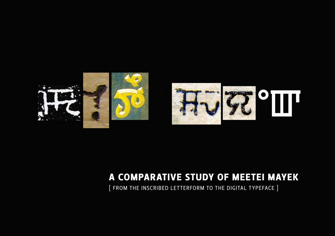
A compArAtive study of meetei mAyek [ From the inscribed letterForm to the digital typeFace ]
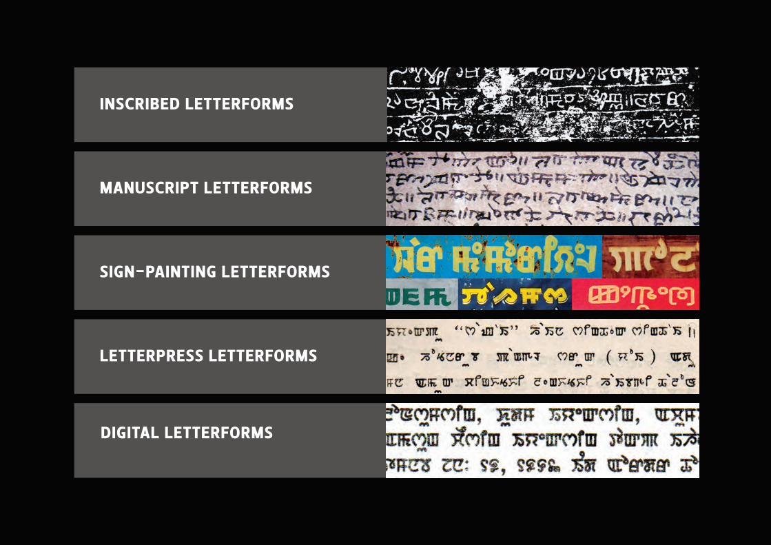
inscribed letterforms
mAnuscript letterforms
sign-pAinting letterforms
letterpress letterforms
digitAl letterforms
brief h istory of meetei mAyek
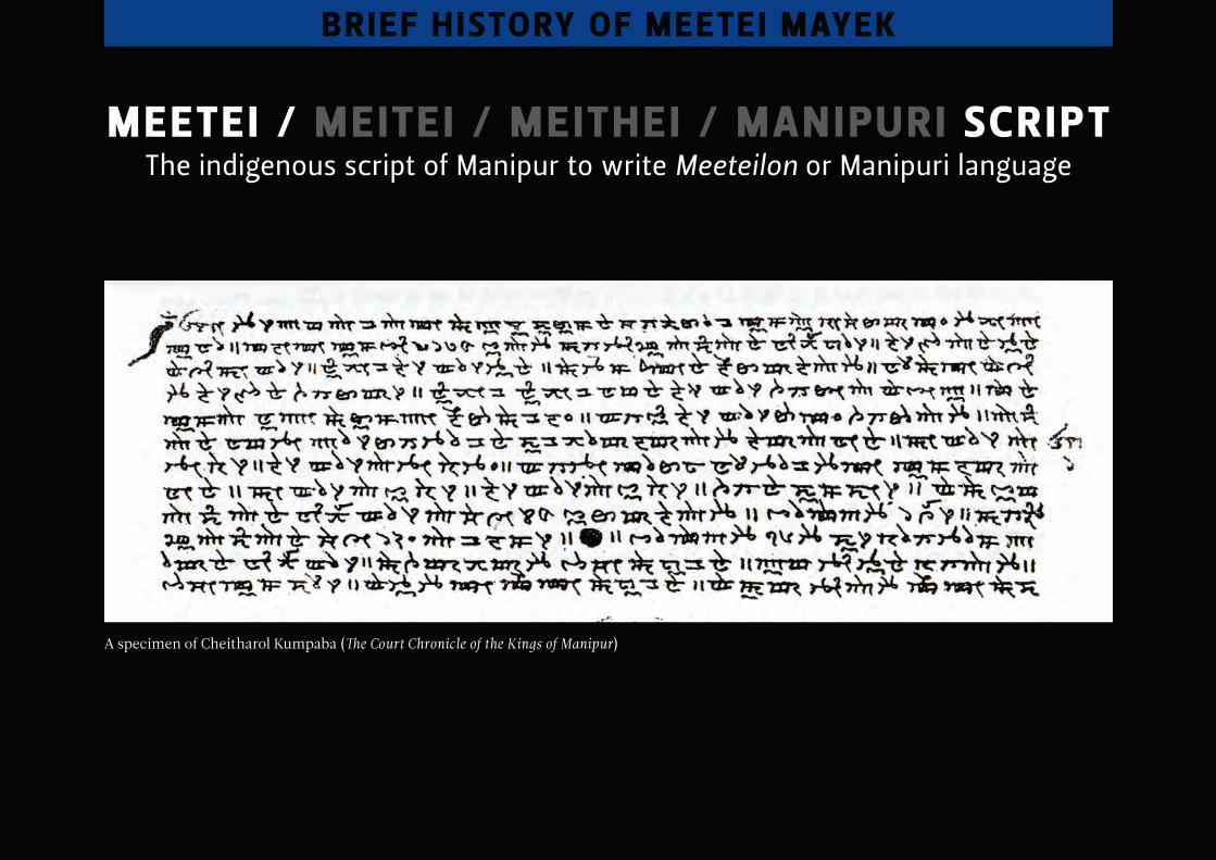
meetei / meite i / meithei / mAnipuri scriptthe indigenous script of manipur to write Meeteilon or manipuri language
A specimen of Cheitharol Kumpaba (The Court Chronicle of the Kings of Manipur)
brief h istory of meetei mAyek

meetei / meite i / meithei / mAnipuri scriptthe indigenous script of manipur to write Meeteilon or manipuri language
india
myanmar
manipur
brief h istory of meetei mAyek
india
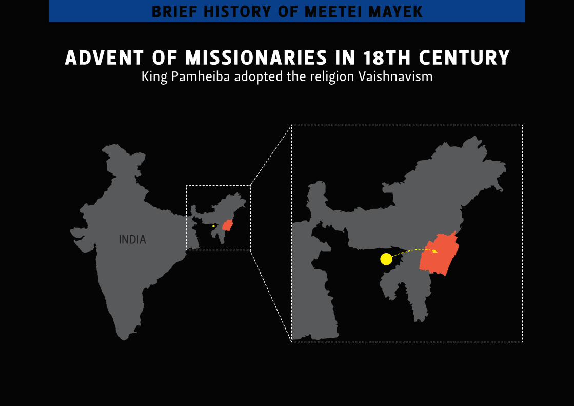
Advent of missionAries in 18th centuryKing pamheiba adopted the religion Vaishnavism
brief h istory of meetei mAyek
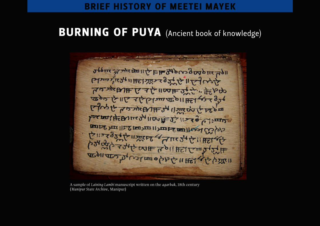
burning of puyA (ancient book of knowledge)
brief h istory of meetei mAyek
A sample of Laining Lambi manuscript written on the agarbak, 18th century (Manipur State Archive, Manipur)
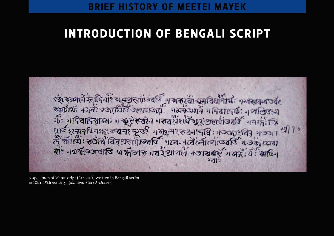
introduction of bengAli script
A specimen of Manuscript (Sanskrit) written in Bengali script in 18th-19th century. (Manipur State Archives)
brief h istory of meetei mAyek
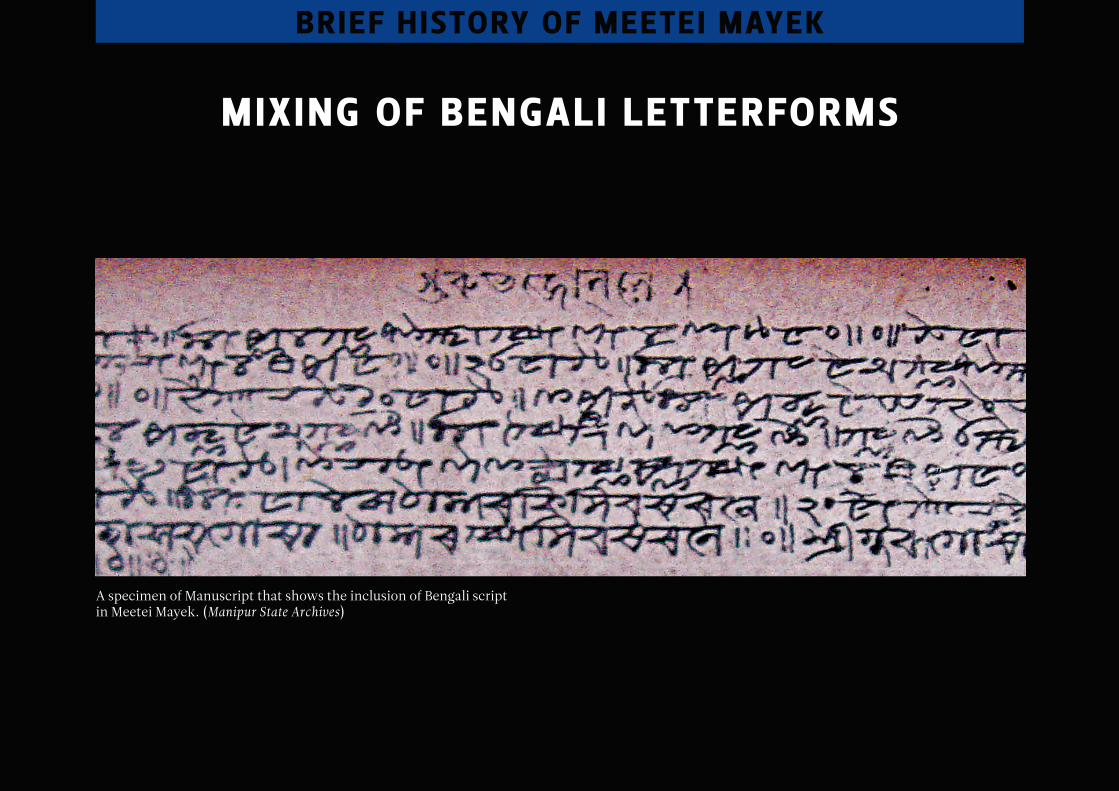
mixing of bengAli letterforms
A specimen of Manuscript that shows the inclusion of Bengali script in Meetei Mayek. (Manipur State Archives)
brief h istory of meetei mAyek
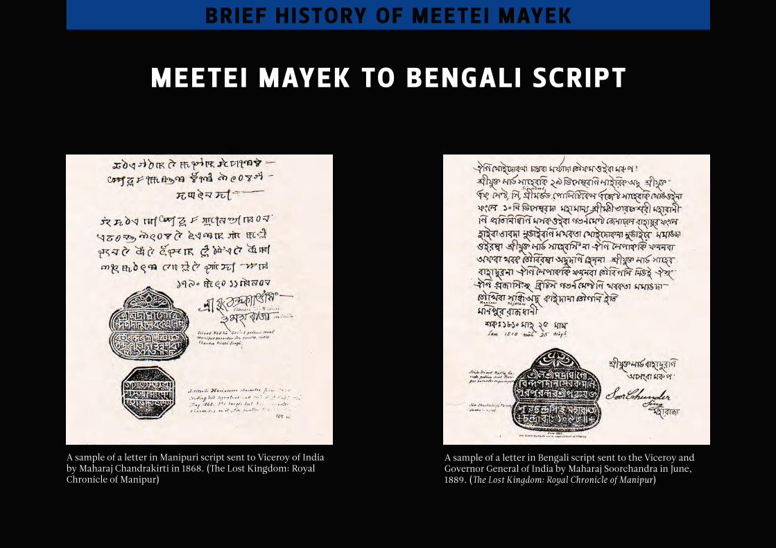
meetei mAyek to bengAli script
A sample of a letter in Manipuri script sent to Viceroy of India by Maharaj Chandrakirti in 1868. (The Lost Kingdom: Royal Chronicle of Manipur)
A sample of a letter in Bengali script sent to the Viceroy and Governor General of India by Maharaj Soorchandra in June, 1889. (The Lost Kingdom: Royal Chronicle of Manipur)
brief h istory of meetei mAyek
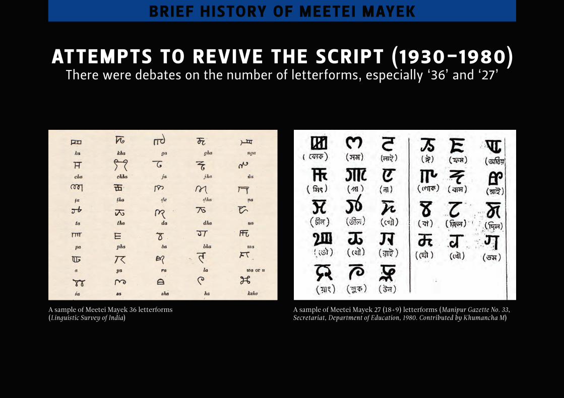
Attempts to revive the script (1930-1980)there were debates on the number of letterforms, especially ‘36’ and ‘27’
brief h istory of meetei mAyek
A sample of Meetei Mayek 36 letterforms (Linguistic Survey of India)
A sample of Meetei Mayek 27 (18+9) letterforms (Manipur Gazette No. 33, Secretariat, Department of Education, 1980. Contributed by Khumancha M)
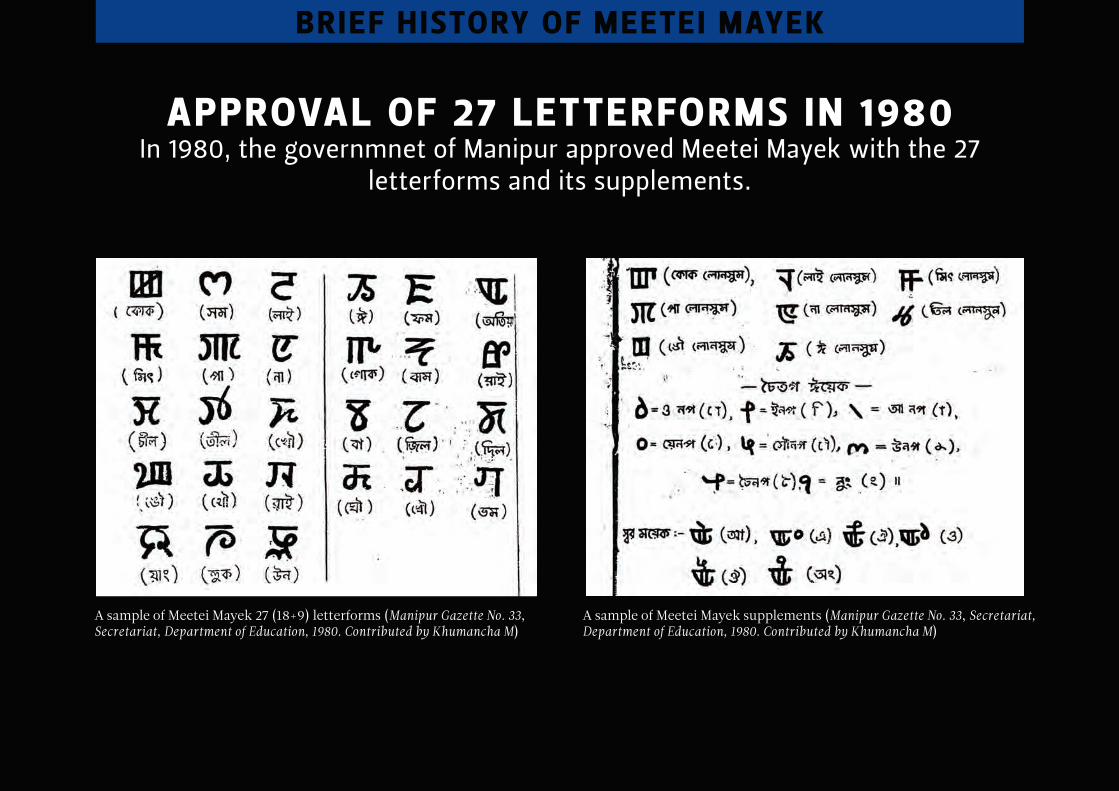
ApprovAl of 27 letterforms in 1980 in 1980, the governmnet of manipur approved meetei mayek with the 27
letterforms and its supplements.
brief h istory of meetei mAyek
A sample of Meetei Mayek 27 (18+9) letterforms (Manipur Gazette No. 33, Secretariat, Department of Education, 1980. Contributed by Khumancha M)
A sample of Meetei Mayek supplements (Manipur Gazette No. 33, Secretariat, Department of Education, 1980. Contributed by Khumancha M)
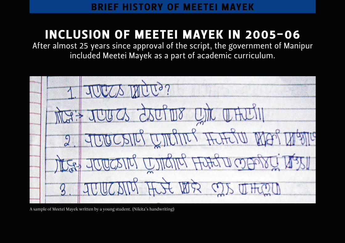
inclusion of meetei mAyek in 2005-06 after almost 25 years since approval of the script, the government of manipur
included meetei mayek as a part of academic curriculum.
brief h istory of meetei mAyek
A sample of Meetei Mayek written by a young student. (Nikita’s handwriting)
meetei mAyek And its peculiArities
meetei mAyek And its peculArities
Base character height
Descender line
vowel signKerning vowel sign
Ligature sign
Vertical stroke or stem
ascender line ascender
BaselineCounter
In-stroke
Out-stroke
HeadlineEar
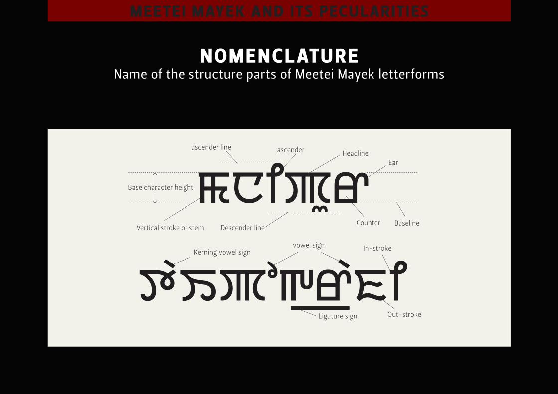
nomenclAture name of the structure parts of meetei mayek letterforms
meetei mAyek And its peculArities
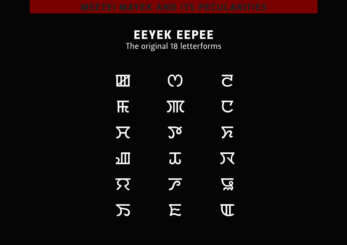
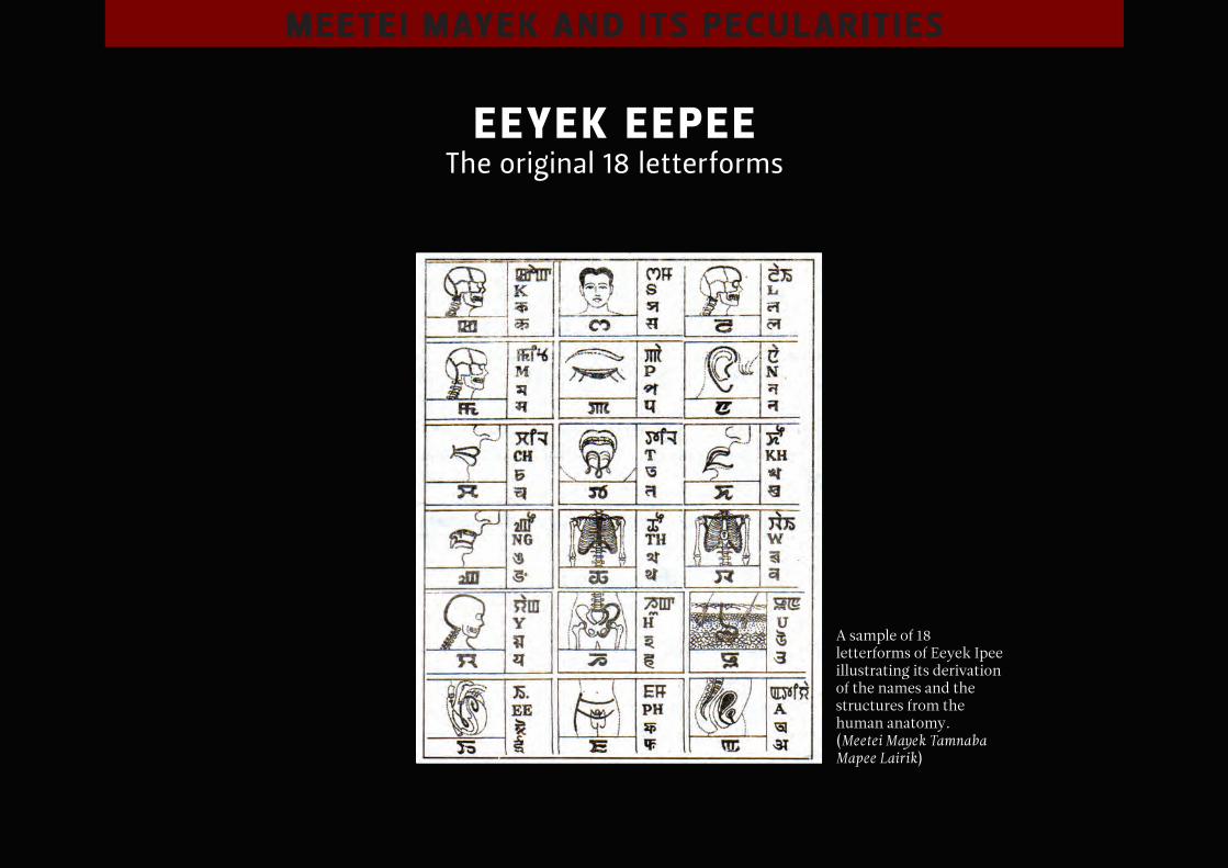
eeyek eepee the original 18 letterforms
meetei mAyek And its peculArities
eeyek eepee the original 18 letterforms
A sample of 18 letterforms of Eeyek Ipee illustrating its derivation of the names and the structures from the human anatomy. (Meetei Mayek Tamnaba Mapee Lairik)
meetei mAyek And its peculArities
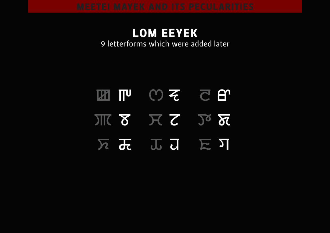
lom eeyek 9 letterforms which were added later
meetei mAyek And its peculArities
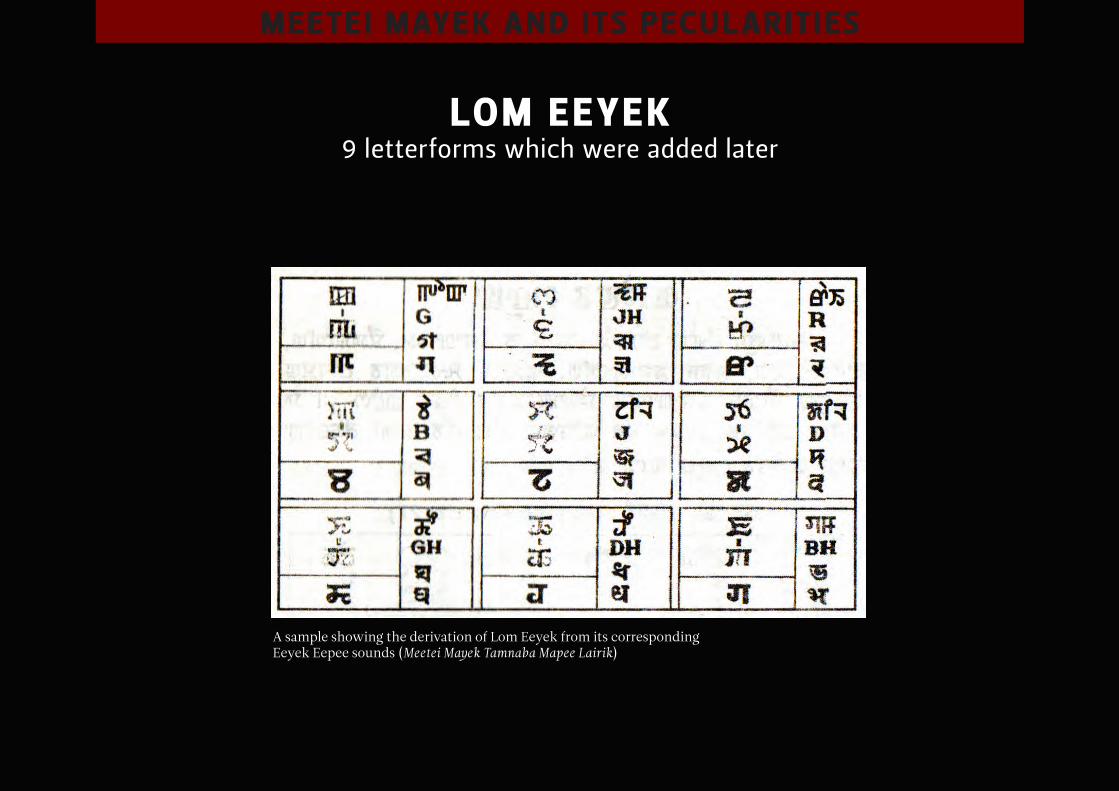
lom eeyek 9 letterforms which were added later
A sample showing the derivation of Lom Eeyek from its corresponding Eeyek Eepee sounds (Meetei Mayek Tamnaba Mapee Lairik)
meetei mAyek And its peculArities
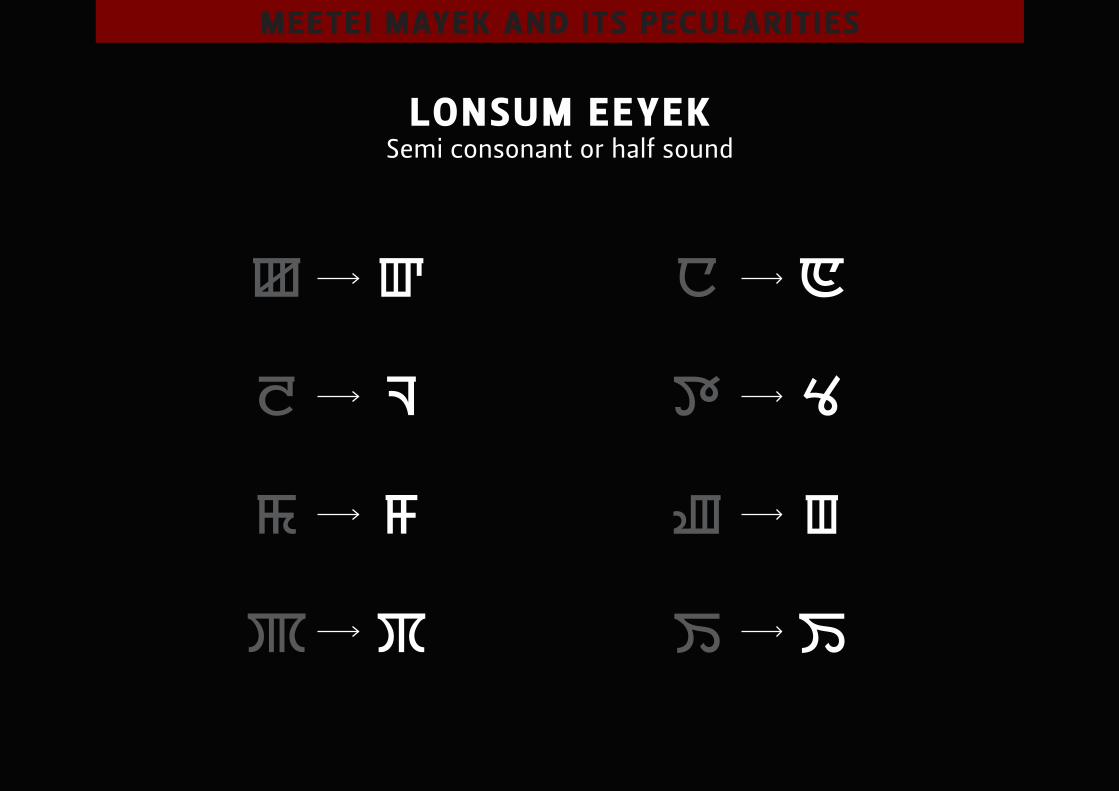
lonsum eeyek semi consonant or half sound
meetei mAyek And its peculArities
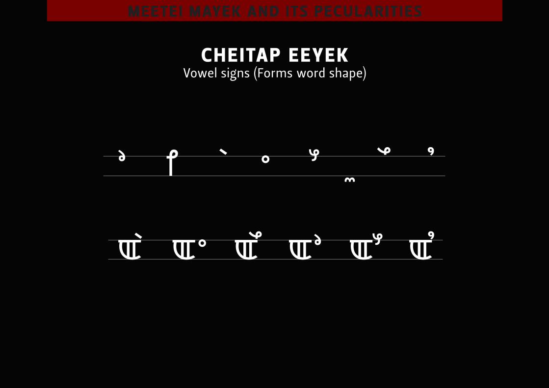
cheitAp eeyek Vowel signs (Forms word shape)
meetei mAyek And its peculArities
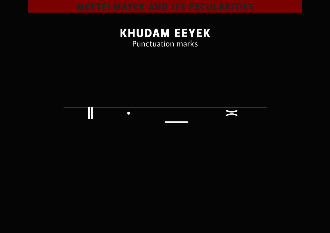
khudAm eeyek punctuation marks
meetei mAyek And its peculArities
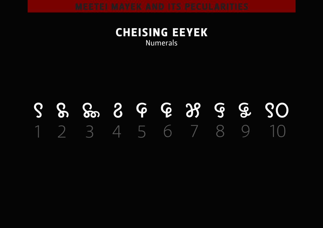
cheis ing eeyek numerals
1 2 3 4 5 6 7 8 9 10
meetei mAyek And its peculArities
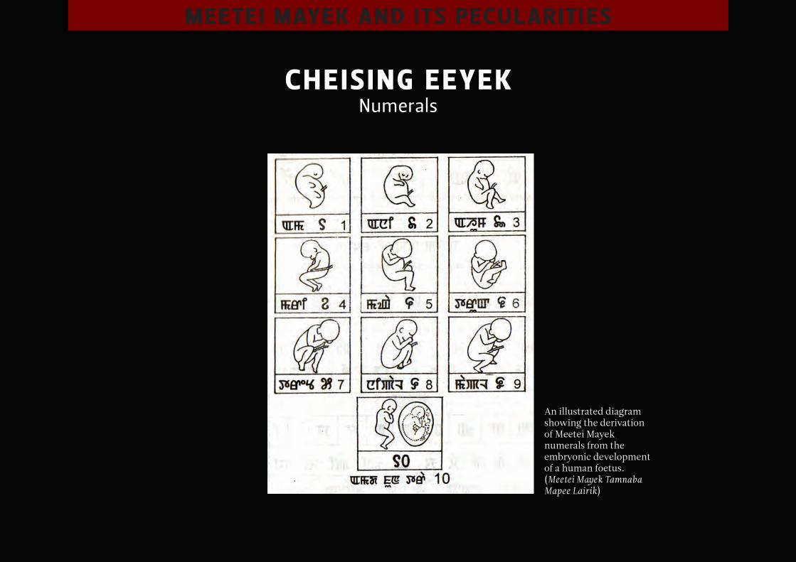
cheis ing eeyek numerals
An illustrated diagram showing the derivation of Meetei Mayek numerals from the embryonic development of a human foetus.(Meetei Mayek Tamnaba Mapee Lairik)
meetei mAyek And its peculArities
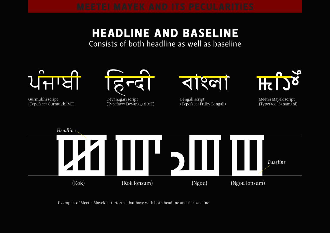
heAdline And bAseline consists of both headline as well as baseline
Gurmukhi script(Typeface: Gurmukhi MT)
Devanagari script(Typeface: Devanagari MT)
Bengali script(Typeface: Frijky Bengali)
Meetei Mayek script(Typeface: Sanamahi)
Examples of Meetei Mayek letterforms that have with both headline and the baseline
(Kok)
Headline
Baseline
(Kok lonsum) (Ngou lonsum)(Ngou)
meetei mAyek And its peculArities
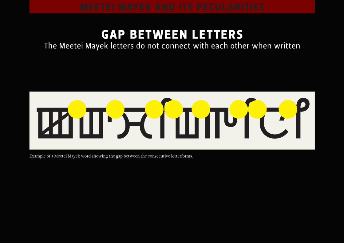
gAp between letters the meetei mayek letters do not connect with each other when written
Example of a Meetei Mayek word showing the gap between the consecutive letterforms.
meetei mAyek And its peculArities
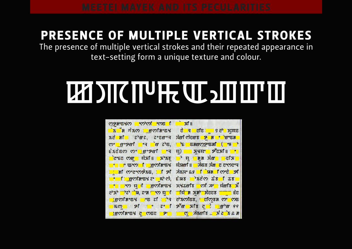
presence of multiple verticAl strokes the presence of multiple vertical strokes and their repeated appearance in
text-setting form a unique texture and colour.

meetei mAyek And its peculArities
Absence of conjunct letterforms though conjunct letterforms existed in 18th-19th manuscript, the modern
meetei mayek does not have conjuct letterforms.
Ligature sign
some chAnges in typogr Aphic expressions
chAnges in the typogr Aphic expressions
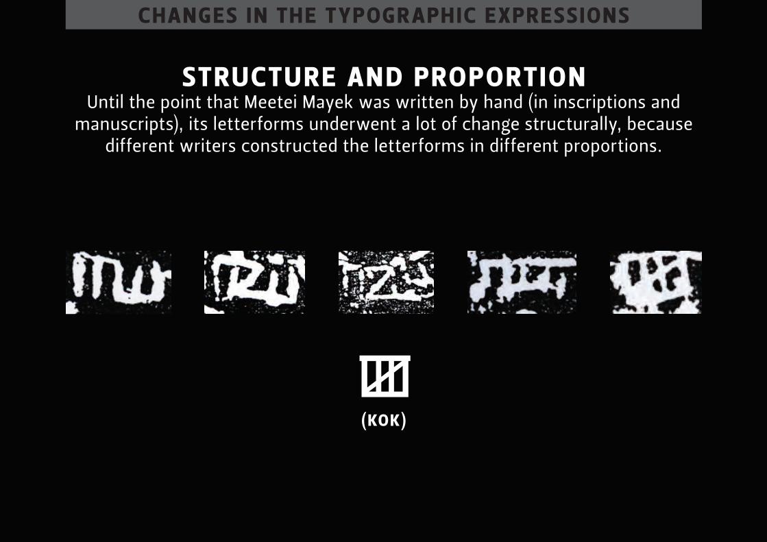
structure And proportion until the point that meetei mayek was written by hand (in inscriptions and
manuscripts), its letterforms underwent a lot of change structurally, because different writers constructed the letterforms in different proportions.
(kok)
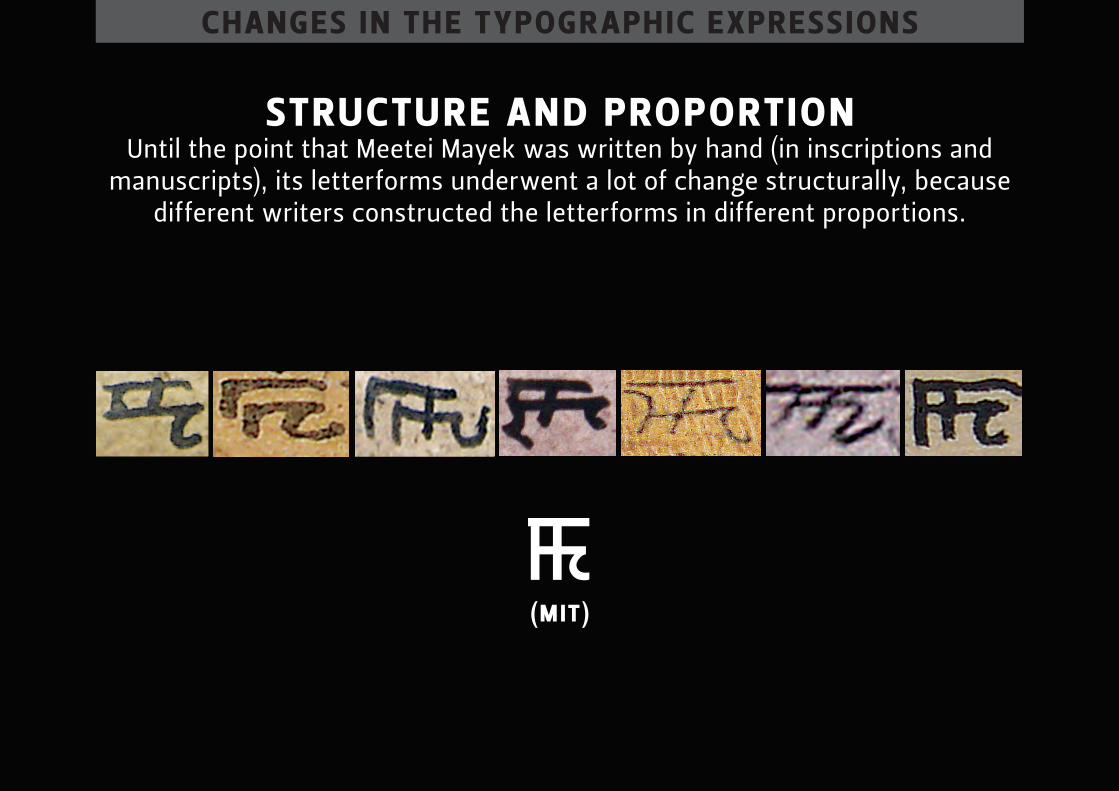
chAnges in the typogr Aphic expressions
structure And proportion until the point that meetei mayek was written by hand (in inscriptions and
manuscripts), its letterforms underwent a lot of change structurally, because different writers constructed the letterforms in different proportions.
(mit)
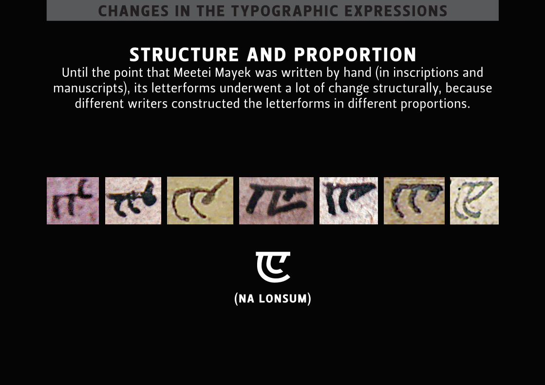
chAnges in the typogr Aphic expressions
structure And proportion until the point that meetei mayek was written by hand (in inscriptions and
manuscripts), its letterforms underwent a lot of change structurally, because different writers constructed the letterforms in different proportions.
(nA lonsu m)
chAnges in the typogr Aphic expressions
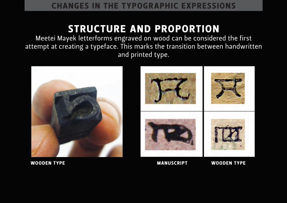
structure And proportion meetei mayek letterforms engraved on wood can be considered the first
attempt at creating a typeface. this marks the transition between handwritten and printed type.
mAn uscript wooden typewooden type
chAnges in the typogr Aphic expressions
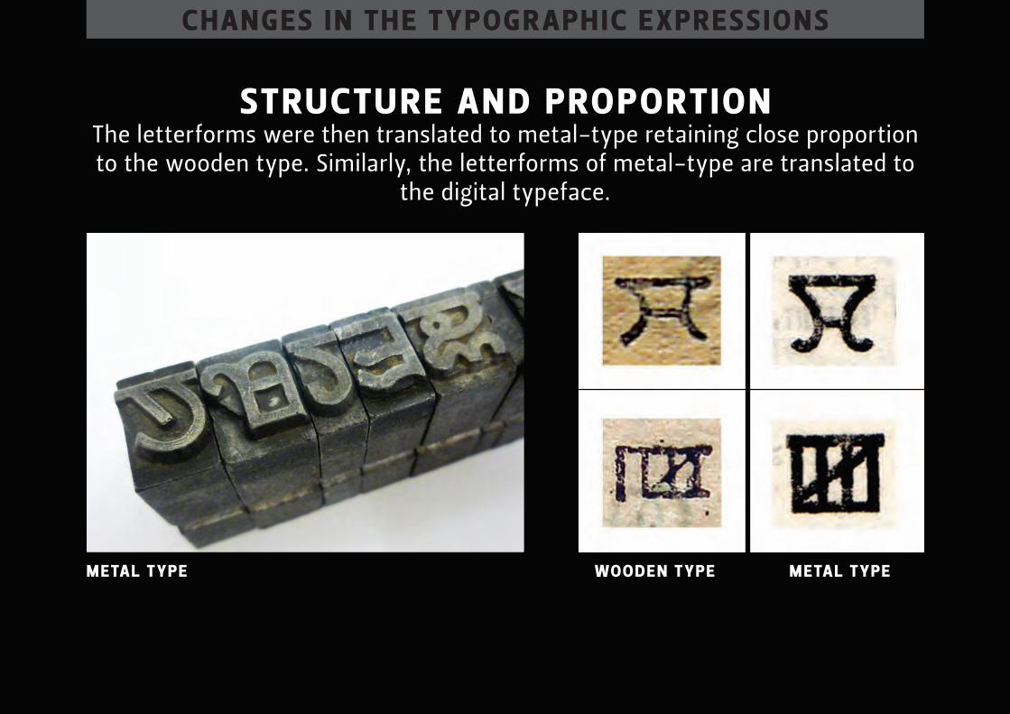
structure And proportion the letterforms were then translated to metal-type retaining close proportion to the wooden type. similarly, the letterforms of metal-type are translated to
the digital typeface.
wooden type metAl typemetAl type
chAnges in the typogr Aphic expressions
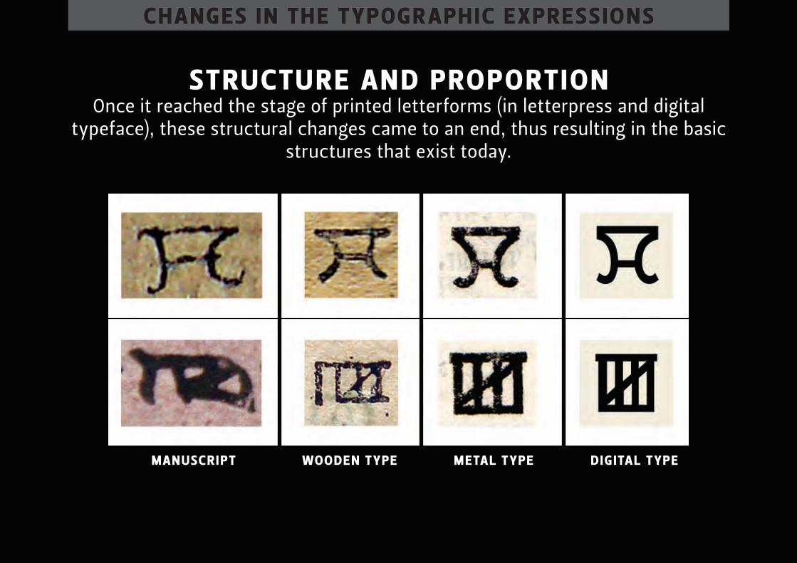
structure And proportion once it reached the stage of printed letterforms (in letterpress and digital
typeface), these structural changes came to an end, thus resulting in the basic structures that exist today.
mAn uscript wooden type metAl type dig itAl type
chAnges in the typogr Aphic expressions
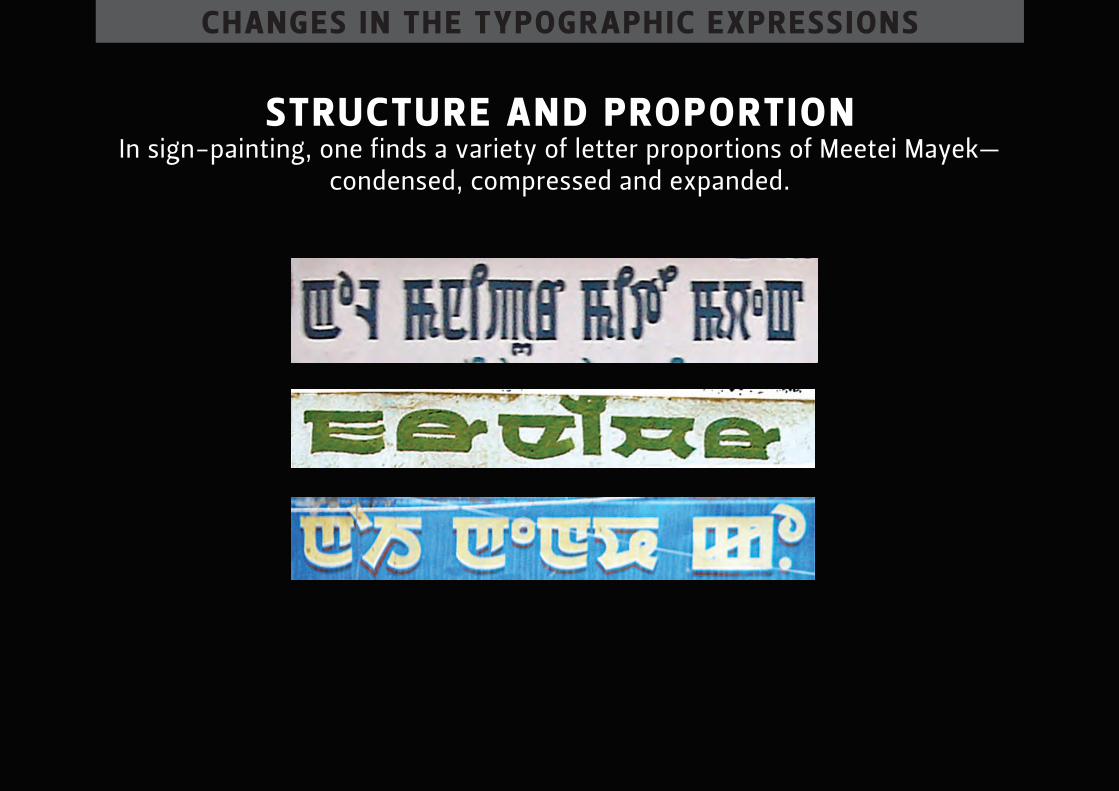
structure And proportion in sign-painting, one finds a variety of letter proportions of meetei mayek—
condensed, compressed and expanded.
chAnges in the typogr Aphic expressions
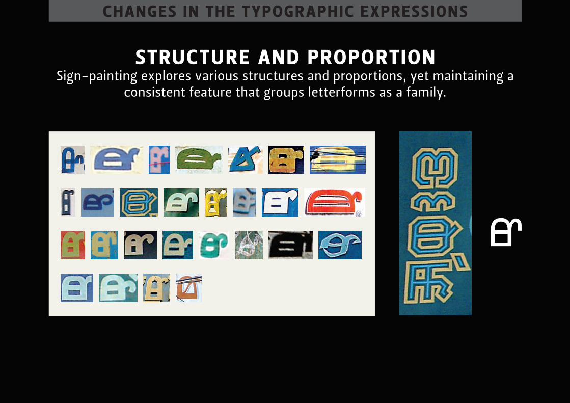
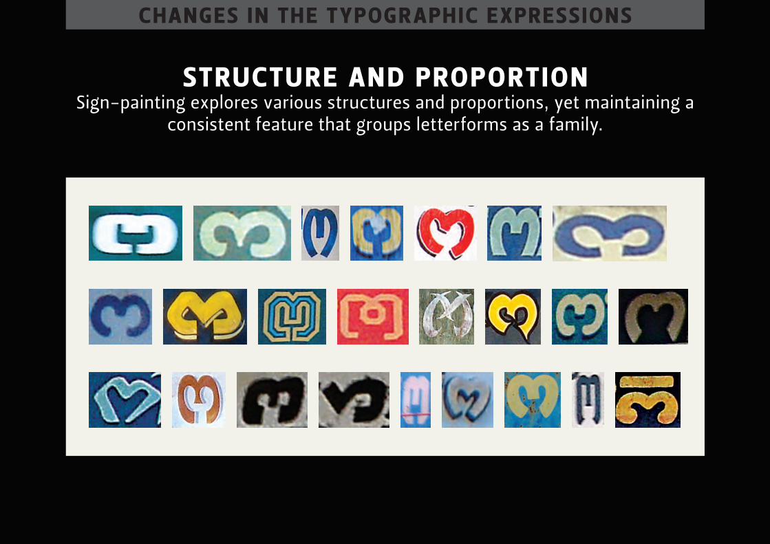
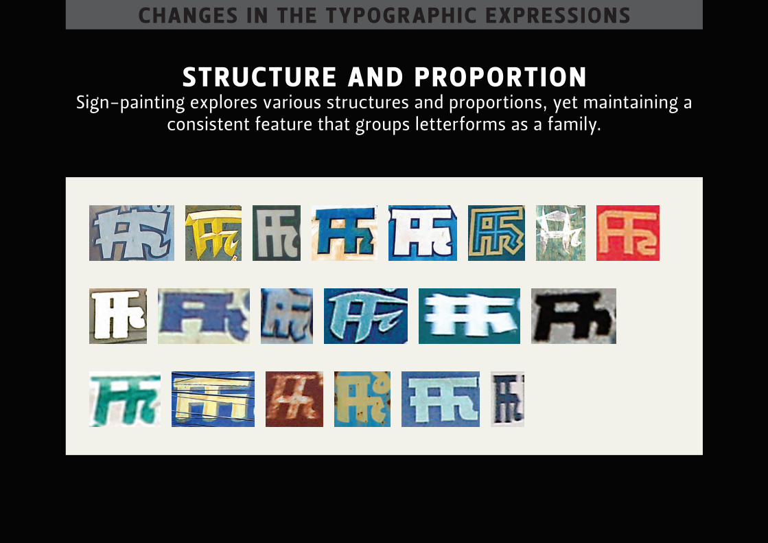
structure And proportion sign-painting explores various structures and proportions, yet maintaining a
consistent feature that groups letterforms as a family.
chAnges in the typogr Aphic expressions
structure And proportion sign-painting explores various structures and proportions, yet maintaining a
consistent feature that groups letterforms as a family.
chAnges in the typogr Aphic expressions
structure And proportion sign-painting explores various structures and proportions, yet maintaining a
consistent feature that groups letterforms as a family.

chAnges in the typogr Aphic expressions
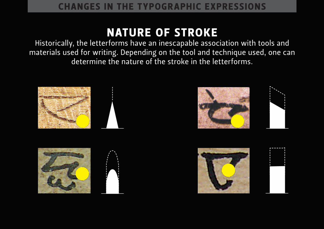
nAture of stroke the nature of the stroke refers to the shape of the stroke of the letterform. it
can broadly be divided into two—mono-linear (equal thickness) and modulated strokes (difference in thickness)
chAnges in the typogr Aphic expressions
nAture of stroke historically, the letterforms have an inescapable association with tools and
materials used for writing. depending on the tool and technique used, one can determine the nature of the stroke in the letterforms.
chAnges in the typogr Aphic expressions
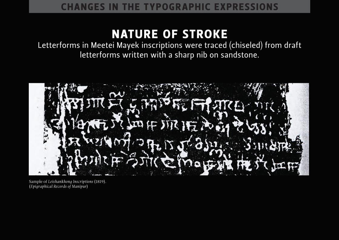
nAture of stroke letterforms in meetei mayek inscriptions were traced (chiseled) from draft
letterforms written with a sharp nib on sandstone.
Sample of Leishankhong Inscriptions (1819). (Epigraphical Records of Manipur)
chAnges in the typogr Aphic expressions
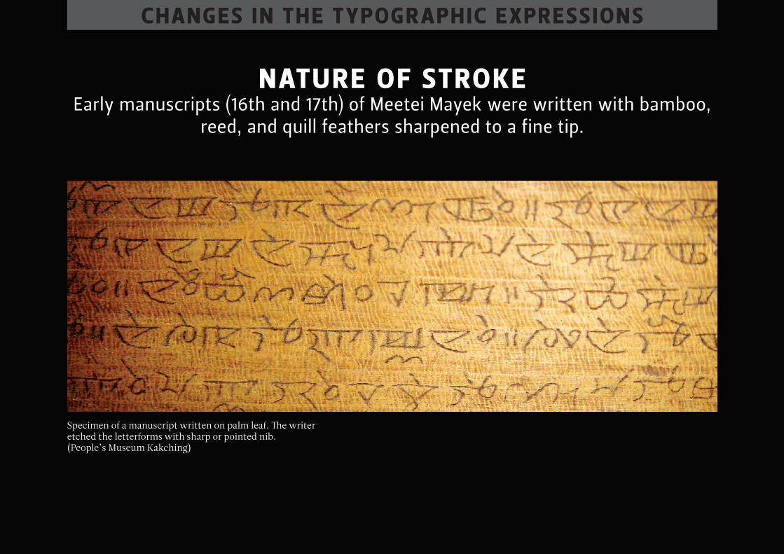
nAture of stroke early manuscripts (16th and 17th) of meetei mayek were written with bamboo,
reed, and quill feathers sharpened to a fine tip.
Specimen of a manuscript written on palm leaf. The writer etched the letterforms with sharp or pointed nib.(People’s Museum Kakching)
chAnges in the typogr Aphic expressions
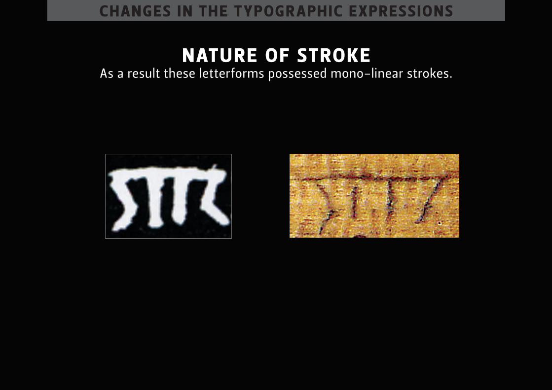
nAture of stroke as a result these letterforms possessed mono-linear strokes.
chAnges in the typogr Aphic expressions
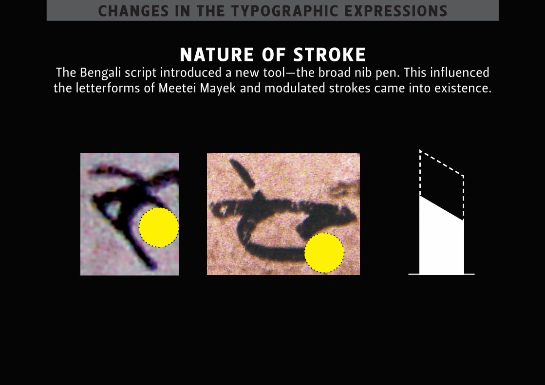
nAture of stroke the bengali script introduced a new tool—the broad nib pen. this influenced the letterforms of meetei mayek and modulated strokes came into existence.
chAnges in the typogr Aphic expressions
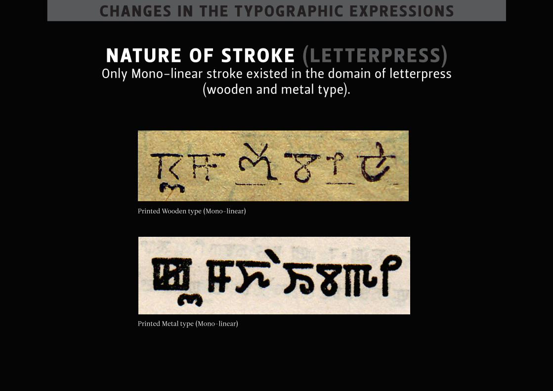
nAture of stroke (letterpress) only mono-linear stroke existed in the domain of letterpress
(wooden and metal type).
Printed Wooden type (Mono-linear)
Printed Metal type (Mono-linear)
chAnges in the typogr Aphic expressions
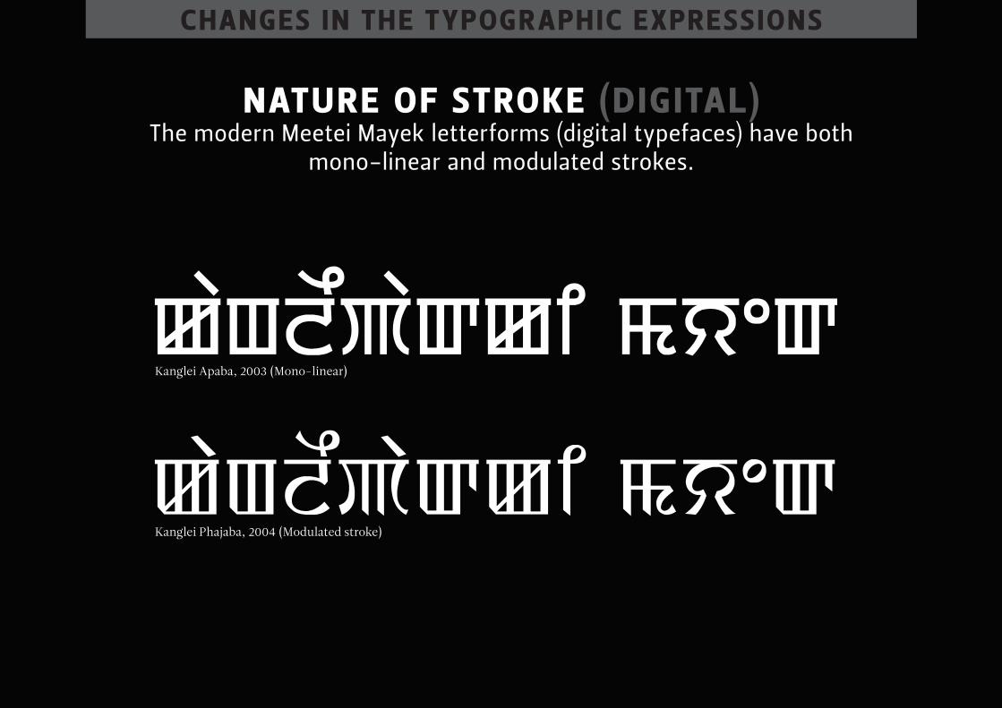
nAture of stroke (dig itAl) the modern meetei mayek letterforms (digital typefaces) have both
mono-linear and modulated strokes.
Kanglei Apaba, 2003 (Mono-linear)
Kanglei Phajaba, 2004 (Modulated stroke)
chAnges in the typogr Aphic expressions
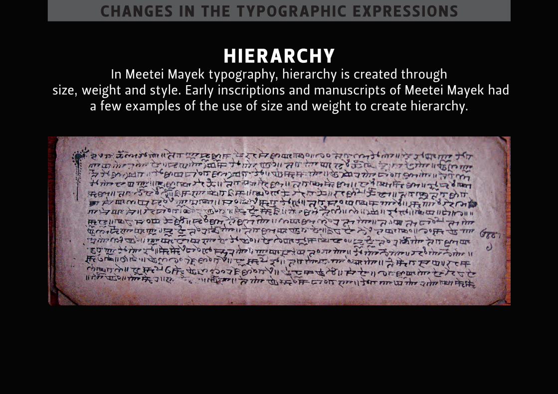
hier Archy in meetei mayek typography, hierarchy is created through
size, weight and style. early inscriptions and manuscripts of meetei mayek had a few examples of the use of size and weight to create hierarchy.
chAnges in the typogr Aphic expressions
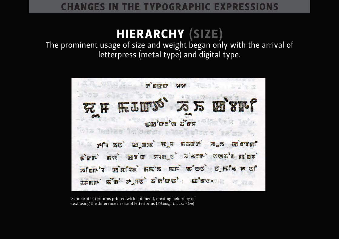
hier Archy (s ize) the prominent usage of size and weight began only with the arrival of
letterpress (metal type) and digital type.
Sample of letterforms printed with hot metal, creating heirarchy of text using the difference in size of letterforms (Eikhoigi Thouramlon)
chAnges in the typogr Aphic expressions
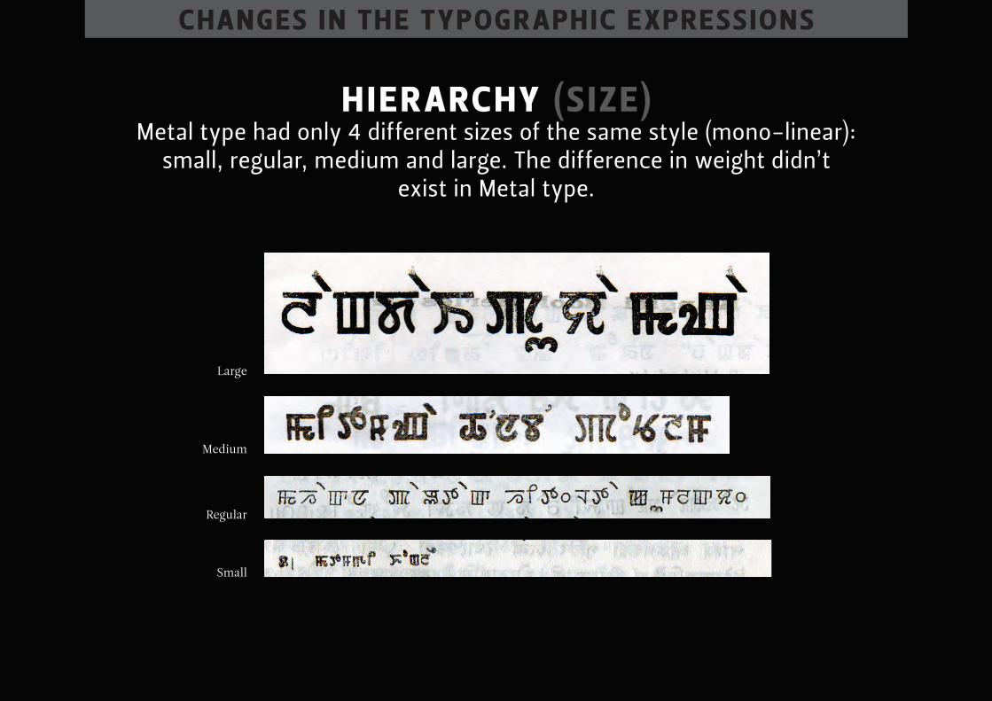
hier Archy (s ize) metal type had only 4 different sizes of the same style (mono-linear):
small, regular, medium and large. the difference in weight didn’t exist in metal type.
Small
Regular
Medium
Large
chAnges in the typogr Aphic expressions
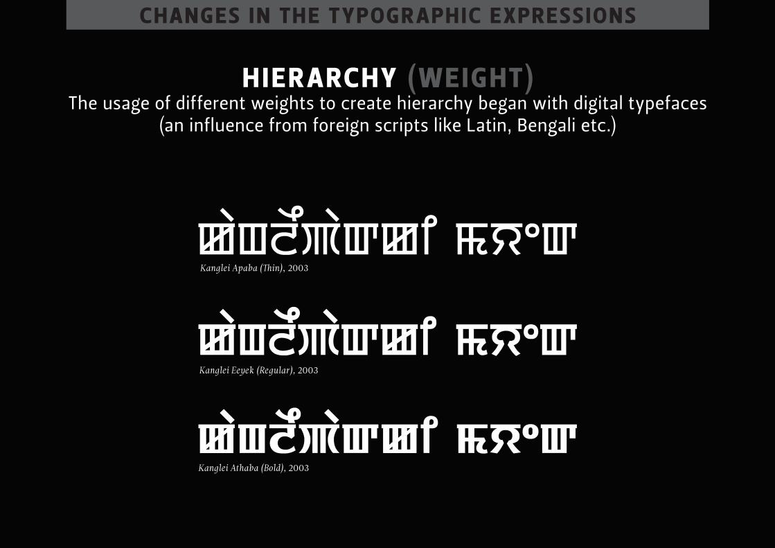
hier Archy (weight) the usage of different weights to create hierarchy began with digital typefaces
(an influence from foreign scripts like latin, bengali etc.)
Kanglei Apaba (Thin), 2003
Kanglei Eeyek (Regular), 2003
Kanglei Athaba (Bold), 2003
chAnges in the typogr Aphic expressions
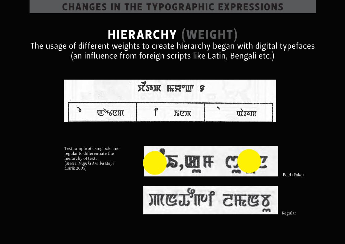
hier Archy (weight) the usage of different weights to create hierarchy began with digital typefaces
(an influence from foreign scripts like latin, bengali etc.)
Text sample of using bold and regular to differentiate the hierarchy of text.(Meetei Mayeki Araiba Mapi Lairik 2005)
Bold (Fake)
Regular
chAnges in the typogr Aphic expressions
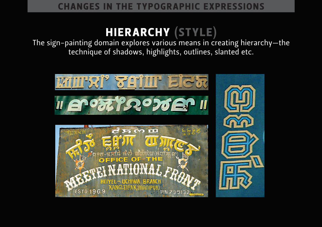
hier Archy (style) the sign-painting domain explores various means in creating hierarchy—the
technique of shadows, highlights, outlines, slanted etc.
chAnges in the typogr Aphic expressions
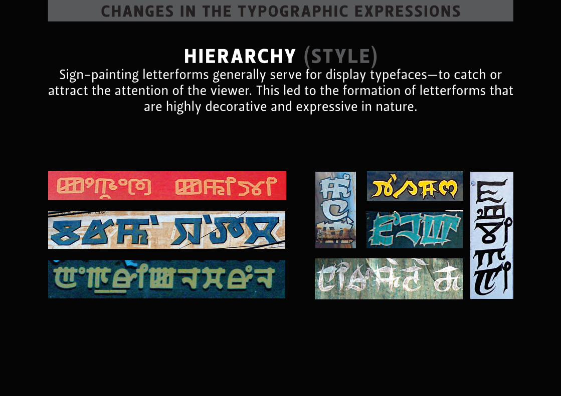
hier Archy (style) sign-painting letterforms generally serve for display typefaces—to catch or
attract the attention of the viewer. this led to the formation of letterforms that are highly decorative and expressive in nature.
chAnges in the typogr Aphic expressions
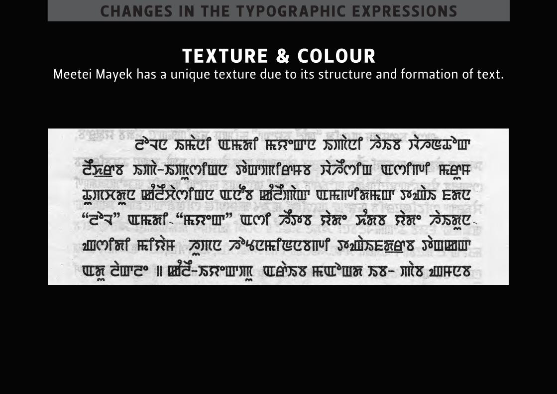
texture & colour meetei mayek has a unique texture due to its structure and formation of text.
chAnges in the typogr Aphic expressions
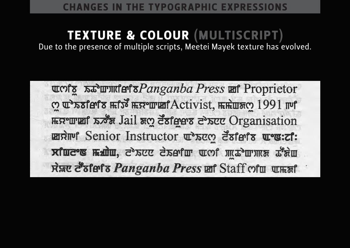
texture & colour (multiscript) due to the presence of multiple scripts, meetei mayek texture has evolved.
chAnges in the typogr Aphic expressions
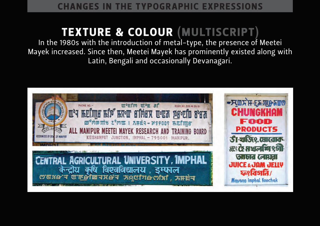
texture & colour (multiscript) in the 1980s with the introduction of metal-type, the presence of meetei
mayek increased. since then, meetei mayek has prominently existed along with latin, bengali and occasionally devanagari.
chAnges in the typogr Aphic expressions
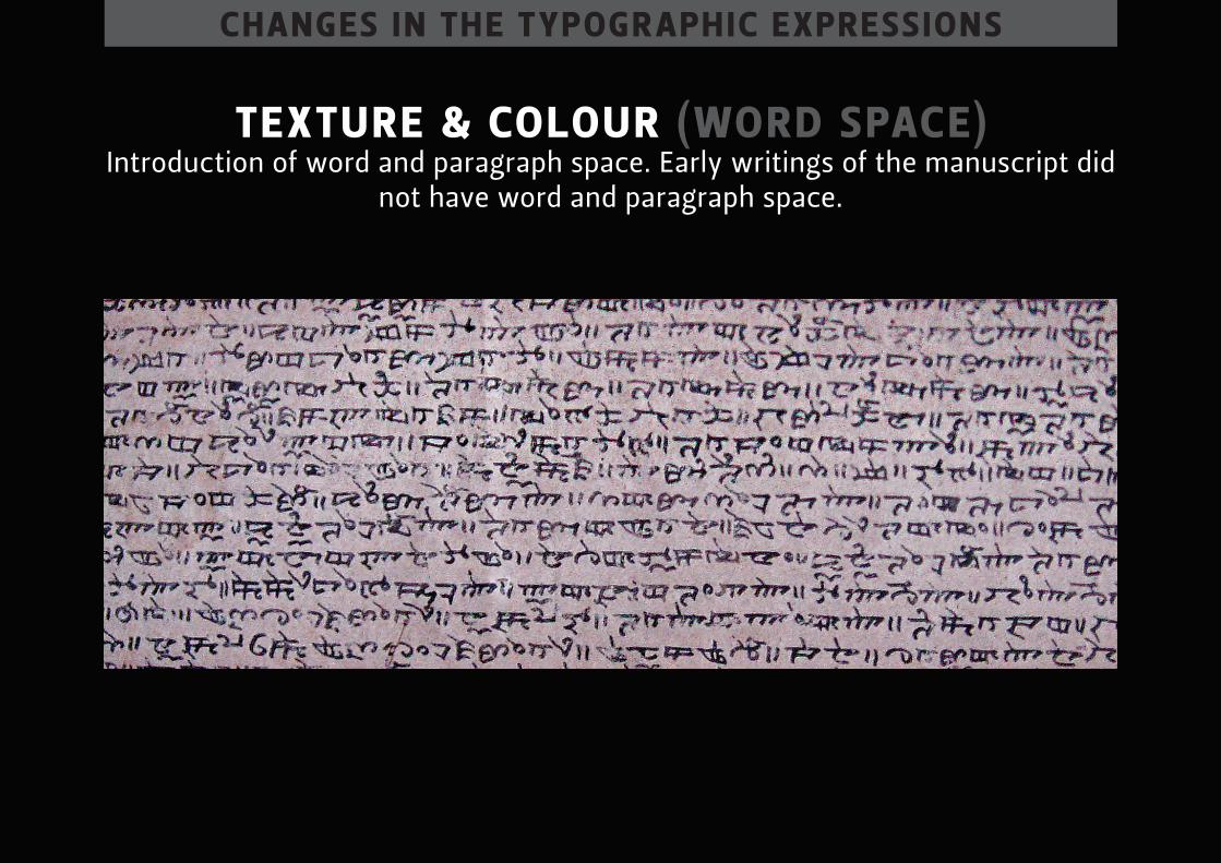
texture & colour (word spAce) introduction of word and paragraph space. early writings of the manuscript did
not have word and paragraph space.
chAnges in the typogr Aphic expressions
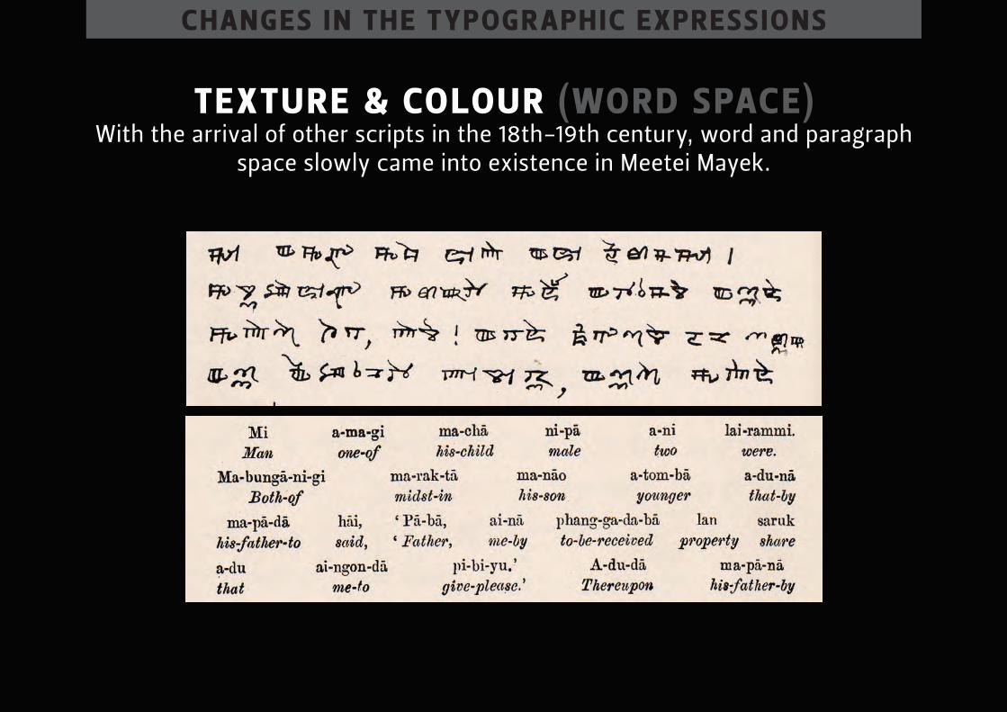
texture & colour (word spAce) With the arrival of other scripts in the 18th-19th century, word and paragraph
space slowly came into existence in meetei mayek.

chAnges in the typogr Aphic expressions
texture & colour (word spAce) though there is no definite reason behind this introduction, word spaces
appear in the samples of transliteration of language.
chAnges in the typogr Aphic expressions
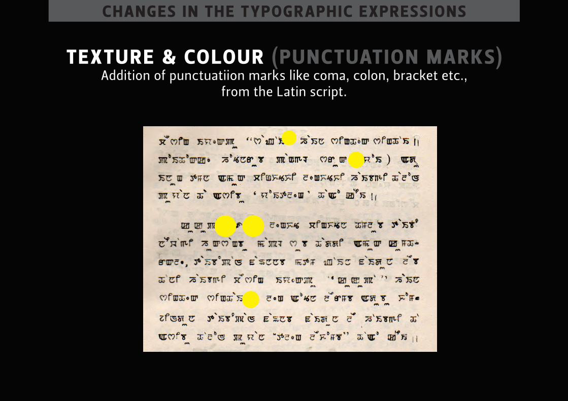
texture & colour (punctuAtion mArks) addition of punctuatiion marks like coma, colon, bracket etc.,
from the latin script.
chAnges in the typogr Aphic expressions
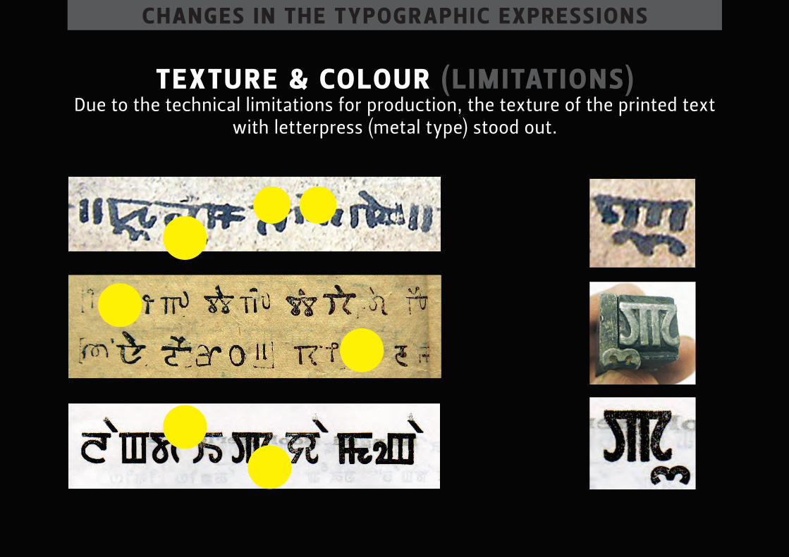
texture & colour (limitAtions) due to the technical limitations for production, the texture of the printed text
with letterpress (metal type) stood out.
chAnges in the typogr Aphic expressions
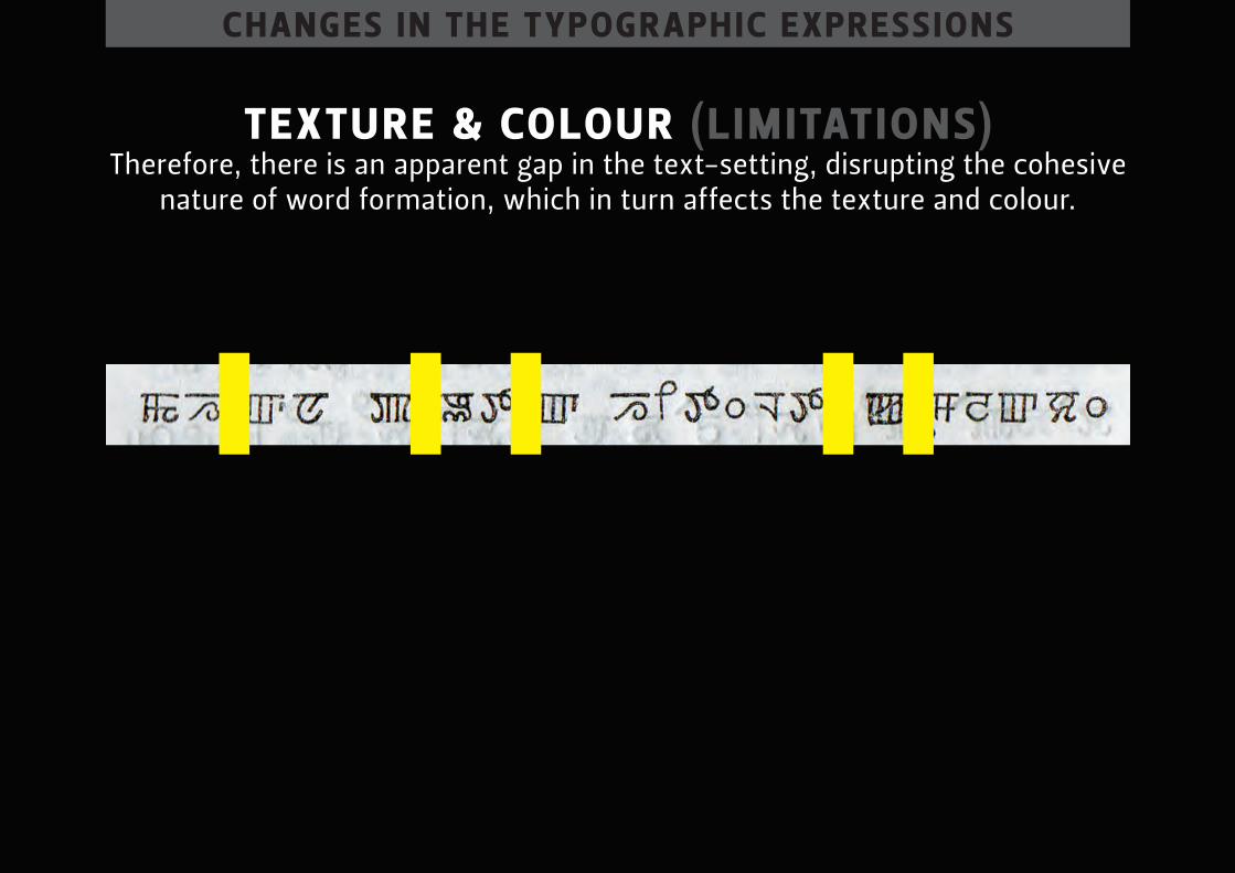
texture & colour (limitAtions) therefore, there is an apparent gap in the text-setting, disrupting the cohesive
nature of word formation, which in turn affects the texture and colour.
chAnges in the typogr Aphic expressions
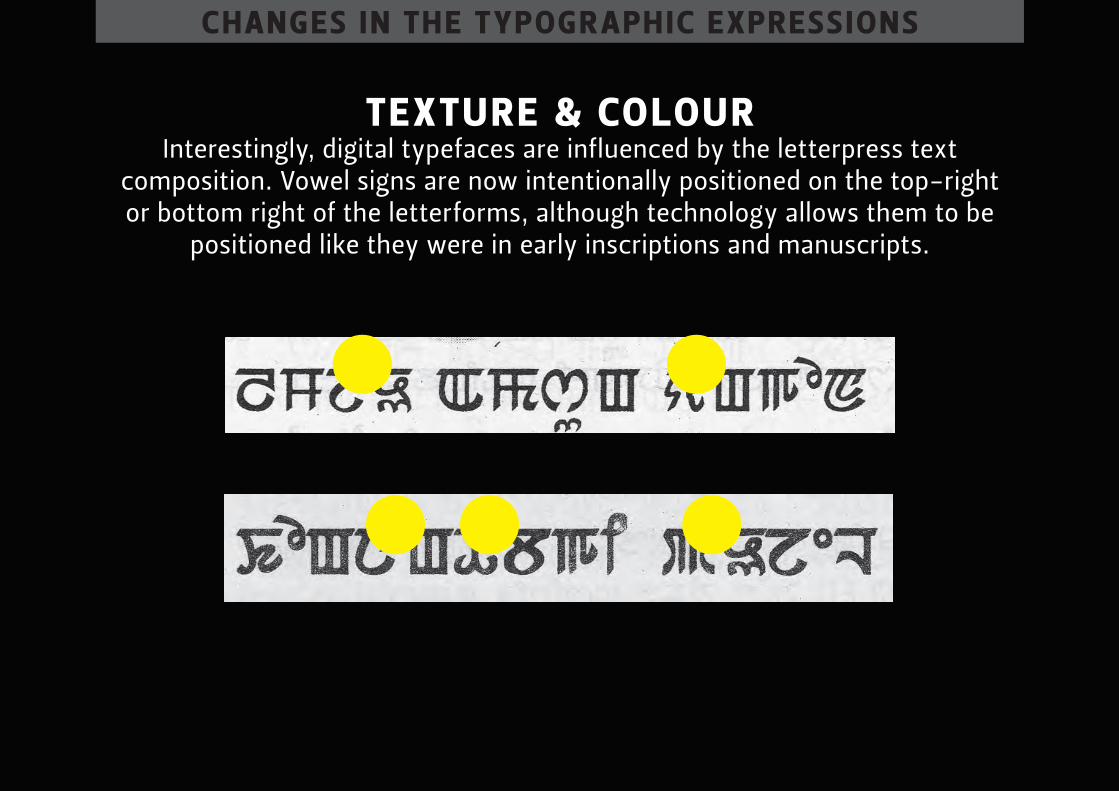
texture & colour interestingly, digital typefaces are influenced by the letterpress text
composition. Vowel signs are now intentionally positioned on the top-right or bottom right of the letterforms, although technology allows them to be
positioned like they were in early inscriptions and manuscripts.
chAnges in the typogr Aphic expressions
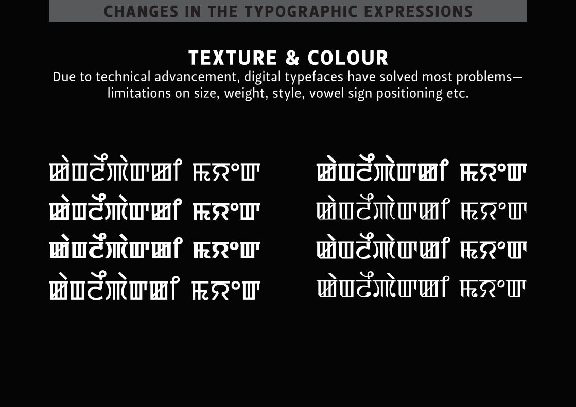
texture & colour due to technical advancement, digital typefaces have solved most problems—
limitations on size, weight, style, vowel sign positioning etc.
chAnges in the typogr Aphic expressions
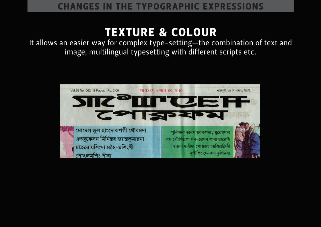
texture & colour it allows an easier way for complex type-setting—the combination of text and
image, multilingual typesetting with different scripts etc.

conclusion
conclusion
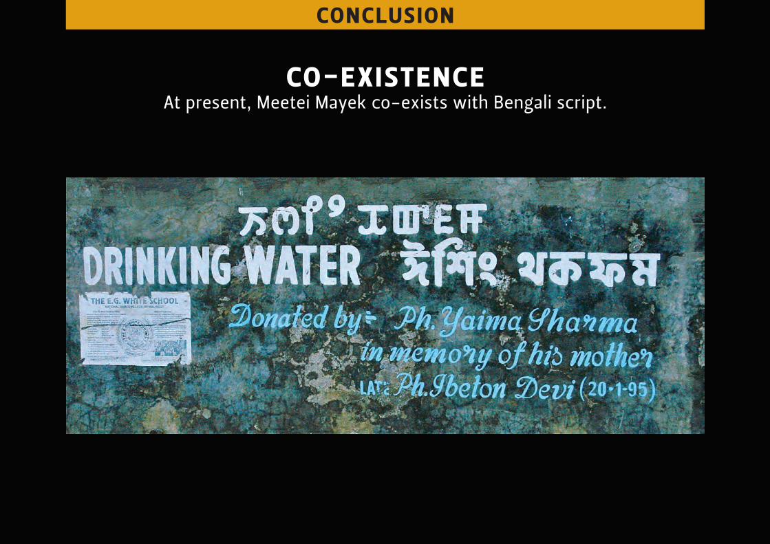
co-existence at present, meetei mayek co-exists with bengali script.
conclusion
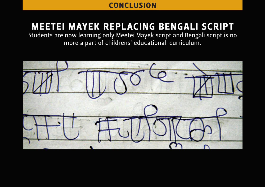
meetei mAyek replAcing bengAli script students are now learning only meetei mayek script and bengali script is no
more a part of childrens’ educational curriculum.
conclusion
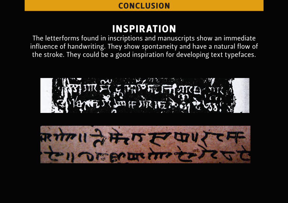
inspir Ation the letterforms found in inscriptions and manuscripts show an immediate
influence of handwriting. they show spontaneity and have a natural flow of the stroke. they could be a good inspiration for developing text typefaces.
conclusion
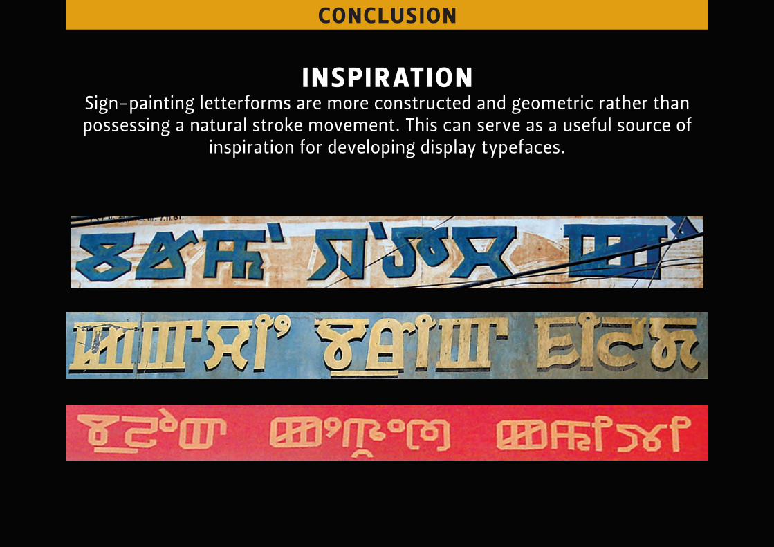
inspir Ation sign-painting letterforms are more constructed and geometric rather than possessing a natural stroke movement. this can serve as a useful source of
inspiration for developing display typefaces.
conclusion
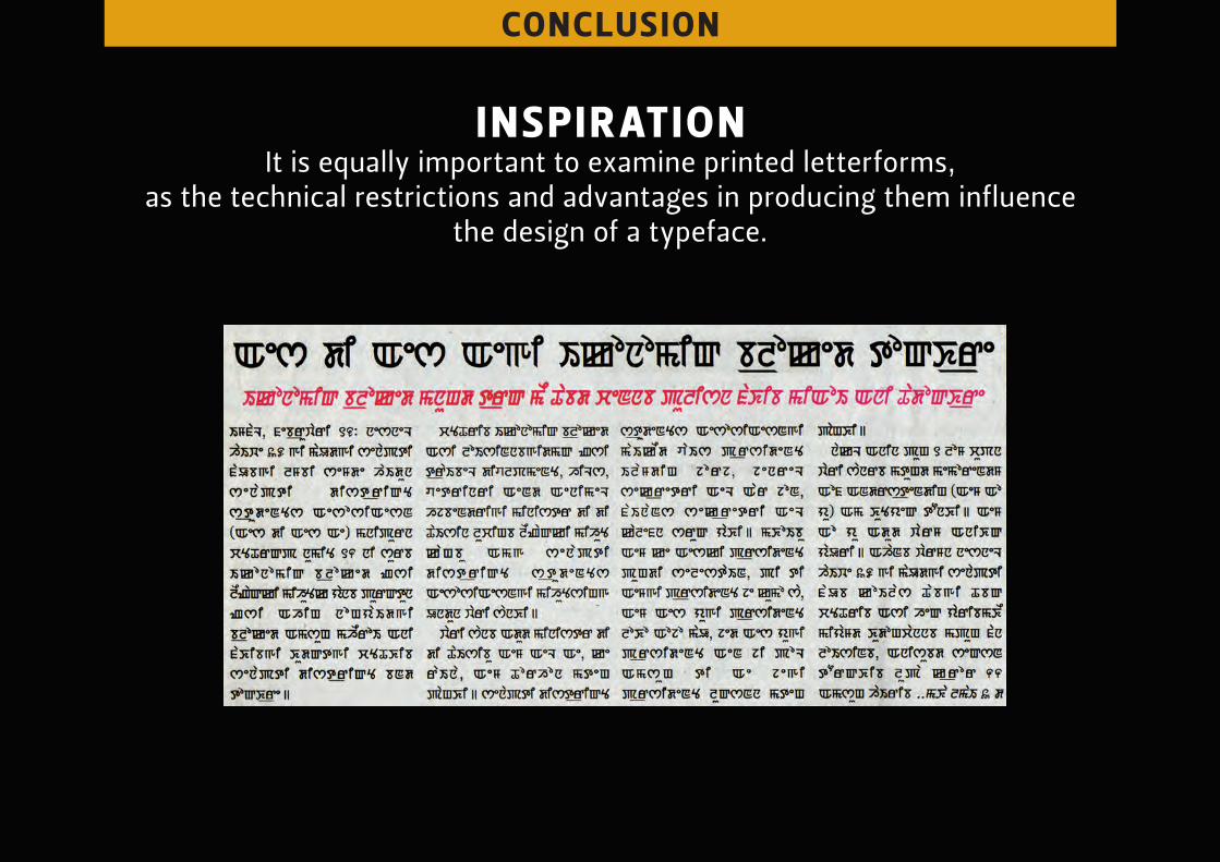
inspir Ation it is equally important to examine printed letterforms,
as the technical restrictions and advantages in producing them influence the design of a typeface.
with these sources of inspir Ation, one will understAnd the limitAtions
And possibilities while designing A typefAce.

Thank you