a coordinated view of the temporal evolution of large-scale - caida
TRANSCRIPT

Computing (2014) 96:53–65DOI 10.1007/s00607-013-0288-2
A coordinated view of the temporal evolutionof large-scale Internet events
Alistair King · Bradley Huffaker ·Alberto Dainotti · k. c. Claffy
Received: 8 August 2012 / Accepted: 30 November 2012 / Published online: 25 January 2013© Springer-Verlag Wien 2013
Abstract We present a method to visualize large-scale Internet events, such as alarge region losing connectivity, or a stealth probe of the entire IPv4 address space.We apply a well-known technique in information visualization—multiple coordinatedviews—to Internet-specific data. We animate these coordinated views to study the tem-poral evolution of an event along different dimensions, including geographic spread,topological (address space) coverage, and traffic impact. We explain the techniqueswe used to create the visualization, and using two recent case studies we describe howthis capability to simultaneously view multiple dimensions of events enabled greaterinsight into their properties.
Keywords Visualization · Measurement methodology · Security · Software tools ·Darknet · Outages
Mathematics Subject Classification 90B18
First IMC Workshop on Internet Visualization (WIV 2012), November 13, 2012, Boston, Massachusetts,USA.
A. King · B. Huffaker · A. Dainotti (B) · k. c. ClaffyCAIDA, University of California, San Diego, USAe-mail: [email protected]
A. Kinge-mail: [email protected]
B. Huffakere-mail: [email protected]
k. c. Claffye-mail: [email protected]
123

54 A. King et al.
1 Introduction
As the Internet grows more critical to our lives, it also grows increasingly complexand resistant to comprehensive modeling or even measurement. The challenge ofvisualizing large volumes of data reflecting Internet behavior and/or misbehavior isdaunting but also irresistible, especially given the expanding scientific, governmen-tal, and popular interest in large-scale outages or attacks. In this work we presentan approach to visualizing multiple views of large-scale Internet events simultane-ously. We apply a well-developed technique in information visualization—multiplecoordinated views [26]—to different Internet-specific data sources. We animate thesecoordinated views to study the temporal evolution of an event in different visual spaces,including geographic spread, topological (address space) coverage, and traffic impact.These multiple views facilitate a deeper analysis of the dynamics and impact of theevent.
The first and most obvious view of interest is geographic coverage of an event.IP addresses found in Internet measurement data can be mapped to an estimatedgeolocation using a variety of (free or commercial) services [15]. Each IP addressalso represents a location in the IP address space, and visualizing how an eventmoves across the IP address space can reveal patterns of interest, e.g., systematicbut stealth scanning of the global public Internet. The third view we examine isnetwork traffic volume and associated statistics, such as number of communicatinghosts.
We build and extend a set of software tools to provide coordinated multipleviews of large-scale Internet events. We start with CAIDA’s Cuttlefish tool [2] whichjuxtaposes a geographic view of traffic (Sect. 3) with aggregated traffic statistics(Sect. 4). Cuttlefish is implemented as a Perl script that uses the GD library [3] torender a PNG image per frame. To visualize coverage of an event across the IPv4address space we use the Measurement Factory’s ipv4-heatmap tool [12]. Section 5describes our graphical address space representation, which required modifying thistool to display properties of the event throughout its evolution. To combine every-thing into a single animation, we developed a simple tool that operates on a frame-by-frame basis, appropriately scaling and placing one frame from each view intoa single dashboard frame. We merged these frames into an animated video of theevent.
Section 6 demonstrates the power of our approach to facilitate deeper insights intonetwork data using two case studies of large-scale events that we analyzed in detail inprevious work [9,10]. Both case studies use traffic collected by the UCSD NetworkTelescope—a large darknet passively capturing traffic sourced mainly by malware-infected hosts around the world [6]. The first event is a botnet-coordinated scan inFebruary 2011, which probed hosts looking for SIP servers across the entire Internetaddress space. This probing event, which we call “sipscan”, involved millions ofhosts and lasted approximately 12 days [9]. The second case study is the government-mandated Internet blackout in Egypt, which isolated the country from the rest of theInternet for more than five days in early 2011 [10]. Animations and screen snapshotsof these two examples are at [8].
123
A coordinated view of the temporal evolution 55
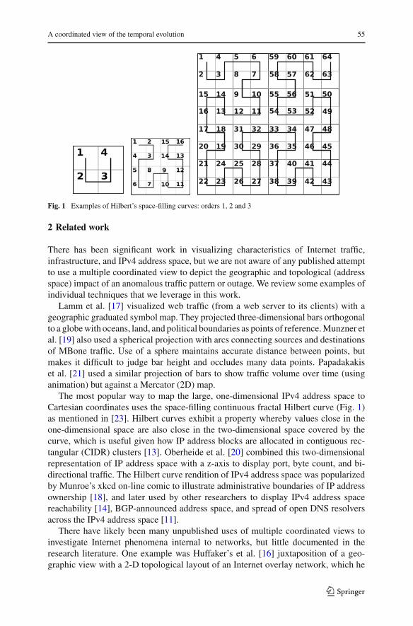
Fig. 1 Examples of Hilbert’s space-filling curves: orders 1, 2 and 3
2 Related work
There has been significant work in visualizing characteristics of Internet traffic,infrastructure, and IPv4 address space, but we are not aware of any published attemptto use a multiple coordinated view to depict the geographic and topological (addressspace) impact of an anomalous traffic pattern or outage. We review some examples ofindividual techniques that we leverage in this work.
Lamm et al. [17] visualized web traffic (from a web server to its clients) with ageographic graduated symbol map. They projected three-dimensional bars orthogonalto a globe with oceans, land, and political boundaries as points of reference. Munzner etal. [19] also used a spherical projection with arcs connecting sources and destinationsof MBone traffic. Use of a sphere maintains accurate distance between points, butmakes it difficult to judge bar height and occludes many data points. Papadakakiset al. [21] used a similar projection of bars to show traffic volume over time (usinganimation) but against a Mercator (2D) map.
The most popular way to map the large, one-dimensional IPv4 address space toCartesian coordinates uses the space-filling continuous fractal Hilbert curve (Fig. 1)as mentioned in [23]. Hilbert curves exhibit a property whereby values close in theone-dimensional space are also close in the two-dimensional space covered by thecurve, which is useful given how IP address blocks are allocated in contiguous rec-tangular (CIDR) clusters [13]. Oberheide et al. [20] combined this two-dimensionalrepresentation of IP address space with a z-axis to display port, byte count, and bi-directional traffic. The Hilbert curve rendition of IPv4 address space was popularizedby Munroe’s xkcd on-line comic to illustrate administrative boundaries of IP addressownership [18], and later used by other researchers to display IPv4 address spacereachability [14], BGP-announced address space, and spread of open DNS resolversacross the IPv4 address space [11].
There have likely been many unpublished uses of multiple coordinated views toinvestigate Internet phenomena internal to networks, but little documented in theresearch literature. One example was Huffaker’s et al. [16] juxtaposition of a geo-graphic view with a 2-D topological layout of an Internet overlay network, which he
123

56 A. King et al.
used to visualize NLANR’s web cache hierarchy. Brown et al. [7] created Cichlid—a multiple view visualization tool that displayed pre-defined Internet topology andtime-series graphs and supported 3D animations.
This work builds on techniques and lessons learned in these studies. We combine asource address geographic graduated symbol source map, IPv4 address space Hilbertcurve, and a time-series plot into a coordinated multiple view display and animationfor use in visualizing large-scale Internet events.
3 Geographical representation
3.1 Mercator projection
An integral part of any geo-visualization is the mapping between the geographic coor-dinate system (latitude and longitude) and the on-screen coordinate system (x and y).Cuttlefish does not dictate geographic reference points, but instead allows the user toprovide an image, its geographic coordinate bounds, and the projection system used.Currently Cuttlefish supports a simple linear translation from geographic to screencoordinates, as well as the commonly used Mercator projection method. The primarydrawback of the Mercator projection is that it distorts the size and shape of objectsdue to the scale increasing from the Equator to the poles. However, most viewers aremore familiar with the Mercator projection, so it tends to minimize the cognitive costof identifying glyph locations. Also, with the advent of the OpenStreetMap project[5], maps with liberal licensing terms are readily available for use with the tool.
3.2 Day/night terminator
Since network traffic is influenced by patterns of human activity [25], time of dayplays an important role in understanding the characteristics of a large-scale Internetevent. For example, traffic from malware-infected hosts often has a strong diurnalcomponent [9] because infected machines are typically PCs that are switched off atnight by users. On the other hand, infected machines are distributed across many(most) time zones, which can dissipate otherwise stark diurnal variations. To mitigatethis problem we use a day/night terminator (labeled in Fig. 2) to visually depict thetime of day across the full range of geographic locations. This visual marker enablesviewers to intuitively infer morning, noon, evening, and night, as well as how thetempo of an animation corresponds to clock time. Although time-of-day estimationfor a given location requires that both (sunrise and sunset) terminators be visible,Cuttlefish also supports a caption denoting the time in one time zone (usually UTC)to assist with such time estimation.
3.3 Value representation
For most large-scale network data, especially with a geographic component, someaggregation must occur to place it on a map or other layout. To aggregate data,
123

A coordinated view of the temporal evolution 57
Fig. 2 Day/night terminators in the geographic animations represent local time in different time zones
Cuttlefish currently supports only a simple summation of data values whose geo-graphic coordinate maps to the same on-screen pixel. So at this point the tool is onlyuseful for visualizing metrics for which total counts are meaningful, such as numberof hosts, packets, byte counts, etc. Cuttlefish can display these aggregated data valuesas either rectangles or circles. With circles, the area of the circle is proportional to themagnitude associated with the location where the circle is centered. With rectangles,their height represents the magnitude associated with their location. Circles are ren-dered onto the map in descending order of size, with the largest circles drawn first,to minimize complete occlusion of smaller circles. Rectangles are rendered in reverselatitude order, that is, starting from the top of the map, and drawn upward from theaggregated pixel to create a mild 3D effect, with rectangles closer to the bottom of thescreen occluding those behind and so appearing closer to the viewer. For both circlesand rectangles, the area or height can use either a linear or logarithmic scale betweenthe minimum and maximum values. The value of the glyph can also be representedby color. Color and size can be used together to represent independent metrics, forexample number of unique hosts and packet count for a location.
4 A view of network traffic
We augment the geographic view just described with a time-series graph plottingstatistics of network traffic observed per time interval, each of which corresponds toone frame of the animation. For each interval we sum the values of one metric (e.g.,host or packet count), across all locations, and use these per-frame values to generatea time-series. For example, in the sipscan frame shown in Fig. 6 (discussed furtherin Sect. 6), the graph in the bottom left corner plots the number of unique sourceIP addresses observed per 320-s interval, globally across the duration of the scan.
123
58 A. King et al.
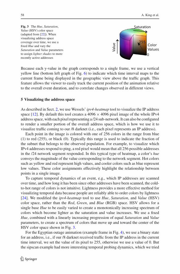
Fig. 3 The Hue, Saturation,Value (HSV) color space(adapted from [22]). Whenvisualizing address spacecoverage over time, we use afixed Hue and vary theSaturation and Value parametersto assign lighter shades to morerecently active addresses
Because each y-value in the graph corresponds to a single frame, we use a verticalyellow line (bottom left graph of Fig. 6) to indicate which time interval maps to thecurrent frame being displayed in the geographic view above the traffic graph. Thisfeature allows the viewer to easily track the current position of the animation relativeto the overall event duration, and to correlate changes observed in different views.
5 Visualizing the address space
As described in Sect. 2, we use Wessels’ ipv4-heatmap tool to visualize the IP addressspace [12]. By default this tool creates a 4096 × 4096 pixel image of the whole IPv4address space, with each pixel representing a /24 sub-network. It can also be configuredto render a smaller portion of the overall address space, which is how we use it tovisualize traffic coming to our /8 darknet (i.e., each pixel represents an IP address).
Each point in the image is colored with one of 256 colors in the range from blue(1) to red (255), or black (0). Typically this range is used to indicate the fraction ofthe subnet that belongs to the observed population. For example, to visualize whichIPv4 addresses respond to ping, a red pixel would mean that all 256 possible addressesin the /24 network segment responded. In this typical type of heatmap, a color’s hueconveys the magnitude of the value corresponding to the network segment. Hot colorssuch as yellow and red represent high values, and cooler colors such as blue representlow values. These color assignments effectively highlight the relationship betweenpoints in a single image.
To capture temporal dynamics of an event, e.g., which IP addresses are scannedover time, and how long it has been since other addresses have been scanned, the cold-to-hot range of colors is not intuitive. Lightness provides a more effective method forvisualizing temporal data because people are reliably able to order colors by lightness[24]. We modified the ipv4-heatmap tool to use Hue, Saturation, and Value (HSV)color space, rather than the Red, Green, and Blue (RGB) space. HSV allows for asingle base Hue to be easily varied to create a monotonically increasing spectrum ofcolors which become lighter as the saturation and value increases. We use a fixedHue, combined with a linearly increasing progression of equal Saturation and Valueparameters, to create a spectrum of colors that move up and toward the center of theHSV color space shown in Fig. 3.
For the Egyptian outage animation (example frame in Fig. 4), we use a binary statefor an address, i.e., if our /8 darknet received traffic from the IP address in the currenttime interval, we set the value of its pixel to 255, otherwise we use a value of 0. Butthe sipscan example had more interesting temporal probing dynamics, which we tried
123

A coordinated view of the temporal evolution 59
Fig. 4 Snapshot from our Hilbert-space animation of source addresses in Africa observed after the Internetblackout in Egypt [8] (animation described in Sects. 5 and 6.2)
to capture in its address space heatmap animation. We use a value of 255 for addressesprobed within the current interval, and logarithmically decay this value for addressesprobed in prior time intervals. The value is decayed further with every succeedinginterval until a lower-bound is reached at which point the value (and correspondingcolor) remains constant. This decay effect vividly illustrates the temporal dynamicsof the scan across the address space, including how recently an address was probed.Figure 5 shows a snapshot frame of the full animation available at [8].
By leveraging the fractal nature of the Hilbert curve, coupled with its propertyof grouping addresses within a prefix into a rectangle, we can zoom into a specificnetwork within the address space, and show a detailed view of the addresses thatcomprise it. Figure 4 shows only the 41.0.0.0/8 network delegated to AfriNIC usinga Hilbert curve of order 12. Each light-colored pixel represents a /24 network fromwhich Conficker-like1 packets were received by the UCSD Network Telescope duringthe hour (February 2 2011 13:00–14:00 UTC) represented by the frame. The shadeddark blue areas are networks we inferred to be in Egypt at the time of the outage, usingboth the MaxMind GeoLite Country database [4], and the AfriNIC [1] delegations toEgyptian companies, as we described in [10]. By combining this frame with othersrepresenting different time periods, we build up an animation of the reduction in thenumber of unique source addresses located in Egyptian networks during the blackoutas observed from the UCSD Network Telescope.
1 We use “Conficker-like” to refer to TCP packets destined to port 445, publicized during the Confickerepisode but a target of scanning activity for many years.
123

60 A. King et al.
Fig. 5 Sample frame from our animation of the temporal evolution of the IP addresses targeted by thesipscan [8]. A Hilbert curve is used to represent the /8 network of the UCSD Network Telescope, in whichthe order of the three least significant bytes of each address are reversed to show the progression of thescan. Colored pixels correspond to addresses that have been probed up to that time (February 5 2011 11:47UTC). We use a logarithmic decay effect on the color of each address to represent the elapsed time sincethe address was last probed—lighter pixels correspond to more recently probed addresses (this frame isa modified version of the original frame in the animation available at [8]; we have exaggerated the decayeffect to better show the progression of the scan in a single image)
6 Multiple coordinated views
For each view, we divide the duration of the event into fixed time intervals, aggregatingdata for each interval into a single frame. Using our composition tool we render a frameset, which graphically merges several sub-frames showing different views. All viewsare rendered with identical bin sizes, so sub-frames with the same index refer to thesame time interval.
Each view provides unique insights into aspects of an event, but when they are com-bined into a synchronized animation, cues from one view can illuminate the macro-scopic behavior. For example, the geographic view has a day/night terminator whichallows the viewer to infer the local time of day for a given location. But the terminatoralone does not provide any temporal reference for the current time within the overallevent—the tool uses a vertical yellow line on the network-traffic graph to provide thistemporal reference (bottom left graph of Fig. 6).
The coordinated view also enables visual correlation. The network traffic graph mayshow behavior phase-shifts during the observed event, e.g., a sudden large drop in thenumber of hosts generating traffic. Such traffic changes can be visually correlated withpatterns in the address space animation and/or associated with specific geographical
123

A coordinated view of the temporal evolution 61
Fig. 6 Single frame from our multiple view animation of the sipscan discussed in Sect. 6 and availablefor viewing at [8]. Combining the geographic and address space coverage with the time-series of networktraffic-related statistics (unique number of observed communicating IP addresses) throughout the scanprovides a high-level view of the coordinated and distributed nature of the event
regions, especially when the geographic map incorporates a traffic-related parametershown in the traffic graph, e.g., circle size or color.
We next apply this multiple coordinated view technique to analyze two large-scaleInternet events—the globally distributed and coordinated “sipscan” we describe in [9],and the Egyptian Internet blackout during the Arab Spring uprising that we measuredand analyzed in [10]. For each example we customize the configuration of each viewto highlight interesting aspects of the event. Both animations are available at [8].
6.1 Sipscan animation
The sipscan was a botnet-orchestrated stealth scan of the entire IPv4 address space thatoccurred over approximately 12 days (31 Jan–12 Feb) in early 2011. We identified thisscan by analyzing traffic collected at the UCSD Network Telescope and isolated itsprobing packets through a payload-based signature. We used the multiple coordinatedview visualization to confirm and analyze the extraordinarily stealth scanning behaviorof the botnet.
Figure 6 shows an example frame from the animation of the sipscan correspondingto a 320-s interval during the scan. The prominent world map at the top of the framedisplays the inferred geographic location of hosts sending probing packets that reached
123

62 A. King et al.
the UCSD Network Telescope. The size of the circles represents the number of uniquesource IP addresses from this location, and the color represents the number of packetsreceived from all observed IP addresses in this location. We represent both valuesbecause we found that hosts send probing packets with different rates (i.e., numberof packets from a geographical location is not directly proportional to the number ofhosts).
The graph in the lower left of the image plots traffic-related statistics over time,in this case showing the total number of unique source IP addresses sending sipscanprobes observed in each 320-s interval. The two black squares in the bottom center andbottom right are address space maps showing the addresses of the /8 network of theUCSD Network Telescope that have been probed up to this point in the scan. Whilethe address map in the center shows the original IP addresses, the one on the rightis constructed with the IP addresses in reverse byte order. This different representa-tion allowed us to examine and validate our hypothesis (based on manual inspectionof packets) that the scan was selecting the target IP by increments in reverse byteorder. The animation clearly shows this behavior: the center address map displaysan apparent random filling pattern, whereas the one on the right shows a progressionthat impressively follows the Hilbert curve. The strict observance of this pattern vis-ible in the address map, combined with the geographical view, illustrates a stronglycoordinated behavior of the bots participating in the scan.
Using multiple-coordinated views during the interval containing the abrupt decreasein hosts (between days 6 and 11) facilitated our discovery of another property of thescan: even when the number of the scanning bots plummets, the botmaster adjusts thecommands sent to the bots to maintain the same pattern. As reflected in the animation,during this period the rightmost address-space map shows a much slower progressionbut still strictly following the Hilbert curve. In [9] we conclude that the progressionin reverse-byte order, combined with other properties, was part of a strategy to makethe scan stealthy. Such findings about the scan progression and the high degree ofcoordination—which this visualization helped demonstrate—were among the mostrelevant of our analysis in [9].
6.2 Egyptian censorship animation
The second case study we consider is the Egyptian Internet blackout. Beginning theevening of January 27, most BGP routes to Egyptian networks were progressivelywithdrawn by governmental order, denying Internet access to the vast majority of thepopulation. This state of no connectivity was maintained for approximately 5 days,until the morning of February 2. In [10] we analyzed the outage using multiple mea-surement data sources and techniques, including traffic collected at the UCSD Net-work Telescope, which is the data used in this case study. Specifically, we observedthe effect of the blackout on malware-infected Egyptian PCs by analyzing the volumeof Conficker-like packets received by the telescope and geolocated to Egypt.
Figure 7 shows one frame from our coordinated view animation of the Egypt Inter-net blackout. The image represents one hour of data from the last full day of the outage(Feb. 1 2011 06:00–07:00 UTC). Similar to the sipscan animation (Fig. 6), the geo-
123

A coordinated view of the temporal evolution 63
Fig. 7 Sample frame from our multiple coordinated views animation of the Egypt Internet blackout,available at [8] (note map image © OpenStreetMap [5] contributors, CC BY-SA)
graphic view dominates the frame. However, because our intent is to highlight eventsin Egypt, we zoom and center the map around Egypt—including nearby countries togive context. We limit maximum and minimum values for the glyphs to those observedfrom Egyptian locations to emphasize the effect of the outage.
The network traffic statistics time-series in the bottom left of the frame plots theunique number of hosts that sent packets to the UCSD Network Telescope per hour.We counted only hosts geolocated to Egypt in order to avoid obscuring the outagesignal with data from unaffected countries. We delineated the blackout period withred lines to enhance the function of the yellow “now” marker—allowing the viewerto correlate temporal proximity to the outage with features of the other views.
As with the sipscan example, we customize the two IPv4 address space views toshed light on details of the outage. The bottom middle image represents the full IPv4address space, highlighting /24 networks from which packets were received in thecurrent time interval. The bottom right image provides the same data, but limited to/24 networks within the 41.0.0.0/8 address block delegated to AfriNIC. In this imagethe networks delegated to organizations in Egypt are shaded with a dark blue color.
The coordinated view in the animation clearly shows the amount of Conficker-liketraffic from Egypt dropping, while the surrounding countries continue to generate thesame amount of traffic. The gradual decrease visible in the first three days of the out-age reflects the progressive disconnection of ISPs that were initially left untouched
123

64 A. King et al.
(probably because considered of strategic importance, such as the ISP serving theEgyptian stock exchange [10]). The zoomed view of the address space confirms thisstaged process, showing how traffic from address blocks delegated to such ISPs sud-denly disappears from the telescope.
7 Conclusion
We applied several well-known techniques in information visualization to the problemof visualizing multiple aspects of large-scale Internet events. Using multiple coordi-nated views, we integrated and implemented these combination of techniques. Wethen animated these coordinated views to study the temporal evolution of an eventalong different dimensions, including geographic spread, topological (address space)coverage, and traffic impact. We used two case studies—a large scale outage and aInternet-wide address space scan—to illustrate the power of the tool to discover newinsights about as well as illustrate characteristics of Internet events. We designed ourtoolchain to be general enough to incorporate other types of views and hope to inte-grate it into the UCSD Network Telescope reporting system which will provide viewssuch as these in a near-realtime fashion.
Acknowledgments Support for the UCSD network telescope operations and data collection, curation,analysis, and sharing is provided by DHS S&T NBCHC070133, NSF CNS-1059439. The author’s effortson this project were supported by DHS S&T NBCHCO70133 (KC), NSF CNS-1059439 and NSF CNS-1228994.
References
1. AfriNIC. The Registry of Internet Number Resources for Africa (2012) http://www.afrinic.net2. Cuttlefish (2012) http://www.caida.org/tools/visualization/cuttlefish/3. Gd graphics library (2012) http://www.boutell.com/gd/4. MaxMind GeoLite Country (2012) http://www.maxmind.com/app/geolitecountry5. OpenStreetMap (2012) http://www.openstreetmap.org6. UCSD Network Telescope (2010) http://www.caida.org/data/passive/network_telescope.xml7. Brown J, McGregor A, Braun H-W (2000) Network performance visualization: insight through ani-
mation. In: Proceedings of Passive and Active Measurement Workshop, Hamilton8. CAIDA. Supplemental data (2012) http://www.caida.org/publications/papers/2012/coordinated_
view_internet_events/supplemental/9. Dainotti A, King A, Claffy K, Papale F, Pescapé A (2012) Analysis of a “/0” Stealth Scan from a
Botnet. In: ACM Internet Measurement Conference, Boston10. Dainotti A, Squarcella C, Aben E, Claffy KC, Chiesa M, Russo M, Pescapé (2011) A Analysis of
country-wide internet outages caused by censorship. In: ACM SIGCOMM Internet measurement con-ference, Berlin
11. Duane Wessels (2009) Gallery of IPv4 Heat Maps. http://maps.measurement-factory.com/gallery/12. Duane Wessels (2009) IPv4 Heatmap tool. http://maps.measurement-factory.com/software/13. Fuller V (2006) Li T RFC 4632 (Best current practice)14. Heidemann J, Pradkin Y, Govindan R, Papadopoulos C, Bartlett G, Bannister J (2008) Census and
survey of the visible internet. In: ACM SIGCOMM Internet measurement Conference, Vouliagmeni15. Huffaker B, Fomenkov M, Claffy kc (2011) Geocompare: a comparison of public and commercial
geolocation databases. In: Network Mapping and Measurement Conference (NMMC). http://www.caida.org/publications/papers/2011/geocompare-tr/
16. Huffaker B, Jung J, Wessels D, Claffy k (1998) Visualization of the growth and topology of the NLANRcaching hierarchy. In: 3rd International WWW Caching Workshop, Manchester
123

A coordinated view of the temporal evolution 65
17. Lamm S, Reed D, Scullin W (1996) Real-time geographic visualization of world wide web traffic.In: Proceedings of Fifth International World Wide Web Conference (WWW5), Paris, pp 1457–1468
18. Munroe R (2006) xkcd: MAP of the INTERNET. http://blog.xkcd.com/2006/12/11/the-map-of-the-internet/
19. Munzner T, Hoffman E, Claffy k, Fenner B (1996) Visualizing the global topology of the MBone.In: IEEE Symposium on Information Visualization, San Francisco
20. Oberheide J, Goff M, Karir M (2006) Flamingo: visualizing internet traffic. In: Network Operationsand Management Symposium. NOMS 2006. 10th IEEE/IFIP, Vancouver
21. Papadakakis N, Markatos E, Palantir AP (1998) A visualization tool for the world wide web. In:INET’98 Proceedings, Geneva
22. Rus J Hsl-hsv models.svg (2012) http://en.wikipedia.org/wiki/File:Hsl-hsv_models.svg23. Shannon AN, Spires V (2003) Exhaustive search system and method using space-filling curves. Patent,
10 2003. US 663684724. Shirley P, Marschner S (2009) Fundamentals of computer graphics, 3rd edn. A.K Peters Ltd, Wellesley25. Thompson K, Miller GJ, Wilder R (1997) Wide-area internet traffic patterns and characteristics. IEEE
Netw Mag 11(6):10–2326. Wang Baldonado MQ, Woodruff A, Kuchinsky A (2000) Guidelines for using multiple views in
information visualization. In: Conference on Advanced visual interfaces, AVI ’00. ACM, New York
123