a guide to doing statistics in second language - routledge
TRANSCRIPT

A Guide to Doing Statistics in Second Language Research Using R
Jenifer Larson-Hall

ii
© Taylor & Francis
Contents
Introduction List of R Packages Used 1 Getting Started with R and R Commander 1.1 Downloading and Opening 1.1.1 Downloading and Installing R 1.1.2 Customizing R 1.1.3 Loading Packages and R Commander 1.2 Working with Data 1.2.1 Entering Your Own Data 1.2.2 Importing Files into R through R Commander 1.2.3 Viewing Entered Data 1.2.4 Saving Data and Reading It Back In 1.2.5 Saving Graphics Files 1.2.6 Closing R and R Commander 1.3 Application Activity in Practicing Entering Data into R 1.4 Introduction to R‘s Workspace 1.4.1 Specifying Variables within a Data Set, and Attaching and Detaching Data Sets 1.5 Missing Data 1.6 Application Activity: Practicing Saving Data, Recognizing Missing Data, and Attaching and Detaching Data Sets 1.7 Getting Help with R 1.8 Using R as a Calculator 1.9 Application Activity with Using R as a Calculator 1.10 Objects 1.11 Application Activity in Creating Objects 1.12 Types of Data in R 1.13 Application Activity with Types of Data 1.14 Functions in R 1.15 Application Activity with Functions 1.16 Manipulating Variables (Advanced Topic) 1.16.1 Combining or Recalculating Variables 1.16.2 Creating Categorical Groups 1.16.3 Deleting Parts of a Data Set 1.16.4 Getting Your Data in the Correct Form for Statistical Tests 1.17 Application Activity for Manipulating Variables 1.17.1 Combining or Recalculating Variables 1.17.2 Creating Categorical Groups 1.17.3 Deleting Parts of a Data Set 1.17.4 Getting Data in the Correct Form for Statistical Tests 1.18 Random Number Generation THERE IS NO CHAPTER 2 3 Describing Data Numerically and Graphically 3.1 Obtaining Numerical Summaries 3.1.1 Skewness, Kurtosis, and Normality Tests with R 3.2 Application Activity with Numerical Summaries 3.3 Generating Histograms, Stem and Leaf Plots, and Q-Q Plots

iii
© Taylor & Francis
3.3.1 Creating Histograms with R 3.3.2 Creating Stem and Leaf Plots with R 3.3.3. Creating Q-Q Plots with R 3.4 Application Activity for Exploring Assumptions 3.5 Imputing Missing Data 3.6 Transformations 3.7 Application Activity for Transformations THERE IS NO CHAPTER 4 or CHAPTER 5 6 Correlation 6.1 Creating Scatterplots 6.1.1 Modifying a Scatterplot in R Console 6.1.2 Viewing Simple Scatterplot Data by Categories 6.1.3 Multiple Scatterplots 6.2 Application Activity with Creating Scatterplots 6.3 Calculating Correlation Coefficients 6.3.1 Robust Correlation 6.4 Application Activity with Calculating Correlation Coefficients 6.5 Partial Correlation 6.6 Point-Biserial Correlations and Inter-rater Reliability 6.6.1 Point-Biserial Correlations and Test Analysis 6.6.2 Inter-rater Reliability 7 Multiple Regression 7.1 Graphs for Understanding Complex Relationships 7.1.1 Coplots 7.1.2 3D Graphs 7.1.3 Tree Models 7.2 Application Activity with Graphs for Understanding Complex Relationships 7.3 Doing the Same Type of Regression as SPSS 7.3.1 Reporting the Results of a Regression Analysis 7.3.2 Reporting the Results of a Standard Regression 7.3.3 Reporting the Results of a Sequential Regression 7.4 Application Activity with Multiple Regression 7.5 Finding the Best Fit 7.5.1 First Steps to Finding the Minimal Adequate Model in R 7.5.2 Reporting the Results of Regression in R 7.6 Further Steps to Finding the Best Fit: Overparameterization and Polynomial Regression 7.7 Examining Regression Assumptions 7.8 Application Activity for Finding the Best (Minimally Adequate) Fit 7.9 Robust Regression 7.9.1 Visualizing Robust Regression 7.9.2 Robust Regression Methods 7.10 Application Activity with Robust Regression 8 Chi-Square 8.1 Summarizing and Visualizing Data 8.1.1 Summary Tables for Goodness-of-Fit Data 8.1.2 Summaries of Group Comparison Data (Crosstabs) 8.1.3 Visualizing Categorical Data 8.1.4 Barplots in R

iv
© Taylor & Francis
8.1.5 New Techniques for Visualizing Categorical Data 8.1.6 Association Plots 8.1.7 Mosaic Plots 8.1.8 Doubledecker Plots 8.2 Application Activity for Summarizing and Visualizing Data 8.3 One-Way Goodness-of-Fit Test 8.4 Two-Way Group-Independence Test 8.5 Application Activity for Calculating One-Way Goodness-of-Fit and Two-Way Group-Independence Tests 9 T-Tests 9.1 Creating Boxplots 9.1.1 Boxplots for One Dependent Variable Separated by Groups (an Independent-Samples T-Test) 9.1.2 Boxplots for a Series of Dependent Variables (Paired-Samples T-Test) 9.1.3 Boxplots of a Series of Dependent Variables Split into Groups 9.2 Application Activity with Creating Boxplots 9.3 Performing an Independent-Samples T-Test 9.4 Performing a Robust Independent-Samples T-Test 9.5 Application Activity for the Independent-Samples T-Test 9.6 Performing a Paired-Samples T-Test 9.7 Performing a Robust Paired-Samples T-Test 9.8 Application Activity for the Paired-Samples T-Test 9.9 Performing a One-Sample T-Test 9.10 Performing a Robust One-Sample T-Test 9.11 Application Activity for the One-Sample T-Test 10 One-Way ANOVA 10.1 Numerical and Visual Inspection of the Data, Including Boxplots Overlaid with Dotcharts 10.1.1 Boxplots with Overlaid Dotcharts 10.2 Application Activity for Boxplots with Overlaid Dotcharts 10.3 One-Way ANOVA Test 10.3.1 Conducting a One-Way ANOVA Using Planned Comparisons 10.4 Performing a Robust One-Way ANOVA Test 10.5 Application Activity for One-Way ANOVAs 11 Factorial ANOVA 11.1 Numerical and Visual Summary of the Data, Including Means Plots 11.1.1 Means Plots 11.2 Putting Data in the Correct Format for a Factorial ANOVA 11.3 Performing a Factorial ANOVA 11.3.1 Performing a Factorial ANOVA Using R Commander 11.3.2 Performing a Factorial ANOVA Using R 11.4 Performing Comparisons in a Factorial ANOVA 11.5 Application Activity with Factorial ANOVA 11.6 Performing a Robust ANOVA 12 Repeated-Measures ANOVA 12.1 Visualizing Data with Interaction (Means) Plots and Parallel Coordinate Plots 12.1.1 Creating Interaction (Means) Plots in R with More Than One Response Variable 12.1.2 Parallel Coordinate Plots

v
© Taylor & Francis
12.2 Application Activity for Interaction (Means) Plots and Parallel Coordinate Plots 12.3 Putting Data in the Correct Format for RM ANOVA 12.4 Performing an RM ANOVA the Fixed-Effects Way 12.5 Performing an RM ANOVA the Mixed-Effects Way 12.5.1 Performing an RM ANOVA 12.5.2 Fixed versus Random Effects 12.5.3 Mixed Model Syntax 12.5.4 Understanding the Output from a Mixed-Effects Model 12.5.5 Searching for the Minimal Adequate Model 12.5.6 Testing the Assumptions of the Model 12.5.7 Reporting the Results of a Mixed-Effects Model 12.6 Application Activity for Mixed-Effects Models 13 ANCOVA 13.1 Performing a One-Way ANCOVA with One Covariate 13.1.1 Visual Inspection of the Data 13.1.2 Checking the Assumptions for the Lyster (2004) Data 13.1.3 Performing a One-Way ANCOVA with One Covariate 13.2 Performing a Two-Way ANCOVA with Two Covariates 13.2.1 Checking the Assumptions for the Larson-Hall (2008) Data 13.2.2 Performing a Two-Way ANCOVA with Two Covariates 13.3 Performing a Robust ANCOVA in R 13.4 Application Activity for ANCOVA Appendix A: Doing Things in R A collection of ways to do things in R gathered into one place. Some are found in various places in the text while others are not, but they are collected here. Examples are ―Finding Out Names of a Data Set,‖ ―Changing Data from One Type to Another‖ and ―Ordering Data in a Data Frame.‖ Ideas for troubleshooting are also included. Appendix B: Calculating Benjamini and Hochberg’s FDR using R Calculate p-value cut-offs for adjusting for multiple tests (the FDR algorithm is much more powerful than conventional tests like Tukey‘s HSD or Scheffe‘s).
Appendix C: Using Wilcox’s R Library How to get commands for robust tests using the Wilcox WRS library into R. References

vi
© Taylor & Francis
Introduction
These online R files are a supplement to my SPSS book A Guide to Doing Statistics in Second Language Research Using SPSS. They will give the reader the ability to use the free statistical program R to perform all of the functions that the book shows how to do in SPSS. However, basic statistical information is not replicated in these files, and where necessary I refer the reader to the pertinent pages in my book. R can perform all of the basic functions of statistics as well as the more widely known and used statistical program of SPSS can. In fact, I would claim that, in most areas, R is superior to SPSS, and continues every day to be so, as new packages can easily be added to R. If you have been using SPSS, I believe that switching to R will result in the ability to use advanced, customizable graphics, better understanding of the statistics behind the functions, and the ability to incorporate robust statistics into analyses. Such robust procedures are only now beginning to be more widely known among non-statisticians, and the methods for using them are varied, but in the book I will illustrate at least some methods that are available now for doing robust statistics. In fact, I feel so strongly about robust statistics that I will not include any information about how to use R to do non-parametric statistics. I believe that with robust statistical methods available there is no reason to use non-parametric statistics. The reason parametric and non-parametric statistics were the ones that became well known was not because they were the ones that statisticians thought would be the best tests, but because their computing requirements were small enough that people could compute them by hand. Robust statistics have become possible only since the advent of strong computing power (Larson-Hall & Herrington, 2010), and authors like Howell (2002) have been predicting that robust methods will shortly ―overtake what are now the most common nonparametric tests, and may eventually overtake the traditional parametric tests‖ (p. 692). Well, I believe the day that non-parametric statistics are unnecessary has come, so I have thrown those out. I do not think robust methods have yet overtaken traditional parametric tests, though, so I‘ve kept those in. The great thing is that, with R, readers anywhere in the world, with or without access to a university, can keep up on modern developments in applied statistics. R is an exciting new development in this road to progress in statistics. If you are like I was several years ago, you may have heard about R and even tried downloading it and taking a look at it, but you may feel confused at how to get started using it. I think of these R excerpts found on this website fondly as ―R for dummies,‖ because I feel that is what I am in many respects when it comes to R. Most of the early chapters and more simple types of statistics will be illustrated by using both the command-line interface of R and a more user-friendly drop-down menu interface called R Commander. Some people who have written books about using R feel that using graphical interfaces is a crutch that one should not rely on, but I suspect these people use R much more often than me. I‘m happy to provide a crutch for my readers and myself! I know R much better now but still open up R Commander almost every time I use R. If you work through the commands in the book using both R Commander and R, you will gradually come to feel much more comfortable about what you can do in the command-line interface. Eventually, by the end of the book, we will have come to more complicated statistics and graphics that aren‘t found in R Commander‘s menus. I hope by that point you will feel comfortable using only the command-line interface of R. One thing that I‘ve done in the book to try to make R more accessible is to break down complicated R commands term by term, like this:

vii
© Taylor & Francis
write.csv(dekeyser, file="dekeyser.csv", row.names=FALSE) write.csv(x) Writes a comma-delimited file in Excel format; by default
will keep column names; it saves the data as a data frame (unless it is a matrix).
file="dekeyser.csv" Names file; don‘t forget the quotation marks around it!
row.names=FALSE If set to FALSE, names for rows are not expected. If you do want row names, just don‘t include this argument.
The command above the line gives the command with illustration from the data set I‘m using, but then I explain what each part of the command means. Try playing around with these terms, taking them out or tweaking them to see what happens. You‘ll also find that all of the commands for R, as well as the names of libraries, data sets, and variables of data sets are in the Arial font. This is a way to set these apart and help you recognize that they are actual names of things in R. Some books show R commands with a command prompt, like this:
>write.csv I have chosen to remove the command prompt, but the commands will be set apart from the rest of the text and will be in Arial so you should be able to recognize them as such. The SPSS book is written as a way for those totally new to statistics to understand some of the most basic statistical tests that are widely used in the field of second language acquisition and applied linguistics. As you work through the information, whether using SPSS or R, I suggest that you open the data sets that are found on the website and work along with me. You will not get very much out of these sections if you just read them! You basically have to sit down at a computer and copy what I do while reading in order to learn. And since R is free and downloadable anywhere, this is easy to do as long as you have a computer and (at least an initial) internet connection! The data used in this R online version can be found on the website for the SPSS book (A Guide to Doing Statistics in Second Language Research Using SPSS) under the ―SPSS Data Sets‖ link (the website is http://cw.routledge.com/textbooks/9780805861853/). The application activities will then help you move on to trying the analysis by yourself, but I have included detailed answers to all activities so you can check what you are doing. My ultimate goal, of course, is that eventually you will be able to apply the techniques to your own data. Almost all of the data sets analyzed in the book and the application activities are real data, gathered from published articles or theses. I‘m deeply grateful to these authors for allowing me to use their data, and I feel strongly that those who publish work based on a statistical analysis of the data should make that data available to others. The statistical analysis one does can affect the types of hypotheses and theories that go forward in our field, but we can all recognize that most of us are not statistical experts and we may make some mistakes in our analyses. Providing the raw data will serve as a way to check that analyses are done properly, and, if provided at the submission stage, errors can be caught early. I do want to note, however, that authors who have made their data sets available for this book have done so in order for readers to follow along with the analyses in the book and do application activities. If you wanted to do any other kind of analysis on your own that would be published using this data, you should contact the authors and ask for permission to either co-author or use their data (depending on your purposes).

viii
© Taylor & Francis
This book was updated with the most recent version of R available at the time of writing, which was R version 2.10.1 (released 12/2009) and R Commander version 1.5.4 (released 12/2009). There is no doubt these programs will continue to change but, at least for R, most of the changes will not affect the way commands are executed. I also tested out all of the syntax in the book on a PC. I have tried R out on a Mac and it works a little differently, so I cannot say that what‘s in the book will work on a Mac, unfortunately. Because you have so much freedom in R, you also have to be somewhat more of a problem-solver than you do in commercial software programs like SPSS. You‘ll get more errors and you‘ll need to try to figure out what went wrong. But probably 70% of the time my errors result simply from not typing the command correctly, so look to that first. There is a section for help and troubleshooting in Appendix A that you might also want to consult. In many cases I have used packages that are additions to R. In a later section I explain how to download packages, and I will tell the reader which library I am using if I need a special one. However, I wanted to make a list, all in one place, of all of the R libraries which I used, so that if a person wanted to download all of them at one time they‘d be able to. These are listed in alphabetic order (be careful to keep the capitalization exactly the same as well): bootStepAIC lme4 pwr car MASS Rcmdr coin mice relaimpo dprep multcomp robust epitools mvoutlier robustbase fBasics nlme TeachingDemos HH norm tree Hmisc nortest vcd lattice psych WRS (but not directly available through R) Writing this book has given me a great appreciation for the vast world of statistics, which I do not pretend to be a master of. Like our own field of second language research, the field of statistics is always evolving and progressing, and there are controversies throughout it as well. If I have advocated an approach which is not embraced by the statistical community wholeheartedly, I have tried to provide reasons for my choice for readers and additional reading that can be done on the topic. Although I have tried my hardest to make my book and the R online sections accessible and helpful for readers, I would appreciate being informed of any typos or errors, or any areas where my explanations have not been clear enough. Last of all, I would like to express my gratitude to the many individuals who have helped me in my statistical journey. First of all is Richard Herrington, who has guided me along in my statistical thinking. He provided many articles, many answers, and just fun philosophizing along the way. I also want to thank those researchers whose efforts have made R, R Commander, and all of the packages for R available. They have done an incredible amount of work, all for the benefit of the community of people who want to use R. Last I would like to thank my family for giving me the support to do this.
Jenifer Larson-Hall

ix
© Taylor & Francis
List of R Packages Used
Additional R packages used in online sections: bootStepAIC lme4 pwr car MASS Rcmdr coin mice relaimpo dprep multcomp robust epitools mvoutlier robustbase fBasics nlme TeachingDemos HH norm tree Hmisc nortest vcd lattice psych WRS (but not directly available through R) The data used in this R online version can be found on the website for the SPSS book (A Guide to Doing Statistics in Second Language Research Using SPSS) under the ―SPSS Data Sets‖ link (the website is http://cw.routledge.com/textbooks/9780805861853/).

Chapter 1
Getting Started with R and R Commander
“In my view R is such a versatile tool for scientific computing that anyone contemplating a career in science, and who expects to [do] their own computations that have a substantial data analysis component, should learn R.” (John Maindonald, R-help, January 2006)
1.1 Downloading and Opening In these online sections I will work with the most recent version of R at the time of writing, Version 2.10.1, released in December 2009. Two major versions of R are released every year, so by the time you read this there will doubtless be a more updated version of R to download, but new versions of R mainly deal with fixing bugs, and I have found as I have used R over the years that the same commands still work even with newer versions of R. R was first created by Robert Gentleman and Ross Ihaka at the University of Auckland, New Zealand, but now is developed by the R Development Core Team. The R Console is command-line driven, and few of its functions are found in the drop-down menus of the console. I have found it helpful to work with a graphical user interface created for R called R Commander, and will show you in this chapter how to get started using both of these. R Commander is highly useful for those new to R, but once you understand R better you will want to use the console to customize commands and also to use commands that are not available in R Commander.
1.1.1 Downloading and Installing R You must have access to the internet to first download R. Navigate your internet browser to the R home page: http://www.r-project.org/. Under some graphics designed to demonstrate the graphical power of R, you will see a box entitled ―Getting Started.‖ Click on the link to go to a CRAN mirror. In order to download R you will need to select a download site, and you should choose one near you. It may be worth noting, however, that I have occasionally found some sites to be faulty at times. If one mirror location does not seem to work, try another one. It is worth emphasizing here that you must always choose a CRAN mirror site whenever you download anything into R. This applies to your first download, but also after you have R running and you later want to add additional R packages. After you have navigated to any download site, you will see a box entitled ―Download and Install R.‖ Choose the version that matches the computing environment you use (Linux, Mac, and Windows are available). For Windows, this choice will take you to a place where you

2
© Taylor & Francis
will see ―base‖ and ―contrib‖ highlighted (see Figure 1.1). Click on ―base.‖ On the next page the first clickable link will be larger than all others and as of this writing says ―Download R 2.10.1 for Windows‖ (this version of R will change by the time you read this book, as R is being upgraded all the time; however, this should not generally result in much change to the information I am giving you in this book—R will still work basically the same way).
Figure 1.1 Downloading R from the internet. Follow the normal protocol then for downloading and installing executable files on your computer. Do not worry about downloading the ―contrib‖ binaries, which are shown in Figure 1.1 below the ―base‖ choice. This is not actually something you or I would download. Once the executable is downloaded on to your computer, double-click on it (or it may run automatically), and a Setup Wizard will appear, after you have chosen a language. You can either follow the defaults in the wizard or customize your version of R, which is explained in the following section.
1.1.2 Customizing R In Windows, when you run the Setup Wizard, you will click a series of buttons and eventually come to Startup option. You have the option to customize, as shown in Figure 1.2. I recommend clicking Yes.

3
© Taylor & Francis
Figure 1.2 Startup options in R. On the screen after the one shown in Figure 1.2, the Display Mode option, I recommend that you choose the SDI option. R‘s default is MDI, meaning that there is one big window (see Figure 1.3), but I find it much easier to use R when graphics and the help menu pop up in separate windows (as they do for the SDI choice). Once you have chosen SDI, I have no other recommendations about further customization and I just keep the default choices in subsequent windows.
Figure 1.3 Multiple windows interface in R. Once you have installed R, go ahead and open it. You will see the RGui screen (this stands for ―R Graphical User Interface‖). If you have not changed the setting to the SDI option, you will see that inside the RGui there is a smaller box called R Console, as shown in Figure 1.3. If you have changed to the SDI option, you will see a format where the R Console is the only window open, as in Figure 1.5.

4
© Taylor & Francis
You may want to further customize R by changing font sizes, font colors, etc. To accomplish this, navigate in the R Console, using the drop-down menus, to EDIT > GUI PREFERENCES. You will see a window as in Figure 1.4, called the Rgui Configuration Editor. If you have not done so before, you could change options to set the style to single windows (SDI). I also like to change the settings here to allocate more memory so that I can see all of my R commands in one session (I‘ve put in ―99999999‖ in the ―buffer chars‖ line, and ―99999‖ in the ―lines‖ box). You might also want to change the default colors of the text commands here as well.
Figure 1.4 Customizing R with the Rgui Configuration Editor. In order to change these values permanently, you will need to save them. Press ―Save‖ and navigate to PROGRAM FILES > R > (R-2.10.1 >) ETC (the step in parentheses may not be necessary). Chose the Rconsole file and press ―Save.‖ A dialogue box will ask if you want to replace the previous file. Click on ―Yes.‖ Close down all windows and restart R to see the changes (you do not need to save the workspace image when you exit).

5
© Taylor & Francis
Figure 1.5 Single window interface in R. At this point, you will still be wondering what you should do! The next step that I recommend is to download a more user-friendly graphical interface that works in concert with R called R Commander, created by John Fox{ XE "R Commander" }. Readers familiar with SPSS and other drop-down menu type programs will initially feel more comfortable using R Commander than R. The R environment is run with scripts, and in the long run it can be much more advantageous to have scripts that you can easily bring back up as you perform multiple calculations. But to get started I will be walking the reader through the use of R Commander as much as possible.
1.1.3 Loading Packages and R Commander In the R Console, navigate to the menu PACKAGES > INSTALL PACKAGE(S). You will need to select your CRAN mirror site first in order to continue with the installation. Once you have made your choice for a CRAN mirror site, a list of packages will pop up. For now, just scroll down alphabetically to the ―r‖s and choose Rcmdr. Press OK and the package will load. Instead of doing the menu route, you can also type the following command in the R Console:
install.packages("Rcmdr") If you have not picked a CRAN mirror during your session, this window will automatically pop up after you type in your command. You must choose a CRAN mirror in a specific physical location to download from before you can continue with your installation. Later on you will be asked to download other packages, and of course you might like to explore other packages on your own. There are hundreds of packages available, some for very specific purposes (like a recent one for dealing with MRI and fMRI data). One good

6
© Taylor & Francis
way to explore these is to use the RGui drop-down menu to go to HELP > HTML HELP. This will open a separate window in your internet browser (although you do not need to be connected to the internet for it to work). Click on the Packages link, and you will see a package index that gives a brief description of each package. Further clicking on specific packages will take you to pages that give you documentation for each command. At this point, most of this documentation will be cryptic and frustrating, so I do not recommend browsing this area just yet. As you become more familiar with R, however, this may be a helpful site. Once R Commander has been downloaded, start it by typing the following line in the RGui window:
library(Rcmdr) This must be typed exactly as given above; there is no menu command to obtain it. Notice that, because R is a scripted environment (such as Unix), spelling and punctuation matter. The ―R‖ of R commander must be capitalized, and the rest of the letters (―cmdr‖) must be lower-case. The Arial font is used in this book to indicate actual commands used in the R interface. The first time you try to open R Commander, it will tell you that you need to download some additional files; just follow the directions for this, and install from the CRAN site, not a local directory. Once those files are downloaded, use the library() command again (or type the up ↑ arrow until you come back to your previous command), and R Commander will open. The R Commander window is shown in Figure 1.6.

7
© Taylor & Francis
Figure 1.6 The R Commander graphical user interface (GUI) taken from Fox (2005).
1.2 Working with Data While you can certainly learn something about R without any data entered, my first inclination is to get my own data into the program so that I can start working with it. This section will explain how to do that.
1.2.1 Entering Your Own Data R has ways that you can type in your own data. However, Verzani (2004) notes that entering data provides a ―perfect opportunity for errors to creep into a data set‖ (p. 23). If at all possible, it is better to be able to read your data in from a database. But sometimes this is not possible and you will need to type your data in.

8
© Taylor & Francis
The most intuitive way to enter data will be using R Commander (remember, to open R Commander from the R Console, type library(Rcmdr) first!). First navigate to the DATA >
NEW DATA SET window. Replace the default title ―Dataset‖ and enter a name for your data set (see Figure 1.7). I named mine with my last name, but without a hyphen. Remember that, whether you capitalize or not, you will need to enter the name for your data set in exactly the same way when you call it up again, so for my name I will have to remember that the initial ―L‖ as well as the ―H‖ of Hall is capitalized. If you enter an illegal character in the name, the ―New Data Set‖ dialogue box will reset itself. The restrictions are similar to those for other types of programs like SPSS (no numbers initially, certain kinds of punctuation like a slash ―/‖ not allowed, etc.).
Figure 1.7 Setting up a new spreadsheet for data in R Commander. After you enter the name and click OK, a spreadsheet like the one in Figure 1.8 automatically appears. In the picture below, I clicked on the first column, ―var1,‖ and a box popped up to let me enter a new name for the variable and choose whether it would be numeric or character. A variable is a collection of data that are all of the same sort. There are two major types of variables in R: character{ XE "character variables" } and numerical variables{ XE "numerical variables" }. Character variables are non-numerical strings. These cannot be used to do statistical calculations, although they will be used as grouping variables. Therefore, make any variables which divide participants into groups ―character‖ variables. Be careful with your variable names. You want them to be descriptive, but if you use commands in R you will also need to type them a lot, so you don‘t want them to be too long. Once you have set your variable names, you are ready to begin entering data in the columns.

9
© Taylor & Francis
Figure 1.8 Entering data directly into R through the data editor. In order to follow the same steps using the R Console, first create a data frame, giving it whatever name you want. Here I name it ―Exp1.‖ Exp1=data.frame() Now give a command that lets you enter data into your newly created data frame:
fix(Exp1)
After you do this, the same spreadsheet as was shown in Figure 1.8 will appear in a window and you can edit it just the way described above. To make more columns appear in your spreadsheet, simply use the arrow keys to move right and more columns will appear. You can close this spreadsheet and the data frame will still be available as long as the same session of R is open. However, you will need to save the data before you exit from R if you want it to be available to you at a later time. If you want to go back later and edit any information, this is simple to do by using either the ―Edit data set‖ button along the top of R Commander, or the fix(Exp1) command as given above, and typing over existing data. The only way to add more columns or rows after you have created your spreadsheet is by adding these to the outermost edges of the existing spreadsheet; in other words, you cannot insert a row or column between existing rows or columns. This does not really matter, since data can later be sorted and rearranged as you like. It is possible, however, to delete entire columns of variables in R Commander by using the DATA > MANAGE ACTIVE VARIABLES IN DATA SET > DELETE VARIABLES from data set command.
Tip: If you do enter your data directly into R or R Commander it might be worth making a simple .txt file that will explain your variable names more descriptively. Then save that file wherever you store your data files. Sometimes when you come back to your data years later, you cannot remember what your variable names meant, so the .txt file can help you remember.

10
© Taylor & Francis
Actually, anything which can be done through a drop-down menu in R Commander can also be done by means of commands in R. R Commander puts the command that it used in the top ―Script Window.‖
1.2.2 Importing Files into R through R Commander Importing files into R can most easily be done by using R Commander. Click on DATA >
IMPORT DATA. A list of data types that can be imported will be shown, as in Figure 1.9.
Figure 1.9 Importing data through R Commander. R Commander has commands to import text files (including .txt, .csv, .dif, and .sylk), SPSS, Minitab, STATA, and Microsoft Excel, Access, or dBase files. These will be imported as data frames (this information will be more important later on when we are working with commands which need the data to be arranged in certain ways). Data from SAS, Systat and S-PLUS can also be imported (see the RData ImportExportManual.pdf under the HELP >
MANUALS (IN PDF) menu for more information). You may need to experiment a couple of times to get your data to line up the way you want. I will demonstrate how to open a .csv file. The box in Figure 1.10 will appear after I have made the choice DATA > IMPORT DATA > FROM TEXT FILE, CLIPBOARD OR URL. The .csv file is comma delimited, so when I open up the dialogue box for text files I need to make the appropriate choices, as seen in Figure 1.10.

11
© Taylor & Francis
Figure 1.10 Importing text files into R through R Commander. Once you choose the correct settings, R Commander lets you browse to where the files are on your computer (if you are uploading from your local file system). Getting data into R using line commands is much more complicated. It is something I never do without R Commander, but it can be done. For more information on this topic, use the R Data Import/Export manual, which can be found by going to the R website, clicking on the link to ―Manuals‖ on the thin left-side panel, and then finding the manual in the list of links online.
1.2.3 Viewing Entered Data Once you have your data entered into R, you can look at it by clicking on the ―View Data Set‖ button along the top of the R Commander box (see Figure 1.11). To make sure that the
I chose a name that is descriptive but not too long. The .csv file has column names in the first row, so I leave the Variable names in file box
checked.
The field separator for .csv files is the comma,
so I clicked on the Commas button.
Getting Data into R Using R Commander menu commands:
DATA > NEW DATA SET Opens a new spreadsheet you can fill in DATA > IMPORT DATA > FROM TEXT FILE, CLIPBOARD OR URL Imports data
Using R line command:
Exp1=data.frame() #create a data frame and name it (replace underline) fix(Exp1) #enter data in your new data set

12
© Taylor & Francis
data set you want is the active data set, make sure it is listed in the ―Data Set‖ box along the top of R Commander. If the data you want is not currently active, just click in the box to select the correct data set.
Figure 1.11 Selecting a data set in R Commander. You can also get a print-out of any data set in the R Console by simply typing the name of the data set:
You can see any one of these variables (which are in columns) by typing the name of the data set followed by a ―${ XE "$" }‖ symbol and the name of the variable, like this:
If you have forgotten the names of the variables, in R you can call up the names with the names(dekeyser) command.
Note that any line with the command prompt ―>‖ showing indicates that I have typed the part that follows the command prompt into R. Throughout this book I have chosen not to type in the prompt when I myself type commands; however, when I copy what appears in R you will see the command prompt. If you copy that command, do not put in the command prompt sign!
The current data set is dd, not dekeyser. Click on the box that says ‗dd‘ to open up the ―Select
Data Set‖ dialogue box.

13
© Taylor & Francis
1.2.4 Saving Data and Reading It Back In Once you have created your own data set or imported a data set into R, you can save it. There are various ways of doing this, but the one which I prefer is to save your data as a .csv file. This is a comma-delimited file, and is saved as an Excel file. The easiest way of doing this is in R Commander. Go to DATA > ACTIVE DATA SET > EXPORT ACTIVE DATA SET, and you will see the dialogue box in Figure 1.12.
Figure 1.12 Saving data files in R Commander. Once you click OK, you will see a dialogue box that lets you save your data in the usual way. Remember that the data you want to save should be the currently active data (you will see the name in the ―File name‖ line, so if it‘s wrong you will know!). Now you can navigate to wherever you want to save the file. Using this method, R automatically appends .txt‖ to the file, but, if you want a .csv file, take out the .txt and replace it with .csv as you are saving it. When you want to open the file at a later date in R, you will repeat the process explained above for importing files. You can also save files through R Console, but it is a little more complicated. Here is the syntax for how to do it:
write.csv(dekeyser, file="dekeyser.csv", row.names=FALSE) write.csv(x) Writes a comma-delimited file in Excel format; by default
will keep column names; it saves the data as a data frame (unless it is a matrix).
file="dekeyser.csv" Names file; don‘t forget the quotation marks around it!
row.names=FALSE If set to FALSE, names for rows are not expected. If you do want row names, just don‘t include this argument.
The object will be saved in R‘s working directory. You can find out where the working directory is by typing the command getwd() like this:
getwd() [1] "C:/Documents and Settings/jenifer/My Documents" You can see that my working directory is in the My Documents folder. If you‘d like to reset this, you can do this by using the setwd() command, like this:
A .csv file should use ―Commas‖ as the separator. You can probably leave the
other boxes on their default.

14
© Taylor & Francis
setwd("C:/Documents and Settings/jenifer/Desktop/R Files") If the file you saved is in the working directory, you can open it with the read.csv(x) command. To make this file part of the objects on the R workspace, type:
dekeyser=read.csv("dekeyser.csv") This will put the data set dekeyser on your workspace now as an object you can manipulate. You can verify which objects you have on your workspace by using the ls() command. In this case, you will leave the parentheses empty. I have a lot of objects in my workspace so I‘ve only shown you the beginning of the list:
1.2.5 Saving Graphics Files Graphics are one of the strong points of R. You will want to be able to cut and paste graphics from the ―R Graphics Device.{ XE "R Graphics Device" }‖ The Graphics window has a pull-down menu to help you do this. Pull down the File menu, and you have the choice to SAVE AS a metafile, postscript, pdf, Png, bmp, or jpeg file. What I usually do, however, is take the COPY TO CLIPBOARD choice, and then choose AS A METAFILE. The file is then available on the clipboard and can be pasted and resized anywhere you like. These two ways of savings graphics, either by converting directly into a separate file or by copying on to the clipboard, are shown in Figure 1.13.
Figure 1.13 Choices for saving graphics or copying them to the clipboard.
1.2.6 Closing R and R Commander When you close R and R Commander, they will ask you various questions about whether you want to save information. One question is ―Save workspace image?‖ If you say yes, all of the objects and command lines you used in your session will be available to you when you open R up again. For example, in this session I had the object dekeyser open, and if I save the workspace that object will be automatically available when I open up R again, as will all of the commands I used, such as write.csv(dekeyser, file="dekeyser.csv", row.names=F). Once reloaded, I can access these commands by simply clicking on the up ↑ and down ↓ arrows as usual. Thus one of the advantages of R is that by saving your workspace with your other data and files you will have easy access to all of your data files and commands for future reference.

15
© Taylor & Francis
However, R does not automatically let you give the workspace a special name and save it in a place different from the working directory if you just shut down your windows. Therefore, you should use the R Console menu to save your workspace before you close the windows. Choose FILE > SAVE WORKSPACE from the drop-down menu in R Console. You will be able to navigate to the folder of your choice and give the .RData file a unique name. When you start R again, you can load this workspace by using the drop-down menu in R Console, going to FILE and then LOAD WORKSPACE. If you have saved a particular workspace and this comes up every time you start R but you want to start with a fresh workspace, you can find the .RData file in your working directory and simply delete it. The next time you open up R there will be no objects and no commands saved (you can verify this by using the command ls() to list all objects). Another question is ―Save script file?‖ If you say yes, all of your command lines will be saved in a file called .Rhistory wherever your working directory is. If you start R again by clicking on this icon, all of your previous commands will be available. This command is also available in the R Console by using the File menu and choosing SAVE HISTORY. Again, this feature can be quite useful for referencing your analysis in the future.
1.3 Application Activities for Practicing Entering Data into R 1. Create a new data set called Count. Assume it has two variables, Score and Group, where Score is numeric and Group is a character variable. Randomly enter the numbers 1–9 for the score (create 10 entries). For Group label the first five entries ―C‖ for control group and the next five entries ―T‖ for treatment group. When you are finished, type:
Count in R Console to make sure your data frame looks good. 2. There is a .txt file that you will use later in this book called read.txt (download it on to your computer from the Routledge website). Import this file into R, and call it read. This data has variable names in the file and the numbers are separated by spaces, so in the dialogue box for importing choose the ―Field Separator‖ called ―Other‖ and type a space into the box that says to ―Specify.‖ Use the button along the top of the R Commander GUI that says ―View data set‖ to make sure the data frame looks appropriate. 3. There are many SPSS files that you will need to import into R. Let‘s try importing the one called DeKeyser2000.sav (files labeled .sav are from SPSS; again, you will need to download this on to your computer from the Routledge website). Name the file dekeyser, and keep the other defaults for importing the same. After it is imported, either use the ―View data set‖ button in R Commander or type the name of the file in the R Console to see the data frame.
1.4 Introduction to R’s Workspace In a previous section I mentioned the command ls(), which lists the names of objects that are in R‘s workspace. These are the data sets the user has imported into R, and the functions the user has defined. R Commander‘s ―Data set‖ button will list the imported data sets, but not the functions that the user has defined (you‘ll understand better how you yourself might define a function when you work through the next chapter, ―Understanding the R Environment‖).
16
© Taylor & Francis
If you want to clean this workspace up, you can remove data sets or functions through the rm() command: rm(a.WH) # ―a‖ was an object in the workspace shown at the end of a previous section This can be useful if you have defined something you want to redefine or just want to clear things off the workspace.
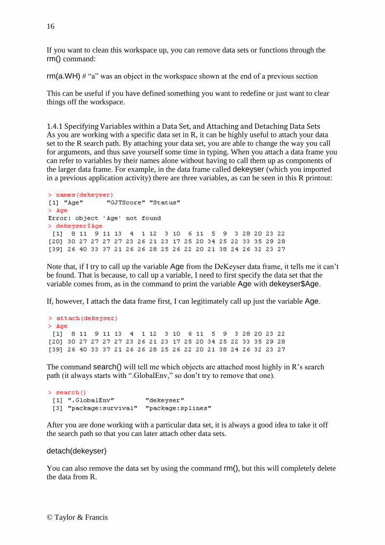
1.4.1 Specifying Variables within a Data Set, and Attaching and Detaching Data Sets As you are working with a specific data set in R, it can be highly useful to attach your data set to the R search path. By attaching your data set, you are able to change the way you call for arguments, and thus save yourself some time in typing. When you attach a data frame you can refer to variables by their names alone without having to call them up as components of the larger data frame. For example, in the data frame called dekeyser (which you imported in a previous application activity) there are three variables, as can be seen in this R printout:
Note that, if I try to call up the variable Age from the DeKeyser data frame, it tells me it can‘t be found. That is because, to call up a variable, I need to first specify the data set that the variable comes from, as in the command to print the variable Age with dekeyser$Age. If, however, I attach the data frame first, I can legitimately call up just the variable Age.
The command search() will tell me which objects are attached most highly in R‘s search path (it always starts with ―.GlobalEnv,‖ so don‘t try to remove that one).
After you are done working with a particular data set, it is always a good idea to take it off the search path so that you can later attach other data sets.
detach(dekeyser) You can also remove the data set by using the command rm(), but this will completely delete the data from R.

17
© Taylor & Francis
1.5 Missing Data Whether you enter your own data or import it, many times there are pieces of the data missing. R will import an empty cell by filling in with the letters ―NA‖ for ―not available.‖ If you enter data and are missing a piece, you can simply type in NA yourself. R commands differ as to how they deal with NA data. Some commands do not have a problem with it, other commands will automatically deal with missing data, and yet other commands will not work if any data is missing. You can quickly check if you have any missing data by using the command is.na(). This command will return a ―FALSE‖ if the value is present and a ―TRUE‖ if the value is missing.
is.na(forget)
The results return what are called ―logical‖ answers in R. R has queried about whether each piece of data is missing, and is told that it is false that the data is missing. If you found the answer ―TRUE,‖ that would mean data was missing. Of course, if your data set is small enough, just glancing through it can give you the same type of information! A way to perform listwise deletion and rid your data set of all cases which contain NAs is to use the na.action=na.exclude argument. This may be set as an option, like this:
options(na.action=na.exclude) or may be used as an argument in a command, like this:
boxplot(forget$RLWTEST~lh.forgotten$STATUS, na.action=na.exclude) In the case of the boxplot, however, this argument does not change anything, since the boxplot function is already set to exclude NAs.
1.6 Application Activities in Practicing Saving Data, Recognizing Missing Data, and Attaching and Detaching Data Sets 1. Create a new file called ―ClassTest.‖ Fill in the following data: Pretest Posttest DelayedPosttest 22 87 91 4 56 68 75 77 75 36 59 64 25 42 76 48 NA 79 51 48 NA You are entering in missing data (using the NA designation). After you have created the file, go ahead and check to see if you have any missing data (of course you do!).

18
© Taylor & Francis
2. Using the same data set you just created in activity 1, call up the variable Posttest. Do this first by using the syntax where you type the name of the data set as well as the name of the variable in, and then attach the data set and call up the variable by just its name. 3. Save the data set you created in activity 1 as a .csv file.
1.7 Getting Help with R R is an extremely versatile tool, but if you are a novice user you will find that you will often run into glitches. A command will not work the way I have described, and you won‘t know why. So, to help you out, I‘d like to introduce you to ways of getting more help in R. First of all, if one of the steps I have outlined in the book doesn‘t work, first try going through the troubleshooting checklist below. I assume that your problem arises when using the R Console, not when using R Commander. Troubleshooting checklist for novices to R:
Have you typed the command exactly as shown in the book? Are the capitalized letters capital and the non-capitalized letters non-capital? Since R records what you do, you can go back and look at your command to check this.
Have you used the appropriate punctuation? Have you closed the parentheses on the command? If you typed the command in Microsoft Word first, you might have a problem with smart quotes. An error message like this:
Error: unexpected input in "hist(norm.x, xlab=”" shows there is a problem with the quote marks.
Do you have any missing data (marked with NA)? If so, can the command you are trying to use deal with NAs? Read the help file to see what is said about missing data there. You may need to delete the row that contains missing data; try imputing the data (topics treated in Chapter 3) so that you will not have any NAs.
What is the structure of your file? Is your file in the correct format for the command? Use the str() command to see whether your variables are numerical, character, or factors.
Next, there are help files available in R. If the command you want to use doesn‘t seem to be working correctly, you can call for further help. For example, if you wanted more information about how to set the working directory with the setwd() command, you would type:
help(setwd) If you don‘t know the name of a command that you would like to use, you can use the help function to try to find the default command for that test in R. For example, if you want to use a t-test but don‘t know the command name, R will suggest you use the command:
help.search("ttest") You can actually find the t-test command if you run a t-test in R Commander, and as a novice that is the way that I recommend going first. However, later in your career with R, you may want help with functions that are not in R Commander, and you can use this command to help search for help files.

19
© Taylor & Francis
Help files in R are extremely helpful, but they can be confusing at first. I was first thrown by the expression ―foo.‖ This means to substitute in whatever the name of your file is. For example, write.csv (foo, file="foo.csv") means to just put in the name of your file wherever ―foo‖ is. Thus, if my file is dekeyser, I would read the help files as telling me to use the command write.csv(dekeyser, file="dekeyser.csv"). There is more information in Appendix A on how to understand R‘s help files, but here are a couple of tips. Let‘s say you want to figure out how t-tests work, and you have discovered the command is t.test(). The last section, the Example section, may be the most useful for you at first. You can type:
example(t.test) Some commands and results will appear in the R Console, and if there are any graphics they will pop up in the R Graphics device. Here is some output from the t-test:
Remember, the number sign (―#‖) means commentary, so the beginning of this example tells you it is a classical example. The next line calls for a plot, and here is where the Graphics Device popped up. When I clicked on it, it outputted a boxplot. The fifth line down shows me one way of calling for a t-test, by using the with() command, where the data is called sleep. I see that the t-test on that line must have two arguments, but in this case it looks as though the data are all found in the same column called ―extra,‖ but are split into two groups, labeled simply as 1 and 2. After that the results for this test are printed out. Since you probably don‘t know the with() command yet, this example may not be clear, but the ―Usage‖ and ―Arguments‖ sections of the help file will tell you what types of arguments you need to put in the command. For t-tests, you will see in the ―Usage‖ section that the syntax is:
t.test(x, . . . ) This means that you must have an argument ―x‖ in the syntax. The ―Arguments‖ section tells you that x is ―a (non-empty) numeric vector of data values.‖ In other words, you must have at least one vector (one column) of data as an argument. One vector would be fine for a one-way t-test, but most t-tests will include two vectors of data, and the ―Arguments‖ section tells you that another argument ―y‖ can be included, which is another numeric vector (also, the

20
© Taylor & Francis
dots in the syntax show that other things, including those things which are listed in the Arguments section, can be inserted into the command). The third entry in the ―Arguments‖ section is shown below.
This means that you can insert a command ―alternative‖ into the syntax, like this:
t.test(x,y, alternative="two.sided") The entry does note, however, that ―two.sided‖ is the default, so it doesn‘t have to actually be inserted (as can be seen in the two-tailed t-test found in the example data earlier). However, if you want to have a one-tailed test, you can use the alternative = ―greater‖ or alternative = ―less‖ argument to call for this. If you keep trying to understand the help files, eventually they will provide help! There are also some useful FAQs and manuals under R Console‘s menu choice Help. One more place you can try going for help is the online R community. If you go to R‘s website (www.r-project.org) and click on ―FAQs‖ on the left-hand menu, you can find answers to common questions. The ―Search‖ link on the left-hand menu takes you to a list of places to search for archived answers to R questions. One I like is http://finzi.psych.upenn.edu/search.html. You actually can submit questions and get help with R, but be sure to follow the protocols and search the archives first so you won‘t be asking a question that has already been asked. I have found that, if you follow the rules for posting to the R help so that you submit a legitimate question, people there can get you answers quite quickly!
1.8 Using R as a Calculator There are many excellent books which you might read to help you learn more about R. I have read several of them (Crawley, 2007; Dalgaard, 2002; Verzani, 2004), and what helped me most was following along on my computer, doing in R what they showed on the page. These books all started on the process of helping the reader to understand how R works by beginning to use R as a calculator. I will follow their example. In fact, if you should do nothing more than learn how to use R as a calculator, you‘ll be happy you did. I don‘t use a calculator anymore for my monthly budget; I use R, and I hope after this chapter is finished you‘ll see why! But my main point here is that, in trying to understand how R actually works, you really need to dig in and copy what I am doing. Chapter 1 helped you get R and R Commander set up on your computer. You now need to continue being active by replicating on your version of R what I do in this chapter. You can take this exercise a step further if you not only copy what I do, but if you intentionally make mistakes and see what happens when you do so. Working this way you will learn a lot about R and how it works. R can add up numbers. Type the following sequence and see what happens: 67+35+99+10308 R will follow your input line with an output line that looks like this:

21
© Taylor & Francis
[1] 10509 This is the sum of the numbers you just added up. The symbols for other basic mathematical functions are a dash for a minus sign (-), a star for multiplication (*), and a slash for division (/). A decimal point is represented by a period (.). Use parentheses to perform mathematical functions in a preferred order. Thus
(240+50*10)/2 #240 plus 50 times 10 divided by 2 will be a different result from
240+(50*10)/2 because the parentheses group the numbers differently.
Notice that I added a commentary after a hash mark in one of the lines above. This is a
traditional way to add commentary after the command line in R. If you could copy and paste
this command into R, the hash mark would tell R to ignore anything after it, and it would not
try to compute anything. If you did not enter the hash mark, like this:
(240+50*10)/2 240 plus 50 times 10 divided by 2 and then entered this line into R, you would see the following error message:
Error: unexpected numeric constant in "(240+50*10)/2 240" When working with R, you are sure to receive lots of error messages. It is useful to pay attention to these, as they can help you figure out what you did wrong. One more useful set of functions is raising a number to a power and taking its square root. Take the square root by using the command sqrt(). The parentheses indicate that you need to put the number you are calculating into the parentheses after that command, like this:
sqrt(16) [1] 4 Remember that, if you are using one of R‘s built-in functions, like the square root calculation, it will require that the arguments to the command be found in parentheses. You will get an
Tip: You can scroll through previous commands by hitting the arrow up button. Once you have a previous command in the input line, you cannot use your mouse to move to different parts of the command in order to edit, but you can use the arrow forward or arrow back keys to edit your command. Try this with the parentheses for the two numbers above; bring up the previous command with the parentheses around (240+50*10) and delete the first parenthesis to put it in front of the 50 now. You‘ll want this skill for when you do the application activity. You can
use the escape button (ESC) to get back to a blank prompt.

22
© Taylor & Francis
error message if you forget to put the parentheses in. The error message will depend on what mistake you made. Look at the following examples:
sqrt32 Error: object "sqrt32" not found Here, R thinks you are calling an object that has the name ―sqrt32,‖ but it doesn‘t have that object in its memory.
sqrt 32 Error: unexpected numeric constant in "sqrt 32" Here the error message is different because I put a space between the command and the number, so now R doesn‘t think it‘s an object, but it can‘t evaluate the function without the parentheses.
sqrt(32 + Here I put the first parenthesis but forgot the second one so R writes a plus sign to give me a chance to continue and finish my command. If I typed an ending parenthesis R would carry out the calculation. However, if you want to get out of a command without finishing the calculation, press the ESC button. You might also want to raise a number to a power, and you can do this by adding the caret (^) after the base number and before the number you want to raise it to. Therefore, the number 10
5 would be represented in R as 10^5. Notice the result you get when you try to calculate
105.
10^5 [1] 1e+05 R doesn‘t think you need to see the number 100000. But if it‘s been a while since you‘ve done math, remember that here the ―e‖ means you take the number that‘s in front of it and move the decimal point to the right the number of spaces indicated by the number after the plus sign. In this case that number is simple (a 1 with 5 zeros after it), but in other cases it wouldn‘t be:
937546583^9 [1] 5.596747e+80
R as a Calculator To use R as a calculator, enter numbers and numerical function symbols after the command prompt. + = add - = subtract * = multiply / = divide sqrt() = square root function ^ = raise a number before the caret symbol to a power given after the symbol Use parentheses to group your mathematical operations, if needed.

23
© Taylor & Francis
1.9 Application Activities with Using R as a Calculator Perform the mathematical functions described below using R.
1. Add the numbers 88, 2689, 331, 389, and 2. 2. Subtract 89.32 from 25338. 3. Multiply 59 and 26. Divide by the square root of 24. 4. Let‘s pretend you make $2500 a month. Subtract out your rent ($800), money for food ($500), health care costs ($150), car payment ($136), car insurance ($55), car gas ($260), gym membership ($35), and entertainment expenses ($225). How much do you have left to save? 5. Add 275 and 38 together; then raise that to the 3rd power and divide everything by 6. 6. Divide 258367 by 268. Add 245 and 897 to that number. Multiply the result by 4 raised to the 20th power. 7. Whoops! You forgot to add in a couple of bills this month, so go back to your calculations in activity 4 and subtract your cell phone bill ($63.24), your cable bill ($35.10) and a new pair of glasses this month ($180). And your rent just went up to $850 a month, so change that. Now how much can you save? 8. Multiply 42 by 84, divide that by the sum of 90, 266, and 35, and then raise that whole result to the 3rd power.
1.10 Objects So there you have it—you have seen how R can be your calculator! Actually the reason I like R better than a calculator is that I have all the numbers printed out in front of me so I can check my math, but I can also go back and change numbers or add more later, just as in the application activity. But we will now move on to looking at R as more than a calculator. Any command that we tell R to do can be put into an object. We name the object ourselves. The line below shows how I take all my budget calculations from the application activity and put them into an object I‘ll call Savings.March.2010:
Savings.March.2010<-2500-(850+500+150+136+55+260+35+225+63.24+35.10+180) Notice that I use the sequence of two symbols, the less than sign (<) and the dash (-), together called the assignment operator, to show that whatever is on the right side is going into the object on the left side of the symbols. You can also use an equals sign here (=), which is of course easier to type, but the assignment operator may be helpful because it shows which way the assignment is going (the part on the right is assigned into the object named on the left). Venables, Smith, and R Development Core Team (2005) note that the equals sign is an equivalent to the assignment operator in most cases, but there are some exceptions. You will see me use both the equals sign and the alternate assignment operator throughout the book.

24
© Taylor & Francis
Notice that, when you type the line that calculates my savings for the month of March into R,
you won‘t see anything. R won‘t return any answer until you ask it to. When you type in the
name of the object, then you get the results of the calculation:
Savings.March.2010 [1] 10.66 This type of object has only one entry. But let‘s create another object that has several entries. I can‘t just enter the name of an object that is not defined, though, so I will first make a couple more objects for my budget:
Salary<-2500 Fixed.Expenses<-c(850,500,150,136,55,260,35,225) Bills<-c(63.24,35.10) Additional.Expenses.March.2010<-180 Notice that, in every case where I‘m entering more than one number, I‘ve used a ―c‖ before the parentheses. The ―c‖ stands for ―concatenation‖ and is a built-in, primitive function of R (for more information about primitive functions of R, type library(help="base")). This is a function that combines its arguments to make a vector, which is basically a column of data if you think of data set up in a spreadsheet. Now I‘ll create a formula to calculate my savings every month without having to type in my fixed numbers every time:
Savings=Salary-(sum(Fixed.Expenses) + sum(Bills) + sum(Additional.Expenses.March.2010)) Notice that I had to use a function, sum(), that sums up the numbers. If I didn‘t do this, I would have gotten as an answer a collection of numbers, not just one number (try it yourself; write the equation without the command sum() and see what the object summary returns). Now R has stored that number in the object called Savings. If I want to see it, I have to ask R to show me what‘s in the object, by just typing its name: Savings [1] 10.66 Obviously, this is what we calculated before, but the point is that now each month I could, for example, just redefine my ―Bills‖ category and my ―Additional Expenses‖ category and then run the equation again to see how much I can save that month. At this point you can now understand how you yourself could create a vector of numbers. You would simply use the c() command and enter a series of numbers separated by commas. Vectors can also consist of character strings as well as numbers. To tell R that these are not numbers, you need to insert double or single quotation marks around the character strings, like this: MyFamily<-c('Andrea', 'Mark', 'Annette', 'Caroline') MyFamily [1] "Andrea" "Mark" "Annette" "Caroline" If you forget the quotation marks, R thinks you are looking for previously defined objects (like those I defined in my budget calculation above), and gives you an error message:

25
© Taylor & Francis
MyFamily<-c(Andrea,Mark,Annette,Caroline) Error: object 'Andrea' not found You cannot combine numbers and character strings in the same vector. If you put numbers and strings into the same object, R will coerce everything to be of the same type, which here is a character (we can tell because the parentheses are around the numbers as well as the names).
MyFamily<-c('Andrea',23, 'Mark',15,'Annette',45,'Caroline',18) MyFamily [1] "Andrea" "23" "Mark" "15" "Annette" "45" "Caroline" "18"
1.11 Application Activities in Creating Objects 1. Create a numeric vector of the following numbers and call it ―Years‖: 1976, 2003, 2009, 1900. Look at the vector you just made. Did it rearrange the order of the numbers? 2. Create a character vector with your own family‘s names in it and call it ―MyFamily.‖ Look at the vector you just made. Are the names listed with a single quote mark, double quote mark, or no quote mark? 3. Create a numeric vector that lists your monthly income called ―Salary.‖ Create another numeric vector that lists your monthly expenses called ―Expenses.‖ Create one more vector called ―Budget‖ that subtracts the sum of your monthly expenses from your salary. Show your vectors.
1.12 Types of Data in R This section will look at different types, or classes, of data in R. This is not just an academic exercise; the class of data in R will often determine how graphics will be displayed in the plot() command, how generic functions such as summary() treat the data, and whether you can use specific types of commands which may require that the data be in a certain format in order to work. It is thus important to understand some of the types of data that you will meet most frequently when using R.
In R you will create objects. A vector is one column of data, consisting of numbers or character strings. A vector can have only one type or the other, not both in the same vector. Create a vector by naming the vector on the left side of the equation and then specifying on the right the content:
FavoriteAmericanIdols<-c('Constantine', 'Clay Aiken', 'Kelly Clarkson') FavoriteNumbers<-c(25,8,17,22) Use the c() concatenation function to combine the elements of the vector. A vector may also consist of mathematical operations on previously defined objects:
LuckyNumber=sum(FavoriteNumbers) LuckyNumber [1] 72

26
© Taylor & Francis
If you import data, you create an object that R labels a data frame. A data frame is a collection of columns and rows of data, and the data can be numeric or character (remember that characters in R are symbols that have no numerical value). It only has two dimensions, that of rows and columns. All of the columns must have the same length. Most of the data you will work with is in data frames, and you can think of it as a traditional table. You can see an example of a data frame in Table 1.1. To create the view in Table 1.1, I simply asked R to give me just the first few rows of data by using the head() command with the mcguireSR data set:
head(mcguireSR) #gives first few rows of the data frame This data set comes from work by McGuire (2009) on how fluency of English as a second language learners is affected by a focus on language chunking. If you want to follow along, import this .csv file (it is comma delimited) and call it mcguireSR. An object with just one column of numbers (if you think of the numbers arranged in a spreadsheet) creates a vector, which was explained previously in the online documents ―Understanding the R environment. Objects‖ and ―Understanding the R environment. Types of data in R.‖ Some commands for robust statistics that you will see later in the book require arguments that are vectors. If you take just one column out of a data frame and turn it into an object with a new name, this is a vector. For example, one column of post-test data is taken out of the imported data set called mcguireSR:
mcguireSR$Post.test [1] 140.5 134.0 143.3 156.3 162.0 141.3 134.2 160.0 134.2 137.2 168.9 128.5 [13] 145.9 147.5 127.7 174.8 165.5 151.8 179.4 I then put these numbers into an object I name MPT (for McGuire post-test):
MPT=mcguireSR$Post.test is.vector(MPT) [1] TRUE class(MPT) [1] "numeric" A command which asks if an object is a vector verifies that it is. A more general command class() tells you what type of data you have, but if it is a vector it will be classified as numeric or character. You can see a vector of data in Table 1.1. For the vector in Table 1.1, I just typed the data from the post-test into a vector by hand:
mcguireVector=c(140.5, 134, 143.3, 156.3, 162.0, 141.3) class(mcguireVector) [1] "numeric" Another object in R that you may need for doing robust statistics is a list. A list is just a collection of vectors, which may be of different lengths and different types (this is different from a data frame, where all of the columns must be the same length). You can see an example of the mcguireSR data turned into a list in Table 1.1. The syntax for massaging the data into a list is a little complicated (don‘t worry too much about it here; I‘ll give you another example when you need to turn your data into a list; it‘s more important to just understand now how a list differs from a data frame or a vector):

27
© Taylor & Francis
mcguirelist=list() #this creates an empty list mcguirelist[[1]]<-c('Control', 'Control', 'Experimental', 'Experimental', 'Experimental', 'Experimental') #the designation [[1]] says that this is the first column of data. I wanted this column to #consist of characters, not numbers, so I had to put a quote around each word mcguirelist[[2]]<-c(140.5,134.0,143.3,156.3,162.0,141.3) mcguirelist[[3]]<-c(126.60,140.38,103.80, 135,60,133.66,146.10) class(mcguirelist) [1] "list" Table 1.1 Illustrations of R Data Types: Data Frames, Vectors, and Lists Data Frame Vector (Just the Post-Test Data)
List
There are a number of other types of data in R, namely matrices, arrays, and factors. A matrix is similar to a data frame, but all the data must be either numeric or character. An array can have more than two dimensions, and looks like a list of tables. It is often used with categorical data. These first two data types are not used much in this book, so I won‘t explain them further. More information can be found in Appendix A, however. The last additional type of data is the factor. A factor is a vector that is a categorical variable, and it contains a vector of integers as well as a vector of character strings which characterize those integers. This is a very useful data type to use with statistical procedures, but in most cases, if you import your data and your categorical variables are strings, R will automatically classify them as factors, so no further attention to this is needed on your part. For example, the imported mcguireSR data set has an independent variable Group, which contains character strings. If this data is summarized, because it is a factor, R can count how many people belong to each group.
mcguireSR$Group [1] Control Control Experimental Experimental Experimental Experimental summary(mcguireSR$Group) Control Experimental 2 4 class(mcguireSR$Group) [1] "factor"

28
© Taylor & Francis
1.13 Application Activities with Types of Data 1. Import and open the beq data set (it is an SPSS .sav file). Find out what type of data this is (use the class() command). 2. There are four variables in this beq data frame. Find out their names by typing names(beq). The variable CatDominance in the beq data set is a categorical variable. Find out if it is indeed a factor (remember that you can pick this variable out of the set by writing the name of the data set followed by a dollar symbol ($) and the name of the variable). 3. How many levels are there in the CatDominance variable? How many people in each level? Use the summary() command. 4. Referring back to the vectors you created in the application activity ―Understanding the R environment.ApplicationActivity _Creating objects,‖ find out what class of data your object Years and also MyFamily are.
1.14 Functions in R There are many built-in functions of R that we will use in future sections. Here I will start with a few simple and basic ones so that you can see how functions work in R. They will not necessarily be useful later, as there are more complex functions that will include the simple functions we look at here, but they will serve as a basic introduction to functions. We‘ll start with the function sum(). The arguments of sum() are numbers which are listed inside the parentheses, with each number followed by a comma. sum(34,10,26) [1] 70 The function mean() will return the average of any numbers included in its arguments.
mean(34,10,26) [1] 34 If you have imported a data set, such as the data frame dekeyser, you can find the mean score of the entire numeric vector with this function as well. In other words, you can put any numeric object inside the mean() function, not just single numbers.
mean(dekeyser$GJTScore)
You can find out what type of data you have by using the class() command. Here is a brief summary of the types of data in R: data frame: a traditional table with columns and rows vector: one column of a traditional table, where items are numeric or character strings matrix: a table where all variables are numeric or all variables are character list: a collection of vectors, which differs from a table because the vectors can have different lengths. array: a collection of tables
factor: a vector that has character strings which can be counted

29
© Taylor & Francis
[1] 157.3860 If you put a non-numeric vector, however, such as the factor Status, in the dekeyser data frame, you will get an error message.
mean(dekeyser$Status) Warning in mean.default(dekeyser$Status) : argument is not numeric or logical: returning NA [1] NA Several other short and simple functions could be used on a numeric vector:
1.15 Application Activities with Functions 1. Import the SPSS data set DeKeyser2000.sav. Call it dekeyser. Verify that the variance of the GJTScore is just the standard deviation squared using the var() and sd() functions. 2. Calculate the average age of the participants in the dekeyser data frame (use the names() command to help you get the right name for this column of data). Use the function mean().
There are many built-in functions in R. Here is a summary of some very simple ones.
sum() add arguments together mean() gives average of arguments length() returns N of vector min() minimum score max() maximum score range() gives minimum and maximum sd() standard deviation var() variance

30
© Taylor & Francis
3. What is the oldest age in the deKeyser data set? Use the function max(). 4. Import the SPSS data set LarsonHallPartial.sav. Call it partial. How many participants were there in this study (count the number using the length() function)? What were the mean and standard deviation of their accuracy on words beginning in R/L?
1.16 Manipulating Variables (Advanced Topic) At some point after you have begun working with R, it is likely that you will want to manipulate your variables and do such things as combine vectors or group participants differently than your original grouping. However, since we have not begun any real work with statistics yet, this section may not seem pertinent and may be more confusing than helpful. I recommend coming back to this section as needed when R is more familiar to you. I will also note that, for me personally, manipulating variables is the hardest part of using R. I will often go to SPSS to do this part, because the ability to paste and copy numbers is a lot more intuitive than trying to figure out the syntax for manipulating numbers in R.
1.16.1 Combining or Recalculating Variables For this example we will use a data set from Torres (2004). Torres surveyed ESL learners on their preference for native speaking teachers in various areas of language teaching. This file contains data from 34 questions about perception of native versus non-native speaking teachers. Let‘s say that I am interested in combining data from five separate questions about whether native speaking teachers are preferable for various areas of language study into one overall measure of student preference. I want to combine the five variables of Pronunciation, Grammar, Writing, Reading, and Culture, but then average the score so it will use the same 1–5 scale as the other questions. To do this in R Commander, first make sure the data set you want to work with is currently active and shown in the ―Data set‖ box in R Commander (you will need to import it from the SPSS file Torres.sav; call it torres). Combine variables by using DATA > MANAGE
VARIABLES IN ACTIVE DATA SET > COMPUTE NEW VARIABLE. You will see a computation box like the one in Figure 1.14 come up.
Figure 1.14 Computing a new variable in R Commander. As you can see in Figure 1.14, I called the new variable preference. I moved the five variables that make up this new variable from the ―Current variables‖ box into the ―Expression to compute‖ box by double-clicking on them. After starting out with a

31
© Taylor & Francis
parenthesis at the beginning, I added the variables one by one. After each variable I manually typed in a plus sign, and at the end of the entire string I typed in ―)/5‖ to divide it all by 5. You can use the same symbols (such as ―+,‖ ―*,‖ ―^‖) that were explained in the online document ―Understanding the R environment.R as a calculator‖ to perform mathematical computations. Last of all you will want to make sure this worked right by opening up the ―View data set‖ button on the R Commander interface and scrolling over to the end of the data set. Figure 1.15 shows how I have done this, and the column appears to be measured on a five-point scale.
Figure 1.15 Verifying that a new variable was correctly calculated in R Commander. I would also ask for the range of scores to make sure I‘m on the right track: range(torres$preference) [1] 2.266667 5.000000 Looks good! I‘d also like to show you how commands can be executed on the R Console. As we go along I will first show you how to perform an action using R Commander, but then I will also explain the R code. At first you may not care about this, but as you become more experienced with R you might want to begin to move toward using more code, and so I want you to understand it. Note that the R code can be found in R Commander in the Script window. If you want to take the code that R Commander used for a certain command and tweak it a little, you can simply copy the code from the Script window to the console and paste it in. Every time I give you R code, I will try to explain it in more detail. The box below first gives the command that was used to combine the variables. I then try to break down the command into its constituent parts and explain what each part is doing.
torres$preference <- with(torres, (pron+ grammar+ writing+ reading+ culture)/5) torres$preference This command creates and names the new variable
preference.
<- This symbol says to assign everything to the right of it into the expression at the left; you can also use an ―equals‖ sign (―=‖).
with(torres, (expression) ) with(data, expression, . . .)

32
© Taylor & Francis
The with() command says to evaluate an R expression in an environment constructed from data.
(pron+grammar+ writing+ reading+ culture)/5
This is the arithmetic expression.
1.16.2 Creating Categorical Groups Sometimes you want to take the data and make categorical groups from it (you should be careful, though; making categorical groups when you have interval-level data is just throwing away information). To illustrate this process, let‘s look at data from DeKeyser (2000). DeKeyser administered a grammaticality judgment test to a variable of child and adult Hungarian L1 learners of English. DeKeyser divided the participants on the basis of whether they immigrated to the US before age 15 or after (this is his Status variable). But let‘s suppose we have a good theoretical reason to suspect that there should be four different groups, and we want to code the data accordingly. (I want to make it clear that I don‘t actually think this is a good idea for this particular data set; I‘m just using it as an example.) In R Commander, we can create new groups (also called recoding variables) by first making sure the data set we want is the active one in the ―Data set‖ box in R Commander (if you have not already done so for a previous application activity, in order to follow along with me here you‘ll need to import the DeKeyser2000.sav SPSS file; name it dekeyser). Then pull down the DATA menu and choose MANAGE VARIABLES IN ACTIVE DATA SET > RECODE VARIABLES. A dialogue box will open (see Figure 1.16).
To Use Existing Variables to Calculate a New Variable In R Commander, choose: DATA > MANAGE VARIABLES IN ACTIVE DATA SET > COMPUTE NEW VARIABLE In R, use the template:
torres$preference <- with(torres, (pron+ grammar+ writing+ reading+ culture)/5)

33
© Taylor & Francis
Figure 1.16 Recoding variables in R Commander. After I pressed OK I looked at the data set and verified that this new variable had been created and seemed fine. The R code for this command is:
dekeyser$FourCat <- recode(dekeyser$Age, '0:7="child"; 8:15="older child"; 16:22="adolescent"; 23:40="adult"; ', as.factor.result=TRUE) dekeyser$FourCat This command creates and names the new variable
FourCat. <- Assignment operator.
recode(data, expression, as.factor.result=TRUE)
The recode command gives instructions on how to restructure a numeric vector into one that is a factor. The expression part gives the recode specifications.
'0:7="child"; 8:15="older child"; 16:22="adolescent"; 23:40="adult"; '
This is the recode specification; note that the entire expression is enclosed in single quotes; each part of the recode directive is separated by a semi-colon; the expression 0:7="child" specifies that, if the number is 0 through 7, the label child should be attached in this factor.
If you want to change existing factor levels that are already categorical and named with non-numerical characters, you will need to put quotation marks around the existing names as well as the new names, as shown in the recoding done for the beqDom file (shown in Figure 1.17).
Choose the variable you want to recode (Age here), give it a new name (FourCat for four categories), and enter
recode directives (the ―Help‖ button can be useful here).

34
© Taylor & Francis
Figure 1.17 Recoding character variables in R Commander (factors with labels). The R code for this command is: beq$Langs <- recode(beq$NumberOfLang, '"Two"="LessFive"; "Three"="LessFive"; "Four"="LessFive"; "Five"="Five"; ',
as.factor.result=TRUE) levels(beq$Langs) #Use this to check that everything came out right [1] "Five" "LessFive" #Looks good!
1.16.3 Deleting Parts of a Data Set Sometimes you may have a principled reason for excluding some part of the data set you have gathered. If you are getting rid of outliers, robust statistics (which I will discuss throughout this book) is probably the best way to deal with such a situation. However, there are other situations where you just need to exclude some part of the data set a priori. For example, in the case of the Obarow (2004) data set discussed in Chapter 11, ―Factorial ANOVA,‖ some children who participated in the vocabulary test achieved very high scores on the pre-test. Children with such high scores would not be able to achieve many gains on a post-test, and one might then have a principled reason for cutting them out of the analysis (although you should tell your readers that you did this). To cut out an entire column of data, make sure your data is the active data set and then use R Commander‘s menu sequence DATA > MANAGE VARIABLES IN ACTIVE DATA SET > DELETE
VARIABLES FROM DATA SET. To follow along with me here, import the Obarow data set (the SPSS file is called Obarow.Original.sav; name it obarow). I decide to cut the variable grade, so I choose it out of the list of variables. A prompt comes up to verify that I want to delete it, and I press OK. The R code for this action is quite simple:
Creating Categorical Groups from Existing Data In R Commander, choose: DATA > MANAGE VARIABLES IN ACTIVE DATA SET > RECODE VARIABLES In recode directives, enter the range of numbers to the left of the equals sign (separate range with a colon) and enter the name of the new category in quotes to the right of the equals sign. If you are recoding categories that already exist, put parentheses around character symbols to the left of the equals sign as well. In R, use the template: beq$Langs <- recode(beq$NumberOfLang, '"Two"="LessFive"; "Three"="LessFive"; "Four"="LessFive"; "Five"="Five"; ',
as.factor.result=TRUE)

35
© Taylor & Francis
obarow$grade <- NULL You just assign nothingness to the variable, and it ceases to exist. There may also be times when you would like to exclude certain rows instead of delete entire variables. There is a menu command in R Commander to accomplish this: DATA > ACTIVE
DATA SET > REMOVE ROW(S) FROM ACTIVE DATA SET. Here you would have a large number of choices as to what you would enter in the line labeled ―Indices or quoted names of row(s) to remove‖ (see Figure 1.18). The ―Help‖ button associated with this box takes you to the help page titled ―Extract or replace parts of a data frame.‖ A look at the examples on that page is quite interesting.
Figure 1.18 Removing a row from the active data set in R Commander. If you want to remove one certain row, you can just put the number of that row in the box. Figure 1.18 shows a range of rows from 7 to 11 that will be excluded. I have given the data set a new name as well. The R code for performing this action is simple as well, as long as you understand that in R you can specify rows and columns in brackets, with rows first and columns second. The R code for removing rows 7 through 11 from the obarow data set and creating a new one is:
NewObarow<-obarow[-c(7:11),] R uses the minus sign (―-‖) to show that it will subtract this subset of rows. The concatenation function, c(), is used whether or not there is more than one row or column being deleted. So the R command says to subtract out rows 7 through 11 (we know they are rows because they come before the comma) from all of the columns (we know this because nothing is specified; if you wanted to subtract out certain rows only from certain columns you would specify the columns after the comma.
Tip: Here‘s a silly mnemonics device to help you remember which comes first, the row or the column: Row, row, row your boat gently down the stream, toss your column overboard and
listen to it scream. Row comes first and column comes second in my version of the nursery rhyme, so you can remember it works that way in the syntax too.

36
© Taylor & Francis
But what if you don‘t know exactly which rows you want to delete? What if, instead, you want to remove any data that exceeds a certain number? To do this, you can use the subset() command. The following command puts a subset of the original data set into a file with a different name. In this command I get rid of any cases where the Pretest 1 score was over 18 points (out of 20 possible).
NewObarow<-subset(obarow, subset=pretest1<=18) Notice that in the subset command I have used the comparison operators less than or equal to(―<=‖). Other such operators in R include more than (―>‖), more than or equal to (―>=‖), less than (―<‖), equal to (―==‖), or not equal to (―!=‖). The subset() command can also be useful for rearranging data, not necessarily deleting it. This topic is covered in the next section.
1.16.4 Getting Your Data in the Correct Form for Statistical Tests Depending on how you have set up your data entry, there are two basic ways that you might have your data set up:
1. Data is split so that the results for each group for each variable are found in different columns. We‘ll call this the ―wide‖ form (see Figure 1.19). This form of data already split by the categorical variables is often used for the robust statistics tests created by Wilcox (2005) that are used in this book.
2. All the data for one variable is in one column, and there is another column that codes the data as to which group it belongs to. Everitt and Dunn (2001) call this the ―long‖ form because the columns will be longer in this case. This is the form used for ANOVA analysis (see Figure 1.20).
Here is an example of the data in the wide format. Let‘s say we are looking at the correlation between test scores of children and adults on regular and irregular verbs. We would have one column that represented the scores of the children on regular verbs, another column
Deleting Parts of a Data Set In R Commander, for removing rows, choose: DATA > ACTIVE DATA SET > REMOVE ROW(S) FROM ACTIVE DATA SET For removing columns, choose: DATA > MANAGE VARIABLES IN ACTIVE DATA SET > DELETE VARIABLES FROM DATA SET In R, to remove columns, assign the column to the NULL operator:
obarow$grade <- NULL To remove rows specify which rows to subtract out (and possibly rename your data):
NewObarow<-obarow[-c(7:11), ]

37
© Taylor & Francis
containing the scores of adults on the regular verbs, etc. In the wide format, we do not need any indexing (or categorical) variables, because the groups are already split by those variables (adult vs. child, regular vs. irregular verbs) into separate columns (see Figure 1.19; note that I just typed this data in by hand—it does not come from any data set. If you‘d like to follow along with me, just type the initial data in Figure 1.19 in yourself and call the file verbs).
Figure 1.19 Data in the ―wide‖ format. This data can be put into the long format (see Figure 1.20). In this case all of the scores are put into just one column, and there is another column (which is a factor) which indexes both the group variable and the verb regularity variable at the same time.

38
© Taylor & Francis
Figure 1.20 Data in the ―long‖ format. With the help of R Commander, moving from one form to another is not too difficult. In R Commander I went to DATA > ACTIVE DATA SET > STACK VARIABLES IN ACTIVE DATA SET. There I picked all four variables by holding down the Ctrl button on my keyboard and right-clicking my mouse on each variable. I renamed the entire file verbsLong, renamed the numeric variable Score and the factor variable that would be created Group. Figure 1.21 shows the ―Stack Variables‖ dialogue box, and Figure 1.20 is the result from that command.
Figure 1.21 Going from wide form to long form in R Commander. This process can of course be done using R code:
verbsLong <- stack(verbs[, c("AdultIrregV","AdultRegVerb ","ChildIrregVerb ", "ChildRegVerb")]) names(verbsLong) <- c("Score", "Group") verbsLong<- Assign the result of what‘s on the right-
hand side of the assignment operator to the object verbsLong.
stack(verbs[ ]) This command stacks separate vectors on top of each other and then creates an indexing column; here, it is told to work on the data set verbs.
[, c("AdultIrregV", "AdultRegVerb", "ChildIrregVerb", "ChildRegVerb")]
The data inside the brackets specifies that we want all of the rows from the data set verbs, and the four columns that correspond to the ones listed.
names(verbsLong ) The names on the right-hand side are assigned to the names dimension of the newly created verbsLong data frame.
For moving from a long format to a wide one, you can simply subset the original data set along the categorical variable or variables. In R Commander, choose DATA > ACTIVE DATA
SET > SUBSET ACTIVE DATA SET. The tricky part comes in figuring out what to put in the box ―Subset expression.‖ This needs to be set up so that the level of the categorical variable is specified. Therefore, before you open the dialogue box to do this, make sure to find out what the levels are for your variable.

39
© Taylor & Francis
levels(VerbsLong$Group) [1] "AdultRegVerb" "ChildRegVerb" "AdultIrregV" "ChildIrregVerb" First, I click off ―Include all variables‖ and select the variable of ―Score‖ because I only want one column of data, not a column with Group and a column with Score. For the subset expression, notice that I need to use double equals signs (―==‖) after the name of the variable (―Group‖) and that I need to spell and capitalize the name of the level exactly right, and put it in parentheses. Figure 1.22 shows the dialogue box and resulting data set.
Figure 1.22 Subsetting a data set in the long form. To continue with this process in R Commander, don‘t forget to change your active data set! If you try to subset the data set you just created (in my case, RegVerbAdults) your result will be null! Click in the ―Data set‖ box along the top of the R Commander window to go back and choose the original data set. In the end I will have four different data sets that I will want to put together into one wide data set. Here the merge() command will not work, because the rows are numbered according to their original position in the long form of the data, and so there will be many NAs inserted (see Figure 1.19 to refer to what the wide form should look like). What is needed is to coerce the data together into a data frame and correctly label the columns. R code will do this:
Verbs<-cbind.data.frame(ChildRegVerb,AdultRegVerb,ChildIrregularVerb, AdultIrregularVerb) Verbs<- Assign the result of what‘s on the right-hand
side of the assignment operator to the object Verbs.
cbind.data.frame() cbind stands for ―column bind,‖ so this ties together columns and makes them into a data frame.
ChildRegVerb,AdultRegVerb, ChildIrregularVerb, AdultIrregularVerb
The names of the four columns I want to bind together
dimnames(Verbs)[[2]]=c("ChildRegVerb","AdultRegVerb","ChildIrregVerb","AdultIrregVerb")

40
© Taylor & Francis
dimnames(Verbs) Set the dimension names of an object, in this case the data frame Verbs.
[[2]] Specifies that the dimension should be the columns (remember, rows come first, and then columns).
c("ChildRegVerb","AdultRegVerb " "ChildIrregVerb", "AdultIrregVerb")
The concatenation command c() contains the names I want appended to the columns. Note these must have quotes around them!
If you have followed my computations, you can verify for yourself at this time that the data set Verbs looks just as it started out in Figure 1.19. One major problem with this process is that, to make a data frame, the vectors you are binding together must be exactly the same length. If they are not, you will get an error message that tells you the vectors have differing numbers of rows. In most cases, you actually don‘t need to bind the subsetted vectors together—as a single vector they will perform in the statistical command the way you intended. To subset using R Commander, use the subset() command. Here is an example of one I used with this data.
ChildRegVerb <- subset(VerbsLong, subset=Group=="ChildRegVerb", select=c(Score)) ChildRegVerb<- Assign the result of what‘s on the right-
hand side of the assignment operator to the object ChildRegVerb.
subset() Take a subset of the first argument.
VerbsLong The name of the data set I want to subset
subset=Group=="ChildRegVerb" Name the level of the variable you want to subset out. Be careful to use the double equals signs and the quotes around the name of the level; otherwise you‘ll get an error message.
select=c(Score) Include this if you don‘t want to take all of the columns from the original data set. Here I only wanted the column with the Score.
In summary, manipulating data from the wide form to the long or vice versa is not impossible in R, but it is a process requiring a number of steps. Certainly if you cut and paste data this may be a much easier process in another program that works with spreadsheets, such as Excel or SPSS, depending on how large your data set is.
1.17 Application Activities for Manipulating Variables
1.17.1 Combining or Recalculating Variables 1. Use the torres data set. From this data set, create a new variable called OralPreferences by combining the variables of speaking and listening preference for a native speaker teacher. Don‘t forget to average the two scores so the result stays on a 1–5 scale. What is the range of scores for this new variable? Find out by using the function range() on the new variable.

41
© Taylor & Francis
2. Use the data set mcguireSR (this is a .csv file, comma delimited, if you did not import it earlier when using the online document ―Understanding the R environment.Manipulating Variables_Advanced Topic‖). Create a variable called gainscore by subtracting the pre-test from the post-test scores. What is the mean score for this variable? 3. Use the data set partial (this is an SPSS file, called LarsonHall.partial.sav; import it now, if you have not imported it before). The variable of R_L_accuracy is not measured in its raw form as a score out of 7. Convert the scores to percentages and call the new variable PercentAccuracy. What is the maximum percentage achieved?
1.17.2 Creating Categorical Groups 1. Using the same beq data set as was used in the section ―Combining or recalculating variables‖ in the online document ―Understanding the R environment.Manipulating Variables_Advanced Topic‖ (or import it if you have not previously), recode the variable NumberOfLang so there are only two levels: those with two or three languages (call them ―minorglots‖) and those with four or more languages (call them ―majorglots‖). Call your new variable Glots. Use the summary() command to see how many participants are in each of your new categories (you might want to reimport this file (BEQ.Dominance.sav) so that all of the cases will be there, since if you were following along with me in the text you might have deleted some cases!). 2. Use the mcguireSR data set (import as a text file; it is comma-delimited). Currently the participants are divided into whether they were in the experimental or control group. But let‘s say you decided you wanted to divide them into slow and fast speakers, according to their fluency scores on the pre-test (again, I don‘t think this is a good idea, but it‘s just for practice in manipulating variables!). Divide the speakers by calling those lower than the mean score ―slow‖ and those at the mean or higher ―fast.‖ Name your new variable rate. Verify your variable has two levels by typing the name of the new variable. 3. Use the torres data set (import SPSS file Torres.sav), and the variable labeled beginner. This indicates whether each person prefers a NS teacher for a beginning-level language learner (where 5 = strongly prefer, 3 = neither prefer nor dislike and 1 = strongly dislike). Categorize participants into those who have strong opinions (both 5s and 1s), moderate opinions (2s and 4s), and neutral (label them as ―strong,‖ ―moderate,‖ and ―neutral‖). Call this new variable TypeOfPreference. Which type of participant predominates? Use the summary() command to see how many participants are in each category.
1.17.3 Deleting Parts of a Data Set 1. Working with rows and columns. First, let‘s do some of the examples with data that are found in R itself. These examples use a data set that comes built into R called swiss which has data on Swiss fertility and socioeconomic indicators for various cities (use the command library(help="datasets") to see a list of all data sets that are included in R). This is a rather large data frame, so let‘s first cut it down to make it more manageable. Type: sw<-swiss[1:5, 1:4] sw #look at your data now Now we will work with the data set sw.

42
© Taylor & Francis
Perform the following commands, and explain what happens for each one, following the example in (a): a. sw[1:3] #shows first 3 columns, all rows b. sw[1:3,] # c. sw[,1:3] d. sw[4:5, 1:3] e. sw[[1]] f. sw[[5]] g. sw["C", ] 2. In activity 1 you created a new data frame called sw, with four variables. Remove the variable Examination. 3. Use the data set ChickWeight (this is a built-in R data set). This data looks at the weight versus age of chicks on different diets. How many data points are there? Find out using the length() command with any variable in the data set (don‘t just use the name of the data set itself, or it will only be 4!). Create a new variable called ChickDiet that excludes chicks that received Diet #4. How many participants are in the ChickDiet data set?
1.17.4 Getting Data in the Correct Form for Statistical Tests 1. The dekeyser data set is currently in the long form (you could look at it by using the command head(dekeyser) to see just the first six rows). Subset it into the wide form so there are only two columns of data, one for participants ―Under 15‖ and one for those ―Over 15.‖ The resulting vectors are of different lengths, so do not try to combine them. How many entries are in each of the two subsetted vectors (you can use the length() command, or the Messages section of R Commander will tell you how many rows the new subset contains)? 2. Import the Obarow.Story1.sav SPSS file (call it OStory). This file is in the long form. Subset it into four columns of data, each one with results on the first gain score (gnsc1.1) for each of the four possible conditions (± pictures, ± music) listed in the Treatment variable. How many entries are in each of the four subsetted vectors (you can use the length() command, or the Messages section of R Commander will tell you how many rows the new subset contains)? 3. Open the .csv text file called Effort. This is an invented data set comparing outcomes of the same participant in four different conditions. It is set up in the wide form. Change it to the long form so there are only two columns of data, and call it EffortLong; call one column Score and the other Condition. What is the average score over the entire group (this is not really something you‘d be interested in, but it‘s just a way to check you‘ve set up the file correctly)? 4. Open the .csv text file called Arabic. This is an invented data set that looks at the results of ten participants on four phonemic contrasts in Arabic, and also records the gender of each participant. It is set up in the wide form. Change it to the long form so there are only two columns of data that are indexed by the type of contrast that was used, and call it ArabicLong. Call one column Contrast (as in the phonemic contrast) and the other Score. What is the average score over the entire group (this is not really something you‘d be interested in, but it‘s just a way to check you‘ve set up the file correctly)?

43
© Taylor & Francis
1.18 Random Number Generation Random number generation may be useful when conducting experiments. When you are starting to do an experiment, you may want to randomize participants, sentences, test items, etc. You can generate random numbers in R by simply typing .Random.seed in the R console: Random.seed
Random single integers can be drawn from this distribution by simply going across the row: 4, 0, 3, 3, 5, 2, etc. Random numbers between 0 and 99 can be drawn by going across the row in pairs: 40, 33, 52, 64, etc.

44
© Taylor & Francis
Chapter 3
Describing Data Numerically and Graphically
3.1 Obtaining Numerical Summaries Follow along with me in this section by importing the SPSS file LarsonHall.Forgotten.sav into R. Make sure that it is the active data set in R Commander. The data set should have 44 rows and 12 columns. I have named it forget. In R Commander, choose STATISTICS > SUMMARIES > NUMERICAL SUMMARIES. This will let you make a summary of one variable with all cases lumped together, or you can also summarize the variable by groups. For this particular data set, I want to see summaries of my data divided into the groups that I created, and I will look at summaries for the listening test variable only (RLWTEST).
Figure 3.1 Inside the ―Numerical Summaries‖ box in R. R Commander uses the numSummary command to produce the summary. numSummary(forget[,"RLWtest"], groups= Status, statistics=c("mean", "sd", "quantiles"))
The choice of N (number of items or participants) is not listed but included when you use this function

45
© Taylor & Francis
First we see the mean, then the standard deviation, then the scores corresponding to the various percentiles, and finally the number (N) of items evaluated. If there are missing values they will be counted in a column at the end of the output as well. To get other types of statistical summaries using R Commander, choose STATISTICS >
SUMMARIES > TABLE OF STATISTICS and enter the function in the ―Other(specify)‖ box (a list of other summary statistics can be found in the table below). This particular command runs only when you have factors to split the data into groups. To obtain the same results as the numerical summary in R, albeit one test at a time, use the tapply() command as shown below:
attach(forget) tapply(RLWtest, list(Status=forget$Status), mean, na.rm=T) attach(forget) The attach command means the current
data set is attached high in the search path, and thus the names of the variables in the set can be used alone instead of specifying them with their data set (such as forget$RLWTEST).
tapply (data, indices, function, . . .) tapply is a command that creates a table for the function defined inside of it.
RLWtest The data in this case is the RLWtest column of the data frame forget; since forget is already attached, we can just type the variable name (otherwise, type forget$RLWtest)
list(Status=forget$Status) This is the index that splits the RLWtest variable; more categorical factors could be listed here if one wanted to split the scores even further, for example:
list(Status=forget$Status, sex=forget$sex)
mean sd var median quantile range min max mean, tr=.2
This is the function applied: standard deviation variance median quantile points range minimum value maximum value trimmed means (here 20%).
na.rm=T Removes any values which are not defined.
Here is the output for the tapply() command using the function to obtain the average score:
You will also want to obtain a count of the number of observations of a variable or, if you have groups, the number of participants in each group. The following command will

46
© Taylor & Francis
summarize the entire number of observations in a variable and remove any NAs for that variable: sum(!is.na(RLWtest)) #overall N for the variable [1] 44
To get a count of the number of participants in each group for a certain variable, making sure to exclude NAs, use the following command: table(Status[!is.na(RLWtest)]) #N count for each group
This command counts all of the entries which are not NAs divided up by the categorizing factor, in this case Status. To split by more than one variable, just add a comma, as in this example from the .csv file writing:
table(writing$L1,writing$condition[!is.na(writing$score)])
A quick step to get the mean, median, minimum, maximum, and Q1 and Q3 for all numeric variables in the set (not split by groups, however) and counts of participants in each level of a factor variable is in R Commander. Choose STATISTICS > SUMMARIES > ACTIVE DATA SET. The R syntax for this command is:
summary(writing)
Another method of obtaining the number of observations, minimum and maximum scores, mean, median, variance, standard deviation, and skewness and kurtosis numbers is the basicStats() function from the fBasics library. basicStats(forget$RLWtest[1:15]) #chooses just rows 1–15, which are the ―non‖ group
Tip: Another way to obtain the entire number of participants in a study is to use the length(forget$RLWtest) command, but the na.rm=T argument cannot be used with this command.

47
© Taylor & Francis
3.1.1 Skewness, Kurtosis, and Normality Tests with R To get a numerical measure of skewness and kurtosis using R, use the fBasics library. If you want to calculate the skewness and kurtosis levels in data that has groups, you must first subset the data into those groups. The following commands show how this was accomplished with the RLWtest variable and only the Non-immersionists group (LarsonHall.forgotten.sav SPSS data set). library(fBasics) non=forget$RLWtest[1:15] #chooses rows 1–15 of the variable to subset and names them ―non‖ skewness(non, na.rm=T) kurtosis(non, na.rm=T) Note that I basically manually subsetted my file above by choosing rows 1–15, but you could also use the subset() command (through either DATA > ACTIVE DATA SET > SUBSET ACTIVE
DATA SET in R Commander or the R code). The skewness help file states that the default method of computing skewness is the ―moment‖ method. Another possible method, that of ―fisher‖ (method=c("fisher")) should be used when resampling with a bootstrap. A variety of numerical tests of normality are available, including the Shapiro–Wilk and Kolmogorov–Smirnoff tests. The Shapiro-Wilk test needs essentially only one argument. This test for normality is appropriately used with group sizes under 50.
shapiro.test(non)
Obtaining the Mean, Standard Deviation, and Quantiles with R 1. Import your data set and make sure it is active in R Commander, or attach() it in R Console. 2. Choose STATISTICS > SUMMARIES > NUMERICAL SUMMARIES. 3. Open the ―Summarize by groups . . .‖ button if you have categorical groups. Press OK, and then OK again. The basic R code for this command is: numSummary(forget[,"RLWtest"], groups= Status, statistics=c("mean", "sd", "quantiles")) 4. Another method that produces a large number of summary items is to use the basicStats() command from the fBasics library.

48
© Taylor & Francis
If the p-value is above p=.05, the data is considered to be normally distributed. The Kolmogorov–Smirnoff test needs two arguments. To use a one-sided test to assess whether the data comes from a normal distribution, the second argument needs to be specified as the pnorm distribution (the normal distribution).
ks.test(non,"pnorm")
The print-out warns that there are ties in the data. It gives a very small p-value (1.872e-13 means you would move the decimal point 12 places to the left of the number), indicating that the non-immersionists‘ data is not normally distributed. The nortest library provides five more tests of normality. Ricci (2005) states that the Lilliefors test is especially useful with small group sizes, and is an adjustment of the Kolmogorov–Smirnoff test.
library(nortest) lillie.test(non)
I want to warn my readers here that just because a numerical normality test does not find a p-value less than .05 it does not necessarily mean your distribution is normal. If your data set is small, these kinds of tests do not have enough power to find deviations from the normal distribution. Graphical tools are just as important as these numerical tests.

49
© Taylor & Francis
3.2 Application Activities with Numerical Summaries 1. Import the SPSS file DeKeyser2000.sav and name it dekeyser. Summarize scores for the GJT grouped by the Status variable. Make sure you have data for the number of participants, the mean, and the standard deviation. By just eyeballing the statistics, does it look as though the groups have similar mean scores (maximum possible score was 200)? What about the standard deviation? 2. Import the SPSS file Obarow.sav and call it obarow (it has 81 rows and 35 columns). Summarize scores for the gain score in the immediate post-test (gnsc1.1) grouped according to the four experimental groups (trtmnt1). Each group was tested on 20 vocabulary words, but most knew at least 15 of the words in the pre-test. Obtain summaries for number of participants, mean scores, and standard deviations. Do the groups appear to have similar mean scores and standard deviations?
3.3 Generating Histograms, Stem and Leaf Plots, and Q-Q Plots
3.3.1 Creating Histograms with R If you want a histogram of an entire variable (not split by groups), it is easy to use R Commander to do this. Go to GRAPHS > HISTOGRAM.
To Obtain Skewness, Kurtosis, and Normality Tests to Assess Normality in R 1. If needed, first subset data into groups by creating a new object that specifies the rows you want. One way of doing so is to specify the column you want with the rows that pertain to the group you want, like this:
non= forget$RLWTEST[1:15] 2. Use these commands from the fBasics library: skewness(non) kurtosis(non) Alternately, the basicStats() command will give a number of descriptive statistics including the skewness and kurtosis numbers. shapiro.test(non)

50
© Taylor & Francis
Figure 3.2 Obtaining a histogram in R Commander. There are many ways you might want to change the histogram that R Commander generates, especially as to the labels it automatically prints out. You can use R Commander to see the code that generates a histogram, and then take that code and play with it in R Console until you get the look you like. The commands used to generate the three histograms with the Larson-Hall and Connell (2005) data in Figure 3.14 of the SPSS book (A Guide to Doing Statistics in Second Language Research Using SPSS, p. 81) are given below. Note that the first histogram leaves the y axis label in, but the second and third histograms get rid of the y label by putting nothing between the parentheses. par(mfrow=c(1,3)) #sets the graphics display to 1 row, 3 columns Hist(forget$RLWtest[1:15], col="gray", border="darkgray", xlab="", main="Non-immersionists") Hist(forget$RLWtest[16:30], col="gray", border="darkgray", xlab="", ylab="", main="Late immersionists") Hist(forget$RLWtest[31:44], col="gray", border="darkgray", xlab="", ylab="", main="Early immersionists")
The code below generates a histogram of 50 samples of the normal distribution (as seen in multiples in Figure 3.11 of the SPSS book (A Guide to Doing Statistics in Second Language Research Using SPSS, p. 79) and singly in Figure 3.3).
hist(rnorm(50,0,1),xlab="", main="", col="lightgray", border="darkgray",prob=T) hist(x, . . . ) The command for a histogram; many other general graphics
parameters can be added.
rnorm(50,0,1) Generates 50 samples of a normal distribution with mean=0 and s=1
xlab="", main="" Deletes the generic x label and main title that R would automatically print.
col="lightgray" Colors the inside of the histogram bins.
border="darkgray" Changes the color of the bin borders.
prob=T Changes the scaling to density; can also use scale="density" (also "percent" or "frequency")
Pick one variable. You can also decide how many bins you want your histogram to have, or leave it on auto. You can choose to have scaling by frequency counts, percentages, or densities. The look of the histogram will not change, just the choice of
scales printed along the y-axis.

51
© Taylor & Francis
To overlay the histogram with a density plot of the normal distribution (Figure 3.3) I used the following code:
norm.x=rnorm(50,0,1) x=seq(-3.5, 3.5, .1) dn=dnorm(x) hist(norm.x, xlab="", main="50 samples", col="lightgray", border="darkgray", prob=T) lines(x, dn, col="red", lwd=2) Note that in R you could use the command Hist or hist. Hist is specific to R Commander and is set up to call the hist command, but adds a couple of default arguments that hist doesn‘t have.
De
nsity
-3 -2 -1 0 1 2 3
0.0
0.1
0.2
0.3
0.4
Figure 3.3 Histogram with overlaid normal distribution. To create histograms of separate groups, you must subset the data into groups or specify certain rows in one vector of data, as was shown above in this section.

52
© Taylor & Francis
3.3.2 Creating Stem and Leaf Plots with R
3.3.3. Creating Q-Q Plots with R To create a Q-Q plot for an entire variable, use R Commander. Go to GRAPHS > QUANTILE-COMPARISON PLOT.
To Obtain Histograms in R 1. If needed, first subset data into groups by creating a new object that specifies the rows you want, like this: non= forget$RLWTEST[1:15] 2. Use the hist command: Hist(non) OR hist(non)
Creating a Stem and Leaf Plot with R Commander 1. If needed, first subset data into groups. 2. From the menu, choose GRAPHS > STEM AND LEAF DISPLAY. Pick the variable you want to graph. If using R Console, the command stem.leaf() creates the plot. 3. There are options to specify how to divide up stems if you have large data files (Leaf Digit, Parts Per Stem, Style of Divided Stems). Use the Help button if you‘d like more information about these options. 4. The option of ―Trim outliers‖ is self-explanatory, but I do not recommend this option for most data sets, as it is not a diagnostic. Uncheck this box, but leave the others checked. The option ―Show depths‖ prints counts of each line. The option ―Reverse negative leaves‖ concerns when numbers are negative.

53
© Taylor & Francis
Figure 3.4 Obtaining a Q-Q plot in R Commander.
-2 -1 0 1 2
40
50
60
70
80
90
norm quantiles
lh.fo
rgo
tte
n$
RL
WT
ES
T
Figure 3.5 A Q-Q plot with 95% confidence intervals. In the Q-Q plot in Figure 3.5, the dotted lines contain a simulated 95% confidence interval envelope. Maronna, Martin, and Yohai (2006, p. 10) say that if no points fall outside the confidence interval we may be ―moderately sure that the data are normally distributed.‖ For this data set, however, we do have one point which falls outside the envelope (top right-hand
If you tick this box, you will be able to click on points that will be identified by their row number in the data set (this is usually done to identify
outliers).
Notice that you can plot your distribution against a variety of different distributions. For purposes of determining whether your data are normally distributed, keep the radio button for Normal ticked.

54
© Taylor & Francis
side) and several points which are right on the border. Thus it would be hard to conclude that these data are exactly normally distributed. To analyze a Q-Q plot for different groups, first split the variable into different subsets. The command detailed below produces a Q-Q plot for the RLWtest data for just the non-immersionist group (non).
qq.plot(non, dist="norm", labels=F) qq.plot (x, . . . ) Performs quantile-comparisons plots; the command qqnorm also
performs a Q-Q plot against the normal distribution.
dist="norm" qq.plot can plot data against several different distributions: ―t,‖ ―f,‖ and ―chisq.‖
labels=F If set to TRUE, will allow identification of outliers with the mouse.
To produce a set of Q-Q plots for a variable split into groups without manually subsetting the data yourself, you can use the Lattice graphics library. The following commands produced Figure 3.6.
Q-Q plot
RL
WT
ES
T
40
50
60
70
80
90
-2 -1 0 1 2
Non
-2 -1 0 1 2
Late
-2 -1 0 1 2
Early
Figure 3.6 Q-Q plots for the LarsonHall.forgotten data.
library(lattice) qqmath(~RLWtest|Status, aspect="xy", data=forget,layout=c(3,1), xlab="Q-Q plot", prepanel=prepanel.qqmathline, panel=function(x, ...){ panel.qqmathline(x,...) panel.qqmath(x,...) }) The commands following the bolded command are used to insert the reference line into the graphic and were taken from the example found in the help(qqmath) page. If the bolded command is used by itself, it will produce the three Q-Q plots without the reference line. This bolded command is analyzed below:

55
© Taylor & Francis
qqmath(~RLWtest|Status, aspect="xy", data=forget, layout=c(3,1), xlab="Q-Q plot") qqmath (~RLWtest|Status, . . . ) Performs a Q-Q plot on the data split by the
second argument (Status).
aspect="xy" This argument controls the physical aspect ratio of the panels; ―xy‖ keeps a certain aspect ratio; alternatively, aspect="fill" makes the panels as large as possible.
data=forget Specifies the data set.
layout=c(3,1) Specifies there should be 3 columns and 1 row; if not specified, the layout will be automatically plotted.
xlab="Q-Q plot" Gives x label.
To learn more about both traditional graphics and lattice graphics in R, see the indispensable book by Paul Murrell (2006).
3.4 Application Activities for Exploring Assumptions Note: Keep your output from the activities in Checking Normality, as you will use some of the same output for the activities in Checking Homogeneity of Variance as well.
3.4.1 Checking Normality 1. Chapter 6 on correlation will feature data from Flege, Yeni-Komshian, and Liu (1999). Import the SPSS file FlegeYKLiu.sav file and name it FYL (it has 264 rows and 3 columns). Examine the data for pronunciation divided according to groups by using Q-Q plots. From the available evidence, does the data appear to be normally distributed? 2. Create a histogram with the GJT variable for each of the two groups in the SPSS file DeKeyser2000.sav file (imported as dekeyser). To make the groups, specify the row numbers. The ―Under 15 group‖ is found in rows 1–15 and the ―Over 15‖ group is found in rows 16–57. What is the shape of the histograms? Describe them in terms of skewness and normality. Look at stem and leaf plots for the same groups. Do you see the same trends? 3. Chapter 12 on repeated-measures ANOVA will feature data from Lyster (2004). Import the SPSS file Lyster.written.sav and name it lyster (it has 180 rows and 12 columns). Examine the gain scores for the comprehension task (CompGain1,CompGain2) divided according to groups (Cond for condition). From the available evidence, does the data appear to be normally distributed? Look at Q-Q plots only.
3.4.2 Checking Homogeneity of Variance 1. Check the homogeneity of variance assumption for pronunciation for the groups in the Flege, Yeni-Komshian, and Liu (1999) study (see activity 1 under ―Checking Normality‖ above) by looking at standard deviations for each group. The maximum number of points on this test was 9. What do you conclude about the equality of variances? 2. Check the homogeneity of variance assumption for the GJTScore variable for the two groups in the DeKeyser (2000) study (use the DeKeyser2000.sav file) by looking at standard

56
© Taylor & Francis
deviations for each group. The maximum number of points on this test was 200. What do you conclude about the equality of variances? 3. Check the homogeneity of variance assumption for the CompGain2 variable for the four groups in the Lyster (2004) study (use the Lyster.Written.sav file) by looking at standard deviations for each group. The maximum number of points any person gained was 21. What do you conclude about the equality of variances?
3.5 Imputing Missing Data It is a very common occurrence, especially in research designs where data is collected at different time periods, to be missing data for some participants. The question of what to do with missing data is a rich one and cannot be fully explored here, but see Tabachnick and Fidell (2001) and Little and Rubin (1987) for more detailed information. I will merely give a short summary of what can be done when the missing data points do not follow any kind of pattern and make up less than 5% of the data, a situation that Tabachnick and Fidell (2001) assert can be handled equally well with almost any method for handling missing data. An example of a pattern of missing data would be that in administering a questionnaire you found that all respondents from a particular first language background would not answer a certain question. If this whole group is left out of a summary of the data, this distorts the findings. In this case, it may be best to delete the entire question or variable. It is up to the user to explicitly specify what to do with missing values. I would like to point out, however, that Wilkinson and the Task Force on Statistical Inference (1999) assert that the worst way to deal with missing data is listwise and pairwise deletion. If you delete an entire case because a value in one variable is missing (listwise deletion), this of course means that all the work you went to in obtaining data from that participant is wasted, and of course with a smaller sample size your power to find results is reduced. Pairwise deletion is when you omit data for those cases where the variable you are examining doesn‘t have data, but you don‘t omit the whole case from your data set. Doing this may result in different Ns for different comparisons in the data set. Two methods that Howell (n.d.) recommends are maximum likelihood and multiple imputation. The details of how these methods work are beyond the scope of this book, but Howell provides a comprehensible summary at http://www.uvm.edu/~dhowell/StatPages/More_Stuff/ Missing_Data/Missing.html#Return1. A free program called NORM, available at www.stat.psu.edu/~jls/misoftwa.html, will perform both maximum likelihood and multiple imputation, and it also available as an R library, also called norm. However, for imputation I prefer the mice library. It is quite easy to impute values using this library and the function of the same name. The default method of imputation depends on the measurement level of the column, according to the mice help file. For an interval-level variable, the default will be predictive mean matching. Below is an example of how I imputed missing variables for the Lafrance and Gottardo (2005) data (imported as lafrance). library(mice) imp<-mice(lafrance) complete(imp) #shows the completed data matrix implafrance<-complete(imp) #name the new file to work with

57
© Taylor & Francis
A very cool function in R will create a graph of the observations of the data, leaving white lines where data is missing, as well as list the number of missing values and the percentage of your data that represents. It is a quick way to get a look at what is missing in your data set.
library(dprep) imagmiss(lafrance, name="Lafrance")
With the imputed data file (the right-hand graph in Figure 3.7) we no longer have the missing values.
imagmiss(implafrance, name="Lafrance imputed")
Figure 3.7 Original Lafrance and Gottardo (2005) data and with missing values imputed.
3.6 Transformations Tabachnick and Fidell (2001) have a very useful table which gives recommendations for what kinds of transformations to use when data appears in various shapes. These transformations are simple to do. If you do decide to transform your data, you should check all of the indicators of normality and homogeneity of variances (as well as other assumptions that apply only in certain tests, such as the linearity assumption in correlation) with the transformed data to see whether any improvement has been achieved. Tabachnick and Fidell‘s recommendations are gathered into Table 3.1. Table 3.1 Recommended transformations for data problems

58
© Taylor & Francis
Distributional Shape Recommended Transformation (X=Column You Want to Transform)
Transformation if Any Zeros Found in Data
Moderate positive skewness sqrt(X)
Substantial positive skewness log10(X) log10(X + C*) Severe positive skewness 1/X 1/(X + C) Moderate negative skewness sqrt(Z**-X)
Substantial negative skewness log10(Z**-X)
Severe negative skewness log10(Z((-X)
*C is a constant that is added so that the smallest value will equal 1. **Z is a constant that is added such that (Z-X) does not equal 0. To perform transformations of the data in R Commander choose DATA > MANAGE ACTIVE
VARIABLES IN DATA SET > COMPUTE NEW VARIABLE. The commands for transformations are not listed in the dialogue box itself. You will also have to add your own parentheses to the variable to show that the function, whether it be the logarithm or square root, is applying to the data. This procedure will produce a new column in your data set that you can then work with. Throughout the exercises in this chapter we have seen that the GJTSCORE variable in DeKeyser (2000) is negatively skewed. I will walk the reader through an example of transforming this data using R. Tabachnick and Fidell (2001) recommend using a reflect and square root transformation for moderately negatively skewed data. To determine the Z constant, we first find that the largest value in the data set is 199. We will add 1, so that Z=200. In R, I used R Commander‘s ―Compute new variable‖ command and it filled it in like this:
Figure 3.8 Computing a square root transformation in R. The expression I write in the box is sqrt(200-GJTScore). After obtaining this new column, I need to check on the distribution of this new variable, which I will do by looking at a histogram.

59
© Taylor & Francis
Non-Transformed
DeKeyser GJT Score
De
nsity
60 100 160
0.0
00
0.0
10
Transformed
DeKeyser GJT ScoreD
en
sity
0 2 4 6 8 12
0.0
00
.06
0.1
2
Figure 3.9 Checking the GJTScore variable with and without transformation for skewness. Although the histogram in Figure 3.9 seems to show less skewness in the transformed variable, the skewness value of the non-transformed variable is −.3 while the skewness of the transformed variable is −.4, a little worse but really not much of a difference. It‘s probably not worthwhile to transform this variable, given that interpreting the scale of the transformed variable is difficult.
3.7 Application Activity for Transformations In previous exercises (from the online document ―Describing data.Application activity_Exploring assumptions,‖ items 1 and 4) we have seen that the distribution of data for group 11 in the Flege, Yeni-Komshian, and Liu (1999) data is positively skewed. Perform the appropriate transformation on the data and look at the new histogram for this group. What is your conclusion about using a transformation for this variable?

60
© Taylor & Francis
The top window of R Commander will show the R prompt commands that the graphical interface automatically inserts. The bottom window shows the output, unless you ask for a graph, in which case a
separate window will open.
Chapter 6
Correlation
6.1 Creating Scatterplots In this section I work with data from Flege, Yeni-Komshian, and Liu (1999), and our first step in looking for a correlation between age and scores on a foreign accent test will be to examine the data to see whether the relationship between these two continuous variables is linear. Scatterplots are an excellent graphic to publish in papers, because they show all of your data to the reader. I urge you to open up R and follow along with the steps that I will show here. In R, create a scatterplot by first opening the graphical interface R Commander with the command library(Rcmdr). Import the SPSS file called FlegeYeniKomshianLiu.sav and name it flegeetal1999.
Figure 6.1 Creating a scatterplot in R Commander. In calling for a scatterplot using the GRAPH > SCATTERPLOT drop-down menu (Figure 6.1) you will subsequently see a list of variables for both the x- and the y-variable (Figure 6.2). The only variables that will appear are what R Commander calls ―numeric‖ as opposed to ―character‖ variables. This means that, if you have any variables coded by letters instead of numbers, you will have to change them to numbers in order for them to be visible to the system.
In R Commander, choose GRAPHS and then SCATTERPLOT
for a simple scatterplot.

61
© Taylor & Francis
Figure 6.2 R Commander scatterplot dialogue box. The regression line on the Flege, Yeni-Komshian, and Liu (1999) data that results from the R Commander call, shown in Figure 6.3, shows a fairly steep negative correlation in the data set, while the Loess line (which smooths the data) shows some curvature to the data, with younger starters scoring higher than the regression line predicts, and older starters scoring lower than the regression line predicts, until about age 20. The Loess line is a locally weighted running-line smoother, and it considers only small chunks of the data at a time as it draws lines based on weighted least squares (Wilcox, 2001). In layman‘s terms, it fits the shape of the data by considering small intervals of the data at a time, instead of the overall pattern fit by a least squares regression line. The Loess line is a way to examine the assumption of linearity in the data (Everitt & Dunn, 2001), and if the regression and Loess lines match this provides confidence in the assumption of a linear trend to the data. In the case of the Flege, Yeni-Komshian, and Liu (1999) data, the Loess line might be considered ―close enough‖ to the regression line to treat the data as linear, but there would be justification for also considering a third-order (cubic) fit to the data, as Flege, Yeni-Komshian, and Liu (1999) did. I have argued (Larson-Hall & Herrington, 2010) that best practices for presenting scatterplots are to always draw both a regression line and a Loess line over the data. This way the readers can ascertain for themselves if your data satisfies the assumption of a linear relationship.
Leave these options the way they are brought up
by default for now.
I added more informative labels to
my x- and y-axes here.

62
© Taylor & Francis
5 10 15 20
24
68
Age of arrival
Pro
nuncia
tion s
core
Figure 6.3 Scatterplot of Flege, Yeni-Komshian, and Liu (1999) pronunciation data, with a regression line (dotted) and a Loess line (solid) imposed on it.
The default scatterplot has boxplots on the margins, a regression line (dotted here), and a Loess (smooth or fit) line that shows the trend of the data.
I added more informative labels to
my x- and y-axes here

63
© Taylor & Francis
6.1.1 Modifying a Scatterplot in R Console Although R Commander gives you the flexibility to modify variable names or the size of the plotting points, there may be other ways you will want to modify your graph as well. In general, the easiest way that I have found to do this is to copy the R Commander code and paste it to the R Console. This code can then be altered with various arguments to get the desired result. The syntax for making the scatterplot can be found in the upper Script Window of R Commander (see Figure 6.4).
Figure 6.4 Obtaining R commands from the script window of R Commander. The code for the scatterplot in Figure 6.3 is as follows:
scatterplot(PronEng~AOA, reg.line=lm, smooth=TRUE, labels=FALSE, boxplots='xy', span=0.5, xlab="Age of arrival", ylab="Pronunciation score", cex=1.6, data=flegeetal1999) scatterplot (object, . . .) Creates a scatterplot graphic, and needs two
Creating a Scatterplot in R 1. First make sure your data set is the active one in R Commander by clicking on the ―Data set‖ button in the upper left corner of R Commander‘s interface. From the drop-down menu, choose GRAPHS > SCATTERPLOT. 2. In the ―Scatterplot‖ dialogue box, choose your x- and y-axes variables. You can also customize your graph here by adding axes labels, removing or keeping the regression and Loess lines and marginal boxplots that are called with the standard command, or changing the size of the plotting character. When finished, press OK. 3. The basic scatterplot command in R is: library (car) #this activates the car library, which has the scatterplot command scatterplot (PronEng~AOA, data=flegeetal1999)
Copy the command from the R Commander script window and then insert it in the R
Console after the ―>‖ prompt.

64
© Taylor & Francis
arguments.
PronEng~AOA Specifies the variables to use; the tilde can be read as ―is modeled as a function of,‖ so here pronunciation is modeled as a function of age.
reg.line=lm Tells R to draw a least squares regression line.
smooth=TRUE Calls for a Loess line.
labels=FALSE Suppresses the names of the variables as X and Y labels.
boxplots='xy' Produces boxplots along the margin of the scatterplot.
span=0.5 Refers to how often the data are sampled to create the Loess line.
xlab="Age of arrival" ylab="Pronunciation score"
Put whatever you want to appear on the x- and y-axes in between the quotation marks.
cex=1.6 Magnifies the size of the scatterplot dots relative to the graph; the default is 'cex=1'.
data=flegeetal1999 Specifies the data set that should be used. Without this command, the syntax will not know where to find the variables PronEng and AOA, unless you have previously attached the data set, like this: attach(flegeetal1999).
Below is a list of some arguments you may want to add to make more changes to your scatterplot. A more complete list can be found by typing help(par), which gives a list of graphical parameters.
main="Flege et. al (1999)"
Adds a main title above the graphic.
pch=2 The plotting character can be changed. Either an integer code for a symbol or an actual character can be used. Codes are 1=circle, 2=triangle, 3=cross, 4=―x,‖ 5=diamond (more are available; type help(points) to see more info). To use a single character, just be sure to put it in quotes. For example, if you type pch=―Q‖ then all the points will be represented by the letter ―Q.‖
font.lab=2 Changes the style of the fonts in the axis annotation, x and y labels, and main titles. Integers are used and 1=plain, 2=bold, 3=italic, and 4=bold italic.
col=c("black", "black")
Changes the color of the plotting characters, regression line, and smooth line to the color specified in the second position; if using by.groups=T, the second and third positions are used; type colors() to see a full list of colors in R.
col.axis="orchid" col.lab col.main
These parameters change the color of the annotation of the axis, the x and y labels, and the main title.
legend=(x,y,legend= c("Name1", "Name2"), fill=c("grey", "red"))
Will plot a legend for groups in the area you specify with the x and y arguments (use the locator() command to let you find a place on the plot and get the coordinates returned to you); fill in the titles of the legend boxes using the fill argument.

65
© Taylor & Francis
The plot() command can be used to create a scatterplot as well, but it takes more work to get it to look as nice as the graph called with the scatterplot() command.
6.1.2 Viewing Simple Scatterplot Data by Categories To add a third variable to your scatterplot by graphically dividing your points up into different groups, open up the R Commander GRAPHS > SCATTERPLOT drop-down menu as before. I will illustrate this process using the SPSS file DeKeyser2000.sav which I have imported and named dekeyser. In the dialogue box, I choose Age for the x-variable and GJTScore for the y-variable. Leave the ticked boxes ticked but click the ―Plot by groups‖ button. Only variables which are not numerical (―character‖ vectors or factors) will be available. If your group status is coded with a number, this data must be changed from ―numeric‖ to ―character,‖ as shown in Figure 6.5. You will also need to ―refresh‖ the data set by changing to a different active data set and then coming back to your original data set. You can also change the variable to a factor by using the R Console: dekeyser$Status<-factor(dekeyser$Status)
Figure 6.5 Changing a numeric to a character variable in R Commander. In the DeKeyser data, however, this is already a factor, so you can just click on Status when you open the ―Plot by groups‖ button (see Figure 6.6).
Tip: Use the up arrow on the keypad while in R Console to scroll through previously typed commands. This can be useful if you make a mistake in typing
and need to correct an error in a previous command.
To get a variable to appear in the ―Plot by groups‖ box, click on the ―Edit data set‖ button. The Data Editor spreadsheet appears. Click
on a variable name.
If the variable is numeric, it will not appear in the ―Plot by groups‖ box. Change
it to ―character.‖

66
© Taylor & Francis
Figure 6.6 Plot by groups button in R scatterplot command. The resulting graph, in Figure 6.7, shows the data split into two groups, one who arrived in the US before age 15 and one who arrived after.
0 10 20 30 40
80
100
120
140
160
180
200
Age of Arrival
Sco
re o
n G
JT
te
st
STATUS
Over 15Under 15
Figure 6.7 R scatterplot of DeKeyser (2000) data with division into groups.

67
© Taylor & Francis
A legend is automatically added in the upper margin. The syntax of this command changes slightly from that found in the previous section. A simplified version is:
scatterplot(GJTScore~Age | Status, by.groups=TRUE, data=dekeyser) The main difference is that Status is added as a splitting variable, and the command by.groups=TRUE is added. If by.groups is set to FALSE, the regression and Loess lines will be drawn over the entire group.
6.1.3 Multiple Scatterplots In some cases you may have a large number of variables to correlate with each other, and in these cases it would be very tedious to graphically examine all of the correlations separately to see whether each pairing were linear. Statistics programs let us examine multiple scatterplots at one time. I will use data from my own research, Larson-Hall (2008), to illustrate this point (to follow along, import the SPSS file LarsonHall2008.sav and call it larsonHall2008). I examine a subset of Japanese learners of English who began studying formally outside of school when they were younger than age 12. To make the graphics manageable, I will show only scatterplots from a 3×3 matrix of the variables of language aptitude test scores, age, and a score for use of English. In R Commander, choose GRAPHS > SCATTERPLOT MATRIX. In the Scatterplot Matrix dialogue box, choose three or more variables in the normal way that you would select multiple items in Windows (hold down the Ctrl key while left-clicking separate variables, or use ―Shift‖ and scroll down with the left mouse key to highlight adjacent variables). I chose the variables age, aptscore, and useeng. In the dialogue box you have your choice of graphics to insert in the diagonal: density plots, histograms, boxplots, one-dimensional scatterplots, normal Q-Q plots, or nothing. You can experiment with which of these extra plots may be the most informative and understandable. The one shown in Figure 6.8 is the default, which is the density plot. This plot gives you a good sense of the distribution of the data, if the variable is not a categorical one (if it is, the distribution will be very discrete, as in the density plot for age). The matrix scatterplot is necessarily information-rich, so take some time to really study it. You are basically looking to see whether you are justified in assuming the linearity of your variables. Note that you will need to look at the graphs only either above or below the diagonal (they are mirror images of one another).
Splitting Data into Groups on a Scatterplot in R 1. First make sure the variable you will use to split groups by is categorical and flagged as a ―character‖ variable by R. If not, use the factor command in R Console:
dekeyser$Status<-factor(dekeyser$Status) 2. From R Commander‘s drop-down menu, choose GRAPHS > SCATTERPLOT and then use the ―Plot by groups‖ button to choose the splitting variable. In R Console, the basic command for a split-group scatterplot is:
library (car) scatterplot(GJTScore~Age | Status, by.groups=TRUE, data=dekeyser)

68
© Taylor & Francis
|||| ||| || | ||||||| || | ||| || || ||| ||| ||| | || |||||| ||| | || ||||| ||| |||||| ||| | || || || || ||| |||| || || |||||| | || | |||||||| |||| ||| |||||| || || || |||| ||| ||| || || || || ||||| |||| |||| ||| |||| || ||| || || | || | |||| ||| ||||
AGE
20 25 30 35
18.0
19.0
20.0
21.0
20
25
30
35
|| || | | |||| || | |||| |||| | || ||| || ||| || || | ||| | | ||| | ||| || ||| | || ||||| | || ||| | | || || ||| || |||| || || ||| || || |||||| | |||| || || || |||| || ||||| | || ||| || ||| || | || ||| || || |||| | || || |||| || || |||| | || || || | | | ||| || | || |||
APTSCORE
18.0 19.0 20.0 21.0 5 10 15 205
10
15
20
||| | | |||| ||| |||| || | || ||| |||||| | || | | | || | || || || || || |||| | ||| | | ||| | ||| || | ||| ||||| |||||| | || || || || | ||| | | |||| |||| || ||| |||| || | ||| || || || || ||| || || |||||| | ||||| ||||| || || ||| | | ||| |||| | | || ||||| || |||| |||
USEENG
Figure 6.8 R multiple scatterplot of Larson-Hall (2008) data. This graphic is implemented with the following syntax:
scatterplot.matrix(~age+aptscore+useeng, reg.line=lm, smooth=TRUE, span=0.5, diagonal = 'density', data=larsonhall2008) The command scatterplot.matrix creates the matrix, and the variables are listed after the tilde. They are combined using a plus sign. The only other command that is different from the simple scatterplot command is diagonal = 'density', which plots a density plot along the diagonal (other choices are 'histogram', 'boxplot', 'oned' (one-dimensional scatterplots), 'qqplot', and 'none'). The scatterplot.matrix command gives both the regression line and the smooth line over all of the plots for the default option. The fact that the smooth line is not very different from the regression line leads us to conclude that these correlations are linear enough to perform further calculations. If you have a data frame that contains only the variables you want to examine, you can call a multiple scatterplot with the simple command plot().

69
© Taylor & Francis
6.2 Application Activities with Creating Scatterplots 1. Use the dekeyser file, if you have followed along with me in the text (otherwise, import the SPSS file called DeKeyser2000.sav and name it dekeyser). Create a scatterplot for the variables of Age and GJTScore. Do there appear to be any outliers in the data? If so, identify them. Comparing the regression line and the Loess line, would you say the data are linear? What trends can you see? 2. DeKeyser noted that the results on the test for participants who had arrived in the US before age 15 and after age 15 seemed to have different kinds of shapes. The data is already split along this dimension by the variable Status. Recreate the scatterplot in Figure 6.7 (from the online document ―Correlation.Creating scatterplots‖), which adds a third dimension (group division) to the scatterplot. What kind of relationship do age and test scores have for each of these groups? 3. Import the SPSS file LarsonHall2008.sav and name it larsonhall2008. This data set was gathered from 200 Japanese college learners of English. The students took the same 200-item grammaticality judgment test that DeKeyser‘s (2000) participants took. Create a simple scatterplot of the variables gjtscore and totalhrs of study to see whether students performed better on this test the more hours of study of English they had. Is there a positive linear relationship among the variables of totalhrs (total hours studied) and gjtscore, so that we could say that, with more hours of study of English, students perform better on the test? Do you note any outliers in the data? If so, identify them. 4. Using the same data set as in activity 3, graphically divide the data into two groups—early learners and later learners—using the variable erlyexp. I wanted to know whether students who had taken private English lessons before age 12 (early learners) would ultimately perform better on morphosyntactic tests than Japanese learners who started study of English only in junior high school at age 12 (later learners). Separate your graph into these two groups. What trends can you see? Comparing the regression line and the Loess line, would you say the data are linear? 5. Import the SPSS file BEQ.Swear.sav and name it beqSwear (this data comes from the Dewaele and Pavlenko Bilingual Emotions Questionnaire). This data was gathered online by Dewaele and Pavlenko from a large number of bilinguals. Explore whether there is a
Creating a Multiple Scatterplot in R 1. On the R Commander drop-down menu, choose GRAPHS > SCATTERPLOT MATRIX. When a dialogue box comes up, select multiple variables by holding down the Ctrl button and clicking on the variables. All of the variables must be numeric, not character (in other words, they cannot be categorical variables). Use the ―Plot by groups‖ button if you would like to split groups. Choose an additional graph to put on the diagonal, such as a density plot or histogram. When finished, press OK. 2. The basic command in R Console for a 3×3 scatterplot matrix is:
library (car) scatterplot.matrix(~age+aptscore+useeng, reg.line=lm, smooth=TRUE, span=0.5, diagonal = 'density', data=larsonhall2008)

70
© Taylor & Francis
correlation between the age that bilinguals started learning their L2 and their own self-ratings of proficiency in speaking their L2 by creating a scatterplot between the variables of agesec and l2speak. What trend can you see? Are the data linear?
6.3 Calculating Correlation Coefficients In order to perform a correlation using R Commander, choose STATISTICS > SUMMARIES >
CORRELATION MATRIX. Choose at least two variables; then choose the type of correlation test you want (Pearson‘s is the parametric test, Spearman‘s is the non-parametric, and partial is when you want to factor out the influence of another continuous variable). You can also choose to get p-values for the correlations, which I recommend calling for.
Figure 6.9 Obtaining correlations in R.
The results print out in the Output Window of R Commander. Below is the information you would get from either R Commander or running the code in R from the command:
Tip: R will enter variables in alphabetical order no matter in what order you choose to enter them.
Click here to choose whether to use Pearson‘s r or Spearman‘s rho (partial correlation is explained later in this chapter). Click in the box for
―Pairwise p-values.‖
The variables list includes both categorical and continuous variables. Choose as many
variables as you like.

71
© Taylor & Francis
The first table of numbers is the correlation coefficient. This means that, among the variables of language learning aptitude (aptscore), grammatical ability (gjtscore), and total hours spent in study of English (totalhrs), the strongest correlation is between grammatical ability and hours spent in study (r=.18). The ―n=200‖ underneath the table states that there are 200 participants in each comparison. The last two tables are tables of p-values, and they are symmetric about the diagonal line, so you need to look only at three of them. In the first table of raw p-values from pairwise comparisons, the only comparison which is statistical is the one between gjtscore and totalhrs, as we might have suspected from the weak strength of the other correlations (.07 and .08 are very weak correlations). The second table gives p-values adjusted for having multiple comparisons, and uses the Holm adjustment. The Holm adjustment is more liberal than the more commonly known adjustment, the Bonferroni.
The R code for obtaining this correlation asks you to first open the Hmisc library, but at a lower position (#4) on R‘s search list:
library(Hmisc, pos=4) rcorr.adjust(larsonhall2008[,c("aptscore","gjtscore","totalhrs")], type="pearson")
rcorr.adjust(larsonhall2008[,c("aptscore","gjtscore","totalhrs")], type="pearson") rcorr.adjust Runs a correlation matrix that also shows
raw and adjusted p-values for pairwise correlations between each two variables. Observations are filtered for missing data and only complete observations are used.
larsonhall2008[ , ] Specifies the variables to use from this data set; the blank before the comma means to use all of the rows, and variables
This is the number of cases tested; if the number differed depending on the pairing, the ―n‖ would also be reported in a matrix, but in this
case all pairings have 200 cases.
Tip: In R Console, to bring up your previous command line and modify it, instead
of typing the entire command all over again push the UP arrow.

72
© Taylor & Francis
listed after the comma specify the columns to use.
c("aptscore","gjtscore","totalhrs") Tells R to use these three columns from the data set.
type="pearson" Calls for Pearson correlation coefficients; Pearson is default but you can also choose ―spearman.‖
In order to perform a Kendall‘s tau correlation, only one pairing can be investigated at a time. You can use R Commander, following the STATISTICS > SUMMARIES > CORRELATION test menu, or R Console with the cor.test() command, method specified as ―kendall‖:
cor.test(larsonhall2008$gjtscore, larsonhall2008$aptscore, method="kendall")
Whereas the Pearson correlation did not find a statistical relationship between the aptitude and grammar scores, the Kendall‘s tau correlation did (p=.01), with a stronger correlation coefficient (tau=.12, whereas the Pearson r=.08). The command cor.test can also be used with the method specified as ―spearman‖ (or Pearson will be used as a default if no method is specified). However, as this command can return values for only one pairing at a time, I have not concentrated on it in this discussion.
Tip: To get a list of the variable names in R, type names(larsonhall2008), inserting your own data set name instead of ―larsonhall2008.‖ This will produce a
list of the variable names in the data set.
Obtaining Correlation Coefficients with R In R Commander, choose STATISTICS > SUMMARIES > CORRELATION MATRIX. Choose variables, type of correlation test, and tick box for ―Pairwise p-values‖ In R code:
library(Hmisc) rcorr.adjust(larsonhall2008[,c("aptscore","gjtscore","totalhrs")], type="pearson")
#this can return Pearson and Spearman coefficients
cor.test(larsonhall2008$ aptscore, larsonhall2008$ gjtscore, method="kendall") #this test can give Pearson, Spearman and Kendall‘s tau coefficients, but doesn‘t return #p-
values

73
© Taylor & Francis
6.3.1 Robust Correlation As has been mentioned previously, ―classical‖ correlation is not robust to violations of assumptions, especially the assumption that the data are normally distributed and that there are no outliers. If you understand how to do correlation in R, it is a simple matter to incorporate methods of correlation which are robust to outliers into your analysis. One command that I like for calculating robust correlation is cor.plot in the mvoutlier library. This command also produces a graph which plots an ellipse around the data points that would be included in the ―classical‖ correlation and those that would be included in the robust correlation. The mvoutlier documentation on this command says that ―Robust estimation can be thought of as estimating the mean and covariance of the ―good‖ part of the data.‖ The calculation is based on the fast minimum covariance determinant described in Pison, Van Aelst, and Willems (2002), and more information about robust detection of outliers is found in Rousseeuw and Leroy (1987). Another command that is easy to implement is cov.rob in the MASS library. I will demonstrate the use of both of these calculations, which are quite similar to each other but highly different from ―classical‖ correlation. I will look at the correlation between age and scores on the GJT in the DeKeyser (2000) study. We have previously worked with this data set and seen that DeKeyser would like to divide the group up into participants who arrived in the US before and after age 15. However, if we try to do an overall correlation on the entire data set, the ―classical‖ correlation command of cor will assume a linear relationship and calculate a correlation coefficient for r. To remind you of what these data look like, I give a scatterplot in Figure 6.10.

74
© Taylor & Francis
0 10 20 30 40
80
100
120
140
160
180
200
AGE
GJT
SC
OR
E
Figure 6.10 Scatterplot of the dekeyser variables of age and gjtscore. Now we will see what kind of correlation we obtain with the robust correlation commands.
library(mvoutlier) attach(dekeyser) cor.plot(Age,GJTScore)
The output reminds us that the classical correlation was strong and negative. This robust correlation says that the correlation is positive but very small, with r=.037. The graph that is plotted in response to this command is very informative.

75
© Taylor & Francis
0 10 20 30 40
50
10
01
50
20
0
x
y
Classical cor = -0.62 Robust cor = 0.03
Figure 6.11 Comparison of data included in classical and robust correlations. The graph from this command (in Figure 6.11) shows an ellipse in a dotted line around the data that would be considered in a classical correlation (which actually has an outlier, so it is slightly different from our previous calculation which did not remove any outliers), and a solid line around the data that is considered to be a ―good‖ representative of the center of the bivariate relationship between the data. In fact, the correlation has basically done what we already knew we should do with the data, which is to consider it as coming from two separate groups and calculate correlations individually. The robust correlation included just the data from the participants who arrived in the US later. The cov.rob() command gives basically the same results: library(MASS) cov.rob(cbind(Age,GJTScore),cor=T) #notice that the variables get bound together using #cbind() detach(dekeyser) If you‘re following along with me you‘ll notice that the robust correlation for this command is slightly different from the cor.plot() command. The difference in calculations relates to the method of estimating the ―good‖ part of the data, but the differences here are very small in comparison to the differences between the ―classical‖ correlation coefficient and the robust correlations.

76
© Taylor & Francis
Just one more note. Some readers may think that non-parametric approaches are robust as well, but an example of a Spearman‘s correlation on this data will show this is not so (Spearman‘s correlation is non-parametric).
cor(AGE, GJTSCORE, method="spearman") [1] -0.549429 Here we see that the correlation coefficient is still negative, and it is still much higher than that found by the robust correlation.
6.4 Application Activities with Calculating Correlation Coefficients
6.4.1 Pearson Correlation 1. Use the dekeyser file (import the SPSS file called DeKeyser2000.sav and name it dekeyser). What correlation did DeKeyser (2000) find between age of arrival (Age) and scores on the GJT (GJTScore) over the entire data set? What correlation did he find when the participants were divided into two groups based on their age of arrival (use the Status variable to split groups; use the quick and dirty method of dividing into groups by specifying the row numbers for each group and go to the R Console with the code for the previous correlation. The ―Under 15‖ group goes in rows 1–15 and the ―Over 15‖ group goes in rows 16–57)? Before performing a correlation, check to see whether the assumptions for parametric correlations hold (but still perform the correlation even if they do not hold). Say something about effect size. 2. Use the flegeetal1999 file (import the SPSS file called FlegeYeniKomshianLiu.sav and name it flegeetal1999). What correlation did Flege, Yeni-Komshian, and Liu (1999) find between the variables of age of arrival (AOA), pronunciation skill in English (PronEng), and pronunciation skill in Korean (PronKor)? Before performing a correlation, check to see whether the assumptions for parametric correlations hold (but still perform the correlation even if they do not hold). Say something about effect size. 3. Use the file larsonhall2008 file (import the SPSS file LarsonHall2008.sav and name it larsonhall2008). There is a variety of variables in this file; let‘s look for relationships between use of English (useeng), how much participants said they liked learning English (likeeng), and score on the GJT test (gjtscore). In other words, we‘re looking at three different correlations. First, check for assumptions for parametric correlations. Do you note
Performing Robust Correlations in R I introduced two commands from different libraries: From the mvoutlier library: cor.plot(Age,GJTScore) #can only do two variables at a time This returns an informative plot From the MASS library:
cov.rob(cbind(Age,GJTScore),cor=T) #can only do two variables at #a time

77
© Taylor & Francis
any outliers? Note which combinations do not seem to satisfy parametric assumptions. Then go ahead and check the correlations between these variables, checking both Pearson‘s and Spearman‘s boxes if assumptions for Pearson‘s are violated. What are the effect sizes of the correlations? 4. Import the SPSS file BEQ.Swear.sav and name it beqSwear (this data comes from the Dewaele and Pavlenko Bilingual Emotions Questionnaire). What correlation was found between the age that bilinguals started learning their L2 (agesec) and their own self-ratings of proficiency in speaking (l2speak) and comprehending their L2 (l2_comp)? First, check for assumptions for parametric correlations. Do you note any outliers? Note which combinations do not seem to satisfy parametric assumptions. Then go ahead and check the correlations between these variables, checking both Pearson‘s and Spearman‘s boxes if assumptions for Pearson‘s are violated. What are the effect sizes of the correlations?
6.4.2 Robust Correlation 1. Perform a robust correlation on the Flege, Yeni-Komshian, and Liu (1999) data (seen in activity 2 under ―Pearson Correlation‖ above, the file is called flegeetal1999) with the variables of age of arrival (AOA), pronunciation skill in English (PronEng), and pronunciation skill in Korean (PronKor). Do you find any differences from the classical correlations? 2. Perform a robust correlation on the Larson-Hall (2008) data (imported from the SPSS file LarsonHall2008.sav and named larsonhall2008) with the variables of use of English (useeng), how much participants said they liked learning English (likeeng), and score on the GJT test (gjtscore). Do you find any differences from the classical correlations? Note that our robust tests will not work on data sets with missing data (you will need to impute the missing data!). 3. Perform a robust correlation on the Dewaele and Pavlenko (2001–2003) data (imported from the SPSS file BEQ.Swear.sav and named beqSwear) with the variables of age that bilinguals started learning their L2 (agesec) and their own self-ratings of proficiency in speaking (l2speak). Do you find any differences from the classical correlations? Again, note that you will have to impute data to get this to work.
6.5 Partial Correlation In R Commander a partial correlation is done by including only the pair of variables that you want to examine and the variable you want to control for. In other words, in order to get the correlation between LOR and aptitude while controlling for age, I will include only these three variables in the correlation. The partial.cor() command in R will return a matrix of partial correlations for each pair of variables, always controlling for any other variables that are included. If you want to follow what I am doing, import the SPSS file LarsonHallPartial.sav and name it partial. The steps to performing a partial correlation are exactly the same as for performing any other correlation in R Commander: STATISTICS > SUMMARIES > CORRELATION MATRIX. Choose the two variables you are interested in seeing the correlation between (I want aptitude and LOR), and then the variable(s) you want to control for (age), and click the Partial button (it doesn‘t matter if you check the box for pairwise p-values; you will not get p-values with the partial correlation command). The syntax for this command, in the case of the partial correlation between LOR and aptitude while controlling for age, is:

78
© Taylor & Francis
partial.cor(partial[,c("age","LOR","aptitude")], use="complete.obs") This syntax should look familiar, as it is almost exactly the same as the rcorr.adjust() command; just the command partial.cor() is new. The argument use="complete.obs" is inserted in order to specify that missing values should be removed before R performs its calculations.
The output shows the Pearson r-value for the pairwise correlation. The results show that the correlation between LOR and aptitude are not statistical when age is removed from the equation (compare that to the non-partial correlation coefficient, which was r=−.55!). Note that I don‘t have a p-value but I don‘t actually need it because I can see that the effect size is now negligible. What the fact that the correlation is non-statistical with age partialled out means is that declines in scores on the aptitude test are almost all actually due to age. In order to test the other correlation we are interested in, that between LOR and accuracy when age is controlled, we would need to perform another partial correlation with only those three variables included. Doing so shows that there is still a strong correlation between LOR and accuracy (r=−.75).
6.6 Point-Biserial Correlations and Inter-rater Reliability
6.6.1 Point-Biserial Correlations and Test Analysis Import the SPSS file LarsonHallGJT.sav as LHtest. To conduct the reliability assessment in R Commander choose STATISTICS > DIMENSIONAL ANALYSIS > SCALE RELIABILITY. Pick the total test score (TotalScore) and the dichotomous scores for each item (for demonstration purposes I will show you the output just for the last three items of the test, Q43, Q44 and Q45).
reliability(cov(LHtest[,c("Q43","Q44","Q45","TotalScore")], use="complete.obs"))
We are interested in only one of these numbers—the correlation between LOR and aptitude.
Partial Correlation in R In R Commander, choose STATISTICS > SUMMARIES > CORRELATION MATRIX. Choose the radio button for ―Partial.‖ Choose three variables—the two you want to see correlated with the third variable the one you want to partial out. (Actually, you can partial out more than one at a time; just add another to the mix.) R code (looking at correlation between two of the variables with the third partialled out):
partial.cor(partial[,c("age","LOR","aptitude")], use="complete.obs")

79
© Taylor & Francis
The output first shows the overall reliability for these three items (it is low here but would be higher with more items). The point-biserial correlation for each item is the third column of data titled ―r(item, total),‖ and the line above the columns informs us that, appropriately, this has been calculated by deleting that particular item (say, Question43) from the total and then conducting a correlation between Q43 and the total of the test (also called the Corrected Item-Total Correlation). Oller (1979) states that, for item discrimination, correlations of less than .35 or .25 are often discarded by professional test makers as not being useful for discriminating between participants.
6.6.2 Inter-rater Reliability To calculate the intraclass correlation for a group of raters, in R Commander choose STATISTICS > DIMENSIONAL ANALYSIS > SCALE RELIABILITY, as was seen above for test item analysis. Choose all of the variables except for ―Speaker.‖ The columns you choose should consist of the rating for each participant on a different row, with the column containing the ratings of each judge. Therefore, in the MDM data set, variable M001 contains the ratings of Mandarin Judge 1 on the accent of 48 speakers, M002 contains the ratings of Mandarin Judge 2 on the accent of the 48 speakers, and so on. The reliability() command will calculate Cronbach‘s alpha for a composite scale.
reliability(cov(MDM[,c("m001","m002","m003","m004","m005","m006","m007", "m008","m009","m010")], use="complete.obs"))
Conducting a Point-Biserial Correlation with R In R Commander choose STATISTICS > DIMENSIONAL ANALYSIS > SCALE RELIABILITY. If doing test item analysis, pick the total test score and the dichotomous scores for each item. The R code is:
reliability(cov(LHtest[,c("Q43","Q44","Q45","TotalScore")], use="complete.obs"))

80
© Taylor & Francis
Whereas for test analysis we were most interested in the third column, the corrected item-total correlation, here we will be interested in the second column, which contains the standardized Cronbach‘s alpha. For the Mandarin judges overall, Cronbach‘s alpha is 0.89. This is a high correlation considering that there are ten items (judges). In general, we might like a rule of thumb for determining what an acceptable level of overall Cronbach‘s alpha is, and some authors do put forth a level of 0.70–0.80. Cortina (1994) says determining a general rule is impossible unless we consider the factors that affect the size of Cronbach‘s alpha, which include the number of items (judges in our case) and the number of dimensions in the data. In general, the higher the number of items, the higher alpha can be even if the average correlations between items are not very large and there is more than one dimension in the data. Cortina says that, ―if a scale has enough items (i.e. more than 20), then it can have an alpha of greater than .70 even when the correlation among items is very small‖ (p. 102). It is therefore important to look at the correlations between pairs of variables, and this means we should look at a correlation matrix between all of the variables. Call for this in R code with the familiar rcorr.adjust() command:
rcorr.adjust(MDM[c("m001","m002","m003","m004","m005","m006","m007","m008", "m009","m010")],type="pearson")
Because the matrix is repeated above and below the diagonal line, you need to look at only one side or the other. By and large the paired correlations between judges are in the range of 0.30–0.60, which are medium to large effect sizes, and this Cronbach‘s alpha can be said to be fairly reliable. However, if the number of judges were quite small, say three, then

81
© Taylor & Francis
Cronbach‘s alpha would be quite a bit lower than what is obtained with 10 or 20 items even if the average inter-item correlation is the same. Try it yourself with the data— randomly pick three judges and see what your Cronbach‘s alpha is (I got .65 with the three I picked). Why don‘t we just use the average inter-item correlation as a measure of reliability between judges? Howell (2002) says that the problem with this approach is that it cannot tell you whether the judges rated the same people the same way, or just if the trend of higher and lower scores for the same participant was followed. Another piece of output I want to look at is the reliability if each item (judge) individually were removed. If judges are consistent then there shouldn‘t be too much variation in these numbers. This information is found in the first column of data next to each of the judges (m001, m002, etc.) in the output for the reliability() command above. Looking at this column I see that there is not much difference in overall Cronbach‘s alpha if any of the judges is dropped for the Munro, Derwing, and Morton (2006) data (nothing drops lower than 86%), and that is a good result. However, if there were a certain judge whose data changed Cronbach‘s drastically you might consider throwing out that judge‘s scores. Overall test reliability is often also reported using this same method. For example, DeKeyser (2000) reports, for his 200-item grammaticality judgment test, that ―The reliability coefficient (KR-20) obtained was .91 for grammatical items [100 items] and .97 for ungrammatical items‖ (p. 509) (note that, for dichotomous test items, the Kuder–Richardson (KR-20) measure of test reliability is equal to Cronbach‘s alpha). DeKeyser gives raw data in his article, but this raw data does not include individual dichotomous results on each of the 200 items of the test. These would be necessary to calculate the overall test reliability. Using the file LarsonHallGJT.sav file (imported as LHtest) I will show how to obtain an overall test reliability score if you have the raw scores (coded as 1s for correct answers and 0s for incorrect answers). I could use the previous reliability() command, but I‘m going to introduce another possibility here. That is the alpha() command from the psych library. I like it because I don‘t have to list individual items, but can instead put the whole data frame into the command. For the LHtest data, though, I just have to make sure I delete any variables (like ID or TotalScore) that are not individual items I want analyzed. library(psych) alpha(LHtest)
The beginning of the output shows me that with all 40 items I have a Cronbach‘s alpha (under the ―raw_alpha‖ column) of 0.67, which can also be reported as a KR-20 score of .67. This is not very high considering how many items I have, so it would be hard to call this a highly reliable test. (I made it up myself and it clearly needs more work! I actually presented a conference paper at AAAL 2008 where I used R to analyze the data with IRT methods, and I would be happy to send you this presentation if you are interested.)

82
© Taylor & Francis
Calculating Inter-rater Reliability In R Commander, get a measure of the intraclass correlation (measured as Cronbach‘s alpha) and the reliability of the ratings if each item (judge) were removed by choosing STATISTICS > DIMENSIONAL ANALYSIS > SCALE RELIABILITY and choosing all of the items in your test (often the rows are different judges who judged the data). The R code for this is:
reliability(cov(MDM[,c("m001","m002","m003","totalScore")], use="complete.obs")) Alternatively, you don‘t have to type in individual names of variables if you use:
library(psych) alpha(MDM) Just make sure to delete any variables first that aren‘t test items! One more piece of information you should examine is a correlation matrix among all your items, and make sure none of them have extremely low correlations. Call for the correlation matrix with the R code:
rcorr.adjust(MDM[c("m001","m002","m003","m004","m005")],type="pearson")

83
© Taylor & Francis
Chapter 7
Multiple Regression
7.1 Graphs for Understanding Complex Relationships This section contains information about how to create three types of graphs that can be helpful in understand relationships among multiple variables. Look through these and see whether you think any might work for your project.
7.1.1 Coplots A coplot is a ―conditioning‖ plot that shows the effects of a third variable in a step-by-step fashion on scatterplots of two variables together. This plot can perhaps best be understood by looking at an example from geography in Figure 7.1 (this coplot and several others can be recreated by typing example(coplot) in R; make sure to click on the Graphics Device to advance to the next graphic).

84
© Taylor & Francis
Fiji
NZ-35
-30
-25
-20
-15
-10
Fiji
NZ
165 170 175 180 185
Fiji
NZ
Fiji
NZ
165 170 175 180 185
Fiji
NZ
Fiji
NZ
165 170 175 180 185
-35
-30
-25
-20
-15
-10
long
lat
100 200 300 400 500 600
Given : depth
Figure 7.1 Coplot for the quakes data in the base R system. The conditioning variable in the figure is depth of the ocean, and the scatterplots show the location of 1,000 earthquakes near Fiji at various latitude and longitude points. Each bar of the six conditioning variables (depth) corresponds to one scatterplot. This correlation begins on the left-hand side for depth, and this first bar (around 100 kilometers) corresponds to the scatterplot on the bottom row, left-hand corner. The scatterplots are then read from left to right, and from bottom to top. Thus the fourth depth bar (spanning from 200 to 500 kilometers) matches up with the left-most scatterplot on the upper row (no. 4). Physically what is seen as the eye travels along the scatterplots from 1 to 6 is a concentration of the earthquakes into a smaller area as the depth of the ocean increases. Note that the conditioning bars overlap so that there is a sense of physically moving deeper and deeper as one‘s eyes skim over the scatterplots. The previous coplot was made with three variables: depth, latitude, and longitude of earthquakes. Coplots can also be constructed with four variables. Figure 7.2 shows a coplot (again, taken from R‘s example coplots) of how state region and levels of illiteracy (percentage of population) affect the interaction of income and life expectancy. This coplot also shows how a smooth line (Loess line) can be drawn over the data to give an indication of the trend of the data.
1 2 3
4 5 6

85
© Taylor & Francis
68
70
72
3000 4000 5000 6000
68
70
72
68
70
72
3000 4000 5000 6000 3000 4000 5000 6000
68
70
72
Income
Life
.Exp
0.5 1.0 1.5 2.0 2.5
Given : Illiteracy
Nort
heast
South
Nort
h C
entr
al
West
Giv
en
: s
tate
.re
gio
n
Figure 7.2 Coplot for the data.frame(state.x77) data in the base R system. There are few data points in each scatterplot, so we would need to be careful about drawing strong conclusions from the data, but in the Northeast and South regions of the US we see somewhat of a trend toward higher life expectancies with higher income, whereas in the West there seems to be a trend of lower life expectancies with higher income. None of these seem to show any clear pattern with increases in illiteracy rates. Now using the Lafrance data (if you are working along with me, import the SPSS file ―LafranceGottardo.sav‖ and name it lafrance), we will look at how nonverbal memory affects the relationship between L2 phonological awareness and L1 word reading scores in first grade.

86
© Taylor & Francis
1.2
1.4
1.6
1.8
0.0 0.5 1.0 1.5
0.0 0.5 1.0 1.5 0.0 0.5 1.0 1.5
1.2
1.4
1.6
1.8
Grade1L1Reading
L2
Ph
on
em
icA
wa
ren
ess
35 40 45 50 55 60
Given : NonVerbalReasoning
Figure 7.3 Coplot for three variables in the Lafrance and Gottardo (2005) data set. The coplot in Figure 7.3 roughly shows that reading ability (Grade1L1Reading) and phonological awareness (L2PhonemicAwareness) are positively correlated in that, as phonological awareness increases, word reading becomes better. In other words, the Loess lines generally show an upward trend in each scatterplot. The conditioning variable of nonverbal reasoning just seems to show that there is more variability in levels of phonological awareness and word reading ability when nonverbal reasoning is lower. That is, the bottom row of scatterplots shows more spread over both reading ability and phonological awareness, while the top row, indicating higher levels of nonverbal reasoning, is more tightly clustered among higher word reading and higher phonological awareness levels (except for one apparent outlier in panels 4 and 5). Coplots are not available in R Commander, so you must use R Console to obtain them. I used the following command to obtain the coplot in Figure 7.3.

87
© Taylor & Francis
coplot(L2PhonemicAwareness~Grade1L1Reading|NonVerbalReasoning, panel= function(x,y,...) panel.smooth(x,y,span=.8,...),data=lafrance) coplot(A~B|C) The coplot() command needs to have at least three
arguments. The argument after the upright bar is the conditioning variable, the one that will be seen in bars at the top of the graph.
panel=function(x,y,…) Because coplot is a high-level function that draws more than one plot (really, a matrix of scatterplots), using the ―panel‖ functions is one way to perform an action that will affect each plot (Murrell, 2006). Here, the panel function is specified as the smoother that follows (notice there is no comma in between the function and the panel.smooth command).
panel.smooth(x,y,span=.8,...) According to Murrell (2006), panel.smooth is a predefined panel function that will add a smooth (Loess) line through points. The span affects how detailed the line is, with larger numbers spreading over a wider number of points and thus being smoother, while smaller numbers take more details into account and result in a choppier line.
data=lafrance This obviously specifies what data set the variables come from.
7.1.2 3D Graphs Another way of looking at three variables at a time is to use a 3D graph. There are several libraries that can draw 3D graphics, but the coolest and easiest to use is definitely the one available through R Commander. In R Commander, choose GRAPHS > 3D GRAPH >
3DSCATTERPLOT. This command will not be available unless you have a data set active that has at least three variables! The dialogue box is shown below. If you are working with me I‘m still using the lafrance data set.
Creating a Coplot The basic R code for this command with three variables is:
coplot(L2PhonemicAwareness~Grade1L1Reading|NonVerbalReasoning, panel= function(x,y,...) panel.smooth(x,y,span=.8,...),data=lafrance) The basic R code for this command with four variables is: coplot(L2PhonemicAwareness~Grade1L1Reading|NonVerbalReasoning*NamingSpeed, panel= function(x,y,...) panel.smooth(x,y,span=.8,...),data=lafrance)
Put the conditioning variable(s) after the upright line (―|‖).

88
© Taylor & Francis
Figure 7.4 Three-dimensional scatterplot dialogue box in R Commander. After you press OK, an RGL device will then open up, and you can move the 3D object with your mouse to rotate it to various positions. The graphs below were screen shots of two positions I found informative, but they cannot do justice to the ability to rotate the graph around that you get in the actual program. You can save the graph as the RGL file by going back to the Graphs drop-down menu, choosing 3D graph again, and then choosing SAVE GRAPH TO FILE (you must do this while your RGL file is still open). You can also identify particular points by going back to the Graphs menu with the 3D graph still open (GRAPHS >3D GRAPH > IDENTIFY OBSERVATIONS
WITH MOUSE).
I‘m choosing to model first-grade L1 word reading scores as a function of Kindergarten L2 word reading scores and L2 phonological awareness.
If you don‘t tick this box, the plot will have little lines attaching the dots to the regression plane. You should experiment with these
choices to see what you like best!

89
© Taylor & Francis
. Figure 7.5 3D scatterplots in R.
What can be deduced from the 3D scatterplot is that scores on the first-grade reading test are better when phonological awareness is increased. The regression plane is fairly flat when looking from the Kindergarten word reading scores axis, however, seeming to show there isn‘t a lot of effect of this score on the other two.
7.1.3 Tree Models Tree models give a more intuitive sense of what is going on with the data than the regression coefficient numbers of a multiple regression. Crawley (2002) says tree models are useful for cases where there are many explanatory variables and you don‘t know which ones to select. It takes a little bit of effort to understand how tree models work, but once you have figured them out they can be quite useful for deciding what variables to include in a regression and what types of interactions are taking place. For the code below to work properly you‘ll need to import a data frame that contains the response variable that you want to model in the first
Creating a 3D Plot In R Commander, go to GRAPHS > 3D GRAPH > 3D SCATTERPLOT. Choose one response variable and two explanatory variables. Your 3D graph will open up and you can move it around with your mouse. The basic command in R is:
scatter3d(lafrance$KinderL2Reading, lafrance$Grade1L1Reading, lafrance$L2PhonemicAwareness, fit=c("linear","smooth"), bg="white", axis.scales=TRUE, grid=TRUE, ellipsoid=FALSE, xlab="KinderL2Reading", ylab="Grade1L1Reading", zlab="L2PhonemicAwareness")
Tip: If you have a mouse with a wheel, rolling the wheel forward will make the graph smaller (recede it into the background) and rolling it backward will enlarge your view of the graph.

90
© Taylor & Francis
column. I have imported the SPSS file ―Lafrance5.sav,‖ which contained only the five explanatory variables that Lafrance and Gottardo (2005) investigate with Grade 1 L1 reading performance as the response variable. I named it lafrance5. The code for the tree model is:
library(tree) model=tree(lafrance5) plot(model) text(model) The model will assume that the first column contains the response variable that you want to model, but if it does not you can specify which variable is the response variable using the regression model notation, where the ―tilde dot‖ following the response variable means to include all other variables in the data frame as explanatory ones:
model=tree(Grade1L1ReadingPerformance~., lafrance.tree) By the way, if you run this model yourself, you will find I have changed the variable names for Figure 7.6 to make them more informative.
Figure 7.6 Tree model for some variables in the Lafrance and Gottardo (2005) set.

91
© Taylor & Francis
In order to understand the tree figure in Figure 7.6, you should know that all of the numbers at the terminal nodes refer to the response variable Grade 1 L1 reading performance. Looking at the tree you should follow a path from the top (called the root) to the nodes (called the leaves). The first important split in the data is between those whose phonological awareness (PA) is below 1.45 and those who are above it. For those who have lower levels of phonological awareness (on the left branch of the first node), no other variable is important, as the next split also occurs with the same variable of phonological awareness. The group can be split into those who have phonological awareness lower than 1.19 and those who have phonological awareness higher than that. The mean score on the Grade 1 L1 word reading test is .64 for those whose phonological awareness is lower than 1.19, and it is 1.07 for those whose phonological awareness is higher than 1.19. For those who have higher levels of phonological awareness (above 1.45, on the right branch of the first node), scores on the reading test in Kindergarten are the next most important variable. For those who scored below .39 on the Kindergarten measure, their mean score on the Grade 1 word reading test is 1.45. For those children who scored higher than .39 on the Kindergarten reading test, naming speed is the next most important variable. Those children who scored lower on naming pictures (less than 2.16) got higher scores on the Grade 1 word reading test (mean=1.73). Those who scored higher on naming speed had an average score of 1.59 on the Grade 1 L1 reading measure. The data can also be seen in a different way by using the print command:
print(model) 1) root 37 7.36000 1.3670 2) PA < 1.45478 12 2.75400 0.8911 4) PA < 1.19011 5 0.72190 0.6429 * 5) PA > 1.19011 7 1.50400 1.0680 * 3) PA > 1.45478 25 0.58540 1.5950 6) Kindergarten_Word_Reading < 0.389076 7 0.05779 1.4490 * 7) Kindergarten_Word_Reading > 0.389076 18 0.32070 1.6520 14) Naming_Speed < 2.16279 8 0.04694 1.7250 * 15) Naming_Speed > 2.16279 10 0.19760 1.5940 * A star marks the terminal nodes for this data. The numbers are the node numbers, and they are labeled by the variable which made the split. So node 2 was split by Phonological Awareness, and this was split for the criteria of being below 1.45478. The number of cases going into the split for node 2 was 12. The next number (2.754) is the deviance at the node, and the last number is the mean score of the response variable (here, first-grade L1 word reading scores) at that node. The lowest score for first-grade word reading was at node 4, and the highest was at node 14. This model can help us understand better how phonological awareness is involved in scores on the response variable. Crawley (2002, p. 585) says, ―This kind of complex and contingent explanation is much easier to see, and to understand, in tree models than in the output of a multiple regression.‖ The results of the tree model would lead us to choose to include phonological awareness, Kindergarten reading scores, and naming speed in our model, and leave out working memory and nonverbal reasoning.

92
© Taylor & Francis
7.2 Application Activities with Graphs for Understanding Complex Relationships
7.2.1 Coplots 1. Use the Lafrance and Gottardo (2005) data (import the SPSS file ―LafranceGottardo.sav‖ and name it lafrance; it has 40 rows and 9 columns). Do a three-variable coplot with first-grade reading measures in L1 (GradeL1Reading) and working memory measures (WorkingMemory) conditioned by L2 phonological awareness (L2PhonemicAwareness) (put the conditioning, or given, variable after the vertical line in the equation). Be sure to include the smooth line. What happens to phonemic awareness as working memory values increase? 2. Use the same data set as in activity 1. Do a three-variable coplot with L2 reading measures from kindergarten (KinderL2Reading) and first grade (Grade1L2Reading) conditioned by L2 phonological awareness (L2PhonemicAwareness) (put it after the vertical line in the equation). What effect does increasing L2 phonological awareness seem to have on the relationship between word reading measures in Kindergarten and first grade? 3. Use the Larson-Hall (2008) data set (use SPSS file LarsonHall2008.sav, importing as larsonhall2008). Explore the relationship between the age that early learners began studying English (earlyage) and their performance on a pronunciation measure (rlwscore) and grammar measure (gjtscore) as adults. Use age as the conditioning variable (put it after the vertical line in the equation). What effect does increasingly later starting age have on outcomes?
7.2.2 3D Plots 1. Use the Lafrance and Gottardo (2005) data set. Create a 3D plot with L2 reading measures from first grade (Grade1L2Reading) as the response variable, conditioned by L1 phonological awareness (L1PhonemicAwareness) and L2 reading measures from Kindergarten (KinderL2Reading). What trend in the data can you see?
7.2.3 Tree Models 1. Lafrance and Gottardo (2005). Use the LafranceGottardo.sav file (not the Lafrance5.sav), which has nine variables. Set up the Grade 1 L2 reading performance to be the response variable (Grade1L2Reading) and note which variables the tree model says are explanatory out of the eight that are entered. Run a tree model again, excluding all other measures of reading performance besides those which turned out to be explanatory in the first run (differences from the first model will be minimal, but I want you to practice cutting out extraneous variables!). 2. Use the Dewaele and Pavlenko (2001–2003) data set. Use the file concerning the use of swear and taboo words, which I have put into the BEQ.Swear.sav SPSS file (import it as beqSwear). Dewaele (2004) examined the frequency of use of swear words in multilinguals‘ languages and the emotional weight they carry in each language (weight1, weight2) with a linear regression involving age, age of onset of acquisition for each language, self-rated proficiency in four areas, and frequency of language use. Dewaele (2004) looked at attriters only, and we will not recreate his regression. I have put the relevant variables into this file, plus a couple more that looked interesting, such as level of educational degree (degree) and number of languages, frequency of swearing in L1 and the weight it carries in L1. Use this data set to examine one tree model for the frequency of swearing in L2 (swear2) and another for the weight it carries in L2 (weight2), and report on what variables seem to be pertinent to

93
© Taylor & Francis
explaining how often multilinguals swear in their second language and what weight they give to swear words.
7.3 Doing the Same Type of Regression as SPSS This section of the book will explain how to fit a model of the type that many software programs, such as SPSS for example, by default apply to a regression. I am not saying that this is the best approach to your data; in fact, I think it is not. However, I understand my readers may want to know how to recreate the type of analysis found in those software programs, and in any case it‘s a fine place to start thinking about how regression is conducted. We will want in the end, though, to go beyond this simplistic thinking and begin thinking about the best fit for the data. Fitting a regression model in R is extremely easy in the sense that writing the regression equation is quite intuitive once you understand how regression works. For example, to fit the five-factor model that SPSS would create for a standard regression using the Lafrance and Gottardo data, one would simply tell R to create a linear model (use the lm command) with the five explanatory factors:
model=lm(Grade1L1ReadingPerformance~NonverbalReasoning+KinderL2Reading Performance+NamingSpeed+WorkingMemory+PhonologicalAwarenessInL2, data=lafrance5) In other words, you put the response variable in the first position of the parentheses, and then model a fit that involves all of the other five variables just being added together. In order to obtain the information about R2 and regression coefficients that you‘ll need to report for a multiple regression, you can simply require a summary of the model:
summary(model) some results deleted . . .
The output contains almost all of the information you‘ll need to report:
unstandardized coefficients under the ―Estimate‖ column, including the intercept of the regression equation in the row labeled ―Intercept‖
results of a t-test for whether each coefficient uniquely contributes to the equation under the ―t value‖ and ―Pr(>|t|)‖ columns

94
© Taylor & Francis
the R2 effect size estimating how much of the variance in scores on the response
variable are accounted for by the explanatory variables in the second-to-last line (―Multiple R-squared‖)
results of an ANOVA for testing whether the predictive power of the model is equal to zero in the last line
You can obtain the 95% CI of the unstandardized coefficients with the confint command:
confint(model)
If you‘d like to pull out the standardized regression coefficients, you can do this by putting the scale command, which standardizes all variables to mean 0 and sd 1, around every variable, like this:
model.standard=lm(scale(Grade1L1ReadingPerformance)~scale(Nonverbal Reasoning)+scale(KinderL2Reading Performance)+ scale(NamingSpeed)+ scale(WorkingMemory)+scale(PhonologicalAwarenessInL2), data=lafrance5) Now in the summary the estimates are standardized regression coefficients.
The reason most people would want standardized coefficients is because they have read that, if coefficients are standardized, their effect sizes can be compared. John Fox (R help archives, February 7, 2007) cautions that it is not really appropriate to try to compare the standardized coefficients of different variables in a regression, because standardizing them does not guarantee that they are really of the same magnitude. Most R statisticians stay away from standardized coefficients. A much better way to compare the relative importance of terms in a regression is to use the calc.relimp command in the relaimpo library. This command returns five different estimates for assessing relative importance of terms in linear regression (Grömping, 2006). The estimates assess each individual term‘s contribution to the multiple regression model, and the lmg metric is the recommended one (pmvd is also recommended but is not available in the US, so is not available to me). The lmg metric is appropriate for assessing relative importance no matter what order the term comes in the model, and is akin to the squared semipartial correlation (sr
2). This measure ―expresses the unique contribution of the IV to the

95
© Taylor & Francis
total variance of the DV‖ (Tabachnik & Fidell, 2001, p. 140), and because of shared variances between the explanatory variables it often does not actually sum up to the total R
2
for the entire model. So the relative importance metrics are effect sizes for each term in the regression model, and are appropriate for making comparisons as to how much of a contribution each term adds to the overall R
2 value. Even better, they are simple to calculate:
library(relaimpo) calc.relimp(model) data deleted . . .
The relative importance metrics show that Phonological Awareness was the most important factor by far out of the five, contributing about 27% of the variance. However, Kindergarten L2 reading and naming speed each contributed about 10%. The model created above provides the ―standard regression‖ that Tabachnick and Fidell (2001) describe, whereas the ―sequential regression‖ that was the focus of an SPSS analysis of Lafrance and Gottardo‘s data could easily be done in R just by creating five different models, each with increasing numbers of variables, like this: model1= lm(Grade1L1ReadingPerformance~NonverbalReasoning, data=lafrance5)
model2= lm(Grade1L1ReadingPerformance~NonverbalReasoning +KinderL2Reading, data=lafrance5)
model3= lm(Grade1L1ReadingPerformance~NonverbalReasoning +KinderL2Reading +NamingSpeed, data=lafrance5) model4= lm(Grade1L1ReadingPerformance~NonverbalReasoning +KinderL2Reading +NamingSpeed+WorkingMemory,
data=lafrance5) model5= lm(Grade1L1ReadingPerformance~NonverbalReasoning +KinderL2Reading +NamingSpeed+WorkingMemory +
PhonologicalAwarenessInL2,data=lafrance5)
The change of R
2 could be calculated by subtracting the smaller model‘s R
2 from the larger
model‘s when you call for the summary of each model. The point of this section is to show that linear multiple regression can easily be done as well in R as in SPSS. The online document ―Multiple Regression.Finding the best fit‖ will show how regression can be done better in R than in SPSS. Last of all, I want to point out that doing this modeling in R Console seems to me easier and more transparent than doing it in R Commander, but there are some advantages to doing it in R Commander, which are that, once you have your model created, menu choices will lead you to many things you can do with your model, including diagnostics and graphs. So if you want to do regression modeling in R Commander, the first step is to create your model. In R Commander, you do this by first making sure the data set you want is active. Next, choose STATISTICS > FIT MODELS > LINEAR REGRESSION. As you can see from the dialogue box in Figure 7.7, you can now pick your response variable and explanatory variables. In keeping with the information given in this section, this regression model will be simple addition of main effects, as in the original model:

96
© Taylor & Francis
RegModel.1 <- lm(Grade1L1ReadingPerformance~KinderL2ReadingPerformance+NamingSpeed+ NonverbalReasoning+PhonologicalAwarenessInL2+WorkingMemory, data=lafrance5)
Figure 7.7 Dialogue box for simple regression in R Commander. Once you press OK, you will now have a model called ―RegModel1‖ (you could of course have changed this name if you‘d liked). Now you can go to the Models drop-down menu. If this is your first model you don‘t need to do anything special, but if you have other models and need to select which one is active you can pick MODELS > SELECT ACTIVE MODEL (see Figure 7.8).
Figure 7.8 Creating regression models in R Commander. You can now use any drop-down menu under the Models menu. The following table gives an idea of all of the things you can do.
Models Menu
Summarize model Returns coefficients with t-tests, residual standard error, R
2 value, ANOVA F test.
Add observation statistics to data
Lets you add columns of data to the end of the active data set, including fitted values, residuals, studentized residuals, hat-values, Cook‘s distances, and observation indices.

97
© Taylor & Francis
Confidence intervals Returns confidence intervals for coefficient parameters.
Akaike information criterion (AIC)
Returns this number for the current model.
Bayesian information criterion (BIC)
Returns this number for the current model.
Stepwise model selection Lets you select between stepwise models that go backward, forward, and a combination of backward/forward or forward/backward. You can also choose whether you want the BIC or AIC to be the criterion for stepping.
Subset model selection Model selection by exhaustive search, forward or backward stepwise, or sequential replacement (read help for more details).
Hypothesis tests
ANOVA table Returns ANOVA output for the model.
Compare two models Lets you perform an ANOVA for two models (used to see if the simplified model is better; see online document ―Multiple Regression.Further steps in finding the best fit‖).
Linear hypothesis Conducts a comparison between your model and a linearly restricted model which you can specify.
Numerical diagnostics
Variance inflation factors The VIF tests for multicollinearity; see online document ―Multiple Regression.Examining Regression Assumptions.‖
Breusch–Pagan test for heteroscedasticity
Tests for heteroscedasticity.
Durbin–Watson test for autocorrelation
(Seems to be used mainly in econometrics.)
RESET test for non-linearity (Diagnostic for correctness of functional form.)
Bonferroni outlier test Tries to identify outliers.
Graphs
Basic diagnostic plots Returns the four graphs shown in Figure 9 in the online document ―Multiple Regression.Examining Regression Assumptions.‖
Residual quantile-comparison plots
Returns Q-Q plot with 95% CIs drawn.
Component + residual plots These plot partial residuals against predictors; they are used to detect non-linearity if data do not follow the regression line.
Added-variable plots Show leverage and influence of observations on subsets of the data; look for influential points far from the regression line.
Influence plot Plots the studentized residuals against the hat-values using a bubble plot; area of circle represents observations proportional to Cook‘s distances.
Effect plots Returns a plot that is useful to help in interpreting interactions; see Fox (2003).

98
© Taylor & Francis
If after reading further along in the text you would like to make a more complicated model and still have all of these choices in R Commander available to you, use the STATISTICS > FIT
MODELS > LINEAR MODEL dialogue box, which gives you the option of including interaction terms, nested terms, quadratic terms, etc.
7.3.1 Reporting the Results of a Regression Analysis One of the first things to report to your readers about a regression analysis is correlations between the explanatory variables and the response variable as well as correlations among the explanatory variables. If at all possible, a correlation matrix with r-values, p-values, and N should be provided to readers, such as that found in Table 7.4 of the SPSS text (A Guide to Doing Statistics in Second Language Research Using SPSS, p. 190). Next, you will want to tell your readers what kind of regression you performed, whether standard, sequential, or stepwise (not recommended). If you performed a sequential regression, you will want to detail the results of the R
2 and R
2 change for each step of the
model. For all regression models you should report regression coefficients, especially the unstandardized coefficients (labeled B) which are necessary to write a predictive equation, including the coefficient for the intercept (labeled as ―Intercept‖ in the R output). If you can include 95% CIs for these, that could be helpful for future researchers who replicate your study. If you performed a sequential regression I don‘t think it is necessary to report on the t-tests for the contribution of each variable to the model (this is apparent from the significance of the R
2 change for each model), but you should probably include this information when
performing a standard regression. Probably the most important thing to report is the multiple correlation coefficient, R
2, and the
squared semipartial correlations for each term of the model (sr2). This R
2 value expresses
how much of the variance in scores of the response variable can be explained by the variance in the statistical explanatory variables, while the sr
2 provides a way of assessing the unique
contribution of each variable to the overall R2. These numbers are already an effect size, so
there is no need to require any additional reports of effect sizes.
7.3.2 Reporting the Results of a Standard Regression The following gives a sample of how the results of a standard regression with the Lafrance and Gottardo (2005) data could be reported, based on the analysis in the previous text (notice that this is not the same as what they actually reported, which was a sequential regression). Lafrance and Gottardo (2005) examined the question of how predictive phonological awareness (measured in L2) was for Grade 1 L1 reading performance when the variables of Kindergarten L2 reading performance, nonverbal reasoning, L2 measures of naming speed, and working memory were also included in the regression equation. There were correlations between the Grade 1 L1 reading measures and the five explanatory variables in the model, with the highest being L2 phonological awareness (r=.73). There were also intercorrelations among the five explanatory variables, with the highest being between phonological awareness and Kindergarten L2 reading measures (r=−.71) and phonological awareness and naming speed (r=−.70). A standard regression resulted in the unstandardized regression coefficients shown below.
Total R
2
Nonverbal Reasoning
Kindergarten Reading
Naming Speed
Working Memory
Phonological Awareness

99
© Taylor & Francis
B B B B B
Relative importance
.55* −.003
.03%
.07
11%
−.31
10%
.03
8%
1.32
27% This model with all five predictors accounted for 58% of the variance in first-grade L1 reading scores, but the only statistical predictor was phonological awareness (PA). Certainly, PA is the most important variable for predicting reading performance.
7.3.3 Reporting the Results of a Sequential Regression If you perform a sequential regression, you will need to report some different types of data. Here is an example of what I would report with the Lafrance and Gottardo data. You could work summaries of the original model and the other models (1–4) given in this section to understand how I arrived at the data reported here (and this is the way that Lafrance and Gottardo reported their data). Lafrance and Gottardo (2005) examined the question of whether phonological awareness (measured in L2) would add in predictive power for Grade 1 L1 reading performance after the variables of Kindergarten L2 reading performance, nonverbal reasoning, L2 measures of naming speed, and working memory were already added to the regression equation. There were correlations between the Grade 1 L1 reading measures and the five explanatory variables in the model (see Table 7.4 in the SPSS book, A Guide to Doing Statistics in Second Language Research Using SPSS, p. 190), with the highest being L2 phonological awareness (r=.73). There were also intercorrelations among the five explanatory variables, with the highest being between phonological awareness and Kindergarten L2 reading measures (r=.71) and phonological awareness and naming speed (r=−.67). It was assumed from previous research that phonological awareness (PA) would be the most significant factor in a standard regression, so a sequential regression was run to examine the effects of the other variables before PA was added. The variable of Kindergarten L2 reading measures added the most explanatory power to the model (R
2=.20) when it was added before
PA, as can be seen in the ΔR2 column. After all other variables were added, PA accounted for
14% of the variance, but it was the only statistical variable in the regression model with all five explanatory variables. Total R
2 for the model, change in R
2, and unstandardized
regression coefficients (B) are found in the table below.
Model Total R
2
ΔR2
Nonverbal Reasoning
B
Kindergarten Reading
B
Naming Speed
B
Working Memory B
Phonological Awareness
B 1 .12 .12 .02* 2 .32 .20 .008 .38* 3 .39 .8 .003 .31* −1.08* 4 .40 .01 .003 .26* −.80 .06 5 .54 .14 −.002 .03 .10 .04 1.45*
*means p<.05 in the t-test for this term; Intercept for Model 5=−1.02; with all five predictors, the regression equation is statistical, F5,34=8.1, p<.0005. Model 5, with all five predictors, accounted for 54% of the variance in first-grade L1 reading scores, but the only statistical predictor was PA. Certainly, PA is the most important variable for predicting reading performance.

100
© Taylor & Francis
The answer to the question of whether phonological awareness added to the prediction of first-grade L1 word reading performance after differences in other predictors were eliminated was yes. Phonological awareness added 14% to explaining the total variance of first-grade L1 reading scores.
7.4 Application Activities with Multiple Regression 1. Lafrance and Gottardo (2005) data. Import the SPSS LafranceGottardo.sav file (and name it lafrance; it has 40 rows and 9 columns) and then replicate the results I listed in the ―Reporting the results of a sequential regression‖ section of the ―Multiple Regression.Doing the same type of regression as SPSS‖ file. Use the Grade 1 L1 reading scores as the response variable and the five explanatory variables shown in the text. Use the summary() function for your five models to get the R, R
2, and unstandardized regression coefficient information.
2. Lafrance and Gottardo (2005) data. Lafrance and Gottardo (2005) also looked at a multiple regression using Grade 1 L2 reading scores as the response variable and the same five explanatory variables (L2 measures) used in the text. Using the LafranceGottardo.sav file, perform a standard regression to determine what variables were statistical predictors of Grade 1 L2 reading scores, what their standardized regression coefficients were, and what the R
2 of
the model is. Also report relative importance metrics. Mention whether this model satisfies the assumptions of regression. 3. French and O‘Brien (2008). Use the French and O‘Brien Grammar.sav file, import it into R, and call it french. The authors examined French L1 children in an intensive English program and tested their phonological memory abilities. In order to see whether phonological memory predicted later abilities in learning vocabulary and grammar in English, the authors performed several sequential multiple regressions. We will look only at one where the response variable was Time 2 grammar (GRAM_2). The explanatory variables were, in the order they were entered, Time 1 grammar (GRAM_1), scores on an intelligence test (INTELLIG), language contact (L2CONTA), then an Arabic nonword phonological memory test at Time 1 (ANWR_1), and lastly an English nonword phonological memory test at Time 2 (ENWR_1). Perform this sequential regression in R by starting with a model with only one term and then adding terms to each subsequent model. Use the summary() command to get the overall R
2 and the unstandardized regression coefficients for each model. Summarize the
results in a table like the one in the last section, ―Reporting the Results of a Sequential Regression,‖ in the online document ―Multiple Regression.Doing the same type of regression as SPSS‖ where the R
2
, change in R2, and unstandardized regression coefficients are listed.
Also calculate relative importance metrics for the last model.
7.5 Finding the Best Fit When you begin to use R to perform regressions, the syntax for the command is so transparent that you cannot help but have some inkling of what you are doing! Once you understand what you are doing, you also come to understand that there are alternative ways of fitting a regression model to your data, and that you can easily alter the model. The quote by John Fox at the beginning of Chapter 7 of the SPSS book, A Guide to Doing Statistics in Second Language Research Using SPSS, summarizes this philosophy—the point is not in simply performing a regression, but in finding the regression model which best fits your data. Crawley says, ―Fitting models to data is the central function of R. The process is essentially one of exploration; there are no fixed rules and no absolutes. The object is to determine a minimal adequate model from the large set of potential models that might be used to describe a given set of data‖ (2002, p. 103).

101
© Taylor & Francis
Let‘s get started then! The first step to understanding how to fit models is to understand a little bit more about the syntax of R‘s regression commands. You‘ve already seen that a plus sign (―+‖) simply adds variables together. This syntax asks R to add in the main effects of each variable. Another possibility for fitting a model is to use interaction effects. The colon (―:‖) indicates an interaction effect. If you have three variables in your regression, a full factorial model that includes all main effects and interaction effects is: model = y~A + B + C + A:B + B:C + A:B:C There is a shortcut for this syntax, however, which is the use of the star (―*‖): model = y~A*B*C = A + B + C + A:B + B:C + A:B:C You can use the carat sign (―^‖) to specify to what order you want interactions. If you only want the two-way interaction but not the three-way interaction, you would write: model = y~(A + B + C)^2 = A + B + C + A:B + A:C You could also achieve the same results this way: model = y~A*B*C – A:B:C which would remove the three-way interaction. Besides interaction terms, you might want your linear regression equation to include quadratic terms, which are squared terms. To raise a number to another number in R you use the carat sign, so A squared would be ―A^2.‖ However, as we saw above, the carat is already used to represent an interaction model expansion, so we will need to use the ―as is‖ function I (upper-case letter i) to suppress the incorrect interpretation of the carat as a formula operator. Thus, to create a model with two main effects plus the quadratic of each main effect, we would write: model = y~A + I(A^2) + B + I(B^2) Table 7.1 is a summary of the operators we have just looked at. Table 7.1 Operators in Regression Syntax
Operator Function Example
+ Adds parts of the regression equation together.
y~A + B y~A + B + A:B
: Creates an interaction term.
y~A + B + C + A:B + A:C + A:B:C
* Expands to all main effects and interactions.
y~A*B = y~ A + B + A:B
- Subtracts out terms. y~A*B-A:B = A + B
^N Expands to Nth-way interaction.
y~(A+B+C)^2 = A + B + C + A:B + A:C
I Uses arithmetic of syntax.
y~A + I(A^2)

102
© Taylor & Francis
I‘d like to make a comment here about the type of regression that R is doing. Standard discussions of multiple regression (such as Tabachnik and Fidell, 2001) will mention three types of regression: standard, sequential, and stepwise. In standard regression only the unique portions of overlap between the explanatory and response variable are counted, while in sequential or hierarchical regression all areas of overlap are counted, so that order of entry into the regression matters. In the next section I will be discussing how to find the best model fit of a regression, and I will be introducing something Crawley (2007) calls stepwise modeling. Now ordinarily statistics books will tell you that stepwise regression is not a good idea; Tabachnik and Fidell call it a ―controversial procedure‖ (2001, p. 133). However, the type of stepwise modeling that Crawley and I are advocating is not one that lets a computer determine the best model. Actually, you can do that using the step command in R, but generally I recommend here conducting your own stepwise regression by hand first, and only later checking the step model. In both sequential and stepwise modeling the order of entry determines how much importance a given variable will have, if explanatory variables are correlated with each other. R is using this type of regression, since Crawley (2007, p. 328) says that ―the significance you attach to a given explanatory variable will depend upon whether you delete it from a maximal model or add it to the null model. If you always test by model simplification then you won‘t fall into this trap.‖ To learn about more advanced operations, such as nesting, non-parametric models, or polynomial regression, Chapter 9 of Crawley (2007) is a good place to start.
7.5.1 First Steps to Finding the Minimal Adequate Model in R ―All models are wrong‖ (Crawley, 2007, p. 339). What Crawley means by this is that, whatever model you use to fit your data, there will be error. Thus all models are wrong, but some models are better than others. In general, a simpler model is better than a more complicated one, if they have the same explanatory value. A model with less error will be better than one with more error. In order to find the best model for your data, Crawley (2007) recommends beginning with the maximal model and then simplifying your model where possible. The way to simplify is to remove one term at a time, beginning with the highest-order interactions. If you have more than one higher-order interaction or main effect to choose from, start with the one that has the highest p-value (the least statistical one). You will then compare your simplified model with the original model, noting the residual deviance and using an ANOVA to check whether the removal of the term resulted in a statistically different model. If the ANOVA is statistical, meaning there is a statistical difference in the deviance of the two models, you will keep the term in the model and continue to test for other terms to delete. By the way, if you have reason to keep an interaction, you must keep all of the components of the interaction in your regression model as well. In other words, if your Condition:Gender interaction is statistical, you must keep the main effect for Condition and the main effect for Gender as well. If there is no difference, however, you will accept the second model as the better and continue forward with the simplified model. This process repeats until the model contains the least amount of terms possible. This process probably sounds confusing, so we will walk through an example of how it works. This whole process can get very complicated with a large number of terms (some statisticians say that you shouldn‘t test more terms than you could interpret, and draw the line at three explanatory variables), so I will explore the Lafrance and Gottardo (2005) data using only the three variables which were important in the relative importance metrics: phonological awareness in the L2 (PAL2), Kindergarten L2 reading performance (KL2WR),

103
© Taylor & Francis
and naming speed, measured in the L2 (NS). If you are following along with me, first import the SPSS file Lafrance5.sav and call it lafrance5. Next, we will impute missing values.
library(mice) imp<-mice(lafrance5) complete(imp) lafrance<-complete(imp) Because I am going to be writing the variables again and again, I am going to change their names to those in parentheses in the previous sentence. lafrance$PAL2<-lafrance$PhonologicalAwarenessInL2 lafrance$KL2WR<-lafrance$KinderL2ReadingPerformance lafrance$NS<-lafrance$NamingSpeed lafrance$G1L1WR<-lafrance$Grade1L1ReadingPerformance The research question is how well these three variables explain what is going on in the response variable, which is Grade 1 L1 reading performance (G1L1WR). The first step is to create the maximal model. Crawley (2007, p. 326) says a maximal model is one that ―[c]ontains all (p) factors, interactions and covariates that might be of any interest.‖ This contrasts with the saturated model, which contains one parameter for every data point. The Lafrance and Gottardo data set contains 37 rows (naming speed has three missing values, so, while most variables have 40 rows, NS has only 37), so a saturated model would contain 37 parameters. We will start with a full factorial model that includes the main effects of the three explanatory variables as well as the three two-way interactions and one three-way interaction. This model thus has seven parameters. Be aware that we could indeed start with an even more complicated maximal model that would include quadratic terms if we thought those were necessary, but for this demonstration we won‘t get that complicated. model1=lm(G1L1WR~PAL2*KL2WR*NS, na.action=na.exclude, data=lafrance) model1=lm ( . . .) This puts the regression model into an object called 'model'
(you can name it anything you like).
lm (formula, data, . . .) 'lm' fits linear models.
G1L1WR ~ . . . The tilde (―~‖) means the thing before it is modeled as a function of the things after it.
PAL2*KL2WR*NS The explanatory variables; this formula expands to:
PAL2 + KL2WR + NS + PAL2:KL2WR + KL2WR:NS + PAL2:NS + PAL2:KL2WR:NS
na.action=na.exclude Excludes missing (NA) values; it is not needed strictly to fit the regression model, but it is needed for the diagnostics, specifically involving the residuals, to come out correctly, so we will enter it here.
data=lafrance If you have not attached the data frame, specify it here.

104
© Taylor & Francis
Having now fit a linear model to our equation, we can do all kinds of things with our fitted object (model1). First we want to look at a summary that will give us the unstandardized regression coefficients, their standard error, and the statistical significance of the regression coefficients by way of a t-test and associated probability. summary(model1)
We should look at the residual deviance (―Residual standard error‖) of the model. It is .33 on 32 degrees of freedom. Models with a better fit will reduce the residual deviance. We don‘t have anything to compare the .32 deviance to yet, but we will later. We also look at the t-tests for each term. At the moment, none are below p=.05, so none are statistical (remember that these p-values are unadjusted). The unstandardized regression coefficients (under ―Estimate‖ in the read-out) are the population regression parameters (the α and β of our regression equation), and estimating these numbers is ―the central object of simple-regression analysis,‖ according to Fox (1997, p. 112). They provide effect size information. The regression coefficients provide information about the strength of the association between the explanatory variable and the response variable. For example, the estimate of 2.35 for PAL2 means that a 1% increase in PAL2 (phonological awareness) is associated with a 2.35% increase in first-grade L1 word reading scores when all the other explanatory variables are held constant (Fox, 2002b, p. 27). The standard error of this estimate (which is something like the standard error of a mean, but calculated slightly differently; see Crawley, 2007, p. 398 for the mathematical formula for calculating standard errors of slopes and intercepts) measures the amount of unreliability surrounding the coefficient. A smaller standard error is therefore always preferable. The t-value in the third column for the coefficients area tests the hypothesis that the slope is equal to zero (H0: βk=0), and the p-value in the fourth column tests the probability that we would find a t-value this large or larger if this hypothesis were true.
Tip: If all of the variables in the data frame are to be used, there is an alternative notation that is much shorter than typing in all of the variable names. The ―.‖ to the right of the tilde means to include all of the remaining variables:
model=lm(G1L1WR ~ ., data=lafrance, na.action=na.exclude)

105
© Taylor & Francis
The next-to-last line at the bottom of the output (―Multiple R-Squared‖) shows how much of the variance in scores this model explains (56%). Because R
2 varies from 0 to 1 and can
never be negative, it is always positively biased. For this reason, an adjusted R2 is also
provided that corrects for the positive bias, and this number says that the model accounts for 46% of the variance in scores. Whichever number you use, both are quite large as effect sizes go and mean the model explains a large amount of variance. The last line at the bottom of the output (―F-statistic‖) shows the results of an ANOVA test of the hypothesis that the regression slopes are all equal to 0. In other words, it tests the hypothesis that the unstandardized regression coefficients (except for the intercept coefficient) are all equal to each other and are all zero (Fox, 1997, p. 122). Logically, there is little chance that this null hypothesis will be true, so it will almost always be statistical, as it is here, and should not be given too much attention. Since no term is statistical in this model because none of the p-values in the Coefficients area are under p=.05, we‘ll take out the highest-order interaction, the three-way interaction, first. The easy way to do this is to use the update command. When you use this command, you‘ll need to be careful with the syntax. After the name of the original model, you‘ll need to use the sequence ―comma tilde dot minus.‖
model2=update(model1,~.- PAL2:KL2WR:NS, data=lafrance) summary(model2)
We notice that the residual error is slightly smaller in this model and that we have one more degree of freedom. The unstandardized regression coefficients for several of the terms have become much smaller; for example, the unstandardized regression coefficient for KL2WR has shrunk from 35.3 to 1.8, and its standard error from 43.5 to 3.1. Now we compare the two models using ANOVA:
anova(model1,model2)

106
© Taylor & Francis
The ANOVA has a p-value=.45, indicating that there is a non-statistical difference in deviance between the two models, so we retain the simpler model2. In general, we prefer the simpler model to the more complex one, if they do not differ in explanatory value. When looking at different models, you should keep in mind that a saturated model (which has as many parameters as data points) will have a perfect fit, meaning that the R
2 value would be
1.0. However, this model would have no explanatory value. So we are always doing a balancing act between trying to reduce the number of parameters (and get more degrees of freedom) and trying to improve the goodness of fit (a higher R
2 value). A value called
Akaike‘s information criterion (AIC) calculates a number that ―explicitly penalizes any superfluous parameters in the model‖ (Crawley, 2007, p. 353) while rewarding a model for better fit. In other words, the AIC tries to give a number to that balancing act between reducing the number of parameters (or conversely increasing the degrees of freedom) and increasing the fit. Thus, the smaller the AIC, the better the model. We can use the AIC function to evaluate models as well:
AIC(model1,model2)
Because model2 has a lower AIC, it is the preferable model. The automatic stepwise deletion function, boot.stepAIC, which we will examine soon, will use the AIC to evaluate models. We will now continue our deletion procedure by choosing the next term to delete. Since the three-way interaction is gone, we will next select a two-way interaction. There are three of them, so we‘ll pick the one with the highest p-value from the summary for model2. That was the PAL2:NS interaction. model3=update(model2,~.- PAL2:NS, data=lafrance) summary(model3)
We finally see a term in model3 which is statistical, which is the main effect of phonological awareness. Let‘s compare model2 and model3: anova(model2,model3)

107
© Taylor & Francis
There is no difference in deviance between the two models (the p-value is higher than .05), so we will accept model3 and delete the next two-way interaction with the highest p-value, which is KL2WR:NS. model4=update(model3,~.- KL2WR:NS, data=lafrance) summary(model4)
Notice that the residual standard error does continue to decrease. Compare model3 and model4: anova(model3,model4)
No difference, so we‘ll take out the last two-way interaction term.
model5=update(model4,~.- PAL2:KL2WR, data=lafrance) summary(model5)
anova(model4,model5)

108
© Taylor & Francis
Again, there‘s no difference between the two models, so we‘ll continue now to delete main effects. From the summary for model5, the main effect with the highest p-value is NS, with p=.74. Deleting this term: model6=update(model5,~.-NS, data=lafrance) summary(model6)
There is no difference between model5 and model6: anova(model5, model6)
So we remove the last main effect that is not statistical, KL2WR.
model7=update(model6,~.-KL2WR, data=lafrance) summary(model7)
The minimal adequate model is one with only phonological acquisition in it. This model explains R
2=.53 of the variance in scores, with .31 residual standard error on 38 degrees of
freedom. Remember that model1 had a residual standard error of .32 on 29 df, so we have improved the fit (by reducing the amount of error) and decreased the number of parameters (thereby increasing the df). We can check to make sure the minimal adequate model is not just the null model (with only one parameter, the overall mean) by comparing the fit of model7 with the null model in model8:

109
© Taylor & Francis
model8=lm(G1L1WR~1,data=lafrance,na.action=na.exclude) anova(model7,model8)
Thankfully, our one-parameter model is indeed statistically different from the null model. Note that the probability of the ANOVA test is recorded in statistical notation, with 9.24e-08 being shorthand for p=.0000000924. We continue by assuming that model7 is our minimal adequate model. We are not done yet, however, because we need to check regression assumptions for this model, which you may see in the online document ―Multiple Regression.Examining Regression Assumptions.‖ This section has shown how to conduct a backwards stepwise analysis by hand until a model is reached where all terms are statistical. Another way to go about a stepwise analysis is to use the boot.stepAIC function from the bootStepAIC library. This function uses a bootstrap procedure to help evaluate different models, and is much more accurate and parsimonious than the step procedure found in the base library of R. Let‘s see what results we get if we use boot.stepAIC with our original model:
library(bootStepAIC) boot.stepAIC(model1,data=lafrance) The beginning of the output gives some numbers which summarize how many times each variable was selected as an independent predictor in each bootstrap sample (100 is the default). Austin and Tu (2004) found 60% was an optimal cut-off level for including the predictors in the final equation. However, because this process is transparent (you can see the percentages in the column titled ―Covariates selected‖), this information gives the researcher tools to determine on their own the strength of the predictors.

110
© Taylor & Francis
The next part of the output concerns the stability of the predictors. The bootstrap procedure samples randomly with replacement, and each sample will contain regression coefficients. Austin and Tu (2004) note that we would ideally want all of the coefficients to be either positive or negative, and that if half the coefficients were positive and half were negative this would be a sign of instability in the model. The boot.stepAIC procedure, unlike the step procedure, is able to assess this measure of stability and provide it to the researcher. The output shows that NS and PAL2:NS were quite unstable.
The next part of the output, not shown here, shows what percentage of the time the term was a statistical predictor at the alpha=.05 level in the model. The next part lists the final minimal adequate model that boot.stepAIC finds.
Last of all is the analysis of deviance table for various permutations of the model (7 in all here).
The final model that boot.stepAIC returns is exactly the same one we reached through our manual deletion. The analysis of deviance table returns the change in deviance each time and the AIC value (which, since it is negative, is smaller the larger the number is!). Because boot.stepAIC uses bootstrap resampling methods, it is an excellent performer that very rarely retains spurious terms in the final model. I will note that the boot.stepAIC will not work with data sets that have missing values. You can try to clear out the missing values before running it (lafrance=na.omit(lafrance)) or impute the data as I did before I started. If we have data that includes missing values, the data is non-orthogonal. If your data set is totally complete and there is no missing data, it is said to be orthogonal. Crawley (2007) notes that, when data sets are non-orthogonal, as this one was before we imputed values, and explanatory variables correlate with each other, as they do here, then the importance you attach to a variable will depend on whether you subtract it from

111
© Taylor & Francis
the maximal model or add it to the null model. Crawley recommends always subtracting from the maximal model to avoid problems with this, and that is what we did manually, and that is also what the bootstep model does; it just does it many times and then evaluates what percentage of the time terms were included. Although boot.stepAIC is extraordinarily accurate at finding the model with the lowest AIC, this doesn‘t mean you can just use it and forget the method of hand deletion that I have shown in this section, because this method generalizes to mixed-effects models (Chapter 12) that boot.stepAIC can‘t model. Another case you may be forced to use hand deletion in is one where you have more parameters than cases, which is called overparameterization. For an example of what to do in this case, see the online document ―Multiple Regression.Further steps in finding the best fit.‖ Once you have determined what your minimal adequate model is, you will be interested in finding out the relative importance of the terms in your model. As mentioned previously, this is best done using the calc.relimp function in the relaimpo library. Since our minimal adequate model involves only one term, we obviously cannot determine the relative importance of terms, but this process was illustrated above. Just don‘t forget to do it if you have more than one term left in your minimal adequate model!
7.5.2 Reporting the Results of Regression in R Crawley (2007) recommends that you report whether your data is orthogonal or not (meaning whether data is missing), report on correlations between your explanatory variables, and then present your minimal adequate model. You should also let your reader
Finding a Minimal Adequate Regression Model Here are the steps that Crawley (2007, p. 327) suggests for the model simplification process:
1. Fit the maximal model (include factors, interactions, possibly quadratic terms). 2. Inspect model summaries and take out highest-order non-statistical terms first, one at a
time, using update(model1,~.-A:B:C). 3. Using ANOVA, compare model1 to model2. If there is no statistical difference
between the models, retain the newer model, inspect the summary of the newer model, and continue to delete least statistical highest-order terms.
4. If the ANOVA shows a statistical difference, keep the older model. 5. I recommend checking your model with boot.stepAIC (bootStepAIC library). 6. Last of all, run calc.relimp (relaimpo library) to determine the relative importance of
the terms in your regression equation. Notes:
If an interaction is kept in a model, its component main effects must be kept too (in other words, if you have NS:PAL2, you must keep both NS and PAL2 in the model as well).
Do not fit more parameters than you have data points.
If deletion results in no statistical parameters, the null model (y~1) is the minimal adequate one (back to the drawing board as far as experimental design is concerned!).
*If your design is non-orthogonal (meaning there are some missing values in some variables), the order in which you conduct the regression will make a difference in how
important the variable seems to be.

112
© Taylor & Francis
know what steps you took in your search by giving a list of the non-statistical terms that were deleted, and the change in deviance. If you report these things, Crawley (2007, p. 329) says, ―Readers can then judge for themselves the relative magnitude of the non-significant factors, and the importance of correlations between the explanatory variables.‖ In the R summary the residual standard error is not the same as the deviance, but the boot.stepAIC summary will give a nice deviance table. You can also calculate the deviance for each model (and then calculate the change in deviance by subtracting the deviance of model 2 from model 1) this way:
deviance(model1) [1] 3.484850 Here, then, is a summary of my search for a minimal adequate model with three factors using the Lafrance and Gottardo (2005) data used in this section. Using data from Lafrance and Gottardo (2005) I modeled a regression analysis with scores on Grade 1 L2 reading performance with the three variables of phonological awareness in L2 (PAL2), Kindergarten scores on the L2 reading performance (KL2WR), and naming speed (NS). There were high intercorrelations among all three explanatory variables (PAL2-KL2WR, r=.7; PAL2-NS, r=−.7; KL2WR-NS, r=−.4). There were missing data points in the naming speed data, so the data was non-orthogonal, but I imputed the data first using R‘s mice library. To search for a minimal adequate model, I started with a full factorial model of all three main effects plus all two-way interactions and the three-way interaction between terms. Deleting the terms and then checking for differences between models, my minimal model was one with only the phonological awareness term. This model explained R
2=.53% of
the variance in scores on the Grade 1 reading test. For PAL2, the estimate for the unstandardized coefficient was 1.58, meaning that, for every 1% increase in phonological awareness, there was a 1.58% increase in scores. This term was statistical, t=6.6, p<.0001. The table below gives the steps of my model search and the change in deviance:
Model Terms Deviance ΔDeviance
Model1 PAL2*KL2WR*NS 3.484850
Model2 -PAL2:KL2WR:NS 3.549857 .0650
Model3 -PAL2:NS 3.550071 .0002
Model4 -KL2WR:NS 3.555204 .0051
Model5 -PAL2:KL2WR 3.656811 .1016
Model6 -NS 3.668267 .0115
Model7 -KL2WR 3.682968 .0147
In checking model assumptions, this model showed heteroscedasticity and non-normal distribution of errors.
7.6 Further Steps to Finding the Best Fit: Overparameterization and Polynomial Regression In the ―Multiple regression:Finding the best fit‖ online document we explored a model of the data for Lafrance and Gottardo (2005) that included only three variables. But let‘s say we actually want to fit all five variables that the authors fit. If we fit a full factorial model with

113
© Taylor & Francis
all main effects and interactions, we will have 1 five-way interaction, 5 four-way interactions, 10 three-way interactions, 10 two-way interactions, and 5 one-way interactions, for a total of 31 interactions. Crawley (2007) says a useful rule of thumb is not to estimate more than n/3 parameters during a multiple regression. Since the Lafrance and Gottardo (2005) data set has n=37 data points, that means we shouldn‘t estimate more than about 12 parameters at any one time. In the case of only three terms, there were seven parameters and that was fine. However, for the case of five terms, we will want to conduct the regression in separate runs. One rule for doing this is that, if you have an interaction, you‘ll need to have the component main effects in the regression at the same time (see Crawley, 2007, p. 446). Actually, just to make things a little more fun, let‘s start by including quadratic terms along with the main effects, just to check whether there is any curvature in our data. In the scatterplots for this data examined previously, there did seem to be some possibility of curvature in relationships between explanatory variables and the response variable. A regression involving quadratic (or higher) terms is called a polynomial regression by Crawley (2007). Although the model is still considered linear, having quadratic terms would mean we are fitting a line with some curvature. If you‘re following along with me, use the imputed data set called lafrance that we created in the online document ―Multiple regression:Finding the best fit.‖ We‘ll need to change a couple more of the names to make it easier to see what we‘re doing.
lafrance$NR<-lafrance$NonverbalReasoning lafrance$WM<-lafrance$WorkingMemory Here is the first model we will try which includes all five main effects and their associated quadratic terms:
model1=lm(G1L1WR~NR+I(NR^2)+WM+I(WM^2)+NS+I(NS^2)+PAL2+ I(PAL2^2)+KL2WR+I(KL2WR^2),data=lafrance) Remember that the (NR^2) term means it is an X
2 term. The I (capital letter ―i‖) in front of
the parentheses means that the carat (^) is performing its arithmetic job of squaring, instead of its regression function of expanding a regression term to the following number of interactions. Let‘s look at a summary of this model: summary(model1)

114
© Taylor & Francis
Nothing is statistical. Instead of a manual stepwise deletion, however, I am going to use the automatic boot.stepAIC procedure. One thing I like about this (over manual deletion in this situation of overparameterization) is that it will be more stable because it can simulate taking 100 samples of the variables.
library(bootStepAIC) boot.stepAIC(model1, data=lafrance) The automatic procedure tells me that my best model is the following:
model2=lm(G1L1WR~ NS + I(NS^2) + PAL2 + I(PAL2^2), data=lafrance) summary(model2)
Not all of the terms are statistical, and it seems boot.stepAIC may have been generous at leaving terms in, but for now we‘ll keep these until we do a final culling. Our next step will be to test the interaction terms. Following Crawley (2007), we will enter the names of the 10 two-way interactions, and then randomize them. Note that, to get the names of all of the two-way interactions, I just fit the full factorial model, asked for the summary, and looked at the summary not for any statistical information, but just for the full specification of all of the interactions!
getfullmodel=lm(G1L1WR~NR*WM*NS*PAL2*KL2WR,data=lafrance) summary(getfullmodel) #Output not printed but gives me what I need for following command interactions=c("NR:WM", "NR:NS", "WM:NS", "NR:PAL2", "WM:PAL2", "NS:PAL2", "NR:KL2WR", "WM:KL2WR", "NS:KL2WR", "PAL2:KL2WR") We‘ll conduct two separate tests with about half of the two-way interaction terms per test and all of the five main effects as well.
model3= lm(G1L1WR~NR+WM+ NS+ PAL2+ KL2WR+ PAL2:KL2WR + NR:NS + NS:PAL2 + NR:WM+NS:KL2WR, data=lafrance) model4= lm(G1L1WR~NR+WM+ NS+ PAL2+ KL2WR+ WM:KL2WR + NR:KL2WR+WM:PAL2+WM:NS+NR:PAL2, data=lafrance) Here are coefficient terms for these two models: Model3:

115
© Taylor & Francis
Model4:
Performing a boot.stepAIC (boot.stepAIC(model3,data=lafrance)) on both model3 and model4, it recommends leaving in the following two-way interactions only:
PAL2:KL2WR NR:WM WM:KL2W NR:KL2WR NR:PAL2 Crawley (2007) recommends putting all the interaction terms that are statistical (or nearly so) into one model with the five main effects and seeing which ones remain statistical. Since we only found 5 two-way interaction terms to keep, this will not overload the number of parameters in one run: model5= lm(G1L1WR~NR+WM+ NS+ PAL2+ KL2WR+ PAL2:KL2WR+ NR:WM +WM:KL2WR +NR:KL2WR +NR:PAL2, data=lafrance)

116
© Taylor & Francis
Not all of the two-way interaction terms included are statistical, so we‘ll run a boot.stepAIC analysis to see what we should keep for this model.
boot.stepAIC(model5, data=lafrance) The bootstrapped algorithm suggests taking out the main effect of NS and the first two interaction terms (PAL2:KL2WR and NR:WM). Updating the model: model6=update(model5,~.-NS-PAL2:KL2WR-NR:WM, data=lafrance)
Again, the bootstrapped procedure has left in terms which are not statistical, but we have whittled the second-order interactions down, so we will keep these in the model for now. We now need to worry about the higher-order interactions. We repeat the process of giving names to the three-way interactions and then testing them in two separate runs with all of the main effects included as well. Another way to proceed would be to include only the three-way interactions that involve the two-way interactions that survived, and create a larger model with the eight parameters in model5 plus the 8 three-way interactions that involve any of the terms, but this surpasses our limit of 12 parameters by quite a bit, so I will continue with the simplification of the three-way terms. interactions=c("NR:WM:NS", "NR:WM: PAL2", "NR:NS: PAL2", "WM:NS: PAL2", "NR:WM: KL2WR", "NR:NS: KL2WR", "WM:NS: KL2WR", "NR: PAL2: KL2WR", "WM: PAL2: KL2WR", "NS: PAL2: KL2WR") model7= lm(G1L1WR~NR+WM+ NS+ PAL2+ KL2WR+ NS:PAL2:KL2WR+NR:WM:PAL2+NR:NS:KL2WR+NR:WM:NS+ WM:PAL2:KL2WR, data=lafrance) model8= lm(G1L1WR~NR+WM+ NS+ PAL2+ KL2WR+ NR:PAL2:KL2WR+WM:NS:KL2WR+NR:WM:KL2WR+NR:NS:PAL2+ WM:NS:PAL2, data=lafrance)

117
© Taylor & Francis
Summaries of the models show that none of the three-way interactions are statistical, but boot.stepAIC would keep two of the three-way parameters: NR:WM:NS and WM:PAL2:KL2WR (both are from model7). Moving on to the 5 four-way interactions and the 1 five-way interaction, I‘ll add the five main effects and test this 11-parameter model.
model9= lm(G1L1WR~NR+WM+ NS+ PAL2+ KL2WR+ NR:WM:NS:PAL2 + NR:WM:NS:KL2WR + NR:WM:PAL2:KL2WR + NR:NS:PAL2:KL2WR + WM:NS:PAL2:KL2WR + NR:WM:NS:PAL2:KL2WR, data=lafrance) According to the summary, none of the higher-way interactions are statistical. The boot.stepAIC run, however, keeps NR:WM:NS:KL2WR and WM:NS:PAL2:KL2WR. You can see that the whole process is quite complicated and lengthy, even using our automated procedure. It also depends somewhat upon the choices you make as to what to include in each regression run. At this point I will put together all of the terms that boot.stepAIC has retained at each juncture, plus all five of the main effects, producing a 14-parameter model, which is higher than the 12 we wanted but we‘ll go with it.
model10=lm(G1L1WR~ NR + WM + NS + I(NS^2) + PAL2 + I(PAL2^2) + KL2WR+ WM:KL2WR +NR:KL2WR +NR:PAL2+ #two-way interactions NR:WM:NS +WM:PAL2:KL2WR + #three-way interactions NR:WM:NS:KL2WR + WM:NS:PAL2:KL2WR, #four-way interactions data=lafrance) The summary of model10 results in a number of statistical effects, but not all, and here is boot.stepAIC‘s final model, with nine terms:
model11=lm(G1L1WR~ NR + WM + NS+ I(NS^2)+PAL2 +KL2WR+ WM:KL2WR + NR:PAL2+NR:WM:NS, data=lafrance)

118
© Taylor & Francis
Amazingly, this results in a pretty good model with all higher-order terms being statistical (way to go, boot.stepAIC!). My own manual stepwise deletion without boot.stepAIC resulted in the deletion of all but the PAL2 term. We can compare these two models:
model12=lm(G1L1WR~PAL2, data=lafrance)
The model with more terms has a higher R
2 (69 vs. 53) and a smaller residual error (.28 vs.
.31). However, the two models do not differ statistically in deviance:
>anova(model10,model11)
Clearly, which result one would pick would depend on the questions. If the question were whether phonological awareness was really, by itself, the best predictor of first-grade reading scores, then this could clearly be argued. If there is no real difference between the models, we will pick the simplest model. If the question were which combination of factors could produce the highest level of explanatory value, the more complex model10 would be the best choice. As you can see, finding the best fit of a model is not a simple endeavor, and it is considerably lengthened by including more parameters! As Crawley (2002, p. 484) says, ―If you really care about the data, this can be a very time-consuming business.‖
7.7 Examining Regression Assumptions The assumptions of multiple regression are that the distribution of the data is normal, that the variances of variables are equal (homoscedasticity), that the variables are not too highly intercorrelated (multicollinearity), and that the data are independent. Crawley (2007) says the most important assumptions are those of constancy of variance and normal distribution, and these are the most common problems that occur in real data sets. In R, the one simple command plot(model) will call up a series of residual plots. For this section I‘ll work with the model of the Lafrance and Gottardo (2005) data that only includes phonological awareness (this is model12 from the section ―Further steps in finding the best fit‖; the data I am using is the imputed data from the LafranceGottardo.sav file; see section 7.5, ―Finding the Best Fit,‖ for how to impute the data).
model12=lm(G1L1WR~PAL2,data=lafrance) plot(model12,cex=1.5) #the cex command makes the circles bigger

119
© Taylor & Francis
0.8 1.0 1.2 1.4 1.6 1.8
-1.0
-0.5
0.0
0.5
Fitted values
Resid
uals
Residuals vs Fitted
7
15
22
-2 -1 0 1 2
-2-1
01
2
Theoretical QuantilesS
tandard
ized r
esid
uals
Normal Q-Q
7
15
22
0.8 1.0 1.2 1.4 1.6 1.8
0.0
0.5
1.0
1.5
Fitted values
Sta
ndard
ized r
esid
uals
Scale-Location7
1522
0.00 0.04 0.08 0.12
-3-2
-10
12
3
Leverage
Sta
ndard
ized r
esid
uals
Cook's distance
0.5
0.5
Residuals vs Leverage
22
1518
Figure 7.9 R regression diagnostic plots. The results of the plot() command are found in Figure 7.9. The Residuals vs. Fitted plot (top left) is used to diagnose heteroscedasticity in the data. If the data are normally distributed, this plot will show a random scattering of points both above and below the line at zero, and to the left and right of the graph. However, the distribution on the right side is more restricted than that on the left, indicating that the variance is not the same at every point in the distribution and that the homogeneity of variances assumption has been violated. Sometimes a transformation of the some of the variables can help correct this problem, but Lafrance and Gottardo had already transformed several of their variables to begin with. The Normal Q-Q plot (top right of Figure 7.9) examines the normality distribution assumption. The standardized residuals are plotted against a normal distribution. This Q-Q plot shows a deviation away from a straight line, especially at the ends of the distribution. Fox (2002b, p. 29) states that such a pattern of pulling away from the comparison line at the ends indicates that the residual distribution is heavy-tailed. Again, this would indicate that the response variable needs transformation to fit the normality assumptions, or that we would do

120
© Taylor & Francis
better to use a method of robust or resistant regression rather than the least squares fit used here. The Scale-Location plot (bottom left) is very much like the residuals plot except that the square roots of the standardized residuals are plotted. Crawley (2002) says this plot is useful for detecting non-constant variance. Again, we see the cramping of values toward the right end of the graph, indicating non-constant variance. The Residuals vs. Leverage plot (bottom right) is intended to help you identify possible outliers that may have an undue amount of influence over the analysis. The dotted lines identify Cook‘s distance, which is a measurement which is designed to highlight particularly influential data points. Point 22 is the highest in leverage (looking along the x-axis), and it is also quite close to Cook‘s distance, which means it is having a large effect on the analysis. According to Crawley (2007), we could try removing this data point and check what influence it has on the regression analysis and assumptions, and report the results both with and without the data point to the reader. It seems to me more objective, however, to use robust methods of checking for outliers and then robust regression analysis. Here is how we could model the fit of the data without point 22, where the exclamation point (―!‖) indicates ―is not‖:
model13=update(model12, subset=(lafrance !=22)) This update does not substantially change the problems we find with non-normality and inequality of variances, and knowing that manually removing outliers results in non-independence would lead me to leave it in. Another plot that can investigate the influence of outliers can be found in the plot(model) command as well, but must be called for by the which argument. This diagnostic measures how much the analysis would change if each point were removed. Therefore smaller values are better, while a value larger than 1.0 would be unusual (Howell, 2002, p. 561).
plot(model12,which=4)

121
© Taylor & Francis
0 10 20 30 40
0.0
0.1
0.2
0.3
0.4
0.5
Obs. number
Co
ok's
dis
tan
ce
lm(G1L1WR ~ PAL2)
Cook's distance
22
15
18
Figure 7.10 Cook‘s d influential point graph. In Figure 7.10, point 22 is clearly quite different from the rest of the points, but if you cut out 22 you might then consider 15 an outlier as well. The problem with just looking for outliers (instead of using robust methods) is that it is a subjective way of looking for outliers. If you do find outliers in your data set, you need to understand that this can radically alter the accuracy of your model. You should first check to make sure the outliers have been accurately entered and are not a data entry mistake. If they are fine, you should consider using a robust regression that can deal with outliers (robust regression is detailed further on in this chapter). Another assumption of multiple regression is that the variables will not be highly intercorrelated (multicollinearity is undesirable). One way of checking for multicollinearity is a diagnostic called the variance inflation factor, or VIF. Heiberger and Holland (2004, p. 243) say that VIF values of over 5 are evidence of collinearity. Fox (2002b, p. 217) states that the square root of the VIF indicates ―how much the confidence interval for βj (the standardized regression coefficient) is expanded relative to similar, uncorrelated data‖ and thus provides a very direct measure of the harm that collinearity may be doing to the model. To call for the VIF in R, use the command vif(model). Note that this command does not work if there is only one explanatory variable, as there cannot be multicollinearity with only one explanatory variable! To show how this command works, then, I will use a model of the Lafrance and Gottardo (2005) data with the five original explanatory variables:
model.vif=lm(G1L1WR~NR+KL2WR+NS+WM+PAL2,data=lafrance) vif(model.vif)

122
© Taylor & Francis
The VIF values are all under 5, so we do not see any strong evidence of multicollinearity. For the assumption of independence of observations, if the data are ordered in some way, for example if we inadvertently tested the most eager students first while the least eager students came in last, there would be some sort of ordering dependency that would be visible in a scatterplot of the residuals against their case number. If your data points are numbered by some sort of ID number you can plot by using the name of that column. For the Lafrance and Gottardo data, the participants are not numbered, so we just use their row number to identify them. We will use the function stdres in the library MASS to examine independence.
library(MASS) plot(row.names(lafrance),stdres(model12),cex=1.5)
0 10 20 30 40
-2-1
01
2
row.names(lafrance)
std
res(m
1)
Figure 7.11 Plot of standardized residuals against ID to check for independence. In looking at the output of this plot in Figure 7.11 you should see whether you perceive any order or pattern to the residuals. If there is no pattern you can conclude there is independence of observations. From this inspection of all four assumptions for regression we can conclude that there are problems in the data set with non-constant variance and non-normality. As has been noted

123
© Taylor & Francis
before, sometimes transformation of variables can help to correct some of these problems, but Lafrance and Gottardo had already transformed these variables and the problems remained. Because of this, I suggest that robust regression and bootstrapping may help to gain a more accurate picture of what is happening. Of course, one could always simply report the results of the regression and let readers know that certain assumptions are not satisfied. The practical importance of not satisfying assumptions is that power is lost.
7.8 Application Activities for Finding the Best (Minimally Adequate) Fit 1. Howell (2002). Import the HowellChp15Data.sav file as howell. Chapter 15 in Howell included a data set where students rated their courses overall and also aspects of the courses on a five-point scale (where 1 = very bad and 5 = exceptional). Use the Overall variable as the response variable and the other variables (teaching skills of instructor, quality of exams, instructor‘s knowledge of subject matter, the grade the student expected in the course where F = 1 and A = 5, and the enrollment of the course) as explanatory variables. First take a look at a scatterplot matrix to make sure the relationships are linear (exclude any variables which are clearly non-linear). Find the minimal adequate model (try doing this by hand for this activity) and report the unstandardized coefficients and the R
2 for the model with only
statistical predictors. Calculate the relative importance of the remaining terms of the regression equation. Comment on regression assumptions by examining residual plots. 2. Dewaele and Pavlenko Bilingual Emotions Questionnaire (2001–2003). Use the BEQ.Swear.sav file (import as beqSwear). Let us take as a given that the variables that might help explain how frequently a person swears in their L2 (swear2) are the frequency
Examining Regression Assumptions in R 1. Plotting your model will return four diagnostic graphics:
plot(model1) Residuals vs. Fitted values—tests for homoscedasticity; you want random points Normal Q-Q plot—tests for normal distribution; data should be linear Scale-Location—tests for homoscedasticity; you want random points Residuals vs. Leverage—identifies influential outliers 2. You can also call two other plots:
plot(model1, which=4) returns a plot of Cook‘s d—identifies influential outliers
plot(model1, which=6) returns a plot of Cook‘s distance vs. leverage 3. Check for multicollinearity using the variance inflation factor (VIF). Problematic scores are over 5. vif(model1) 4. Call for a plot of standardized residuals against ID—tests for independence of observations. library(MASS) plot(row.names(lafrance),stdres(model1))

124
© Taylor & Francis
that the person uses their L2 (l2freq), the weight they give to swearing in their L2 (weight2), and their evaluation of their speaking and comprehension skills in L2 (l2speak, l2_comp). First take a look at a scatterplot matrix to make sure the relationships between these variables are linear. Conduct an analysis to determine which of these variables effectively predicts frequency in swearing in an L2 until you arrive at the minimal adequate model (you may try this by hand or use the boot.stepAIC() command). Calculate the relative importance of the remaining terms of the regression equation. Report the unstandardized coefficients and the R
2
for the model with only statistical predictors, and comment on regression assumptions. 3. Larson-Hall2008.sav (import as larsonhall2008). Are amount of hours of input in a foreign language (totalhrs), aptitude (aptscore), and scores on a phonemic task (rlwscore) useful predictors of scores on a grammaticality judgment test (gjtscore)? Perform a hierarchical regression using the GJT (gjtscore) as the response variable, and the three other variables as explanatory variables. First take a look at a scatterplot matrix to make sure the relationships are linear. If they are not, think about adding in quadratic (squared) terms. Conduct an analysis to determine which of these variables effectively predicts frequency in swearing in an L2 until you arrive at the minimal adequate model (you may try this by hand or use the boot.stepAIC() command). Calculate the relative importance of the remaining terms of the regression equation. Report the unstandardized coefficients and the R
2 for the
model with only statistical predictors, and comment on regression assumptions.
7.9 Robust Regression As can be seen in the previous sections on calculating multiple regression, real data often violates the fundamental assumptions in regression of homogeneity of variances and normal distribution of data. Violations of assumptions can result in real problems statistically interpreting data. Wilcox (2001, p. 205) says that when regression models have one outlier this can ―mask an important and interesting association‖ and distort the main shape of the distribution, and Wilcox (2005) points out that, with a heavy-tailed distribution (which can result with outliers), the probability of a Type I error (rejecting the null when it is true) can be as high as 50%. When variances are unequal (violating the assumption of homoscedasticity), this can result in low power to find statistical differences, which is a Type II error (Wilcox, 2001). Robust models can help avoid some of these problems, but Wilcox (2005) notes that no one robust regression method can be recommended in all situations. However, Wilcox (2001) remarks that the worst choice for regression is to simply continue to use the least squares estimator (the one that is used in the regression we have been doing up to this point) and hope that all is well! According to Wilcox (2001, p. 206), the conventional least squares estimator used in classical regression as an estimate of location does not ―perform relatively well over a reasonably wide range of situations.‖ Tukey (1975) many years ago said, ―just which robust/resistant methods you use is not important—what is important is that you use some. It is perfectly proper to use both classical and robust/resistant methods routinely, and only worry when they differ enough to matter. But when they differ, you should think hard.‖ Wilcox (2005) lists some methods which he says perform well over a wide range of situations, and these include the Theil–Sen estimator, M-estimators (one with Huber‘s psi and the other called the Coakley–Hettmansperger estimator), the MGV estimator, the STS estimator, least trimmed squares, the least absolute value estimator, and the deepest regression line method. One way these approaches differ is in their breakdown points. A breakdown point of a mean is the ―smallest proportion of observations that can make it arbitrarily large or small. Said another way, the finite-sample breakdown point of the sample mean is the smallest proportion

125
© Taylor & Francis
of n observations that can render it meaningless‖ (Wilcox, 2003, p. 59). The breakdown point of least squares regression is 1/n, meaning that just one point can significantly change the analysis. The breakdown points of robust estimators range from about .2 to about .5. Wilcox recommends performing robust regression analysis with an estimator with a smaller breakdown point (.2 or .3) and a larger breakdown point (.5) and comparing the two estimates. He advises that, if the results are similar, one should choose the estimator with the highest power and smallest confidence intervals to estimate a 95% CI. However, if results are different, Wilcox (2003) advises researchers to plot regression lines to find out why the results are different.
7.9.1 Visualizing Robust Regression Robust regression includes several ways of objectively detecting outliers in a regression model. One of my favorite graphic ways to think about this is the tolerance ellipse from the robustbase library because it is easy to understand. I think this is especially effective when you compare the robust and classical ellipses. I will demonstrate how this works first with a regression with only one parameter, and then show how it can be used with more than one parameter. This tolerance ellipse is drawn around the data that would be used in a ―classical‖ regression and also the data that would be used in a robust regression, using the minimum-covariance determinant (MCD) estimator. The MCD has a breakdown point of .5 and searches for the half of the data that is ―most tightly clustered together‖ (Wilcox, 2005, p. 216). If you are going to follow along with me here, import the Lafrance3.csv file, and call it Lafrance3. With the one-parameter model (PAL2) for the Lafrance and Gottardo (2005) variable G1L1WR, here is the call:
library(robustbase) covPlot(cbind(Lafrance3$G1L1WR,Lafrance3$PAL2),which="tolEllipsePlot", classic=T, cor=T)

126
© Taylor & Francis
0.0 0.5 1.0 1.5 2.0 2.5
1.0
1.2
1.4
1.6
1.8
2.0
Tolerance ellipse (97.5%)
1520
23
32
21
9
8
2
13
7
22
robustclassical
Figure 7.12 Tolerance ellipse for G1L1WR~PAL2 regression (one-parameter). As can be seen in Figure 7.12, quite a number of the original points will be left out in the robust correlation that uses the MCD estimator. This same type of diagnostic can be performed when there is more than one parameter as well (using the robust library). The way this is done, however, you will need to have a data frame or matrix with only the variables you are plotting in it. Lafrance3 was constructed to contain only the one response variable and three explanatory variables that I wanted to examine.
library(robust) lafrance1.fit=fit.models( list(Robust="covRob", Classical="ccov"), data=Lafrance3) This command works because I am using the data with the imputed values, but the fit.models() command doesn‘t like NAs in the data. To quickly clear your data of any NAs (not the best approach, I need to note though), you could do this:
Lafrance3<-na.omit(Lafrance3) Now to examine fit assumptions.

127
© Taylor & Francis
plot(lafrance1.fit)
With selection 4, you will see a graph like the following (this one has been modified with shorter names!):
Figure 7.13 Tolerance ellipses for G1L1WR~PAL2+NS+KL2WR regression (three-parameter). This plot will compare the estimates (on the left of the diagonal line) of robust and classical correlations for several pairs of variables. The robust estimates are most different in the three ellipses in the G1L1WR horizontal row.

128
© Taylor & Francis
7.9.2 Robust Regression Methods If you already understand how to conduct a regression in R, then conducting a robust regression is quite easy. While there is a variety of commands in R that can perform robust regressions, I‘ll introduce you to the ones in the robust library, as their output directly parallels the output we have seen previously for the lm command. A different robust command in R that many authors have introduced in their books (Crawley, 2007; Faraway, 2005; Fox, 2002b; Jurečková & Picek, 2006) is the rlm command in the MASS library. I won‘t go through that one because I don‘t find the output as informative. The robust library was not available in R until around 2005–2006, which may be the reason earlier books did not mention it. Another library that I won‘t explore here, but that you might be interested in, is the robustbase library. According to Konis (2007), one of the authors of the robust library, robustbase provides a more technical approach to robust regression fitting than robust. The main function you will need in the robust library is called lmRob (robust linear model). Instead of using least squares estimates as linear regression does, other kinds of more robust estimators are used in robust regression. According to its documentation, the lmRob command can use either the MM-estimator proposed by Yohai (1987) or an adaptive estimate derived from work by Gervini and Yohai (1999). Maronna, Martin, and Yohai (2006, p. 144) recommend the method employed in lmRob, which is to use ―an MM-estimator with bisquare function and efficiency 0.85, computed from a bisquare S-estimate.‖ These authors assert that M-estimators will perform nearly as well as least squares if the data are normally distributed, while outperforming least squares when they are outliers or heavy tails in the distribution. We will take a look at robust regression on the Lafrance and Gottardo data with three predictors—phonological awareness (PAL2), Kindergarten L2 reading performance (KL2WR), and naming speed (NS). The lmRob model uses resampling, and the procedure is automatized so that, if there are fewer than 250 observations and two variables or fewer than
Comparison of Classic and Robust Fits with Tolerance Ellipses 1. Open up the robustbase library
library(robustbase) 2. If you have just two variables, specify them as vectors and bind them together:
covPlot(cbind(lafrance$G1L1WR,lafrance$PAL2),which="tolEllipsePlot", classic=T) 3. If you have a matrix of variables, create a fit model first. This will use all of the variables in your data set, so subset first if you need to, and then plot it. This command comes from the robust library:
library(robust) your.fit=fit.models( list(Robust="covRob", Classical="ccov"), data=yourdata) plot(your.fit) #Choice 4 returns tolerance ellipses

129
© Taylor & Francis
80 observations and three variables, exhaustive sampling is used. If numbers are bigger, lmRob uses different methods of resampling. If you want to control some parameters such as the type of resampling that is done, the number of resampling subsets used, the robust estimate that is used (MM or adaptive), the efficiency of the estimates, or which loss functions to use, you can change these with the lmRob.robust.control command (I will demonstrate how to do this). First of all, I will use the robust library‘s fit.models command, which allows us to compare both robust and classic analyses side by side (I am using the Lafrance3 file, which is a .csv file).
library(robust) lafrance3.fit=fit.models( list(Robust="lmRob", LS="lm"),
formula=G1L1WR~ PAL2*KL2WR*NS, data=Lafrance3) summary(lafrance3.fit) Notice that you should use this fit.models() command exactly as I have given it here. You will fill in your own data only in those portions which I have underlined below:
lafrance3.fit=fit.models( list(Robust="lmRob", LS="lm"), formula=G1L1WR~PAL2*KL2WR*NS, data=lafrance3)
You will give the function your own name, put in the formula you have determined, and name the data set that the formula variables come from. Otherwise, you should keep the syntax exactly the same. When you summarize, you will get a large amount of output:

130
© Taylor & Francis
As you can see, this output directly parallels that obtained from the non-robust lm function, and this printout gives a comparison with the least squares (LS) estimation of the same data. We see the parameter estimates under ―Value,‖ their standard errors, a t-test for whether each term is statistically different from 0, and the probability of obtaining a value as large as or larger than the t-value. Note that some of the robust estimates are quite different from the classic estimates, for example in the KL2WR main effect estimate. The residual standard error (under ―Residual Scale Estimate‖) and the R
2 value are also
printed. Note that the R2
value is lower for the robust model, but the residual error is also lower. One additional piece of the output is the test for bias. According to the S-PLUS user‘s guide for the robust library (Insightful Corporation, 2002, p. 26), the meaning of this test is that it provides ―two statistical tests of the bias: the first for bias of the final M-estimate relative to a highly robust initial estimate, and the second for the bias of the LS estimate relative to the final M-estimate.‖ If the p-value is not below p=.05, it means there is little evidence for bias in these measures. As with the non-robust regression, none of the parameters of the robust model are statistical, so we would want to go through a handwise deletion procedure in the same way as for the non-robust regression (supposedly there is an update function in this library called update.lmRob, but I cannot get it to work; if it did, this command should make it work: m2.robust=update.lmRob(m1.robust,~.-PAL2:KL2WR:NS, evaluate=T), and you can try it).
m1.robust=lmRob(G1L1WR~PAL2*KL2WR*NS,data=Lafrance3) summary(m1.robust) m2.robust=lmRob(G1L1WR~PAL2+KL2WR+NS+PAL2:KL2WR+PAL2:NS+KL2WR:NS,data=Lafrance3) #this deletes the 3-way interaction term PAL2:KL2WR:NS summary(m2.robust) The robust library also has a robust step function called step.lmRob (boot.stepAIC won‘t work with lmRob objects). With step.lmRob() models are evaluated using a robust version of Akaike‘s final prediction error criterion called the robust final prediction error (RFPE). As with the AIC, the smaller the RFPE is, the better. Trying the step function with the full model of the three variables above does not result in any change, but if I put in just the main effects the step function tells me it would be good to get rid of the KL2WR term.
m3.robust=lmRob(G1L1WR~PAL2+KL2WR+NS,data=Lafrance3) step.lmRob(m3.robust)

131
© Taylor & Francis
The output shows that the RFPE is 28.6874 to start with. Deleting single terms one by one results in different RFPE numbers. Specifically, by deleting KL2WR the RFPE goes down to 28.498, which is better than the starting number. So the step procedure recommends getting rid of this term and gives the unstandardized regression coefficients and residual error (but not R
2).
The R
2 of this model can be obtained by the summary:
m4.robust=lmRob(G1L1WR~PAL2+NS,data=Lafrance3) summary(m4.robust) You can also perform regression diagnostics by using the plot.lmRob command. To perform this command you cannot have any NAs in your data, or you will receive a warning error about incorrect number of dimensions. When you use this command you can see a selection of choices first of all:
plot.lmRob(m1.robust)

132
© Taylor & Francis
I especially like to use the plot command with the fit.models object, because this returns side-by-side graphs comparing the robust and classic fit.
plot(lafrance3.fit) If you use the fit.models method, this plot would return the following graphs with the original three-term regression model. First is the Q-Q plot checking for the normal distribution in Figure 7.14.
Normal QQ Plot of Residuals
Quantiles of Standard Normal
Re
sid
ua
ls
-2
0
2
-2 -1 0 1 2
19 6
14
LS
-2 -1 0 1 2
19
14
6
Robust
Figure 7.14 Side-by-side least squares and robust Q-Q plots.

133
© Taylor & Francis
Although the majority of points fit the line with both the least squares (LS) and robust estimators, this is a problem for LS (because it assumes strict normalcy) but not for the robust estimator, which, having a breakdown point of .5, is fine if the middle portion satisfies the regression assumptions. The next plot (shown in Figure 7.15) is a kernel probability density estimate. Here there is not much difference between the two density plots; both show the bulk of the data points are centered around zero, but also have bumps on either side of the tall midpoint that indicate there are outliers in the data.
Kernel Density of Residuals
Residuals
Ke
rne
l D
en
sity
0.0
0.5
1.0
1.5
2.0
2.5
-1.0 -0.5 0.0 0.5 1.0
LS
-1.0 -0.5 0.0 0.5 1.0
Robust
Figure 7.15 Side-by-side least squares and robust kernel probability density plots. The next figure (Figure 7.16) shows a plot of scaled residuals versus robust distances. According to the documentation for the robust library (Insightful Corporation, 2002), points that fall to the right of the vertical dotted line are considered leverage points and are called x-outliers.
1 These points might have undue influence on the analysis. Points above and below
1 To obtain this document, go to http://cran.r-project.org/src/contrib/robust_0.3-11.tar.gz and
download it on to your computer. (These versions change often and the title of the document may change as well, so if you have trouble with this website just go to http://cran.r-project.org/src/contrib/ and search for the document there.) It needs WinZip to open it. Extract it to someplace you will remember, like your desktop. Open the file that says ―robust‖ and the file is called ―Robust.pdf.‖

134
© Taylor & Francis
2.5 are also outside the bulk of the data, and would be labeled residual outliers (but on this graph there are none). In Figure 7.16 we see that there are three x-outliers, but these will not affect the robust analysis.
Standardized Residuals vs Robust Distances
Robust Distances
Sta
nd
ard
ize
d R
esid
ua
ls
-1.5
-1.0
-0.5
0.0
0.5
1.0
1.5
5 10 15
19
6
14
LS
5 10 15
19
14
6
Robust
Figure 7.16 Side-by-side least squares and robust residuals vs. robust distances plot (investigates leverage). The next plot in the list, shown in Figure 7.17, the Residuals vs. Fitted values plot, is one we‘ve seen before, which investigates homoscedasticity. The pattern here does look somewhat like a pie shape, and it appears we still have heteroscedasticity in the robust regression.

135
© Taylor & Francis
Residuals vs. Fitted Values
Fitted Values
Re
sid
ua
ls
-0.5
0.0
0.5
0.6 0.8 1.0 1.2 1.4 1.6 1.8
19
6
14
LS
0.6 0.8 1.0 1.2 1.4 1.6 1.8
19
14
6
Robust
Figure 7.17 Side-by-side least squares and robust Residuals vs. Fitted values plot. The rest of the plots are not ones we will investigate. Plots 9 and 10 are exactly like Plots 2 and 3 except that they put the LS and robust data on the same plot, overlaid. Last of all, in this section I will show you how to control some of the aspects of the robust regression. You will need the lmRob.control command, which can be set for a variety of parameters which I explain below. my.control=lmRob.control(initial.alg="Auto", final.alg="MM", efficiency=.95) my.control= lmRob.control ( . . .)
Make an object that specifies control parameters; then you will put this into the regression model later.
initial.alg="Auto" Gives choice of initial algorithm for resampling; choices are ―Auto‖ (determined by size of data set), ―Random,‖ ―Exhaustive,‖ or ―Fast.‖
final.alg="MM" Gives choice of estimator; choices are ―MM‖ and ―Adaptive.‖
efficiency=.95 MM-estimates have a 90% efficiency compared to LS estimates. However, when you increase efficiency you get less protection from bias due to outliers. Therefore, you may want to use a smaller efficiency such as .85 or .8.
This specification for control (which is currently set to the defaults) is then inserted into the model object, like this:

136
© Taylor & Francis
m1.robust=lmRob(G1L1WR~PAL2*KL2WR*NS, control=my.control, data=lafrance3)
7.10 Application Activities with Robust Regression 1. Lafrance and Gottardo (2005) data. Compare the model you got for the ―Multiple Regression.Application activity_Multiple regression‖ section, item 2, using least squares estimates with a robust model. Mention diagnostic plots. 2. Larson-Hall (2008) data. Compare the model you got for the ―Multiple Regression.Application Activity_Finding the best fit‖ section, item 3, using least squares estimates with a robust model. Mention diagnostic plots. 3. Howell (2002). Compare the model you got for the ―Multiple Regression.Application Activity_Finding the best fit‖ section, item 1, using least squares estimates with a robust model. Mention diagnostic plots. 4. Dewaele and Pavlenko data, beq.swear file. Compare the model you got for the ―Multiple Regression.Application Activity_Finding the best fit‖ section, item 2, using least squares estimates with a robust model. Mention diagnostic plots.
Robust Regression 1. There are many libraries for robust regression, but I focused on the lmRob command in the robust library. This works just the way that lm works:
m1.robust=lmRob(G1L1WR~PAL2*KL2WR*NS,data=Lafrance3) summary(m1.robust) m2.robust= lmRob(G1L1WR~PAL2+KL2WR+NS- PAL2:KL2WR:NS, data=Lafrance3) anova(m1.robust,m2.robust) plot(m1.robust) #for diagnostic plots

137
© Taylor & Francis
Chapter 8
Chi-Square
8.1 Summarizing and Visualizing Data With categorical data, tables are a useful tool for seeing a summary of the data and getting a quick view of the patterns that may be present. In the case of goodness-of-fit data, because there is only one variable, a simple tabular summary is the best way to examine the data. For group comparison data, variables can be crosstabulated to produce a contingency table of the data.
8.1.1 Summary Tables for Goodness-of-Fit Data In producing a table to summarize patterns with a goodness-of-fit situation, data from Geeslin and Guijarro-Fuentes (2006) will be used. The authors wanted to know whether Spanish speakers (both L1 and L2), in a given context, preferred the Spanish verb ser, estar, or the use of both. The dependent variable was the choice of verb, which is categorical and has no inherent ranking or value. Note that the dependent variable is a count of how many times each of the three possibilities of verbs was chosen. The independent variable was also categorical and consisted of membership in one of the three populations (Spanish L1 speaker, Portuguese L1 speaker, or Portuguese L1 learner of Spanish L2). The data set you will use is one I calculated by using the report for percentage use of the verbs in Appendix B of Geeslin and Guijarro-Fuentes‘s paper and knowing how many participants were in each group. Note that a summary of the data over all of the items would result in a situation like that of Scenario Four (mentioned in the book on p. 214), so only the responses of native speakers of Spanish from item 3 will be examined (you can follow along with me by importing the SPSS file GeeslinGF3_5.sav and saving it as geeslin3). To make a frequency table when you have raw count data, in R commander choose STATISTICS > SUMMARIES > FREQUENCY DISTRIBUTIONS. Choose the variables you want to see summarized. The additional box you can check on the dialogue box (shown in Figure 8.1) will conduct a chi-square goodness-of-fit test, which we will examine later in the chapter, so for now don‘t check it.

138
© Taylor & Francis
Figure 8.1 R Commander frequency distribution dialogue box. The output is a simple table that counts the number of responses in each category and a table of the percentage of the counts:
The output shows that, although the majority of native speakers chose to use estar in the situation for item 3 (68.4%), there was some variation with the other two choices as well. The R code for this action in R Commander has several steps because it wants to produce both a raw count table and a percentage table, as I‘ve shown above: .Table <- table(geeslin3$Item3) #puts the table into an object that can be called again .Table # counts for Item3 100*.Table/sum(.Table) # percentages for Item3 remove(.Table) #takes the table out of the desktop
8.1.2 Summaries of Group Comparison Data (Crosstabs) When you have more than one variable, you will want to look at the crosstabulation of the variables to understand the interactions that are occurring. I will use data from the Dewaele and Pavlenko (2001–2003) Bilingualism and Emotion Questionnaire (BEQ) (to follow along with me, import the SPSS file BEQ.Dominance and name it beqDom). I will be asking the question of whether the number of languages someone speaks has any relationship to whether they choose their first language as their dominant language, their non-dominant language, or
Creating a Frequency Table with One Categorical Variable 1. In R Commander, choose STATISTICS > SUMMARIES > FREQUENCY DISTRIBUTIONS. Choose the variable(s) you want to summarize. 2. R code: table(geeslin3$Item3) #gives the raw counts
100* table(geeslin3$Item3)/sum(table(geeslin3$Item3)) #gives percentages

139
© Taylor & Francis
a co-dominant language. In this data set there are two categorical variables, that of number of languages, and language dominance (CatDominance). For the crosstabs in R Commander, pull down STATISTICS > CONTINGENCY TABLES > TWO-WAY TABLE. In this instance, with only two variables, as seen in Figure 8.2, you will choose the two-way table option but from the Contingency tables menu you should have seen that there is a multi-way table available as well. Note that all the variables need to be classified as ―character‖ variables in R for the two-way table to be a choice in the dialogue box (see Appendix A if you need help with changing a numeric vector into a categorical vector). This information pertains to the situation where you have raw counts of data, as in the BEQ.Dominance.sav file.
Figure 8.2 Obtaining a crosstab with two categorical variables in R. The output of the two-way table (here done without looking at any percentages) is shown in Table 8.1 (with the format improved). Table 8.1 Dewaele and Pavlenko Two-Way Table
No. of Languages
L1 Dominant
Other Dominant
L1 + Other(s) Dominant
Two 94 26 17
Three 159 26 83
Four 148 23 110
Five 157 30 163
Very quickly we can see that, although generally the majority of people reply that their L1 is dominant, the number of L1+ answers gets larger as the number of languages goes up, until
You can choose to see percentages along with counts here.
The way to conduct the chi-square test of group independence is just to leave
this box checked.

140
© Taylor & Francis
for those who know five languages this is the answer with the largest count. On the other hand, the number of those who are dominant in a language that is not their L1 is smaller, but this doesn‘t seem to increase as the number of languages known increases. Here is the analysis of the R code that R Commander uses for the crosstab (without any percentages called for) in R:
.Table <- xtabs(~NumberOfLang+CatDominance, data=beqDom)
.Table <- . . . The data is put into an object named ―.Table.‖
.xtabs(~NumberOfLang+CatDominance, data=beqDom)
The xtabs() command will build a contingency table out of the variables following the tilde. Order affects how contingency tables look—put the row variable first and the column variable second.
After you finish this command you will need to ask R to show the data for the table like this: .Table Another situation that might arise is when you have the information from a summary table already (something like what is shown in Table 8.1). You can then create your own matrix from the data and perform the commands listed below (such as rowPercents()) on this data as well. The following commands create a 2×2 data set that crosses the use of relative clauses with teaching method:
TM<-matrix(c(12,0,18,16),nrow=2,ncol=2,byrow=T, dimnames=list(c("Relative Clauses", "No +RCs"), c("Method A", "Method B"))) The dimnames() command lists the names to give the rows first (―Relative clauses,‖ ―No RCs‖), and then the names to give the columns. If you have more than two categorical variables and raw count data, you should choose the MULTI-WAY TABLE option under CONTINGENCY TABLES. The format is the same as for the two-way table except that the Hypothesis Tests are not included. For three-way or higher tables, you may need to experiment to see which order brings out the format of your data that is best suited to your purposes. As a table can have only two dimensions, the control variable is the one which will split your data into separate tables. Just to show you an example of what this would look like, using the same beqDom data I will investigate the question of whether sex interacts with the other variables, and since I have chosen it as the control variable I will get one table with only the data for females and one table with the data for males. Figure 8.3 shows the multi-way table.

141
© Taylor & Francis
Figure 8.3 How to make a crosstab with three or more categorical variables in R. The result is two separate tables, split by sex:
The R command is very simple—just add the third variable to the end of the equation seen for the two-way table:
.Table <- xtabs(~NumberOfLang+CatDominance+sex, data=beqDom)
.Table In R you cannot build one table that shows raw counts and percentages in the same count table, but you can easily calculate the percentages and create your own formatted table like this: rowPercents(.Table) # Row Percentages colPercents(.Table) # Column Percentages totPercents(.Table) # Percentage of Total; this only works with two-way tables

142
© Taylor & Francis
8.1.3 Visualizing Categorical Data Categorical data consist of counts of frequencies, so a traditional way of visualizing such data has been with barplots. In this section I will examine how to make barplots with R, but I do not recommend using them. In this section I will show you three new and exciting plots for categorical data that are more helpful than barplots in visualizing your data. Friendly (2000) notes that, while methods for visualizing quantitative data have a long history and are widely used, methods for visualizing categorical data are quite new, and most people do not yet know about them. Take a look at what association plots, mosaic plots, and doubledecker plots can do to showcase your categorical data.
8.1.4 Barplots in R Perhaps because barplots are not a highly favored graphic by more statistically minded people, they are not very sophisticated in R Commander. You can use R Commander to create a barplot for one categorical variable that will provide a frequency count of the different categories of the variable. To make more sophisticated barplots, R code will need to be used. I will demonstrate the use of a barplot for one categorical variable in R by using the Geeslin and Guijarro-Fuentes data (geeslin3). In this data set, native speakers of Spanish chose their preferred verb. A barplot will simply provide a visual view of the frequency with which each choice was picked. In R Commander, choose GRAPHS > BAR GRAPH. Pick the variable you want to examine. You will get output that looks like Figure 8.4.
Creating a Crosstabulated Table in R with Two or More Categorical Variables 1. On R Commander‘s drop-down menu, choose STATISTICS > CONTINGENCY TABLES >
TWO-WAY TABLE (or MULTI-WAY TABLE) 2. Choose the variables for row and column. The ―Control‖ variable in the multi-way table will split your data. In order to get the data in a format that is easy to understand you might need to experiment with changing the order of the variables in these areas. 3. The syntax for obtaining crosstabs in R is:
.Table <- xtabs(~NumberOfLang+CatDominance, data=beqDom) where any number of variables can be entered after the tilde but the first one will be the rows of the table, the second the columns, and the third and further variables will split the data into separate tables.

143
© Taylor & Francis
Estar Ser Both
Item3
Fre
qu
en
cy
02
46
81
01
2
Figure 8.4 Barplot of one categorical variable in R from Geeslin and Guijarro-Fuentes (2006) data. The R syntax which generates this figure can be analyzed as follows:
barplot(table(geeslin3$Item3), xlab="Item3", ylab="Frequency") barplot() The command to make the barplot.
table (geeslin3$Item3)
Turns geeslin3$Item3 into a contingency table (we saw this command earlier in the chapter to make a summary count table of one variable).
xlab, ylab These arguments label the x and y axes respectively.
To look at barplots with two categorical variables, let‘s examine the Dewaele and Pavlenko BEQ data (beqDom file). We want to look at the relationship between the number of languages a person knows and which language they say is their dominant language. Look at a barplot of this data in Figure 8.5.

144
© Taylor & Francis
Two Three Four Five
Number of languages
Nu
mb
er
of re
sp
on
se
s
05
01
00
15
0
L1 dominant
LX dominant
L1+more dominant
Figure 8.5 Barplot of two categorical variables in R from Dewaele and Pavlenko (2001–2003) data. The barplot shows graphically that, although the response for LX (any other language besides L1) stays the same no matter how many languages a person knows, the response for having L1 plus at least one other language be dominant increases with the number of languages a person knows. The code for this barplot is: library(epitools) colors.plot(TRUE) #use this to pick out three colors x y color.names 1 14 12 grey83 2 14 11 grey53 3 14 10 grey23

145
© Taylor & Francis
attach(beqDom) #by doing this, we can just specify variable names barplot(tapply(CatDominance, list(CatDominance, NumberOfLang), length), col=c("grey84", "grey54", "grey24"),beside=T,ylab="Number of responses", xlab="Number of languages") locator() #allows you to pick a point on graph to locate the legend $x $y [1] 0.8272034 158.2098 legend(.827,149.7,legend=c("L1 dominant", "LX dominant", "L1+more dominant"), fill=c("grey84", "grey54", "grey24")) detach(beqDom) The analysis of the barplot command is: barplot(tapply(CatDominance, list(CatDominance, NumberOfLang), length), col=c("grey84", "grey54", "grey24"),beside=T,ylab="Number of responses", xlab="Number of languages") barplot() The command to make the barplot.
tapply (x, index, function) Applies a function to the array in x using a list of factors in the index argument.
x= CatDominance This array for the tapply command is the CatDominance factor. Choose the dependent variable. I want my barplot to show how many people are in each of the categories of dominance (there are three: L1, LX, and L1PLUS).
index=list(CatDominance, NumberOfLang)
This index for the tapply command gives a list of two factors. If I put in only NumberOfLang, I would end up with only one bar for each factor in NumberOfLang. In order to split these up into three bars for each factor (one for each of the dominance categories), I need to put both factors that I want in this index list.
function=length This function for tapply is just the number of responses, so I use the function length. Other possible functions you might want to use include: mean, median, sum, range, quantile.
col=c( . . . ) Specifies the colors to fill in the boxes with; I used the epitools library, color.plot=TRUE command to bring up a graphic containing all of R‘s colors (see code above). I then clicked on the three colors I wanted, and the print-out returned the names of the colors.
beside=T Causes the bars of the barplot to stand upright.
ylab="", xlab="" Gives labels to the x- and y-axes.
The analysis of the legend command is:
legend(.827,158,legend=c("L1 dominant", "LX dominant", "L1+more dominant"), fill=c("grey83", "grey53", "grey23")) legend (x, y, legend, fill) The command to plot a legend at point x, y, and to add a
legend and fill colors for the legend.
x=.827, y=158 I obtained this value for x, y by previously using the locator command.
legend=c("L1dominant", "LX dominant", "L1+more dominant")
The part inside the c() specifies what characters to use to label the legend.

146
© Taylor & Francis
fill=c("grey83", . . . ) If you want to have boxes that show colors matching your barplot boxes, add this argument.
Although barplots can be useful to help visualize categorical data, I will note once again that I do not recommend barplots for graphing interval data. However, if you do insist on using a barplot for interval data you really ought to put error bars on it at least (the frequency counts shown here cannot have error bars because categorical data is summarized using counts and percentages, not measures of dispersion). Instructions on how to write code that will produce error bars in R is given in Crawley (2007) starting on page 56. You should also choose ―mean‖ for the function instead of ―length‖ as was shown here for count data. You can also see the barplot and code in Chapter 11 for the Writing.txt file.
If you have summary data instead of raw count data, you can also easily create a barplot with that data. Using the data set mentioned previously in this section (TM), I would simply use the following code to get a nice-looking barplot:
barplot(TM,beside=T, main="Teaching Method and Production of Relative Clauses") legend(3.24,14.1,c("Rel.clauses", "No RCs"),fill=c("grey22", "grey83"))
8.1.5 New Techniques for Visualizing Categorical Data The next part of this document will contain ways of visualizing categorical data as flat contingency tables. Meyer, Zeileis, and Hornik (2007) explain that, in these kinds of plots, ―the variables are nested into rows and columns using recursive conditional splits. . . . The result is a ―flat‖ representation that can be visualized in ways similar to a two-dimensional table‖ (p. 5). The three plots that I like best are association plots, mosaic plots, and doubledecker plots. Although commands for association plots and mosaic plots exist in the base R system (assocplot, mosaicplot), I have found that it can be difficult to get data into the correct format to work with these commands. A better choice is the vcd library, which provides an easy way to format data through the structable command, and provides more ways to manipulate graphic parameters (see Meyer, Zeileis, & Hornik, 2007 for examples). The vcd library also provides other plots for visualizing categorical data, such as the sieve plot, cotab plot, and pairs plot, although these plots will not be explored here.
Creating a Barplot in R 1. If you have one variable, you can use R Commander‘s drop-down menu. Choose GRAPHS >
BAR GRAPH. Pick your one variable. 2. The R syntax for one variable is: barplot(table(geeslin3$Item3)) 3. If you have two variables, use the R syntax:
barplot(tapply(CatDominance, list(CatDominance, NumberOfLang), length), col=c("grey84", "grey54", "grey24"),beside=T,ylab="Number of responses", xlab="Number of languages") legend(.827,158,legend=c("L1 dominant", "LX dominant", "L1+more dominant"), fill=c("grey83", "grey53", "grey23"))

147
© Taylor & Francis
8.1.6 Association Plots The Cohen–Friendly association plot in the vcd library (assoc) shows visually where the counts in the data exceed the expected frequency and where they show less than the expected frequency. More technically, it shows the ―residuals of an independence model for a contingency table‖ (Meyer, Zeileis, & Hornik, 2007). In this way, the association plot can help the reader quickly ascertain which interactions are different from what is expected by the assumption that the two variables are independent. Let‘s examine the Dewaele and Pavlenko (beqDom) data for the relationship between number of languages and language dominance to illustrate this graphic.
-4.60
-4.00
-2.00
0.00
2.00
3.29
Pearsonresiduals:
L1 Dominant
Nu
mb
er
of
Lg
es
Kn
ow
n
Fiv
eF
ou
rT
hre
eT
wo
YES NO YESPLUS
Figure 8.6 Association plot (Dewaele and Pavlenko data). In Figure 8.6 you can see that all of the boxes above the line are blue and have solid lines and those that are below the line are red and have dotted lines. What we can see here is that there are more persons (solid lines) with two languages who say their L1 is their dominant language (YES) or is not their dominant language (NO) than expected, while there are fewer

148
© Taylor & Francis
persons with two languages (dotted lines) who say they are dominant in more than one language (YESPLUS) than we would expect if there were no relationship between number of languages and language dominance (the null hypothesis). The departure from expected is not so striking for those with three and four languages, but we again see some striking differences for persons with five languages. There are fewer persons (dotted lines) with five languages who say their L1 is their dominant language (YES), and there are more persons (solid lines) with five languages who say they are dominant in more than one language (YESPLUS) than would be expected if the variables were independent. The Pearson residuals plot to the right uses both color and saturation to indicate inferences that can be made from the data. The most saturated hue (the one below −4.00) for the red (dotted line) allows you to identify areas where the null hypothesis that the variables are independent can be rejected (Meyer, Zeileis, & Hornik, 2007). Residuals above 4 or below −4 indicate a difference that means the null hypothesis can be rejected. Residuals between 2 and 4 (and −2 and −4) are medium-sized and do not indicate a statistical rejection of the null hypothesis (Meyer, Zeileis, & Hornik, 2007). Therefore, in Figure 8.6, the only cell which we can see is individually statistical is the one between persons with two languages and L1 dominance in more than one language (YESPLUS). In order to create an association plot, the data need to be in the form of a contingency table. The beqDom file is a data frame, so a new object that is a contingency table must be created. The variables that will be used are CatDominance (the answer for which language is dominant) and NumberOfLang (the number of languages a person knows). The commands I used to generate this plot are below.
library(vcd) (DOM=structable(CatDominance~NumberOfLang,data=beqDom)) assoc(DOM, gp=shading_Friendly, labeling_args=list(set_varnames= c(CatDominance ="L1 Dominant", NumberOfLang ="Number of Lges Known"))) Here is the analysis for getting the data into the correct format:
(DOM=structable(CatDominance ~ NumberOfLang,data=beqDom)) ( . . . ) Putting the parentheses around the entire command will cause the
table to appear without having to call the object; I have named the object DOM but it could be named anything—x, blah, etc.
structable() This vcd command creates a structured contingency table which automatically removes NA values and allows you to specify exactly which columns you want to use out of a certain data frame.
CATDOMIN~ NUMBEROF
The formula inside the structable() command is exactly like the regression equation (see Chapter 7). Here it means that the outcome, dominance in a language, is modeled by the predictor variable, number of languages spoken.
data=beqDom Specifies the data frame to be used.
This command is the one that produces the actual graphic:
assoc(DOM, gp=shading_Friendly, labeling_args=list(set_varnames= c(CatDominance ="L1 Dominant", NumberOfLang ="Number of Lges Known"))) assoc () The command for an association plot in the vcd library.
gp=shading_Friendly Specifies the type of shading on the plot; if left off, the association plot will consist of equally colored grey boxes. I

149
© Taylor & Francis
like the Friendly shading because it distinguishes positive and negative with solid and dotted lines, making it better for black and white production. One other nice shading option is gp=shading_hcl.
labeling_args=list(set_varnames= c(. . .))
This argument allows you to specify exactly what names you want to give to your variables. Another useful labeling argument for renaming factor levels could be added with a comma after the argument to the left (still in the labeling_args argument though): set_labels=list(CatDominance =c("L1", "LX", "L1+LX")
Note that the mosaic plot could be used as well with three variables. The object created by structable would just add one more variable. The variable of sex is contained in the beqDom data frame, so it is a simple matter to create a new object with three variables:
DOM3=structable(CatDominance~NumberOfLang+sex,data=beqDom) assoc(DOM3) If you do not have raw count data but instead summary data, it even easier to use the association plot command. First, create a data set with the data. The code shown here is for an imaginary experiment that looked at anxiety levels in a language classroom and the interaction with whether students had studied abroad (SA) or not.
anxietylevel<-matrix(c(14,44,38,58,4,21),nrow=3,ncol=2,byrow=T, + dimnames=list(c("low", "mid", "high"), #gives names for rows + c("SA", "NoSA"))) #gives names for columns assoc(anxietylevel,gp=shading_Friendly,main="Study Abroad") However, I think the mosaic plot or doubledecker plot is a better visual for this more complex situation, and so I will recommend you use those plots when you have three categorical variables.
8.1.7 Mosaic Plots Another plot which is quite similar to the association plot is the mosaic plot. In order to compare plots, we will use the same Dewaele and Pavlenko data in this section (beqDom).
Creating Association Plots in R 1. Open the vcd library:
library(vcd) 2. Put your data in the correct form:
(DOM=structable(CatDominance ~ NumberOfLang,data=beqDom)) 3. Call the plot:
assoc(DOM, gp=shading_Friendly, labeling_args=list(set_varnames= c(CatDominance ="L1 Dominant", NumberOfLang ="Number of Lges Known")))

150
© Taylor & Francis
-4.60
-4.00
-2.00
0.00
2.00
3.29
Pearsonresiduals:
L1 Dominant
Nu
mb
erO
fLa
ng
Fiv
eF
ou
rT
hre
eT
wo
YES NO YESPLUS
Figure 8.7 Mosaic plot with two variables (Dewaele and Pavlenko data). It should be clear that the mosaic plot uses the same kind of reasoning as the association plot, with red-shaded areas (which are dotted) indicating values that are less than expected, and blue-shaded areas (which are solid) indicating values that are more than expected. The area of the boxes also gives an indication of its proportion to the whole, which the association plot did relative to the row but not to the whole data set. Using the same values of shading as in the association plot (from Friendly), individual cells that violate the assumption of independence are more deeply colored. The command needed to create this plot is mosaic (), and uses exactly the same arguments as were needed for the association plot, including the object I‘ve named DOM which has the data structured already:
mosaic(DOM, gp=shading_Friendly, labeling_args=list(set_varnames= c(CatDominance="L1 Dominant", NumberOfLangs="Number of Lges Known")))

151
© Taylor & Francis
Mosaic plots are also good at representing the intersection of three categorical variables. Let‘s look at the Mackey and Silver (2005) data (mackey), this time not only looking at the relationship between experimental group and absence or presence of development in question formation on the delayed post-test, but also considering how pre-test developmental level interacted with the other factors.
-0.942
0.000
1.710
Pearsonresiduals:
Delayed Posttest level
Gro
up
Pre
tes
t le
ve
l
Exp
eri
me
nta
l
43
21
Co
ntr
ol
43
21
Developed Not developed
Figure 8.8 Mosaic plot with three variables (Mackey and Silver data). Here is the R code that I used to make this three-variable association plot: (DEV=structable(DevelopDelPost~Group+PreTest,data=mackey)) mosaic(DEV, gp=shading_Friendly, labeling_args=list(set_varnames= c(DevelopDelPost="Delayed Posttest level", Group="Group", PreTest="Pretest level")))

152
© Taylor & Francis
Just looking at the pattern of results with dotted lines being places where results are less than expected and solid lines those where results are more than expected, those in the control group who were in the lowest level of the pre-test had fewer results than expected in both the ―developed‖ and ―not developed‖ categories, whereas those in the highest levels (3 and 4) of the experimental group had fewer results in both the ―developed‖ and ―not developed‖ categories than expected. Notice that the boxes for level 4 are both quite skinny and the one under the control condition has a dot over it. This means there were not enough participants in this category to evaluate it. The Friendly shading shows us that none of the trends were large enough to merit much attention, and we would expect no statistical differences here from the null hypothesis that all of the variables are independent.
8.1.8 Doubledecker Plots The doubledecker plot is a very nice visual when you have three or more categorical variables and you want to visualize conditional independent structures. For this section I will illustrate with the Titanic data (the data set is called Titanic and is in R‘s base data set, so you should be able to perform all of the commands in this section without importing any special data set). This data of course has nothing to do with linguistics, but understanding this table in the context of something you may already understand somewhat may help with figuring out how this table works. The table looks at what factors influenced whether passengers on the Titanic survived. The Titanic data set is a table, and if you type Titanic into R you will see that there are three predictor factors that are included in the Titanic survival tables: sex (male or female), age (child or adult) and class (first, second, third, or crew). With three predictors and one response variable (survival), we can include all of the variables in a mosaic or association plot,
2 but to my way of thinking the doubledecker plot is a more
elegant solution. The doubledecker plot in Figure 8.9 gives labels in layers underneath the table. The darker shadings are for those who survived (the skinny key that shows this is on the far right of the graph).
2 If you want to see a mosaic plot utilizing all of the Titanic variables, run the following code
(from Meyer, Zeileis, & Hornik, 2007, p. 31):
>mosaic(Titanic, labeling_args=list(rep=c(Survived=F,Age=F)))
Creating Mosaic Plots in R 1. Open the vcd library:
library(vcd) 2. Put your data in the correct form:
(DOM=structable(CatDominance ~ NumberOfLang,data=beqDom)) 3. Call the plot:
mosaic(DOM, gp=shading_Friendly, labeling_args=list(set_varnames= c(CatDominance ="L1 Dominant", NumberOfLang ="Number of Lges Known")))

153
© Taylor & Francis
Class
Sex
Age
1st
Male
ChildAdult
Female
ChildAdult
2nd
Male
ChildAdult
Female
ChildAdult
3rd
Male
ChildAdult
Female
ChildAdult
Crew
Male
ChildAdult
Female
ChildAdult
Yes
No
Survived
Figure 8.9 Doubledecker plot using four categorical variables (Titanic data). As your eye moves from left to right over Figure 8.9, first you can see that proportionally more people in first class survived than in third class or crew (width of boxes represents proportions of numbers). Among first-class passengers (almost all of whom were adults; the children are a slim black line to the left of the adults in first class), proportionally more females than males survived. The command for this table is (after the vcd library is opened):
doubledecker(Survived~Class+Sex+Age, data=Titanic) The order of the arguments will change the order in the table, so if you create your own doubledecker plot you might want to experiment with the order.
8.2 Application Activities for Summarizing and Visualizing Data
8.2.1 Application Activities with Crosstabs 1. Use the Dewaele and Pavlenko BEQ.Dominance.sav data. Recreate the three-way intersection between number of languages known, dominance, and sex shown after Figure 8.3. Does the pattern noted overall between number of languages and dominance seem to hold equally well for both males and females?
Creating Doubledecker Plots in R 1. Open the vcd library: library(vcd) 2. Call the plot: doubledecker(Survived~Class+Sex+Age, data=Titanic)

154
© Taylor & Francis
2. Use the Mackey and Silver (2005) data set (use the MackeySilver2005.sav file and import it as mackey) and examine the frequency of the differing developmental levels of question formation in the pre-test. What is the most frequent developmental level? What is the least frequent? 3. Use the Mackey and Silver (2005) data set to examine whether there is any difference between experimental groups on the pre-test data. From just eyeballing the data, does it appear that students in both experimental groups had roughly the same distribution of developmental levels for question formation?
8.2.2 Application Activities with Barplots 1. Create a one-variable barplot for the Mackey and Silver (2005) data (use the MackeySilver2005.sav file and import it as mackey) for the delayed post-test data. Did more students from the experimental group develop in their ability to form questions or not? 2. Use the Mackey and Silver (2005) data set and create a barplot that examines the development of questions on the immediate post-test (DevelopPost), categorized by experimental group (Group). Can you see any patterns for the groups? 3. Using the fabricated data set of LanguageChoice.sav (import as languageChoice), create a barplot that shows the distribution of which language students choose to study, based on which university (Population) they come from. Comment on differences in language preference between the two universities. 4. Using the fabricated data set Motivation.sav (import as motivation), create one barplot that shows the distribution of YES and NO responses to the question ―Do you like this class?‖ for the five teachers at the beginning of the semester (first). Then create another barplot that shows the distribution of responses at the end of the semester (last). What do you notice from the visual data?
8.2.3 Application Activities with Association Plots, Mosaic Plots, and Doubledecker Plots 1. Using the Dewaele and Pavlenko BEQ.Swear.sav file (import as beqSwear; notice this is a different file from the beqDom file we have been working with in the chi-square documents), create a mosaic plot examining the relationship between language dominance (L1dominance) as an outcome variable, and educational level (degree) and number of languages (numberoflanguages) as predictor variables. Educational level (degree) has four levels: Ph.D., MA, BA and A level. In order not to make the mosaic plot too messy, don‘t worry about changing the default labels on the graph, and instead add this argument to your mosaic plot: labeling_args=list(rep=c(degree=F) (it cuts out repetition of the educational-level labels). Do you see any patterns to remark upon? 2. Using the same beqSwear file, create a doubledecker plot with educational level and number of languages as the predictor variables and language dominance as the response variable. You might want to play around with the order of the two predictor variables to see which seems better. Do any patterns stand out? Compare how this same data looks in the mosaic plot versus the doubledecker plot. Which do you prefer? 3. Use the Mackey and Silver (2005) data set (mackey) and create an association plot that examines the development of questions on the delayed post-test (DevelopDelPost) as a

155
© Taylor & Francis
function of development on the immediate post-test (DevelopPost) and experimental group (Group). What stands out? Compare the information you glean in this plot with the information you got from the barplots in activities 1 and 2 in ―Application Activities with Barplots‖ (above). Which do you feel is the more informative plot? Additionally, create a mosaic plot of the same data. Which do you prefer for this data set—the association plot or the mosaic plot? 4. Use the fabricated data set Motivation.sav (import as motivation). This data set shows the distribution of YES and NO responses as to whether students are motivated to learn a second language (the class they are enrolled in) at the beginning (first) and end (last) of the semester. Data is further divided into responses given in each of five teachers‘ classes. Study this data and try to come up with the best visual plot you can for the data. What would be most appropriate—an association plot, a mosaic plot, or a doubledecker plot? Try all of them and see what looks best to you. Furthermore, you will have to decide which of the variables you call the outcome and which of the others the predictor variables.
8.3 One-Way Goodness-of-Fit Test Using the data available from Geeslin and Guijarro-Fuentes (2006), I will examine the question of whether native speakers had a preference for any of the three answers possible (the verb ser, the verb estar, or both verbs equally) on three items of their test (by the way, this is not the question the authors themselves asked). I imported the GeeslinGF3_5.sav file into R and called it geeslin3. The data can be in character or numerical form for this test. To call for the goodness-of-fit chi-square test in R Commander, you follow exactly the same sequence as was seen in section 8.1, ―Summarizing and Visualizing Data,‖ to get a numerical summary: STATISTICS > SUMMARIES > FREQUENCY DISTRIBUTIONS. Pick the variable you want to test and tick the box that says ―Chi-square goodness-of-fit test.‖ After you press OK, an additional box will pop up, as shown in Figure 8.10.
Figure 8.10 Dialogue boxes for goodness-of-fit chi-square test. The null hypothesis that will be tested is that every category is equally likely. Since there are three categories, that means each category has a 1/3 chance of being selected. The ―Goodness-of-fit‖ test dialogue box automatically assumes that each level has an equal chance unless you change this ratio manually. The output for this test is shown here:

156
© Taylor & Francis
The chi-square test shows that the probability of getting this distribution of answers is highly unlikely (p=.004) if the null hypothesis is true. We therefore conclude that the L1 speakers of Spanish had a preference for some of the answers over others, although the chi-square test cannot tell us which answer was preferred. The chi-square does not tell us whether two of the choices (of the verb ser, estar, or both) are the same and one is different, or if all three are different. For that, however, look to the counts, which are reproduced again below. They clearly show that the native speakers favored the verb estar in this particular situation.
The simple R code for the chi-square test is: chisq.test(table(geeslin3$Item3), correct=FALSE) chisq.test() Performs a chi-square test for group independence as well as
goodness of fit.
table() Creates a contingency table even if there is only one variable (xtabs is normally used if there is more than one variable).
(geeslin3$Item3) The column of raw data.
correct=FALSE Specifies that the continuity correction should not be applied. Default is TRUE.
By default, the probability of each choice is set to be equal, which is what I wanted in this case. However, if you would like to specify different probabilities using R code, you will need to create a new object where the probabilities sum to 1, and then include that object in the arguments to the chi-square command. For example, to test the hypothesis that there was a 40% chance of picking estar or ser and only a 20% chance of picking both, you would specify your p-value and then include it in the command like this: prob=c(.4,.4,.2) chisq.test(table(ggf35$ITEM3),correct=FALSE,p=probs) To conduct the test on items 4 and 5, the steps above can be repeated. For item 4, however, a table summary shows that the only answer chosen was the first one, estar. Running the chi-square statistic will result in an error message that 'x' (your vector of numbers) must have at least two elements. However, it is hardly necessary to run a formal chi-square for this item, since it is clear there is little probability that all participants would choose estar if each of the three choices were equally likely. For item 5, the result is that χ
2=11.79, df=2 (because there
are three choices), and p=.0028. Here the native speakers of Spanish chose estar 15 times, so it appears that, in all three items (3 through 5), the native speakers statistically preferred the choice of estar over the other choices.

157
© Taylor & Francis
8.4 Two-Way Group-Independence Test The chi-square test for independence uses two variables and tests the null hypothesis that there is no relationship between the two variables. To illustrate the use of this test I will use the Dewaele and Pavlenko data from their Bilingual Emotion Questionnaire (BEQ.Dominance, imported into R as beqDom). Dewaele and Pavlenko received answers from 1,578 multilinguals to the question as to what language they considered their dominant language. They categorized their answers into yes (L1 dominant), no (L1 not dominant), and yesplus (L1 plus more dominant). I will examine the question of whether the number of languages that a person speaks affects their language dominance. To perform the two-way chi-square in R Commander, choose STATISTICS from the drop-down menu, and then CONTINGENCY TABLES, as shown in Figure 8.11. At this point, you will need to decide which choice in this menu is appropriate for your data.
Figure 8.11 Opening up the two-way group-independence chi-square command in R. The TWO-WAY TABLE choice is used when you have only two variables, no matter how many levels those variables have. Use this choice when your data are in raw input, not summary form (the MULTI-WAY TABLE can be used when you have three variables, but it will not perform a chi-square on the data; it will just produce two tables split by the third variable that you specify). The last choice, ENTER AND ANALYZE TWO-WAY TABLE, should be used when you have summary and not raw data (see further on in the chapter for an example). The data in beqDom is not in summary form, so I choose TWO-WAY TABLE. We have previously seen the dialogue box that comes up, which lets us choose the row and column variables, whether we want to see percentages of the data, and which hypothesis tests we can pick (this is shown again in Figure 8.12).
Performing a One-Way Goodness-of-Fit Chi-Square 1. If desired you can specify the probabilities of each choice, making sure the numbers sum to 1: probs=c(.4, .4, .2) 2. Perform the chi-square:
chisq.test (table(ggf35$item5), p=probs) (but leave out the last argument if your null hypothesis is that all choices are equally likely)

158
© Taylor & Francis
Figure 8.12 How to perform a two-way group-independence chi-square in R. I did not choose anything besides the chi-square test, so besides the crosstabs summary count (seen previously in section 8.1, ―Summarizing and Visualizing Data‖) my output looks like this:
The result of the chi-square is that the χ
2 value is very large (59.6) on 6 degrees of freedom,
and so the p-value is quite small (p=.000000000055). We reject the null hypothesis and say that there is a relationship between the number of languages someone speaks and which language they say is dominant. Note that the test itself does not tell us anything about the nature of this relationship with regard to specific details about the levels of the variables. For more information about how to do this, see section 8.5.4 of the SPSS book, A Guide to Doing Statistics in Second Language Research Using SPSS. For an explanation of the relationship, plots are much more informative. We saw in the association plot in section 8.1, ―Summarizing and Visualizing Data,‖ that there are fewer people than would be expected who say they are dominant in more than one language if they know only two languages, while there are more people than would be expected who say they are dominant in more than one language if they know five languages. The barplot (Figure 8.5) was also informative in showing that the number of people who were dominant in more than one language seemed to increase monotonically as the number of languages known increased. Suffice it here to say that plots should always be used to augment the information given in a chi-square test.
Under hypothesis tests, leave the default ―Chi-square test‖ ticked for the normal chi-square test; choose ―Components‖ if you want a table of residuals; choose ―expected frequencies‖ if you want to know this; and choose ―Fisher‘s exact test‖ if you have exactly two levels in both variables and if you have a problem with small sample size.

159
© Taylor & Francis
Along with looking at the output, don‘t forget to check R Commander‘s message box for a warning if any of the expected frequencies are too low. This was not a problem with the Dewaele and Pavlenko data (this is a huge data set!), but Figure 8.13 is an example where the expected frequencies are small:
Figure 8.13 R Commander’s warning about low expected frequencies. The R code that was used to generate the chi-square test of group independence was: chisq.test(xtabs(~CatDominance+NumberOfLang, data=beqDom), correct=FALSE) chisq.test Performs a chi-square test for contingency tables as well as
goodness of fit.
xtabs Creates a contingency table of the specified variables.
(~CatDominance+NumberOfLang)
The variables that are tested in this two-way chi-square.
data=beqDom Specifies the data set to be used.
correct=FALSE Specifies that the continuity correction should not be applied. The correction is generally applied only when there are only two levels for each of the two variables, which is called a 2×2 table (but I have argued that you should not use it even in that case). The default setting is TRUE, so be sure to include this argument.
Going back to the choice of entering data directly into a contingency table (ENTER AND
ANALYZE TWO-WAY TABLE in Figure 8.11), let‘s say that you were looking at a contingency table in a published report but did not have the raw data. It would be easy to perform a chi-square test (but not draw up an association or mosaic plot!) if you only had summary data. An example of this is a study by Shi (2001) in which the author asked whether teachers whose L1 was English emphasized different aspects of essay grading from teachers whose L1 was Chinese. The teachers graded holistically, and then could list three comments, in order of their importance. The chi-square we will conduct will examine whether the teachers differed in the amount of importance they attached to different areas (where the importance of these areas was simply the frequency with which they made comments which fell into these categories). Actually, the author did not give a frequency table, but I am estimating frequencies from the barplot in Figure 2 of the paper, where the author organized comments from the teachers into 12 different categories. My interpolated data is in Table 8.2. Table 8.2 Grading Importance in Shi‘s (2001) Study of Writing Teachers
Gen
eral
Conte
nt
Idea
s
Arg
um
ent
Org
aniz
ati
on
Para
gra
ph
Org
aniz
ati
on
Tra
nsi
tions
Langua
ge
Inte
llig
ibil
ity
Acc
ura
cy
Flu
ency
Len
gth

160
© Taylor & Francis
English L1
11 19 35 57 23 9 5 3 23 22 14 4
Chinese L1
22 4 58 64 42 16 0 0 15 2 4 3
Right off the bat we can guess that this test will be statistical, just because there are so many different categories that it would not be hard to find that some of the groups performed differently from the others! But I am simply using this data to illustrate how to perform a chi-square if all you have is summary data (and, surprisingly, even summary data is hard to find in many published reports using chi-square!). In R Commander if you go to STATISTICS > CONTINGENCY > ENTER AND ANALYZE TWO-WAY
TABLE (as shown in Figure 8.11), then you will see the dialogue box in Figure 8.14.
Figure 8.14 Enter a two-way table in R Commander. Since I couldn‘t enter all of the variables from Shi‘s table here (she had 12 variables and R Commander‘s dialogue box lets me put in only 10), I instead used R syntax to get the entire table analyzed:
The sliders can adjust the number of levels in each of the two variables to up to 10 each. Then simply enter
the numbers into the boxes here.
The other parts of the dialogue box are then exactly like the two-way
table in Figure 8.12.

161
© Taylor & Francis
As predicted, this chi-square has a very small p-value (the author gives the following chi-square results: χ
2
= 51.14, 19.99, 58.42; df = 11, p < 0.001; it is not clear why the author gives three chi-square numbers, but the third one looks very close to my result). Also, note the warning in the output above, after the chi-square command. The full warning says: ―Chi-squared approximation may be incorrect.‖ This is the warning that is generated when expected frequencies are smaller than 5. The easiest way to tell how many cells have expected frequencies less than 5 is to use R Commander. However, there is also a way to draw this information out from R. If you put the results of the chi-square test into an object, here named .Test, you can look at the expected values and see how many are less than 5. .Test=chisq.test(T,correct=FALSE) #Remember, the false is for continuity correction
.Test$expected
Here, expected cell counts for columns 7, 8, and 12 are less than 5, so there are six cells with counts less than 5. Remember that in the section on assumptions for chi-square in the SPSS book (A Guide to Doing Statistics in Second Language Research Using SPSS, section 8.4, ―Assumptions of Chi-Square,‖ pp. 226–227) I noted that violating this assumption of a ―normal‖ distribution was problematic only insofar as it would result in low power. Since we have found a statistical result we really don‘t have to worry about the fact that expected values are low. I would like to note that the output from R‘s chi-square test gives the chi-square value, the degrees of freedom, and a p-value. However, it does not give any measure of effect size. As noted previously in the chapter, Howell (2002) recommends the phi-coefficient (φ) and Cramer‘s V as appropriate effect sizes for a chi-square test. Phi is used when there are only two levels of each variable. If you want these numbers you can use the command assocstats() for the two-way chi-square (this command comes from the vcd library).
summary(assocstats(xtabs(~CatDominance+NumberOfLang, data=beqDom))) Notice the difference now in the amount of output generated by the assocstats() command:

162
© Taylor & Francis
Now we know that we had 1,036 valid cases tested here. We also have results for not just the Pearson chi-square, but also the likelihood ratio test, which is a popular alternative to the Pearson test that also uses the χ
2 distribution. Howell (2002) says that the likelihood ratio will
be equivalent to the Pearson when the sample sizes are large (as we see is the case here). The print-out also shows effect sizes phi (φ=.24) and Cramer‘s V (V=.17). Since this is a 3×4 table (three levels in CatDominance and four in NumberOfLangs), it is appropriate to use the Cramer‘s V effect size. Phi and Cramer‘s V are percentage variance effect sizes, so this means that the number of languages that an individual knows explains 17% of the variance in the variable of L1 dominance. According to Cohen‘s guidelines in the SPSS book (A Guide to Doing Statistics in Second Language Research Using SPSS, Table 4.8, p. 119) for effect size strength, w=.17(sqrt(3-1))=.24, which is a small to medium effect size. If you are dealing with ordinal data you might want to report the results of the linear-by-linear association test instead of the Pearson‘s chi-square or the likelihood test. This test can be obtained by using the coin library, with the independence_test command, like this:
library(coin) independence_test(CatDominance~NumberOfLang,data=beqDom,teststat="quad")
This number is only slightly lower than the Pearson chi-square result.

163
© Taylor & Francis
8.5 Application Activities for Calculating One-Way Goodness-of-Fit and Two-Way Group-Independence Tests 1. Using the Geeslin and Guijarro-Fuentes (2006) data (geeslin3), analyze item15 to see whether the native speakers of Spanish chose each possibility with equal probability. Additionally, generate some kind of visual to help you better understand the data, and describe what you have found. 2. Using the same data as in activity 1 above, test the hypothesis that there is only a 10% probability that speakers will choose answer 3 (―both verbs equally‖), while the probability that they will choose the other two choices is equal. 3. Using the Mackey and Silver (2005) data (mackey), investigate the question of whether there was any relationship between question development and experimental group for the immediate post-test (DevelopPost). Do the results for the immediate post-test hold true for the delayed post-test (DevelopDelPost)? Be sure to report on effect size.
Performing a Two-Way Group-Independence Chi-Square 1. In R Commander, choose STATISTICS > CONTINGENCY > TWO-WAY TABLE (if you have raw data) or ENTER AND ANALYZE TWO-WAY TABLE (if you have summary data). 2. If you have raw data, choose variables (two) and press OK. If you have summary data, adjust the sliders to the correct number of levels for each of the two variables and enter the summary data. 3. The basic syntax in R is: chisq.test(xtabs(~CatDominance+NumberOfLang, data=beqDom), correct=FALSE) 4. If you get a warning that the approximation may be incorrect, this means the expected count in at least one of your cells is less than 1. Check the warning message at the bottom of R Commander, or put the chi-square test into an object and pull up the expected counts this way:
.Test= chisq.test(xtabs(~CatDominance + NumberOfLang,data= beqDom), correct=FALSE) .Test$expected 5. In order to get effect sizes and the likelihood ratio test, use the assocstats command in the vcd library:
library(vcd) summary(assocstats(xtabs(~CatDominance+NumberOfLang, data=beqDom))) 6. If you have ordinal data and want to get the linear-by-linear association, use the coin library:
library(coin) independence_test(CatDominance~NumberOfLang,data=beqDom,teststat="quad")

164
© Taylor & Francis
4. We saw in previous sections that there seemed to be some statistical associations in the Dewaele and Pavlenko data between the number of languages people knew and their answer as to which language was dominant. Use the beqDom file (variables: CatDominance, NumberOfLang) to investigate this question using the chi-square test. 5. Bryan Smith (2004) tested the question of whether preemptive input or negotiation in a computer-mediated conversation was more effective for helping students to learn vocabulary. Smith considered the question of whether these strategies resulted in successful uptake. He found that 21 participants who heard preemptive input had no uptake, while 2 had successful uptake. He further found that 37 participants who heard negotiated input had no uptake and 6 had successful uptake. It‘s likely that the data are not independent (as Smith reported n=24 only in his paper), but, assuming that these data are independent, is there any relationship between the way the participants heard the vocabulary and whether they had successful uptake? You‘ll need to use the method for summary data.

165
© Taylor & Francis
Chapter 9
T-Tests
9.1 Creating Boxplots
9.1.1 Boxplots for One Dependent Variable Separated by Groups (an Independent-Samples T-Test) To look at the data from the Leow and Morgan-Short (2004) experiment, we will want to look at a boxplot that shows distributions on one variable for the two different groups. If you‘re following along with me, import the LeowMorganShort.sav file and save it as leow. To make a boxplot of one dependent variable split into two groups with R Commander, click GRAPHS > BOXPLOT to open up your dialogue box, as shown in Figure 9.1.
Figure 9.1 How to make a boxplot in R of one variable separated into groups. From the boxplot for the pre-test recognition task in Figure 9.2, we can immediately see that the distribution of scores on this task is non-normal for both the think-aloud and non-think-aloud groups. Since this boxplot may look very strange to you, I will walk you through it.
To identify outliers, tick this box.
Pick your grouping variable here. If the variable you want isn‘t available, cancel and make it a ―character‖ variable (see Appendix A for more help, under ―Converting a
Numeric Variable to a Character Variable‖).

166
© Taylor & Francis
Non Think Aloud Think Aloud
01
23
4
GROUP
Pre
-te
st R
ece
ptive
5
9
32
49
69
Figure 9.2 Leow and Morgan-Short‘s (2004) pre-experimental receptive measurement divided into groups in a boxplot. For the non-think-aloud group in Figure 9.2, almost all of the scores are concentrated on zero, which indicates that this group knew very few of the four imperative forms they were shown. This was good, because the authors wanted to include people who had only a limited knowledge of imperative forms before the treatment. There were 39 participants in the non-think-aloud group, and we can see that 36 of them received a zero on this task. Three are then labeled as outliers because they got one, two, or four points on the pre-test. For the think-aloud group in Figure 9.2, we can tell that a majority of the 38 participants received a zero, because the thick black median line lies on zero, and the median marks where half of the participants are below and half are above (in such a discrete-point test as this one, we will get a line only on the points themselves). The box of the boxplot contains 75% of the participants, so we know that at least 28 participants scored either one or zero (38 × .75=28.5). Finally, the whisker of the boxplot for the think-aloud group extends to 2, which is categorized as the maximum value of the distribution. Two participants, one who scored three and the other who scored four, are classified as outliers to the distribution. Notice that, although the median scores do not seem to be that different between the think-aloud and non-think-aloud groups, the distributions are clearly not normal, because the boxes and whiskers of the boxplot are not symmetrical around the median lines. Both are positively skewed (meaning the tail extends to the right if we were looking at a histogram, or if we turned the boxplot on its side), with the majority of scores concentrated toward the lower end of the scale. In the think-aloud group, the median line is clearly non-symmetric in relation to

167
© Taylor & Francis
the box. The whiskers are also non-symmetric, meaning the distribution is not normally distributed. The presence of outliers also means that the distribution is not normal. The analysis of this command in R is:
boxplot(RecPreScore~Group, ylab="RecPreScore", xlab="Group", data=leow) identify(leow$Group, leow$RecPreScore) boxplot(x~y) Makes a boxplot modeling x as a function of y.
RecPreScore ~ Group, Scores on the pre-test recognition task are modeled as a function of group.
ylab="RecPreScore" xlab="Group"
Gives custom names to x- and y-axis labels.
data= leow Gives the data set a name.
identify(x) This command will allow identification of points on the plot with the mouse.
leow$Group, leow$ RecPreScore
Names of the variables in the plot.
9.1.2 Boxplots for a Series of Dependent Variables (Paired-Samples T-Test) To look at the data from the French and O‘Brien (2008) study, we will want to look at four variables—scores on the ENWR and ANWR at Time 1 and Time 2. If you are following along with me, import the SPSS file French&O‘BrienGrammar.sav and call it french. To look at a series of boxplots of dependent variables side by side in R we will just use the boxplot command from the previous section and add more variables (so our only choice for this is the R Console, not R Commander). boxplot(ANWR_1,ANWR_2,ENWR_1,ENWR_2, ylab="Score on test out of 40", names=c("Arabic Time 1", "Arabic Time 2", "English Time 1", "English Time 2"), las=1,notch=TRUE,col="grey", boxwex=.5, ylim=range(c(1,40)),medcol="white")
Creating a Boxplot in R for One Variable Split into Groups 1. On the R Commander drop-down menu, choose GRAPHS > BOXPLOT. Pick your dependent variable. To split the variable into groups, use the ―Plot by Groups‖ button. To identify outliers, tick the box labeled ―identify outliers with mouse.‖ The basic R code for this command is: boxplot(RecPreScore~Group, ylab="RecPreScore", xlab="Group", data=leow)

168
© Taylor & Francis
Arabic Time 1 Arabic Time 2 English Time 1 English Time 2
0
10
20
30
40
Sco
re o
n te
st o
ut o
f 4
0
Figure 9.3 A boxplot of French and O‘Brien‘s (2008) phonological memory measures. The resulting boxplot in Figure 9.3 shows the distribution of all four variables that measure phonological memory in this experiment. Notice that all of the distributions except for the English nonwords at Time 2 look fairly normally distributed. There are no outliers identified. The medians for the Arabic nonword test are quite similar at Time 1 and Time 2, although the range of the distribution at Time 2 is slightly smaller than at Time 1. For the English nonword test the median at Time 2 is definitely higher than at Time 1, and the range of distribution at Time 2 is also smaller. There are a large number of parameters that you can experiment with to make your boxplots look really nice. Below is my analysis of the command I used for the boxplots in Figure 9.3.
attach(french) boxplot(ANWR_1,ANWR_2,ENWR_1,ENWR_2, ylab="Score on test out of 40", names=c("Arabic Time 1", "Arabic Time 2", "English Time 1", "English Time 2"), las=1,notch=TRUE,col="grey", boxwex=.5, ylim=range(c(1,40)),medcol="white")
attach(french)
Attaching this means I don‘t have to type attach$ANWR_1 before every variable (just remember to detach!).

169
© Taylor & Francis
boxplot() The command to call for a boxplot.
ANWR_1,ANWR_2, etc. List as many variables as you want here, separated by commas.
ylab=“Score on test out of 40”
Gives custom name to the y-axis label.
names=c("Arabic Time 1", etc.)
Gives x-axis labels to the variables; otherwise they appear only as numbers.
las=1 Orients the variable labels horizontal to the axis (las=2 would orient them perpendicular to the axis).
notch=TRUE Makes notched boxplots, where the 95% confidence interval is indicated by the notches.
col="grey" Fills the boxplots with a color.
boxwex=.5 Boxwex is a scale factor for all boxes. It makes the boxes thinner than normal.
ylim=range(c(1,40)) Specifies that y-axis limits should range from 1 to 40.
medcol="white" Makes the median line the indicated color.
The following table gives additional commands that could be useful for customizing any boxplot that you make (for even more, type help(boxplot) or see Paul Murrell‘s 2006 book R graphics).
varwidth=TRUE Draws boxplots with width proportional to number of observations in group.
outline=FALSE Won‘t draw in outliers if set to FALSE.
names=FALSE Won‘t print labels under each boxplot if set to F.
horizontal=TRUE Draws boxplots horizontally if set to T.
par(mfrow=c(1,2)) Sets the parameter so that two graphs can be displayed side by side in the Graphics Device; the first number in c() gives the number of rows, and the second number gives the number of columns.
Creating a Boxplot for Several Variables Side by Side The basic R code for this type of boxplot is:
boxplot(ANWR_1,ANWR_2,ENWR_1,ENWR_2)
I have also included commands in this section for many ways to customize boxplots.
Tip: If you can‘t remember the names of your variables, you can go back to R Commander and pull up the Data Editor with the Edit data set button. Alternatively, type the command names(french) in R Console.

170
© Taylor & Francis
9.1.3 Boxplots of a Series of Dependent Variables Split into Groups There‘s one more boxplot that might be useful to look at. This is the case where we have more than one dependent variable, but the scores are split into groups. I‘ll use the Leow and Morgan-Short (2004) data on the productive pre-test and post-test measures (leow). The data will be split by the think-aloud and non-think-aloud groups. The best way to get such a boxplot in R is to set the par(mfrow) command to include the number of plots you want, set side by side. I will examine only two variables.
NTA ThinkAloud
01
23
45
Productive pre-tests
NTA ThinkAloud
01
23
45
Productive post-tests
Figure 9.4 Leow and Morgan-Short‘s (2004) variables split by groups using multiple boxplots. Figure 9.4 shows that in the pre-test, where participants had to produce the imperative form, basically everyone in both groups scored zero. The boxplot labels all those who scored above zero as outliers. In the post-test, both groups have the same distribution, although there are more outliers in the think-aloud group than the non-think-aloud one (at least in this portion of the data; it actually goes to 15, but I have limited it, since the distribution is so close to zero in both cases). Still, in the productive post-test, at least half of the participants scored zero, as evidenced by the median line on zero. The code for Figure 9.4 is:

171
© Taylor & Francis
par(mfrow=c(1,2)) levels(leow$Group)=c("NTA", "ThinkAloud") #Make labels shorter so they‘ll print boxplot(ProPreScore~Group,data=leow,ylim=range(c(0,5)),col="gray", main="Productive pre-tests",boxwex=.5) boxplot(ProPostScore~Group,data=leow,ylim=range(c(0,5)),col="gray", main="Productive post-tests",boxwex=.5) I won‘t analyze this command because it is not substantially different from the boxplot() command I analyzed in the previous section. However, I will point out that, to split by groups, you model the dependent variable (ProPreScore) by the independent variable (Group) by using the tilde syntax (ProPreScore~Group). Also notice that it is especially important to use the ylim argument here so graphs which are being compared are using the same scale.
Note: Here‘s the code I used for the boxplots in Figure 9.6 of the SPSS book (A Guide to Doing Statistics in Second Language Research Using SPSS, p. 255):
boxplot(RecPostScore~Group,data=leow,ylim=range(c(0,17)),col="gray", main="Receptive Task",boxwex=.5) boxplot(ProPostScore~Group,data=leow,ylim=range(c(0,17)),col="gray", main="Productive Task",boxwex=.5)
9.2 Application Activities with Creating Boxplots 1. Use Leow and Morgan-Short‘s (2004) data (import LeowMorganShort.sav and call it leow). Create two new variables (gainscores) by subtracting the pre-test score from the post-test score in both the receptive and productive conditions (the receptive conditions are preceded by the prefix ―rec-‖ and the productive by the prefix ―pro-‖). Plot these two new variables (I called them ―recfinal‖ and ―profinal‖; do not divide the boxplots by experimental group right now). Did the participants seem to perform differently in the receptive versus productive condition? Would you say these distributions have the same size of box (the interquartile range)? Are there any outliers? Do these groups have normal distribution? 2. Using the same data as in activity 1, make a boxplot of the variable you calculated in activity 1 (the gain score in the receptive condition, which I called ―recfinal‖) but this time divide this boxplot into the think-aloud and non-think-aloud groups. Are there any outliers? Which group improved the most on the receptive measure? Which group has more spread? What do you think it means if one boxplot is larger (has more spread) than another?
Creating a Boxplot in R for Multiple Variables Split into Groups The way to do this in R is to concatenate a series of boxplots split by groups. The way to tell R to put boxplots together is to use the following command: par(mfrow=c(1,2)) #the first entry tells # of rows, second tells # of columns Now put in as many split-group boxplots as you planned for:
boxplot(ProPreScore~Group,data=leow,ylim=range(c(0,5))) boxplot(ProPostScore~Group,data=leow,ylim=range(c(0,5)))

172
© Taylor & Francis
3. Use the Yates2003.sav data set (call it yates). This is data from an MA thesis by Yates (2003) which examined whether pronunciation practice that emphasized suprasegmentals (by having participants mimic the actors in Seinfeld) was more effective than laboratory segmental practice in improving English learners‘ accent. Create a series of boxplots of the four variables. Did the lab group seem to improve over the semester? What about the mimicry group? Are there any outliers? Which group has more spread? 4. Use the Inagaki and Long (1999) t-test data (InagakiLong1999.Ttest.sav, import as inagaki). The authors tested the hypothesis that learners of Japanese who heard recasts of target L2 structures would have a greater ability to produce those structures than learners who heard models of the structures. These data were for adjectives, and the authors compared the differences between the recast and model groups. Plot a boxplot of the gain score divided by groups. Did the groups seem to perform differently? Would you say these distributions have the same size of box (the interquartile range)? Are there any outliers? Do these groups have normal distribution?
9.3 Performing an Independent-Samples T-Test Perform an independent-samples t-test in R Commander by clicking on STATISTICS > MEANS
> INDEPENDENT SAMPLES T-TEST (see Figure 9.5).
Figure 9.5 Performing an independent-samples t-test in R Commander. The R code for the independent-samples t-test is:
t.test(ProPostScore~Group, alternative='two.sided', conf.level=.95, var.equal=FALSE, data=leow)
Here is the output:
If you choose to assume equal variances, the ―classical‖ t-test will be done; if you choose not to assume equal variances, the Welch procedure will be done (this is generally considered safer, according to Dalgaard,
2002).
We use the two-tailed hypothesis because we don‘t suspect that one group will be better or worse than the
other.

173
© Taylor & Francis
We see from the last line that the means for the post-test production task in the two groups are different numbers (think-aloud group=1.34, non-think-aloud group=1.15), but our question is whether they are different enough to say they come from two different populations (the actual difference in mean scores between our groups is .19). To answer this question, look at the 95% confidence interval. The interval in which we expect, with 95% confidence, to find the true difference between the means is quite wide, from −1.68 to 1.30. This confidence interval covers zero, which means we cannot reject the null hypothesis. The CI is also much wider than the actual mean difference (only .19), indicating that we are not very confident about the actual difference between groups. However, with repeated sampling we would expect to find the mean difference in our CI range. When you report the results of a t-test, you‘ll also want to report the t-statistic (notice it is very small, much smaller than 2) and the degrees of freedom (df). Notice that the df is not an integer—this happens when the Welch procedure is used. If you report the CI you don‘t actually need to report the p-value, but you can. The R code for this test is:
t.test(ProPostScore~Group, alternative='two.sided', conf.level=.95, var.equal=FALSE, data=leow) t.test (x, . . .) Calls a t-test.
ProPostScore~Group Syntax for modeling the dependent variable by the independent variable (Group).
alternative="two.sided" This default calls for a two-sided hypothesis test; other alternatives: "less", "greater".
conf.level=.95 Sets the confidence level for the mean difference.
var.equal=FALSE Calls for the Welch procedure, which does not assume equal variances.
data=leow Specifies the data set.

174
© Taylor & Francis
9.4 Performing a Robust Independent-Samples T-Test We have seen repeatedly that real data sets rarely exactly fulfill the requirement of having a normal distribution. We can perform a robust t-test on our data and not have to worry that the data is not normal or that there may be outliers in the data. Wilcox (2003) states that using 20% trimmed means and the non-parametric (percentile) bootstrap procedure is the best overall approach for a robust test of data. You could adjust the amount of means trimming to be larger or smaller if you had reason to, but for general purposes stick to 20%. Wilcox has an R library, but at the moment it cannot be retrieved from the drop-down list method in R Console. Instead, type this line directly into R:
install.packages("WRS",repos="http://R-Forge.R-project.org") If you have any trouble installing this, go to the website http://r-forge.r-project.org/R/?group_id=468 for more information. Once the library is downloaded, open it:
library(WRS) The command we‘ll want to use is trimpb2(). This command calls for the data to be subsetted so that the vector contains only the data for one group. Here is how I subsetted for the Leow and Morgan-Short productive post-test data (this could also be done in R Commander by going to DATA > ACTIVE DATA SET > SUBSET ACTIVE DATA SET): ProPostScoreNTA <- subset(leow, subset=Group=="NTA", select=c(ProPostScore)) #n=30
Performing an Independent-Samples T-Test On the R Commander drop-down menu, choose STATISTICS > MEANS > INDEPENDENT
SAMPLES T-TEST. Pick your group variable (the independent variable) and the ―Response Variable‖ (the dependent variable). Unless otherwise strongly compelled, leave the ―Assume equal variances‖ button at its default of ―No.‖ Basic R code for this command is: t.test(ProPostScore~Group, var.equal=FALSE, data=leow)
Tip: The only variables that will appear in the Groups list for the independent-samples t-test in R Commander are those that have only two dimensions, as the Leow and Morgan-Short data set has. Thus, if you have three groups that you would like to compare using three different t-tests, you should subset your original data set to contain just two groups at a time. For example, with my data set (SPSS file called LarsonHall.Forgotten.sav, imported as forget) that had three groups, here is a command to subset that will exclude the group ―Non‖: forgetNoNon <- subset(forget, subset=Status!= "Non") #note that the ―!=‖ symbol means ―does not equal‖

175
© Taylor & Francis
ProPostScoreTA <- subset(leow, subset=Group=="ThinkAloud", select=c(ProPostScore)) #n=37 Now I‘m ready to run the robust command:
trimpb2 (ProPostScoreNTA, ProPostScoreTA, tr=.2, alpha=.05, nboot=2000, win=F, plotit=T) Note that R may require a little bit of time to run this calculation. The output looks like this:
The first thing we will look at is the confidence interval for the difference in means between the groups, which we see runs through zero [−.59, .36]. The interval is very wide and runs through zero, so we conclude there is no difference between groups. The $est.dif value is the difference between the two groups using the 20% trimmed means, not the normally calculated means. You can calculate this yourself: mean(ProPostScoreNTA,tr=.2) #untrimmed mean is 1.15 0.2 mean(ProPostScoreTA,tr=.2) #untrimmed mean is 1.34 0.25 Therefore, the estimated 20% trimmed mean difference between groups is .05! Notice that the CI for the bootstrapped test is different from the one for the parametric test (which was [−1.68, 1.30]). It is no wonder the two are different, since the original data were not normally distributed at all. The robust CI will more likely approximate the actual 20% trimmed mean differences we would find with future testing. The p-value tests the null hypothesis that the difference between groups is zero. Here is an analysis of Wilcox‘s robust command:
trimpb2 (ProPostScoreNTA, ProPostScoreTA, tr=.2, alpha=.05, nboot=2000, win=F) trimpb2(x, y, . . . ) Command stands for ―trimmed percentile bootstrap.‖
x, y The data sets used in the trimpb() command are found in the variables x and y; these must be single vectors of data containing the data of only one group.
tr=.2 Specifies 20% means trimming; if you have many outliers you might want to set this higher.
alpha=.05 Default alpha level.
nboot=2000 Specifies the number of times to bootstrap; Wilcox (2003, p. 224) says that 500 samples probably suffice, but says there are arguments for using 2,000.
WIN=F If set to TRUE, this will Winsorize the data, an alternative to

176
© Taylor & Francis
means trimming which I will not use (see Wilcox, 2003 for more information)
win=.1 If Winsorizing, specifies the amount.
I want to note that the way you order your two variables does matter slightly. It doesn‘t matter in the sense that the outcome will change, but it does matter in the sense that your CI will change depending on which variable is being subtracted from the other. So in a case where you have a CI that uses negative numbers given one ordering of the variables (say, for example, it is [−10.75, −1.28] in one case), it will use positive numbers given the opposite ordering of the variables (now the CI is [1.36, 10.57] in the opposite order). This of course is of no consequence, as the difference between the groups is the same.
In reporting the results of a robust test, you will want to mention what robust method was used, the N, the mean for each group, and a confidence interval for the mean difference between the groups. Here is an example: Using 20% trimmed means and a percentile bootstrapping method, an independent-samples t-test found no evidence of a difference between scores on the productive post-test task for the think-aloud group (20% trimmed mean=.25, N=37) and the non-think-aloud group (20% trimmed mean=.2, N=30). The 95% CI for the difference in means was [−.59,.36] (p=.74). The effect size for this comparison, calculated on the entire data set, was Cohen‘s d=−.06, a negligible effect size.
9.5 Application Activities for the Independent-Samples T-Test 1. Larson-Hall (2008) examined 200 Japanese college learners of English. They were divided into two groups, one called early learners (people who started studying English before junior high school) and the other later learners (people who started studying English only in junior high). Import the Larsonhall2008.sav file, name it larsonhall2008, and see whether the groups (divided by the variable erlyexp) were different in their language learning aptitude (aptscore), use of English in everyday life (useeng), scores on a grammaticality judgment test (GJT), and scores on a phonemic listening test (rlwscore). Be sure to explore whether the data are normally distributed and have equal variances by looking at boxplots. Report results for all variables regardless of meeting assumptions: 95% CIs, means, standard deviations, Ns, hypothesis testing results (t- and p-values), and effect sizes. Discuss what the numbers mean. 2. Use the Inagaki and Long (1999) t-test data (import InagakiLong1999.Ttest.sav as inagaki). Test the hypothesis that learners of Japanese who heard recasts of adjectives would
Performing a Robust Independent-Samples T-Test in R First, the Wilcox commands must be loaded or sourced into R (see Appendix C).
library(WRS) The basic R code for this command is:
trimpb2 (ProPostScoreNTA, ProPostScoreTA, tr=.2, alpha=.05, nboot=2000, win=F) where the variables are subsetted from the leow$ProPostScore variable

177
© Taylor & Francis
have a greater ability to produce this structure than learners who heard models of the structure. Be sure to explore whether the data are normally distributed and have equal variances by looking at boxplots. Report results regardless of meeting assumptions: 95% CIs, means, standard deviations, Ns, hypothesis testing results (t- and p-values), and effect sizes. Discuss what the numbers mean. 3. Practice doing a t-test with a data set that contains more than two groups at a time. Use the LarsonHall.Forgotten.sav file and import it as forget. There are three groups in this data, called ―Non,‖ ―Early,‖ and ―Late‖ (I examined Japanese users of English who had never lived abroad, ―Non,‖ lived abroad as children, ―Early,‖ or lived abroad as adults, ―Late‖). First subset the data set into three smaller data sets that contain only two groups at a time. Then perform independent-samples t-tests on the variable of SentenceAccent to see if the groups are different in how well they pronounced entire sentences. Use the Status variable to divide the groups. Report effect sizes for the tests as well. 4. In activity 1 you examined several comparisons. The phonemic test gjtscore did not show a statistical difference between groups. Run a robust t-test with the two groups (erlyexp) and compare the results of the robust test to the parametric t-test. 5. Open the made-up data set called vocabulary (it is a .csv file). This file shows gain scores from each group on a vocabulary test done after one group experienced an experimental treatment to help them remember vocabulary better, and the other group did not. (Note that the data are not in the correct format needed to perform an independent-sample t-test; you must change from a wide format to a long format; see the online document ―Factorial ANOVA.Putting data in correct format for factorial ANOVA‖ for help with this.) First perform a normal parametric t-test on the data. Then perform a robust t-test, first with 20% means trimming, and then 10% means trimming. What are the results?
9.6 Performing a Paired-Samples T-Test To perform the paired-samples t-test in R, use R Commander and choose STATISTICS >
MEANS >PAIRED T-TEST (see Figure 9.6).
Figure 9.6 Performing a paired-samples t-test in R Commander. The R code for the paired-samples t-test is:

178
© Taylor & Francis
t.test(french$ANWR_1, french$ANWR_2, alternative='two.sided', conf.level=.95, paired=TRUE)
The only difference between this command and that for the independent-samples t-test explained in the online document ―T-tests: The independent samples t-test‖ is the addition of the argument paired=TRUE. This argument simply specifies that a paired-samples test should be done. The output looks like this:
Looking at the confidence intervals, we see that the 95% CI for the mean difference between the ANWR at Time 1 and Time 2 is [−.52, .02]. This just barely goes through zero, but means that the difference between mean scores could be as large as .52 or as small as zero (or go .02 in the other direction) with 95% confidence. For a 40-point test this is not a wide CI, but it is quite close to zero. If we just considered the p-value of p=0.07, we might argue that we could reject the null hypothesis that there was no difference between measurements, but the CI argues for the fact that the effect size will be quite small. In fact, the calculated effect size (for more information on how to do this, see the SPSS book, A Guide to Doing Statistics in Second Language Research Using SPSS, Section 9.5.2, p. 263) for this difference is d=−0.05, which is a negligible effect size. On the other hand, a paired-samples t-test exploring the differences between mean scores for Time 1 and Time 2 for the ENWR reveals something different.
The CI is −3.53, −2.68, meaning that the differences between groups might be as large as three and a half points or as small as about two and a half points, with 95% confidence. This is much further from zero than the difference between Time 1 and Time 2 on the ANWR, and we can conclude that the participants statistically improved in their performance on the ENWR over time (additionally, the effect size here is quite large, with d=.8). French and O‘Brien concluded that scores on the ENWR improved because the participants were becoming more proficient at English, but the fact that scores did not improve statistically on

179
© Taylor & Francis
the ANWR shows it is a language-independent measure of phonological memory (for people who do not know Arabic!).
9.7 Performing a Robust Paired-Samples T-Test We have seen repeatedly that real data sets rarely exactly fulfill the requirement of having a normal distribution. We can perform a robust t-test on our data and not have to worry that the data is not normal or that there may be outliers in the data. Wilcox (2003) states that using 20% trimmed means and the non-parametric (percentile) bootstrap procedure is the best overall approach for a robust test of data. You could adjust the amount of means trimming to be larger or smaller if you had reason to, but for general purposes stick to 20%. Wilcox has an R library, but at the moment it cannot be retrieved from the drop-down list method in R Console. Instead, type this line directly into R:
install.packages("WRS",repos="http://R-Forge.R-project.org") If you have any trouble installing this, go to the website http://r-forge.r-project.org/R/?group_id=468 for more information. Once the library is downloaded, open it: library(WRS) The command we‘ll want to use is rmmcppb(). Wilcox (2003) notes that, when using paired groups, there are two hypotheses that could be tested—that the difference between the groups is zero, or that the group means are equivalent. For the first choice, the hypothesis is: H0: μD = 0
Performing a Paired-Samples T-Test in R On the R Commander drop-down menu, choose STATISTICS > MEANS > PAIRED T-TEST. Pick your two matching variables. The order will not be important unless you have a one-tailed hypothesis. Basic R code for this command is: t.test(french$ANWR_1, french$ANWR_2, alternative='two.sided', conf.level=.95, paired=TRUE)
Tip: If you use a directional one-tailed hypothesis for a t-test, you will have more power to find differences. If you use a one-tailed test, however, the CI will not specify an upper range. This makes sense if you think it through, because if you are testing the hypothesis that one group will be better than another then you are not testing for how much greater the difference could be; you simply want to test if it could range into the lesser range. Note that the p-value that will be given is already
adjusted for a one-tailed (or directional) hypothesis.

180
© Taylor & Francis
In this case, bootstrapping will be done by resampling with replacement the difference values for each pair. For the second choice, the hypothesis is: H0: μ1 = μ2 When we want to test this hypothesis, pairs of observations will be resampled. The difference in these two hypotheses is not merely academic. At times, it may affect the outcome of whether the null hypothesis is rejected or not. It should be noted that the paired t-test used in SPSS tests the hypothesis that the difference score is zero (Wilcox, 2003, p. 363), and this is true for R as well (note that the paired t-test output in R explicitly states the alternative hypothesis: ―true difference in means is not equal to 0‖). If you are following along with me, I will use the French and O‘Brien (2008) data (import it and name it french). To test both kinds of hypotheses robustly, use the following Wilcox command in the R Console (specify which kind of hypothesis you want in the dif=T argument) (for more detailed information about these commands, see Wilcox, 2003).
rmmcppb(french$ANWR_1, french$ANWR_2, alpha=.05, est=mean, tr=.2, dif=T, nboot=2000, BA=T, hoch=F) rmmcppb (x, y=NA, . . .) Computes a percentile bootstrap to compare
paired data.
french$ANWR_1 french$ANWR_2
These are vectors of data from the french data set.
alpha=.05 The alpha level.
est=mean By default, est=mest (M-estimator), but it won‘t work with this data; can use median as well.
tr=.2 If you use the mean, also use 20% means trimming.
plotit=T This will return a plot either of the bootstrapped difference scores (if dif=T) or pairs of bootstrap values, with a polygon around the 95% confidence region for the parameters.
dif=T Here is where we can decide which hypothesis to test; dif=T sets the command to test the hypothesis of no difference (H0: θD = 0); if F, tests hypothesis of equal measures of location (Ho: θ1 = θ2).
nboot=2000 Number of bootstrap samples to use.
BA=F When using dif=F, BA=T uses a correction term that is recommended when using MOM.
hoch=F If dif=F, it is recommended to set this to TRUE.
Additional arguments:
seed=F If true, you can set the seed of the random number generator so results of bootstrap can be duplicated.
seed(2) If you use seed, have to specify the seed with the number in parentheses.
This test will return a confidence interval and a p-value. The rest of the data can be ignored for now.

181
© Taylor & Francis
The read-out reminds us which hypothesis we tested, in this case that the mean difference between the scores was zero (H0: μD = 0), the same type of hypothesis that the parametric test is using. The estimate of the difference between the two groups is .44 (from the psihat value), with a 95% confidence interval for the 20% trimmed mean difference of [−.7, −.17]. This confidence interval does not contain zero, so we can reject the null hypothesis and conclude that there was a difference in outcomes. Now the parametric t-test told us there was no difference between groups, and I think the authors were happy with that outcome, because they showed that the students improved on the test of phonological memory that involved the language they were learning (English) and stayed the same on the test of memory that involved a language they didn‘t know (Arabic). You might think then that they wouldn‘t want to use a robust test and report a result that showed a difference. Perhaps not, but I maintain that what is important is the effect size, and that hasn‘t changed. The effect size is still very small, so we see that there is a statistical difference between groups, but the largest amount that we predict that the scores will differ from Time 1 to Time 2 is only 0.7 points out of 40. There is a slight increase over time, but the increase is still very small! What I think this exercise should show you is that p-values are not important. They will change with the size of the sample, but the effect size is what‘s important, and also confidence intervals give you much more information than p-values do! When you use the Wilcox‘s rmmcppb() command, a plot of the bootstrapped mean differences is also returned. I‘m not sure what you‘d use it for but it‘s fun to look at to remember what the bootstrapping process is doing!
0 500 1000 1500 2000
-0.8
-0.6
-0.4
-0.2
0.0
Est. D
iffe
ren
ce

182
© Taylor & Francis
Figure 9.7 Estimated differences in mean scores between paired samples after a 20% trimmed means bootstrap. Figure 9.7 shows this plot of the 2,000 estimated mean differences, and you can see that most of them are not even close to zero (95% of them will lie in our 95% CI zone—that‘s how it‘s calculated!).
In reporting the results of a robust test, you will want to mention what robust method was used, the N, the mean for each group, and a confidence interval for the mean difference between the groups. For an example see the final paragraph of the online document ―T-tests: A robust independent-samples t-test.‖
9.8 Application Activities for the Paired-Samples T-Test 1. You saw an example analysis of the French and O‘Brien (2008) data in the online document ―T-tests: The paired samples t-test.‖ French and O‘Brien (2008) also performed paired-samples t-tests to see whether the participants in the study improved on receptive vocabulary (RVOCAB), productive vocabulary (PVOCAB), and grammar measures (GRAM) (note that all of these will have a ―1‖ or a ―2‖ appended to them to show whether they were a pre-test or a post-test). Maximum points were 60 on both vocabulary measures and 45 on the grammar measure. Perform three t-tests to investigate whether the schoolchildren made progress on these measures over the course of their English immersion. First comment on the distribution of the data by using boxplots; then report on the t-tests no matter whether distributions are normal or not. Use the French and O‘Brien grammar.sav file, imported as french. Be sure to report on effect sizes as well. 2. Yates (2003). You examined boxplots from this data if you performed the application activities in the online document ―T-tests: Application activity_Creating boxplots‖ (import the Yates.sav file as yates now if you have not already done so). Compare the accent scores of the lab group before and after training, and also the mimicry group before and after training. Be sure to look at effect sizes. How might you explain the results? 3. The Larson-Hall and Connell (2005) data (import LarsonHall.Forgotten.sav as forget) can be analyzed with a paired-samples t-test. A paired-samples t-test will answer the question of whether the participants performed the same way with their accent on words beginning with /r/ (AccentR) and /l/ (AccentL). Be sure to look at effect sizes. What are the results?
Performing a Robust Paired-Samples T-Test First, the Wilcox library must be loaded into R and opened: library(WRS)
If you want to test the hypothesis that the difference in means is zero (H0: μ D = 0), the basic code is: rmmcppb(french$ANWR_1, french$ANWR_2, est=mean, tr=.2, dif=T, plotit=T)
If you want to test the hypothesis that the group means are equivalent (H0: μ 1 = μ 2), the basic code is the same but the argument dif=T should be changed to dif=F (and you should add the following arguments: BA=T, hoch=T).

183
© Taylor & Francis
4. In the online document ―T-tests: The paired samples t-test‖ I performed a robust t-test on French and O‘Brien‘s (2008) variable ANWR, using the hypothesis that the mean difference between the scores was zero (H0: = 0). Run this robust t-test again and vary some of the parameters. For example, try the same hypothesis but cut means trimming down to 10%. Try running the robust test with the hypothesis that the group means are equal (H0: θ1 = θ2), and try that with different levels of means trimming. Do you find the groups to be statistically different or not with these other tests? How can a researcher deal with the fact that different tests produce different outcomes? 5. Activity 2 looked at results from Yates. Yates was hoping to find that mimicry improved accent ratings more than traditional lab work (scores are from five-point Likert scales for comprehensibility and accent, apparently added together from different judges instead of averaged). Perform robust paired-samples t-tests with mimicry (which had a higher effect size than lab) and see if there are any test configurations which allow you to find a statistical difference between groups (reference ideas for test configurations in activity 4).
9.9 Performing a One-Sample T-Test We will examine the question of whether ESL learners preferred NESTs or non-NESTs in the areas of culture and speaking in this example. I use the Torres.sav file, imported as torres. For the one-sample t-test, in R Commander choose STATISTICS > MEANS > SINGLE-SAMPLE T-TEST (see Figure 9.8).
Figure 9.8 Performing a one-sample t-test in R. The output of the one-sample t-test looks like this:
For the Torres study, we will replace the default Null hypothesis: mu of ―0‖ with ―3‖ because a ―3‖ means ―no preference‖ in this experiment.
Only one dependent variable at a time can be tested.

184
© Taylor & Francis
On the first line you find the variable that you tested for, which in this case was Grammar. It is important to look at the mean score for this, which is the last line of the output. The mean of the grammar variable is 3.20, which means there is a slight preference above the neutral value for NESTs. It is important to look first at your data to make sure you have a feel for it. Look also at the df on the second line, which tells you how many people were in your test, plus one (because there is one degree of freedom subtracted from the N for the one-sample t-test). Make sure to get a feel for your data before looking at the results of the statistical test. The results of the t-test can be found in the second line of the output. Here you will find the t-test value, degrees of freedom, and the p-value of the null hypothesis. The p-value is not less than .05, so we cannot reject the null hypothesis in this case. Notice that, in this case, the 95% confidence interval does not go through 0; instead, it goes through 3, which we have set up to be our neutral number. So the fact that the mean difference for this sample goes through 3 means we may find no difference between our group and the neutral score we are testing it against (and this means we cannot reject the null hypothesis that the true mean is 3).
The R code for this test is:
t.test(torres$grammar, alternative='two.sided', mu=3, conf.level=.95) t.test (x, . . .) Gives the command for all t-tests, not just the
one-sample test.
torres$grammar This is the grammar variable in the torres data set.
alternative="two.sided" This default calls for a two-sided hypothesis test; other alternatives: "less", "greater"
mu=3 Tells R that you want a one-sample test; it compares your measured mean score to an externally measured mean.
conf.level=.95 Sets the confidence level for the mean difference.
Effect sizes can be determined quite simply; just take the mean of x listed in the output, subtract your neutral value from it (for the Torres grammar variable this was 3, so 3−3.19=.19) and divide by the standard deviation of the group you have, just as you would do if the variances were not equal (see the SPSS book, A Guide to Doing Statistics in Second Language Research Using SPSS, Section 9.4.2, pp. 258–259 if you do not remember this). The effect size for grammar is thus 0.19/1.12=.17, a very small effect size.
Tip: If you use a one-tailed directional hypothesis, you do not have to adjust the p-value. The one that is returned has already been adjusted for a one-way hypothesis. Remember that using a one-tailed hypothesis will give you more power to find differences.

185
© Taylor & Francis
9.10 Performing a Robust One-Sample T-Test I assume here that you have already looked at the robust t-tests for independent-samples t-tests and paired-samples t-tests. To perform a 20% trimmed mean percentile bootstrap for a one-sample t-test, use Wilcox‘s command trimpb() (this is very similar to the robust command for independent-samples t-tests, which was trimpb2()). Basically, the only difference in syntax between the two tests is that we add an argument specifying the neutral value: null.value=3. Thus, this test contains means trimming (default is 20%) and uses a non-parametric percentile bootstrap. Be sure to open the WRS library before running this command. trimpb(torres$grammar, tr=.2, alpha=.05, nboot=2000,WIN=F,null.value=3) Here is the output from this call:
The output shows the 95% confidence interval for the population mean of the grammar variable that lies over the neutral point of 3, [2.97, 3.48]. Since the CI contains the neutral value of 3, we cannot reject the null hypothesis that the true population mean is equal to 3. The p-value also formally tests the null hypothesis that the actual mean is 3. We would probably like to have some measure of the central location here, so we can calculate the trimmed mean of the original sample (before it was bootstrapped) like this: mean(torres$PRON,tr=.2) [1] 4.596774
Performing a Robust One-Sample T-Test First, the Wilcox commands must be loaded or sourced into R (see online document ―Using Wilcox‘s R Library‖). The basic R code for this command is:
trimpb(torres$PRON, tr=.2, null.value=3)
Performing a One-Sample T-Test On the R Commander drop-down menu, choose STATISTICS > MEANS > SINGLE-SAMPLE T-TEST. Basic R code for this command is:
t.test(torres$grammar, mu=3)

186
© Taylor & Francis
9.11 Application Activities for the One-Sample T-Test 1. Torres (2004) data. Use the data set Torres.sav, imported as torres. Calculate one-sample t-tests for the variables of listenin and reading using a one-sample parametric test. Comment on the size of the effect sizes. 2. Using the same data set as in activity 1, look at the variables of culture and pronunciation using both parametric one-sample tests and robust one-sample tests. Do you find any differences? What are the effect sizes? 3. Dewaele and Pavlenko Bilingual Emotions Questionnaire (2001–2003) data. Use the BEQ.sav data set, imported as beq. Test the hypothesis that the people who took the online Bilingualism and Emotions Questionnaire will rate themselves as fully fluent in speaking, comprehension, reading, and writing in their first language (ratings on the variable range from 1, least proficient, to 5, fully fluent). Use the variables l1speak, l1comp, l1read, and l1write. Calculate effect sizes and comment on their size.

187
© Taylor & Francis
Chapter 10
One-Way ANOVA
10.1 Numerical and Visual Inspection of the Data, Including Boxplots Overlaid with Dotcharts To get a sense first of what is happening with the Ellis and Yuan (2004) data, let‘s take a look at a numerical summary of the dependent variable of syntactic variety. In R:
numSummary(ellisyuan$SyntaxVariety , groups=ellisyuan$Group, statistics=c("mean", "sd")) Table 10.1 in the SPSS book (A Guide to Doing Statistics in Second Language Research Using SPSS, p. 272) shows the means and standard deviations for each of Ellis and Yuan‘s three groups. Turning now to visual examination of the data, boxplots would be good for examining whether the distribution of the data was normal and whether variances look similar. The chapter on t-tests has already explained how to call for boxplots, but the next section provides a specialized boxplot that is harder to create in R, but may be a visual that you think is worth your time creating.
10.1.1 Boxplots with Overlaid Dotcharts A boxplot overlaid with a dotchart will plot individual data points over the group variables. I like this type of graph because all of the data are visible, even in a situation where you want the grouping of the data to be apparent as well. This type of chart can be useful for seeing individual patterns of responses that are hidden within the grouping of the boxplot. This plot uses data from Ellis and Yuan (2004).

188
© Taylor & Francis
NP_No planning PTP_PretaskPlanning OLP_OnlinePlanning
10
15
20
25
30
Syn
tactic v
ari
ety
Figure 10.1 Boxplots with overlaid dotcharts of the Ellis and Yuan (2004) data. The boxplots in Figure 10.1 show that the pre-task planning group (PTP) was able to produce the most syntactic variety, as it has the highest mean. The boxplot also labels the highest point in the NP group as an outlier, while the highest point in the PTP group is not considered an outlier. No attention should be give to the horizontal spread of the points on the boxplot, as this is arbitrary. The command for creating this graphic is somewhat complicated. However, with the explanations given in the boxes below, it should be possible to adapt the command to different numbers of groups, and groups whose sizes are unequal (the group sizes in Ellis and Yuan are equal).
Step 1: bx.p<-boxplot(SyntaxVariety~Group, data=ellisyuan) bx.p<-boxplot () bx.p is a name I created to name my object;
I‘m forcing the results of the boxplot into a

189
© Taylor & Francis
dummy variable which I can then further modify.
boxplot(SyntaxVariety~Group, data=ellisyuan)
This is the normal syntax for a boxplot.
Step 2: with (ellisyuan, {bxp (bx.p, staplewex=1, boxfill="light grey", medlwd=8, medcol="white", boxwex=.5, ylab="Syntactic variety", outl=F) points (jitter (rep (1:3, each=14), 1.2), unlist (split (SyntaxVariety, Group)), cex=.8, pch=16) } ) with(data, expression, . .) Evaluates an R expression in an environment
constructed from data.
{ . .. } The curly braces are used if we will execute more than one command inside the with () command.
bxp() Draws boxplots from a list of summaries (the shaded commands are arguments to the bxp command).
bx.p Our boxplot object.
staplewex=1 Adjusts the length of the line that marks the extreme ends of the whiskers; this command makes those lines a little longer than normal so the dots look proportional.
boxfill="lightgrey" Specifies the color inside the box.
medlwd=8 Specifies the width of the median line.
medcol="white" Specifies the color of the median line.
boxwex=.5 Adjusts the width of the box (makes the results look more professional, in my opinion).
ylab=" " Gives a name to the y-axis.
outl=F Tells the bxp command not to print outliers (we don‘t want them printed twice).
points (x, y, . . . ) Draws points at specified coordinate vectors x and y.
jitter (x, 1.2) Adds noise to numbers so they will not cluster on top of one another; the number ―1.2‖ gives the amount the dots should be spread out from each other.
rep(1:3, each=14) Replicates the specified sequence (here, from 1 to 3) the specified number of times (here, 14 times each).
3
3 Murrell (2006) says that this works because ―the ith box is located at position i on the x-
axis.‖ In other words, the points command plots the dots at position 1, then 2, and then 3, covering in turn boxplot 1, boxplot 2, and boxplot 3. To understand how to alter this command, consider this. The command rep (1:3, each=4) would create the following output: 1 1 1 1 2 2 2 2 3 3 3 3

190
© Taylor & Francis
unlist (split (SyntaxVariety, Group)
Takes a list and simplifies it into a vector; the split command divides the SyntaxVariety data into groups defined by the Group factor; this command is needed for getting the dots into the correct place.
cex=.8 Specifies the size of the overlaid dots.
pch=16 Specifies the plotting character (here, dots).
If you need to alter some part of the graphic, you would need to choose the correct place to alter it. For example, if you wanted to limit the y-axis of the boxplot to the range 1–5, the command ylim=c(1,5) would be inserted somewhere in the bxp command, after the data call (the bx.p in this case). If you wanted to change the size or type of plotting character of the dots, this needs to be done within the points command. Note: If you are copying code directly from my documents and get an error message about an unexpected ')' in " ) " then the problem might be the quotation marks! My MS Word document replaces straight quotation marks with ―smart‖ quotation marks, and R doesn‘t like these!
10.2 Application Activities for Boxplots with Overlaid Dotcharts 1. Ellis and Yuan (2004). Import the EllisYuan.sav data set as ellisyuan and run the boxplot with overlaid dotcharts command by inserting the commands from Step 1 and Step 2 of the ―One way ANOVA.Visual summary with boxplots overlaid with dotcharts‖ online document into the R Console. Once you have verified you can get the same figure as in this document, change the plotting character for the points to pch=15. What character do you get? 2. Make a boxplot with an overlaid dotchart for the disfluencies measure (Disfluencies) in the Ellis and Yuan data, make the box color white and the median line black, and make the boxplots notched (notch=T; this is an argument of the bxp command). 3. Practice changing the numbers of participants. Make a boxplot with an overlaid dotchart for the Leow and Morgan-Short data (leow), using the receptive task post-test data (RecPostScore). There are 38 participants in the think-aloud group and 39 in the non-think-aloud group. Make the box blue and the median line red. There are 20 points possible on this test, so make sure the y-axis goes from 0 to 20.
10.3 One-Way ANOVA Test I will illustrate how to perform a one-way ANOVA using Ellis and Yuan‘s (2004) variable of SyntaxVariety, which was explored graphically at the beginning of Chapter 10 of the SPSS book (A Guide to Doing Statistics in Second Language Research Using SPSS). The research
If you have two groups with unequal group sizes, this command should be altered. Say you had 54 total participants, 22 in group A, 15 in group B, and 17 in group C. The following command will distribute points correctly:
rep(c(1:3), c(22, 15,17)) This will repeat the 111 . . . 222 . . . 333 sequence the specified number of times (first 22 times, then 15 times, and then 17 times).

191
© Taylor & Francis
question we are interested in is whether the groups with differing amounts of planning time are statistically different in the amount of syntactic variety they produce. The independent variable is experimental group. To answer this question using R Commander, pull down the menu sequence STATISTICS > MEANS > ONE-WAY ANOVA as shown in Figure 10.2.
Figure 10.2 How to get a one-way ANOVA in R. Although the dialogue box is simple, the output produced by this command is quite extensive! The first piece of information returned is the omnibus F test.
This output shows that there is a statistical omnibus effect, so there is some difference between the groups, with F2,39=9.05, p=.0006. The hypothesis df is 2 (the number of groups minus 1), and the error df is 39, and both of these dfs must be reported. Even though the p-value is small, remember that this doesn‘t mean that there is a 6 in 10,000 chance that the result happened by chance. What it really means is that, if the null hypothesis were true (that all the groups have equal means), the probability that you would get this particular result is very small. So we reject the null hypothesis that the groups are all the same. Technically, if your omnibus ANOVA is not statistical then you should stop your analysis and not continue with post-hocs. Since you have called for post-hocs before seeing the omnibus test, however, they will be provided, but just ignore them if the omnibus is not statistical. The next pieces of output give vital descriptive statistics for the groups—means, standard deviations, and the counts.
We see from the means that the group who got the most planning time (PTP) produced the most syntactic variety (22.07). The next piece of output performs the post-hoc tests to find out exactly which of the groups are different from the others. Howell (2002) recommends the LSD test as the most powerful
Pick your IV from the ―Groups‖ box (this must be a character variable in R) and your DV from the ―Response Variable‖ box. Tick the box for ―Pairwise comparison of
means.‖

192
© Taylor & Francis
post-hoc test to find differences if you have only three means (in R, use the choice ―none‖ for this). If you have more than three, both Howell (2002) and Maxwell and Delaney (2004) recommend Bonferroni or Tukey‘s post-hocs. Bonferroni has more power to find differences if fewer tests are performed, while Tukey‘s has more power if more tests are performed. Both Tukey‘s and Bonferroni are conservative tests and strictly control the familywise error rate. If you would like more power to find differences, Maxwell and Delaney (2004) recommend Benjamini and Hochberg‘s FDR (available in R). If variances are not equal, Howell (2002) recommends Games–Howell, and Maxwell and Delaney (2004) like it too (but this is not available in the R packages I am using). Note that the choice of post-hocs can have a clear effect on results, so I recommend that, if you choose to control the familywise error rate, you should choose the tests with the highest power (the FDR).
This piece of output first shows the mean difference between the two groups (under ―Estimate‖), and then the lower and upper cut-off points of a 95% confidence interval. Just as with all of the other confidence intervals we have seen, the test will be statistical if it does not pass through zero. This is because, if zero is in the interval, that means there is a possibility that the real difference between groups is zero. So, to summarize, we find a statistical difference between the PTP and NP group, but not between OLP and NP or OLP and PTP. The last part of the output from R Commander produces a graphic that plots these three confidence intervals for the mean difference between groups, which shows graphically what we find from the numerical output above (I do not show this because I will show you a better graphic later in the chapter). The R code for performing a one-way ANOVA is actually the same type of syntax that is used for performing regression (except that we used the lm() command for regression in the previous chapter while we use the aov() command in this chapter). ANOVA is simply a special form of the linear regression model, and this is reflected in the syntax which R uses to perform the one-way ANOVA (Miles and Shevlin, 2001 is a fairly accessible book which explains how regression and ANOVA are related). This is made explicit in the code that R Commander uses for the ANOVA:
AnovaModel.1 <- aov(SyntaxVariety ~ Group, data=ellisyuan) aov() The aov command creates an analysis of variance
model. It actually uses the lm() command seen in Chapter 7, but differs in that the output from the summary() and print() commands are more suitable for an ANOVA.
AnovaModel.1=aov() Put the aov model into an object which R Commander labeled AnovaModel.1 automatically (we can change this name, of course).
aov(SyntaxVariety ~ Group)
The model says that the scores on the Syntactic variety variable (SyntaxVariety) are modeled as a function of Group.
data=ellisyuan Specifies what data set should be used.

193
© Taylor & Francis
So the first command is to create a regression model (an ANOVA model) and put it into an object. But, in order to see the ANOVA table and find the omnibus F test, one will need to call for a summary of the regression model. Thus, this is the next step of the syntax that R Commander uses:
summary(AnovaModel.1) You have seen the results of this call in the ANOVA table above. If you would like to change the type of sums of squares used by the test, you can change the call for the summary to the Anova() command:
Anova(AnovaModel.1, type=c("II")) We don‘t see any changes in results with any of the types of sums of squares, however, because the Ellis and Yuan (2004) data are equal for each group (a balanced design). Another possible command for the ANOVA omnibus test is a oneway.test():
oneway.test(SyntaxVariety~Group,data=ellisyuan, var.equal=T)
Notice that the syntax is equivalent to aov(), with the addition of the argument about whether variances should be considered equal or not (this can be set to TRUE or FALSE). With this command the entire ANOVA table is not returned, just the F-value, degrees of freedom, and p-value. For Levene‘s test for homogeneity of variances (with the usual caveat that this test may not have enough power to be useful), use the command:
levene.test(ellisyuan$SyntaxVariety, ellisyuan$Group)
For the Ellis and Yuan (2004) data, Levene‘s test shows that there is no reason to reject the assumption that the variances of the groups are homogeneous (reject this assumption only if p<.05). Previous inspection of graphs and numerical summaries has also shown us that there does not seem to be a great difference in variances between the groups. To obtain means, standard deviations, and counts for each group, R Commander uses the numSummary() command that we have seen in previous chapters:
numSummary(ellisyuan$SyntaxVariety , groups=ellisyuan$Group, statistics=c("mean", "sd"))

194
© Taylor & Francis
To call post-hoc tests, R Commander uses the glht() command from the multcomp package. This command sets up multiple comparisons, but it provides more detail if the result is placed into an object and then a summary and confidence intervals can be called. library(multcomp) .Pairs <- glht(AnovaModel.1, linfct = mcp(Group = "Tukey")) confint(.Pairs) # confidence intervals plot(confint(.Pairs))
glht(AnovaModel.1) The general linear hypothesis test (glht) needs a model, and we specified this previously.
linfct= Specifies what linear hypothesis should be tested.
mcp Multiple comparisons are returned by using this argument.
(Group="Tukey") Tells mcp to use Tukey post-hoc comparisons using the Group variable divisions.
The data that is returned by simply performing the glht() command is not nearly as much as can be returned by using the confint() command and summary() command. The confint command will return confidence intervals, as shown in the R Commander output above for the pairwise comparisons. In addition, the summary() command, which you can add if you like, will return t-values and p-values for the pairwise comparisons:
What if you don‘t want to use the Tukey adjustment, and instead would like to use a different type of adjustment for multiple p-values? Just add an additional argument to the summary() command:
summary(.Pairs,adjusted(type=c(p.adjust.methods=c("fdr")))) Here I have used the FDR method; the choices of adjustment types available in p.adjust.methods arguments are: "bonferroni", "holm", "hochberg", "hommel", "BH", "BY", "fdr", and "none". The last piece of data that R Commander calls for is a plot of the confidence intervals for the pairwise comparisons. R Commander uses this code: plot(confint(.Pairs))

195
© Taylor & Francis
However, an MMC (mean–mean multiple comparisons plot) that I like even better can be found in the HH library. Create a new object using the glht.mmc() command, and then plot it. library(HH) ellisyuan.mmc=glht.mmc(AnovaModel.1,linfct=mcp(Group="Tukey")) plot(ellisyuan.mmc) The plot not only contains the confidence intervals of the comparisons which correspond to the actual width of the interval if one consults the contrast value along the x-axis, but also shows means of each group along the left-hand y-axis.
multiple comparisons of means of SyntaxVariety
contrast value
-6 -4 -2 0 2 4 6
simultaneous 95% confidence limits, Tukey method
mean
SyntaxVariety
Group level contrast
OLP_OnlinePlanning
PTP_PretaskPlanning
OLP_OnlinePlanning
PTP_PretaskPlanning
NP_Noplanning
22.07 PTP_PretaskPlanning
18.86 OLP_OnlinePlanning
16.21 NP_Noplanning
PTP_PretaskPlanning-OLP_OnlinePlanning
OLP_OnlinePlanning-NP_Noplanning
PTP_PretaskPlanning-NP_Noplanning
Figure 10.3 MMC (multiple comparison of means) plot with Ellis and Yuan (2004) data. The line type and color of statistical comparisons differ from non-statistical comparisons as well on this plot. The solid line in the middle is red and indicates a statistical comparison,
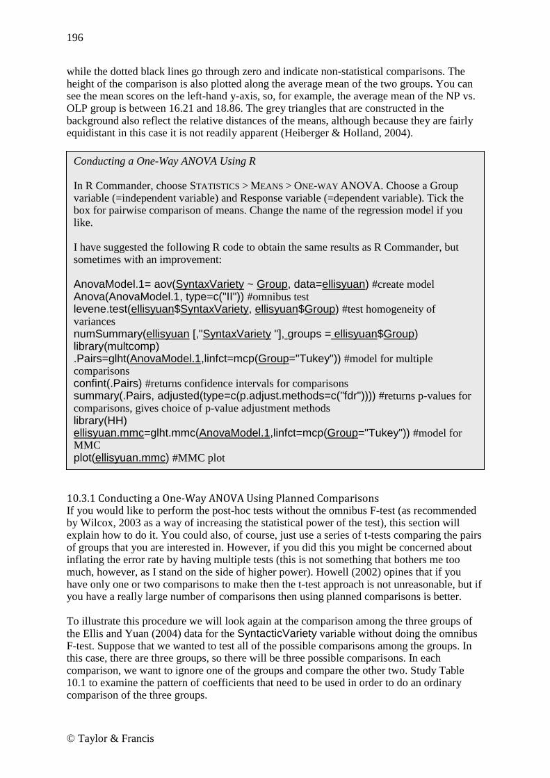
196
© Taylor & Francis
while the dotted black lines go through zero and indicate non-statistical comparisons. The height of the comparison is also plotted along the average mean of the two groups. You can see the mean scores on the left-hand y-axis, so, for example, the average mean of the NP vs. OLP group is between 16.21 and 18.86. The grey triangles that are constructed in the background also reflect the relative distances of the means, although because they are fairly equidistant in this case it is not readily apparent (Heiberger & Holland, 2004).
10.3.1 Conducting a One-Way ANOVA Using Planned Comparisons If you would like to perform the post-hoc tests without the omnibus F-test (as recommended by Wilcox, 2003 as a way of increasing the statistical power of the test), this section will explain how to do it. You could also, of course, just use a series of t-tests comparing the pairs of groups that you are interested in. However, if you did this you might be concerned about inflating the error rate by having multiple tests (this is not something that bothers me too much, however, as I stand on the side of higher power). Howell (2002) opines that if you have only one or two comparisons to make then the t-test approach is not unreasonable, but if you have a really large number of comparisons then using planned comparisons is better. To illustrate this procedure we will look again at the comparison among the three groups of the Ellis and Yuan (2004) data for the SyntacticVariety variable without doing the omnibus F-test. Suppose that we wanted to test all of the possible comparisons among the groups. In this case, there are three groups, so there will be three possible comparisons. In each comparison, we want to ignore one of the groups and compare the other two. Study Table 10.1 to examine the pattern of coefficients that need to be used in order to do an ordinary comparison of the three groups.
Conducting a One-Way ANOVA Using R In R Commander, choose STATISTICS > MEANS > ONE-WAY ANOVA. Choose a Group variable (=independent variable) and Response variable (=dependent variable). Tick the box for pairwise comparison of means. Change the name of the regression model if you like. I have suggested the following R code to obtain the same results as R Commander, but sometimes with an improvement: AnovaModel.1= aov(SyntaxVariety ~ Group, data=ellisyuan) #create model Anova(AnovaModel.1, type=c("II")) #omnibus test levene.test(ellisyuan$SyntaxVariety, ellisyuan$Group) #test homogeneity of variances
numSummary(ellisyuan [,"SyntaxVariety "], groups = ellisyuan$Group) library(multcomp) .Pairs=glht(AnovaModel.1,linfct=mcp(Group="Tukey")) #model for multiple comparisons confint(.Pairs) #returns confidence intervals for comparisons summary(.Pairs, adjusted(type=c(p.adjust.methods=c("fdr")))) #returns p-values for comparisons, gives choice of p-value adjustment methods library(HH) ellisyuan.mmc=glht.mmc(AnovaModel.1,linfct=mcp(Group="Tukey")) #model for MMC plot(ellisyuan.mmc) #MMC plot

197
© Taylor & Francis
Table 10.1 Planned Comparison Coefficients for Two-Way Comparisons
Groups Compare Group 1 to Group 2
Compare Group 1 to Group 3
Compare Group 2 to Group 3
NP=Group 1 1 1 0 PTP=Group 2 −1 0 1 OLP=Group 3 0 −1 −1
From Table 10.1 you can see that you put a number in the row of the groups you want to compare. The number could be 1, 2, or 1,000, but there needs to be an equally large number to be subtracted so that, when the columns are added up, they add up to zero. Any row of the column which contains a non-zero number will be included in the comparison. For the planned comparison shown in Table 10.1, only two groups at a time are being compared. All possible pairings are made (that is, NP versus PTP, NP versus OLP, and PTP versus OLP). Creating your own planned comparisons in R is straightforward using the glht() command seen in section 10.3 and used to conduct post-hoc multiple comparisons. To set up planned comparisons like those in Table 10.1, simply specify your contrasts by referring to the levels of your categorical variable. For example, for the Groups variable in Ellis and Yuan (2004), the names of the levels can be obtained with the levels command:
levels(ellisyuan$Group) [1] "NP_No planning" "PTP_PretaskPlanning" "OLP_OnlinePlanning" These names are a little complicated! I will simplify them: levels(ellisyuan$Group)=c("NP", "PTP", "OLP") Now I can specify the coefficients for the comparisons I want to make in an object I‘ll call contr (look back to the columns of Table 10.1 to understand the numbers I use). The numeric coefficients refer to the inclusion of the levels in the order they are found in R in the levels() command you just looked at. contr=rbind("NP-PTP"=c(1,-1,0), "NP-OLP"=c(1,0,-1), "PTP-OLP"=c(0,1,-1)) Now I run the glht() command again, specifying that the testing for Group will be the object I just created. I can then run summary() and confint() on this object. Ellisyuan.Pairs=glht(AnovaModel.1,linfct=mcp(Group=contr)) The results will be exactly the same as in section 10.3, since I am specifying the same contrasts (they are reversed in sign, but this does not make any difference ultimately). To make planned comparisons with more than three groups, or only among certain groups, the idea is the same, but the number used in the comparison needs to be adjusted so that each column adds up to zero. So let‘s say what we really wanted to know with the Ellis and Yuan (2004) data was whether having planning time made a difference or not, and whether having unlimited time made a difference or not. For the question of planning time, we could compare the group with

198
© Taylor & Francis
planning time (PTP) to the two others without planning time (NP and OLP). For the question of unlimited writing time, we could compare the group with unlimited time (OLP) to the groups who had only 17 minutes of writing time (NP and PTP). Study the coefficients in Table 10.2 to see how we could call for these comparisons. Table 10.2 Planned Comparison Coefficients for Multiple Comparisons with Elis and Yuan (2004)
Groups Compare PTP to NP and OLP
Compare OLP to NP and PTP
NP=Group 1 −1 −1 PTP=Group 2 2 −1 OLP=Group 3 −1 2
Table 10.3 shows coefficients that could be used in a study with four groups and various research questions. Table 10.3 Planned Comparison Coefficients for Multiple Comparisons with L1 Groups
Groups Compare Latinate Groups to NS
Compare Japanese Group to NS
Compare all NNS groups to NS
Native speakers 2 1 3
Spanish L1 −1 0 −1
Portuguese L1 −1 0 −1
Japanese L1 0 −1 −1
Creating Planned Comparisons in R 1. Specify the coefficients for the comparisons you want to make. You‘ll need to use the names of the levels of the independent variable, so find out the names and change them first if they are rather complicated: levels(ellisyuan$Group) #find out names levels(ellisyuan$Group)=c("NP", "PTP", "OLP") #set new names 2. rbind() the coefficients together into a matrix. It would probably help to first write the coefficients down in a table like the ones I have shown in the text. List the coefficients in the order they are found in the levels() command. Make sure the column adds up to zero. Create a new object with the rbind() command. contr=rbind("NP-PTP"=c(1,-1,0), "NP-OLP"=c(1,0,-1), "PTP-OLP"=c(0,1,-1)) 3. Run the glht() command again, using the new object as the model for the independent variable:
Ellisyuan.Pairs=glht(AnovaModel.1,linfct=mcp(Group=contr)) 4. You may now obtain the statistics from this model with summary() and confint().

199
© Taylor & Francis
10.4 Performing a Robust One-Way ANOVA Test Using the same Ellis and Yuan (2004) data used in this chapter for a one-way ANOVA, let‘s look at another variable called Words. This is a variable that gives a count of the number of words the writers in the various experimental conditions produced. A boxplot of this variable in Figure 10.4 shows one extreme outlier in the OLP condition, but otherwise fairly symmetric distributions with equal variances.
NP PTP OLP
15
02
00
25
03
00
GROUP
WO
RD
S
Figure 10.4 Boxplots of Ellis and Yuan (2004) data for Words. Pairwise comparisons using Tukey‘s adjustment find only the comparison between PTP and NP statistical:
ellisyuan.anova <- aov(Words ~ Group, data=ellisyuan) ellisyuan.Pairs <- glht(ellisyuan.anova, linfct = mcp(Group = "Tukey")) summary(ellisyuan.Pairs)
Now I‘ll reanalyze this variable using Wilcox‘s trimmed means bootstrap-t function t1waybt().

200
© Taylor & Francis
To use this you will need to gain access to Rand Wilcox‘s R library. At the moment it cannot be retrieved from the drop-down list method in R Console. Instead, type this line directly into R:
install.packages("WRS",repos="http://R-Forge.R-project.org") If you have any trouble installing this, go to the website http://r-forge.r-project.org/R/?group_id=468 for more information. Once the library is downloaded, open it:
library(WRS) Before using Wilcox‘s function the data will need to be massaged into the correct form, which will involve a list where each part of the list is a separate vector for each group‘s data on the dependent variable. Note that for the section on planned comparisons (found in the online document ―One way ANOVA.One-way ANOVA test‖) I changed the names of the levels of this group, and I use those here (if you import it afresh from the SPSS file the names of the levels of the groups will be different!). ellis=list() #creates a list called ellis ellis[[1]]=subset(ellisyuan,subset=Group=="NP",select=c(Words)) ellis[[2]] <- subset(ellisyuan, subset= Group =="PTP", select=c(Words)) ellis[[3]] <- subset(ellisyuan, subset= Group =="OLP", select=c(Words)) The last three lines enter one subset each of the Words variable into a group of data in the list. For example, ellis[[1]] references the first group of data in the list. The subset function has three arguments: 1) the data; 2) the specification of the subset, using the name of your group variable (mine is Group); 3) the variable you want to subset. Actually, I used R Commander to subset the first group in order to remember the syntax for subsetting. To use R Commander, choose DATA > ACTIVE DATA SET > SUBSET ACTIVE DATA SET. The data is now ready to use in the t1waybt() function. t1waybt(ellis, tr=.2, nboot=599) t1waybt() Performs a bootstrap-t (parametric bootstrap) comparison of
trimmed means.
ellis The first argument is the data, which needs to be in list or matrix form.
tr=.2 Default is that 20% of the means should be trimmed.
nboot=599 Specifies the number of bootstraps to perform, with 599 as the default.
The output returned by this test is the F-value (in $test) and the p-value of that F-test (p=.005). Remember, this test is just giving the omnibus F-test, which was also statistical in the non-robust case. The output does not return degrees of freedom, since these are not

201
© Taylor & Francis
associated with bootstrapping procedures. In some cases you may not care even to check the omnibus test, but instead just proceed directly to multiple comparisons. In order to perform multiple comparisons to determine which groups are different from each other, you can use the mcppb20() command. It performs multiple comparisons using a percentile bootstrap method for comparing 20% trimmed means. Two other commands you might be interested in for multiple comparisons are lincon(), which uses trimmed means only, or linconb(), which uses trimmed means plus the bootstrap-t. Wilcox says that the bootstrap-t is relatively effective with small sample sizes, but, when samples sizes are all 15 or below, power can drop. The basic syntax of these commands is the same as mcppb20, so I will not repeat it.
mcppb20(ellis)
First, remember that group1=NP, group2=PTP, and group3=OLP (that‘s the way the list is set up). The information under $con specifies the contrasts, and this is read in columns, so that the first contrast is comparing groups 1 and 2, the second groups 1 and 3, and the third groups 2 and 3 (the places where the 1s are). Under $psihat, we see that the difference between groups 1 and 2 is 53.7 words, with a standard error of 11.6. The confidence interval for this difference could be as large as 80.8 words or as small as 24.3 words, but this interval does not pass through zero, so we can conclude, with 95% confidence, that there is a real difference between these groups. Although the other comparisons are not statistical (the third comparison between PTP and OLP has a p-value under .05, but the critical value for being statistical is α=.017 in the $crit.p.value), notice that their confidence intervals are shorter with the robust analysis than they were in the non-robust analysis ([−.1,59.9] for PTP_OLP in the robust measure, [−55.2, 6.79] in the non-robust measure). Although I used just the bare minimum for the mcppb20() command, below I elaborate on the structure of this command: mcppb20(ellis, crit=NA, con=0, tr=.2, alpha=.05, nboot=2000, grp=NA) mcppb20( ellis) The data for this command need to be in list or matrix form.
crit=NA Specifies the critical value (the cut-off point) for p; for α=.05, critical value=2pcrit. For α≠.05, and if crit=NA, α/C (where C=# of hypotheses to be tested) is used (basically, the Bonferroni method).
con=0 Space for specifying planned comparisons. Do this by creating vectors, such as one=c(1,−2,1) and then using

202
© Taylor & Francis
cbind() to pull together all your comparisons: con=cbind(one, two, three)
tr=.2 Default is that 20% of the means should be trimmed.
alpha=.05 Sets alpha level; default is .05.
nboot=2000 Specifies number of bootstraps; default is 2,000.
grp=NA Specifies which groups should be included; by default all are.
The results show that, although a robust analysis did not change the final outcome with the Ellis and Yuan (2004) variable of Words using a strict cut-off point of α=.05, confidence intervals were smaller and presumably more accurate for those who would use it to compare results of future testing.
In reporting the results of a robust test, you will want to mention what robust method was used, the N, the mean for each group, and probably the confidence intervals for the mean differences between the groups.
10.5 Application Activities for One-Way ANOVAs 1. Using the Ellis and Yuan data (EllisYuan.sav, imported as ellisyuan), look at the variables of error-free clauses, MSTTR (a measure of lexical variety), and speed per minute (SPM). First examine the data visually. What do you find with regard to normality, homogeneity of variances, and outliers? Next, perform a one-way ANOVA on each of the three variables along with post-hocs. Report omnibus F-results; find 95% confidence intervals for the difference in means, and calculate effect sizes for the contrasts. What would you remark upon here? 2. Pandey (2000) conducted research on how well native speakers of different English dialects performed on the TOEFL and reported the raw data scores in her article. Pandey‘s research design is shown in the following diagram:
Robust One-Way ANOVAs 1. Perform a robust omnibus one-way ANOVA test with this command for a trimmed-means bootstrap-t function:
t1waybt(ellis, tr=.2, nboot=599) 2. Perform robust post-hoc multiple comparisons with this command for a trimmed-means with percentile bootstrap:
mcppb20(ellis, crit=NA, con=0, tr=.2, alpha=.05, nboot=2000, grp=NA)

203
© Taylor & Francis
Pandey did not perform statistics on her data, but merely observed the trend that both focus groups had quite low TOEFL scores the first time they were tested (mean for Focus Group A—443; mean for Focus Group B—429), but, with comparative instruction, both focus groups improved their scores over time. In comparison, the control groups‘ scores hardly changed at all the second time they took the test. Using the Pandey2000.sav file (import as pandey, investigate statistically the research question of whether Groups A and B are different from each other in their first gain scores (GAIN1), and also whether Group A and B together are different from the control group in the first gain scores. You‘ll need to use planned comparisons to answer this question. Be sure to first visually examine the data (even if it does not fit assumptions, go ahead and analyze it here). 3. Thought question. Imagine a research design that investigates the pragmatic development of Chinese learners of Russian. The researcher asked participants to complete discourse completion tasks at three separate times during the semester. The participants were in three different classes, and each class received each of the three treatments (Control—no pragmatic discussion; explicit pragmatic discussion; and implicit pragmatic discussion), with five weeks between each treatment. Immediately following the treatment, participants took the discourse completion task. The researcher wants to know whether the groups differed depending on their treatment, and plans to conduct a one-way ANOVA with GROUP as the IV and score on the discourse completion task at every time period as the DV, as is shown in the table below. What is wrong with this research design?
4. Inagaki and Long (1999) conducted an experiment with Japanese learners to see whether asking participants to repeat a correct model after they heard it would be as effective as recasting after an incorrect utterance (and whether these would differ from a control condition where participants simply studied kanji characters). Two structures, that of correct adjective formation when there are multiple adjectives, and subject placement after a locative phrase, were examined with 24 participants. If possible, conduct two separate one-way ANOVAs to determine whether there was any difference between the three experimental groups on the gain score of the two structures (―GainAdj‖ and ―GainLoc‖). The group variable in each case is also different (―AdjModelOrRecast‖ for the adjective formation, and ―LocModelOrRecast‖ for the locative formation). Be sure to first visually examine the data. Use the InagakiLong.sav file and import it as inagaki1999 (this file has 24 rows and 5 columns).

204
© Taylor & Francis
5. Dewaele and Pavlenko Bilingual Emotions Questionnaire (2001–2003). Use the BEQ.Context.sav file, imported as beqContext. Multilinguals who answered the questionnaire rated their proficiency in L2 speaking, comprehension, reading, and writing on a 1–5 scale (where 5 = fully fluent). Multilinguals also differed in the context in which they had acquired their L2, if it was naturalistic, instructed, or both. Examine the question of whether there are differences in proficiency on L2 speaking (l2speak) and L2 reading (l2read) depending on the context of instruction (L2Context). Be sure to first visually examine the data, and report effect sizes. Perform robust one-way ANOVAs on this data; do the results change?

205
© Taylor & Francis
Chapter 11
Factorial ANOVA
11.1 Numerical and Visual Summary of the Data, Including Means Plots In order to inspect the data let‘s look at the mean scores and standard deviations of the first story from the Obarow (2004) data (to follow along with me, import the Obarow.Story1.sav file as obarowStory1), which are found in Table 11.1. I used the numSummary() command to give me these descriptive statistics.
numSummary(obarowStory1[,c("gnsc1.1", "gnsc1.2")], groups=obarowStory1$Treatment1, statistics=c("mean", "sd")) Table 11.1 Numerical Summary from Obarow (2004) Story 1
Immediate Gains N Mean SD
No pictures No music 15 .73 1.62 Music 15 .93 1.80 Pictures No music 17 1.47 1.01 Music 17 1.29 1.72
Delayed Gains N Mean SD
No pictures No music 15 1.40 1.88 Music 14 1.64 1.50 Pictures No music 17 1.53 2.12 Music 17 1.88 2.03
Considering that there were 20 vocabulary words tested from the story, we can see from the gain scores that most children did not learn very many words in any of the conditions. Actually the least number of words that any children knew in the first story was 11, so there were not actually 20 words to learn for any children. Also, it appears that in every category gains were larger when considered in the delayed post-test (one week after the treatment) than in the immediate post-test (the day after treatment ended). The numerical summary also shows that standard deviations are quite large, in most cases larger than the mean. For the visual summary, since we are looking at group differences, boxplots would be an appropriate way of checking the distribution of data. Figure 11.1 shows boxplots of the four different groups, with the left side showing the immediate gain score and the right side showing the delayed gain score.

206
© Taylor & Francis
-M-P
-M+
P
+M
-P
+M
+P
-4
-2
0
2
4
6
8
Immediate Gainscore
Ga
inscore
3
14
48
-M-P
-M+
P
+M
-P
+M
+P
-4
-2
0
2
4
6
8
Delayed Gainscore
Ga
inscore
3
13
48
Figure 11.1 Boxplots of the Obarow Story 1 data. The boxplots show a number of outliers for two of the four groups, meaning that the assumption of normality is already violated. None of the boxplots looks exactly symmetric, and some distributions have extreme skewness. I‘d like you to consider one more issue about the data in the obarowStory1 file. Notice which variables are factors (they show a count of the levels): summary(obarowStory1)

207
© Taylor & Francis
Notice that PicturesT1 is a factor, as is MusicT1. But so is Treatment1, which basically combines the factors of pictures and music. For my factorial ANOVA, if I want to see the effect of music and pictures separately, basically I‘ll need to have these as separate factors. But in some cases I want to have just one factor that combines both of these elements, and that is why I created the Treatment1 factor as well. Make sure you have the factors whose interaction you want to check as separate factors in your data set. If you see a need later to combine them, as I did, you can create a new factor.
11.1.1 Means Plots One type of graphic that is often given in ANOVA studies is a means plot. Although this graphic is useful for discerning trends in the data, it often provides only one piece of information per group—the mean. As a way of visualizing an interaction, means plots can be helpful, but they are graphically impoverished, since they lack much information. These types of plots will be appropriate only with two-way and higher ANOVAs (since a means plot with a one-way ANOVA would have only one line). In R Commander, open GRAPHS > PLOT OF MEANS. In the dialogue box I choose two factors (see Figure 11.2), one displaying whether the treatment contained music or not (MusicT1) and the other displaying whether the treatment contained pictures or not (PicturesT1). Choose the categorical variables in the ―Factors‖ box and the continuous dependent variable in the ―Response Variable‖ box. This choice results in the means plot in Figure 11.3.
Figure 11.2 Creating a means plot in R Commander.
Note that you have several options for displaying error bars in R. I chose 95% confidence
intervals.

208
© Taylor & Francis
Plot of Means
Treatment1
Me
an
vo
ca
b le
arn
ed
0.0
0.5
1.0
1.5
2.0
no music music
obarowStory1$PicturesT1
no pictures
pictures
Figure 11.3 Means plot of first treatment in Obarow (2004) data with music and picture factors. Figure 11.3 shows that those who saw pictures overall did better (the dotted line is higher than the straight line at all times). However, there does at least seem to be a trend toward interaction, because when music was present this was helpful for those who saw no pictures, while it seemed to be detrimental for those who saw pictures. We‘ll see in the later analysis, however, that this trend does not hold statistically, and we can note that the difference between the mean of pictures with no music (about 1.5) and the mean of pictures with music (about 1.3) is not a very large difference. Our graph makes this difference look larger. If the scale of your graph is small enough, the lines may not look parallel, but when you pull back to a larger scale that difference can fade away. Visually, no interaction would be shown by parallel lines, meaning that the effects of pictures were the same whether music was present or not.

209
© Taylor & Francis
Notice also that, because confidence intervals around the mean are included, the means plot has enriched information beyond just the means of each group. The fact that the confidence intervals overlap can be a clue that there may not be a statistical difference between groups as well, since the intervals overlap. The R code for this plot is:
plotMeans(obarowStory1$gnsc1.1, obarowStory1$MusicT1, obarowStory1$PicturesT1, error.bars="conf.int") plotMeans(DepVar, factor 1, factor 2)
Returns a means plot with one dependent and one or two independent variables.
obarow$gnsc1.1 The response, or dependent variable.
obarow$MusicT1, obarow$PicturesT1
The factor, or independent variables.
error.bars="conf.int" Plots error bars for the 95% confidence interval on the means plot; other choices include "sd" for standard deviation, "se" for standard error, and "none".
The command interaction.plot() can also be used but is a bit trickier, because usually you will need to reorder your data in order to run this command. Nevertheless, if you want to plot more than one dependent variable at a time, you could use interaction.plot in R (see the visual summary document for Chapter 12, ―Repeated-Measures ANOVA,‖ for an example of how to do this). One problem you might run into when creating a means plot is that the factors levels are not in the order or set-up you want for the graph you want. With the Obarow data this wasn‘t an issue, as there were several choices for factors (the Treatment1 factor coded for four different conditions, while the MusicT1 coded just for ±Music and the PicturesT1 coded just for ±Pictures). If I had used the Treatment1 factor, which contains all four experimental conditions, I would have gotten the graph in Figure 11.4.

210
© Taylor & Francis
Plot of Means
Treatment 1
Me
an
vo
ca
b le
arn
ed
0.4
0.6
0.8
1.0
1.2
1.4
1.6
No music No pics No music Yes pics Yes music No pics Yes music Yes pics
Figure 11.4 Means plot of first treatment in Obarow (2004) data with experimental factor. Figure 11.4 is not as useful as Figure 11.3, because it doesn‘t show any interaction between the factors, so I wouldn‘t recommend using a means plot in this way. However, I will use this example of a factor with four levels to illustrate how to change the order of the factors. You can change the order of factors through the ordered() command. First, see what the order of factor levels is and the exact names by listing the variable:
obarowStory1$Treatment1 4 Levels: −M−P −M+P +M−P +M+P (note that −M means ―No Music‖ and −P means ―No Pictures‖) Next, specify the order you want the levels to be in:
obarowStory1$Treatment1=ordered(obarowStory1$Treatment1, levels= c("-M+P", "+M+P", "+M-P", "-M-P")) Now run the means plot again.

211
© Taylor & Francis
Plot of Means
Treatment 1
Me
an
vo
ca
b le
arn
ed
0.4
0.6
0.8
1.0
1.2
1.4
1.6
No music Yes pics Yes music Yes pics Yes music No pics No music No pics
Figure 11.5 Obarow (2004) means plot with rearranged factors. The result, shown in Figure 11.5, is rearranged groups showing a progression from highest number of vocabulary words learned to the lowest. Note that this works fine for creating a graph, but you will want to avoid using ordered factors in your ANOVA analysis. The reason is that, if factors are ordered, the results in R cannot be interpreted in the way I discuss in this chapter.
Creating a Means Plot in R From the R Commander drop-down menu, open GRAPHS > PLOT OF MEANS. Pick one or two independent variables from the ―Factors‖ box and one dependent variable from the ―Response Variable‖ box. Decide what kind of error bars you‘d like. The simple command for this graph in R is:
plotMeans(obarowStory1$gnsc1.1, obarowStory1$MusicT1, obarowStory1$PicturesT1, error.bars="conf.int")

212
© Taylor & Francis
11.2 Putting Data in the Correct Format for a Factorial ANOVA The Obarow data set provides a good example of the kind of manipulations one might need to perform to put the data into the correct format for an ANOVA. A condensation of Obarow‘s original data set is shown in Figure 11.6. It can be seen in Figure 11.6 that Obarow had coded students for gender, grade level, reading level (this was a number from 1 to 3 given to them by their teachers), and then treatment group for the particular story. Obarow then recorded their score on the pre-test, as it was important to see how many of the 20 targeted words in the story the children already knew. As can be seen in the pre-test columns, most of the children already knew a large number of the words. Their scores on the same vocabulary test were recorded after they heard the story three times (immediate post-test) and then again one week later (delayed post-test). The vocabulary test was a four-item multiple choice format.
Figure 11.6 The original form of Obarow‘s data. The format found here makes perfect sense for entering the data, but it is not the form we need in order to conduct the ANOVA. First of all, we want to look at gain scores, so we will need to calculate a new variable from the pre-test and post-test columns. In R Commander we can do this by using DATA > MANAGE VARIABLES IN ACTIVE DATA SET > COMPUTE NEW
VARIABLE (note that I will not walk you through these steps here, but you can look at the online document ―Understanding the R environment.Manipulating Variables_Advanced Topic‖ for more information on the topic). Then there is an issue we should think about before we start to rearrange the data. Although the vocabulary words were chosen to be unfamiliar to this age of children, there were some children who achieved a perfect score on the pre-test. Children with such high scores will clearly not be able to achieve any gains on a post-test. Therefore, it is worth considering whether there should be a cut-off point for children with certain scores on the pre-test. Obarow herself did not do this, but it seems to me that, unless the children scored about a 17 or below, there is really not much room for them to improve their vocabulary in any case. With such a cut-off level, for the first story there are still 64 cases out of an original 81, which is still quite a respectable size. To cut out some rows in R, the simplest way is really to use the R Console:
new.obarow <- subset(obarow, subset=PRETEST1<18) The next thing to rearrange in the original data file is the coding of the independent variables. Because music and pictures are going to be two separate independent variables, we will need two columns, one coded for the inclusion of music and one coded for the inclusion of

213
© Taylor & Francis
illustrations in the treatment. The way Obarow originally coded the data, trtmnt1, was coded as 1, 2, 3, or 4, which referred to different configurations of music and pictures. Using this column as it is, we would be able to conduct a one-way ANOVA (with trtmnt1 as the IV), but we would not then be able to test for the presence of interaction between music and pictures. In order to have two separate factors, I could recode this in R like this for the music factor (and then also create a picture factor):
obarow$MusicT1 <- recode(obarow$trtmnt1, '1="no music"; 2="no music"; 3="yes music"; 4="yes music"; ', as.factor.result=TRUE) After all of this manipulation, I am ready to get to work on my ANOVA analysis! If you are following along with me, we are going to use the SPSS file Obarow.Story1, imported as obarowStory1. Notice in Figure 11.7 that I now have a gain score (gnsc1.1), and two columns coding for the presence of music (MusicT1) and pictures (PicturesT1). There are only 64 rows of data, since I excluded any participants whose pre-test score was 18 or above.
Figure 11.7 The ―long form‖ of Obarow‘s data.
11.3 Performing a Factorial ANOVA
11.3.1 Performing a Factorial ANOVA Using R Commander To replicate the type of full factorial ANOVA done in most commercial statistics programs, you can use a factorial ANOVA command in R Commander. Choose STATISTICS > MEANS >
MULTI-WAY ANOVA, as seen in Figure 11.8.
Figure 11.8 Conducting a three-way ANOVA in R Commander.

214
© Taylor & Francis
With the Obarow (2004) data set I am testing the effect of three independent variables (gender, presence of music, and presence of pictures), which I choose from the Factors box. The response variable I will use is the gain score for the immediate pre-test (gnsc1.1). The R Commander output will give an ANOVA table for the full factorial model, which includes all main effects and all interaction effects: y=Gender + Music + Pictures + Gender*Music + Gender*Pictures + Music*Pictures + Gender*Music*Pictures where ―*‖ means an interaction.
Any effects which are statistical at the .05 level or lower are noted with asterisks. Here we see on the first line that the main effect of gender is statistical (F1,56=4.35, p=.04). In other words, separating the numbers strictly by gender and not looking at any other factor, there is a difference between how males and females performed on the task. Main effects may not be of much interest if any of the interaction effects are statistical, since if we knew that, for example, the three-way interaction were statistical, this would tell us that males and females performed differently depending on whether music was present and depending on whether pictures were present. In that case, our interest would be in how all three factors together affected scores, and we wouldn‘t really care about just the plain difference between males and females. However, for this data there are no interaction effects. The last line, which is called Residuals, is the error line. This part is called error because it contains all of the variation we can‘t account for by the other terms of our equation. Thus, if the sum of squares for the error line is large relative to the sum of squares for the other terms (which it is here), this shows that the model does not account for very much of the variation. Notice that the numbers you can obtain here may be different from the identical analysis run in a different statistical program such as SPSS. This is because R is using Type II sums of squares (and this is identified clearly in the output), while SPSS or other statistical programs may use Type III sums of squares (for more information on this topic, see section 11.4.3 of the SPSS book, A Guide to Doing Statistics in Second Language Research Using SPSS, pp. 311–313).

215
© Taylor & Francis
If you need to calculate mean squares (possibly because you are calculating effect sizes that ask for mean squares), these can be calculated by using the sums of squares and degrees of freedom given in the R Commander output. The mean square of any row is equal to the sum of squares divided by the df of the row. Thus, the mean square of Gender is 9.99/1=9.99. The next part of the output from R Commander gives descriptive statistics (mean, sd, and count) for the permutation of the independent variables in the order they are placed in the regression. The first three lines of the ANOVA table above show the order in which the variables were placed: gender, then music, and then pictures. The last variable placed in the equation is Pictures, so the descriptive statistics show the number of vocabulary items used when, first of all, pictures are present versus absent, and splits that data up into variables of gender and music. The following output shows the mean scores for this situation:
If this wasn‘t the organization of the data that you wanted, you could just change the order of the factors in your ANOVA model (by hand in R, since there is no way to change the order in R Commander). In reporting on a factorial ANOVA you will want to report descriptive statistics (which R Commander output gives, as shown here), information about each main effect and interaction in your model (shown in the ANOVA table), effect sizes for factors, and the overall effect size of multiple R
2.
The partial eta-squared effect size for main effects and interactions (if all of the factors are
fixed, not random) can be calculated by using the formula erroreffect
effect
partialSSSS
SS2ˆ where
SS=sum of squares. For the case of the main effect of gender, then partial eta-squared=9.99/(9.99+128.601)=.072. The multiple R squared is not found in the output that R Commander calls for. You can obtain it by doing a summary of the linear model that R Commander constructs. Here the model was automatically labeled as AnovaModel.6, as seen in Figure 11.8. summary(AnovaModel.6)) [output cut here]

216
© Taylor & Francis
The summary first provides coefficient estimates for the default level of the factors compared to the other factors. The last three lines of the regression output are shown above. The first line, which is labeled ―Residual standard error,‖ is the square root of the error variance from the ANOVA table above (128.601) with the error degrees of freedom. We want this number to be as small as possible, for this is the part of the data that we can‘t explain. The second line gives the overall effect size for the full factorial regression, while the adjusted R squared gives the same thing but adjusted for positive bias. So this full factorial model accounts for 15% of the variance in scores or, adjusting for bias, the full model accounts for only 4.2% of the variance. The third line is a model that is rarely of interest, but it tests the hypothesis that ―performance is a function of the full set of effects (the main effects and the interactions)‖ (Howell, 2002, p. 464).
11.3.2 Performing a Factorial ANOVA Using R The code for the full factorial performed by R Commander was clearly apparent in the previous section. What I will demonstrate in this section is how to perform an ANOVA where we will not try to fit the (one) model to the data, but instead fit the data to the model by searching for the best fit of the data. This procedure is identical to what was seen in the section on Regression (in the online documents ―Multiple Regression.Finding the best fit‖ and ―Multiple Regression.Further steps in finding the best fit‖), since ANOVA in R is modeled as a regression equation, and then commands like Anova() reformat the results into an ANOVA table. As with regression, it makes more sense to find the minimally adequate model for the data and only later examine plots which evaluate the suitability of assumptions such as homogeneity of variances, normality of distribution, etc. I will assume that my reader has already looked at the section on finding the minimally adequate model in the online document ―Multiple Regression.Finding the best fit,‖ but, as a review, the steps I will follow to find the minimally adequate model are (following Crawley, 2007):
1. Create a full factorial model. 2. Examine the output for statistical terms. 3. Create a new model that deletes unstatistical entries, beginning with largest terms first
and working backwards to simpler terms. 4. Compare the two models, and retain the new, simpler model if it does not cause a
statistical increase in deviance.
Conducting a Factorial ANOVA Using R Commander 1. STATISTICS > MEANS > MULTI-WAY ANOVA. 2. Choose your independent variables under the ―Factors (pick one or more)‖ box on the left. Highlight more than one by holding down your Ctrl button while you left-click the factors. Choose a dependent variable in the ―Response Variable (pick one)‖ box. Click OK. 3. To obtain R
2 and adjusted R
2, take the ANOVA model that R Commander creates and run a
summary on it:
summary(AnovaModel)

217
© Taylor & Francis
Using the Obarow (2004) data contained in Obarow.Story.1 (imported as obarow into R), I will first create the full factorial model. Remember that, instead of writing out the entire seven-parameter model (with 1 three-way interaction, 3 two-way interactions, and 3 main effects), using the asterisk (*) notation creates the full model.
attach(obarow) model=aov(gnsc1.1~gender*MusicT1*PicturesT1) summary(model) The summary() command produces an ANOVA table, as was seen above in the previous section with R Commander. This summary shows that there is only one statistical entry, the main effect of gender. The choice of aov() instead of lm() for the regression model means that the summary() command will return an ANOVA table instead of regression output. Although only one variable is statistical, just as we saw with regression modeling, the best way to go about our ANOVA analysis is to perform stepwise deletion, working backwards by removing the largest interactions first, and testing each model along the way. We could simply stop after this first pass and proclaim that gender is the only variable that is statistical, but that would not be finding the minimally adequate model. I suggested in the chapter on regression and I will also suggest here that finding the minimally adequate model is a much more informative analysis than a simple full factorial model with reporting on which main effects and interactions are statistical. What we will find is that, by performing the minimally adequate model, the stepwise removal of variables may change the analysis along the way, since order matters in a data set where the number of persons in groups is not strictly equal (as is true in this case). Now we will simplify the model by removing the least significant terms, starting with the highest-order terms first (in our case, we‘ll remove the third-order interaction first).
model2=update(model,~.-gender:MusicT1:PicturesT1) Remember, the syntax here must be exactly right! The syntax in the parentheses that comes after the name of the model to update (here, called just ―model‖) is ―comma tilde period minus.‖ This syntax means that model2 will take the first argument (model) as it is and then subtract the three-way interaction. Now we compare the updated model to the original model using anova().
anova(model,model2)
The fact that the ANOVA is not statistical tells us that our newer model2 does not have statistically higher deviance than the original model, and thus it is not worse at explaining what is going on than the original model. We prefer model2 because it is simpler. We can now look at a summary of model2 and decide on the next least statistical argument to take out from among the two-way interactions:

218
© Taylor & Francis
summary(model2)
The least statistical of the two-way interactions is gender:PicturesT1 (it has the highest p-value), so we will remove that in the next model.
model3=update(model2,~.- gender:PicturesT1) anova(model2,model3)
Again, there is no difference in deviance between the models, so we will leave this interaction term out. Examining the summary of model3:
we see that the next interaction term with the highest p-value is MusicT1:PicturesT1. I will leave it to the reader to verify that, by continuing this procedure, you will reach model7, which contains only the variable of gender. At this point, we should compare a model with only gender to the null model, which contains only the overall average score and total deviance. The way to represent the null model is simply to put the number ―1‖ as the explanatory variable after the tilde. If there is no difference between these two models, then what we have found is that none of our variables do a good job of explaining what is going on! model8=aov(gnsc1.1~1) anova(model7,model8)

219
© Taylor & Francis
Fortunately, here we find a statistical difference in the amount of deviance each model explains, so we can stop and claim that the best model for the data is one with only one explanatory variable, that of gender.
summary(model7)
The regression output for the same model will give more information:
summary.lm(model7) [output cut here]
The multiple R
2 value shows that the variable of gender accounted for about 8% of the
variance in scores, a fairly small amount. Notice that the F-statistic and p-value given in the regression output are exactly the same as in the ANOVA table, but this is only because there is only one term in the equation. A shortcut to doing the stepwise deletion by hand is the command boot.stepAIC from the bootStepAIC library with the original full factorial model (as mentioned in Chapter 7, this function is much more accurate and parsimonious than the step command found in R‘s base library): boot.stepAIC(model,data=obarow) #need to specify data set even though attached!

220
© Taylor & Francis
The full model has an AIC (Akaike information criterion) score of 60.66. As long as this measure of fit goes down, the step procedure will continue to accept the more simplified model, as we did by hand. In other words, the lower the AIC, the better (the AIC is a measure of the tradeoff between degrees of freedom and the fit of the model). The second line of the steps indicated on the print-out shows that a model that has removed the three-way interaction has a lower AIC than the full model (59.34 as opposed to 60.66). The step procedure‘s last step is to stop when there are still three terms in the equation. Let‘s check out the difference between this model that boot.stepAIC kept (I‘ll create a model9 for this) and the model we retained by hand (model7).
model9=aov(gnsc1.1~gender+MusicT1+gender:MusicT1) summary.lm(model9) data deleted . . .
We find that model9 has a slightly smaller residual standard error on fewer degrees of freedom than model7 (1.495 for model9, 1.498 for model7), and a higher R
2 value (11.2%
for model9, 7.9% for model8), but a model with more parameters will always have a higher R
2 (there are 64 participants in the Obarow study, and if we had 64 parameters the R
2 fit
would be 100%), so this is not surprising. An ANOVA table shows that neither the MusicT1 nor the interaction gender:MusicT1 is statistical in this three-parameter model.
summary(model9)
Just to make sure what we should do, let‘s compare model7 to model9 using anova(). anova(model7,model9)
An ANOVA finds no statistical difference between these models. All other things being equal, we prefer the model that is simpler, so in the end I will retain the model with only the main effect of gender.

221
© Taylor & Francis
The message here is that, although boot.stepAIC can be a useful tool, you will also want to understand and know how to hand-calculate a stepwise deletion procedure. Crawley (2007) notes that step procedures can be generous and leave in terms which are not statistical, and you will want to be able to check by hand and take out any terms which are not statistical. Another situation where a stepping command is not useful is when you have too many parameters relative to your sample size, called overparameterization (see the online section ―Multiple Regression.Further steps in finding the best fit‖ for more information on this). In this case, you should work by hand and test only as many parameters as your data size will allow at a time. Now that the best fit of the data (so far!) has been determined, it is time to examine ANOVA (regression) assumptions by calling for diagnostic plots:
plot(model7) detach(obarow) Plotting the model will return four different diagnostic plots, shown in Figure 11.9.
0.8 1.0 1.2 1.4
-4-2
02
4
Fitted values
Resid
uals
Residuals vs Fitted
48
14
3
-2 -1 0 1 2
-2-1
01
23
Theoretical Quantiles
Sta
ndard
ized r
esid
uals
Normal Q-Q
48
14
3
0.8 1.0 1.2 1.4
0.0
0.5
1.0
1.5
Fitted values
Sta
ndard
ized r
esid
uals
Scale-Location48
143
0.000 0.010 0.020 0.030
-3-2
-10
12
3
Leverage
Sta
ndard
ized r
esid
uals
Cook's distance
Residuals vs Leverage
48
14
3

222
© Taylor & Francis
Figure 11.9 Diagnostic plots for a minimally adequate model of Obarow (2004). The first plot, shown in the upper left-hand corner of Figure 11.9, is a residual plot, and if the data have equal variances it should show only a random scattering of data. Since the data values are so discrete we don‘t really see a scattering at all, but the outliers on the right-hand side of the plot (we know they are outliers because they are numbered) may indicate that the residuals are increasing as the fitted values get larger, indicating a problem with heteroscedasticity. The second plot, shown in the upper right-hand corner, tests the data against the assumption of a normal distribution. The data should be reasonably linear, and, although the discreteness means that the middle points form little parallel lines instead of following the diagonal, there also does not seem to be any clear pattern of non-normality (such as an S-shaped or J-shaped pattern in the Q-Q plot). The third plot, shown in the lower left-hand corner, is, like the first plot, meant to detect heteroscedasticity, and if there were problems the data would show a pattern and not be randomly scattered. The last plot, in the lower right-hand corner, is meant to test for influential points, and these are identified as 3, 14, and 48 in the Obarow (2004) data set. Crawley (2002, p. 240) says the two biggest problems for regression/ANOVA are heterogeneity of variances (non-constant variance across the x-axis) and non-normal errors. There seem to be problems in this model with both non-normal points (some outliers with influence) and possibly heterogeneity of variance. One way of dealing with non-normality would be to run the analysis again and leave out the influential points, and report the results of both ways to the reader (although by now you probably know this type of analysis would not be my recommendation). If you were to do this properly, you would start again with the full model, but just to show how this could be accomplished in R, here is the code for our minimally adequate model with the three influential points identified in plot 4 removed:
model.adj=aov(gnsc1.1[-c(3,14,48)]~gender[-c(3,14,48)],data=obarow) summary.lm(model.adj) The problem is that there are still outliers, and new influential points pop up when we remove the previous three points. Thus, my preference would be to use a robust ANOVA order to address the issues of both non-normality and possible heterogeneity of variances. The final summary that I would make of the Obarow (2004) data is that there was no difference (at least, in the immediate gain score) for the effect of music and pictures, but there was an effect for gender. One idea to take away from the Obarow data is that, when expected results fail to materialize, it often pays to explore your data a bit to look for other explanatory variables. Obarow (2004) looked at her data using only the music and pictures variables and found no statistical results.

223
© Taylor & Francis
The results of a factorial ANOVA should include information about the type of ANOVA you used, and by this I mean information about the regression equation that was used in your analysis. Your reader should know whether you just used a full factorial model (as many commercial statistical programs like SPSS do) or whether you searched for the minimal adequate model, as I have recommended. Reports of these two different types of analyses will be quite different. If you do a minimal adequate model you should report on the steps you took in the search for the minimal adequate model and report the change in deviance and
Conducting a Factorial ANOVA Using R There is no simple formula for conducting a factorial ANOVA in R, but there are steps to take: 1. Create a full factorial model of your data using either aov() or lm() model1=aov(gnsc1.1~gender*MusicT1*PicturesT1, data=obarow) 2. Begin to look for the best model that fits the data. You might start with the step function from the bootStepAIC library: boot.stepAIC (model1) 3. Confirm boot.stepAIC‘s choices with your own stepwise deletion procedure: a. Look at ANOVA table of model (use anova()) and decide which one term to delete in the next model. b. Choose the highest-order term to delete first. If there is more than one, choose the one with the highest p-value. If an interaction term is statistical, always retain its component main effects (for example, if gender*MusicT1 is statistical, you must keep both gender and MusicT1 main effects). c. Create a new model by using update:
model2=update(model1,~.-gender:MusicT1:PicturesT1, data=obarow) d. Compare the new and old model using anova: anova(model1, model2) e. If there is no statistical difference between models, retain the newer model and continue deleting more terms. If you find a statistical difference, keep the older model and you are finished. f. Finally, you may want to compare your model with the null model, just to make sure your model has more explanative value than just the overall mean score:
model.null=lm(gnsc1.1~1,data=obarow) 4. When you have found the best fit, check the model‘s assumptions of normality and constant variances (homoscedasticity):
plot(maximalModel)

224
© Taylor & Francis
possibly also AIC scores for the models (check the deviance and AIC of models by hand by using the deviance() and AIC() commands). Results should also include information about how you checked regression assumptions of the data, along with descriptive statistics such as the N, means, and standard deviations. Besides F-values and p-values for terms in the regression equation, you should provide effect sizes. For post-hoc tests or planned comparisons, report p-values. Here is an example of a report you might write for the Obarow (2004) data if you just looked at the full model: A 2×2×2 full factorial ANOVA examining the effects of music, pictures, and gender on the increase in participants‘ vocabulary size found a statistical effect for the main effect of gender only (F1,56 = 4.486, p=.039, partial eta-squared=.07). None of the effect sizes for any other terms of the ANOVA were above partial eta-squared=.03. Females overall learned more vocabulary after hearing the story three times (M=1.53, sd=1.76, n=33) than males did (M=.67, sd=1.12, n=11). The effect size shows that this factor accounted for R
2=7% of the
variance in the data, which is a small effect. None of the other main effects or interactions were found to be statistical. I did not check any of the assumptions of ANOVA. Here is an example of a report you might write for the Obarow (2004) data if you searched for the minimal adequate model: A search for a minimal adequate model was conducted starting with a full factorial model with three independent variables of gender, use of music, and use of pictures. The ANOVA model began with all three main effects plus all two-way interactions and the three-way interaction between terms. Deleting the terms and then checking for differences between models, my minimal model was a model that retained only the main effect of gender (F1,62=5.3, p=.02). This model explained R
2=8% of the variance in scores on the vocabulary
test. The table below gives the steps of my model search and the change in deviance and AIC between models (where increase in deviance is desirable but decrease in AIC indicates better fit):
Model Terms Deviance ΔDeviance AIC
Model1 Gender*Music*Pictures 128.60 244.29
Model2 −Gender:Music:Pictures 129.97 1.37 242.96
Model3 −Gender:Pictures 130.24 0.27 241.10
Model4 −Music:Pictures 131.71 1.47 239.81
Model5 −Gender:Music 136.27 4.56 239.99
Model6 −Music 136.63 0.36 238.16
Model7 −Pictures 139.14 2.51 237.33
In checking model assumptions, this model showed heteroscedasticity and non-normal distribution of errors.
11.4 Performing Comparisons in a Factorial ANOVA This section will explain what you should do in a factorial ANOVA if any of your variables have more than two levels. The Obarow (2004) data that was examined in the online document ―Factorial ANOVA.Factorial ANOVA test‖ had only two levels per variable, and there was thus no need to do any more analysis, because mean scores showed which group performed better. I will be using a data set adapted from the R data set ChickWeight. The

225
© Taylor & Francis
data provides the complex analysis that I want to show here, but I have renamed it in order to better help readers to understand the types of analyses that we would do in second language acquisition. I call this data set Writing, and we will pretend that this data describes an experiment which investigated the role of L1 background and experimental condition on scores on a writing sample (if you want to follow along with me, import Writing.txt file into R Commander, choosing ―white space‖ as the field separator, and naming it Writing). The dependent variable in this data set is the score on the writing assessment, which ranges from 35 to 373 (we might pretend this is an aggregated score from four separate judges who each rated the writing samples on a 100-point score). The independent variables are first language (four L1s: Arabic, Japanese, Russian, and Spanish) and condition. There were three conditions that students were asked to write their essays in: ―correctAll,‖ which means they were told their teachers would correct all of their errors; ―correctTarget,‖ which means the writers were told only specific targeted errors would be corrected; and ―noCorrect,‖ in which nothing about correction was mentioned to the students. First, a barplot will help in visually getting a feel for the multivariate data (Figure 11.10).

226
© Taylor & Francis
correctAll correctTarget noCorrect
Mean scores on writing assessment0
50
10
01
50
20
02
50
Arabic
Japanese
Russian
Spanish
Figure 11.10 Barplot of Writing data set (adapted from ChickWeight in core R). The barplot in Figure 11.10 shows that those who were not told anything about correction got the highest overall scores. Those who were told everything would be corrected got the most depressed scores. Within the condition of ―correctAll,‖ there doesn‘t seem to be much difference depending on L1, but within the ―noCorrect‖ condition the L1 Spanish writers seemed to have scored much higher. To get the mean values, we use tapply(): attach(Writing) tapply(score,list(L1,condition),mean)

227
© Taylor & Francis
Now we will begin to model. We can use either aov() or lm() commands; it makes no difference in the end. Using the summary call for aov() will result in an ANOVA table, while summary for lm() will result in parameter estimates and standard errors (what I call regression output). However, you can easily switch to the other form by using either summary.lm() or summary.aov(). In order to proceed with the method of level comparison that Crawley (2007) recommends, which is model simplification, we will be focusing on the regression output, so I will model with lm(). An initial full factor ANOVA is called with the following call: write=lm(score~L1*condition) Anova(write)
The ANOVA shows that the main effect of first language, the main effect of condition, and the interaction of L1 and condition are statistical. Remember, however, that when interactions are statistical we are usually more interested in what is happening in the interaction and the main effects are not as important. Thus, we now know that scores are affected by the combination of both first language and condition, but we still need to know in more detail how L1 and condition affect scores. This is when we will need to perform comparisons. We‘ll start by looking at a summary of the model (notice that this is the regression output summary, because I modeled with lm() instead of aov(). summary(write)

228
© Taylor & Francis
This output is considerably more complex than the ANOVA tables we‘ve seen before, so let‘s go through what this output means. In the parameter estimate (regression) version of the output, the factor levels are compared to the first level of the factor, which will be whatever comes first alphabetically (unless you have specifically ordered the levels). To see what the first level is, examine it with the levels command:
levels(L1) [1] "Arabic" "Japanese" "Russian" "Spanish" Thus, the row labeled L1[T.Japanese] compares the Arabic group to the Japanese group because it compares the first level of L1 (Arabic) to the level indicated. The first level of condition is allCorrect. The Intercept estimate shows that the overall mean score on the writing sample for Arabic speakers in the allCorrect condition is 48.2 points, and Japanese learners in the allCorrect condition score, on average, 1.7 points above the Arabic speakers (that is what the Estimate for L1[T.Japanese] shows). The first three rows after the intercept show, then, that no group is statistically different from the Arabic speakers in the allCorrect condition (which we can verify visually in Figure 11.10). The next two rows, with ―condition‖ at the beginning, are comparing the ―correctTarget‖ and ―noCorrect‖ condition each with the ―allCorrect‖ condition, and both of these comparisons are statistical. The last six rows of the output compare various L1 groups in either the ―correctTarget‖ condition or the ―noCorrect‖ condition with the Arabic speakers in the ―allCorrect‖ condition (remember, this is the default level). Thus, the last six lines tell us that there is a difference between the Russian speakers in the ―correctTarget‖ condition and the Arabic speakers in the ―allCorrect‖ condition, and also that all L1 speakers are statistically different in the ―noCorrect‖ condition from the Arabic speakers in the ―allCorrect‖ condition. At this point, you may be thinking this is really complicated and you really didn‘t want comparisons only with Arabic or only in the ―allCorrect‖ condition. What can you do to get the type of post-hoc tests you would find in a commercial statistical program like SPSS which can compare all levels? The pairwise.t.test() command can perform all possible pairwise comparisons if that is what you would like. For example, we can look at comparisons only between the L1s:
pairwise.t.test(score,L1, p.adjust.method="fdr")
This shows that, overall, Arabic L1 speakers are different from all the other groups; the Japanese L1 speakers are different from the Spanish L1 speakers, but not the Russian L1 speakers. Lastly, the Russian speakers are not different from the Spanish speakers. We can also look at the comparisons between conditions:
pairwise.t.test(score,condition, p.adjust.method="fdr")

229
© Taylor & Francis
Here we see very low p-values for all conditions, meaning all conditions are different from each other. Lastly, we can look at comparisons on the interaction:
pairwise.t.test(score,L1:condition, p.adjust.method="fdr")
This is only the beginning of a very long chart . . . Going down the first column, it‘s clear that none of the groups are different from the Arabic L1 speakers in the ―correctAll‖ condition (comparing Arabic to Japanese p=.87, Arabic to Russian p=.69, Arabic to Spanish p=.80). That, of course, doesn‘t tell us everything; for example, we don‘t know whether the Japanese speakers are different from the Russian and Spanish speakers in the ―correctAll‖ condition, but given our barplot in Figure 11.10 we might assume they will be when we check. Looking over the entire chart we get a full picture of the nature of the interaction: no groups are different from each other in the ―correctAll‖ condition; in the ―correctTarget‖ condition, only the Russian and Arabic and the Spanish and Arabic speakers differ statistically from each other; in the ―noCorrect‖ condition, all groups perform differently from one another. Here is the analysis of the post-hoc command in R:
pairwise.t.test(score,L1:condition, p.adjust.method="fdr") pairwise.t.test(score, . . . Put in the dependent (response) variable as the
first argument.
L1:condition The second argument is the variable containing the levels you want compared; here, I didn‘t care about the main effects of L1 or condition, just the interaction between them, so I put the interaction as the second argument.
p.adjust.method="fdr" Specifies the method of adjusting p-values for multiple tests; you can choose hochberg, hommel, bonferroni, BH, BY, and none (equal to LSD); I chose fdr because it gives more power while still controlling for Type I error.
We‘ve been able to answer our question about how the levels of the groups differ from one another, but we have had to perform a large number of post-hoc tests. If we didn‘t really care about the answers to all the questions, we have wasted some power by performing so many. One way to avoid such a large number of post-hoc tests would be to have planned out your question in advance and to run a priori planned comparisons. I do not know of any way to do this in one step for that crucial interaction post-hoc, but one approach would be to run the interaction post-hoc with no adjustment of p-values, and then pick out just the post-hoc tests

230
© Taylor & Francis
you are interested in and put the p-values into the FDR calculation (of course, since all of these post-hocs had low p-values to start with, doing this calculation for this example will not change anything, but in other cases it could certainly make a difference!). For example, let‘s say you only cared about which groups were different from each other in ―noCorrect‖ condition. You can run the post-hoc with no adjustment of p-values: pairwise.t.test(score,L1:condition, p.adjust.method="none") Picking out the p-values for only the ―noCorrect‖ condition, they are:
Arabic Japanese Russian
Japanese 7.4e-05
Russian 7.4e-11 .016
Spanish <2e-16 2.4e-07 .00599
Now put these in the FDR calculation (also found in Appendix B): pvalue<-c(7.4e-05,7.4e-11,2e-16,.016,2.4e-07,.00599) sorted.pvalue<-sort(pvalue) j.alpha<-(1:6)*(.05/6) dif<-sorted.pvalue-j.alpha neg.dif<-dif[dif<0] pos.dif<-neg.dif[length(neg.dif)] index<-dif==pos.dif p.cutoff<-sorted.pvalue[index] p.cutoff [1] 0.016 The p.cutoff value is the value under which the p-values will be statistical. Obviously, all of the values in this case are statistical. The final conclusion we can make is that in the ―noCorrect‖ condition L1 was very important. Every L1 group scored differently in this condition, with the mean scores showing that, from the best performers to the worst, we have Spanish L1 > Russian L1 > Japanese L1 > Arabic L1. In the ―correctTarget‖ condition the Russian L1 and Spanish L1 speakers performed better than the Arabic L1 speakers, and the Japanese were somewhere in the middle, neither statistically different from the Arabic speakers nor statistically different from the Russian and Spanish speakers. For the ―correctAll‖ condition L1 made absolutely no difference. Everyone performed very poorly when they thought all of their mistakes were going to be graded. This is the story that I would tell if reporting on this study.
Tip: Sometimes logic doesn‘t work with multiple comparisons! For example, you may at times find that statistically Group A is different from Group B, and Group B is different from Group C, but statistically Group A is not different from Group C. As Howell (2002) points out, logically this seems impossible. If A ≠ B and B ≠ C, then logically A ≠ C. However, logic is not statistics and sometimes there is not enough power to find a difference which logically should
be there. Howell says sometimes we just have to live with uncertainty!

231
© Taylor & Francis
11.5 Application Activities with Factorial ANOVA 1. Obarow (2004) data. In the online document ―Factorial ANOVA.Factorial ANOVA test‖ I performed a factorial ANOVA on the gain score for Obarow‘s Treatment 1. Import the SPSS file Obarow.Story2.sav and call it obarow2. You will need to prepare this data for analysis as outlined in the online document ―Factorial ANOVA.Putting data in correct format for factorial ANOVA.‖ You will need to decide whether to select cases. You will need to change the trtmnt2 variable into two different IVs, music and pictures (use the values for trtmnt2 to help guide you). Then calculate a gain score. Once you have configured the data to a form ready to perform an ANOVA, visually and numerically examine the data. Last, perform a factorial ANOVA to find out what effect gender, music, and pictures had on the gain score for the second treatment/story. 2. Larson-Hall and Connell (2005). Import the LarsonHall.Forgotten.sav data set as forget. Use the SentenceAccent variable to investigate whether the independent variables of gender (sex) and (immersion) status could help explain variance in what kind of accent rating participants received. You will need to use post-hoc tests with this data, because there are three levels for the status variable. Be sure to comment on assumptions. 3. Import the Eysenck.Howell13.sav data set as eysenck. This data comes from a study by Eysenck (1974), but the data are given in Howell (2002), Chapter 13. Eysenck wanted to see whether age group (young=18–30 years, old=55–60 years) would interact with task condition in how well the participants could recall words from a word list. There were five conditions, four of which ascertained whether the participants would learn the words incidentally, but some tasks required more semantic processing than others. The tasks were letter counting (Counting), rhyming the words in the list (Rhyming), finding an adjective to modify the noun in the list (Adjective), forming an image of the word (Imagery), and control (Intention; intentionally trying to learn the word). You will first need to rearrange the data from the wide form to the long form. Perform a 2 (AgeGroup) × 5 (Condition) factorial ANOVA on the data.
Performing Comparisons after a Factorial ANOVA with R 1. If the comparison you want to make is with just the one factor level that R uses as a default, the output of the summary.lm() (if you have modeled with aov()) or summary() (if you have modeled with lm()) can provide enough information to make comparisons. 2. You can target only certain main effects or certain interactions by using the syntax: pairwise.t.test(Writing$score,Writing$L1, p.adjust.method="fdr") #for main effect pairwise.t.test(Writing$score:Writing$L1, p.adjust.method="fdr")#for interaction where the first argument is the response variable and the second is the explanatory variable. 3. To simulate planned comparisons, use the pairwise.t.test() with no adjustment for p-values (p.adjust.method="none"); then pick out the comparisons you want and use the FDR method (Appendix B) to adjust the p-values and calculate a cut-off value to substitute for
alpha=.05.

232
© Taylor & Francis
11.6 Performing a Robust ANOVA In this section I will provide an explanation of some of Wilcox‘s (2005) robust methods for two-way and three-way ANOVAs. Before using these commands you will need to load Wilcox‘s library, WRS, into R (see the online document ―Using Wilcox‘s R library‖ to get started with this). The command t2way() uses trimmed means for a two-way ANOVA, the command t3way() uses trimmed means for a three-way ANOVA, and the command pbad2way() uses M-measures of location (not means) in a two-way design. For all of these tests, the data need to be stored in a matrix or list. Wilcox (2005, p. 280) gives the table found in Table 11.2, which shows which column contains which data (where x[[1]] means the data in column 1 of a matrix or the first vector of a list). Table 11.2 Data Arranged for a Two-Way ANOVA Command from Wilcox
Factor B
Factor A x[[1]] x[[2]] x[[3]] x[[4]] x[[5]] x[[6]] x[[7]] x[[8]]
Thus, the data for level 1 of both Factors A and B is contained in the first vector of the list (x[[1]]), the data for level 1 of Factor A and level 2 of Factor B is contained in the second vector of the list (x[[2]]), and so on. If you have your data already in the wide format, there is no need to put it into a list. Instead, you can tell the command what order to take the columns in by specifying for grp, like this:
grp<-c(2,3,5,8,4,1,6,7) where column 2 (as denoted by c(2)) is the data for level 1 of Factors A and B, column 3 is the data for level 1 of Factor A and level 2 of Factor B, etc. For Obarow‘s data let‘s look at a two-way ANOVA with music and pictures only. There are two levels to each of these factors. I will call ―No music No pictures‖ level 1 of Factor Music and Factor Pictures, ―No music Yes pictures‖ level 1 of Music and level 2 of Pictures, ―Yes music No Pictures‖ level 2 of Music and level 1 of Pictures, and ―Yes music Yes pictures‖ level 2 of both factors. I will create a list from the Obarow.Story1.sav file, which I previously imported as ObarowStory1 and subset the variables for the immediate gain score into separate vectors in the list. levels(obarowStory1$Treatment1) #find out exactly what names to use to subset [1] "No Music No Pictures" "No Music Yes Pictures" "Yes Music No Pictures" [4] "Yes Music Yes Pictures" O2way=list() O2way[[1]]=subset(obarowStory1, subset=Treatment1=="No Music No Pictures", select=c(gnsc1.1)) O2way[[2]]=subset(obarowStory1, subset=Treatment1=="No Music Yes Pictures", select=c(gnsc1.1)) O2way[[3]]=subset(obarowStory1, subset=Treatment1=="Yes Music No Pictures", select=c(gnsc1.1)) O2way[[4]]=subset(obarowStory1, subset=Treatment1=="Yes Music Yes Pictures", select=c(gnsc1.1)) Now I can run the t2way() test:

233
© Taylor & Francis
library(WRS) t2way(2,2,O2way,tr=.2,grp=c(1,2,3,4)) #the first two numbers indicate the number of levels in the first variable and the second variable, respectively
The output from this test returns the test statistic Q for Factor A (which is Music here) in the $Qa line, and the p-value for this test in the $A.p.value line. So the factor of Music is not statistical, p=.26. Neither is the factor of Pictures (p=.53), nor the interaction between the two (p=.95). If there had been statistical effects for groups, and the groups had more than two levels, you would want to perform multiple comparisons to find out which levels were statistically different for one another. For this, the command mcppb20(), which uses means trimming and the percentile bootstrap, would be the appropriate command. This command was explained in the online document ―One way ANOVA. A robust one-way ANOVA test‖ and could be used with the O2way list we just created. For a two-way analysis using percentile bootstrapping and M-estimators, the command pbad2way() can be used. The data need to be arranged in exactly the same way as for the previous command, so we are ready to try this command out:
pbad2way(2,2,O2way,est=mom, conall=T, grp=c(1,2,3,4)) The term conall=T means that all possible pairs are tested, while using the term conall=F would provide an alternative strategy that might affect power (see Wilcox, 2005, p. 318 for more details). This term can be used with the modified one-step M-estimator (MOM), as shown here, or the median (est=median). The output will simply return significance levels for the two variables and the interaction. Obviously a three-way interaction will be more complicated. The command t3way() also requires data to be set up in a specific way. The easiest way to do this again will be to create a list. Now we need to arrange the data so that, for level 1 of Factor A, we will find the first

234
© Taylor & Francis
vector of the list contains level 1 for Factor B and level 1 for Factor C. The second vector will contain level 1 for Factor A, level 1 for Factor B, and level 2 for Factor C. See Table 11.3 (taken from Wilcox, 2005, p. 286) for more details on how a design of 2×2×4 would be set up. Table 11.3 Data Arranged for a Three-Way ANOVA Command from Wilcox Level 1 of Factor A
Factor C
Factor B x[[1]] x[[2]] x[[3]] x[[4]] x[[5]] x[[6]] x[[7]] x[[8]]
Level 2 of Factor A
Factor C
Factor B x[[9]] x[[10]] x[[11]] x[[12]] x[[13]] x[[14]] x[[15]] x[[16]]
For the Obarow data then, using a 2×2×2 design with Gender included as Factor C, we would have the data arranged as indicated in Table 11.4. Table 11.4 Obarow Data Arranged for a Three-Way ANOVA Music: No Gender:
Male Female Pictures: No x[[1]] x[[2]]
Yes x[[3]] x[[4]] Music: Yes Gender
Male Female Pictures: No x[[5]] x[[6]]
Yes x[[7]] x[[8]] I don‘t know how to subset with two variables at a time, so I will first create two data sets, one with males and one with females, before I subset once more for the treatment categories:
obarowStory1Male <- subset(obarowStory1, subset=gender=="male") obarowStory1Female <- subset(obarowStory1, subset=gender=="female") O3way=list() O3way[[1]]=subset(obarowStory1Male, subset=Treatment1=="No Music No Pictures", select=c(gnsc1.1)) O3way[[2]]=subset(obarowStory1Female, subset=Treatment1=="No Music No Pictures", select=c(gnsc1.1)) O3way[[3]]=subset(obarowStory1Male, subset=Treatment1=="No Music Yes Pictures", select=c(gnsc1.1)) O3way[[4]]=subset(obarowStory1Female, subset=Treatment1=="No Music Yes Pictures", select=c(gnsc1.1)) O3way[[5]]=subset(obarowStory1Male, subset=Treatment1=="Yes Music No Pictures", select=c(gnsc1.1)) O3way[[6]]=subset(obarowStory1Female, subset=Treatment1=="Yes Music No Pictures", select=c(gnsc1.1)) O3way[[7]]=subset(obarowStory1Male, subset=Treatment1=="Yes Music Yes Pictures", select=c(gnsc1.1))

235
© Taylor & Francis
O3way[[8]]=subset(obarowStory1Female, subset=Treatment1=="Yes Music Yes Pictures", select=c(gnsc1.1)) Now I am ready to perform the three-way analysis using trimmed means:
t3way(2,2,2, O3way, tr=.2) Error in `[.data.frame`(x, order(x, na.last = na.last, decreasing = decreasing)) : undefined columns selected
For some reason I get an error message here. I wondered if it was because the length of the lists is different, but the two-way command seemed to work just fine with different-sized lists. So I went back and typed in the data (looking at what I had obtained from my work above):
O3way[[1]]=c(3,3,1,3,0,1,3,1,0,1,2,1) O3way[[2]]=c(2,1,1,1,1) O3way[[3]]=c(6,-1,0,3,2,3,1,0,2) O3way[[4]]=c(1,0,0,1,2,-2,1,2) O3way[[5]]=c(4,1,4,2,0) O3way[[6]]=c(2,2,1,1,-1,-1,0,-2,-1,2) O3way[[7]]=c(1,5,-1,0,2,0,1,-2) O3way[[8]]=c(1,2,1,0,1,-1,1) t3way(2,2,2,O3way)
Now the test worked fine . . . ! It started with the values for the main variables, with the main effect for Factor C (gender) last:
Since it is a three-way ANOVA, it also returns the results of all of the two-way interactions, such as Music:Treatment (ab) and Music:Gender (ac), as well as the three-way interaction. The test statistic Q is returned along with a critical value for Q and the p-value. You can see

236
© Taylor & Francis
in the output that the interaction between music and gender is statistical here (a different result from the parametric test using untrimmed means). Wilcox (2005) does not provide any methods for three-way analyses using bootstrapping. I‘m afraid I don‘t see that these robust tests are as useful, though, as previous ones, since there seems to be no way of searching for the minimal adequate model.
Performing Robust ANOVAs Using Wilcox’s (2005) Commands 1. For a two-way ANOVA, rearrange data in list form so that data in the first vector of the list, x[[1]], contains the information for level 1 of Factor A and level 1 of Factor B, x[[2]] contains the information for level 1 of Factor A and level 2 of Factor B, and so on. For a three-way ANOVA, separate first by levels of Factor A; then x[[1]] contains information for level 1 of Factor B and level 1 of Factor C, x[[2]] contains information for level 1 of Factor B and level 2 of Factor C, and so on (this is fairly confusing, but examples are given in the text). 2. Use one of Wilcox‘s (2005) commands after opening the WRS library: t2way(J, K, O3way, tr=.2) #trimmed means; J=# of levels for Factor A, K=# of levels for Factor B t3way(J, K, L, O3way, tr=.2) #trimmed means; J=# of levels for Factor A, K=# of levels for Factor B, L=# of levels for Factor C pbad2way(J, K, O3way, est=mom, conall=T) #uses bootstrapping and MOM estimator (or median also possible); J=# of levels for Factor A, K=# of levels for Factor B

237
© Taylor & Francis
Chapter 12
Repeated-Measures ANOVA
12.1 Visualizing Data with Interaction (Means) Plots and Parallel Coordinate Plots
12.1.1 Creating Interaction (Means) Plots in R with More Than One Response Variable Interaction or means plots using the plotMeans() command were covered in the online document ―Factorial ANOVA.Visual summary with means plots,‖ but I noted there that this command cannot deal with more than one response variable at a time. The interaction.plot() command can deal with more than one response variable, but you may have to massage your data into a different format for the plot to work. I reiterate that interaction plots in general are relatively information-poor plots, but they can be useful for getting the big picture of what is going on with your data, so I will explain here how to make interaction.plot() work with the Murphy (2004) data. The data needs to be in the ―long‖ form, where all of the numerical scores are concatenated into one column, with index columns specifying the categories the data belongs to. Murphy‘s (2004) data in its original form was set up to easily perform an RM ANOVA in SPSS (this is called the ―wide‖ form), which means it is not in the correct form for making an interaction plot in R (or for doing the repeated-measures analysis in R either). Murphy‘s (2004) original data set, with performance on each of the six verb categories in separate columns, is shown in Figure 12.1. This data set is only 60 columns long.
Figure 12.1 Murphy (2004) data in original form. The online section ―Repeated measures ANOVA.Putting data in correct format for RM ANOVA‖ explains how to put Murphy‘s data into the correct form for the interaction plot and the RM ANOVA (the ―long‖ form). After manipulation, Murphy‘s data has one column with the score (verbs), one column to note which of the three groups the participant belongs

238
© Taylor & Francis
to (NS adult, NS children, or NNS adults), one column for verbtype (Regular or Irregular), and one column for similarity (Distant, Intermediate, or Prototypical).
Figure 12.2 Murphy (2004) data in ―long‖ form. This data can now easily be made into an interaction plot:
interaction.plot(murphyLong$group, murphyLong$verbtype, murphyLong$verbs, type=c("b"), xlab=" Group", ylab=" Mean score") The interaction.plot() command needs to have the following order of variables: 1) factor that forms the x-axis, a categorical variable (murphyLong$group); 2) factor that will call for separate lines, a categorical variable (murphyLong$verbtype); 3) response variable (murphyLong$verbs). The type=c("b") argument labels the lines with numbers at each point. The result is found in Figure 12.3.

239
© Taylor & Francis
1
1
1
3.0
3.5
4.0
4.5
group
me
an
of v
erb
2
2
2
NS children NS adults NNS adults
type
12
Regular verbsIrregular verbs
Figure 12.3 Interaction plot with Murphy data. If you didn‘t like the order of the factor levels that R automatically produced, it would not take too much work to massage this into a different order:
is.factor(murphyLong$group) [1] FALSE
Check to see if your variable is a factor; here, we see it is not.
murphyLong$group=as.factor(murphyLong$group) Rename the same variable as a factor.
levels(murphyLong$group) [1] "1" "2" "3"
Find out what the names of the levels are.
murphyLong$group=ordered(murphyLong$group, levels=c("2", "3", "1"), labels=c("NS adults", "NNS adults", "NS children"))
Use the ordered() command to change the order of the levels using the existing level labels, and then give more descriptive labels.
Tip: If you change the definition of a variable that already exists in a data set (such as changing a column to become a factor when it previously was not), you need to detach and then reattach the data frame in order for the change to take effect inside the data frame (in my example, the data frame was not attached, so this was not necessary).

240
© Taylor & Francis
Now the interaction.plot() command will graph the data in the desired order.
1
1
1
3.0
3.5
4.0
4.5
group
me
an
of v
erb
2
2
2
NS children NS adults NNS adults
type
12
Regular verbsIrregular verbs
Figure 12.4 Ordered interaction plot with Murphy data. Figure 12.4 shows that all groups treated regular and irregular verbs differently, although there do not appear to be any interactions (the lines are parallel). NNS adults scored the highest, while NS children scored the lowest. Keep in mind that the measurement (of a maximum of five) is of the number of –ed suffixed forms, so a score toward minimum means fewer of the forms were suffixed, while a score toward maximum means most of the forms were suffixed. While the means plot can be helpful in spotting patterns, this chapter will present another type of plot that can be quite useful in understanding how individuals contribute to the group scores and can be used with repeated measures, and that is the parallel coordinate plot.

241
© Taylor & Francis
12.1.2 Parallel Coordinate Plots A very nice graphic that takes the place of the means plot and contains many more points of data is the parallel coordinate plot (sometimes called a profile plot). Adamson and Bunting (2005) say that a profile plot can help viewers get a general impression of the trends of individuals that go into a means plot. An example of a profile plot for the Lyster (2004) data is seen in Figure 12.5. This shows the performance of individuals in the four different conditions over the three times participants were tested (pre-test, immediate post-test, and delayed post-test) on the written completion task (cloze). The graphic shows a line representing each individual, and separate panels are given for the participants within each treatment group. Considering that the further to the right in the panel a score is the higher it is, a leaning to the right in a line indicates that the learner has improved on their ability to use French gender correctly for this task. We see a very strong trend toward learning for the FFI Prompt group in the immediate post-test (Post1TaskCompl), although this attenuates in the delayed post-test (Post2TaskCompl). There also seems to be some general movement to the right in both the FFI Recast and FFI Only groups, although we can see some individuals who get worse in the post-tests. In the comparison group the individual movement of lines from pre-test to post-test seems very random.
Creating Interaction Plots with interaction.plot() in R Although this section cannot be easily summarized, the problem with interaction.plot() is that the data must be in the so-called ―long‖ format where: a. all of the data for the response variable is in one column b. there are two columns that contain categorical variables pertaining to the response variable, and each is the same length as the response variable, usually meaning that the categorical variables will need to be repeated at least once in the column. The online section ―Repeated Measures ANOVA.Putting data in correct format for RM ANOVA‖ gives detailed instructions about how to change the format of the data. Then the basic syntax for interaction.plot() is:
interaction.plot(murphyLong$group, murphyLong$verbtype, murphyLong$verbs, type=c("b"), xlab="Group", ylab="Mean score")

242
© Taylor & Francis
PreTaskCompl
Post1TaskCompl
Post2TaskCompl
Min Max
FFIrecast FFIprompt
PreTaskCompl
Post1TaskCompl
Post2TaskCompl
FFIonly
Min Max
Comparison
Figure 12.5 Profile plot of data for Lyster (2004). The syntax for creating a parallel plot is quite simple. I imported the Lyster.written.sav file.
library(lattice) attach(lyster) parallel(~lyster[6:8] | lyster$Cond) parallel (x, . . . ) Command for parallel coordinate plot; x should be a data
frame or matrix, as the Lyster data set is.
(~lyster[6:8] The name of the matrix is lyster, and the brackets enclose the three columns of the matrix that should be used.
| Cond The vertical line (found by using the Shift key plus backslash) precedes the conditioning variable, in this case the condition (Cond).

243
© Taylor & Francis
It is also possible to easily split the output with another variable. For example, in the data from Chapter 11 by Obarow, a parallel coordinate plot could be done showing the change from the immediate post-test to the delayed post-test according to each of the four conditions (we can do this because Obarow tested over more than one time period, thus providing the data for a repeated-measures study, even though we ignored the variable of time in Chapter 11). However, that study also found a statistical difference for gender, so we could include this variable to split each of the four conditions (see Figure 12.6).
gnsc1.1
gnsc1.2
Min Max
No music No pics
male
No music Yes pics
male
Min Max
Yes music No pics
male
Yes music Yes pics
male
gnsc1.1
gnsc1.2
No music No pics
female
Min Max
No music Yes pics
female
Yes music No pics
female
Min Max
Yes music Yes pics
female
Figure 12.6 Parallel coordinate plot for Obarow Story 1. The syntax for adding another variable is just to connect it using the asterisk (―*‖).
parallel(~obarow[8:9]|obarow$Treatment1*obarow$gender) If this is extended to three variables, which is possible, R will print two different pages of R graphics, split by the last variable in your list. For example, the command:

244
© Taylor & Francis
parallel(~obarow[8:9]|obarow$PicturesT1*obarow$MusicT1*obarow$gender) will give one page of graphics with just the females split by pictures and music, and another page of graphics with just the males split by pictures and music (try it!).
12.2 Application Activities for Interaction (Means) Plots and Parallel Coordinate Plots 1. Create a means plot with Lyster‘s (2004) data. Import the SPSS file LysterClozeLong.sav and save it as lysterMeans. Lyster had four experimental groups (―Cond‖) over three time periods (―Time‖) for the written cloze task measured here (―ClozeTask‖). The data have already been arranged in the long form. Create a means plot with the three time periods as the separate lines, and the four groups as categories on the x-axis. Which group received the highest mean score on the immediate post-test? Which group received the highest mean score on the delayed post-test? Do you see any parallel trends in the means plot? Which groups made gains and which did not? How does this plot compare to the parallel coordinate plot in Figure 12.5? 2. Larson-Hall (2004) data. Create a means plot by first importing the LarsonHall2004MeansPlot.sav file and calling it LHMeans. In this study Japanese learners of Russian were tested for repeated measures on phonemic contrasts, but the original data has been cut down to just three contrasts (R_L, SH_SHCH, F_X). The data has already been arranged in the long form. Make a means plot where the separate lines are the three contrasts (―contrast‖). Now try to make a means plot where separate lines are the four groups (―level‖). Describe the means plots you can make. 3. Lyster (2004) data. Import the Lyster.Written.sav file as lyster. Create a parallel coordinate plot for the written binary task in the Lyster data set. Use the variables PreBinary, Post1Binary and Post2Binary and split the data by the variable of condition (Cond). Describe what the plots show about how each group performed. 4. Murphy (2004) data. Create a parallel coordinate plot for the Murphy (2004) data set (using the ―wide‖ form of the Murphy data set; if you have already imported the Murphy.sav SPSS file as murphy you can just use this data set). Examine how participants performed with regular verbs, with data split into the three different groups of participants. Then look at a parallel coordinate plot for the irregular verbs. Do the participants seem to have parallel patterns? Keep in mind that the measurement is of the number of –ed suffixed forms, so a score toward minimum means fewer of the forms were suffixed while a score toward maximum means most of the forms were suffixed.
Creating Parallel Coordinate Plots The basic command in R is:
library(lattice) parallel(~lyster[6:8] | lyster$Cond) or
parallel(~obarow[8:9]|obarow$Treatment1*obarow$gender) where the data needs to be in a data frame or matrix so that columns can be selected for the first argument of the command.

245
© Taylor & Francis
12.3 Putting Data in the Correct Format for RM ANOVA Data for any type of linear modeling in R (whether regression, ANOVA, or mixed-effects) needs to be arranged in ―long‖ form, which means that all of the data for the response variable needs to be in one column. There will then be index columns that specify the categorical distinctions for the fixed-effect and random-effect variables. Murphy‘s (2004) original data set is arranged in the proper format to do an RM ANOVA in SPSS (see Figure 12.7); therefore, it will need to be reconfigured for R. In the original data set there are 60 participants with six recorded pieces of information each (participants‘ scores on the 30-item wug test have been divided into categories depending on regular/irregular verb type and prototypical/intermediate/distant similarity to real verbs). This means we will want one (60×6=) 360-item column along with four indexing columns: one for the participants themselves (since the participants‘ data will take up more than one row, we need to know which rows all belong to the same person), one for the between-group category the entry belongs to (NS adult, NS child, or NNS adult), one for verb type, and one for verb similarity.
Figure 12.7 Murphy (2004) data in original form. The following table will walk you through the steps in R for converting Murphy‘s (2004) data from a ―short‖ form into a ―long‖ form (I will start with the imported SPSS file Murphy.sav which has been called ―murphy‖ and convert it into murphyLong).
names(murphy) [1] "group" "RegProto" [3] "RegInt" "RegDistant" [5] "IrregProto" "IrregInt" [7] "IrregDistant"
Find out names of the columns; group is a categorical variable specifying which of three categories the participants fit in.
murphyLong<- stack(murphy [,c("RegProto", "RegInt", "RegDistant", "IrregProto", "IrregInt", "IrregDistant")])
stack takes all the numerical values and concatenates them into one long column which is indexed by column names, and we specify which columns to choose.
names(murphyLong) <- c("verbs", "index")
I‘ve named the two columns in the new data frame.
levels(murphy$group) [1] "NS children" "NS adults" "NNS adults"
The next step is to make an index column specifying which group each entry belongs to. In order to do this, I first ask for the names (and implicit

246
© Taylor & Francis
order) of the original variable, group.
group=gl(3,20,360,labels= c("NS children", "NS adults", "NNS adults"))
The gl command stands for ―generate levels‖ and creates a factor whose arguments are: 1) number of levels; 2) how many times each level should repeat; 3) total length of result; and 4) labels for levels; note that number 2 works only if the number of subjects in each group is exactly the same!
participant=factor(rep(c(1:60),6)) Generates an index so that each item is labeled as to the participant who produced it (because there were 60 separate rows for each original variable, and these were 60 separate individuals).
verbtype=gl(2,180,360,labels=c("regular", "irregular"))
Generates an index of verb type (regular vs. irregular).
similarity=rep(rep(1:3,c(20,20,20)),6)
For verb similarity, instead of using gl I use rep to demonstrate how this factor could be called for if you had different numbers of groups in each category; the rep command works like this: 1:3 specifies to insert the numbers ―1,‖ ―2,‖ ―3‖; the c(20,20,20) specifies the times that each number (1, 2, or 3) should be repeated; the 6 specifies that this whole sequence should be repeated 6 times (this applies to the outer rep command).
similarity=as.factor(similarity)
The rep command does not create a factor, so we do that here.
levels(similarity)=c("prototypical", "intermediate", "distant")
Give the similarity levels names here.
murphyLong=data.frame(cbind(verbs= murphyLong$verbs, group, verbtype, similarity, participant))
Collect all of the vectors just created and put them together into a data frame; notice that for all but the first column the name will be the name of the vector, but for the first one I specify the name I want.
str(murphyLong) This command will tell you about the structure of the data frame. You might use this to verify that the variables that are factors are marked as factors. Even though I made all of the variables that were factors into factors, they are not factors after I bind them, so I go through the steps again.
murphyLong$group=as.factor(murphyLong$group) levels(murphyLong$group)=c("NS children", "NS adults", "NNS adults")
Make group into a factor and label levels.
murphyLong$verbtype=as.factor(murphyLong$verbtype)
Make verb type into a factor and label levels.

247
© Taylor & Francis
levels(murphyLong$verbtype)= c("regular", "irregular") murphyLong$similarity=as.factor(murphyLong$similarity) levels(murphyLong$similarity)= c("prototypical", "intermediate", "distant")
Make similarity into a factor and label levels.
The function reshape may also be useful and cut down on the number of steps used here, but I cannot recommend it myself (an example of it being used is in Faraway, 2006, p. 167). The Murphy (2004) data set will now be in the form shown in Figure 12.8.
Figure 12.8 Murphy (2004) data in ―long‖ form.
12.4 Performing an RM ANOVA the Fixed-Effects Way I think using a mixed-effects model with R is a better choice than trying to reduplicate the least squares ANOVA approach used by commercial programs such as SPSS. However, if you are interested in replicating an RM ANOVA in the way SPSS does (which I‘m calling a fixed-effects model), this document will provide some information about how an RM ANOVA in R could be performed. This discussion is somewhat abbreviated because I am more interested in illustrating the best way to perform an RM ANOVA, which I am convinced is by using a mixed-effects model, than I am in illustrating the fixed-effects model (for information about the RM ANOVA using mixed-effects, see the document ―Repeated Measures ANOVA.Performing an RM ANOVA the mixed-effects way‖). Therefore, I will just briefly note that the assumptions for a fixed-effects only model are similar to those we have seen previously for other parametric models, namely that the data and residuals be normally distributed and that variances of groups and their residuals be equal. There is one additional requirement for an RM ANOVA, however, which is called sphericity. Sphericity is not a simple concept, but very basically it measures whether differences between the variances of a single participant‘s data are equal, so it‘s like our homogeneity of variances assumptions for the same person when we have repeated measures. There are formal tests for measuring sphericity, such as Mauchley‘s test and Box‘s test, and if the requirement of sphericity is not met one can use a correction (such as the Greenhouse–Geisser or Huynh–Feldt correction), or test within-subject effects by using a separate RM ANOVA for each level of a group (Howell, 2002). However, the method that I will show you for using RM ANOVA in R does not automatically provide a test of sphericity, nor does it give corrections. Therefore, I will simply note that if you wish to follow the assumptions of a parametric RM ANOVA you may want to learn more about how to do this

248
© Taylor & Francis
on your own (Paul Gribble lists three ways to conduct an ANOVA with repeated measures at http://blog.gribblelab.org/2009/03/09/repeated-measures-anova-using-r/. The first is the way that I show you here, the second is using a mixed-effects model as I will show you later, and the third way involves restructuring the data to use the Anova() command in the car library, which will then return a sphericity value and corrections). An RM ANOVA can be performed in R by using an aov() linear model and adding an ―Error‖ term that contains the ―subjects‖ term, plus the within-subjects variables with variables listed from largest to smallest if there is any hierarchy to the data (Baron & Li, 2003; Crawley, 2007; Revelle, 2005). For example, recall that, for the Murphy (2004) data, we are asking whether verb type, verb similarity, and age/NS status (in the ―group‖ variable) affect how often participants attach the regular past tense [–ed] ending. The response variable is verbs. The variables verbtype, similarity, and group are categorical explanatory variables. Two are within-subject variables (verbtype and similarity), and one is a between-subject variable (group). We will put only the within-subject variables in the ―Error‖ section of the model, not the between-subject variable. In order for this modeling to work properly, it is very important that your data have the correct structure. Check the structure with the str() command, and make sure all of your categorical variables are factors as well as your subject or participant variable.
str(murphyLong)
If your participant variable is not a factor then make it one (it won‘t be in the file you import from SPSS): murphyLong$participant=as.factor(murphyLong$participant) In the Murphy data set, the subjects are called ―participant.‖ To make sure you have the correct set-up for this analysis (if you are following along with me), import the SPSS file called MurphyLongForm.sav and call it murphyLong. Now we can model:
murphy.aov=aov(verbs~(verbtype*similarity*group)+ Error(participant/verbtype*similarity),data=murphyLong) summary(murphy.aov) The following table gives the syntax that would be used for differing numbers of within-subject and between-subject variables (Revelle, 2005).
1.1.1.1.1.1.1.1 Number of
1.1.1.1.1.1.1.2 Number of
1.1.1.1.1.1.1.3 Model Formula

249
© Taylor & Francis
Within-Subject Variables
Between-Subject Variables
1 0 aov(DV~IV + Error (Subject/IV), data=data) 2 0 aov(DV~IV*IV + Error (Subject/IV*IV),
data=data) 3 0 aov(DV~IV*IV*IV +
Error(Subject/(IV*IV*IV)), data=data) 2 1 aov(DV~~(IVbtw*IV*IV) + Error(Subject/(
IV*IV)), data=data) 2 2 aov(DV~~(IVbtw* IVbtw *IV*IV) +
Error(Subject/( IV*IV)) , data=data)
The pattern is clear—within-subject variables are entered in the error term as well as in the non-error term, but between-subject variables need only be entered once. Note that, if you are working with data in a ―wide‖ or ―short‖ form in R, you will need to create your own ―participant‖ column in order to keep track of which participant is linked to which piece of data. Note also that it actually doesn‘t matter whether the between-subject variables come before or after the within-subject variables (I ran my analysis with the between-subject variable of group after the within-subject variables). Returning now to the output of the repeated-measures model, we have the following output:

250
© Taylor & Francis
The output provides quite a bit of information, which can be overwhelming at first. All of the information after the first grouping (labeled ―Error: participant‖) concerns the within-subjects effects, but the first grouping concerns the between-subjects effect. Here we have only one between-subjects variable, that of group, and so we can see that the effect of group is statistical because the p-value, found in the column labeled ―Pr(>F),‖ is less than .05. We will want to note a couple more pieces of information about this interaction, which are the F-value and the degrees of freedom, and report that the main effect of group was statistical (F2,57=5.67, p=.006, partial eta-squared=(2*5.67/ ((2*5.67) +57) =.17).
4
For the within-subject effects there are basically three groupings: those dealing with verbtype, those dealing with similarity, and those dealing with the interaction between verbtype and similarity. The report for similarity is split into two sections (labeled ―Error: similarity‖ and ―Error: participant:similarity‖) depending on what error term is in the denominator, but they both concern the effect of similarity. Remember, one of the features of repeated measures is that, instead of using the same error term as the denominator for every entry in the ANOVA table, an RM ANOVA is able to use different (appropriate) error terms as denominators and thus factor out subject differences. In R these error terms are the row labeled ―Residuals.‖ I advise researchers to look first at the largest interactions and then work backwards, since main effects for single variables may not retain their importance in the face of the interactions. The largest interaction is the three-way interaction between type of verb, similarity of verb, and group, which is the last entry in the output printed here (labeled ―Error: participant: verbtype: similarity‖). This is a statistical interaction (F4,114=3.28, p=.01, partial eta-squared=4*3.28/((4*3.28)+114)=.10) with a medium effect size. What this means is that participants from the different groups performed differently on regular and irregular verbs, and they also performed differently on at least one of the types of similarities of verbs. In other words, the groups did not all perform in a parallel manner on both types of verbs and all three types of verb similarities. The process of understanding the output is the same for other interactions and main effects listed in the output. Howell (2002) notes that researchers should not feel compelled to report every statistical effect that they find, feeling they must do so for the sake of completeness. In addition, Kline (2004) observes that non-statistical effects may be at least as interesting as, if not more interesting than, statistical effects. One important point to consider is the effect size. If a certain comparison has an effect size that is noteworthy but the comparison is not statistical, this may be due to insufficient power (probably owing to a small group size), and further testing with larger groups would probably uncover a statistical relationship. If this information could further hypotheses, then it should probably be reported. In an RM ANOVA you are sure to have large amounts of output, so consider carefully what your questions are and what data you would like to report. Going through the rest of the output, we can see that there is a statistical main effect for verb type with a large effect size (F1,57=233.24, p<.0001, partial eta-squared=.80). The main effect for similarity does not include an F value or a p-value, but we can calculate the F by dividing the mean square of similarity by the mean square of the error (Residual) term for similarity (found in the grouping ―Error: participant:similarity‖), which would be 16.19/.42=38.5,
4 Note that I am using the equation
2
22
1f to calculate effect size.

251
© Taylor & Francis
which is a very large F and would certainly be statistical (using the SPSS print-out of the same analysis I find a statistical main effect for similarity, F2,114=38.22, p<.0001, partial eta-squared=.40). The interaction between verbtype and group is not statistical (F2,57=2.20, p=.12, partial eta-squared=.07), but the interaction between similarity and group is (F4,114=3.94, p=.005, partial eta-squared=.12), and so is the interaction between verbtype and similarity (F2,114=62.63, p<.0001, partial eta-squared=.52). At this point we still have some unanswered questions because, since there are more than two levels of variables involved in the variables in the interaction, we don‘t yet understand the nature of the interaction. For example, is the difference between verb similarities statistical for all three groups of participants? Is the difference between verb regularity statistical across all three similarities of verbs? Some of these questions we can answer based on data already contained in the output, but some we will have to do some extra work to request. However, keep in mind that results that are pertinent to the theoretical hypotheses and address the issues the researcher wants to illuminate are the right choice for reporting. For the Murphy (2004) data, let us look at the hypotheses Murphy formulated and, knowing that there is a statistical three-way interaction, decide which further comparisons to look at. Murphy‘s (2004) hypotheses were:
1. All groups will add more –ed forms to regular verbs than irregular verbs. 2. Similarity should play a role on irregular verbs but not regular verbs. 3. Group differences in amount of suffixed forms should be seen only in the irregular
verbs, not the regular ones. 4. No previous research looked at these three groups, so it is unclear which groups will
pattern together. For hypothesis 1 we could first look at descriptive statistics. A normal call for summary statistics will not get us what we need, however. To get our answer we need to manipulate our data so all of the regular verbs are in one column and all of the irregular verbs are in another column (so each of these columns will have a maximum score of 15 points). This can be done by using the murphy data set and creating a new variable that adds together all of the points of the irregular verbs and then for regular verbs, like this (in R Commander, use Data > Manage variables in active data set > Compute new variable): murphy$Irregulars <- with(murphy, IrregDistant+ IrregInt+ IrregProto) murphy$Regulars <- with(murphy, RegDistant+ RegInt+ RegProto) Now I call for descriptive statistics separating the scores in these new variables by group membership (in R Commander: Statistics > Summaries > Numerical summaries). The descriptive statistics show in every case that regulars were suffixed more than irregulars (mean scores—NS children: reg.V = 14.6, irreg.V = 11.5; NS adults: reg.V = 13.4, irreg.V = 9.1; NNS adults: reg.V = 14.2, irreg.V = 10.5). We also know there is a statistical difference with a very strong effect size for verbtype from the output above (F1,57=233.24, p<.0001, partial eta-squared=.80), and since there were only two levels for verb type no further analysis is necessary to state that regular verbs received statistically more –ed forms than irregulars, and that all of the participant groups followed this pattern (because there was no interaction between verbtype and group, so it follows that all groups performed in a parallel manner). For hypothesis 2 we would want to see an interaction between similarity and verbtype. This interaction was indeed statistical, again with a large effect size (F2,114=62.63, p<.0001, partial

252
© Taylor & Francis
eta-squared=.52). We need to know more about this interaction, and we can use the pairwise.t.test() command (explained in more detail in the online document ―Factorial ANOVA.Performing comparisons in a factorial ANOVA‖) to look at post-hoc comparisons with the interaction. I don‘t want to perform post-hocs comparing the regular verbs to irregular ones, however, just the regular ones to each other, so I specify the rows in order to pick out just the regular verbs first:
pairwise.t.test(murphyLong$verbs[1:180], murphyLong$verbtype[1:180]:murphyLong$similarity[1:180], p.adjust.method="fdr")
The pairwise comparisons show that, for regular verbs, prototypical and intermediate verbs are statistically different from distant verbs (a look at the summary statistics not shown here indicates they are more suffixed than distant verbs; in fact, prototypical and intermediate verbs that are regular have exactly the same mean). This contradicts the hypothesis that similarity plays no role for regular verbs. Repeat the process for irregular verbs only:
pairwise.t.test(murphyLong$verbs[181:360], murphyLong$verbtype[181:360]:murphyLong$similarity[181:360], p.adjust.method="fdr") For irregular verbs (verbtype 2), there are statistical differences between prototypical and distant verbs and also between intermediate and distant verbs. Thus hypothesis 2 is not upheld, because similarity interacts with both types of verbs. Murphy (2004) points out that these effects run in opposite directions; participants suffix least for distant similarity when verbs are regular, but suffix most for distant similarity when verbs are irregular (look back to the means plot in Figure 12.3 to confirm this visually). Hypothesis 3 posited that the groups would suffix differently on the irregular verbs but not on the regular verbs. In other words, there should be an interaction between verbtype and group, but there is none (F2,57=2.2, p=.12, partial eta-squared=.07). The means plots indicate that group differences in the amount of suffixed verbs are present for both regular and irregular verbs. To look in more detail at how the groups performed on both types of verbs, we can run the RM ANOVA analysis again but only put in regular verbs (so there would be only one independent variable of similarity, and we could pick out just the rows that tested regular verbs as in the pairwise t-test above). We would run it again with just the irregular verbs too. Post-hocs will then tell us whether the groups performed differently on the regular verbs (in the first run) and on the irregular verbs (in the second run). In the case of Murphy‘s data, where there were two IVs, the RM ANOVA is appropriate, but, in other cases where there is only one IV, further testing would need to be done with a one-way ANOVA.

253
© Taylor & Francis
Doing this for the regular verbs, I found that the variable of group was statistical. Post-hocs showed that children are statistically different from NS adults (p=.03) but not NNS adults, and that NS and NNS adults are not statistically different from one another. For irregular verbs, post-hocs showed exactly the same situation as with regular verbs. Hypothesis 3 is therefore discredited, as there are group differences for both irregular and regular verbs. Note that running a couple more tests beyond the original RM ANOVA to answer a hypothesis (such as I just did for hypothesis 3) does not mean that you need to adjust p-values for everything because you have run too many tests. Howell (2002) has only two cautions in such cases. One is that you not try to include every result from the tests. Just get the results you need and don‘t look at the rest. The second caution is that, if you are going to use many more results from such additional testing, then you should adjust the familywise error rate. However, in this case where only a couple of results were investigated, and in fact we did not look at the results of every single comparison, there is no need to adjust the error rate. Hypothesis 4 was concerned about which groups would pattern together. To answer this question we can report there was an overall statistical main effect for group (F2,57=5.7, p=.006, partial eta-squared=.17). We can run post-hoc tests for group using the pairwise.t.test() command. These show that NS children were statistically different from NS adults and NNS adults were statistically different from the NS adults but not children. To summarize then, what steps you will take after running an RM ANOVA will depend on your questions, but hopefully this discussion has helped you see how you might address the questions you have.
12.5 Performing an RM ANOVA the Mixed-Effects Way You have hopefully look at section 12.4, which shows how to perform a least squares RM ANOVA that replicated the type of model SPSS uses for RM ANOVA. In this section I will demonstrate how to use a mixed-effects model to examine repeated-measures data.
Performing an RM ANOVA with R (Fixed Effects Only) 1. Use an aov() linear model and add an ―Error‖ term that contains the ―subjects‖ term, plus the within-subjects variables with variables listed from largest to smallest if there is any hierarchy to the data. Here is one example for two within-group variables (A and B) and one between-group variable (Group):
model.aov=aov(DepVar~(VarA*VarB*Group)+ Error(Participant/VarA*VarB), data=dataset Examples of other configurations are shown in the text.
2. For this to work properly, make sure all of your independent variables as well as your Participant variable are factors (use str() to ascertain the structure of your data set). 3. Use normal means of assessing linear models, such as summary(model.aov), and normal
reduction of model by looking for the minimal adequate model.

254
© Taylor & Francis
12.5.1 Performing an RM ANOVA There are two basic research designs in the field of second language research that might call for a repeated-measures ANOVA: either 1) data is collected from the same people at different time periods (longitudinal data as in the Lyster experiment or data obtained after participants undergo different conditions of a treatment) or 2) data is collected from the same people at one time but divided up into categories where each person has more than one score (such as the regular versus irregular verbs in Murphy‘s experiment). Sometimes this second type consists of just different but related parts (such as different phonemic categories), and sometimes it consists of hierarchically related structures (this is also traditionally called a ―split-plot‖ design). Although traditionally the main division has been labeled as temporal versus spatial replication, the term ―spatial replication‖ does not make much sense for data in our field. I will label these as cases of ―data category replication.‖ Both of these situations will be illustrated in this section. An example of data category replication which uses hierarchical structures is the study by Gass and Varonis (1994), where 8 of the 16 NS–NNS dyads performed a task using a script, while half had no script. These two groups were further split so that 4 out of the 8 dyads could ask and answer questions about the placement of figures on the board (interaction) while the other 4 dyads could not. Figure 12.9 represents this hierarchical structure where the presence of interaction is nested within the providing of modified input. In the split-plot design, groups are divided on the basis of one variable (here, whether they have the script or not), but in the nested variable their categories are repeated (here, the interaction or no interaction condition is repeated under both the script and no script condition).
Figure 12.9 Hierarchical structure of Gass and Varonis (1994). Many researchers recommend analyzing repeated measures with both temporal and data category replication by using a mixed-effects linear model (Crawley, 2007; Everitt & Hothorn, 2006; Faraway, 2006; Venables & Ripley, 2002). Such models may not be familiar to readers, as it is only within the last two decades that computing power has increased to the point where such models are feasible for practical implementation (Galwey, 2006). However, these models make more precise predictions than traditional ANOVA models possible (Baayen, 2008) as well as provide broader validity than traditional regression or ANOVA models (Galwey, 2006). Linear models we have previously seen in this book postulate that any variance that is not explained by the included variables is part of the error. It is clear that part of this error is variations among individuals—in other words, different people are different, whether they all receive the same experimental treatment or not. Since these individuals‘ differences are not

255
© Taylor & Francis
built into the variables of a linear model, what we may call the ―subject effect‖ (the individual variation that is inevitable) is always part of the error in a linear model. We noted previously in the chapter that RM ANOVA does address this issue. Repeated-measures models, along with mixed-effects models, recognize within-subject measures as a source of variation separate from the unexplained error. If a ―Subject‖ term is included in the model, this will take the variance due to individuals and separate it from the residual error. The way that RM ANOVA and mixed-effects models differ, however, is in how they go about calculations. Solving RM ANOVA calculations is a straightforward process which can even be done easily by hand if the design is balanced, as can be seen in Howell‘s (2002) Chapter 14 on RM ANOVA. This calculation is based on least squares (LS) methods where mean scores are subtracted from actual scores. Galwey (2006) says that solving the equations involved in a mixed-effects model is much more complicated and involves fitting a model using a method called residual or restricted maximum likelihood (REML). Unlike LS methods, REML methods are iterative, meaning that ―the fitting process requires recursive numerical models‖ (Galwey, 2006, p. x). This process is much smarter than LS; for example, it can recognize that, if subjects have extreme scores at an initial testing time, on the second test with the same subjects they will have acclimated to the process and their scores are not bound to be so extreme and it adjusts to anticipate this, essentially ―considering the behavior of any given subject in the light of what it knows about the behavior of all the other subjects‖ (Baayen, 2008, p. 302). There is then ample reason to consider the use of mixed-effects models above a traditional RM ANOVA analysis for repeated-measures data. This section, however, can only scratch the surface of this broad topic, and I do recommend that readers take a look at other treatments of mixed-effects models, including the very clear Crawley (2007), and also Baayen (2008), which contains examples from psycholinguistics, especially work with reaction times and decision latencies.
12.5.2 Fixed versus Random Effects A mixed-effects model is called mixed because it can contain both fixed and random effects. Understanding what is a fixed effect and what is a random effect is an effort that takes some work and experience, but I will try to provide some guidance here. Note that previous to the RM ANOVA we have considered only fixed effects in our models. Fixed effects are those whose parameters are fixed and are the only ones we want to consider. Random effects are those effects where we want to generalize beyond the parameters that constitute the variable. A ―subject‖ term is clearly a random effect because we want to generalize the results of our study beyond those particular individuals who took the test. If ―subject‖ were a fixed effect, that would mean we were truly only interested in the behavior of those particular people in our study, and no one else. Note that the difference between fixed and random factors is not the same as between-subject and within-subject factors. A factor which is repeated, such as the presence of interaction in the Gass and Varonis (1994) study, may be of direct interest to us as a fixed effect. We want to know specifically whether the interaction itself was useful. A different repeated factor, such as the classroom that subjects come from, may simply be a nuisance variable that we want to factor out and generalize beyond, so this will be a random factor. Table 12.1 (which is also found as Table 2.1 in the SPSS book, A Guide to Doing Statistics in Second Language Research Using SPSS, p. 41) contains a list of attributes of fixed and random effects, and gives possible examples of each for language acquisition studies (although classification always depends upon the intent of the researcher, as noted above!).

256
© Taylor & Francis
This table draws upon information from Crawley (2007), Galwey (2006), and Pinheiro and Bates (2000). Table 12.1 Deciding whether an Effect is Fixed or Random—Some Criteria Fixed effects Fixed effects have informative labels for factor levels. Examples of fixed effects:
treatment type male or female native speaker or not child versus adult first language (L1) target language
If one of the levels of a variable were replaced by another level, the study would be radically altered. Fixed effects have factor levels that exhaust the possibilities. We are only interested in the levels that are in our study, and we don‘t want to generalize further. Fixed effects are associated with an entire population or certain repeatable levels of experimental factors. Random effects Random effects have uninformative factor levels. Examples of random effects:
subjects words or sentences used classroom school
If one of the levels of a variable were replaced by another level, the study would be essentially unchanged. Random effects have factor levels that do not exhaust the possibilities. We want to generalize beyond the levels that we currently have. Random effects are associated with individual experimental units drawn at random from a population.
Crawley (2007, p.628) explains that random effects are drawn from a pool where there is potentially infinite variation, but we ―do not know exactly how or why they [populations] differ.‖ For this reason, when looking at random effects, we focus only on how they influence the variance of the response variable, whereas for fixed effects we can focus on how they influence the mean of the response variable.
12.5.3 Mixed Model Syntax The trickiest part of this modeling is deciding which variables are fixed and which are random, and deciding how to write the syntax of the random model. We‘ll look first at the Lyster (2004) data (using the SPSS file LysterClozeLong.sav, imported as lysterMeans), which involves replication of measurement over time. First, let‘s look at a linear model which does not try to take into account that the same participants were tested more than once. lyster.linear=lm(ClozeTask~Cond*Time,data=lysterMeans) Here‘s what the syntax for a mixed-effects model for the same data would look like, using the syntax of the nlme library mixed-effects model. (Some authors such as Baayen, 2008, recommend the lme4 library, with its main command lmer(), over the nlme library. However, I find the nlme syntax and output a little easier to understand for the beginner.) library(nlme) lyster.m1=lme(fixed=ClozeTask~Cond*Time, random=~1|Subject, data=lysterMeans)

257
© Taylor & Francis
What you can see in this model is that the fixed effects are set up exactly the same way as we explored in Chapter 7 (see online document ―Multiple Regression.Doing the same type of regression as SPSS‖), and we have seen this same syntax in the ANOVA tests. It is the random effects part that is new to us. Notice that the random model has two parts—the part that comes before the vertical bar and the part that comes after. The part that comes before the vertical bar will allow the slopes of the response variable to vary in accordance with the named factor, while the part that comes after the vertical bar will allow the intercepts of the response variable to vary in accordance with the named factor. If a random variable is found only after the vertical bar, as seen in the model for the Lyster data, this is called a random intercept type of mixed-effects model. The syntax random=~1|Subject means that the response variable of scores on the cloze task is allowed to vary in intercept depending upon the subject. Put another way, random intercepts mean that ―the repeated measurements for an individual vary about that individual‘s own regression line which can differ in intercept but not in slope from the regression lines of other individuals‖ (Faraway, 2006, p. 164). According to Galwey (2006), one should first approach a mixed-effects model by treating as many variables as possible as fixed-effect terms. Those factors that should be treated as random effects are what Galwey (2006, p. 173) terms ―nuisance effects (block effects). All block terms should normally be regarded as random.‖ Factors you are truly interested in can be either fixed or random, depending on whether you want to generalize beyond those categories that are contained in the variable. For example, for Lyster‘s data we can choose to generalize only to the time periods where data was measured, in which case we would not put this variable into the random-effects model. On the other hand, we definitely would like to generalize more widely than the particular subjects who took the test, so that term will go into the random-effects model. Another possibility for the Lyster data is the following model:
lyster.m3=lme(fixed=ClozeTask~Cond*Time, random=~Time|Subject, data=lysterMeans) If there are variables on both sides of the bar, this is called the random intercepts and slope type of model. The random part of this model means that the response variable of scores on the cloze task is allowed to vary in slope depending on the time it was tested, and in intercept depending upon the particular subject being measured. Faraway (2006) says this type of model where both slopes and intercepts can vary is a more realistic model, especially for longitudinal data where observations may be highly correlated. As we will see later, this particular model for the Lyster (2004) data is not a good model, and one of the main reasons is that there are only three time periods. A time period is more appropriately put into the random effects part of the model when it is a continuous variable that is a measurement of growth. In Lyster‘s study there are only three time periods, and this is thus not a continuous variable. For the Murphy data (using the murphyLong data set created in this chapter) here is one possibility for a mixed-effects model: murphy.m1=lme(fixed=verbs~group*verbtype*similarity, random=~1|similarity/participant, data=murphyLong)

258
© Taylor & Francis
In this model the random effects are nested within each other, and this allows the intercept to vary for different participants at the level of verb similarity. The nested model is a logical model because the three terms for similarity (Distant, Intermediate, and Prototypical) are repeated for both verb types (Regular and Irregular), which means that the verb similarity category is actually nested within the verb type category, as shown in Figure 12.10. You should only put nested effects in the error term if they are replicated. Pinheiro and Bates (2000, p. 27) say ―[N]ested interaction terms can only be fit when there are replications available in the data.‖
Figure 12.10 The nested nature of the Murphy terms ―verb type‖ and ―similarity.‖ If you have effects that are nested within each other (this design is also called a split-plot design), you will need to put those nested effects in order from largest to smallest (spatially or conceptually) to the right of the vertical bar. We will note, however, that Murphy‘s model is not actually a split-plot design, since all participants were asked to suffix both regular and irregular verbs. With true split-plot designs (such as the Gass and Varonis hierarchical design seen in Figure 12.9) the participants are divided by the dominating variable and then the variable that is dominated is repeated. In other words, if Murphy‘s design were a split-plot design, participants would have suffixed either regular or irregular verbs only (the dominating variable), but then suffixed verbs from all of the similarity types (the dominated variable). Here is a mixed-effects model for a true split-plot design, such as the Gass and Varonis (1994) design shown earlier in the chapter: fixed=score~ScriptGroup*InteractionGroup, random=~1|ScriptGroup/InteractionGroup/ participant This idea of a mixed-effects model will surely seem new and confusing. But if you are not sure you have constructed the best model, there is no need to worry because you can try out different models and compare the fit of each model later. Checking the 95% confidence intervals of parameter estimates, both fixed and random, will also help ascertain if there are problems with the model. If parameters are extremely wide, this indicates an inappropriate model. Pinheiro and Bates say, ―Having abnormally wide intervals usually indicates problems with the model definition‖ (2000, p. 27). For more reading about syntax that is used in mixed-effects models, see Baayen (2008), Crawley (2007), Faraway (2006), Galwey (2006), and Pinheiro and Bates (2000). If you plan to use mixed-effects models regularly I do recommend further reading, as this chapter is only a short introduction.

259
© Taylor & Francis
12.5.4 Understanding the Output from a Mixed-Effects Model You should have some idea now of how the syntax of a mixed-effects model works. Let‘s examine the output we‘ll receive when we summarize our created models. To contrast the output, first look at the output generated from a least squares analysis of the Lyster data.
lyster.linear=lm(ClozeTask~Cond*Time,data=lysterMeans) summary(lyster.linear)
Remember that a linear model assumes that all observations are independent. We have 540 observations, but we know that this experiment had only 180 participants. Therefore, we can see from the error degrees of freedom (528) that this model has pseudoreplication. Crawley (2007) defines pseudoreplication as analysis of the data with more degrees of freedom than you really have. Even if you don‘t really understand exactly what degrees of freedom are, you need to take notice of them to make sure that your model does not show pseudoreplication. As we will see, models that correctly take the repeated measurements into account will have much lower degrees of freedom. Now let‘s go ahead and run our mixed-effects model, making sure to open the appropriate library (nlme) so that the commands will work.
library(nlme) lyster.m1=lme(fixed=ClozeTask~Cond*Time, random=~1|Subject, data=lysterMeans) summary(lyster.m1)

260
© Taylor & Francis
The first line of the output describes what kind of model we have used, which is a model fit by a technique called residual maximum likelihood (REML). The next part of the output gives some measures of goodness of fit, including the Akaike information criterion (AIC), which we have seen and used previously to compare model fit, the Bayesian information criterion (BIC), which penalizes additional parameters more heavily, and the log likelihood. These will be useful later in comparing model fits. For all of these numbers, the lower the number the better the fit, but because they are calculated differently not all of these values will always agree! Next comes information about random effects. Notice that just the standard deviation is given. There are no parameter estimates and no p-values. This is because random effects are, given the definition of the model, presumed to have a mean of zero, and it is their variance (or standard deviation, which is the square root of the variance) that we are estimating (Baayen, 2008). In a linear model, we run the model intending to estimate parameters (coefficients) of the fixed models, while in the mixed model we estimate variances of the random factors as well as parameters of the fixed factors. We have two standard deviations here, one for the effect of subject (defined relative to the intercept, so its value is found under the ―Intercept‖ column), and the other for the residuals, which is the variance the model has not been able to explain. Baayen points out that this residual variance ―is a random variable with mean zero and unknown variance, and is therefore a random effect‖ (2008, p. 268), just as our subject variable is random. For the random effects, variances (the standard deviations squared) should be reported. Crawley (2007, p. 628) says ―[v]ariance components analysis is all about estimating the size of this variance, and working out its percentage contribution to the overall variation.‖ So here we see two sources of variance—the subjects and the residual (leftover, unexplained) error. The standard deviation of the subject error is 4.39 and the residual error 3.41. Now we‘ll square these to make them variances, and express each as a percentage of the total, as Crawley (2007, p. 640) explains: sd=c(4.39, 3.41) var=sd^2 100*var/sum(var) [1] 62.36885 37.63115 This shows that the subject effect was a large 62.4% of the total variance. Only 36.6% of the variance was unexplained. I continue with the output, which shows the fixed effects of the model in regression format.

261
© Taylor & Francis
This is in the format of regression output, so, to see the ANOVA results, call for the anova() analysis of the model:
anova(lyster.m1)
In accordance with our traditional interpretation of the fixed effects, we see that both main effects and the interaction between condition and time are statistical. Continuing with the output of the model:
This part of the output is a full correlation matrix of all of the parameters. Baayen (2008) asserts that these correlations are not the same as what you would get when using the cor() command on pairs of vectors, but that these numbers ―can be used to construct confidence ellipses for pairs of fixed-effects parameters‖ (p. 268). Since we will not be doing this, Baayen suggests suppressing this part of the output by typing the following line, which then subsequently affects the summary function for the lyster.m1 model:
print(lyster.m1, corr=FALSE) Fox (2002a) concurs that the correlation output is not usually anything we would use, but does note that if there are large correlations this would be indicative of problems within the model. This is the last part of the output:

262
© Taylor & Francis
This gives quartiles of the standardized within-group residuals, and a count of the number of observations and the number of groups. Again, use this information to make sure you do not have pseudoreplication in your model. We see here that everything is in order—we did have 540 observations, but only 180 participants. Since we found a statistical interaction between condition and groups in the fixed-effects part of the model, we would want to continue to look more closely at that interaction. This could be accomplished using the pairwise.t.test() command, as explained in the online document ―Factorial ANOVA.Performing comparisons in a factorial ANOVA.‖
12.5.5 Searching for the Minimal Adequate Model Just as was shown previously with linear models, we can look for a minimal adequate model by subtracting terms from our original model and then comparing them using anova() (note that neither step() nor boot.stepAIC() is available for a mixed-effects model). In this case,
Creating a Mixed-Effects Model 1. Use the nlme (or lmer4, if you want to find out more about it) library and the lme() command. 2. Your model has a fixed-effect part (which you should be used to seeing by now) and a random-effects part (which is new). The random-effects part has a line separating variables that will affect the slopes (before the line) and variables that will affect the intercepts (after the line). For our field, in many cases the only term you may wish to put in the random-effects part is a ―Participants‖ term in order to separate out the individual variation in subjects. Here is an example of one such model:
lyster.m1=lme(fixed=ClozeTask~Cond*Time, random=~1|Subject, data=lysterMeans) 3. Evaluate the fixed-effects part of your model by traditional means. Use the anova() command. 4. Evaluate the random-effects part of the model by looking at the standard deviation of the random effects and calculating the percentage contribution to the variation in the model, as in this example with an intercept (participant) random effect of 4.39 and the unexplained random effect portion (the residual) of 3.41:
sd=c(4.39, 3.41) var=sd^2 100*var/sum(var) [1] 62.36885 37.63115
The calculation shows that the subject effect explained 62.4% of the variance in the model.

263
© Taylor & Francis
though, we cannot compare mixed-effects models with different fixed-effect terms if we are using the REML method. We must switch to the normal maximum likelihood method by specifying method="ML" in our model. On the other hand, if you want to compare differences in the random effects part of the model, you do not need to switch methods. To make this process clearer, let‘s look again at the Lyster data. In the ANOVA output, the interaction of condition and time was statistical, leading us to believe we cannot simplify this model any further (remember, if the interaction is statistical then we must keep the component main effects of the interaction). However, just to illustrate the fact that we need to keep the interaction, we can subtract the interaction out of the model and compare models using the log likelihood test. Because we are changing the fixed part of the model, we must change to the ―ML‖ method:
lyster.m1=lme(fixed=ClozeTask~Cond*Time, random=~1|Subject, data=lysterMeans, method="ML") lyster.m2=lme(fixed=ClozeTask~Cond+Time, random=~1|Subject, data=lysterMeans, method="ML") anova(lyster.m1,lyster.m2)
The p-value of less than .05 indicates that there is a statistical difference between models. All of the evaluations of fit (AIC, BIC, and log likelihood) are smaller for model 1, so that is the model we will keep. In some cases, however, the AIC can be smaller for one model while the BIC is smaller for the second model. Pinheiro and Bates (2000, p. 29) note that ―the BIC puts a heavier penalty than does AIC on having more parameters in the model.‖ If that is the case, other factors will have to come into play in your decision on which model to keep. So we have decided on the best model for the fixed part of the mixed-effects model. However, we may still want to experiment with model fit for the random part of our mixed-effects model. In section 12.5.3, ―Mixed Model Syntax,‖ I provided two possibilities for modeling the Lyster data, one with a random intercept model and the other with a random slopes and intercept model. We can compare models which differ only in fixed effects by keeping the REML method, so we‘ll need to respecify the method in model 1 (however, this is the default in new models, so we don‘t need to specify it for model 3): lyster.m1=lme(fixed=ClozeTask~Cond*Time, random=~1|Subject, data=lysterMeans, method="REML") lyster.m3=lme(fixed=ClozeTask~Cond*Time, random=~Time|Subject, data=lysterMeans) anova(lyster.m1, lyster.m3)
The log likelihood test shows that there is a statistical difference between the two models, with a lower AIC for the random slopes and intercepts model (m3) but a lower BIC for the random intercept only model (m1). Because Faraway (2006) noted that a random slopes and

264
© Taylor & Francis
intercepts model is a more realistic one, I will choose the lyster.m3 as the best model fit to the data. The summary() command gives the results for the random effects:
We want to estimate how much each factor adds to the variance, so use the formula found in the summary box for ―Creating a Mixed-Effects Model‖ at the end of section 12.5.4, adding in all four of the variances that we have (note that the intercept variance represents the variance for the pre-test, because it is the default level of the variable): sd=c(5.06, 4.04, 4.69, 1.95) var=sd^2 100*var/sum(var) [1] 37.805912 24.100242 32.479128 5.614717 This result shows that the pre-test accounted for 37.8% of the variance, the immediate post-test 24.1%, the delayed post-test 32.5%, and there was only 5.6% of the variance that was not accounted for which ends up as error. For the fixed effects Pinheiro and Bates (2000) say we should examine the results with the anova() command and not by examining the t-values and p-values of the regression output. With the different model the ANOVA evaluation has different F-values than the first model, but the conclusion that all main effects and interactions in the model are statistical does not change:
anova(lyster.m3)
We can use the command in lme called intervals() to call for 95% confidence intervals of all the parameters.
intervals(lyster.m3)
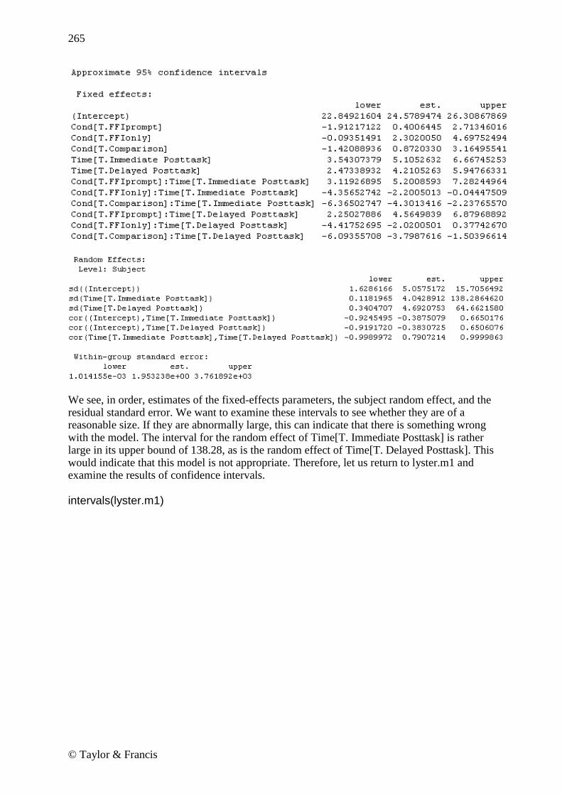
265
© Taylor & Francis
We see, in order, estimates of the fixed-effects parameters, the subject random effect, and the residual standard error. We want to examine these intervals to see whether they are of a reasonable size. If they are abnormally large, this can indicate that there is something wrong with the model. The interval for the random effect of Time[T. Immediate Posttask] is rather large in its upper bound of 138.28, as is the random effect of Time[T. Delayed Posttask]. This would indicate that this model is not appropriate. Therefore, let us return to lyster.m1 and examine the results of confidence intervals.
intervals(lyster.m1)

266
© Taylor & Francis
Here everything looks much more reasonable! We can return to the estimates of random variance calculated previously (see section 12.5.4) and report the results of the ANOVA on lyster.m1. However, there is one more detail to take care of in the statistical analysis, which is understanding more about the interaction for the fixed term of the model. In looking at the Lyster (2004) research design, it is clear that all of the subjects who were not in the comparison group improved their scores in the post-tests. What we are therefore particularly interested in knowing is which group performed the best at the first and second post-tests. I recommend following Howell‘s (2002) advice for RM ANOVA, which is to run separate ANOVAs at each level of one factor. To address these issues, let‘s model two ANOVAs at each of the post-test times. First we must subset the data to contain only the immediate post-test scores; then we can model the ANOVA and run multiple comparisons using the glht() command (find out more information about this command in the online document ―One way ANOVA.One-way ANOVA test‖).
lyster.post1=subset(lysterMeans,subset=Time=="Immediate Posttask") post1.m1=lm(ClozeTask~Cond,data=lyster.post1) library(multcomp) post1.pairs=glht(post1.m1,linfct=mcp(Cond="Tukey")) confint(post1.pairs)

267
© Taylor & Francis
For the first post-test, 95% confidence intervals show differences between all groups except FFI only versus FFI recast. Recalling the mean scores of the conditions on the cloze test: numSummary(lyster.post1[,"ClozeTask "],groups=lyster.post1$Cond)
We can say that FFI prompt scored statistically better than any other group, the comparison group scored statistically lowest, and FFI recast and FFI were in the middle but not statistically different from one another. Written another way, this could be expressed by: FFI prompt > FFI recast, FFI only > Comparison Redoing this process for the second post-test, results are almost identical, but now the FFI recast group is not statistically different from the comparison group either, meaning that the FFI prompt group is statistically better than all other groups, FFI only is statistically better than the comparison group, and FFI recast and comparison are not different from one another. Note that we have run a couple more tests than just the mixed-effects model, but we really don‘t need to worry that there is anything wrong with this, according to Howell (2002). The only caveats that Howell provides are that you do not need to include every result which you obtain, and that if you do run a significant number of additional tests then you ought to think about adjusting the p-values to stay within the familywise error rate. Only those results which are relevant to your hypotheses need to be reported, and you can ignore the rest, and in this case we did not run a large number of additional tests, so we won‘t worry about adjusting p-values.
12.5.6 Testing the Assumptions of the Model Just as with any type of regression modeling, we need to examine the assumptions behind our model after we have settled on the minimal adequate model. The assumptions of a mixed-effects model are somewhat different than those we are used to seeing for parametric statistics. Crawley (2007, p. 628) says there are five assumptions:
1. ―Within-group errors are independent with mean zero and variance σ2.‖ 2. ―Within-group errors are independent of the random effects.‖ 3. ―The random effects are normally distributed with mean zero and covariance matrix
Ψ.‖

268
© Taylor & Francis
4. ―The random effects are independent in different groups.‖ 5. ―The covariance matrix does not depend on the group.‖
The plot command is the primary way of examining the first two assumptions that concern the error component. The first plot is a plot of the standardized residuals versus fitted values for both groups:
plot(lyster.m1, main="Lyster (2004) data")
Lyster (2004) data
Fitted values
Sta
nd
ard
ize
d r
esid
ua
ls
-2
-1
0
1
2
3
15 20 25 30 35 40
Figure 12.11 Fitted values vs. standardized residual plots to examine homoscedasticity assumptions for Lyster (2004). The plot in Figure 12.11 is used to assess the assumption of the constant variance of the residuals. Remember that these plots should show a random scattering of data with no tendency toward a pie shape. This residual plot indicates some problems with heteroscedasticity in the residuals because there is a tapering of the data on the right-hand side of the graph. We can study these plots further by examining them by group as shown in Figure 12.12.
plot(lyster.m1,resid(.,type="p")~fitted(.)|Cond)

269
© Taylor & Francis
Fitted values
Sta
nd
ard
ize
d r
esid
ua
ls
-2
-1
0
1
2
3
15 20 25 30 35 40
FFIrecast FFIprompt
FFIonly
15 20 25 30 35 40
-2
-1
0
1
2
3
Comparison
Figure 12.12 Fitted values vs. standardized residual plots divided by groups in Lyster (2004). For the Lyster (2004) data, it appears that it is group 2 (FFI+prompt) where the data are heteroscedastic, since it is the lower right-hand corner box that shows the real tapering off of values on the right-hand side of the graph. It is possible to fit variance functions in lme that will model heteroscedasticity (and thus correct for it), but this topic is beyond the scope of this book (see Pinheiro and Bates, 2000, Chapter 5 for more information). The following command looks for linearity in the response variable by plotting it against the fitted values (the with command lets me specify the data set for each command):
with(lysterMeans, plot(lyster.m1,ClozeTask~fitted(.)))
Fitted values
Clo
ze
Ta
sk
10
15
20
25
30
35
40
15 20 25 30 35 40

270
© Taylor & Francis
Figure 12.13 Response variable plotted against fitted values to examine linearity assumption for Lyster (2004) data. The plot returned by this command in Figure 12.13 looks reasonably linear. Next we can examine the assumption of normality for the within-group errors (assumption 3) by looking at Q-Q plots. Notice that this command calls for Q-Q plots that are divided into different categories of time for the Lyster (2004) data.
qqnorm(lyster.m1,~resid(.)|Time)
Residuals
Qu
an
tile
s o
f sta
nd
ard
no
rma
l
-2
0
2
-5 0 5 10
Pretask Immediate Posttask
-2
0
2
Delayed Posttask
Figure 12.14 Q-Q plots to examine normality assumption for Lyster (2004) data. Figure 12.14 does not seem to show any departures from normality. We could examine Q-Q plots for other divisions of the data, such as the interaction of Time and Condition:
qqnorm(lyster.m1,~resid(.)|Time:Cond) Everything still looks very normal. In sum, just as with many of our real data sets, these data do not appear to satisfy all of the assumptions of our model. For assumptions about random effects (assumption 4) we will look at a Q-Q plot of the random effects. The estimated best linear unbiased predictors (BLUPs) of the random effects can be extracted with the ranef command: qqnorm(lyster.m1,~ranef(.)) This graph shows that the assumption of normality is reasonable (it is not shown here). For help in checking the fifth assumption listed here, that of the homogeneity of the random effects covariance matrix, see Pinheiro and Bates (2000).

271
© Taylor & Francis
12.5.7 Reporting the Results of a Mixed-Effects Model When reporting the results of a mixed-effects model, you should give the reader your minimal adequate model, and state whether you considered other models in your search for the best model. If several models were considered, then the AIC for each model should be reported. The best model for the data should be reported with the appropriate fixed-effect parameters. For the random effects, variances (the standard deviations squared) should be reported and the percentage variance that the random effects explain can be noted. An ANOVA summary of the model will generally be most appropriate for telling your reader about statistical terms in the model if that is your interest. Although you could construct a regression equation with the fixed-effect parameters, I don‘t think most people who are doing repeated-measures analyses are looking for regression models. They are looking to see whether there are group differences, and these are best addressed by ANOVA summaries and then further analysis with multiple comparisons to see which factor levels differ statistically from each other, and what their confidence intervals and effect sizes are. Here is a sample report about a mixed-effects model of the Lyster data with the cloze task: The minimal adequate model for the cloze task in Lyster (2004) is:
fixed=ClozeTask~Cond + Time + Cond:Time, random=~1|Subject In the fixed-effects part of the model, the main effect of Condition was statistical (F3,176=11.2, p<.0001, partial eta-squared=.16), the main effect of Time was statistical (F2,352=100.8, p<.0001, partial eta-squared=.36), and the interaction of Condition and Time was statistical (F6,352=21.1, p<.0001, partial eta-squared=.26). Further examination of the interaction between Condition and Time showed that, for the immediate post-test, the FFI prompt group performed statistically better than all other groups, while the FFI recast and FFI only groups performed statistically better only than the comparison group. For the delayed post-test, the FFI prompt group performed statistically better than all other groups, the FFI only group was statistically better than the comparison group, and there was no statistical difference between the FFI recast and comparison groups. It is clear that recasting by using prompts produced the best results for this task. In the random effects part of the model the intercept of participants was allowed to vary. Another model where both slopes and intercepts were allowed to vary was tested (random=time|Subject) and had an AIC of 3166 (as compared to 3180 for the model shown above), but confidence intervals for this model were too wide, showing problems with the model, so it was rejected. The standard deviation was 4.39 for the subject effect and 3.41 for the error, meaning that the effect of subjects accounted for 62.4% of the total variance. Examination of model assumptions showed heteroscedasticity in the data.
12.6 Application Activities for Mixed-Effects Models 1. Using the mixed-effects model proposed in section 12.5.1 (right before Figure 12.9), find the best way to model the variable of verbs in the Murphy data set (be sure to open the nlme library first; also, import the SPSS file MurphyLongForm.sav as murphyLong for this

272
© Taylor & Francis
exercise; look at the structure of the data and make sure group, verbtype, and similarity are factors—if you don‘t have the correct structure, you will get an error message with something about ―Error in MEEM‖). Look at the fixed effects—will you keep the full factorial model or reduce it? Compare the syntax of the random model found in the online document (one with ―similarity‖ and ―participant‖ in the random model) to a random model with only the one term of ―participant.‖ Examine model assumptions. 2. Write a mixed-effects model for following research designs (start with the maximal model for the fixed effects). There is no right answer for the random effects part, but in most cases you will want to let intercepts vary by participant. a. Toth (2006): 3 (group: type of input) × 3 (time tested) RM ANOVA, repeated measures on the time of testing. b. Erdener and Burnham (2005): 4 (condition of orthographic and audio-visual material) × 2 (L1) × 2 (L2) RM ANOVA, repeated measures on the condition. c. Larson-Hall (2004): 16 (contrast) × 3 (proficiency level) RM ANOVA, repeated measures on the contrast. 3. Lyster (2004) binary-choice test. Import the Lyster.Written.sav file as lyster. In order to conduct this test you will need to rearrange the data into the long form, with the columns for PreBinary, Post1Binary, and Post2Binary all in one column. Next construct a mixed-effects model and use the results of anova() to report on statistical terms. Report on the variances for the random effects, and calculate percentages for variances. Describe your search for the minimal adequate model. Try to fit at least one other model and perform a log-likelihood test with anova. Perform additional tests to answer the question of which groups were statistically better at the immediate post-test. Perform checks on model assumptions and report on how well the data fit the assumptions.

273
© Taylor & Francis
Chapter 13
ANCOVA
13.1 Performing a One-Way ANCOVA with One Covariate
13.1.1 Visual Inspection of the Data The following is the R code I used in looking at the Lyster data: Get the SPSS file Lyster.Oral.sav and name it lysterO. Code for parallel coordinate plots:
library(lattice) parallel(~lysterO[2:4]|lysterO$Cond) Code for mean and standard deviation summary:
numSummary(lysterO[,c("PreObjectID", "PostObjectID", "DelayObjectID")],groups=lysterO$Cond) Code for scatterplots found on p. 360 of the SPSS book (A Guide to Doing Statistics in Second Language Research Using SPSS):
library(lattice) xyplot(PreObjectID~PostObjectID|Cond,layout=c(4,1),col="black",type=c("p","smooth", "r"),data=lysterO) #the "type" argument determines what to draw; "p"=points, "smooth"=Loess line, "r"=regression line; I used all of them!
13.1.2 Checking the Assumptions for the Lyster (2004) Data For the first assumption that there may be a strong correlation between covariates, for Lyster‘s data, since there is only one covariate, I do not need to worry about correlation between covariates. For the second assumption of linearity between the covariate and the dependent variable, the scatterplots shown by using the code given above are a good way to test this. The Loess lines imposed on each of the scatterplots by group do not match the regression lines very well except in the case of the FFI only group. Clearly the slopes of the lines for the groups are not parallel, which will violate the third assumption of homogeneity of regression. This data set seems to be a good candidate for a robust analysis, and we will look at that later in the

274
© Taylor & Francis
chapter. Remember, what we risk losing by continuing to conduct a parametric analysis when the data do not meet the assumptions is the power to find differences that do exist. Another way to test whether there is homogeneity of regression slopes is to test for the presence of an interaction between the covariate and the treatment or grouping variable. If the interaction is not statistical, I can proceed with the normal model, according to Tabachnick and Fidell (2001, p. 292). We can do this by setting up a normal regression model for the Lyster (2004) variable of Object Identification and then adding in the covariate plus an interaction between the dependent variable and the covariate. Basically this will mean setting up a full factorial ANOVA with the two variables in the case of the one-way ANOVA, like this:
objectID.m1=aov(PostObjectID~Cond*PreObjectID, data=lysterO) summary(objectID.m1)
The ANOVA output shows that the interaction (Cond:PreObjectID) is not statistical (p=.32). This is one of those times when we are hoping the p-value will be larger than p=0.05. If it is, we can conclude that the slopes of the groups on the covariate are parallel enough and that there is homogeneity of regression. If there were a statistical interaction, then you can see that that would mean that the groups performed differently on the covariate. In the case of checking for the assumption of homogeneity of slopes, the interaction (Cond:PreObjectID) is the only row of the ANOVA that you need to look at; you can ignore the other parts of the output.
13.1.3 Performing a One-Way ANCOVA with One Covariate Performing an ANCOVA in R requires no more effort than simply including an extra term in the regression equation for an ANOVA. For example, this would be the regression equation if we simply wanted to perform a one-way ANOVA to examine the effect of group on post-test scores for the Lyster variable of Object Identification:
aov(PostObjectID~Cond, data=lysterO) Now we can just add the PreObjectID (the covariate) term to the right of the tilde:
object.m1=aov(PostObjectID~Cond+PreObjectID, data=lysterO) object.m0=aov(PostObjectID~Cond, data=lysterO) We could use either aov() or lm() to model the regression; the only difference is in the format of the output. I will show the aov() modeling here. Although the syntax in R is simple, the idea for ANCOVA is that the maximal model will have different slopes and intercepts for each level of the factor. Since we have only one independent variable (as we are looking at a one-way ANOVA) there will be no need to try to simplify terms.
anova(object.m1)

275
© Taylor & Francis
The summary shows that pre-test scores have a statistical effect on the post-test score. However, we also now have evidence that the condition has a statistical effect on post-test scores even with the effect of the pre-test factored out. Including the covariate means that we can factor out the influence of that variable. Note that order can matter in the regression equation (Crawley, 2007), so that we actually get a different outcome if we model with the covariate first:
object.m2=aov(PostObjectID~PreObjectID + Cond, data=lysterO) anova(object.m2)
Now the factor of condition is not statistical. After you have considered your ANCOVA, it might turn out that you will need to conduct pairwise comparisons on the variables. In this case, we know that Condition is statistical for the Lyster data, but don‘t know which groups differ from each other. We want to conduct pairwise comparison with the effect of the pre-test factored out, however. For this, use the glht() command we have seen previously (in the online document ―One way ANOVA.One-way ANOVA test‖), but use it on the ANCOVA model.
summary(glht(object.m1, linfct=mcp(Cond="Tukey"))) Assumptions for ANOVA can be checked in the normal way: plot(object.m1) Diagnostic plots show evidence of heteroscedasticity, evidence of some departure from normality at the ends of the Q-Q plot, and several influential outliers (just what we‘ve come to expect from our real-life data sets!).

276
© Taylor & Francis
13.2 Performing a Two-Way ANCOVA with Two Covariates In my own research I wanted to examine the effect of studying English at a younger age if the amount of input was minimal (four hours or less a week). I collected data on both grammaticality judgments in English (gjtscore) and phonemic discrimination ability (RLWtest). However, I also assumed that the total amount of input in English over however many years the student had studied could factor into their abilities, and I also thought perhaps the participants‘ own language aptitude would affect their scores. So I decided to factor these variables out of the equation by measuring them and using them as covariates. But before I can proceed with a two-way ANCOVA, I need to check whether this data fulfills the requirements for doing an ANCOVA.
13.2.1 Checking the Assumptions for the Larson-Hall (2008) Data For the first assumption that there may be a strong correlation between covariates, for my own study (Larson-Hall, 2008) I used two covariates, and we would check the correlation between the two variables of language aptitude (aptscore) and total amount of input in English (totalhrs) by simply following the menu STATISTICS > SUMMARIES > CORRELATION
MATRIX in R Commander and choosing those two variables. The correlation between these two covariates is r=0.08. This is not cause for worry at all. For the assumption that the regression slopes are equal we can test for the presence of an interaction between the covariates and the grouping variable (here, erlyexp). We‘ll test for an interaction between each covariate and the grouping variable one at a time.
check1=aov(gjtscore~erlyexp* aptscore, data=larsonhall2008) summary(check1) check2=aov(gjtscore~erlyexp* totalhrs, data=larsonhall2008) summary(check2) In neither case was the interaction statistical, so I may proceed with the ANCOVA analysis.
Performing a One-Way ANCOVA with One Covariate 1. Model your ANOVA with the aov() command (lm() can also be used, but a summary will result in regression output, not ANOVA tables). Add your covariate to your equation (do not have it enter into interactions with the variables of interest). Here is an example where scores on the Object Identification task (measure on a post-test) are modeled according to the condition that the subjects were in with a covariate of scores on the Object Identification task in a pre-test:
object.m1=aov(PostObjectID~Cond+PreObjectID, data=lysterO) 2. Examine output using the anova() command. Whether you pay attention to the statistical significance of the covariate depends on your question. You will, however, want to note whether your variable of interest is statistical even when the effects of the covariate are factored out. 3. If you would like to perform post-hoc comparisons, use the regression model in the glht() procedure to compare adjusted means.

277
© Taylor & Francis
13.2.2 Performing a Two-Way ANCOVA with Two Covariates Conceptually there is not much difference between performing a one-way or a two-way ANCOVA in R, but this section will illustrate how it can be done. If you are following along with me, import the SPSS file LarsonHall2008.sav as larsonhall2008. In this study I looked at whether exposure in childhood to formal English lessons resulted in Japanese college students being able to perform better on a test of the English R/L/W contrast and on a grammaticality judgment test in English. Since Japanese learners of English who began studying English at a younger age might have more hours of exposure, I wanted to use this variable as a covariate. In other words, I wanted to factor this out of the comparison between the group that had had early exposure and the group that hadn‘t. I also thought it was possible language aptitude might be involved, so I measured that in order to statistically take that factor out of the equation. And that is what we will do here—try taking both the factor of hours of exposure and language aptitude out of the equation! We‘ll look at the question of scores on the grammaticality judgment test. My original research question was whether the group which had early exposure differs from the group which did not, but in order to illustrate a two-way ANCOVA I will also include the independent variable of the sex of the participant. Here is the ANOVA model in R:
lh.m1=aov(gjtscore~erlyexp*sex+totalhrs+aptscore, data=larsonhall2008) Is this the only possible model? No. The covariates will not enter into any interactions in the model, but the two independent variables are presumed to have an interaction in this first model. Let‘s check out whether this assumption is justified.
summary(lh.m1)
The summary shows that there is a statistical main effect for sex, but not for early exposure or the interaction between sex and early exposure, at least when the effects of aptitude and hours of exposure are factored out. Let‘s try removing the interaction between sex and early exposure.
lh.m2=update(lh.m1,~.-erlyexp:sex, data=larsonhall2008) summary(lh.m2)

278
© Taylor & Francis
Nothing has changed—the early exposure variable is still not statistical. Shall we keep this simpler model?
anova(lh.m1, lh.m2)
Yes. There is no difference between the models, so we will keep the simpler one. At this point I don‘t want to eliminate the variable of early exposure, however, because my main question is whether this variable is statistical when the effect of aptitude and input is factored out. My analysis has answered that question—it is not.
13.3 Performing a Robust ANCOVA in R In a robust ANCOVA we would like to eliminate the assumption of parametric models that the regression lines of all groups are parallel (Wilcox, 2005). The method I will present in this section does not make any assumptions about the linearity of regression lines, allows heteroscedasticity, and performs well even if data is non-normal. The general idea of the method is to use a Loess smoother and then make comparisons between groups at specific points along the smooth line. This method also trims the data (20% is recommended) and bootstraps it with the recommended bootstrap-t. The function will pick five arbitrary points at first, but a researcher can specify the points themselves as well, and will probably want to after looking at scatterplots with smooth lines that will result from the output. Wilcox‘s (2005) function ancboot from the WRS library can only be used with one covariate, and it can only examine two groups at a time. In other words, the only time this function would work without having to first subset your data would be if you have an independent variable with only two groups and one covariate. This function has been shown to have good power when ANCOVA assumptions are not met, but another advantage, Wilcox says, it that ―[e]ven when ANCOVA has relatively good power, an advantage of using trimmed means with a running-interval smoother is that the goal is to determine where the regression lines differ and by how much, and this is done without assuming that the regression lines are straight‖ (2005, p. 526).
Performing a Two-Way ANCOVA with Two Covariates 1. Model your ANOVA with the aov() command. Add your covariates to your equation (but do not have them enter into interactions with the variables of interest). Here is an example where scores on a grammaticality judgment test are modeled according to whether the participant studied English at an early age (erlyexp) and the sex of the participant (sex), but the equation is modified by including a covariate of total hours of input and scores on an aptitude test:
lh.m1=aov(gjtscore~erlyexp*sex+totalhrs+aptscore, data=larsonhall2008) 2. Examine output using the anova() command.

279
© Taylor & Francis
To use the ancboot function, first the data must be subsetted into separate data frames for each group as shown below (an example of my published work using this function can be found in Larson-Hall, 2008). We‘ll continue to work with the Object Identification variable from the previous section, so use the Lyster.Oral.sav file that you imported as lysterO.
lyster.prompt=subset(lysterO,subset=Cond=="FFIprompt") lyster.recast=subset(lysterO,subset=Cond=="FFIrecast") lyster.only=subset(lysterO,subset=Cond=="FFIonly") lyster.comp=subset(lysterO,subset=Cond=="Comparison") Here is an example of ancboot() used to compare the FFI prompt and FFI recast groups on the pre-test and immediate post-test scores. Notice that x1 is pre-test scores from one group and x2 is pre-test scores from the other group. Then y1 is post-test scores from the first group and y2 is post-test scores from the second group.
x1=lyster.prompt$PreObjectID y1=lyster.prompt$PostObjectID x2=lyster.recast$PreObjectID y2=lyster.recast$PostObjectID
ancboot(x1,y1,x2,y2,fr1=1,fr2=1,tr=.2, nboot=599, plotit=T, pts=NA) ancboot (x1, y1, x2, y2) Performs an ANCOVA using trimming and a percentile
bootstrap method; the data for group 1 are stored in x1 and y1, and the data for group 2 are stored in x2 and y2.
fr1=1, fr2=1 The values of the span (f) for the groups, defaults to 1; span refers to how frequently data are sampled by the running-interval smoother, meaning how smooth the smooth line looks.
tr=.2 Specifies amount of trimming, default is 20%.
nboot=599 Specifies number of bootstrap samples to use; 599 is default.
plotit=T Plots a scatterplot with Loess smoothers drawn in.
pts=NA If not specified, the function will automatically choose five points at which to compare groups. The points can be specified by the user, such as pts=c(1,3,5).
The output returns the points where data are compared, confidence intervals for the test that trimmed means of the groups are equivalent at that point, and a p-value for the test. Wilcox says that the function determines ―a critical value based on the Studentized maximum modulus distribution‖ (2005, p. 527). The plot that is returned is also very useful. Here is the text output from the command run above:

280
© Taylor & Francis
The results show that the FFI prompt and FFI recast groups were tested only at two points on the pre-test (we set it up so that the pre-test was on the x-axis and the post-test on the y-axis), points 11 and 12 (we know this because only 11 and 12 are listed in the column with ―X‖). The n1 and n2 specify how many subjects were tested at each of those points. If we decide we want to test at more intervals, we find that the number of participants in those points is smaller, which is why the automatic procedure only tested at points 11 and 12.
ancboot(x1,y1,x2,y2,fr1=1,fr2=1,tr=.2, nboot=599, plotit=T, pts=c(8,10,12,16,18))
The ―DIF‖ column gives the difference in scores at that point, and the ―TEST‖ gives the test statistic for the hypothesis that the mean of one group is equal to the mean of the other at that point. The ―se‖ column gives the standard error for the test statistic, and the ―p.value‖ column gives the p-value for the test. None of the points show any statistical difference between the groups. The ―ci.low‖ and ―ci.hi‖ columns give the lower and upper ends of the 95% confidence interval for the difference between the groups. The last part of the text output lists the critical value used to evaluate whether the test is statistical. If the value in the ―TEST‖ column is below this critical value, the test will not be statistical. Wilcox notes that this critical value will be adjusted if fewer than five points appropriate for testing can be found. The plot that is called for is extremely helpful in understanding what is happening, and shows the points with the smooth lines on them (Figure 13.1).

281
© Taylor & Francis
8 10 12 14 16 18
81
01
21
41
61
82
0
X
Y
+
+
+
+
+
+
+
+
+
+
+
++
+
+
+
Figure 13.1 Output from Wilcox‘s ancboot function showing Loess smooth lines for ANCOVA comparison. When I tried to make a comparison between the FFI prompt and FFI only group, I got the following error message:
Like many error messages, this one was confusing, as there were no NAs in the data sets. However, I got the idea that maybe the program was having trouble picking out points to test at, and when I specified just points 10 and 12 the function worked, although at both of these points one group had only five points. This is probably what was problematic, as Wilcox says ―the points among the covariates at which the groups will be compared are determined by the function; it finds a point among the x1 values that has the deepest halfspace depth, plus the points on the .5 depth contour, and the groups are compared at these points, provided that the corresponding sample sizes are at least 10‖ (2005, p. 533).

282
© Taylor & Francis
Because only two groups can be compared at one time on two variables, this robust ANCOVA is more limited that the parametric version, but I think that, when it can work, it is an informative function.
13.4 Application Activities for ANCOVA 1. Class Time. Import the data set I have called ClassTime.sav as classtime (this data set was taken from Howell, 2002, p. 629, but I adapted it to reflect a design that will be associated with the second language research field). Let‘s pretend that a researcher who is in charge of teaching Arabic at the university level notices that there seems to be a difference in how students in her 8 a.m. class respond to her teaching versus how students in the later classes respond. At the start of a new school year she gives them an initial test of their enthusiasm and motivation for learning Arabic. There are 30 items, which contain a ten-point Likert scale, where a higher score is more positive about the class. The researcher averages their answers together for a score out of 10. She then administers the same test at the end of the semester. The researcher has five classes, one at 8 a.m., one at 10 a.m., one at 11 a.m., one at 1 p.m., and one at 2 p.m. This study could be analyzed with an RM ANOVA (if the data were arranged in the ―wide‖ format), but the researcher decides to analyze it with an ANCOVA using the pre-test scores as a covariate so that any differences among the post-test scores due to variability in pre-test scores will be controlled. Use PreTestScores as the covariate, PostTestScores as the dependent variable, and TimeOfClass as the independent variable. First check the special assumptions for ANCOVA. Even if the data violates the assumptions, go ahead and perform the ANCOVA. What are the results of the parametric ANCOVA? Then run a robust ANCOVA on the comparison between the 10 a.m. and 1 p.m. class. Do the results differ from the parametric ANCOVA? 2. Larson-Hall (2008). Import the SPSS file LarsonHall2008.sav as larsonhall2008. In the online document ―ANCOVA: Two-way ANCOVA with two covariates‖ you saw an analysis with two covariates (aptscore and totalhrs) with the dependent variable of grammaticality judgment test scores. Perform the same analysis using the dependent variable of the phonemic discrimination test scores (rlwscore). Start by seeing whether the model satisfies
Performing a Robust ANCOVA 1. Wilcox (2005) lists several possible commands for performing robust ANCOVAs. In this section I focus on just one, ancboot(), which does not assume that groups have parallel regression lines, and uses means trimming and also a bootstrap-t procedure. 2. Data need to be arranged so that data for only one group are in a data frame. 3. The command is:
ancboot(x1,y1,x2,y2,fr1=1,fr2=1,tr=.2, nboot=599, plotit=T, pts=NA) where x1=data for a particular variable from group 1 at time 1, and y1=data for the same variable from group 1 at time 2. Similarly, x2=data for the same variable as x1 but from group 2 at time 1, and y2=data for the same variable from group 2 at time 2. The rest of the specifications are default but can be changed. 4. Errors might arise if there are too few data points at specific points of comparison, but this can be controlled via the pts term of the command. A scatterplot called from this command helps show visually what points of comparison are of interest.

283
© Taylor & Francis
the special ANCOVA assumptions. If it does, start with the maximal model and simplify if possible. Is early exposure a statistical factor when the effect of aptitude and input is factored out?

284
© Taylor & Francis
Appendix A
Doing Things in R
This appendix is not an exhaustive list of all the things that R can do, but rather a list of some common steps you may want to take gathered in one convenient place, and a place to throw a few miscellaneous ideas about R that didn‘t fit neatly anywhere in the book. Getting Started I‘m Looking at the R Console; Now What? Getting Data into R Finding Out Names of a Data Set Looking at a Data Set Making R Work for You in the Long Run
Getting Help! How to Pull Up Specific Help Files How to Find Help When You‘re Not Sure What You Want How to Understand R Help Files Finding Out the Arguments That Are Needed for a Command When You Want More Information about a Certain Package Helpful Online Articles or Sites That Explain More about R Getting Help Online
Types of Data Understanding the Types of Data in R Changing Data from One Type to Another
Manipulating Data Finding Out What Class Your Data Is Finding Out the Size of Your Data Finding Out How Many Rows in One Column of Data Finding Out about the Structure of Your Data Looking at Just a Few Rows of Your Data Attaching and Detaching Data Picking Out Certain Rows or Columns Finding Out What Objects Are in Your Active Desktop Finding Out What Data Sets Are in a Package or Library Removing an Object from Your Active Desktop Removing Specific Points from an Analysis Removing All NAs from a Data Frame or Matrix Ordering Factors of a Categorical Variable Recoding Factors of a Categorical Variable into Different Factors

285
© Taylor & Francis
Extracting One Column from a Matrix and Making a New Variable Converting a Numeric Variable to a Character Variable (Changing a Variable into a Factor) Converting an Array into a Condensed Table Replacing Certain Cells in a Matrix with Something Else Creating a Vector of Data Putting Vectors of Data Together into a Data Frame Adding Columns to a Data Frame Naming the Columns of a Matrix or Data Frame Subsetting a Data Frame (Choosing Columns) Subsetting a Data Frame (Choosing Groups) Subsetting a Data Frame When There Are NAs Subsetting a Data Frame to Remove Only One Row While Doing Regression Ordering Data in a Data Frame Changing the Order of Rows or Columns in a Data Frame Naming or Renaming Levels of a Variable Creating a Factor Adding a Created Factor to the End of a Data Frame Changing the Ordering of Factor Levels without Using the ―Ordered‖ Command Dividing a Continuous Variable into Groups to Make Factors Sampling Randomly from a List of Numbers Creating Nicely Formatted Tables Creating a Table, Summarizing Means over Groups
Graphics Demonstration of Some Cool Graphics Other Interesting Demonstration Files Choosing a Color That You Like Placing More Than One Graphic in the Graphics Device Getting Things out of R into Other Programs Round Numbers Getting Data out of R Troubleshooting Revealing Command Syntax Understanding Error Messages Getting Out of a Function That Won‘t Converge or Whose Syntax You Have Typed Incorrectly Resetting the Contrasts Option for Regression Miscellaneous Trimmed Means if There Are NAs Using the Equals Sign instead of the Arrow Combination Calculating the Standard Error of the Means Suppressing Stars That Show ―Statistical Significance‖ Loading a Data Set That Is Already in R, so R Commander Can See It

286
© Taylor & Francis
Getting Started
I’m Looking at the R Console; Now What? The really first thing to do is to get R Commander going so you will have a menu-driven graphical user interface (GUI) to help you. To get R Commander if you do not have the CD that came with this book, in R Console pull down the Packages menu and click on ―Install packages.‖ The first long skinny window that will pop up is labeled ―CRAN mirror.‖ You need to choose a CRAN mirror site before you can download packages. Choose any site, but preferably one near your geographical location. Press OK, and then another long skinny window will pop up. Scroll down to the ―R‖s and double click on ―Rcmdr.‖ Once that is finished installing, type this (exactly!) in the R Console window:
>library(Rcmdr) The R Commander GUI will open.
Getting Data into R I think the easiest way to do this is to use R Commander. Open R Commander (type >library(Rcmdr) into R Console to get R Commander to open). In R Commander, choose ―Data‖ from the menu, and then ―Import data.‖ If you have an SPSS (.sav) file, choose the ―from SPSS data set‖ option. The only thing I change in the dialogue box that pops up is the name of the data set. If you have a .txt file, use the ―from text file or clipboard‖ choice. This is a little trickier, and you‘ll have to know whether your numbers are separated by white spaces, commas, tabs, or something else. If a file is .csv, this means it is comma-delimited, so tick the ―Commas‖ button under ―Field Separator.‖ You might have to experiment with this to get the correct format of your imported file. Once you click OK, R Commander lets you browse your computer to find the file. With R Console, if the file you want is in the R/bin folder, just type:
>lafrance<-read.csv("lafrance.csv") The first lafrance is necessary in order to put the .csv file into an object named lafrance that is in the workspace. If you only do the read.csv("lafrance.csv") command, it will print out the file on the R Console but you cannot manipulate the object.
Finding Out Names of a Data Set >names(lafrance)
Looking at a Data Set If you want to see what your data file looks like, press the ―View data set‖ button on the R Commander window. This shows you the active file (lh2004 in this case).

287
© Taylor & Francis
Making R Work for You in the Long Run Make it a habit to collect all the R commands and analyses that you do in some type of separate file, whether it be a Word document, TinnR (an ASCII file editor intended to be better than the Notepad program, and found at www.sciviews.org/Tinn-R), or R‘s own .Rhistory file (this can be opened with Notepad and contains a collection of the commands you made during your session). You can make comments on what you did (preceded by a # so that R will ignore them if you run the commands again) to help you remember your analyses years later.
Getting Help!
How to Pull Up Specific Help Files Let‘s say you want to understand the lmRob function better, so you pull up the help file for it (and you already have opened the robust library). You can pull up this help file in the following ways: >help("lmRob") #use of quotes optional here >help("[[") #use of quotes absolutely necessary here >?lmRob In R Console: Help>RFunctions (text); then type in lmRob
How to Find Help When You’re Not Sure What You Want Suppose you want to make a histogram but you‘re not sure how to do it in R. You‘ve tried histogram(my.data) but that doesn‘t work, so you can type this to find out more about how to make histograms:
>help.search("histogram") R will come up with a list of relevant topics. At the bottom of the box that pops up when you use the help.search() command it says ―Type ‗help(FOO, package=PKG)‘ to inspect entry ‗FOO(PKG) TITLE.‘‖ This command is hard to process at first! But, as an example, let‘s say you entered help.search(―histogram‖). The following is something like the list of topics you will see:

288
© Taylor & Francis
Now you can type the name of a specific package into R to get more information about it. For example, let‘s look at the first entry in this list:
>help(hist.data.frame, package=Hmisc) Notice that FOO is just shorthand for the function name. You can also try the apropos command, which is a partial name search and looks for commands relevant to the topic you put in parentheses:
>apropos ("ML", ignore.case=FALSE) [1] "MLRplot"
How to Understand R Help Files There are nine basic parts to help files: Description, Usage, Arguments, Details, Value, Author(s), References, See Also, and Examples. I often find it easiest to start with the examples. You can type:
>example(cr.plots) and, if there are example files, they will run on R and show you what the function does. This is especially helpful if graphics are involved. To find out more about what cr.plots are and how they work, type one of these equivalent commands: >help(cr.plots) >?cr.plots The following window will appear:

289
© Taylor & Francis
We see that cr.plots are part of the car library (a very useful library). The Description section tells us that cr.plots are component+residual plots. The Usage part will show you exactly what arguments can be used in the function. For the cr.plots function, there are several different usages. The first is:
This is the most general syntax of the function. It tells us that we will need to put a model in the first argument position. The next argument is a variable, but it is not clear yet what that variable will be. Other arguments include one called ―ask‖ and ―one.page.‖ You can find out more about what these arguments are in the Arguments and Details sections. The default settings for these arguments are also given here. For example, in the ―S3‖ method, the third argument, the default for order will be ―1.‖ Don‘t give up if you can‘t understand the Usage right away, because there is more information later in the help document! The other variations in the Usage section tell us that this plot might also be called by crp. Its usage with lm models and glm models gives additional arguments that a user might be interested in setting. So they are all the same command, but different variations of it for different situations.

290
© Taylor & Francis
The Arguments section can help clarify the syntax. For example, Arguments tells us that the model in the first argument position needs to be a regression object created by lm or glm. Here are some details about ―ask‖ and ―one.page‖:
It looks as though, for ―ask,‖ we can set it to ask=TRUE. However, it wasn‘t entirely clear to me how to use ask, since the Usage seemed to indicate I should put in a variable name there. To figure this out, I looked at R Commander (because this is a menu function in R Commander) as well as the Examples, and then I just fooled around with trying various kinds of syntax. I actually discovered that, if I put in a model name without any other arguments, then a menu popped up to ask me which variables I wanted to consider:
This led me to believe that ―ask‖ is not so much something the user sets as an integral part of the command which asks the user which things to plot. The Details section also often has some useful details that the author does not have any other place to put. For example, for cr.plots it is noted that the model cannot contain interactions. This is an important piece of information. Author and References are self-explanatory. The See Also has clickable terms that can lead you to related functions that will help you figure out how to use the function. As you become more familiar with the R help pages they will make more sense and become more helpful!
Finding Out the Arguments That Are Needed for a Command > args(lm) function (formula, data, subset, weights, na.action, method = "qr", model = TRUE, x = FALSE, y = FALSE, qr = TRUE, singular.ok = TRUE, contrasts = NULL, offset, ...)
When You Want More Information about a Certain Package Let‘s say you want to do robust regression and you have noted that robustbase is a package that does robust regression. There are a couple of ways to get more information about this package:
>help.start() In R Console: Help> HTML help

291
© Taylor & Francis
Find the Packages hyperlink under References. Many packages have links here so that you can hyperlink from one function to another within the package. However, not all packages are found here. For example, say I want to know more about the prettyR package. Another thing to try is vignettes.
>vignette(all=T) >vignette("grid") #for a vignette from a specific package I still can‘t find anything about prettyR, so I go to this website: www.cran.r-project.org. Click on ―Packages‖ on the left-hand side bar. This has pdf documents from many packages which can be quite helpful, and it has one about prettyR.
Helpful Online Articles or Sites That Explain More about R On the R website (www.r-project.org), go to Manuals and you will find ―An
Introduction to R.‖
One fun place to look at various kinds of graphs available in R is the web site http://addictedtor.free.fr/graphiques/.
An introduction to statistical computing in R and S by John Fox at http://socserv.socsci.mcmaster.ca/jfox/Courses/R-course/index.html.
Tom Short‘s R reference card, organizing R syntax by function and giving short explanations in a compact format: http://cran.r-project.org/doc/contrib/Short-refcard.pdf.
A short online tutorial about using R for psychological research: http://www.personality-project.org/r/r.guide.html.
Notes on the use of R for psychology experiments and questionnaires: http://www.psych.upenn.edu/~baron/rpsych/rpsych.html.
A general resource is on the R home page; go to Other, and then follow the link to Contributed Documentation, where you will find many articles.
Getting Help Online If you are having a problem, the R help archives usually have some answers. You can also post a question to [email protected]. However, before posting you must be sure to research your question by searching the archives and reading the posting guide, which can be found by clicking on Mailing Lists and reading the information there. To search for answers on the R help archives, go to the R website (www.r-project.org) and go to Search. I usually go to Baron‘s R site search, which is the first hyperlink on the page. Insert your term and browse away. When you post a question, the posting guide does ask you to state what version of R you are using. You can get this information by typing:
>sessionInfo() This tells you what version of R you are using, what packages are attached, and what versions those packages are.

292
© Taylor & Francis
Types of Data
Understanding the Types of Data in R If you import an SPSS file into R, it will be a ―data frame.‖ A data frame is a collection of columns and rows of data, and the data can be numeric (made up of numbers) or character (a ―string‖ in SPSS or, in other words, words that have no numerical value). It has only two dimensions, that of rows and columns. All of the columns must have the same length. Most of the data you will work with in this book is in data frames, and you can think of it as a traditional table. Here is an example of a data frame:
A ―matrix‖ is similar to a data frame, but all the columns must be of the same format, that is, either numeric or character. Like a data frame, a matrix has only two dimensions (row and column), and all columns must be of the same length. Here is an example of what happened when I turned the data frame above into a matrix:
You can see that all the cells are now surrounded by quotation marks, meaning they are characters. A look at the structure of this matrix reveals indeed that all the variables are now regarded as character, meaning they do not have any numerical meaning. A vector is just one line of data that might represent one column of a data frame or matrix. It can be composed of numeric, character, or logical entries. a=c(3,6,7,10,3) #numeric b=c("Type A", "Type A", "Type B", "Type C") #character c=c(TRUE, TRUE, FALSE, FALSE, FALSE, TRUE) #logical If you take one column from a data frame, this is also a vector:
> lh2004$group [1] 1 1 1 1 1 1 1 1 1 1 1 2 2 2 2 2 2 2 2 2 2 2 2 3 3 3 3 3 3 3 3 3 3 4 4 [36] 4 4 4 4 4 4 A list is a collection of vectors, which do not all need to be the same length. The elements of the list can be of different types as well. For example, we can create a list that holds all of the vectors presented above:

293
© Taylor & Francis
>my.list=as.list(c(a,b,c))
Each entry is referenced by its position in the list. For example, the 13th member of the list can be referenced by:
> my.list[[13]] [1] "FALSE" An array is similar to a data frame, but it can have more than two dimensions. The array for the Titanic data, found in the vcd library, is an array.
This data set has four dimensions, which can be ascertained by their dimension names:

294
© Taylor & Francis
A factor is a vector that R considers a categorical variable, and it contains two parts—a vector of integers as well as a vector of character strings that characterize those integers. Here I create a factor called ―category‖:
> category=c(rep("A", 10), rep("B", 15)) > category=factor(category) > category [1] A A A A A A A A A A B B B B B B B B B B B B B B B Levels: A B > summary(category) A B 10 15 In the summary, R knows that this is a factor and so it counts up the As and Bs separately. If we had not made ―category‖ into a factor and performed a summary, it would simply count up 25 character entries.
Changing Data from One Type to Another There are many commands to change data types (use methods(is) for a complete list), but essentially there are only a few that are likely to be useful. One is when you want to change your data from separate vectors to a data frame, like this: >collect=as.data.frame(results, group, type) Another may be when you want to change a data frame into a matrix: >collect.matrix=as.matrix(collect) Another common task is changing a non-factor into a factor: > murphyLong$verbtype=as.factor(murphyLong$verbtype) Remember, you can check the class of your data by typing:
>class(collect.matrix)
Manipulating Data
Finding Out What Class Your Data Is >class(lafrance) [1] "data.frame" Possible classes include ―data.frame,‖ ―matrix,‖ ―array,‖ ―vector,‖ ―table,‖ and ―list.‖ For more information about what types of data classes mean, see the ―Types of Data‖ section. If you use class on a vector, it will tell you whether it is numeric or character: > class(lyster$cloze) [1] "numeric"

295
© Taylor & Francis
Finding Out the Size of Your Data >dim(lyster) [1] 540 4 This specifies that the data frame has 540 rows and 4 columns.
Finding Out How Many Rows in One Column of Data >length(murphy$REGULARV) [1] 60
Finding Out about the Structure of Your Data The str command will give you a wealth of information about your data. > str(Forbes2000) #data found in HSAUR library 'data.frame': 2000 obs. of 8 variables: $ rank : int 1 2 3 4 5 6 7 8 9 10 ... $ name : chr "Citigroup" "General Electric" "American Intl Group" $ country : Factor w/ 61 levels "Africa","Australia",..: 60 60 60 60 56 60 56 28 $ category : Factor w/ 27 levels "Aerospace & defense",..: 2 6 16 19 19 2 2 8 9 $ sales : num 94.7 134.2 76.7 222.9 232.6 ... $ profits : num 17.85 15.59 6.46 20.96 10.27 ... $ assets : num 1264 627 648 167 178 ... $ marketvalue: num 255 329 195 277 174 ... The first line tells us what class of object it is and also that there are eight variables. The next eight lines tell us about each of the variables, whether they are character (chr; for the Forbes2000 data, these are not factors because none of the strings is repeated; they are all different companies), factors (and how many levels in each factor; you get a factor if you import with character strings), or just plain numbers (num).
Looking at Just a Few Rows of Your Data >head(murphy) # lists the first few rows >murphy[1:15,] #lists the first 15 rows >murphy[sort(sample(60,5)),] #samples 5 rows from the 60 possible
Attaching and Detaching Data You can find out what data sets are already attached by typing:
>search() If any data sets are attached, they will be listed. If more than one data set is attached, the last one attached is in the highest position and will take precedence if they have any names that are the same. Attach a data set by typing:
>attach(lyster)

296
© Taylor & Francis
One good reason to attach data is so that you can perform subsequent commands using just the names of the variables inside the attached data set instead of always having to append the name of the data set. In other words, if you have not attached the data, to calculate the mean of the ―cloze‖ variable inside the lyster data set, you‘ll need to type:
>mean(lyster$cloze) On the other hand, if you have attached the data set, you can just type:
>mean(cloze) Note that, if you modify something in the data when it is attached, then changes will not be seen until you detach and reattach the data. To detach the data: >detach(lyster) or just: >detach() which detaches the most recently attached data set (the one highest up in the search path list).
Picking Out Certain Rows or Columns With a data frame or matrix, there are a number of syntax equivalents you can use to pick out a certain column:
lyster[,3] lyster[[3]] lyster$time To pick out a row: lyster[15,]
Finding Out What Objects Are in Your Active Desktop >ls() This command lists all active objects, which are data sets and user-defined functions.
Finding Out What Data Sets Are in a Package or Library >data(package="languageR") This command causes a separate window with a list of the data sets to appear. To find out more about the data sets, in R Console choose Help > HTML help and, when a new window comes up, choose ―Packages.‖ Choose your package (such as ―languageR‖), click on hyperlink, then navigate to name of data set to find out more about it. To find out about all available data sets, type:
>data(package=.packages(all.available=TRUE))

297
© Taylor & Francis
Removing an Object from Your Active Desktop Assume you have created an object that you now want to get rid of:
>rm(meanFun) You can remove all active objects this way; just make sure that is really what you want to do!
>rm(list = ls())
Removing Specific Points from an Analysis To remove just one point: >model2=lm(growth[-7]~tannin[-7]) To remove more than one point from an analysis:
>model3=lm(growth[-c(1,7)]~tannin[-c(1,7)])
Removing All NAs from a Data Frame or Matrix >newlh=na.omit(newlh) >newlh=na.exclude(newlh) The omit function will filter the NAs, while exclude will delete them. The following command also works by asking R to include any entries in which the logical answer to the question of whether there are NAs (is.na) is FALSE (! indicates a logical negation). >newlh=newlh[!is.na(newlh)]
Ordering Factors of a Categorical Variable First, find out if your variable is a factor:
> is.factor(beq$CATDOMIN) [1] TRUE If it is not, you can easily make it so:
>beq$CATDOMIN=as.factor(beq$CATDOMIN) Next, check to see if it is already ordered:
> is.ordered(beq$CATDOMIN) [1] FALSE You‘ll need to know the exact names of the levels:
> levels(beq$CATDOMIN) [1] "YES" "NO" "YESPLUS"

298
© Taylor & Francis
Now you are ready to order the levels to your own preference: >beq$CATDOMIN=ordered(beq$CATDOMIN,levels=c("YES", "YESPLUS", "NO")) If your factors came without names, you can set those in this command too: >group=ordered(group,levels=c("2", "3", "1"), labels=c("NS adults", "NNS adults", "NS children"))
Recoding Factors of a Categorical Variable into Different Factors First, find out if your variable is a factor:
> is.factor(beq$FIRSTLAN) [1] TRUE You‘ll need to know the exact names of the levels: > levels(beq$FIRSTLAN) [1] " " "Afrikaans" "Albanian" "Arabic" [5] "Armenian" "Basque" "Bengali" "Boobe" (There are 108 levels! We want to consolidate.) Now you can begin to form groups:
levels(beq$FIRSTLAN)[c(57,93,78,79,80)]= "Italic" levels(beqmore$FIRSTLAN)[c(27,24,25,26,40,41,42,43,44)]= "Germanic" etc.
Extracting One Column from a Matrix and Making a New Variable >data=lyster[,'cloze'] >data=lyster$cloze #both of these commands are equivalent
Converting a Numeric Variable to a Character Variable (Changing a Variable into a Factor) When your splitting variable is characterized as ―character‖ it will be listed when you open the ―Plot by groups‖ button in R Commander. If this doesn‘t work (and sometimes it seems not to), you can fix it by using R Console. Just make sure the data set is not attached (detach()) before you run the following code:
>lyster$condition=factor(lyster$condition) >is.factor(lyster$condition) [1] TRUE
Converting an Array into a Condensed Table >library(vcd) >(STD=structable(~Sex+Class+Age,data=Titanic[, ,2:1, ]))

299
© Taylor & Francis
Replacing Certain Cells in a Matrix with Something Else Here I‘m thinking of a situation where you might import a data set that had a ―99‖ everywhere that data was not entered. To use this data set correctly in R you‘ll need to have NAs in those places. If we assume that m1 is a matrix or vector (this won‘t work with a data frame), you can use the following command:
>m1[m1==99]=NA
Creating a Vector of Data >data<-c( 22, 23, . . . ) This will just put data into one variable.
Putting Vectors of Data Together into a Data Frame >my.data.frame=data.frame(rt=data, subj=factor(subject), drug=factor(treatment)) Note that, if ―treatment‖ were already a factor, there would be no need to specify it as such in the data frame.
Adding Columns to a Data Frame >new.data.frame<-cbind.data.frame(participant=1:20, my.data.frame)
Naming the Columns of a Matrix or Data Frame >dimnames(Ela.mul)[[2]]= c("subj", "gp", "d11", "d12", "d13", "d21", "d22", "d23") Here the [[2]] refers to the column names, so this is generalizable to any matrix or data frame. Ela.mul subj gp d11 d12 d13 d21 d22 d23 1 1 1 19 22 28 16 26 22 2 2 1 11 19 30 12 18 28
Subsetting a Data Frame (Choosing Columns) You can pick out the columns by their names (this data is in the HSAUR library):
>Forbes3=Forbes2000[1:3, c("name", "sales", "profits", "assets")] or by their column number:
>Forbes3=Forbes2000[1:3, c(2,5,6,7)] Note that this subset also chooses only the first three rows. To choose all of the rows, leave the space before the comma blank:
>Forbes3=Forbes2000[,c(2,5,6,7)] This way of subsetting puts the columns into the order that you designate.

300
© Taylor & Francis
You can also subset according to logical criteria. The following command chooses only the rows where assets are more than 1000 (billion):
>Forbes2000[Forbes2000$assets > 1000, c("name", "sales", "profits", "assets")]
Subsetting a Data Frame (Choosing Groups) To subset in R Commander, go to DATA > ACTIVE DATA SET > SUBSET ACTIVE DATA SET. You‘ll need to know the exact column name of the factor that divides groups, and the exact way each group is specified in that column to put into the ―Subset expression‖ box. The R syntax is:
>lh2004.beg <- subset(lh2004, subset=LEVEL=="Beginner") Note that a double equal sign (==) should be used after the index column name (LEVEL) and quotation marks should be around the name of the group. This syntax includes all columns in the data set.
>lh2004.beg <- subset(lh2004, subset=LEVEL=="Beginner", select=c(PJ_P,R_L,SH_SHCH)) The ―select‖ argument lets you choose only certain columns to subset.
Subsetting a Data Frame When There Are NAs First, create a new variable composed of only rows which don‘t have NAs:
>library(HSAUR) >na_profits=!is.na(Forbes2000$profits) >table(na_profits) >Forbes2000[na_profits, c("name", "sales", "profits", "assets")]
Subsetting a Data Frame to Remove Only One Row While Doing Regression >model2=update(model1,subset=(tannin !=6) The exclamation point means ―not‖ that point, so this specifies to remove row 6 of the tannin data set for the updated model.
Ordering Data in a Data Frame Say we want an index with sales in order from largest to smallest: >order_sales=order(Forbes2000$sales) #in HSAUR library Now we want to link the company name up with the ordered sales. First, rename the column:
>companies=Forbes2000$name Now order the companies according to their sales:
>companies[order_sales]

301
© Taylor & Francis
Last, use the ordered sales as the rows and then choose the columns you want to see:
>Forbes2000[order_sales, c("name", "sales", "profits", "assets")]
Changing the Order of Rows or Columns in a Data Frame >data(Animals,package="MASS") > brain<-Animals[c(1:24,26:25,27:28),] This takes rows 1–24, then row 26, then row 25, and then rows 27–28. To change the order of columns, just specify numbers after the comma.
>names(lh2004) [1] "LEVEL" "ZH_SH" "ZH_Z" "L_LJ" "R_L" "SH_S" "SH_SHCH" [8] "TS_T" "TS_S" "TS_CH" "PJ_P" "PJ_BJ" "MJ_M" "F_V" [15] "F_X" "F_FJ" "R_RJ" >lh2004.2=lh2004[,c(5,7,11,2:4,6,8:10,12:16)] > names(lh2004.2) [1] "R_L" "SH_SHCH" "PJ_P" "ZH_SH" "ZH_Z" "L_LJ" "SH_S" [8] "TS_T" "TS_S" "TS_CH" "PJ_BJ" "MJ_M" "F_V" "F_X" [15] "F_FJ"
Naming or Renaming Levels of a Variable >levels(dataset$gender) [1] "1" "2" > levels(dataset$gender)=c("female", "male") > levels(gender) [1] "female" "male"
Creating a Factor >TYPE=factor(rep(1:4, c(11,12,10,8))) This creates a factor with four numbers, each repeated the number of times specified inside the ―c‖ to create a vector of length 41.
>group=rep(rep(1:3, c(20,20,20)), 2) This creates a factor where the numbers 1 through 3 are repeated 20 times each, and then cycled through again to create a vector of length 120. A factor can also be created with the gl function (―generate levels‖). The following syntax creates the same results as the previous rep command:
>group=gl(4, 20, 120, labels=c("Quiet", "Medium", "Noisy", "Control") The first argument specifies how many different factors are needed, the second specifies how many times each should be repeated, and the third specifies the total length. Note that this can work so long as each factor is repeated an equal number of times. What‘s nice about gl is that factor labels can be specified directly inside the command.

302
© Taylor & Francis
Adding a Created Factor to the End of a Data Frame Assume that TYPE is a created factor.
>lh2003=cbind(lh2003,TYPE)
Changing the Ordering of Factor Levels without Using the “Ordered” Command First, find out the current order of factor levels:
>group [1] 1 1 1 1 1 1 1 1 . . . [21] 2 2 2 2 2 2 2 . . . [41] 3 3 3 3 3 3 3 . . . attr(,"levels ") [1] "NS children" "NS adults" "NNS adults" Now change the factor order so that NS adults are first, NNS adults are second, and NS children are third.
>group=factor(rep(rep(c(3,1,2),c(20,20,20)),2)) Relabel ―group‖ with level labels in the order of the numbers—the actual order in the list has not changed, but R will interpret the first name as corresponding to number 1, and so on.
>levels(group)=c("NS adults", "NNS adults", "NS children")
Dividing a Continuous Variable into Groups to Make Factors This can be done in R Commander. Choose DATA > MANAGE VARIABLES IN ACTIVE DATA SET > BIN NUMERIC VARIABLE. R command is: >ChickWeight$timecat = bin.var(ChickWeight$Time, bins=3, method='natural', labels=c('early','mid','older')) This command divides the continuous variable into three partitions.
Sampling Randomly from a List of Numbers Suppose you want to generate a matrix that samples randomly from the numbers 1 through 5, which might represent a five-point Likert scale. The following command will generate a 100-row (assume that‘s the number of respondents) and 10-column (assume that‘s the number of items they responded to) matrix: >v1=matrix(sample(c(1:5),size=1000,replace=T),ncol=10) Obviously you could change this to specify the numbers that would be sampled, the number of columns, and the number of rows.
Creating Nicely Formatted Tables >library(Epi) >stat.table(GROUP, list(count(),mean(VERBS)),data=murphy)

303
© Taylor & Francis
Creating a Table, Summarizing Means over Groups The tapply function is quite useful in creating summary tables. The generic syntax is:
>tapply(X, INDEX, FUNCTION) where X could be thought of as a response variable, INDEX as the explanatory variable(s), and FUNCTION as any kind of summary function such as mean, median, standard deviation, length, etc.
>tapply(murphy$VERBS, list(murphy$VERBTYPE, murphy$SIMILARI), mean)
Graphics
Demonstration of Some Cool Graphics >demo(graphics)
Other Interesting Demonstration Files >demo(lm.glm)
Choosing a Color That You Like >library(epitools) >colors.plot(TRUE) This command activates a locator, and you click on the colors you like from the R Graphics device. The names of the colors you click on will now show up in R Console.
Placing More Than One Graphic in the Graphics Device Use the parameter setting to specify the number of rows and then columns: >par(mfrow=c(2,3)) #2 rows, 3 columns
Getting Things out of R into Other Programs
Round Numbers >round(t.test(v1)$statistic,2)

304
© Taylor & Francis
This command rounds off the value of t to two places. This can be useful for cutting and pasting R output into a manuscript.
Getting Data out of R If you‘d like to save a data set that you worked with in R, the write.table(object1, "file1") is the command to use. However, it is much easier to do this by using R Commander, which gives you a variety of options and lets you choose the file you will save it at. In R Commander, choose DATA > ACTIVE DATA SET > EXPORT ACTIVE DATA SET. If you choose ―spaces‖ as a field separator, your file will be a .txt file. If you choose ―commas,‖ you can append the .csv designation to the name of your file, which means it is a comma-delimited .csv file. A program like Excel can open either of these types of files, but there are fewer steps if the file is .csv than if it is .txt.
Troubleshooting
Revealing Command Syntax If you want to see the parts that go into any command and the arguments necessary for the command, just type the command, and they will be listed: >cr.plots
Understanding Error Messages Many times error messages are cryptic. The first thing you should suspect is a typing error. Fox (2002b) says that, if you get an error telling you ―object not found,‖ suspect a typing error or that you have forgotten to attach the object or the library that contains the object. Fox says the traceback command can provide some help, showing the steps of the command that were undertaken: >traceback()
Getting Out of a Function That Won’t Converge or Whose Syntax You Have Typed Incorrectly Press the ―Esc‖ button on your keyboard.
Resetting the Contrasts Option for Regression >options(contrast=c("contr.treatment", "contr.poly") This is the default contrast setting in R.

305
© Taylor & Francis
Miscellaneous
Trimmed Means if There Are NAs To get the 20% trimmed means, it is necessary to use the na.rm=T argument (which removes NA entries), as the mean command will not work with NAs in the data column:
>mean(smith$NEGDPTP,tr=.2,na.rm=T) [1] 0.6152154
Using the Equals Sign instead of the Arrow Combination According to Verzani (http://www.math.csi.cuny.edu/Statistics/R/simpleR) the arrow combination (―<-‖) had to be used as the assignment operator prior to R version 1.5.0. I prefer to use the equals sign, as it takes less typing.
Calculating the Standard Error of the Means R does not have a function for standard error of the means, but it is easy to calculate, because SE is just the square root of the variance, divided by the number of observations. The SE makes it easy to find the confidence interval for those means.
>se<-function(x) { y<-x[!is.na(x)] #remove the missing values sqrt(var(as.vector(y))/length(y)) } Once you have defined your function, you can use it with tapply to get a table: >tapply(lyster$condition,IND=list(lyster$group, lyster$sex), FUN=se)
Suppressing Stars That Show “Statistical Significance” >options(show.signif.stars=F) This can be placed in the Rprofile file of R‘s etc subdirectory for permanent use, or can be used temporarily if simply entered into R Console in a session.
Loading a Data Set That Is Already in R, so R Commander Can See It >data(ChickWeight)

306
© Taylor & Francis
Appendix B
Calculating Benjamini and Hochberg’s FDR using R
pvalue<-c(.03, .002,.002,.93) Insert all of your p-values for your multiple tests into the parentheses after ―c.‖
sorted.pvalue<-sort(pvalue)
j.alpha<-(1:4)*(.05/4) Here I used 4 because I had 4 p-values; insert your own number of comparisons wherever there is a 4.
dif<-sorted.pvalue-j.alpha
neg.dif<-dif[dif<0]
pos.dif<-neg.dif[length(neg.dif)]
index<-dif==pos.dif
p.cutoff<-sorted.pvalue[index]
p.cutoff This line will return the cut-off value.
p.sig<-pvalue[pvalue<=p.cutoff]
p.sig This line will return the p-values which are significant.
This code is taken from Richard Herrington‘s calculations on the website
http://www.unt.edu/benchmarks/archives/2002/april02/rss.htm. For more information about
controlling the familywise error rate, please see this informative page.

307
© Taylor & Francis
Appendix C
Using Wilcox’s R Library
Wilcox has an R library, but at the moment it cannot be retrieved from the drop-down list method in R Console. Instead, type this line directly into R: install.packages("WRS",repos="http://R-Forge.R-project.org") If you have any trouble installing this, go to the website http://r-forge.r-project.org/R/?group_id=468 for more information. Once the library is downloaded, open it: library(WRS)

308
© Taylor & Francis
References
Adamson, G., & Bunting, B. (2005). Some statistical and graphical strategies for exploring the effect of interventions in health research. In J. Miles & P. Gilbert (Eds.), A handbook of research methods for clinical and health psychology (pp. 279–294). New York: Oxford University Press. Austin, P. C., & Tu, J. V. (2004). Bootstrap methods for developing predictive models. The American Statistician, 58(2), 131–137. Baayen, R. H. (2008). Analyzing linguistic data: A practical introduction to statistics using R. Cambridge: Cambridge University Press. Baron, J., & Li, Y. (2003). Notes on the use of R for psychology experiments and questionnaires. On http://www.psych.upenn.edu/~baron/rpsych/rpsych.html. Retrieved February 15, 2006. Cortina, J. M. (1994). What is coefficient alpha? An examination of theory and applications. Journal of Applied Psychology, 78(1), 98–104. Crawley, M. J. (2002). Statistical computing: An introduction to data analysis using S-PLUS. New York: Wiley. Crawley, M. J. (2007). The R book. New York: Wiley. Dalgaard, P. (2002). Introductory statistics with R. New York: Springer-Verlag. DeKeyser, R. M. (2000). The robustness of critical period effects in second language acquisition. Studies in Second Language Acquisition, 22, 499–533. Dewaele, J.-M. (2004). Perceived language dominance and language preference for emotional speech: The implications for attrition research. In M. Schmid, B. Köpke, M. Kejser, & L. Weilemar (Eds.), First language attrition: Interdisciplinary perspectives on methodological issues (pp. 81–104). Amsterdam/Philadelphia: John Benjamins. Dewaele, J.-M., & Pavlenko, A. (2001–2003). Webquestionnaire: Bilingualism and Emotions. University of London, London. Ellis, R., & Yuan, F. (2004). The effects of planning on fluency, complexity, and accuracy in second language narrative writing. Studies in Second Language Acquisition, 26, 59–84. Erdener, V. D., & Burnham, D. K. (2005). The role of audiovisual speech and orthographic information in nonnative speech production. Language Learning, 55(2), 191–228. Everitt, B., & Dunn, G. (2001). Applied multivariate data analysis (2nd ed.). New York: Hodder Arnold. Everitt, B., & Hothorn, T. (2006). A handbook of statistical analyses using R. Boca Raton, FL: Chapman & Hall/CRC. Eysenck, M. W. (1974). Age differences in incidental learning. Developmental Psychology, 10(6), 936–941. Faraway, J. J. (2005). Linear models with R. Boca Raton, FL: Chapman & Hall/CRC. Faraway, J. J. (2006). Extending the linear model with R: Generalized linear, mixed effects, and nonparametric regression models. Boca Raton, FL: Chapman & Hall/CRC. Flege, J. E., Yeni-Komshian, G., & Liu, S. (1999). Age constraints on second-language acquisition. Journal of Memory and Language, 41, 78–104.

309
© Taylor & Francis
Fox, J. (1997). Applied regression analysis, linear models, and related models. Thousand Oaks, CA: Sage. Fox, J. (2002a). Linear mixed models: Appendix to An R and S-PLUS companion to applied regression. On R home page. Fox, J. (2002b). An R and S-PLUS companion to applied regression. Thousand Oaks, CA: Sage. Fox, J. (2003). Effect displays in R for generalised linear models. Journal of Statistical Software, 8(15), http://www.jstatsoft.org/v08/i15/paper. Fox, J. (2005). The R Commander: A basic-statistics graphical user interface to R. Journal of Statistical Software, 14(9), 1–42. French, L. M., & O‘Brien, I. (2008). Phonological memory and children‘s second language grammar learning. Applied Psycholinguistics, 29(1), 1–25. Friendly, M. (2000). Visualizing categorical data. Cary, NC: SAS. Galwey, N. W. (2006). Introduction to mixed modeling: Beyond regression and analysis of variance. Chichester, West Sussex: Wiley. Gass, S., & Varonis, E. (1994). Input, interaction, and second language production. Studies in Second Language Acquisition, 16, 283–302. Geeslin, K. L., & Guijarro-Fuentes, P. (2006). Second language acquisition of variable structure in Spanish by Portuguese speakers. Language Learning, 56(1), 53–107. Gervini, D., & Yohai, V. J. (1999). A class of robust and fully efficient regression estimates. Unpublished manuscript, Universidad de Buenos Aires. Grömping, U. (2006). Relative importance for linear regression in R: The package relaimpo. Journal of Statistical Software, 17(1), 1–27. Heiberger, R. M., & Holland, B. (2004). Statistical analysis and data display: An intermediate course with examples in S-PLUS, R, and SAS. New York: Springer. Howell, D. C. (n.d.). Treatment of missing data. University of Vermont, David Howell‘s web site http://www.uvm.edu/~dhowell/StatPages/More_Stuff/Missing_Data/Missing.html. Retrieved June 26, 2007. Howell, D. C. (2002). Statistical methods for psychology. Pacific Grove, CA: Duxbury/Thomson Learning. Inagaki, S., & Long, M. (1999). Implicit negative feedback. In K. Kanno (Ed.), The acquisition of Japanese as a second language (pp. 9–30). Amsterdam: Benjamins. Insightful Corporation (2002). S-PLUS 6 robust library user’s guide. Seattle, WA: Insightful Corporation. Jurečková, J., & Picek, J. (2006). Robust statistical methods with R. Boca Raton, FL: Chapman & Hall/CRC. Kline, R. (2004). Beyond significance testing: Reforming data analysis methods in behavioral research. Washington, DC: American Psychological Association. Konis, K. (2007). On the R-SIG-Robust Archives, https://stat.ethz.ch/pipermail/r-sig-robust/2007/000170.html. Lafrance, A., & Gottardo, A. (2005). A longitudinal study of phonological processing skills and reading in bilingual children. Applied Psycholinguistics, 26(4), 559–578. Larson-Hall, J. (2004). Predicting perceptual success with segments: A test of Japanese speakers of Russian. Second Language Research, 20(1), 33–76. Larson-Hall, J. (2008). Weighing the benefits of studying a foreign language at a younger starting age in a minimal input situation. Second Language Research, 24(1), 35–63. Larson-Hall, J., & Connell, S. (2005). Evidence for a critical period: Remnants from forgotten languages. Paper presented at the Second Language Research Forum, Columbia Teacher‘s College, New York. Larson-Hall, J., & Herrington, R. (2010). Improving data analysis in second language acquisition by utilizing modern developments in applied statistics. Applied Linguistics, 31(3): 368–390.

310
© Taylor & Francis
Leow, R. P., & Morgan-Short, K. (2004). To think aloud or not to think aloud. Studies in Second Language Acquisition, 26(1), 35–57. Little, R. J. A., & Rubin, D. B. (1987). Statistical analysis with missing data. New York: Wiley. Lyster, R. (2004). Differential effects of prompts and recasts in form-focused instruction. Studies in Second Language Acquisition, 26(4), 399–432. Mackey, A., & Silver, R. E. (2005). Interactional tasks and English L2 learning by immigrant children in Singapore. System, 33(2), 239–260. Maronna, R. A., Martin, R. D., & Yohai, V. J. (2006). Robust statistics: Theory and methods. Hoboken, NJ: Wiley. Maxwell, S. E., & Delaney, H. D. (2004). Designing experiments and analyzing data: A model comparison perspective (2nd ed.). Mahwah, NJ: Erlbaum. McGuire, M. (2009). Formulaic sequences in English conversation. Unpublished MA, University of North Texas, Denton. Meyer, D., Zeileis, A., & Hornik, K. (2007, 2007-06-11). The vcd package. Retrieved October 3, 2007. Miles, J., & Shevlin, M. E. (2001). Applying regression and correlation. London: Sage. Munro, M., Derwing, T., & Morton, S. L. (2006). The mutual intelligibility of L2 speech. Studies in Second Language Acquisition, 28, 111–131. Murphy, V. A. (2004). Dissociable systems in second language inflectional morphology. Studies in Second Language Acquisition, 26(3), 433–459. Murrell, P. (2006). R graphics. Boca Raton, FL: Chapman & Hall/CRC. Obarow, S. (2004). The impact of music on the vocabulary acquisition of kindergarten and first grade students. Unpublished Ph.D., Widener University, Chester, PA. Oller, J. W. (1979). Language tests at school. London: Longman. Pandey, A. (2000). TOEFL to the test: Are monodialectal AAL-speakers similar to ESL students? World Englishes, 19(1), 89–106. Pinheiro, J. C., & Bates, D. (2000). Mixed-effects models in S and S-PLUS. New York: Springer. Pison, G., Van Aelst, S., & Willems, G. (2002). Small sample correlations for LTS and MCD. Metrika, 55, 111–123. Revelle, W. (2005). Using R for psychological research: A simple guide to an elegant package. On www.personality-project.org/r/r.guide.html. Ricci, V. (2005). Fitting distributions with R. On http://cran.r-project.org/doc/contrib/Ricci-distributions-en.pdf. Rousseeuw, P. J., & Leroy, A. M. (1987). Robust regression and outlier detection. New York: Wiley. Shi, L. (2001). Native- and nonnative-speaking teachers‘ evaluation of Chinese students‘ English writing. Language Testing, 18(3), 303–325. Smith, B. (2004). Computer-mediated negotiated interaction and lexical acquisition. Studies in Second Language Acquisition, 26(3), 365–398. Tabachnick, B. G., & Fidell, L. S. (2001). Using multivariate statistics (4th ed.). Boston, MA: Allyn & Bacon. Torres, J. (2004). Speaking up! Adult ESL students’ perceptions of native and non-native English speaking teachers. Unpublished MA, University of North Texas, Denton. Toth, P. (2006). Processing instruction and a role for output in second language acquisition. Language Learning, 62(2), 319–385. Tukey, J. W. (1975). Useable resistant/robust techniques of analysis. In Proceedings of the First ERDA Symposium (pp. 11–31). Los Alamos, NM. Venables, W. N., & Ripley, B. D. (2002). Modern applied statistics with S. New York: Springer. Venables, W. N., Smith, D. M., & R Development Core Team. (2005). An introduction to R.

311
© Taylor & Francis
Verzani, J. (2004). Using R for introductory statistics. Boca Raton, FL: Chapman & Hall/CRC. Wilcox, R. (2001). Fundamentals of modern statistical methods: Substantially improving power and accuracy. New York: Springer. Wilcox, R. (2003). Applying contemporary statistical techniques. San Diego, CA: Elsevier Science. Wilcox, R. (2005). Introduction to robust estimation and hypothesis testing. San Francisco: Elsevier. Wilkinson, L., & Task Force on Statistical Inference, APA, Science Directorate, Washington, DC, US. (1999). Statistical methods in psychological journals: Guidelines and explanations. American Psychologist, 54(8), 594–604. Yates, K. (2003). Teaching linguistic mimicry to improve second language pronunciation. Unpublished MA, University of North Texas, Denton. Yohai, V. J. (1987). High breakdown-point and high efficiency estimates for regression. Annals of Statistics, 15, 642–665.