a new kind of help - university of north carolina at...
TRANSCRIPT

New Approaches to Providing Help for Public Access Information Systems:Multi-layered Interfaces and Integrated Initial Guidance
Catherine Plaisant, Hyunmo Kang, and Ben ShneidermanDepartment of Computer Science & Human Computer Interaction Laboratory
University of Maryland, College Park, MD 20742
December 6. 2002 - Draft - Do not circulate
1. INTRODUCTION
The help system of computer applications attempts to provide useful and usable information on their usage. While standardization and innovations in user interfaces have made computer application easier to use, it is clear that getting started with unfamiliar interfaces, learning advanced features and understanding application domain concepts remains a challenge for many users. Although the help system is typically used only when users cannot proceed with their task and most of the help information is never consulted at all, there is no doubt about the necessity of providing help. Different applications will benefit from different style of help: for example a complex CAD system to be used daily by an engineer will require elaborate tutorials and detailed online reference manuals. On the other hand a web application used once or twice by novice users may benefit from a video demonstration or a one-page set of “get started” directions. Such web applications are even likely to be abandoned by users who can’t accomplish their goal within a few seconds or minutes. Therefore, the challenge is often to choose the best method of providing help for a given application.
In the context of the NSF funded project on improving access to statistical information, we are exploring what help system might be best suited to improve the learnability of tools available to the general public to find, browse or manipulate statistical information. Public access information systems imply that most users will be first time users of the interface, and that they will have limited time and interest in learning the system. Users will want an answer to their question, not necessarily learn all that a tool can do for them.
We chose to focus our work on the investigation of multi-layered application design and a new help method called Integrated Initial Guidance (IIG or “sticky note” approach). Multi-layer designs structure the interface so that a simpler interface is available for users to get started and more complex features are accessed as users move to more advanced layers. Integrated Initial Guidance is a new method of providing help from within the working interface, right at the start of the application. Using the metaphor of “sticky notes” overlaid on top of the functional interface it locates the main widgets and demonstrates their manipulation and explains the resulting actions using preset activations of the interface. Additional sticky notes lead to example tasks, also being executed step by step within the interface itself.

We choose Dynamap as a case study. Dynamap is a relatively simple interactive visualization tool developed at HCIL and to be released by the Census bureau with Census information on CDs. Our countless demonstrations of Dynamap made us confident that users could understand and use dynamap after a minute of demonstration, but usability test at Census with novice users and no training revealed that users had difficulties getting started with Dynamaps. For example not all users could notice and use the double sided sliders, they would not see the correspondence between the map and the scatter plot, had difficulties zooming in the map etc.
We implemented a prototype of Integrated Initial Guidance in the Visual Basic Dynamap environment. The help interface was revised iteratively while we collected feedback from eight users. We then tested the revised interface with 6 additional users who were also presented with an alternative - but now commonly used - form of help consisting of a separated short video demonstration of the interface. Our current results highlights the benefits of the Integrated Initial Guidance approach but also the challenges in designing and implementing this new approach. User feedback also highlights the benefits of the video demonstrations, which are simpler to implement. Guidelines for the design and use both techniques are being defined.
2. RELATED WORK
Multi-layered approach
The Multi-layered approach, initially called level-structured approach [Shneiderman, 1997], advocates the use of two or more interfaces each containing a pre-determined set of features of growing complexity. A few commercial applications used that approach (Hypercard, Framemaker). McGrenere [ McGrenere 2002] allowed users to specify which features would be available in each layer, and conducted an experiment showing that users were able to learn to use a commercial word processor when first using the simplified version of the software.
Help in general
Early work in the 80’s has shown that avoiding jargon, keeping sentences short, emphasizing tasks was helpful, but the philosophy of IIG is primarily guided by many of the principles of the minimal manual [Carroll, 87/88] which promotes shorter manuals focusing on providing procedural information, and tries to address the “active user paradox” [Carroll, Rosson 87] stating that users’ eagerness to conduct meaningful activities often stops them from spending time “just” learning and therefore leading their skills to asymptote to relative mediocrity. In “Minimalism beyond the Nurnberg Funnel” [Carroll, 97] more details are given on how to create Minimal Manuals but those manuals remain large documents (typically 20-50 pages) requiring substantial time to study. More recent studies continue to show their benefits (e.g. [Stieren 96]) but we also know that most users still don’t bother reading the documentation at all [Rettig, 91].
There has been very limited recent research activity on online help (e.g. a search on “online help” at amazon.com returns zero hits). Older books e.g. [Kearsley 88] [Duffy et al. 92] covered mostly the design of extensive online help manuals. [Kearsley 88] provides a good historical set
2

of examples. [Duffy et al. 92] provides an interesting Help Design Evaluation Questionnaire (HDEQ).
Palmiter [Palmiter and Elkerson 91] showed that users were faster and more accurate to perform tasks after being shown animated demonstrations than textual explanations. Subjective preference also favored animation. Surprisingly the time and error effect was reversed after a week, showing limitations to the benefits of using animations. Authors suggest re-enforcing the animations (which were non segmented i.e. in one continuous execution) with textual explanations. Segmenting the animations may also help comprehension and retention.
Harrison [Harrison 95] showed that using help using visuals was more effective than text only explanations. In the experiment the animations were not significantly more effective than static visuals but the authors conjecture that this is due to the fact that the tasks were not very dynamic in nature (i.e. consisted mostly of clicks on fixed objects) and that static displays may have been sufficient. The reading of the help text was not found helpful either. In the experiment several types of help screens were presented before users had to complete a set of tasks, i.e. the help was entirely separated from the interface (in time and space).
[wiedenbeck 97] showed the importance of providing exercises. An experiment compared free exploration, exercises, and a combined format consisting of an exercise followed by exploration. The performance of the low-experience subjects did not differ based on the type of practice. However, high-experience subjects who were trained using exercises or the combined format did significantly better than those trained using exploration alone. The similarity of performance of subjects in the exercise and combined practice conditions suggests that the exercise component of the practice explains their success.
The idea of using the metaphor of sticky notes for providing get started help was 1st implemented in the PhotoFinder kiosk [Shneiderman et al. 2002]
Students in a HCI class conducted an experiment comparing 3 types of help interface (text only, animated images only, and integrated interactive “a-la IIG” see fig. 1) [Adams, 2001]. The three help systems were implemented for the software application PhotoFinder . Each help system was tested with ten different subjects. The integrated interactive help was found to improve user's task completion time for only 1 of the 5 tasks. Users were instructed to perform the task quickly, which seemed to encourage users to not look at the help at all, and caused serious errors or in some cases abandon of the task in the non integrated text or image versions.
3

Figure 1: In the PhotoFinder kiosk version, an early version of IIG gave the 4 main steps to annotate photos. In the smaller top yellow note a menu lists
other tasks for which help is available.
The different types of help methods
Variety of online help methods: (expanded from [Shneiderman, 1997] “Designing the User Interface”)
Online manuals (independent documents providing help) Brief getting started notes – for eager 1st time users to try out features (* most closely related to IIG) Introductory tutorial – explain commonly used features Thorough tutorial - covers typical and advanced features Quick reference – concise presentation of syntax Conversion manual – features of new version features for users of previous
versions Detailed reference manual – all features are covered
Online help facility “a la Microsoft help” – list possible articles, with an index and search, crossreferences
Online demonstrations - gives a guided tour of system (*most closely related to IIG) Widget based explanations (Macintosh balloon, Microsoft tooltip) Community based methods of providing help
Email Help desk, staffed by company staff Bulletin Boards, where experts and fellow users can discuss problems and
answer questions
4

Searchable archives of communication (organized e.g. FAQs, or not e.g. archives of help emails or bulletin boards
and of course all possible hybrid solutions (e.g. online tutorial with reference manual and demonstrations)
Taxonomy of help (i.e. the dimensions of the many ways we could provide help, not just manuals)(The characteristics attributes of IIG are marked with a *)
Degree of integration in the interface (from less to more integrated)
- Some online tutorials are completely independent of the application, even developed by different companies
- Online help (same software, separate window(s) usually called from a “help” button, “get started “ or “did you know” message box).
- Context dependant help (in a separate window an “agent” watches the user actions, make suggestions, sometimes takes action)
- *Integrated help shown in the interface itself
(this dimension includes “:format” from the list of alternatives from Kearsley, stating that the size and placement of the help information is important.)
Domain covered by help system*Use of interface widgets (syntactic)*Methods to accomplish tasks (semantics)Domain specific knowledge (pragmatic)
e.g. name of variables, uncertainty, statistical knowledge etc.
Time of interventionBefore starting (tutorial) *At the beginning of the interaction (how to get started)During task (“what is this”, system initiated agent help)
– called dynamic help in [Kearsley 88]After failure (help button, FAQs)When user returns the next time (startup tips)
Media type of explanation*Textual (paragraphs of text, with list of steps)Image (e.g. screen prints can illustrate the explanations)VoiceVideo recording of interfaces being used*Record and replay of the interface itself in action, with or without annotations
Method of initiationUser initiated (tutorial, MS Help)System initiated (MS animated agent, e.g. paper clip)
5

Mix-initiative [Horvitz, 99], [Lieberman, 2001]
*In our case IIG is system initiated for first use, then user initiated.
Extensibility (from Kearsley)Users can add more information to the help system (e.g. adding synonyms)Or not…
ReversibilityWhen animation is used to demonstrate actions in the interface, reversibility describes
whether the state of the interface is reversible or not after performing the help.
3. TOWARD A NEW KIND OF HELP
Goal of help in the context of public information system
The ultimate goal is to assist users so they can answer the question(s) which drove them to the interface, but many users do not have a well formed query so a more practical goal might be to provide enough information for users to get started with a new interface so they can access “some” interesting information immediately, and remain engaged enough to continue exploring the interface.
Characteristics of Integrated Initial Guidance
Based on the design goal mentioned above, integrated help (i.e. inside the interface itself, therefore allowing users to explore as well) provides:
- Highlights of main features - Location the main interface widgets with “show me” function
o Allows users to take action themselves but also provides optional animated demonstration
o Introduces main procedures as series of stepso Provides explanation of the effect of actionso Hints at alternative (generally more advance procedures)
- Animated demonstrations of the execution of simple to complex tasks (which incorporates advanced widget functions)
4. CASE STUDY of DYNAMAP (now called YMap)
With Dynamap users can click on a map to display facts about the area selected in a table. They can select multiple areas and zoom on the map. They can use dynamic queries t to filter the map according to a list of criteria. Finally they can use a scatter plot, tightly coupled to the map, to see relationships between 2 criteria.
6

4.1 Creating a multi-layered design of dynamap
Dynamap is well suited for a 3 layer design using- level 1: map and table only- level 2: map and table, plus dynamic query filters- level 3: map and table and dynamic query, plus scatterplot
This could be accomplished easily by hiding (or rendering inactive) the appropriate subwindows of the interface.
Subsequently we will name the original no-layer interface “all-at-once”, opposed the 3-level interface named “multi-layered interface”
4.2 Integrated Initial Help for Dynamap
We created 2 versions of IIG for dynamap. One for the All-at-Once version, and one for the Multi-layered version
4.2.1 All-at-Once
This version provides IIG for simple features only, and lets users discover more complex features by themselves via exploration.
Figure 2: Here the interface is complete with all features. Only a general set of help information is presented.
7

4.2.2 Multi-layered
A separate IIG help is provided at each level, introducing more and more complex features as they become available in the interface.
Figure 3: Three different levels of the level structured approach, (a) the first level shows only the map and the data table (b) second level shows slider bar along with map and table (c) the third
level adds scatterplot..
Figure 4: In the first level, the IIG stickies lead to a demo of how to use the map, zooms, and select multiple states. Example tasks are listed in a separate sticky note.
8

Figure 5: An example task is demonstrated in a series of steps. The steps are all shown in transparency and revealed progressively as users click on “ show me” or perform the step
themselves.
5. GUIDELINES FOR THE DESIGN OF INTEGRATED INITIAL GUIDANCE (IIG)
With IIG there is a tradeoff between keeping the help simple and addressing as many interface aspects as possible.
Therefore the Integrated Initial Guidance is likely to be incomplete (opposed to the more traditional reference manuals or tutorials which are supposed to cover all aspects of the system, exceptions, etc).
The designer’s role is to choose which aspects of the interface need to be addressed in the IIG (completeness) and how to structure the help information (grouping, location and ordering).
Completeness To refine the a priori guideline specifying to focus on the highlights of major functions with an explanation of their effect, we observed that we also followed those important guidelines when choosing the features to address with the IIG:
- Highlight the unconventional features (e.g. point to the buttons leading to the advanced interface)
- Demonstrate the use of widgets lacking affordances (e.g. clicking on this map or on points of the scatterplot)
9

- Remind users of the features people are known to forget or not notice (e.g. scroll the table)
- On the other hand, you should ignore known standard features (e.g. open and save files, or reset)- Prioritize the importance of functions to eliminate less important one in order to avoid
cluttering the screen with IIG
GroupingOnce designers have selected which aspect of the interface to provide help for with IIG, it is important to structure the help information in meaningful chunks, each corresponding to a skicky note. Small chunks will minimize the need to remember instructions as they are executed with the “show me” or as you execute them yourself, but small chunks will lead to more sticky notes, cluttering the screen and adding confusion.
In our exploration we found that chunks could be group either in series or in parallel. Series of sticky notes correspond to natural series of steps associated with a procedure (e.g. select a dynamic query slider, adjust the minimum value, the maximum value, and explain the effect on the map) and serial grouping issue. It was important to mark the sticky notes with progress indicators (e.g. 1 of 4), and we found it useful at any given point in the series to show the past and future steps as translucent notes, allowing users to go back and repeat certain steps, or skip others. All the task examples corresponded to series as they demonstrated a particular way of performing a task.
Parallel groupings correspond to alternatives. For example parallel notes can show that users could either zoom, or select on the map, or change level. All notes are shown as equivalent, and remain visible at all time even during the “show me” demonstrations.
Or course we often found that the information we needed to provide corresponded to parallel series. We attempted to create such structures (e.g. a parallel of 2 alternatives: zoom on map or select states, each being a series of step (e.g. zoom = click on zoom, click on the map, click on zoom out) but our user testing indicated that users felt disoriented by the complexity of the flow.
After several attempts we concluded that there was a strong benefit in choosing one or the other (parallel or series) but avoiding combining the two. This imply that designers have to force alternatives into a series (i.e. explaining/demonstrating first the several zooming steps , then the steps to selecting the map), or force series into single demonstration by aggregating steps into a single “show me” demonstration.
As one could see from the long list of guidelines, fitting many explanations in a meaningful and well structured set of sticky notes is not easy
LocationAnother challenge was to place the sticky notes at their best possible location. We uses the following rules:
- Place sticky notes close to the related widget
10

- Avoid hiding important components of the interface at the start, but also later when “show me” animations take place.
- Layout sticky notes so that their layout implies the order in which they should be read. Of course we assumed that in general users would read from top to bottom and left to right, but this is not always the case. For example users tended to read the sticky note that was the closest to where their cursor was (i.e. where they had just clicked before).
We found this part of the design particularly challenging, as there those three rules were often not compatible. Because the placement was so delicate, we chose to fix the location of the sticky notes. Because users could use the interface in a normal open ended way sticky notes sometime got in the way of users’ interaction with the interface despite our attempts to avoid it. Users tried to move the notes but could not, leading to some frustration. Users could understand the rational for keeping the notes at a fixed location, but were inevitably challenged this decision at first.
“Show me” demonstrationsBy definition the “show me” demonstrations were executed within the working interface and allowed users to either perform the step themselves or see each step being executed for them. This of course has the potential to create situations where the interface and the automated demonstrations are not synchronized (e.g. the step might instruct users to select Texas but they select another state). When a user fails to perform an instruction as instructed, we chose to have the help send the user back to that same instruction or to do the step automatically, depending of the instruction)When an instruction has already been completed by the user, the help system should skip to the next sticky note instruction automatically. We chose to save the state of the interface before a series of show me is executed and to return to this saved state after the demonstrations.
As the length of this section suggest, we found that it was not easy to design and effective set of sticky notes explanations for Dynamap. Nevertheless it was clear that this process was made much easier by the use of a multi-layered approach. The multi-layered approach naturally simplified the task of structuring the help information. Each level was explained with a smaller set of sticky notes and it was easier to organize them in series or parallel groups. We attempted to create an equivalent set of explanation for the single-layer version of the interface but were quickly discouraged to do so by users who found the already complex all-at-once interface even more overwhelming with all the sticky notes overlapping it.
6. VIDEO DEMONSTRATIONS
As we conducted the 1st user testing (see corresponding section below), several users commented on the importance of the “show me” demonstrations and on the possibility to simply record the demos as videos.
Such videos demonstrations have been used before to demonstrate interfaces and we thought it would be useful to compare, at least informally, the IIG with a simpler video demonstration.
11

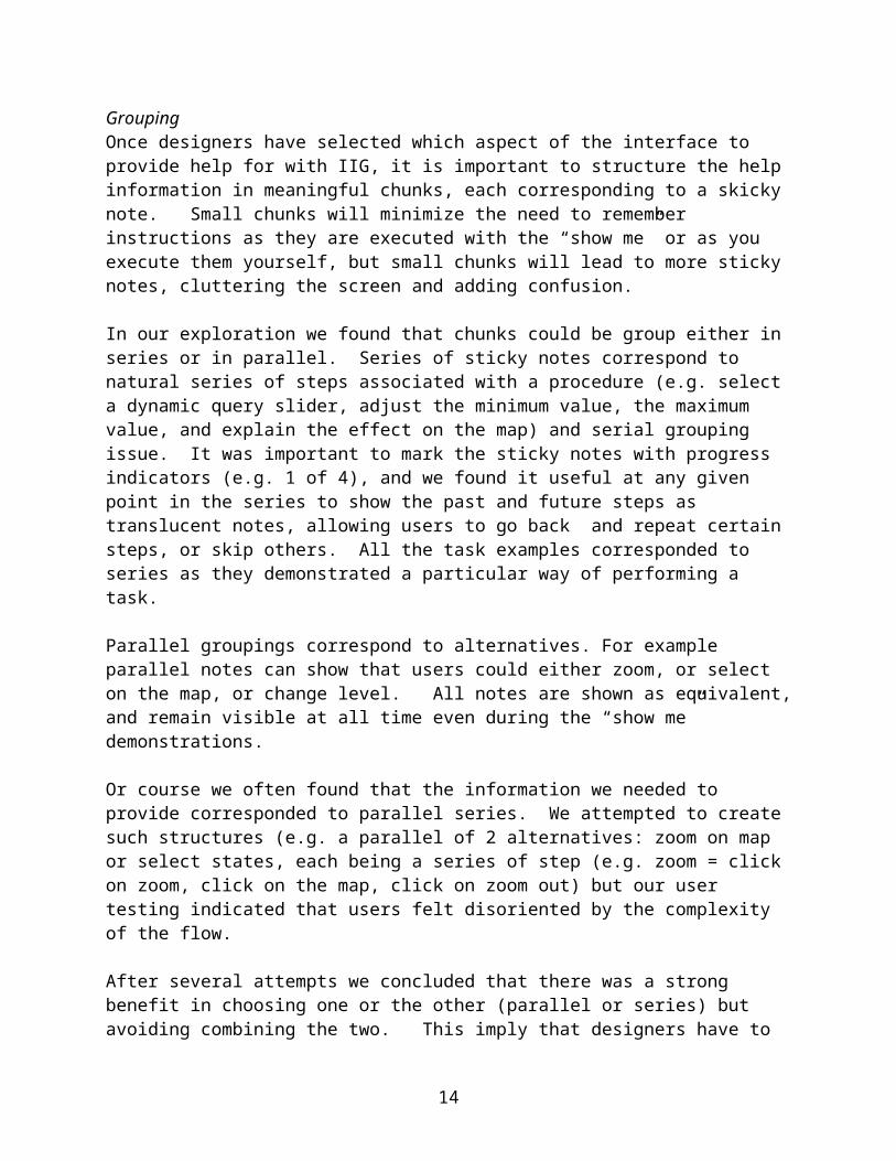
We created video demonstrations of the two Dynamap interfaces (all at once and multi-layered). Those videos are quick tutorials, i.e. outside the interface, passive and fixed, with no user intervention. On the other hand they are quickly “absorbed” by users and can be repeated at will To remain closer to providing an integrated “feeling” for the demonstration we created full size videos by merely recording a demonstration of the interface with Camcasia. Camcasia allows us to highlight the cursor and shows when mouse clicks occur. Simple video help can be easy to create: we wrote a scenario for the video, recorded the video with sound, and integrated it in Dynamap in about a 1/10th of the time it took to create the IIG help. Of course adding customized highlights, text transcripts, titles and transitions in the video would require more time.
Figure 6: All-at-once Video Help: The main functions of dynamap are listed in the introduction panel. Users can select to see demonstration of a subset of features (e.g. a 20 sec. video shows describing how to use the map and table), or select the longer 2 min version. Those videos demonstrate the use of widgets but do not demonstrate specific tasks. Video demonstrations can be stopped anytime.
12

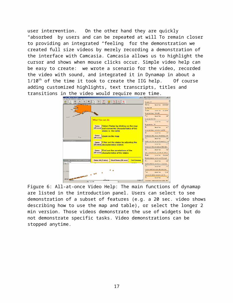
Figure 7: Multi-layered interface Video Help: the introduction dialog box looks similar but also introduces the 3 levels of the interface(level1, level2, and level3). At the end of each level video demo, the interface is automatically changed to that. Here again, users can see all the demos at once by selecting the “Demo All”.
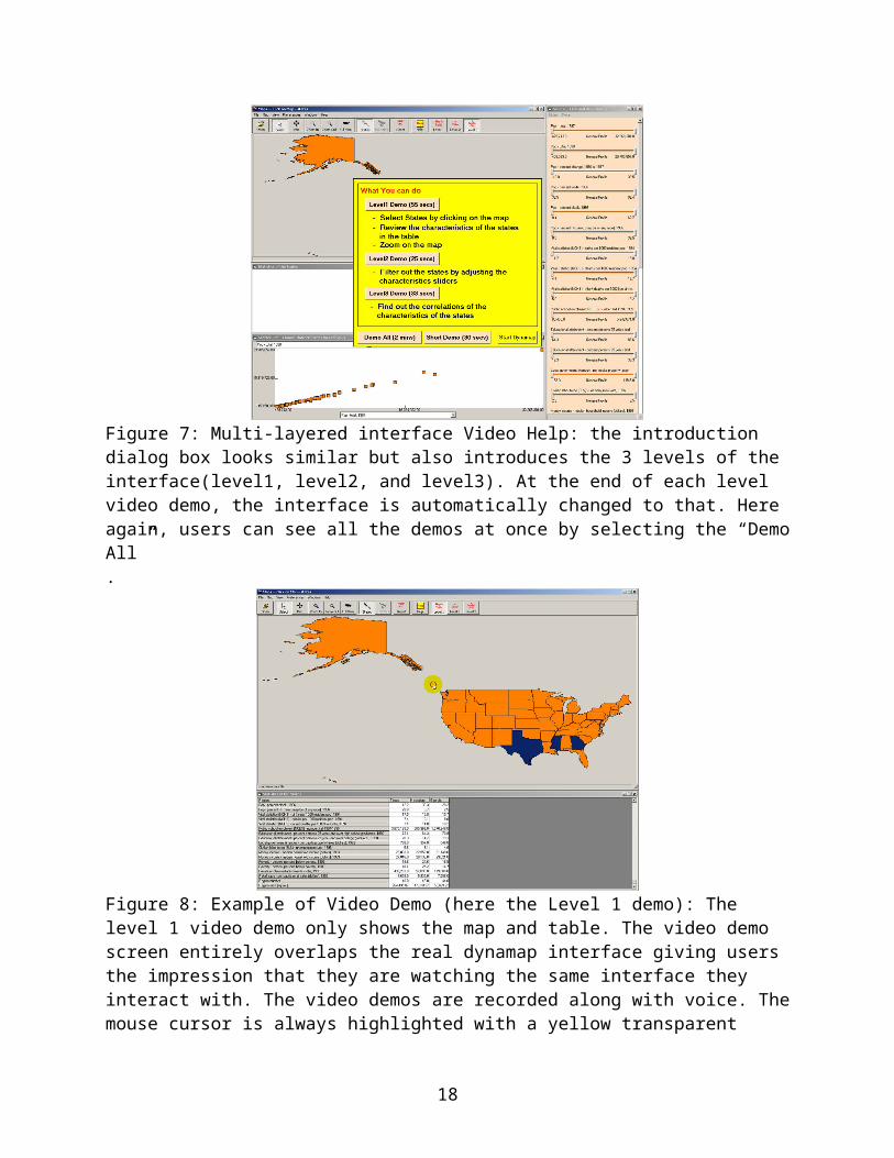
Figure 8: Example of Video Demo (here the Level 1 demo): The level 1 video demo only shows the map and table. The video demo screen entirely overlaps the real dynamap interface giving users the impression that they are watching the same interface they interact with. The video demos are recorded along with voice. The mouse cursor is always highlighted with a yellow transparent circle and the mouse clicks are visualized by the animated red circle. Demo can be stopped and terminated anytime when user press the escape key.
13
7. USER EVALUATION
In this early stage we used a formative evaluation method to collect informal usability information on our prototype implementation, as well as general feedback and suggestions for improvements. A first set of 6 users used the interface, changes were made and more testing was done with 6 different users to see if the changes seemed effective.
1st testing
Procedure:We asked a first set of 6 users to use Dynamaps with the IIG for about 20 minutes each. Four were HCIL students with CS background; two were staff without CS background (1 administrative assistant and a graphic artist). None had ever used dynamap.We collected feedback from users versions were available: one with all 3 levels of the interface available at once (map, filters and scatter plot) and one with a structured levels approach with 3 levels (easy = map only, intermediate= map and filters, advanced= with scatter plot). First we provided some context for the study and explained that we were not usability testing the dynamap interface itself but seeking feedback on the way help is being provided. Users were encouraged to think aloud and to use Dynamap as they would normally. We reproduce a more realistic situation we gave them a scenario (i.e. “you are considering moving to a different area of the country, imagine that you just searched the web for US states and statistics, found a website with this interface similar to this, explore the interface as you like and try to compare different locations according to whatever criteria are of interest to you”. No specific tasks were given. All users used the structured levels interface. At the end they were shown the all-at-once interface and asked to compare and give feedback on that alternative version.
Overall resultsThe most striking observation was that all six users used the IIG features in very different ways, and that together the six users used all aspects we had designed in the IIG. A user focused its use of the help mostly on trying out the example tasks, while several others never used them. Some users used the “show me” feature; others did not and executed the steps themselves; others started by doing it themselves but then used the “show me” function when the failed to guess the procedure (e.g. to select multiple states). One user did not seem to use the help but kept all the yellow sticky notes opened without problems (in fact he searched but did not see the “Close all help” button and just kept working with the sticky notes visible. It seems that he was probably glancing at the text of the sticky notes and probably learned some things from it, but never clicked on the “show me” or “next” buttons. All users found something of interest in the data about the states and became engaged in the application. The help sticky notes were never explored systematically. Most users read some sticky notes then focused on their task, read a few more notes and experimented further. Some were happily using level 1 and 2 may have never moved to the “higher” levels of the interface (e.g. adding the scatter plot) without our encouragement to do so. We remain ambivalent about this finding: on one hand the structured level may hinder the discovery of the advanced features, but on the other hand it seems to facilitate the discovery of the simpler features, bringing more satisfaction to more users who may never seek the more advanced features.
14

All six users indicated that they preferred the structured level interface over the all at once interface, even though one of the six was at first fairly confused about the changing features of the interface.
2nd testing with revised IIG and video demonstration
ProcedureIn this second series of user tests we presented users with 2 different help: the revised IIG and the video demo help. Six new users were recruited. Following the same procedure described above, we let them explore dynamap using one of the two help methods, then showed the other method to them and asked them to compare the two methods and indicate aspects that liked or disliked and their preferences.
Overall results
Again, we saw a great diversity of use and large individual differences. We found that our revision of the IIG prototype were effective. There was much less confusion about where to start and where to go next. The instructions were more clear and bugs had been worked out. We found the video help to be very promising, allowing users to get started very quickly. Some users seemed to have learned every aspects of the interface within the few minutes of the video demonstration and able to focus on their task immediately. Others seemed to learn the syntax of the application immediately (e.g. they learned how to move the sliders) but seem to have more difficulty learning the impact of their action on the data (e.g. what was the impact of moving the sliders) probably because of the faster pace and more passive mode of demonstration. One user liked the video help a lot but we could see clearly that he had not understood all the explanations. After seeing the IIG he made clear that the IIG was better for him as it allowed him to slowly and carefully review each demonstration, try it himself, then move one to another part of the interface.
All users found the use of sound very important in providing more compact explanations and lively demonstration. After seeing the video with sound, the “show me” demonstrations appeared slow and less exciting.
15

8. FUTURE WORK
8.1 Guidelines for the design of video demonstrationsWe have gained a lot of experience scripting and recording video demonstrations of interfaces through our own 10-year-old HCIL video series. We will create a set of guidelines and examples for others to follow.
8.1 Generalization to other designs
Explore the use of multi-layered designs, IIG and Video help with other interfaces. Good candidates are the relation browser / stat locator, the glossary, other visualization tools such as Treemap and commercial tools such as Beyond 20/20
8.2 Summative evaluationTwo possible directions: controlled experiment and field study
Controlled experiment
Several possibilities again:1) Compare the structured levels interface with the single interface approach, both using a video demonstration of the interface. This study would focus on measuring the benefits of the multi layered interface and would provide feedback on the design of the video help.
2) Compare IIG and video demonstration, for both single and multi layers interfaces.
Possible dependant variables- After 1 minutes of exploration ask users if they got something useful from the system
and how motivated they would be to continue using that tool if they were on their own.- After 5 minutes of exploration, evaluate if users have learned enough features of the
system to complete simple tasks. (e.g. 3 simple tasks) Time limit on task time, count how many tasks have been accomplished.
- With another 5 minutes of exploration evaluate if users learned enough features of the system to accomplish advanced tasks. (e.g. 3 complex tasks)
We can make it simpler by only having 2 simple tasks and 1 hard task.
Issues: because of large individual differences in ability to learn and learning style we would need a large number of subjects. An alternative is to use a within subject design which would require using 2 different interfaces of comparable difficulty and presenting similar learning challenges, which may prove difficult to setup.
16
Field study
If we find an good “host” for our testing, the interface could be instrumented to count how often users click on the “show me button”, look at the task demos, change level of interface, and what they do with the interface. Once the interface is deployed, we could collect data and hopefully there would be a correlation between their use of the help and the complexity of what they do. One limiting factor is that we cannot record automatically the fact that users are just “looking at the sticky notes”
REFERENCES
[1] Adams, W., Brown, J., Rapeepun, D., Williams, W., The Effectiveness of Online Help Systems: Text Only, Animated Images Only, and Integrated Interactive, http://www.otal.umd.edu/SHORE2001/help (2001)
[2] Carroll, J.M., Minimalism beyond the Nurnberg Funnel, MIT Press, Cambridge, 1997[3] Carroll, J.M., Rosson, M.B, Paradox of the active user, Interfacing Thought: Cognitive
Aspects of Human-Computer Interaction, MIT Press, Cambridge, 80-111, 1987.[4] Carroll, J.M., Smith-Kerker, P.L., Ford, J.R., Mazur-Rimetz, S.A., The minimal manual,
Human Computer Interaction, 3 (2), 123-153, 1987.[5] Covi, L.M., Ackerman, M.S., Such easy-to-use systems !: How organizations shape the
design and use of online help systems, Proceedings of Conference on Organizational computing systems, August 1995.
[6] Duffy, T.M., Palmer, J., Mehlenbacher, B., Online Help Systems: Design and Evaluation. Norwood, NJ: Ablex, 1993.
[7] Goodall, S.D., Online help, Proceedings of the 10th annual international conference on Systems documentation, November 1992.
[8] Harrison, S.M., A comparison of still, animated, or nonillustrated on-line help with written or spoken instructions in a graphical user interface, In proceedings on Human factors in computing systems, 82-89, May, 1995.
[9] Horvitz , E., Principles of Mixed-Initiative User Interfaces, In Proceedings of CHI '99 ACM SIGCHI Conference on Human Factors in Computing Systems, Pittsburgh, PA, May 1999.
[10] Kearsley G., Online Help Systems: Design and Implementation, Norwood, NJ: Ablex; 1988.[11] Knabe, K., Apple guide: a case study in user-aided design of online help, Conference
companion on Human factors in computing systems, May 1995.[12] Lieberman, H., Interfaces that Give and Take Advice, In Human-Computer Interaction for
the New Millenium, ACM Press/Addison-Wesley, 475-485, 2001.[13] McGrenere, J., Baecker, R., Booth, K., An evaluation of a multiple interface design solution
for bloated software, In Proceedings of CHI’02 Human Factors in Computing Systems, 163-170, ACM, New York, 2002.
[14] Palmiter, S., Elkerton, J., An evaluation of animated demonstrations for learning computer-based tasks, In Proceedings of CHI ‘91 Human Factors in Computing Systems, 257-263, ACM, New York, 1991.
[15] Palmiter, S., Elkerton, J., Baggett, P., Animated demonstrations vs. written instructions for learning procedural tasks: A preliminary investigation, International Journal of Man-Machine Studies, 34, 687-701.
17
[16] Patrick, A., McGurgan, A., One proven methodology for designing robust online help systems, Proceedings of the 11th annual international conference on Systems documentation, November 1993.
[17] Prince R., Su, J., Tang, H., Zhao, Y., The design of an interactive online help desk in the Alexandria Digital Library, ACM SIGSOFT Software Engineering Notes, Proceedings of the international joint conference on Work activities coordination and collaboration, 24(2), March 1999.
[18] Randall, N., Pedersen, I., Who exactly is trying to help us? The ethos of help systems in popular computer applications, Proceedings of the 16th annual international conference on Computer documentation, September 1998.
[19] Rettig, M., Nobody reads documentation, Communications of the ACM, 34(7), 19–24, July 1991.
[20] Roesler A.W., McLellan , S.G., What help do users need?, Conference proceedings on Human factors in computing systems, 337-441, May 1995.
[21] Selber, S.A., Johnson-Eilola, J., Mehlenbacher, B., Online support systems, ACM Computing Surveys (CSUR), 28(1), March 1996.
[22] Shneiderman, B., Kang, H., Kules,B., Plaisant, C., Rose, A., Rucheir, R , Design: A photo history of SIGCHI, evolution of design from personal to public, Interactions, 9(3), 17-23, May 2002.
[23] Shneiderman, B., Universal usability, Communications of the ACM, 43(5), May 2000. [24] Stieren C., The zen of minimalism, Proceedings of the sixteenth annual international
conference on Computer documentation, 103 – 112, September 1998.[25] Wiedenbeck, S., Zila, P. L., Hands-on practice in learning to use software: a comparison of
exercise, exploration, and combined formats, ACM Transactions on Computer-Human Interaction (TOCHI), 4(2), 169-196, June 1997.
18

Appendix 1Examples of Help
Completely Separate Help (Unix man command bring the manual in another window)
Integrated Help: Microsoft Visual Basic – When users type in the function name, the list of arguments and their types are displayed as a tool tip.
Integrated Help at the widget level (Microsoft Tool Tip)
19

Semi-Integrated Help (Visual Basic working environment: when user select a keyword and press F1 key, the related topic comes up in a separate window)
This “did you know” message box appear at start time, on a separate window
Semi integrated help: Context dependent help
20

The standard Windows help. It provides an index, table of contents, and a wizard. It is outside the interface in a separate window. In some cases “show me” buttons are available to execute a function (CP: in fact I can’t find any examples any more but I think there were…)
A good simple example of semi integrated short manual for Spotfire. Series of exercices are given. Some actions are done automatically by the help system (e.g. load data), but mostly users do the actions themselves following detailed procedures, e.g. click on the year button at the bottom center of the screen.
21

SimPLE has an even tighter integration of the help (called guidance) with the interface. Users can click on highlighted words in the help text to see where interface components are located (e.g. a valve or an interface widget). Animations can be executed from the help to demonstrate behaviors, but in this case it is the system which is simulated, not the procedure to use the interface.
Interactive online interactive tutorial (with fake interface - flash)
22

APPENDIX 2Additional details about user testing
1- Additional usability problems addressed before the 2nd testing
Problems and how we addressed them:1. Most users didn’t understand the relation between the “Task example” sticky note and
the set of Widget Explanation sticky notes. This could be improved by labeling the default “task example” menu item “Learn the interface”, and move this menu to be likely to be the 1st one read.
2. Users didn’t always know were to start reading the notes, i.e. the order was not clear. We had hypothesized that users would read from the top left of the screen, but users seemed to first read the node close to where they had just clicked. The effect seemed to be that users usually didn’t visit all the notes, but sampled them. The change described in #1 as well as a revision of the order and placement of the notes should help limit the confusion about where to start.
3. Most users started from “Easy” level and moved to “Intermediate” and “Advanced” levels… but one user started from the intermediate level, indicating that the intermediate level would probably more appropriate as it is usually the right level for that user when getting started with video games (easy being too easy). The labels of the level “Easy”, “Intermediate” and “Advanced” were changed to level 1, 2 and 3 with labels for “Map and table”, “ Sliders”, Scatter plot”.
4. Some users indicated that they could not tell right away what changed between the levels (e.g. not recognizing that slider bars are added in intermediate level and scatter plot in advanced level). We made two changes to respond to that problem. 1) animation now shows what new window are added or removed, 2) a note summarizes what features are available at each level when users switch level.
5. All users tried to close the help window at first. They asked that the “close all” be more prominent, but then didn’t easily find the help again. To address this problem we use animation to show all the sticky notes going back to the “Help” button to indicate showing where to click to see the notes again. Some users were confused about how to use “Help” toggle button in the toolbar and “Show help at startup” checkbox in the example task dialog box. We are not sure how to address this problem yet.
6. Sometimes, users asked to be able to move or get rid of individually sticky but when explained, they understood that the placement on the notes had to remain fix as they have to be need the control they correspond to, or not occlude other notes or parts of the interface.
7. Most users didn’t immediately recognize that the dot in scatter plot represents the state in the map. An additional note is added to that effect.
8. Some users mentioned that they could not tell whether the final step of a series of sticky notes had been reached or not. We added some indication of progress (e.g. step 2 of 3) and made suggestions for what to do next at the end of a series (e.g. “next, you can explore level 3”)
23

9. One user stated that the translucent notes looked like disabled controls (it seemed un-click-able) but others didn’t seem bothered by it and clicked on those notes to make them visible.
10. Most users didn’t see or recognize the “Alternative” directions in the sticky note. They were moved above the “show me “ button to be more visible.
11. Overall the animations were a bit too fast, and more pausing is needed to leave time for people to “digest” the information.
12. Open issue: because the “show me” feature takes control of the interface, it is necessary to record the status of the interface and restore it at the end of the demonstration. Unfortunately because users could make useful digressions while using the help demos themselves it is not easy to recognize the optimal time to record the status of the interface.
In all-in-one version, we talked with two users about using audio clip with animation to present a short tutorial of the whole interface. This might become the next testing: comparing this audio overall intro to the IIG.
List of smaller corrections needed in the IIG 1. Keep the text of selected task in the combobox in example task dialogbox2. The attributes in the table should be highlighted depending on the example task being
demonstrated3. Use only task examples that is obvious to users (Advanced task 2 don’t seem to be
obvious)4. Red arrows should not be overlapped with buttons5. The next step should be highlighted only after the animation is completed6. The text “map->scatter plot” and “scatte plot->map” are confusing7. The zoomout sentence “one level: press 'zoom out' button full scale: press 'full view'
button” should be changed8. (Easy task example 1) Step 1: select the states -> Step 1: select the states (to select
multiple states, click on the state with pressing ctrl key)9. Adjust position of example task dialog box10. Animation speed should be consistent (not too fast) independent to computer speed11. Mouse cursor need to be paused for a while before selecting characteristics for x,y axes
in scatter plot12. “Step 1” -> “Step 1/Step 3” (show total steps)13. The translucent sticky notes should be positioned behind the highlighted sticky note (i.e.
avoid occlusion of interface controls)14. (Intermediate task 1) Don’t need “Step 1: Select birth rate slider”15. (Intermediate task 1) Need one more step for selecting the state after filtering out the
other states16. (Intermediate task 2) Get rid of “Step 1: Select population slider”17. (Intermediate task 2) Need one more step for selecting the state after filtering out the
other states18. (Advanced task 3) Make “step 1” animation to select both characteristics for x,y axes
24

Unresolved issues to reexamine: For the sticky notes being part of a series some users had problem in skipping the steps that
they didn’t want to repeat in order to reach other steps they needed help about. Some users also had problems in going back to the previous steps. This brings a larger history keeping issue and didn’t decide on any action yet.
2- Second user testing comparing revised IIG and Video Help
- 1st user: biologist – not power computer user – female - never saw dynamapSkipped demo at first but could not multiple select so went back to look at short video, but couldn’t find out what she wanted… so she tried 2min demo and figured out most of features without any problem and immediately went to work no problem. (she even figured out how to switch between the select and zoom mode… that was not explained with voice but shown in the demo)
When we showed her IIG help after the video demo, she told that she was a little bit confused because she could not see the overall introduction of interface (like tutorial)… and she mentioned that the animation without voice seemed boring…
- 2nd: not CS user, novice, male Read through the instructions in the sticky note but got rid of help without watching the video demo. But he returned and looked at long video started fine, but showed signs of not having understood everything. (He remembered the first part of demo very well but didn’t recall the remaining parts.) Then looked at the IIG and like it a lot because he could view demos several times and there were better explanation on what was happening (e.g. the effect of the sliders) Did not seem lost in the new revised IIG. (He liked the stepwise instructions and repeated animations for the parts he didn’t understand at first.).
- 3rd user CS female graduate student – power user She understood very well about the parallel and serial structure of sticky notes as well as the level structured approach. And she read through the all the alternative ways (in small fonts). She only read the instructions in the sticky notes and didn’t even try any video demo. She mentioned that she didn’t want to watch the long demo (she thought that even 30 sec demo was too long) to find out the feature she wanted to know. She preferred to see only the help for features she was interested in (this led us to revise the interface to provide access to only parts of the video. She also mentioned about the difficulty ofd selecting the optimum working problem in the explanations. She said she could go either way… that both solutions were OK
- 4th user CS female undergraduate student – not power user – never saw dynamapShe didn’t quite understand the level structure and felt that positions of sticky notes were random. She didn’t feel comfortable at the parallel structure of sticky notes (e.g. widget explanation) but liked the serial stepwise task based sticky notes.
25

- 5th user: CS male graduate student – power computer user – had used Spotfire (a dynamic data manipulation interface)With the video help: he read through all the instructions in the sticky note and didn’t want to watch the demo. He figured out most features by himself and he preferred to search a feature from the list (i.e. the classic Microsoft help) rather than watch the demo to find out the feature. He preferred the all-at-once video demo rather than level structured video demo (he was probably confortable enough with this kind of interface to absorb the content of the long video all at once.) He didn’t like the level structure since he wanted to see the whole interfaces at once and select the appropriate widgets from the whole interface on his own (like PhotoShop – choosing only the necessary windows from the view menu). So, he selected the level 3 and never went back to lower levels as soon as he figured out that the lower level showed only the part of whole interface.
When looking at the level structured sticky note help: he seemed a bit confused by the parallel and serial sequences of sticky notes. He much more liked the task-based examples rather than the widget explanation, and also mentioned, “the more complicated the user interface is, the more helpful the task-based examples will be”. In summary, he liked the task-based serial stepwise sticky note help and wanted to have this kind help in the complicated applications such as PhotoShop.
- 6th user- CS female graduate student – never saw dynamap, no HCI background(Level structured video demo)Since she didn’t know what she could do with dynamap, she watched through all the video demos first. She seemed to understand most features by watching video demos, but she often went back to review the video demo when she forgot how to perform certain features. Therefore, she wanted to see only the feature demo she was interested in and didn’t want to see the whole level structured demo repeatedly to find out the feature. She mentioned that the level structured video demo was very helpful as an overall introduction (or tutorial) of system, but she wanted to see only the short feature demo (like all-at-once video demo) during performing her task. She also suggested that it would be very helpful to show not only the user interfaces displayed in monitor but also other input devices (e.g. holding control key down) in the video demo.
(Level structured sticky note help)She was also confused at the parallel sequence of sticky notes mainly because there were too many sticky notes highlighted simultaneously in the screen. She often wanted to stop the animations before the animation was completed. She understood and liked the task-based serial stepwise sticky help, but in overall, she preferred the video demo rather than the sticky help.
26