a sense of place assignment
DESCRIPTION
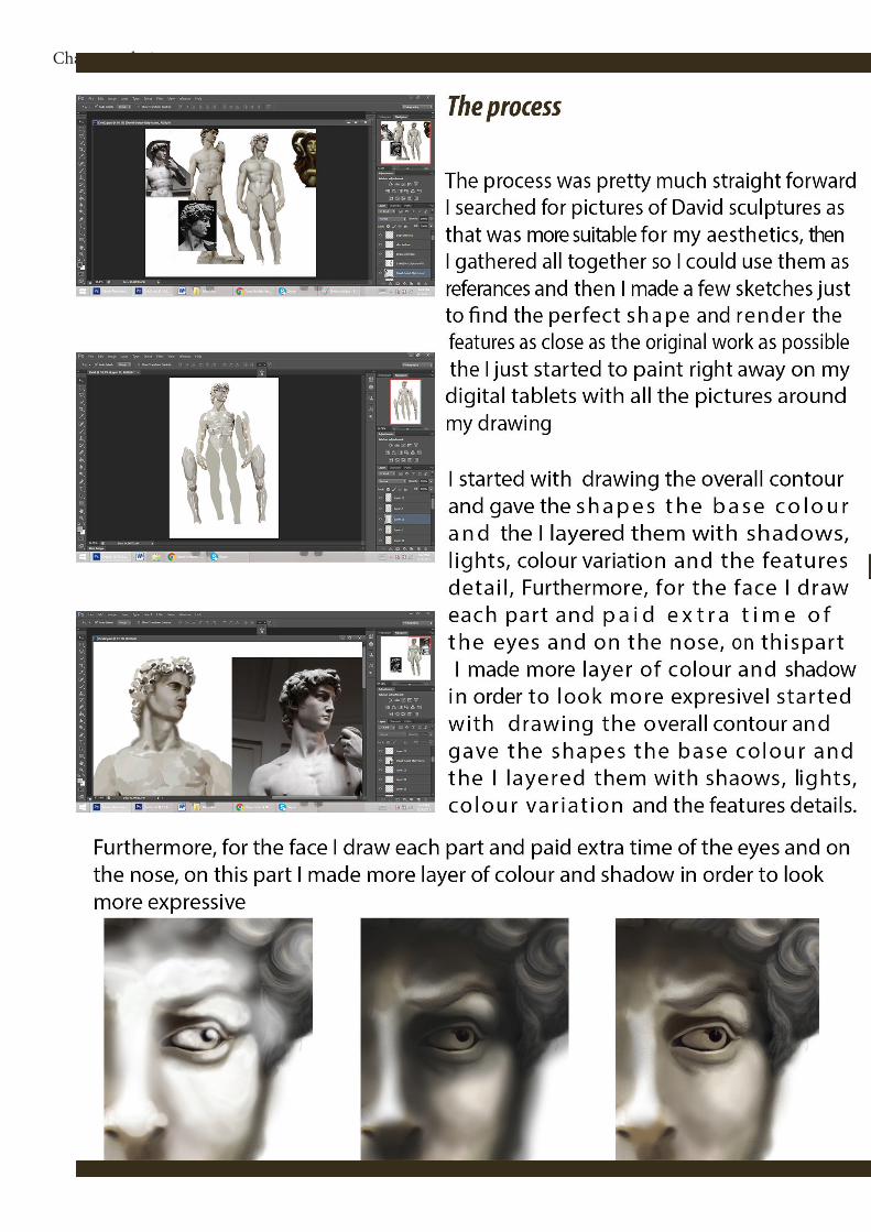
ÂTRANSCRIPT


ABSTRACT
An entire conceptual world is build, developed on the seven deadly sins and their projection in the real word. Based on that concept, each sin has a genealogy with ramifications in different areas of our development and a real manifestation; therefore they are shaping the environment and interfere with our sense of a place. From the technological evolution, to marketing, factories and everything that we come in con-tact to, these main catalogued sins are taking the form of demand and production creating a system in which the damaging habits are shown, promoted and included in the daily life. For instance, drinking or smoking are accepted and encouraged in social contexts as celebrations, therefore we feel free to indulge in this kinds of practice es-pecially when alcoholic beverages can be considered an extension of entertainment. The Society landscape is a projection of our wishes, culture, believes and needs, those are more remarkable through comparison between different nations. How-ever, the approaches are different, but the primary needs, of the people are the same. Related to the deadly sins theme, these unlearned and natural needs are exploited and perverted mainly through abuses in gluttony, greed and imbalance in wrath. Moreover the relation between a sense of place and the sins is strongly tied together, it dictate our infrastructure, industry, and consumption, building the world around us on a demand and supply system. If the public asks for violence, cheap food or pornography, the system will respond by providing them with what they want and eventually with the increasing of demands the production will also increase. This series of event will then automatically manifest in the environment, as an example in university cities the demand for fast food is higher and there-fore the fast food restaurant are in a higher number than average number too.
In my work the seven deadly sins influence the overall place and are represented in three posters beside the entire world illustration

• The Humans- the humans represent the public and the char-acter that is participating in all the action. Besides this they make the connection between the concept word and our reality
• Greed – greed is perceived to be a general excessive de-sire and is one of the main force that rule the concept word
• Allure- The allure work together with greed to attract more hu-mans in the gameThe second theme is related to a reversed reality, where animals take the appearance and the behavior of humans whereas humans take an-imal’s place in cages, farms and supermarket shelves and food products.

Gluttony
In 2002, sciences gathered in the an annual meeting of the American Association for the Advancement of Science , warning the government about the rising obesity trans that was considered a global epidemic that was not more a problem of a certain so-cial class. Moreover the obesity issue was firs pin pointed in 1990 ,when they predict-ed that by the year 2005 this disease will replace smoking as the major public health.
A few years later the ‘war against obesity’ had replaced the ‘war against tobac-co’ and the phase The phrase ‘war against obesity, sloth, and addiction’ appears in the UK in The Times as early as 1981.Attached to the obesity term ,sloth be-calmed just a extension, and was associate more with overweight people Over-indulgence and over-consumption of food, drinks, or wealth items, gluttony, is the most embraced sin in my work, and is present not only from the start of the project development but through all the content. This particular sin is most present in the branding area of the project in forms of advertisements; howev-er this gluttony is not addressed to humans, but to animals as a form of revenge.
The outcome stands out due to the morbid that triggered strong reactions Excessive food consumption is exploited by the fast food industry and has now reached a point where overindulging is a socially accepted and a bounding custom that not only bring pleasure but companion, comfort and fulfill a lack of certain physical needs. Also, the custom of eating evolved in to a culture and is one of the most significant part in our daily life but also in celebrations or in marking important events. It is not just the simple fact of nourishing your body ,is a tool if interaction and with many cultures build around food religions, cities, and even countries are defined more or less by this.We can see the repercussions of food abusing shaping our society by the ev-er-rising obesity rates and diseases’ related to food intake, however it also has an impact on the environment, pollution, over production and saturation of the market
The marketing and even us as designer are helping this trend to more forward from them tiniest clicke as labels that say: sugar-free , natural ,fat-free, however, it is just a method of marketing and image exploitation. Making the food look more ap-pealing and healthy is nothing more that a mirage, the average shopper won’t even take a glance on the back of the cereal box and would be more that sure allured by the pleasant design of the carton box. So I decided to use this tool as a rein-forcement of the inversed word ,human products are treated like any animal one


The secondary platform of developing for the project is the website that will provide more information strictly related to the reversed food industry, and that will serve as an inter-active page between the viewer and the company. The site purpose is to serve as a tool in reinforcing the message and is representing a responds to the inverted world context.
The design part was fully customized by me and provides the viewer with a quick and accessible lay out with all the information available, character de-scriptions and appearance as well as displaying a range of human products.Moreover the site has a conceptual online shop from where the pub-lic can purchase products ranging from food to textiles and miscel-laneous and can take a look at a range of ironical made adverts.
http://badionela.wix.com/letitia-senseofplace

FOOD and Delight
In the food and Delight section there is a display of a small selection of my advertisements made as a response to the goods usually found on every days shop shelves. Each animal product corresponds to one of a human’s body, cow milk becomes human milk, eggs – human fetuses and meat is just converted to its human counterpart.
I created four advertisements in order to experiment more with the idea of invert-ing the roles and the feedback that I received for them was very strong, from curi-osity to discomfort even disgust. It was really interesting to watch how people are responding to this sort of images. Even when we are inform of the content of our food we don’t always acknowledge the true meaning of the words. As an exam-ple, we view a boiled egg as just a boiled egg, not as an unfertilized chicken ovule. However the reactions are much stronger when we invert the roles, and hopefully they will make the consumer think twice about what he/she is eating or they will be revolted on the industrial farming methods.


FURNITURE and CLOTHING
This area takes the contrast between humans and ani-mals to a whole new level and is challenging the view-er with strong images. The usual leather used in shoes, and clothing manufacture is replaced with a graphic tex-ture of human skin with some of the features still intact.The collection explores the grotesque style in order to de-liver the shocking contrasts between human skin and leath-er, however it does not show an actual piece of clothing that would be ready for selling but a dramatic caricature. The general style of the outfits and furniture is unpolished and is defined by the morbid contrast between the suggested hu-man skin and usual materials such as wood, glass and lace.
All the images in this section were collected over the spawn of a week and were inspired by the infamous Eg Gein, , (August 27, 1906[1] – July 26, 1984) an American murderer known for killing humans and using their skin in manufacturing objects. In putting together all the products, the end result was not to ex-plain and deliver the public a solution but to rise a problem ,after the immediate repulsive reaction viewer would have enough time to rethink about his position in relation with the animals.

HUMAN FARMS
Through this portal the viewer can access a of photography gallery with work created by different artist that have in common a certain feel-ing to their art, that could be interpreted in the context on my project’s message. The original meaning is not kept and was modified in order to serve the purpose of an imaginary human slaughter house inside pic-tures. Extreme body modification and experiences such as suspension, the act of suspending a human body from hooks that have been put through body piercings and multiple PETA protests’ served as materials
Character design


Lay Out: Poster
The reverse word structure and the architecture are based on a 7 step hierarchy that rep-resent the seven deadly sins: gluttony, lust, greed, pride, despair, wrath, sloth and vainglory. Moreover each level has a main character in the appearance of a humanoid form The name of humanoid appear on the site with extra information about the char-acter and they appearance is linked to their personality, but more that everything else with their actions. They all portray a touchable shape of a concept. In design-ing them my goal is to transmit their status and the sin through their appearance
Gula (gluttony)Fornicatio (fornication, lust)Avaritia (avarice/greed)Superbia (hubris, pride)Tristitia (sorrow/despair/despondency)Ira (wrath)Vanagloria (vainglory)Acedia (sloth)
The placed in the a hierarchy I chosen depending on their damage on the soul and seriousness .In Dante’s perspective and the early philosophes that would be the abuses of the most divine faculty, the rationality Thu pride and envy, that in their opin-ion will contaminate the condition of the soul, making a parallel to the Luciferic fall,
The first level was not treated with much attention as its theme did not served my concept on a deeper level and developing it would just overload the entire image.The gluttony island has a fast food shop with Miss Muu face, as a reminder of her role and her position. Thru her I developed further the website and the human farms. Here is also hidden one of my commercials for human milk on one of the boards.


I started by setting the parameters, measurements and the main horizontals and verticals as I usually did in an architecture project . I first started to experiment with shape, to see which one would suit the island better, in google sketch up by construct-ing platforms connected by stairs as that would be the frame of the construction..One of the main priorities was to find an angle that will present the best fea-tures of the construction and lighten the most favorable part of it but still show-ing the action on both sides, the reality on a side and the concept on the other.
However the distracting element, the stairs had to be unremarkable in or-der not to oversaturate the composition but visible enough to confer the con-cept of the passage between the word, You could descend deeper in to the word level but the route you choose can influence the experiences.
The stairs system functionality is not emphasized, there is not a plain clean route created by them but rather and a descriptive one :In life there is not a straight road, not even to damnation.My original idea was to make each staircase of 12 stairs but that failed on the designing part, the clear number and shift format took away from the expressiv-ity of the world so I had to erase the signification and see them as connections
Colorless, shapeless and without any identity or accent the platforms are a reflection of the environment. The building are shattering them, and the plant broke out from their silhouettes.This platforms are a projection of the surface on which our existence is supported, as the ground under our foots, they are almost featureless and with-out a personality, however their contour Is still kept as they are defining our reality.
The platforms are there only to display the event, and not to take part on the action.
Step 2 Filling in
Following the stages of a collage I prepared each element by painting and designing details and silhouettes a few days before starting the actual poster.I researched in to different architectural styles in order to find an approach that will suit my message better from thru the material aspects of the city in direct connec-tion with the cultural aspects of city life.
Developing a conflict between the urban planning and the empty space I used a network-based conceptions of space.The emphasizes was on understand a urban space not in terms of bounded, small-

Developing a conflict between the urban planning and the empty space I used a network-based conceptions of space.The emphasizes was on understand a urban space not in terms of bounded, small-scale, communities with an intense public realm, but in terms of their decentralized and sprawling character
The city is overflowing and growing around the system as a protective shell around the core of the main forces that drive the world, consumer and exploitation. There is not a clear style of a certain feeling but a diversity that was born from the need of progress. The urban and rural environment are combined in an unbalanced way however they are all build on the nature surface, the rocks. The meaning behind this it that we can only build with the resources of the nature, the same nature from which we grow apart.
I painted by myself all the cliffs and the rock area as well as designing and drawing the majority of the buildings later I added pieces of pictures in order to fill in more the space. As a final touch I traced the humans and my characters among all the extra elements.