a total return index for south africa2015.essa.org.za/fullpaper/essa_2868.pdf · a total return...
TRANSCRIPT

1
A total return index for South Africa
Nicolaas van der Wath
Bureau for Economic Research, University of Stellenbosch, 2015
ABSTRACT
In this paper I developed a broad methodology whereby the total return on national asset
portfolios can be calculated, with South Africa as a first example. As an end result I present a
suite of indices that tracks the total return, yield and volatility of the South African household
asset portfolio. In this methodology I identified the five most important asset classes in the
household portfolio, namely bonds, shares, cash, commodities and property. The next step
was to estimate five total return indices (TRIs), one for each asset class. To do this I listed all
the traded securities I could find in each class which had a daily TRI going back 13 years, and
derived TRIs where none was available. I used principle component analysis to combine these
individual TRIs into a mixed blend, one for each asset class. These five asset-class TRIs were
then blended again, this time according to their respective weights in the household asset
portfolio. The result was a TRI that tracks the value of a basket of assets, representative of
South African households’ asset holdings.
By taking the growth rate of this TRI, I obtained a financial conditions index (FCI), which
tracked, in advance, a very similar path than annual economic growth and can thus be used to
improve mechanical GDP forecasts. A volatility index was also derived from the TRI; it
highlights periods of shocks in the financial system such as the international financial crisis
and quantitative easing (QE). From all these, I were able to conclude that property is one of
the safer, yet higher yield investments, in the household asset portfolio. I also found that
South Africa is very open and vulnerable to international financial conditions. They tend to
have a real impact on domestic economic growth.

2
TABLE OF CONTENTS
1 Introduction ........................................................................................................................ 4
2 Background on TRIs .......................................................................................................... 5
3 Index methodology ............................................................................................................. 6
4 Empirical results ............................................................................................................... 14
5 From a TRI to an FCI ....................................................................................................... 23
6 A volatility index for South Africa .................................................................................. 27
7 Conclusion........................................................................................................................ 30
8 References ........................................................................................................................ 32
9 Appendix .......................................................................................................................... 33

3
LIST OF FIGURES
Figure 1: The JSE all share: price index vs. TRI ....................................................................... 5
Figure 2: Simplified flow-diagram of the methodology ............................................................ 7
Figure 3: SA household balance sheet ....................................................................................... 8
Figure 4: Sub-TRIs for each of the five asset classes .............................................................. 15
Figure 5: Weights of each sector in the shares-TRI ................................................................. 16
Figure 6: Commodity total return rate vs. GDP growth rate .................................................... 17
Figure 7: Total return rate and TRI for houses ......................................................................... 19
Figure 8: Total return rates on cash vs. bonds .......................................................................... 20
Figure 9: The SATRI ................................................................................................................ 21
Figure 10: Portfolio size: actual compared to potential ........................................................... 22
Figure 11: FCI for South Africa vs. GDP growth .................................................................... 24
Figure 12: XY-plot of the SAFCI vs. 6-month lagged GDP growth ....................................... 25
Figure 13: SA-volatility index vs. S&P500-volatility .............................................................. 28
Figure 14: The investment frontier (XY-plot of yield rate vs. daily volatility) ....................... 29
Figure 15: Commodity yield rate vs. inflation rate .................................................................. 34
Figure 16: Shares-TRIs: the PC-weighted vs. the simple average ........................................... 35
Figure 17: Comparison between the SAFCI and SARB-FCI .................................................. 35
Figure 18: VIX vs. weighted average volatility on S&P500 .................................................... 36
LIST OF TABLES
Table 1: Rollover procedure ..................................................................................................... 11
Table 2: Final weights for the asset classes in the TRI portfolio ............................................. 12
Table 3: The TRIs that constitute each asset class, and their respective weights .................... 13
Table 4: RMSEs of the different 6-month-ahead forecasts ...................................................... 26
Table 5: Household balance sheet divided into asset classes ................................................... 33

4
1. Introduction
The gradual integration of the world financial system enabled investors, large and small, to
choose from an ever growing number of foreign assets in which to invest. The challenge to
evaluate and compare different investments has expanded beyond the local bourse. As a
result, investors, fund managers, and even policy makers are confronted with a larger amount
of data to analyse, in order to make sense of the financial situation. This analysis, which can
be complex and sophisticated at times, are gradually becoming even more so. As such, there
might be a need to develop financial indicators that are able to accurately summarise a large
set of data. The main purpose of such a summarised-indicator would thus be to simplify the
task of the investor or analyst.
In practice, one of the tools used by investors to compare different investment assets is the
total return index (TRI). In general, a TRI can be used to measure the returns an investor
would have received on his investment (Nyberg & Vaihekoski, 2010). More specifically, they
indicate the actual value of an investment portfolio over time, assuming that all dividends and
interest are reinvested in the portfolio. However, TRIs are published for individual
companies, as well as combined sectors on stock exchanges. They have not, as far as I could
determine, been developed for countries. This presented an opportunity to develop a
methodology whereby national TRIs can be derived. Such TRIs can then serve as tools to
accurately summarise financial and investment data on a national basis. This will save the
international investor and analyst the time and effort to filter through large sets of sub-
national data. They would be able to directly compare countries in terms of investment return.
In this endeavour I managed to develop a TRI for South Africa. It gives an indication of the
performance, over time, of a representative portfolio invested in the country. Not only this, I
found the TRI and its derivatives could be used for other macro-economic purposes too,
besides portfolio comparison. Firstly, the TRI presents an index whereby the savings
component of the national household portfolio can be isolated. Secondly, the first derivate
(annual growth rate) of the TRI can also be used as a financial conditions index (FCI), which
may add value in macro-economic modelling and forecasting. Thirdly, a national volatility
index can be derived, useful for investment frontier analysis.
The rest of this paper is organized as follows. Section 2 explains how Total Return Indices
(TRIs) are calculated, and how they can be used. Section 3 describes the methodology I used

5
to develop the TRI for South Africa, while section 4 presents the empirical results. In sections
5 and 6 the derived indices are discussed, followed by the conclusion in section 7.
2. Background on TRIs
The name “total return index” refers to an index which tracks the total return of an asset,
whether it be shares, bonds or bank deposits. TRI’s track the value of a portfolio of
investment assets with the principle assumption that all returns (dividends or interest) are
reinvested in the portfolio (Investopedia, 2015).
Price indices, on the other hand, focus only the price per unit of the capital in a portfolio.
Price indices can be used to track price levels of goods, services and assets, among others.
The All Share Index (ALSI) on the Johannesburg Stock Exchange (JSE) is a prime example
of a price index: it reflects only the average price level of shares over time. In contrast, TRIs
are applicable to assets only, and it captures both the asset price and yield. The companies
listed on the JSE pay dividends, and if those dividends are reinvested to buy more of the same
shares, then the portfolio will grow by the dividends and the price. A TRI can therefore be
calculated for the ALSI.
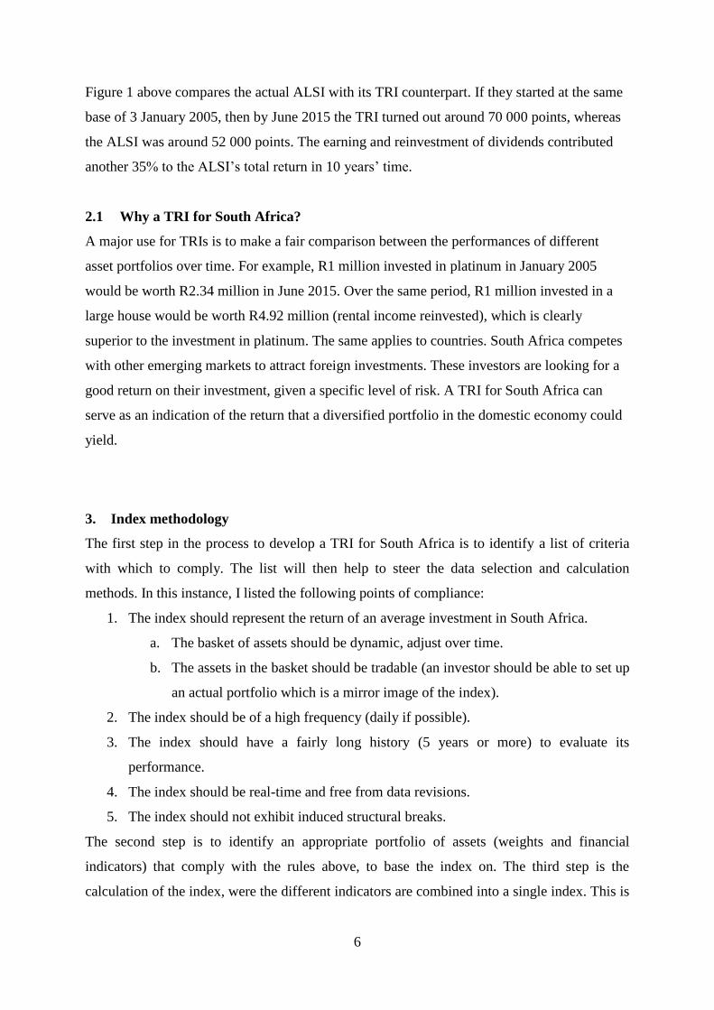
Figure 1: The JSE all share: price index vs. TRI
Source: Thomson Reuters
0
10 000
20 000
30 000
40 000
50 000
60 000
70 000
80 000
2005 2006 2007 2008 2009 2010 2011 2012 2013 2014 2015 2016
index
FTSE/JSE ALL SHARE - TOT RETURN IND FTSE/JSE ALL SHARE - PRICE INDEX
6
Figure 1 above compares the actual ALSI with its TRI counterpart. If they started at the same
base of 3 January 2005, then by June 2015 the TRI turned out around 70 000 points, whereas
the ALSI was around 52 000 points. The earning and reinvestment of dividends contributed
another 35% to the ALSI’s total return in 10 years’ time.
2.1 Why a TRI for South Africa?
A major use for TRIs is to make a fair comparison between the performances of different
asset portfolios over time. For example, R1 million invested in platinum in January 2005
would be worth R2.34 million in June 2015. Over the same period, R1 million invested in a
large house would be worth R4.92 million (rental income reinvested), which is clearly
superior to the investment in platinum. The same applies to countries. South Africa competes
with other emerging markets to attract foreign investments. These investors are looking for a
good return on their investment, given a specific level of risk. A TRI for South Africa can
serve as an indication of the return that a diversified portfolio in the domestic economy could
yield.
3. Index methodology
The first step in the process to develop a TRI for South Africa is to identify a list of criteria
with which to comply. The list will then help to steer the data selection and calculation
methods. In this instance, I listed the following points of compliance:
1. The index should represent the return of an average investment in South Africa.
a. The basket of assets should be dynamic, adjust over time.
b. The assets in the basket should be tradable (an investor should be able to set up
an actual portfolio which is a mirror image of the index).
2. The index should be of a high frequency (daily if possible).
3. The index should have a fairly long history (5 years or more) to evaluate its
performance.
4. The index should be real-time and free from data revisions.
5. The index should not exhibit induced structural breaks.
The second step is to identify an appropriate portfolio of assets (weights and financial
indicators) that comply with the rules above, to base the index on. The third step is the
calculation of the index, were the different indicators are combined into a single index. This is

7
followed by an evaluation process whereby the index and its derivatives are measured
according to different criteria.
3.1 Broad overview
To better understand the methodology I developed to estimate a TRI for South Africa, I will
start off with a simplified overview. Firstly, the broad method ended up as a two-stage
process. In stage one I developed five different TRIs for the five main asset classes. In stage
two I combined these five sub-TRIs into the main TRI for South Africa. As an added use of
the TRI, a financial conditions index and volatility index could also be derived. The flow
diagram below explains the broad methodology in graphical format, with stage one depicted
in green and stage two in red. Firstly, sub-TRIs are calculated for each asset class, using the
individual TRIs of each individual asset. The sub-TRIs are then combined into a single TRI
for South Africa. Taking the annual yield on the TRI results in an FCI and the standard
deviation of the differenced TRI results in a volatility index (VI).
Figure 2: Simplified flow-diagram of the methodology
Ind-TRI (asset 1)
Sub-TRI (asset class A)
Sub-TRI (asset class B)
TRI (total portfolio)
FCI (% change on TRI)
VI (stdev on ΔTRI)
Ind-TRI (asset 2)
Ind-TRI (asset 3)
Ind-TRI (asset 4)
Ind-TRI (asset 5)
Ind-TRI (asset 6)

8
3.2 Data selection: a portfolio to represent South Africa
Investors aim to maximise their profits, and this incentive determines the way they set up their
asset portfolios. There are many theories in place, most of them emphasising diversification,
or spreading the risk (Callan Associates Inc, 2012). However, one purpose of the intended
TRI is to enable comparison between countries. Thus I needed to choose a portfolio selection
strategy that could be standardised between countries while also be representative of those
countries.
Consequently, I based the TRI-portfolio on the composition of South Africa’s household
balance sheet, published annually by the South African Reserve Bank (SARB) since 2012.
The household balance sheet indicates how much of five main asset classes households own.
There is a slight change in the composition each year, indicating that the portfolio’s weights
will have to be adjusted periodically. From this data, presented in Figure 3 below, it is clear
that households tend to keep most of their assets at pension funds & long-term insurers. This
allocation is followed by residential buildings (houses) and then other financial assets such as
shares and unit trusts. They also keep a small part of their wealth in the form of non-financial
assets such as gold, jewellery, cars, furniture etc.
Figure 3: SA household balance sheet
Source: SARB
0%
10%
20%
30%
40%
50%
60%
70%
80%
90%
100%
2000 2001 2002 2003 2004 2005 2006 2007 2008 2009 2010 2011 2012 2013 2014
percentage
Residential buildings Other non-financial Monetary institutions
Pension funds & insurers Other financial

9
The main five asset classes
To build a portfolio of tradable assets, the main five asset classes in the household balance
sheet need to have their own TRIs to track their performance over time. This is directly
possible for the first three, but pension funds & long term insurers and other financial assets
(partly unit trusts) need to be broken down into their sub-components. These pension funds,
insurers and unit trusts are themselves major investors in the financial markets and their
balance sheets are also published by the SARB. Interestingly, they keep more than half their
portfolio invested in shares. Table 5 in the appendix presents the items in the household
balance sheet, along with their respective asset groups for which a price history is available. I
used the next coded abbreviations for the five asset classes:
1. PROP – residential property;
2. CMD - commodities;
3. JSE – shares;
4. INT – cash, deposits and other interest bearing securities;
5. BOND – bonds.
Note that non-financial assets (Figure 3), such as cars, furniture, precious metals and
jewellery are mostly not traded on the financial markets. However, commodity prices might
be a rough proxy for the price level of this asset class, especially for gold, jewellery and assets
that contain lots of metal such as cars. To sub-divide non-financial assets into its sub-
components will not be worth the effort, since the SARB do not publish it openly. Also, it
should not make any significant difference to the overall TRI since non-financial assets
constitute a very small portion of the total (5%) portfolio. Therefore, in the lack of any better
options, this rough approximation will be allowed.
Commodity prices will also be used as a proxy for the “other assets” in which pension funds
& long-term insurers invest. The reason is that derivatives such as forwards and options for
commodities are not listed anywhere in the portfolio. South Africa do have an active market
in the trade of commodity derivatives such as maize, gold, crude oil, diesel etc. (JSE, 2014).
Please note that although households own foreign assets too, it will not be entered into this
portfolio as a separate item or asset class. After all, the main purpose of the portfolio is to
track conditions in the South African financial markets. However, many of the large
companies listed in the JSE are dual-listed in London or New York, and many other South

10
African companies have significant operations in foreign countries. Therefore, the selected
portfolio will still be indirectly exposed to international financial conditions.
Further to this, the commodity prices in our portfolio will be expressed in rand terms (local
currency; ZAR). Fluctuations in the rand would thus enter the portfolio through two channels:
share prices (on account of duel listings) and commodity prices.
3.3 Calculation method
By this point it becomes clear that the estimation of the national TRI will be a two-stage
process. Stage one is the estimation of the TRIs of each asset class, followed by the estimation
of the main TRI from them. For this reason there is two distinct methods of deriving weights
in the portfolio:
1. Accounting method: five weights, one for each main asset class to calculate the main TRI.
2. Statistical method: various weights for various assets to calculate the asset-class TRIs.
Keeping dynamic: new weights every year
To keep the index and its underlying portfolio dynamic and synchronised with reality, the
weights for both the individual assets as well as the asset classes are adjusted every year. The
weights of the individual assets are based on daily market data. Thus, it is possible to
calculate new weighs for a calendar year once the previous one is totally completed on 31
December. This enables us to roll over from the old to the new weights at the very beginning
of the new calendar year. The weights of the five asset classes are also rolled over in the same
manner, but at the beginning of every April (not January as in the case of the individual
assets). The SARB publishes the household balance sheet only once a year in March,
therefore the new data for the main five weights will only be available for use from April.
Avoiding induced shocks: the rollover procedure
An important property of our intended index is that it should not exhibit methodologically
induced structural breaks. Still, in some years there are noticeable shifts in the portfolio of
households, such as in 2008 (see Figure 3 above). These shifts carry the risk of causing
structural breaks in any TRI that base their portfolio weighting on them. To soften such
structural breaks and yield a more gradual adjustment in the portfolio, I based the five main
weights on a three-year moving average of the household balance sheet. Similarly, I based the
weights of the individual assets on a five-year moving average of the daily return indices.

11
However, data is only available for all the individual assets from 2002. As a result, the
weights of 2007 was the first to have five years of historical data available. However, in order
to extend the index history back by two years, I allowed the weights of 2005 and 2006 based
on three and four years of historical data respectively.
Also, to smooth the impact of switching from the old weights to the new weights every year
(for both the individual assets and the asset classes), I used a rollover procedure. Similar
rollover methods are used by commodity funds such as those of Standard Bank (Standard
Bank, 2011). These procedures also allow index-funds to readjust their portfolios gradually
over a period of time, instead of instantaneous and all in one day. The rollover procedure is
accomplished as follows:
1. On the first trading day of the new year, we use only 10% of the new weights and 90%
of the old weights.
2. On the next day we use 20% of the new weights, and 80% of the old weights.
3. This process continues, until the 9th
trading day where we use 90% of the new weights
and only 10% of the old weights.
4. On the 10th
trading day we use only the new weights.
Table 1: Rollover procedure
Trading day Old weights New weights
0 100% 0%
1 90% 10%
2 80% 20%
3 70% 30%
4 60% 40%
5 50% 50%
6 40% 60%
7 30% 70%
8 20% 80%
9 10% 90%
10 0% 100%
Asset class weights (by accounting method)
The final weights for each of the five asset classes are summarised in Table 2 below. They are
based on a three-year moving average of the household portfolio, as published in the national
accounts by the SARB (see Figure 3 above and Table 5 in the appendix).

12
Table 2: Final weights for the asset classes in the TRI portfolio
BOND JSE CMD INT PROP TOTAL
2003 0.11 0.39 0.12 0.18 0.21 1.00
2004 0.11 0.37 0.11 0.18 0.22 1.00
2005 0.11 0.36 0.11 0.18 0.24 1.00
2006 0.10 0.37 0.10 0.18 0.26 1.00
2007 0.09 0.38 0.09 0.17 0.26 1.00
2008 0.09 0.39 0.08 0.17 0.27 1.00
2009 0.09 0.36 0.08 0.19 0.27 1.00
2010 0.09 0.34 0.08 0.20 0.28 1.00
2011 0.10 0.34 0.09 0.20 0.28 1.00
2012 0.10 0.35 0.09 0.19 0.27 1.00
2013 0.10 0.36 0.09 0.19 0.26 1.00
2014 0.11 0.37 0.09 0.18 0.25 1.00
2015 0.11 0.38 0.09 0.17 0.24 1.00
Source: BER
Now that the weights for each asset class have been determined, the next step is to derive
weights for the individual assets inside each asset class.
Individual asset weights (by principle component (PC) analysis)
A number of price and return indices are available for each asset class. For example, I found
at least nine different commodities relevant to South Africa that has a daily price history
dating back from April 2002. The question is now to weight them in such a way that the
combined index captures as much variance in the asset class as possible. One method to
obtain such a weighted average is to use the factor loadings of the first principle component
(PC). The literature indicates that PC-analysis is perhaps one of the favourite methods to
determine such weights, especially in the case of financial conditions indices (FCIs) (Gumata,
Klein, & Ndou, 2012). PC-analysis is just one of various statistical methods in the field of
factors models.
The factor model aims to extract from a table of variables, Xt, a similar sized table of
variables, Ft, which captures the variation of the original set. The columns of Ft are called
common factors, and the mean of each column is 0. Each column of Ft is a weighted average
of the columns of the original table Xt. The weights can be written in a smaller table of their
own, called the coefficient matrix β. We can write the mathematical formula as follows:
𝑋𝑡 − 𝜇 = 𝛽𝐹𝑡 − 𝑈𝑡

13
where μ is a vector (column) of the means of the variables in Xt, and Ut is a matrix (table) of
residuals (error values). One method to derive the coefficient matrix β is through PC-analysis.
In this case the eigen vectors of the covariance matrix would form the columns of β. In PC-
analysis, the first column of Ft captures most of the variance. In the special case where all the
variables in Xt are normalised, their coefficient weights in β is the same as their correlations
with Ft.
To calculate the first PC of each asset class respectively, I collected a set of daily historical
price data of assets that constitute each asset class (listed in Table 3). I rebased the data and
applied PC-analysis on a rolling window of five years to estimate weights of the individual
assets, within each of the five asset classes respectively. These weights were recalculated
every year, in order to keep the TRI dynamic, as described in the sub-section above. The
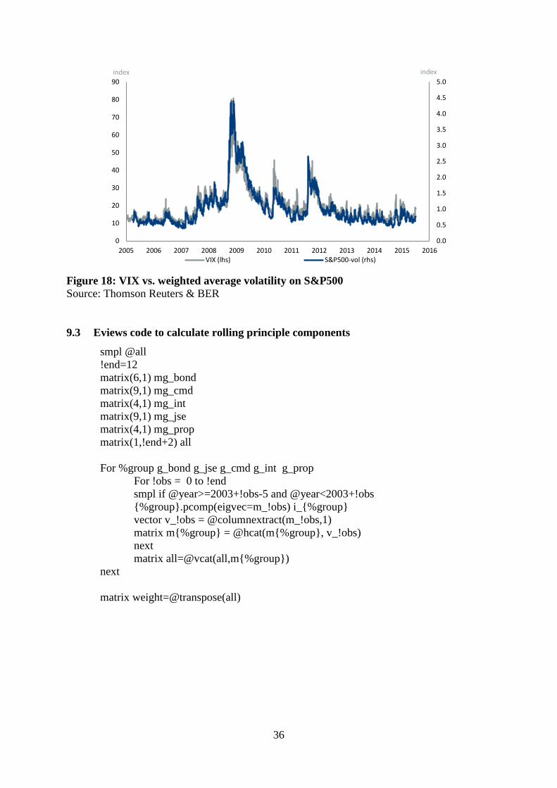
Eviews code I developed for this task is presented in the appendix.
Note that in some years the resultant weights given by PC-analysis were negative for some
input assets. That would imply a short position, which presents a challenge in the case of most
assets, and goes against the intention of the household asset portfolio. Therefore, all negative
weights were readjusted to zero in the calculation of the five asset-class TRIs.
Table 3 below presents all the individual TRIs used to compose the main TRI, grouped
according to their respective asset classes. In the case of bonds and cash deposits, both
interest bearing securities, the uniformity of the weights is striking. The reason for this
uniformity is the close correlation between the TRIs within each asset class. When the
correlations are so high, the different TRIs are very similar and should therefore carry similar
weights. It also implies that fewer TRIs are actually needed within these asset classes. I have
already reduced them considerably.
Table 3: The TRIs that constitute each asset class, and their respective weights Nr Datastream code Data series 2013 2014 2015
Bonds
BOND1 SAFRA13 South African All 1-3 Years - Tot Return Ind 0.166 0.166 0.166
BOND2 SAFRA37 South African All 3-7 Years - Tot Return Ind 0.167 0.167 0.167
BOND3 SAFRA7T South African All 7-12 Years - Tot Return Ind 0.167 0.167 0.167
BOND4 SAFRA12 South African All 12+ Years - Tot Return Ind 0.166 0.166 0.166
BOND5 SAFRGOV South African Govt. (Govi) - Tot Return Ind 0.167 0.167 0.167
BOND6 SAFROTH South African Other (Othi) - Tot Return Ind 0.167 0.167 0.167
Shares
JSE1 JSEI3C3 Ftse/Jse Chemicals - Tot Return Ind 0.118 0.117 0.119

14
JSE2 JSEI1BM Ftse/Jse Basic Materials - Tot Return Ind 0.050 0.058 0.041
JSE3 JSEI1ID Ftse/Jse Industrials - Tot Return Ind 0.120 0.118 0.120
JSE4 JSEI1CG Ftse/Jse Consumer Gds - Tot Return Ind 0.120 0.118 0.121
JSE5 JSEI1H1 Ftse/Jse Health Care - Tot Return Ind 0.117 0.118 0.120
JSE6 JSEI1CS Ftse/Jse Consumer Svs - Tot Return Ind 0.120 0.118 0.120
JSE7 JSEI1T1 Ftse/Jse Telecom - Tot Return Ind 0.113 0.116 0.120
JSE8 JSEI1FN Ftse/Jse Financials - Tot Return Ind 0.121 0.118 0.120
JSE9 JSEI1G1 Ftse/Jse Technology - Tot Return Ind 0.121 0.118 0.119
Commodities
CMD1 SAYCS01 Safex-Yellow Maize Continuous Ltdt - Sett. Price 0.130 0.116 0.113
CMD2 SACCS01 Safex-Wheat Continuous Ltdt - Sett. Price 0.128 0.115 0.121
CMD3 SAUCS00 Safex-Sunflower Seed Continuous - Sett. Price 0.133 0.115 0.099
CMD4 OILBRNP Crude Oil-Brent Dated Fob U$/Bbl 0.140 0.123 0.126
CMD5 GOLDBLN Gold Bullion Lbm U$/Troy Ounce 0.082 0.123 0.124
CMD6 PLATFRE London Platinum Free Market $/Troy Oz 0.105 0.113 0.117
CMD7 DIAHGVS Diamonds-0.5 Carat G Vs2 U$/Carat 0.093 0.109 0.113
CMD8 HWWICS$ Coal 2 Sa Steam Coal Avg Fob Rich.Bay 0.100 0.102 0.090
CMD9 STSIOMP Steel Composite Price Index - Price Index 0.090 0.084 0.098
Cash and loans
INT1 SAJIB1M South African Jibar 1 Month - Middle Rate 0.250 0.250 0.250
INT2 SAJIB3M South African Jibar 3 Month - Middle Rate 0.250 0.250 0.250
INT3 SAJIB6M South African Jibar 6 Month - Middle Rate 0.250 0.250 0.250
INT4 SAJIB1Y South African Jibar 1 Year - Middle Rate 0.250 0.250 0.250
Property
PROP1
Middle Class Propes: Large - Index (2000=100) 0.255 0.253 0.252
PROP2
Middle Class Propes: Medium - Index (2000=100) 0.255 0.253 0.252
PROP3
Middle Class Propes: Small - Index (2000=100) 0.239 0.242 0.246
PROP4 Fnb Prope Price Index (Hpi) (Index: Jan 2001=100) 0.251 0.252 0.251
Source: DataStream, BER calculations
4. Empirical results
4.1 The TRIs
Figure 4 below depicts the TRIs that I calculated for the five asset classes in the main
portfolio, together with the composite TRI (SATRI). They all start on 3 January 2005 at a
level of 1, which can be seen as investing R1 or R1 million on that day. By June 2015 the
total return on shares reached a level of 6.13. This jump implies that the initial investment of
R1 million in shares would have grown to R6.13 million (including dividends reinvested) in
slightly more than ten years. An investment of R1 million in bonds would have grown to
R2.15 million. The combined TRI for the portfolio of South African households (SATRI)
have reached a value of 4.29 by June 2015. This level is more-or-less in the middle of the
performance spectrum of the five asset classes.

15
Figure 4: Sub-TRIs for each of the five asset classes
Source: BER
Shares (JSE)
Shares constitute by far the largest portion of the household asset portfolio. Therefore, shares
would influence the SATRI more than any other asset class (see Table 2). Individual TRIs are
published by FTSE for shares traded on the JSE, their sub-sectors and main sectors. I selected
nine main sectors1 which were available on DataStream. They are listed in Table 3 above
along with their respective abbreviations (JSE1 to JSE9).
In the case of shares, the inter-correlation among the nine individual TRIs was not as high as
for some of the other asset classes. The inter-correlation also changed significantly from year
to year, resulting in changing factor loadings from the first principle component –and thus
changing weights for the combined shares-TRI. In Figure 5 below it is clear the major shift in
weights started to happen in 2011. For example, the weight of basic materials (JSE2)
diminished from 11% in 2010 to only 4% in 2015. This readjusted shares portfolio performed
slightly better than the equally weighted portfolio would have (see Figure 16 in the appendix).
1 The Oil and Gas index made irregular structural breaks, were rebased by FTSE and
unsuitable for use in the TRI. Refer to this note by FTSE:
http://www.ftse.com/products/index-notices/home/getnotice/?id=1358478
I therefore replaced it by the Chemicals index.
0
1
2
3
4
5
6
7
8
2005 2006 2007 2008 2009 2010 2011 2012 2013 2014 2015
index
BOND JSE CMD INT PROP SATRI

16
Figure 5: Weights of each sector in the shares-TRI
Source: BER
Commodities (CMD)
Commodities have price indices, but since they do not pay dividends or yield an income, their
TRIs will be the same as their price indices. Nine commodities were selected for the basket
based on their relevance to South Africa as well as the availability of a daily price index from
2002. The list is presented in Table 3 above.
The inclusion of crude oil needs special clarification. Though crude oil is not produced
domestically, it was also included since South Africa still consumes great quantities of it.
Energy companies keep huge reserves of liquid fuels and South Africans can invest in crude
oil futures on the JSE. The price of crude oil is also one of the most important gauges of
international commodity prices.
0%
10%
20%
30%
40%
50%
60%
70%
80%
90%
100%
2005 2006 2007 2008 2009 2010 2011 2012 2013 2014 2015
percentage
JSE1 JSE2 JSE3 JSE4 JSE5 JSE6 JSE7 JSE8 JSE9

17
Figure 6: Commodity total return rate vs. GDP growth rate
Source: SARB & BER
Figure 6 above compares South Africa’s GDP growth with the commodity total return rate.
From this figure it seems that since 2008 South Africa’s annual economic growth rate became
significantly interlinked with the price of commodities for a period of time. Commodity prices
peaked in February 2014, but decline significantly since then. Looking forward, the price of
commodities is unlikely to pick up on account of China’s growth slowdown; consequently,
growth in South Africa might also remain subdued.
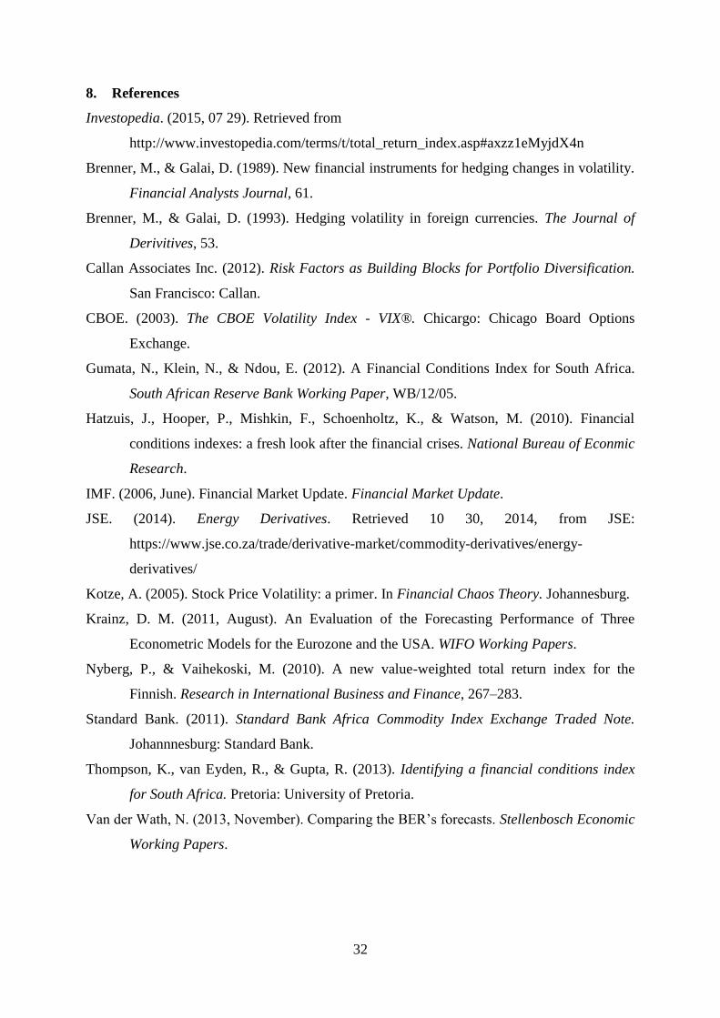
Commodity prices are also interlinked with domestic consumer prices, leading inflation by
roughly 6-12 months (see Figure 15 in the appendix). The gradual decline in commodity
prices since the beginning of 2014 partly explains why inflation moved below 6% later that
year.
-3
-2
-1
0
1
2
3
4
5
6
7
-60
-40
-20
0
20
40
60
80
2005 2006 2007 2008 2009 2010 2011 2012 2013 2014 2015
y-o-y % change y-o-y % change
CMD GDP (rhs)

18
Residential property (PROP)
In the case of residential property, monthly house price indices (HPIs) are published by Absa
and FNB with a lag of one month. However, a TRI for houses is not readily available for
South Africa, thus I had to derive my own. To do this, I first had to calculate a total rate of
return index which combines price growth and rental income. The monthly rental yield index
was derived in the following general formula:
𝑚𝑜𝑛𝑡ℎ𝑙𝑦 𝑟𝑒𝑛𝑡𝑎𝑙 𝑦𝑖𝑒𝑙𝑑 =𝑚𝑜𝑛𝑡ℎ𝑙𝑦 𝑟𝑒𝑛𝑡𝑎𝑙 𝑖𝑛𝑐𝑜𝑚𝑒
ℎ𝑜𝑢𝑠𝑒 𝑝𝑟𝑖𝑐𝑒
Or more specifically:
𝑟𝑒𝑛𝑡𝑎𝑙 𝑦𝑖𝑒𝑙𝑑𝑡 =𝐶1∗𝑅𝑃𝐼𝑡
𝐶2∗𝐻𝑃𝐼𝑡 where
RPI refers to the consumer price sub-index for housing rentals2, as published by Statistics
South Africa (StatsSA) with a lag of two months;
HPI refers to the house price index for middle class houses published by Absa;
C1 and C2 refers to constants (and can reduce to a single constant C), and t to the month.
I then calibrated C such that the annual rental yield for 2014 would be 8% (rental income less
maintenance, insurance, property tax and income tax)3. Next I added the rental yield to the
price growth rate to obtain total return rates for each of the HPIs respectively.
𝑡𝑜𝑡𝑎𝑙 𝑦𝑖𝑒𝑙𝑑𝑡 = 𝑟𝑒𝑛𝑡𝑎𝑙 𝑦𝑖𝑒𝑙𝑑𝑡 + 𝑝𝑟𝑖𝑐𝑒 𝑔𝑟𝑜𝑤𝑡ℎ𝑡
(Note that when growth rates are added, the logarithmic approach should be used for further
calculations.) Finally, I derived four daily TRIs for property by applying the total yield rate
above to indices with a base of 1 on 3 January 2005 (see appendix for the formula). By using
the factor loading of the first principle component as weights, a combined TRI was calculated
for residential property.
2 Before 2008 StatsSA did not publish a CPI for housing rentals. As a proxy before 2008 I
used the CPI for Household operation: Other household services. 3 Derived from a quick scan of properties in the market during 2014 in terms of selling prices
and rentals asked (considering similar properties in similar neighbourhoods).

19
Figure 7: Total return rate and TRI for houses
Source: BER
The yield rate on houses has been abnormally high at the beginning of 2005, as seen in Figure
7 above. House prices grew significantly during the asset bubble that preceded the financial
crises in 2008. This bubble originated in the US where low interest rates drove yield-seeking
investors to lend money to sub-prime borrowers –fuelling the market price of houses. When
the bubble bust, share prices fell sharply in the wake of the global financial crises that
followed. However, South African house prices never declined to the same extent as shares or
houses in the US.
We can deduct form the housing-TRI that a household who bought a house for R1 million in
January 2005, will now (June 2015) have an asset worth R 4.51 million. That is if they
reinvested the owner’s rent equivalent also in housing.
Cash and deposits (INT)
In 2014 households owned 17% of their portfolio in the form of cash (or money), which were
invested in deposits at banks, the money market or loans to borrowers. They earned an
interest on these, which depends on the period of investment. To track the interest rate over
different maturities, I calculated a combined TRI on the Jibar interest rates for one month up
to one year (see Table 3). Initially, other interest rates were also included in the basket, such
as the prime rate, but due to the nearly exact correlation among them all, I dropped some.
0.0
0.5
1.0
1.5
2.0
2.5
3.0
3.5
4.0
4.5
5.0
0
10
20
30
40
50
60
2005 2006 2007 2008 2009 2010 2011 2012 2013 2014 2015
index y-o-y % change
Yield rate TRI (rhs)
20
Individual TRIs are not readily available from any source, only the actual interest rates. I had
to derive individual TRIs, assuming a level of 1 on 3 January 2005 as the base day, then
calculating the growth in the index should all interest earned be reinvested. For more detail on
the formula I used to derive the TRIs, see the appendix.
Among the five asset classes, cash turned out to be the least volatile (see the smooth yield rate
in Figure 8 below). However, lower volatility (or risk) comes at a price –a lower total return.
R1 million invested in the money market on 3 January 2005 will have grown to R2.19 million
by June 2015. This return is on the lower side among the five asset classes (see Figure 4).
Figure 8: Total return rates on cash vs. bonds
Source: BER calculations
Bonds (BOND)
Bonds, also an interest bearing security such as money market deposits, exhibit much more
volatility in its yield rates. The reason for this fluctuation is the fixed coupon rates and
maturity dates, which are then discounted to net present value and traded relative to new
issued bonds. As a result, the net present value of existing bonds can trade at large premiums
or discounts, depending on differences in the coupon interest rate with newly issued bonds.
Consequently, the yield rates on bonds fluctuated much more compared to money market
yield rates (see Figure 8 above). However, despite this volatility, the return on bonds is not
higher compared to money market deposits. R1 million invested in bonds in January 2005
was worth R2.15 million in June 2015.
-10
-5
0
5
10
15
20
25
30
2005 2006 2007 2008 2009 2010 2011 2012 2013 2014 2015
y-o-y % change
INT BOND

21
To derive a single TRI for the bond market, I calculated a weighted index based on the
individual TRIs of six different bonds. Similar to money market interest rates, I selected
bonds of different maturities, from 1 year to more than 12 years. Government as well as
private bonds were included in the basket. In the case of bonds, individual TRIs were readily
available from the Bond Exchange division of the JSE. It is published daily on Thomson
Reuters’ DataStream. The bonds included in the basket are listed in Table 3.
4.2 The South Africa Total Return Index (SATRI)
Now that I have estimated a TRI for each of the five asset classes, I can combine them into
one TRI for South Africa. I do this using the weights as determined by the household balance
sheet, and according to the moving averages and rollover periods described above. The final
result is presented below in Figure 9. One major advantage of the SATRI is its direct and
practical interpretation.
Figure 9: The SATRI
Source: BER
The SATRI indicates that each R1 of the average South African asset portfolio at the
beginning of 2005, nearly doubled in value in just 3½ years. Then the global financial crisis in
2008 caused a decline of around 25c, which was recouped 18 months later. From there on the
portfolio’s value took four years to double again (2010-2014). Much of this growth coincided
with the asset purchase programme of the US Federal Reserve (Fed), otherwise known as
quantitative easing (QE). This growth streak run out of steam by the end of 2014, when the
0.0
0.5
1.0
1.5
2.0
2.5
3.0
3.5
4.0
4.5
5.0
2005 2006 2007 2008 2009 2010 2011 2012 2013 2014 2015 2016
index

22
Fed finally winded down its QE-programme. A similar programme, announced by the
European Central Bank (ECB) in January 2015, initially caused some optimism in financial
markets. However, the high hopes were short lived; the index peaked on 20 February 2015 at
a level of 4.86. Since then the index receded somewhat on account of lower commodity
prices, troubles with Greece, a crash in Chinese stock prices and expectations of an interest
rate hike by the Fed.
4.3 Scenario analysis: the household asset portfolio
We can now use the SATRI to calculate what the household asset portfolio could have been,
if households did not withdraw from it4. This is done by taking a specific base year, and then
inflate the portfolio by the SATRI. For example, at the very beginning of 2005 the portfolio
was worth R2.7 trillion, while the SATRI stood on 1.00 at the same time. By the first day of
2015 the SATRI reached a value of 4.46, indicating an expansion of 347%. If the asset
portfolio increased to the same extent, it would have been worth R14.4 trillion. In reality, the
SARB reported it to be only R9.9 trillion, thus households lost R4.5 trillion in potential
wealth duo to withdrawals. Figure 10 below present the year-by-year value of the actual
portfolio, compared to its potential, and the yearly withdrawals.
Figure 10: Portfolio size: actual compared to potential
Source: BER
4 But still changed the composition each year to match the dynamic weighting.
-2
0
2
4
6
8
10
12
14
16
2005 2006 2007 2008 2009 2010 2011 2012 2013 2014
R trillion
Actual Withdrawn No-withdraw scenario

23
Note that in 2009, in the midst of the global financial crisis, households actually contributed
to their portfolios. They might have done this in a spree of bargain hunting as assets were
priced relatively lower in 2009. In all the other years they withdrew some of the dividends
and interest that their investments yielded. We can deduct from Figure 10 above that South
African households mostly use their investment income to save, and rarely their labour
income.
5. From a TRI to an FCI
Naturally, investors and analysts will not only be interested in the actual level of the SATRI,
but also in its rate of change (growth rate). When I plotted the SATRI growth rate over some
existing financial conditions indices (FCIs) for South Africa, the similarity was striking.
Therefore I investigated if the SATRI growth rate would comply to the general definition of
FCIs. The literature defines an FCI very broadly, and there is no consistent methodology to
construct them (Gumata et al (2012), Hatzius et al (2010), Thomson et al (2013)). However,
three properties in them are universal:
1. They are a blended mix of different indicators;
2. These indicators are strictly from the financial sector.
3. The final index is in first difference (growth rate) format.
Considering the year-on-year percentage change in the SATRI, it complies in full to these
three conditions. Firstly, the indicators on which the SATRI is based are all assets traded in
the financial sector, whether houses, shares, bonds, cash or commodities. Secondly, their
return indices are all blended into one, namely the SATRI. Thirdly, the SATRI growth rate is
in first difference format, thus qualifying it as a suitable FCI.
Because the SATRI is constituted on daily data, I calculate its rate of change on a 260-day
difference. Figure 11 below depicts this financial conditions index for South Africa, which I
dubbed the SAFCI, along with annual GDP growth. The link with the real economy is clearly
visible up to 2012, with the SAFCI leading economic growth by three to six months. The
impact of the global financial crisis (2008 - 2010) is also visible in both, but the impact of the
Fed’s asset purchases (QE3) only visible on the SAFCI.

24
Figure 11: FCI for South Africa vs. GDP growth
Source: BER
The Fed’s third wave of asset purchases, which commenced in September 2012, inflated
international asset prices above normal levels. The SAFCI adhered to the same market
distortions and jumped sharply. In May 2013 the Fed announced that it would start to taper
these purchases again, and the SAFCI receded quickly from another recent spike. By October
2014, when the QE3 programme finally winded down, the SAFCI fell sharply. After that it
recovered following the QE announcement of the European Central Bank (ECB) in January
2015. However, this improvement did not last long as the SAFCI plummeted severely on the
back of a Chinese slowdown and market collapse. By June 2015 the SAFCI was close to the
0-level, last reach during the global financial crisis.
Note should also be taken that the SAFCI is very similar the SARB equivalent-FCI (see
Figure 17 in the appendix). They have an 87% correlation with each other.
5.1 Explaining the real economy
One of the main purposes that analysts have for FCI’s is to use them as a gauge for the real
economy (Hatzuis, Hooper, Mishkin, Schoenholtz, & Watson, 2010). Figure 11 above
compares the SAFCI with annual GDP growth. Between 2005 and 2012 the correlation was
very good, with the SAFCI leading GDP growth by three to six months. However, since
September 2012 there was a disconnection, which coincided with the third wave of asset
purchases (QE3) by the Fed. During, and slightly after this period, a gap between the FCI and
-15
-10
-5
0
5
10
15
20
25
30
35
-3
-2
-1
0
1
2
3
4
5
6
7
2005 2006 2007 2008 2009 2010 2011 2012 2013 2014 2015 2016
yield rate y-o-y % change
GDP (lhs) SAFCI
QE3 GFC
25
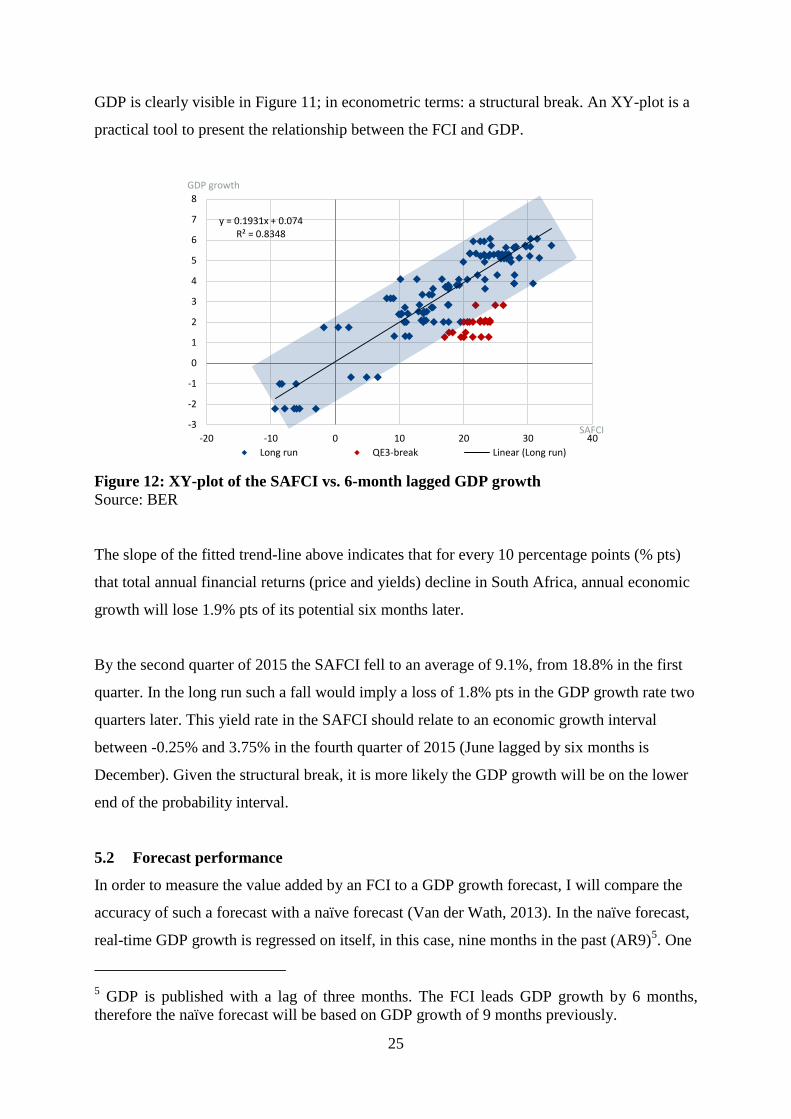
GDP is clearly visible in Figure 11; in econometric terms: a structural break. An XY-plot is a
practical tool to present the relationship between the FCI and GDP.
Figure 12: XY-plot of the SAFCI vs. 6-month lagged GDP growth
Source: BER
The slope of the fitted trend-line above indicates that for every 10 percentage points (% pts)
that total annual financial returns (price and yields) decline in South Africa, annual economic
growth will lose 1.9% pts of its potential six months later.
By the second quarter of 2015 the SAFCI fell to an average of 9.1%, from 18.8% in the first
quarter. In the long run such a fall would imply a loss of 1.8% pts in the GDP growth rate two
quarters later. This yield rate in the SAFCI should relate to an economic growth interval
between -0.25% and 3.75% in the fourth quarter of 2015 (June lagged by six months is
December). Given the structural break, it is more likely the GDP growth will be on the lower
end of the probability interval.
5.2 Forecast performance
In order to measure the value added by an FCI to a GDP growth forecast, I will compare the
accuracy of such a forecast with a naïve forecast (Van der Wath, 2013). In the naïve forecast,
real-time GDP growth is regressed on itself, in this case, nine months in the past (AR9)5. One
5 GDP is published with a lag of three months. The FCI leads GDP growth by 6 months,
therefore the naïve forecast will be based on GDP growth of 9 months previously.
y = 0.1931x + 0.074 R² = 0.8348
-3
-2
-1
0
1
2
3
4
5
6
7
8
-20 -10 0 10 20 30 40
GDP growth
SAFCI
Long run QE3-break Linear (Long run)
26
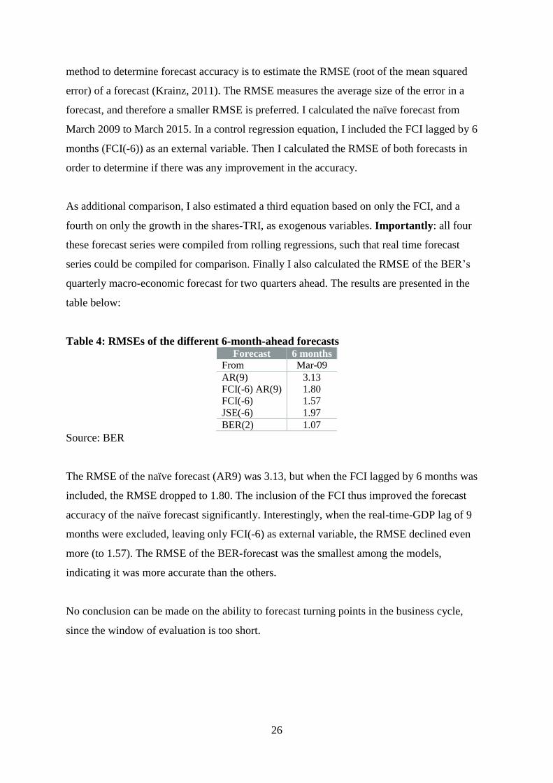
method to determine forecast accuracy is to estimate the RMSE (root of the mean squared
error) of a forecast (Krainz, 2011). The RMSE measures the average size of the error in a
forecast, and therefore a smaller RMSE is preferred. I calculated the naïve forecast from
March 2009 to March 2015. In a control regression equation, I included the FCI lagged by 6
months (FCI(-6)) as an external variable. Then I calculated the RMSE of both forecasts in
order to determine if there was any improvement in the accuracy.
As additional comparison, I also estimated a third equation based on only the FCI, and a
fourth on only the growth in the shares-TRI, as exogenous variables. Importantly: all four
these forecast series were compiled from rolling regressions, such that real time forecast
series could be compiled for comparison. Finally I also calculated the RMSE of the BER’s
quarterly macro-economic forecast for two quarters ahead. The results are presented in the
table below:
Table 4: RMSEs of the different 6-month-ahead forecasts Forecast 6 months
From Mar-09
AR(9) 3.13
FCI(-6) AR(9) 1.80
FCI(-6) 1.57
JSE(-6) 1.97
BER(2) 1.07
Source: BER
The RMSE of the naïve forecast (AR9) was 3.13, but when the FCI lagged by 6 months was
included, the RMSE dropped to 1.80. The inclusion of the FCI thus improved the forecast
accuracy of the naïve forecast significantly. Interestingly, when the real-time-GDP lag of 9
months were excluded, leaving only FCI(-6) as external variable, the RMSE declined even
more (to 1.57). The RMSE of the BER-forecast was the smallest among the models,
indicating it was more accurate than the others.
No conclusion can be made on the ability to forecast turning points in the business cycle,
since the window of evaluation is too short.

27
6. A volatility index for South Africa
6.1 Background on volatility
Volatility is a measure of the variation in the price of any financial instrument over time, and
is used to quantify the risk associated with that instrument. Two main types exist, namely
historical and implied volatility (Brenner & Galai, 1989). Historical volatility is based on a
historical price time series of an asset, and implied volatility on the option prices of an asset
(traded derivative with a future expectation). In statistical terms, volatility is defined as the
standard deviation of the logarithmic returns of a time series and represented by the symbol σ.
It is calculated for a specific time period, for example a 22 or 65 day horizon (Kotze, 2005).
A high volatility is indicative of large swings in the value of an asset, and is associated with
greater forecast difficulty –thus more risk. Lower volatility is indicative of price stability and
better forecasts of future changes –thus smaller risk. An advantage of high volatility is that it
presents more opportunity for speculation (to buy low and sell high), but at the penalty of
more uncertainty. Normally, riskier assets would carry higher rates of return in order to
compensate the investor for carrying that risk. Alternatively, safer assets carry lower rates of
return to penalise the investor for being risk averse. This ratio explains why investment yield
rates are lower in the advanced economies compared to emerging economies.
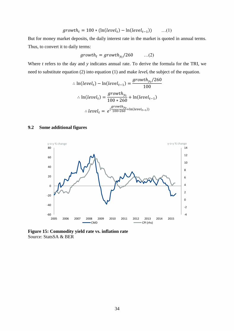
The best known volatility index in the financial markets is probably the Chicago Board
Options Exchange Market Volatility Index, or better known as the CBOE-VIX. The VIX is an
implied volatility measure and is calculated as a weighted blend of a range of options on the
S&P500 index (CBOE, 2003).
6.2 Calculating volatility on the SATRI
As mentioned above, volatility can be calculated for different periods of time, say monthly,
quarterly or annually. This variety of periods leads to the question of which frequency would
be the most suitable to derive a single volatility index from the SATRI. I decided to test and
compare six different horizons, from weekly to annually, calculating a moving standard
deviation based on 5, 10, 22, 65, 130 and 260 days respectively. At the end I settled on a
simple average of all six horizons6. In effect, this methodology resulted in a volatility index
6 I tested a weighted average with the rolling weights being the factor loadings of the first
principle component, but the result was not significantly different from the simple average.

28
which is horizon-free. Interestingly enough, I applied this methodology to the S&P500, and
obtained a volatility index (S&P500-vol) which has a 95% correlation to the VIX. See Figure
18 in the appendix for a graphical comparison. Figure 13 below compares the final volatility
index (which I dubbed the SAVI) derived from the SATRI with the S&P500-vol.
Figure 13: SA-volatility index vs. S&P500-volatility7
Source: BER
Interestingly, but as expected, the SAVI (portfolio of assets) is significantly less volatile
compared to the S&P500 (shares only). Still, the co-movement between them is striking; the
largest impact on South African financial conditions was definitely the global financial crises
in 2008. The second largest was in May and June of 2006, when the inflation rate nearly
doubled within three months, and the prime rate was hiked for the first time in 45 months.
The IMF reported a synchronized tightening in monetary policy around the world at that
stage, due to inflationary pressures (IMF, 2006). A recent major shock was in May 2013,
when the Fed made the famous tapering announcement, followed by the actual end of QE3 in
October 2014. Since then volatility has escalated significantly into 2015, reaching levels last
seen in the global financial crisis.
7 Note that these two indices actually run on the same scale, but the SAVI is much lower than
the S&P500-vol, and therefore presented on its own scale for comparative purposes.
0.0
0.2
0.4
0.6
0.8
1.0
1.2
0.0
0.5
1.0
1.5
2.0
2.5
3.0
3.5
4.0
4.5
5.0
2005 2006 2007 2008 2009 2010 2011 2012 2013 2014 2015 2016
index index
S&P500-vol (rhs) SAVI
Inflation spike and prime hike
Global financial crisis
Fed's tapering announcement
Final end to QE3

29
6.3 The efficient frontier in investment
One method used by investment analysts is an XY-ploy of the return versus the risk. Ideally,
the preferred investment would yield a higher return given a specific level of risk. We can plot
a theoretical line, called the efficient frontier, which represents the best return attainable for
each level of risk (Callan Associates Inc, 2012). This efficient frontier is upward sloping,
since safer investments demand lower returns and riskier investments higher returns. Thus, for
any level of risk, the ideal would be to attain a yield rate close to the efficient frontier. Yields
above the efficient frontier are abnormal. To assess the five different asset classes in the
typical household portfolio, I present such a plot in Figure 14 below.
Figure 14: The investment frontier (XY-plot of yield rate vs. daily volatility)
Source: BER data from 2005 to 2015
On average, cash deposits (INT) and property (PROP) are the least risky among the five asset
classes, and commodities (CMD) this most risky. Simultaneously, cash deposits also have the
lowest yield rate. Shares and commodities were the only investments that had negative returns
during the global financial crisis. It is also clear that commodities (CMD) are a sub-optimal
investment; its return is too low given the level of risk associated with it. This outcome is not
surprising since commodities have no dividend or interest return, only price growth. In
contrast to commodities, residential property (PROP) turns out to have a low risk given its
higher yield rates.
-10
0
10
20
30
40
50
0.0 0.2 0.4 0.6 0.8 1.0 1.2 1.4 1.6
yield rate
Volatility
BOND JSE CMD INT PROP SAVI Average
Efficient frontier

30
Another point to take notice of is the negative relation between yield and risk for shares and
commodities over time. In other words, they tend to be volatile when their yields are low;
quite the opposite of the ideal investment. In contrast, residential property behaves much
more according to theory. As its yield declined over time, so did its volatility. Over the last
decade it turned out that property had a lower risk but higher yield than the other asset classes,
placing it above the efficient frontier on average.
The plot for the combined portfolio of the five asset classes (SAVI) is also presented in Figure
14. The portfolio has a yield which is fair given its volatility, though its huge exposure to
shares nearly resulted in some losses during the international financial crisis.
7. Conclusion
I developed a suite of financial indices, each with a very practical use. The SATRI, which is
the base index, tracks to the total return of the portfolio of assets belonging to South African
households. It has a base of 1 on 3 January 2005, and grew to a value of 4.26 by June 2015. It
can be used by investors to gauge the performance of the portfolio of assets which is typical
to South Africa. The index is updated daily, and therefore also useful as a real time indicator.
Secondly, the SAFCI, which is the year-on-year percentage change in the SATRI, falls in the
same broad class of financial conditions indicators. It correlates highly with annual growth in
the real economy, leading it by three to six months. It can be used by analysts to assist in the
forecasting of economic growth. The SAFCI is highly influenced by international financial
events and policies –an indication of the openness of the South African economy.
Thirdly, the SAVI, which is the standard deviation of daily changes in the SATRI, tracks
volatility in the domestic financial market. It highlights the magnitude of domestic shocks and
their linkages to international shocks. The volatility indices of the five assets classes in the
portfolio also indicate that property and cash deposits are a better assets compared to
commodities and bonds.

31
Finally, I will now be able to update this suite of indices on a regular basis (even daily) in
order to inform the consumers of economic and financial data to make better policy, business
and investment decisions.
32
8. References
Investopedia. (2015, 07 29). Retrieved from
http://www.investopedia.com/terms/t/total_return_index.asp#axzz1eMyjdX4n
Brenner, M., & Galai, D. (1989). New financial instruments for hedging changes in volatility.
Financial Analysts Journal, 61.
Brenner, M., & Galai, D. (1993). Hedging volatility in foreign currencies. The Journal of
Derivitives, 53.
Callan Associates Inc. (2012). Risk Factors as Building Blocks for Portfolio Diversification.
San Francisco: Callan.
CBOE. (2003). The CBOE Volatility Index - VIX®. Chicargo: Chicago Board Options
Exchange.
Gumata, N., Klein, N., & Ndou, E. (2012). A Financial Conditions Index for South Africa.
South African Reserve Bank Working Paper, WB/12/05.
Hatzuis, J., Hooper, P., Mishkin, F., Schoenholtz, K., & Watson, M. (2010). Financial
conditions indexes: a fresh look after the financial crises. National Bureau of Econmic
Research.
IMF. (2006, June). Financial Market Update. Financial Market Update.
JSE. (2014). Energy Derivatives. Retrieved 10 30, 2014, from JSE:
https://www.jse.co.za/trade/derivative-market/commodity-derivatives/energy-
derivatives/
Kotze, A. (2005). Stock Price Volatility: a primer. In Financial Chaos Theory. Johannesburg.
Krainz, D. M. (2011, August). An Evaluation of the Forecasting Performance of Three
Econometric Models for the Eurozone and the USA. WIFO Working Papers.
Nyberg, P., & Vaihekoski, M. (2010). A new value-weighted total return index for the
Finnish. Research in International Business and Finance, 267–283.
Standard Bank. (2011). Standard Bank Africa Commodity Index Exchange Traded Note.
Johannnesburg: Standard Bank.
Thompson, K., van Eyden, R., & Gupta, R. (2013). Identifying a financial conditions index
for South Africa. Pretoria: University of Pretoria.
Van der Wath, N. (2013, November). Comparing the BER’s forecasts. Stellenbosch Economic
Working Papers.

33
9. Appendix
This addendum provides additional tables, graphs and explanations to supplement the main
text.
Table 5: Household balance sheet divided into asset classes Household balance sheet (2014) R billion Asset class
Residential buildings 2 355 property Other non-financial assets 491 commodities
Assets with monetary institutions 859 cash
Interest in pension funds and long-term insurers 3 805 a., b. and c. Other financial assets 2 370 shares & unit trusts (d.)
TOTAL 9 879
a. Official pension and provident funds 1 693
Cash and deposits 48 cash
Fixed-interest securities: Government 351 bonds
Fixed-interest securities: Local governments 2 bonds
Fixed-interest securities: Public enterprises 152 bonds
Fixed-interest securities: Other 85 bonds Ordinary shares 921 shares
Other assets 133 commodities
b. Private self-administered pension and provident funds 908 Coin, banknotes and deposits 59 cash
Fixed-interest securities: Government 163 bonds
Fixed-interest securities: Local governments 5 bonds Fixed-interest securities: Public enterprises 16 bonds
Fixed-interest securities: Other 120 bonds
Ordinary shares 508 shares Loans: Mortgage 0 loans
Loans: To public sector 0 loans
Loans: Other 2 loans Fixed property 14 property
Other assets 21 commodities
c. Long-term insurers 2 371 Coin, banknotes and deposits 182 cash
Fixed-INTerest securities: Government 198 bonds
Fixed-INTerest securities: Local governments 5 bonds
Fixed-INTerest securities: Public enterprises 29 bonds
Fixed-INTerest securities: Other 147 bonds
Ordinary shares 1 247 shares Loans: Mortgage 1 loans
Loans: Against policies 2 loans
Loans: To public sector 3 loans Loans: Other 173 loans
Fixed property 58 houses
Other assets 326 commodities d. Unit trusts 1 652
Public-sector securities 206 bonds Stocks, debentures and preference shares 65 shares
Ordinary shares 947 shares
Cash and deposits 435 cash
Source: SARB Quarterly Bulletin, March 2014
9.1 Deriving a TRI from a growth rate series
First, we are working with daily data, and there is normally 260 trading days in a calendar
year (public holidays are included), and 260/12 trading days in a month. Secondly, bank
deposit interest is compounded monthly, but the TRI is calculated daily. To avoid any
compound differences building up over time, I will use the logarithmic formula for growth,
where the daily growth rate are:
34
𝑔𝑟𝑜𝑤𝑡ℎ𝑡 = 100 ∗ (ln(𝑙𝑒𝑣𝑒𝑙𝑡) − ln(𝑙𝑒𝑣𝑒𝑙𝑡−1)) …(1)
But for money market deposits, the daily interest rate in the market is quoted in annual terms.
Thus, to convert it to daily terms:
𝑔𝑟𝑜𝑤𝑡ℎ𝑡 = 𝑔𝑟𝑜𝑤𝑡ℎ𝑦𝑡/260 …(2)
Where t refers to the day and y indicates annual rate. To derive the formula for the TRI, we
need to substitute equation (2) into equation (1) and make levelt the subject of the equation.
∴ ln(𝑙𝑒𝑣𝑒𝑙𝑡) − ln(𝑙𝑒𝑣𝑒𝑙𝑡−1) =𝑔𝑟𝑜𝑤𝑡ℎ𝑦𝑡
/260
100
∴ ln(𝑙𝑒𝑣𝑒𝑙𝑡) =𝑔𝑟𝑜𝑤𝑡ℎ𝑦𝑡
100 ∗ 260+ ln(𝑙𝑒𝑣𝑒𝑙𝑡−1)
∴ 𝑙𝑒𝑣𝑒𝑙𝑡 = 𝑒(𝑔𝑟𝑜𝑤𝑡ℎ𝑦𝑡100∗260
+ln(𝑙𝑒𝑣𝑒𝑙𝑡−1))
9.2 Some additional figures
Figure 15: Commodity yield rate vs. inflation rate
Source: StatsSA & BER
-4
-2
0
2
4
6
8
10
12
14
-60
-40
-20
0
20
40
60
80
2005 2006 2007 2008 2009 2010 2011 2012 2013 2014 2015
y-o-y % change y-o-y % change
CMD CPI (rhs)

35
Figure 16: Shares-TRIs: the PC-weighted vs. the simple average
Source: BER
Figure 17: Comparison between the SAFCI and SARB-FCI
Source: BER
0.0
1.0
2.0
3.0
4.0
5.0
6.0
7.0
8.0
9.0
2010 2011 2012 2013 2014 2015 2016
index
Simple averages PC-weighted
-15
-10
-5
0
5
10
-15
-10
-5
0
5
10
15
20
25
30
35
40
2005 2006 2007 2008 2009 2010 2011 2012 2013 2014 2015
y-o-y % change y-o-y % change
SAFCI SARB eqv FCI (rhs)
36
Figure 18: VIX vs. weighted average volatility on S&P500
Source: Thomson Reuters & BER
9.3 Eviews code to calculate rolling principle components
smpl @all
!end=12
matrix(6,1) mg_bond
matrix(9,1) mg_cmd
matrix(4,1) mg_int
matrix(9,1) mg_jse
matrix(4,1) mg_prop
matrix(1,!end+2) all
For %group g_bond g_jse g_cmd g_int g_prop
For !obs = 0 to !end
smpl if @year>=2003+!obs-5 and @year<2003+!obs
{%group}.pcomp(eigvec=m_!obs) i_{%group}
vector v_!obs = @columnextract(m_!obs,1)
matrix m{%group} = @hcat(m{%group}, v_!obs)
next
matrix all=@vcat(all,m{%group})
next
matrix weight=@transpose(all)
0.0
0.5
1.0
1.5
2.0
2.5
3.0
3.5
4.0
4.5
5.0
0
10
20
30
40
50
60
70
80
90
2005 2006 2007 2008 2009 2010 2011 2012 2013 2014 2015 2016
index index
VIX (lhs) S&P500-vol (rhs)

37
9.4 Eviews code to calculate real-time forecasts
For !obs = 0 to 81
smpl 2003m7+!obs 2003m7+!obs+59
equation eq_gdp_ar.ls rt_gdp rt_gdp(-9) c
equation eq_gdp_ar_fci.ls rt_gdp fci(-6) rt_gdp(-9) c
equation eq_gdp_fci.ls rt_gdp fci(-6) c
equation eq_gdp_jse.ls rt_gdp jse(-6) c
smpl 2003m07+!obs+68 2003m07+!obs+68
eq_gdp_ar.fit gdp_ar_f
eq_gdp_ar_fci.fit gdp_ar_fci_f
eq_gdp_fci.fit gdp_fci_f
eq_gdp_jse.fit gdp_jse_f
series rt_gdp_ar_f=gdp_ar_f
series rt_gdp_ar_fci_f=gdp_ar_fci_f
series rt_gdp_fci_f=gdp_fci_f
series rt_gdp_jse_f=gdp_jse_f
next
smpl @all