accessibility evaluation report of ryerson university’s
TRANSCRIPT

Page 1 of 24
Accessibility Evaluation Report of Ryerson University’s Website
Audited and Reported By
Sajjad Khan
Website Evaluated Ryerson University (http://www.ryerson.ca)
Date of Assessment
November 11, 2016
Assessment Methods Used Heuristic Evaluation, Automated Review
Number of Pages Audited
10
Tools Used ChromeVox, Adobe Photoshop, Icecream Screen Recorder, MS Word, Google
Chrome, Snagit, YouTube

Page 2 of 24
Table of Contents
1. Problem Statement.......................................................................................................
1.1 Research question
1.2 Project description
1.3 Accessibility evaluation of Ryerson’s website
2. Web Accessibility.........................................................................................................
2.1 What is web accessibility
2.2 Why accessibility is important?
2.3 Web Content Accessibility Guidelines (WCAG)
2.4 Types of disabilities
2.5 Assistive technologies
3. Accessibility Evaluation Report..................................................................................
3.1 Introduction
3.2 Purpose
3.3 Assessment breakdown
3.4 Methodologies
3.5 Environment
3.6 Findings.............................................................................................................
3.6.1 Screen reader compliance
3.6.2 Device compatibility check
3.6.3 Font sizes assessment
3.6.4 Video transcripts and captions
04
05
06
09
Page 3 of 24
3.6.5 Information architecture/navigation structure check
3.6.6 Consistency examination
3.6.7 Keyboard compatibility analysis
3.7 Recommendations............................................................................................
3.7.1 Provide appropriate alternative text
3.7.2 Provide appropriate document structure/Follow W3C Standards
3.7.3 Ensure users can complete and submit all forms
3.7.4 Ensure links make sense out of context
3.7.5 Provide custom transcripts and custom caption for videos and audio
3.7.6 Ensure accessibility for PDF, MS Word, and PowerPoint files
3.7.7 Allow users to skip repetitive elements on the page
3.7.8 Do not rely on color alone to convey information
3.7.9 Create designs for different viewport sizes
3.7.10 Make it accessible through keyboard only
3.7.11 Make it consistent
3.7.12 Constantly test for accessibility
3.7.13 Provide sufficient contrast between foreground and background
3.7.14 Use larger font text sizes
4. Conclusion.....................................................................................................................
17
24
Page 4 of 24
1. Problem Statement
1.1 Research question
How to remove digital accessibility barriers for audiences with limitations in higher
education and how a successful and enjoyable user experience could be offered to students.
1.2 Project description
Accessibility is about ensuring an equivalent user experience for people with disabilities.
For the Web, it means that people with disabilities can perceive, understand, navigate, and
interact with websites and tools, and that they can contribute equally without barriers. The
purpose of this research would be to study how people with disabilities use the higher education
websites, the challenges they face, and how the obstacles could be removed to provide uniformly
delightful experience.
1.3 Accessibility evaluation of Ryerson’s website
Ryerson University’s website has been analyzed using heuristic accessibility assessments.
Initially, approximately ten live pages have been assessed. The website has been evaluated to
find the accessibility barriers for people with disabilities. The screen recording, capturing, image
editing, web browser and other tools have been used to evaluate the website against the web
content accessibility guidelines. The evaluation report has been prepared including findings and
recommendations.

Page 5 of 24
2. Web Accessibility
2.1 What is web accessibility?
Web accessibility refers to the inclusive practice of removing barriers that prevent
interaction with, or access to websites, by people with disabilities. When sites are correctly
designed, developed and edited, all users have equal access to information and functionality.
Everyone have equal right to access and user web to achieve goal with delight and ease.
Web Accessibility means people with limitations can navigate, understand, and interact with the
websites. Web accessibility comprise of all disabilities that affect the interaction with the web
including visual, auditory, physical, speech, cognitive and neurological disabilities.
2.2 Why web accessibility is important?
The Web is an increasingly important resource in many aspects of life: education,
employment, government, commerce, health care, recreation, and more. It is important that the
Web should be accessible in order to provide equal access and equal opportunity to people with
disabilities. Implementation of web accessibility guidelines can help remove accessibility
barriers to text, audio, and visual media. Another important consideration for higher education
institutions is that web accessibility is required by laws.
2.3 Web Content Accessibility Guidelines (WCAG)
The Web Content Accessibility Guidelines (WCAG) are a set of guidelines that specify
how to make content accessible, primarily for people with disabilities, published by the Web
Accessibility Initiative (WAI) of the World Wide Web Consortium (W3C), the main
international standards organization for the Internet.

Page 6 of 24
2.4 Types of disabilities
• Visual: Visual impairments including blindness, various common types of low vision and
poor eyesight, various types of color blindness;
• Motor/mobility: Difficulty or inability to use the hands, muscle slowness, due to conditions
such as Parkinson's Disease or stroke;
• Auditory: Deafness or hearing impairments, including individuals who are hard of hearing;
• Cognitive/Intellectual: Learning disabilities, distractibility, inability to remember or focus
on large amounts of information.
2.5 Assistive technologies
Users with disabilities need assistive tools and hardware, in order to explore the websites,
like screen readers (JAWS), Voice recognition software, larger text keyboard, screen
magnification software, etc.
3. Accessibility Heuristic Evaluation Report Website evaluated: Ryerson University (http://www.ryerson.ca)
Date of assessment: November 11, 2016
Assessment methods used: Heuristic Evaluation, Automated Review
Number of pages analysed: 10
Tools used: ChromeVox, Adobe Photoshop, Icecream Screen Recorder, MS Word, Google
Chrome, Snagit, YouTube

Page 7 of 24
3.1 Introduction
This report comprises the accessibility evaluation results on Ryerson University’s website
(http://www.ryerson.ca). Initially, 10 live pages have been assessed. The website has been
evaluated to find the accessibility barriers for people with disabilities. The screen recording,
capturing, image editing, web browser and other tools have been used to evaluate the website
against the web content accessibility guidelines.
3.2 Purpose
The purpose of the accessibility testing practice was to examine how students with
different types of disabilities including vision, hearing and mobility would interact with
Ryerson’s website and to find the issues they may encounter while browsing the website to
achieve their specific goals. After conducting the evaluation, provide recommendations to
improve the user experience of the people with limitations.
3.3 Assessment Breakdown # User Type Test Type Web Page URL Tool Used
1 Blind/Visually Impaired
Screen Reading
http://www.ryerson.ca/
ChromeVox, Icecream Screen Recorder
2 Visually Impaired Device Independence
http://www.ryerson.ca/
Google Chrome, iPhone 6, Snagit, Adobe Photoshop
4 Visually Impaired Font Sizes http://www.ryerson.ca/ http://www.ryerson.ca/about/ http://www.ryerson.ca/currentstudents/ http://www.ryerson.ca/graduate/futurestudents/programs/masters/
Google Chrome, Snagit, Adobe Photoshop

Page 8 of 24
5 Deaf/Hearing
Impaired Video Transcripts and Captions
http://www.ryerson.ca/graduate/digitalmedia/ http://www.ryerson.ca/graduate/mediaproduction/
Google Chrome
6 Cognitive disability/All Users
Information Architecture
http://www.ryerson.ca/ http://www.ryerson.ca/graduate/
Google Chrome, Snagit
7 Cognitive disability/All Users
Consistency (Font, Color, Dimensions, Navigation)
http://www.ryerson.ca/about/ http://www.ryerson.ca/undergraduate/admission/overview/ http://www.ryerson.ca/news/news/
Google Chrome, Snagit
8 Mobility Impaired Keyboard compatibility/Tab Order
http://library.ryerson.ca/ https://www.youtube.com/watch?v=stx0HYYLtW0
Google Chrome, Snagit, HTML Code
3.4 Methodology
Approximately 10 pages of Ryerson University’s website have been assessed for screen
reading software compatibility, responsiveness, format, consistency, information architecture,
layout, video captioning and keyboard tab ordering using heuristic accessibility evaluation
method.
3.5 Environment
Operating System: Windows 10
Web Browser: Google Chrome 54
Screen Reader: ChromeVox
Monitor Resolution: 1600x900
Image Manipulation: Adobe Photoshop CC 2015
Screen Capturing: Snagit 13
Page 9 of 24
3.6 Evaluation Findings
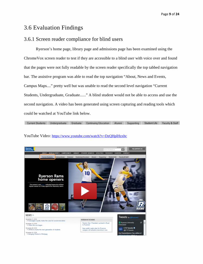
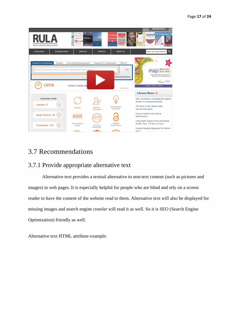
3.6.1 Screen reader compliance for blind users
Ryerson’s home page, library page and admissions page has been examined using the
ChromeVox screen reader to test if they are accessible to a blind user with voice over and found
that the pages were not fully readable by the screen reader specifically the top tabbed navigation
bar. The assistive program was able to read the top navigation “About, News and Events,
Campus Maps....” pretty well but was unable to read the second level navigation “Current
Students, Undergraduate, Graduate......” A blind student would not be able to access and use the
second navigation. A video has been generated using screen capturing and reading tools which
could be watched at YouTube link below.
YouTube Video: https://www.youtube.com/watch?v=DzQHplHzxhc

Page 10 of 24
3.6.2 Device compatibility check for visually impaired users
Ryerson’s website has been tested on desktop and mobile device and found that it is not
adjustable to different screen sizes. A student with vision impairments would not be able to use
the website on a mobile device due to the very small font sizes and complex layout. To
experience this, Ryerson’s website could be opened in desktop computer and mobile device to
compare them and see the difference. See below desktop and iPhone view.

Page 11 of 24
Desktop View:
iPhone View:
Competitor Analysis
A competitor analysis have been conducted Ryerson and University of Toronto to find
out the website compatibility with mobile device and found that University of Toronto’s website
is responsive. Means it is scalable as per screen and device size and the content/text is bigger and

Page 12 of 24
readable on all devices. It would be easier for a student with low vision to access and read the
contents on mobile devices as well. See below desktop and iPhone views.

Page 13 of 24
Desktop View: iPhone View:

Page 14 of 24
3.6.3 Font sizes assessment for visually impaired/aged users
The font size on Ryerson’s website is small especially on home, about, my Ryerson,
admission pages and the person with low vision would not be able to read the text. Also font size
is fixed and not scalable.
Page 15 of 24
3.6.4 Video transcripts are unavailable for deaf or hearing impaired users
The text version (transcript) of the video is not available in most of the videos. It is also
noted that YouTube auto captions have been on some of the videos which is not accessibility
best practice, instead custom captions and custom transcripts should be used for all videos.
Captions are on-video and transcripts are off-video. It has been also observed that video controls
were not available on few videos which makes hard for user with mobility issue to control the
video.
Videos on Digital Media Page: http://www.ryerson.ca/graduate/digitalmedia/
Videos on Media Production Page: http://www.ryerson.ca/graduate/mediaproduction/ 3.6.5 Information architecture/navigation structure check for users with cognitive disability/aging
The information architecture does not allow user to navigation between pages. For
example once the user clicks “Graduate” from top navigation would land on “Graduate” page.
But once the user is on “Graduate” page, both top navigations disappeared. There is no option for
the user to go to “Undergraduate”, “Continuing Education, Alumni....” pages and all top
navigation links. Also there is no button to go back to home page unless the user clicks on
Ryerson’s logo. It has been also noted that the Breadcrumbs navigation is not available which
provides the user another option to navigate the website and also tells the user the current
location and from where he/she came from.
http://www.ryerson.ca/ http://www.ryerson.ca/graduate/ http://www.ryerson.ca/sfa/ http://www.ryerson.ca/about/governors/

Page 16 of 24
3.6.6 Consistency examination for users with cognitive disability
Number of inconsistencies have been found with respect to font size, font family, font
color, background colors, page widths, navigation structure and heading structure. It will make
the user confused and would make it hard to understand and navigate.
http://www.ryerson.ca/about/ http://www.ryerson.ca/undergraduate/admission/overview/ http://www.ryerson.ca/news/news/ http://www.ryerson.ca/graduate/futurestudents/programs/ http://www.ryerson.ca/graduate/mediaproduction/about/ https://www.ouac.on.ca/apply/ryersongrad/en_CA/user/login 3.6.7 Keyboard compatibility analysis for users with mobility issues
Tests have been conducted to check if the website is accessible just by using keyboard,
without using the mouse and found the tabbing order is not in place on some pages including
Ryerson’s Library. The focus is going on “Go” but first and then on Search box which is
incorrect. It should go on search box first and then on “Go” so that the user can enter the
keyword first and then would click “Go” button to get the search results. A video has been
created using screen capturing and reading tools which could be watched at the YouTube link
below.
YouTube Video: https://www.youtube.com/watch?v=stx0HYYLtW0
Page 17 of 24
3.7 Recommendations
3.7.1 Provide appropriate alternative text
Alternative text provides a textual alternative to non-text content (such as pictures and
images) in web pages. It is especially helpful for people who are blind and rely on a screen
reader to have the content of the website read to them. Alternative text will also be displayed for
missing images and search engine crawler will read it as well. So it is SEO (Search Engine
Optimization) friendly as well.
Alternative text HTML attribute example:

Page 18 of 24
In above example the screen reader will read text aloud which is in code (alt=”Holiday Toy List”) for blind user. If the image would not be able to load due to the slow internet connection, the same alt text would be displayed and the voice over software would read it aloud for blind user.
3.7.2 Provide appropriate document structure/Follow W3C Standards
Use structured HTML (Hypertext Markup Language ) code for headings, lists,
paragraphs and other structural elements. Use <h1><h2> tags for headings and <p> tag for
paragraph. Use external CSS (Cascading Style Sheets) file. Keep the styles and HTML code
separate. They can facilitate keyboard navigation within the page and also compatible with
screen readers for persons with vision impairments.
HTML compliant and accessible pages are more robust and provide better search engine
optimization. Cascading Style Sheets (CSS) allow you to separate content from presentation.
This provides more flexibility and accessibility of your content.
Example of HTML structured code:

Page 19 of 24
3.7.3 Ensure users can complete and submit all forms
Ensure that every form element (text field, checkbox, dropdown list, etc.) has a label and
make sure that label is associated to the correct form element using the <label> element. Also
make sure the user can submit the form and recover from any errors, such as the failure to fill in
all required fields. Also add correct keyboard tabbing order for the users who might not be able
to use mouse.
3.7.4 Ensure links make sense out of context
Every link should make sense if the link text is read by itself. Screen reader users may
choose to read only the links on a web page. Certain phrases like “click here” and “more” must
be avoided. Use descriptive links. All links should be underlined or bold.
3.7.5 Provide custom transcripts and custom caption for multimedia
Deaf or hearing impaired users would not be able to listen. Videos and audio must have
captions and transcript. Also provide video and audio controls accessible by using keyboard.

Page 20 of 24
3.7.5 Ensure accessibility PDF, Word, and PowerPoint presentations
PDF documents and other non-HTML content must be as accessible as possible. If you
cannot make it accessible, consider using HTML instead or, at the very least, provide an
accessible alternative.
3.7.6 Allow users to skip repetitive elements on the page
You should provide a method that allows users to skip navigation or other elements that
repeat on every page. This is usually accomplished by providing a “Skip to Main Content,” or
“Skip Navigation” link at the top of the page which jumps to the main content of the page.
3.7.7 Do not rely on color alone to convey information
Use of color can enhance comprehension, but do not use color alone to convey
information. That information may not be available to a person who is colorblind and will be
unavailable to screen reader users.
In below example red color has been used to inform user that it is a required field. A
color blind user would just look at it as black and white as the example below, and would not be
able to know which fields are required and which are not required. See examples below.

Page 21 of 24
Original example with colors:
Same image converted to black and white.
In above black and white form, a color blind user would not be able to differentiate between required and non required fields.
3.7.8 Create designs for different viewport sizes Website should be responsive to different screen and device sizes. It should be able to scale itself based on the screen size. Use percentages instead of pixels for dimensions and use mobile first or responsive design approaches

Page 22 of 24
Desktop View:
iPhone View:
3.7.9 Make it accessible through keyboard only Users with mobility issues should be able to access the website through keyboard only because they might not be able to use a mouse.
3.7.10 Make it consistent
Use consistent page layout, consistent navigation, breadcrumbs, recognizable graphics,
descriptive links and easy to understand language. The website should be clean, simple, efficient,
findable and easier to navigate.
3.7.11 Constantly test for accessibility
During the whole website development process, keep testing the website using persons
with disabilities and assistive technologies. Also conduct expert audits and web accessibility

Page 23 of 24
automated checkers to find the issues. Use iterative or agile methodology for website design and
development so that the changes can be made at earlier stage on the bases on user’s feedback.
3.7.12 Provide sufficient contrast between foreground and background Users with color blindness would not be able to read the text with low contrast colors.
The rule of thumb is that, a lighter text color should be used on a darker background color and
vice versa. Use high contrast between text and background color.
Example of high contrast color buttons on right and low contrast color buttons on left.
When converted into black and white, the low color contrast buttons on the left are not readable. A color blind person would be unable to access and use the buttons with low contrast.
Page 24 of 24
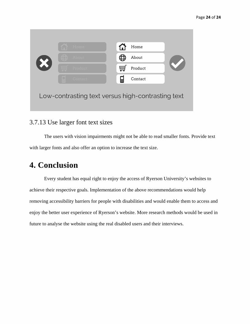
3.7.13 Use larger font text sizes The users with vision impairments might not be able to read smaller fonts. Provide text
with larger fonts and also offer an option to increase the text size.
4. Conclusion Every student has equal right to enjoy the access of Ryerson University’s websites to
achieve their respective goals. Implementation of the above recommendations would help
removing accessibility barriers for people with disabilities and would enable them to access and
enjoy the better user experience of Ryerson’s website. More research methods would be used in
future to analyse the website using the real disabled users and their interviews.