accessible material - fraser...accessible material august 2010 tealbook book a tables and charts†...
TRANSCRIPT

Accessible Material
August 2010 Tealbook Tables and Charts
Table of Contents
Document Section Accessible Material
Book A
Domestic Economic Developments and Outlook FOMC20100810tealbooka20100804_1.htm
International Economic Developments and Outlook FOMC20100810tealbooka20100804_2.htm
Financial Developments FOMC20100810tealbooka20100804_3.htm
Risks and Uncertainty FOMC20100810tealbooka20100804_4.htm
Greensheets FOMC20100810tealbooka20100804_5.htm
Book B
Monetary Policy Strategies FOMC20100810tealbookb20100805_1.htm
Monetary Policy Alternatives FOMC20100810tealbookb20100805_2.htm
Explanatory Notes FOMC20100810tealbookb20100805_3.htm
Last update: January 29, 2016

Accessible Material
August 2010 Tealbook Book A Tables and Charts†
Domestic Economic Developments and Outlook
Key Background Factors Underlying the Baseline Staff Projection
Figure: Federal Funds Rate
Line chart, by percent, 2006 to 2011. Data are quarterly averages. There are three series, "Current Tealbook", "June Tealbook", and "Market, expected rate". Current Tealbook and June Tealbook follow the same path throughout the graph. They begin in early 2006 at about 4.5 and increase to about 5.25 by mid-2006 where they remain constant until mid-2007. They then decrease to about 0.13 by early 2009 and remain relatively stable here until late 2011. Market, expected rate begins in 2010:Q3 at about 0.13 and increases to about 0.4 by the end of 2011.
Figure: Long-Term Interest Rates
Line chart, by percent, 2006 to 2011. Data are quarterly averages. There are six series, "Current Tealbook: BBB corporate yield", "Current Tealbook: Conforming mortgage rate", "Current Tealbook: 10-year Treasury yield", "June Tealbook: BBB corporate yield", "June Tealbook: Conforming mortgage rate", and "June Tealbook: 10-year Treasury yield". Current Tealbook: BBB corporate yield begins in 2006 at about 6 and generally increases to about 9.5 by late 2008. It then generally decreases to about 5.2 by 2010 and then generally increases to about 5.7 by late 2011. Current Tealbook: Conforming mortgage rate begins in 2006 at about 6.25 and fluctuates but generally decreases to about 4.5 by 2010. It then increases to about 5.3 by late 2011. Current Tealbook: 10-year Treasury yield begins in 2006 at about 4.7 and fluctuates but generally decreases to about 3.25 by early 2009. It then generally increases to about 3.9 by early 2010 and then generally decreases to about 3.1 by mid-2010. By late 2011 it has generally increased to about 3.95. June Tealbook: BBB corporate yield begins in 2006 at about 6 and generally increases to about 9.5 by late 2008. It then generally decreases to about 5.5 by 2010 and then generally increases to about 6.0 by late 2011. June Tealbook: Conforming mortgage rate begins in 2006 at about 6.25 and fluctuates but generally decreases to about 4.8 by 2010. It then increases to about 5.6 by late 2011. June Tealbook: 10-year Treasury yield begins in 2006 at about 4.7 and fluctuates but generally decreases to about 3.25 by early 2009. It then generally increases to about 3.9 by early 2010 and then generally decreases to about 3.5 by mid-2010. By late 2011 it has generally increased to about 4.25.
Figure: Equity Prices
Line chart, by ratio scale where 2006:Q1 = 100, 2006 to 2011. Data are quarter-end. There are two series, Current Tealbook: Dow Jones Total Stock Market Index and June Tealbook: Dow Jones Total Stock Market Index. Current Tealbook: Dow Jones Total Stock Market Index begins in 2006 at about 100 and generally increases to about 117 by 2007. It then generally decreases to about 62 by 2009 and then generally increases to about 93 by early 2010. By mid-2010 it has generally decreased to about 82 and by late 2011 it has generally increased to about 110. June Tealbook: Dow Jones Total Stock Market Index begins in 2006 at about 100 and generally increases to about 117 by 2007. It then generally decreases to about 62 by 2009 and then generally increases to about 93 by early 2010. By mid-2010 it has generally decreased to about 89 and by late 2011 it has generally increased to about 112.
Figure: House Prices
Line chart, by ratio scale where 2006:Q1 = 100, 2006 to 2011. Data are quarterly. There are two series, Current Tealbook: LoanPerformance index and June Tealbook: LoanPerformance index. Current Tealbook: LoanPerformance index begins in 2006 at about 100 and generally decreases to about 70 by early 2009. It then generally increases to about 72.5 by late 2011. June Tealbook: LoanPerformance index begins in 2006 at about 100 and generally decreases to about 70 by early 2009. It then generally increases to about 72 by late 2009 and then generally decreases to about 70 by late 2011.
Figure: Crude Oil Prices
Line chart, by dollars per barrel, 2006 to 2011. Data are quarterly averages. There are two series, Current Tealbook: West Texas Intermediate and June Tealbook: West Texas Intermediate. Current Tealbook: West Texas Intermediate begins in early 2006 at about 64 and generally increases to about 70 by mid-2006. It then generally decreases to about 57 by 2007 and then generally increases to about 125 by 2008. By 2009 it has generally decreased to about 44 and by late 2011 it has generally increased to about 88. June Tealbook: West Texas Intermediate begins in early 2006 at about 64 and generally increases to about 70 by mid-2006. It then generally decreases to about 57 by 2007 and then generally increases to about 125 by 2008. By 2009 it has generally decreased to about 44 and by early 2010 it has generally increased to about 80. It then generally decreases to about 77 by mid-2010 and then generally increases to about 83 by late 2011.
Figure: Broad Real Dollar
Line chart, by scale where 2006:Q1 = 100, 2006 to 2011. Data are quarterly averages. There are two series, Current Tealbook and June Tealbook. Current Tealbook begins in 2006 at about 100 and generally decreases to about 86.5 by 2008. It then generally increases to about 98 by early 2009 and then generally decreases to about 90 by late 2009. By 2010 it has generally increased to about 91.5 and by late 2011 it has generally decreased to about 85. June Tealbook begins in 2006 at about 100 and generally decreases to about 86.5 by 2008. It then generally increases to about 98 by early 2009 and then generally decreases to about 90 by late 2009. By 2010 it has generally increased to about 92.5 and by late 2011 it has generally decreased to about 86.

Note: Shading represents the projection period, which begins in 2010:Q3. In the upper-left panel that reports the federal funds rate, the black dotted line is not apparent because the paths of the federal funds rate in the June and the current Tealbooks are the same.
[Box:] The Effects of Fiscal Policy on the Economy
Fiscal Impetus(Percentage point contribution to rate of change in real GDP, Q4/Q4 basis)
Category 2008 2009 2010 2011
1. Total 1.0 .7 .2 .0
2. Federal 1.1 1.3 .6 -.4
Of which: Grants to state and local .0 .5 .2 -.3
3. State and local (excluding effects of grants) -.1 -.6 -.3 .4
Memo:
State and local (including effects of grants) -.1 -.1 -.1 .1
Figure: Contribution of Discretionary Fiscal Policy to 4-Quarter Change in Real GDP
Line chart, by percentage points, 2008 to 2011. There is a horizontal line at zero. There are two series, Total FI and FI + follow-on effects. Total FI begins in 2008:Q1 at about 0.1 and increases to about 1.05 by 2008:Q3. It then generally decreases to about 0.65 by 2009:Q3 and then generally increases to about 0.75 by 2010:Q1. By 2011:Q2 it has generally decreased to about -0.2 and by 2011:Q4 it has generally increased to about -0.1. FI + follow-on effects begins in 2008:Q1 at about 0.1 and generally increases to about 1.075 by 2009:Q2. It then generally decreases to about 0.15 by 2011:Q2 and then generally increases to about 0.2 by 2011:Q4.
Figure: Contribution of Fiscal Policy to Change in Real GDP
Bar chart, by percentage points, 2008 to 2011. There are two series, Automatic stabilizers and Discretionary fiscal policy. Approximate values are: 2008: Discretionary fiscal policy 0.9, Automatic stabilizers 0.35. 2009: Discretionary fiscal policy 0.8, Automatic stabilizers 0.75. 2010: Discretionary fiscal policy 0.4, Automatic stabilizers 0.55. 2011: Discretionary fiscal policy 0.2, Automatic stabilizers 0.55.
Summary of the Near-Term Outlook
(Percent change at annual rate except as noted)
Measure
2010:Q2 2010:Q3
Previous Tealbook
Current Tealbook
Previous Tealbook
Current Tealbook
Real GDP 3.6 2.1 2.7 2.4
Private domestic final purchases 4.5 4.3 2.5 1.5
Personal consumption expenditures 2.9 1.6 2.2 1.6
Residential investment 18.7 28.5 -5.5 -8.6
Nonres. structures -.8 4.8 -2.2 .6
Equipment and software 20.3 26.1 10.4 3.9
Federal purchases 6.9 9.2 5.2 4.3
State and local purchases -.6 1.4 .0 -.5
Contribution to change in real GDP(percentage points)
Inventory investment -.3 .6 .6 .8
Net exports -.2 -2.9 -.3 .1
Recent Nonfinancial Developments (1)
Figure: Change in Private Payroll Employment

Line chart, by thousands of employees, 2001 to 2010. There is a horizontal line at zero. There are two series, Change in Private Payroll Employment and 3-month moving average. Change in Private Payroll Employment begins in early 2001 at about -40 and generally decreases to about -360 by late 2001. It then generally increases to about 150 by late 2002 and then generally decreases to about -210 by early 2003. By early 2005 it has generally increased to about 350 and by early 2009 it has generally decreased to about -820. It then generally increases to about 90 by June 2010. 3-month moving average begins in early 2001 at about 90 and generally decreases to about -320 by late 2001. It then generally increases to about 25 by late 2002 and then generally decreases to about -140 by early 2003. By early 2006 it has generally increased to about 300 and by early 2009 it has generally decreased to about -750. It then generally increases to about 120 by June 2010.
Source: U.S. Dept. of Labor, Bureau of Labor Statistics.
Figure: Unemployment Rate
Line chart, by percent, 2001 to 2010. The series begins in 2001 at about 4.2 and generally increases to about 6.4 by 2003. It then generally decreases to about 4.4 by 2007 and then generally increases to about 10.1 by 2009. By June 2010 it has generally decreased to about 9.5.
Source: U.S. Dept. of Labor, Bureau of Labor Statistics.
Figure: Manufacturing IP ex. Motor Vehicles and Parts
Line chart, by 3-month percent change, annual rate, 2001 to 2010. There is a horizontal line at zero. The series begins in early 2001 at about -3 and then generally decreases to about -8 by mid-2001. It then generally increases to about 7 by mid-2002 and then generally decreases to about -2.5 by late 2002. By early 2005 it has generally increased to about 8 and by mid-2005 it has generally decreased to about -4. It then generally increases to about 12 by late 2005 and then generally decreases to about -1 by late 2006. By early 2007 it has generally increased to about 7.5 and by early 2009 it has generally decreased to about -22. It then generally increase to about 5.5 by June 2010.
Source: Federal Reserve Board, G.17 Statistical Release, "Industrial Production and Capacity Utilization."
Figure: Production of Light Motor Vehicles
Line chart, by millions of units, annual rate, 2001 to 2010. The series begins in 2001 at about 10.7 and generally increases to about 13.2 by 2003. It then generally decreases to about 3.6 by the end of 2008 and then generally increases to about 7.6 by June 2010. There is also a "Schedules" data point on the graph, in 2010:Q3, at about 8.1.
Note: Schedules data are from Ward's Communications.
Source: Ward's Auto Infobank.
Recent Nonfinancial Developments (2)
Figure: Real PCE
Line chart, by billions of chained (2005) dollars, 2001 to 2010. The series begins in 2001 at about 7750 and generally increases to about 9350 by 2007. It then generally decreases to about 9100 by 2009 and then generally increases to about 9250 by June 2010.
Source: U.S. Dept. of Commerce, Bureau of Economic Analysis
Figure: Sales of Light Motor Vehicles
Line chart, by millions of units, annual rate, 2001 to 2010. The series begins in early 2001 at about 17.5 and generally decreases to about 16 by mid-2001. Within a month or so it increases to about 21.7 and then decreases to about 15.7 by late 2001. From late 2001 to early 2005 it fluctuates between about 15.2 and 18.2. It then generally increases to about 20.5 by mid-2005 and then decreases to about 14.5 by late 2005. By early 2006 it has generally increased to about 18 and by early 2009 it has generally decreased to about 9.1. It then generally increases to about 14 by mid-2009 and within a month or so decreases to about 8.8. By July 2010 it has generally increased to about 11.5.
Source: Ward's Auto Infobank.
Figure: Single-Family Housing Starts
Line chart, thousands of units, annual rate, 2001 to 2010. There are two series, Starts and Adjusted permits. Starts begins in 2001 at about 1300 and generally increases to about 1830 by 2006. It then generally decreases to about 370 by 2009 and then generally increases to about 590 by early 2010. By June 2010 it has generally decreased to about 450. Adjusted permits begins in 2001 at about 1300 and generally increases to about 1870 by 2005. It then generally decreases to about 365 by 2009 and then generally increases to about 590 by early 2010. By June 2010 it has generally decreased to about 450.
Note: Adjusted permits equal permits plus starts outside of permit-issuing areas.
Source: U.S. Census Bureau.
Figure: Single-Family Home Sales

Line chart, by thousands of units, annual rate, 2001 to 2010. There are two series, New and Existing. New begins in 2001 at about 980 and generally increases to about 1400 by 2005. It then generally decreases to about 310 by June 2010. Existing begins in 2001 at about 4550 and generally increases to about 6350 by 2005. It then generally decreases to about 4000 by late 2008 and then generally increases to about 5750 by late 2009. By June 2010 it has generally decreased to about 4650.
Source: For existing, National Association of Realtors; for new, U.S. Census Bureau.
Figure: Nondefense Capital Goods Excluding Aircraft
Line chart, by billions of dollars, 2001 to 2010. There are two series, Orders and Shipments. Orders begins in 2001 at about 62.3 and generally decreases to about 46 by early 2002. It then generally increases to about 71.5 by late 2007 and then generally decreases to about 47.5 by 2009. By June 2010 it has generally increased to about 61. Shipments begins in 2001 at about 62.3 and generally decreases to about 59 by early 2003. It then generally increases to about 67.5 by mid-2008 and then generally decreases to about 53 by 2009. By June 2010 it has generally increased to about 60.
Source: U.S. Census Bureau.
Figure: Nonresidential Construction Put in Place
Line chart, by billions of chained (2005) dollars, 2001 to 2010. The series begins in 2001 at about 275 and generally decreases to about 220 by late 2002. It then generally increases to about 410 by late 2007. From late 2007 to late 2008 it fluctuates between about 400 and 415. It then generally decreases to about 270 by June 2010.
Source: U.S. Census Bureau.
Recent Nonfinancial Developments (3)
Figure: Inventory Ratios ex. Motor Vehicles
Line chart, by months, 2001 to 2010. There are two series, Staff flow-of-goods system and Census book-value data. Staff flow-of-goods system begins in 2001 at about 1.68 and generally decreases to about 1.45 by late 2007. It then generally increases to about 1.6 by early 2009 and then generally decreases to about 1.49 by June 2010. Census book-value data begins in 2001 at about 1.39 and generally decreases to about 1.18 by 2005. It then generally increases to about 1.25 by 2006 and then generally decreases to about 1.19 by 2008. By early 2009 it has generally increased to about 1.4 and by May 2010 it has generally decreased to about 1.2.
Note: Flow-of-goods system covers total industry ex. motor vehicles and parts, and inventories are relative to consumption. Census data cover manufacturing and trade ex. motor vehicles and parts, and inventories are relative to sales.
Source: U.S. Census Bureau; staff calculation.
Figure: Defense Spending
Line chart, by billions of chained (2005) dollars, 2001 to 2010. There are two series, "Unified" in which the data are monthly and "NIPA" in which the data are quarterly. Unified begins in 2001 at about 385 and generally increases to about 555 by 2004. From 2004 to early 2007 it fluctuates between about 460 and 565. It then generally increases to about 650 by June 2010. NIPA begins in 2001 at about 390 and generally increases to about 520 by 2004. From 2004 to early 2007 it fluctuates between about 505 and 530. It then generally increases to about 640 by 2010:Q2.
Note: The unified series is seasonally adjusted and deflated by BEA prices. The NIPA series excludes the consumption of fixed capital.
Source: Monthly Treasury Statement.
Figure: Trade Balance
Line chart, by billions of dollars, 2001 to 2010. The series begins in early 2001 at about -35 and generally increases to about -26 by late 2001. It then generally decreases to about -68 by 2005 and then generally increases to about -56 by 2007. By 2008 it has generally decreased to about -68 and by 2009 it has generally increased to about -24. It then generally decreases to about -42.5 by May 2010.
Source: U.S. Dept. of Commerce, Bureau of Economic Analysis; U.S. Census Bureau.
Figure: Exports and Non-Oil Imports
Line chart, by billions of dollars, 2001 to 2010. There are two series, Non-oil imports and Exports. Non-oil imports begins in early 2001 at about 115 and generally decreases to about 97 by late 2001. It then generally increases to about 182 by 2008 and then generally decreases to about 132 by 2009. By May 2010 it has generally increased to about 167. Exports begins in early 2001 at about 89 and generally decreases to about 77 by late 2001. It then generally increases to about 167 by 2008 and then generally decreases to about 123 by 2009. By May 2010 it has generally increased to about 151.
Source: U.S. Dept. of Commerce, Bureau of Economic Analysis; U.S. Census Bureau.
Figure: Total PCE Prices

Line chart, by percent, 2001 to 2010. There is a horizontal line at zero. There are two series, 12-month change and 3-month change. 12-month change begins in 2001 at about 2.5 and generally decreases to about 0.7 by early 2002. It then generally increases to about 4 by 2005 and then generally decreases to about 1.5 by 2006. By 2008 it has generally increased to about 4.5 and by 2009 it has generally decreased to about -1. It then generally increases to about 1.5 by June 2010. 3-month change begins in early 2001 at about 3 and generally decreases to about -2.1 by late 2001. It then generally increases to about 4 by early 2002. From early 2002 to mid-2005 it fluctuates between about -1.2 and 4.1. It then generally increases to about 8.7 within a month or so and then generally decreases to about -1.5 by late 2006. By mid-2008 it has generally increased to about 7 and by late 2008 it has generally decreased to about -9. It then generally increases to about 4 by 2009 and then generally decreases to about -1 by June 2010.
Note: 3-month changes are at an annual rate.
Source: U.S. Dept. of Commerce, Bureau of Economic Analysis.
Figure: PCE Prices ex. Food and Energy
Line chart, by percent, 2001 to 2010. There is a horizontal line at zero. There are two series, 12-month change and 3-month change. 12-month change begins in early 2001 at about 1.8 and generally decreases to about 1 by late 2001. It then generally increases to about 2.7 by 2002 and then generally decreases to about 1.3 by 2003. By 2008 it has generally increased to about 2.7 and by June 2010 it has generally decreased to about 1.3. 3-month change begins in early 2001 at about 2.45 and generally decreases to about -1.1 by late 2001. Within a month or so it generally increases to about 4 and then generally decreases to about 0.75 by early 2003. It then generally increases to about 3.5 by 2005. From 2005 to mid-2008 it fluctuates between about 1 and 3.5. It then generally decreases to about 0.1 by 2008 and then generally increases to about 2.6 by 2009. By June 2010 it has generally decreased to about 0.9.
Note: 3-month changes are at an annual rate.
Source: U.S. Dept. of Commerce, Bureau of Economic Analysis.
Projections of Real GDP and Related Components
(Percent change at annual rate from end of preceding period except as noted)
Measure 2008 20092010
2011H1 H2
Real GDP -2.8 .2 2.9 2.5 3.6
Previous Tealbook -1.9 .1 3.4 3.0 3.7
Final sales -1.9 -.3 1.3 2.4 3.8
Previous Tealbook -1.4 -.1 2.6 2.6 3.4
Personal consumption expenditures -1.9 .2 1.7 1.8 3.5
Previous Tealbook -1.8 1.0 3.1 2.3 3.1
Residential investment -24.6 -13.4 6.1 -.5 19.0
Previous Tealbook -21.0 -12.5 3.0 4.9 17.1
Nonresidential structures -1.5 -26.5 -7.2 .7 -.5
Previous Tealbook 3.2 -25.3 -8.3 -1.2 -.2
Equipment and software -11.8 -4.9 23.2 7.2 11.6
Previous Tealbook -10.7 -7.5 16.8 11.3 10.8
Federal purchases 9.2 3.6 5.4 2.3 1.0
Previous Tealbook 8.9 3.6 4.0 3.0 1.4
State and local puchases -.4 -1.0 -1.2 -.4 .0
Previous Tealbook -.3 -.1 -2.3 .2 .5
Exports -2.9 -.1 10.8 10.3 8.2
Previous Tealbook -3.4 -.7 9.7 7.7 7.4
Imports -6.0 -7.2 19.7 5.1 6.5
Previous Tealbook -6.8 -6.6 11.5 6.9 6.9
Contributions to change in real GDP(percentage points)
Inventory change -.8 .5 1.6 .1 -.2
Previous Tealbook -.5 .1 .8 .4 .3
Net exports .7 1.2 -1.5 .5 .0
Previous Tealbook .7 1.0 -.5 -.1 -.2
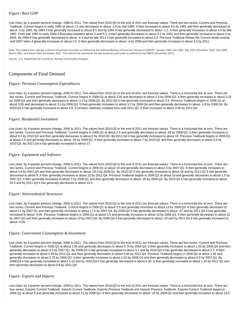
Figure: Real GDP
Line chart, by 4-quarter percent change, 1980 to 2011. The values from 2010:Q2 to the end of 2011 are forecast values. There are two series, Current and Previous Tealbook. Current begins in early 1980 at about 1.5 and decreases to about -1.8 by mid-1980. It then increases to about 4.6 by 1981 and then generally decreases to about -3 by 1982. By 1984 it has generally increased to about 8.5 and by 1991 it has generally decreased to about -1.2. It then generally increases to about 4.5 by late 1992. From late 1992 to early 2000 it fluctuates between about 2 and 5.5. It then generally decreases to about 0.2 by 2001 and then generally increases to about 4 by 2004. By 2009 it has generally decreased to about -4.3 and by late 2011 it has generally increased to about 3.9. Previous Tealbook follows the Current series exactly until 2007 when it generally increases to about 2.5. It then generally decreases to about -4 by 2009 and then generally increases to about 3.9 by 2011.
Note: The shaded bars indicate a period of business recession as defined by the National Bureau of Economic Research (NBER): January 1980-July 1980, July 1981-November 1982, July 1990-March 1991, and March 2001-November 2001. The vertical line represents the last business cycle peak as defined by the NBER (December 2007).
Source: U.S. Department of Commerce, Bureau of Economic Analysis.
Components of Final Demand
Figure: Personal Consumption Expenditures
Line chart, by 4-quarter percent change, 2006 to 2011. The values from 2010:Q2 to the end of 2011 are forecast values. There is a horizontal line at zero. There are two series, Current and Previous Tealbook. Current begins in 2006:Q1 at about 3.05 and decreases to about 2.5 by 2006:Q3. It then generally increases to about 3.25 by 2006:Q4 and then generally decreases to about -2.3 by 2009:Q2. By 2011:Q4 it has generally increased to about 3.5. Previous Tealbook begins in 2006:Q1 at about 3.05 and decreases to about 2.5 by 2006:Q3. It then generally increases to about 3.2 by 2006:Q4 and then generally decreases to about -1.8 by 2008:Q4. By 2010:Q2 it has generally increased to about 2.6. It remains relatively constant here until 2011:Q2. It then increases to about 3.05 by 2011:Q4.
Figure: Residential Investment
Line chart, by 4-quarter percent change, 2006 to 2011. The values from 2010:Q2 to the end of 2011 are forecast values. There is a horizontal line at zero. There are two series, Current and Previous Tealbook. Current begins in 2006:Q1 at about 2.5 and generally decreases to about -28 by 2009:Q2. It then generally increases to about 5.5 by 2010:Q2 and then generally decreases to about 0 by 2010:Q3. By 2011:Q4 it has generally increased to about 19. Previous Tealbook begins in 2006:Q1 at about 2.5 and generally decreases to about -26 by 2009:Q2. It then generally increases to about 7 by 2010:Q2 and then generally decreases to about 0.5 by 2010:Q3. By 2011:Q4 it has generally increased to about 17.
Figure: Equipment and Software
Line chart, by 4-quarter percent change, 2006 to 2011. The values from 2010:Q2 to the end of 2011 are forecast values. There is a horizontal line at zero. There are two series, Current and Previous Tealbook. Current begins in 2006:Q1 at about 10 and generally decreases to about 3 by 2007:Q1. It then generally increases to about 4.8 by 2007:Q4 and then generally decreases to about -20.3 by 2009:Q1. By 2010:Q2 it has generally increased to about 16 and by 2011:Q2 it has generally decreased to about 9. It then generally increases to about 12 by 2011:Q4. Previous Tealbook begins in 2006:Q1 at about 10 and generally decreases to about 1.5 by 2007:Q1. It then generally increases to about 3 by 2008:Q1 and then generally decreases to about -20 by 2009:Q2. By 2010:Q3 it has generally increased to about 15.5 and by 2011:Q4 it has generally decreased to about 10.5.
Figure: Nonresidential Structures
Line chart, by 4-quarter percent change, 2006 to 2011. The values from 2010:Q2 to the end of 2011 are forecast values. There is a horizontal line at zero. There are two series, Current and Previous Tealbook. Current begins in 2006:Q1 at about 2.5 and generally increases to about 13 by 2006:Q3. It then generally decreases to about 11 by 2007:Q1 and then generally increases to about 17.5 by 2007:Q4. By 2009:Q4 it has generally decreased to about -27 and by 2011:Q4 it has generally increased to about -0.05. Previous Tealbook begins in 2006:Q1 at about 2.5 and generally increases to about 13 by 2006:Q3. It then generally decreases to about 12 by 2007:Q2 and then generally increases to about 19 by 2007:Q4. By 2009:Q4 it has generally decreased to about -25 and by 2011:Q4 it has generally increased to about -0.05.
Figure: Government Consumption & Investment
Line chart, by 4-quarter percent change, 2006 to 2011. The values from 2010:Q2 to the end of 2011 are forecast values. There are two series, Current and Previous Tealbook. Current begins in 2006:Q1 at about 1.55 and generally decreases to about 0.75 by 2006:Q3. It then generally increases to about 1.55 by 2006:Q4 and then generally decreases to about 0.3 by 2007:Q1. By 2008:Q4 it has generally increased to about 3.1 and by 2010:Q3 it has generally decreased to about 0.7. It then generally increases to about 1.55 by 2011:Q1 and then generally decreases to about 0.45 by 2011:Q4. Previous Tealbook begins in 2006:Q1 at about 1.55 and generally decreases to about 0.75 by 2006:Q3. It then generally increases to about 1.55 by 2006:Q4 and then generally decreases to about 0.5 by 2007:Q1. By 2008:Q3 it has generally increased to about 3.15 and by 2010:Q3 it has generally decreased to about 0.25. It then generally increases to about 1.45 by 2011:Q1 and then generally decreases to about 0.9 by 2011:Q4.
Figure: Exports and Imports
Line chart, by 4-quarter percent change, 2006 to 2011. The values from 2010:Q2 to the end of 2011 are forecast values. There is a horizontal line at zero. There are four series, Exports Current Tealbook, Imports Current Tealbook, Exports Previous Tealbook and Imports Previous Tealbook. Exports Current Tealbook begins in 2006:Q1 at about 9 and generally increases to about 12 by 2008:Q2. It then generally decreases to about -15 by 2009:Q2 and then generally increases to about 14.5

by 2010:Q2. By 2011:Q4 it has generally decreased to about 8. Exports Previous Tealbook begins in 2006:Q1 at about 9 and generally increases to about 11 by 2008:Q2. It then generally decreases to about -15 by 2009:Q2 and then generally increases to about 14.5 by 2010:Q2. By 2011:Q4 it has generally decreased to about 7.5. Imports Current Tealbook begins in 2006:Q1 at about 6.5 and generally decreases to about -18.5 by 2009:Q2. It then generally increases to about 16 by 2010:Q2 and then generally decreases to about 6 by 2011:Q4. Imports Previous Tealbook begins in 2006:Q1 at about 6.5 and generally decreases to about -18.5 by 2009:Q2. It then generally increases to about 15 by 2010:Q2 and then generally decreases to about 7 by 2011:Q4.
Source: U.S. Department of Commerce, Bureau of Economic Analysis.
Aspects of the Medium-Term Projection
Figure: Personal Saving Rate
Line chart, by percent, 1990 to 2011. The values from 2010:Q2 to the end of 2011 are forecast values. There are two series, Current and Previous Tealbook. Current begins in 1990 at about 6.4 and generally increases to about 7.7 by 1992. It then generally decreases to about 1.1 by 2005 and then generally increases to about 7.6 by 2009. By 2011 it has generally decreased to about 6.1. Previous Tealbook begins in 1990 at about 6.4 and generally increases to about 7.7 by 1992. It then generally decreases to about 1.1 by 2005 and then generally increases to about 5.8 by 2009. By 2011 it has generally decreased to about 4.1.
Source: U.S. Dept. of Commerce, Bureau of Economic Analysis.
Figure: Wealth-to-Income Ratio
Line chart, by ratio, 1990 to 2011. The values from 2010:Q2 to the end of 2011 are forecast values. There are two series, Current and Previous Tealbook. Current begins in 1990 at about 4.85. From 1990 to 1995 it fluctuates between about 4.65 and 4.9. It then generally increases to about 6.15 by 1999 and then generally decreases to about 4.95 by 2002. By 2005 it has generally increased to about 6.4 and by 2009 it has generally decreased to about 4.4. It then generally increases to about 4.95 by 2011. The Previous Tealbook series follows the Current series almost exactly.
Note: Household net worth as a ratio to disposable personal income.
Source: Flow of Funds Accounts.
Figure: Single-Family Housing Starts
Line chart, by millions of units, 1990 to 2011. The values from 2010:Q2 to the end of 2011 are forecast values. There are two series, Current and Previous Tealbook. Current begins in 1990 at about 1.05 and generally decreases to about 0.7 by 1991. It then generally increases to about 1.75 by 2006 and then generally decreases to about 0.35 by 2009. By 2011 it has generally increased to about 0.82. Previous Tealbook begins in 1990 at about 1.05 and generally decreases to about 0.7 by 1991. It then generally increases to about 1.75 by 2006 and then generally decreases to about 0.35 by 2009. By 2011 it has generally increased to about 0.88.
Source: U.S. Census Bureau.
Figure: Equipment and Software Spending
Line chart, by share of nominal GDP, 1990 to 2011. The values from 2010:Q2 to the end of 2011 are forecast values. There are two series, Current and Previous Tealbook. Current begins in 1990 at about 7.4 and generally decreases to about 6.7 by 1992. It then generally increases to about 9.6 by 2000 and then generally decreases to about 7.5 by 2004. By 2006 it has generally increased to about 8.1 and by 2009 it has generally decreased to about 6.4. It then generally increases to about 7.5 by 2011. Previous Tealbook begins in 1990 at about 7.4 and generally decreases to about 6.7 by 1992. It then generally increases to about 9.6 by 2000 and then generally decreases to about 7.5 by 2004. By 2006 it has generally increased to about 8.1 and by 2009 it has generally decreased to about 6.3. It then generally increases to about 7.3 by 2011.
Source: U.S. Dept. of Commerce, Bureau of Economic Analysis.
Figure: Federal Surplus/Deficit
Line chart, by share of nominal GDP, 1990 to 2011. The values from 2010:Q2 to the end of 2011 are forecast values. There is a horizontal line at zero. There are two series, Current and Previous Tealbook. Current begins in 1990 at about -3.1 and generally decreases to about -5.4 by 1992. It then generally increases to about 2.5 by 2000 and then generally decreases to about -3.7 by 2004. By 2007 it has generally increased to about -1 and by 2009 it has generally decreased to about -10.5. It has generally increased to about -7.8 by 2011. Previous Tealbook begins in 1990 at about -3.1 and generally decreases to about -5.4 by 1992. It then generally increases to about 2.5 by 2000 and then generally decreases to about -3.7 by 2004. By 2007 it has generally increased to about -1 and by 2009 it has generally decreased to about -10.5. It has generally increased to about -8.1 by 2011.
Note: Share of federal government surplus/deficit is shown as a 4-quarter moving average.
Source: Monthly Treasury Statement.
Figure: Current Account Surplus/Deficit
Line chart, by share of nominal GDP, 1990 to 2011. The values from 2010:Q2 to the end of 2011 are forecast values. There is a horizontal line at zero. There are two series, Current and Previous Tealbook. Current begins in 1990 at about -1.6 and generally increases to about 0.8 by 1991. It then generally decreases to about -6.7

by 2005 and then generally increases to about -2.25 by 2009. By 2011 it has generally decreased to about -3.2. Previous Tealbook begins in 1990 at about -1.6 and generally increases to about 0.8 by 1991. It then generally decreases to about -6.7 by 2005 and then generally increases to about -2.8 by 2009. By 2011 it has generally decreased to about -3.2.
Source: U.S. Dept. of Commerce, Bureau of Economic Analysis.
Note: The shaded bars indicate a period of business recession as defined by the National Bureau of Economic Research (NBER): July 1990-March 1991, and March 2001-November 2001. The vertical lines represent the last business cycle peak as defined by the NBER (December 2007).
[Box:] The Long-Run Prospects for Housing Construction
Figure: Household Formation and Adult Population
Line chart, by percent change, 1970 to 2015. There are two series, Households and Population 16 and older. Households begins in 1970 at about 2.0 and generally increases to about 3.2 by 1972. It then generally decreases to about 0.45 by 1983 and then generally increases to about 2.0 by 1989. From 1989 to 2001 it fluctuates between about 0.75 and 2.1. It then generally decreases to about 0.48 by 2009 and then generally increases to about 0.98 by 2011. By 2015 it has generally decreased to about 0.9. Population 16 and older begins in 1970 at about 2.3 and generally decreases to about 1.0 by 1989. It then generally increases to about 1.25 by 1993. From 1993 to 2005 it fluctuates between about 1.0 and 1.3. It then generally decreases to about 0.9 by 2015.
Note: Dashed lines indicate staff forecasts (from 2010 to 2015), and shaded areas indicate NBER recession dates: 1969:Q4-1970:Q4, 1973:Q4-1975:Q1, 1980:Q1-1980:Q3, 1981:Q3-1982:Q4, 1990:Q3-1991:Q1, and 2001:Q1-2001:Q4. A vertical line indicates the NBER Peak in December 2007.
Source: Staff estimates from Census Bureau and BLS data.
Figure: Housing Starts and Construction Demand
Line chart, by millions of units, 1970 to 2015. There are two series, Total housing starts and Trend construction demand. Total housing starts begins in 1970 at about 1.8 and generally increases to about 2.9 by 1972. It then generally decreases to about 1.35 by 1975 and then generally increases to about 2.3 by 1978. By 1982 it has generally decreased to about 1.3 and by 1984 it has generally increased to about 2.1. It then generally decreases to about 1.2 by 1991 and then generally increases to about 2.2 by 2005. By 2009 it has generally decreased to about 0.6 and by 2011 it has generally increased to about 1.0. Trend construction demand begins in 1970 at about 2.05 and generally increases to about 2.35 by 1971. It then generally decreases to about 1.4 by 1982 and then generally increases to about 2.25 by 1987. By 1990 it has generally decreased to about 1.35 and by 2005 it has generally increased to about 1.9. It then generally decreases to about 1.75 by 2015.
Note: Starts include single-family, multifamily, and mobile homes. Dashed lines indicate staff forecasts (from 2010 to 2015), and shaded areas indicate NBER recession dates: 1969:Q4-1970:Q4, 1973:Q4-1975:Q1, 1980:Q1-1980:Q3, 1981:Q3-1982:Q4, 1990:Q3-1991:Q1, and 2001:Q1-2001:Q4. A vertical line indicates the NBER Peak in December 2007.
Source: Staff estimates from Census Bureau and BLS data.
Decomposition of Potential GDP
(Percent change, Q4 to Q4, except as noted)
Measure 1974-1995 1996-2000 2001-2007 2008 2009 2010 2011
Potential GDP 3.0 3.5 2.8 2.5 2.6 2.4 2.5
Previous Tealbook 3.0 3.5 2.8 2.7 2.7 2.3 2.4
Selected contributions1
Structural labor productivity 1.5 2.7 2.6 2.1 2.4 1.9 2.0
Previous Tealbook 1.5 2.7 2.6 2.3 2.6 1.8 2.0
Capital deepening .7 1.5 .7 .5 .1 .3 .6
Previous Tealbook .7 1.5 .7 .5 .0 .2 .5
Multifactor productivity .5 .9 1.6 1.3 2.1 1.5 1.4
Previous Tealbook .5 .9 1.6 1.6 2.4 1.5 1.4
Trend hours 1.7 1.1 .8 .7 .4 .7 .7
Previous Tealbook 1.7 1.1 .8 .8 .5 .8 .8
Labor force participation .5 .0 -.2 -.2 -.2 -.2 -.2
Previous Tealbook .5 .0 -.2 -.2 -.2 -.2 -.2
Note: Components may not sum to totals because of rounding. For multiyear periods, the percent change is the annual average from Q4 of the year preceding the first year shown to Q4 of the last year shown.
1. Percentage points. Return to table
Source: Staff assumptions.

Figure: Nonfarm Business Productivity
Line chart, by chained (2005) dollars per hour, 2000 to 2011. There is a shaded bar from 2010:Q2 to 2011:Q4 that represents the forecast period. There is one series, Structural productivity, and it begins in 2000:Q1 at about 42.2 and generally increases to about 57 by 2011:Q4. There is also a trend line for this series and it begins in 2000:Q1 at about 42.5 and increases to about 57 by 2011:Q4.
Figure: Labor Force Participation Rate
Line chart, by percent, 2000 to 2011. There is a shaded bar from 2010:Q2 to 2011:Q4 that represents the forecast period. There is one series, Trend, and it begins in 2000:Q1 at about 67.3 and generally decreases to about 65.95 by 2005:Q1. It then generally increases to about 66.3 by 2007:Q1 and then generally decreases to about 64.6 by 2011:Q4. There is also a trend line for this series and it begins in 2000:Q1 at about 66.7 and generally decreases to about 65.4 by 2011:Q4.
Source: U.S. Department of Labor, Bureau of Labor Statistics; staff assumptions.
The Outlook for the Labor Market
(Percent change, Q4 to Q4, except as noted)
Measure 2008 2009 2010 2011
Output per hour, nonfarm business -.3 6.3 1.4 1.3
Previous Tealbook 1.4 5.6 1.2 .9
Nonfarm private employment -2.7 -4.7 1.2 2.7
Previous Tealbook -2.7 -4.7 1.6 3.0
Labor force participation rate1 65.9 64.9 64.7 64.6
Previous Tealbook 65.9 64.9 64.8 64.7
Civilian unemployment rate1 6.9 10.0 9.7 8.9
Previous Tealbook 6.9 10.0 9.5 8.6
MEMO
GDP gap2 -5.7 -7.9 -7.6 -6.6
Previous Tealbook -4.8 -7.3 -6.5 -5.4
Note: A negative number indicates that the economy is operating below potential.
1. Percent, average for the fourth quarter. Return to table
2. Percent difference between actual and potential GDP in the fourth quarter of the year indicated. Return to table
Source: U.S. Department of Labor, Bureau of Labor Statistics; staff assumptions.
Figure: Private Payroll Employment, Average Monthly Changes
Line chart, by thousands, 1990 to 2011. There is a shaded bar from 2010:Q2 to 2011:Q4 that represents the forecast period. There is a horizontal line at zero. There are two series, Current and Previous Tealbook. Current begins in 1990 at about 200 and generally decreases to about -220 by 1991. It then generally increases to about 320 by 1994. From 1994 to 1999 it fluctuates between about 100 and 320. It then generally decreases to about -310 by 2001 and then generally increases to about 320 by 2006. By 2009 it has generally decreased to about -790 and by 2011 it has generally increased to about 270. Previous Tealbook follows Current exactly until 2010 when it begins increasing at a faster pace. It has increased to about 340 by 2011.
Source: U.S. Dept. of Labor, Bureau of Labor Statistics.
Figure: Unemployment Rate
Line chart, by percent, 1990 to 2011. There is a shaded bar from 2010:Q2 to 2011:Q4 that represents the forecast period. There are four series, Current, Previous Tealbook, NAIRU and NAIRU with EEB adjustment. Current begins in 1990 at about 5.25 and generally increases to about 7.7 by 1992. It then generally decreases to about 4 by 2000 and then generally increases to about 6.2 by 2003. By 2007 it has generally decreased to about 4.5 and by 2009 it has generally increased to about 10. It then generally decreases to about 9 by 2011. Previous Tealbook follows Current exactly until 2010 when it begins decreasing at a faster pace. By 2011 it has decreased to about 8.75. NAIRU begins in 1990 at about 5.7 and generally decreases to about 4.8 by 2008. It then generally increases to about 5.2 by 2009 and remains constant here until 2011. NAIRU with EEB adjustment begins in 1990 at about 5.7 and generally decreases to about 5.5 by 1991. It then generally increases to about 6 by 1992 and then generally decreases to about 5 by 2001. By 2002 it increases to about 5.4 and by 2008 it has generally decreased to about 4.8. It then generally increases to about 6.25 by 2010 and then generally decreases to about 5.75 by 2011.
Note: The EEB adjustment is the staff estimate of the effect of extended and emergency unemployment compensation programs on the NAIRU.
Source: U.S. Dept. of Labor, Bureau of Labor Statistics; staff assumption.
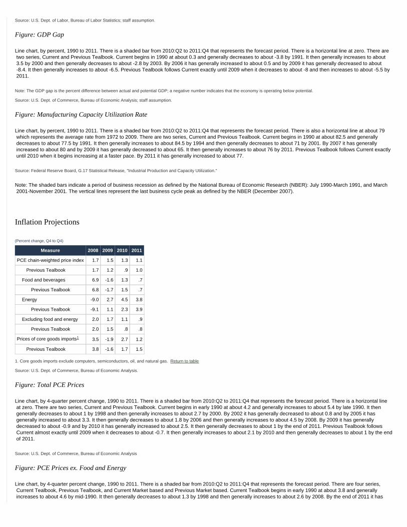
Figure: GDP Gap
Line chart, by percent, 1990 to 2011. There is a shaded bar from 2010:Q2 to 2011:Q4 that represents the forecast period. There is a horizontal line at zero. There are two series, Current and Previous Tealbook. Current begins in 1990 at about 0.3 and generally decreases to about -3.8 by 1991. It then generally increases to about 3.5 by 2000 and then generally decreases to about -2.8 by 2003. By 2006 it has generally increased to about 0.5 and by 2009 it has generally decreased to about -8.4. It then generally increases to about -6.5. Previous Tealbook follows Current exactly until 2009 when it decreases to about -8 and then increases to about -5.5 by 2011.
Note: The GDP gap is the percent difference between actual and potential GDP; a negative number indicates that the economy is operating below potential.
Source: U.S. Dept. of Commerce, Bureau of Economic Analysis; staff assumption.
Figure: Manufacturing Capacity Utilization Rate
Line chart, by percent, 1990 to 2011. There is a shaded bar from 2010:Q2 to 2011:Q4 that represents the forecast period. There is also a horizontal line at about 79 which represents the average rate from 1972 to 2009. There are two series, Current and Previous Tealbook. Current begins in 1990 at about 82.5 and generally decreases to about 77.5 by 1991. It then generally increases to about 84.5 by 1994 and then generally decreases to about 71 by 2001. By 2007 it has generally increased to about 80 and by 2009 it has generally decreased to about 65. It then generally increases to about 76 by 2011. Previous Tealbook follows Current exactly until 2010 when it begins increasing at a faster pace. By 2011 it has generally increased to about 77.
Source: Federal Reserve Board, G.17 Statistical Release, "Industrial Production and Capacity Utilization."
Note: The shaded bars indicate a period of business recession as defined by the National Bureau of Economic Research (NBER): July 1990-March 1991, and March 2001-November 2001. The vertical lines represent the last business cycle peak as defined by the NBER (December 2007).
Inflation Projections
(Percent change, Q4 to Q4)
Measure 2008 2009 2010 2011
PCE chain-weighted price index 1.7 1.5 1.3 1.1
Previous Tealbook 1.7 1.2 .9 1.0
Food and beverages 6.9 -1.6 1.3 .7
Previous Tealbook 6.8 -1.7 1.5 .7
Energy -9.0 2.7 4.5 3.8
Previous Tealbook -9.1 1.1 2.3 3.9
Excluding food and energy 2.0 1.7 1.1 .9
Previous Tealbook 2.0 1.5 .8 .8
Prices of core goods imports1 3.5 -1.9 2.7 1.2
Previous Tealbook 3.8 -1.6 1.7 1.5
1. Core goods imports exclude computers, semiconductors, oil, and natural gas. Return to table
Source: U.S. Dept. of Commerce, Bureau of Economic Analysis.
Figure: Total PCE Prices
Line chart, by 4-quarter percent change, 1990 to 2011. There is a shaded bar from 2010:Q2 to 2011:Q4 that represents the forecast period. There is a horizontal line at zero. There are two series, Current and Previous Tealbook. Current begins in early 1990 at about 4.2 and generally increases to about 5.4 by late 1990. It then generally decreases to about 1 by 1998 and then generally increases to about 2.7 by 2000. By 2002 it has generally decreased to about 0.8 and by 2005 it has generally increased to about 3.3. It then generally decreases to about 1.8 by 2006 and then generally increases to about 4.5 by 2008. By 2009 it has generally decreased to about -0.9 and by 2010 it has generally increased to about 2.5. It then generally decreases to about 1 by the end of 2011. Previous Tealbook follows Current almost exactly until 2009 when it decreases to about -0.7. It then generally increases to about 2.1 by 2010 and then generally decreases to about 1 by the end of 2011.
Source: U.S. Dept. of Commerce, Bureau of Economic Analysis
Figure: PCE Prices ex. Food and Energy
Line chart, by 4-quarter percent change, 1990 to 2011. There is a shaded bar from 2010:Q2 to 2011:Q4 that represents the forecast period. There are four series, Current Tealbook, Previous Tealbook, and Current Market based and Previous Market based. Current Tealbook begins in early 1990 at about 3.8 and generally increases to about 4.6 by mid-1990. It then generally decreases to about 1.3 by 1998 and then generally increases to about 2.6 by 2008. By the end of 2011 it has

generally decreased to about 0.95. Previous Tealbook follows Current Tealbook almost exactly until 2009 when it starts decreasing at a different rate. By the end of 2011 it has decreased to about 0.8. Current Market based begins in early 1990 at about 4.4 and generally increases to about 4.8 by mid-1990. It then generally decreases to about 0.9 by 1998 and then generally increases to about 1.9 by 2001. By 2003 it has generally decreased to about 1.3 and by 2008 it has generally increased to about 2.6. It then generally decreases to about 0.75 by the end of 2011. Previous Market based follows Current Market based almost exactly until 2010 when it starts declining at a faster rate. By the end of 2011 it has generally decreased to about 0.65.
Source: U.S. Dept. of Commerce, Bureau of Economic Analysis.
Figure: Compensation per Hour
Line chart, by 4-quarter percent change, 1990 to 2011. There is a shaded bar from 2010:Q2 to 2011:Q4 that represents the forecast period. There is a horizontal line at zero. There are four series, Current Productivity and Costs, Previous Productivity and Costs, Current Employment cost index and Previous Employment cost index. Current Productivity and Costs begins in early 1990 at about 4.4 and generally increases to about 7.25 by mid-1990. It then generally decreases to about 1 by 1995 and then generally increases to about 7 by 1998. By 1999 it has generally decreased to about 3 and by 2000 it has generally increased to about 8.8. It then generally decreases to about 2.5 by 2002 and then generally increases to about 5.9 by 2004. By 2009 it has generally decreased to about -0.1 and by early 2010 it has generally increased to about 3.9. It then generally decreases to about 0.8 by mid-2010 and then generally increases to about 2.1 by the end of 2011. Previous Productivity and Costs follows Current Productivity and Costs almost exactly until the end of 2007 when it begins declining at a different rate. By 2010 it has generally decreased to about 0.1 and by the end of 2011 it has generally increased to about 2.4. Current Employment cost index begins in 1990 at about 5.1 and generally decreases to about 2.5 by 1995. It then generally increases to about 4.7 by 2000 and then generally decreases to about 1.2 by 2009. By the end of 2011 it has generally increased to about 2. Previous Employment cost index follows Current Employment cost index exactly.
Source: U.S. Dept. of Labor, Bureau of Labor Statistics.
Figure: Long-Term Inflation Expectations
Line chart, by percent, 1990 to 2010. There are two series, Thomson Reuters/Michigan next 5 to 10 yrs. and SPF next 10 yrs. Thomson Reuters/Michigan begins in early 1990 at about 4 and generally increases to about 4.75 by mid-1990. It then generally decreases to about 2.65 by 1998. From 1998 to early 2005 it fluctuates between about 2.5 and 3.25. From early 2005 to late 2007 it fluctuates between about 2.9 and 3.3. It then generally increases to about 3.4 by 2008 and then generally decreases to about 2.9 by July 2010. SPF begins in early 1990 at about 3.99 and generally increases to about 4.2 by mid-1990. It then generally decreases to about 2.3 by early 1999 and then generally increases to about 2.5 by mid-1999. It remains relatively stable here at 2.5 until 2010:Q2.
Note: The Survey of Professional Forecasters (SPF) projection is for the CPI.
Source: Thomson Reuters/University of Michigan Surveys of Consumers; The Federal Reserve Bank of Philadelphia.
Note: The shaded bars indicate a period of business recession as defined by the National Bureau of Economic Research (NBER): July 1990-March 1991, and March 2001-November 2001. The vertical lines represent the last business cycle peak as defined by the NBER (December 2007).
The Long-Term Outlook
(Percent change, Q4 to Q4, except as noted)
Item 2010 2011 2012 2013 2014
Real GDP 2.7 3.6 4.8 5.0 4.6
Civilian unemployment rate1 9.7 8.9 7.6 6.2 5.3
PCE prices, total 1.3 1.1 1.0 1.2 1.4
Core PCE prices 1.1 .9 1.0 1.1 1.4
Federal funds rate1 .1 .1 .4 2.1 3.3
1. Percent, average for the final quarter of the period. Return to table
Figure: Real GDP
Line chart, by 4-quarter percent change, 2002 to 2014. There is a horizontal line at zero. There are two series, Real GDP and Potential GDP. Real GDP begins in 2002 at about 1.6 and generally increases to about 4.1 by 2004. It then generally decreases to about -4.1 by 2009 and then generally increases to about 5.05 by 2013. By the end of 2014 it has decreased to about 4.6. Potential GDP begins in 2002 at about 3.55 and generally decreases to about 2.1 by late 2004. It then generally increases to about 2.7 by late 2009 and then generally decreases to about 2.35 by late 2010. By the end of 2014 it has generally increased to about 2.72.
Figure: Unemployment Rate
Line chart, by percent, 2002 to 2014. There are two series, Unemployment rate and NAIRU. Unemployment rate begins in 2002 at about 5.7 and generally increases to about 6.1 by 2003. It then generally decreases to about 4.3 by late 2006 and then generally increases to about 10.05 by 2009. By the end of 2014 it has generally decreased to about 5.35. NAIRU begins in 2002 at about 5 and generally decreases to about 4.75 by 2008. It then generally increases to about 5.25 by 2009 and remains constant here until the end of 2014.

Figure: PCE Prices
Line chart, by 4-quarter percent change, 2002 to 2014. There are two series, PCE prices excluding food and energy and Total PCE prices. PCE prices excluding food and energy begins in early 2002 at about 1.5 and generally increases to about 2 by mid-2002. It then generally decreases to about 1.4 by 2003 and then generally increases to about 2.6 by 2008. By 2009 it has generally decreased to about 1.4 and by 2010 it has generally increased to about 1.75. It then generally decreases to about 0.9 by 2011 and generally increases to about 1.4 by the end of 2014. Total PCE prices begins in 2002 at about 0.75 and generally increases to about 3.25 by 2006. It then generally decreases to about 1.9 by 2007 and then generally increases to about 4.3 by 2008. By 2009 it has generally decreased to about -0.75 and by 2010 it has generally increased to about 2.35. It then generally decreases to about 1 by 2010 and generally increases to about 1.4 by the end of 2014.
Figure: Interest Rates
Line chart, by percent, 2002 to 2014. There are three series, Federal funds rate, 10-year Treasury and BBB corporate. Federal funds rate begins in 2002 at about 1.75 and generally decreases to about 1 by 2003. It then generally increases to about 5.25 by 2006 and then generally decreases to about 0.13 by late 2009. It remains relatively stable here until mid-2012. It then generally increases to about 3.4 by the end of 2014. 10-year Treasury begins in 2002 at about 5.4 and generally decreases to about 3.75 by 2003. It then generally increases to about 5.2 by 2006 and then generally decreases to about 3.1 by 2010. By the end of 2014 it has generally increased to about 4.5. BBB corporate begins in 2002 at about 7.6 and generally decreases to about 5.4 by 2004. It then generally increases to about 9.5 by 2008 and then generally decreases to about 5.1 by 2010. By the end of 2014 it has generally increased to about 6.
Note: In each panel, shading represents the projection period (2010:Q2 through 2014:Q4).
Evolution of the Staff Forecast
Figure: Change in Real GDP
Line chart, by percent, 2008 to 2010. Data are Q4 over Q4 and are plotted on the Tealbook publication dates. There is a horizontal line at zero. There are 3 series 2009, 2010 and 2011. 2009 begins on January 23, 2008 at about 2.1 and increases to about 3 by March 13, 2008. It then generally decreases to about -2.25 by March 12, 2009 and then generally increases to about 0.2 by August 4, 2010. 2010 begins on September 10, 2008 at about 2.75 and decreases to about 2.25 by October 22, 2008. It then increases to about 2.75 by January 22, 2009 and then decreases to about 1.5 by March 12, 2009. By January 20, 2010 it has generally increased to about 3.5 and by August 4, 2010 it has generally decreased to about 2.75. 2011 begins on September 16, 2009 at about 4.5 and generally increases to about 4.75 by January 20, 2010. It then generally decreases to about 3.65 by August 4, 2010.
Figure: Unemployment Rate
Line chart, by percent, 2008 to 2010. Data are from the fourth quarter and are plotted on the Tealbook publication dates. There are three series, 2009, 2010 and 2011. 2009 begins on January 23, 2008 at about 5.2 and generally increases to about 10 by October 29, 2009. It remains relatively stable here until August 4, 2010. 2010 begins on September 10, 2008 at about 5.8 and generally increases to about 9.5 by March 12, 2009. It then decreases to about 9 by April 22, 2009 and then increases to about 9.7 by June 17, 2009. By September 16, 2009 it has decreased to about 9.2 and by December 9, 2009 it has increased to about 9.6. It then decreases to about 9.3 by April 21, 2010 and then increases to about 9.75 by August 4, 2010. 2011 begins on September 16, 2009 at about 7.75 and generally increases to about 8.9 by August 4, 2010.
Figure: Change in PCE Prices excluding Food and Energy
Line chart, by percent 2008 to 2010. Data are Q4 over Q4 and are plotted on the Tealbook publication dates. There are three series, 2009, 2010, and 2011. 2009 begins on January 23, 2008 at about 1.9 and generally increases to about 2.2 by June 18, 2008. It then generally decreases to about 1 by March 12, 2008 and then generally increases to about 1.4 by June 17, 2009. It remains constant here at 1.4 until October 29, 2009. It then increases to about 1.5 by December 9, 2009 and remains constant here until June 16, 2010. By August 4, 2010 it has increased to about 1.7. 2010 begins on September 10, 2008 at about 1.9 and generally decreases to about 0.5 by March 12, 2009. It then generally increases to about 1.2 by December 9, 2009 and then generally decreases to about 0.75 by June 16, 2010. By August 4, 2010 it has generally increased to about 1.1. 2011 begins on September 16, 2009 at about 1 and generally increases to about 1.1 by December 9, 2009. It then generally decreases to about 0.75 by June 16, 2010 and then increases to about 0.9 by August 4, 2010.
Note: Because the core PCE price index was redefined as part of the comprehensive revisions to the NIPA, projections prior to the August 2009 Tealbook are not strictly comparable with more recent projections.
Appendix: Annual Revision of the National Income and Product Accounts
Annual Revision to the National Income and Product Accounts
Figure: Real GDP
Line chart, by billions of chained (2005) dollars, 2005 to 2010. There are two series, Revised (through 2010:Q2) and Previous (through 2010:Q1). Revised begins in 2005:Q1 at about 12530 and generally increases to about 13375 by 2007:Q4. It then generally decreases to about 12800 by 2009:Q2 and then generally increases to

about 13210 by 2010:Q2. Previous begins in 2005:Q1 at about 12530 and generally increases to about 13410 by 2008:Q2. It then generally decreases to about 12900 by 2009:Q2 and then generally increases to about 13240 by 2010:Q1.
Figure: Real Personal Consumption Expenditures
Line chart, by 4-quarter percent change, 2005 to 2010. There is a horizontal line at zero. There are two series, Revised (through 2010:Q2) and Previous (through 2010:Q1). Revised begins in 2005:Q1 at about 3.3 and then increases to about 3.8 by 2005:Q2. It then generally decreases to about 2.5 by 2006:Q3 and then increases to about 3.4 by 2006:Q4. By 2009:Q2 it has generally decreased to about -2.3 and by 2010:Q2 it has generally increased to about 1.6. Previous begins in 2005:Q1 at about 3.3 and then increases to about 3.8 by 2005:Q2. It then generally decreases to about 2.5 by 2006:Q3 and then increases to about 3.4 by 2006:Q4. By 2008:Q4 it has generally decreased to about -1.75 and by 2010:Q1 it generally increases to about 1.6.
Figure: Total PCE Prices
Line chart, 4-quarter percent change, 2005 to 2010. There is a horizontal line at zero. There are two series, Revised (through 2010:Q2) and Previous (through 2010:Q1). Revised begins in 2005:Q1 at about 2.8 and decreases to about 2.7 by 2005:Q2. It then generally increases to about 3.3 by 2005:Q4 and then generally decreases to about 1.9 by 2006:Q4. By 2008:Q3 it has generally increased to about 4.4 and by 2009:Q3 it has generally decreased to about -0.75. It then generally increases to about 2.4 by 2010:Q1 and then decreases to about 2 by 2010:Q2. Previous follows Revised almost exactly until 2009:Q4 when it starts increasing at a slower rate. By 2010:Q1 it has increased to about 2.
Figure: PCE Prices Ex. Food and Energy
Line chart, by 4-quarter percent change, 2005 to 2010. There are two series, Revised (through 2010:Q2) and Previous (through 2010:Q1). Revised begins in 2005:Q1 at about 2.35. From 2005:Q1 to 2008:Q3 it fluctuates between about 2.2 and 2.5. It then generally decreases to about 1.3 by 2009:Q3 and then generally increases to about 1.8 by 2010:Q1. By 2010:Q2 it has decreased to about 1.5. Previous begins in 2005:Q1 at about 2.35. From 2005:Q1 to 2008:Q3 it fluctuates between about 2.2 and 2.6. It then generally decreases to about 1.25 by 2009:Q3 and then generally increases to about 1.5 by 2009:Q4. By 2010:Q1 it has decreased to about 1.4.
Figure: Market-Based PCE Prices Ex. Food and Energy
Line chart, by 4-quarter percent change, 2005 to 2010. There are two series, Revised (through 2010:Q2) and Previous (through 2010:Q1). Revised begins in 2005:Q1 at about 2.0 and generally increases to about 2.5 by 2006:Q3. It then generally decreases to about 1.8 by 2007:Q3 and then generally increases to about 2.6 by 2008:Q3. By 2010:Q2 it has generally decreased to about 1.1. Previous follows Revised almost exactly until 2008:Q4 when it begins decreasing at a different rate. By 2010:Q1 it has generally decreased to about 1.25.
Figure: Real DPI
Line chart, by 4-quarter percent change, 2005 to 2010. There is a horizontal line at zero. There are two series, Revised (through 2010:Q2) and Previous (through 2010:Q1). Revised begins in 2005:Q1 at about 1.8 and generally decreases to about 0.5 by 2005:Q4. It then generally increases to about 4.7 by 2006:Q4 and then generally decreases to about 1.3 by 2008:Q1. By 2008:Q2 it has increased to about 3.75 and by 2009:Q2 it has generally decreased to about -0.02. It then generally increases to about 1.1 by 2009:Q3 and then generally decreases to about 0.3 by 2010:Q3. Previous begins in 2005:Q1 at about 1.8 and generally decreases to about 0.5 by 2005:Q4. It then generally increases to about 4.7 by 2006:Q4 and then generally decreases to about 0 by 2008:Q1. By 2008:Q2 it has increased to about 2.2 and by 2008:Q3 it has generally decreased to about -0.5. It then generally increases to about 1.05 by 2010:Q1.
Figure: Personal Saving Rate
Line chart, by percent, 2005 to 2010. There is a horizontal line at zero. There are two series, Revised (through 2010:Q2) and Previous (through 2010:Q1). Revised begins in 2005:Q1 at about 1.6 and generally decreases to about 1.1 by 2005:Q3. It then generally increases to about 2.5 by 2006:Q2 and then generally decreases to about 1.8 by 2007:Q3. By 2008:Q2 it has generally increased to about 5 and by 2008:Q3 it has decreased to about 3.5. It then generally increases to about 7.3 by 2009:Q2 and then generally decreases to about 5.5 by 2010:Q1. By 2010:Q2 it has generally increased to about 6.1. Previous begins in 2005:Q1 at about 1.6 and generally decreases to about 1.1 by 2005:Q3. It then generally increases to about 2.5 by 2006:Q2 and then generally decreases to about 1.1 by 2008:Q1. By 2008:Q2 it has generally increased to about 3.4 and by 2008:Q3 it has decreased to about 2.1. It then generally increases to about 5.3 by 2009:Q2 and then generally decreases to about 3.4 by 2010:Q1.
Figure: Profits as a Share of GNP
Line chart, by percent, 2005 to 2010. There are two series, Revised (through 2010:Q1) and Previous (through 2010:Q1). Revised begins in 2005:Q1 at about 11.3 and generally increases to about 12.3 by 2006:Q3. It then generally decreases to about 6.8 by 2008:Q4 and then generally increases to about 10.75 by 2010:Q1. Previous begins in 2005:Q1 at about 11.3 and generally increases to about 12.3 by 2006:Q3. It then generally decreases to about 7.75 by 2008:Q4 and then generally increases to about 10.8 by 2010:Q1.

Figure: Productivity (Nonfarm Business Sector)
Line chart, by four-quarter percent change, 2005 to 2010. There is a horizontal line at zero. There are two series, Revised (through 2010:Q2) and Previous (through 2010:Q1). Revised begins in 2005:Q1 at about 2.35 and generally decreases to about 1.05 by 2005:Q2. It then generally increases to about 1.8 by 2005:Q3 and then generally decreases to about 0.2 by 2006:Q3. By 2007:Q4 it has generally increased to about 2.7 and by 2008:Q4 it has generally decreased to about -0.4. It then generally increases to about 6.3 by 2010:Q1 and by 2010:Q2 it has decreased to about 4. Previous begins in 2005:Q1 at about 2.35 and generally decreases to about 1.05 by 2005:Q2. It then generally increases to about 1.8 by 2005:Q3 and then generally decreases to about 0.2 by 2006:Q3. By 2007:Q3 it has generally increased to about 2.9 and by 2008:Q4 it has generally decreased to about 1.4. It then generally increases to about 6 by 2010:Q1.
Note: Data are staff estimates.
Figure: Compensation per Hour (Nonfarm Business Sector)
Line chart, by four-quarter percent change, 2005 to 2010. There is a horizontal line at zero. There are two series, Revised (through 2010:Q2) and Previous (through 2010:Q1). Revised begins in 2005:Q1 at about 4.7 and generally decreases to about 3.5 by 2005:Q4. It then generally increases to about 4.2 by 2006:Q1 and then generally decreases to about 2.7 by 2006:Q3. By 2006:Q4 it has increased to about 4.6 and by 2009:Q1 it has generally decreased to about 0.05. It then generally increases to about 3.7 by 2010:Q1 and then generally decreases to about 1.2 by 2010:Q2. Previous begins in 2005:Q1 at about 4.7 and generally decreases to about 3.5 by 2005:Q4. It then generally increases to about 4.2 by 2006:Q1 and then generally decreases to about 2.7 by 2006:Q3. By 2006:Q4 it has increased to about 4.6 and by 2009:Q1 it has generally decreased to about 1.75. It then generally increases to about 3.4 by 2009:Q2 and then generally decreases to about 0.2 by 2009:Q4. By 2010:Q1 it has generally increased to about 1.7.
Note: Data are staff estimates.
Figure: Unit Labor Costs (Nonfarm Business Sector)
Line chart, by four-quarter percent change, 2005 to 2010. There is a horizontal line at zero. There are two series, Revised (through 2010:Q2) and Previous (through 2010:Q1). Revised begins in 2005:Q1 at about 2.4 and generally increases to about 2.8 by 2005:Q2. It then generally decreases to about 2 by 2005:Q3 and then generally increases to about 4 by 2007:Q1. By 2007:Q4 it has generally decreased to about 0.9 and by 2008:Q3 it has generally increased to about 3.2. It then generally decreases to about -3.5 by 2009:Q4 and then generally increases to about -2.8 by 2010:Q2. Previous begins in 2005:Q1 at about 2.4 and generally increases to about 2.8 by 2005:Q2. It then generally decreases to about 2 by 2005:Q3 and then generally increases to about 4 by 2007:Q1. By 2008:Q2 it has generally decreased to about 0 and by 2008:Q3 it has generally increased to about 2. It then generally decreases to about -5.2 by 2009:Q4 and then generally increases to about -4.2by 2010:Q1.
Note: Data are staff estimates.
† Note: Data values for figures are rounded and may not sum to totals. Return to text
Last update: January 29, 2016

Accessible Material
August 2010 Tealbook Book A Tables and Charts†
International Economic Developments and Outlook
Summary of Staff Projections
(Percent change from end of previous period, annual rate)
Indicator 2009
2010 Projection
Q12010
2011Q2 H2
Foreign output .4 4.8 4.7 3.2 3.4
June TB .4 4.9 4.3 3.3 3.3
Foreign CPI 1.2 3.4 1.3 2.0 2.2
June TB 1.2 3.4 2.0 1.9 2.2
Recent Foreign Indicators
Figure: Nominal Exports
Line chart, by scale where January 2006 = 100, 2006 to 2010. There is a horizontal line at 100. There are three series, Foreign, AFE, and EME. Foreign begins in early 2006 at about 100 and generally increases to about 132.5 by mid-2008. It then generally decreases to about 83 by early 2009 and then generally increases to about 107.5 by mid-2010. AFE begins in early 2006 at about 100 and generally increases to about 139 by mid-2008. It then generally decreases to about 83 by early 2009 and then generally increases to about 105 by mid-2010. EME begins in early 2006 at about 100 and generally increases to about 109 by late 2006. It then generally decreases to about 101 by early 2007 and then generally increases to about 121 by mid-2008. By early 2009 it has generally decreased to about 80 and by mid-2010 it has generally increased to about 107.
Note: EME excludes Venezuela.
Figure: Industrial Production
Line chart, by scale where January 2006 = 100, 2006 to 2010. There is a horizontal line at 100. There are three series, Foreign, AFE and EME. Foreign begins in early 2006 at about 100 and generally increases to about 107.5 by early 2008. It then generally decreases to about 92 by early 2009 and then generally increases to about 103 by mid-2010. AFE begins in early 2006 at about 100 and generally increases to about 103 by mid-2007. It then generally decreases to about 83.5 by early 2009 and then generally increases to about 91 by mid-2010. EME begins in early 2006 at about 100 and generally increases to about 114 by early 2008. It then generally decreases to about 100.5 by early 2009 and then generally increases to about 120 by mid-2010.
Note: AFE excludes Australia and Switzerland. EME excludes Chile.
Figure: Retail Sales
Line chart, by 12-month percent change, 2006 to 2010. There is a horizontal line at zero. There are three series, Foreign, AFE and EME. Foreign begins in early 2006 at about 3.5 and generally increases to about 5.5 by mid-2007. It then generally decreases to about -2.7 by early 2009 and then generally increases to about 4 by mid-2010. AFE begins in early 2006 at about 2.8 and generally increases to about 5 by the end of 2006. It then generally decreases to about -4.5 by early 2009 and then generally increases to about 4.8 by early 2010. By mid-2010 it has generally decreased to about 2. EME begins in early 2006 at about 7 and generally decreases to about 4 within a month or so. It then generally increases to about 10 by early 2007 and then generally decreases to about 2.5 by early 2009. By early 2010 it has generally increased to about 10 and by mid-2010 it has generally decreased to about 6.
Note: AFE excludes Australia and Switzerland. EME includes Brazil, China, Israel, Korea, Singapore, Taiwan, and Venezuela.
Figure: Employment
Line chart, by 4-quarter percent change, 2006 to 2010. There is a horizontal line at zero. There are three series, Foreign, AFE and EME. Foreign begins in early 2006 at about 1.9. From early 2006 to mid-2007 it fluctuates between about 1.9 and 2.1. It then generally increases to about 2.3 by late 2007 and then generally decreases to about -1.1 by mid-2009. By early 2010 it has generally increased to about 0.4. AFE begins in early 2006 at about 1.4 and generally increases to about 1.9 by late 2007. It then generally decreases to about -1.9 by mid-2009 and then generally increases to about -0.4 by early 2010. EME begins in early 2006 at about 2.7 and generally decreases to about 2.05 by mid-2007. It then generally increases to about 3 by late 2007 and then generally decreases to about -0.05 by mid-2009. By early 2010 it has generally increased to about 1.9.

Note: EME excludes China and Chile.
Figure: Consumer Prices: Advanced Foreign Economies
Line chart, by 12-month percent change, 2006 to 2010. There is a horizontal line at zero. There are two series, Headline and Core. Headline begins in early 2006 at about 2.03 and generally decreases to about 1.05 by late 2006. It then generally increases to about 3.5 by mid-2008 and then generally decreases to about -1 by mid-2009. By mid-2010 it has generally increased to about 1. Core begins in early 2006 at about 0.9 and generally increases to about 1.5 by mid-2007. It then generally decreases to about 0.9 by early 2008 and then generally increases to about 1.3 by late 2008. By mid-2010 it has generally decreased to about 0.6.
Note: Excludes Australia, Sweden, and Switzerland. Core is a staff calculation that excludes all food and energy.
Source: Haver Analytics and CEIC.
Figure: Consumer Prices: Emerging Market Economies
Line chart, by 12-month percent change, 2006 to 2010. There is a horizontal line at zero. There are three series, Headline, Excluding food - East Asia and Excluding food - Latin America. Headline begins in early 2006 at about 2.5. From early 2006 to early 2007 it fluctuates between about 1.25 and 2.7. It then generally increases to about 7 by mid-2008 and then generally decreases to about 0.25 by mid-2009. By mid-2010 it has generally increased to about 3.5. Excluding food - East Asia begins in early 2006 at about 2.4 and generally decreases to about 1.5 by early 2007. It then generally increases to about 4.2 by mid-2008 and then generally decreases to about -2.2 by mid-2009. By mid-2010 it has generally increased to about 2. Excluding food - Latin America begins in early 2006 at about 4.25 and generally decreases to about 3.2 by early 2007. It then generally increases to about 5.5 by late 2008 and then generally decreases to about 3.9 by late 2009. By mid-2010 it has generally increased to about 4.75.
The Foreign Outlook
Total Foreign
Figure: Real GDP
Line chart, by percent change, 2007 to 2011. Data are annual rates. There is a horizontal line at zero. The period from 2009:Q4 to 2011:Q4 is shaded to indicate forecast data. There are two series, Current Tealbook and Last Tealbook. Current Tealbook begins in early 2007 at about 5 and generally decreases to about -9.5 by early 2009. It then generally increases to about 5 by late 2009 and then generally decreases to about 3 by mid-2010. It remains relatively stable here at 3 until the end of 2011. Last Tealbook follows Current Tealbook almost exactly.
Figure: CPI
Line chart, by percent change, 2007 to 2011. Data are annual rates. There is a horizontal line at zero. The period from 2010:Q2 to 2011:Q4 is shaded to indicate forecast data. There are two series, Current Tealbook and Last Tealbook. Current Tealbook begins in early 2007 at about 3.2 and generally increases to about 5.3 by early 2008. It then generally decreases to about -0.7 by early 2009 and then generally increases to about 3.5 by early 2010. By mid-2010 it has generally decreased to about 1.3 and by late 2011 it has generally increased to about 2.1. Previous Tealbook begins in early 2007 at about 3.2 and generally increases to about 5.3 by early 2008. It then generally decreases to about -0.7 by early 2009 and then generally increases to about 3.5 by early 2010. By mid-2010 it has generally decreased to about 1.9 and by late 2011 it has generally increased to about 2.1.
Advanced Foreign Economies
Figure: Real GDP
Line chart, by percent change, 2007 to 2011. Data are annual rates. There is a horizontal line at zero. The period from 2010:Q1 to 2011:Q4 is shaded to indicate forecast data. There are two series, Current Tealbook and Last Tealbook. Current Tealbook begins in early 2007 at about 3.3 and generally decreases to about -9 by early 2009. It then generally increases to about 3.7 by early 2010. It then generally decreases to about 2.5 by mid-2010 and remains relatively constant here until late 2011. Last Tealbook follows Current Tealbook almost exactly.
Figure: CPI
Line chart, by percent change, 2007 to 2011. Data are annual rates. There is a horizontal line at zero. The period from 2010:Q2 to 2011:Q4 is shaded to indicate forecast data. There are two series, Current Tealbook and Last Tealbook. Current Tealbook begins in early 2007 at about 2.5 and generally decreases to about 0.6 by mid-2007. It then generally increases to about 3.6 by late 2007 and then generally decreases to about 2.8 by early 2008. By mid-2008 it has increased to about 3.6 and by late 2008 it has decreased to about -1.9. It then generally increases to about 2.1 by late 2009 and then generally decreases to about 0.05 by mid-2010. By late 2011 it has generally increased to about 1.2. Last Tealbook begins in early 2007 at about 2.5 and generally decreases to about 0.6 by mid-2007. It then generally increases to about 3.6 by late 2007 and then generally decreases to about 2.8 by early 2008. By mid-2008 it has increased to about 3.6 and by late 2008 it has decreased to about -1.9. It then generally increases to about 2.1 by late 2009 and then generally decreases to about 0.4 by mid-2010. By late 2011 it has generally

increased to about 1.2.
Emerging Market Economies
Figure: Real GDP
Line chart, by percent change, 2007 to 2011. Data are annual rates. There is a horizontal line at zero. The period from 2009:Q4 to 2011:Q4 is shaded to indicate forecast data. There are two series, Current Tealbook and Last Tealbook. Current Tealbook begins in early 2007 at about 7.5 and generally decreases to about -11 by early 2009. It then generally increases to about 9 by mid-2009 and then generally decreases to about 4 by mid-2010. By late 2011 it has generally increased to about 4.8. Last Tealbook follows Current Tealbook almost exactly.
Figure: CPI
Line chart, by percent change, 2007 to 2011. Data are annual rates. There is a horizontal line at zero. The period from 2010:Q2 to 2011:Q4 is shaded to indicate forecast data. There are two series, Current Tealbook and Last Tealbook. Current Tealbook begins in early 2007 at about 3.8 and generally increases to about 7.6 by early 2008. It then generally decreases to about -0.05 by early 2009 and then generally increases to about 4.7 by early 2010. By mid-2010 it has generally decreased to about 2.5 and by late 2010 it has generally increased to about 3. It remains here at 3 until the end of 2011. Previous Tealbook begins in early 2007 at about 3.8 and generally increases to about 7.6 by early 2008. It then generally decreases to about -0.05 by early 2009 and then generally increases to about 4.7 by early 2010. By mid-2010 it has generally decreased to about 2.8 and by late 2010 it has generally increased to about 3. It remains here at 3 until the end of 2011.
Staff Projections for Advanced Foreign Economies
(Percent change from end of previous period, annual rate)
Indicator 2009
2010 Projection
Q12010
2011Q2 H2
Real GDP -1.4 3.6 3.3 2.4 2.3
June TB -1.5 3.6 3.1 2.3 2.3
CPI .2 2.1 .1 1.0 1.3
June TB .2 2.1 1.1 .7 1.3
Staff Projections for Emerging Market Economies
(Percent change from end of previous period, annual rate)
Indicator 2009
2010 Projection
Q12010
2011Q2 H2
Real GDP 2.8 6.4 6.4 4.2 4.7
June TB 2.7 6.5 5.7 4.6 4.6
CPI 2.2 4.7 2.4 2.9 3.0
June TB 2.2 4.6 2.9 3.0 3.0
[Box:] Can Fiscal Consolidation Be Stimulative?
Ireland's Fiscal Consolidation (1987-89)
Figure: General Government Gross Debt
Line chart, by percent of GDP, 1982 to 1991. The period from the beginning of 1987 to the end of 1989 is shaded. The series begins in 1982 at about 91 and generally increases to about 123 by 1987. It then generally decreases to about 93 by 1990 and then generally increases to about 94.5 by 1991.

Figure: Government Deficit
Line chart, by percent of GDP, 1982 to 1991. The period from the beginning of 1987 to the end of 1989 is shaded. The series begins in 1982 at about -13.2 and generally increases to about -9.5 by 1984. It then generally decreases to about -10.8 by 1985. By 1989 it has generally increased to about -2.5 and by 1991 it has generally decreased to about -2.8.
Figure: Government Bond Spread
Line chart, by percentage points, 1982 to 1991. The period from the beginning of 1987 to the end of 1989 is shaded. There is a horizontal line at zero. The series begins in 1982 at about 8.8 and generally decreases to about 4.8 by 1983. It then generally increases to about 8 by late 1984 and then generally decreases to about 2.8 by early 1986. By late 1986 it has generally increased to about 7.4 and by 1991 it has generally decreased to about 0.7.
Note: Spread relative to German 10-year government bond yield.
Figure: Public Finance Components
Line chart, by percent of GDP, 1982 to 1991. The period from the beginning of 1987 to the end of 1989 is shaded. There are two series, Government expenditure and Tax revenue. Government expenditure begins in 1982 at about 57 and generally decreases to about 53 by 1984. It then generally increases to about 54 by 1985 and then generally decreases to about 42.5 by 1989. By 1991 it has generally increased to about 44.5. Tax revenue begins in 1982 at about 44 and generally increases to about 44.8 by 1983. It then generally decreases to about 42.5 by 1986 and then generally increases to about 44 by 1988. By 1989 it has generally decreased to about 40 and by 1991 it has generally increased to about 42.
Figure: GDP
Line chart, by 4-quarter percent change, 1982 to 1991. The period from the beginning of 1987 to the end of 1989 is shaded. There is a horizontal line at zero. The series begins in 1982 at about 2.8 and generally decreases to about -0.8 by 1983. It then generally increases to about 5 by 1984 and then generally decreases to about -1.1 by 1986. By 1987 it has generally increased to about 5.8 and by 1989 it has generally decreased to about 4.9. It then generally increases to about 9.5 by 1990 and then generally decreases to about 1.7 by 1991.
Figure: Consumption and Investment
Line chart, by 4-quarter percent change, 1982 to 1991. There is a horizontal line at zero. The period from the beginning of 1987 to the end of 1989 is shaded. There are two series, Private investment and Private consumption. Private investment begins in 1982 at about -5.5 and generally decreases to about -12.5 by 1983. It then generally increases to about -1 by 1984 and then generally decreases to about -12.5 by 1985. By 1988 it has generally increased to about 13 and by 1989 it has generally decreased to about 9. It then generally increases to about 17 by 1990 and then generally decreases to about -10 by 1991. Private consumption begins in 1982 at about -8 and generally increases to about 3 by 1983. It then generally decreases to about 1.5 by 1984 and then generally increases to about 5 by 1985. By 1986 it has generally decreased to about 1.5 and by 1989 it has generally increased to about 7.5. It then generally decreases to about 0.5 by 1990 and then generally increases to about 1.5 by 1991.
Source: OECD and Haver Analytics.
Developments in Global Trade
Real Global GDP, Trade, and Industrial Production
Figure: Levels
Line chart, by scale where 2008:Q1 = 100, 2000 to 2010. There are three series, GDP, Merchandise Trade (the average of imports and exports), and Industrial Production. GDP begins in 2000 at about 79 and generally increases to about 100 by 2008. It then generally decreases to about 97 by 2009 and then generally increases to about 102 by 2010. Merchandise Trade begins in 2000 at about 59 and generally increases to about 65 by early 2001. It then generally decreases to about 60 by late 2001 and then generally increases to about 102 by 2008. By 2009 it has generally decreased to about 80.5 and by 2010 it has generally increased to about 98.5. Industrial Production begins in early 2000 at about 73 and generally increases to about 76 by late 2000. It then generally decreases to about 73.5 by 2001 and then generally increases to about 100 by 2008. By 2009 it has generally decreased to about 88 and by 2010 it has generally increased to about 100.5.
Source: For GDP, staff estimate. For Merchandise Trade and Industrial Production, Netherlands Bureau for Economic Policy Analysis.
Figure: Growth

Line chart, by percent change over the previous year, 2000 to 2010. There is a horizontal line at zero. There are three series, GDP, Merchandise Trade, and Industrial Production. GDP begins in 2000 at about 4 and generally decreases to about 0.5 by 2001. It then generally increases to about 4 by 2008 and then generally decreases to about -3 by 2009. By 2010 it has generally increased to about 4.8. Merchandise Trade begins in early 2000 at about 12.5 and generally increases to about 16.5 by mid-2000. It then generally decreases to about -7.5 by late 2001 and then generally increases to about 9 by late 2002. By 2003 it has generally decreased to about 3 and by 2004 it has generally increased to about 14.5. It then generally decreases to about -19.5 by 2009 and then generally increases to about 22.5 by 2010. Industrial Production begins in early 2000 at about 5 and generally increases to about 7.5 by mid-2000. It then generally decreases to about -4 by late 2001 and then generally increases to about 5.5 by early 2003. By mid-2003 it generally decreases to about 2 and by mid-2004 it generally increases to about 7. It then generally decreases to about 3 by early 2005 and then generally increases to about 7.5 by 2007. By 2009 it has generally decreased to about -12 and by 2010 it has generally increased to about 12.
Figure: Shipping Prices
Line chart, by scale where January 2004 = 100, 2004 to 2010. Data are weekly. There are two series, Baltic Dry Index and Harpex Index. Baltic Dry Index begins in early 2004 at about 90 and generally decreases to about 50 by mid-2004. It then generally increases to about 120 by late 2004 and then generally decreases to about 35 by mid-2005. By late 2007 it has generally increased to about 212 and by early 2008 it has generally decreased to about 107. It then generally increases to about 225 by mid-2008 and then generally decreases to about 12 by late 2008. By late 2009 it has generally increased to about 93 and by mid-2010 it has generally decreased to about 37. Harpex Index begins in 2004 at about 96 and generally increases to about 195 by 2005. It then generally decreases to about 89 by late 2006 and then generally increases to about 127 by early 2008. By late 2009 it has generally decreased to about 27 and by mid-2010 it has generally increased to about 63.
Source: For Baltic Dry Index, Baltic Exchange. For Harpex Index, Harper Petersen.
Figure: Nominal Merchandise Trade Balances
Line chart, by billions of U.S. dollars, annual rate, 2000 to 2010. Data are 3-month moving averages. There is a horizontal line at zero. There are four series, China, Japan, Euro area, and United States. China begins in 2000 at about 25. From 2000 to late 2003 it fluctuates between about 0 and 60. It then generally decreases to about -25 by early 2004 and then generally increases to about 430 by 2009. By early 2010 it has generally decreased to about 60 and by mid-2010 it has generally increased to about 240. Japan begins in 2000 at about 120 and generally decreases to about 40 by 2001. It then generally increases to about 125 by 2004 and then generally decreases to about 50 by 2006. By 2007 it has generally increased to about 120 and by 2009 it has generally decreased to about -50. It then generally increases to about 60 by 2010. Euro area begins in early 2000 at about -10 and generally decreases to about -30 by late 2000. It then generally increases to about 120 by 2004 and then generally decreases to about -75 by early 2006. By late 2006 it has generally increased to about 50 and by 2008 it has generally decreased to about -150. It then generally increases to about 60 by 2009 and then generally decreases to about -10 by mid-2010. United States begins in early 2000 at about -375 and generally decreases to about -460 by late 2000. It then generally increases to about -390 by 2002 and then generally decreases to about -900 by 2008. By 2009 it has generally increased to about -460 and by mid-2010 it has generally decreased to about -630.
Source: Haver.
Evolution of Staff's International Forecast
Figure: Total Foreign GDP
Line chart, by percent change, Q4 over Q4, January 23, 2008 to August 4, 2010. The x-axis is Tealbook publication dates. There is a horizontal line at zero. There are three series, 2009, 2010 and 2011. 2009 begins on January 23, 2008 at about 3.3 and generally increases to about 3.7 by March 13, 2008. It then generally decreases to about -2.2 by March 12, 2009 and then generally increases to about 0.4 by August 4, 2010. 2010 begins on September 10, 2008 at about 3.7 and generally decreases to about 2.2 by March 12, 2009. It then generally increases to about 4 by August 4, 2010. 2011 begins on September 16, 2009 at about 4 and remains relatively stable here until January 20, 2010. It then generally decreases to about 3.4 by August 4, 2010.
Figure: Total Foreign CPI
Line chart, by percent change, Q4 over Q4, January 23, 2008 to August 4, 2010. The x-axis is Tealbook publication dates. There is a horizontal line at zero. There are three series, 2009, 2010 and 2011. 2009 begins on January 23, 2008 at about 2.4 and generally increases to about 2.75 by July 30, 2008. It then generally decreases to about 0.6 by March 12, 2009 and then generally increases to about 1.1 by June 17, 2009. By August 6, 2009 it has generally decreased to about 0.9 and by August 4, 2010 it has generally increased to about 1.15. 2010 begins on September 10, 2008 at about 2.35 and generally decreases to about 1.6 by March 12, 2009. It then generally increases to about 2.6 by April 21, 2010 and then generally decreases to about 2.1 by August 4, 2010. 2011 begins on September 16, 2009 at about 1.75 and generally increases to about 2.1 by August 4, 2010.
Figure: U.S. Current Account Balance
Line chart, by percent of GDP, January 23, 2008 to August 4, 2010. The x-axis is Tealbook publication dates. There is a horizontal line at zero. There are three series, 2009, 2010 and 2011. 2009 begins on January 23, 2008 at about -4.6 and generally increases to about -3.8 by April 23, 2008. It then generally decreases to about -4.3 by June 18, 2008 and then generally increases to about -3 by December 10, 2008. By March 12, 2009 it has generally decreased to about -3.75 and by September 16, 2009 it has generally increased to about -3. From September 16, 2009 to August 4, 2010 it fluctuates between about -3.25 and -2.8. It ends at about -2.8 on August 4, 2010. 2010 begins on September 10, 2008 at about -3.4 and generally decreases to about -4.2 by March 12, 2009. It then generally increases to about -3 by October 29, 2009. From October 29, 2009 to August 4, 2010 it fluctuates between about -3.25 and -3. It ends at -3 on August 4, 2010. 2011 begins on September 16, 2009 at about -3.1 and generally increases to about -2.9 by October 29, 2009. It then generally decreases to about -3.25 by June 16, 2010 and then generally increases to about -3 by August 4, 2010.

† Note: Data values for figures are rounded and may not sum to totals. Return to text
Last update: January 29, 2016

Accessible Material
August 2010 Tealbook Book A Tables and Charts†
Financial Developments
Policy Expectations and Treasury Yields
Figure: Implied Federal Funds Rate
Line chart, by percent, 2010:Q3 to 2012:Q4. There are four series, "Mean: August 3, 2010", "Mean: June 22, 2010", "Mode: August 3, 2010" and "Mode: June 22, 2010". "Mean: August 3, 2010" begins in 2010:Q3 at about 0.2 and generally decreases to about 0.1 by 2011:Q1. It then generally increases to about 1 by 2012:Q4. "Mean: June 22, 2010" begins in 2010:Q3 at about 0.22 and remains relatively stable here until 2011:Q1. It then generally increases to about 1.5 by 2012:Q4. "Mode: August 3, 2010" begins in 2010:Q3 at about 0.2 and generally decreases to about 0.08 by 2011:Q2. It then generally increases to about 0.25 by 2012:Q4. "Mode: June 22, 2010" begins in 2010:Q3 at about 0.21 and generally decreases to about 0.1 by 2011:Q1. It then generally increases to about 0.65 by 2012:Q4.
Note: Mean is estimated from federal funds and Eurodollar futures. Mode is estimated from distribution of federal funds rate implied by interest rate caps. Both include an allowance for term premiums and other adjustments.
Source: Bloomberg and CME Group.
Figure: Implied Expectation of Quarter of First Rate Increase from the Desk's Dealer Survey
Bar chart, by percent, 2010:Q3 to 2012:Q3 or later. There are 2 series "Recent: 18 respondents" and "Last FOMC: 18 respondents". "Recent: 18 respondents" begins in 2010:Q3 at about 0.05 and increases to about 18 by 2011:Q3. It then decreases to about 9 by 2012:Q2 and then increases to about 12 by 2012:Q3 or later. "Last FOMC: 18 respondents" begins in 2010:Q3 at about 2 and increases to about 26 by 2011:Q1. It then decreases to about 4 by 2012:Q1 and then increases to about 6 by 2012:Q2.
Note: For the last FOMC, the probability reported in the 2012:Q2 bin corresponds to the probability that the first policy rate hike will occur in 2012:Q2 or later.
Figure: Interest Rates
Line chart, by percent, June 21, 2010 to August 3, 2010. There's a label on June 23 representing the June FOMC, on June 29 representing the Consumer confidence report, on July 2 representing the June employment report, on July 14 representing the FOMC minutes release, on July 16 representing the CPI report and the Michigan Survey, and on July 21 representing the Chairman's testimony. There are two series, June 2011 Eurodollar and 10-year Treasury yield. June 2011 Eurodollar begins on June 21 at about 1.04 and generally decreases to about 0.67 by July 22. It then generally increases to about 0.75 by July 28 and then generally decreases to about 0.59 by August 3. 10-year Treasury yield begins on June 21 at about 3.3 and generally decreases to about 2.89 by July 1. It then generally increases to about 3.13 by July 13 and then generally decreases to about 2.86 by July 21. By July 28 it has generally increased to about 3.07 and by August 3 it has generally decreased to about 2.92.
Note: 5-minute intervals. 8:00 a.m. to 4:00 p.m. No adjustments for term premiums.
Source: Bloomberg.
Figure: 10-Year Treasury Implied Volatility
Line chart, by basis points, 2007 to 2010. Data are daily. There is a label in June 2010 representing the June FOMC. The series begins in 2007:Q1 at about 4.5 and generally increases to about 10.2 by 2008:Q2. It then generally decreases to about 7 by 2008:Q3 and then generally increases to about 13.5 by 2008:Q4. By early 2009:Q2 it has generally decreased to about 6.6 and by late 2009:Q2 it has generally increased to about 11.75. It then generally decreases to about 5 by 2010:Q1 and then generally increases to about 8 by 2010:Q2. By 2010:Q3 it has generally decreased to about 6.5.
Note: 10-year Treasury note implied volatility derived from options on futures contracts.
Source: Bloomberg.
Figure: Inflation Compensation
Line chart, by percent, 2007 to 2010. Data are daily. There is a label in June 2010 representing the June FOMC. There is also a horizontal line at zero. There are two series, 5 to 10 years ahead and Next 5 years. 5 to 10 years ahead begins in 2007:Q1 at about 2.5 and generally increases to about 3.1 by 2008:Q1. It then generally decreases to about 2.4 by early 2008:Q4 and then generally increases to about 3.7 by mid-2008. By late 2008 it has generally decreased to about 2 and by 2010:Q1 it has generally increased to about 3.25. It then generally decreases to about 2.6 by August 3, 2010. Next 5 years begins in 2007:Q1 at about 2.3. From 2007:Q1 to 2008:Q1 it fluctuates between about 1.75 and 2.4. It then generally increases to about 2.6 by 2008:Q2 and then generally decreases to about -1.6 by 2008:Q4. By 2010:Q1 it has generally increased to about 2.1 and by August 3, 2010 it has generally decreased to about 1.5.
Note: Estimates based on smoothed nominal and inflation-indexed Treasury yield curves. Next 5 years is adjusted for the indexation-lag (carry) effect.
Source: Barclays PLC and staff estimates.

Asset Market Developments
Figure: Equity Prices
Line chart, by scale where January 26, 2010 = 100, 2008 to 2010. Data are daily. There is a label in June 2010 representing the June FOMC. There are two series, S&P 500 and S&P 500 Bank Index. S&P 500 begins in 2008:Q3 at about 116 and generally decreases to about 61 by 2009:Q1. It then generally increases to about 111 by early 2010:Q2 and then decreases to about 104 by August 3, 2010. S&P 500 Bank Index begins in early 2008:Q3 at about 134 and generally decreases to about 99 within a few weeks. It then generally increases to about 178 by late 2008:Q3 and then generally decreases to about 35 by 2009:Q1. By early 2010:Q2 it has generally increased to about 123 and by August 3, 2010 it has generally decreased to about 116.
Source: Bloomberg.
Figure: Implied Volatility on S&P 500 (VIX)
Line chart, by percent, log scale, 2007 to 2010. Data are daily. There is a label in June 2010 representing the June FOMC. The series begins in 2007:Q1 at about 7 and generally increases to about 33 by 2008:Q1. It then generally decreases to about 13 by 2008:Q2 and then generally increases to about 80 by 2008:Q4. By early 2010:Q2 it has generally decreased to about 14 and by mid-2010:Q2 it has generally increased to about 46. It then generally decreases to about 23 by August 3, 2010.
Source: Chicago Board Options Exchange.
Figure: Equity Risk Premium
Line chart, by percent, 1990 to 2010. Data are monthly. There are two series, Expected 10-year real equity return and Expected real yield on 10-year Treasury. Expected 10-year real equity begins in early 1990 at about 7.6 and then increases to about 9.6 by late 1990. It then generally decreases to about 7 by 1992 and then generally increases to about 8.7 by 1994. By 2000 it has generally decreased to about 2.4 and by 2002 it has generally increased to about 6.9. It then generally decreases to about 5 by 2004 and then generally increases to about 12 by 2008. By 2009 it has generally decreased to about 8 and by August 3, 2010 it has generally increased to about 9.6. Expected real yield on 10-year Treasury begins in 1990 at about 4.2 and generally decreases to about 2 by 1993. It then generally increases to about 4.6 by 1995. From 1995 to 1999 it fluctuates between about 2.4 and 4.6. It then generally decreases to about 0.8 by 2003 and then generally increases to about 2.7 by 2007. By August 3, 2010 it has generally decreased to about 0.6.
Note: Expected real yield on 10-year Treasury is off-the-run 10-year Treasury yield less Philadelphia Fed 10-year expected inflation. August 3, 2010 values are the latest observations using daily interest rates and stock prices and latest earnings data from I/B/E/S.
Source: Thomson Financial.
Figure: Corporate Bond Spreads
Line chart, by basis points, 2002 to 2010. Data are daily. There is a label in June 2010 representing the June FOMC. There are two series, 10-year high-yield and 10-year BBB. 10-year high-yield begins in 2002:Q1 at about 540 and generally increases to about 850 by 2002:Q4. It then generally decreases to about 350 by 2004:Q1. From 2004:Q1 to 2007:Q2 it fluctuates between about 250 and 450. It then generally increases to about 1680 by 2008:Q4 and then generally decreases to about 510 by August 3, 2010. 10-year BBB begins in 2002:Q1 at about 200 and generally increases to about 300 by 2002:Q4. It then generally decreases to about 100 by 2005:Q1 and then generally increases to about 670 by 2008:Q4. By August 3, 2010 it has generally decreased to about 200.
Note: Measured relative to a smoothed nominal off-the-run Treasury yield curve.
Source: Merrill Lynch and staff estimates.
Figure: Libor over OIS Spreads
Line chart, by basis points, June 2009 to August 2010. Data are daily. There is a label in June 2010 representing the June FOMC. There are three series, 1-month, 3-month and 6-month. 1-month begins in June 2009 at about 13. From June 2009 to February 2010 it fluctuates between about 7 and 13. It then generally decreases to about 4 by April 2010 and then generally increases to about 15 by July 2010. By August 3, 2010 it has generally decreased to about 11. 3-month begins in June 2009 at about 44 and generally decreases to about 10 by September 2009. From September 2009 to April 2010 it fluctuates between about 7 and 15. It then generally increases to about 34 by July 2010 and then generally decreases to about 25 by August 3, 2010. 6-month begins in June 2009 at about 99 and generally decreases to about 18 by March 2010. It then generally increases to about 55 by June 2010 and then generally decreases to about 46 by August 3, 2010.
Source: British Bankers' Association and Prebon.
Figure: Spread on 30-Day Unsecured Financial Paper
Line chart, by basis points, 2007:Q3 to 2010:Q3. Data are 5-day moving average. There is a label in June 2010 representing the June FOMC. There is also a horizontal line at zero. The series begins in 2007:Q3 at about 1 and generally increases to about 150 by 2008:Q4. It then generally decreases to about -8 by 2009:Q4 and then generally increases to about 0 by August 3, 2010.
Note: The spread is the AA financial unsecured rate minus the AA nonfinancial unsecured rate.
Source: Depository Trust & Clearing Corporation.

Foreign Developments
Figure: Nominal 10-year Government Bond Yields
Line chart, by percent, 2007 to 2010. Data are daily. There are three series, Germany, United Kingdom and Japan. Germany begins in early 2007 at about 3.9 and generally increases to about 4.7 by mid-2007. It then generally decreases to about 3.6 by early 2008 and then generally increases to about 4.8 by mid-2008. By early 2009 it has generally decreased to about 2.8 and by mid-2009 it has generally increased to about 3.8. It then generally decreases to about 2.7 by August 3, 2010. United Kingdom begins in early 2007 at about 4.75 and generally increases to about 5.5 by mid-2007. It then generally decreases to about 4.25 by early 2008 and then generally increases to about 5.3 by mid-2008. By early 2009 it has generally decreased to about 2.85 and by early 2010 it has generally increased to about 4.3. It then generally decreases to about 3.4 by August 3, 2010. Japan begins in early 2007 at about 1.75 and generally increases to about 2 by mid-2007. It then generally decreases to about 1.25 by early 2008 and then generally increases to about 1.9 by mid-2008. By early 2009 it has generally decreased to about 1.2. From early 2009 to early 2010 it fluctuates between about 1.2 and 1.5. It then generally decreases to about 1 by August 3, 2010.
Source: Bloomberg.
Figure: Euro-Area 2-Year Government Bond Spreads
Line chart, by percentage points, 2007 to 2010. Data are daily. There is a horizontal line at zero. There are three series, Greece, Portugal and Spain. Greece begins in early 2007 at about 0 and generally increases to about 2.5 by early 2009. It then generally decreases to about 0 by late 2009 and then generally increases to about 17.8 by early 2010. Within a week it has generally decreased to about 4.8 and by August 3, 2010 it has generally increased to about 9. Portugal begins in early 2007 at about 0 and generally increases to about 0.7 by early 2008. It then generally decreases to about 0.15 by mid-2008 and then generally increases to about 1.35 by early 2009. By late 2009 it has generally decreased to about -0.1 and by early 2010 it has generally increased to about 5.5. Within a week it generally decreases to about 1.6 and by mid-2010 it has generally increased to about 2.85. It then generally decreases to about 1.6 by August 3, 2010. Spain begins in early 2007 at about 0 and generally increases to about 0.3 by early 2008. It then generally decreases to about 0 by mid-2008 and then generally increases to about 0.7 by late 2008. By early 2009 it has generally decreased to about 0.05 and within a week or so it has generally increased to about 0.75. It then generally decreases to about 0 by mid-2009 and then generally increases to about 2.8 by mid-2010. By August 3, 2010 it has generally decreased to about 0.9.
Note: Spread over German bunds.
Source: Bloomberg.
Figure: Stock Price Indexes
Line chart, by scale where January 1, 2007=100, 2007 to 2010. Data are daily. There are four series, DJ Euro, Topix, FTSE, and MSCI Emerging Markets. DJ Euro begins in early 2007 at about 100 and generally increases to about 111 by mid-2007. It then generally decreases to about 45 by early 2009 and then generally increases to about 68 by August 3, 2010. Topix begins in early 2007 at about 100 and generally decreases to about 40 by early 2009. It then generally increases to about 57 by mid-2009. From mid-2009 to mid-2010 it fluctuates between about 45 and 60. It ends on August 3, 2010 at about 50. FTSE begins in early 2007 at about 100. From early 2007 to late 2007 it fluctuates between about 94 and 112. It then generally decreases to about 57 by early 2009 and then generally increases to about 83 by August 3, 2010. MSCI Emerging Markets begins in early 2007 at about 100 and generally increases to about 147 by late 2007. It then generally decreases to about 50 by late 2008. By August 3, 2010 it has generally increased to about 111.
Source: Bloomberg.
Figure: 3-Month Libor-OIS Spreads
Line chart, by percentage points, 2007 to 2010. Data are daily. There is a horizontal line at zero. There are three series, Dollar, Euro and Sterling. Dollar begins in early 2007 at about 0.1 and remains here until mid-2007. It then generally increases to about 0.95 by late 2007. From late 2007 to mid-2008 it fluctuates between about 0.25 and 1.15. It then generally increases to about 3.65 by late 2008 and then generally decreases to about 0.1 by early 2010. By August 3, 2010 it has generally increased to about 0.3. Euro begins in early 2007 at about 0.1 and remains here until mid-2007. It then generally increases to about 0.75 by late 2007. From late 2007 to mid-2008 it fluctuates between about 0.35 and 0.9. It then generally increases to about 1.9 by late 2008 and then generally decreases to about 0.25 by early August 3, 2010. Sterling begins in early 2007 at about 0.12 and remains relatively stable here until mid-2007. It then generally increases to about 1.1 by late 2007. From late 2007 to mid-2008 it fluctuates between about 0.25 and 1.1. It then generally increases to about 2.6 by late 2008 and then generally decreases to about 0.25 by August 3, 2010.
Source: Bloomberg.
Figure: Nominal Trade-Weighted Dollar Indexes
Line chart, by scale where January 1, 2007 = 100, 2007 to 2010. Data are daily. There are three series, Broad, Major, and OITP. Broad begins in early 2007 at about 100 and generally decreases to about 88 by early 2008. It then generally increases to about 108 by early 2009 and then generally decreases to about 92.5 by late 2009. By early 2010 it has generally increased to about 100 and by August 3, 2010 it has generally decreased to about 95. Major begins in early 2007 at about 100 and generally decreases to about 85 by early 2008. It then generally increases to about 106 by early 2009 and then generally decreases to about 87.5 by late 2009. By early 2010 it has generally increased to about 99 and by August 3, 2010 it has generally decreased to about 91.5. OITP begins in early 2007 at about 100 and generally decreases to about 90.5 by mid-2008. It then generally increases to about 110 by early 2009 and then generally decreases to about 98 by August 3, 2010.
Source: Federal Reserve and Bloomberg.
Figure: Foreign Net Purchases of U.S. Treasury Securities

Bar chart, by billions of dollars, annual rate, 2007 to 2010. There is a horizontal line at zero. There are two series, Official and Private. Official begins in 2007:H1 at about 75 and increases to about 710 by 2008:H2. It then decreases to about 100 by 2010:Q2. Private begins in 2007:H1 at about 60 and increases to about 70 by 2007:H2. It then decreases to about 65 by 2008:H1 and then increases to about 250 by 2008:H2. By 2009:H2 it has decreased to 0 and by 2010:Q1 it has increased to about 410. It then decreases to about 400 by 2010:Q2.
Source: Treasury International Capital data adjusted for staff estimates.
[Box:] How Many Borrowers Have an Incentive to Refinance and Are Likely Able to Do So?
Figure
Line chart, by cumulative distribution. The x-axis goes from 4 to 8 and represents interest rates. There is a label at the interest rate of about 4.55 representing the July contract rate and a label at the rate of 5.55 representing the July contract rate + 1. The series begins at a rate of 4 with a distribution of zero. It then increases to a distribution of 0.95 by the rate of 7. It then increases at a slower rate to the distribution of 1 by the rate of 8.
Distribution of Prime, Fixed-Rate Loans in May 2010Gap = Current Rate - July 2010 Contract Rate (4.56 percent)
Gap<0.5 0.5<Gap<1 1<Gap
Incentive to refinance Small Moderate Large
Percent of loans 25 21 54
Percent of loans with:
(a) LTV<=80 or HARP-eligible 18 15 35
(b) Both (a) and good credit 17 15 32
Note: Weighted by current loan balance. Prime, fixed-rate loans constitute 78 percent of all outstanding first liens. LTV does not include second liens. Good credit is defined as not having been delinquent on the mortgage in the past 12 months.
Source: Lender Processing Services.
Household Finance
Figure: Mortgage Rate and MBS Yield
Line chart, by percent, 2007 to 2010. Data are weekly. There is a label in June 2010 representing the June FOMC. There are two series, 30-year conforming fixed mortgage rate and MBS yield. 30-year conforming fixed mortgage rate begins in 2007:Q1 at about 6.3 and generally increases to about 6.75 by 2007:Q2. It then generally decreases to about 4.98 by 2008:Q1 and then generally increases to about 6.6 by 2008:Q3. By early 2009:Q2 it has generally decreased to about 4.8 and by late 2009:Q2 it has generally increased to about 5.6. It then generally decreases to about 4.5 by July 28, 2010. MBS yield begins in 2007:Q1 at about 5.8 and generally increases to about 6.45 by 2007:Q2. It then generally decreases to about 4.7 by 2008:Q1 and then generally increases to about 6.4 by 2008:Q4. By 2009:Q1 it has generally decreased to about 3.75 and by 2009:Q2 it has generally increased to about 5.1. It then generally decreases to about 3.5 by August 3, 2010.
Note: For MBS yield, Fannie Mae 30-year current coupon rate.
Source: For mortgage rate, Freddie Mac; for MBS yield, Bloomberg.
Figure: Refinancing Applications
Line chart, by scale where March 16, 1990=100, 2002 to 2010. Data are weekly. There is a label in June 2010 representing the June FOMC. The series begins in 2002 to about 1500 and generally increases to about 10,400 by 2003. It then generally decreases to about 1100 by 2006 and then generally increases to about 4000 by early 2008. By late 2008 it has generally decreased to about 1100 and by the end of 2008 it has generally increased to about 6050. It then generally decreases to about 1900 by early 2010 and then generally increases to about 5000 by July 30, 2010.
Note: Seasonally adjusted by FRB staff.
Source: Mortgage Bankers Association.
Figure: Delinquencies on Prime and FHA-Backed Mortgages
Line chart, by percent of loans, 2002 to 2010. Data are monthly. There are two series, FHA and Prime. FHA begins in 2002 at about 4 and generally increases to about 8 by early 2010. It then decreases to about 7.4 by June 2010. Prime begins in 2002 at about 1.5. From 2002 to 2007 it fluctuates between about 1 and 1.5. It then generally increases to about 7 by early 2010 and then decreases to about 6.2 by June 2010.
Note: Percent of loans 90 or more days past due or in foreclosure. Prime includes near-prime mortgages.
Source: McDash.

Figure: Growth of Household Sector Debt
Line chart, by percent, 1992 to 2010. Data are quarterly, s.a.a.r. There is a horizontal line at zero. There are two series, Consumer credit and Home mortgage. Consumer credit begins in 1992 at about -1.8 and generally increases to about 16.7 by 1995. It then generally decreases to about 2.2 by 1998 and then generally increases to about 13.8 by 2000. By 2006 it has generally decreased to about 2.8 and by 2007 it has generally increased to about 7. It then generally decreases to about -4 by 2010:Q2. Home mortgage begins in 1992 at about 7.5 and generally decreases to about 3.5 by 1993. It then generally increases to about 16 by 2003 and then generally decreases to about -2 by 2010:Q2.
Note: 2010:Q2 values are estimates.
Source: Federal Reserve.
Figure: Gross Consumer ABS Issuance
Bar chart, by billions of dollars, 2006 to 2010. Data are monthly rates. There are two series, TALF eligible and Non-TALF. Approximate values are: 2006: Non-TALF 19.5. 2007: Non-TALF 19.6. 2008:H1: Non-TALF 18. 2008:H2: Non-TALF 3.7. 2009:H1: Non-TALF 4, TALF eligible 6.2. 2009:Q3: Non-TALF 3, TALF eligible 11. 2009:Q4: Non-TALF 4.8, TALF eligible 3.2. 2010:Q1: Non-TALF 4.5, TALF eligible 1.8. April 2010: Non-TALF 4.7. May 2010: Non-TALF 10. June 2010: Non-TALF 5. July 2010: Non-TALF 3.2.
Note: Credit card, auto, and student loan ABS.
Source: Inside MBS & ABS; Merrill Lynch; Bloomberg; Federal Reserve Board.
Figure: Delinquencies on Consumer Loans
Line chart, by percent, 1998 to 2010. There are three series, Credit card loans in securitized pools, Nonrevolving consumer loans at commercial banks and Auto loans at captive finance companies. Credit card loans in securitized pools begins in 1998 at about 5.2 and generally decreases to about 4.4 by 2000. It then generally increases to about 5.3 by 2003 and then generally decreases to about 3.2 by 2005. By 2009 it has generally increased to about 6.3 and by June 2010 it has generally decreased to about 5.3. Nonrevolving consumer loans at commercial banks begins in 1998 at about 3.1 and generally decreases to about 2.1 by 2006. It then generally increases to about 3.7 by 2009 and then generally decreases to about 3.5 by 2010:Q1. Auto loans at captive finance companies begins in 1998 at about 3.1 and generally decreases to about 2.3 by 1999. It then generally increases to about 2.9 by 2001 and then generally decreases to about 1.8 by 2004. By 2009 it has generally increased to about 3.3 and by June 2010 it has generally decreased to about 2.8.
Source: For credit cards, Moody's Investors Service; for nonrevolving consumer loans, Call Report; for auto loans, Federal Reserve Board.
Business Finance
Figure: Selected Components of Net Debt Financing, Nonfinancial Firms
Bar chart, by billions of dollars, 2006 to 2010. Data are monthly rates. There is a horizontal line at zero. There are three series, Commercial paper, C&I loans and Bonds. Commercial paper and C&I loans are seasonally adjusted on a period-end basis. There is also a "Total" series presented as a line chart which sums the total of the other series. Approximate values are: 2006: Bonds 17, C&I 13, Commercial paper 3, Total 33. 2007: Bonds 25, C&I 22, Commercial paper 0, Total 47. 2008: Bonds 17, C&I 10, Commercial paper 2, Total 29. 2009:H1: Bonds 41, C&I -21, Commercial paper -15, Total 5. 2009:H2: Bonds 22, C&I -30, Commercial paper -2, Total -10. 2010:Q1: Bonds 35, C&I -23, Commercial paper 5, Total 17. 2010:Q2: Bonds 19, C&I -9, Commercial paper 7, Total 17. July 2010 (estimates): Bonds 23, C&I -3, Commercial paper 4, Total 24.
Source: Depository Trust & Clearing Corporation; Thomson Financial; Federal Reserve Board.
Figure: Syndicated Leveraged Loan Issuance, by Lender Type
Bar chart, by billions of dollars, 1998 to 2010. Data are monthly rates. There are two series, Institutional and Bank. Approximate values are: 1998: Institutional 3, Bank 19. 1999: Institutional 5, Bank 22. 2000: Institutional 4, Bank 22. 2001: Institutional 2, Bank 16. 2002: Institutional 8, Bank 14. 2003: Institutional 10, Bank 17. 2004: Institutional 19, Bank 21. 2005: Institutional 21, Bank 21. 2006: Institutional 31, Bank 20. 2007: Institutional 36, Bank 22. 2008: Institutional 6, Bank 19. 2009: Institutional 4, Bank 16. 2010:Q1: Institutional 123, Bank 12. 2010:Q2: Institutional 16, Bank 16.
Source: Thomson Reuters LPC.
Figure: Selected Components of Net Equity Issuance, Nonfinancial Firms
Bar chart, by billions of dollars, 2006 to 2010. Data are monthly rates. There is a horizontal line at zero. There are four series, Private issuance, Public issuance, Repurchases and Cash mergers. There is also a "Total" series presented as a line chart which sums the total of the other series. Approximate values are: 2006: Private issuance 13, Public issuance 5, Repurchases -37, Cash mergers -25, Total -44. 2007: Private issuance 21, Public issuance 5, Repurchases -46, Cash mergers -39, Total -59. 2008: Private issuance 21, Public issuance 4, Repurchases -46, Cash mergers -39, Total -60. 2009:H1: Private issuance 18, Public issuance 5, Repurchases -8, Cash mergers -5, Total 10. 2009:H2: Private issuance 12, Public issuance 5, Repurchases -13, Cash mergers -15, Total -11. 2010:Q1 (preliminary): Private issuance 9, Public issuance 5, Repurchases -21, Cash mergers -12, Total -19.
Source: Thomson Financial, Investment Benchmark Report; Money Tree Report by PricewaterhouseCoopers, National Venture Capital Association, and Venture Economics.

Figure: Revisions to Expected S&P 500 Earnings
Line chart, by percent, 2000 to 2010. Data are monthly. There is a horizontal line at zero. The series begins in 2000 at about 0 and generally decreases to about -6.2 by 2001. It then generally increases to about 0.7 by early 2002 and then generally decreases to about -3.1 by late 2002. By 2004 it has generally increased to about 2 and by 2009 it has generally decreased to about -13. It then generally increases to about 3.2 by early 2010 and then generally decreases to about -0.8 by mid-July 2010.
Note: Index is a weighted average of the percent change in the consensus forecasts of current-year and following-year earnings per share for a fixed sample. The revision in February 2009 was -17.2%.
Source: Thomson Financial.
Figure: Commercial Mortgage Debt
Line chart, by percent change, annual rate, 2001 to 2010. Data are quarterly. There is a horizontal line at zero. The series begins in early 2001 at about 8.5 and generally increases to about 11.2 by mid-2001. It then generally decreases to about 6.8 by 2002 and then generally increases to about 16.5 by 2005. By early 2007 it has generally decreased to about 8.8 and by mid-2007 it has generally increased to about 15. It then generally decreases to about -8.5 by 2009 and then generally increases to about -5.5 by 2010:Q2.
Note: The 2010:Q2 value is an estimate.
Source: Federal Reserve.
Figure: Delinquency Rates on Commercial Mortgages on Existing Properties
Line chart, by percent, 1996 to 2010. There are three series, at life insurance companies, CMBS, and at commercial banks. At life insurance companies begins in early 1996 at about 2.3 and generally increases to about 2.7 by mid-1996. It then generally decreases to about 0 by 2006 and then generally increases to about 0.25 by 2010:Q1. CMBS begins in 1999 at about 0.4 and generally increases to about 2 by 2003. It then generally decreases to about 0.25 by 2007 and then generally increases to about 8.6 by June 2010. At commercial banks begins in 1996 at about 3.4 and generally decreases to about 1.3 by 2000. It then generally increases to about 1.7 by 2001 and then generally decreases to about 1 by 2006. By 2010:Q1 it has generally increased to about 5.75.
Note: CMBS are commercial mortgage-backed securities. At commercial banks is excluding farmland.
Source: Citigroup; Call Report data; ACLI.
Commercial Banking and Money
Figure: Bank Credit
Line chart, by scale where January 2008 = 100, January 2007 to July 2010. Data are monthly averages. There are two series, Core loans and Securities. Core loans begins in January 2007 at about 91.5 and generally increases to about 103 by October 2008. It then generally decreases to about 89 by July 2010. Securities begins in January 2007 at about 95.5 and generally increases to about 102 by November 2007. It then generally decreases to about 100 by January 2008 and then generally increases to about 108 by October 2008. By December 2008 it has generally decreased to about 104 and by July 2010 it has generally increased to about 112.5.
Note: The data have been adjusted to remove the effects of consolidations of assets under FAS 166 and FAS 167. Core loans consist of commercial and industrial, real estate, and consumer loans. The July 2010 values are preliminary.
Source: Federal Reserve.
Figure: Changes in Standards and Demand for Bank Loans
Line chart, by net percent, 1991 to 2010. Data are quarterly. There is a horizontal line at zero. There are two series, Standards and Demand. Standards begins in 1991 at about 29 and generally decreases to about -24 by 1993. It then generally increases to about 36 by 1998 and then generally decreases to about 4 by 1999. By 2001 it has generally increased to about 45 and by 2006 it has generally decreased to about -23. It then generally increases to about 88 by 2008 and then generally decreases to about -12 by July 2010. Demand begins in 1991 at about -15 and generally increases to about 38 by early 1994. It then generally decreases to about -12 by mid-1994 and then generally increases to about 45 by 1998. By 2001 it has generally decreased to about -45 and by 2005 it has generally increased to about 28. It then generally decreases to about -60 by 2008 and then generally increases to about -6 by July 2010.
Note: A composite index of changes in standards or loan demand that represents the net percentage of loans on respondents' balance sheets that were in categories for which banks reported tighter lending standards or stronger loan demand over the past 3 months.
Source: Senior Loan Officer Opinion Survey on Bank Lending Practices
Figure: Changes in Spreads on Bank C&I Loans
Line chart, by net percent, 1990 to 2010. Data are quarterly. There is a horizontal line at zero. There are two series, Large/middle-market firms and Small firms. Large/middle-market firms begins in 1990 at about 11 and generally increases to about 60 by 1991. It then generally decreases to about -61 by 1994 and then generally increases to about 49 by 1998. By 1999 it has generally decreased to about 7 and by 2001 it has generally increased to about 60. It then generally decreases to about -72 by 2005 and then generally increases to about 100 by 2008. By July 2010 it has generally decreased to about -50. Small firms begins in 1990 at about 6 and generally increases to about 38 by 1991. It then generally decreases to about -43 by 1997 and then generally increases to about 45 by 2002. By 2005 it has generally decreased to about -55 and by 2008 it has generally increased to about 95. It then generally decreases to about -33 by July 2010.

Note: Net percent of respondents that widened spreads over the past 3 months.
Source: Senior Loan Officer Opinion Survey on Bank Lending Practices.
Figure: Changes in Banks' Willingness to Make Consumer Installment Loans
Line chart, by net percent, 1966 to 2010. There is a horizontal line at zero. The series begins in 1966 at about -25. From 1966 to 1978 it fluctuates between about -36 and 64. It then generally decreases to about -80 by 1980 and then generally increases to about 61 by 1982. By 1991 it has generally decreased to about -15 and by 1994 it has generally increased to about 35. It then generally decreases to about -5 by 1996 and then generally increases to about 15 by 1999. By 2001 it has generally decreased to about -5 and by 2005 it has generally increased to about 25. It then generally decreases to about -61 by 2008 and then generally increases to about 25 by July 2010.
Source: Senior Loan Officer Opinion Survey on Bank Lending Practices.
Growth of M2 and Its ComponentsPercent, s.a.a.r.
M2 Liquid deposits
Small time deposits RMMF Curr.
2008 8.6 6.9 12.3 13.6 5.8
2009
H1 7.6 16.4 -6.1 -15.4 10.8
H2 2.4 16.5 -26.4 -31.0 2.9
2010
Q1 0.0 9.2 -25.0 -27.1 2.1
Q2 2.0 8.4 -18.6 -20.2 6.4
July (e) -0.8 2.7 -16.6 -11.5 4.5
Note: RMMF are retail money market mutual funds.
e Estimate. Return to table
Source: Federal Reserve.
Figure: Interest Rates on Selected Components of M2
Line chart, by percent, 2008 to 2010. Data are monthly. There are three series, Money market mutual funds, Small time deposits, and Liquid deposits. Money market mutual funds begins in January 2008 at about 3.4 and generally decreases to about 1.7 by June 2008. It remains relatively stable here until September 2008. It then generally decreases to about 0 by September 2009 and remains relatively stable here until July 2010. Small time deposits begins in January 2008 at about 3 and generally decreases to about 1.7 by March 2008. It then generally increases to about 2.05 by October 2008 and then generally decreases to about 0.4 by July 2010. Liquid deposits begins in January 2008 at about 2.1 and generally decreases to about 1.1 by March 2008. It then generally increases to about 1.4 by June 2008 and then generally decreases to about 0.45 by July 2010.
Source: Federal Reserve; Call Report; Bank Rate Monitor.
[Box:] Balance Sheet Developments over the Intermeeting Period
Federal Reserve Balance SheetBillions of dollars
Change since last
FOMCCurrent
(08/02/10)Maximum
level
Date of maximum
level
Total assets -18 2,329 2,364 05/13/10
Selected assets:
Liquidity programs for financial firms -0 1 1,176 11/06/08
Primary, secondary, and seasonal credit -0 +0 114 10/28/08
Term auction credit (TAF) 0 0 493 03/11/09
Foreign central bank liquidity swaps +0 1 586 12/04/08
Asset-Backed Commercial Paper Money Market Mutual Fund Liquidity Facility (AMLF) 0 0 152 10/01/08

Lending through other credit facilities -3 40 351 01/23/09
Net portfolio holdings of Commercial Paper Funding Facility LLC (CPFF) +0 +0 351 01/23/09
Term Asset-Backed Securities Loan Facility (TALF) -3 40 49 03/11/10
Support for specific institutions 1 118 121 05/05/10
Credit extended to AIG, net -2 24 91 10/27/08
Preferred interests in AIA Aurora LLC and ALICO Holdings LLC +0 26 26 08/02/10
Net portfolio holdings of Maiden Lane LLC, Maiden Lane II LLC, and Maiden Lane III LLC 2 69 75 12/30/08
Securities held outright* -17 2,054 2,073 06/14/10
U.S. Treasury securities +0 777 791 08/14/07
Agency debt securities -6 159 169 03/11/10
Agency mortgage-backed securities -11 1,118 1,129 06/14/10
Memo: Term securities lending facility (TSLF) 0 0 236 10/01/08
Total liabilities -20 2,270 2,309 05/13/10
Selected liabilities:
Federal Reserve notes in circulation 5 904 908 07/07/10
Reserve balances of depository institutions -41 1,013 1,249 02/24/10
Term deposits held by depository institutions 1 2 4 07/28/10
U.S. Treasury, general account 15 68 187 12/31/09
U.S. Treasury, supplementary financing account -0 200 559 10/22/08
Other deposits -2 +0 81 03/12/10
Total capital 2 59 59 08/02/10
+0 (-0) denotes positive (negative) value rounded to zero Return to table
* Par value. Return to table
Appendix: Senior Loan Officer Opinion Survey on Bank Lending Practices
Measures of Supply and Demand for Commercial and Industrial Loans, by Size of Firm Seeking Loan
Figure: Net Percentage of Domestic Respondents Tightening Standards for Commercial and Industrial Loans
Line chart, by percent, 1990 to 2010. There is a label in April 2010 representing the April Survey. There is also a horizontal line at zero. There are two series, Loans to large and medium-sized firms and Loans to small firms. Loans to large and medium-sized firms begins in 1990:Q2 at about 57 and generally decreases to about -20 by 1993:Q3. It then generally increases to about 38 by 1998:Q4 and then generally decreases to about 6 by 1999:Q3. By 2001:Q1 it has generally increased to about 59 and by 2005:Q2 it has generally decreased to about -25. It then generally increases to about 85 by 2008:Q4 and then generally decreases to about -9 by 2010:Q3. Loans to small firms begins in 1990:Q2 at about 53 and generally decreases to about -18 by 1994:Q4. It then generally increases to about 46 by 2001:Q1 and then generally decreases to about -25 by 2005:Q2. By 2008:Q4 it has generally increased to about 75 and by 2010:Q3 it has generally decreased to about -9.
Figure: Net Percentage of Domestic Respondents Increasing Spreads of Loan Rates over Banks' Costs of Funds
Line chart, by percent, 1990 to 2010. There is a label in April 2010 representing the April Survey. There is also a horizontal line at zero. There are two series, Loans to large and medium-sized firms and Loans to small firms. Loans to large and medium-sized firms begins in 1990:Q2 at about 12 and generally increases to about 60 by 1991:Q1. It then generally decreases to about -58 by 1994:Q2 and then generally increases to about 50 by 1998:Q4. By 1999:Q2 it has generally decreased to about 7 and by 2001:Q4 it has generally increased to about 60. It then generally decreases to about -73 by 2005:Q2 and then generally increases to about 99 by 2008:Q4. By 2010:Q3 it has generally decreased to about -50. Loans to small firms begins in 1990:Q2 at about 6 and generally increases to about 38 by 1991:Q1. It then generally decreases to about -30 by 1993:Q4. From 1993:Q4 to 1998:Q3 it fluctuates between about -40 and -7. It then generally increases to about 40 by 2001:Q4 and then generally decreases to about -55 by 2005:Q2. By 2008:Q4 it has generally increased to about 92 and by 2010:Q3 it has generally decreased to about -34.
Figure: Net Percentage of Domestic Respondents Reporting Stronger Demand for Commercial and Industrial Loans
Line chart, by percent, 1990 to 2010. There is a label in April 2010 representing the April Survey. There is also a horizontal line at zero. There are two series, Loans to large and medium-sized firms and Loans to small firms. Loans to large and medium-sized firms begins in 1991:Q4 at about -32 and generally increases to about 40 by

1994:Q2. It then generally decreases to about -5 by 1996:Q1 and then generally increases to about 28 by 1998:Q2. By 2001:Q4 it has generally decreased to about -72 and by 2005:Q1 it has generally increased to about 45. It then generally decreases to about -21 by 2007:Q2 and then generally increases to about 0 by 2008:Q2. By 2009:Q1 it has generally decreased to about -60 and by 2010:Q3 it has generally increased to about 2. Loans to small firms begins in 1991:Q4 at about -27 and generally increases to about 40 by 1994:Q2. It then generally decreases to about -50 by 2001:Q4 and then generally increases to about 39 by 2004:Q3. By 2009:Q2 it has generally decreased to about -64 and by 2010:Q3 it has generally increased to about -5.
Measures of Supply and Demand for Commercial Real Estate Loans
Figure: Net Percentage of Domestic Respondents Tightening Standards for Commercial Real Estate Loans
Line chart, by percent, 1990 to 2010. There is a label in April 2010 representing the April Survey. There is also a horizontal line at zero. The series begins in 1990:Q3 at about 68 and generally decreases to about -7 by 1994:Q2. It then generally increases to about 13 by 1996:Q1 and then generally decreases to about -12 by 1997:Q3. By 1998:Q4 it has generally increased to about 48 and by 2001:Q2 it has generally decreased to about 5. It then generally increases to about 45 by 2002:Q1 and then generally decreases to about -25 by 2005:Q1. By 2008:Q4 it has generally increased to about 88 and by 2010:Q3 it has generally decreased to about 5.
Figure: Net Percentage of Domestic Respondents Reporting Stronger Demand for Commercial Real Estate Loans
Line chart, by percent, 1990 to 2010. There is a label in April 2010 representing the April Survey. There is also a horizontal line at zero. The series begins in 1995:Q2 at about 14 and generally increases to about 26 by 1995:Q4. It then generally decreases to about -2 by 1996:Q2 and then generally increases to about 48 by 1998:Q2. By 2001:Q4 it has generally decreased to about -54 and by 2004:Q3 it has generally increased to about 25. It then generally decreases to about -67 by 2009:Q2 and then generally increases to about -7 by 2010:Q3.
Measures of Supply and Demand for Residential Mortgage Loans
Figure: Net Percentage of Domestic Respondents Tightening Standards for Residential Mortgage Loans
Line chart, by percent, 1990 to 2007. There is a horizontal line at zero. There is one series, "All residential". It begins in 1990:Q3 at about 9 and increases to about 32 by 1991:Q1. It then generally decreases to about -16 by 1993:Q4 and then generally increases to about 5 by 1995:Q4. From 1995:Q4 to 2000:Q2 it fluctuates between about -7 and 5. It then generally increases to about 11 by 2003:Q1 and then generally decreases to about -9 by 2004:Q2. From 2004:Q2 to 2006:Q3 it fluctuates between about -10 and 2. It then generally increases to about 17 by 2007:Q1.
There is a second line chart, by percent, from 2007 to 2010. There is a horizontal line at zero. There are three series, "Prime", "Nontraditional" and "Subprime". "Prime" begins in 2007:Q2 at about 15 and generally increases to about 72 by 2008:Q3. It then generally decreases to about -6 by 2010:Q3. "Nontraditional" begins in 2007:Q2 at about 46 and generally decreases to about 40 by 2007:Q3. It then generally increases to about 90 by 2008:Q4 and then generally decreases to about 4 by 2010:Q3. "Subprime" begins in 2007:Q2 at about 56 and remains relatively stable here until 2007:Q4. It then generally increases to about 100 by 2008:Q4 and then generally decreases to about 47 by 2009:Q1.
Note: For data starting in 2007:Q2, changes in standards for prime, nontraditional, and subprime mortgage loans are reported separately. Series are not reported when the number of respondents is 3 or fewer.
Figure: Net Percentage of Domestic Respondents Reporting Stronger Demand for Residential Mortgage Loans
Line chart, by percent, 1990 to 2007:Q1. There is a horizontal line at zero. There is one series, "All residential". It begins in 1990:Q4 at about -47 and generally decreases to about -58 by 1991:Q1. It then generally increases to about 60 by 1991:Q2 and then generally decreases to about 5 by 1991:Q4. From 1991:Q4 to 1994:Q1 it fluctuates between about 4 and 46. It then generally decreases to about -78 by 1995:Q1 and then generally increases to about 52 by 1995:Q3. By 1996:Q3 it has generally decreased to about -23 and by 1998:Q2 it has generally increased to about 64. It then generally decreases to about -62 by 2000:Q1 and then generally increases to about 47 by 2001:Q2. From 2001:Q2 to 2003:Q3 it fluctuates between about -1 and 47. It then generally decreases to about -39 by 2004:Q1 and then generally increases to about 20 by 2005:Q3. By 2006:Q4 it has generally decreased to about -60 and by 2007:Q1 it has generally increased to about -35.
There is a second line chart, by percent, from 2007:Q2 to 2010. There is a horizontal line at zero. There are three series, "Prime", "Nontraditional" and "Subprime". "Prime" begins in 2007:Q2 at about -20 and generally decreases to about -60 by 2008:Q1. It then generally increases to about -25 by 2008:Q2 and then generally decreases to about -53 by 2008:Q4. By 2009:Q2 it has generally increased to about 37 and by 2010:Q2 it has generally decreased to about -14. It then generally increases to about 10 by 2010:Q3. "Nontraditional" begins in 2007:Q2 at about -15 and generally decreases to about -70 by 2008:Q1. It then generally increases to about -30 by 2008:Q2 and then generally decreases to about -72 by 2008:Q4. By 2009:Q4 it has generally increased to about -5 and by 2010:Q1 it has generally decreased to about -35. It then generally increases to about 0 by 2010:Q3. "Subprime" begins in 2007:Q2 at about -20 and generally decreases to about -73 by 2008:Q1. It then generally increases to about -30 by 2008:Q3 and then generally decreases to about -100 by 2008:Q4. By 2009:Q1 it has increased to about -50.
Note: For data starting in 2007:Q2, changes in demand for prime, nontraditional, and subprime mortgage loans are reported separately. Series are not reported when the number of respondents is 3 or fewer.

Measures of Supply and Demand for Consumer Loans
Figure: Net Percentage of Domestic Respondents Tightening Standards for Consumer Loans
Line chart, by percent, 1990 to 2010. There is a vertical line at April 2010 representing the April survey. There is also a horizontal line at zero. There are two series, Credit card loans and Other consumer loans. Credit card loans begins in 1996:Q1 at about 27 and generally increases to about 50 by 1996:Q3. It then generally decreases to about -4 by 2000:Q3 and then generally increases to about 20 by 2001:Q2. By 2005:Q2 it has generally decreased to about -9 and by 2006:Q1 it has generally increased to about 4. It then generally decreases to about -12 by 2007:Q2 and then generally increases to about 66 by 2008:Q3. By 2010:Q3 it has decreased to about 9. "Other consumer loans" begins in 1996:Q1 at about 18 and generally increases to about 25 by 1996:Q3. It then generally decreases to about -1 by 1999:Q1 and then generally increases to about 20 by 2001:Q4. By 2005:Q2 it has generally decreased to about -10 and by 2008:Q3 it has generally increased to about 67. It then generally decreases to about -14 by 2010:Q3.
Figure: Net Percentage of Domestic Respondents Reporting Increased Willingness to Make Consumer Installment Loans
Line chart, by percent, 1990 to 2010. There is a vertical line at April 2010 representing the April survey. There is also a horizontal line at zero. The series begins in 1990:Q2 at about 7 and generally decreases to about -15 by 1991:Q1. It then generally increases to about 30 by 1994:Q1 and then generally decreases to about -7 by 1996:Q3. By 1999:Q2 it has generally increased to about 13 and by 2001:Q4 it has generally decreased to about -10. It then generally increases to about 21 by 2005:Q3 and then generally decreases to about -48 by 2008:Q4. By 2010:Q3 it has generally increased to about 22.
Figure: Net Percentage of Domestic Respondents Reporting Stronger Demand for Consumer Loans
Line chart, by percent, 1991 to 2010. There is a vertical line at April 2010 representing the April survey. There is also a horizontal line at zero. The series begins in 1991:Q4 at about -28 and fluctuates but generally increases to about 38 by 1994:Q2. It then fluctuates but generally decreases to about -35 by 2001:Q1 and then fluctuates but generally increases to about 33 by 2003:Q3. By 2008:Q4 it has fluctuated but decreased to about -50 and by 2010:Q3 it has fluctuated but increased to about -7.
† Note: Data values for figures are rounded and may not sum to totals. Return to text
Last update: January 29, 2016

Accessible Material
August 2010 Tealbook Book A Tables and Charts†
Risks and Uncertainty
Alternative Scenarios
(Percent change, annual rate, from end of preceding period except as noted)
Measure and scenario2010
2011 2012 2013-14H1 H2
Real GDP
Extended Tealbook baseline 2.9 2.5 3.6 4.8 4.8
Weaker recovery 2.9 1.6 2.3 4.6 5.2
Lower potential 2.9 2.1 2.8 3.3 3.6
Virtuous circle 2.9 3.0 5.0 5.6 4.9
Higher inflation 2.9 2.5 3.5 4.5 4.4
Greater disinflation 2.9 2.5 3.6 4.8 5.4
Double-dip recession in Europe 2.9 2.3 3.1 4.7 5.0
Dollar depreciation 2.9 2.7 4.3 4.9 4.5
Unemployment rate1
Extended Tealbook baseline 9.7 9.7 8.9 7.6 5.3
Weaker recovery 9.7 9.8 9.5 8.2 5.5
Lower potential 9.7 9.8 9.4 8.8 7.4
Virtuous circle 9.7 9.6 8.4 6.8 4.6
Higher inflation 9.7 9.7 8.9 7.7 5.7
Greater disinflation 9.7 9.7 8.9 7.6 4.8
Double-dip recession in Europe 9.7 9.7 9.0 7.8 5.5
Dollar depreciation 9.7 9.7 8.6 7.2 5.0
Core PCE inflation
Extended Tealbook baseline 1.2 .9 .9 1.0 1.3
Weaker recovery 1.2 .9 .9 .9 1.2
Lower potential 1.2 1.1 1.4 1.5 1.8
Virtuous circle 1.2 .9 1.0 1.1 1.4
Higher inflation 1.2 1.2 1.6 1.8 2.0
Greater disinflation 1.2 .8 .4 .0 .0
Double-dip recession in Europe 1.2 .8 .7 .9 1.3
Dollar depreciation 1.2 1.1 1.3 1.1 1.3
Federal funds rate1
Extended Tealbook baseline .2 .1 .1 .4 3.3
Weaker recovery .2 .1 .1 .1 2.9
Lower potential .2 .1 1.1 1.9 3.9
Virtuous circle .2 .1 .1 1.4 4.3
Higher inflation .2 .1 .3 1.5 3.8
Greater disinflation .2 .1 .1 .1 1.8
Double-dip recession in Europe .2 .1 .1 .2 3.1
Dollar depreciation .2 .1 .1 .6 3.6

1. Percent, average for the final quarter of the period. Return to table
Forecast Confidence Intervals and Alternative Scenarios
Confidence Intervals Based on FRB/US Stochastic Simulations
Figure: Real GDP
Line chart, by 4-quarter percent change, 2008 to 2014. There is a horizontal line at zero. There are ten series, Extending Tealbook baseline, Weaker recovery, Lower potential, Virtuous circle, Higher inflation, Greater disinflation, Double-dip recession in Europe, Dollar depreciation, 90 percent interval and 70 percent interval. Extending Tealbook baseline begins in 2008:Q1 at about 2 and generally decreases to about -4.2 by 2009:Q2. It then generally increases to about 3.3 by 2010:Q3 and then generally decreases to about 2.6 by 2011:Q1. By 2013:Q2 it has generally increased to about 5.2 and by 2014:Q4 it has generally decreased to about 4.7. Weaker recovery begins in 2010:Q2 at about 3.1 and generally decreases to about 1.5 by 2011:Q2. It then generally increases to about 5.5 by 2014:Q1 and then generally decreases to about 5.2 by 2014:Q4. Lower potential begins in 2010:Q2 at about 3.1 and generally decreases to about 2.1 by 2011:Q1. It then generally increases to about 3.7 by 2014:Q4. Virtuous circle begins in 2010:Q2 at about 3.1 and generally increases to about 3.5 by 2010:Q3. It then generally decreases to about 3 by 2010:Q4 and then generally increases to about 5.75 by 2012:Q3. By 2014:Q4 it has generally decreased to about 4.7. Higher inflation begins in 2010:Q2 at about 3.1 and generally increases to about 3.3 by 2010:Q3. It then generally decreases to about 2.6 by 2011:Q1 and then generally increases to about 4.4 by 2014:Q4. Greater disinflation begins in 2010:Q2 at about 3.1 and generally increases to about 3.3 by 2010:Q3. It then generally decreases to about 2.6 by 2011:Q1 and then generally increases to about 5.7 by 2014:Q2. By 2014:Q4 it has generally decreased to about 5.5. Double-dip recession in Europe begins in 2010:Q2 at about 3.1 and generally decreases to about 2.5 by 2011:Q1. It then generally increases to about 5.2 by 2013:Q4 and then generally decreases to about 4.8 by 2014:Q4. Dollar depreciation begins in 2010:Q2 at about 3.1 and generally decreases to about 2.9 by 2011:Q1. It then generally increases to about 4.9 by 2012:Q3 and then generally decreases to about 4.3 by 2014:Q4. The other 2 series track each other closely throughout the chart with the 70 percent interval beginning in 2010:Q3 at about 0.25 percent both lesser and greater than the Extended Tealbook baseline and widening out to about 2.5 percent both lesser and greater than the Extended Tealbook baseline. The 90 percent interval begins in 2010:Q3 at about 0.4 percent both lesser and greater than the Extended Tealbook baseline and widens out to about 4 percent both lesser and greater than the Extended Tealbook baseline.
Figure: Unemployment Rate
Line chart, by percent, 2008 to 2014. There are ten series, Extending Tealbook baseline, Weaker recovery, Lower potential, Virtuous circle, Higher inflation, Greater disinflation, Double-dip recession in Europe, Dollar depreciation, 90 percent interval and 70 percent interval. Extending Tealbook baseline begins in 2008:Q1 at about 4.9 and generally increases to about 10.1 by 2009:Q4. It then generally decreases to about 5.35 by 2014:Q4. Weaker recovery begins in 2010:Q2 at about 9.7 and generally increases to about 9.75 by 2011:Q1. It then generally decreases to about 5.6 by 2014:Q4. Lower potential begins in 2010:Q2 at about 9.7 and generally decreases to about 7.5 by 2014:Q4. Virtuous circle begins in 2010:Q2 at about 9.7 and generally decreases to about 4.6 by 2014:Q4. Higher inflation begins in 2010:Q2 at about 9.7 and generally decreases to about 5.75 by 2014:Q4. Greater disinflation begins in 2010:Q2 at about 9.7 and generally decreases to about 4.9 by 2014:Q4. Double-dip recession in Europe begins in 2010:Q2 at about 9.7 and generally decreases to about 5.6 by 2014:Q4. Dollar depreciation begins in 2010:Q2 at about 9.7 and generally decreases to about 5.1 by 2014:Q4. The other 2 series track each other closely throughout the chart with the 70 percent interval beginning in 2010:Q3 at about 0.1 percent both lesser and greater than the Extended Tealbook baseline and widening out to about 1 percent both lesser and greater than the Extended Tealbook baseline. The 90 percent interval begins in 2010:Q3 at about 0.2 percent both lesser and greater than the Extended Tealbook baseline and widens out to about 2 percent both lesser and greater than the Extended Tealbook baseline.
Figure: PCE Prices excluding Food and Energy
Line chart, by 4-quarter percent change, 2008 to 2014. There is a horizontal line at zero. There are ten series, Extending Tealbook baseline, Weaker recovery, Lower potential, Virtuous circle, Higher inflation, Greater disinflation, Double-dip recession in Europe, Dollar depreciation, 90 percent interval and 70 percent interval. Extending Tealbook baseline begins in 2008:Q1 at about 2.5 and generally increases to about 2.55 by 2008:Q2. It then generally decreases to about 1.3 by 2009:Q3 and then generally increases to about 1.75 by 2010:Q1. By 2011:Q2 it has generally decreased to about 0.9 and by 2014:Q4 it has generally increased to about 1.4. Weaker recovery begins in 2010:Q2 at about 1.5 and generally decreases to about 0.85 by 2012:Q1. It then generally increases to about 1.25 by 2014:Q4. Lower potential begins in 2010:Q2 at about 1.5 and generally decreases to about 1.2 by 2010:Q4. It then generally increases to about 1.88 by 2014:Q4. Virtuous circle begins in 2010:Q2 at about 1.5 and generally decreases to about 0.9 by 2011:Q2. It then generally decreases to about 1.55 by 2014Q. Higher inflation begins in 2010:Q2 at about 1.5 and generally decreases to about 1.25 by 2010:Q4. It then generally increases to about 2.01 by 2014:Q4. Greater disinflation begins in 2010:Q2 at about 1.5 and generally decreases to about -0.15 by 2013:Q3. It then generally increases to about -0.03 by 2014:Q4. Double-dip recession in Europe begins in 2010:Q2 at about 1.5 and generally decreases to about 0.7 by 2011:Q4. It then generally increases to about 1.4 by 2014:Q4. Dollar depreciation begins in 2010:Q2 at about 1.5 and generally decreases to about 1.2 by 2010:Q4. It then generally increases to about 1.35 by 2011:Q3 and then generally decreases to about 1.1 by 2013:Q1. By 2014:Q4 it has generally increased to about 1.35. The other 2 series track each other closely throughout the chart with the 70 percent interval beginning in 2010:Q3 at about 0.1 percent both lesser and greater than the Extended Tealbook baseline and widening out to about 1 percent both lesser and greater than the Extended Tealbook baseline. The 90 percent interval begins in 2010:Q3 at about 0.15 percent both lesser and greater than the Extended Tealbook baseline and widens out to about 1.5 percent both lesser and greater than the Extended Tealbook baseline.
Figure: Federal Funds Rate
Line chart, by percent, 2008 to 2014. There are ten series, Extending Tealbook baseline, Weaker recovery, Lower potential, Virtuous circle, Higher inflation, Greater disinflation, Double-dip recession in Europe, Dollar depreciation, 90 percent interval and 70 percent interval. Extending Tealbook baseline begins in 2008:Q1 at about 3.2 and generally decreases to about 0.13 by 2010:Q1. It remains relatively stable here until 2012:Q3. It then generally increases to about 3.3 by 2014:Q4. Weaker recovery begins in 2010:Q3 at about 0.13 and remains stable here until 2013:Q1. It then generally increases to about 2.95 by 2014:Q4. Lower potential begins in

2010:Q3 at about 0.13 and remains stable here until 2011:Q1. It then generally increases to about 3.9 by 2014:Q4. Virtuous circle begins in 2010:Q3 at about 0.13 and remains stable here until 2011:Q4. It then generally increases to about 4.3 by 2014:Q4. Higher inflation begins in 2010:Q3 at about 0.13 and remains stable here until 2011:Q3. It then generally increases to about 3.8 by 2014:Q4. Greater disinflation begins in 2010:Q3 at about 0.13 and remains stable here until 2013:Q3. It then generally increases to about 1.8 by 2014:Q4. Double-dip recession in Europe begins in 2010:Q3 at about 0.13 and remains stable here until 2012:Q4. It then generally increases to about 3.05 by 2014:Q4. Dollar depreciation begins in 2010:Q3 at about 0.13 and remains stable here until 2012:Q2. It then generally increases to about 3.6 by 2014:Q4. The other 2 series track each other closely throughout the chart with the 70 percent interval beginning in 2012:Q3 at about 1 percent both lesser and greater than the Extended Tealbook baseline and widening out to about 2 percent both lesser and greater than the Extended Tealbook baseline. The 90 percent interval begins in 2012:Q3 at about 1.75 percent both lesser and greater than the Extended Tealbook baseline and widens out to about 3 percent both lesser and greater than the Extended Tealbook baseline.
Selected Tealbook Projections and 70 Percent Confidence Intervals Derived from Historical Tealbook Forecast Errors and FRB/US Simulations
Measure 2010 2011 2012 2013 2014
Real GDP (percent change, Q4 to Q4)
Projection 2.7 3.6 4.8 5.0 4.6
Confidence interval
Tealbook forecast errors 1.9-3.6 1.8-5.5 2.9-6.7 … …
FRB/US stochastic simulations 2.1-3.4 2.0-5.4 2.7-6.8 2.6-7.3 2.2-7.3
Civilian unemployment rate (percent, Q4)
Projection 9.7 8.9 7.6 6.2 5.3
Confidence interval
Tealbook forecast errors 9.3-10.0 8.1-9.7 6.4-8.8 … …
FRB/US stochastic simulations 9.4-9.9 8.2-9.6 6.6-8.5 5.1-7.3 4.2-6.5
PCE prices, total (percent change, Q4 to Q4)
Projection 1.3 1.1 1.0 1.2 1.4
Confidence interval
Tealbook forecast errors .8-1.7 -.1-2.2 -.3-2.3 … …
FRB/US stochastic simulations 1.0-1.6 .1-2.1 .0-2.1 .1-2.4 .3-2.7
PCE prices excluding food and energy (percent change, Q4 to Q4)
Projection 1.1 .9 1.0 1.1 1.4
Confidence interval
Tealbook forecast errors .7-1.4 .2-1.6 .0-2.0 … …
FRB/US stochastic simulations .9-1.3 .3-1.6 .2-1.8 .3-2.1 .5-2.3
Federal funds rate (percent, Q4)
Projection .1 .1 .4 2.1 3.3
Confidence interval
FRB/US stochastic simulations .1-.1 .1-.8 .1-2.1 .2-4.0 1.6-5.2
Notes: Shocks underlying FRB/US stochastic simulations are randomly drawn from the 1969-2009 set of model equation residuals.
Intervals derived from Tealbook forecast errors are based on projections made from 1979-2009, except for PCE prices excluding food and energy, where the sample is 1981-2009.
… Not applicable. The Tealbook forecast horizon has typically extended about 2 years. Return to table
Tealbook Forecast Compared with Blue Chip
(Blue Chip survey released June 10, 2010. In each figure, the shaded area represents the area between the Blue Chip top ten and bottom ten averages.)
Figure: Real GDP
Line chart, by percent change, 2008 to 2011. Data are annual rates. There is a horizontal line at zero. There are two series, Blue Chip consensus and Staff forecast. Blue Chip consensus begins in 2008:Q1 at about -0.8 and generally increases to about 0.7 by 2008:Q2. It then generally decreases to about -6.9 by 2008:Q4 and

then generally increases to about 5 by 2009:Q4. By 2010:Q2 it has generally decreased to about 2.5 and by 2011:Q4 it has generally increased to about 3.1. Staff forecast follows Blue Chip consensus almost exactly until 2010:Q2 when it decreases to about 2.2. It then generally increases to about 4.3 by 2011:Q4. The shaded area begins in 2010:Q3 at about 1 percent both lesser and greater than the Blue Chip forecast and ends in 2011:Q4 at about 0.9 percent lesser and greater than the Blue Chip forecast.
Figure: Real PCE
Line chart, by percent change, 2008 to 2011. Data are annual rates. There is a horizontal line at zero. There are two series, Blue Chip consensus and Staff forecast. Blue Chip consensus begins in 2008:Q1 at about -0.8 and generally increases to about 0.1 by 2008:Q2. It then generally decreases to about -3.5 by 2008:Q3 and then generally increases to about 2.8 by 2011:Q4. Staff forecast follows Blue Chip consensus almost exactly until 2010:Q2 when it begins increasing at a different rate. By 2011:Q4 it has generally increased to about 4.2. The shaded area begins in 2010:Q3 at about 1 percent both lesser and greater than the Blue Chip forecast and ends in 2011:Q4 at about 0.8 percent lesser and greater than the Blue Chip forecast.
Figure: Unemployment Rate
Line chart, by percent, 2008 to 2011. There are two series, Blue Chip consensus and Staff forecast. Blue Chip consensus begins in 2008:Q1 at about 5 and generally increases to about 10 by 2009:Q4. It then generally decreases to about 8.8 by 2011:Q4. Staff forecast follows Blue Chip consensus almost exactly until 2010:Q3 when it begins decreasing at a slower rate. By 2011:Q4 it has generally decreased to about 8.9. The shaded area begins in 2010:Q3 at about 0.25 percent both lesser and greater than the Blue Chip forecast and ends in 2011:Q4 at about 0.75 percent lesser and greater than the Blue Chip forecast.
Figure: Consumer Price Index
Line chart, by percent change, 2008 to 2011. Data are annual rates. There is a horizontal line at zero. There are two series, Blue Chip consensus and Staff forecast. Blue Chip consensus begins in 2008:Q1 at about 4.5 and generally increases to about 6.4 by 2008:Q3. It then generally decreases to about -9.7 by 2008:Q4 and then generally increases to about 3.8 by 2009:Q3. By 2010:Q2 it has generally decreased to about -0.9 and by 2011:Q4 it has generally increased to about 1.9. Staff forecast follows Blue Chip consensus almost exactly until 2010:Q4 when it generally increases to about 2.2. It then generally decreases to about 1 by 2011:Q4. The shaded area begins in 2010:Q3 at about 0.5 percent both lesser and greater than the Blue Chip forecast and ends in 2011:Q4 at about 1 percent lesser and greater than the Blue Chip forecast.
Figure: Treasury Bill Rate
Line chart, by percent, 2008 to 2011. There is a horizontal line at zero. There are two series, Blue Chip consensus and Staff forecast. Blue Chip consensus begins in 2008:Q1 at about 2.1 and generally decreases to about 0.1 by 2009:Q4. It then generally increases to about 1.6 by 2011:Q4. Staff forecast follows Blue Chip consensus almost exactly until 2009:Q4. It generally increases to about 0.2 by 2010:Q2 and remains constant here until 2011:Q4. The shaded area begins in 2010:Q3 at about 0.15 percent both lesser and greater than the Blue Chip forecast and ends in 2011:Q4 at about 1 percent lesser and greater than the Blue Chip forecast.
Figure: 10-Year Treasury Yield
Line chart, by percent, 2008 to 2011. There are two series, Blue Chip consensus and Staff forecast. Blue Chip consensus begins in 2008:Q1 at about 3.65 and generally increases to about 3.9 by 2008:Q2. It then generally decreases to about 2.7 by 2009:Q1 and then generally increases to about 3.78 by 2010:Q1. By 2010:Q3 it has generally decreased to about 3.35 and by 2011:Q4 it has generally increased to about 4.3. Staff forecast follows Blue Chip consensus almost exactly until 2010:Q2 when it begins decreasing at a steeper rate. By 2010:Q3 it has decreased to about 3 and by 2011:Q4 it has generally increased to about 3.75. The shaded area begins in 2010:Q2 at about 0.125 percent both lesser and greater than the Blue Chip forecast and ends in 2011:Q4 at about 0.75 percent lesser and greater than the Blue Chip forecast.
Note: The yield is for on-the-run Treasury securities. Over the forecast period, the staff's projected yield is assumed to be 15 basis points below the off-the-run yield.
† Note: Data values for figures are rounded and may not sum to totals. Return to text
Last update: January 29, 2016

Accessible Material
August 2010 Tealbook Book A Tables and Charts
Greensheets
Changes in GDP, Prices, and Unemployment
(Percent, annual rate except as noted)
IntervalNominal GDP Real GDP PCE price index Core PCE price index Unemployment rate1
06/16/10 08/04/10 06/16/10 08/04/10 06/16/10 08/04/10 06/16/10 08/04/10 06/16/10 08/04/10
Quarterly
2009: Q1 -4.6 -3.9 -6.4 -4.9 -1.5 -1.6 1.1 .9 8.2 8.2
Q2 -.8 -.4 -.7 -.7 1.4 1.9 2.0 2.3 9.3 9.3
Q3 2.6 2.3 2.2 1.6 2.6 2.9 1.2 1.5 9.7 9.7
Q4 6.1 4.7 5.6 5.0 2.5 2.7 1.8 2.1 10.0 10.0
2010: Q1 4.2 4.8 3.1 3.7 1.5 2.1 .6 1.2 9.7 9.7
Q2 4.8 4.0 3.6 2.1 -.2 .1 .9 1.1 9.8 9.7
Q3 3.4 3.8 2.7 2.4 .9 1.1 .8 .9 9.7 9.7
Q4 4.3 3.4 3.2 2.6 1.5 1.8 .8 .9 9.5 9.7
2011: Q1 4.2 4.1 3.3 3.0 1.1 1.2 .8 .9 9.3 9.5
Q2 4.3 4.4 3.5 3.4 1.0 1.0 .8 .9 9.1 9.4
Q3 4.6 4.8 3.8 3.9 1.0 1.0 .8 .9 8.9 9.2
Q4 4.8 5.3 4.1 4.3 .9 1.0 .8 .9 8.6 8.9
Two-quarter2
2009: Q2 -2.7 -2.2 -3.6 -2.8 -.1 .1 1.6 1.6 2.4 2.4
Q4 4.3 3.5 3.9 3.3 2.5 2.8 1.5 1.8 .7 .7
2010: Q2 4.5 4.4 3.4 2.9 .7 1.1 .8 1.2 -.2 -.3
Q4 3.8 3.6 3.0 2.5 1.2 1.5 .8 .9 -.3 .0
2011: Q2 4.3 4.2 3.4 3.2 1.1 1.1 .8 .9 -.4 -.3
Q4 4.7 5.1 3.9 4.1 .9 1.0 .8 .9 -.5 -.5
Four-quarter3
2008:Q4 .1 -.7 -1.9 -2.8 1.7 1.7 2.0 2.0 2.1 2.1
2009:Q4 .7 .6 .1 .2 1.2 1.5 1.5 1.7 3.1 3.1
2010:Q4 4.2 4.0 3.2 2.7 .9 1.3 .8 1.1 -.5 -.3
2011:Q4 4.5 4.7 3.7 3.6 1.0 1.1 .8 .9 -.9 -.8
Annual
2008 2.6 2.2 .4 .0 3.3 3.3 2.4 2.3 5.8 5.8
2009 -1.3 -1.7 -2.4 -2.6 .2 .2 1.5 1.5 9.3 9.3
2010 4.1 3.8 3.3 2.9 1.4 1.8 1.1 1.4 9.7 9.7
2011 4.3 4.1 3.4 3.1 1.0 1.2 .8 .9 9.0 9.3
1. Level, except for two-quarter and four-quarter intervals. Return to table
2. Percent change from two quarters earlier; for unemployment rate, change is in percentage points. Return to table
3. Percent change from four quarters earlier; for unemployment rate, change is in percentage points. Return to table
Changes in Real Gross Domestic Product and Related Items

(Percent, annual rate except as noted)
Item2009 2010 2011
2009 1 2010 1 2011 1Q1 Q2 Q3 Q4 Q1 Q2 Q3 Q4 Q1 Q2 Q3 Q4
Real GDP -4.9 -.7 1.6 5.0 3.7 2.1 2.4 2.6 3.0 3.4 3.9 4.3 .2 2.7 3.6
Previous Tealbook -6.4 -.7 2.2 5.6 3.1 3.6 2.7 3.2 3.3 3.5 3.8 4.1 .1 3.2 3.7
Final sales -3.9 .2 .4 2.1 1.1 1.6 1.6 3.2 3.0 3.7 3.9 4.8 -.3 1.9 3.8
Previous Tealbook -4.1 .7 1.5 1.7 1.2 3.9 2.2 3.0 3.1 3.4 3.3 3.7 -.1 2.6 3.4
Priv. dom. final purch. -7.1 -2.9 1.8 .6 2.1 4.3 1.5 2.9 3.4 4.5 4.9 5.3 -2.0 2.7 4.5
Previous Tealbook -7.2 -2.7 2.2 2.1 3.0 4.5 2.5 3.4 3.8 4.1 4.2 4.2 -1.5 3.3 4.1
Personal cons. expend. -.5 -1.6 2.0 .9 1.9 1.6 1.6 2.0 2.5 3.4 3.9 4.2 .2 1.8 3.5
Previous Tealbook .6 -.9 2.8 1.6 3.4 2.9 2.2 2.3 2.9 3.1 3.2 3.3 1.0 2.7 3.1
Durables 4.8 -3.1 20.1 -1.1 8.8 7.5 6.8 5.6 7.0 8.8 9.8 12.9 4.8 7.2 9.6
Nondurables .4 -.7 1.7 3.1 4.2 1.6 .7 2.0 3.1 3.2 3.0 3.0 1.1 2.1 3.1
Services -1.6 -1.7 -.5 .5 .1 .8 1.1 1.5 1.6 2.7 3.3 3.3 -.8 .9 2.7
Residential investment -36.2 -19.7 10.6 -.8 -12.3 28.5 -8.6 8.3 15.6 19.3 19.6 21.5 -13.4 2.8 19.0
Previous Tealbook -38.2 -23.3 18.9 3.8 -10.6 18.7 -5.5 16.4 15.9 17.3 17.3 17.8 -12.5 3.9 17.1
Business fixed invest. -35.2 -7.5 -1.7 -1.4 7.8 19.8 3.0 7.8 7.2 8.8 8.5 9.0 -12.7 9.4 8.4
Previous Tealbook -39.2 -9.6 -5.9 5.3 3.7 13.5 6.5 8.5 7.6 8.0 7.9 7.3 -14.1 8.0 7.7
Equipment & software -31.6 .2 4.2 14.6 20.4 26.1 3.9 10.5 10.1 12.2 11.8 12.5 -4.9 14.9 11.6
Previous Tealbook -36.4 -4.9 1.5 19.0 13.5 20.3 10.4 12.2 10.7 11.3 11.1 10.1 -7.5 14.0 10.8
Nonres. structures -41.0 -20.2 -12.4 -29.2 -17.8 4.8 .6 .7 -.2 -.3 -.6 -.8 -26.5 -3.3 -.5
Previous Tealbook -43.6 -17.3 -18.4 -18.0 -15.2 -.8 -2.2 -.2 -.1 -.2 -.3 -.2 -25.3 -4.8 -.2
Net exports2 -389 -342 -391 -330 -338 -426 -422 -395 -390 -394 -400 -391 -363 -395 -394
Previous Tealbook2 -386 -330 -357 -348 -374 -380 -390 -387 -393 -399 -409 -407 -356 -383 -402
Exports -27.8 -1.0 12.2 24.4 11.4 10.3 11.9 8.7 8.3 8.1 8.2 8.1 -.1 10.6 8.2
Imports -35.3 -10.6 21.9 4.9 11.2 28.8 8.6 1.7 5.8 7.3 7.9 4.9 -7.2 12.1 6.5
Gov't. cons. & invest. -3.0 6.1 1.6 -1.4 -1.6 4.5 1.4 .0 .3 .4 .5 .5 .8 1.1 .4
Previous Tealbook -2.6 6.7 2.6 -1.3 -1.9 2.4 2.1 .6 .7 .9 .9 .9 1.3 .8 .9
Federal -5.0 14.9 5.7 .0 1.8 9.2 4.3 .5 .9 1.0 1.1 .9 3.6 3.9 1.0
Defense -8.4 16.8 9.0 -2.5 .4 7.4 6.5 .8 .0 .0 .2 -.1 3.3 3.7 .0
Nondefense 2.6 10.9 -.9 5.6 5.0 13.0 -.3 -.2 3.0 3.1 3.1 3.2 4.5 4.2 3.1
State & local -1.7 1.0 -1.0 -2.3 -3.8 1.4 -.5 -.2 -.2 .0 .1 .2 -1.0 -.8 .0
Change in bus. inventories2 -126 -162 -128 -37 44 61 87 68 69 62 59 46 -113 65 59
Previous Tealbook2 -114 -160 -139 -20 41 31 48 54 61 65 81 94 -108 43 75
Nonfarm2 -129 -169 -128 -43 37 51 82 63 65 58 56 42 -117 58 55
Farm2 2 6 -1 6 8 10 6 6 4 4 4 4 3 7 4
1. Change from fourth quarter of previous year to fourth quarter of year indicated. Return to table
2. Billions of chained (2005) dollars. Return to table
Changes in Real Gross Domestic Product and Related Items
(Change from fourth quarter of previous year to fourth quarter of year indicated, unless otherwise noted)
Item 2003 2004 2005 2006 2007 2008 2009 2010 2011
Real GDP 3.8 3.1 2.7 2.4 2.3 -2.8 .2 2.7 3.6
Previous Tealbook 3.8 3.1 2.7 2.4 2.5 -1.9 .1 3.2 3.7
Final sales 3.8 2.8 2.7 2.8 2.5 -1.9 -.3 1.9 3.8

Previous Tealbook 3.8 2.8 2.7 2.8 2.7 -1.4 -.1 2.6 3.4
Priv. dom. final purch. 4.2 4.2 3.1 2.5 1.3 -3.8 -2.0 2.7 4.5
Previous Tealbook 4.2 4.2 3.1 2.5 1.4 -3.2 -1.5 3.3 4.1
Personal cons. expend. 3.4 3.5 2.7 3.3 1.7 -1.9 .2 1.8 3.5
Previous Tealbook 3.4 3.5 2.7 3.3 2.0 -1.8 1.0 2.7 3.1
Durables 8.9 5.5 2.1 6.3 3.9 -12.3 4.8 7.2 9.6
Nondurables 3.9 3.0 3.3 3.2 .8 -2.9 1.1 2.1 3.1
Services 2.2 3.4 2.6 2.8 1.7 .3 -.8 .9 2.7
Residential investment 11.5 6.6 5.3 -15.7 -20.7 -24.6 -13.4 2.8 19.0
Previous Tealbook 11.5 6.6 5.3 -15.7 -20.5 -21.0 -12.5 3.9 17.1
Business fixed invest. 5.9 7.0 4.4 7.8 8.2 -8.3 -12.7 9.4 8.4
Previous Tealbook 5.9 7.0 4.4 7.8 7.9 -6.0 -14.1 8.0 7.7
Equipment & software 7.5 8.8 6.1 6.0 4.3 -11.8 -4.9 14.9 11.6
Previous Tealbook 7.5 8.8 6.1 6.0 3.2 -10.7 -7.5 14.0 10.8
Nonres. structures 1.3 1.7 -.1 13.0 17.3 -1.5 -26.5 -3.3 -.5
Previous Tealbook 1.3 1.7 -.1 13.0 18.9 3.2 -25.3 -4.8 -.2
Net exports1 -604 -688 -723 -729 -655 -504 -363 -395 -394
Previous Tealbook1 -604 -688 -723 -729 -648 -494 -356 -383 -402
Exports 6.2 7.1 6.7 10.2 10.1 -2.9 -.1 10.6 8.2
Imports 5.1 10.9 5.2 4.1 .7 -6.0 -7.2 12.1 6.5
Gov't. cons. & invest. 1.6 .6 .7 1.5 1.9 3.1 .8 1.1 .4
Previous Tealbook 1.6 .6 .7 1.5 2.5 3.0 1.3 .8 .9
Federal 5.7 2.3 1.2 2.2 3.1 9.2 3.6 3.9 1.0
Defense 8.4 2.4 .4 4.4 2.6 9.5 3.3 3.7 .0
Nondefense .7 2.3 2.6 -2.3 4.2 8.5 4.5 4.2 3.1
State & local -.5 -.4 .4 1.2 1.2 -.4 -1.0 -.8 .0
Change in bus. inventories1 17 66 50 59 28 -38 -113 65 59
Previous Tealbook1 17 66 50 59 19 -26 -108 43 75
Nonfarm1 17 58 50 63 29 -39 -117 58 55
Farm1 0 8 0 -4 -1 1 3 7 4
1. Billions of chained (2005) dollars. Return to table
Contributions to Changes in Real Gross Domestic Product
(Percentage points, annual rate except as noted)
Item2009 2010 2011
2009 1 2010 1 2011 1Q1 Q2 Q3 Q4 Q1 Q2 Q3 Q4 Q1 Q2 Q3 Q4
Real GDP -4.9 -.7 1.6 5.0 3.7 2.1 2.4 2.6 3.0 3.4 3.9 4.3 .2 2.7 3.6
Previous Tealbook -6.4 -.7 2.2 5.6 3.1 3.6 2.7 3.2 3.3 3.5 3.8 4.1 .1 3.2 3.7
Final sales -3.8 .3 .5 2.2 1.1 1.6 1.6 3.2 3.0 3.6 3.9 4.7 -.3 1.9 3.8
Previous Tealbook -4.1 .7 1.5 1.8 1.2 3.9 2.2 3.0 3.1 3.4 3.3 3.7 -.1 2.6 3.4
Priv. dom. final purch. -6.1 -2.4 1.5 .6 1.7 3.5 1.2 2.4 2.8 3.7 4.0 4.4 -1.6 2.2 3.7
Previous Tealbook -6.1 -2.3 1.8 1.8 2.5 3.7 2.1 2.8 3.1 3.4 3.4 3.5 -1.3 2.8 3.4
Personal cons. expend. -.3 -1.1 1.4 .7 1.3 1.2 1.1 1.4 1.7 2.4 2.8 3.0 .1 1.3 2.5
Previous Tealbook .4 -.6 2.0 1.2 2.4 2.0 1.6 1.6 2.1 2.2 2.2 2.3 .7 1.9 2.2
Durables .4 -.2 1.4 -.1 .6 .5 .5 .4 .5 .6 .7 .9 .3 .5 .7

Nondurables .1 -.1 .3 .5 .7 .3 .1 .3 .5 .5 .5 .5 .2 .3 .5
Services -.8 -.8 -.2 .3 .0 .4 .5 .7 .7 1.3 1.6 1.6 -.4 .4 1.3
Residential investment -1.2 -.5 .3 .0 -.3 .6 -.2 .2 .4 .4 .5 .5 -.4 .1 .5
Previous Tealbook -1.3 -.7 .4 .1 -.3 .4 -.1 .4 .4 .4 .4 .5 -.4 .1 .4
Business fixed invest. -4.5 -.7 -.1 -.1 .7 1.7 .3 .7 .7 .8 .8 .9 -1.4 .9 .8
Previous Tealbook -5.3 -1.0 -.6 .5 .3 1.2 .6 .8 .7 .8 .8 .7 -1.6 .7 .7
Equipment & software -2.5 .0 .3 .9 1.2 1.6 .3 .7 .7 .8 .8 .9 -.3 1.0 .8
Previous Tealbook -3.0 -.3 .1 1.1 .8 1.2 .7 .8 .7 .8 .8 .7 -.5 .9 .7
Nonres. structures -2.0 -.8 -.4 -1.0 -.5 .1 .0 .0 .0 .0 .0 .0 -1.1 -.1 .0
Previous Tealbook -2.3 -.7 -.7 -.6 -.5 .0 -.1 .0 .0 .0 .0 .0 -1.1 -.1 .0
Net exports 2.9 1.5 -1.4 1.9 -.3 -2.9 .1 .8 .1 -.1 -.2 .2 1.2 -.5 .0
Previous Tealbook 2.6 1.7 -.8 .3 -.9 -.2 -.3 .1 -.2 -.2 -.3 .1 1.0 -.3 -.2
Exports -3.6 -.1 1.3 2.6 1.3 1.2 1.4 1.1 1.1 1.0 1.1 1.1 .0 1.3 1.1
Imports 6.5 1.6 -2.7 -.7 -1.6 -4.1 -1.3 -.3 -.9 -1.2 -1.3 -.8 1.2 -1.8 -1.1
Gov't. cons. & invest. -.6 1.2 .3 -.3 -.3 .9 .3 .0 .1 .1 .1 .1 .2 .2 .1
Previous Tealbook -.5 1.3 .6 -.3 -.4 .5 .4 .1 .2 .2 .2 .2 .3 .2 .2
Federal -.4 1.1 .5 .0 .2 .7 .3 .0 .1 .1 .1 .1 .3 .3 .1
Defense -.5 .9 .5 -.1 .0 .4 .4 .0 .0 .0 .0 .0 .2 .2 .0
Nondefense .1 .3 .0 .1 .1 .3 .0 .0 .1 .1 .1 .1 .1 .1 .1
State & local -.2 .1 -.1 -.3 -.5 .2 -.1 .0 .0 .0 .0 .0 -.1 -.1 .0
Change in bus. inventories -1.1 -1.0 1.1 2.8 2.6 .6 .8 -.6 .0 -.2 -.1 -.4 .5 .8 -.2
Previous Tealbook -2.4 -1.4 .7 3.8 1.9 -.3 .6 .2 .2 .1 .5 .4 .1 .6 .3
Nonfarm -1.0 -1.2 1.3 2.6 2.6 .5 1.0 -.6 .1 -.2 -.1 -.4 .5 .8 -.2
Farm -.1 .1 -.2 .2 .1 .1 -.2 .0 -.1 .0 .0 .0 .1 .0 .0
1. Change from fourth quarter of previous year to fourth quarter of year indicated. Return to table
Changes in Prices and Costs
(Percent, annual rate except as noted)
Item2009 2010 2011
2009 1 2010 1 2011 1Q1 Q2 Q3 Q4 Q1 Q2 Q3 Q4 Q1 Q2 Q3 Q4
GDP chain-wt. price index 1.1 .3 .7 -.2 1.0 1.8 1.3 .8 1.1 .9 .9 1.0 .5 1.2 1.0
Previous Tealbook 1.9 .0 .4 .5 1.0 1.1 .6 1.0 .9 .8 .8 .7 .7 1.0 .8
PCE chain-wt. price index -1.6 1.9 2.9 2.7 2.1 .1 1.1 1.8 1.2 1.0 1.0 1.0 1.5 1.3 1.1
Previous Tealbook -1.5 1.4 2.6 2.5 1.5 -.2 .9 1.5 1.1 1.0 1.0 .9 1.2 .9 1.0
Energy -36.3 4.8 41.5 18.0 16.4 -17.5 5.1 18.2 6.8 3.9 2.6 1.9 2.7 4.5 3.8
Previous Tealbook -36.7 -2.0 40.6 19.9 16.1 -18.6 1.2 14.6 6.3 4.3 3.2 2.1 1.1 2.3 3.9
Food -.8 -3.3 -2.4 -.1 1.8 1.6 .7 1.2 .8 .7 .7 .7 -1.6 1.3 .7
Previous Tealbook -1.1 -3.6 -2.1 -.1 1.9 1.9 1.3 1.1 .7 .7 .7 .7 -1.7 1.5 .7
Ex. food & energy .9 2.3 1.5 2.1 1.2 1.1 .9 .9 .9 .9 .9 .9 1.7 1.1 .9
Previous Tealbook 1.1 2.0 1.2 1.8 .6 .9 .8 .8 .8 .8 .8 .8 1.5 .8 .8
CPI -2.2 1.9 3.7 2.6 1.5 -.7 1.4 2.2 1.3 1.1 1.0 1.0 1.5 1.1 1.1
Previous Tealbook -2.2 1.9 3.7 2.6 1.5 -1.0 .9 1.8 1.2 1.1 1.0 .9 1.5 .8 1.1
Ex. food & energy 1.6 2.3 1.5 1.5 .0 .9 1.1 .9 .8 .9 .9 .9 1.7 .7 .9
Previous Tealbook 1.6 2.3 1.5 1.5 .0 .6 .7 .7 .8 .8 .8 .8 1.7 .5 .8
ECI, hourly compensation2 .7 1.1 1.5 1.5 2.6 1.8 1.9 1.9 2.4 1.9 1.9 1.9 1.2 2.0 2.0
Previous Tealbook2 .7 1.1 1.5 1.5 2.6 1.8 1.9 1.9 2.2 2.0 2.0 2.0 1.2 2.0 2.0

Nonfarm business sector
Output per hour 3.6 8.5 7.0 6.0 3.8 -1.0 1.6 1.0 .7 1.1 1.5 2.0 6.3 1.4 1.3
Previous Tealbook .9 7.6 7.8 6.3 2.9 .1 .7 .9 .7 .7 1.0 1.0 5.6 1.2 .9
Compensation per hour -3.6 9.3 3.5 1.6 .0 -.3 1.5 2.3 3.0 2.1 1.9 1.9 2.6 .9 2.2
Previous Tealbook -4.2 7.7 -.4 -1.9 1.5 .7 2.3 2.3 3.1 2.2 2.0 2.0 .2 1.7 2.3
Unit labor costs -6.9 .7 -3.3 -4.2 -3.7 .7 -.1 1.3 2.2 1.0 .3 -.2 -3.5 -.5 .8
Previous Tealbook -5.0 .1 -7.6 -7.7 -1.4 .6 1.5 1.4 2.4 1.5 1.0 1.0 -5.1 .5 1.5
Core goods imports chain-wt. price index3 -10.0 -2.4 1.2 4.3 4.2 3.2 1.3 2.0 1.4 1.2 1.2 1.1 -1.9 2.7 1.2
Previous Tealbook3 -9.4 -2.3 1.3 4.7 4.1 3.0 -.1 .0 1.1 1.4 1.8 1.8 -1.6 1.7 1.5
1. Change from fourth quarter of previous year to fourth quarter of year indicated. Return to table
2. Private-industry workers. Return to table
3. Core goods imports exclude computers, semiconductors, oil, and natural gas. Return to table
Changes in Prices and Costs
(Change from fourth quarter of previous year to fourth quarter of year indicated, unless otherwise noted)
Item 2003 2004 2005 2006 2007 2008 2009 2010 2011
GDP chain-wt. price index 2.1 3.2 3.5 2.9 2.6 2.1 .5 1.2 1.0
Previous Tealbook 2.1 3.2 3.5 2.9 2.7 1.9 .7 1.0 .8
PCE chain-wt. price index 1.9 3.0 3.3 1.9 3.5 1.7 1.5 1.3 1.1
Previous Tealbook 1.9 3.0 3.3 1.9 3.6 1.7 1.2 .9 1.0
Energy 8.6 18.6 21.5 -3.7 19.4 -9.0 2.7 4.5 3.8
Previous Tealbook 8.6 18.6 21.5 -3.7 19.7 -9.1 1.1 2.3 3.9
Food 3.2 2.7 1.5 1.7 4.8 6.9 -1.6 1.3 .7
Previous Tealbook 3.2 2.7 1.5 1.7 4.7 6.8 -1.7 1.5 .7
Ex. food & energy 1.5 2.2 2.3 2.3 2.4 2.0 1.7 1.1 .9
Previous Tealbook 1.5 2.2 2.3 2.3 2.5 2.0 1.5 .8 .8
CPI 2.0 3.4 3.7 1.9 4.0 1.6 1.5 1.1 1.1
Previous Tealbook 2.0 3.4 3.7 1.9 4.0 1.6 1.5 .8 1.1
Ex. food & energy 1.2 2.2 2.1 2.7 2.3 2.0 1.7 .7 .9
Previous Tealbook 1.2 2.2 2.1 2.7 2.3 2.0 1.7 .5 .8
ECI, hourly compensation1 4.0 3.8 2.9 3.2 3.0 2.4 1.2 2.0 2.0
Previous Tealbook1 4.0 3.8 2.9 3.2 3.0 2.4 1.2 2.0 2.0
Nonfarm business sector
Output per hour 5.0 1.5 1.5 1.0 2.7 -.3 6.3 1.4 1.3
Previous Tealbook 5.0 1.5 1.5 1.0 2.9 1.4 5.6 1.2 .9
Compensation per hour 5.7 3.4 3.6 4.5 3.6 2.3 2.6 .9 2.2
Previous Tealbook 5.7 3.4 3.6 4.5 3.6 3.1 .2 1.7 2.3
Unit labor costs .6 1.9 2.0 3.5 .9 2.7 -3.5 -.5 .8
Previous Tealbook .6 1.9 2.0 3.5 .7 1.7 -5.1 .5 1.5
Core goods imports chain-wt. price index2 1.6 3.6 2.2 2.5 2.9 3.5 -1.9 2.7 1.2
Previous Tealbook2 1.6 3.6 2.2 2.5 3.5 3.8 -1.6 1.7 1.5
1. Private-industry workers. Return to table
2. Core goods imports exclude computers, semiconductors, oil, and natural gas. Return to table
Other Macroeconomic Indicators
2009 2010 2011

Item 2009 1 2010 1 2011 1Q1 Q2 Q3 Q4 Q1 Q2 Q3 Q4 Q1 Q2 Q3 Q4
Employment and production
Nonfarm payroll employment2 -2.2 -1.7 -1.0 -.4 .1 .7 .1 .4 .7 .8 .8 .8 -5.4 1.2 3.1
Unemployment rate3 8.2 9.3 9.7 10.0 9.7 9.7 9.7 9.7 9.5 9.4 9.2 8.9 10.0 9.7 8.9
Previous Tealbook3 8.2 9.3 9.7 10.0 9.7 9.8 9.7 9.5 9.3 9.1 8.9 8.6 10.0 9.5 8.6
NAIRU3 5.1 5.2 5.2 5.2 5.2 5.2 5.2 5.2 5.2 5.2 5.2 5.2 5.2 5.2 5.2
Previous Tealbook3 5.1 5.2 5.2 5.2 5.2 5.2 5.2 5.2 5.2 5.2 5.2 5.2 5.2 5.2 5.2
GDP gap4 -7.4 -8.2 -8.4 -7.9 -7.6 -7.6 -7.7 -7.6 -7.5 -7.3 -7.0 -6.6 -7.9 -7.6 -6.6
Previous Tealbook4 -7.0 -7.8 -7.9 -7.3 -7.1 -6.8 -6.7 -6.5 -6.3 -6.1 -5.8 -5.4 -7.3 -6.5 -5.4
Industrial production5 -17.6 -10.3 8.3 7.0 7.0 6.6 3.5 1.4 3.5 4.4 4.6 5.1 -3.8 4.6 4.4
Previous Tealbook5 -19.0 -10.4 6.4 6.8 7.6 7.5 6.0 4.6 4.8 4.7 5.2 4.4 -4.7 6.4 4.8
Manufacturing industr. prod.5 -21.0 -9.3 10.4 7.1 6.1 7.9 2.7 2.0 4.2 5.5 5.5 6.6 -4.1 4.6 5.5
Previous Tealbook5 -22.0 -8.8 8.4 5.6 6.3 9.9 6.8 5.3 4.9 5.5 5.8 4.9 -5.0 7.1 5.3
Capacity utilization rate - mfg.3 67.0 65.6 67.4 68.8 70.0 71.3 71.8 72.1 72.8 73.8 74.7 75.9 68.8 72.1 75.9
Previous Tealbook3 66.7 65.4 67.0 68.2 69.5 71.3 72.6 73.7 74.6 75.6 76.7 77.6 68.2 73.7 77.6
Housing starts6 .5 .5 .6 .6 .6 .6 .6 .7 .8 .9 1.0 1.1 .6 .6 .9
Light motor vehicle sales6 9.5 9.6 11.5 10.7 11.0 11.3 11.4 11.6 12.0 12.6 13.4 14.3 10.3 11.4 13.1
Income and saving
Nominal GDP5 -3.9 -.4 2.3 4.7 4.8 4.0 3.8 3.4 4.1 4.4 4.8 5.3 .6 4.0 4.7
Real disposable pers. income5 .4 5.9 -4.4 .0 1.7 4.4 1.1 1.5 1.7 3.9 4.0 4.0 .4 2.2 3.4
Previous Tealbook5 .2 6.2 -3.6 .0 1.9 4.8 1.9 2.2 .8 4.5 4.1 3.9 .7 2.7 3.3
Personal saving rate3 5.4 7.2 5.6 5.5 5.5 6.2 6.3 6.2 6.0 6.2 6.2 6.2 5.5 6.2 6.2
Previous Tealbook3 3.7 5.4 3.9 3.7 3.4 3.9 3.8 3.8 3.4 3.7 3.9 4.1 3.7 3.8 4.1
Corporate profits7 71.2 14.8 47.1 42.8 48.9 20.0 4.0 3.5 1.8 2.1 3.6 3.5 42.5 17.8 2.8
Profit share of GNP3 8.0 8.3 9.1 9.8 10.7 11.1 11.1 11.1 11.1 11.0 11.0 10.9 9.8 11.1 10.9
Net federal saving8 -1,003 -1,337 -1,357 -1,310 -1,310 -1,338 -1,338 -1,337 -1,249 -1,218 -1,220 -1,204 -1,252 -1,331 -1,223
Net state & local saving8 -42 -34 -19 14 29 5 21 29 -10 -18 -14 -11 -20 21 -13
Gross national saving rate3 11.4 10.7 10.1 10.8 11.2 11.8 11.8 11.9 12.1 12.4 12.5 12.6 10.8 11.9 12.6
Net national saving rate3 -2.3 -2.8 -3.3 -2.3 -1.7 -.8 -.6 -.5 -.3 .1 .2 .4 -2.3 -.5 .4
1. Change from fourth quarter of previous year to fourth quarter of year indicated, unless otherwise indicated. Return to table
2. Change, millions. Return to table
3. Percent; annual values are for the fourth quarter of the year indicated. Return to table
4. Percent difference between actual and potential GDP; a negative number indicates that the economy is operating below potential. Annual values are for the fourth quarter of the year indicated. Return to table
5. Percent change, annual rate. Return to table
6. Level, millions; annual values are annual averages. Return to table
7. Percent change, annual rate, with inventory valuation and capital consumption adjustments. Return to table
8. Billions of dollars; annual values are annual averages. Return to table
Other Macroeconomic Indicators
(Change from fourth quarter of previous year to fourth quarter of year indicated, unless otherwise noted)
Item 2003 2004 2005 2006 2007 2008 2009 2010 2011
Employment and production

Nonfarm payroll employment1 -.1 2.0 2.4 2.1 1.2 -2.8 -5.4 1.2 3.1
Unemployment rate2 5.8 5.4 5.0 4.5 4.8 6.9 10.0 9.7 8.9
Previous Tealbook2 5.8 5.4 5.0 4.5 4.8 6.9 10.0 9.5 8.6
NAIRU2 4.9 4.9 4.8 4.8 4.8 4.9 5.2 5.2 5.2
Previous Tealbook2 4.9 4.9 4.8 4.8 4.8 4.9 5.2 5.2 5.2
GDP gap3 -1.6 -.7 -.3 -.3 -.5 -5.7 -7.9 -7.6 -6.6
Previous Tealbook3 -1.6 -.8 -.4 -.4 -.4 -4.8 -7.3 -6.5 -5.4
Industrial production4 1.4 2.9 2.3 2.5 2.3 -7.6 -3.8 4.6 4.4
Previous Tealbook4 1.6 3.0 2.6 1.8 1.8 -6.7 -4.7 6.4 4.8
Manufacturing industr. prod.4 1.6 3.5 3.5 2.0 2.6 -10.0 -4.1 4.6 5.5
Previous Tealbook4 1.8 3.6 3.8 1.2 1.9 -8.7 -5.0 7.1 5.3
Capacity utilization rate - mfg.2 74.6 77.4 78.8 79.0 79.1 70.9 68.8 72.1 75.9
Previous Tealbook2 74.6 77.3 79.2 79.0 78.7 70.9 68.2 73.7 77.6
Housing starts5 1.8 2.0 2.1 1.8 1.4 .9 .6 .6 .9
Light motor vehicle sales5 16.6 16.8 16.9 16.5 16.1 13.1 10.3 11.4 13.1
Income and saving
Nominal GDP4 6.0 6.4 6.3 5.4 5.0 -.7 .6 4.0 4.7
Real disposable pers. income4 3.9 3.5 .6 4.6 1.5 1.0 .4 2.2 3.4
Previous Tealbook4 3.9 3.5 .6 4.6 1.0 .3 .7 2.7 3.3
Personal saving rate2 3.6 3.6 1.5 2.5 2.1 5.2 5.5 6.2 6.2
Previous Tealbook2 3.6 3.6 1.5 2.5 1.5 3.8 3.7 3.8 4.1
Corporate profits6 12.2 21.9 19.6 3.7 -8.1 -31.9 42.5 17.8 2.8
Profit share of GNP2 9.1 10.5 11.8 11.6 10.1 6.9 9.8 11.1 10.9
Net federal saving7 -376 -379 -283 -204 -245 -616 -1252 -1331 -1223
Net state & local saving7 -39 -8 26 51 12 -47 -20 21 -13
Gross national saving rate2 14.3 14.3 15.5 16.3 13.6 11.8 10.8 11.9 12.6
Net national saving rate2 2.5 2.7 3.5 4.2 1.3 -1.4 -2.3 -.5 .4
1. Change, millions. Return to table
2. Percent; values are for the fourth quarter of the year indicated. Return to table
3. Percent difference between actual and potential GDP; a negative number indicates that the economy is operating below potential. Values are for the fourth quarter of the year indicated. Return to table
4. Percent change. Return to table
5. Level, millions; values are annual averages. Return to table
6. Percent change, with inventory valuation and capital consumption adjustments. Return to table
7. Billions of dollars; values are annual averages. Return to table
Staff Projections of Federal Sector Accounts and Related Items
(Billions of dollars except as noted)
ItemFiscal year 2009 2010 2011
2008a 2009a 2010 2011 Q1a Q2a Q3a Q4a Q1a Q2 Q3 Q4 Q1 Q2 Q3 Q4
Unified budget Not seasonally adjusted
Receipts1 2524 2104 2162 2431 442 599 516 488 466 643 565 546 513 733 639 608
Outlays1 2983 3520 3468 3701 891 904 845 876 795 930 867 943 948 904 906 923
Surplus/deficit1

-458 -1416 -1306 -1270 -449 -305 -329 -388 -329 -287 -302 -397 -435 -171 -267 -315
Previous Tealbook -458 -1416 -1381 -1341 -449 -305 -329 -388 -329 -318 -346 -410 -446 -198 -287 -329
On-budget -642 -1553 -1394 -1366 -468 -382 -318 -394 -359 -351 -289 -440 -433 -236 -258 -364
Off-budget 183 137 88 96 19 77 -11 6 30 64 -13 43 -2 65 -9 49
Means of financing
Borrowing 768 1743 1385 1317 465 338 379 261 478 344 301 449 390 196 282 305
Cash decrease -296 96 5 20 98 -49 43 82 -25 -71 19 0 50 -20 -10 15
Other2 -13 -424 -83 -68 -114 16 -92 45 -124 14 -18 -53 -5 -5 -5 -5
Cash operating balance, end of period 372 275 270 250 269 318 275 194 219 290 270 270 220 240 250 235
NIPA federal sector Seasonally adjusted annual rates
Receipts 2556 2261 2329 2519 2224 2191 2176 2232 2327 2362 2395 2423 2515 2551 2588 2626
Expenditures 3072 3355 3653 3775 3227 3528 3533 3542 3637 3700 3733 3760 3764 3768 3808 3830
Consumption expenditures 912 977 1029 1082 958 989 1000 1002 1017 1039 1060 1064 1080 1087 1095 1102
Defense 620 659 692 727 643 663 677 673 684 695 715 719 726 729 732 735
Nondefense 291 318 337 355 315 326 323 328 333 344 345 346 353 358 362 367
Other spending 2160 2378 2624 2693 2269 2539 2533 2540 2620 2661 2674 2696 2684 2681 2713 2728
Current account surplus -515 -1094 -1324 -1256 -1003 -1337 -1357 -1310 -1310 -1338 -1338 -1337 -1249 -1218 -1220 -1204
Gross investment 140 151 164 171 145 151 156 158 161 168 171 172 171 171 172 172
Gross saving less gross investment3 -537 -1122 -1361 -1293 -1025 -1364 -1388 -1342 -1344 -1377 -1379 -1377 -1287 -1255 -1256 -1239
Fiscal indicators4
High-employment (HEB) surplus/deficit -457 -758 -918 -858 -686 -962 -949 -896 -904 -936 -937 -930 -846 -820 -834 -836
Change in HEB, percent of potential GDP 1.6 1.9 0.9 -0.6 1.6 1.8 -0.1 -0.4 0.0 0.1 -0.1 -0.1 -0.6 -0.2 0.0 -0.0
Fiscal impetus (FI), percent of GDP 0.8 1.2 0.9 -0.2 0.1 0.8 0.3 0.2 0.2 0.3 0.1 -0.0 -0.1 -0.1 -0.1 -0.1
Previous Tealbook 0.8 1.0 0.8 -0.1 0.0 0.7 0.3 0.1 0.1 0.2 0.2 0.1 -0.2 -0.0 -0.1 -0.2
1. Budget receipts, outlays, and surplus/deficit include corresponding social security (OASDI) categories. The OASDI surplus and the Postal Service surplus are excluded from the on-budget surplus and shown separately as off-budget, as classified under current law. Return to table
2. Other means of financing are checks issued less checks paid, accrued items, and changes in other financial assets and liabilities. Return to table
3. Gross saving is the current account surplus plus consumption of fixed capital of the general government as well as government enterprises. Return to table
4. HEB is gross saving less gross investment (NIPA) of the federal government in current dollars, with cyclically sensitive receipts and outlays adjusted to the staff's measure of potential output and the NAIRU. Quarterly figures for change in HEB and FI are not at annual rates. The sign on Change in HEB, as a percent of nominal potential GDP, is reversed. FI is the weighted difference of discretionary changes in federal spending and taxes in chained (2005) dollars, scaled by real GDP. The annual FI estimates are on a calendar year basis. Also, for FI and the change in HEB, positive values indicate aggregate demand stimulus. Return to table
a Actual. Return to table
Change in Debt of the Domestic Nonfinancial Sectors
(Percent)
Period1 Total
Households
Business State and local governments
Federal government
Memo: Nominal
GDPTotal Home mortgages
Consumer credit
Year
2004 8.8 11.0 13.4 5.6 6.2 7.3 9.0 6.4
2005 9.5 11.1 13.3 4.5 8.7 10.2 7.0 6.3
2006 9.0 10.1 11.2 4.1 10.6 8.3 3.9 5.4
2007 8.7 6.7 6.8 5.8 13.1 9.5 4.9 5.0
2008 6.0 .3 -.4 1.5 5.4 2.2 24.2 -.7
2009 3.1 -1.7 -1.5 -4.4 -2.5 4.8 22.7 .6
2010 4.6 -1.3 -2.0 -1.6 1.2 3.0 20.1 4.0
2011 5.0 1.6 .3 5.1 2.7 4.7 12.5 4.7

Quarter
2008: 1 5.7 3.3 2.8 4.6 8.0 3.9 8.1 1.0
2 3.3 .1 -.5 3.5 6.7 1.3 5.9 4.1
3 8.3 -.5 -2.4 .7 5.6 3.4 39.2 .4
4 6.1 -1.8 -1.8 -2.7 1.1 .1 37.0 -7.9
2009: 1 3.8 -1.2 -.1 -3.9 -.7 4.7 22.6 -3.9
2 4.3 -1.6 -1.6 -4.8 -2.9 4.0 28.2 -.4
3 2.7 -2.5 -3.4 -3.1 -3.0 5.6 20.6 2.3
4 1.3 -1.6 -1.1 -6.2 -3.5 4.6 12.6 4.7
2010: 1 3.6 -2.4 -3.8 -1.7 .2 4.2 18.5 4.8
2 4.9 -1.9 -2.1 -4.2 .5 -2.3 24.0 4.0
3 3.8 -.9 -1.5 -1.2 1.7 5.0 13.5 3.8
4 5.8 .2 -.5 .8 2.1 5.2 19.1 3.4
2011: 1 4.4 .8 -.3 3.1 2.5 4.8 11.7 4.1
2 5.2 1.2 .0 4.3 2.4 4.8 14.2 4.4
3 4.8 1.9 .5 5.7 2.9 4.4 11.0 4.8
4 5.1 2.5 1.0 7.1 3.0 4.4 11.0 5.3
Note: Quarterly data are at seasonally adjusted annual rates.
1. Data after 2010:Q1 are staff projections. Changes are measured from end of the preceding period to end of period indicated except for annual nominal GDP growth, which is calculated from Q4 to Q4. Return to table
Flow of Funds Projections: Highlights
(Billions of dollars at seasonally adjusted annual rates except as noted)
Category 2008 2009 2010 20112009 2010 2011
Q3 Q4 Q1 Q2 Q3 Q4 Q1 Q2 Q3 Q4
Domestic nonfinancial sectors
Net funds raised
Total 1563.2 966.1 1425.8 1617.9 992.4 141.3 1038.3 1589.7 1165.3 1909.8 1414.0 1743.2 1585.0 1729.4
Net equity issuance -336.0 -63.3 -171.6 -188.0 65.7 -312.2 -207.6 -110.6 -188.0 -180.0 -180.0 -180.0 -196.0 -196.0
Net debt issuance 1899.2 1029.4 1597.3 1805.9 926.7 453.6 1246.0 1700.3 1353.3 2089.8 1594.0 1923.2 1781.0 1925.4
Borrowing indicators
Debt (percent of GDP)1 227.3 241.8 242.1 243.8 243.9 242.3 241.1 241.4 241.8 242.7 243.3 243.6 243.8 243.6
Borrowing (percent of GDP) 13.2 7.3 10.9 11.8 6.6 3.2 8.6 11.7 9.2 14.1 10.6 12.7 11.6 12.4
Households
Net borrowing2 35.9 -240.8 -172.3 216.5 -349.1 -220.3 -325.7 -263.4 -125.3 25.2 104.2 166.8 253.1 341.8
Home mortgages -46.6 -162.6 -202.1 30.4 -359.6 -113.5 -389.8 -215.0 -152.8 -50.7 -30.4 0.0 50.6 101.4
Consumer credit 38.8 -115.3 -39.2 125.1 -79.5 -155.4 -42.9 -103.6 -28.7 18.3 75.5 106.3 140.5 178.0
Debt/DPI (percent)3 126.2 124.4 118.9 114.9 124.0 122.5 120.9 119.0 118.0 116.9 116.2 115.1 114.1 113.3
Business
Financing gap4 260.3 -17.9 2.9 31.2 -78.4 -14.6 43.2 -32.5 5.2 -4.2 17.1 15.0 46.6 46.1
Net equity issuance -336.0 -63.3 -171.6 -188.0 65.7 -312.2 -207.6 -110.6 -188.0 -180.0 -180.0 -180.0 -196.0 -196.0
Credit market borrowing 576.1 -281.9 125.8 302.5 -336.7 -389.3 26.9 57.4 189.3 229.4 276.8 269.8 323.2 340.3
State and local governments
Net borrowing 48.1 108.2 71.6 113.7 127.6 107.4 98.6 -55.7 117.7 125.7 117.7 117.7 109.7 109.7
Current surplus5 206.8 244.1 238.3 209.2 255.1 276.4 237.3 225.2 241.0 249.9 211.1 203.8 209.2 212.7
Federal government

Net borrowing 1239.2 1443.9 1572.5 1173.2 1484.9 955.8 1446.1 1962.0 1171.6 1709.5 1095.4 1368.9 1095.0 1133.6
Net borrowing (n.s.a.) 1239.2 1443.9 1572.5 1173.2 378.7 261.4 477.7 344.5 300.9 449.4 389.8 196.2 281.8 305.4
Unified deficit (n.s.a.) 680.5 1471.3 1314.6 1188.5 329.4 388.1 328.9 287.0 302.1 396.6 435.1 171.2 266.8 315.4
Depository institutions
Funds supplied 407.6 -639.9 -49.7 159.6 -1001.3 -536.7 -570.2 281.4 59.7 30.1 132.6 153.0 168.5 184.2
Note: Data after 2010:Q1 are staff projections.
1. Average debt levels in the period (computed as the average of period-end debt positions) divided by nominal GDP. Return to table
2. Includes change in liabilities not shown in home mortgages and consumer credit. Return to table
3. Average debt levels in the period (computed as the average of period-end debt positions) divided by disposable personal income. Return to table
4. For corporations, excess of capital expenditures over U.S. internal funds. Return to table
5. NIPA state and local government saving plus consumption of fixed capital and net capital transfers. Return to table
n.s.a. Not seasonally adjusted. Return to table
Foreign Real GDP and Consumer Prices: Selected Countries
(Quarterly percent changes at an annual rate)
Measure and country
Projected
2009 2010 2011
Q1 Q2 Q3 Q4 Q1 Q2 Q3 Q4 Q1 Q2 Q3 Q4
Real GDP1
Total foreign -9.6 2.6 4.4 4.8 4.9 4.3 3.3 3.3 3.3 3.3 3.4 3.4
Previous Tealbook -9.3 2.4 4.2 4.7 4.5 3.7 3.7 3.8 3.8 3.8 3.8 3.8
Advanced foreign economies -8.7 -0.7 0.9 3.1 3.6 3.1 2.3 2.2 2.3 2.3 2.3 2.4
Canada -7.0 -2.8 0.9 4.9 6.1 4.1 3.3 3.3 3.3 3.3 3.2 3.2
Japan -15.8 6.9 0.4 4.6 5.0 3.8 1.9 1.9 1.8 1.8 1.7 1.7
United Kingdom -10.0 -2.7 -1.1 1.8 1.2 2.1 2.0 2.0 2.1 2.2 2.3 2.4
Euro area -9.6 -0.4 1.6 0.5 0.8 1.9 1.1 0.9 1.0 1.1 1.2 1.4
Germany -13.4 1.8 2.9 0.7 0.6 2.9 1.7 1.4 1.5 1.7 1.9 2.0
Emerging market economies -10.6 6.9 8.8 6.9 6.5 5.7 4.5 4.7 4.6 4.6 4.7 4.7
Asia -2.7 13.7 10.2 7.2 13.5 6.5 4.7 5.8 5.7 5.7 5.8 5.8
Korea 1.0 9.8 13.4 0.7 8.8 4.5 4.1 4.0 4.0 4.1 4.1 4.2
China 7.1 15.5 10.8 10.1 11.3 9.5 9.1 8.8 8.5 8.5 8.5 8.5
Latin America -18.3 1.6 7.9 7.1 0.4 5.1 4.3 3.7 3.6 3.6 3.6 3.6
Mexico -24.5 1.2 10.1 7.9 -1.4 5.3 4.2 3.6 3.5 3.5 3.5 3.5
Brazil -5.9 6.0 9.0 9.3 11.4 6.0 4.8 4.2 4.0 4.0 4.0 4.0
Consumer prices2
Total foreign -0.7 1.0 1.5 3.1 3.4 2.0 1.8 2.0 2.1 2.2 2.1 2.1
Previous Tealbook -0.6 1.0 1.5 3.1 3.4 2.5 2.2 2.1 2.1 2.1 2.2 2.2
Advanced foreign economies -1.3 -0.2 0.2 2.1 2.1 1.1 0.5 1.0 1.3 1.4 1.2 1.2
Canada -1.0 0.1 0.6 3.7 2.3 1.9 1.4 1.6 1.8 2.1 2.0 2.0
Japan -3.0 -1.7 -2.1 -1.3 0.7 -1.4 -1.2 -0.9 -0.7 -0.7 -0.6 -0.6
United Kingdom 0.9 1.7 2.9 3.1 5.5 2.6 1.4 1.7 1.7 1.6 1.6 1.7
Euro Area -1.0 -0.1 0.5 2.3 1.8 1.3 0.1 1.2 1.6 1.6 1.1 1.2
Germany -0.5 -0.1 0.2 1.8 1.3 1.2 0.5 1.3 1.6 1.7 1.2 1.2
Emerging market economies -0.1 2.1 2.7 4.0 4.6 2.9 3.0 3.0 3.0 3.0 3.0 3.0
Asia -2.3 0.6 2.3 4.6 3.4 2.5 2.7 2.5 2.5 2.6 2.6 2.6
Korea 2.1 2.3 2.1 3.1 3.3 2.2 2.3 2.4 2.4 2.4 2.4 2.4
China -3.4 -0.0 1.3 4.6 3.0 3.0 2.6 2.3 2.3 2.4 2.5 2.5

Latin America 4.7 5.5 3.3 2.6 7.8 3.9 3.8 4.0 4.0 4.0 4.1 4.1
Mexico 4.7 5.8 3.3 2.0 7.9 2.9 3.4 3.7 3.7 3.7 3.7 3.7
Brazil 4.9 5.0 3.2 3.6 7.4 6.4 4.2 3.9 4.2 4.3 4.3 4.3
1. Foreign GDP aggregates calculated using shares of U.S. exports. Return to table
2. Foreign CPI aggregates calculated using shares of U.S. non-oil imports. Return to table
Foreign Real GDP and Consumer Prices: Selected Countries
(Percent change, Q4 to Q4)
Measure and country 2003 2004 2005 2006 2007 2008 2009Projected
2010 2011
Real GDP1
Total foreign 2.9 3.9 4.1 3.9 4.2 -.8 .4 4.0 3.4
Previous Tealbook 2.9 3.8 4.1 3.9 4.2 -.8 .4 3.9 3.3
Advanced foreign economies 1.8 2.6 2.8 2.5 2.4 -1.7 -1.4 2.9 2.3
Canada 1.5 3.7 3.1 1.9 2.5 -.9 -1.1 4.0 3.2
Japan 2.4 1.1 2.9 2.1 1.8 -4.2 -1.4 2.7 1.7
United Kingdom 3.2 2.4 2.4 2.7 2.4 -2.7 -2.9 2.7 2.0
Euro area 1.2 1.8 2.1 3.5 2.2 -2.0 -2.1 1.5 1.3
Germany .1 .2 1.6 4.3 1.6 -1.8 -2.2 2.4 1.7
Emerging market economies 4.5 5.6 5.9 5.8 6.5 .3 2.8 5.3 4.7
Asia 7.0 6.0 7.8 7.2 8.4 .9 7.1 7.5 5.7
Korea 3.6 2.7 5.2 4.6 5.7 -3.2 6.1 5.8 4.2
China 10.3 10.0 10.5 11.0 12.6 7.2 11.5 8.3 8.4
Latin America 1.7 5.1 3.9 4.6 4.6 -.4 -1.0 3.3 3.7
Mexico 1.2 4.6 3.5 3.8 3.8 -1.2 -2.4 2.8 3.6
Brazil .8 5.1 3.5 4.8 6.8 .9 4.4 5.4 3.9
Consumer prices2
Total foreign 2.1 2.8 2.3 2.1 3.7 3.4 1.2 2.2 2.2
Previous Tealbook 2.1 2.8 2.3 2.1 3.7 3.4 1.2 2.3 2.2
Advanced foreign economies 1.3 1.8 1.6 1.4 2.2 2.0 .2 1.0 1.3
Canada 1.7 2.3 2.3 1.4 2.5 1.9 .8 1.1 1.9
Japan -.3 .5 -1.0 .3 .6 1.0 -2.0 -.6 -.7
United Kingdom 1.3 1.4 2.1 2.7 2.1 3.9 2.1 2.6 2.3
Euro Area 2.0 2.3 2.3 1.8 2.9 2.3 .4 1.4 1.4
Germany 1.1 2.1 2.2 1.3 3.1 1.7 .3 1.1 1.3
Emerging market economies 3.1 3.9 3.0 2.9 5.1 4.6 2.2 3.2 3.0
Asia 2.3 3.1 2.6 2.4 5.5 3.7 1.3 2.6 2.6
Korea 3.5 3.4 2.5 2.1 3.4 4.5 2.4 2.4 2.4
China 2.7 3.2 1.4 2.1 6.6 2.6 .6 2.5 2.5
Latin America 4.9 5.6 3.7 4.1 4.2 6.6 4.0 4.7 4.1
Mexico 3.9 5.3 3.1 4.1 3.8 6.2 4.0 4.4 3.7
Brazil 11.5 7.2 6.1 3.2 4.3 6.2 4.2 5.0 4.3
1. Foreign GDP aggregates calculated using shares of U.S. exports. Return to table
2. Foreign CPI aggregates calculated using shares of U.S. non-oil imports. Return to table
U.S. Current Account

Quarterly Data
Projected
2009 2010 2011
Q1 Q2 Q3 Q4 Q1 Q2 Q3 Q4 Q1 Q2 Q3 Q4
Billions of dollars, s.a.a.r.
U.S. current account balance -382.3 -337.8 -390.0 -403.6 -436.0 -499.8 -469.3 -452.7 -465.8 -453.7 -461.4 -448.3
Previous Tealbook -409.6 -388.4 -421.1 -445.4 -496.7 -457.0 -476.0 -476.1 -502.4 -497.6 -516.5 -513.8
Current account as percent of GDP -2.7 -2.4 -2.8 -2.8 -3.0 -3.4 -3.2 -3.0 -3.1 -3.0 -3.0 -2.9
Previous Tealbook -2.9 -2.7 -3.0 -3.1 -3.4 -3.1 -3.2 -3.2 -3.3 -3.2 -3.3 -3.3
Net goods & services -361.8 -321.8 -397.3 -418.8 -461.0 -513.9 -501.7 -498.2 -501.1 -508.9 -520.2 -513.1
Investment income, net 106.3 112.9 149.6 148.1 175.0 152.4 155.9 164.6 167.3 172.0 178.3 179.9
Direct, net 246.8 238.2 265.1 258.2 281.5 261.1 267.6 277.8 285.0 293.3 303.1 310.0
Portfolio, net -140.5 -125.3 -115.5 -110.1 -106.5 -108.7 -111.7 -113.2 -117.7 -121.3 -124.8 -130.2
Other income and transfers, net -126.9 -128.9 -142.3 -132.9 -150.0 -138.3 -123.5 -119.1 -132.0 -116.9 -119.5 -115.1
Annual Data
2003 2004 2005 2006 2007 2008 2009Projected
2010 2011
Billions of dollars
U.S. current account balance -520.7 -630.5 -747.6 -802.6 -718.1 -668.9 -378.4 -464.5 -457.3
Previous Tealbook -520.7 -630.5 -747.6 -802.4 -727.3 -708.9 -416.1 -476.4 -507.6
Current account as percent of GDP -4.7 -5.3 -5.9 -6.0 -5.1 -4.7 -2.7 -3.2 -3.0
Previous Tealbook -4.7 -5.3 -5.9 -6.0 -5.2 -4.9 -2.9 -3.2 -3.3
Net goods & services -494.2 -609.3 -714.2 -759.2 -702.1 -698.8 -374.9 -493.7 -510.8
Investment income, net 51.0 73.4 78.8 54.7 106.6 159.3 129.2 162.0 174.4
Direct, net 112.7 150.9 173.2 174.0 241.6 287.7 252.1 272.0 297.9
Portfolio, net -61.7 -77.5 -94.4 -119.4 -134.9 -128.4 -122.8 -110.0 -123.5
Other income and transfers, net -77.5 -94.5 -112.2 -98.1 -122.6 -129.3 -132.8 -132.7 -120.9
Last update: January 29, 2016

Accessible Material
August 2010 Tealbook Book B Tables and Charts†
Monetary Policy Strategies
Equilibrium Real Federal Funds Rate
Figure: Short-Run Estimates with Confidence Intervals
Line chart, 1990 to 2010. Unit is percent. There are five series, "The actual real funds rate based on lagged core inflation," "Range of four model-based estimates," "70 percent confidence interval," "90 Percent confidence interval," and "Tealbook-consistent measure (FRB/US)." The actual real funds rate based on lagged core inflation begins at about 4.25 and generally decreases to about 0 mid-1992. It generally increases to about 5.5 in mid-2000 then generally decreases to about -1 in mid-2004. It generally increases to about 3 in late 2005 and remains about constant until late 2007. It generally decreases ending at about -1. Range of four model-based estimates begins at a range of about [1, 4] and remains about constant until mid-1994. It generally increases to about [2, 4.5] in early 2000 then generally decreases to about [-1, 1]. It generally increases to about [1, 3] in late 2005 then generally decreases to f about [-8, -2] in early 2009. It generally increases ending at about [-3, 1]. 70 percent confidence interval begins at a range of about [0, 3.5] and generally increases to about [1, 4.5] in late 1999. It generally decreases to about [-2, 2] in early 2003 then generally increases to a range of about [-1, 3] in late 2007. It generally decreases to about [-8, -2] in early 2009. It generally increases ending at about [-4, -3.5]. 90 percent confidence interval begins at a range of about [-3, 5] and generally decreases to about [-2.5, 3] in early 1991. It generally increases to about [.25, 6] in early 2000. It generally decreases to [-3, 3] in early 2003 then generally increases to about [-2, 4] in late 2006. It generally decreases to about [-9, 0] in early 2009 then generally increases ending at about [-4.25, 2.25]. Tealbook-consistent measure (FRB/US) begins at about 4 in mid-1997 and fluctuates but generally increases to about 6 in early 2000. It generally decreases to about 0 in mid-2003 then generally increases to about 3 in early 2007. It generally decreases to about -4 in early 2009 then generally increases to about -2 in mid-2009. It generally decreases ending at about -2.5.
Short-Run and Medium-Run Measures
Current Tealbook Current Quarter Estimate as of Previous Tealbook Previous Tealbook
Short-Run Measures
Single-equation model -2.7 -1.4 -1.4
Small structural model -3.1 -1.1 -0.9
EDO model 1.1 1.2 1.2
FRB/US model -2.5 -2.5 -2.6
Confidence intervals for four model-based estimates
70 percent confidence interval -3.9 to 0.9
90 percent confidence interval -4.9 to 2.3
Tealbook-consistent measures
EDO model -5.4 -3.2 -4.3
FRB/US model -2.3 -1.5 -1.8
Medium-Run Measures
Single-equation model 1.0 1.2 1.2
Small structural model 1.3 1.5 1.6
Confidence intervals for two model-based estimates
70 percent confidence interval 0.2 to 2.1
90 percent confidence interval -0.5 to 2.6
TIPS-based factor model 2.0 2.0
Memo
Actual real federal funds rate -1.4 -1.0
Note: Explanatory Note A provides background information regarding the construction of these measures and confidence intervals. The actual real federal funds rate shown is based on lagged core inflation as a proxy for inflation expectation. For information regarding alternative measures, see Explanatory Note A. Estimates of r* may change at the beginning of a quarter even when there is no shift in the staff outlook because the twelve quarter horizon covered by the calculation has rolled forward one quarter. Therefore, whenever the Tealbook is published early in the quarter, this table includes a third column labeled "Current Quarter Estimate as of Previous Tealbook."
Constrained vs. Unconstrained Monetary Policy (2 Percent Inflation Goal)

Figure: Nominal Federal Funds Rate
Line chart, 2010 to 2014. Unit is percent. There are three series, "Current Tealbook: Constrained," "Current Tealbook: Unconstrained," and "Previous Tealbook: Unconstrained." Current Tealbook: Constrained begins at about 0 and remains about constant until early 2014. It generally increases ending at about 1.8. Current Tealbook: Unconstrained begins at about 0 and generally decreases to about -4 in late 2011. It generally increases ending at about 4. Previous Tealbook: Unconstrained begins at about 0 and generally decreases to about -4 in early 2011. It generally increases ending at about 4.
Figure: Real Federal Funds Rate
Line chart, 2010 to 2014. Unit is percent. There are three series, "Current Tealbook: Constrained," "Current Tealbook: Unconstrained," and "Previous Tealbook: Unconstrained." Current Tealbook: Constrained begins at about -2 and generally increases to about -1 in late 2010. It remains about constant until early 2014 then generally increases ending at about 0. Current Tealbook: Unconstrained begins at about -2 and generally decreases to about -6 in late 2011. It generally increases ending at about 2. Previous Tealbook: Unconstrained begins at about -2 and generally decreases to about -6 early 2011. It generally increases ending at about 2.
Figure: Civilian Unemployment Rate
Line chart, 2010 to 2014. Unit is percent. There are three series, "Current Tealbook: Constrained," "Current Tealbook: Unconstrained," and "Previous Tealbook: Unconstrained." Current Tealbook: Constrained begins at about 10 and generally decreases to about 9.5 in early 2011. It remains about constant until mid-2011 then generally decreases ending at about 4. Current Tealbook: Unconstrained begins at about 10 and generally decreases to about 9.5 in late 2010 then generally decreases to about 4.5 in early 2014. It remains about constant to the end of the timeline. Previous Tealbook: Unconstrained begins at about 10 and generally decreases to about 4.25 in early 2013. It generally increases ending at about 4.75.
Figure: Core PCE Inflation
Line chart, 2010 to 2014. Unit is percent. Data are four-quarter averages. There are three series, "Current Tealbook: Constrained," "Current Tealbook: Unconstrained," and "Previous Tealbook: Unconstrained." Current Tealbook: Constrained begins at about 1.75 and generally decreases to about 1 in early 29011. It generally increases ending at about 1.75. Current Tealbook: Unconstrained begins at about 1.75 and fluctuates but generally decreases to about 1.25 in early 2011. It generally increases ending at about 2. Previous Tealbook: Unconstrained begins at about 1.5 and generally decreases to about 1.25 in late 2010. It generally increases ending at about 2.
The Policy Outlook in an Uncertain Environment
Figure: FRB/US Model Simulations of Estimated Outcome-Based Rule
Line chart, 2010 to 2014. Unit is percent. There are three series, "Current Tealbook," "Previous Tealbook," and "Staff assumption." Current Tealbook begins at about 0 and remains about constant until late 2012. It generally increases ending at about 4. Previous Tealbook begins at about 0 and remains about constant until mid-2012. It generally increases ending at about 4. Staff assumption begins at about 0 and remains about constant until mid-2012. It generally increases ending at about 3.25. There is a dark shaded range that begins at 0 between mid-2011 and late 2013 then generally increases ending at a range between about [1.5, 6]. There is a light shaded area that begins at about 0 between early 2011 and late 2014. It generally increases ending at a range of about [0, 7].
Figure: Information from Financial Markets
Line chart, 2010 to 2014. Unit is percent. There are two series, "Current Tealbook" and "Previous Tealbook." Current Tealbook begins at about 0 and remains about constant until mid-2011. It generally increases ending at about 2.25. Previous Tealbook begins at about 0 and remains about constant until early 2011. It generally increases ending at about 3. There is a dark shaded area that begins at about 0 and generally increases ending at a range of about [1, 3.25]. There is a light shaded area that begins at about 0 and generally increases ending at a range of about [.75, 4.5]. The Previous Tealbook 70 percent confidence interval is displayed as a range that begins at 0 and increases ending at about [1.5, 4.5]. The Previous Tealbook 90 percent confidence Interval is displayed as a range that begins at about 0 and increases ending at about [1, 6].
Note: In both panels, the dark and light shading represent the 70 and 90 percent confidence intervals, respectively. Financial market quotes are as of August 4.
Near-Term Prescriptions of Simple Policy Rules
Constrained Policy Unconstrained Policy
2010Q3 2010Q4 2010Q3 2010Q4
Taylor (1993) rule 0.13 0.13 -0.81 -1.23
Previous Tealbook 0.13 0.13 -0.80 -1.07
Taylor (1999) rule 0.13 0.13 -4.64 -5.04

Previous Tealbook 0.13 0.13 -4.16 -4.32
Estimated outcome-based rule 0.13 0.13 -0.60 -1.62
Previous Tealbook 0.13 0.13 -0.47 -1.28
Estimated forecast-based rule 0.13 0.13 -0.70 -1.72
Previous Tealbook 0.13 0.13 -0.46 -1.18
First-difference rule 0.13 0.13 -0.17 -0.38
Previous Tealbook 0.13 0.13 -0.02 -0.13
Memo
2010Q3 2010Q4
Staff assumption 0.13 0.13
Fed funds futures 0.16 0.14
Median expectation of primary dealers 0.13 0.13
Blue Chip forecast (August 1, 2010) 0.20 0.20
Note: In calculating the near-term prescriptions of these simple policy rules, policymakers' long-run inflation objective is assumed to be 2 percent. Explanatory Note B provides further background information.
† Note: Data values for figures are rounded and may not sum to totals. Return to text
Last update: January 29, 2016

Accessible Material
August 2010 Tealbook Book B Tables and Charts†
Monetary Policy Alternatives
Table 1: Overview of Alternatives for the August 10 FOMC Statement
June StatementAugust Alternatives
A B1 B2 C
Economic Activity
Recent Developments
recovery is proceeding
recovery is proceeding at an unsatisfactory pace
pace of recovery has slowed
recovery is proceeding
Labor Market
is improving gradually; high unemployment; employers remain reluctant to add to payrolls
recovery is proceeding at an unsatisfactory pace; high unemployment; employers remain reluctant to add to payrolls
pace of recovery has slowed; high unemployment; employers remain reluctant to add to payrolls
is improving only slowly; high unemployment; employers remain reluctant to add to payrolls
is improving gradually
Outlook
pace of recovery likely to be moderate for a time
near-term outlook has weakened
pace of recovery likely to be modest in the near term
pace of recovery likely to be moderate for a time
a sustainable economic recovery is under way
Financial Conditions
Recent Developments
less supportive of economic growth; bank lending has continued to contract in recent months
somewhat less supportive of economic growth in recent months; bank lending has continued to contract
bank lending has continued to contract
somewhat more supportive of economic growth in recent weeks
Inflation
Recent Developments
substantial slack restraining cost pressures; stable inflation expectations
substantial slack restraining cost pressures; and… n.a.
stable inflation expectations
Outlooklikely to be subdued for some time
likely to remain, for some time, below levels most consistent with dual mandate
likely to be subdued for some time
gradual return to higher levels of resource utilization in a context of price stability
Federal Funds Rate Target and Interest Rates Paid on Reserves (IOR)
Intermeeting Period
0 to 1/4 percent0 to 1/8 percent; cut IOR to 10 bps
0 to 1/4 percent
Forward Guidance for Federal Funds Rate
economic conditions are likely to warrant exceptionally low levels for an extended period
maintain this range until resource utilization and underlying inflation have moved appreciably closer to longer-term objectives
exceptionally low levels likely to be warranted for an extended period--at least until resource utilization and underlying inflation are clearly moving toward longer-term objectives
economic conditions are likely to warrant exceptionally low levels for an extended period
economic conditions are likely to warrant low levels for some time
Reinvestment of SOMA Assets
Approach
Interim strategy: allow agency debt and MBS to roll off but reinvest Treasuries
reinvest principal payments from agency debt and MBS into longer-term Treasury securities;
continue to roll over maturing Treasury debt
Interim strategy: allow agency debt and MBS to roll off but reinvest Treasuries
allow Treasuries as well as agency debt and MBS to roll off

Long-Run Projections of the Balance Sheet and Monetary Base
Figure: Total Assets
Line chart, 2006 to 2020. Unit is billions. Data are monthly. There are four series, "Alt A and Alt B1," "Alt C," "Baseline (Alt B2)," and "Baseline (June Tealbook)." All 4 series begin at about 500 and remain about constant until mid-2008. They generally increase together to about 2250 in mid-2008. They generally decrease together to about 1800 in late 2008 then fluctuate but generally increase together to about 2400 in mid-2010. Alt A and Alt B1 generally decrease together to about 1500 in early 2017. Alt C generally decreases to about 1250 in late 2013 then generally increases to about 1500 in early 2017. Baseline (Alt B2) generally decreases to about 1250 in early 2015 then generally increases to about 1500 in early 2017. Baseline (June Tealbook) generally decreases to about 1400 in early 2015 then generally increases to about 1500 in early 2017. The 4 series generally increases together from about 1500 in early 2017 ending at about 1800.
Source: Federal Reserve.
Federal Reserve Balance Sheet
End-of-Year Projections -- Baseline Scenario
Jun 30, 2010
End-of-Year
2010 2012 2014 2016 2018 2020
$ Billions
Total assets 2,334 2,177 1,678 1,348 1,485 1,648 1,841
Selected assets:
Liquidity programs for financial firms 2 0 0 0 0 0 0
Primary, secondary, and seasonal credit 1 0 0 0 0 0 0
Central bank liquidity swaps 1 0 0 0 0 0 0
Lending through other credit facilities 42 41 12 2 0 0 0
Term Asset-Backed Securities Loan Facility (TALF) 42 41 12 2 0 0 0
Support for specific institutions 118 102 31 13 5 0 0
Credit extended to AIG 50 49 0 0 0 0 0
Net portfolio holdings of Maiden Lane LLC,Maiden Lane II LLC, and Maiden Lane III LLC 67 53 31 13 5 0 0
Securities held outright 2,060 1,929 1,544 1,252 1,406 1,577 1,773
U.S. Treasury securities 777 775 775 775 1,221 1,577 1,773
Agency debt securities 165 147 77 39 16 0 0
Agency mortgage-backed securities 1,118 1,007 692 438 169 0 0
Special drawing rights certificate account 5 5 7 7 7 7 7
Net portfolio holdings of TALF LLC 1 1 1 1 0 0 0
Total other assets 112 103 89 78 72 69 66
Total liabilities 2,278 2,118 1,600 1,245 1,349 1,468 1,603
Selected liabilities:
Federal Reserve notes in circulation 904 919 981 1,119 1,241 1,360 1,495
Reverse repurchase agreements with foreign official and international accounts 67 67 59 59 59 59 59
Deposits with Federal Reserve Banks 1,263 1,113 546 53 35 35 35
Reserve balances held by depository institutions 972 831 336 25 25 25 25
U.S. Treasury, general account 88 80 5 5 5 5 5
U.S. Treasury, supplementary financing account 200 200 200 18 0 0 0
Total capital 56 59 78 103 136 180 239
Source. Federal Reserve H.4.1 statistical release and staff calculations.
Growth Rates for the Monetary Base

Date Baseline Alternative A and B1 Alternative C
Percent, annual rate
Monthly
Jan-10 -17.8 -17.8 -17.8
Feb-10 72.2 72.2 72.2
Mar-10 -19.7 -19.7 -19.7
Apr-10 -37.6 -37.6 -37.6
May-10 -2.0 -2.0 -2.0
Jun-10 -5.8 -5.8 -5.8
Jul-10 27.1 29.7 27.3
Aug-10 10.4 19.0 10.6
Sep-10 -33.8 -20.6 -40.3
Oct-10 -19.8 -3.9 -27.6
Nov-10 -9.2 7.0 -12.0
Dec-10 -29.4 -14.3 -33.3
Quarterly
Q1 2010 14.0 14.0 14.0
Q2 2010 -10.4 -10.4 -10.4
Q3 2010 6.0 10.3 5.4
Q4 2010 -18.1 -3.9 -23.0
Annual - Q4 to Q4
2009 41.5 41.5 41.5
2010 -2.3 2.4 -3.7
2011 -13.3 -0.1 -17.1
2012 -13.2 -4.3 -23.2
2013 -11.8 -8.8 -2.8
Note. Not seasonally adjusted.
Growth Rates for M2
(Percent, seasonally adjusted annual rate)
Tealbook Forecast *
Monthly Growth Rates
Jan-10 -7.9
Feb-10 8.7
Mar-10 -3.4
Apr-10 -3.9
May-10 11.6
Jun-10 4.4
Jul-10 -0.8
Aug-10 1.5
Sep-10 1.6
Oct-10 1.5
Nov-10 1.7
Dec-10 1.7
Quarterly Growth Rates
2010 Q1 0.0

2010 Q2 2.0
2010 Q3 2.5
2010 Q4 1.6
Annual Growth Rates
2009 5.1
2010 1.5
2011 2.5
* This forecast is consistent with nominal GDP and interest rates in the Tealbook forecast. Actual data through July 2010; projections thereafter. Return to table
† Note: Data values for figures are rounded and may not sum to totals. Return to text
Last update: January 29, 2016

Accessible Material
August 2010 Tealbook Book B Tables and Charts
Explanatory Notes
A. Measures of the Equilibrium Real Rate
Measure Description
Single-equation Model
The measure of the equilibrium real rate in the single-equation model is based on an estimated aggregate-demand relationship between the current value of the output gap and its lagged values as well as the lagged values of the real federal funds rate.
Small Structural
Model
The small-scale model of the economy consists of equations for six variables: the output gap, the equity premium, the federal budget surplus, the trend growth rate of output, the real bond yield, and the real federal funds rate.
EDO Model
Estimates of the equilibrium real rate using EDO--an estimated dynamic-stochastic-general-equilibrium (DSGE) model of the U.S. economy--depend on data for major spending categories, price and wages, and the federal funds rate as well as the model's structure and estimate of the output gap.
FRB/US Model
Estimates of the equilibrium real rate using FRB/US--the staff's large-scale econometric model of the U.S. economy--depend on a very broad array of economic factors, some of which take the form of projected values of the model's exogenous variables.
Tealbook-consistent
Two measures are presented--based on the FRB/US and the EDO models. Both models are matched to the extended Tealbook forecast. Model simulations determine the value of the real federal funds rate that closes the output gap conditional on the extended baseline.
TIPS-based Factor Model
Yields on TIPS (Treasury Inflation-Protected Securities) reflect investors' expectations of the future path of real interest rates. The TIPS-based measure of the equilibrium real rate is constructed using the seven-year-ahead instantaneous real forward rate derived from TIPS yields as of the Tealbook publication date. This forward rate is adjusted to remove estimates of the term and liquidity premiums based on a three-factor arbitrage-free term-structure model applied to TIPS yields, nominal yields, and inflation.
Proxy used for expected inflation
Actual real federal funds rate
(current value)
Tealbook-consistent FRB/US-based measure of the
equilibrium real funds rate (current value)
Tealbook projected
real funds rate (avg. over next twelve quarters)
Lagged core inflation -1.4 -2.3 -0.7
Lagged headline inflation -1.8 -2.5 -0.9
Projected headline inflation -1.1 -2.4 -0.8
C. Long-run Projections of the Balance Sheet and Monetary Base
Federal Reserve Balance Sheet End-of-Year Projections -- Baseline Scenario
Jun 30, 2010
End-of-Year
2010 2012 2014 2016 2018 2020
$ Billions
Total assets 2,334 2,177 1,678 1,348 1,485 1,648 1,841
Selected assets:
Liquidity programs for financial firms 2 0 0 0 0 0 0
Primary, secondary, and seasonal credit 1 0 0 0 0 0 0
Central bank liquidity swaps 1 0 0 0 0 0 0
Lending through other credit facilities 42 41 12 2 0 0 0
Term Asset-Backed Securities Loan Facility (TALF) 42 41 12 2 0 0 0
Support for specific institutions 118 102 31 13 5 0 0
Credit extended to AIG 50 49 0 0 0 0 0
Net portfolio holdings of Maiden Lane LLC,Maiden Lane II LLC, and Maiden Lane III LLC 67 53 31 13 5 0 0

Securities held outright 2,060 1,929 1,544 1,252 1,406 1,577 1,773
U.S. Treasury securities 777 775 775 775 1,221 1,577 1,773
Agency debt securities 165 147 77 39 16 0 0
Agency mortgage-backed securities 1,118 1,007 692 438 169 0 0
Special drawing rights certificate account 5 5 7 7 7 7 7
Net portfolio holdings of TALF LLC 1 1 1 1 0 0 0
Total other assets 112 103 89 78 72 69 66
Total liabilities 2,278 2,118 1,600 1,245 1,349 1,468 1,603
Selected liabilities:
Federal Reserve notes in circulation 904 919 981 1,119 1,241 1,360 1,495
Reverse repurchase agreements with foreign official and international accounts 67 67 59 59 59 59 59
Deposits with Federal Reserve Banks 1,263 1,113 546 53 35 35 35
Reserve balances held by depository institutions 972 831 336 25 25 25 25
U.S. Treasury, general account 88 80 5 5 5 5 5
U.S. Treasury, supplementary financing account 200 200 200 18 0 0 0
Total capital 56 59 78 103 136 180 239
Source. Federal Reserve H.4.1 statistical release and staff calculations.
Last update: January 29, 2016