affective graphs: the visual appeal ... - semantic web journal · affective graphs: the visual...
TRANSCRIPT

Semantic Web 1 (2009) 1–5 1IOS Press
Affective Graphs: The Visual Appeal ofLinked DataEditor(s): Roberto Garcia, Universitat de Lleida, Spain; Heiko Paulheim, University of Mannheim, Germany; Paola Di Maio, UniversalInterfaces Research Lab, ISTCS, Edinburgh,Solicited review(s): Ian Dickinson, Epimorphic, UK; Lloyd Rutledge, Open Universiteit, The Netherlands; Ghislain Hachey, Nuzusys
Suvodeep Mazumdar a,∗, Daniela Petrelli b Khadija Elbedweihy a Vitaveska Lanfranchi a andFabio Ciravegna a
a OAK Group, Department of Computer Science,University of SheffieldRegent Court, 211 Portobello Street, S1 4DP,Sheffield, United Kingdom.Email: {F.Lastname}@sheffield.ac.ukb Art & Design Research CentreSheffield Hallam University,Sheffield, United KingdomE-mail: [email protected]
Abstract. The essence and value of Linked Data lies in the ability of humans and machines to query, access and reason uponhighly structured and formalised data. Ontology structures provide an unambiguous description of the structure and content ofdata. While a multitude of software applications and visualisation systems have been developed over the past years for LinkedData, there is still a significant gap that exists between applications that consume Linked Data and interfaces that have beendesigned with significant focus on aesthetics. Though the importance of aesthetics in affecting the usability, effectiveness andacceptability of user interfaces have long been recognised, little or no explicit attention has been paid to the aesthetics of LinkedData applications. In this paper, we introduce a formalised approach to developing aesthetically pleasing Semantic Web interfacesby following aesthetic principles and guidelines identified from literature. We apply such principles to design and develop ageneric approach of using visualisations to support exploration of Linked Data, in an interface that is pleasing to users. Thisprovides users with means to browse ontology structures, enriched with statistics of the underlying data, facilitating exploratoryactivities and enabling visual query for highly precise information needs. We evaluated our approach in three ways: an initialobjective evaluation comparing our approach with other well-known interfaces for the Semantic Web and two user evaluationswith Semantic Web researchers.
Keywords: Linked Data, Information Visualisation, Aesthetics, Visual Analytics, Semantic Web
1. Introduction
The human response to aesthetics has been a sub-ject of study and experimentation for a long time incognitive psychology, art and industrial design. Aes-thetics, or the “pleasure attained from sensory percep-
*Corresponding author. E-mail: [email protected].
tion” [35] plays a significant part in any product de-sign. Norman [63] describes that beautifully designedproducts make users feel positive and good, therebyputting them in a state of mind that makes them morereceptive and open. Semantic Web and Linked DataInterfaces have traditionally been designed and evalu-ated performance and reliability, with few evaluationsfocussing on usability [43,52]. In addition to a greater
1570-0844/09/$27.50 c© 2009 – IOS Press and the authors. All rights reserved

2 Affective Graphs: The Visual Appeal of Linked Data
stress on usability and user experience1, a lot of con-sideration also needs to be paid to aesthetics while de-signing products [42].
Attention toward how aesthetic pleasure affect per-ceived usability of interfaces began with the findingsof Kurosu and Kashimura [50], where the authors at-tempted to draw a correlation between users’ perceivedusability and perceived visual aesthetics. Their resultsindicated that visually appealing interfaces were per-ceived to be easier to use. Tractinsky et al. [78] re-peated the experiment using a more rigorous approachand proposed the notion “what is beautiful is usable”to establish a relation between the perceived usabil-ity and aesthetics — showing a strong correlation be-tween the perceived aesthetics and usability. Similarexperiments evaluating different versions of websites[49] and designs of DVD players [18] indicated thatthe perceived quality of information being delivered tothe users is influenced by the interaction style of thesystem.
Considerable research has been conducted in under-standing the human perception of aesthetics and iden-tifying principles that can provide a more aestheticallypleasing experience, an explicit focus on aesthetics forLinked Data and Semantic Web applications has beenhighly limited. Few works note the attention to andthe need for aesthetics [38,25,19,68], a more system-atic approach toward aesthetically designed interfacesfor the Semantic Web is largely missing. The workdiscussed in this paper is part of our effort aimed atmaking Semantic Data easily accessible to users. Ini-tially we looked at the use of semantically rich data inthe aerospace industry and paired dynamic query withmultiple visualisations [66]; through a user-centred de-sign process we identified both the data and the keyinteraction features that composed the foundation of ahighly interactive system for data exploration. The ini-tial successful example pushed us to seek a more gen-eral approach that could be applied to any Linked Dataset irrespective of the nature of the data. The idea wasthat any Linked Data could be seen and manipulatedthrough a generic user interface.
A dashboard interface was designed, developed andevaluated with users [57,56]: the focus was on provid-ing multiple, complementary visualisations on the re-
1A significant lack of attention to usability and user experiencehas been a concern to the community. Indeed, David R. Karger’stalk (http://videolectures.net/eswc2013_karger_semantic/) stressingthe need for designing Semantic Web solutions with explicit atten-tion to users bears testimony to the urgent need for such solutions
sult of retrieved set out of very large linked-data repos-itories. A number of views widely applicable acrossa number of different data sets (e.g. time, space, tag-cloud, statistics, etc.) were tested on different datasets (botanic data and DBpedia). The user evalua-tion clearly showed that the dashboard display was ef-fective and engaging and that domain-specific viewswould have been useful to domain experts interested indigging into the data set for knowledge discovery. Asmuch as the output was appreciated, the mechanism forproviding input was criticised. As the goal was to pro-vide a generic interface for interacting with the data,the data structure was looked at and presented to theuser as a set of features to be composed in a queryform. This approach clearly did not work even withusers knowledgeable in the domain (botanists, biolo-gists and ecologists). While the visualisation of resultswas solid, a serious re-thinking of the way linked-datacould be presented to users for an initial explorationand query composition was needed. This is the purposeof the work in this paper: it is an attempt to explorealternative ways of looking at Linked Data startingfrom a visual art approach that favours a neat designand aesthetics to information abundance and bare func-tion. Our interest is not on proving the same frame-work works for Linked Data, but to see if by com-bining aesthetic principles and functionalities, a newway of interacting with Linked Data can be proposedthat is more engaging and effective. In this paper, westress the importance in combining aesthetic designand user centered design processes in the developmentof Semantic Web solutions, and it is the combinationof the two that can contribute toward a more pleasantand satisfactory experience. In this paper, we try to ad-dress the following challenges to effectively interactwith Linked Data by employing Visual Analytics tech-niques and principles of aesthetic design:
– To develop a generic interface for Linked data– Support human analysis through visual features– Visually pleasing to foster engagement– Support interactivity to foster active exploration
The paper is organised as follows: the next sec-tion provides a review of the literature based on Vi-sual Analytics and aesthetics specifically for the Se-mantic Web; Section 2 discusses the related work onthe use of aesthetics for interface design; Section 3discusses some of the ways data has been visualisedin the Semantic Web and how some aesthetic princi-ples can be applicable in Semantic Web; Section 4 liststhe principles that have been identified from literature

Affective Graphs: The Visual Appeal of Linked Data 3
that can help develop aesthetic interfaces for SemanticWeb; Section 5 discusses an in-depth investigation intothe aesthetic properties of some well-known SemanticWeb interfaces; Section 6 then discusses our high-levelapproach toward generic visualisations for SemanticWeb; Section 7 presents our implemented system witha scenario of use; Section 8 discusses the rationale be-hind our design and the various design decisions whichshaped the final solution. Section 9 discusses how thesystem was implemented, how queries are generatedand how are interactions translated into queries. Sec-tion 10 discusses our evaluations of the system. Sec-tion 11 looks back at the Linked Data principles andaligns them with the implemented system while Sec-tion 12 concludes the paper with our reflections andand outline of future work.
2. Aesthetics in Interface Design
Schwarz et al. and Lang [73,51] noted the correla-tion between the time taken to process an object andhuman aesthetic response — the perception of beautycan be explained as a function of the fluency in the pro-cessing of the object. Two phases of the human cog-nitive system that come into play are the preattentivephase (low level processes before processing the sen-sory information) and interpretive phase (representa-tions that are learned). The perception of aesthetics istherefore based on the “combination of cognitive andsensory modes of experiences” [24]. The pre-attentiveprocessing stage exists before conscious processing,and occurs at Norman’s visceral level [63,55]. Thisraises the question — how can information be repre-sented to be quickly processed by our preattentive pro-cesses? Very interesting to this context is the work con-ducted by Healey in [30,31,32], where the authors in-vestigate visualisation of multivariate data using preat-tentive processing in a rapid manner (less than 250ms).
The experiments conducted by Healey drew severalinteresting conclusions such as:
– Hue can be used as a mechanism to rapidlyand accurately determine a target (example, ananomaly);
– Form(shape) can be used to determine targets ifhue is not varied; varying hue affects the abilityto determine a form-defined target;
– Varying form does not affect the ability to deter-mine a hue-defined target; location is not a deter-ministic factor in identifying a target.
Several other cognitive aspects have also been pro-posed elsewhere, such as a minimalistic approach [80],symmetrical layouts, Golden Ratio [24,20] and so on.
Tufte’s work, in [80] is also significant for identify-ing aesthetic principles for information visualisation.He lists several guidelines for building attractive dis-plays of statistical information:
– have a properly chosen format and design– use words, numbers, and drawing together– reflect a balance, a proportion, a sense of relevant
scale– display and accessible complexity of detail– often have a narrative quality, a story to tell about
the data– are drawn in a professional manner, with the tech-
nical details of production done with care– avoid content-free decoration
Bennet [6] discussed Gestalt principles applied tograph drawing from two perspectives — perceptualgrouping (the ability to extract low-level primitive vi-sual features from images and formulate a higher-level structure, e.g. grouping simple and stable fig-ures that are similar in shape, located nearby etc.) andperceptual segregation (the ability to separate featuresfrom images and grouping them into mutually exclu-sive areas in order to construct a useful representationof the image, e.g. symmetry, orientation, contours).Several principles were also noted by [58,47] suchas balance (symmetrical and asymmetrical), rhythm(regular, flowing, progressive), proportion (proportionof dimension), dominance (dominant, sub-dominant,subordinate), unity (the relationship between the vi-sual components and elements and the complete visualscene), emphasis, movement, pattern, harmony and va-riety.
Beck [5] investigated aesthetic dimensions for dy-namic graphs and proposed principles for general aes-thetics, dynamic aesthetics and scalability applicableto three types of graph representation techniques —node-link, matrix and list. Among the general aestheticprinciples, the authors list principles such as reduce vi-sual clutter, reduce spatial aliases, spatial matchingof multiple representatives and maximise compactness.Beck also notes while dealing with dynamic data, itis important to preserve user’s mental map2 in orderto facilitate graph comparisons and ensure the user re-
2Mental Map is the abstract structural information a user gathersby looking at graph layouts

4 Affective Graphs: The Visual Appeal of Linked Data
quires minimum cognitive load3 to compare presentgraphs with previous one to perceive changes. Beckalso points out that temporal aliases4 should be min-imised so that a continuity between consecutive framesis established.
3. Data Visualiation in The Semantic Web
Semantic Web and Linked Data provides a machine-readable and understandable way of formalising in-formation across different platforms. However, sincedata is eventually meant for human consumption, thereis a need to present such information in an intuitiveand meaningful manner. This task is further compli-cated with the ever-increasing volumes of data con-tinually generated. Extracting actionable informationfrom large volumes of data is a highly complex taskfor analysts and decision makers. ‘Visual Analytics’aims to reduce this complexity by visually represent-ing information to enable users directly interact withthe information, gain insight and draw conclusions,thereby aiding decision-making processes [46]. Theopportunities that arise from combining Linked Dataand Visual Analytics help promote a mutually benefi-cial research direction: Linked Data can benefit greatlyby Visual Analytics — enabling discovery of hiddentrends and patterns; Visual Analytics can benefit by thedevelopment and evaluation of scalable web-based Vi-sual Analysis techniques for large distributed networks[26].
Several researchers have attempted to support com-plex querying and/or visualising query results. [34]classifies such attempts in two categories — simpleand complex approaches. Complex approaches (suchas SPARQLViz5 and iSPARQL6) include advanceduser interfaces and query constructs, designed for ex-perienced users and experts. Simple approaches suchas mSpace [72],/facet [37] or Parallax [39], on theother hand are designed for casual users, but are lim-ited in answering more complex queries. Such inter-
3Cognitive Load is the amount of information needed by theworking memory of a user in order to process a visualisation
4Visual elements that are mistaken for one another due to theirtemporal placement
5SPARQLViz, http://sparqlviz.sourceforge.net/ is a plugin forIsaViz, that enables users to build queries from a SPARQL queryinterface
6OpenLink’s iSPARQL interface graphically renders a user’sSPARQL query, showing how query concepts and relations arelinked
faces employ basic visualisations such as lists, tables,maps, matrices or scatter plots to represent informa-tion, thereby limiting the analytical dimensions be-ing represented. Data Visualisation in the SemanticWeb need a more careful consideration. This is due tomore content being added to human readable contentto make it machine-processable such as RDFa7 andmicrodata8. However, the additional information beingadded is highly structured and well connected — thiscreates more opportunities to visually represent struc-tured data in a standardised manner.
Green proposed a few guidelines to motivate VisualAnalytics research for discovery and knowledge build-ing, based on their human cognition model [27] —
– Provide multiple views (foster discovery of pat-terns using different views, as humans have dif-ferent ways of processing information
– Direct interaction (interaction to be providedwithout interfering with the user’s train of thought);
– Central role of interaction (interaction enablesuser and machine to share knowledge);
– Insulation of reasoning flow (visualisation shouldnot hamper the rhythm of reasoning);
– Intimate (seamless) interaction;
Most relevant to Semantic Web research is the re-cent work by Dadzie and Rowe [16], which presentsdesign guidelines for Linked Data by exploring theliterature. Starting from high level design guidelines[75], the authors propose the need for Linked Datatools to support multi-dimensional, hierarchical andnetwork data. Additionally, the tools should also pro-vide support for identifying/highlighting relationshipswithin the data and the ability to export data tousers/applications for re-use. The authors explored de-sign guidelines for Linked Data interfaces from thepoint of view of lay-users (regular web users with-out knowledge of ontologies or RDF) and tech savvyusers. We discuss their work and align it with our ef-forts in more detail in Section 11.
Many Visual Analytics tools such as [85,2,86,48,45,54] have been built over the years, though not appliedto Semantic Web data. However, such tools continue toprovide inspiration for Visual Analytics research in theSemantic Web community. Traditional plotting tech-niques such as Scatter Plots [14], Pie Charts and Paral-lel Coordinate Plots [40] as well as newer techniquessuch as Spiral Graphs [12] and Fisheye lenses [71]
7http://www.w3.org/TR/xhtml-rdfa-primer/8http://www.w3.org/TR/2011/WD-microdata-20110525/

Affective Graphs: The Visual Appeal of Linked Data 5
can be incorporated with different forms of visualisa-tions. A few Visual Analytics systems have also beenbuilt specifically for the Semantic Web, such as Ste-faner’s Elastic Tag Maps9, Elastic Lists [77] and thework done by [34,84,88] which have been developedfor different application areas such as social networkanalysis, movement data analysis, bibliographic refer-ence analysis, event detection and so on.
Application of formal aesthetics principles in inter-face design for the Semantic Web is the purpose of thispaper. Research into such areas is needed in Seman-tic Web as a positive aesthetic experience can greatlyinfluence the acceptability of a solution. As discussedpreviously, there has been a significant amount of re-search that investigates the impact of aesthetics on us-ability and experience with a tool. The nature of Se-mantic Web data, in addition to being multidimen-sional and multivariate, is graphical. Several principlesof graph visualisation aesthetics are therefore applica-ble in this context [6,20]. Eichelberger list several aes-thetic principles to be followed while drawing class di-agrams in UML10, which we believe are highly perti-nent and can be considered while designing similar LDapplications. We list the principles that we believe aremost appropriate for data visualisation in the SemanticWeb, specifically for graph based visualisations:
– Separate hierarchical and non-hierarchical rela-tions, hierarchy should be clearly visible
– Centrally position parents or children— this isparticularly useful for hierarchical representa-tions such as Semantic Web data. Child nodes tobe located at median position of its parents.
– Nodes should be clustered according to semanticreasons — semantically similar nodes should bepositioned close
– Avoid, if possible crossings and overlappings onedges
– Vicinity of comment nodes — comments con-nected to other models should be located as closeas possible to the connected nodes. In a LD set-ting, this can be a way of connecting multiple on-tologies/datasets/graphs.
– Adornments should be clearly assigned to theirmodel elements. In a LD setting, graphs adorn-ments/additional specifications (e.g. labels, iconsetc.) should be standardised based on the samegroup/ functionality.
9http://well-formed-data.net/experiments/tag_maps_v5/10UML specification http://www.omg.org/spec/
– Respect graph drawing constraints — aspect ra-tio, compact drawing, symmetry, minimisation ofedge bends
Following a survey on aesthetic heuristics, Ben-net [6] also proposed similar design principles, classi-fied into syntactic (structural) and semantic (domain-specific) categories.
4. Principles of Aesthetics for Linked Data
We studied the literature for Visual Analytics tech-niques for exploring data, as well as aesthetic princi-ples for information visualisation and interface design.We also explored the literature for techniques and prin-ciples specific to the Semantic Web. Our survey identi-fied several aesthetic design principles that we believecan help designers and developers build interactive andaesthetic user interfaces for exploring Semantic Weband Linked Data. Based on the principles we noted, wepropose the following design principles for LD in Ta-bles 1 and 2. We believe these principles are most im-portant for the Semantic Web community and can beused as a set of guidelines while designing and devel-oping interfaces. The guidelines are divided into twosections — general aesthetic principles involve the de-sign and layout of the interface in general (Table 1);node-link representation principles involve the designof node-link graphs for representing Linked Data (Ta-ble 2).
5. Evaluating aesthetics of Linked Dataapplications
The starting point of our research was to understandhow well existing Semantic Web tools align with eachother with respect to aesthetic properties as aestheticshas not been studied before in the Semantic Web. Ourreview of the literature explored several evaluations ofuser interfaces for the Semantic Web and Linked Data,where evaluations have been conducted mostly as user-based studies (understanding usability) or performanceanalyses (precision, recall, speed etc.). Evaluating theaesthetic properties of Semantic Web-based user inter-faces is a step forward in the direction of establishinga research area fundamentally focussed on the devel-opment of aesthetically pleasing interfaces for the Se-mantic Web. We aimed at objectively evaluating inter-face aesthetic properties as it can provide a simple and

6 Affective Graphs: The Visual Appeal of Linked Data
Design Principle Description Proposed By
1. Use words, numbers and drawing to convey infor-mation
Graphics alone are not always enough to convey the significance of a piece of information— numbers, narratives, explanations can aid in better communication
[80]
2. Well balanced, proportioned and symmetrical de-sign
Interface should be arranged so that optically larger and smaller objects balance eachother in a symmetrical manner; Interface should be well proportioned (i.e. golden ratio,greater horizontal length etc.)
[80,47,36,59,36,6,24,20]
3. Rhythm, unity in designInterface should be designed from multiple visual elements, coherently constituting apleasing layout, with regular patterns of visual changes to make the appearance exciting
[58,59]
4. Different weights of lines to represent different in-formation
Contrasting lines indicate different meanings — weights can be associated with values ortypes of data
[80]
5. Simple, consistent and stable figuresComplex visual representations require greater interpretation and add to the cognitiveburden of users; Adhering to Semantic Web principles and standards require a consistentrepresentation of data elements across domains and application areas
[6,10]
6. Using variations of colour, shape, size, intensity topresent trends, interesting patterns, anomalies or rep-resent similarity, physical connection
colour, hue, size, shape etc are visual clues that we can quickly spot, thereby making iteasier to observe patterns, anomalies etc.
[30,36,6]
7. Minimalist design, reduce visual clutter Interface should be minimalistic, and contain as little data-free visual elements as possible [62,80,36,5,13]
8. Balance in harmony and typicalityTypical solutions require little effort, but at the cost of being a mundane solution — bal-ance in variety and typicality is important
[36,49,47,58]
9. Maintain consistency in visual representations, in-teraction mechanisms and standards
Visual representations (colour, shape, hue etc) should be consistent across all domains; in-teraction mechanisms should be familiar to users and standardised (e.g. right-click shouldpresent context menus etc.)
[62,58]
10. Follow visual information seeking principles withminimal cognitive burden on users
Provide mechanisms to overview, navigate, filter and access data instances on demand,whilst ensuring minimum cognitive load and changes to the mental map
[70,75,80,79]
Table 1General Principles for Aesthetic Linked Data Visualisation
Design Principle Description Proposed By
11. Separate representations of hierarchical and non-hierarchical relations
Differentiating between hierarchical and non-hierarchical relations helps users navigate along oracross graphs
[20]
12. Reduce overlapping nodes [20]
13. Center parents or children The parent node should be located as close as possible to the median position of the child nodes [20]
14. Cluster nodes based on semanticsThe position of nodes should be based on their semantics so that nodes that are adjacent to eachother have a significance
[20,6]
15. Avoid edge crossings or overlaps Every edge should be as visible and readable as possible and spaced apart from nodes [20,6]
16. Uniform and minimal edge bends Minimal angles on the edges to help users follow links [6]
17. Even distribution of nodes Well distributed and evenly spaced nodes, but ensuring compactness [6]
18. Maintain aspect ratio, symmetryMaintaining symmetry within the layout as well as in the overall interface; aspect ratio of the graphshould match the container (interface, screen, page etc.)
[20,6]
19. Minimise total graph area Compact layout but ensuring readability [6]Table 2
Principles for Aesthetic Node-Link Representations
inexpensive way of assessing various aesthetic proper-ties of the system. Our experiments were based on themodel provided by Ngo [60,59], where different met-rics of an interface are computed, on the basis of thelayout of visual objects within the visual space. Thesemetrics have also been previously used in identifyingmost aesthetically pleasing layouts of websites from aset of candidate designs [89,90]. Our survey of the lit-erature did not identify any existing work in Seman-tic Web research where such metrics have been usedin evaluating aesthetic properties of interfaces. Such
metrics have also been reported to be highly corre-lated with subjective scores from users [89,67,65,1].Following from the work conducted by Purchase [67],we believe that the placement of visual objects in in-terfaces can be a strong predictor of aesthetic appealand perceived usability. It is important to note that thisstudy involved only the interface layout from a gen-eral aesthetic point of view and factors such as colour,styling, typography or individual visualisations werenot a part of this study, but will be explored as part ofa future work.

Affective Graphs: The Visual Appeal of Linked Data 7
5.1. Experiment design
We based our evaluation on eight of the thirteenmetrics provided by Ngo [59,60]. Our starting point isthe five most important properties identified by Zainet al in their similar evaluation exercise with Ngo’smeasures. [89,90] — Balance, Equilibrium, Sym-metry, Sequence and Rhythm. Balance is a mea-sure of how the visual elements with different opticalweights (larger objects are perceived as ‘heavier’) aredistributed in the interface; Equilibrium indicates howcentered the layout appears to be; Symmetry indicateshow well replicated elements are on either side of thehorizontal and vertical axes at the center of the inter-face; Sequence is a measure of how well objects arearranged in the interface, with respect to the movementof the eye; and Rhythm indicates the variation of vi-sual objects in order to make an interface exciting. Weidentified two other metrics from the design principlesthat would be important for our evaluation — Cohe-sion and Unity. Cohesion is a measure of the similar-ity of aspect ratios of the visual elements in an inter-face; and Unity is a measure of the extent to which theelements seem to belong together.
The final property, Order and Complexity is definedas the sum of all the properties. The metrics not consid-ered in this study are simplicity, regularity, homogene-ity, economy and density. Certain visualisations suchas graph-based ones can affect how simple or complexa user might interpret the interface. Other visualisa-tions such as scatterplots or maps can also affect theinterpretation of the general economy, regularity, ho-mogeneity and density of an interface. We aim to in-vestigate these metrics in more details in a future studywhere we explore the implications of complex visu-alisations and graphs on these factors. All the scoresrange between 0 and 1, where 0 indicates a highly neg-ative assessment, while 1 indicates a highly positiveassessment. These metrics are defined in [60,59] andthe relevant formulae are provided in Appendix A. Werevisit this evaluation in Section 10, where we inves-tigate how our interface performs as compared to theexisting interfaces.
The first step in evaluating the metrics was under-standing which tools would be good candidates for ourcomparative studies. Our survey of the literature iden-tified ten well-known Semantic Web tools that haveexisted over the past few years: mSpace [72], Power-Aqua [53], K-Search [8], Sig.ma [82], Tabulator [7],
DBpediaFacet11, Semantic Crystal, NLP Reduce, Gin-seng and Querix [43,44]. While some of the tools rang-ing from browsers and search systems (e.g. K-Search,PowerAqua, mSpace, Sig.ma) to standalone interfaces(e.g. Semantic Crystal, NLP Reduce, Querix, Ginseng)are clearly research prototypes, our intention is to alsounderstand how they compare with the rest.
A standalone java-based application was developed,which was fed screen shots of the interface layouts(Fig. 1). The user then manually marked up the ar-eas that contain visual objects by using mouse ges-tures like click and drag. Each of the manual annota-tions were then stored locally and their dimensions cal-culated. The application then aggregates the differentmeasures as the visual objects are marked up, based onthe formulae provided by Ngo. The screenshots of theten systems are either obtained from local installations,publication material, website images or screenshots inuser manuals. These measures are then collected andcompared against each other. As this process involveshuman annotations (markups), each interface is anno-tated three times by one user and the mean is then com-puted and compared against the others.
5.2. Results
The scores were plotted as shown in the Fig. 2. Ascan be seen, most of the interfaces performed well onequilibrium. Cohesion scores for DBPedia Facet andPowerAqua were comparitively lower, though all sys-tems scored relatively high. Sig.ma was observed to bethe most balanced system, followed by K-Search andmSpace. In general, all systems scored relatively lowin Rhythm and Symmetry. Querix, DBpedia Facets andTabulator scored the least in Rhythm, while Querix,DBpedia Facets, Tabulator and PowerAqua scored theleast in Symmetry. Overall, the best performing toolwas mSpace, with a Order and Complexity score of0.65, followed by NLP Reduce and PowerAqua withscores of 0.62 and 0.61. The lowest scoring tool wasTabulator, with a score of 0.43. It can be observed thatall the interfaces scored between low to medium, interms of their overall aesthetic properties.
This provided the starting point for our research,where the first step was to identify the need to inves-tigate aesthetics and design tools with an explicit at-tention to aesthetics. It also demonstrated that out often well known Semantic Web tools, most interfaces
11DBpedia Faceted Search, http://wiki.dbpedia.org/FacetedSearch

8 Affective Graphs: The Visual Appeal of Linked Data
Fig. 1. Layouts used to compute interface aesthetic metrics. The layouts were obtained from the interfaces directly or from the relevant papers,publication materials, websites or user manuals. The layouts shown are of ten well-known Semantic Web interfaces (screenshots of the systemare shown on the left, while images on the right show the respective markups): 1. NLP Reduce, 2. Ginseng, 3. Semantic Crystal, 4. Querix, 5.DBpediaFacet, 6. Sig.ma, 7. KSearch, 8. Tabulator, 9. PowerAqua, 10. mSpace and 11. Affective Graphs (later discussed in Section 10)
Fig. 2. Comparative evaluation of seven aesthetic metrics with ten Semantic Web tools. The eighth metric, Order and Complexity is computedas a sum of the others
do not score highly on aesthetic properties related toscreen design and object positioning. Few other factorssuch as overall colour palette, typography and iconog-raphy also have significant impact on aesthetics [80].While these factors may be easily evaluated from asubjective point of view, objective analysis in a com-parative setting is difficult. This is particularly due tothe relative absence of benchmark scores to ascertainthe positive or negative scores of interfaces in compar-ison to other.
We note that other factors such as colour, texture andshape of visual items also need to be considered in or-der to comprehensively assess aesthetic properties ofsystem. However, as Ngo anticipated, this task is sig-nificantly more difficult as it introduces far more vari-ability in order to be considered as an objective analy-sis. Furthermore, we only consider this evaluation as apreliminary study on the attention to aesthetics in thedesign of existing Semantic Web interfaces. A morecomprehensive study is planned in the near future in-volving a large number of users to subjectively score

Affective Graphs: The Visual Appeal of Linked Data 9
available interfaces on several criteria such as colourpalette, texture, shapes, typography and so on.
6. Visual Analysis of Linked Data — An Approach
As it could be expected, representing Linked Data inan abstract way leads to graph representation as LinkedData is essentially multiple data instances connectedwith links to constitute a highly connected and direc-tional graph. Hence, our starting point for the design isa node-link graph, where nodes represent concepts andlinks represent relations the concepts share. Node-linkgraphs, large ones particularly, are notoriously diffi-cult structures to handle and understand. The challengehere is to present large sets of data, but preserving theirlinks and hierarchical structure.
The most important requirement was to facilitate theuser to explore unknown (and known) datasets. In ad-dition, we also wanted to enable users query for spe-cific information using a visual approach. An impor-tant requirement for our design was to put a lot of em-phasis on the aesthetic quality of our interface. Ourapproach had to be a generic one, in order to ensureany Linked Data set can be consumed. We divided oursolution into the following four major functions to ad-dress the requirements:
1. Making the underlying schema of data appar-ent to users; highlighting further details suchas context, relations and statistics. While on-tologies provide a formal specification of the do-main, the data itself is what the users are mostlyinterested in — this generated a need to visualisethe ontology as well as the data at the same time.
2. Support data driven exploration via statisticsby making use of standard statistical presen-tation techniques. Visualising entire ontologiesand data instances can be a useful way of pre-senting the data as well as the domain, howeverat the expense of increasing cognitive burden andexhausting screen space — this generates a needfor users to access concepts and their data ‘ondemand’, rather than showing everything that isavailable.
3. Provide access to individual data instances atall times. While our initial interest was in pre-senting statistics with ontological concepts andproperties, discussions with users and SemanticWeb experts throughout our iterative design pro-cess resulted in the need for ways to provide easyaccess to data
4. Support highly specific information need byintroducing flexible user interactions. Thebeauty of Semantic Web is in making availablehigh quality, dynamic and precise informationthat is highly inter-connected: such informationcan be exploited from interfaces that can sup-port building complex queries to precisely an-swer highly specific questions.
We aligned the identified features with the designprinciples listed in the previous section. Followinganalysis of the design principles, low-fidelity mock upswere built in order to understand how users would in-teract with visualisations in an intuitive manner. Thefollowing section presents the system that was devel-oped, explaining with an example scenario of use. Sec-tion 8 then discusses how different design decisionswere taken, aligning the interface with the design prin-ciples.
7. Affective Graphs — A Scenario of Use
Fig. 3 shows a screenshot of the final implementedsystem, Affective Graphs. The system was built as a re-sult of several re-designs and prototypes, with constantinputs from users and evaluation feedback throughoutthe implementation. Section marked A shows the inter-active node-link representation of the underlying data.The image shows a user exploring the latest DBpedia12
dataset, presently viewing lakes (the node on focus is atthe bottom right corner). Users can gain a large amountof information just by observation and interacting withthe visualisation. We list some information that a usercan quickly find while interacting with the system:
– The dataset contains information regarding places,persons, work, species, organisations, transporta-tion, films and so on. This is observed by select-ing the ‘owl:Thing’ 13 node and hovering over thepie sections.
– The subclass hierarchy is immediately apparentto the users — lakes are types of bodies of wa-ter, which are natural places and persons are typesof agents etc. This is observed by following thetriangle-shaped hierarchical edges. The colour ofthe edges indicate the respective pie-sections theyoriginated from.
12http://dbpedia.org, as on 20.05.201313The first node that users can see is the owl:Thing node that en-
compasses all the data classes described within the dataset.

10 Affective Graphs: The Visual Appeal of Linked Data
Fig. 3. A screenshot of AffectiveGraphs, where the node currently on focus is ‘Lake’: Section A contains the interactive node-link representationof the data, Section B contains contextual information relevant to the concept currently being explored (here, Lake), Section C contains searchelements and controls the visual rendering of the node-link graph, Section D shows the SPARQL query being generated for search, Section Econtains advanced features to modify the query.
– There are 41k lakes, 2.5m places, 3.27m persons,218k natural places in the dataset etc. This canbe found from the labels of the nodes as well astooltips provided on pie sections.
– The amount of information on agents is the most,followed by places (hovering over the pie sec-tions reveal the subclasses as agent, place, work,species etc. in the order of instance counts). Thiscan be observed from the positioning and size ofthe pie chart sections — the subclasses with thegreatest number of instances are the biggest insize as well as positioned at the bottom left of thepie charts.
– The information regarding the birthplace of 3.07mpersons are available in the dataset. This is foundby hovering over the ‘birthplace’ relation con-necting persons and places.
– There are five relations in persons that are linkedto the same concept — parent (87k instances),spouse (100k instances), influencedBy (99k in-stances), influenced (49k instances) and child(43k instances). This can be seen as four curvedloops originating from and ending in the personnode — hovering on the edges reveal the relationsand the number of instances.
– Three data properties exist in the lakes concept —areaOfCatchment (3.4k instances), frozen (612instances) and shoreLength (4.8k instances). Thisis shown as three edges originating out from theLake, hovering over the edges show the relationand the number of instances. Similarly, the dataproperties for person and place can also be inves-tigated.
Affective Graphs: The Visual Appeal of Linked Data 11
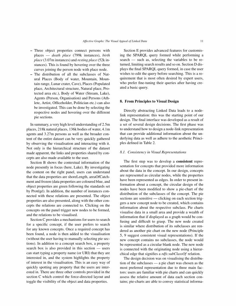
– Three object properties connect persons withplaces — death place (799k instances), birthplace (3.07m instances) and resting place (52k in-stances). This is found by hovering over the threecurves joining the person node with place node.
– The distribution of all the subclasses of Nat-ural Places (Body of water, Mountain, Moun-tain range, Lunar crater, Cave), Places (Populatedplace, Architectural structure, Natural place, Pro-tected area etc.), Body of Water (Stream, Lake),Agents (Person, Organisation) and Persons (Ath-lete, Artist, Officeholder, Politician etc.) can alsobe investigated. This can be done by selecting therespective nodes and hovering over the differentpie sections.
In summary, a very high level understanding of 2.5mplaces, 218k natural places, 136k bodies of water, 4.1magents and 3.27m persons as well as the broader con-tent of the entire dataset can be very quickly gatheredby observing the visualisation and interacting with it.Not only is the hierarchical structure of the datasetmade apparent, the links and properties shared by con-cepts are also made available to the user.
Section B shows the contextual information of thenode presently in focus (here, Lake). By investigatingthe content on the right panel, users can understandthat the data properties are shoreLength, areaOfCatch-ment and frozen (data properties are coloured blue, andobject properties are green following the standards setby Protégé). In addition, the number of instances con-nected with these relations are presented. The objectproperties are also presented, along with the other con-cepts the relations are connected to. Clicking on theconcepts on the panel trigger new nodes to be formed,and the relations to be visualised.
Section C provides a mechanisms for users to searchfor a specific concept, if the user prefers to searchfor any known concepts. Once a required concept hasbeen found, a node is then added to the visualisation(without the user having to manually selecting pie sec-tions). In addition to a concept search box, a propertysearch box is also provided in this section — userscan start typing a property name (or URI) that they areinterested in, and the system highlights the propertyof interest in the visualisation. This is an easy way ofquickly spotting any property that the users are inter-ested in. There are three other controls provided in thesection C which control the force-directed layout andtoggle the visibility of the object and data properties.
Section E provides advanced features for customis-ing the SPARQL query formed while performing asearch — such as, selecting the variables to be re-turned, limiting search results and so on. Section D dis-plays the final SPARQL query formed, in case the userwishes to edit the query before searching. This is a re-quirement that is most often desired by expert users,who prefer fine-tuning their queries after having cre-ated a basic query.
8. From Principles to Visual Design
Directly abstracting Linked Data leads to a node-link representation: this was the starting point of ourdesign. The final interface was developed as a result ofa set of several design decisions. The first phase wasto understand how to design a node-link representationthat can provide additional information about the un-derlying data as well as adhere to the aesthetic Princi-ples defined in Table 2.
8.1. Consistency in Visual Representations
The first step was to develop a consistent repre-sentation for concepts that provided more informationabout the data in the concept. In our design, conceptsare represented as circular nodes, while the propertieshave been represented as edges. In order to present in-formation about a concept, the circular design of thenodes have been modified to show a pie-chart of thedistribution of the subclasses of the concept. The piesections are sensitive — clicking on each section trig-gers a new concept node to be created, which containsinformation about the respective subclass. Pie chartsvisualise data in a small area and provide a wealth ofinformation that if displayed as a graph would be con-fusing and difficult to grasp. The new node createdis similar where distribution of its subclasses are ren-dered as another pie chart on the new node (Principle5, 9 suggest consistent visual representations). If thenew concept contains no subclasses, the node wouldbe represented as a circular blank node. The new nodeis connected with the originating node using a hierar-chical edge that signifies a rdfs:subClassOf relation.
The design decision was on visualising the distribu-tion of the subclasses — a pie chart was chosen as themost preferred representation due to three main fac-tors: users are familiar with pie charts and can quicklyassess the relative amount of data each section con-tains; pie-charts are able to convey statistical informa-

12 Affective Graphs: The Visual Appeal of Linked Data
tion within a small and regular area better than a tablespecially when conserving space is important (Princi-ple 19, 7 suggest a minimalist approach); a circular de-piction of nodes in a node-link graph is an organic geo-metric representation that most users are familiar with.
8.2. Representing Semantic Concepts
The pie-chart representation itself provided thenext design challenge — our aim was to provide apie-chart with regions easily distinguishable from oneanother. The use of colours in order to distinguishpie sections is a standard process — however, thetask is further complicated as there are multiple piecharts in the layout. Initial efforts at using a stan-dard bank of 20 unique manually selected colours wereunhelpful and caused confusion in the users as stan-dard colours seemed to indicate certain commonalityamong the similar coloured-sections. Furthermore, arepetitive standard colour palette would reduce the va-riety in the design (Principle 8 suggests introducingvariety in the design). The system was then changedto generate random colours in a HSB (or HSV) scale,varying only the hue values to keep the saturation andbrightness consistent as well as provide a greater rangeof colours. The HSB scale was preferred to the RGBscale as the former provides greater flexibility in vary-ing colours (here, hue) by keeping the saturation andbrightness constant, which is not as easily achievablein the latter. Moreover, HSB scale is more natural anduser friendly way since it replicates the way we “per-cieve” colours14. Fig. 4 explains this with a simple ex-ample — the figure on the left was produced from a setof randomly generated HSB colours with brightnessand saturation fixed. Though the different regions inthe two pie charts are easily distinguishable, the RGBpie chart contains sections of unequal brightness. RGBcolours can also achieve the same results as the HSBpie chart, but with more complex methods.
Though randomly generated, there is often a highchance of creating duplicate colours (that may havedifferent colour codes, but are nearly indistinguish-able by the human eye). Similar colours can also bewrongly interpreted as the same (or similar) concepts.This was significantly reduced by generating randomcolours that are different (based on a threshold) fromthe set of colours already generated by providing alook-up service for the set of colours already gener-
14http://tools.medialab.sciences-po.fr/iwanthue/theory.php
Fig. 4. Comparison of randomly generated pie-chart coloursfor RGB (left) and HSB (right). Though the colours on theright are completely random, constant values of brightness andsaturation generate a more pleasing chart. Images created inhttp://sketch.processing.org/
ated. The pie sections are further distinguished withthe use of borders and interactive events (such as therespective sections are extended when the user hoversover them)
8.3. Representing Semantic Relations
The third design challenge was the representationof relations (properties) — an important considera-tion was the different types of relations that may existwithin the data set. We identified three types of rela-tions — data properties, object properties and hierar-chical properties. Hierarchical properties are a kind ofobject properties as they essentially describe the rela-tions between a parent object and its child. However, inour representation we have chosen to isolate the hierar-chical properties from object properties (Principle 11).Data properties are presented as free edges — wherean edge is connected to the node at one end, and a cir-cular object at the other. The positioning of data prop-erties is random, but ensuring that the edges are notoverlapped (Principle 15 suggests minimal overlaps ofedges). The circular object is the sensitive end of anedge, providing interactions with the users (hoveringon the object highlights the edge and provides a tool-tip display, clicking activates query mechanisms etc).We describe the different edge representations in theFig. 5
Object properties are represented as curves — thisis due to the preference of users to curves as opposedto straight lines [4,9] and also the lack of acute an-gles and edge bends (Principle 15 suggests avoidingedge bends). Cubic Bézier curves were chosen to ren-der the edges as they provide a greater control and

Affective Graphs: The Visual Appeal of Linked Data 13
Fig. 5. Different visual representations of edges bear different on-tological significance — hierarchical edges are represented as trian-gles showing the parent and child node, data properties are repre-sented as satellite objects and object properties are represented ascurves
flexibility [87]. Additionally, the presence of straightlines as connections between objects can make it dif-ficult to follow links. Fig. 6 (i) shows an examplescenario where the same nodes have been connectedusing straight edges (left) and curved edges (right) .Interactive mechanisms on the curved edges also make
Fig. 6. (i) Comparison of Straight Edges with curved Edges. Imagefrom [23], (ii) Visual response to hovering over an object property
it easier for users to follow how the nodes are linkedin case of larger graphs. Hovering on the sensitive sec-tions of the edges highlight and increase their thick-ness, making them easier to spot as shown in Fig. 6(ii) (Principle 4 suggests the use of lines with differentthickness to add variety; Principle 6 suggests the use ofvariations in colour to help users spot elements). Theedges of the node currently in focus are also shaded in
a darker colour to help users find the edges connectedto the current node (Principle 6 suggests using varietyin colours).
The representations of hierarchical and non- hierar-chical relations are different, as we believe that eachcan be used as a different interaction mechanism (Prin-ciple 11 suggests a different representation of the two).While non-hierarchical relations describe the differentproperties of objects (such as birthplace, age, date ofbirth etc.), hierarchical relations contribute more to-ward explaining how the data is structured. Hence,the design decision was to provide edges with greaterweights for representing hierarchical relations. Fur-thermore, in order to identify the children of a node,the hierarchical edges are represented as triangles sig-nifying directionality, as shown in Fig. 5. Inspiredfrom the design of Protégé15, the data properties arecoloured blue while the object properties are colouredgreen (Principle 5 and 9 suggest maintaining consis-tency and such colour schemes are well establishedwithin the Semantic Web community). This designhelps users quickly identify which edges are data andobject relations, as well as hierarchical edges (Princi-ple 4 suggests using differently weighted lines to sig-nify different meaning and principle 6 suggests vary-ing visual properties to enable users to quickly spotfeatures).
8.4. Layout
The next design challenge was layout of the node-link graph. Initial attempts at automated layouts helpedin balancing the representation effectively — nodeswere arranged in a force-directed layout, based onthe Processing simulation library, developed by Bern-stein16. However, as the number of nodes increased,the graph grew far more compact than required. Fur-thermore, the force-directed layout made users disori-ented and complicated the interaction as objects keptfloating around the graphical space to optimally po-sition them. Two changes were then made for the fi-nal design — a change in the layout algorithm and achange in the spring configurations.
The force-directed layout is active only during theinitial 5 seconds of a node being created — this al-
15Protégé is one of the most widely used frameworks for mod-elling ontologies and knowledge systems, with a wide user commu-nity and http://protege.stanford.edu/
16Jeffrey Traer Bernstein’s physics simulation library is a stan-dard library available for use with Processingjs applications,http://murderandcreate.com/physics/

14 Affective Graphs: The Visual Appeal of Linked Data
lows for enough time for the node to be rendered whilepositioning itself in an approximate enough positionfor a good layout. However, the user has the abilityto click-and-drag the node to wherever they desire,without being restricted by the force-direction (Princi-ple 9 suggests maintaining consistency in interactionmechanisms — this helps users learn the system morequickly as this is a familiar interaction present in sev-eral graph visualisations; Principle 8 suggests a bal-ance in typicality — while representation of nodes aspie charts and introduction of several types of edgeswith different semantics is a novel addition, familiarinteraction mechanisms help users adjust to a new set-ting). This provides flexibility and freedom to the usersas they can layout their graphical exploration in anymanner they please, but at the same time provides arough approximation for a newly created node to en-sure readability is maintained. The users however, havean option to disable the feature, which would cause theforce-direction to be active at all times.
The second change involves modifying the contri-bution of different types of edges toward the force-direction as well as the overall display of the graph. Inthe final design, the hierarchical edges (subclass rela-tions) are made the only type of edges that contributedirectly toward the layout. This makes the layout morebalanced and well-spread, instead of a highly com-pressed layout due to object properties exerting forcesbetween many more nodes (Principle 12 suggests min-imal overlapping nodes — the nature of the graph be-ing relatively more spread-out ensures that the mini-mal number of nodes are overlapped; The balance pro-vided by the hierarchical and non-hierarchical edges incontributing toward the layout ensures that Principle19 is adhered to, without compromising on readabil-ity) . The non-hierarchical edges do not contribute di-rectly toward the layout, and are just links that visuallyconnect concepts and interact with users.
8.5. Designing Interactions
Another design challenge was to introduce interac-tions in the visualisation. Initial prototypes were de-signed to make it quicker for the user to perform func-tions. For example, the nodes supported right-clicks toadd concepts to queries, using a control key and leftclicking on nodes would hide them and so on. How-ever, this caused a lot of confusion among users, re-sulting in frustration and needing help constantly. Are-design of the interface introduced similar interac-tion mechanisms as seen in other graph visualisation
tools and interfaces such as Google maps (Principle 8and 9 recommends using some familiar solutions to re-duce the effort required for users in learning the tool).The interface allows drag and drop actions to reposi-tion nodes as users prefer. Right-click on nodes andedges provide users with context menu, enabling themto add concepts or relations to queries, hide nodes andso on.
The final design challenge was to incorporate the vi-sualisation into a complete interface, where all the vi-sual elements are in unison. User studies and VisualAnalytic principles such as Table 1 showed the needfor an interface that provides features for advancedusers. In addition, the need for representing the under-lying formal query was also raised. In order to balancethe layout, the two new visual elements (advanced andformal query display) were positioned below the graphinterface. A contextual display that provides more in-formation about the current topic of exploration is alsoplaced on the right. The positioning of various visualobjects have been made to provide a well-balancedand symmetric layout. Consideration was also madeto arrange the objects based on a sequence — objectsshould be positioned in a layout that facilitates move-ments of the eye (most readers start reading from thetop left and move to the bottom right) [60,59].
The final interface was developed as a part of an it-erative user-centered design process, with every sub-sequent iteration resulting in user evaluations or fo-cus groups. An iterative user-centered design processis one where end users are involved in the final devel-opment and design of an interface. The whole processof design, implementation and evaluation is carried outseveral times, where each subsequent iteration resultsin a refined interface. Several users from different com-munities such as academia, research, aerospace en-gineering and knowledge management had been in-volved in the process, and their comments, feedbackand suggestions were extremely helpful in developingthe final design of the interface.
9. Logical Architecture
The primary goal of Affective Graphs is an auto-mated visualisation of aesthetic graphs from data. Thissection discusses how we implemented the interface aswell as describe how users interact with the system.
The system is composed of two sub systems: thefront end (right block, Fig. 7) provides the visuali-sation, interactions, advanced controls and filters, the

Affective Graphs: The Visual Appeal of Linked Data 15
Fig. 7. Architecture
backend (left block, Fig. 7) deals solely with queryingendpoints using SPARQL generated during the pre-vious processes. Every user-interaction with the vari-ous frontend modules results in SPARQL queries be-ing generated in the SPARQL generator, which inter-prets these actions based on the methods discussedlater in this section. The queries are then transferredto the PHP backend. The Query Engine in the back-end interpret these queries and make any modificationsin the query such as variable names, adding prefixesetc. The Data selector then checks a local cache tosee if the same query had been used previously. Dueto the unpredictability (and unavailability at times) ofSPARQL endpoints, we decided to build a local datas-tore that stores the responses of queries that have beenpreviously sent to a public endpoint. This was a steptaken to address an issue highlighted during a previouswork where endpoints were found to be unpredictablein terms of their query response times [57,56].
If the query’s response had been previously recorded,and if the data provided by the endpoint is not recent,the previous response is gathered from the cache. Onthe unavailability of any cached result for the query,the public endpoint is queried and the result is storedin the cache to be fetched at a later stage. The resultis then converted to a JSON object and returned to thefront end. The frontend interprets the object and ren-ders the data into the visualisation as required.
The first step in implementing the solution is to un-derstand how to construct automated queries based onuser interactions. Users interact with visual objects inthe web interface, triggering calls to the server, pass-ing the URIs of the entities they represent; the serverconstructs the queries from templates. This processis slightly more complicated, as SPARQL query re-quires the usage of variables. This is obtained by con-tinuously maintaining a catalogue of the entities being
queried for and constructing variables built out of theURIs. For every node being built (as well as duringinitialisation), the interface sends three requests to theserver:
– A subclass request for all the subclasses of theconcept along with the respective counts of thenumber of instances within the domain
– A domain property request for all the properties(along with number of instances) that have theconcept as its domain.
– A range property request for all the properties(along with number of instances) that have theconcept as its range.
These requests are translated into formal SPARQLqueries using templates such as the following subclassrequest query:1. SELECT distinct ?subClass count (?x) as ?count ?label2. WHERE {3. ?x a ?subClass.4. ?subClass rdfs:subClassOf dbp:Place.5. ?subClass rdfs:label ?label.6. FILTER langMatches( lang(?label), "EN" )7. }order by desc(?count)
As can be seen from the query, the backend queries theendpoint for all the subclasses of a class that is cur-rently being visualised (the ‘Place’ concept, as seen online 4). The filter directs the endpoint to return only la-bels that are in english. The response from the querywould then be converted into JSON in the backend,and then returned to the frontend. A sample responseis as follows:
[{"subClass type":"uri","subClass":"http://dbpedia.org/ontology/PopulatedPlace","count type":"literal","count":"360296","count datatype":"http://www.w3.org/2001/XMLSchema#integer","label type":"literal","label":"populated place","label lang":"en"},...,{"subClass type":"uri","subClass":"http://dbpedia.org/ontology/Monument","count type":"literal","count":"4","count datatype":"http://www.w3.org/2001/XMLSchema#integer","label type":"literal","label":"monument","label lang":"en"}]
The response provides the frontend with the sub-class and the number of instances that are types of thesubclass. This is then parsed by javascript and process-ing modules to build the pie chart and create the piesections. Each pie section is built as an interactive el-ement, listening to mouse gestures and responding ac-cordingly.
Similarly, a sample range property request is as fol-lows:

16 Affective Graphs: The Visual Appeal of Linked Data
1. PREFIX rdfs: <http://www.w3.org/2000/01/rdf-schema#>2. SELECT distinct ?prop count(?instance)as ?count ?domain3. WHERE {4. ?prop rdfs:range dbp:Stream.5. ?prop rdfs:domain ?domain.6. ?instance ?prop ?obj.7. }order by desc (?count)
The query retrieves all the properties that have ‘Stream’as its range (line 4). Along with the results, the queryalso requests for the domains of the properties as wellas the number of instances. A similar response is re-turned for the domain and range property requests.The returned objects are properties and the number ofinstances. The properties are then classified into datatype and object type properties.
Fig. 8. Different visual representations of nodes and edges bear dif-ferent ontological significance
The graphical space of AffectiveGraphs is a particlesystem, that simulates gravity, drag and apply forcesbetween particles. Particles are objects that can movearound within the particle system, based on the forcesacting upon them. Spring forces and attractive forcesact on the particles — springs ensure the connectedparticles are always maintained at a minimum dis-tance from each other, while attraction can be positiveor negative (repulsion). Unlike non-hierarchical rela-tions, hierarchical ones are used as springs, therebycontributing toward the final layout. The semantic in-terpretation of a spring is a ‘rdfs:subClassOf’ (hierar-chical) relation in our current implementation of Af-fective Graphs. However, this can be changed to anyother relation that is deemed appropriate for a particu-lar dataset. A non hierarchical edge, on the other handcan have two semantic interpretations: an object edgethat connects semantic concepts (like an object prop-erty connects two semantic concepts), represented by a
green bezier curve between two nodes (edge C in Fig.8) or a loop that connects one node to itself (edge Din Fig. 8); a data edge that emerges from a node and isrepresented by a blue straight line (edge B in Fig. 8).
9.1. Query Mechanism
Our approach was to exploit the inherent featurein a semantic dataset where concepts are connectedto themselves and other concepts with relations. Sucha visual approach toward presenting, exploring andquerying data stems from our belief that Semantic Webdata is fundamentally highly visual and graphical andour approach toward consumption of such data couldbe more interactive by presenting to users the data asit was conceptualised by data providers at the time ofcreation. This makes construction of complex queriessignificantly easier — just by right clicking on nodesand edges and selecting ‘Add/Remove Query’ from thecontext menu to set/remove a query term, as shown inFig. 9.
The figure shows a screenshot of Affective Graphsconfigured to visualise the geographical dataset fromthe Mooney Natural Language Learning Data17. Theleft side of the image shows a user right-clickingon a non-weighted object edge (an object property,hasMountain) that connects State and Mountain toload the context-menu. Upon selecting ‘Add/RemoveQuery’ from the menu, the concepts State and Moun-tain are highlighted in blue as well as the edge has-Mountain. The highlighting is a visual feedback thatcommunicates that the system has accepted the user’squery and has built a corresponding query. Right handside of the Fig. 9 shows Affective Graphs showing thequery that was built.
If a concept was selected as a query item, then theinterface highlights only the concept and interprets theaction as the user is interested in looking at the in-stances that are types of the particular concept. Af-fective Graphs attempts to understand what conceptor properties are being selected and associate internalquery variables to the selections, partially building/re-building a query after every subsequent action. Eachpartial query is a small fraction of the final SPARQLquery that represents what the user actions are inter-preted as. The following is an example of a SPARQLquery generated as a result of the user interactions asshown in Fig. 9
17http://www.cs.utexas.edu/users/ml/nldata.html

Affective Graphs: The Visual Appeal of Linked Data 17
Fig. 9. Visually building queries
@prefix mooney:<http://www.mooney.net/geo#>.1. SELECT * WHERE {2. ?State a mooney:State.3. OPTIONAL { ?State rdfs:label ?State_Label}.4. ?Mountain a mooney:Mountain.5. OPTIONAL { ?Mountain rdfs:label ?Mountain_Label}.6. ?State mooney:hasMountain ?Mountain.7. ?Mountain mooney:height ?height.8. }
The SPARQL query thus generated consists of twoparts: partial query directly built by the user (lines 6and 7) and partial query prepared by Affective Graphs(lines 2-5). While the user-built partial query is a di-rect representation of the selection made by the user,the partial queries are built out of the concepts thatare selected — the final query looks for instances andtheir instances that are types of the selected concepts.These instances are ‘joined’ by the properties that areselected. Labels are used to render the results in auser-friendly way, separating the content from its for-malised representation.
Often, users may have highly specific informationneed that they would like to query for such as the birthdate or birth place of Elton John or a generic querysuch as the height of all mountains and rivers within astate that contains the character sequence ‘miss’ withintheir names. Queries such as these (FILTER queries)can be constructed in Affective Graphs using con-straints — users can right click a node or concept thatis set as a query and select ‘Add Constraint’ from thecontext menu, which would load a dialog that promptsfor constraints. Fig. 10 shows the user entering a con-straint that sets the number of pages in a book authoredby a writer to be greater than 300.
Users can also select if this constraint would be setas a negation constraint, as well as an OR query. Thedata type of property would dictate the type of con-straint — if the data type is a string literal, then the fil-ters being applied would be a regular expression filter.Instead, if the data type would be numeric, then com-
Fig. 10. adding constraints
parisons would be possible. After a constraint is set,Affective Graphs would communicate the user of thenew action by setting the respective query concept orproperty in a darker shade.
The following SPARQL query represents the inter-action as shown in the figure:
@prefix dbont:<http://dbpedia.org/ontology/>.1. SELECT * WHERE {2. ?writer a dbont:Writer.3. ?writer rdfs:label ?writer_Label.4. ?book a dbont:Book.5. ?book rdfs:label ?book_Label.8. ?writer dbont:notableWork ?book.9. ?writer dbont:birthName ?birthName.10. ?book dbont:numberOfPages ?numberOfPages.11. FILTER ( (?numberOfPages > 300))12. }
Setting concepts and properties as query itemswould result in the creation of partial queries on lines2-10 and setting constraints would result in the cre-ation of partial query on line 11. Multiple constraintswould generate multiple lines of FILTER queries.Once the user has completed identifying the conceptsand properties of interest, the relevant SPARQL queryis displayed at the bottom of the screen (Section D,Fig. 3). It can be often useful for users to configuretheir queries and only select concepts that they are in-

18 Affective Graphs: The Visual Appeal of Linked Data
terested in — e.g. though a query may contain multi-ple concepts and properties, it could be possible thatin the end, a user is only interested in one particularconcept and uses the rest as means of constructing log-ical joins to arrive at the resulting concept. Paginationand limiting result sets could also be a useful featurewhen dealing with large result sets. Users can click onthe ‘Search’ button (Section E, Fig. 3) to get results,which would be presented at the bottom of the screen.
9.2. User Interactions and Contextual InformationPresentation
Being a graphical interface, Affective Graphs sup-ports mouse interactions such as left and right clicks,drag and hover as well as pre-configured keyboardshort-cuts. Users navigate through the graphs by usingconventional techniques such as left click on pie sec-tions to create new nodes, hover on the sections to seeconcept labels, right click to load a context menu, dragnodes to reposition them to a more convenient loca-tion.
The right hand side of the Affective Graphs inter-face shows contextual information (i.e. Context Sec-tion) about the concept currently in focus, as well asthe query being built (marked as section B in Fig. 3).This context section is presented as an overlay on thegraphical element, which can be easily hidden if theuser wishes to. In addition to the constraints alreadyapplied in the query, this section presents a list of allthe properties (object and data type) that are associatedwith the current concept in focus, along with indicat-ing which other concepts are connected to the currentconcept via the object properties.
9.3. Result Presentation
Presentation of results is a challenging process thatcan have multiple solutions, based on different moti-vations such as user preference, expertise, applicationframework, domain and so on. The solutions that wehave considered are mostly visualisation of result setsas charts, graphs, maps and so on by incorporating ba-sic visualisations. However, in our current implemen-tation we decided to present results in a sortable ta-ble, improved from a standard endpoint presentation asHTML tables.
It should be noted that the presentation of the resultsis not an integral part of Affective Graphs as the systemis to provide users with an interactive and highly visualway of exploring and querying unknown Linked Data.
The final system would be an integrated system, com-bining Affective Graphs with a dashboard approach forpresenting results that had been previously developed[57,56].
9.4. Tools Used
Affective Graphs was built using a client-server ar-chitecture. A web-based interface was developed us-ing HTML and javascript. The visualisation is built us-ing Processingjs18. CSS19 and jqueryUI20 are respon-sible for styling the interface, while jquery21 handlesthe interaction with the server. The backend consists ofPHP22 scripts, using ARC223 to interact with LinkedData endpoints.
10. Evaluation
As a user-centered development process, severalsessions of discussions, focus groups, and evaluationswith users shaped the final interface for AffectiveGraphs. Changes were functional as well as enhance-ments (such as adding contextual menu items, tooltips,search boxes etc.) after each session with users, hencethe interface has significantly evolved since its incep-tion. We discuss three significant evaluations that aremost relevant to this paper:
– Evaluation 1: An objective evaluation of aestheticproperties of the system, compared with existingtools.
– Evaluation 2: A user evaluation with experts andcasual users to understand how the tool performscompared to other tools.
– Evaluation 3: A user evaluation with SemanticWeb experts to understand how well users per-ceive the system with increased exposure to thetool.
10.1. Evaluation of Aesthetic Properties
Several rounds of re-design after consecutive user-feedback resulted in a version of Affective Graphs thatwas relatively mature and ready to be evaluated with
18http://processingjs.org/js19http://www.w3schools.com/css/20http://jqueryui.com/21http://jquery.com/22http://php.net/23https://github.com/semsol/arc2/wiki

Affective Graphs: The Visual Appeal of Linked Data 19
a final set of users. In order to understand the aes-thetic properties of the interface, we analysed Affec-tive Graphs using the same metrics as we had previ-ously used to compare existing Semantic Web inter-faces (see Section 5). In this evaluation, we wanted toanswer two major questions:
– How does the system compare with respect to thesystem that was judged to be the most aestheti-cally pleasing tool?
– How does the system compare with the highestscore achieved by any tool for the individual cat-egories?
Section 5 showed that the Semantic Web interfacesthat we had earlier analysed had relatively low scores,with the highest score obtained by any tool being 0.65out of a maximum possible score of 1. The eight mea-sures of aesthetic properties were calculated for Affec-tive Graphs and compared with two other sets of scores— the tool which scored the highest in our previousexperiment, mSpace. Additionally, we compared Af-fective Graphs with the highest scores obtained by anytool in each of the individual criteria. The experimentidentified the tools which obtained the highest scoresfor different categories — balance (Sig.ma), Equilib-rium (Sig.ma), Symmetry (mSpace), Sequence (Pow-erAqua, NLP Reduce), Rhythm (K-Search), Cohesion(mSpace) and Unity (NLP Reduce).
Similar to the previous experiment, the scores foreach metric are calculated three times. However, inthis experiment, we compare the highest scores ob-tained by each, since we are interested in the bestscores. Fig. 11 shows a comparative plot of the bestscores obtained by any tool, best scoring tool and Af-fective Graphs. The figure shows that Affective Graphsscored the highest in four out of the seven categories(Rhythm, Sequence, Symmetry and Cohesion). Thesystem scored lesser than the other two in balance andunity. Equilibrium scores are marginally lower thanthe other two, with Affective Graphs scoring 0.987as compared to 0.999 by the highest scoring tool(Sig.ma).
Overall, as can be seen from the graph, AffectiveGraphs scored the highest, significantly higher than thebest scores obtained by the Semantic Web tools (anorder and complexity score of 0.8404 as compared to0.6523). Whilst these scores, are by no means conclu-sive in deciding the most aesthetically pleasing inter-face, the positive results serve as a good indication to-ward developing a more pleasant experience for users.Our intent, in this evaluation was not to judge an inter-
face as the most aesthetically pleasing one, but to ex-plore an alternative way of objectively evaluating Se-mantic Web interfaces and assessing how the imple-mented system scores with respect to existing systems.This is important as the system was designed consid-ering aesthetics as one of the most important features.
An objective evaluation as the one explored can onlyprovide an indication of the aesthetic properties of asystem. However, the truest reflection on the aestheticappeal of an interface can only be provided by a sub-jective judgement of the users. Personal preferences,bias, societal impact, learning experiences and otherfactors influence a user’s judgement and preference fora particular interface. This makes it an extremely dif-ficult task to assess a real user’s perception to an in-terface. While we acknowledge the significant role ofusers in determining the pleasurable quality of an in-terface, we believe that early objective analysis of theaesthetic principles is helpful and can provide a start-ing point for development. As previously discussed,interface layout is only one of the several factors thatcontribute toward the aesthetic appeal of an interface.However, other factors such as colour and texture areconsiderably difficult to formulate in order to ascertainan objective value [59].
10.2. User Evaluation with casual and expert users
Aligning an interface with aesthetic principles andobjective metrics can help estimate the visual plea-sure that users may experience while using the system.However, it is important to verify if the approach ofthe system can be used to perform fact finding tasks,which users of Linked Data engage themselves with.There were two main objectives for this evaluation:
1. How does Affective Graphs perform in compar-ison to other systems employing different queryapproaches ?
2. How does an aesthetically designed interface af-fect the user’s perception of the system as awhole ?
In order to answer the first question, we identifiedother systems which employ different querying mech-anisms (such as natural language, form based andgraph based) and evaluated all the tools together withthe same questions and dataset. The evaluation also in-cluded user satisfaction questionnaires that users wereprovided with at the end of every session with eachtool. The questionnaires were aimed at gathering sub-jective feedback for each tool, which were then later

20 Affective Graphs: The Visual Appeal of Linked Data
Fig. 11. Comparison of Affective Graphs with the highest scoring tool and the maximum scores in each aesthetic metric
analysed. The following describe the experiment de-sign and the subsequent analysis.
10.2.1. Experiment DesignFive systems (Semantic Crystal, K-Search, Ginseng,
Affective Graphs and NLP Reduce) employing dif-ferent querying techniques (visual, natural language,form based) were evaluated independently in a com-parative setting as a part of the second evaluation cam-paign in the SEALS project 24. Five questions carefullychosen from the Mooney Natural Language LearningData25 were presented to the users, which needed to beanswered by interacting with the systems. The ques-tions were of different complexities: a query involv-ing one concept and one relation (e.g. All capitals ofstates in the USA); a query involving two conceptsand two relations (e.g. Cities in states through which ariver Mississippi runs); a query involving a compari-son (e.g. States that have a city named Columbia witha city population of over 50,000); a query that involvessuperlative comparison (e.g. Lakes that are present ina state with the highest point) and a negation query(e.g. Rivers do not traverse the state with the capitalNashville). Since different query techniques are em-ployed by the systems, some of them are a better natu-ral fit for the type of tasks that were presented to users.For example, a form-based approach would be a betternatural fit for answering specific questions comparedto a graphical one. While Affective Graphs would fitnaturally in an exploratory scenario, the constraintsimposed by the SEALS project to comparatively eval-uate and benchmark systems limited the types of tasks
24http://www.seals-project.eu/seals-evaluation-campaigns25http://www.cs.utexas.edu/users/ml/nldata.html
that could be used for the evaluation. The next eval-uation, described in Section 10.3 hence involved ex-ploratory tasks to understand how Affective Graphscould provide support to users in such situations. Theusers, in either of the evaluations were not aware thatan explicit focus on aesthetics was made while design-ing the system. The first evaluation discussed in thissection had the same introduction to all the systems toensure that the users would not be biased toward anyparticular system.
Twenty users (10 experts and 10 casual users) agedbetween 19-46, with a mean age of 30 years were re-cruited to evaluate the systems via email. Expert usershad knowledge and experience with Semantic Web,while casuals had little or no knowledge. The userstried the systems in a random order, to reduce the im-pact of learning or frustration toward a particular tool.
The evaluation was conducted by a test leader whowas independent from the development of any of thetools, to avoid any bias during the evaluation.
For the scope of this paper, we discuss the evaluationfrom the perspective of Affective Graphs, comparingwith the other systems. The results of the comparativestudy conducted by the SEALS project is discussed inmore details by Elbedweihy [22]
10.2.2. ResultsWe analyse the results for the two user types in two
ways: we explore how long it takes for a user to for-mulate a satisfactory query (query input time) and howmany times they executed their queries to perform theirtasks (number of attempts). Fig. 12 shows three box-plots — SUS score, query input time and number ofattempts for each tool clustered by the user type.
Analysing the query input time (middle boxplot)shows a trend that we had expected to observe — NLP

Affective Graphs: The Visual Appeal of Linked Data 21
Fig. 12. Evaluation results for SUS scores, query input time and number of attempts for Affective Graphs: the users have been grouped into twotypes — experts and casual
Reduce took the least time to formulate queries, whileSemantic Crystal and Affective Graphs took consider-ably longer. The only exception being Ginseng, whereusers were frustrated by a restrictive natural languageinterface (this is described in more details in [22]).Users took relatively longer to formulate queries us-ing the graphical approach of Affective Graphs. Whileconducting the experiment, it was observed that thiswas mostly due to the fact that users found themselvesengaged with the system, and were interested in ex-ploring different features of the interface. The num-ber of attempts also provided an interesting insight— users took the most number of attempts in retriev-ing satisfactory results using NLP Reduce. AffectiveGraphs scored among the least for both experts and ca-suals. However, given their prior knowledge in Seman-tic Web formalisms, experts took the least number ofattempts using Affective Graphs.
Combining the query input time and number of at-tempts reveals the most interesting observation — ca-sual and expert users took a significantly large amountof time in order to formulate highly precise queries,thereby being able to answer their information needsatisfactorily. This finding is key to our efforts, as userscan exploit the highly graphical approach to expressthemselves more precisely to their satisfaction.
The users highly appreciated the system and felt ex-cited about an interactive and intuitive system present-ing information in a pleasing way. This was more in-teresting for the evaluation, as there was no explicit
mention of aesthetics playing a critical role in the de-sign of the system. One of the most encouraging com-ments from one of the participants, “it is interestingthat when you use a colourful and interactive system,you do not mind trying several times to get an answeras it is a playful and enjoyable experience” clearlyidentifies with our focus and aim — to help users com-prehend, query and explore unknown Linked Data andprovide a pleasant, exciting and enjoyable experience.Another interesting comment “we have been exposedto natural language querying tools like google and ya-hoo for a long time and hence find ourselves morecomfortable with such systems, but had I been intro-duced to such graphical techniques, I would proba-bly choose them over traditional natural language sys-tems” shows that a user’s pre-disposition and prior ex-perience with natural language interfaces can influencethe acceptability of a different solution. However, if theexperience of using such an interface is pleasant andenjoyable, there is a greater likelihood of the systembeing accepted by user communities.
Users were provided with a questionnaire consistingof System Usability Scale (SUS) questions, which arestandard questions for determining a user’s perceptiontoward several aspects of a system. Affective Graphsscored the highest (60.0) in average overall usabilityscore (SUS) when both the user types are combined(compared to 55 scored by Semantic Crystal, 41.25 byK-Search and 40.0 by Ginseng and NLP Reduce). In-terestingly, expert users like the system more than ca-

22 Affective Graphs: The Visual Appeal of Linked Data
sual users, possibly owing to the prior knowledge ofSemantic Web formalisms and graphical approaches torepresenting data.
While there were users who disliked a completelyvisual approach toward exploring data, most of theusers liked this approach, and would prefer to fre-quently use the system as a part of their daily analyt-ical tasks. Most users also felt the system was easy touse, though the experts seemed to be more comfort-able with the system — we acknowledge this since theexperts have prior knowledge of semantic formalismsand have a better understanding of the ontologicalconcepts and visual representations of properties andclasses. Similar to ease of use, most often expertsfound the system easier to learn owing to their knowl-edge and expertise. Often repeated as comments werethat both the casual and expert users found the inter-face fun, playful and enjoyable to use overall. This isextremely encouraging since this shows that it is pos-sible to interact with Linked Data in a manner whichdoes not involve highly formal and structured ways ofquerying.
In addition to the questionnaire responses, userswere asked qualitative questions that attempt to under-stand the positive and negative features of the system.The responses of the questionnaires were collated andgrouped into different categories:
1. Affective Graphs Interface2. Visual Query Mechanism3. Result presentation4. Others
Our discussion is driven by the positive and negativecomments regarding these aspects of the system. Theevaluation with the users has been highly satisfying,where users confirmed our approach and appreciatedthe different features that promise to make interactingwith Linked Data an enjoyable, fun and exciting ex-perience for users. Comments such as “once I got thehang of it, it made much more sense and was easy touse”, “Bit of a learning curve but after that it was quiteeasy and intuitive to use”, “Easiest to define queriesout of the ones I’ve used” and “this system was sim-pler to use than I expected” show that the users had aninitial impression of the system to be difficult to use.However, with a little experience and learning, the in-tuitiveness and ease of use was apparent. Learnabilityis a feature that is extremely important specially withnew approaches toward consuming Linked Data.
Comments such as “The graph visualisation workedwell graphics were intuitive and easy to use and com-
bine I liked to see the links between the concepts itmade it easier to understand”, “The nice user inter-face made for a more pleasant search experience, andthe animations made it clear which concepts were con-nect”, “friendly interface, fun” and “The graphic in-terface is really intuitive and easy to use Visual ap-pearance of system was modern and interesting” re-flects the positive feeling that users had after usingthe system. Upon asking how the system could be im-proved, several suggestions came up, such as display-ing the entire ontology at one go and hide reverse re-lations (e.g. hasMountain and isMountainOf). Whilewe agree that hiding reverse relations could help re-ducing the number of edges, it would be beneficial ifthere are reverse relations existing in the ontologies (afew datasets do not have any reverse relations defined)and the same data is reflected on a reverse relation (itcould be possible that the reverse relations are not pop-ulated synchronously), thereby possibly increasing thechances of a user missing information. Showing theentire ontology to a user can also have a negative ef-fect of increasing cognitive burden on users by show-ing them information that is not relevant to their inter-ests. Our current approach has been to present infor-mation to the user only if they convey their interest onspecific concepts and relations.
Users appreciated the visual query approach, andliked the interactive mechanisms involved in the query-ing process. Comments like “The query generationis intuitive and simple to use. It hides all complexityof the underlying query language. You dont need tothink in advance the order of the elements that have tobe taken into account in the query and add them anytime.”, “I liked to see how the links and circles acti-vated when I added them to my question. That made merealise what I was actually been query, that also gaveme and idea of the coverage of my question” show thatthe users appreciated the visual communication of thequery being applied and how the querying mechanismattempts to ‘hide’ the complexity involved in build-ing a SPARQL query. However, users felt that severalthings could be improved in the system in two mainareas: automatically linking query concept and proper-ties (where smaller queries can be linked to constructa single larger query, automatically selecting conceptsas query elements when a property is selected), a morevaried colour palette to prominently highlight filterconstraints. Users also felt that there could be more on-screen help to guide the users in building queries andthere seemed to be some cognitive gap among users

Affective Graphs: The Visual Appeal of Linked Data 23
while converting a natural language question (tasks)into a representative visual query.
Results presentation was by far the weakest aspectof the system – other systems such as K-Search andSemantic Crystal scored relatively higher in this cat-egory. We believe there are three reasons for this: ahighly visual and interactive mechanism of queryingand exploring data generated an expectation of a sim-ilar representation for the result sets (comments suchas “better presentation of query results”, “perhaps amore graphical approach to the answers like when cre-ating the select statement would help” indicate thatthe users were slightly disappointed with a textual re-sult set), lack of enrichment of result sets (commentssuch as “i d like to have ‘move over’ function thatbrings up a summary of each result” imply that somelevel of processing on the results would be helpful)and experimental constraints required users to createqueries in a specific manner where they were requestedto specify the variable names as a part of the query,thereby resulting in a set of URIs returned rather thanlabels (“the results were too SW”). As previously high-lighted, it is also to be noted that Affective Graphs is atool that was built specifically for querying and explor-ing Linked Data. A different interface has been builtfor rendering result sets [57,56], which will be inte-grated with Affective Graphs at a later stage.
One of the user’s comment, “It would probably lookOK as a search system in a Science Fiction B-Movie”is encouraging and valued to our approach — usersseemed to be excited and stimulated by using the sys-tem.
Our observations and discussions with the users dur-ing the evaluation highlighted several areas and issuesthat needed more attention. The next iteration of designand implementation addressed such issues and after sixmonths, another set of evaluation was conducted. Wediscuss the next phase of evaluations in the followingsubsection.
10.3. Effect of Prolonged Use (ExtendedLearnability)
The motivating factors for conducting this eval-uation were two-fold: (1) an evaluation at an ear-lier development cycle introduced several questionsthat were highly interesting and required a more in-depth study of how users interact with and respond tothe system; (2) as a scheduled evaluation to estimatehow newly added features and modifications were per-ceived by users.
The overall positive results of Affective Graphs washighly encouraging, and user feedback and sugges-tions were analysed to understand how the system canbe improved. The most common feedback was that theusers enjoyed interacting with the system and, in spiteof being perceived as slightly complex, users foundthe system highly stimulating and engaging. This waslargely credited to the ‘playful’, attractive and inter-active nature of the system. The users, however men-tioned that they would like more training and oppor-tunity to learn the system in order to exploit the fullpotential of the system. This, along with the apprecia-tion of the aesthetic appeal of the tool seeded the nextstage of development for Affective Graphs, where ourinterest was in understanding how learning the systemwould affect the use of the system. More specifically,we wanted to understand:
1. How easy (in terms of time and effort required)it is to learn how to use Affective Graphs to per-form tasks of different complexity and conductexploratory search tasks ?
2. What is the effect of learning on performing tasks?
3. How does learning affect the aesthetic perceptionof the system ?
Learnability, used interchangeably with ease oflearning is an important criterion of usability that fo-cuses on the ease of learning how to use a system or aninterface. [74] describes learnability as the relation ofperformance and efficiency to training and frequencyof use. [61] discusses how learnability can be mea-sured in terms of the time required for a user to be ableto perform certain tasks successfully or reach a spec-ified level of proficiency. A similar definition is givenby [76] as “the time it takes members of the user com-munity to learn how to use the commands relevant to aset of tasks". [81] argues that measuring usability in aone-time evaluation might be misleading since the useof some applications/systems requires frequency andtherefore assessing learnability would be essential.
Learnability has received a significant amount of fo-cus in the literature, some of which focused on as-sessing learnability as a usability criterion while oth-ers investigated how it is affected by different factors(such as interface design). While some of this work fo-cused on initial learnability (referring to the initial per-formance with the system), others looked at extendedlearnability (referring to the change in performanceover time) [28]. For example, [33] studied the learn-ability of two hypermedia authoring tools (HATs) as

24 Affective Graphs: The Visual Appeal of Linked Data
perceived by academics. Subjects’ answers to a set ofLikert scale-based questions and their feedback, whichwas recorded during the sessions, were used to investi-gate learnability issues. In [64], learnability of two dif-ferent methods of interaction with databases was com-pared using similar measures which are based on sub-jective data (such as questionnaires and users’ feed-back). [41] assessed the learnability of searching twouniversity Web sites by asking students of the firstuniversity to search the other site and vice versa. Incontrast to the previous studies, efficiency-based mea-sures, including success rate (number of tasks per-formed correctly) and the time required to performthe tasks, were used to assess learnability. Addition-ally, [69,83,17,33] showed that learnability and usabil-ity are congruent.
Despite this attention, both IR and Semantic Searchevaluations focused either on performance-oriented as-pects (such as precision and recall) [29,3] or assessedusability in terms of efficiency, effectiveness and sat-isfaction, leaving aside learnability and memorabil-ity [43,21].
10.3.1. Experiment DesignA dataset, consisting of information regarding pa-
pers presented in conferences and workshops in thearea of Semantic Web26 was uploaded to a local Vir-tuoso installation and made available for AffectiveGraphs to query. There were three main motivationsfor choosing the dataset, given a group of users —Semantic Web experts are familiar with the dataset;Users have a good understanding of scientific publish-ing; and Availability of real-world query logs27. Thelogs of the user queries for the dataset were then anal-ysed to understand the different types of requests madeby users. Following our analysis, we identified the fol-lowing four types of queries that are most often used:
1. Simple Task (ST): CnAnFn ;n = 1Simple queries that comprises only one conceptand one attribute but also a filter or a restrictionvalue applied to the attribute. E.g. Find the peo-ple with first name ‘Knud’
2. Multiple Attributes Task (MAT): CnAm ;n = 1,m ≥ 1
26Semantic Web Dog Food dataset, http://data.semanticweb.org/27The USEWOD 2012 dataset
(http://data.semanticweb.org/usewod/2012/challenge.html) con-sisted of two years of real-world query logs from 12/2008 till12/2010
Increased number of attributes without a filter.E.g. List the name, page and homepage of organ-isations
3. Multiple Concepts Task (MCT): CnRm ;n ≥ 1,m ≥ 1Searching across multiple concepts, similar tobreadth search. E.g. List all the people who havegiven keynote talks
4. Complex Task (CT): CnAmFoRp ;n > 1,m, o, p ≥ 1Include all the four components: concepts withrelations linking them, attributes/properties ofthe concepts as well as filters restricting thevalues of the attributes. E.g. Find the pageand homepage of each person whose status is‘Academia’ and was a chair of a session eventand find its location.
where ‘C’ = Concept, ‘A’ = Attribute, ‘F’= Filter, ‘R’=Relation.
Ten expert users (8 men, 2 women) aged between22-38 (mean of 31 years) were then asked to performa given set of search tasks using the interface in a con-trolled laboratory setting over three one-hour sessions.The users were either researchers or software devel-opers highly proficient in Semantic Web technologiesas well as conversant with scientific publishing do-main. The three sessions were spread over three con-secutive days. On the first session, subjects were ini-tially introduced to the experiment and its goals, fol-lowed by a 5 minute presentation and explanation ofthe system. The second session started with a simi-lar 5 minute presentation, with special focus to howthe system can be efficiently used and a few shortcuts.Following a 5-10 minutes hands-on practice session,users were then given control of the system and wereasked to perform four tasks, one of each type. In ad-dition to the fact-finding tasks, users were also askedto perform an exploratory task, where the real answerto the task was not known, and could depend on theuser’s interpretation of the question. These exploratorytasks were asked on the first and third sessions. Sincewe wanted to understand the effect of learning on per-forming tasks and the exploratory tasks were expectedto be time-consuming, we decided to have these tasksas part of the first and third sessions. The set of tasksare provided in Appendix B, where in every session, arandom task from each category was selected.
As discussed previously, the most common waysin literature to measure learnability were either basedon objective data by comparing users’ performance/

Affective Graphs: The Visual Appeal of Linked Data 25
efficiency over time or subjectively using learnabil-ity questions such as “I found this interface easy tolearn". To allow for deeper analysis, we collected bothobjective and subjective data covering the experimentresults. Input time, success rate and number of at-tempts provided objective data, while responses fromthree questionnaires (System Usability Scale [11], Ex-tended and Aesthetics) provided the subjective data.Questionnaires were filled in at the end of every ses-sion. The system usability scale questionnaire includedquestions that attempt to understand the affect of learn-ability on usability. The extended questionnaire in-cluded more specific questions on learnability, remem-bering features and so on. Aesthetics questionnaire in-cluded questions on what the user’s perception of var-ious aesthetic properties of the system. Additionally,users were also presented with open-ended questionsto gather further details about how their experiencewas.
10.3.2. Data Analysis and ResultsThough a lot of data was collected from our evalu-
ation, our analysis and discussions will focus on twomajor aspects: how users performed their tasks andhow they perceived the interface. Additionally, we willdiscuss the feedback users provided in terms of re-sponses to open-ended questions. Following the eval-uation, we investigated two main observations: inputtime and number of attempts. Here, we define inputtime as the amount of time taken to compose a satisfy-ing query i.e. time taken from the time the user startsthe task till the search is executed. Number of attemptsis defined as the number of queries executed by usersto complete their tasks. We also analysed these mea-sures to understand how the behaviour of users was af-fected as they learnt the system.
Objective data, in the form of query logs werecollected, which indicated two key features — howquickly do users perform tasks after training, howmany attempts at completing the task do the users needbefore they are satisfied with the results. An evaluationcontroller collected user interaction events and the logswere later analysed. We grouped the logs into the threesessions and compared the data. This is shown in theFig. 13.
Efficiency and Effectiveness The figure on the leftshows a boxplot of the distribution of the number of at-tempts required to perform the five types of tasks in thedifferent sessions. During the evaluation, we observedtwo types of behavior among users, based on the typeof task. Users behaved similarly when they were faced
with simpler tasks (ST, MAT, MCT) and their behaviorchanged as the tasks became more complex. Initially,users needed a few attempts at solving simple tasks.Complex tasks required a few more attempts at solv-ing the tasks. The number of attempts required for thesimple tasks started reducing over the sessions as usersgained more familiarity with the tool. This was an ex-pected result, as users are more comfortable with a newinterface with time, and gain more expertise interact-ing with it. Furthermore, users started trying new tech-niques and features during the second session, whichincreased the level of comfort and helped users adaptto Affective Graphs more.
An unexpected observation was the change in be-havior while performing slightly complex tasks- usersseemed to require more attempts in order to performthe tasks during the latter sessions. This was surpris-ing, as we had expected the users to find such tasks eas-ier with more time and familiarity. The (median) num-ber of attempts for complex task (CT) increased from 2in session 1 to 2.5 in session 2 and 3.5 in session 3. The(median) number of attempts for exploratory tasks(ET)increased from 3.5 in session 1 to 5 in session 3. Thisclearly showed a change in the behavior and approachtoward solving complex tasks.
The figure on the right shows a boxplot of the dis-tribution of the amount of time required by users toformulate their queries to solve the tasks (input time).In general, we observed a significant decrease of in-put time from an overall average of 106.48s in the firstsession and 72.72s in the second session to 66.845s inthe final session. All of the types of tasks have showna steady reduction in the input time. Our observationsduring the evaluation sessions credited this to the in-creased comfort and acquaintance with the system andits features with more time and familiarity with the sys-tems. While the relatively simpler tasks (ST,MAT andMCT) have seen a general reduction in the times, thecomplex and exploratory tasks are of greater interest toour analysis owing to the more complex nature of thetasks.
The user’s performance in the complex tasks (CTand ET) appear highly interesting. The reduction intime is significant — from a median of 140.86s in thefirst session and 107.01s in the second to 75.575s inthe final session for the complex tasks (CT) and 91.16sin the first session to 56.87s in the final for the ex-ploratory tasks (ET). This explains the earlier observa-tion where the number of attempts increased with morefamiliarity with the tool — greater familiarity andcomfort with Affective Graphs helped users try several

26 Affective Graphs: The Visual Appeal of Linked Data
Fig. 13. Analysis of performance of users with five types of tasks: ST: Simple, MAT: Multiple Attribute, MCT: Multiple Concept, CT: Complex,ET: Exploratory. Figure on the left shows a box-plot of the number of attempts required to solve a task satisfactorily, grouped into sessions andtask types. Figure on the right shows a box-plot of the input time grouped into sessions and task types
things more quickly as users found it easier to formu-late queries. This was also observed during the eval-uations: initially, users were carefully building longqueries, connecting multiple concepts. This techniquegradually changed to a different one in the second ses-sion, where users tried short bursts of queries, gradu-ally building up to form a longer one. Users could usethe outcome of the short queries to quickly formulatea longer query, which was well-informed and drivenby the results of short queries. Let us consider the sec-ond exploratory task in Appendix B: the task requiresthe user to identify persons who are experts in Knowl-edge Management. There could be several approachestoward solving this task — users could look at all per-sons that have organised tutorials that are associatedwith Knowledge Management, or all persons who haveseveral publications on the topic. The ultimate goal ofthis task is to connect multiple concepts (either pro-ceedings, tutorials or workshop events) by correspond-ing relations, and identify people. The approach fol-lowed in session 1 was to select all the relevant rela-tions, set constraints and connect the concepts in thevery first attempt at one go — this would not give anyresults for many queries, thereby making the user tryre-building the entire query after every attempt. Uponrealising this repetitive process, most users graduallyshifted their approach toward building short queries (to
find all the authors, tutorial authors etc.) and investi-gate the results to build a final query that was morecertain to provide useful answers.
User Satisfaction Three questionnaires were pre-sented to users at the end of every session — a gen-eral usability questionnaire (ten 5-point Likert scalequestions for computing SUS scores [11]), an extendedquestionnaire (five 5-point Likert scale questions and2 open questions, related to understanding learnability,ease of use and remembering features) and an aesthet-ics questionnaire (fifteen 5-point Likert Scale ques-tions, related to understanding various aesthetic fea-tures of the interface). Finally, two open-ended ques-tions were asked at the end of the third session, whichaimed at understanding what users liked/disliked in thesystem, and how that changed over the sessions (as aresult of learning and increased familiarity)
Overall, the system was appreciated by users, andthe high SUS scores indicate the positive response. Thehigh SUS score of 76.25 in the initial session indicatedthe first reactions of the users to the system — usersseemed to like the interactive and ‘playful’ environ-ment, which evoked an overall positive response. Thesecond session noted a significant improvement in theSUS scores(82.5) — this was more due to the users be-ing excited and satisfied about successfully trying sev-eral features. The final session shows a marginally de-

Affective Graphs: The Visual Appeal of Linked Data 27
creased SUS score (81.25), but still significantly higherthan the first. We believe this is due to the users beingmore accustomed to the system, and having learnt newfeatures over the sessions, the initial excitement of dis-covering new features had normalised by the third ses-sion. Users appreciated the visual approach adopted byAffective Graphs, as shown in the answers when askedwhat the users liked about the system:
– “The visual aspect of the system makes it less te-dious to perform searches. I also found it easierto define the relations and constraints on the re-lations than in other systems”
– “interface is visually appealing: responsive, colour-ful, professional feedback is good nice to explorethe structure of the underlying data without clut-ter”
– “the graphical interface makes it very easy to use.the exploratory nature is very good, it is easy tolearn by exploring”
– “This interface eases a lot the use of SPARQL andmakes simple querying an RDF dataset’’
– “Overall though, I liked how queries could bebuilt using the system to retrieve precise facts. Itis much easier to use a system like this than hav-ing to build queries by hand”
Affective Graphs was judged by users using 5-pointLikert scales, values ranging from 1 to 5, 1 being themost positive, while 5 being the most negative. Thesystem was judged moderately easy to use and under-stand (Fig. 14, bottom right) initially with a medianscore of 2 in the initial two sessions. The system wasalso initially judged to be moderately straightforward.With more familiarity and experience with the tool,users felt more confident and the median scores re-duced to 1 from 2 in the first two sessions. Users grad-ually felt more comfortable exploring new features bytrial and error, and this also reflected in the user’s sub-jective scores — A median of 2 in the first two ses-sions reduced to 1 in the third. Overall, users also didnot face any issues remembering features throughoutthe experiment, and by the third session, they appearedto remember features without any effort. A few com-ments also noted how the users perception and experi-ence of the system changed over time:
– “Ability to use the system effectively and my con-fidence/speed in using the system grew over time."
– “The system became easier to use and understandover time."
– “With practise, the tool became easier to use. Ifound satisfactory solutions to the questions muchquicker in the second and third sessions than I didin the first."
– “At first the system seems complicated to use. Af-ter using it a few times I found it a lot easier toconstruct the queries."
– “I also got more confidence with using the systemto progressively build queries instead of trying toget everything in place at once”
Users were also initially confused by few featuresand visual elements on the screen — for example, thecontext window on the right (Section B, Fig. 3) wasinitially perceived as an element which was not help-ful, but with more familiarity the use of the windowwas more evident and users could eventually performtheir tasks much better. User comments such as “(I)thought having to use the right hand context box tofind out possible onward links to other concepts was apain. got used to this and in the last session was usingthis box all the time to find suitable associated con-cepts.” and “With time I learned how to use the paneon the right more effectively to identify potential rela-tionships I could explore between an object already onthe canvas and other objects.” show that there is muchscope for improvement in such areas, but the value ofthe content on the window is highly useful if the usersare familiar with the tool.
Our continual insistence on an aesthetically pleasingexperience as one of the key design requirements hadsignificant benefits on the users. Several users appre-ciated the interface, and during informal discussionsshowed a lot of interest in how the tool was built. Com-ments such as:
– “Nice UI, clear design to see results”– “easy to use; intuitive; friendly good way to visu-
alise the structure and data. Good to see possiblelinks from selected concepts”
– “interface is visually appealing: responsive, colour-ful, professional feedback is good nice to explorethe structure of the underlying data without clut-ter”
– “Its a great search tool!”– “UI nice and is good to use, faster to use than
typing SPARQL.”– “(Liked) The layout and the connections between
the different sets. As it was easy to see where theconnection between sets were.”

28 Affective Graphs: The Visual Appeal of Linked Data
Fig. 14. Results of the User Evaluations. Left — Aesthetics questionnaire responses, Right Top — SUS scores, Right Bottom — Extendedquestionnaire responses (
– “(Liked) the highlighting tool when searching forparticular entities was well designed, and helpedwith finding the correct query”
show the overall pleasant experience users had whileinteracting with Affective Graphs. We believe that theresponse to the interface is directly an outcome of ourdesign decisions while developing the system. The Fig.14 shows how the users perceived different aestheticproperties of the interface over time. We did not no-tice significant changes in the user’s perception of aes-thetic the properties. The median scores of 9 of the 15properties remained constant throughout the sessions.4 of the properties had a minor variance in the ses-sions. Most of the users found the interface to be cre-ative, beautiful and stimulating. The colours presentedto the users were pleasant and helpful in general. Usersinitially found the system relatively complex, but withmore learning, the system appeared to be simpler touse.
10.3.3. DiscussionsWhile the overall reception of the tool was positive,
there were three main aspects which were highlightedduring the evaluation. One aspect was the placementof edges in the layout. Recalling from the design deci-
sions, the layout was designed in such a way that ex-ecuted the force direction algorithm for a few secondsonce a user interaction triggers a new node to be ren-dered. This stopped nodes from overlapping, but therewere no measures for removing overlapping proper-ties. User comments such as “The relational arms inthe user interface sometimes overlapped and madeit difficult to trace the connections and read the la-bels”, “Arms of the relations overlap sometimes, es-pecially when multiple concepts/relations are on thescreen” and “Reading the names of certain proper-ties can be difficult when they overlap with the con-cepts behind them- perhaps the option to drag individ-ual property nodes rather than just the concept nodeswould be a way to overcome this?” highlighted theissue. Increasing the amount of time allotted to exe-cute the force-direction algorithm would help positionthe new node in a more optimal position, but at thecost of more browser processing. A different sugges-tion that came from the mentioned user comments wasbe to enable click-and-drag events to allow users tocustomise the position of relations. We are also investi-gating machine learning techniques that model a user’sre-positioning events on the interface to identify bestpossible locations for a new node, based on the user’s

Affective Graphs: The Visual Appeal of Linked Data 29
previous behavior or a common behavior identified byanalysing multiple users.
Another issue highlighted was the context windowon the right of the interface — users had clearly notnoticed the usefulness of this section at the start of theexperiment. It is important to understand the reasonsfor this — while, a better and more elaborate expla-nation of the section would certainly increase its vis-ibility, a change in the design of the section is worthinvestigating. Users could realise the value of the sec-tion only during the final stages of the second sessionand the final session when they started trying differentfeatures and exploring different elements of the inter-face — a comment by a user on the final session, “Ijust noticed today there’s a box on the right with infor-mation about the concepts and the relations that canbe defined with other concepts. I think this informa-tion is essential and maybe it’s should be made moreevident to the user’’ sums up the need to re-think thedesign of the section. Some solutions were also pro-posed by the users — comments such as “The help onthe side about related concepts is not straight-forwardin the first session, perhaps a different view would bemore helpful (maybe a tree view?? maybe a small con-cept graph??)” provide some suggestions to adhere toa highly visual approach toward presentation of con-textual information.
The third issue highlighted was the presentation ofthe nodes themselves. While users were satisfied withthe presentation of the information, a few users notedthat hovering over pie sections to find out subclassesof interest could be an intensive process and may benegatively affecting a positive user experience. A fewproposed solutions have risen as a result of informaldiscussions with users — showing labels of all pie sec-tions of the node in focus, showing labels of the mostsignificant sections in the pie chart and showing a leg-end or list of pie sections in a placeholder to name afew. This, however needs further investigation as pro-viding more labels do not necessarily contribute to agreater visual experience. A minimalist approach hasbeen suggested by many in our literature survey, andmultiple labels visible on the work-space would clutterthe screen and add to the user’s information load.
11. Discussions
Our initial experiments with Linked Data interfacesand aesthetic measures has highlighted the need forexplicit attention to aesthetics while designing inter-
faces for the Semantic Web. Starting from principlesdeveloped by the HCI and the Visual Analytics com-munities, we proposed principles that could be usedto develop Semantic Web applications. We used theseprinciples to design and build an interface that facili-tates exploratory browsing of Linked Data. [16] pro-vided a comprehensive review of Linked Data visual-isation approaches and categorised their design guide-lines based on the perspectives of a tech user and a lay-user. We look back at these guidelines and align themwith the features provided in the Affective Graphsinterface in order to understand how it fits with thegreater expectations of the Semantic Web community.The guidelines proposed by the authors are shown inTable 11 .
One of the main guidelines proposed by the authorsfor both lay and tech users is the need for an intuitiveinterface that facilitates browsing of large complexmulti-dimensional data (L1, T1). User evaluations andfocus groups have been highly positive and indicatethat users had a good experience with the tool whileexploring data. The exploratory tasks focussed on un-derstanding how well users can explore an unknowndataset to find relevant information. Users found theinteractive and visual approach stimulating and werewilling to explore data in a playful manner, therebyfinding answers to their tasks (L2, T2). We also noteda change in behaviour as users started becoming moreconfident with the system with increasing familiarityand practice. Affective Graphs also makes it apparentto the user how different concepts are hierarchicallyrelated and what are the common relationships theyshare (L3,T3). Exploring nodes in focus provided userswith more information about the node, which helpedusers gather an understanding of a concept without ac-tively searching for it’s content (L4).
Although not discussed within the scope of this pa-per, Affective Graphs also has features for exportingdata from query results (T7, L6, L7). The SPARQLqueries are stored in the system, and if a user is in-terested in the result sets, they can export the resultsin a file. This feature was disabled during the evalua-tions as it was not a focus of our experiments. SinceAffective Graphs is not meant to be a standalone sys-tem, and will be integrated with another visualisationframework, which makes it possible to simultaneouslyvisualise result sets in multiple facets (L7). One of themost useful features identified by Dadzie and Roweis the ability to query for specific instances of datawithin a dataset. Affective Graphs helps users buildqueries in a highly visual an interactive manner. We

30 Affective Graphs: The Visual Appeal of Linked Data
Tech-Users Lay-Users
T1. Intuitive Navigation through LD structures L1. Intuitive navigation through the large amounts of complex,multi-dimensional data
T2. Data exploration to understand content and structure L2. Exploratory knowledge discoveryT3. Data exploration to identify links across and within datasets L3. Support for basic to advanced querying, to support filtering
and IR in order to cater to experts as well as casual usersT4. Data exploration to identify errors, noise and anomalies L4. Detailed analysis of ROIs
in content and syntaxT5. Advanced querying using formal query syntax L5. Publication/syndicationT6. Publication/syndication, verification and validation of new L6. Data extraction for reuse
data and linksT7. Data extraction for reuse L7. Presentation of the results of analysis to different audiences.
Table 3Design guidelines proposed by Dadzie and Rowe [16] visual information presentation catering to two types of users — lay and tech
believe this would be of immense help to lay usersas they would not be trained in formal query syntax.Their interactions with visual elements would generatequeries which would enable them to answer specificinformation needs (L4, L3). The interactions can alsoserve as a starting point for advanced users, who canthen directly edit the SPARQL query thereby gener-ated or modify various query parameters such as limitthe number of results, order results and so on (T5).
12. Conclusions
The starting point of Affective Graphs was under-standing how to approach exploration of semantic datain a highly visual approach. In addition to satisfying auser’s information need and providing an intuitive andinteractive experience, an aesthetically pleasing inter-face is paramount to a user’s positive impression ona system. The recent movement toward the release ofthousands of open datasets as Linked Data by govern-ments and organisations have fostered an environmentwhere Semantic Web practitioners, enthusiasts, devel-opers and researchers can develop highly useful ap-plications, integration services and mashups28. How-ever, greater stress on aesthetic appeal of interfaces forthe Semantic Web is essential. This is more urgent asSemantic Web technologies and Linked Data growsto a more established and mainstream research direc-tion — standards such as HTML5, Schema.org andmovements like big data, knowledge graph29, seman-
28As of March 2013, CKAN(http://thedatahub.org/) registered5216 open datasets including data about railways, census reports,emission data, meteorology and so on.
29http://www.google.com/insidesearch/features/search/knowledge.html
tic search30 have already been employed to great suc-cess31. We acknowledge the assertion of Cruesen [15]as aesthetics being one of the most important factorsthat influence product choice. Tracktinsky’s [78] no-tion of “what is beautiful is usable” stresses the im-portance of an aesthetically pleasing design in influ-encing perceived usability — aesthetically pleasing so-lutions are perceived to be more usable. Our experi-ence with the user evaluations also noted a similar re-sponse from users — even when users were unable toperform tasks, they enjoyed the experience and werewilling to try several times even after many unsuccess-ful attempts. While most solution developers attemptto answer the user’s information need at the first fewattempts, it is often possible that the user would need tore-attempt several times. Our observations noted thatan aesthetic interface helped reduce frustration amongusers if they failed to perform tasks after several at-tempts. Discussions with users also showed that userstend to remember their experience when an aesthet-ically pleasing tool is used. Several participants hadshown keen interest in the functioning of the system,as well as requested for copies of the application de-ployed on their own datasets. While one might arguethat a positive experience arises out of a combinationof several factors such as functionality, effectiveness,intuitiveness and so on, we believe that aesthetics hashelped in influencing how users perceived the system.
As described previously, the prime focus of theapproach has always been motivated toward an aes-thetically pleasing experience. Our investigation intothe literature highlighted several recommendations and
30https://www.facebook.com/about/graphsearch31http://semanticweb.com/the-semantic-web-has-gone-
mainstream-wanna-bet_b27329

Affective Graphs: The Visual Appeal of Linked Data 31
principles that are relevant to Linked Data exploration,and the Semantic Web community in general. We dis-tinguish the design principles into two: general princi-ples and node-link principles. The most common gen-eral recommendation that was identified from our lit-erature survey suggests using interfaces that are well-balanced, proportional and symmetric. Another com-mon suggestion is to use a minimalist approach thatcan aid in reducing visual clutter. Suggestions to pro-vide mechanisms to support standard visual informa-tion seeking tasks have also been recommended. Prin-ciples such as these can be quickly referenced whiledeveloping prototypes and solutions in order to ensurean aesthetically pleasing experience. Affective Graphswas developed starting from the aesthetic principles,and design decisions were taken to ensure the tool fol-lows such recommendations.
Following an iterative user-centered developmentprocess, Affective Graphs has been re-designed sev-eral times, every time as a result of an evaluation orfocus group. After several re-designs, the final versionof the system was objectively evaluated on the basis ofthe layout of visual elements on the screen. This lay-out was compared with 10 other well known interfacesand research prototypes. The results from this evalu-ation was highly encouraging, with Affective Graphsscoring the highest among all the Semantic Web tools.Such a study had not been conducted in the SemanticWeb community. It is important to understand how vi-sual elements are arranged in an interface, specificallybecause human response to visual objects is dictatedby several properties such as shape, order, symmetry,balance and so on. We followed such an approach as itprovides a relatively inexpensive way of initially vali-dating the layout of an interface. The final evaluationwas conducted with 10 expert users where users evalu-ated the system in three sessions, over a period of threeconsecutive days. The aim of this evaluation was to un-derstand how well users perceive the system and alsohow their perception changes over sessions. We anal-ysed objective and subjective data to gather an under-standing of how users change their behavior while per-forming tasks as well as how their judgement of thesystem changes as they gain more familiarity with thesystem.
Overall, the positive results of the user evaluationsare highly promising and we believe that more fo-cus should be stressed on aesthetics while develop-ing tools for the Semantic Web. This is particularlyimportant at this critical juncture where thousands ofLinked Datasets are being released to the public, to
be exploited. While more work is needed in establish-ing the role of aesthetics in the Semantic Web com-munity, we believe this is a step forward and the pos-itive evaluations with the users and their feedback ishighly encouraging. Future work includes modifyingthe context window to provide a greater visibility tousers. Changes in the layout algorithm would also beinvestigated. In the future, another interesting studycould be to understand the impact of learnability ses-sions on users in a much larger scale — to initiallyevaluate the system with users and then conduct amulti-session evaluation for learning, and finally re-doing initial evaluation to understand how the ses-sions have impacted use. The most important follow-up work would be in integrating a dashboard visuali-sation interface [57,56] with Affective Graphs, whereusers can query using the visual approach of AffectiveGraphs, and visualise the results in multiple visual per-spectives of the dashboard.
Acknowledgements
This research was funded by the Samulet projectfunded by Rolls-Royce plc. and the Technology Strat-egy Board. We gratefully acknowledge their support.We thank our focus group attendees for their coopera-tion and extremely helpful suggestions.
Appendix
A. Aesthetic Metrics
The following provides a description and the formu-lae to calculate the metrics as used in the evaluation.These definitions and formulae were proposed by Ngo.
Balance is defined as the distribution of opticalweight in a picture, where optical weight is the per-ception that some objects appear heavier than others.Larger objects are heavier while smaller objects arelighter.
Balance = 1−|BMvertical|+ |BMhorizontal|
2∈ [0, 1] (1)
Equilibrium represents stabilisation, a midwaycenter of suspension. It can be defined as equal bal-ance between opposing force, various visual objectsare centers of forces. A layout is in equilibrium whenits center coincides with the center of the frame.

32 Affective Graphs: The Visual Appeal of Linked Data
Equilibrium = 1−|EMx|+ |EMy |
2∈ [0, 1] (2)
Symmetry denotes the balanced distribution ofequivalent elements about a common line. Essentiallyrepresenting axial duplication, symmetry defines howwell a unit on one side of the center is replicated onthe other side.
Symmetry = 1−|SYMv |+ |SYMh|+ |SYMr|
3
∈ [0, 1]
(3)
The measure of sequence relates to the way that vi-sual objects are positioned in a layout with respect tothe movement of the eye — heavier objects being onthe top left, while lighter and smaller objects at the bot-tom right.
Sequence = 1−
∑j=UL,UR,LL,LR
|qj − vj |
8∈ [0, 1] (4)
Rhythm relates to understand the variety in the ar-rangement, dimension, number and form of visual ob-jects within a layout.
Rhythm = 1−|Rhythmx|+ |Rhythmy + |RhythmArea|
2
∈ [0, 1]
(5)
Cohesion denotes how the aspect ratios of each vi-sual element relates to the screen’s width and height.
Cohesion =|CMfl|+ |CMlo|
2∈ [0, 1] (6)
Unity signifies coherence, where visual elementsappear to belong together, seen together as one thing— similar sized objects, using less space between ele-ments, larger margins and so on.
Unity =|UMform|+ |UMspace|
2∈ [0, 1] (7)
Order and Complexity is defined as the sum of allthe above measures for a layout.
Order_Complexity =
7∑i=1
Mi
7∈ [0, 1] (8)
B. Tasks for User Evaluation
B.1. Simple Tasks (ST)
1. Find the people with first name ‘Knud’.2. Find the “inproceedings” whose title contains
‘Semantic Search’.3. Find the organisations whose name contains
‘Karlsruhe’.
B.2. Multiple Attributes Task (MAT)
1. List the name, page and homepage of organisa-tions.
2. List the name, familyName and status of all peo-ple.
3. List the location, homepage and summary of alltutorial events.
B.3. Multiple concepts Task (MCT)
1. List all the conference venues and their meetingrooms.
2. List the programme committee members and theconference events they participated at.
3. List all the people who have given keynote talks.
B.4. Complex Task (CT)
1. Find the description and summary of keynotetalks which took place at ‘WWW’ conferencesand the name of the presenter.
2. Find the name, homepage and page of peoplewho were workshop organisers for a workshopabout ‘Ontology Matching’.
3. Find the page and homepage of each personwhose status is ‘Academia’ and was a chair of asession event and find its location.

Affective Graphs: The Visual Appeal of Linked Data 33
B.5. Exploratory Task (ET)
1. Imagine you are a young researcher, starting yourcareer in ‘Ontology alignment’. Since the organ-isation you are affiliated to conducts research ina different area, you do not have direct access toexperts in your area of research. The only accessto information is via Affective Graphs, whichprovides visual means to look for information.Using such systems, can you identify a few re-searchers in the area of your interest and whyhave you chosen them?
2. Imagine you are organising a day-long work-shop on knowledge management in business atan organisation. As a part of the workshop, therewould be two tutorials from experts. Who are theexperts you would choose and why?
References
[1] Ahamed Altaboli and Yingzi Lin. Objective and subjec-tive measures of visual aesthetics of website interface design:The two sides of the coin. In JulieA. Jacko, editor, Human-Computer Interaction. Design and Development Approaches,volume 6761 of Lecture Notes in Computer Science, pages 35–44. Springer Berlin Heidelberg, 2011. ISBN 978-3-642-21601-5.
[2] Gennady Andrienko, Natalia Andrienko, and Stefan Wrobel.Visual analytics tools for analysis of movement data. SIGKDDExplor. Newsl., 9(2):38–46, December 2007. ISSN 1931-0145.
[3] K. Balog, P. Serdyukov, and A.P. de Vries. Overview of theTREC 2010 Entity Track. In TREC 2010 Working Notes. NIST,November 2010.
[4] Moshe Bar and Maital Neta. Humans prefer curved visual ob-jects. Psychological Science: A Journal of the American Psy-chological Society / APS, 17(8):645–8, August 2006. ISSN0956-7976. . URL http://www.ncbi.nlm.nih.gov/pubmed/16913943.
[5] Fabian Beck, Michael Burch, and Stephan Diehl. Towards anaesthetic dimensions framework for dynamic graph visualisa-tions. In Proceedings of the 2009 13th International Confer-ence Information Visualisation, IV ’09, pages 592–597, Wash-ington, DC, USA, 2009. IEEE Computer Society. ISBN 978-0-7695-3733-7. . URL http://dx.doi.org/10.1109/IV.2009.42.
[6] Chris Bennett, Jody Ryall, Leo Spalteholz, and Amy Gooch.The aesthetics of graph visualization. In Proceedings ofthe Third Eurographics Conference on Computational Aes-thetics in Graphics, Visualization and Imaging, Computa-tional Aesthetics’07, pages 57–64, Aire-la-Ville, Switzerland,Switzerland, 2007. Eurographics Association. ISBN 978-3-905673-43-2. . URL http://dx.doi.org/10.2312/COMPAESTH/COMPAESTH07/057-_064.
[7] Tim Berners-Lee, Yuhsin Chen, Lydia Chilton, Dan Connolly,Ruth Dhanaraj, James Hollenbach, Adam Lerer, and DavidSheets. Tabulator: Exploring and analyzing linked data on the
semantic web. In Proceedings of the 3rd International Seman-tic Web User Interaction, Athens, Georgia, USA, 2006.
[8] Ravish Bhagdev, Sam Chapman, Fabio Ciravegna, VitaveskaLanfranchi, and Daniela Petrelli. Hybrid search: Effectivelycombining keywords and ontology-based searches. In ManfredHauswirth, Manolis Koubarakis, and Sean Bechhofer, editors,Proceedings of the 5th European Semantic Web Conference,LNCS, Berlin, Heidelberg, June 2008. Springer Verlag.
[9] Ulrik Brandes and Dorothea Wagner. Using graph layout tovisualize train interconnection data. In Proceedings of the 6thInternational Symposium on Graph Drawing, GD ’98, pages44–56. Springer-Verlag, London, UK, UK, 1998. ISBN 3-540-65473-9. URL http://dl.acm.org/citation.cfm?id=647550.728937.
[10] Richard Brath, Mike Peters, and Robin Senior. Visualizationfor communication: The importance of aesthetic sizzle. In Pro-ceedings of the Ninth International Conference on InformationVisualisation, IV ’05, pages 724–729, Washington, DC, USA,2005. IEEE Computer Society. ISBN 0-7695-2397-8.
[11] John Brooke. SUS: A quick and dirty usability scale. In P. W.Jordan, B. Weerdmeester, A. Thomas, and I. L. Mclelland, edi-tors, Usability evaluation in industry. Taylor and Francis, Lon-don, UK, 1996.
[12] John V. Carlis and Joseph A. Konstan. Interactive visualizationof serial periodic data. In Proceedings of the 11th annual ACMsymposium on User interface software and technology, UIST’98, pages 29–38, New York, NY, USA, 1998. ACM. ISBN1-58113-034-1.
[13] Paul Chandler and John Sweller. Cognitive load while learningto use a computer program. Applied Cognitive Psychology, 10(2):151–170, 1996. ISSN 1099-0720.
[14] William C. Cleveland and Marylyn E. McGill. DynamicGraphics for Statistics. CRC Press, Inc., Boca Raton, FL,USA, 1st edition, 1988. ISBN 053409144X.
[15] Mariëlle E. H. Creusen and Jan P. L. Schoormans. The differentroles of product appearance in consumer choice. Journal ofProduct Innovation Management, 22(1):63–81, 2005. ISSN1540-5885. . URL http://dx.doi.org/10.1111/j.0737-_6782.2005.00103.x.
[16] Aba-Sah Dadzie and Matthew Rowe. Approaches to visual-ising linked data: A survey. Semant. web, 2(2):89–124, April2011. ISSN 1570-0844. . URL http://dx.doi.org/10.3233/SW-_2011-_0037.
[17] Fred D. Davis, Richard P. Bagozzi, and Paul R. Warshaw.User acceptance of computer technology: A comparison oftwo theoretical models. Manage. Sci., 35(8):982–1003, August1989. ISSN 0025-1909. . URL http://dx.doi.org/10.1287/mnsc.35.8.982.
[18] Antonella De Angeli, Alistair Sutcliffe, and Jan Hartmann. In-teraction, usability and aesthetics: what influences users’ pref-erences? In Proceedings of the 6th conference on DesigningInteractive systems, DIS ’06, pages 271–280, New York, NY,USA, 2006. ACM. ISBN 1-59593-367-0.
[19] Mira Dontcheva, Steven M. Drucker, David Salesin, andMichael F. Cohen. Relations, cards, and search templates: user-guided web data integration and layout. In Proceedings ofthe 20th annual ACM symposium on User interface softwareand technology, UIST ’07, pages 61–70, New York, NY, USA,2007. ACM. ISBN 978-1-59593-679-0.
[20] Holger Eichelberger. Nice class diagrams admit good design?In Proceedings of the 2003 ACM symposium on Software vi-

34 Affective Graphs: The Visual Appeal of Linked Data
sualization, SoftVis ’03, pages 159–ff, New York, NY, USA,2003. ACM. ISBN 1-58113-642-0.
[21] K Elbedweihy, S N Wrigley, F Ciravegna, Dorothee Rein-hard, and Abraham Bernstein. Evaluating semantic search sys-tems to identify future directions of research. In Second In-ternational Workshop on Evaluation of Semantic Technologies,number 843 in CEUR Workshop Proceedings, pages 25–36,May 2012.
[22] Khadija Elbedweihy, Stuart N. Wrigley, and Fabio Ciravegna.Evaluating semantic search query approaches with expert andcasual users. In Proceedings of the 11th International Confer-ence on The Semantic Web - Volume Part II, ISWC’12, pages274–286, Berlin, Heidelberg, 2012. Springer-Verlag. ISBN978-3-642-35172-3. . URL http://dx.doi.org/10.1007/978-_3-_642-_35173-_0\_18.
[23] Benjamin Finkel and Roberto Tamassia. Curvilinear graphdrawing using the force-directed method. In Proceedings ofthe 12th international conference on Graph Drawing, GD’04,pages 448–453, Berlin, Heidelberg, 2004. Springer-Verlag.ISBN 3-540-24528-6, 978-3-540-24528-5.
[24] P. Fishwick, S. Diehl, J. Prophet, and J. Löwgren. Perspec-tives on aesthetic computing. Leonardo, 38(2):133–141, 2005.ISSN 0024094X.
[25] Roberto García, JuanManuel Gimeno, Ferran Perdrix, RosaGil, Marta Oliva, JuanMiguel López, Afra Pascual, andMontserrat Sendín. Building a usable and accessible semanticweb interaction platform. World Wide Web, 13(1-2):143–167,2010. ISSN 1386-145X.
[26] Michael Granitzer, Vedran Sabol, Wolfgang Kienreich, Dick-son Lukose, and Kow Weng Onn. Visual Analyses on LinkedData – An Opportunity for both Fields. Technical report, STIInternational, Riga, Latvia, 2010.
[27] Tera Marie Green, William Ribarsky, and Brian Fisher. Build-ing and applying a human cognition model for visual analyt-ics. Information Visualization, 8(1):1–13, January 2009. ISSN1473-8716. . URL http://dx.doi.org/10.1057/palgrave.ivs.2008.28.
[28] Tovi Grossman, George Fitzmaurice, and Ramtin Attar. Asurvey of software learnability: Metrics, methodologies andguidelines. In Proceedings of the SIGCHI Conference on Hu-man Factors in Computing Systems, CHI ’09, pages 649–658,New York, NY, USA, 2009. ACM. ISBN 978-1-60558-246-7. . URL http://doi.acm.org/10.1145/1518701.1518803.
[29] Harry Halpin, Daniel M Herzig, Peter Mika, Roi Blanco, Jef-frey Pound, Henry S Thompson, and Thanh Tran Duc. Eval-uating Ad-Hoc Object Retrieval. In Proceedings of the 1st In-ternational Workshop on Evaluation of Semantic Technologies(IWEST), 2010.
[30] Christopher G. Healey, Kellogg S. Booth, and James T. Enns.Harnessing preattentive processes for multivariate data visual-ization. In Proceedings of Graphics Interface ’93, Vancouver,BC, Canada, Canada, 1992. University of British Columbia.
[31] Christopher G. Healey, Kellogg S. Booth, and James T. Enns.Visualizing real-time multivariate data using preattentive pro-cessing. ACM Trans. Model. Comput. Simul., 5(3):190–221,July 1995. ISSN 1049-3301.
[32] Christopher G. Healey, Kellogg S. Booth, and James T.Enns. High-speed visual estimation using preattentive process-ing. ACM Trans. Comput.-Hum. Interact., 3(2):107–135, June1996. ISSN 1073-0516.
[33] Marti Hearst, Ame Elliott, Jennifer English, Rashmi Sinha,Kirsten Swearingen, and Ka-Ping Yee. Finding the flow in website search. Commun. ACM, 45(9):42–49, September 2002.ISSN 0001-0782. . URL http://doi.acm.org/10.1145/567498.567525.
[34] Philipp Heim, Steffen Lohmann, Davaadorj Tsendragchaa, andThomas Ertl. Semlens: Visual analysis of semantic data withscatter plots and semantic lenses. In Proceedings of the 7th In-ternational Conference on Semantic Systems (I-SEMANTICS2011), pages 175–178, New York, NY, USA, 2011. ACM.ISBN 978-1-4503-0621-8.
[35] P. Hekkert. Design aesthetics: principles of pleasure in design.Psychology Science, 48(2):157–172, 2006. ISSN 1614-9947.
[36] Paul Hekkert and Helmut Leder. Product Experience, chap-ter Product Aesthetics, pages 259–285. Elsevier Science, SanDiego, USA, 2008. ISBN 9780080450896. .
[37] Michiel Hildebrand, Jacco van Ossenbruggen, and LyndaHardman. /facet: A browser for heterogeneous semantic webrepositories. In Proceedings of the 5th International Confer-ence on The Semantic Web, ISWC’06, pages 272–285, Berlin,Heidelberg, 2006. Springer-Verlag. ISBN 3-540-49029-9, 978-3-540-49029-6. . URL http://dx.doi.org/10.1007/11926078_20.
[38] Aidan Hogan, Andreas Harth, Jürgen Umbrich, Sheila Kin-sella, Axel Polleres, and Stefan Decker. Searching and brows-ing linked data with swse: The semantic web search en-gine. Web Semantics, 9(4):365–401, December 2011. ISSN1570-8268. . URL http://dx.doi.org/10.1016/j.websem.2011.06.004.
[39] David F Huynh and David Karger. Parallax and com-panion: Set-based browsing for the data web, 2009.http://davidhuynh.net/media/papers/2009/www2009-_parallax.pdf [Online; accessed 28-Oct-2014].
[40] Alfred Inselberg. Parallel Coordinates: Visual Multidimen-sional Geometry and Its Applications. Springer-Verlag NewYork, Inc., Secaucus, NJ, USA, 2009. ISBN 0387215077.
[41] Judy Jeng. Usability assessment of academic digital libraries:Effectiveness, efficiency, satisfaction, and learnability. InLIBRI: International Journal of Libraries and Information Ser-vices, volume 55, pages 96–121, 2005. .
[42] Patrick W. Jordan. Human factors for pleasure in productuse. Applied Ergonomics, 29(1):25–33, February 1998. ISSN00036870.
[43] Esther Kaufmann and Abraham Bernstein. How useful are nat-ural language interfaces to the semantic web for casual end-users? In Proceedings of the 6th International The Seman-tic Web and 2Nd Asian Conference on Asian Semantic WebConference, ISWC’07/ASWC’07, pages 281–294. Springer-Verlag, Berlin, Heidelberg, 2007. ISBN 3-540-76297-3, 978-3-540-76297-3. URL http://dl.acm.org/citation.cfm?id=1785162.1785184.
[44] Esther Kaufmann and Abraham Bernstein. Evaluating theusability of natural language query languages and interfacesto semantic web knowledge bases. Web Semant., 8(4):377–393, November 2010. ISSN 1570-8268. . URL http://dx.doi.org/10.1016/j.websem.2010.06.001.
[45] Daniel A. Keim, Tilo Nietzschmann, Norman Schelwies, JörnSchneidewind, Tobias Schreck, and Hartmut Ziegler. A spec-tral visualization system for analyzing financial time seriesdata. In Beatriz Sousa Santos, Thomas Ertl, and Kenneth I.

Affective Graphs: The Visual Appeal of Linked Data 35
Joy, editors, EuroVis, pages 195–202. Eurographics Associa-tion, 2006. ISBN 3-905673-31-2.
[46] Daniel A. Keim, Florian Mansmann, Jörn Schneidewind, JimThomas, and Hartmut Ziegler. Visual data mining. InSimeon J. Simoff, Michael H. Böhlen, and Arturas Mazeika,editors, Visual Data Mining, chapter Visual Analytics: Scopeand Challenges, pages 76–90. Springer-Verlag, Berlin, Heidel-berg, 2008. ISBN 978-3-540-71079-0. . URL http://dx.doi.org/10.1007/978-_3-_540-_71080-_6_6.
[47] Nanyoung Kim. A history of design theory in art education.Journal of Aesthetic Education, 40(2):pp. 12–28, 2006. ISSN00218510. URL http://www.jstor.org/stable/4140227.
[48] Robert Kosara, Fabian Bendix, and Helwig Hauser. Parallelsets: Interactive exploration and visual analysis of categori-cal data. IEEE Transactions on Visualization and ComputerGraphics, 12(4):558–568, July 2006. ISSN 1077-2626. . URLhttp://dx.doi.org/10.1109/TVCG.2006.76.
[49] Minu Kumar and Nitika Garg. Aesthetic principles and cog-nitive emotion appraisals: How much of the beauty lies in theeye of the beholder? Journal of Consumer Psychology, 20(4):485–494, October 2010. ISSN 10577408.
[50] Masaaki Kurosu and Kaori Kashimura. Apparent usability vs.inherent usability: experimental analysis on the determinantsof the apparent usability. In Conference Companion on HumanFactors in Computing Systems, CHI ’95, pages 292–293, NewYork, NY, USA, 1995. ACM. ISBN 0-89791-755-3.
[51] Alexander Lang. Aesthetics in information visualization.Technical report, University of Munich, Department of Com-puter Science, 2010.
[52] Holger Lausen, Ying Ding, Michael Stollberg, Dieter Fensel,Rubén Lara Hernández, and Sung-Kook Han. Semantic webportals: state-of-the-art survey. J. Knowledge Management, 9(5):40–49, 2005.
[53] Vanessa Lopez, Enrico Motta, and Victoria Uren. Poweraqua:Fishing the semantic web. In Proceedings of the 3rd Euro-pean Conference on The Semantic Web: Research and Appli-cations, ESWC’06, pages 393–410, Berlin, Heidelberg, 2006.Springer-Verlag. ISBN 3-540-34544-2, 978-3-540-34544-2. .URL http://dx.doi.org/10.1007/11762256_30.
[54] Abish Malik, Ross Maciejewski, Ben Maule, and David S.Ebert. A visual analytics process for maritime resource alloca-tion and risk assessment. In IEEE VAST, pages 221–230. IEEE,2011. ISBN 978-1-4673-0015-5.
[55] Kim Marriott, Helen Purchase, Michael Wybrow, and CagatayGoncu. Memorability of visual features in network diagrams.IEEE Transactions on Visualization and Computer Graphics,18(12):2477–2485, 2012. ISSN 1077-2626.
[56] Suvodeep Mazumdar, Andrea Varga, Vita Lanfranchi, DanielaPetrelli, and Fabio Ciravegna. A knowledge dashboard formanufacturing industries. In Raúl García-Castro, DieterFensel, and Grigoris Antoniou, editors, The Semantic Web:ESWC 2011 Workshops, volume 7117 of Lecture Notes inComputer Science, pages 112–124. Springer Berlin Heidel-berg, 2011. ISBN 978-3-642-25952-4.
[57] Suvodeep Mazumdar, Daniela Petrelli, and Fabio Ciravegna.Exploring user and system requirements of linked data visual-ization through a visual dashboard approach. Semantic Web -Interoperability, Usability, Applicability, 5:203–220, 2014. .
[58] John David McClurg-Gevenese. The principles of de-sign. Design in Theory and Practice, 2005. URL
http://www.digital-_web.com/articles\\/principles\_of\_design.
[59] David Chek Ling Ngo, Lian Seng Teo, and John G. Byrne.Modelling interface aesthetics. Information Sciences, 152(1):25–46, June 2003. ISSN 0020-0255. . URL http://dx.doi.org/10.1016/S0020-_0255(02)00404-_8.
[60] D.C.L. Ngo, A. Samsudin, and R. Abdullah. Aesthetic mea-sures for assessing graphic screens. Journal of InformationScience and Engineering, 16(1):97–116, 2000.
[61] Jakob Nielsen and Thomas K. Landauer. A mathematicalmodel of the finding of usability problems. In Proceedings ofthe INTERACT ’93 and CHI ’93 conference on Human factorsin computing systems, CHI ’93, pages 206–213, New York,NY, USA, 1993. ACM. ISBN 0-89791-575-5.
[62] Jakob Nielsen and Rolf Molich. Heuristic evaluation of user in-terfaces. In Proceedings of the SIGCHI Conference on HumanFactors in Computing Systems, CHI ’90, pages 249–256, NewYork, NY, USA, 1990. ACM. ISBN 0-201-50932-6. . URLhttp://doi.acm.org/10.1145/97243.97281.
[63] Donald A. Norman. Emotional Design: Why We Love (OrHate) Everyday Things. Basic Books, January 2004.
[64] Soyeon Park. Usability, user preferences, effectiveness, anduser behaviors when searching individual and integrated full-text databases: Implications for digital libraries. J. Am. Soc.Inf. Sci., 51(5):456–468, March 2000. ISSN 0002-8231. . URLhttp://dx.doi.org/10.1002/(SICI)1097-_-4571(2000)51:5<_456::AID-_ASI6>_-3.3.CO;2-_F.
[65] Su-e Park, Dongsung Choi, and Jinwoo Kim. Visualizinge-brand personality: Exploratory studies on visual attributesand e-brand personalities in korea. International Journal ofHuman-Computer Interaction, 19(1):7–34, 2005.
[66] Daniela Petrelli, Suvodeep Mazumdar, Aba-Sah Dadzie, andFabio Ciravegna. Multi visualization and dynamic query foreffective exploration of semantic data. In Proceedings of the8th International Semantic Web Conference, ISWC ’09, pages505–520, Berlin, Heidelberg, 2009. Springer-Verlag. ISBN978-3-642-04929-3. . URL http://dx.doi.org/10.1007/978-_3-_642-_04930-_9_32.
[67] Helen C. Purchase, John Hamer, Adrian Jamieson, and OranRyan. Investigating objective measures of web page aestheticsand usability. In Proceedings of the Twelfth Australasian UserInterface Conference - Volume 117, AUIC ’11, pages 19–28,Darlinghurst, Australia, Australia, 2011. Australian ComputerSociety, Inc. ISBN 978-1-920682-97-2. URL http://dl.acm.org/citation.cfm?id=2460616.2460619.
[68] Mariano Rico and Pablo Castells. Jacinta: a mediator agent forhuman-agent interaction in semantic web services. In Proceed-ings of The Semantic Web-International Semantic Web Confer-ence (ISWC), 2004.
[69] Teresa L. Roberts and Thomas P. Moran. The evaluation of texteditors: Methodology and empirical results. Commun. ACM,26(4):265–283, April 1983. ISSN 0001-0782. . URL http://doi.acm.org/10.1145/2163.2164.
[70] R. Rosenholtz, Y. Li, and L. Nakano. Measuring visual clutter.Journal of Vision, 7(2):1–22, 2007. .
[71] Manojit Sarkar and Marc H. Brown. Graphical fisheye views ofgraphs. In Proceedings of the SIGCHI Conference on HumanFactors in Computing Systems, CHI ’92, pages 83–91, NewYork, NY, USA, 1992. ACM. ISBN 0-89791-513-5.

36 Affective Graphs: The Visual Appeal of Linked Data
[72] m.c. schraefel, Max Wilson, Alistair Russell, and Daniel A.Smith. mspace: Improving information access to multimediadomains with multimodal exploratory search. Commun. ACM,49(4):47–49, April 2006. ISSN 0001-0782. . URL http://doi.acm.org/10.1145/1121949.1121980.
[73] Norbert Schwarz, Piotr Winkielman, Bruce Morton, JohnSkowronski, and Bruce Whittlesea. Processing fluency andaesthetic pleasure: Is beauty in the perceiver’s processing ex-perience. Social Psychology Review, 8:364–382, 2004.
[74] B Shackel. Ergonomics in design for usability. In Proceed-ings of the Second Conference of the British Computer Society,Human Computer Interaction Specialist Group on People andComputers: Designing for Usability, pages 44–64. CambridgeUniversity Press, New York, NY, USA, 1986. ISBN 0-521-33259-1. URL http://dl.acm.org/citation.cfm?id=17324.24077.
[75] Ben Shneiderman. The eyes have it: A task by data type taxon-omy for information visualizations. In VL ’96: Proceedings ofthe 1996 IEEE Symposium on Visual Languages. IEEE Com-puter Society, 1996.
[76] Ben Shneiderman and Catherine Plaisant. Designing the UserInterface: Strategies for Effective Human-Computer Interac-tion. Addison-Wesley Longman Publishing Co., Inc., 1986.
[77] Moritz Stefaner and Boris Muller. Elastic lists for facetbrowsers. In Proceedings of the 18th International Confer-ence on Database and Expert Systems Applications, DEXA’07, pages 217–221, Washington, DC, USA, 2007. IEEE Com-puter Society. ISBN 0-7695-2932-1. . URL http://dx.doi.org/10.1109/DEXA.2007.63.
[78] N. Tractinsky, A. S. Katz, and D. Ikar. What is beautiful isusable. Interacting with Computers, 13(2):127–145, December2000. ISSN 09535438.
[79] Edward Tufte. Envisioning information. Graphics Press,Cheshire, CT, USA, 1990. ISBN 0-9613921-1-8.
[80] Edward R. Tufte. The visual display of quantitative informa-tion. Graphics Press, Cheshire, CT, USA, 1986. ISBN 0-9613921-0-X.
[81] Thomas Tullis and William Albert. Measuring the User Expe-rience: Collecting, Analyzing, and Presenting Usability Met-rics. Morgan Kaufmann Publishers Inc., San Francisco, CA,USA, 2008. ISBN 0123735580, 9780123735584.
[82] Giovanni Tummarello, Richard Cyganiak, Michele Catasta,Szymon Danielczyk, Renaud Delbru, and Stefan Decker.
Sig.ma: Live views on the web of data. Web Semantics: Sci-ence, Services and Agents on the World Wide Web, 8(4):355 –364, 2010. ISSN 1570-8268.
[83] John Whiteside, Sandra Jones, Paula S. Levy, and DennisWixon. User performance with command, menu, and iconicinterfaces. SIGCHI Bull., 16(4):185–191, April 1985. ISSN0736-6906. . URL http://doi.acm.org/10.1145/1165385.317490.
[84] Niels Willems, Willem Robert van Hage, Gerben de Vries,Jeroen H. M. Janssens, and Veronique Malaise. An integratedapproach for visual analysis of a multisource moving objectsknowledge base. Int. J. Geogr. Inf. Sci., 24(10):1543–1558,October 2010. ISSN 1365-8816.
[85] Pak Chung Wong, Beth Hetzler, Christian Posse, Mark Whit-ing, Susan Havre, Nick Cramer, Anuj Shah, Mudita Singhal,Alan Turner, and Jim Thomas. In-spire infovis 2004 contestentry. In Proceedings of the IEEE Symposium on Informa-tion Visualization, INFOVIS ’04, pages 216.2–, Washington,DC, USA, 2004. IEEE Computer Society. ISBN 0-7803-8779-3. . URL http://dx.doi.org/10.1109/INFOVIS.2004.37.
[86] Pak Chung Wong, George Chin Jr., Harlan Foote, PatrickMackey, and Jim Thomas. Have green - a visual analyticsframework for large semantic graphs. In Pak Chung Wongand Daniel A. Keim, editors, IEEE VAST, pages 67–74. IEEE,2006. ISBN 1-4244-0591-2.
[87] F. Yamaguchi. Curves and surfaces in computer aided geomet-ric design. Springer-Verlag Berlin, 1 edition, Nov 1988. ISBN978-3540174493.
[88] Xintian Yang, Sitaram Asur, Srinivasan Parthasarathy, andSameep Mehta. A visual-analytic toolkit for dynamic inter-action graphs. In Proceedings of the 14th ACM SIGKDD in-ternational conference on Knowledge discovery and data min-ing, KDD ’08, pages 1016–1024, New York, NY, USA, 2008.ACM. ISBN 978-1-60558-193-4.
[89] Jasni Mohamad Zain, Mengkar Tey, and Yingsoon Goh. Doesaesthetics of web page interface matters to mandarin learning?CoRR, abs/1101.1608, 2011.
[90] Jasni Mohamad Zain, Mengkar Tey, and Yingsoon Goh. Prob-ing a self-developed aesthetics measurement application (sda)in measuring aesthetics of mandarin learning web page inter-faces. CoRR, abs/1101.1606, 2011.