analysis of equity markets: a graph theory approach · pdf file3 basic graph theory this...
TRANSCRIPT

The University of Arizona
Department of Mathematics
Analysis of Equity Markets: A GraphTheory Approach
Joshua Rubin Abrams, Jose Celaya-Alcala, Drew BaldwinRyan Gonda, Zhaoren Chen
May 16, 2017
Copyright © SIAM Unauthorized reproduction of this article is prohibited 190
Contents
1 Introduction 193
2 Background on Equity Markets
2.1 Stocks . . . . . . . . . . . . . . . . . . . . . . . . . . . . . . . . . . . . . . . . . . . . 193
2.2 Sectors of the S&P 500 . . . . . . . . . . . . . . . . . . . . . . . . . . . . . . . . . . . 194
2.3 Terminology . . . . . . . . . . . . . . . . . . . . . . . . . . . . . . . . . . . . . . . . . 194
3 Basic Graph Theory 194
4 Assumptions 196
5 Methods from the Paper 197
6 Analysis 197
6.1 Data Collection . . . . . . . . . . . . . . . . . . . . . . . . . . . . . . . . . . . . . . . 198
6.2 Spearman Rank Correlation . . . . . . . . . . . . . . . . . . . . . . . . . . . . . . . . 198
6.3 Graph Statistics . . . . . . . . . . . . . . . . . . . . . . . . . . . . . . . . . . . . . . 199
6.3.1 Degree Distribution . . . . . . . . . . . . . . . . . . . . . . . . . . . . . . . . 199
6.3.2 High Degree Stocks . . . . . . . . . . . . . . . . . . . . . . . . . . . . . . . . . 199
6.4 k-Core Analysis . . . . . . . . . . . . . . . . . . . . . . . . . . . . . . . . . . . . . . . 200
6.5 Sector Graph . . . . . . . . . . . . . . . . . . . . . . . . . . . . . . . . . . . . . . . . 201
7 Future Development 202
7.1 Directed Graph . . . . . . . . . . . . . . . . . . . . . . . . . . . . . . . . . . . . . . . 202
7.2 Short-Term Trading Tools . . . . . . . . . . . . . . . . . . . . . . . . . . . . . . . . . 202
7.3 Real Business Cycle Modeling . . . . . . . . . . . . . . . . . . . . . . . . . . . . . . . 202
8 Conclusion 203
9 Acknowledgement 203
191
193

10 Appendix A: Code 205
11 Appendix B: Graphs 208
12 Appendix C: Tables 209
192

Abstract
In this paper, we develop a characterization of the structure of the US Stock Market by study-ing how correlations between the various stocks and sectors of the market fluctuate. Throughthis characterization, we hope to identify the “strongest” of stocks, and sectors and thus iden-tify which investments are safest. This analysis will allow us to provide an alternate investmentstrategy for those wishing to avoid long term risk in equity markets. This is done using a cor-relation based graph representing the stock market. The central finding of this study is thattransportation sector, a subset of the industrial sector, is the best indicator of the market’sfluctuation.
1 Introduction
The stock market may be one of the best examples of randomness in the world. Millions of shares aresold and bought each day by individuals worldwide. The potential for application of mathematicalmodels and methods to understand market behavior is significant. Accounting for the currenteconomic and political scenarios at the time of investment is an incredibly difficult task. This maybe used to explain the current uneasiness of investing capital in equities markets. We explore themost efficient ways to maximize the possible return on equities while at the same time reducingexposure to the inherit volatility of the market. The work by Shirokikh, Pastukhov et al., whichuses the techniques of graph theory and employs autoregressive models to accomplish this goal isthe starting point of this study [1].
2 Background on Equity Markets
2.1 Stocks
A stock is like a partitioning of a company. A consumer can purchase one of these partitions, calleda share. So if one purchases a share of, say, GOOGLE, you are part owner of the company. Henceuse of the word “share”. Colloquially, the words “stock” and “share” are used interchangeably. Wewill do the same for the remainder of this paper.
Stocks are traded like any other good; if more people buy stocks than sell them, prices increase.Alternatively, if more people sell than buy, the price decreases. Prices can be seen as information.As such, price movement can be interpreted as information moving between investors on the stateof the market. One could draw analogies to a disease spreading through a population, or electricitythrough a network.
Stocks are listed and traded on exchanges. These exchanges include the NASDAQ, the New YorkStock Exchange, and the London Stock Exchange, though the list is extensive. Overall marketperformance can be gauged by looking at indices [4]. Some examples of indices are the S&P 500,DJIA, and the DAX. Indices are weighted averages of the prices of various stocks in a subset of themarket. So, if say the DJIA value is decreasing, then the value of multiple stocks are decreasing,which is indicative of poor market behavior.
In this paper, we focus on the S&P 500 index which represents five hundred American companieswith the biggest market capitalization. These companies may be thought of as the ‘biggest’, or most
193

influential companies which would ideally reflect the state of the United States stock market.
2.2 Sectors of the S&P 500
A sector is a subset of the overall market. There are 10 sectors in the S&P 500 with each sectorcategorizing a type of industry in the US economy. Some examples included in the S&P 500 areHealth care, Technology, and Financial sectors. These sectors effectively break up the market intodifferent sections, each of which deals with a factor of production in an economy. The idea of sectorsallows us to globally analyze which parts of the market are strongest/most connected. For example,we can find sector trends in these ten sectors and measure the strength of each trend. This is crucialin our model as it will allow for more robust short term analysis. This will also allow us to analyzethe behavior of markets in downturn and upturn trends, and help explain why financial crashesbring on recessions.
2.3 Terminology
Here we will define some terms we will use throughout the paper. The time series of a stock is oneof its characteristics plotted against time, such as price against time. More technically, a time seriesTs(t) is a function R→ R that gives the value of stock s at time t. A stock’s log returns are simplythe logarithm of its returns. An ETF is an Exchange Traded Fund, it is a fund that is made up ofinvestments in various commodities, stocks, or bonds. An ETF can be traded much like a stock.
3 Basic Graph Theory
This section is designed to be a lexicon for the reader. We discuss concepts of graph theory and howthey apply to this paper’s approach to this project.
We consider a simple graph G = (V,E) to be a tuple, where V is a set of vertices (or nodes) andE, a set of edges, is a subset of V × V . A graph is comprised of edges that connect vertices. Thenotation (u, v) ∈ E, means that node u shares an edge with node v. We say that two nodes areconnected if they share an edge.
The first part of our research focuses on undirected graphs. A graph is undirected if whenever(u, v) ∈ E, (v, u) ∈ E too. We denote a mutual connection between two nodes by a straight linethat connects those two nodes. Thus, one way connections are not possible by this definition. Laterin section 7.1, we address the case of directed graphs. These are graphs whose edges point in onlyone direction, and so allow one way connections. In the context of this paper, vertices in a graphare stocks that are connected by an edge. Directed graphs will be used to explore how one stockmay influence another; we represent this relationship by having the influential stock point to theinfluenced stock.
We can describe connections of a graph using an adjacency matrix. The adjacency matrix is ann × n matrix, where n is the number of nodes in a graph. If one were to enumerate the nodes ofthe graph, the connections of the graph are described by placing a 1 in entries whose coordinatescorrespond to the nodes that have a connection. Otherwise, two nodes that are not connected get a0 in that entry. Often, a node is not connected to itself, as in the following example, but this is not
194

a requirement of the definition.
A weighted graph is a graph whose edges are assigned values that represent the importance (orweight) of that edge. The adjacency matrix that describes the weighted edges is called a weightedadjacency matrix. See Figure 1 for an example of an undirected weighted graph and Figure 2 forthe corresponding weighted adjacency matrix that describes the connections of Figure 1.
One should note that the adjacency matrix produced for the analysis of stocks in this paper is aweighted adjacency matrix whose entries reflect the correlation between any pair of these stocks.Thus we expect a value of 1 all along the diagonal since every stock is directly correlated with itself.
1
2
3
4
5
6
7
0.6
0.67
0.89
0.05 0.4 0.16
0.46
0.7
0.5
Figure 1: Weighted Undirected Graph
0 0 0 0.6 0 0.67 00 0 0.05 0.89 0 0 00 0.05 0 0.4 0 0 0
0.6 0.89 0.4 0 0.16 0.7 0.50 0 0.46 0.16 0 0 0
0.67 0 0 0.7 0 0 00 0 0 0.5 0 0 0
Figure 2: Weighted Adjacency Matrix corre-sponding to Figure 1
We refer to the degree of a node to be the number of connections a node has.
A degree matrix is a n× n matrix, whose diagonal entries correspond to the degree of the ith nodeand whose off-diagonal entries are all zero. The combination of these two matrices (degree andadjancency matrix) describe all qualitative aspects of the graph.
Graphs can be broken up into subgraphs. Each subgraph is a subset of the original graph. We saythat node u is path-connected to node v if there exists u1, u2, ..., uk ∈ V such that u is connected tou1, ui is connected to ui+1 for all i ∈ {1, ..., k−1}, and uk is connected to v. A connected componentof an undirected graph is a subgraph in which any two nodes are path-connected and there existsno edge between any node in the subgraph to a node outside the subgraph.
1 2
3 4
5 6
7
8 9
Figure 3: Undirected graph with 3 connectedcomponents
0 1 0 0 0 0 0 0 01 0 1 1 0 0 0 0 00 1 0 1 0 0 0 0 00 1 1 0 0 0 0 0 00 0 0 0 0 1 1 0 00 0 0 0 1 0 0 0 00 0 0 0 1 0 0 0 00 0 0 0 0 0 0 0 10 0 0 0 0 0 0 1 0
Figure 4: Unweighted Adjacency Matrix cor-responding to Figure 3
195

The graph Laplacian, denoted L, is defined in the following way:
L := D −A
where D refers to the degree matrix and A refers to the adjacency matrix of a given graph. We candescribe many qualitative characteristics of a graph using a graph Laplacian. The following is a listof properties of the graph Laplacian.
• If the graph G is undirected, then its adjacency matrix and graph Laplacian are symmetric.
• The sum of the rows of the graph Laplacian is always 0, because the degree of each nodematches the number of nodes it is adjacent to.
• It follows that zero is always an eigenvalue to the eigenvector of all ones in every entry.
• The eigenvalues of the graph Laplacian are nonnegative real numbers.
• The algebraic multiplicity of the 0-eigenvalue describes the number of connected componentsof a graph.
• The smallest positive eigenvalue gives us a notion of how “connected” the graph is. It is relatedto what is commonly known as Cheeger’s constant [2].
1 2
3 4
5
Figure 5: Undirected graph
0 1 1 1 11 0 0 0 01 0 0 1 11 0 1 0 01 0 1 0 0
Figure 6: Unweighted Adjacency Matrix cor-responding to Figure 5
4 −1 −1 −1 −1−1 −1 0 0 0−1 0 3 −1 −1−1 0 −1 2 0−1 0 −1 0 2
=
4 0 0 0 00 1 0 0 00 0 3 0 00 0 0 2 00 0 0 0 2
−
0 1 1 1 11 0 0 0 01 0 0 1 11 0 1 0 01 0 1 0 0
Figure 7: Graph Laplacian corresponding to graph in Figure 5
4 Assumptions
Before delving into the problem and existing methods to analyze market strength, we point out thefollowing critical assumptions for the purposes of this paper:
• The financial market is efficient. In other words, all market information is available to everyparticipant at any given time, and stocks are perfectly priced. This assumption provides usthe capability to use the price alone to analyze each stock.
196

• Stock prices move continuously, allowing us to represent the stock market as a dynamicalsystem, and employ time series shifting.
• There is a correlation between the movement of prices of every stock as well as the performanceof each sector. It measures statistical relationships between two or more random variables orobserved data values.
• Each sector has at least one major group of stocks, which strongly correlate with each other,and the groups are the major drivers in each sector. Later we define them as cluster groups.
• A stock may influence another stock within a ten day period. This is used for the implemen-tation of our time series shifting in the directed graph.
5 Methods from the Paper
In [1], Shirokikh, Pastukhov et al. make use of graph theory and statistics to compute the relationshipbetween stocks. The Spearman Rank correlation coefficient, denoted ρ, is defined in the followingway:
ρ =
∑i
(xi − x)(yi − y)√∑i
(xi − x)2∑i
(yi − y)2
where x = (x1, ..., xn), and y = (y1, ..., yn) are the time series or log returns of any two stocks xand y. x and y are the average values of the entries of x and y. The above correlation acts as arank-based approach of correlating stocks depending on price. The Spearman rank correlation isanalogous to an inner product between two vectors. Correlations take on any value in the interval[−1, 1], where a correlation of 1 is a direct correlation, a correlation of −1 is an inverse correlation,and a correlation of 0 represents no correlation. The authors of [1] recorded the correlations betweenevery pair of stocks in a weighted adjacency matrix.
The Spearman rank correlation was studied and compared to the Pearson rank correlation, which issimply another method to quantify correlation between to stocks [3]. We chose to use the Spearmancorrelation, because it can represent correlations independent of outliers and nonlinearities, wherethe Pearson correlation cannot.
While we should note that the authors of [1] used an undirected graph, they were still able to obtaina set of stocks with the highest correlations. However, these have no relation to sectors. We remedythis problem by proposing a novel approach to modeling correlation between equities. While thisfield uses varying degrees of statistics, [1] took a more visual approach with graph theory. Thismethodology provides a more global view of how the different sectors of the market are interacting,improving the accuracy of short term analysis.
6 Analysis
As mentioned above, the paper [1] uses statistics and graph theory extensively. Here, we go intodetail about how we used these ideas and/or modified them for our purposes. Also, we will presenthow we wish to expand on the paper, and explain how this analysis will culminate in an investmentstrategy that minimizes long term risk in equity markets.
197
6.1 Data Collection
We collected our data from the Wharton Research Data Services (WRDS), an online database offinancial information [5]. We did this for every stock that appeared in the S&P 500 from January1, 2008 to December 31, 2015. Due to changes in the composition of the S&P 500 during this timeframe, the data set included a total of 922 unique stocks with a large variance in the number ofrecorded days. We accounted for this variance by setting the Spearman rank correlation coefficientto 0 if the intersection length of two stocks’ date lists was less than one sixth of the maximumpossible length for the given period. This is to ensure that correlations are not predicted wherethere is not enough information.
6.2 Spearman Rank Correlation
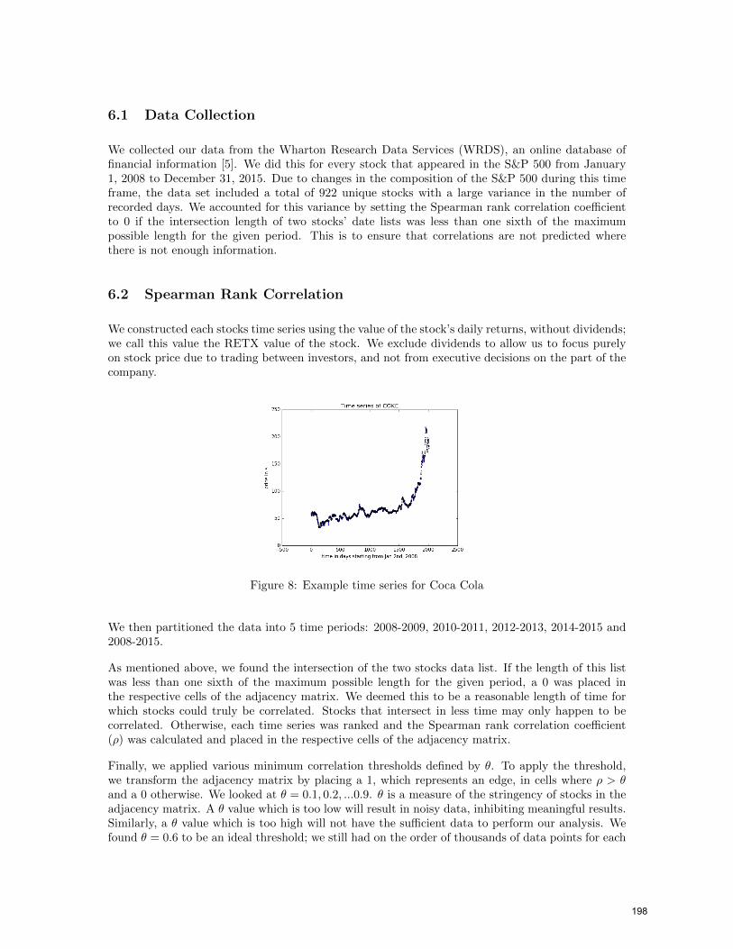
We constructed each stocks time series using the value of the stock’s daily returns, without dividends;we call this value the RETX value of the stock. We exclude dividends to allow us to focus purelyon stock price due to trading between investors, and not from executive decisions on the part of thecompany.
Figure 8: Example time series for Coca Cola
We then partitioned the data into 5 time periods: 2008-2009, 2010-2011, 2012-2013, 2014-2015 and2008-2015.
As mentioned above, we found the intersection of the two stocks data list. If the length of this listwas less than one sixth of the maximum possible length for the given period, a 0 was placed inthe respective cells of the adjacency matrix. We deemed this to be a reasonable length of time forwhich stocks could truly be correlated. Stocks that intersect in less time may only happen to becorrelated. Otherwise, each time series was ranked and the Spearman rank correlation coefficient(ρ) was calculated and placed in the respective cells of the adjacency matrix.
Finally, we applied various minimum correlation thresholds defined by θ. To apply the threshold,we transform the adjacency matrix by placing a 1, which represents an edge, in cells where ρ > θand a 0 otherwise. We looked at θ = 0.1, 0.2, ...0.9. θ is a measure of the stringency of stocks in theadjacency matrix. A θ value which is too low will result in noisy data, inhibiting meaningful results.Similarly, a θ value which is too high will not have the sufficient data to perform our analysis. Wefound θ = 0.6 to be an ideal threshold; we still had on the order of thousands of data points for each
198

2-year period and kept up to 10% of the information for each 2-year period. Keeping informationfor a θ value too low (e.g. 50%) includes pairs of stocks that are loosely correlated. Please refer totables 20 and 21 in Appendix C to view distribution of data that remained after choosing θ values.
6.3 Graph Statistics
6.3.1 Degree Distribution
The degree distribution of the graph’s nodes can be used to describe connectivity patterns of theoverall graph. We found that our degree distribution closely followed a power− law, that is, P(k) ∝k−γ where P(k) is the frequency of nodes with degree k. This is the case in many real-world networks(Shirokikh et al. 2013). This served as a check for accuracy, if we were incorrect in our approachthen this power law would not have been evident. A comparison of our results and the expectedpower law distribution is shown below
Figure 9: Generated degree distribution Figure 10: Power law distribution
6.3.2 High Degree Stocks
In order to determine which stocks have the largest impact on the overall market, we simply lookedat the top 10 stocks with the highest degree in each period.
We found that, for a threshold θ = 0.6, in 2008-2009, 8 of the 9 highest degree stocks were from theFinance sector, while the other stock is no longer listed. For 2010-2011, we found there were newadditions of stocks from the consumer defensive and industrial sectors. Then, for 2012-2013, themost correlated stocks were medium risk ETFs, with riskier ETFs falling in the 2014-2015 period.
Due to changes in the composition of the S&P 500 for each period, the number of stocks that existedfor a significant duration over a given period varied. Therefore, in the following chart, we calculatedthe degree of each stock as a percent of the maximum degree for that period. The maximum degreebeing the number of stocks that existed in that period.
199

Figure 11: Degree of most correlated stocks as percent of maximum degree for period (θ = 0.6)
6.4 k-Core Analysis
To potentially highlight additional structural properties of the graph, we move from the regularconnected components, to the tight network clusters of k-cores. We chose k-cores as oppose toanalyzing cliques, where all nodes are pairwise connected, due to computational efficiency. This isimportant since market analysis tends to deal with large data sets in time-critical settings.
A k-core is a subgraph containing all the remaining nodes after recursively removing nodes of degreeless than k. To find the k-cores, an algorithm was used that recursively removed nodes with lessthan k edges until all remaining nodes had k edges. In the following example, starting with thegraph in Figure 12, if we wanted to find the 3-core of the graph we would start by removing allnodes with degree less than 3, which would be node 6. We then repeat, and because of the previousremoval, node 5 is now of degree 2, so we remove it. We are left with the graph in Figure 13.
1 2
3 4
5
6
Figure 12: Undirected graph
1 2
3 4
Figure 13: 3-core of graph in Figure 12
After computing the k-cores, we found the degeneracy of the graph. This is the maximum k suchthat the graph contains a non-empty k-core. As noted for high degree stocks, a different number ofstocks existed in each period and therefore we define the maximum degeneracy for a given period asthe number of stocks that existed in that period. The plot below summarizes how, in each period,the degeneracy of the graph evolved as θ increased.
200

Figure 14: Degeneracy for each θ as percent of maximum degeneracy for period
This graph suggests that, during the recession period (2008-2009), a large cluster of loosely correlatedstocks existed. Then, following the recession period (2010-2011), this cluster dramatically reducedin size, before stabilizing. One possible explanation for this behavior is that, during the recessionperiod, many investors were selling shares to avoid losses. This could have resulted in a market widedrop. Then, for the next couple years, due to fear, activity in the market was markedly reduced.
6.5 Sector Graph
The sector graph allows us to globally visualize how each sector is interacting. It is paramountto the goal of our project to be able to quickly determine where the most connections are underthe economic conditions at the time. By way of graph structure it will theoretically be easy to seewhen structural instabilities may be occurring in one sector and is thus likely to occur a downswingtrend.In the period 2008-2009 the finance sector was the lowest correlated sector. We conclude this isdue to the accelerating negative returns this sector was encountering in 2007-2008 from the recessionin the US economy.
Figure 15: Total Sector correlation between2008 and 2009
Figure 16: Total Sector correlation between2010 and 2011
201

7 Future Development
7.1 Directed Graph
Consider a time series Ts(t) : R→ R that gives the value of stock s at time t. In practice, we won’thave an exact function, but a data vector Ts for the stock, where the kth entry is the value of thestock at time k. Define Ts,[a,b] to be the vector containing entries a through b of Ts.
We have the Spearman-Rank function S(T1,T2) which maps a pair of time series to a numberbetween -1 and 1. Take two time series Ts and Tr, of the same length l. Take a = 0 and b = l−N ,where N is the maximum number of days before a stock can influence another. We make theassumption that N = 10 suffices, but further research could determine what optimal N is. Wedefine the modified Spearman-Rank function:
SM (Ts,Tr) = max{S(Ts,[a,b],Tr,[a+k,b+k])} for k ∈ {0, ..., N}
We also define the max-delay function:
M(Ts,Tr) = k ∈ {0, ..., N} 3 S(Ts,[a,b],Tr,[a+k,b+k]) > S(Ts,[a,b],Tr,[a+i,b+i]) ∀i ∈ {0, ..., N}
The modified Spearman-Rank function allows us to define a directed graph, this is because unlikethe Spearman-Rank function where S(T1,T2) = S(T2,T1), the order of the arguments matter. Ifthe modified Spearman-Correlation is high from T1 to T2, then T1 influences T2, while the reversemight not be true. In the paper by Shirokikh, Pastukhov et al., [1] mention the fact that theirgraph is undirected, and cannot show influence, so this method will hopefully fill this gap perfectly.In summary, this method will allow us to get a better picture of the market and the relationshipsbetween stocks, sectors etc.
7.2 Short-Term Trading Tools
Short term trading tools will play a pivotal role in the actual implementation of our model. Thoughour model can identify the sectors where the most robust analysis will be located it cannot beemployed to make returns on individual stocks. Through short term trading tools such as BollingerBands, relative strength indicators, and ultimate oscillators etc. we will be able to (theoretically)better predict where a stock will be in a short time interval. The nature of short term trading toolsis not one of high accuracy, usually due to weak market infrastructure and poor macroeconomicconditions, however our model should lesson the effects of external market forces and allow theanalysis to rely purely on internal stock information. This will lead to a higher percentage ofwinning trades on the part of the investor.
7.3 Real Business Cycle Modeling
The term business cycle describes the booms and busts an economy encounters over a period oftime. Macroeconomics devotes much of its research to this area, and we believe our project maylend itself to furthering knowledge in this area. We are fortunate enough to have data from themost recent financial crises in 2008, so we performed analysis to obtain meaningful results. Thedata shows that previous to the 2008 financial crash, which occurred in October, the finance sectorwas the lowest correlated sector to the other 9 sectors. Interestingly enough, as the graph shows the
202

finance sector composed more than 80 percent of the highest correlated stocks from 2008-2009. Werecall that the spearman rank index is based upon RETX values, which indicated that the financesector was composed of stocks that were generating returns which were highly similar. However,due to what we call inherent market weakness in the finance sector these values were all negativeleading up to this period.Using this analysis we may generalize what conditions precede a recessionand which precede a bull market.
8 Conclusion
The results that we obtained from our analysis matched what happened in the stock market throughthe time period we studied (2008-2015). We accomplished our goal of constructing a model for im-proving short term analysis. For the time period 2008-2009, our model showed that the transporta-tion sector, a subset of industrial’s, was the best candidate. In the following period of 2010-2011,the industrial sector was the highest returning sector. Furthermore, during 2008-2009, eight of theten stocks with the greatest number of correlations were in the finance sector, with the other twostocks being DuPont which is listed in the industrial sector, and FO which is no longer listed on theexchange. During 2010-2011, many finance stocks remain as the highest degree stocks. However,there were more industrial and consumer defensive stocks who also had greater number of corre-lations. Thus, in the period of the stock market crash, most of the highly-correlated stocks werein the finance sector, leading to an isolation of finance stocks from all other stocks. In addition,the increasing negative returns of the finance stocks during 2008-2009 show that a financial crashoccurred. Following the crash, we witnessed a flocking of ETF’s (exchange traded funds), becauseinvestors wished to capture more of the volatility in the market recovery while hedging with saferstocks. As noted previously, the finance sector composed the most critical portion of the degree dis-tribution, when the financial crises hit the financial sector, the result was a recession in the overallmarket.
Further research would include inducing a shock in the market by lowering all correlations of a sectorwith its neighbors due to increased negative returns to track the correlations, and returns of othersectors over time. One could investigate: which sectors have the greatest affect on the market, howlong it would take for the market to stabilize, which stocks are most resistant to market crashes,and which stocks recover the most after the market crash i.e. identify the best stocks to invest in.
9 Acknowledgement
This project was mentored by Tova Brown, whose help is greatly appreciated. We thank Dr. Hermifor his guidance. Support from a UA TRIF (Technology Research Initiative Fund) grant to J. Legais also acknowledged.
References
[1] Shirokikh, Oleg, Grigory Pastukhov, Vladimir Boginski, and Sergiy Butenko. ComputationalStudy of the US Stock Market Evolution: A Rank Correlation-based Network Model. Compu-tational Management Science Comput Manag Sci 10.2-3, (2013): 81-103.
203

[2] Chung, F. R. K. Laplacians of graphs and Cheeger inequalities. math.ucsd.edu. N.p., n.d. Web.3 May 2016. http://www.math.ucsd.edu/ fan/wp/cheeger.pdf.: Chapter 2
[3] Jan Hauke, Tomasz Kossowski. Comparison of Values of Pearson’s and Spearman’s CorrelationCoefficients on the Same Sets of Data. Quaestiones Geographicae. June 2011. Volume 30, Issue2, Pages 87–93, ISSN (Print) 0137-477X, DOI: 10.2478/v10117-011-0021-1.
[4] ”Market Indices.” sec.gov, https://www.sec.gov/fast-answers/answersindiceshtm.html. Ac-cessed 16 May 2017.
[5] Wharton Research Database Services, Wharton School of Business, https://wrds-web.wharton.upenn.edu/wrds/. Accessed 16 Feb 2016.
204

10 Appendix A: Code
All Data Analysis for this project was done in Python. Some graphs and figures were generatedusing Excel. We created tools for the following:
• Plotting a time series for a stock
• Calculating the Spearman-Rank Correlation
• Creating the adjacency matrix for our graph
• Enforcing a Theta Threshold on an adjacency matrix
• Finding the k-cores in our network
• Determine the degeneracy of the graph
• Graphing an an adjacency matrix (2D and 3D)
• Determining correlations between sectors
• Calculating the Degree Distribution of our graph
• Calculating the Edge Density of our graph
• Various other minor scripts
Our code is available at: https://bitbucket.org/Team_Name_Goes_Here/stock-analysis
Code to generate the Spearman Adjacency Matrix for a given starting year and ending year.
# for each name in stocknames
for a in xrange(2, len(stocknames)):
row = []
# for every other stock related to stocknames[a]
for b in xrange(a,len(stocknames)):
rho = c.spearman_cor(details+stocknames[a], details+stocknames[b],
start_year, end_year)
row.append(rho)
The code to find which stocks are in a given k-core is shown below:
def k_core(data,k):
’’’
Determines which stocks exist in a given k-core.
Parameters
data: A numpy array with rows and columns representing stocks.
An edge between the stock of the corresponding row and column is represented
by a 1. A 0 is placed otherwise.
k: An int that specifies which k-core to find.
205

Returns: A list of ints representing indices of stocks in k-core.
’’’
row_sums = np.sum(data, axis = 1)
indices = np.where(row_sums < k + 1)
while indices[0].size != 0:
for i in indices:
data[:,i] = 0
data[i,:] = 0
row_sums = np.sum(data, axis = 1)
indices = np.where((row_sums != 0) & (row_sums < k + 1))
stock_indices_in_kcore = np.where(row_sums != 0)
return stock_indices_in_kcore[0]
Snippet of code to calculate correlations between sectors
new_mat = [[0 for i in range(len(sectors))] for j in range(len(sectors))]
l = len(indices)
total = 0
i = 0
j = 1
k = 2
while not j == l-1:
while k != l:
D,n = Process(matrix,indices[i],indices[j],indices[k]) #loop in here
if n != 0:
new_mat[i][k-1] = float(D)/float(n)
else:
new_mat[i][k-1] = float(D)
total += n
k += 1
i += 1
j += 1
k = j+1
To generate the degree distribution
# This creates and saves a file that contains the
# degree distribution of our matrix
def make_deg_dist(path):
deg_vec = read_vector(path)
sorted_vec = sorted(deg_vec)
total = sum(deg_vec)
uniq_vecs = np.unique(deg_vec)
deg_lists = []
for i in sorted_vec:
deg_lists.append([k for k in sorted_vec if k == i])
206

uniq_lists = list(np.unique(np.asarray(deg_lists)))
freq_list = [float(len(i))/total for i in uniq_lists]
plt.plot(uniq_vecs, freq_list, ’*b’, linestyle=’-’)
plt.title(’Degree distribution’)
plt.xlabel(’Degree’)
plt.ylabel(’Percentage occurence’)
plt.savefig(path[:-4]+’.png’)
The following functions were used to calculate the eigenvalues of a given matrix and for the graphlaplcian, identify the number of connected components and connectivity of the graph
# Calculate eigenvalues and return them
def eigenvalues_of(matrix): return LA.eig(matrix)
# Find number of connected components and smallest positive eigenvalue
def conn_comp_and_connectivity(e_vals):
uniq_e_vals = np.unique(e_vals)
e_val_list = []
sorted_evals = sorted(e_vals)
for e in sorted_evals:
e_val_list.append([k for k in sorted_evals if e == k])
uniq_lists = list(np.unique(np.asarray(e_val_list)))
num_conn_comp = len(uniq_lists[0])
connectivity = uniq_lists[1][0]
print uniq_lists[:3]
return num_conn_comp, np.real(connectivity)
Part of code used to strip data about sectors from yahoo finance
sector_list = [’Basic Materials’,’Conglomerates’, ... ,’Services’, ’Technology’, ’Utilities’]
# List all file names (stockname.csv) in Details folder
details = "../Data/historicaldata/Details/"
snames = os.listdir(details)
total = float(len(snames))
table = [["TICKER","SECTOR"]]
counter = 0
for stock in snames:
page = url.urlopen(’https://finance.yahoo.com/q/in?s=%s+Industry’%stock[:-4])
soup = bs(page,’html.parser’)
for sector in sector_list:
if ’>’+sector+’</a>’ in str(soup):
table.append([stock[:-4], sector])
print "Stock %s is in Sector %s"%(stock[:-4], sector)
207

else:
table.append([stock[:-4], "NONE"])
write_content(table, "sector_data.csv")
11 Appendix B: Graphs
Figure 17: Top degree stocks in 2008-2015 are plotted for each time period.
208

Figure 18: The percent of data remaining as θ increases is tracked.
Figure 19: Example 3D graph we generated
12 Appendix C: Tables
209

θ = 0.1 θ = 0.2 θ = 0.3 θ = 0.4 θ = 0.5 θ = 0.6 θ = 0.7 θ = 0.8 θ = 0.92008-2009 55.76% 52.52% 42.09% 27.34% 14.03% 4.68% 2.16% 0.36% 0.00%2010-2011 18.41% 16.97% 15.88% 12.76% 7.58% 3.01% 1.08% 0.72% 0.24%2012-2013 57.02% 41.48% 28.45% 19.30% 13.66% 9.65% 5.64% 2.38% 0.50%2014-2015 57.04% 39.52% 24.10% 15.12% 9.88% 6.44% 4.34% 2.69% 0.75%
Figure 20: Degeneracy for ρ > θ as Percent of Max Degeneracy for Period
2008-09 2010-11 2012-13 2014-150.0 ≤ θ < 0.1 808656 754389 467342 5843740.1 ≤ θ < 0.2 13678 61476 134492 975440.2 ≤ θ < 0.3 5100 9232 103314 756020.3 ≤ θ < 0.4 8736 5106 66600 479780.4 ≤ θ < 0.5 8384 8208 37570 240360.5 ≤ θ < 0.6 4178 7310 21738 117560.6 ≤ θ < 0.7 928 2672 11304 51440.7 ≤ θ < 0.8 138 710 5408 19420.8 ≤ θ < 0.9 8 346 1430 8780.9 ≤ θ < 1.0 0 52 126 166
Figure 21: Edge Distribution
Symbol Name LastSale MarketCap IPOyear SectorAXAS Abraxas Petroleum Corporation 1.14 121234441.14 n/a EnergyAE Adams Resources & Energy, Inc. 39.1 164908003.6 n/a EnergyAAV Advantage Oil & Gas Ltd 5.45 1004931696.65 n/a EnergyANW Aegean Marine Petroleum Network Inc. 7.62 367827709.86 2006 EnergyAHGP Alliance Holdings GP, L.P. 14.47 866217610 2006 EnergyARLP Alliance Resource Partners, L.P. 12.88 957950322 1999 EnergyALJ Alon USA Energy, Inc. 11.37 808143306.96 2005 EnergyALDW Alon USA Partners, LP 14.13 883266851.07 2012 EnergyAETI American Electric Technologies, Inc. 2.4295 20053095.4295 n/a EnergyAEUA Anadarko Petroleum Corporation 32.76 0 2015 EnergyAPC Anadarko Petroleum Corporation 48.76 24791468427.72 n/a EnergyAR Antero Resources Corporation 24.75 6857268066 2013 EnergyAPA Apache Corporation 49.63 18774919019.92 n/a EnergyAREX Approach Resources Inc. 1.56 63714749.28 2007 Energy
Figure 22: Example table of stocks for each sector; these stocks are in the Energy sector.
210