analyzing the shape of data example’s 1.describe the shape of the graphed data.do you notice any...
TRANSCRIPT

Analyzing The Shape of Data

Example’s
1.Describe the shape of the graphed data.Do you notice any gaps in the data?
15, 20, 25, 30, 35, 40, 45, 50, 55, 60 ,65 ,70 ,75 ,80 ,85 ,90 ,95
xxx
xxxx
xx
xxxxxx
xx
xxxx
xx
xxxx
xx x

1.Does the data set contain any outliers?
15, 20, 25, 30, 35, 40, 45, 50, 55, 60 ,65 ,70 ,75 ,80 ,85 ,90 ,95
xxx
xxxx
xx
xxxxxx
xx
xxxx
xx
xxxx
xx x

4
1.What Value would be a good representation of variation of this data set?
15, 20, 25, 30, 35, 40, 45, 50, 55, 60 ,65 ,70 ,75 ,80 ,85 ,90 ,95
xxx
xxxx
xx
xxxxxx
xx
xxxx
xx
xxxx
xx x

5
What value would be a good measure for the center of the data set?
15, 20, 25, 30, 35, 40, 45, 50, 55, 60 ,65 ,70 ,75 ,80 ,85 ,90 ,95
xxx
xxxx
xx
xxxxxx
xx
xxxx
xx
xxxx
xx x
6
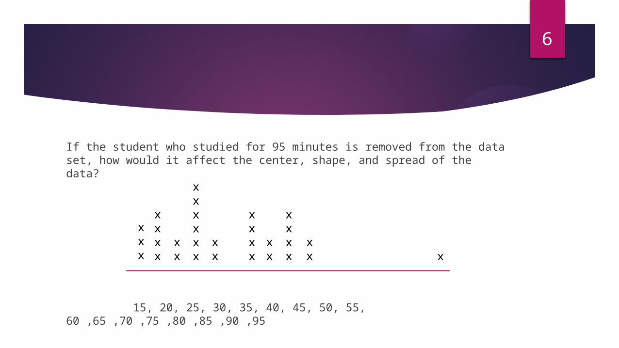
If the student who studied for 95 minutes is removed from the data set, how would it affect the center, shape, and spread of the data?
15, 20, 25, 30, 35, 40, 45, 50, 55, 60 ,65 ,70 ,75 ,80 ,85 ,90 ,95
xxx
xxxx
xx
xxxxxx
xx
xxxx
xx
xxxx
xx x
Vocabulary7
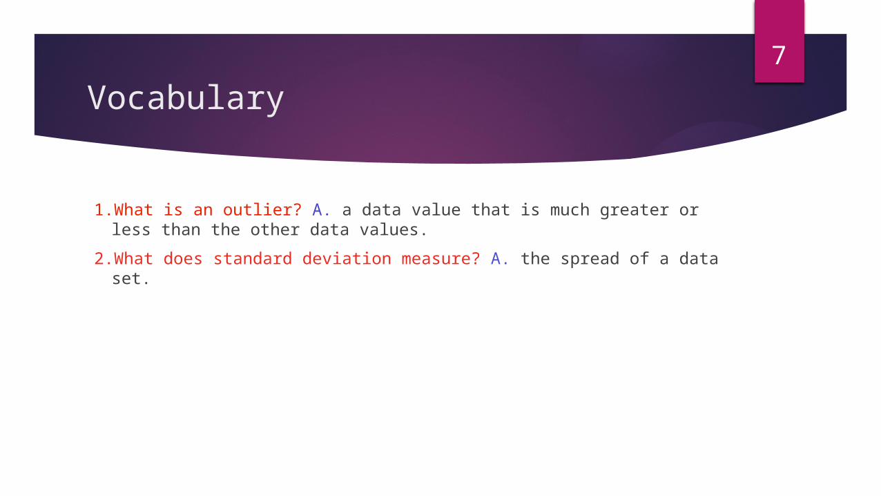
1.What is an outlier? A. a data value that is much greater or less than the other data values.
2.What does standard deviation measure? A. the spread of a data set.
Graphs don't have to be perfectly symmetric to be described symmetric.
8
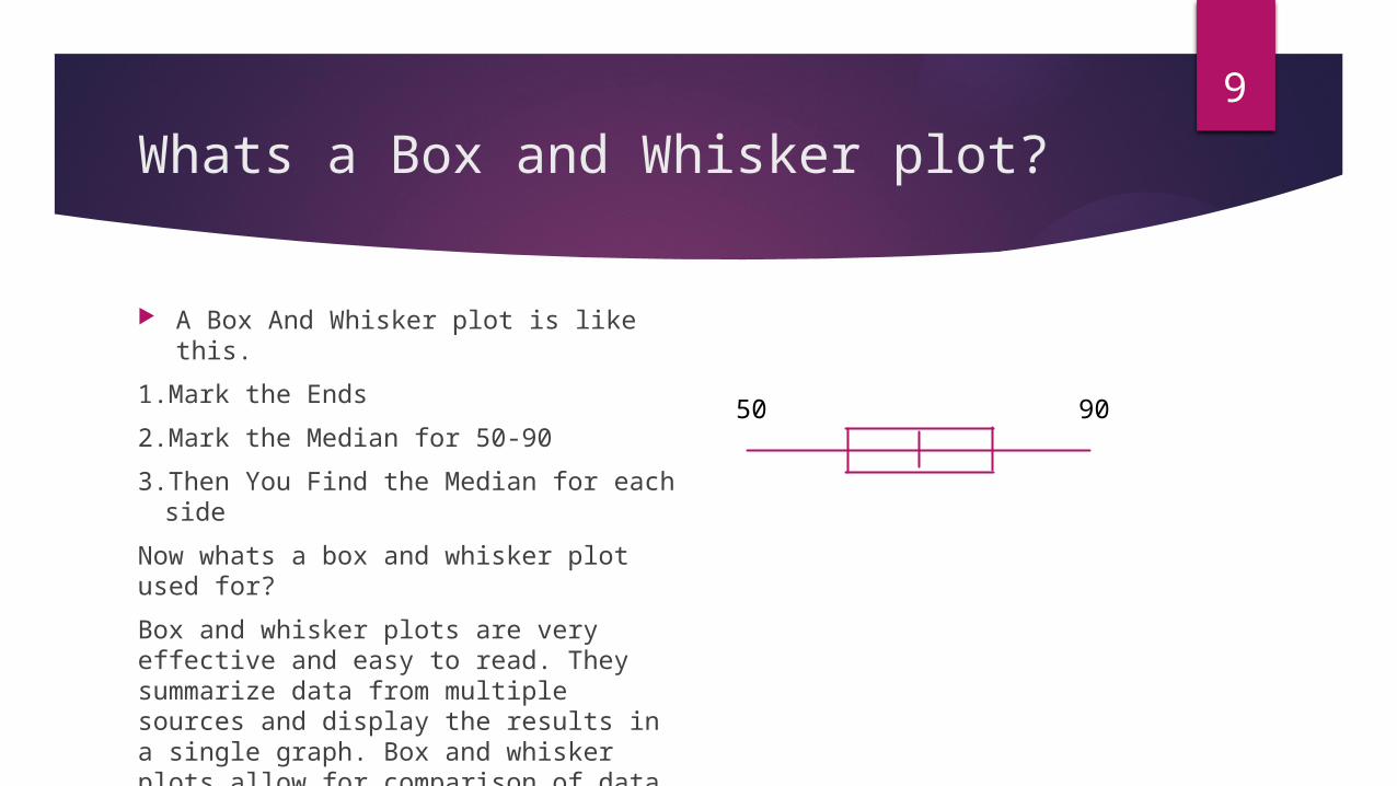
Whats a Box and Whisker plot?
A Box And Whisker plot is like this.
1.Mark the Ends
2.Mark the Median for 50-90
3.Then You Find the Median for each side
Now whats a box and whisker plot used for?
Box and whisker plots are very effective and easy to read. They summarize data from multiple sources and display the results in a single graph. Box and whisker plots allow for comparison of data from different categories for easier, more effective decision-making.
9
50 90

Whats a Histogram?10
A diagram consisting of rectangles whose area is proportional to the frequency of a variable and whose width is equal to the class interval.
200-219 220-239 240-259 290-2790
17.5
35
52.5
70
87.5
Sales($)
# Days
Why use a histogram?
A frequency distribution shows how often each different value in a set of data occurs. A histogram is the most commonly used graph to show frequency distributions. It looks very much like a bar chart, but there are important. differences between them.
11
ANALYZING THE SHAPE OF DATAMADE BY: TEAM 1
12