ancillary task 2.5
TRANSCRIPT
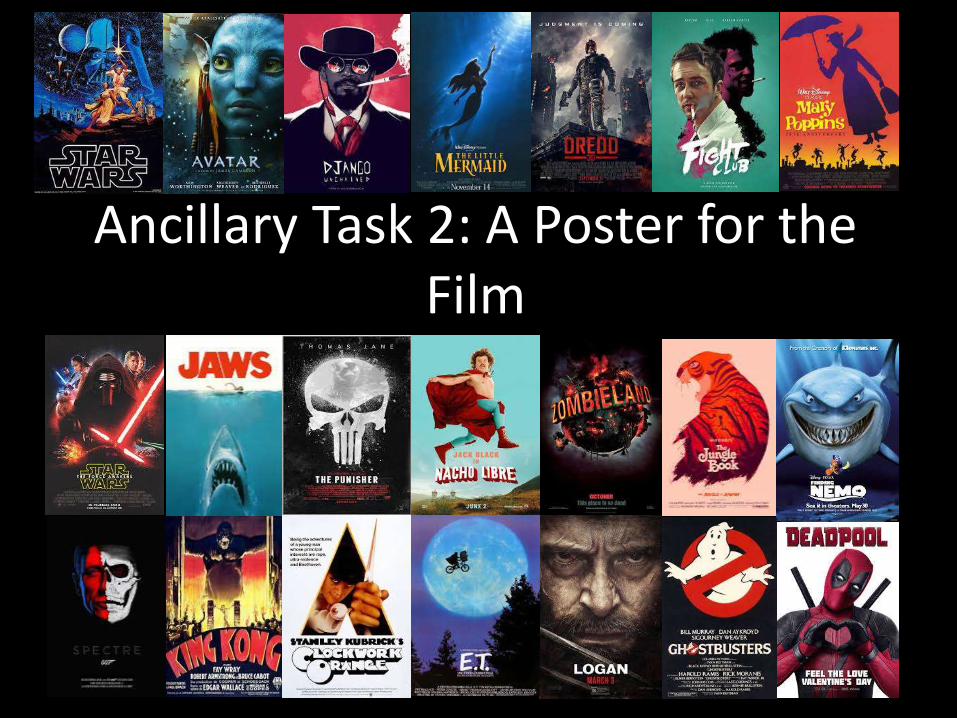
Ancillary Task 2: A Poster for the Film
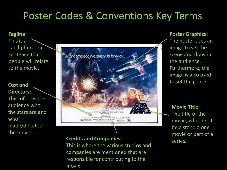
Poster Codes & Conventions Key Terms
Poster Graphics:The poster uses an image to set the scene and draw in the audience. Furthermore, the image is also used to set the genre.
Movie Title:The title of the movie, whether it be a stand alone movie or part of a series.
Tagline:This is a catchphrase or sentence that people will relate to the movie.
Cast and Directors:This informs the audience who the stars are and who made/directed the movie.
Credits and Companies:This is where the various studios and companies are mentioned that are responsible for contributing to the movie.
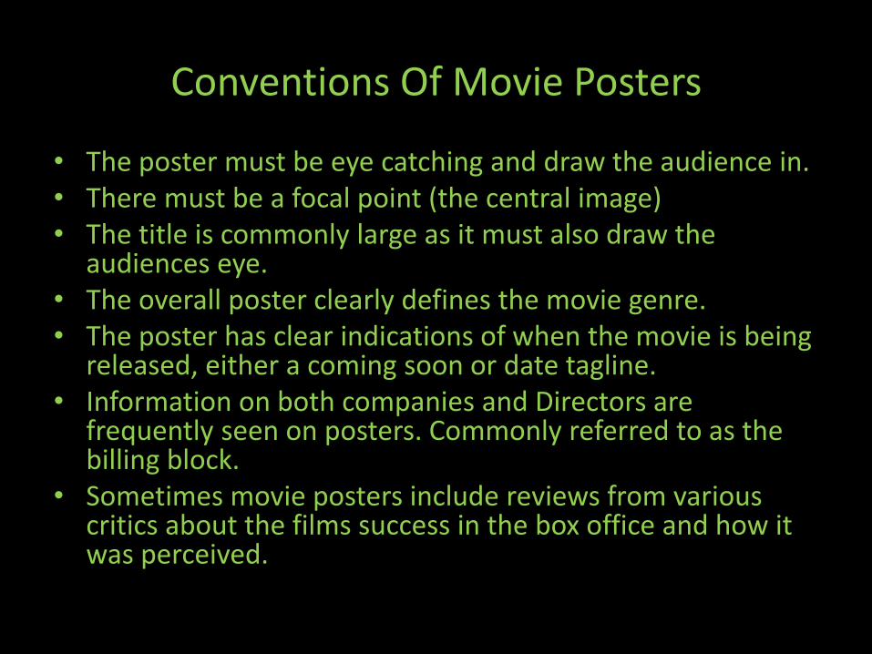
Conventions Of Movie Posters
• The poster must be eye catching and draw the audience in.• There must be a focal point (the central image) • The title is commonly large as it must also draw the
audiences eye. • The overall poster clearly defines the movie genre.• The poster has clear indications of when the movie is being
released, either a coming soon or date tagline. • Information on both companies and Directors are
frequently seen on posters. Commonly referred to as the billing block.
• Sometimes movie posters include reviews from various critics about the films success in the box office and how it was perceived.
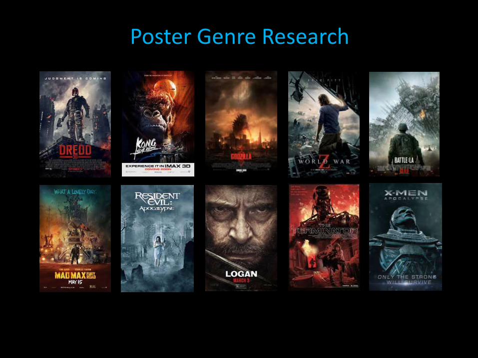
Poster Genre Research
Poster Genre Research
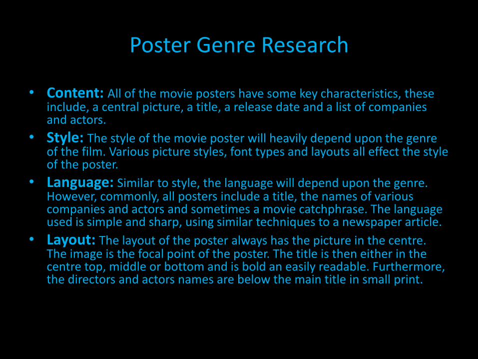
• Content: All of the movie posters have some key characteristics, these include, a central picture, a title, a release date and a list of companies and actors.
• Style: The style of the movie poster will heavily depend upon the genre of the film. Various picture styles, font types and layouts all effect the style of the poster.
• Language: Similar to style, the language will depend upon the genre. However, commonly, all posters include a title, the names of various companies and actors and sometimes a movie catchphrase. The language used is simple and sharp, using similar techniques to a newspaper article.
• Layout: The layout of the poster always has the picture in the centre. The image is the focal point of the poster. The title is then either in the centre top, middle or bottom and is bold an easily readable. Furthermore, the directors and actors names are below the main title in small print.
Application
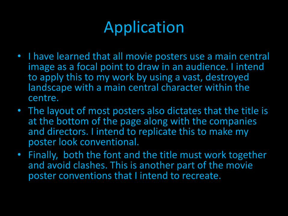
• I have learned that all movie posters use a main central image as a focal point to draw in an audience. I intend to apply this to my work by using a vast, destroyed landscape with a main central character within the centre.
• The layout of most posters also dictates that the title is at the bottom of the page along with the companies and directors. I intend to replicate this to make my poster look conventional.
• Finally, both the font and the title must work together and avoid clashes. This is another part of the movie poster conventions that I intend to recreate.
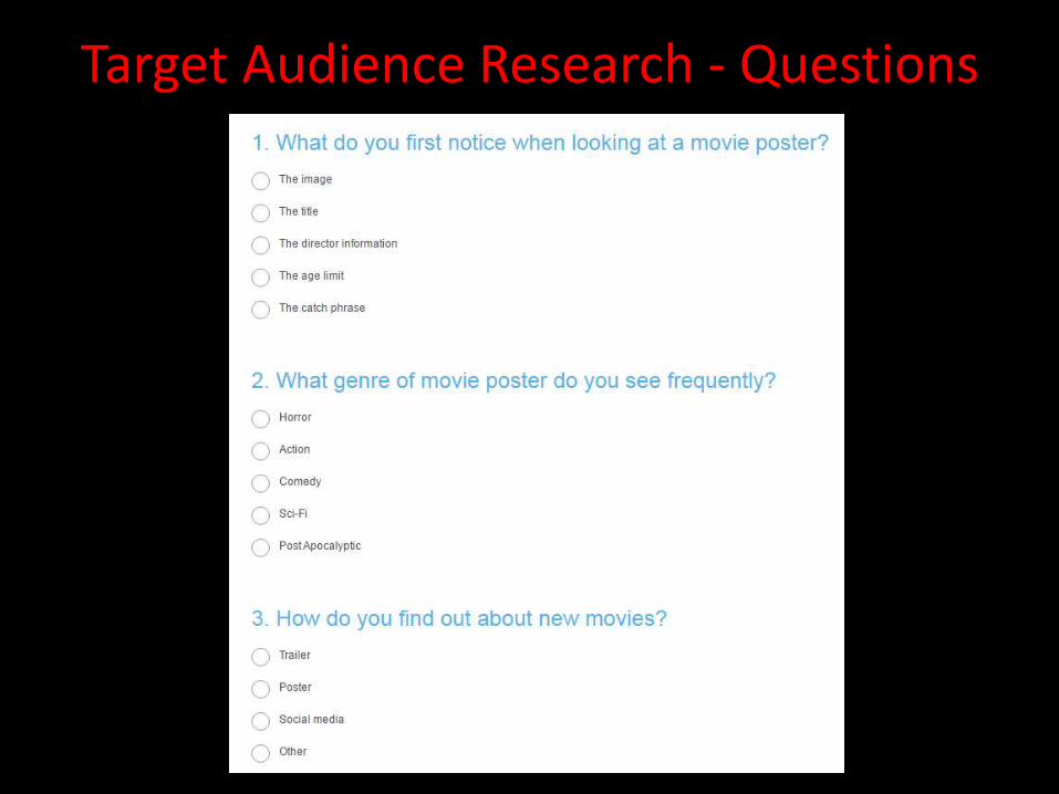
Target Audience Research - Questions
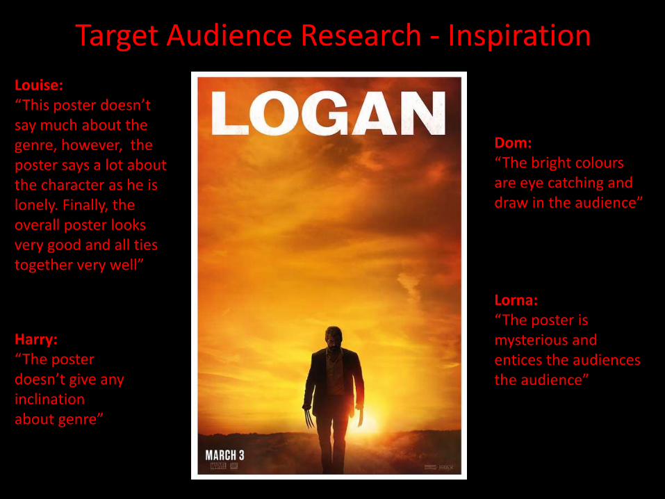
Target Audience Research - Inspiration
Louise:“This poster doesn’t say much about the genre, however, the poster says a lot about the character as he is lonely. Finally, the overall poster looks very good and all ties together very well”
Dom:“The bright colours are eye catching and draw in the audience”
Lorna:“The poster is mysterious and entices the audiences the audience”
Harry:“The poster doesn’t give any inclination about genre”
Target Audience Research - Inspiration
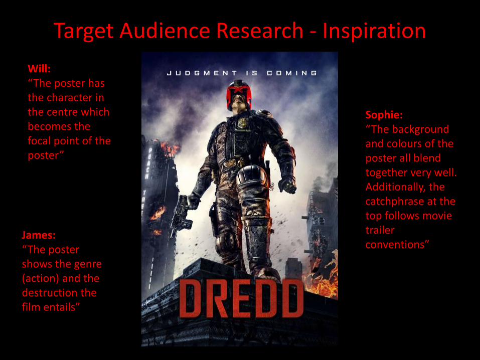
James:“The poster shows the genre (action) and the destruction the film entails”
Sophie:“The background and colours of the poster all blend together very well. Additionally, the catchphrase at the top follows movie trailer conventions”
Will:“The poster has the character in the centre which becomes the focal point of the poster”
Target Audience Research – Inspiration
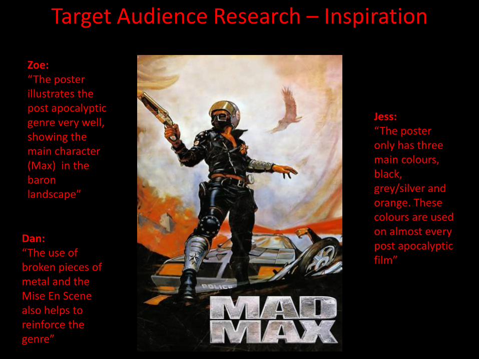
Zoe:“The poster illustrates the post apocalyptic genre very well, showing the main character (Max) in the baron landscape”
Dan:“The use of broken pieces of metal and the Mise En Scene also helps to reinforce the genre”
Jess:“The poster only has three main colours, black, grey/silver and orange. These colours are used on almost every post apocalyptic film”
Target Audience Research – Conclusion
• After looking at my questionnaire and the various comments about the movie posters, I have decided that I will use this information to create my own genre specific poster.
• This will be created by using a limited set of colours, similar to the comments made about the ‘Mad Max’ poster, as well as the colouring used within the ‘Logan’ poster. Furthermore, The posters do not have a large amount within the image and are simple however illustrate the genre really well. I intend to use this as inspiration for my poster, a main image and simple colours will be used to set the genre whilst not revealing too much about the film.
• Finally, the production companies and directors name will be at the bottom of the poster, this gives the poster a professional look whilst also giving info on release dates and the companies responsible for the film.
Composition - Grid Layout
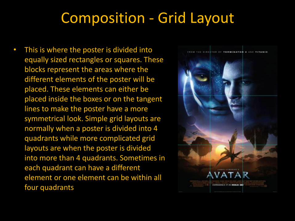
• This is where the poster is divided into equally sized rectangles or squares. These blocks represent the areas where the different elements of the poster will be placed. These elements can either be placed inside the boxes or on the tangent lines to make the poster have a more symmetrical look. Simple grid layouts are normally when a poster is divided into 4 quadrants while more complicated grid layouts are when the poster is divided into more than 4 quadrants. Sometimes in each quadrant can have a different element or one element can be within all four quadrants
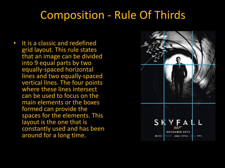
Composition - Rule Of Thirds
• It is a classic and redefined grid layout. This rule states that an image can be divided into 9 equal parts by two equally-spaced horizontal lines and two equally-spaced vertical lines. The four points where these lines intersect can be used to focus on the main elements or the boxes formed can provide the spaces for the elements. This layout is the one that is constantly used and has been around for a long time.
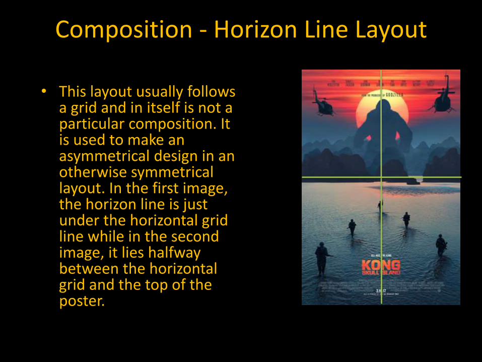
Composition - Horizon Line Layout
• This layout usually follows a grid and in itself is not a particular composition. It is used to make an asymmetrical design in an otherwise symmetrical layout. In the first image, the horizon line is just under the horizontal grid line while in the second image, it lies halfway between the horizontal grid and the top of the poster.
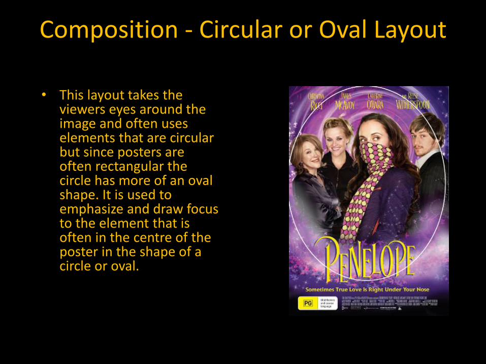
Composition - Circular or Oval Layout
• This layout takes the viewers eyes around the image and often uses elements that are circular but since posters are often rectangular the circle has more of an oval shape. It is used to emphasize and draw focus to the element that is often in the centre of the poster in the shape of a circle or oval.
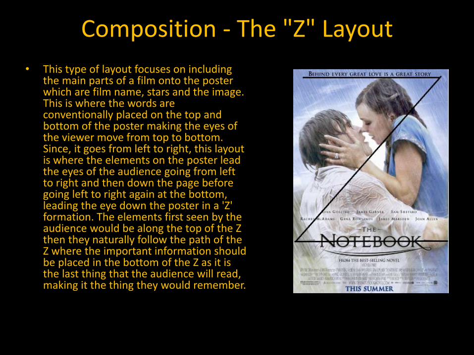
Composition - The "Z" Layout
• This type of layout focuses on including the main parts of a film onto the poster which are film name, stars and the image. This is where the words are conventionally placed on the top and bottom of the poster making the eyes of the viewer move from top to bottom. Since, it goes from left to right, this layout is where the elements on the poster lead the eyes of the audience going from left to right and then down the page before going left to right again at the bottom, leading the eye down the poster in a 'Z' formation. The elements first seen by the audience would be along the top of the Z then they naturally follow the path of the Z where the important information should be placed in the bottom of the Z as it is the last thing that the audience will read, making it the thing they would remember.
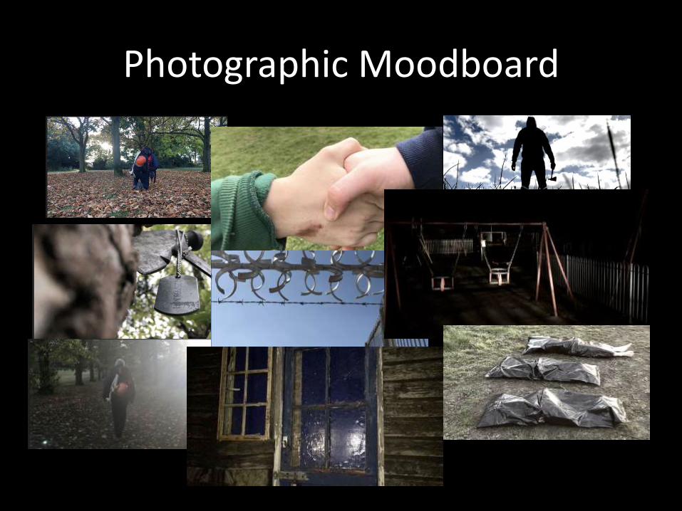
Photographic Moodboard
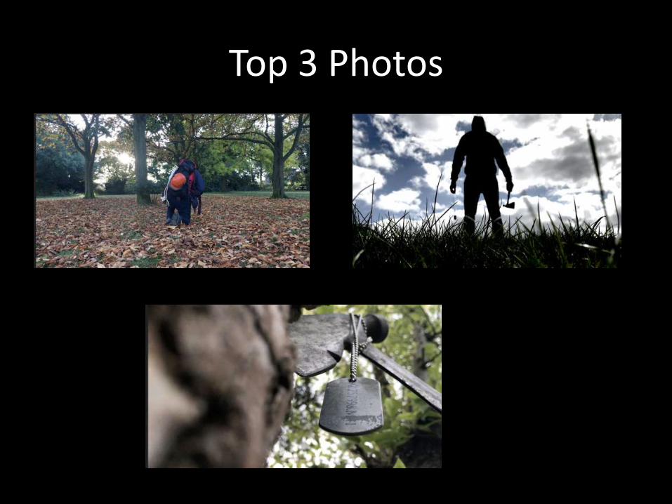
Top 3 Photos
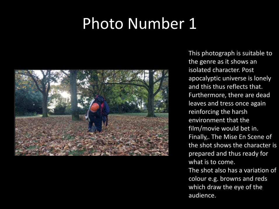
Photo Number 1
This photograph is suitable to the genre as it shows an isolated character. Post apocalyptic universe is lonely and this thus reflects that. Furthermore, there are dead leaves and tress once again reinforcing the harsh environment that the film/movie would bet in. Finally,. The Mise En Scene of the shot shows the character is prepared and thus ready for what is to come. The shot also has a variation of colour e.g. browns and reds which draw the eye of the audience.
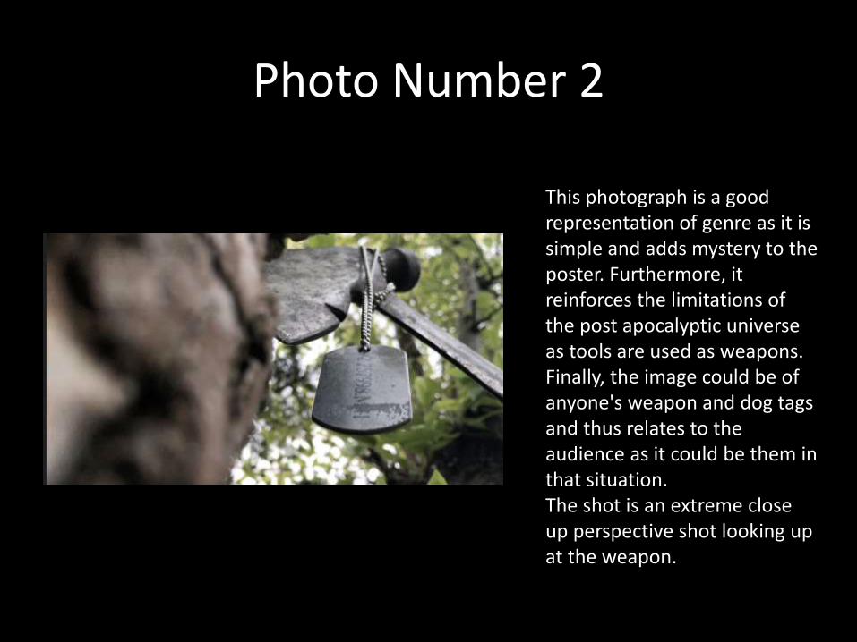
Photo Number 2
This photograph is a good representation of genre as it is simple and adds mystery to the poster. Furthermore, it reinforces the limitations of the post apocalyptic universe as tools are used as weapons. Finally, the image could be of anyone's weapon and dog tags and thus relates to the audience as it could be them in that situation. The shot is an extreme close up perspective shot looking up at the weapon.
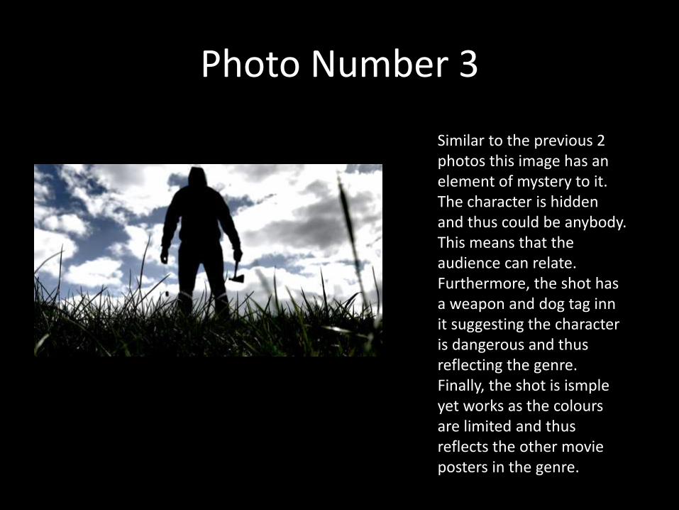
Photo Number 3
Similar to the previous 2 photos this image has an element of mystery to it. The character is hidden and thus could be anybody. This means that the audience can relate. Furthermore, the shot has a weapon and dog tag inn it suggesting the character is dangerous and thus reflecting the genre. Finally, the shot is ismpleyet works as the colours are limited and thus reflects the other movie posters in the genre.
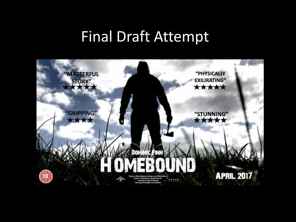
Final Draft Attempt
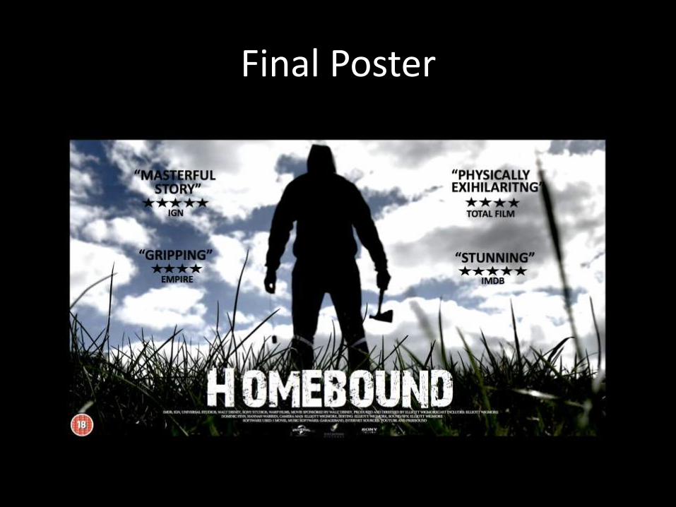
Final Poster