andrew glassner’s notebook · commercial foundries offer many professional typefaces as well,...
TRANSCRIPT
Ilove letters. From the squiggly g to the stately m, ourmodern alphabet offers a wealth of beautiful shapes.One of the great benefits of the revolution in desktop
publishing is that it has opened up the doors of typefacedesign to anyone with a computer and patience. Talentand a sense of aesthetics aren’t required to create a validtypeface, but they don’t hurt.
Dozens of Web sites offer visitors thousands of free type-faces (see the “Further Resources” sidebar for pointers toall the sites mentioned in this article). Most of these freefonts are the work of inspired amateurs who had an ideafor a typeface; they created it using commercial designtools, and then released their work into the world. You canalso buy collections of typefaces on CD compilations, sav-ing you the trouble of downloading them one by one.Commercial foundries offer many professional typefacesas well, created by skilled and trained designers.
I love browsing new typefaces and collecting the onesI like. This collecting pays off when a graphic-design jobrequires me to pick just the right typefaces to go withthe artwork, text, and overall feel of the piece.
I’m pretty discriminating in what I choose to save frompublic-domain sites, but when I find one that I like, Idownload it for my collection. The quality of the typo-graphical information provided with a free font varies:few include kerning information, it’s rare to see any kindof layout hinting, and most are missing at least a fewcharacters like ampersands or semicolons. But if you’rewilling to live with these limitations, you can find somegreat designs.
Between the free typefaces I’ve saved from the Web,those that I’ve gotten with magazine CDs or packagesI’ve purchased, and the commercial typefaces that I’vebought for specific jobs, I’ve now got more than 9,000typefaces on my computer.
Of course, they’re not all installed. Every typefaceinstalled in an operating system consumes systemresources, and slows down everyday tasks. Happily, sev-eral programs exist that let you browse through all thefont files on your computer.
Even with one of those programs, 9,000 typefaces is alot to look through. In practical terms, it’s way too many.I recently designed a logo for a company, so I had to lookfor a good typeface for the company name. Using a com-mercial font browser, I set the name of the company inthe preview window, and then stepped through every
typeface on my hard drive so I could see how the namelooked in that font. Because I had to visually consider eachone, my top speed was about 2 fonts per second. A littlemath shows that if I ground through without a singlebreak, I could have theoretically looked them all over inabout an hour and a quarter. In reality, my eyes glazedover after a few minutes, and it took about four hours toconsider the whole collection. When I finally finishedlooking through everything, I knew I never wanted to gothrough that again.
CategoriesNobody wants to sort through 9,000 typefaces every
time they get a new job. Commercial foundries often labeltheir work with a wide variety of keywords to make themeasier to find. For example, Apple uses 28 different cate-gories such as Blackletter, Cyrillic, Glyphic, Monospaced,Opticals, Ornamentals, and Swash. Planet typographyhas a different set of categories, but just as useful.
Searching through categories is great when you havea general feeling for what you want, and all of your fontshave been given useful and accurate labels. Unfortu-nately, free fonts rarely come categorized. In my collec-tion, I have only a few hundred commercial typefaces;the rest are nothing more than a family name and, if I’mlucky, an indication of whether the font is regular, bold,or italic.
I thought about sitting down and going through allmy typefaces and assigning categories to them. Thiswouldn’t be difficult, but it would be colossally boringand time consuming. I could get a reasonably good listof categories from any of the commercial catalogs, butassigning them one by one to each face would take for-ever. Even if I wrote a program to help me out, I figuredit would take at least a whole day to go through every-thing. Even then, a huge number of the public-domaintypefaces are so oddball that they would end up in themiscellaneous or novelty categories, which would defeatthe whole point of the exercise.
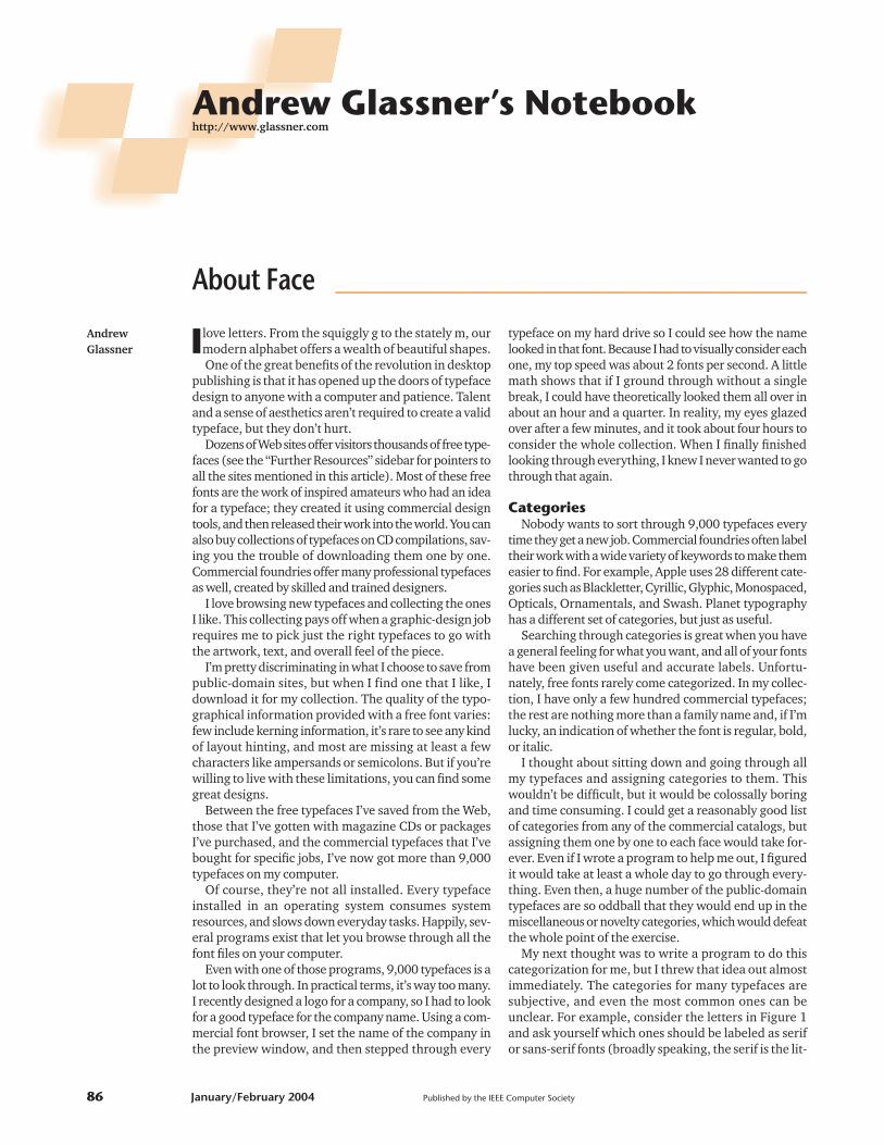
My next thought was to write a program to do thiscategorization for me, but I threw that idea out almostimmediately. The categories for many typefaces aresubjective, and even the most common ones can beunclear. For example, consider the letters in Figure 1and ask yourself which ones should be labeled as serifor sans-serif fonts (broadly speaking, the serif is the lit-
AndrewGlassner
About Face ________________________________________
Andrew Glassner’s Notebookhttp://www.glassner.com
86 January/February 2004 Published by the IEEE Computer Society
tle flare at the ends of lines, like the foot at the bottomof the letter F in Figure 1a). Reasonable people can holddifferent opinions on which of these letters have serifsand which don’t, and there’s no way a computer canreliably settle these disputes. Writing a program to reli-ably detect serifs in even the easiest cases still seemspretty hard to me.
MetricsIf deciding whether a character has serifs is hard,
imagine how much tougher it would be to categorize atypeface as handwritten or brushstroke. Automatingthese types of quality distinctions is nearly impossible.Yet I wanted a procedural way to sort through my fontcollection. So rather than automatically assigning qual-
IEEE Computer Graphics and Applications 87
Further ResourcesTo create the figures for this article, I used display fonts
taken from ClickArt Fonts 2 (published by Broderbund,2003) and the 2000 Font Collection (published byGreenstreet, 2003). Many of the fonts on these CDs are alsofreely available on the Web, but it’s still worth buying thepackages. It’s more convenient than downloading them allone by one, and these companies seem to spend some timecleaning up the font files.
Many free fonts available online have corrupted or badlyformed descriptors in the file, which means that someprograms can’t use a given typeface. Of course, you onlydiscover the failures when you’re trying to finish a projectonly moments before the deadline.
I’ve had no problem reading any of the fonts on thesecompilation CDs, which makes them worth the purchaseprice to me. Be aware that the quality of the fonts in thesecollections tends to vary considerably.
You can read about the type metrics saved in Adobe fontsin the document “Adobe Font Metrics Format SpecificationFile” by Adobe Systems. Version 4.1 is available online athttp://partners.adobe.com/asn/developer/pdfs/tn/5004.AFM_Spec.pdf.
The Panose specifications are laid out in the “Panose 2.0White Paper” by Michael S. De Laurentis. It’s available athttp://www.w3.org/Fonts/Panose/pan2.html. Anothersource for Panose data is the “Panose Classification MetricsGuide” available online from AGFA Monotype athttp://www.panose.com/hardware/pan1.asp.
Many great tools are available for browsing fonts on yourcomputer. On my PC I use Printer’s Apprentice (http://www.loseyourmind.com). Other popular tools areTypograph for the PC (http://www.neuber.com/typograph),and Font Book for the Mac (http://www.apple.com/macosx/features/fontbook).
You can see the type classifications used by Apple at
http://www.adobe.com/type/browser/classifications.html,and those used by Planet Typography athttp://www.planet-typography.com/manual/families.html.
If you’re looking for the name of a particular typeface,check out two great Web sites. Indentifont asks you a seriesof questions based on the qualities of the typeface you’relooking at (http://www.identifont.com). What The Font?!lets you upload an image of a few characters and respondswith the name of the typeface (http://www.myfonts.com/WhatTheFont).
If you enjoy the thrill of the hunt, and discovering newamateur typefaces as they’re developed, lots of sites existthat collect these typefaces, often providing versions inboth PC and Macintosh formats. DaFont(http://www.dafont.com/en), and Abstract Fonts(http://www.abstractfonts.com/fonts) both sort thetypefaces by category. Other sites I periodically check areHigh Fonts (http://www.highfonts.com), and 1001 Fonts(http://www.1001fonts.com). Once you’ve browsed thecollections at these sites, most let you sort by date, so youcan quickly catch up on what’s been added since the lasttime you stopped by. Many other smaller sites specialize indifferent varieties of typefaces.
Of course, don’t forget professional, commercial fonts.You must pay for these, but your money buys you a high-quality typeface with sophisticated kerning and hintinginformation, ligatures, and other professional details thatwill make your typeset work look professional and polished.The Adobe Type Library provides a wide variety of qualitytypefaces (http://www.adobe.com/type/main.jhtml). Agood consolidated source of fonts offered by many differentfoundries is MyFonts (http://www.myfonts.com).
A nice general resource for typefaces is athttp://jeff.cs.mcgill.ca/,luc/classify.html. You can find a nicecollection of pangrams at http://rinkworks.com/words/pangrams.shtml.
1 Serifs for the letter F. The top row goes from a letter with clear serifs on the left to a sans-serif letter on the right.On the bottom row, you could argue about whether these have serifs at all. Top row fonts: Amery, FreemanCondensed, Antique, Loose Cruse, Castle, Architect, and Adams. Bottom row: Cowboy, Epic, Cocoa, Adorable,Freedom 9, Amaze, and Banner Light.
itative descriptions and labels, I decided to see how far Icould get with simple numerical measures.
Of course, other people have looked into developingnumerical measures, or metrics, for typefaces. ThePanose system specifies about 65 measurements to helpdescribe and distinguish a font.
Panose was designed for Latin typefaces only, so it’snot applicable to typefaces for languages like Hebrewand Kanji. A Panose description of a Latin Text face ismade up of 10 numbers, one each for the type of family,serif style, weight, proportion, contrast, stroke variation,arm style, letterform, midline, and X-height. To each ofthese categories the system assigns a number, drawnfrom a list of standardized values. For example, familytype is set to 2 for Latin Text, and serif style is set to 5 ifthe serifs are of the form the Panose documentation calls“obtuse square cove”. If you’re looking for a particulartypeface, you can figure out what its Panose code wouldbe, and then use that code in a directory of fonts to see asample and identify its name.
Another approach to identify a font is to use a tool thattries to work backward from one or more characters. TheIdentifont Web site leads you through a series of ques-tions about the shape and style of different characters.Using a process of elimination, the site eventually iden-tifies the typeface by name and foundry. If you’re justbrowsing for something interesting, you can answer thequestions according to your intuition or how you thinkyour desired font would look, and see what it gives you.
If you have a sample in-hand, you can submit it to theWhat The Font?! site. You simply upload an image of atype sample you have, and it will look through its data-base to name the font for you.
Neither of these approaches is quite as nice as hunt-ing through a wide variety of typefaces all at once andchoosing among them, like flipping through the pagesof a catalog. I wanted to try creating a system that wouldlet me characterize my intentions in some general, high-level way and browse through the typefaces that matchthose goals, yet not require me to hand annotate everytypeface in my collection with one or more descriptivelabels.
I decided to cook up a bunch ofdifferent metrics that seemed easyto measure and had a chance ofbeing meaningful, and then write atool that let me browse through mycollection according to how wellthey met the weighted collection ofmetrics.
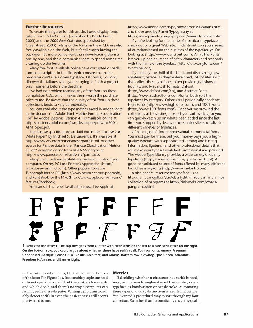
About faceFigure 2 shows a screen shot of
my program, About Face, in action.The interface all happens in threewindows. I call the top window thepreview window, the lower left thecontrol panel, and the lower right thefont browser.
Let’s start with the control panel.The gray section at the top lets uspick characters to display in the font
browser, and the text and point size of the sample shownin the preview window.
Below the gray section are six pairs of sliders. Each pairlets you specify the value for a particular metric, and howmuch that value should matter. For example, the top met-ric is density, which can take on a value from 0 to 1. Tomeasure density, I typeset the character entered in themeasure box (in the top left of the control panel), find itsbounding box, and then compute the average density ofthe character. White is 0, black is 1, and gray values areintermediate. I add up the density of all the pixels anddivide by the total number of pixels in the bounding boxto get a measure for the density of that character.
You can move the level slider from 0 at the left to 1 atthe right, describing the density you’d like. Then youadjust the weight slider, again from 0 at the left to 1 atthe right. This describes how much the density valueshould factor into the system’s choice of font.
There’s a pair of sliders for each of the other four met-rics, which I’ll describe later.
When you press the update button, the system goesthrough all the fonts in the program’s directory, andscores the measure character of each font with regardto the metrics. The sorted results are shown in the fontbrowser window in the bottom right of Figure 2. Thebest result is in the upper-left, and descending scoresrun left to right, top down.
You can click on any font in the font browser window,and the preview window will show you the preview textusing that typeface. The name of the window changes toidentify the face that’s currently displayed.
It’s fun to think about what constitutes good previewtext. Obviously if you’re setting something in particular,like a company name, you’ll want to see that text. Ifyou’re going to use the typeface in a more general way,you want to get a feeling for its general appearance. Oneapproach is to use a short fragment of text from the copyyou’re going to set. Another approach is to use a pan-gram, which is a sentence that contains all the letters ofthe alphabet. The best-known pangram is “The quickbrown fox jumps over a lazy dog.” Some people enjoyconstructing ever-shorter pangrams. Perhaps the short-
Andrew Glassner’s Notebook
88 January/February 2004
2 Screen shotof About Face inaction. Thecontrol panel isin the lowerleft, the fontbrowser is inthe lower right,and the previewwindow is ontop.
est one that reads like a real sentence, and doesn’t useodd abbreviations, is “Sphinx of black quartz, judge myvow.” I tend to change the preview text several times asI’m considering a typeface, just to look at different com-binations of letters and see how the text feels.
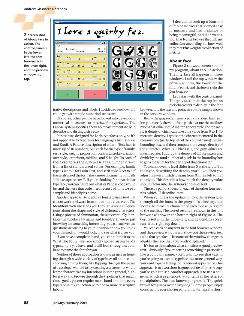
In Figure 3a I’ve set the desired density to 0, andcranked the weight for density all the way up and set allthe other weights to zero. Thus the fonts are sorted sothat the lightest (or whitest) is first, with increasinglydarker faces following. In Figure 3b I moved the desireddensity to 1, and the darkest letters bubble to the top. IfI want to sort on some other letter, I just enter it into themeasure box and press the Update button.
MetricsFinding good metrics is the key to making this
approach work. I wanted metrics that I could easily com-pute, and wouldn’t require any kind of shape analysis. Ithought about many of the standard morphographicmeasures, but they didn’t seem like they’d be of muchvalue in finding fonts.
I eventually settled on a set of five measures. We’vealready covered density, so let’s look at the others.
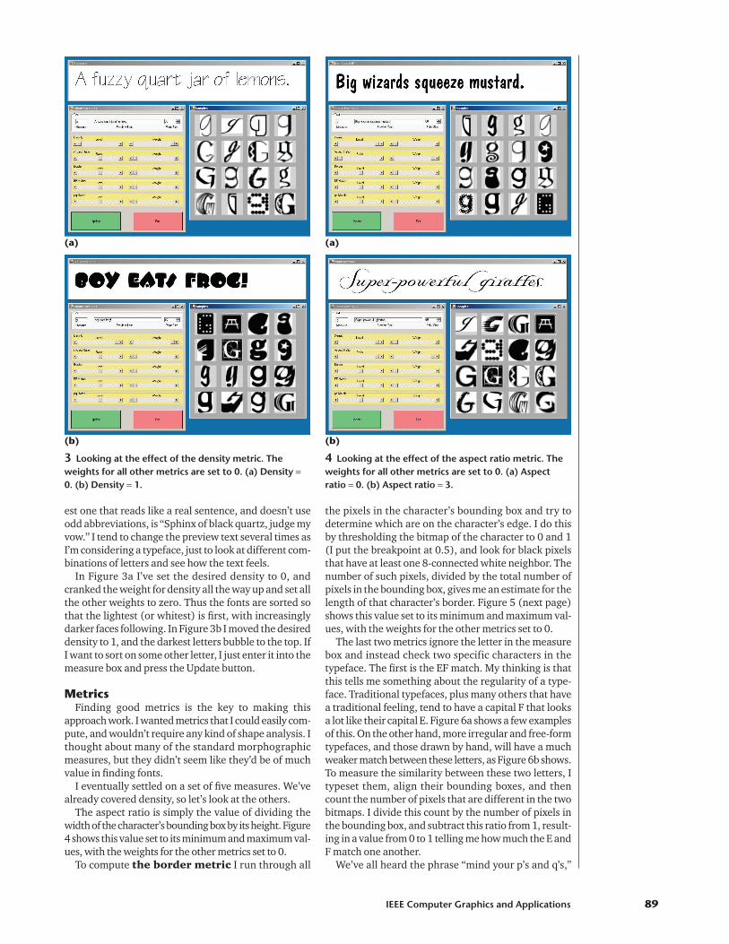
The aspect ratio is simply the value of dividing thewidth of the character’s bounding box by its height. Figure4 shows this value set to its minimum and maximum val-ues, with the weights for the other metrics set to 0.
To compute the border metric I run through all
the pixels in the character’s bounding box and try todetermine which are on the character’s edge. I do thisby thresholding the bitmap of the character to 0 and 1(I put the breakpoint at 0.5), and look for black pixelsthat have at least one 8-connected white neighbor. Thenumber of such pixels, divided by the total number ofpixels in the bounding box, gives me an estimate for thelength of that character’s border. Figure 5 (next page)shows this value set to its minimum and maximum val-ues, with the weights for the other metrics set to 0.
The last two metrics ignore the letter in the measurebox and instead check two specific characters in thetypeface. The first is the EF match. My thinking is thatthis tells me something about the regularity of a type-face. Traditional typefaces, plus many others that havea traditional feeling, tend to have a capital F that looksa lot like their capital E. Figure 6a shows a few examplesof this. On the other hand, more irregular and free-formtypefaces, and those drawn by hand, will have a muchweaker match between these letters, as Figure 6b shows.To measure the similarity between these two letters, Itypeset them, align their bounding boxes, and thencount the number of pixels that are different in the twobitmaps. I divide this count by the number of pixels inthe bounding box, and subtract this ratio from 1, result-ing in a value from 0 to 1 telling me how much the E andF match one another.
We’ve all heard the phrase “mind your p’s and q’s,”
IEEE Computer Graphics and Applications 89
3 Looking at the effect of the density metric. Theweights for all other metrics are set to 0. (a) Density =0. (b) Density = 1.
(a)
(b)
4 Looking at the effect of the aspect ratio metric. Theweights for all other metrics are set to 0. (a) Aspectratio = 0. (b) Aspect ratio = 3.
(a)
(b)

which urges us to pay attention to details. This phrasestarted out as advice to typesetters, who set metal type inframes to create words. These metal letters were shapedbackward so that the text would appear correctly whenthe letters were inked and pressed against paper. Becausethe lowercase letters p and q usually looked similar, itwas easy to confuse them. (The same thing applied tothe lowercase b and d, but I don’t remember any specif-ic advice regarding those.) I felt this aphorism was a goodmetric, like the EF-match metric, so that’s what the lastsliders control. I measure this just like the EF match, butI mirror reverse the q before computing the measure.Figure 7a shows some pq pairs that are good matches,and Figure 7b shows some poor matches.
Figure 8 shows the program in action. I played withthe sliders for a bit, adjusting the values and the weights,and I followed my instincts to find the kind of letterforms I was after.
EfficiencyAs I said earlier, I have thousands of typefaces on my
hard disk. If I had to measure all of these characteristicseach time I changed a value, the program would be tooslow to use.
Instead, I precompute all of these metrics for eachcharacter in each typeface and save the results in a file(the EF- and pq-match metrics are saved only once perface, of course). When I enter a new character into the
measure box, I read through the file and pull into mem-ory the values for that character from all the faces. Theneach time I move the sliders, it’s a simple matter to com-pute the score.
To compute a score, let’s say that the value for slideri is vi, and its weight is wi. In my current system, thatmeans density is v0, aspect ratio is v1, and so on. All ofthe values, and all of the weights, are between 0 and 1(the only exception is the value of the desired aspectratio, which ranges from 0 to 3). I score each font oneat a time. I start by looking up the metrics for the char-acter in the measure box. Let’s call them p, so the den-sity of that character is p0, its aspect ratio is p1, and soon. The highest-scoring character will be the one whosevalues exactly match the desired values on the sliders;that is, each pi − vi = 0. Of course, most of the time thesevalues will be different, so we weight the absolute valueof the difference by the corresponding weight for thatmetric, and then add everything up. In symbols, wecompute the score S by
I could normalize by the sum of the weights, but there’s noneed to since they’re the same for all the typefaces, and weonly care about the relative scores, not their actual values.
S w v pi i i
i
= −=∑ | |
0
5
Andrew Glassner’s Notebook
90 January/February 2004
5 Looking at the effect of the border metric. Theweights for all other metrics are set to 0. (a) Border = 0.(b) Border = 1.
(a)
(b)
6 Looking at the effect of the EF-match metric. Theweights for all other metrics are set to 0. (a) The EFmatch = 1 (this gives higher scores to fonts where the Eand F are as dissimilar as possible). (b) The EF match = 0.
(a)
(b)

I wrote this program in C# using Microsoft’s .NETdevelopment environment. This made it easy to createlittle bitmaps with typeset characters in them. I didn’thave to learn how to read or parse the font files them-selves, or figure out how to use them to render text.Instead, I just gave the system the font, the text to be set,a bitmap, and it did the rest.
Each time I press the Update button and create a newsorted list of typefaces, I read them into memory oneby one, typeset the given character, scale it down if nec-essary, and then copy it into the browser window. I dothis until the browser’s filled. Then any time I get amouse click in the browser, I find which box it’s in, lookup that typeface, and update the preview windowaccordingly.
It can take a few seconds to measure all the metricsfor all the characters in a given font, including all of itsvariant faces (for example, bold, italic, condensed, andso on). Once that information is saved, it’s fast to read inand use for updating. Working with several thousandfonts, I can get new sorted lists almost instantly for data-bases of a few hundred fonts.
Wrapping upAs I mentioned, the big trick here is figuring out the
right set of metrics that make it possible to searchthrough a huge number of fonts efficiently and pleas-
antly. I approached this system as a testbed: it’s prettyeasy to add new metrics, try them out, and toss themoverboard if they don’t measure up.
I probably went through a few dozen metrics beforesettling on these. They seem pretty reliable at measur-ing what they’re supposed to, and I find that often whenI’m searching for some kind of typeface, these let me getsomething in the ball park. Unfortunately, with so manyfonts on my computer, the ball park is huge. I show thetop 36 candidates for each search in the browser win-dow, but I often find myself wishing for more (I wantedto make sure that the characters in the browser windowwould be legible in this column, so I temporarily set thebrowser window to show a 4 × 4 grid of fonts rather thanthe 6 × 6 grid I use in practice).
I’d like to add a few things to this program. One is aNext button—so that, for example, I can see the sec-ond-best set of 36 candidates, or the third best, and soon. I’d also like to add a More-like-this button, so I canselect a typeface and quickly get others that closelymatch. This can be on the basis of just the selected char-acter in the measure box, or an overall score for thewhole typeface.
On the whole, I’d say that the program is a qualifiedsuccess and a good start. I can sometimes find good type-faces quickly, and I’m sometimes pleasantly surprised bywhat I discover. On the other hand, when I have some-thing specific in mind, I’ve found that these metrics some-times don’t let me hone in on my preconceived ideas veryclosely.
More work on the metrics, and the user interface(which is admittedly crude and just for proof of concept)would definitely pay off in a more pleasant and robusttool for finding typefaces. �
AcknowledgmentsThanks to Matt Conway, Greg Hitchcock, and
Geraldine Wade for discussions and references while Iworked on this article.
Contact Andrew Glassner at [email protected].
IEEE Computer Graphics and Applications 91
7 Looking at the effect of the pq match metric. Theweights for all other metrics are set to 0. (a) The pqmatch = 1 (this gives higher scores to fonts where the pand q are as dissimilar as possible). (b) The pq match = 0.
(a)
(b)
8 Snapshot of About Face in use.