andrew santa lucia 2013
DESCRIPTION
Work Samples of Current and Past workTRANSCRIPT

Andrew Santa Lucia | Architectural Designer / Critic | 2740 W. Logan Blvd, #8 Chicago, IL 60647 | C: 305-343-6285 E: [email protected]
This is the first phase of CVESC’s interior office redesign. The client asked for us to redevelop a very tight closet space and make into an office. The other series of floating shelves were done for a different office adjacent to our closet. Phase II includes a larger space to accommodate for more doctors.
As a small project, a theory of SMALLNESS is necessary to adapt to size. Size is relative and standard dimensions in tight spaces usually create more issues than solutions. In Phase I of CVESC’s office design, we set out to create an attitude to be able to deal with shrinking of space we were faced with.
This meant literally using every part of the room to our advantage. We hugged the small aperture afforded to us by the window and used it as a fulcrum to attach the shelves and floating desk. We used Baltic Birch plywood and paid close attention to the material expression and detail of the project precisely because of its scale.
The second office space only called for floating shelves. These were longer, but the same material. We decided to recess them back 10” for every level, rising up 14”, 12” and 10” for the last shelf. This opened the room up to great view afforded by the window.
In the end, this was our first real project and it was basically a closet and some change. Our desire was architects was to elevate it to something more that could carry the person’s lifestyle very easily and adapt to changes in it.
Smallness:Closetedofficespacebuilt (2013) - Chicago veterinary Emergency and Specilaty Clinic, Chicago, IL (2013)
Designed/Built by And or us
64.00
14.00
16.7
5
53.00
20.0
0
Surgery O�ce - Room 245 and 231 - Floor Plans
1’ 3’ 6’
CLOSET OFFICE: View from Entrance CLOSET OFFICE: Table and File Cabinet Details
CLOSET OFFICE: View towards desk and shelves
SECOND OFFICE: View towards Floating Shelves
SECOND OFFICE: Detail View towards Floating Shelves

Andrew Santa Lucia | Architectural Designer / Critic | 2740 W. Logan Blvd, #8 Chicago, IL 60647 | C: 305-343-6285 E: [email protected]
This is a schematic design for a tutoring space on the South Side of Chicago, currently in the fabrication/development stage. This is an AND-OR designed project.
This is the first commissioned project for AND OR Architecture Collaborative. Through associations with CITY Year (AmeriCorps) at Gage Park High School on the South Side of Chicago, Reform Objects in Logan Square and UIC College of Art, Design and Architecture, we are working with a CitiBank Grant to fund the material, fabrication and construction of this space. With these restrictions, come many freedoms, most directly the freedom to change current complacent learning spaces into something radically different than what they are.
This project is primarily a paint and furniture project, with a very small budget. There are four individual pieces of furniture that pop-up throughout the space and can be reconstituted to create new types of collective space.
The Tutorium should function in a few keys ways: (1.) be a destination setting for students, (2.) be fluid and mobile in terms of changing focus from the individual to the collective, (3.) establish a horizontal model of learning where students and tutors are fundamentally on the same level and in the same place in space, and (4.) establish a clear and comfortable area for education that inspires students.
The contemporary interior of American classrooms seems more sterile and institutional, than conversational. Although these are not opposing forces, the conversation or the basis for intellectual exchange is championed in the tutorium.
Gage ParkTutoriumGage Park High School, City Year Mentoring Room - Backof the Yards, Chicago, IL (2012)
a. Existing desk 1. Two-Person Work Desk
2. Four Person Work Table
3. Five Person Work Bench/Table
Current Gage Park Classroom where Tutorium will be built
Existing Desk
Infographics based on Focus Group survey with students
Lounge Chair Reading Center Free Standing Tetronimo Benches Superthick Graphic Box Seating (follows Supergraphic on wall
Exploded Fabrication (CNC/Milled Wood) Plan for Fre Standing Benches Perpsective looking towards rear of classroom
Perpective ‘Dollhouse Plan’ of Room with Furinutre + Supergraphics
Repurposed Desk(s) made into 2-3 person tutoring tables

Andrew Santa Lucia | Architectural Designer / Critic | 2740 W. Logan Blvd, #8 Chicago, IL 60647 | C: 305-343-6285 E: [email protected]
I want to grow
up!!I want to
feel young again!
I want things to go back to the
way they were!!
I just want to be alive!!!
1 2 3
4
How to let Prentice Grow...(up, down, around, inside, outside, near, far and in-between)
1. OLD DOG (Old Prentice)Prentice Womens Hospital serves as an origin point for the development of a language for new city making in Chicago. This type of urban narrative allows for highly figural buildings - soft, iconic, fun and easy - to act as an urbanizing agent in terms fo speed and shapes.
2. INFLATE Allow Prentice’s iconic figural columness floor plan to reproduce itself across the street into a 30% larger floor plate. This acts as the maturing agent and is a direct response to Northwestern University’s criticism of Old Prentice’s inability to sustain the 500,000 sq. ft. of new space they want. By inflating the current floor plan and shape of the building into a gigantic second mass across the street, the first inklings of Prentice as a paradigm for figure cities are born.
3. INFANTALIZEFrom an inflated state, then Prentice can move into a smaller more infant version of the original Floor Plan, adjacent to the “Inflated” tower. “Infant” tower can be a completely different program for the hospital, such as administrative or hotel.
4. COPY-CAT (Prentice City)The “Prentice City” complex is completed by erecting an exact copy of the Old Prentic Women’s Hospital on Southwest corner of the VA Lot. As a model for future figural city blocks, “Prentice City” is the first historic building to multpiply without kitsch reproduction or abstract repetition.
1. OLD DOG (Old Prentice)Prentice Womens Hospital serves as an origin point, a figural language for new city making in Chicago. This type of urban narrative allows for highly figural buildings - soft, iconic, fun and easy - to act as an urbanizing agent in terms fo speed and shapes.
2. INFLATEAllow Prentice’s iconic figural column-less floor plan to reproduce itself across the street into a 30% larger floor plate. This acts as the maturing agent and is a direct response to Northwestern University’s criticism of Old Prentice’s inability to sustain the 500,000 sq. ft. of new space they want. By inflating the current floor plan and shape of the building into a gigantic second mass across the street, the first inklings of Prentice as a paradigm for figure cities are born.
3. INFANTALIZEFrom an inflated state, then Prentice can move into a smaller more infant version of the original Floor Plan, adjacent to the “Inflated” tower. “Infant” tower can be a completely different program for the hospital, such as administrative or hotel.
4. COPY-CAT (Prentice City)The “Prentice City” complex is completed by erecting an exact copy of the Old Prentice Women’s Hospital on Southwest corner of the VA Lot. As a model for future figural city blocks, “Prentice City” is the first historic building to multiply without kitsch reproduction or abstract repetition.
Growing UpPrenticeChicago Prize 2012 Competition Entry, Chicago, IL - 2012
Andrew Santa Lucia | Architectural Designer / Critic | 2740 W. Logan Blvd, #8 Chicago, IL 60647 | C: 305-343-6285 E: [email protected]
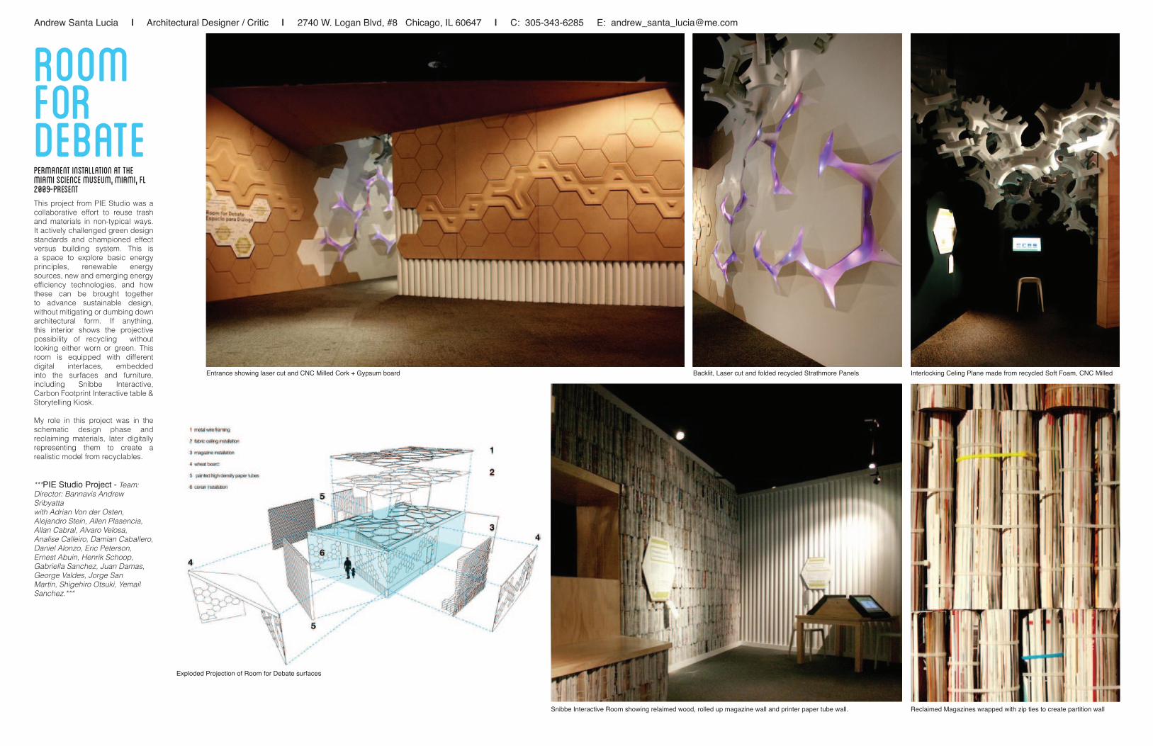
This project from PIE Studio was a collaborative effort to reuse trash and materials in non-typical ways. It actively challenged green design standards and championed effect versus building system. This is a space to explore basic energy principles, renewable energy sources, new and emerging energy efficiency technologies, and how these can be brought together to advance sustainable design, without mitigating or dumbing down architectural form. If anything, this interior shows the projective possibility of recycling without looking either worn or green. This room is equipped with different digital interfaces, embedded into the surfaces and furniture, including Snibbe Interactive, Carbon Footprint Interactive table & Storytelling Kiosk.
My role in this project was in the schematic design phase and reclaiming materials, later digitally representing them to create a realistic model from recyclables.
***PIE Studio Project - Team: Director: Bannavis Andrew Sribyattawith Adrian Von der Osten, Alejandro Stein, Allen Plasencia, Allan Cabral, Alvaro Velosa, Analise Calleiro, Damian Caballero, Daniel Alonzo, Eric Peterson, Ernest Abuin, Henrik Schoop, Gabriella Sanchez, Juan Damas, George Valdes, Jorge San Martin, Shigehiro Otsuki, Yemail Sanchez.***
roomforDebatePermanent Installation at the Miami Science Museum, Miami, FL 2009-present
Entrance showing laser cut and CNC Milled Cork + Gypsum board Backlit, Laser cut and folded recycled Strathmore Panels
Snibbe Interactive Room showing relaimed wood, rolled up magazine wall and printer paper tube wall.
Exploded Projection of Room for Debate surfaces
Interlocking Celing Plane made from recycled Soft Foam, CNC Milled
Reclaimed Magazines wrapped with zip ties to create partition wall

Andrew Santa Lucia | Architectural Designer / Critic | 2740 W. Logan Blvd, #8 Chicago, IL 60647 | C: 305-343-6285 E: [email protected]
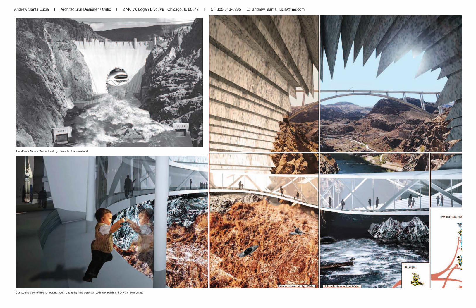
The Hoover Dam is located in a pivotal tug-of-war between nature and natural resource. Without it, Las Vegas and Los Angeles, or the lost-Las’s of post-modernity, would not exist. Water is the negotiated commodity and the Colorado River is the only loser. The reservoirs will inevitably silt up, if they don’t go dry earlier. Will the only thing for future alien archaeologists to examine be our silt-laden concrete arches? As a narrative, Damn Inevitable describes this future through a story about carving a hole through the Hoover Dam and allowing the Colorado River to flow freely once again. As architecture, this move is a détournement of the culturally accepted use of a dam, where its structure and iconicity is used against itself and inhabited. The nature center is the piece of active program embedded in this stultifying icon of the past.
Maybe the reason there is a collective amnesia and our lack of history in this country is because of an inevitable restlessness to change, to amend. And then again maybe passive consumption is our form of entropy. Damn Inevitable is the architecture of active ownership and involvement of an I-have-no-other-choice-but-to-be-informed future audience. Damn inevitable is an end to manifest destiny.
***INNATURE OpenGap Competition Entry for Nature Center in 2012. Work done with John Clark and Kevin Stewart***
Dam(n) Inevitable Nature Center, Hoover Dam, Arizona/nevada border, 2012
Graph showing population rise in the Southwest United States versus available drinking water, projecting past our current history Cartoon Diagram of Major Changes to the Hoover Dam
Autonomous Plan of main education and nature center floor
Axonometric of Nature Center (green), opening (yellow) and Silt Room (fuchsia)North Side/Back Side of New Hoover Dam with waterfall mouth
Front Elevation of Nature Center Back Elevation of Nature Center
Transverse Section through Nature Center and Underwater Silt Room
Andrew Santa Lucia | Architectural Designer / Critic | 2740 W. Logan Blvd, #8 Chicago, IL 60647 | C: 305-343-6285 E: [email protected]
Aerial View Nature Center Floating in mouth of new waterfall
Compound View of Interior looking South out at the new waterfall (both Wet (wild) and Dry (tame) months)

Andrew Santa Lucia | Architectural Designer / Critic | 2740 W. Logan Blvd, #8 Chicago, IL 60647 | C: 305-343-6285 E: [email protected]
messy MIES + MASSIVE middle is an exhibition centering on Mies van der Rohe’s ambiguously built/unbuilt architecture including a never-before-exhibited project.
This exhibition presents three projects designed by Mies, starting with the Barcelona Pavilion (design/built 1929, destroyed 1930, rebuilt 1986), Brussels Pavilion (designed/unbuilt 1934, reappears publicly 1966) and the IIT Master Plan (partially built in the 1940s in its original design). Interestingly enough, all three projects do not exist in their original intention or even literal interpretation. The Barcelona Pavilion stood for a mere six months and was little noticed. Only later, decades after its demolition, did it emerge in the collective consciousness as a masterpiece of modern architecture, materializing in 1986 as a built copy by popular demand. The design for the Brussels Pavilion disappeared into the chaos of World War II only to make its way back into Mies’ hands in 1966. The IIT Campus Plan was only partially realized in its initial design, as it is missing several buildings in Mies’ master plan, and instead creates the pastiche urbanism we know today.
The exhibition provides two frames to engage with Mies’ models: the first is a series of designed enclosures/viewing platforms and the second is a series of interactive flash cards. The exhibition also intends to open up the conversation about the variant character versions of Mies that have evolved over time.
***Co-Curated with William Huchting, AIA***
messymies+massivemiddleInteractive Exhibition at Oakton Community Collge, Skokie, IL2012
View from the Entrance of the exhibition Barcelona Pavilion without Flash Card
Opening Night Seating at Dinner Table
Barcelona Pavilion with Flash Card Frame
Gallery Talk and Auditorium
View towards ‘Bark It’ Lounge and the Dinner Table Audience looking at Barcelona Pavilion Model
View outside the Cone of Silence (floating model inside, wrapped in mirrors) View inside the Cone of Silence View from the Entrance of the exhibition
View from the Rear of the exhibition

Andrew Santa Lucia | Architectural Designer / Critic | 2740 W. Logan Blvd, #8 Chicago, IL 60647 | C: 305-343-6285 E: [email protected]
The original master plan of the Scott-Carver Homes, in Liberty City, Miami, had little to no relationship with the various urban situations occurring within the city. The identification of various systems focused on movement, urban activity, and potential for economic growth led to an orientation of micro-communities, all of which adapted to their immediate contexts.
The housing blocks at Scott-Carver take cues from the climactically responsive buildings of old South Florida. Maximizing cross-ventilation, minimizing direct sun exposure, and re-emphasizing the front porch and its applicability to medium density structures. The blocks simultaneously engage issues of ecology and community. By increasing density within the housing sites, the residual open space takes on three distinct forms. By establishing a gradient between active and passive open space, the uniform housing structures become animated by the shifting ground conditions which surround them. The identity of each micro-community can then become more apparent through different visual expressions, such as art or agriculture, in turn providing new images of a growing community, without jumping to conclusions as to how that would work.
The Competition Entry for USGBC Natural Talent Design Competition was one of four finalists, and was subsequently exhibited at the Miami Workers Center in Liberty City, Miami.
***This was a collaboration between myself and David de Cespedes, as a group called CASIS. It was a redevelopment of another work entitled, “Degentrification + Densification + Synthesis: ”, a competition entry for the Future of Cities 2007.
Liberty City AfterHOPE VILiberty City, Miami, FL - 2008-2009
Liberty City Urban Identity After Hope VI
Green Space
Cultural/Public Centers
Figure Ground (transparency vs. opaquness
Current Vehicular Flow
Existing Use/Program/Amenities
View from the Platform Gardens into new Communities.
New Transportation Hub in Liberty City

Andrew Santa Lucia | Architectural Designer / Critic | 2740 W. Logan Blvd, #8 Chicago, IL 60647 | C: 305-343-6285 E: [email protected]
Exploded Axonometric of Tigerman’s 1966 Instant City Site
Linear Urban Plan of Tigerman’s 1966 Instant City across the Eisenhower ExpresswayStanley Tigerman’s initial focus on Instant City was on historical models of building cities along infrastructure and the introduction of road or highway system as being the first time where infrastructure caused schisms in community. He locates this project ambiguously along the “highways of the future” as a way to continue and recapture the infrastructural community. The program is distributed, much like the USDA food pyramid : the base is comprised of public services and amenities, as well as commercial; then having the semi-private/public offices and administrative level; finally housing the inhabitants on the upper levels, with mechanical being tucked into the highest areas of the pyramid.
Alternative Projection of Instant City into a pyramid blanketing downtown Chicago and housing Soldier Field in its peak. This merges Tigerman’s intention of using the Instant City Pyramid typology in Football City (1967) over Soldier Field. This version is blown up and brought above the city.
***Completed for University of Illinois at Chicago - School of Architecture: Graduate Urban Seminar taught by Dr. Alexander Eisenschmidt in Spring 2011.
Program Distribution into the Pyramid - 1966
BlanketPyramidLoop, Chicago, IL - 2011
Blanket Pyramid, Chicago, IL - 2011
Transverse Urban Section of Tigerman’s 1966 Instant City
REGISTRATION # ____________________________________________________
Andrew Santa Lucia
Afterglow
Authenticity is still possible in architecture. In this case, it’s possible to reoriginate an old model. You can teach an old dog new tricks.Blanket Pyramid uses Stanley Tigerman’s 1966 project, Instant City, and creates a new narrative through a different scale. Blankey Pyramid makes Instant City into a mega-structural pyramid blanketing downtown Chicago and housing Soldier Field in its peak, merging Tigerman’s intention of using the Instant City Pyramid typology in Football City (1967) over Soldier Field. This version is blown up and brought above the city.
Blanket Pyramid

Andrew Santa Lucia | Architectural Designer / Critic | 2740 W. Logan Blvd, #8 Chicago, IL 60647 | C: 305-343-6285 E: [email protected]
1. Cushion Laminate 1 - (128)8 sections of 16 each
2. Button Laminate - (18)6 sections of 3 sequential
laminates each
3. Structure Laminate 1 - (18)3 sections of 6 each
4. Section Base 1 - (12)2 sections of 6 each
5. Structure Base 2 - (6)2 sections of 3 each
Exploded Assembly Diagram
1. Cushion Laminate 1 - (128)8 sections of 16 each
2. Button Laminate - (18)6 sections of 3 sequential
laminates each
3. Structure Laminate 1 - (18)3 sections of 6 each
4. Section Base 1 - (12)2 sections of 6 each
5. Structure Base 2 - (6)2 sections of 3 each
Exploded Assembly Diagram
Mini-Modern Series“Re-originating modernism through the reproduction and revisions of iconic pieces of furniture, allows children and teenagers alike to engage with the history of style. During a time when modernism and its attitudes are resurfacing, the Mini-Modern Series promises to bring style back in your life, regardless of your age or tax bracket.”
MEESE“The canonical ‘Barcelona Chair’ from architect Mies van der Rohe employed his signature use of steel and luxurious materials such as leather to create a cantilevered chair in his Barcelona Pavilion. MEESE recreates, but more importantly repurposes his initial idea, through using aspects of the design, such as angles, curves and details. This laminated 1/8” & 1/4” corrugated cardboard chair is perfectly blown out of proportion, in the small way, to achieve an oddly familiar, yet a more functional version of Mies’ chair, for kids.”
***Completed for University of Illinois at Chicago - School of Architecture: Graduate Technology Seminar taught by Michael Gelick in Spring 2012.
MEESE:A KidsChairUIC, Chicago, IL - 2012
1 2 3 4 5 6 7 8 9Available Color Options
Meese Mini-Modern Series
Pamphlet for Propsective BuyersBarcelona Chair - Mies van der Rohe
Carboard Laminate Fabrication Details Exploded Fabrication Axonometric
Prototype 1
Prototype 1
Prototype 1

Andrew Santa Lucia | Architectural Designer / Critic | 2740 W. Logan Blvd, #8 Chicago, IL 60647 | C: 305-343-6285 E: [email protected]
Fig. 18Satellite Image of Patio Villa
Onderlangs 46, 3062 Rotterdam, The Netherlands
OMA (1988)
Satellite Photograph of Site in The Netherlands
Original Patio in the center of the house flanked by glass walls.(1988)
Plans Ground Floor + Second Floor (1988)
This thesis project examines boundaries in architecture, and how they are transgressed. This is done through closely analyzing an existing building, through a lens of gender and sexuality, and proposing a renovation. As post-modern gender theory transgresses the boundary and confine of structured opposition in sexuality, architecture also transgresses the boundaries created by walls and division, through opening, through permeation. This condition is a threshold. The threshold accepts the boundary, because without it there is nothing to transgress. Due to that acceptance, there is an architectural paradox in creating boundaries to transgress them. This thesis project embraces paradox and examines new ways to design and transgress boundaries that question normative notions of gender and sexuality. The site is the Patio Villa in Rotterdam, The Netherlands by Rem Koolhaas.
The villa has been the venue to test ideas regarding publicity and privacy, linguistic development of architectural form, politics, and much more. The compact and directed scope of the villa lends itself to commenting and questioning on much broader topics. Completed in 1988, the patio villa by Rem Koolhass/OMA, is one of the offices first major projects. This marks a turning point for Koolhaas in that it is is one of his first built works, marking his transition from a theorist to a practitioner.
Diagram Plan (Intersection)
Study Model (Intersection) Study Model (Intersection)
Diagram Plan (Circuit)
Study Model (Circuit)Study Model (Circuit)
Diagram Plan (division wall)
Study Model (Division) Study Model (Division)
Fig. 62Elevation 1/16”=1’
(This elevation shows the materiality of the facade and the introduc-tion of the glass loggia/widow’s walk element, superimposed on top
of the actual facade. The users would need to go outside of their home to move through it, adding to the paradox of going on out and
in at the same time.
South Elevation facing Street (renovation)
Exploded Axonometric of Patio Villa (1988)
Exploded Axonometric of both Widow’s villa and Dick/Joops Patio Villa (renovation)
This thesis project explored the effects of gender and sexuality on the interior. Formally, the operations of this investigation occur on the interior and focus on the transgression of boundaries, both literally and phenomenally.
The building being renovated is Rem Koolhaas/OMA’s early project titled ‘Patio Villa’ in 1988. It was designed for a prominent gay couple in the Netherlands. They continue to live here until today and were interviewed during this process.
Throughout a year of research, writing and design, this final iteration is based upon a series of moments/operations working within the accepted cultural norms of surface, boundary and threshold, as well as instigates provocative reuse of spaces, based on sexuality, gender and history of both.
Initially meant to be a triplex, then becoming a duplex, the villas were divided for 1. a gay couple and 2. a widow. Using this chance detail, I constructed narratives of interaction between the couple/widow based on their adjacency and enabled through architectural manipulation.
From conceptual understandings of reorganizing space and history/theory of gender identity + sexuality, this thesis did not intend to answer any general questions, instead attempted to activate generalities of lifestyles and engender a new misreading/misshaping of the contemporary dutch house.
***Thesis Project completed for Florida International University - School of Architecture: thesis critics: John A. Stuart, Fall 2009-Spring 2010. (Miami, FL)
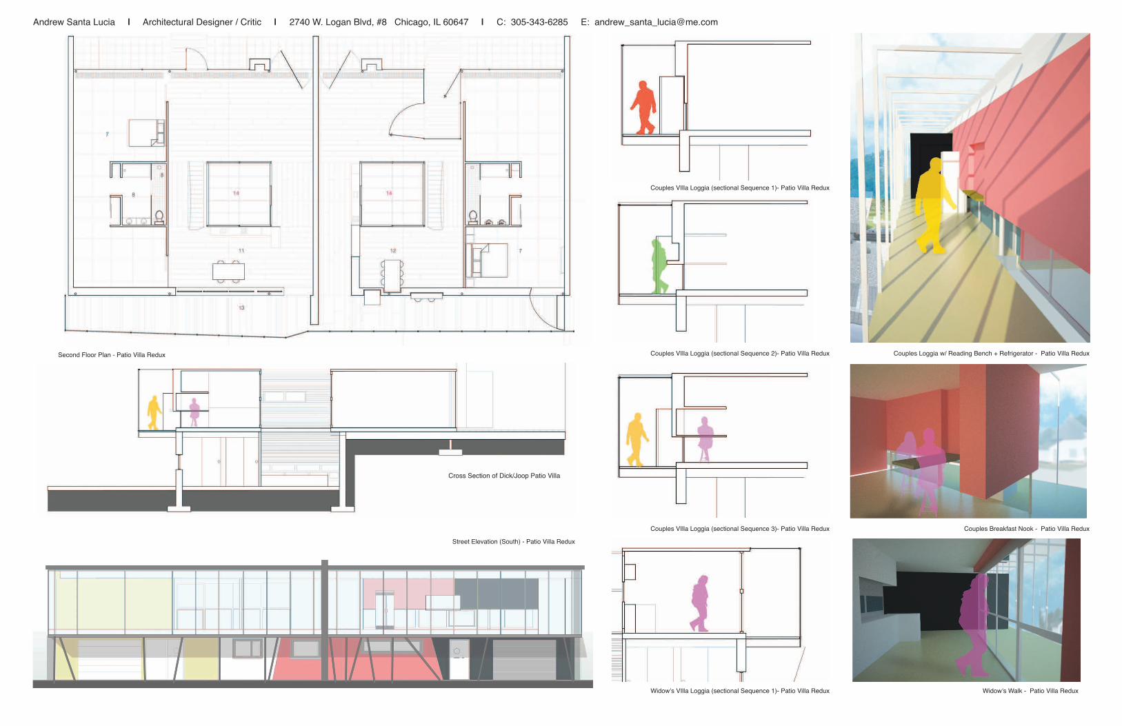
PatioVillaReduxRotterdam, The Netherlands, 2010
Patio Villa Duplex Site Photograph Ground and Second Floor Plans

Andrew Santa Lucia | Architectural Designer / Critic | 2740 W. Logan Blvd, #8 Chicago, IL 60647 | C: 305-343-6285 E: [email protected]
View in Sauna adjacent to interior gardenView in interior garden adjacent to Sauna
Poured in place Conrete Footing
Steel Beam
Steel C Channel Column
Wooden Weephole Wall - allows sauna steam to collect and roll off into cistern
Hydration System Connected to Greywater
Colection from Sauna Steam Runoff
CMU - various sizes
Poured in Place Concrete
Flooring
Ground Floor Plan (renovation)
Logitudinal Section (renovation)
Ground Floor Plan (renovation)
Logitudinal Section (renovation)
Ground Floor Plan - Patio Villa Redux
Longitudinal Section - Patio Villa Redux
Andrew Santa Lucia | Architectural Designer / Critic | 2740 W. Logan Blvd, #8 Chicago, IL 60647 | C: 305-343-6285 E: [email protected]
Second Floor Plan (renovation)
Cross Section of Dick/Joop Patio Villa Exterior/interior wall -shows three different sectional conditions within the same wall
Fig. 62Elevation 1/16”=1’
(This elevation shows the materiality of the facade and the introduc-tion of the glass loggia/widow’s walk element, superimposed on top
of the actual facade. The users would need to go outside of their home to move through it, adding to the paradox of going on out and
in at the same time.
Cross Section of Widow’s Villa
View from inside Widow’s Villa looking out
Cross Section of Dick/Joop Patio Villa
View from Loggia walkway with alternating wall
View from Living Room with Alternatig wall
Cross Section of Dick/Joop Patio Villa
View from Loggia walkway with alternating wall
View from Living Room with Alternatig wall
Second Floor Plan (renovation)
Cross Section of Dick/Joop Patio Villa Exterior/interior wall -shows three different sectional conditions within the same wall
Second Floor Plan (renovation)
Cross Section of Dick/Joop Patio Villa Exterior/interior wall -shows three different sectional conditions within the same wall
Fig. 62Elevation 1/16”=1’
(This elevation shows the materiality of the facade and the introduc-tion of the glass loggia/widow’s walk element, superimposed on top
of the actual facade. The users would need to go outside of their home to move through it, adding to the paradox of going on out and
in at the same time.
South Elevation facing Street (renovation)
Exploded Axonometric of Patio Villa (1988)
Exploded Axonometric of both Widow’s villa and Dick/Joops Patio Villa (renovation)
Second Floor Plan - Patio Villa Redux
Street Elevation (South) - Patio Villa Redux
Couples VIlla Loggia (sectional Sequence 1)- Patio Villa Redux
Couples VIlla Loggia (sectional Sequence 2)- Patio Villa Redux
Couples VIlla Loggia (sectional Sequence 3)- Patio Villa Redux
Widow’s VIlla Loggia (sectional Sequence 1)- Patio Villa Redux Widow’s Walk - Patio Villa Redux
Couples Breakfast Nook - Patio Villa Redux
Couples Loggia w/ Reading Bench + Refrigerator - Patio Villa Redux

Andrew Santa Lucia | Architectural Designer / Critic | 2740 W. Logan Blvd, #8 Chicago, IL 60647 | C: 305-343-6285 E: [email protected]
Using a digitally driven design method to create a soft-physical type, this bounce house looks to erode a glass-ceiling imposed on women in contemporary society, by establishing a malleable systems of shapes that flow in and out of each other for leisure activities to take place right on Biscayne Bay.
Through careful formal analysis and generative processes, a proposal for a structural member that could perform and change under three different scalar moves, a model was created and edited to create a fully self-sustaining and referential shape for the bounce house. This allowed for the softness of the pneumatic sections to function seamlessly with the more rigid mechanical ones, in turn creating sculptural structure and functional shapes.
BOUNCE:Miami Womens CenterMiami, FL - 2009
original cell
developing cell
evolved cell
original cell
developing cell
evolved cell
Section
Formal Analysis on Arthropod: Used as Generator
Structural Combnations Generated from Analysis
Model of Structural Memebers Model - v.1.0
Section through Bounce House v.2.0
Renderings of Pool + Bounce House in action

Andrew Santa Lucia | Architectural Designer / Critic | 2740 W. Logan Blvd, #8 Chicago, IL 60647 | C: 305-343-6285 E: [email protected]
S.O.F.I. Kiosk 1’ 3’ 6’Construction Section 1
N
S.O.F.I. Kiosk 1’ 3’ 6’Plan
South Beach’s S.O.F.I. (South of Fifth Street) district is a collection of historic exchanges between art, culture, architecture and technology that calls for a urban public gathering space that questions the boundaries between inside and outside; digital and analog; as well as real and virtual, through fragmented kiosks that push the enigmatic imagery associated with its character. The S.O.F.I. Kiosk perpetuates the visual character of Art Deco without kitch reproduction, instead focusing on breaks in the urban fabric, as well as fragmented urban views afforded through the facade narrative. Employing simple shapes as fenesrtation and coupling them with more complex volumetric arrangements, yields a new typology for urban collective form.
N
S.O.F.I. Kiosk
Urban Plan 1”= 80’
S.O.F.I. Kiosk
South Beach, Miami, FL
South Beach, Miami, FL USA - 2006South Beach, Miami, FL, 2006