ap statistics day one syllabus ap content outline estimating populations and subpopulations
TRANSCRIPT

AP StatisticsDay One
•Syllabus•AP Content Outline•Estimating Populations and Subpopulations

Learning Targets:
I can listen and ask questions while going over the syllabus.
I can listen and ask questions while going over the AP Content for Statistics.
I can give a best guess estimate for the different populations and subpopulations for different regions of the United States.

United States
Predicted ActualTotal
White
African American
Latino American
Asian American
Native American
Results from a Google Search

Kentucky
Predicted ActualTotal
White
African American
Latino American
Asian American
Native American
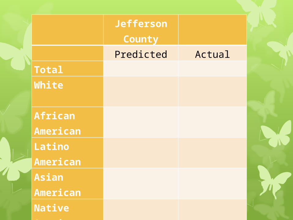
Jefferson County
Predicted ActualTotal White
African American
Latino American
Asian American
Native American

Bullitt County
Predicted ActualTotal
White
African American
Latino American
Asian American
Native American

AP STATISTICS
Introduction
Vocabulary
Graphs
Learning Targets:
I can define the critical vocabulary for Chapter One of Statistics (see handout).
I can classify data as categorical or quantitative.
I can create a bar graph, a pie chart, a dot plot, and a stem plot and know when to use which kind of graph.

Vocabulary
Individuals are the objects described by a set of data. Individuals may be people, but they may also be animals or things.
A variable is any characteristic of an individual. A variable can take different values for different individuals.
Example: A college student’s data base includes data about every currently enrolled student. The students are the individuals described by the data set. For each individual, the data contain the values of variables such as age, gender, choice of major, and grade point average.
Questions you should ask yourself when you meet a new set of data
1. Who? What individuals do the data describe? How many individuals appear in the data?
2. What? How many variables are there? What are the exact definitions of these variables? In what units is each variable recorded? Is there any reason to mistrust the values of any variable?
3. Why? What is the reason the data were gathered? Do we hope to answer some specific questions? Do we want to draw conclusions about individuals other than the ones we actually have data for?

A categorical variable places an individual into one of several groups or categories.
A quantitative variable takes numerical values for which arithmetic operations such as adding and averaging make sense.
The types of graphs and numerical summaries we should choose depend on the types of variables we are examining.

Variable Graphical Displays
Numerical Summaries
Categorical Pie Charts, Bar Graphs
Counts, percents, proportions
Quantitative Dotplots, stemplots, histograms
Center: mean, median, mode; Spread: range,
standard deviation,
interquartile range
There are some numerical values that are not quantitative. Can you think of some?
Types of graphs we should choose

How to Construct a Bar Graph
Step 1: Label your axes and title your graph. Draw a set of axes. Label the horizontal axis and vertical axes. Title your graph.
Step 2: Scale your axes. Use the counts in each category to help you scale your vertical axes. Write the category names at equally spaced intervals beneath the horizontal axis.
Step 3: Draw a vertical bar above each category name to a height that corresponds to the count in that category. Leave a space between the bars in a bar graph.


How to Construct a Pie Chart
Step 1: Create a frequency table.
Step 2: Calculate the relative frequency for each category.
Step 3: Multiply the relative frequency for each category by 360˚. This number represents the number of degrees that “piece of pie” is.
Step 4: Draw a circle. Using the center construct each piece using the degrees found above.

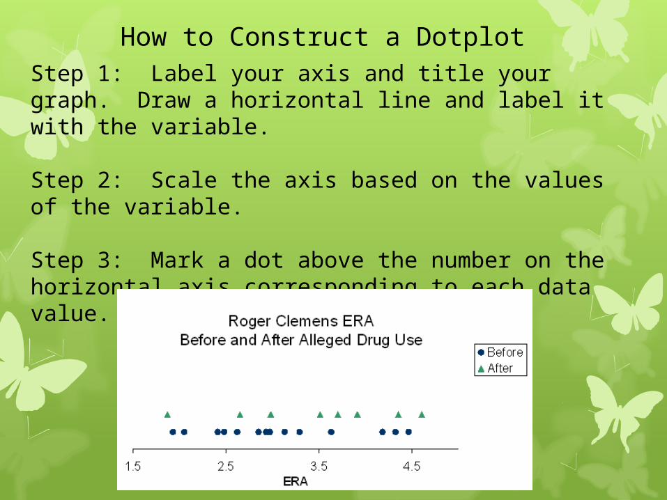
How to Construct a DotplotStep 1: Label your axis and title your graph. Draw a horizontal line and label it with the variable.
Step 2: Scale the axis based on the values of the variable.
Step 3: Mark a dot above the number on the horizontal axis corresponding to each data value.

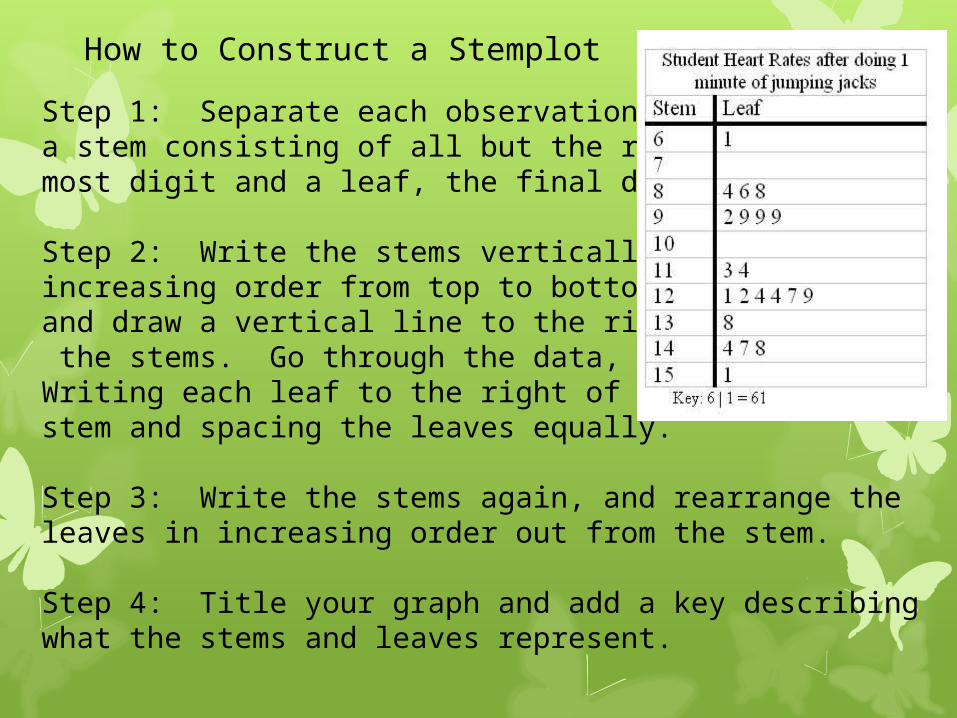
How to Construct a Stemplot
Step 1: Separate each observation intoa stem consisting of all but the right-most digit and a leaf, the final digit.
Step 2: Write the stems vertically in increasing order from top to bottom,and draw a vertical line to the right of the stems. Go through the data, Writing each leaf to the right of itsstem and spacing the leaves equally.
Step 3: Write the stems again, and rearrange the leaves in increasing order out from the stem.
Step 4: Title your graph and add a key describing what the stems and leaves represent.

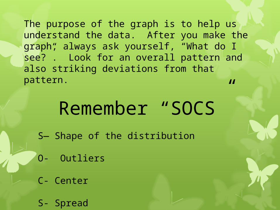
The purpose of the graph is to help us understand the data. After you make the graph, always ask yourself, “What do I see?”. Look for an overall pattern and also striking deviations from that pattern.
Remember “SOCS”S— Shape of the distribution
O- Outliers
C- Center
S- Spread
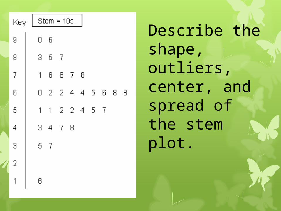
Describe the shape, outliers, center, and spread of the stem plot.

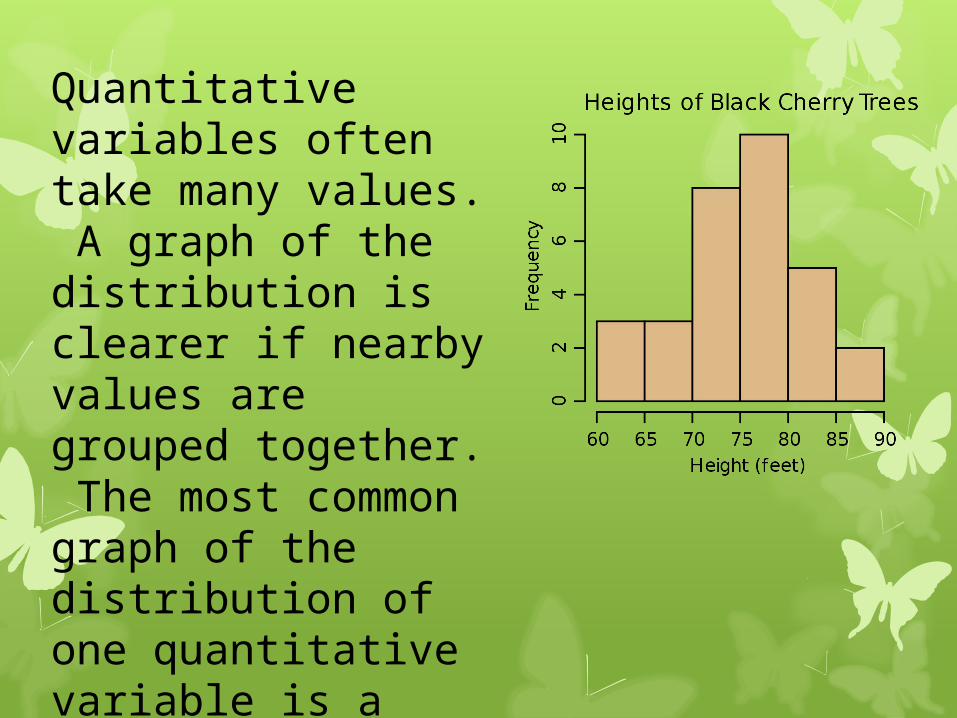
Quantitative variables often take many values. A graph of the distribution is clearer if nearby values are grouped together. The most common graph of the distribution of one quantitative variable is a histogram.
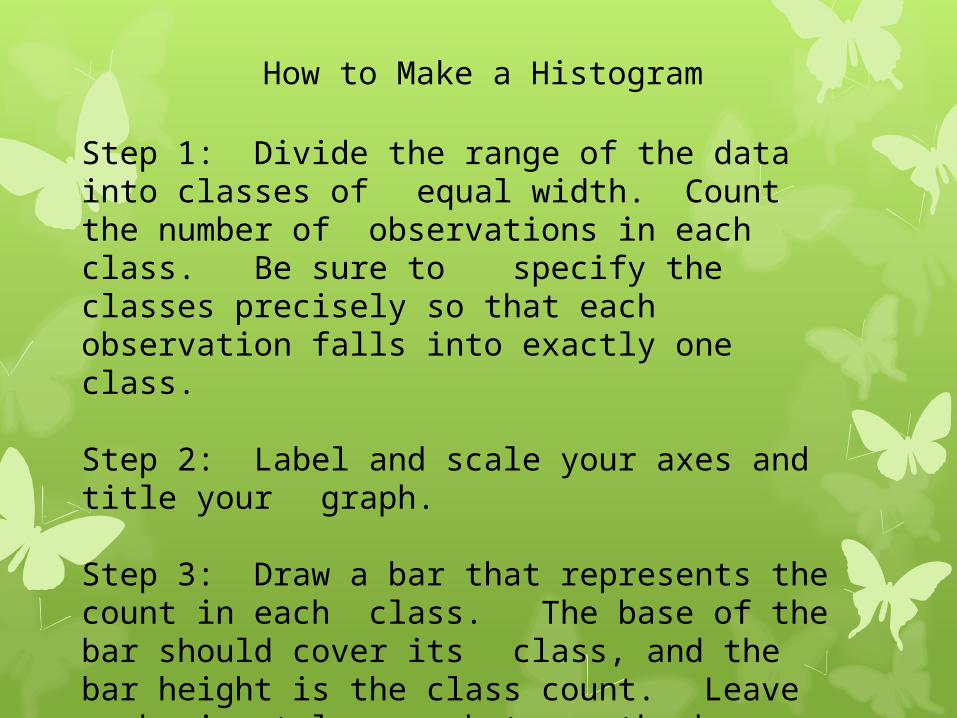
How to Make a Histogram
Step 1: Divide the range of the data into classes of equal width. Count the number of
observations in each class. Be sure to specify the classes precisely so that
each observation falls into exactly one class.
Step 2: Label and scale your axes and title your graph.
Step 3: Draw a bar that represents the count in each class. The base of the bar should cover its class, and the bar height is the class count. Leave no horizontal space between the bars, unless one class is empty.

Histogram Tips• There is no one right choice of the classes in a
histogram. Too few classes will give a “skyscraper” appearance and too many will give a “pancake” appearance.
• Five classes is a good minimum.
• Our eyes respond to the area of the bars in a histogram, so be sure to choose classes that are all the same width. Then area is determined by height and all classes are fairly represented.
• If you use a computer or graphing calculator, beware of letting the device choose the class.
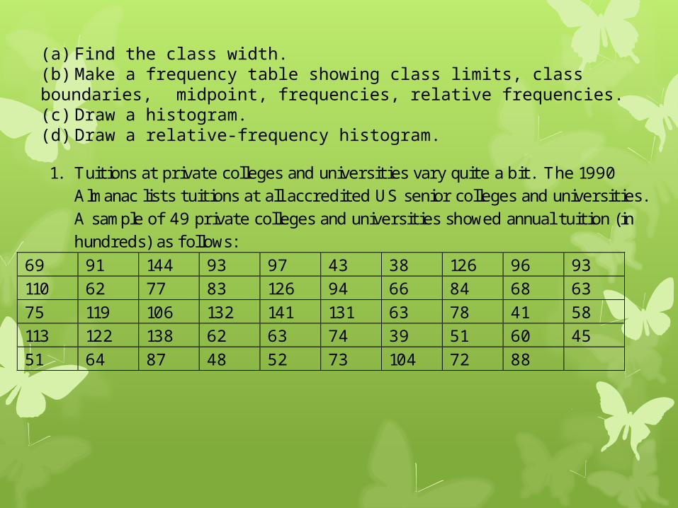
1. Tuitions at private colleges and universities vary quite a bit. The 1990 Almanac lists tuitions at all accredited US senior colleges and universities. A sample of 49 private colleges and universities showed annual tuition (in hundreds) as f ollows:
69 91 144 93 97 43 38 126 96 93 110 62 77 83 126 94 66 84 68 63 75 119 106 132 141 131 63 78 41 58 113 122 138 62 63 74 39 51 60 45 51 64 87 48 52 73 104 72 88
(a) Find the class width.(b) Make a frequency table showing class limits, class boundaries, midpoint, frequencies, relative frequencies.(c) Draw a histogram.(d) Draw a relative-frequency histogram.
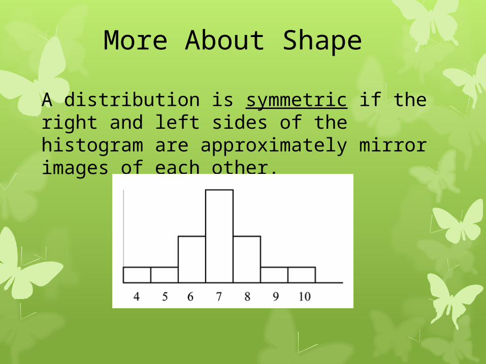
More About Shape
A distribution is symmetric if the right and left sides of the histogram are approximately mirror images of each other.
More About Shape
A distribution is skewed to the right if the right side of the histogram extends much farther out that the left side.

More About Shape
A distribution is skewed to the left if the left side of the histogram extends much farther out that the right side.
Relative Frequency, Cumulative Frequency, Percentiles, and Ogives
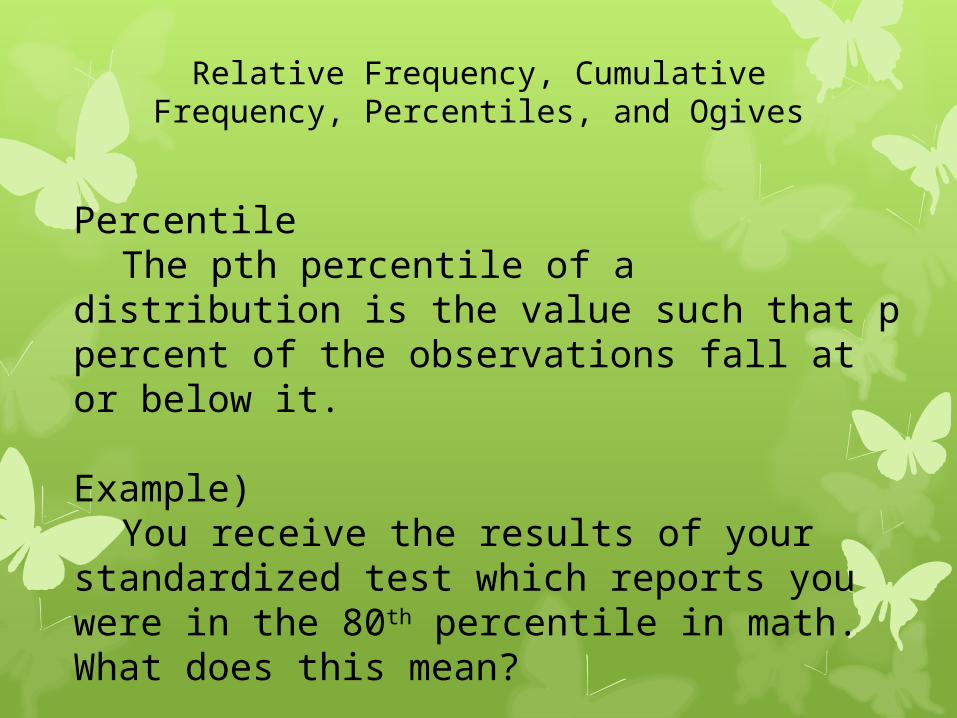
PercentileThe pth percentile of a distribution is
the value such that p percent of the observations fall at or below it.
Example)You receive the results of your
standardized test which reports you were in the 80th percentile in math. What does this mean?

Determining the kth percentile, P 1. Arrange the data in ascending order. 2. Compute an index, i, using the formula
100
nk i where k is the percentile of the data value and n is
the number of individuals in the data set. 3. a. ) I f i is not an integer, round up to the next highest
integer. Locate the ith value of the data set written in ascending order. This number represents the kth percentile. b. ) I f i is an integer, the kth percentile is the arithmetic mean of the ith and (i + 1)st data value.
Relative Frequency, Cumulative Frequency, Percentiles, and Ogives
Relative Frequency, Cumulative Frequency, Percentiles, and Ogives
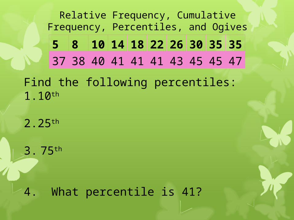
5 8 10
14
18
22
26
30
35
35
37
38
40
41
41
41
43
45
45
47Find the following percentiles:
1.10th
2.25th
3. 75th
4. What percentile is 41?
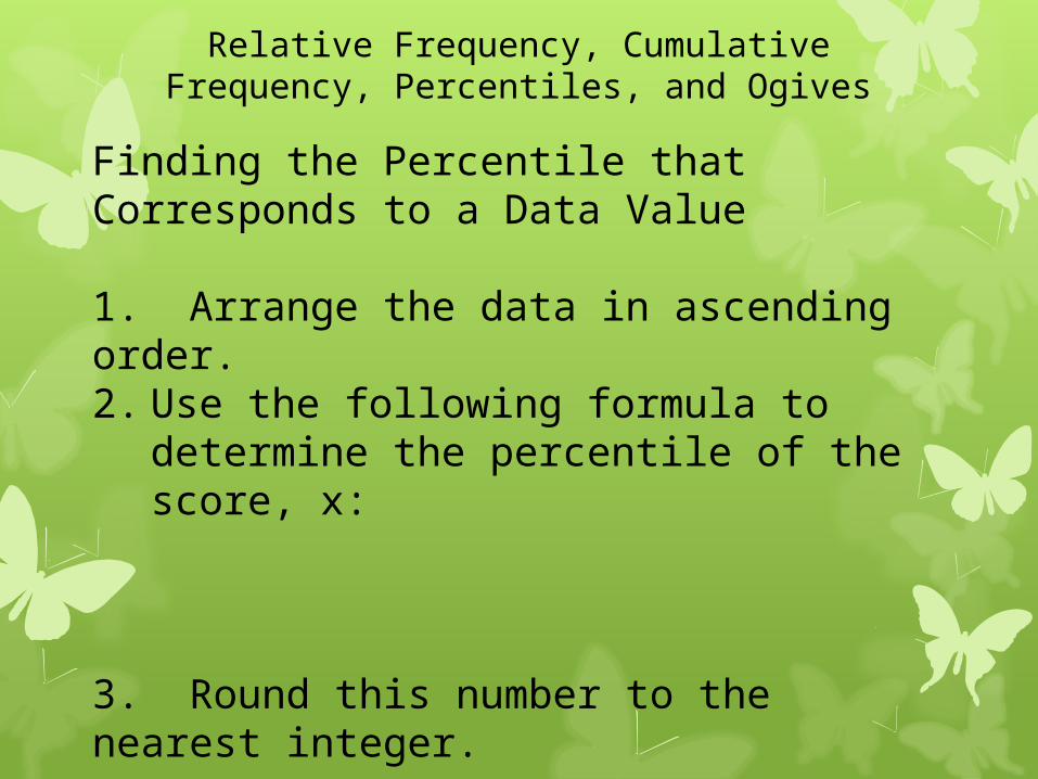
Finding the Percentile that Corresponds to a Data Value
1. Arrange the data in ascending order.2. Use the following formula to
determine the percentile of the score, x:
3. Round this number to the nearest integer.
Relative Frequency, Cumulative Frequency, Percentiles, and Ogives

Relative Frequency, Cumulative Frequency, Percentiles, and Ogives
A histogram does a good job of displaying the distribution of values of a variable. But it tells us little about the relative standing of an individual observation. If we want this type of information, we should construct a relative cumulative frequency graph, often called an ogive (pronounced o-jive).

How to Construct an Ogive
Step 1. Decide on class intervals and make a frequency table, just as in making a histogram. Add three columns to your frequency table: relative frequency, cumulative frequency, and relative cumulative frequency.
Class Frequency Relative frequency
Cumulative frequency
Relative cumulative frequency

Step 2. Label and scale your axes and title your graph. Scale the horizontal axis according to your choice of class intervals and the vertical axis from 0% to 100%.
Step 3. Plot a point corresponding to the relative cumulative frequency in each class interval at the left endpoint of the next class interval. Begin your ogive with a point at height 0% at the left endpoint of the lowest class interval. Connect consecutive points with a line segment to form the ogive. The last point you should be at a height of 100%.
How to locate an individual within the distribution (page 29)
How to locate a value corresponding to a percentile (page 29)
Relative Frequency, Cumulative Frequency, Percentiles, and Ogives
Time Plots
A time plot of a variable plots each observation against the time at which it was measured. Always mark the time scale on the horizontal axis and the variable of interest on the vertical axis. If there are too many points, connecting the points by lines helps show the pattern of changes over time.
When you are examining a time plot, look for an overall pattern and strong deviations from the pattern. One common overall pattern is a trend, a long-term upward or downward movement across time. A pattern that repeats itself at regular intervals is known as a seasonal variation.