arcgis insights: best practices · a box plot displays data distribution showing the median, upper...
TRANSCRIPT

ArcGIS Insights: Best practices

Whenever possible, we send the
computation to the data. In some
cases the data may be ‘live’. Interim
results are saved in the workbook.
Data sets can be joined, and we do not
flatten tables, which allows for 1-n and n-n
joins. There are four attribute join types,
compound joins and spatial joins.
Insights works with multiple shape fields,
reducing data storage demands.
Additional geocoding can be done with
using Enable Location.
Self-service analytics

Ways to use data efficiently for
effective analysis with Insights.
DATA ACCESS
01
Ways to work with Insights to meet
your analysis needs.
VISUAL ANALYTICS
02MODELS, PYTHON AND R
03
Increase productivity by leveraging
open data science.
Key features

Feature layers Excel
GeoDatabases CSV
Shapefiles
GeoJson
Deployment and data options
ONLINE
DESKTOP
ENTERPRISE
DATA
DATABASES (spatial or non-spatial tables)
OPEN SOURCE
Python scripts R scripts
Python notebooks

Flat files
Tables
Date conversions
EXCEL and CSV files

Domains and subtypesPipelines
Subtype: Asset group
Value Description
1 Steel
2 Cast iron
3 Steel
4 Plastic
5 Iron
Coded value domain: Is connected
Value Description
1 True
2 False
Coded value domain: Asset type
Value Description
1 Service
2 Distribution
3 Transmission
4 Gathering

Copy to workbookData of many types from multiple sources including organizations, databases and files can be analyzed together in Insights

Strings (Qualitative)
Numbers (Quantitative)
Data/Time (Temporal)
Spatial (Location)
DYNAMIC SEMANTIC MODELING
Data driven analytics

DemoVISUAL ANALYTICS

DATA OUTLIERS
MEDIAN VALUE
WHISKER (25% OF THE DATA)
MAXIMUM VALUE
Boxplots: show distribution of values - median, upper & lower quartiles, min & max values and, any outliers in the dataset.
Translating data to answers

Distribution: the arrangement of phenomena, could be numerically or spatially
Measure: ascertain the size, amount, or degree of (something)
Change: process through which something becomes different, often over time
A Data clock creates a circular chart of temporal data,commonly used to see the number of events at differentperiods of time.
A box plot displays data distribution showing the median,upper and lower quartiles, min and max values and, outliers.Distributions between many groups can be compared.
Histograms show the distribution of a numeric variable.The bar represents the range of the class bin with theheight showing the number of data points in the class bin.
A heat chart shows total frequency in a matrix. Using atemporal axis values, each cell of the rectangular grid aresymbolized into classes over time.
Line graphs visualize a sequence of continuous numericvalues and are used primarily for trends over time. Theyshow overall trends and changes from one value to the next.
A bar graph uses either horizontal or vertical bars to showcomparisons among categories. They are valuable toidentify broad differences between categories at a glance.
Bubble charts represent numerical values of variables byarea. With two variables (category and numeric), the circlesplaced so they are packed together.
A bar graph uses either horizontal or vertical bars to showcomparisons among categories. They are valuable toidentify broad differences between categories at a glance.
A treemap shows both the hierarchical data as a proportionof a whole and, the structure of data. The proportion ofcategories can easily be compared by their size.
A heat chart shows total frequency in a matrix. Values ineach cell of the rectangular grid are symbolized intoclasses.
Graduated symbol maps show a quantitative differencebetween mapped features by varying symbol size. Data areclassified with a symbol assigned to each range.
A choropleth map allows quantitative values to be mappedby area. They should show normalized values not countscollected over unequal areas or populations.
A chord diagram visualizes the inter-relationships betweencategories and allows comparison of similarities within adataset or, between different groups of data.
Scatterplots allow you to look at relationships between twonumeric variables with both scales showing quantitativevariables. The level of correlation can also be quantified.
A Density/heat map calculates spatial concentrations ofevents or values enabling the distribution to be visualizedas a continuous surface.
Interaction: flow of information, products or goods between places
A chord diagram visualizes the inter-relationships between categories and allows comparison of similarities within a dataset or, between different groups of data.
A combo chart combines two graphs where they sharecommon information on the x-axis. They allow relationshipsbetween two datasets to be shown.
A Density/heat map calculates spatial concentrations ofevents or values enabling the distribution to be visualizedas a continuous surface.
Graduated symbol maps show a quantitative differencebetween mapped features by varying symbol size. Data areclassified with a symbol assigned to each range.
A unique symbol map (areas or points) allows descriptive(qualitative) information to be shown by location. Areashave different fills and points can be geometric or pictorial.
A choropleth map allows quantitative values to be mappedby area. They should show normalized values not countscollected over unequal areas or populations.
Spider lines , also termed desire lines, show paths betweenorigins and destinations. They show connections betweenplaces.
Spider lines, also termed desire lines, show paths betweenorigins and destinations. Flow maps show directionalconnections and flow between places.
Relationship: a connection or similarity between two or more things or, the state of being related to something else
Donut charts are used to show the proportions ofcategorical data, with the size of each piece representingthe proportion of each category.
A treemap shows both the hierarchical data as a proportionof a whole and, the structure of data. The proportion ofcategories can easily be compared by their size.
AcknowledgementInspired by work by Jon Schwabish and Severino Ribecca, The Graphic Continuum, 2014 and, Alan Smith et al. Visual Vocabulary, The Financial Times, 2016
QuantitativeQualitative TemporalData type:
Linda Beale PhD, 2017
Bubble charts with three numeric variables are multivariatecharts that show the relationship between two values while athird value is shown by the circle area.
Part-to-whole: relative proportions or percentages of categories, showing the relationship between parts and whole
Link analysis is used to investigate relationships betweenentities where and an entity is an object, person, place orevent. Links connect two or more entities.


Result dataset
If the analysis results in any changes to the source data, a new result dataset will be created and added to the data pane.
Line type Pipe diameter
DistributionMain 10
Distribution 4
Transmission 6
DistributionMain 8
Drain 6
Overflow 8
Transmission 6
Transmission 10
Overflow 12
Drain 4
Drain 6
… …
This data can be shared and the interactivity can be used to select subsets e.g. outliers.
Line type Min Max Count of
lower outliers
Lower
whisker
Upper
whisker
Q1 Median Q3 Min upper
outlier values
Max upper
outlier values
Count of
upper outliers
Commercial 0.75 0.75 17 1 8 4 6 6 10 12 8
DistributionMain 0 2.5 872 3 10 6 6 8 12 36 632
Domestic 0 0.75 0.75 0.75 0.75 0.75 1 16 582
Drain 0 2 12 4 6 8 0
Irrigation 0 0.75 1 0.75 0.75 1 2 2 8
… …
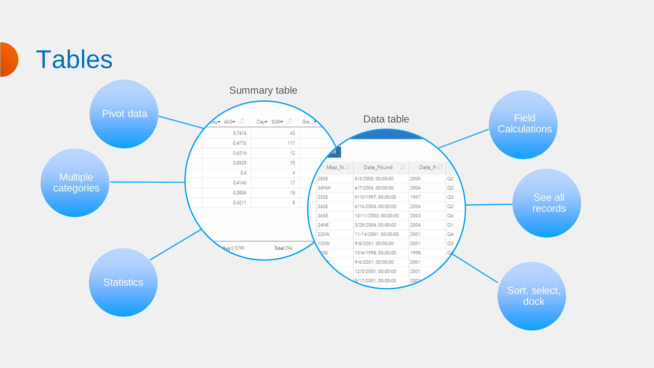
Pivot data
Multiple categories
Statistics
Field Calculations
See all records
Sort, select,dock
TablesSummary table
Data table

Action button

Multiple geometries
Insights can be used for traditional and spatial analysis. Spatial data can have multiple geometries (shapes).
POINTS
LINES
POLYGONS
ALL-IN-ONE

Workflow models

DemoWORKING VISUALLY

Link analysisLink, network or graph analysis focuses on evaluating relationships, interactions and connections.
LINKSNODES
Categorical field
Adding more fields
Merge nodes
Link nodes
Flip
Weight
Type

0 42
Autocorrelation
Regression analysis
+ -
FUNCTION DATASET
Global tests
Variable evaluation
Compare models
Make predictions

Data scienceConnect to your own Python and R kernels to extend analysis and visualization using both open source software platforms.

Python: Manage data
import difflib
import pandas as pd
import numpy as np
def clean_city_field(df, city_field, cities_lkup):
""" Clean the city field in the raw input address table csv
file."""
clean_df = df.copy()
clean_df.dropna(subset=[city_field])
new_cities = []
cities = clean_df[city_field].str.upper().tolist()
cities_look = [city.upper() for city in cities_lkup]
for city in cities:
if city not in cities_look:
new_city = difflib.get_close_matches(city,
cities_look, n=1, cutoff=0.7)
if new_city:
city = new_city[0]
new_cities.append(city)
clean_df[city_field] = new_cities
return clean_df
Replace missing values
Loop through folders
Append files
Reformat data
DATA ENGINEEERING

Extending analysis and visualizations
Extend your analysis using Python and/or R. Incorporate visualizations as cards. Manage your data.
Use the scripting editor to add scripts to models, save sessions and more…
Use existing open data science platforms - connecting through a Jupyter Kernel Gateway.
Insights Kernel gateway Kernel
HTTP / WSS ZMQ

Sharing analysis
INTEGRATED WITH ANALYSIS
Share datasets
workbooks
pages (live/static)
Create packages
Use cross-filters
Change axis labels
Pop-out legends
Foreground/background color
Add Filters
Include text/video/images

DemoDEMO TITLE

DATA ANALYSIS PRESENTATION
Future plans
Auto update analysis
Packaging
SharePoint lists
OneDrive access
OS Authentication for SQL Server
Improvements to kernel density
Clustering
Labels on bar/column charts
Sync y-axis on combo charts
Pre-defined drop-down filters
Change page font
Z-order of cards
Legends