ariana grande 'my everything' digipak analysis
TRANSCRIPT
Ariana Grande Digipak AnalysisBy Sam Fairhead

Front Cover
The artist is wearing revealing clothing – Laura Mulvey male gaze theory, this is usually a convention used on the cover of a pop music album
Italic writing of ’My Everything’ is the sunshine in my soul font. This has a girly element to it which can be linked to her target audience – young and teenage girls. Also is a handwriting effect which suggests that Ariana has written it herself and this album is personal to her.
Artists name is in the Kurining font – signature style – brand identity and house style – can be seen in a lot of her other albums
Artist is not making direct address – not a usual convention of a pop music album. Head tilting away and only showing part of her face – concept of mystery which may engage the audience as they may be intrigued
Artists hair is half up half down. This is the artists signature hair style and is seen in a lot of her other music videos – brand identity – recognizable to audience – USP

THE CDName of the artist is again
written in Kurining font, iconic to her brand identity.
Shows Ariana winking at the camera. This connotes mystery – which links in with the front cover which also connotes mystery
Close up on the CD uses direct address. This contrasts with the front cover. However, this direct address is interrupted by the shadows across the artist’s face. This again suggests mystery, which is the theme on the front cover.
The use of black and white is also used on the front cover - sense of house style. Also emphasises simplicity of the digipak and creates a classic style which links in to her music style and songs on the album. The purple is also used on the back cover, which again has a sense of house style.
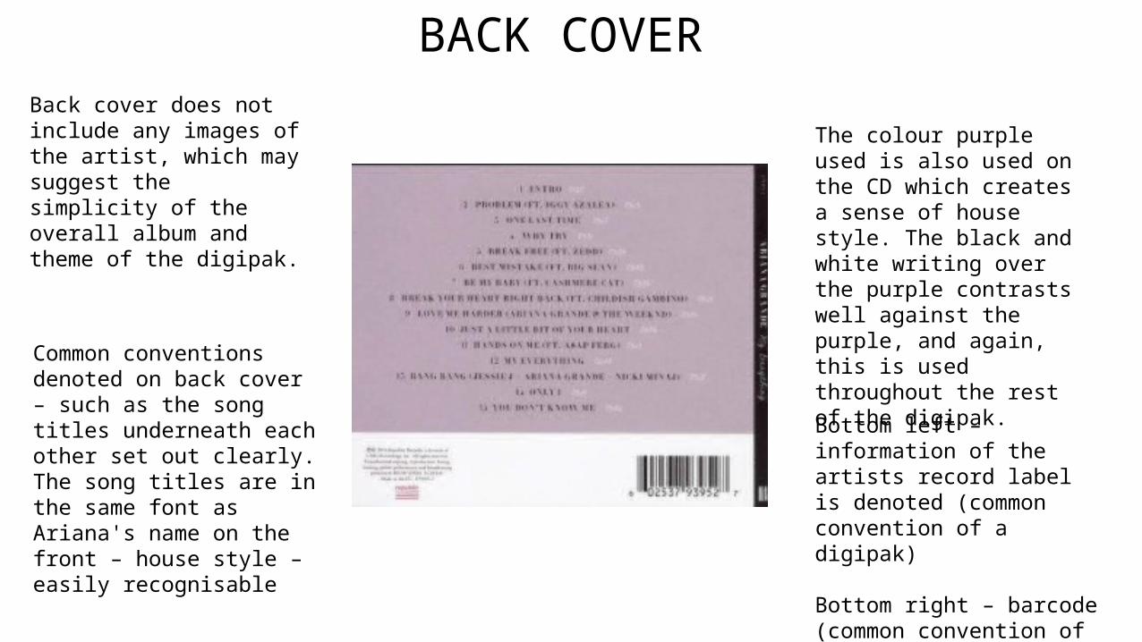
BACK COVERBack cover does not include any images of the artist, which may suggest the simplicity of the overall album and theme of the digipak.
The colour purple used is also used on the CD which creates a sense of house style. The black and white writing over the purple contrasts well against the purple, and again, this is used throughout the rest of the digipak.
Common conventions denoted on back cover – such as the song titles underneath each other set out clearly. The song titles are in the same font as Ariana's name on the front – house style – easily recognisable
Bottom left – information of the artists record label is denoted (common convention of a digipak)
Bottom right – barcode (common convention of a digipak)

Website
The website promotes her most recent album, rather than anything else such as merchandise etc. This may mean that more people will buy her album as it is the first thing they see when they go on to her website – benefiting her and her record label.
Font used for artists name, is, again, the same font that was used on the digipak – house style.
Colours used are black, white and purple which are the exact same colours used on the artists album. – house style
The website includes all social media networking sites such as Twitter and Instagram, which Ariana uses. This makes it easy for fans to interact with the artists and keep up with the latest updates of her music and what she is doing.