artists’ …cdn.johnnealbooks.com/downloads/bl11-1pgs.pdf · i like to include instruction for...
TRANSCRIPT

ARTISTS’ BOOKSbBOOKBINDINGbPAPERCRAFTbCALLIGRAPHY
Volume 11, Number 1 $8.50

Lin Max: Stitched Books
Tilt, Bounce, Color, Texture: Kirsten Horel’s Creative Path by Gail Stevens
Veiko Kespersaks by Sue Gunn
Designing Faces, Figures, Florals and More! Book Review by Robert Hurford
Writing On Dark Paper by Robert Hurford
Joyce Teta: Letters & Books
A Stitch In Letters by Betty Barna
A Personal Pointed Pen Style by Molly Suber Thorpe
Making a Paper Wallet by Carol DuBosch
Scribe: Artist of the Written Word Book Review by Annie Cicale
Contributors / credits
Subscription information
3
4
10
16
18
20
24
28
32
38
42
47
Bound & Lettered b Fall 2013 1
Volume 11, Number 1, October 2013.
Foundation Work Study. 9¾" x 13". On the recommendation
of Christopher Haanes, a finished book as teacher of process. Text is
from Jane Eyre by Charlotte Brontë. “Joyce Teta: Letters & Books,” page 20.
4 Bound & Lettered b Fall 2013
TILT, BOUNCE, COLOR, TEXTUREKirsten Horel’s Creative PathBY GAIL STEVENS
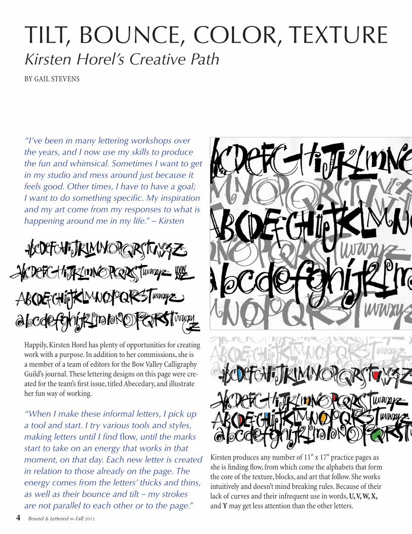
“I’ve been in many lettering workshops over the years, and I now use my skills to produce the fun and whimsical. Sometimes I want to get in my studio and mess around just because it feels good. Other times, I have to have a goal; I want to do something specific. My inspiration and my art come from my responses to what is happening around me in my life.” – Kirsten
“When I make these informal letters, I pick up a tool and start. I try various tools and styles, making letters until I find flow, until the marks start to take on an energy that works in that moment, on that day. Each new letter is created in relation to those already on the page. The energy comes from the letters’ thicks and thins, as well as their bounce and tilt – my strokes are not parallel to each other or to the page.”
Happily, Kirsten Horel has plenty of opportunities for creating work with a purpose. In addition to her commissions, she is a member of a team of editors for the Bow Valley Calligraphy Guild’s journal. These lettering designs on this page were cre-ated for the team’s first issue, titled Abecedary, and illustrate her fun way of working.
Kirsten produces any number of 11" x 17" practice pages as she is finding flow, from which come the alphabets that form the core of the texture, blocks, and art that follow. She works intuitively and doesn’t mind breaking rules. Because of their lack of curves and their infrequent use in words, U, V, W, X, and Y may get less attention than the other letters.

VEIKO KESPERSAKS
BY SUE GUNN
10 Bound & Lettered b Fall 2013
By the 1960s, propaganda had become a form of art all over the Soviet Union, in-cluding in Estonia, where noted calligra-pher Veiko Kespersaks is from originally. Every factory employed an artist who produced political posters and banners, and each one of them had to be taught lettering. For this, Estonia was very lucky to have Villu Toots, a well-respected calligrapher and enthusiast who worked hard to further the lettering arts and who published several books on the subject. In fact, Veiko says, calligraphy in Estonia collapsed after the death of Toots in 1993. WhiIe in secondary school in the 1980s, Veiko’s art teacher, a pupil of Villu Toots, noticed his talent at writing and suggest-ed he join Villu’s lettering school at the Cultural University in Tallinn. Unfortu-nately, by the time Veiko wanted to attend the school, Villu was semi-retired and rarely taught. However, after Veiko pro-duced a group of bookplates in his final year at school (which were very popular in Estonia at the time), Villu took notice. Veiko visited his home several times, and Villu became a teacher and mentor as well as a friend. He even lent Veiko for-eign art magazines, of which Veiko says: “In those days, these were much sought after for their rarity. After his death I still associated such magazines with him, and when I saw some for sale at a second-hand bookshop, I bought a number.” Veiko credits Villu Toots with being his
Right, top: Carpet. A Finnish joke. Watercolors, automatic and pointed pens.
Right, bottom: Invitations and envelopes. Commissioned work for Harrods, London.

28 Bound & Lettered b Fall 2013
A PERSONAL POINTED PEN STYLEBY MOLLY SUBER THORPE
My calligraphic journey had its beginning in 2004. It was then, after graduating from high school in Richmond (a small city amidst the cornfields of Indiana), that I moved to France to attend the American University of Paris, AUP. I’d studied French since age 10 and had been to France a couple times in high school, staying with a host family in the Loire Valley (with whom I am still very close).
While at AUP, I studied art history, comparative French-English literature, and creative writing. After my first two years, and after getting a taste for layout design through my role as editor of Paris/Atlantic, the school’s art and literary magazine, I had the revelation: I wanted to pursue graphic design instead. (As the daughter of two college professors — philosophy and Ancient Greek/Latin — I grew up thinking a
Above and right: A wedding suite for an early summer wedding on the coast of Maine, done as samples for a client. Smooth craft paper was calligraphed in navy gouache using a Brause 66EF nib, then attached to navy card stock.

32 Bound & Lettered b Fall 2013
MAKING APAPER WALLETBY CAROL DUBOSCH
I am charmed by this simple Paper Wallet, which I recently discovered in Helen Hiebert’s book Playing with Paper. She credits Hedi Kyle with its initial development. In its basic form, the structure is easily folded from one piece of paper. My favorite size to make is constructed from a single sheet of 8½" x 11" text weight paper, trimmed to 7⅛" x 11". The finished dimensions are 2¼" x 3½". At this size, the wallet is perfect to securely hold up to three gift cards, credit cards, or business cards. By adding pages to the basic structure, it can become a book, a place to journal or take notes. For this, six sheets (4¼" x 3½") are cut from another piece of 8½" x 11" paper. The sheets are then folded in half to create twelve pages. These pages can be held in place with a rubber band or sewn to the structure’s spine. I like to include instruction for this project in my calligraphy classes. Students have many pages of carefully written practice papers, and these are perfect to repurpose into this easy-to-make, folded paper project. I teach the structure by providing printed diagrams and demonstrating in front of the class, as well as by sharing step-by-step models. The instructions in this article use those step-by-step models. The size of the Paper Wallet can be increased or decreased by using a proportional scale and working with the dimen-sions in either direction. A larger example could be made using a full sheet of 11" x 17" paper; the resulting wallet would be 3½" x 5½". (11" x 17" is a proportional enlargement of the original 7⅛" x 11" sheet; it is 155% larger.) The largest wallet that I’ve made is 6¼" x 9¾", folded from kraft paper, 19½" x 30" (275% larger). I’ve enjoyed folding magazine pages, calendar images, scrapbook papers, and gift wrap into colorful variations of the wallet. One of my students folds the wallets from posters she finds around town.
Supply List1-2 sheets of 8½" x 11" text weight paper, 12" metal ruler, pencil, scissors, needle & thread (or rubber band), bone folder.
Proportional scale. This tool, also called a proportion
wheel, was ubiquitous in the era before computers. It is still very useful to have when you want to scale up or scale down a project without a computer
or a calculator. With this tool, it’s all visual
– no calculation is involved.
Paper Wallet shown open (here
and above) and closed (below).
38 Bound & Lettered b Fall 2013
SCRIBE: ARTIST OF THE WRITTEN WORD BY JOHN STEVENS BOOK REVIEW BY ANNIE CICALE
The calligraphic community’s place in the grand visual world has changed over the years. Lettering artists have always worked in the commercial sphere, though parts of those tasks are now done on the computer rather than by hand. Lettering has long appeared in fine art, but now calligraphic artists are beginning to find homes for their work in galleries and museums. A leader whose work has dominated in both areas is John Stevens. His lovely new book, Scribe:
Artist of the Written Word, is one of the most important lettering arts books to have been produced in many years. In the late 1800s, as an antidote to the Industrial Revolution, artists began once again making things by hand. In England, led by William Morris, this Arts and Crafts Movement produced many craftspeople whose work is still revered today. The books and teachings of lettering artist and type designer Edward Johnston influenced so many of his contemporaries. In Germany, Rudolf Koch led many craftspeople in his workshop, producing fine type, printing, and book design. Descendents of these inspirational artists include Hermann Zapf, Ann Camp, and more recently, Sheila Waters and Ewan Clayton. As the letter arts movement has evolved in the twentieth century and into the twenty-first, scribes have pushed the art and craft in many directions. Calligraphers have experimented with various media, using all kinds of paper, vellums, metals, and fabrics; if a mark can be made on it, scribes have tried it. Scribes have used their skills to make sculptural artists’ books. The letterforms themselves have changed over time, as scribes have put less emphasis on typographical precision and more on expressive movement, often at the expense of legibility. Stand-ing alone in this cacophony of visual sound is the work of John Stevens. I have been a fan of John’s work since meeting him in 1983 at Hermann Zapf ’s workshop at Rochester Institute of Technology. While my classmates and I struggled to draw just a few letters, John sat in the back of the room and lettered page after page of elegant forms. Beginning his career as a sign writer (and musician), his work has maintained the fluidity of brush- made forms while his letters have maintained their purity. I often say there
A line from Horace, the Roman lyric poet. English: “He who feared that he would not succeed sat still.” The regular pattern of stressed strokes is altered to change the rhythm and movement of the line of lettering. John uses this technique in subtle and not-so-subtle ways in his calligraphic designs. In his teaching, he provides students
with exercises to explore and move beyond standard practice; one of those exercises is included in the book.
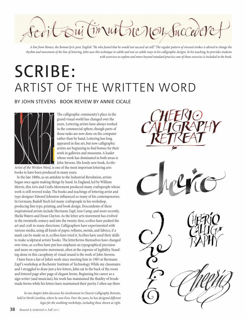
In one chapter John discusses his involvement in Cheerio Calligraphy Retreats, held in North Carolina, where he now lives. Over the years, he has designed different
logos for the weeklong workshops, including those shown at right.