as media foundation portfolio: evaluation q5
TRANSCRIPT

HOW DID YOU ATTRACT/ADDRESS YOUR AUDIENCE?
AS Media - Evaluation
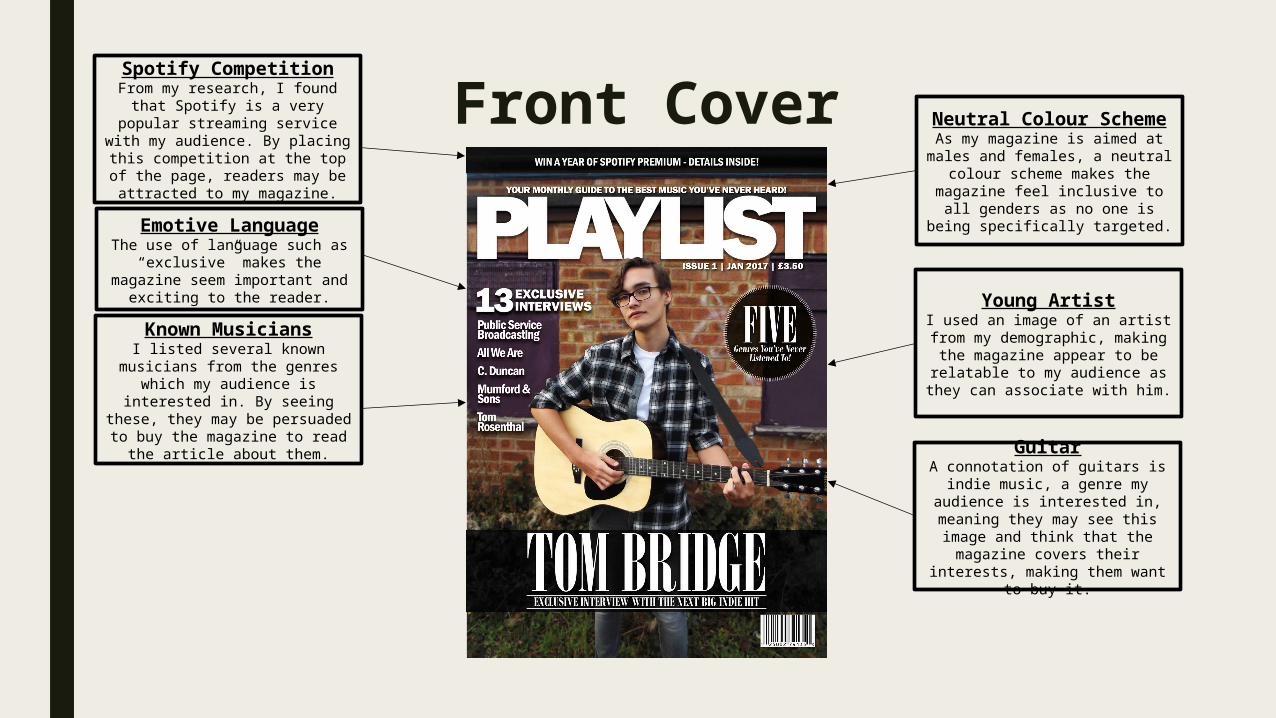
Front CoverSpotify Competition
From my research, I found that Spotify is a very popular
streaming service with my audience. By placing this
competition at the top of the page, readers may be attracted
to my magazine.
Known MusiciansI listed several known musicians
from the genres which my audience is interested in. By seeing these, they may be
persuaded to buy the magazine to read the article about them.
Emotive LanguageThe use of language such as
“exclusive” makes the magazine seem important and exciting to
the reader. Young ArtistI used an image of an artist from
my demographic, making the magazine appear to be relatable
to my audience as they can associate with him.
Neutral Colour SchemeAs my magazine is aimed at males and females, a neutral
colour scheme makes the magazine feel inclusive to all genders as no one is being
specifically targeted.
GuitarA connotation of guitars is indie music, a genre my audience is
interested in, meaning they may see this image and think that the magazine covers their interests,
making them want to buy it.

Contents Page
Instagram-style ImageInstagram is a very popular
social media platform within my target audience, so the sight of
an image edited in an Instagram style may make them interested
in reading the article.
Tom Bridge FeatureThrough the placement of the
folio and article title on top of an image of an artist, an association is created. Due to the size of the
image and the fact that the article title is in a different
colour, readers will believe that this article is important and
worthwhile.
Article TitlesThrough the use of bait-style
article titles such as “Five Genre’s You’ve Never Listened
To”, readers may be intrigued by this point and decide to read the
full article as a result.
Social Media Information
My target audience is very active on social media, so by placing social media information within the magazine, they are being
encouraged to interact with the magazine, creating conversation.
Clean/Modern DesignThrough my use of white space,
a simplistic colour scheme, and a mixture of serif and sans-serif fonts, I have created a very
modern and visually appealing design.

DPSPull QuoteBy placing a quote from the
article at the top of the page, readers may be intrigued by it and persuaded to read the full
article to find the context.
Clean/Modern DesignThrough my use of white space,
a simplistic colour scheme, and a mixture of serif and sans-serif fonts, I have created a very
modern and visually appealing design.
Full-page Image of Artist
As readers look through the pages of my magazine, they may see this image of an artist they
recognise and decide to read the article. The fact an artist from their demographic has been
used may also persuade them as they can relate to him.
Concise TextI have used a Q&A format for this interview, leading a very concise and personal feeling article. As
my target audience is interested in finding out about the stories
behind musicians, but is not necessarily interested in reading
paragraphs of body text, this style may attract them as it is very concise whilst still being
informative.