audience feedback for finished product
TRANSCRIPT

By Will Jewell

Front Cover (quality, look, information about what’s inside)1/5 Poor–
2/5 Average-
3/5 Ok- /
4/5 Good- ////
5/5 Great -
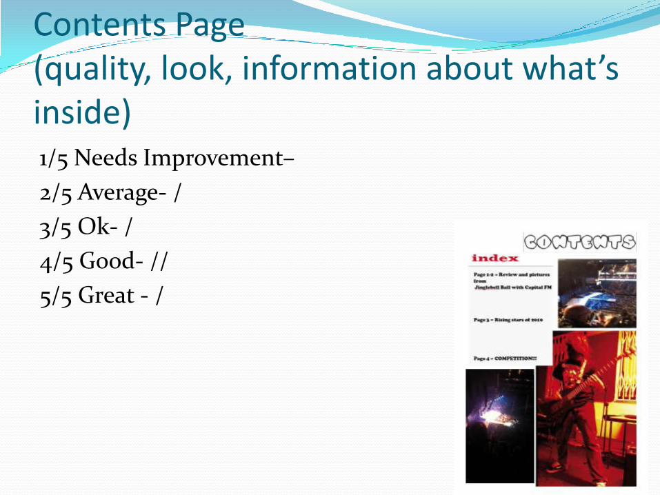
Contents Page (quality, look, information about what’s inside)1/5 Needs Improvement–
2/5 Average- /
3/5 Ok- /
4/5 Good- //
5/5 Great - /

2 Page Spread (quality, look, information about what’s inside) 1/5 Poor–
2/5 Average-
3/5 Ok- //
4/5 Good- /
5/5 Great - //
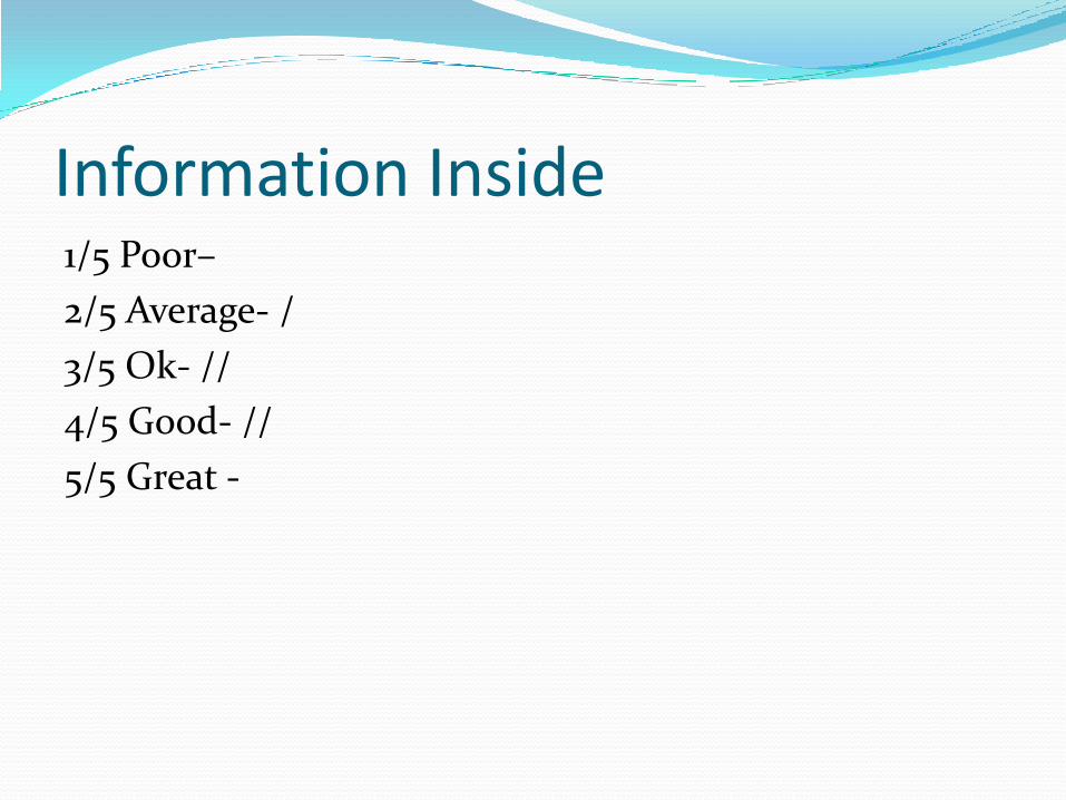
Information Inside1/5 Poor–
2/5 Average- /
3/5 Ok- //
4/5 Good- //
5/5 Great -

Value For Money1/5 Poor–
2/5 Average- /
3/5 Ok-
4/5 Good- /
5/5 Great - ///

Photos 1/5 Poor–
2/5 Average-
3/5 Ok-
4/5 Good- //
5/5 Great - ///

Eye CatchingYes – /////
No -

Reflection on Audience Feedback
According to my audience feedback questionnaire that I gave to 5 people in my class to fill out I have got pretty similar results from all of them. For my front cover I told the 5 chosen people to rate my front cover out of 5 saying that 1 was poor and 5 was great. For the front cover I got a high majority of people saying it is 4/5 (good) which I am very happy with. It shows that people think it is high quality, has good information and looks professional. The other person gave it a 3 which is still ‘ok’ in the ratings which means that although its not great it would still grab their attention in the shops. I think the fact that I put a screen shot of my front cover in the bottom corner to give the people doing my questionnaire a preview helped my ratings because it gives them a chance to have a good look at it before voting.
Front Cover
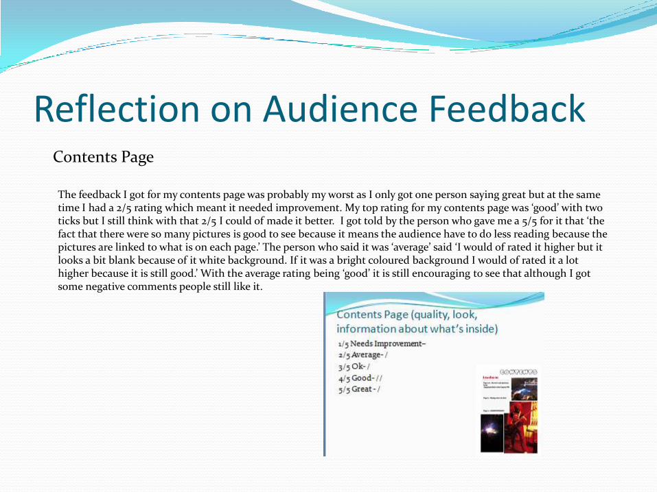
Reflection on Audience FeedbackContents Page
The feedback I got for my contents page was probably my worst as I only got one person saying great but at the same time I had a 2/5 rating which meant it needed improvement. My top rating for my contents page was ‘good’ with two ticks but I still think with that 2/5 I could of made it better. I got told by the person who gave me a 5/5 for it that ‘the fact that there were so many pictures is good to see because it means the audience have to do less reading because the pictures are linked to what is on each page.’ The person who said it was ‘average’ said ‘I would of rated it higher but it looks a bit blank because of it white background. If it was a bright coloured background I would of rated it a lot higher because it is still good.’ With the average rating being ‘good’ it is still encouraging to see that although I got some negative comments people still like it.

Reflection on Audience Feedback
Two Page Spread
My two page spread got the highest ratings out of all the finished product (front cover, contents page, 2 page spread) with the majority of people saying it was great. This is something I personally agree with because I thought my 2 page spread was the best part of the magazine. Although it got 2 ‘greats’ it also got 2 ‘oks’ which isn’t bad but at the same time it isn’t very pleasing. I got told that the fact that I used bright and eye catching font colours made it ‘great’ and that’s why they gave me the highest mark because it keeps them interested. Also I think that the quotes that I put on the 1st page of the two page spread helped as well because it gave a personal review from the people who actually went to the concert so its not just my opinion its everybody's. The many colours stimulate the mind as well to keep the readers gripped to the page which is what I want because otherwise they will get bored easily.

Reflection on Audience FeedbackInformation Inside
The feedback that I got for my inside information in the magazine was pleasing as most people gave it either a 3 or 4 out of 5. They said that having real band names and artists in my articles and having stories about rising stars in my magazine made itreally interesting because it made them believe that they were reading a real magazine and not a made up story. Also the information on the front cover was also taken into account and they said it was informative in places and it made them want to pick up the magazine and read it especially the competition with Bruno Mars. The fact that it was so informative meant that they would consider buying it again if they purchased it in a shop in the first place.

Reflection on Audience FeedbackValue For Money
The 5 people I gave my questionnaire to decided that it was a great value for money at a price of £2.50 and that they would pay that much for that magazine every time it is published. One person said that the high quality articles and pictures with this layout is definitely worth the money. The fact that I put the price in bright yellow and quite large font made them see the price straight away which they said would help them make a decision quickly if they saw two magazines they liked in a shop. If it was to expensive then I think most people would of given it a very low rating which isn’t good. This shows that £2.50 is a good price for a music magazine of this quality.

Reflection on Audience FeedbackPhotos Used
The response i got from my chosen 5 about the pictures used in my magazine was very pleasing with all 5 people giving it a 4/5 or a 5/5. This shows that the audience liked my photos and thought they were of the highest quality. They thought that the action shots of the music artists and the arena during a concert really made them grasp the atmosphere and it was really enjoyable. They also thought that the use of photo shop was effective because if it wasn’t used they said it would of been too ordinary and boring. The glow from the stage on the pictures also made them feel like they were there at the concert. This shows that the audience like action shots as well as normal shots of artists and also like to see pictures from the concerts that are being reviewed so they can judge it for themselves.

Reflection on Audience FeedbackEye Catching
This was by far the best feedback i got from my audience feedback sheet as everyone said that my magazines front cover was eye catching and that they would notice it in a shop shelf. They mentioned that the use of bright colours on the front grabbed their eye and made them want to see what it says. Also they said that because the masthead was modernised it made it stand out more too. They mentioned that because the masthead was on a white backdrop it made it stand out more as well so added to the effect which is why they voted ‘yes’ it is eye catching. This shows that the audience like bright colours to grab their attention when they are browsing through a magazine rack and that having the masthead on a different coloured backdrop is even better because that is the first thing they look for.