awm 11 unit 1 working with graphsdriscollhomework.weebly.com/uploads/1/9/4/9/19497657/unit_1... ·...
TRANSCRIPT

1
AWM 11 – UNIT 1 – WORKING WITH GRAPHS
Assignment Title Work to complete Complete
1 Introduction to Statistics Read the introduction – no written assignment
2 Bar Graphs Bar Graphs
3 Double Bar Graphs Double Bar Graphs
4 Broken Line Graphs Broken Line Graphs
Quiz 1
5 Histograms Interpreting Histograms
6 Histograms Creating Histograms
7 Circle Graphs Interpreting Circle Graphs
8 Circle Graphs Drawing Angles
9 Circle Graphs Creating Circle Graphs
10 Misleading Graphs Misleading Graphs
Quiz 2
Practice Test Practice Test How are you doing?
Get this page from your teacher
Math Journal Math Journal Journal entry based on criteria on handout and question jointly chosen.
Self-Assessment
Self-Assessment On the next page, complete the self-assessment assignment.
Unit Test Unit Test Show me your stuff!

2
Self Assessment In the following chart, show how confident you feel about each statement by drawing one of the following: , , or . Then discuss this with your teacher BEFORE you write the test!
Statement
After completing this chapter;
I can determine the types of graphs that can be used to represent given data
I can explain the advantages and disadvantages of different types of graphs
I can create a bar graph, a broken line graph, a histogram, and a circle graph
I can interpret bar graphs, broken line graphs, histograms, and circle graphs in order to answer questions about the data
I can discuss the trends a graph represents for a given set of data
I can explain how different graphs of the same data can be used to be misleading
Vocabulary: Unit 1
angle bar graph broken line graph circle graph histogram statistics trend
3
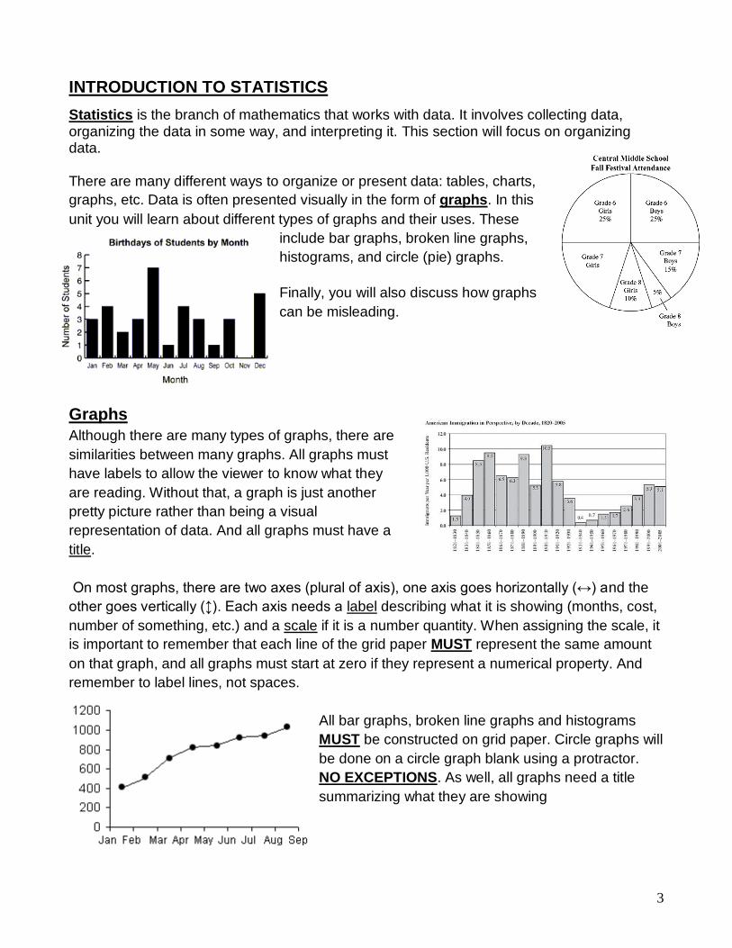
INTRODUCTION TO STATISTICS
Statistics is the branch of mathematics that works with data. It involves collecting data, organizing the data in some way, and interpreting it. This section will focus on organizing data. There are many different ways to organize or present data: tables, charts,
graphs, etc. Data is often presented visually in the form of graphs. In this
unit you will learn about different types of graphs and their uses. These
include bar graphs, broken line graphs,
histograms, and circle (pie) graphs.
Finally, you will also discuss how graphs
can be misleading.
Graphs
Although there are many types of graphs, there are
similarities between many graphs. All graphs must
have labels to allow the viewer to know what they
are reading. Without that, a graph is just another
pretty picture rather than being a visual
representation of data. And all graphs must have a
title.
On most graphs, there are two axes (plural of axis), one axis goes horizontally (↔) and the
other goes vertically (↕). Each axis needs a label describing what it is showing (months, cost,
number of something, etc.) and a scale if it is a number quantity. When assigning the scale, it
is important to remember that each line of the grid paper MUST represent the same amount
on that graph, and all graphs must start at zero if they represent a numerical property. And
remember to label lines, not spaces.
All bar graphs, broken line graphs and histograms
MUST be constructed on grid paper. Circle graphs will
be done on a circle graph blank using a protractor.
NO EXCEPTIONS. As well, all graphs need a title
summarizing what they are showing
4
BAR GRAPHS
A bar graph is a visual representation used to show
comparison. On a bar graph, the bars can be
horizontal or vertical as shown on the right. Most bar
graphs are drawn with vertical bars. The values
plotted are discrete, meaning they have a distinct or
exact value. There is always the same amount of
space between the bars and the bars are always the
same thickness.
When drawing a bar graph with vertical bars, the horizontal
axis does not have a scale: it just the names of each bar.
The vertical axis will need a scale. For this Math course,
each vertical scale must start at zero, and end it just above
the highest data value unless otherwise specified (negative
temperatures). For example, if your data consisted of the
information below, you would start your vertical axis at zero
and the top value might be 55 if increments go up by 5, or
56 if increments go up by 2.
For this course, the bars in the graph should not be coloured with individual colours,
but all one colour. A highlighter is fine, or they can be simply shaded with a pencil.
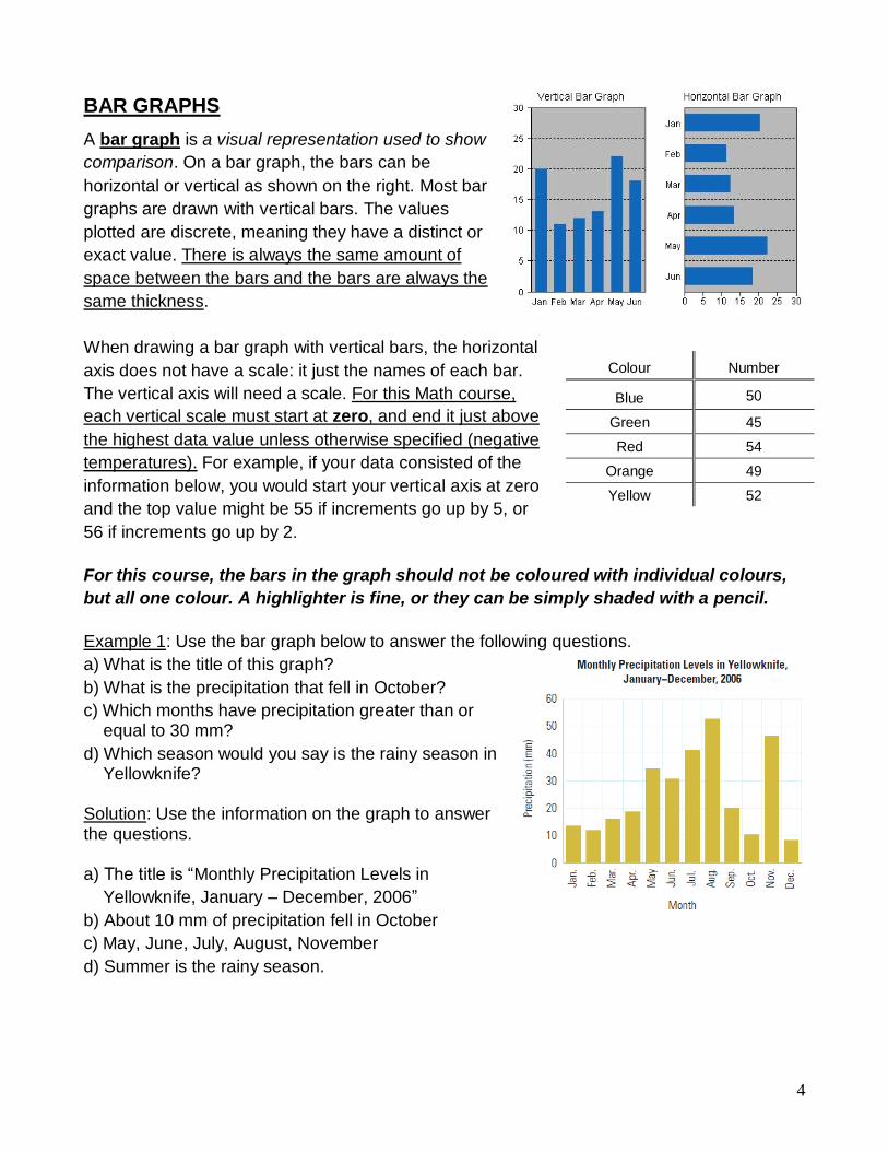
Example 1: Use the bar graph below to answer the following questions.
a) What is the title of this graph?
b) What is the precipitation that fell in October?
c) Which months have precipitation greater than or equal to 30 mm?
d) Which season would you say is the rainy season in Yellowknife?
Solution: Use the information on the graph to answer the questions. a) The title is “Monthly Precipitation Levels in
Yellowknife, January – December, 2006”
b) About 10 mm of precipitation fell in October
c) May, June, July, August, November
d) Summer is the rainy season.
Colour Number
Blue 50
Green 45
Red 54
Orange 49
Yellow 52

5
0
2
4
6
8
10
12
14
16
18
20
Blue Green Yellow Red Orange Purple
Nu
mb
er
of
Stu
de
nts
Colour
Favourite Colour of Grade 3 Students
Example 2: Create a vertical bar graph using the data in the table below.
Solution: Draw and label the axes, set a scale, and plot the data accordingly.
The horizontal axis is labelled “Colour” while the vertical axis is labelled “Number of Students.” The scale must go up from 0 and a good top value would be 20 with the increment of 2 for each line. The data is plotted as shown below.
Note that this graph was produced using a software program so it might look slightly different when done with pencil and paper. There are other acceptable values that could be used on the vertical axis; this is not the only answer. Example 3: The following data is shown in both a vertical and horizontal bar graph. Which
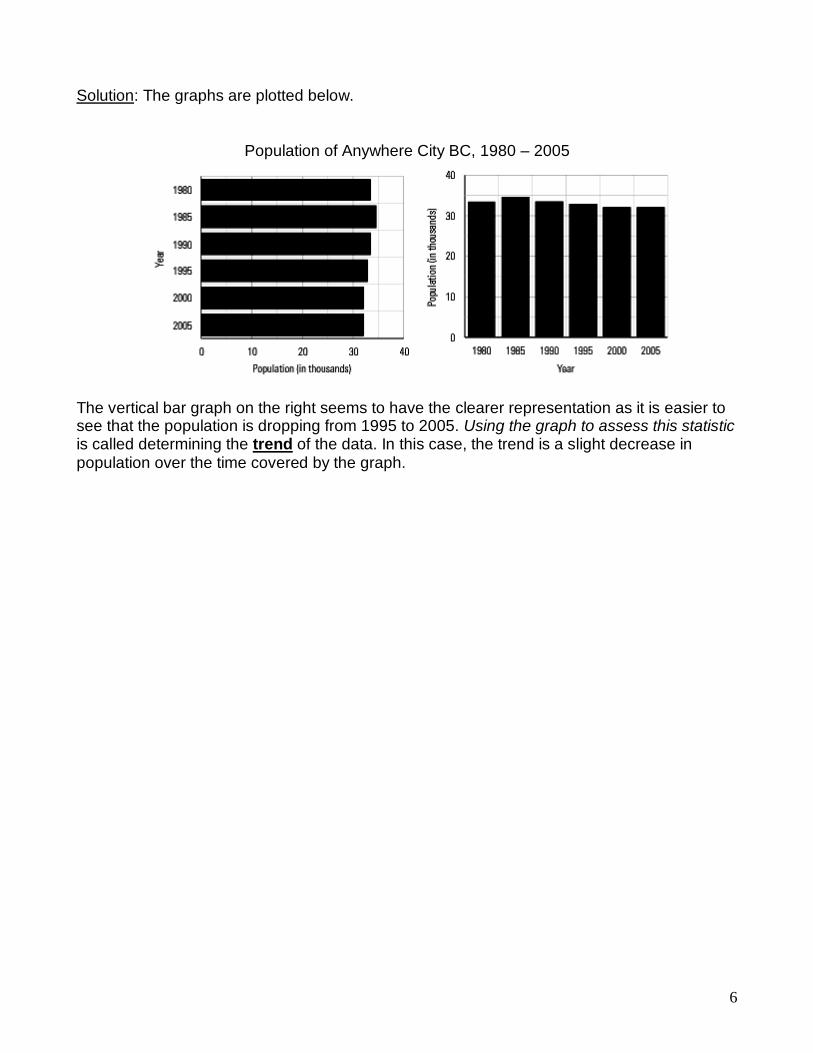
graph is a clearer representation of the data and why?
Population of Anywhere City, BC, 1980 – 2005
Year 1980 1985 1990 1995 2000 2005
Population (in thousands)
33.5 34.3 33.4 32.8 32.0 32.0
Favourite Colour of Grade 3 Students
Colour Blue Green Yellow Red Orange Purple
Number of Students
16 5 3 18 11 8
6
Solution: The graphs are plotted below.
Population of Anywhere City BC, 1980 – 2005 The vertical bar graph on the right seems to have the clearer representation as it is easier to see that the population is dropping from 1995 to 2005. Using the graph to assess this statistic is called determining the trend of the data. In this case, the trend is a slight decrease in population over the time covered by the graph.

7
ASSIGNMENT 2 – BAR GRAPHS
1) Use this bar graph to answer the following questions.
How many DVDs were sold on:
a) Monday? _________________________________________
b) Tuesday? ________________________________________
c) Wednesday? _____________________________________
d) Thursday? _______________________________________
e) Friday? __________________________________________
On which days were:
f) More than 130 DVDs sold? ______________________________________
g) 120 or more DVDs sold? ________________________________________
h) Fewer than 130 DVDs sold? _____________________________________
i) 150 or fewer DVDs sold? ________________________________________
Were more DVDs sold on:
j) Monday or Wednesday? _______________________________________
k) Tuesday or Thursday? ________________________________________
l) Wednesday or Friday? ________________________________________
0
20
40
60
80
100
120
140
160
180
Monday Tuesday Wednesday Thursday Friday
DV
Ds
So
ld
Day
DVDs Sales
8
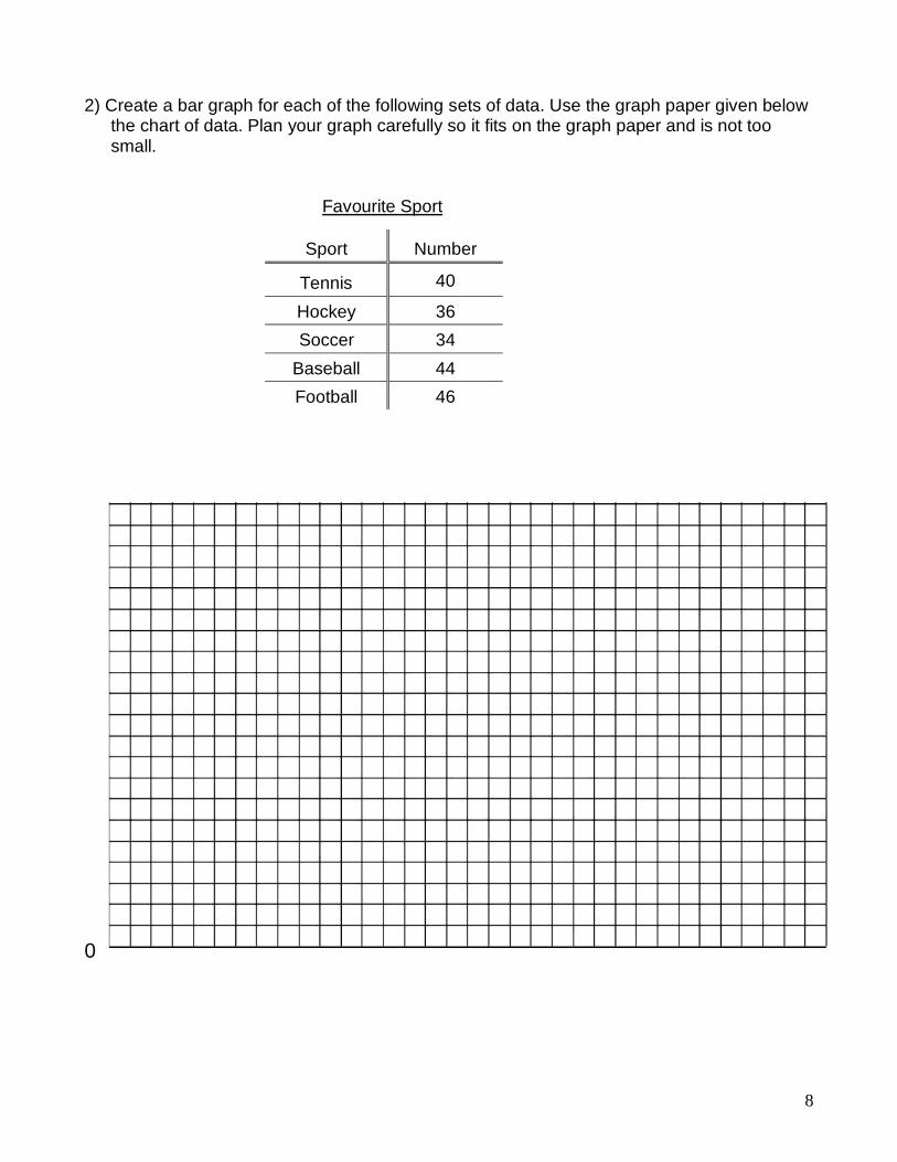
2) Create a bar graph for each of the following sets of data. Use the graph paper given below the chart of data. Plan your graph carefully so it fits on the graph paper and is not too small.
Favourite Sport
0
Sport Number
Tennis 40
Hockey 36
Soccer 34
Baseball 44
Football 46

9
Math Test Scores
NOTE: The “Test Score” goes on the horizontal axis ( ) while the “Number of Students” goes on the vertical axis.
0
Test Score
Number of Students
60 15
65 10
70 20
75 30
80 50
85 25
90 5
95 15

10
Double Bar Graphs
Double bar graphs are used to compare two things and show the trends between both at the
same time. Double bars graphs have everything the same as single bar graphs except they
have two bars at each spot on the horizontal axis comparing some entity. Drawing double
bars graphs follows the same set of rules as for single bar
graphs. Examples of double bar graphs could be fuel
consumption for different vehicles comparing highway and
city driving or housing prices for new and resale homes, or
the graph to the right.
This example of a double bar graph shows several key
features; the pair of bars is the same width and touching
each other. There is the regular space between sets of
bars. There needs to be some form of a legend to indicate
what different colours or patterns represents. And like ALL
graphs, the axes are labelled, the vertical axis has a scale
on it, and the graph has a title.
Example: Use the double bar graph to answer the following questions. a) What are the two company names?
b) Which company is represented by the darker bar?
c) How many computers does each company sell?
d) How many working spaces does each company
have?
e) Why would one company have more computers
than working spaces?
Solution:
a) Competitor’s company and Ginger’s company
b) Competitor’s company
c) Competitor’s company - 8
Ginger’s company - 5
d) Competitor’s company - 7
Ginger’s company - 8
e) Some computers may be laptops and not used in a
workspace.
11
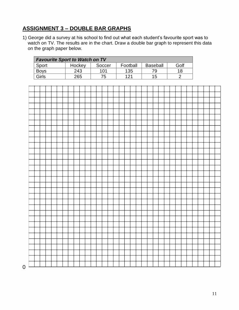
ASSIGNMENT 3 – DOUBLE BAR GRAPHS
1) George did a survey at his school to find out what each student’s favourite sport was to watch on TV. The results are in the chart. Draw a double bar graph to represent this data on the graph paper below.
Favourite Sport to Watch on TV
Sport Hockey Soccer Football Baseball Golf
Boys 243 101 135 79 18
Girls 265 75 121 15 2
0

12
BROKEN LINE GRAPHS
A broken-line graph displays information by using a scale.
It is similar to a bar graph, but it has points at the top of
where the bars would be. These points are joined in
individual line segments creating a “broken” line. It shows
continuous change over a period of time. Just as with a bar
graph, a broken line graph needs labels on the axes and a
title.
Broken line graphs are used to show trends over time. By
looking at just the line on a broken line graph rather than a
set of bars on a bar graph, it is easier to discover the
changes in the data over time. As with double bar graphs,
broken line graphs can have more than one broken line on
a graph.
If you see a symbol like the one shown in the diagram to the right on an axis, it
means that some amount of the axis has been omitted. If it is a scale, it is indicating
that while the graph starts at zero, it really leaves out a large chunk of the values on
the axis. DO NOT USE THIS TYPE OF SYMBOL OR METHOD. It produces
inaccurate and misleading graphs which will be discussed later in this unit.
To construct a broken-line graph, complete the following steps.
1) Plan, draw and label the vertical scale to show the range of values. The label contains
the words stating what the numbers are like metres, income, number if hours, etc.
Remember to start at zero and to go just above the highest value. Each line MUST
represent the same amount on your scale. If it is 5, your lines will go up like this: 0, 5,
10, 15, 20, 25, etc. It is not necessary to label every line with a number as it may get
cluttered and hard to read.
2) Next plan, draw and label the horizontal scale. The spacing between each vertical line
that you choose to label where you will plot a point MUST be consistent. For example,
don’t leave two lines for the first 5 points and then only one line at the right side
between points because you are running out of room! Plan your graph carefully!
3) Next, plot the points of data. To do this, find the values on each axis and where they
meet, draw a small point.
4) When all the points are plotted, connect them WITH A RULER. Do not try to make the
line one straight line. It is a series of line segments between each dot.
5) Finally, write a title for the graph that describes what the graph is illustrating.
13
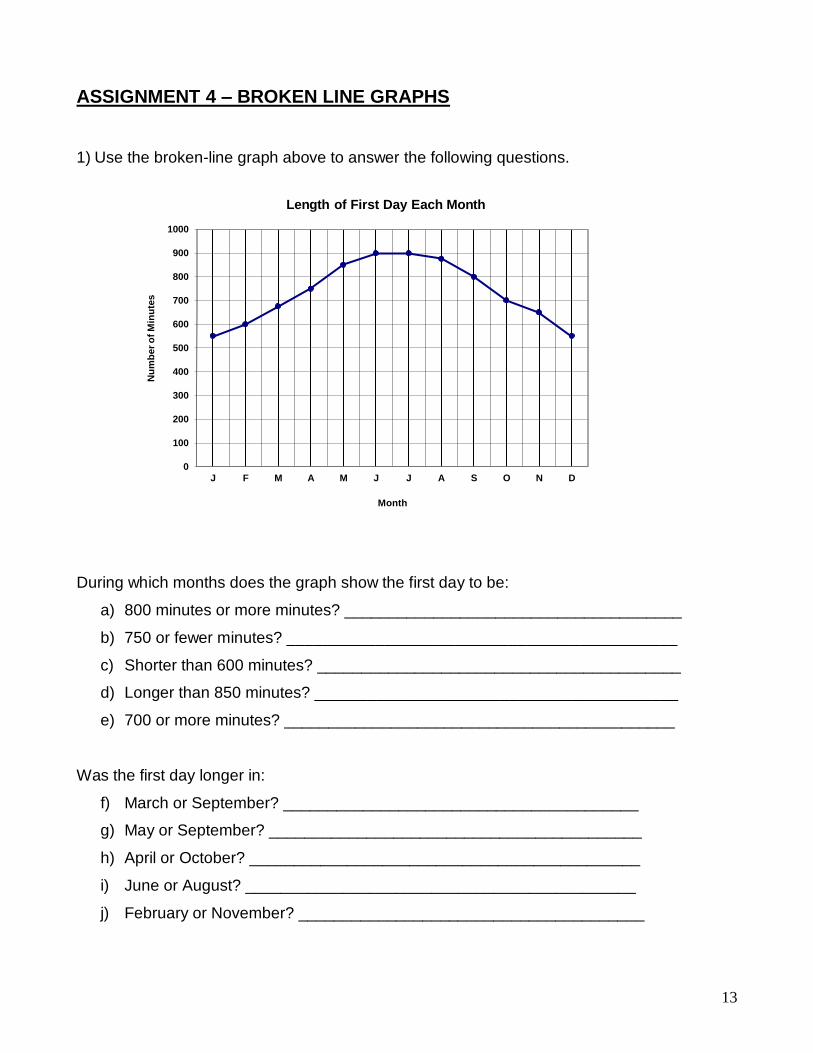
ASSIGNMENT 4 – BROKEN LINE GRAPHS
1) Use the broken-line graph above to answer the following questions.
During which months does the graph show the first day to be:
a) 800 minutes or more minutes? ______________________________________
b) 750 or fewer minutes? ____________________________________________
c) Shorter than 600 minutes? _________________________________________
d) Longer than 850 minutes? _________________________________________
e) 700 or more minutes? ____________________________________________
Was the first day longer in:
f) March or September? ________________________________________
g) May or September? __________________________________________
h) April or October? ____________________________________________
i) June or August? ____________________________________________
j) February or November? _______________________________________
0
100
200
300
400
500
600
700
800
900
1000
J F M A M J J A S O N D
Nu
mb
er
of
Min
ute
s
Month
Length of First Day Each Month
14
0
5
10
15
20
25
30
35
40
45
50
55
60
65
70
2000
2001
2002
2003
2004
2005
2006
2007
2008
2009
Pro
fit
(th
ou
san
ds
of
do
llars
)
Year
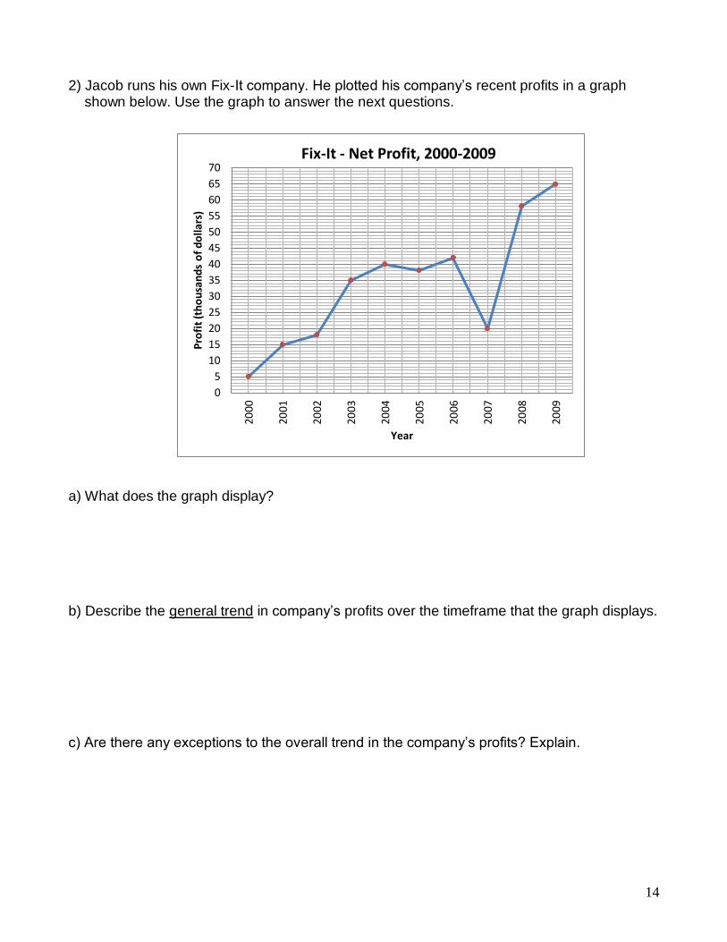
Fix-It - Net Profit, 2000-2009
2) Jacob runs his own Fix-It company. He plotted his company’s recent profits in a graph shown below. Use the graph to answer the next questions.
a) What does the graph display? b) Describe the general trend in company’s profits over the timeframe that the graph displays. c) Are there any exceptions to the overall trend in the company’s profits? Explain.

15
3) Create a broken-line graph for the following set of data. Plan your graph carefully so it fits on the graph paper but is not too small.
Math Test Scores
NOTE: The “Test Score” goes on the horizontal axis while the “Number of Students” goes on the vertical axis.
0
Test Score
Number of Students
60 15
65 10
70 20
75 30
80 50
85 25
90 5
95 15

16
4) Create a broken-line graph for the following set of data. Plan your graph carefully so it fits on the graph paper but is not too small.
0
ASK YOUR TEACHER FOR QUIZ 1
Monthly Precipitation in Banff, Alberta
Month J F M A M J J A S O N D
Precipitation (mm)
28 22 23 32 60 82 54 60 42 29 27 28

17
HISTOGRAMS
A histogram is a special type of bar graph. It shows a range of continuous data on the horizontal axis grouped into what are called classes. There is no space between the bars of a histogram because the data is continuous, and the width of each bar that represents the classes is the same.
On the graph above, the label on the vertical axis is
“Frequency”. This simply tells us how often the item on
the horizontal axis occurred. The vertical axis could
also have a more descriptive title. In this case, it might
say “Number of Cards”.
On the graph to the left, the label on the vertical axis is
more descriptive, saying “Number of Students” rather
than frequency. This is the preferred way to label the
axis.
Also notice that the range of values horizontal axis in
each graph is shown differently. Both show a range,
but the graph above shows labels at the ends of each
bar on the histogram while the graph to the left shows
the entire range written under the bar. The preferred
way to show the range is the graph at the top of the
page.
Marks on Math Quiz
The data used to plot a histogram comes from a tally chart or a
frequency table. A tally chart lists the classes to be plotted and
has tally marks for each time there is a piece of data in that
class. A frequency table summarizes the tally marks into
number data. Sometimes, both types of data are combined in
the same table as seen here.
18
0
100
200
300
400
500
600
700
800
900
1000
0 5 10 15 20 25 30 35
Nu
mb
er o
f P
eop
le
Hours
Number of Hours of TelevisionWatched per Week
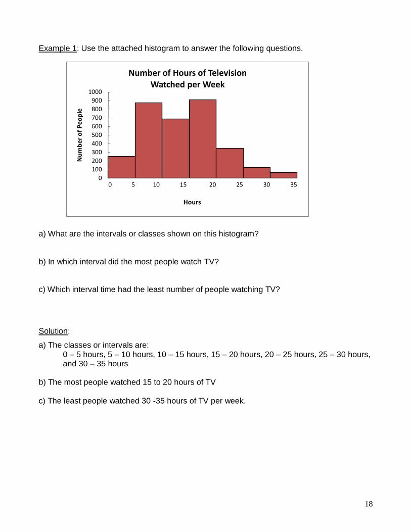
Example 1: Use the attached histogram to answer the following questions. a) What are the intervals or classes shown on this histogram? b) In which interval did the most people watch TV? c) Which interval time had the least number of people watching TV?
Solution:
a) The classes or intervals are: 0 – 5 hours, 5 – 10 hours, 10 – 15 hours, 15 – 20 hours, 20 – 25 hours, 25 – 30 hours,
and 30 – 35 hours b) The most people watched 15 to 20 hours of TV c) The least people watched 30 -35 hours of TV per week.

19
ASSIGNMENT 5 – INTERPRETING HISTOGRAMS
Use the data in the following histograms to answer the questions.
1. What are the classes in this histogram? List them.
______________________________________________
2. In which class (or interval) does the most data occur?
______________________________________________
3. In which class (or interval) does the least data occur?
______________________________________________
Masses of Players on School Football Team
4. How many students have a mass between 55 and 60 kg?
______________________________________________
5. How many students have a mass between 70 and 75 kg?
______________________________________________
6. How many students have a mass of less than 70 kg?
______________________________________________
7. How many students have a mass of 70 kg or more?
______________________________________________
8. How many students are on the football team?
______________________________________________
9. How many classes are there in this histogram?
______________________________________________
10. What are the classes?
______________________________________________
11. In which class does the greatest frequency occur?
______________________________________________
12. Which 2 classes have the same frequency?
______________________________________________

20
CREATING HISTOGRAMS
Most of the histograms you will be drawing already have the first 3 steps completed and the frequency chart drawn. In case you are presented with raw data, you need to understand how the frequency chart is created.
1. Gather the data you are interested in.
The example data here represents the heights of students in Grade 11 in centimetres.
152 161 189 158 177 167 182 155 171 163 185 173 183
166 177 172 157 168 181 167 188 158 168 162 159 153
171 186 152 167 173 175 159 184 189 187 162 151 179
163 185 183 177 176 152 174 179 182 158 172 186 171
185 157 173 188 152 176 187 157 172 179
2. Look at the data and determine the categories or
intervals you will use to organize the data.
Sometimes the classes will be given to you. Other
times you must determine them from the data. The
tally chart here shows the results of a survey about
height of students in Grade 11.
3. Construct a frequency table for your data. The frequency corresponds to the number
of times each value is observed. Using this example, the frequency table might look
like this.
THIS IS WHERE MOST OF THE DATA YOU WILL BE WORKING WITH WILL
START – WITH A PREMADE FREQUENCY TABLE.
4. To create the histogram, draw a horizontal and a vertical
axis. The horizontal axis (X) shows the data categories
(such as time, or a measurement, like weight). In this
case, it would be Height. The vertical axis (Y)
represents the frequency of the observations (the
number of observations for each category). In this case
it would be Number of Students.
5. For each category of data, draw a rectangle (without space between the rectangles).
The width of the rectangle represents the interval between two groups, and the height
represents the observed frequency.
The histogram for this data is found on the next page.
Height (cm)
Number of
Students
150 – 160 15
160 – 170 11
170 – 180 19
180 – 190 17

21
0
2
4
6
8
10
12
14
16
18
20
150 - 160 160 - 170 170 - 180 180 - 190
Nu
mb
er o
f St
ud
ents
Height in cm
Height of Grade 11 Students
ASSIGNMENT 6 – CREATING HISTOGRAMS
1) The table below gives data on the distribution of the age of teachers at a large high
school. Use this data to draw a histogram on the grid paper on the next page.
Age of Teachers at Central High School
Age Less than 25 25 – 34 35 – 44 45 – 54 55 – 64 65 and older
Number 3 18 30 22 17 2
2) The table below shows the Average Daily Temperatures in Yellowknife, NWT in July.
Use this data to draw a histogram on the second grid paper on the next page.
Average Daily July Temperatures, Yellowknife, NWT
Temperature (0C) 10 – 13 13 – 16 16 – 19 19 – 22 22 – 25
Number of Days 2 8 7 13 1
22
0
0
23
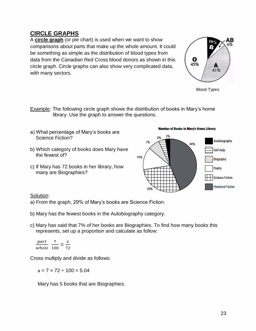
CIRCLE GRAPHS A circle graph (or pie chart) is used when we want to show
comparisons about parts that make up the whole amount. It could
be something as simple as the distribution of blood types from
data from the Canadian Red Cross blood donors as shown in this
circle graph. Circle graphs can also show very complicated data,
with many sectors.
Blood Types
Example: The following circle graph shows the distribution of books in Mary’s home
library. Use the graph to answer the questions. a) What percentage of Mary’s books are
Science Fiction? b) Which category of books does Mary have
the fewest of? c) If Mary has 72 books in her library, how
many are Biographies? Solution:
a) From the graph, 29% of Mary’s books are Science Fiction. b) Mary has the fewest books in the Autobiography category. c) Mary has said that 7% of her books are Biographies. To find how many books this
represents, set up a proportion and calculate as follow:
𝑝𝑎𝑟𝑡
𝑤ℎ𝑜𝑙𝑒
7
100 =
𝑥
72
Cross multiply and divide as follows:
x = 7 × 72 ÷ 100 = 5.04
Mary has 5 books that are Biographies.

24
ASSIGNMENT 7 – INTERPRETING CIRCLE GRAPHS
1) The circle graph of Favourite Colours was created after several students surveyed their grade. There were 175 students surveyed.
a) What colour did most students respond was
their favourite? b) What was the least favourite colour? c) How many students responded that red was
their favourite colour? 2) Grace’s expenses are shown in this circle graph. a) What two expenses did she spend the same amount on? b) Which expense does she spend the most on? c) What is her combined percentage spent on clothing and food? d) If she saves $275.00 each month, how much does she earn?

25
DRAWING ANGLES
In order to draw a circle graph accurately, angles must be constructed using a protractor
that correspond to the size that each “slice” of the pie represents.
To construct an angle, do the following:
i. Draw a straight line about 5 – 10 cm long. On one end, mark a “tick” as shown
below.
ii. Place the protractor on the line with the tick directly under the perpendicular line
going up to 900 and the line you drew directly under one of the horizontal sides out
to zero.
iii. Mark the location of the degrees of the angle you wish to draw. In this example, 530
is plotted. Be careful to follow the correct scale. This means that if you start on
the right side at zero, follow the INSIDE scale around until you reach the angle
measure you require.
iv. Draw a line from the tick to the mark you made for the angle measure. This now
forms the angle you were required to construct.
i. ii)
iii) 530 iv)
530
When constructing angles, always do it on plain or unlined paper.
26
ASSIGNMENT 8 – DRAWING ANGLES
Construct the following angles in the space below.
1) 650 2) 1580
3) 1250 4) 900
5) 110 6) 1310
7) 1120 8) 420

27
CREATING CIRCLE GRAPHS
To plot a circle graph, the amount or percentage given must first be converted to
degrees and then the appropriate angles are plotted. Every circle has a degree
measure of 3600 and half of that is shown on a standard protractor. You will always be
given a circle base to plot you graphs in. Make sure you use it!
Example 1: Construct a circle graph to show what amount of a
college student’s budget is spent in each category.
Solution: In order to plot this data accurately, each percentage
in the table to the right must be converted into a degree
measurement. To do this, divide each percent by 100 to get
as a non-percentage number, and multiply by 3600. Round each angle to the closet
whole degree. This is an example of the calculations, but the calculation part does not
need to be written on the circle graph blanks provided for this task.
In the circle blank provided, construct the first angle. When it is plotted, use its second
line as the start for the next angle. When there are angles greater than 1800, plot all the
other angles and leave the big angle as the area leftover at the end.
For each graph, label the sections with what it represents. The percentages are not
requires. Include a title. A legend is not required, nor is it necessary to colour the
sectors. If the sectors are too small, a line pointing at the sector with the label can be
used.
College Expenses
Expenditure Percentage
Travel 5 %
Personal 16%
Food 14%
Housing 10%
Books 3%
Tuition 52%
Expenditure Percentage Calculation Angle
Travel 5 % 5 ÷ 100 ×360 = 180 180
Personal 16% 16 ÷ 100 ×360 = 57.80 580
Food 14% 14 ÷ 100 ×360 = 50.40 500
Housing 10% 10 ÷ 100 ×360 = 360 360
Books 3% 3 ÷ 100 ×360 = 10.80 110
Tuition 52% 52 ÷ 100 ×360 = 187.20 1870
28
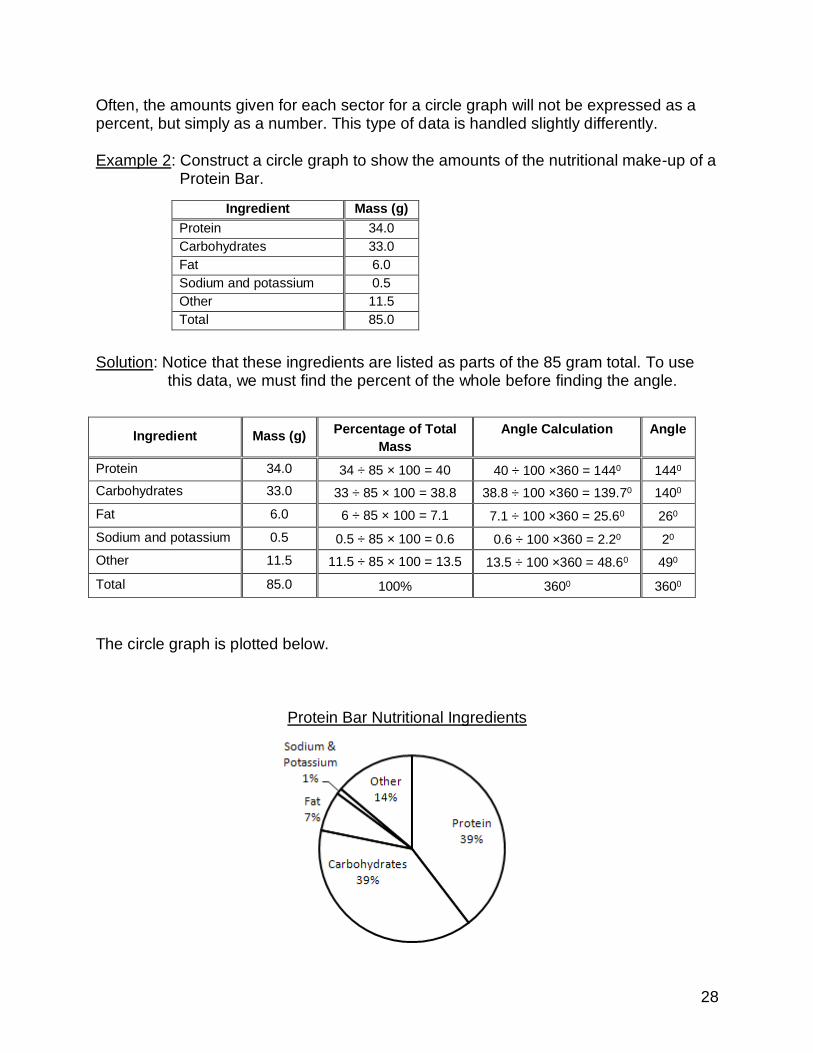
Often, the amounts given for each sector for a circle graph will not be expressed as a percent, but simply as a number. This type of data is handled slightly differently. Example 2: Construct a circle graph to show the amounts of the nutritional make-up of a
Protein Bar. Solution: Notice that these ingredients are listed as parts of the 85 gram total. To use
this data, we must find the percent of the whole before finding the angle.
The circle graph is plotted below.
Protein Bar Nutritional Ingredients
Ingredient Mass (g)
Protein 34.0
Carbohydrates 33.0
Fat 6.0
Sodium and potassium 0.5
Other 11.5
Total 85.0
Ingredient Mass (g) Percentage of Total
Mass
Angle Calculation Angle
Protein 34.0 34 ÷ 85 × 100 = 40 40 ÷ 100 ×360 = 1440 1440
Carbohydrates 33.0 33 ÷ 85 × 100 = 38.8 38.8 ÷ 100 ×360 = 139.70 1400
Fat 6.0 6 ÷ 85 × 100 = 7.1 7.1 ÷ 100 ×360 = 25.60 260
Sodium and potassium 0.5 0.5 ÷ 85 × 100 = 0.6 0.6 ÷ 100 ×360 = 2.20 20
Other 11.5 11.5 ÷ 85 × 100 = 13.5 13.5 ÷ 100 ×360 = 48.60 490
Total 85.0 100% 3600 3600
29
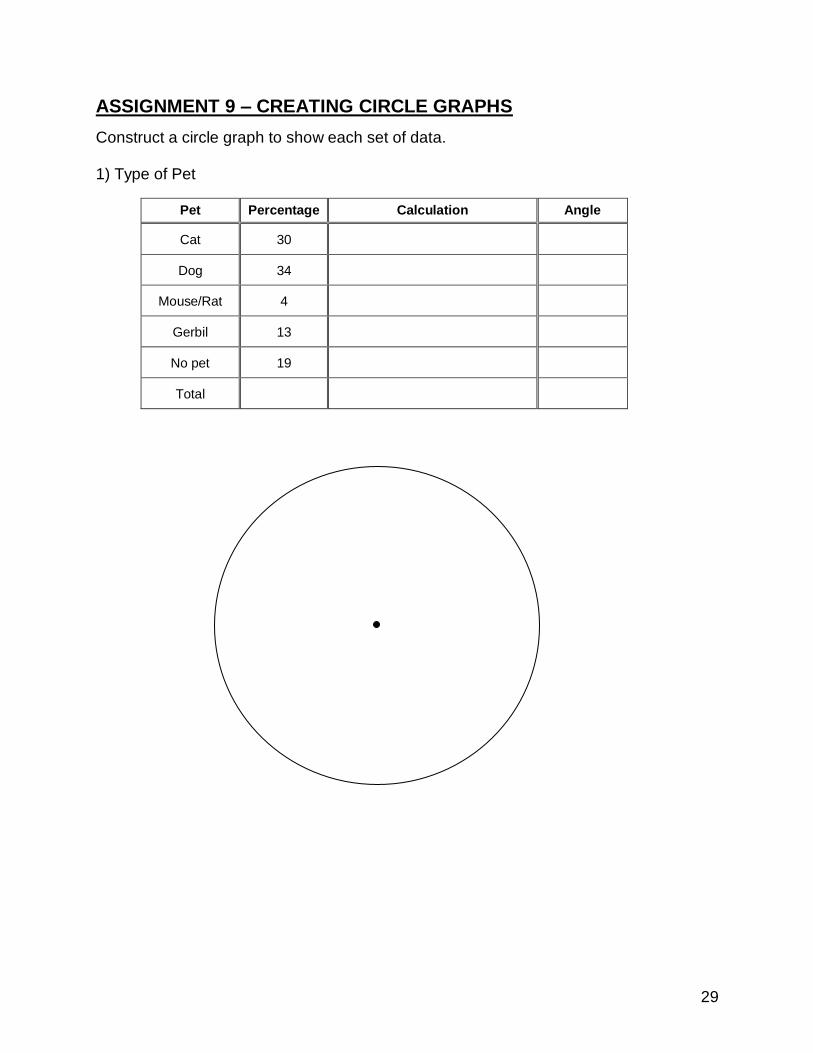
ASSIGNMENT 9 – CREATING CIRCLE GRAPHS
Construct a circle graph to show each set of data. 1) Type of Pet
Pet Percentage Calculation Angle
Cat 30
Dog 34
Mouse/Rat 4
Gerbil 13
No pet 19
Total

30
2) Transportation to School
Method of Travel Number
of People
Percentage of Total
People
Angle Calculation Angle
Drive 12
Ride from parent 63
Carpool 20
Motorbike 5
Bus 75
Bicycle 10
Walk 15
Total 100% 3600 3600

31
3) Daily Activities Sleep: 8 hrs School: 4 hrs Job: 5 hrs Homework: 1 hr Meals: 2 hrs Relaxation: 2.5 hrs Travel: 1.5 hrs
Total 100% 3600 3600

32
0100200300400500600700800900
1000
1997
1998
1999
2000
2001
2002
2003
2004
2005
2006
2007
2008
Earn
ings
($)
Year
Average Weekly Earnings of Canadians
MISLEADING GRAPHS
Any graph can be made to seem misleading. By increasing or decreasing the scale,
changing the starting point on an axis – especially not starting at zero – you can make
the viewer see the data in a certain way. Distorting or skewing the data in this way
makes the graph, or any other kind of statistic, misleading.
We have already touched on one way graphs can be misleading. If the vertical axis of a
graph does not start at zero, a whole lot of the data is “missing.” Look at the next graph.
When looking at this broken line graph, it
appears that there has been a big
increase between 1997 and 2008 in the
average weekly earnings of Canadians.
But look a little more closely. The
Earnings on the vertical axis starts at
$600 and only goes up to $800. The
increments on the axis are $40. This
makes the increase seem large when it
really isn’t that big. This could be
misleading to people who don’t carefully
look at the scale on the vertical axis.
A graph that represents the data fairly and more accurately (not misleading) is
illustrated here. See how the increase in earnings does not seem so large over the
period of time? The vertical scale starts at zero rather than just showing a chunk of the
graph.

33
In the next graph, while the graph appears to start at zero, the first 60+ students have
been cut from the bottom of the graph. This makes the bars look much shorter than they
really are and thus does not represent the data fairly or accurately. All three Schools
shown on this graph actually have bars that are more than double the size (length) of
what is shown. It appears that the graduation rate for School B is almost double that of
School A based on the size of the bars. In fact, they are much closer, differing by less
than 10 students for both boys and girls.
Graphs can also be misleading when the increments on the vertical axis are not consistent. Bar graphs as well as broken line graphs can be misleading. Histograms and circle graphs are less likely to be misleading unless they are drawn incorrectly. Things to watch for to tell if graphs are misleading:
- Does the vertical axis start at zero? - Is there a gap between zero and the next value? - Are the increments along the vertical axis the same? That means does
each grid line represent the same amount on the scale. - Are the bars on a bar graph all the same width? - Is the space between bars on a bar graph the same? - Is the scale on the horizontal axis on a broken line graph squished? - Is the scale on the vertical axis on a broken line graph squished?

34
9.9
10
10.1
10.2
10.3
10.4
Company A Company B Company C Company D
Net
Pro
fit
($ m
illio
ns)
ASSIGNMENT 10 – MISLEADING GRAPHS
1) Think about the two graphs below. They show the same data plotted in different ways.
a) Which of the graphs makes appear that the drop in the population living in rural areas
was faster? Why is this? b) Which graph do you think is a better representation of the actual change in the rural
population? Why is this? c) In what year was the population half rural and half urban? 2) Is this graph misleading? Why or
why not.

35
3) Is this graph misleading? Why or why not. 4) On the grid below, create a line graph that would represent the data more accurately
and fairly.
ASK YOUR TEACHER FOR QUIZ 2