bar graphs. a bar graph compares categorical variable(s) with a quantitative variable. the...
TRANSCRIPT

Bar Graphs

A Bar Graph compares categorical variable(s) with a
quantitative variable. The categorical variable goes on the X axis, and the quantitative goes
on the Y axis.
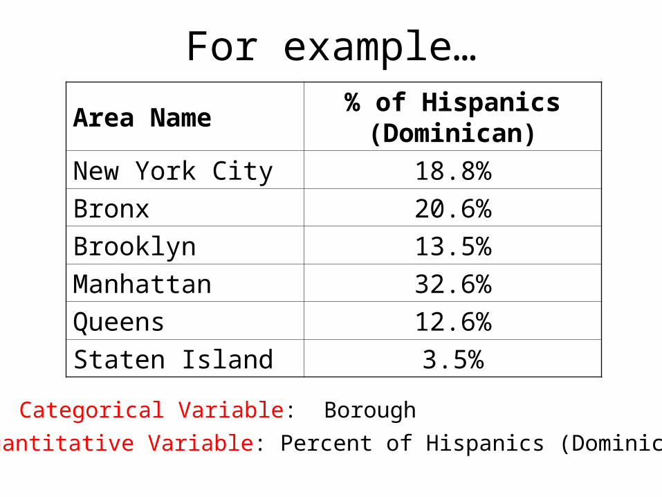
For example…
Area Name% of Hispanics
(Dominican)
New York City 18.8%
Bronx 20.6%
Brooklyn 13.5%
Manhattan 32.6%
Queens 12.6%
Staten Island 3.5%
Categorical Variable: Borough
Quantitative Variable: Percent of Hispanics (Dominican)


A bar graph can also compare two categorical variables with a quantitative variable:
Area Name % of Hispanics (Dominican)
% of Hispanics (Puerto Rican)
New York City 18.8% 36.5%
Bronx 20.6% 49.5%
Brooklyn 13.5% 43.7%
Manhattan 32.6% 28.7%
Queens 12.6% 19.5%
Staten Island 3.5% 53.3%
Categorical Variables: Borough Hispanic Nation of Origin
Quantitative Variables: Percent of total Hispanics, by NOO

Option 1: Categorical Variable 1 together
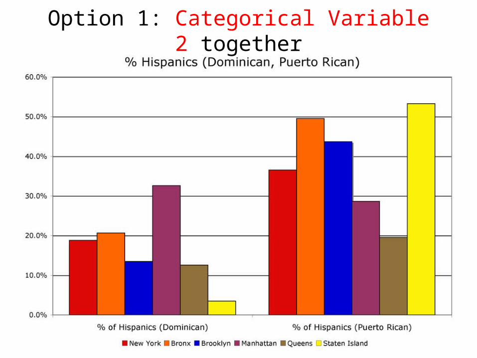
Option 1: Categorical Variable 2 together
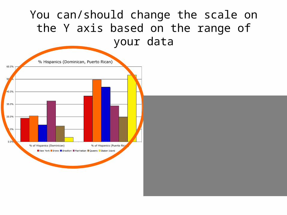
You can/should change the scale on the Y axis based on the range of your data

If you have two or more sets of quantitative data that combined
equal 100%, you can also make a Segmented Bar Graph
Percent White
Percent Non-White
Total
New York City 44.7% 55.3% 100%
Bronx 29.9% 70.1% 100%
Brooklyn 41.2% 58.8% 100%
Manhattan 54.3% 45.7% 100%
Queens 44.1% 55.9% 100%
Staten Island 77.7% 22.3% 100%