basic quantitative analysis: using excel to analyze your · pdf filebasic summary data . do...
TRANSCRIPT
Created by Kimberly Yousey - Copyright 2007
Basic Quantitative Analysis: Using Excel to Analyze Your Data
Kimberly Yousey, PhD. Associate Director, Assessment Programs
StudentVoice 716-652-9400 press 1
Created by Kimberly Yousey - Copyright 2007
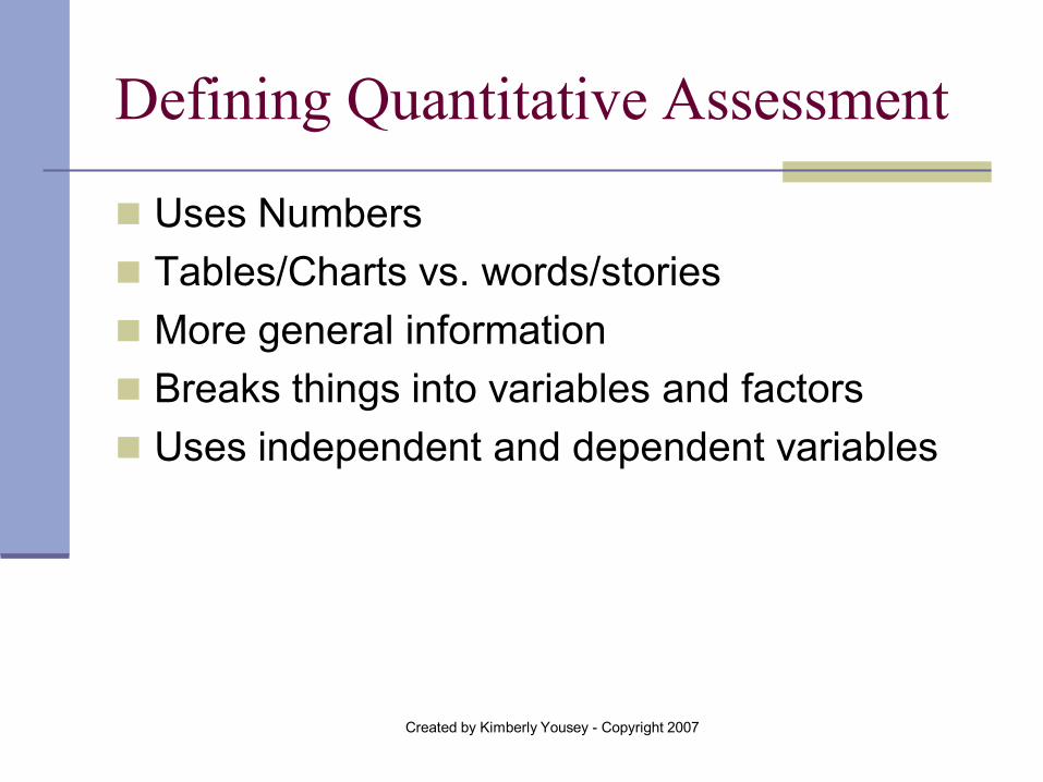
Defining Quantitative Assessment
Uses Numbers Tables/Charts vs. words/stories More general information Breaks things into variables and factors Uses independent and dependent variables
Created by Kimberly Yousey - Copyright 2007
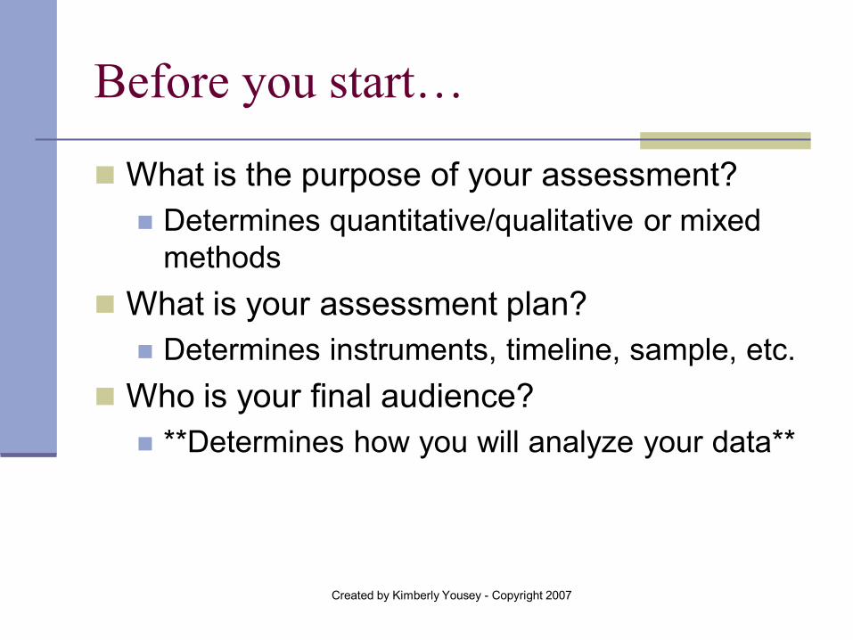
Before you start…
What is the purpose of your assessment? Determines quantitative/qualitative or mixed
methods What is your assessment plan?
Determines instruments, timeline, sample, etc. Who is your final audience?
**Determines how you will analyze your data**
Created by Kimberly Yousey - Copyright 2007
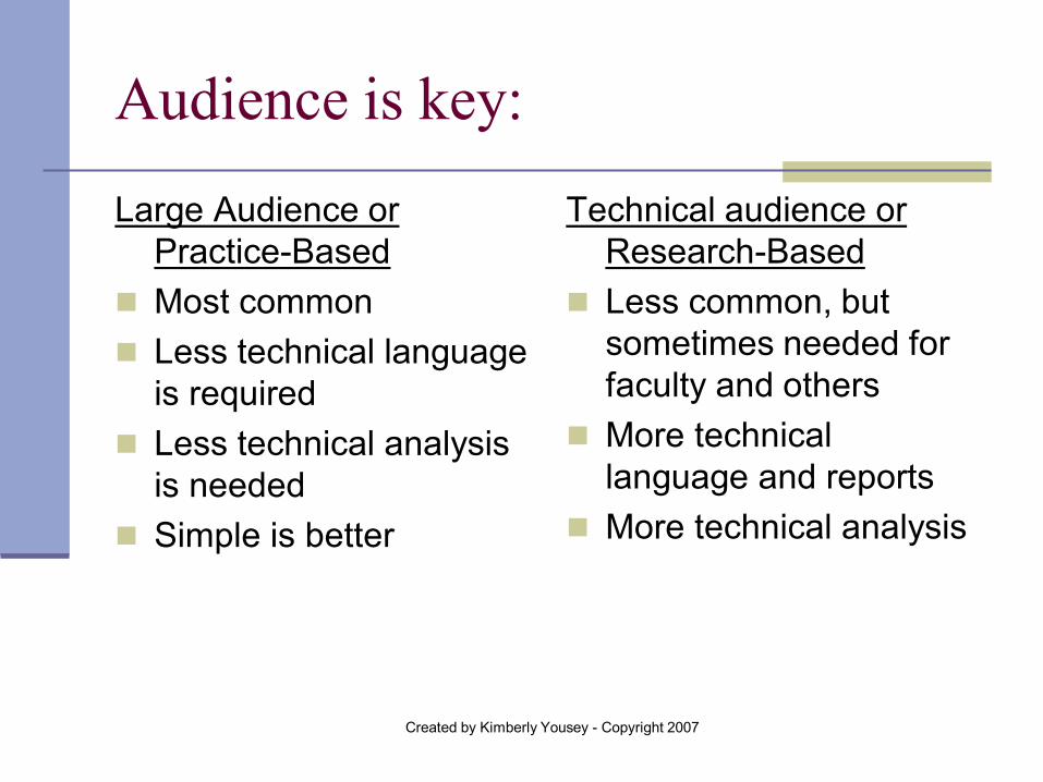
Audience is key:
Large Audience or Practice-Based
Most common Less technical language
is required Less technical analysis
is needed Simple is better
Technical audience or Research-Based
Less common, but sometimes needed for faculty and others
More technical language and reports
More technical analysis
Created by Kimberly Yousey - Copyright 2007
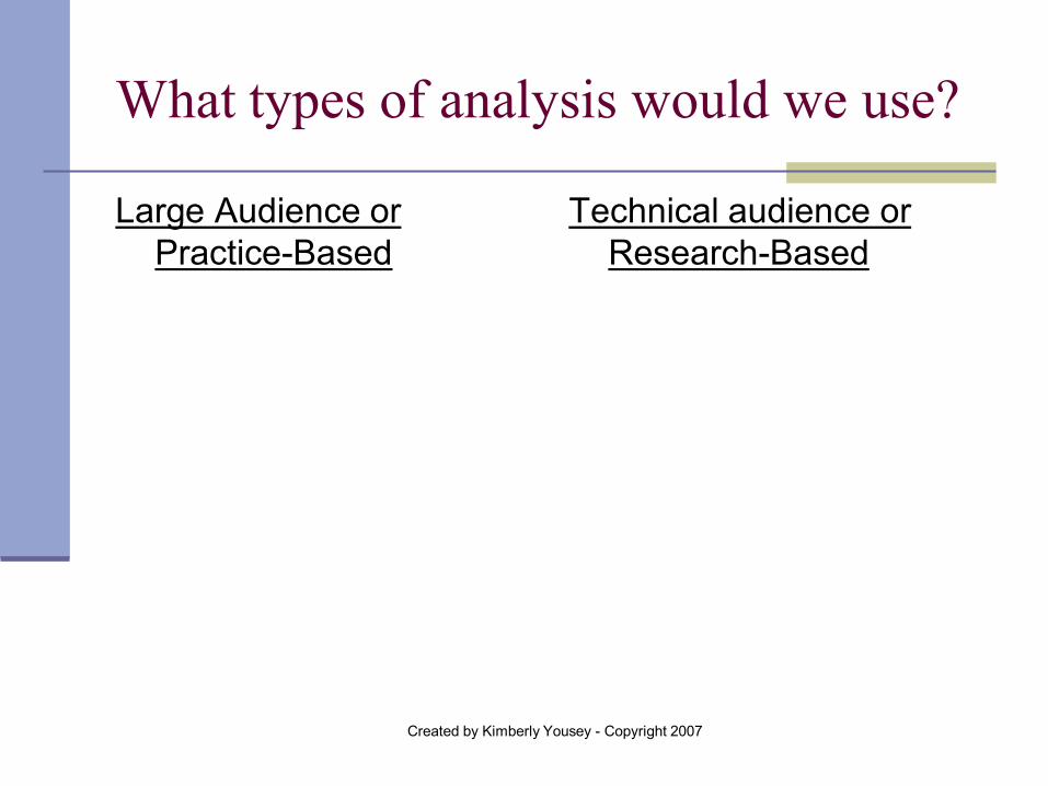
What types of analysis would we use?
Large Audience or Practice-Based
Technical audience or Research-Based
Created by Kimberly Yousey - Copyright 2007
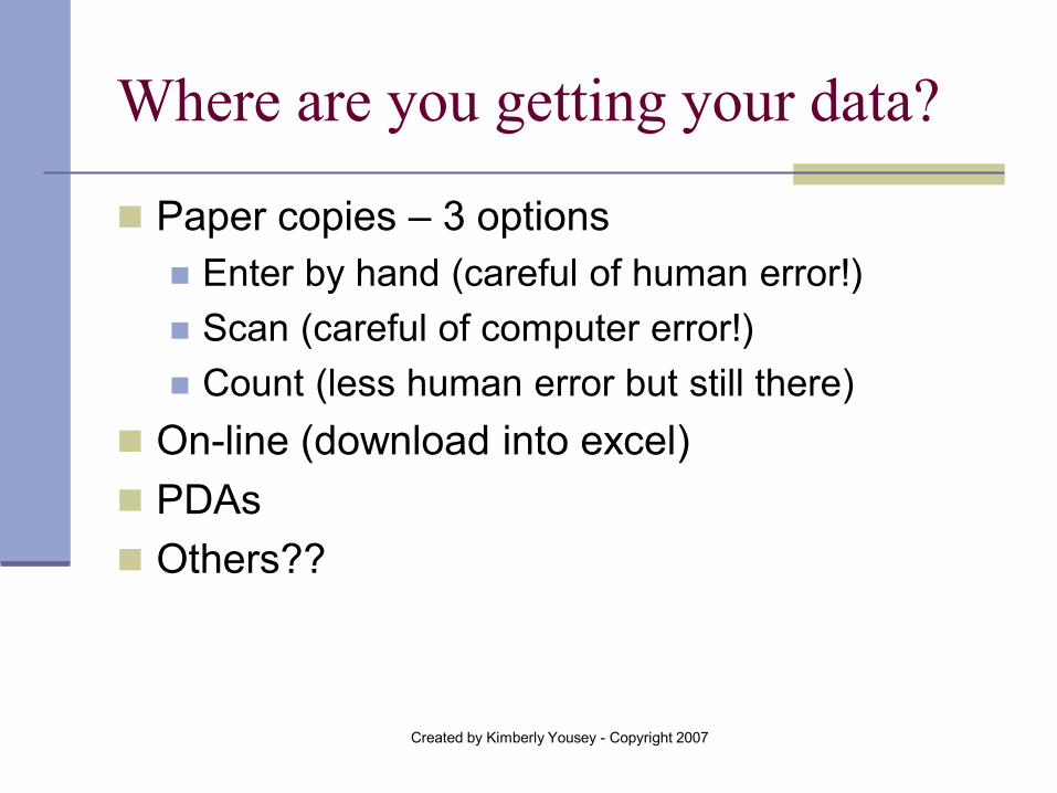
Where are you getting your data?
Paper copies – 3 options Enter by hand (careful of human error!) Scan (careful of computer error!) Count (less human error but still there)
On-line (download into excel) PDAs Others??
Created by Kimberly Yousey - Copyright 2007
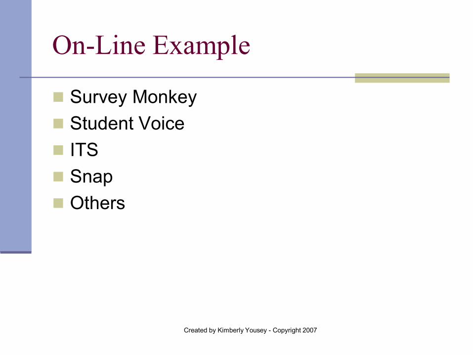
On-Line Example
Survey Monkey Student Voice ITS Snap Others
Created by Kimberly Yousey - Copyright 2007
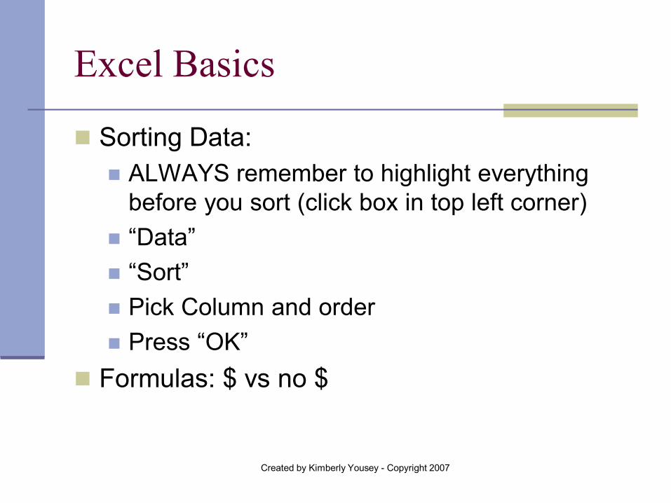
Excel Basics
Sorting Data: ALWAYS remember to highlight everything
before you sort (click box in top left corner) “Data” “Sort” Pick Column and order Press “OK”
Formulas: $ vs no $
Created by Kimberly Yousey - Copyright 2007
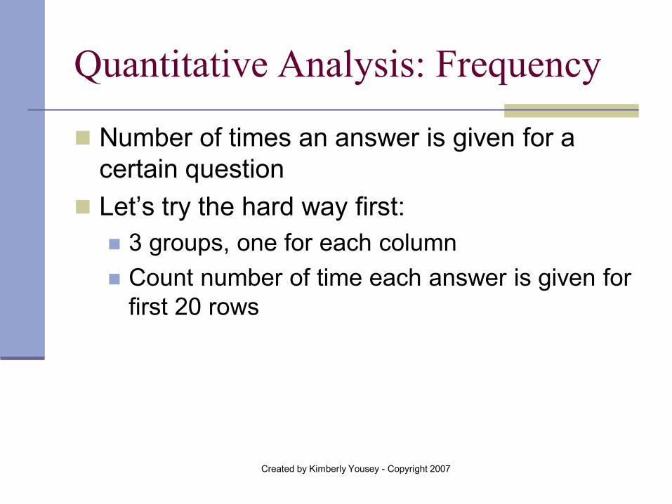
Quantitative Analysis: Frequency
Number of times an answer is given for a certain question
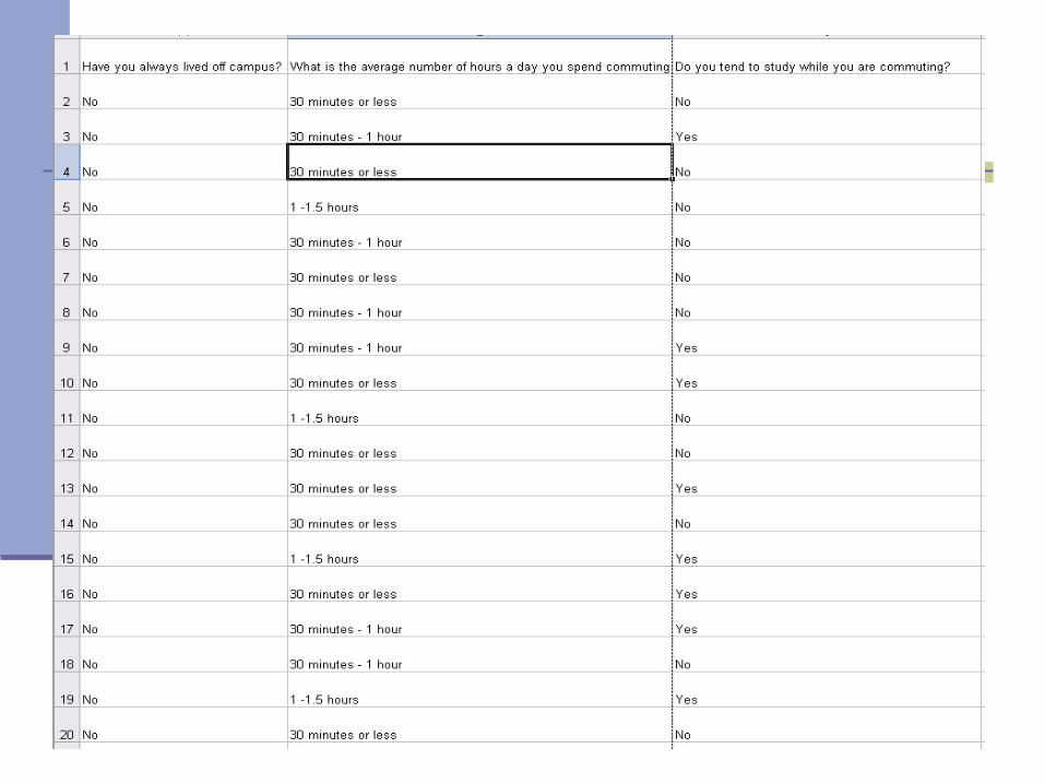
Let’s try the hard way first: 3 groups, one for each column Count number of time each answer is given for
first 20 rows
Created by Kimberly Yousey - Copyright 2007
Created by Kimberly Yousey - Copyright 2007
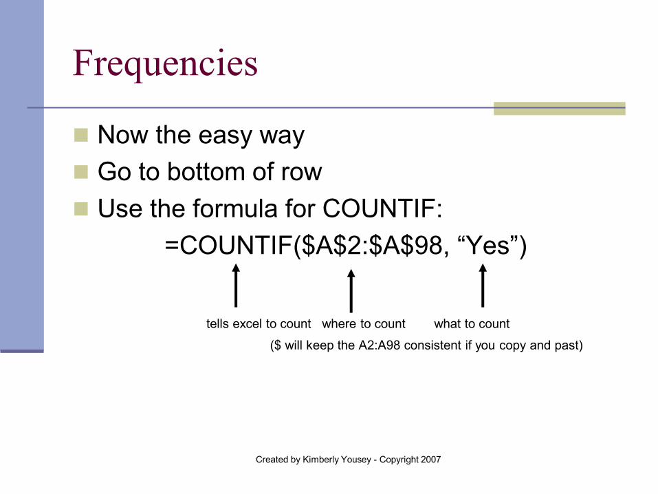
Frequencies
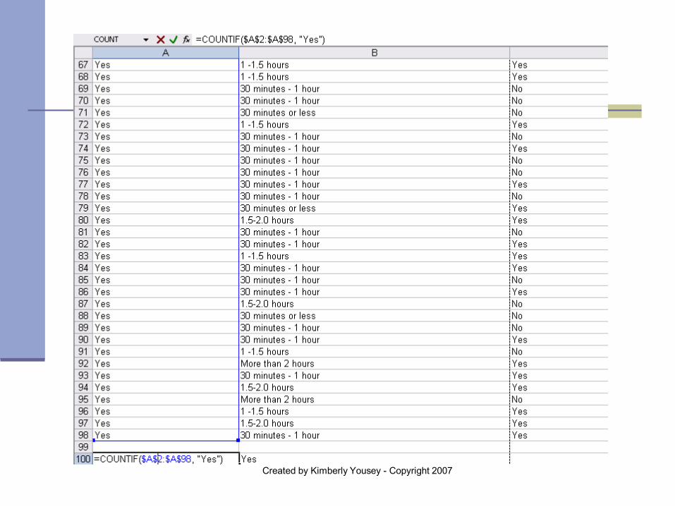
Now the easy way Go to bottom of row Use the formula for COUNTIF:
=COUNTIF($A$2:$A$98, “Yes”)
tells excel to count where to count what to count
($ will keep the A2:A98 consistent if you copy and past)
Created by Kimberly Yousey - Copyright 2007
Created by Kimberly Yousey - Copyright 2007
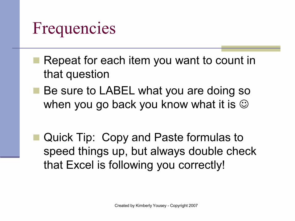
Frequencies
Repeat for each item you want to count in that question
Be sure to LABEL what you are doing so when you go back you know what it is
Quick Tip: Copy and Paste formulas to
speed things up, but always double check that Excel is following you correctly!
Created by Kimberly Yousey - Copyright 2007
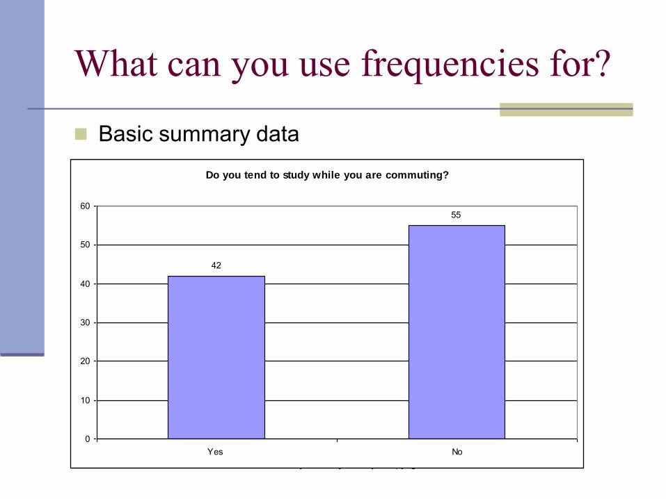
What can you use frequencies for?
Basic summary data
Do you tend to study while you are commuting?
42
55
0
10
20
30
40
50
60
Yes No

Created by Kimberly Yousey - Copyright 2007
But wait, how did you make that pretty graph? 1. Go to the “Chart Wizard” icon or “Insert” then “Chart” 2. Pick which chart you would like (this example is bar so we
picked the “Column” option) 3. “Next” 4. Want to name things? Hit “Series”. In this example we need to
change the “Category Labels” so we click on that space and then highlight the “Yes” and “No” cells in our Excel worksheet
5. “Next” 6. “Title” – Have you Always Lived on Campus “Axes” and “Gridlines”– don’t usually have to do anything “Legend” – turned off “Show Legend” “Data Labels” – clicked on “Value” “Data Table” – did nothing 7. “Next” 8. “Finish”
Created by Kimberly Yousey - Copyright 2007
Percents
Why percents vs. straight frequencies? Compare different sized groups Proportions Sometimes easier to understand Audience
Created by Kimberly Yousey - Copyright 2007
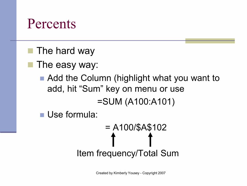
Percents
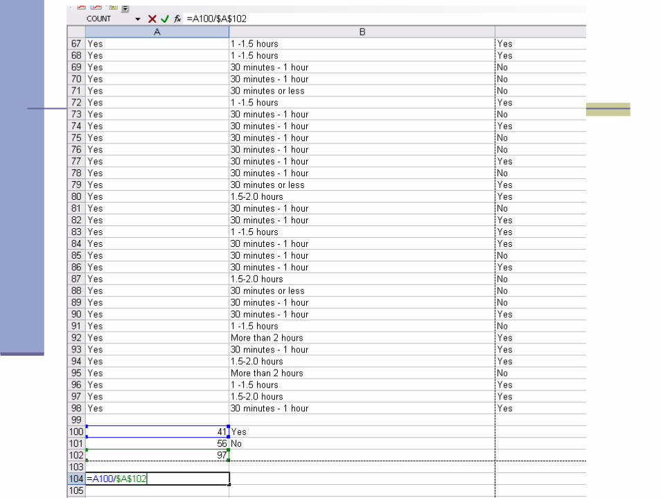
The hard way The easy way:
Add the Column (highlight what you want to add, hit “Sum” key on menu or use
=SUM (A100:A101) Use formula:
= A100/$A$102
Item frequency/Total Sum
Created by Kimberly Yousey - Copyright 2007
Created by Kimberly Yousey - Copyright 2007
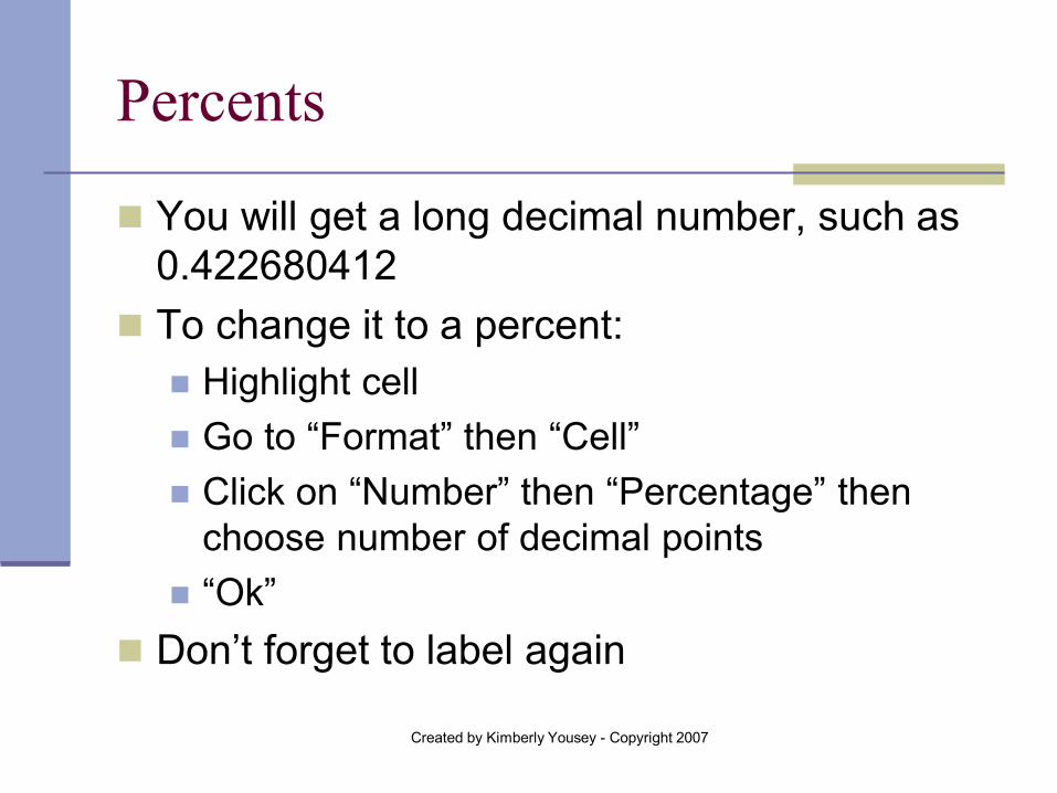
Percents
You will get a long decimal number, such as 0.422680412
To change it to a percent: Highlight cell Go to “Format” then “Cell” Click on “Number” then “Percentage” then
choose number of decimal points “Ok”
Don’t forget to label again
Created by Kimberly Yousey - Copyright 2007
Percents
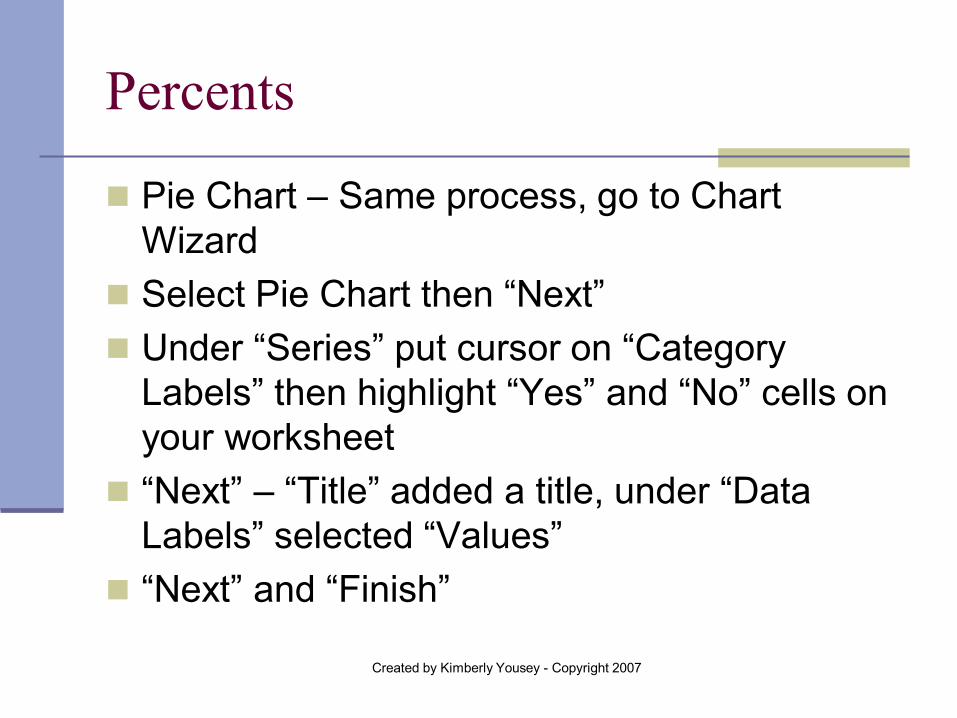
Pie Chart – Same process, go to Chart Wizard
Select Pie Chart then “Next” Under “Series” put cursor on “Category
Labels” then highlight “Yes” and “No” cells on your worksheet
“Next” – “Title” added a title, under “Data Labels” selected “Values”
“Next” and “Finish”
Created by Kimberly Yousey - Copyright 2007
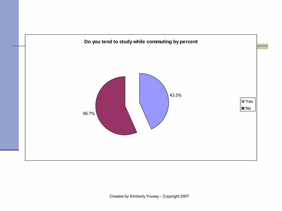
Do you tend to study while commuting by percent
43.3%
56.7%
Yes No
Created by Kimberly Yousey - Copyright 2007
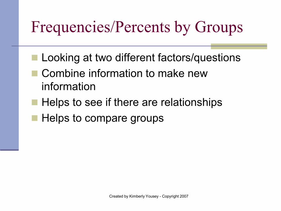
Frequencies/Percents by Groups
Looking at two different factors/questions Combine information to make new
information Helps to see if there are relationships Helps to compare groups
Created by Kimberly Yousey - Copyright 2007
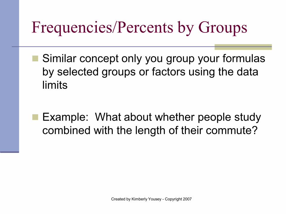
Frequencies/Percents by Groups
Similar concept only you group your formulas by selected groups or factors using the data limits
Example: What about whether people study
combined with the length of their commute?
Created by Kimberly Yousey - Copyright 2007
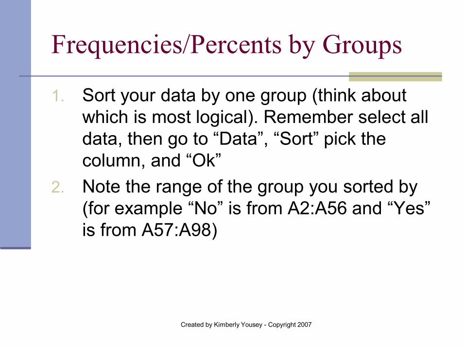
Frequencies/Percents by Groups
1. Sort your data by one group (think about which is most logical). Remember select all data, then go to “Data”, “Sort” pick the column, and “Ok”
2. Note the range of the group you sorted by (for example “No” is from A2:A56 and “Yes” is from A57:A98)
Created by Kimberly Yousey - Copyright 2007
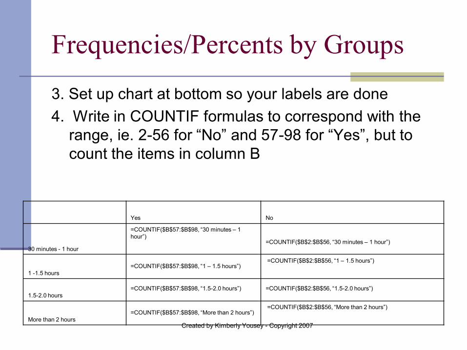
Frequencies/Percents by Groups
3. Set up chart at bottom so your labels are done 4. Write in COUNTIF formulas to correspond with the
range, ie. 2-56 for “No” and 57-98 for “Yes”, but to count the items in column B
Yes No
30 minutes - 1 hour
=COUNTIF($B$57:$B$98, “30 minutes – 1 hour”)
=COUNTIF($B$2:$B$56, “30 minutes – 1 hour”)
1 -1.5 hours =COUNTIF($B$57:$B$98, “1 – 1.5 hours”)
=COUNTIF($B$2:$B$56, “1 – 1.5 hours”)
1.5-2.0 hours =COUNTIF($B$57:$B$98, “1.5-2.0 hours”)
=COUNTIF($B$2:$B$56, “1.5-2.0 hours”)
More than 2 hours =COUNTIF($B$57:$B$98, “More than 2 hours”)
=COUNTIF($B$2:$B$56, “More than 2 hours”)
Created by Kimberly Yousey - Copyright 2007
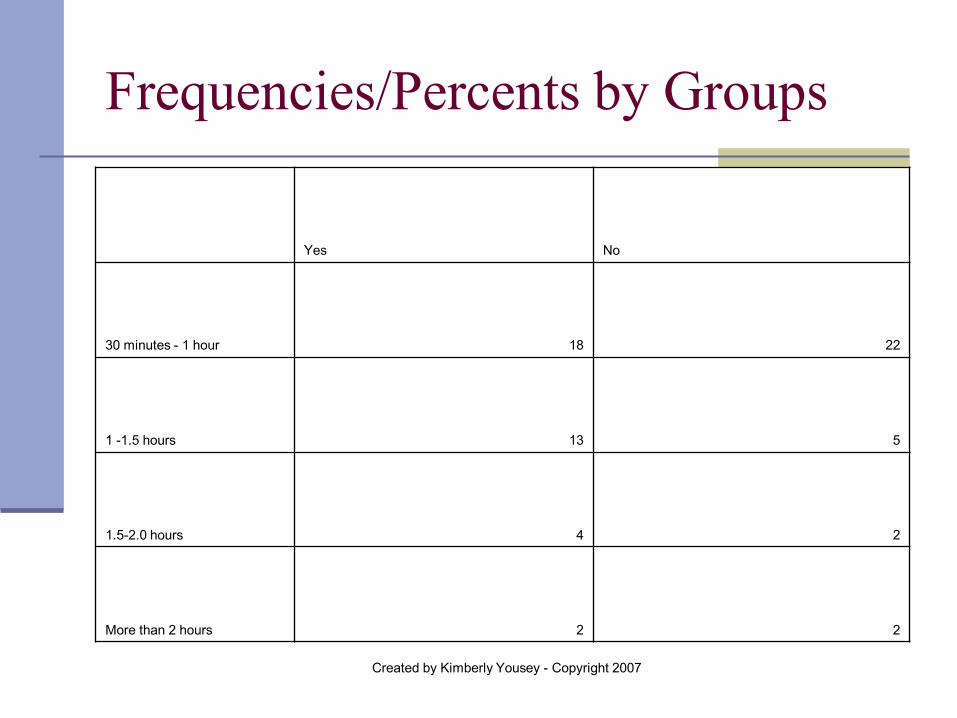
Frequencies/Percents by Groups
Yes No
30 minutes - 1 hour 18 22
1 -1.5 hours 13 5
1.5-2.0 hours 4 2
More than 2 hours 2 2
Created by Kimberly Yousey - Copyright 2007
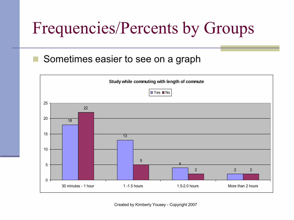
Frequencies/Percents by Groups
Sometimes easier to see on a graph
Study while commuting with length of commute
18
13
42
22
5
2 2
0
5
10
15
20
25
30 minutes - 1 hour 1 -1.5 hours 1.5-2.0 hours More than 2 hours
Yes No
Created by Kimberly Yousey - Copyright 2007
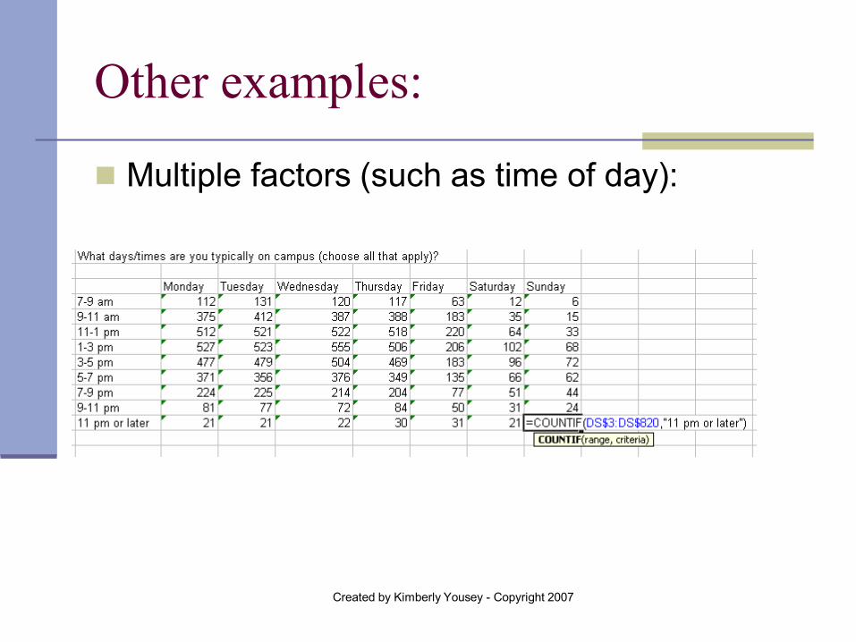
Other examples:
Multiple factors (such as time of day):
Created by Kimberly Yousey - Copyright 2007
“Real Life” Example:
Can show by tables, graphs or just in words Pictures are easier and faster to read
Created by Kimberly Yousey - Copyright 2007
Random Drawings
Incentives, prizes, samples and more Formula: = RANDBETWEEN (1, ____) The formula will draw a random number
between the numbers you indicate You can match that number up with a line in
excel with a corresponding email address If you need more than 1 drawing (i.e. drawing
for 10 iTunes cards), copy and paste formula 10 times
Created by Kimberly Yousey - Copyright 2007
Tips to Remember:
Copying and Pasting formulas saves a lot of time Remember to double check Use $ when you want a cell to stay constant Do not use $ when you want excel to follow you
Save frequently Move graphs to new worksheets (copy/paste OR you
can set to displan on a new worksheet when in the chart-maker before you hit “Finish” on last page select “As a new sheet” and give it a new name)

Created by Kimberly Yousey - Copyright 2007
Where can you go for help?
Staff Development/Training – Take an Excel course
Formula and other books “Help” tab on Excel is EXCELLENT! [email protected]

Created by Kimberly Yousey - Copyright 2007
Questions?
Thanks for coming!