becoming a professional artist
TRANSCRIPT

14 • SAQA Journal • Spring 2014
Moving from hobbyist to
professional doesn’t have to
take long, but it does require plan-
ning, time and money. Eight years
ago, I didn’t own a sewing machine.
Today, I’m making a living as a fiber
artist.
The first step on the road to success
as a fiber artist is getting brand recog-
nition in the marketplace. Your brand
can be your art or your name. I chose
my name because I didn’t want to be
tied to a specific type of fiber art.
Next you need a strategic plan. You
must decide where you want to be
in a year or two, then set goals to get
there.
And you need money. You need to
invest in yourself. This can be a stick-
ing point for many artists, but it’s
necessary if you are going to succeed.
To get started, I opened a checking
account and put $5,000 into it to use
to market my brand. The first thing
I invested in was my domain name,
www.carolannwaugh.com.
Now you’re ready to develop your
product — your body of work. You
need at least 15-20 pieces before you
market yourself. I took a lot of classes
toward finding my voice as a fiber art-
ist. I winnowed down what I learned,
focusing on what worked best for me.
You develop as an artist by making
lots of art. Then one day, you realize
you have a body of work to exhibit.
Making art is the core of your work.
I keep this focus by working in my
studio from 10 a.m. to 4 p.m. every
day. I do email only before and after
these hours, and I do all my market-
ing work one day a week — usually on
the weekend — so it does not intrude
into making art.
Next steps
Once you have your initial body of
work, next steps are:
• Have professional photos taken of
each piece, showing the full piece
including the edges and details.
• Create a database or spreadsheet to
keep track of your work. This will
become the one place you turn to
for information including title, size,
date created, series, price, sales data
and more.
• Develop descriptions of each piece
to include in your database or
spreadsheet.
It’s unlikely you will make a living
just selling your art. About 10 percent
of my annual revenue comes from
selling original art. The remaining
90 percent comes from three sources:
teaching workshops and giving lec-
tures; book and kit sales; and royalties
from teaching online.
Becoming a professional artistby Carol Ann Waugh
Editor’s note: This article is based on the
mini workshop “Going from Hobbyist to
Professional: The Road to Success” presented
by Studio Art Quilt Associates (SAQA)
member Carol Ann Waugh at the 2013
SAQA conference in Santa Fe, New Mexico.
Carol Ann Waugh at work in her Denver, Colorado, studio.

SAQA Journal • Spring 2014 • 15
Consider how you will parlay your
art into making money. I’ve found
self-publishing books to be a good
revenue source. Guilds and local quilt
shops will pay you to lecture and
teach. While I avoid calling my art
“quilts,” I do believe it is important
to relate to the quilt world if you
are trying to make a living. I don’t
usually enter my work in quilt shows
because I mount my fiber art on
wooden panels so it hangs best on
hard walls like those at art galleries
and museums.
Getting organized
While many of us would like to only
focus on making art, if you need to
make money, then you must give
attention to the business side of the
art world. You’ll find you have more
time to make art if you organize your
marketing efforts. Here are steps to
take:
• Enter juried art and quilt shows.
Create a spreadsheet of exhibition
opportunities. Include exhibition
topics, guidelines, deadlines and
judges. Track what gets accepted
and rejected.
• Write your resume then enhance
it by winning awards. Once you’ve
taken home your first prize, you’re
an “award-winning artist.”
• Create and maintain a website and
blog.
• Develop snail-mail and email lists
of friends, prospects, buyers and
VIPs. Create a monthly newsletter
to promote your exhibitions, new
work, classes and more. Keep a con-
tact book in your studio for visitors
to sign up for your newsletter.
• Print business cards and postcards
featuring your work and contact
information. Give them to every-
one and leave them everywhere.
• Participate in social-media sites.
• Develop a large network of other
artists in all mediums.
• Join a co-op gallery.
• Have a solo exhibition.
• Develop relationships with art
consultants.
• Keep up with local arts events.
• Write articles and submit your work
for reader or member galleries of
quilt and art magazines. Get to
know the editors personally.
• Develop several workshops and
lectures, then let quilt guilds know
what you have to offer. Offer
classes in your studio and at quilt
shops. Teach online through such
sites as www.Crafsty.com, www.
AcademyofQuilting.com and www.
QuiltCampus.com.
• Write and self-publish a book.
Pulling it all together
Overwhelmed by the amount of work
required to market your work? Don’t
be. Determine what you do well and
do those things, then hire others to
do what you don’t enjoy or aren’t
qualified to do. I hired someone
to create my website and someone
to post on social media. I engage a
professional photographer to shoot
images of my work, and I work with a
graphic designer to create my printed
materials. I wrote the first draft of my
book, then turned it over to a devel-
opmental editor to deliver a finished
book.
If I can make it from hobbyist to
professional, so can you.
Carol Ann Waugh is an internationally known, award-winning fiber artist and contemporary art-gallery owner from Denver, Colorado. You can see her work at www.carolannwaugh.com. If you are in Denver, stop by her studio and gallery — www.abuzzgallery.com — but email her first at [email protected] to be sure she’s there.
Untitled, Stupendous Stitching series 66 x 78 inches 2013 Collection of IMA, Denver, Colorado.

22 • SAQA Journal • 2017 | No. 4 SAQA Journal • 2017 | No. 4 • 23
to evoke an emotional response. There are three questions your artist statement should answer to ensure that outcome:
• What was the inspiration for your piece?
• What does it mean to you personally?
• What do you hope the viewer will take away from it?
Most likely you won’t be present when viewers linger at your artwork to take in its nuances and ponder its meaning. Your statement may have less than a minute to answer their questions, so every word must count! I cannot emphasize that enough, so I’ll say it again: Every word must count. That is why this isn’t the place to detail the kinds of thread you used or to tell your life story. Reflect on the three questions to help get to the core of what you want to express.
To illustrate good artist statements, I reviewed a variety of SAQA catalogs to find those that grabbed my atten-tion. There were many great exam-ples, but I narrowed my choices down to just a few that range in length from a mere 25-55 words. All of them paint a vivid picture in and of them-selves, or inspire further reflection in dialogue with the image.
From Text Messages:“In an age of ubiquitous communica-tion, are we really getting through to one another? The tiny fragments of words in my quilts hint at stories and substance, but whatever they are
about remains a mystery. What did we lose when we traded instantaneous connection for the more leisurely, more thoughtful letters and books of the past?” — Kathleen Loomis
This statement, about the piece Crazed 20: Print on the Dotted Line, literally converses with the viewer. It asks direct questions that both reveal the artist’s point of view and offer a space for a viewer to con-sider her or his own. The artist refers to a visual element in her work (tiny fragments of words) without getting into detail about the materials and techniques. Her inspiration is clear, as is the personal meaning behind it.
From Seasonal Palette:“There is nothing like a warm spring day. It glows with fresh colors and all they promise: new beginnings, sweet potential, hope for the future.” — Laura Wasilowski
This statement is short and sweet, but leaves no question as to what the artist hopes the viewer will take away from her piece. The writing evokes emotions that complement the work itself, drawing on a viewer’s experi-ences: the sense of renewal inherent to spring, and the warmth and color that contrasts winter’s cold, drab grays.
From Wild Fabrications:“What ‘wild’ things happen in the swamp when no one is watching? I
Craft an amazing artist statement in less than 60 wordsby Allison Reker
see “Statement” on page 32
Imagine a viewer standing in front of your impressive art quilt. The
piece overwhelms with mysterious lines and gleeful colors. The viewer draws closer to learn the essence of your piece by reading your artist statement.
To continue the dialogue already in play, your artist statement should leave room for the viewer to connect thoughts, emotions, and experiences to you. A strong statement will make your piece memorable long after the viewer has walked away from your artwork or turned the page in the exhibition catalog.
Focus on brevityThe importance of an artist state-ment can make it intimidating to write. Often the temptation is to make it long and complicated. You might feel you have a lot to say, and that you are going to cram every-thing into this communication. Big words and lengthy sentences sound smart and professional, right? The last thing you want to do is come across like a droning art history professor. That will just put distance between you and the viewer. What you are really trying to do is create a sense of intimacy to draw view-ers into your world. If viewers don’t immediately know what your state-ment is trying to say, they will move on. Complexity is a distraction.
There is an added temptation to fill your statement with the nitty-gritty details about how your piece was made, the materials used, and how it was assembled. When you
have a limited amount of space — a curb that exhibition organizers frequently set — this type of informa-tion is unwanted clutter. To dissect the artwork in your statement is like revealing how a magic trick is done while it is being performed. You want to keep the sense of wonder alive.
For SAQA exhibitions and cata-logs, there is a separate materials and techniques section set aside specifi-cally for this purpose. Those viewers who want to know more can read this section, while those who prefer to preserve the mystery can enjoy your piece without interruption.
Reality checkThere is another reality to consider when writing artist statements for SAQA-specific publications and display labels. All long statements are edited to a specific size require-ment, usually to a maximum of 50-80 words. This is due to space con-straints. Like any other piece of writ-ing, crafting an artist statement is a process. Don’t expect to get it perfect on the first draft. Write that wordy statement to get all your ideas out on paper, but don’t stop there. Revise it, revise it again, and then again. Hone it until all the extraneous information is cut away, and you are left with the points you really want to say.
Emotional response Remember, your artist statement is an opportunity to make a deeper con-nection with a viewer, and to extend the dialogue your piece visually started. Remember that you are trying
imagined an alligator and an egret sur-reptitiously hanging out among the lily pads while a passing turtle gets quite a surprise.” — Christine Holden
Not all statements need to be seri-ous. This statement’s playful whimsy engages the viewer’s imagination and invites that person to come up with their own answer to the artist’s question. What does happen in the swamp when no one is watching? When you’re creating a piece of art-work, anything is possible! What sort of surprise does the passing turtle get, anyway? You’ll have to experience the artwork itself to find out.
Heart of the matterArtwork is personal. When writing your statement, take some time to really think about the significance of your piece. What emotional spark
Laura Wasilowski Young Forest 78 x 32 inches
Christine Holden What Happens in the Swamp?
30 x 26 inches

32 • SAQA Journal • 2017 | No. 4 SAQA Journal • 2017 | No. 4 • 33
Phot
o pr
ovid
ed b
y vi
sits
anan
toni
o.co
m
Statement from page 23
Gardner from page 9
gave her options for exhibiting her work more widely, as well as for teaching and lecturing.
“Yes you can,” is Gardner’s advice for new art quilters. “Just do it the way it suits you. There are no rules. Ignore the quilt police!”
As for the future, Gardner says she’s not much of a planner. At 73, her quilts are getting smaller. “I can’t imagine I shall ever stop sewing pictures. It’s part of my life,” she says. “Whenever I am given a bag of scraps I feel I’ve been given a treasure and just the color of a bit of cloth sparks my imagination — just right for a dog or a cat, and I start wondering about what to do next,” she says.
See more of Gardner’s work at www.bodilgardner.dk.
Cindy Grisdela is a SAQA JAM based in Reston, Virginia. See her work at cindygrisdela.com.
inspired its conception? What deeper meaning did you find as you engaged in the creative process? How can you strip away all of the unnecessary words until only the heartbeat of your message remains? Vulnerability has its risks, but it is also a point of connection between artists and view-ers. You have something to say, and they are eagerly listening.
Take some time to step out of your shoes and slip on those of the viewer. What does your brief statement reveal about you and your art? What do you want it to reveal?
Let the conversation begin.
Allison Reker is the SAQA membership coordinator. She also is the author of three fictional books and a freelance editor for various publications. She resides in Beavercreek, Ohio.
DAYTONA BEACH, FLFebruary 28–March 3
Lancaster, PAMarch 21–24
Spring Paducah, KYApril 18–21
Grand Rapids, MIAugust 22–25
2018
Hundreds of Beautiful Quilts on Exhibit
Aisles of Fabrics, Machines & Quilting Supply Vendors
World-Renowned Quiltmaking Instructors
See the SAQA – Korean Quilts Now exhibit at these AQS QuiltWeek events!
NATIONAL BRAND PARTNER
Detail: KALEIDOSCOPIC CALAMITY by Margaret Solomon Gunn
Fiber Artnow
subscribe now! www.fiberartnow.net
A fiber arts magazine & communityprint & digital magazine, exhibition listings, artist submissions,
artist interview program, events calendar & map, jobs board & more!
SPRING 2015 Vol. 4, Issue 3
Fiber Art
PAPER ART:
MANIPULATING
THE MEDIUM
CONTEMPORARY EMBROIDERY
EXPRESSING CULTURE
THROUGH FELT MAKING
$10US+CAN
now
WEAVING A
TAPESTRY LEGACY
fibers | mixed media | textiles
RUST! KNITTING CIRCUS, &
QUILTING THE SIERRA NEVADAPLUS!
BREATHTAKING LANDSCAPES:
DYEING WITH INDIGO
LYN
N P
OLLA
RD
fibers | mixed media | textiles
Innovation in Fiber, Art, & Design
www.surfacedesign.org
Join for the Journal... stay for the community
Surface Design Association

16 • SAQA Journal • Fall 2011
What to say in your artist statementWhy and how you make your art, what that says about you—and nothing more
by Leni Levenson Wiener
For many artists, writing an artist
statement can be as painful as a
trip to the dentist for a root canal, but
an artist statement is a powerful and
important tool. It’s your opportunity
to explain your work to those viewing
it, as if you were standing next to
them and engaging in conversation.
It’s your platform to discuss why you
make your art, how you make your
art, and what your art says about you.
It helps to think about the func-
tion of an artist statement. Imagine
your work is hanging in a show, and
a stranger who has never seen your
work is taken by your piece and
wants to know more. This interested
stranger may ultimately become a
buyer or even a collector of your
work, so the short three or four para-
graph representation of you on the
wall next to your artwork must say a
lot, in only a few words.
First and foremost, an artist state-
ment should tell the person reading
it what you do and why you do it.
Your opening paragraph should be
a simple description of your work
(“hand appliqué with beading,”
“raw-edge machine appliqué,” “print-
ing and stamping on canvas with
stitching and found objects,” etc.)
and what themes or techniques most
attract you.
Next, talk about how you work, the
techniques you employ, and how you
make your artistic decisions along the
way. Explain to the reader why you
use particular materials or working
methods. Talk about whether you
plan your work first or progress more
intuitively. Remember that the person
reading your artist statement may or
may not be an artist, so don’t get too
technical. Explain only the basics,
and don’t include, for instance, the
size needles you use or how you dye
your fabric. Your artist statement is
like lingerie — showing a little skin is
intriguing; too much might just be,
well, too much.
Finish your artist statement by
explaining how your work reflects
you and your life experiences, what
you’re trying to say, or what influ-
ences you — and be specific. If you say
you’re exploring the time/space con-
tinuum, explain exactly how you’ve
done that in your work. What about
you, your life, and your unique per-
sonal experiences led you to choose a
particular theme? Is there a statement
you want your work to make? This is
your chance to tell the viewer what
you want them to take away from
seeing your work.
An artist statement is just what it
sounds like: a statement by the art-
ist. You are the artist, so it should be
in your voice, in your words, and,
therefore, it should always be writ-
ten in the first person. Write your
artist statement so it sounds the way
you speak—no flowery language, no
trendy artspeak, no technical jargon,
no haiku (please, no haiku). Too
many artists think their artist state-
ment should be art all by itself. You
only get someone’s attention for a
few seconds; don’t scare them away
because they have to figure out both
the art and the artist statement.
A good rule of thumb for writing
an artist statement is to keep it short
and simple so you don’t lose your
audience. Your finished artist state-
ment should be shorter than this
article, much shorter. If you can’t
explain something succinctly, don’t
include it. This is also not the place
to give your life history. If I only want
to understand the artwork in front
of me, I don’t need to know that you
first took a crayon to the living room
walls when you were only three or
that your mother encouraged you
to make shapes with the soapsuds
in the bathtub. I also don’t need to
know what other media you work
in, or have worked in, throughout
your artistic career — unless it speaks
directly to the work I’m looking at
right now.
Lots of artists make the mistake of
including other information that has
no place in an artist statement. This
is not a resume. An artist statement is
meant to help someone understand
what motivates you to do the work
you do. Your education should not be
included unless it’s directly relevant
and speaks specifically to something
in your work. Just because you have a
degree in art doesn’t necessarily mean
it belongs in your artist statement. If
An artist statement is meant to
help someone understand what
motivates you to do the work you do.
SAQA Journal • Fall 2011 • 17
you’re a professional ninja and your
work centers on martial arts themes,
then by all means include it. If you
have a Ph.D. in biology and explore
cell structure in your work, then
that’s relevant. Otherwise, no one
is really interested in your degree in
animal psychiatry or comparative
Nordic literature.
An artist statement is also not the
place to discuss your job, your mar-
ried life, your children, or your pets —
even if they are the cutest things in
the world. And if you enjoy collect-
ing mismatched saucepan covers or
performing kabuki in your kitchen for
the neighborhood cats, please don’t
tell us. We really don’t want to know.
Unfortunately, this is also not the
place for reviews and raves. If a gal-
lery or a magazine has said something
nice about you, that’s great, but don’t
put it in your artist statement. Save
it for your website, your blog, or
your next movie poster. The New York
Times says “best use of color in an art
quilt this season … a must see …” An
artist statement should not include
where your work has been shown or
what awards you have won. Remem-
ber that you are only describing why
and how you make art; you are not
listing your accomplishments (too
bad; I know).
Your artist statement is about your
art, so don’t waste valuable real estate
discussing who has inspired you or
comparing yourself to other artists.
Besides, even though you may have
been highly influenced by another
artist’s work or workshop, or think
you’re the next Picasso, sharing that
only makes the reader want to go see
their work instead of yours.
Spend some time thinking about
what you want to say before you start
writing your artist statement. Make
notes and jot down new ideas as they
come to you. Write down any phrases
or words that you find particularly
descriptive — but don’t get too
attached to them. If they don’t work
in the finished statement, be willing
to let them go. Use a dictionary and
a thesaurus so you can convey what
you want with the fewest number of
words and in the clearest possible for-
mat. Think about why you are drawn
to certain colors, themes, or methods
of working. Try to include anything
that will help the reader understand
who you are as a person and how that
impacts your work. Write the artist
statement for a stranger; your friends
and family already know about your
work and how it reflects who you are.
It’s a good idea to write two artist
statements at the same time: a long
version (less than one page) and a
short version (one paragraph). Some
exhibitions will ask for a longer artist
statement and some for a shorter one.
The shorter version is a very quick
overview of what you do and why. It
does not give you much room to elab-
orate. If you have these two versions
already written, you’ll have one ready
to go whenever you need it or you’ll
be able to easily tweak it to fit the
specific request of the show venue.
There are situations when the
venue will ask for an artist statement
for the particular work they are exhib-
iting. In this case, the foundation is
the same, but you need to add infor-
mation specific to that piece —why
you chose this theme or these colors,
why you created it using specific tech-
niques, or how you approached the
subject or challenge.
Once your artist statements have
been written, bounce them off of
other people, both people who know
you and your artwork, and those who
don’t. Refrain from accosting people
in the parking lot of the supermarket
and asking for their opinions, but
do ask someone who might not be
familiar with your art or the art world
in general.
In the business world, sales-
men develop an elevator speech.
In essence, an elevator speech is
an explanation that would take no
longer than the time you would
have while riding the elevator with
someone. An artist statement is not
all that different. It is an artist’s eleva-
tor speech — a chance to explain your
work before that glazed-over look
appears in someone’s eyes and you
know you’ve reached your floor. In a
gallery setting, when they lose inter-
est, they walk away.
When you learn to keep it short,
simple, and sounding like you do
when you speak, you will see that
writing an artist statement is not
nearly as challenging as you may
have thought. And I promise you that
in the end, it’s much easier than a
root canal.
SAQA professional artist member Leni Levenson Wiener is a fiber artist and book author living in New Rochelle, New York. Her website is www.leniwiener.com.
10 • SAQA Journal • 2017 | No. 3 SAQA Journal • 2017 | No. 3 • 11
I have been a professional photogra-pher for almost 40 years, shooting
editorial, corporate, and commercial assignments in Arizona and at times overseas. Given the diversity of my work, I have had to learn and use a wide assortment of equipment. The cameras and lenses I used to shoot sports assignments for news organiza-tions were very different from what I used to shoot products in a studio setting. Each time I set out, I had to ask: What does the client need and how will it be used? Will it be for a newspaper, an annual report, or pos-sibly a billboard? By answering those questions, I was able to choose gear, make travel plans, and then think about the more creative aspects of the shoot, the storyline, and how to best share it visually.
A little over 10 years ago, I moved from my daily photography life to become the photo editor at Arizona Highways Magazine. I already had a long relationship with the magazine, serving as an intern here in 1978, so the transition was pretty seamless. In this position, I am responsible for a number of things. I assess work submitted by photographers, new and established. I make photo assign-ments that cover myriad subjects. I am also one of the people respon-sible for ensuring and maintaining the high quality of photography published in the magazine. So when SAQA Journal editor Diane Howell asked me to talk about shooting and reproducing beautiful quilts in your magazine, I thought I could offer some helpful tips.
If given the assignment to shoot art quilts, how would I move forward? I am a firm believer in scouting and research, so I asked Howell to share the magazine. I now know it is 8.5 x 11 inches and a full-color publica-tion, the same as Arizona Highways. I also know that quilts are often very detailed, with some being extremely colorful and others much more subtle and subdued. The less obvious story is the long hours and the amount of work that has gone into each cre-ation. Knowing this, I want a camera and lens combination that will give me the most colors and greatest tonal
range possible. I also want to use a lens that is razor sharp.
That said, my choices are actually fairly limited to either a full-frame digital SLR (DSLR), or a full-frame mirrorless camera. Both of these options look a lot like the 35mm film cameras many of us grew up with, and both allow a vast array of lenses to choose from. The big difference is, instead of film, they use an electronic light-capturing device called a sen-sor. The sensor is the heart of the digital camera and in my opinion, the full-frame, which is the same size as 35mm film, produces the highest
Smartphone cameras vs. DSLRs Which is right for publication purposes?
by Jeff Kida
quality digital files available. That’s because the sensor is made up of light receptors called photosites, which gather information (light) when an exposure is made. The sensor then converts this data into electronic signals. Bigger sen-sors have the ability to gather more information, which in turn produces a higher-quality image. Better quality equals happier client.
If for some reason I was unable to use a full-frame camera, I would still go with
a mirrorless or DSLR outfitted with a smaller sensor. These are produced in a number of sizes, but they are still larger and therefore able to gather more information than point-and-shoot cameras or smartphones.
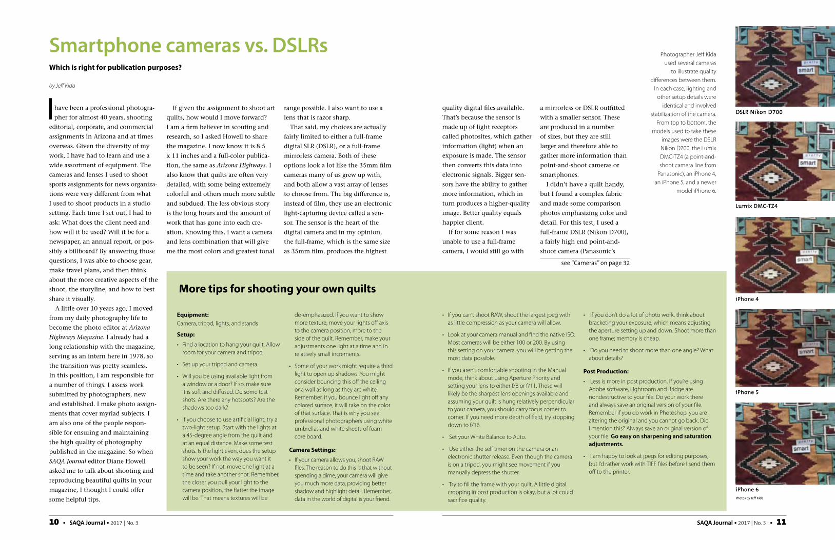
I didn’t have a quilt handy, but I found a complex fabric and made some comparison photos emphasizing color and detail. For this test, I used a full-frame DSLR (Nikon D700), a fairly high end point-and-shoot camera (Panasonic’s
Photographer Jeff Kida used several cameras
to illustrate quality differences between them.
In each case, lighting and other setup details were
identical and involved stabilization of the camera.
From top to bottom, the models used to take these
images were the DSLR Nikon D700, the Lumix DMC-TZ4 (a point-and-shoot camera line from
Panasonic), an iPhone 4, an iPhone 5, and a newer
model iPhone 6.
Equipment:Camera, tripod, lights, and stands
Setup:• Find a location to hang your quilt. Allow
room for your camera and tripod.
• Set up your tripod and camera.
• Will you be using available light from a window or a door? If so, make sure it is soft and diffused. Do some test shots. Are there any hotspots? Are the shadows too dark?
• If you choose to use artificial light, try a two-light setup. Start with the lights at a 45-degree angle from the quilt and at an equal distance. Make some test shots. Is the light even, does the setup show your work the way you want it to be seen? If not, move one light at a time and take another shot. Remember, the closer you pull your light to the camera position, the flatter the image will be. That means textures will be
de-emphasized. If you want to show more texture, move your lights off axis to the camera position, more to the side of the quilt. Remember, make your adjustments one light at a time and in relatively small increments.
• Some of your work might require a third light to open up shadows. You might consider bouncing this off the ceiling or a wall as long as they are white. Remember, if you bounce light off any colored surface, it will take on the color of that surface. That is why you see professional photographers using white umbrellas and white sheets of foam core board.
Camera Settings:• If your camera allows you, shoot RAW
files. The reason to do this is that without spending a dime, your camera will give you much more data, providing better shadow and highlight detail. Remember, data in the world of digital is your friend.
More tips for shooting your own quilts
• If you can’t shoot RAW, shoot the largest jpeg with as little compression as your camera will allow.
• Look at your camera manual and find the native ISO. Most cameras will be either 100 or 200. By using this setting on your camera, you will be getting the most data possible.
• If you aren’t comfortable shooting in the Manual mode, think about using Aperture Priority and setting your lens to either f/8 or f/11. These will likely be the sharpest lens openings available and assuming your quilt is hung relatively perpendicular to your camera, you should carry focus corner to corner. If you need more depth of field, try stopping down to f/16.
• Set your White Balance to Auto.
• Use either the self timer on the camera or an electronic shutter release. Even though the camera is on a tripod, you might see movement if you manually depress the shutter.
• Try to fill the frame with your quilt. A little digital cropping in post production is okay, but a lot could sacrifice quality.
• If you don’t do a lot of photo work, think about bracketing your exposure, which means adjusting the aperture setting up and down. Shoot more than one frame; memory is cheap.
• Do you need to shoot more than one angle? What about details?
Post Production:• Less is more in post production. If you’re using
Adobe software, Lightroom and Bridge are nondestructive to your file. Do your work there and always save an original version of your file. Remember if you do work in Photoshop, you are altering the original and you cannot go back. Did I mention this? Always save an original version of your file. Go easy on sharpening and saturation adjustments.
• I am happy to look at jpegs for editing purposes, but I’d rather work with TIFF files before I send them off to the printer.
DSLR Nikon D700
Lumix DMC-TZ4
iPhone 4
iPhone 5
iPhone 6
see “Cameras” on page 32
Photos by Jeff Kida

32 • SAQA Journal • 2017 | No. 3 SAQA Journal • 2017 | No. 3 • 33
experience with the newer smart-phones, but from everything I read smartphone cameras have improved dramatically. These would include the HTC U11, the new Google Pixel, the Samsung Galaxy S8, and iPhone 7.
Once your camera choice is sorted, there are other key factors to ensure your images stand out. A major factor for success is to use a tripod no matter what kind of camera you are using. A tripod will always give you higher quality files. Since quilts aren’t mov-ing, you can kick up the level of your photos exponentially by stabilizing the camera. There are clamps/adapt-ers made to affix smartphones to a tripod, so anyone can take advantage of this practice.
Jeff Kida is photo editor at Arizona Highways Magazine. He is often seen out and about with camera in hand.
Fiber Artnow
subscribe now! www.fiberartnow.net
A fiber arts magazine & communityprint & digital magazine, exhibition listings, artist submissions,
artist interview program, events calendar & map, jobs board & more!
SPRING 2015 Vol. 4, Issue 3
Fiber Art
PAPER ART:
MANIPULATING
THE MEDIUM
CONTEMPORARY EMBROIDERY
EXPRESSING CULTURE
THROUGH FELT MAKING
$10US+CAN
now
WEAVING A
TAPESTRY LEGACY
fibers | mixed media | textiles
RUST! KNITTING CIRCUS, &
QUILTING THE SIERRA NEVADAPLUS!
BREATHTAKING LANDSCAPES:
DYEING WITH INDIGO
LYN
N P
OLLA
RD
fibers | mixed media | textiles
Lumix Model DMC-TZ4), and three generations of iPhones. All shots were made under the same light-ing conditions using a tripod. With the iPhones, I had to use a clamp to secure them, but each was still stabilized when the shots were made. When I looked at the results, they mostly tracked with the testing we have done with various digital formats at the magazine. The newer iPhone 6 actually surprised me, and I hear the iPhone 7 is even better.
That said, when I really examined the individual files, the Nikon D700 showed much greater dynamic range and more nuanced colors than any of the other cameras. Since 2007, Arizona Highways has run very few photos made with digital cameras that were outfitted with a sensor smaller than a half-frame. In only one of those cases did the photo run larger than a half
page. That was a very atmospheric image made on a foggy morning, so detail was not an issue.
It should be noted that the newer iPhone 6 used in these test shots more than held its own against my
8-year-old Lumix point-and-shoot camera that has a bigger sensor and a Leica lens. Our Apple IT guy swears the iPhone 7 will produce files that
can be used with confidence in a magazine such as ours.
But today, which images from the test would I accept for print? Obvi-ously, those from the Nikon D700. I would be comfortable using either the Lumix DMC-TZ4 or the iPhone 6 at something more like one-half page.
I went back and looked at the original files to find the Lumix DMC-TZ4 and the iPhone 6 are very close. Both cameras generate jpegs, which means the images are being processed by the camera. With the iPhone 6, the files seem to have a little more contrast, which can look a lot like sharpness. As technology improves, we are seeing advancements in both sensor technology and improved software. The files from these cameras have a different look, but in terms of being print worthy, I think they are pretty even. I don’t have any personal
Cameras from page 11
Delve into Surface Designwith SAQA Seminar 2017!
Brought to SAQA members by the Education Committee, a new topic will be introduced every two weeks in September and October.
The seminar's four topics are: PRINT • PAINT • DYE • OTHER TECHNIQUES
SAQA Seminar 2017 participants receive:• Access to articles, tutorials, and book reviews plus links to inspirational resources• Video conversations with surface design artists• Live video chats• Facebook group for SAQA Seminar 2017 participants
For details, visit saqa.com/seminar
DES MOINES, IOWAOctober 4–7, 2017
Iowa Events Center
NATIONAL BRAND PARTNER
Detail: PINEAPPLE SALSA by Ann Van Fleet, Beloit, WI
CREATE INSPIRE ENJOY TOGETHER
A major factor for success
is to use a tripod.
SAQA Journal • 2016 | No. 2 • 11
A s SAQA members, we have a
wealth of opportunities for
publication of our work, including
the SAQA Journal, exhibition catalogs,
the Portfolio, and numerous places on
the SAQA website. In order to take
advantage of these opportunities,
we have to do more than just create
the work itself — we must also be
committed to obtaining the best pos-
sible photographs of the work. This
means either hiring an experienced
professional or, if we have the money
and the motivation, investing in the
right equipment as well as learning
as much as possible about artwork
photography so we can take our own
photographs.
Every photograph is the result of
many different considerations, some
of which become especially critical
when photographing artwork. In
addition to proper setup and a good
quality camera (note: your iPhone
photo still isn’t good enough for a
catalog), you need to have a good
understanding of sharpness and
focus, light and exposure, depth
of field, image noise, and dynamic
range. One of the least understood
aspects of digital photography is white
balance, which is key to getting the
correct color in your image.
Color temperature
As an artist, you’re aware that with-
out light, there is no color. But what
you may not be aware of is that light
itself can be said to have color. The
visible light spectrum is a very narrow
band of frequencies within the larger
electromagnetic spectrum. The range
of visible light colors is described
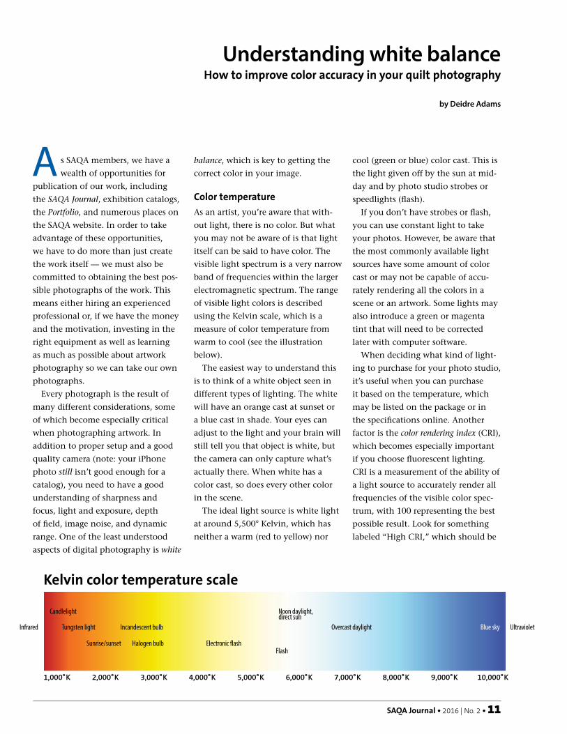
using the Kelvin scale, which is a
measure of color temperature from
warm to cool (see the illustration
below).
The easiest way to understand this
is to think of a white object seen in
different types of lighting. The white
will have an orange cast at sunset or
a blue cast in shade. Your eyes can
adjust to the light and your brain will
still tell you that object is white, but
the camera can only capture what’s
actually there. When white has a
color cast, so does every other color
in the scene.
The ideal light source is white light
at around 5,500° Kelvin, which has
neither a warm (red to yellow) nor
cool (green or blue) color cast. This is
the light given off by the sun at mid-
day and by photo studio strobes or
speedlights (flash).
If you don’t have strobes or flash,
you can use constant light to take
your photos. However, be aware that
the most commonly available light
sources have some amount of color
cast or may not be capable of accu-
rately rendering all the colors in a
scene or an artwork. Some lights may
also introduce a green or magenta
tint that will need to be corrected
later with computer software.
When deciding what kind of light-
ing to purchase for your photo studio,
it’s useful when you can purchase
it based on the temperature, which
may be listed on the package or in
the specifications online. Another
factor is the color rendering index (CRI),
which becomes especially important
if you choose fluorescent lighting.
CRI is a measurement of the ability of
a light source to accurately render all
frequencies of the visible color spec-
trum, with 100 representing the best
possible result. Look for something
labeled “High CRI,” which should be
Understanding white balanceHow to improve color accuracy in your quilt photography
by Deidre Adams
1,000°K 2,000°K 3,000°K 4,000°K 5,000°K 6,000°K 7,000°K 8,000°K 9,000°K 10,000°K
Candlelight
Tungsten light
Sunrise/sunset
Incandescent bulb
Halogen bulb Electronic flash
Noon daylight,direct sun
Overcast daylight Ultraviolet Infrared Blue sky
Kelvin color temperature scale
Flash

12 • SAQA Journal • 2016 | No. 2
at 90 or better. Avoid household fluo-
rescent bulbs that don’t list a CRI rat-
ing; these will mostly likely be much
lower and your photos will have color
problems that can’t be fully corrected
later.
Another lighting situation that’s
highly problematic is having mul-
tiple light sources in your image. An
example of this might be light com-
ing from a window at the same time
you’ve got a household lamp casting
light on your subject. This kind of
lighting is difficult to impossible to
correct.
Setting white balance
Any camera you consider for photo-
graphing your artwork should have
the ability to set white balance, and
preferably to set a custom white bal-
ance. Below is a typical list of settings
available on a wide range of cameras.
AWB
K
Auto white balance
Shade
Cloudy
Strobe/�ash
Daylight
Fluorescent
Tungsten
Kelvin
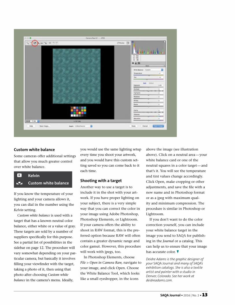
Custom white balanceIf you’ve never looked at this setting
on your camera, chances are it’s set to
auto. Auto white balance may give
acceptable results in a wide range of
circumstances, but it’s very unlikely
that it will give you the best result for
photographing artwork. Be sure to
read your camera’s manual to learn
how to use these settings.
White balance card setComes with white, black and gray cards; $10-20 depending on size and manufacturer. B&H Photo and Amazon carry different options. Be sure to read the user reviews; some people say the gray is not completely neutral, which can result in slight color shifts.
DGK Color Tools DKC-Pro Color Calibration & White Balance Chart Set$14.95 at B&H Photo. Very inexpensive; however, some reviews say the neutral gray side is not completely accurate.
X-Rite ColorChecker Classic Card$59 at B&H Photo. In addition to grayscale chips, this card includes 18 color chips to help with color calibration.
X-Rite ColorChecker Passport Photo$89 at B&H Photo. In addition to color and grayscale chips, the Passport ColorChecker comes with software that allows you to build profiles for every lighting situation, which can simplify correcting a large number of images simultaneously with Photoshop or Lightroom.
White balance products
The number of available white balancing accessories is
large and bewildering. Here is just a small sampling of
what you can find at B&H Photo (www.bhphotovideo.
com), Adorama (adorama.com), or Amazon.com. Prices
vary tremendously, and it may or may not be true that
you get what you pay for. Be sure to do your research —
read the user reviews and check photography forums for
recommendations.
SAQA Journal • 2016 | No. 2 • 13
Custom white balance
Some cameras offer additional settings
that allow you much greater control
over white balance.
AWB
K
Auto white balance
Shade
Cloudy
Strobe/�ash
Daylight
Fluorescent
Tungsten
Kelvin
Custom white balance
If you know the temperature of your
lighting and your camera allows it,
you can dial in the number using the
Kelvin setting.
Custom white balance is used with a
target that has a known neutral color
balance, either white or a value of gray.
These targets are sold by a number of
suppliers specifically for this purpose.
See a partial list of possibilities in the
sidebar on page 12. The procedure will
vary somewhat depending on your par-
ticular camera, but basically it involves
filling your viewfinder with the target,
taking a photo of it, then using that
photo after choosing Custom white
balance in the camera’s menu. Ideally,
you would use the same lighting setup
every time you shoot your artwork,
and you would have this custom set-
ting saved so you can come back to it
each time.
Shooting with a target
Another way to use a target is to
include it in the shot with your art-
work. If you have proper lighting on
your subject, there is a very simple
way that you can correct the color in
your image using Adobe Photoshop,
Photoshop Elements, or Lightroom.
If your camera offers the ability to
shoot in RAW format, this is the pre-
ferred option because RAW will often
contain a greater dynamic range and
color gamut. However, this procedure
will work with jpegs, too.
In Photoshop Elements, choose
File > Open in Camera Raw, navigate to
your image, and click Open. Choose
the White Balance Tool, which looks
like a small eyedropper, in the icons
above the image (see illustration
above). Click on a neutral area — your
white balance card or one of the
neutral squares in a color target — and
that’s it. You will see the temperature
and tint values change accordingly.
Click Open, make cropping or other
adjustments, and save the file with a
new name and in Photoshop format
or as a jpeg with maximum qual-
ity and minimum compression. The
procedure is similar in Photoshop or
Lightroom.
If you don’t want to do the color
correction yourself, you can include
your white balance target in the
image you send to SAQA for publish-
ing in the Journal or a catalog. This
can help us to ensure that your image
has accurate color.
Deidre Adams is the graphic designer of your SAQA Journal and many of SAQA’s exhibition catalogs. She is also a textile artist and painter with a studio in Denver, Colorado. See her work at deidreadams.com.

SAQA Journal • Winter 2015 • 29
At the SAQA 25th Anniversary
Conference in Alexandria, Vir-
ginia, last May, Gregory Case, a pro-
fessional fiber art photographer from
Colorado, addressed various issues
confronting artists who photograph
their own work. He also touched on
the fact that not everyone needs or
wants professional photographs. If
the purpose of the images is to share
them within a local circle—friends,
family, or a guild, perhaps—a snap
on a smartphone may be all that’s
needed. Sometimes, however, some-
thing more professional is needed.
Case cautioned, “Far more people
will see the image of your work than
will see it in person.” Social media
sites like Facebook, Instagram, and
Pinterest rely primarily on visual
marketing, not to mention an artist’s
personal website. Juried shows, books,
and magazines also judge work based
on the photograph of a piece, not the
piece itself. Therefore, whether an art-
ist decides to seek out a professional
photographer or photograph their
work themselves, the quality and
professionalism of the photograph
are very important.
Having art photographed by a pro-
fessional can be expensive. For this
reason, many quilt artists take their
own photographs. Case advised that
to begin photographing your own
work like a professional, you should
begin by reading the user’s manual
for your camera.
Color is a prime consideration in
presenting fiber and textile work,
and each device—camera, smart-
phone, tablet, computer monitor and
printer—interprets color differently.
It’s critical to understand how the
particular device being used works. In
the default mode, most cameras over-
saturate color and enhance contrast,
and many lose subtleties of color and
color transitions that are necessary
for accurate color representation of
the quilt in an image.
Generally speaking, the more
expensive the camera, the more con-
trol you’re likely to have over image
quality, color and detail, Case said. To
prove this point, he showed several
examples of photos taken with an
Apple iPhone 5s, which uses the JPEG
format, and a Canon G15 point-and-
shoot camera with RAW capability.
Before taking any photographs,
you must first decide which camera
processing method to use, JPEG or
RAW. A JPEG image type has a file
extension of either .jpg or .jpeg. It’s a
widely-used format and can be read
immediately on most computers
without further processing after the
shot is taken. The disadvantages of
the JPEG image type include the
loss of up to a third of the color data
and reduced flexibility to correct the
color, Case said.
To help compensate for the defi-
ciencies of the JPEG format, take
some time to choose the appropriate
camera settings before taking the first
photo. Adjust the brightness and con-
trast. Use the most appropriate “white
balance” — a setting that allows you
to calibrate the device to correctly
display the color white under differ-
ent lighting conditions. Choose the
largest file size and highest quality
settings to minimize image compres-
sion. Case noted that smartphones
and some point-and-shoot cameras
don’t allow you to adjust the default
settings. If you’re purchasing a new
camera, make sure these adjustments
are available on the model you’ve
selected.
The other image file type avail-
able in some cameras is RAW. When
photographing using the RAW file
format, the camera image data is
Photographing your art like a professionalby Cindy Grisdela
Some cameras offer easily accessible “canned” white balance settings to
help you achieve good results under different lighting conditions.

30 • SAQA Journal • Winter 2015
Exhibition OpportunitiesAwards & Grants SupportOutstanding Member Resources
Receive the established thought leader in textilearts publications plus:
JOIN US FOR THE BENEFITS.
We’re MORE than agorgeous magazine.
SURFACE DESIGN ASSOCIATION
www.surfacedesign.org
unprocessed and requires processing
with computer-imaging software such
as Photoshop. Many single lens reflex
(SLR) cameras and some point-and-
shoot models offer this option.
Case noted that some of the
advantages of using the RAW format
include better color control, the abil-
ity to adjust the white balance after
the shot is taken, and more control
over exposure when compared to the
JPEG format.
Many smartphones have a preset
white balance setting that can’t be
adjusted, while many point-and-
shoot cameras have automatic set-
tings that can be chosen depending
on the available lighting—indoors,
outdoors, or flash. More expensive
cameras allow you to custom-set your
white balance by shooting an image
of a white piece of paper or a white
wall and setting the camera to bal-
ance the colors to that image.
Once you’ve sorted out some of
these technical details, the next step is
setting up a space for photography. A
fairly large area is needed to maintain
the recommended distance of 6-15 feet
between the camera and the quilt. Case
advises pinning the quilt straight onto
a backdrop and centering the camera
on a tripod with a cable release or self-
timer. This gives the photographer the
opportunity to compose the shot and
make adjustments if needed.
Some quilters prefer to take their
shots outdoors. For this technique,
Case said it is essential to plan in
advance and set up your shot on an
overcast day with no wind.
Once you have the photographs,
it’s important to review them on a
desktop computer monitor, not just
on the LCD screen of the camera,
before taking everything down. After
reviewing the images and confirming
that they’re acceptable, it might be
helpful to take a shot of the setup so
you’ll know next time what worked
well.
Lastly, Case added that if photog-
raphy proves too difficult or time
consuming, give him a call. With
11 years of experience as a full-time
photographer of quilts, textiles and
fiber art and with work that has been
seen in over 100 different publica-
tions, he’d be happy to lend a hand.
You can contact him at (719) 647-
0472 or [email protected].
Cindy Grisdela is a Juried Artist Member of Studio Art Quilt Associates from Reston, Virginia. See her work at www.cindygrisdela.com.
A Must for SeriousArt Quilters
Whether you’ve been in business foryears or you’re just starting out, you'llfind the resources you need to createyour own success at the IAPQ. We’ll
show you how to: • make more money quilting
• market your business • build business and
professional skills• manage your finances
• take advantage of Internet technology
• work smarter • network and more
Don’t miss this opportunityto uplevel your quilt business
Sign up for our valuable starterresources at
www.professionalquilter.comwww.IAPQMasterMind.com
14 • SAQA Journal • 2018 | No. 1
Pricing can be the monkey
wrench in your marketing tool-
box. Finding the sweet spot between
desired earnings and what the market
will bear can seem like an over-
whelming task.
What’s the secret to success? A
no-nonsense approach to math and
a lack of emotion in the process, say
the artists who responded to a SAQA
Journal query.
Although almost all responding
artists price their works by the square
inch, they emphasize different factors
to determine their final multiplier. A
review of their techniques and tips
provides insight into how to establish
your own price points. In addition,
Dena Dale Crain’s tutorial on how
to calculate pricing, taken from her
retired class Math for Quilters, is a
sidebar to this article.
Unit pricingIn Sandra Donabed’s straightforward
approach, she calculates prices for
her work by the square inch and then
rounds up to the nearest number end-
ing in two zeros.
“Prices are written in stone once
assigned, but I do raise the square-
inch price every decade or so on
all new work,” says Donabed of
Jupiter, Florida. The only time she
discounts work is during an open
studio sale event or if someone makes
an appointment to see her work in
her studio. Her studio discount is
generally 10 percent to 20 percent off
gallery retail pricing.
Cindy Grisdela of Reston, Virginia,
has a similar approach. “I price by the
square foot. I raise my prices every
couple of years or if I have a signifi-
cant event in my professional life that
would justify an increase,” she says.
She does not hold sales.
Decisions and lessonsBeing able to price things with emo-
tional nonattachment takes disci-
pline. Neroli Henderson of St. Kilda,
Victoria, Australia, used to price her
pieces based on how much work went
into them or how much she “loved”
a piece.
“As I got better known, I realized it
was a really futile way for me to price.
I have too many pieces to hold on to
for the nostalgia, and I’ve had to get
less precious about all but a couple of
my works. I’ve also realized that what
I love aren’t often the works that are
loved by others,” Henderson says.
She finds that how much time she
spends on a piece matters little to its
value in the end. “There are many
things that make a work important.
What does it say? Is it identifiable as
my work? Is it one of the most well-
known of a series? Did it win awards?
Has it been in major exhibitions? Has
it been shown in major magazines or
books? Is it iconic?”
Finally, she notes that often the
most important thing for a collector
buying a specific artist’s work, besides
their love for it, is the little signature
in the corner.
Henderson now prices by the
square inch, too. She began at about
$1.80 AUD, increasing it as she won
awards and was featured in interna-
tional publications; last fall her price
was $2.77 AUD. “The amount of
hours I spend doesn’t matter to the
buyer, only the finished piece. That
said, I make enough to make sure I
have an okay hourly rate overall.”
The lay of the landAnn Brauer of Shelburne Falls, Mas-
sachusetts, arrives at her price per
square inch through a multifaceted
approach. “Selling quilts is what I do
to support myself, so pricing matters
to me. I need to sell the work, but I
also need to make money. I look at
the amount I want to earn per hour
or per year. I want this to be a reason-
able sum based on my experience and
the rates of comparably skilled people
in my area. I also know my expenses,
including materials, my studio, adver-
tising, and time spent doing work-
related activities. I can then figure
out how long it takes me to make a
quilt. If it takes a week, then I know
approximately what the cost of this
quilt should be,” she says.
To firm up the final price, Brauer
takes buyers’ behavior into account.
“If I put too large a price on it, then
the work does not sell, which is coun-
terproductive. If I price it too low,
then I don’t make enough money.
This can be a problem when working
Pricing got you down?Never fear — math saves the day!
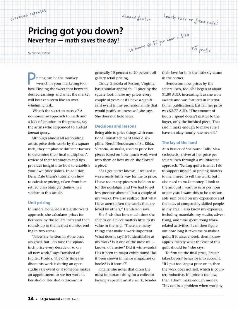
by Diane Howell26 hours
@ $6 per hour = $1
56
15% profit
hourly rate or fixed rate?overhead expenses
demand factor

SAQA Journal • 2018 | No. 1 • 15
with different sizes. I need to be able
to justify the price to myself and to
my potential customer. Sometimes a
smaller item can be part of a larger
marketing strategy.”
The concepts of comparable pric-
ing and selling partnerships are key.
“Because my aim is to sell quilts I
need to determine if the price works
in my market. Although most of my
sales are made directly to the pur-
chaser, I need to leave room for the
discount that decorators and galleries
take. Then to make it easy on myself
after setting the standard price, I go
by the square inch. I price custom
quilts at the same price as quilts I
make in general since while there
is some additional time involved in
meeting the needs of the client, I also
know that the quilt is sold.”
Margaret Blank of Mirror, Alberta,
Canada, has also found the local
market to be a strong factor in her
pricing. Like Brauer, she prices by
the square inch, remains mindful of
the size of the piece, and “my small
town/tourist/rural market.” She notes:
“Generally this has worked well and
yes, my price has risen a tad in the
past couple of years as I’ve become
better known in the area and have
more on my curriculum vitae.”
After taking costs and local pricing
into account, there is one factor left
to consider. “Every quilt has a home
and a price,” Brauer says. Some quilts
are more difficult to place than oth-
ers, and her designs change. “If I am
no longer showing the work regularly,
then I may reduce it. The question I
ask myself is whether I will be glad to
let the quilt sell at the reduced price.
As I learned after Hurricane Irene [in
2011, when my studio floated away],
having too much stock is not always
a good idea.”
Time is moneyZara Zannettino of Highbury, West
Australia, Australia, says her time is
the most important factor in pricing.
To get to her square-inch figure, she
logs every step of production. “[This
practice] is valuable for quoting. I feel
it ensures I can remove the emotion
and help justify my pricing. I person-
ally hate the angst that artists often
put themselves through, as they
typically ‘undervalue’ their hard work
and experience,” she says.
Her formula is: (current value of
material costs x size) + (hours or
expected hours based on comparable
historical records) x (a reasonable per-
hour labor rate).
“I must get paid a certain hourly
rate or not produce it for sale, as this
is the largest cost factor involved.
If this fixed-rate isn’t possible for a
commission or sale, then I won’t pro-
ceed, as I don’t want to devalue my
time or resent the commitment.” To
help maintain value for other artists,
she also feels it is important to not
negotiate a lower price once she has
calculated a realistic value.
Zannettino does have one bargain,
and that is if she gifts an older work
to someone she finds deserving.
“The reaction is priceless, no one has
devalued my time, and I have taken
the time to consider who deserves
[the piece].”
Other factorsSusan Lenz of Columbia, South
Carolina, also prices by the square
inch, but her calculation sometimes
includes framing. “The work for
which I have gallery representation
is framed. Their commission is 50
percent. I calculate the minimum
wholesale cost of framing and double
it. I add this amount to the square-
inch calculation,” she says.
The amount for framing is gener-
ally less than retail because Lenz does
all of her own framing. She buys the
supplies in bulk and in advance with
free shipping to reduce costs.
Then she opts for a reality check.
“I consult the manager at my main
gallery to determine if he thinks [the
price] is reasonable and if he thinks
they can sell it.” From there, Lenz
says the price is never lowered and
there is never a sale. “Customers must
be able to purchase with confidence.
They should never hear about anyone
receiving a better price for similar
work. The only discount is when buy-
ing multiples. I have authorized my
galleries to take 10 percent off at their
discretion.” However, the 10 percent
must come from gallery’s portion of
the sales.
Lenz’s overall approach is based
on common-sense principles. “For
me, there’s no sense in sticking a
whopping price tag on a piece that
‘Selling is complicated. There’s the
guesswork of gauging the public’s
pocketbook and willingness
to open it.’ — Susan Lenz
26 hours @ $6 per h
our = $156

16 • SAQA Journal • 2018 | No. 1
To set prices for quilts, begin with the costs involved in making it. Those costs are:
• Costs of all materials
• Cost of labor at fair market value, or what you might expect to pay someone else to do the work
• Overhead expenses
• Margin for profit
A formula for this calculation might look like this:Materials + Labor + Overhead + Profit = Price
Let’s run through a simple example of what to include when making that calculation:
Materials: Costs of fabrics, batting, and notions total $97.48.
Labor: 26 hours at $6 per hour totals $156.
Overhead: This includes costs for space, electricity, water, telephone, and other incidental expenses. Let’s assume it took about a month to make our sample quilt and that overhead expenses were $43.
Profit: Equate profit to what your money might earn if you did something else with it besides investing in your business. What are current interest rates on cash investments in stocks, bonds, and mutual funds? Any money invested in a quilting business should pay at least as well.
Calculating profit
Figuring a profit margin of 10 percent means 10 percent of the final price is profit, not that you add up all the expenses and then add 10 percent of that amount to set the final price. Note that 10 percent of $100 is $10 profit, whereas, 10 percent of $90 is only $9 profit.
The price in this example is $97.48 materials + $156 labor + $43 overhead + 10 percent profit. The asking price is $329.42. You arrive at this figure by adding the first three amounts to achieve a total of $296.48. To get the full retail price, divide $296.48 by 0.9, which yields $329.42. Your profit is $32.94.
If you want a 15 percent profit, divide $296.48 by 0.85, because you want this figure to be 85 percent of the total
has no chance of finding a permanent
home. Plus, if my work fails to move
in a gallery, that gallery will eventually
return it, and stop representing me,” she
says. “An artist must understand that
the gallery must sell in order to stay in
business. Selling is complicated. There’s
more involved than time, materials, and
even the affection an artist might have
for her creation. There’s the guesswork
of gauging the public’s pocketbook and
willingness to open it.”
The work sold through galleries is a
fraction of Lenz’s creations. She prices
other works at $1-$2 per square inch,
the lower number for mostly machine-
stitched works, and the higher for
mostly hand-stitched works. Framed
works are calculated the same way as
described above. This pricing process
provides a dollar amount for solo show
exhibition lists.
Lenz is at peace about her approach
to pricing for these works. “I know that
my price per square inch is low. I know
that it doesn’t equitably represent a fair
wage on any timeline. I also know that
I can produce more than four times
what I will ever be able to sell and that
storage is a very real issue. To me, the
best thing that can happen to one of my
works is for someone to love it enough
to give it a home, hang it, and get it out
of storage. I could price my work higher,
but it would disrupt the delicate balance
between selling and storing.
“My artistic mentor once told me that
the right time to raise prices was when
an artist couldn’t keep up with demand.
So far, this hasn’t happened. He also told
me that lowering a price and having a
sale will generally drive away serious col-
lectors who are looking for serious artists
who expect the value of their work to go
up over time, not down.”
Diane Howell is editor of the SAQA Journal.
Step-by-step pricing tutorial
by Dena Dale Crain

SAQA Journal • 2018 | No. 1 • 17
price. This yields the retail price of $348.80, of which $52.32 represents a 15 percent profit.
Pricing by Area
After repeatedly going through this pricing exercise, many professional quilters learn there is a correlation between the size of the quilt and the amount and costs of materials and time required to make it. Using a record of costs, they establish an average price per unit, generally set as price per square inch or square centimeter.
Using the average price per unit method, a quilt that measures 18 x 42 inches has a total area of 756 square inches. At a rate of 90 cents per square inch, this quilt’s price is easy to calculate. It would be $680.40.
To set a standard per-unit price, the quality of all the quilts should be consistent. To price a simple cotton quilt with little quilting using the same method to price a complicated, densely quilted silk piece with expensive embellishments, means overpricing one and underpricing the other.
Demand factor
Neither of the two previously described pricing methods considers that demand for an extraordinarily good quilt is higher than the demand for a less exciting quilt. A third pricing method permits pricing based on quality by factoring in the likelihood of demand.
Examine all your quilts. Likely, there are some that are early pieces, and the quality is not especially good. There are some quilts of better quality, but the designs are not exciting. Recent quilts are better in both design and construction.
If you can divide the quilts into categories, you can grade the quilts from worst to best. Grading is a structure that will inform you about pricing. Clearly, prices for the worst quilts should be lower than prices for the best quilts.
Use cost information to assign a minimum value to each quilt. Add the minimum required profit. Then use anticipated demand to raise or hold steady the retail price.
For example, there are three quilts to sell: a good one, a better one and a great one. They are all made from the same
kinds of fabrics and all three are about the same size. Cost of materials is about the same, but perhaps there is more labor in the best one. Cost pricing factors in the extra labor, but the spread in prices between the three quilts is not great. Area pricing does not factor in quality, unless you assign a different per-square-unit price for each level of quality.
Assign a factor of 1 to the least impressive of the three quilts. For example, you priced the quilt at $250. The factor of 1 holds the price at that level. When that quilt is sold, you will cover the costs of materials, labor, overhead and a small profit.
Assign a larger factor to the second quilt. The size of this factor is up to you, but it may be something like 1.2 or 1.3. Multiply the minimum price by this factor. For example, you have priced the second quilt at $300. Its factored price is $300 x 1.2, or $360. The extra $60 covers anticipated demand for the piece.
Assign an even greater factor, perhaps as high as 2 or 3, to the best quilt. Your $350 quilt now has a set price of $700.
Track the price at which each quilt sells, and let this price inform future pricing. If there are many potential buyers for a quilt at a higher price, raise the factor. If the quilt does not find a buyer within a reasonable period, reduce the price.
At first, this procedure is largely guesswork. As you gain experience selling quilts and judging the market for them, good pricing strategy is less about guessing and more about knowing what sells and at what price.
More Tips
Many quilters find that selling pays for quilting supplies, lifts self-esteem and reputation, and makes it possible to buy new equipment to make more quilts. It also clears out old quilts to make room for new ones.
Even if you quilt for fun or to make gifts, never take your quilting efforts for granted. You are engaged in highly specialized work. Training, materials, tools, and equipment are expensive. You deserve to be compensated for those expenses.
Dena Dale Crain is a SAQA JAM who resides in Nakuru, Kenya.
materials + labor + overhead + profit = price

A version of this article appeared in the Summer 2009 issue of the SAQA Journal.
18 • SAQA Journal • 2017 | No. 3 SAQA Journal • 2017 | No. 3 • 19
Elizabeth Van Schaick: How will a developing artist or art quilt maker know when it is time to take out insurance for the first time? That is, when does it become necessary or highly advisable?
Christine Johnston: There is no set answer for this. Most quiltmakers feel comfortable while the quilts are in their home. When they start shipping or taking their quilts elsewhere, that is usually when the first phone call happens.
EVS: So when an artist begins to send pieces to other venues more than occasionally, and generally antici-pates income from the artwork, tak-ing out insurance seems wise. Once an artist is established in terms of reputation or selling prices, are there additional considerations or new types of coverage?
CJ: The policy my company offers is called a basic “Inland Marine” (also known as a “floater”) policy. When-ever you are running any type of business, you need to sit down with your insurance advisor to find out if
there is other coverage that should be considered. Every person is different in her wants and needs. This particu-lar policy is geared to the quilt world, just like a jewelry floater policy or a musical instrument policy is geared toward a particular area. Each policy has special nuances that are geared to the type of artwork.
EVS: What types of policies exist for insuring the artist’s artwork while in her own possession, and while on loan to other locales?
CJ: Any type of Inland Marine policy. This covers items anywhere within a specified area, for us it’s the United States and Canada, but each carrier’s policy is different.
EVS: What is covered by these policies — what types of situations? What is not covered?
CJ: I can tell you what is NOT covered on my policy: wear and tear, dete-rioration, climate, animals. Those are the major exclusions, but there are others, like war, nuclear attack, terrorism, etcetera. My policy will not
cover any type of electronics. There are other policies out there that will.
EVS: Do you have any warnings con-cerning artists’ insurance?
CJ: As with anything, get it in writ-ing. Some insurance agents state the homeowner’s policies will cover the quilts. Some carriers will, but most will not if the quilter is doing this as a business.
EVS: Some exhibition organizations may carry insurance that would cover participants’ artwork, but not all do, or they may state limitations. When entering an exhibition, sale, or special event, does an artist who has her own insurance need to ask whether her artwork is covered by the exhibition location or company’s policy?
CJ: No. Again, my policy covers anywhere in the United States and Canada.
EVS: What does the artist need to have, in terms of documentation or official valuations, when first taking out a policy?
CJ: Appraisals from a certified appraiser or an established market value. Without these two items, the quiltmaker would only be reimbursed the cost of her material.
EVS: Do you have any contacts to whom you would send artists to get accurate appraisals for these purposes?
CJ: I go to the National Quilt Asso-ciation website to find the list of certified appraisers. [Ed. Note: NQA is dissolved; a list of appraisers is avail-able from American Quilter’s Society at www.americanquilter.com]
EVS: Are you able to say how much insurance typically costs for art quilts of small to medium size? Is it afford-able for artists who are not yet mak-ing a high income?
CJ: I can tell you what my policy costs. I can’t tell you what an “aver-age” quilt will appraise for. My policy costs $1.17 per $100 of value. This is $117 for $10,000 worth of goods. [Ed. Note: These are 2017 prices.] Artists need to check conditions and limits on coverage for works of art and be aware of whether a policy covers equipment used in making the work. Sewing machines might be covered under a homeowner’s insurance policy or a policy that covers a body of artwork. Not all policies cover the computer, printer, or other electron-ics that are used to make art quilts. If such items are not included in a sepa-rate art business policy, the carrier of homeowner’s insurance may require that computers and other electron-ics be itemized on an additional business rider in order to get recom-pense. Artist Kim Ritter encountered this difficulty when she lost some equipment to hurricane damage. In addition, she had difficulty resolving
Insure your work and state its worthby Elizabeth Van Schaick
a claim for antique quilts that were damaged. Part of the problem was whether they were classified as “art” or “collectibles.” Unfortunately, Ritter’s home/flood policy covered “collectibles” only up to $1500. Also, since the quilts were business-related, they were not covered. Obtaining appraisals beforehand and adding a business rider would have ensured a different outcome.
Insurance value for art venuesProcedures and forms may vary quite a bit from one location to another. Shows like American Quilter’s Society will not allow insurance without a written appraisal, whereas many art venues and craft venues rely on fair market value as grounds for a value. It is important to remember that an estimate is not the same thing as an appraisal. Registration forms for exhi-bitions and sales will often ask you to declare an insurance value. According to June Underwood, “If the exhibi-tion has asked for a selling price and the museum gets part of the sales (typically 50 percent or less), then the insurance value that I would set would be the sale price that I put on the work less the museum’s commis-sion. Thus if the retail price was $100 and the museum took 50 percent, the insurance value would be $50.”
In many situations, the art may be hung for display only, and the venue does not conduct sales. In this case, Underwood suggests setting the value according to the prices the artist has received for other similar pieces in the past. “You can adjust prices downward or upward from prices for other works if the sizes aren’t simi-lar. Figure the price per square inch or square foot of a similar piece you have sold, adjust accordingly, and make that the insurance value.”
What if an artist doesn’t have a sales record? “Then I would use a
low-ball figure for quilt art in general, something like roughly 50 cents a square inch or however you like to calculate it. The low-ball price that I cite here might not be quite right in your region of the country, but I think it’s close to an average.”
Finally, in the event of an exhibit of antique or traditional quilts for which no sales had ever occurred,
Underwood suggests that perhaps an average selling price in the region for the kind of quilt being exhibited would be a good estimate. A call to a business that sells vintage quilts might provide some kind of figure.
“No estimate of insurance value is guaranteed to get you that amount — lots of discussion and negotiation will occur before a check appears in the mail. But at least using the rules of thumb I’ve given, you’ll have a ratio-nale for the value you’ve put on the work.” Even having some documenta-tion will provide better support than having none. Filing documentation and clear, full descriptions in words and/or photographs ahead of time will definitely save confusion and grief if the worst should ever happen.
At the time this article first appeared, Elizabeth Van Schaick, was a quilt and paper collage artist, a writer, and an instructor at the Samuel S. Fleisher Art Memorial in Philadelphia, Pennsylvania.
When an artist has completed a piece of artwork stemming from her own inspiration, creativity, and time, it may be daunting to think about ensuring its safety. Many artists may put off considering insurance against damage
and loss. They may get murky or conflicting information on what restitution is available and under what circumstances.Above all, it is crucial to have a detailed discussion with an insurance agent and ask specific questions about any
policy you have or are considering buying. Standard homeowner’s insurance may cover new or old artwork while it is in your home, depending on the policy, and what information or documents the insurance carrier originally required. When entered into an exhibition, art pieces may be covered by the sponsoring organization’s policy, but not always.
Below is an interview with Christine Johnston, CIC, USI Insurance Services LLC of Arizona, who offers some clarifica-tion about insurance for new artwork. Artist June Underwood contributes some tips about determining insurance values on exhibition paperwork.
It is important to remember that an estimate is not the
same thing as an appraisal.