beth old town
TRANSCRIPT

The theme for my project is the Old Town in Cowes. Out of the photos I took, the one from slide eleven is my favourite. I think it’s an interesting picture because it’s the reflection of the street, and I like how the light has been captured.
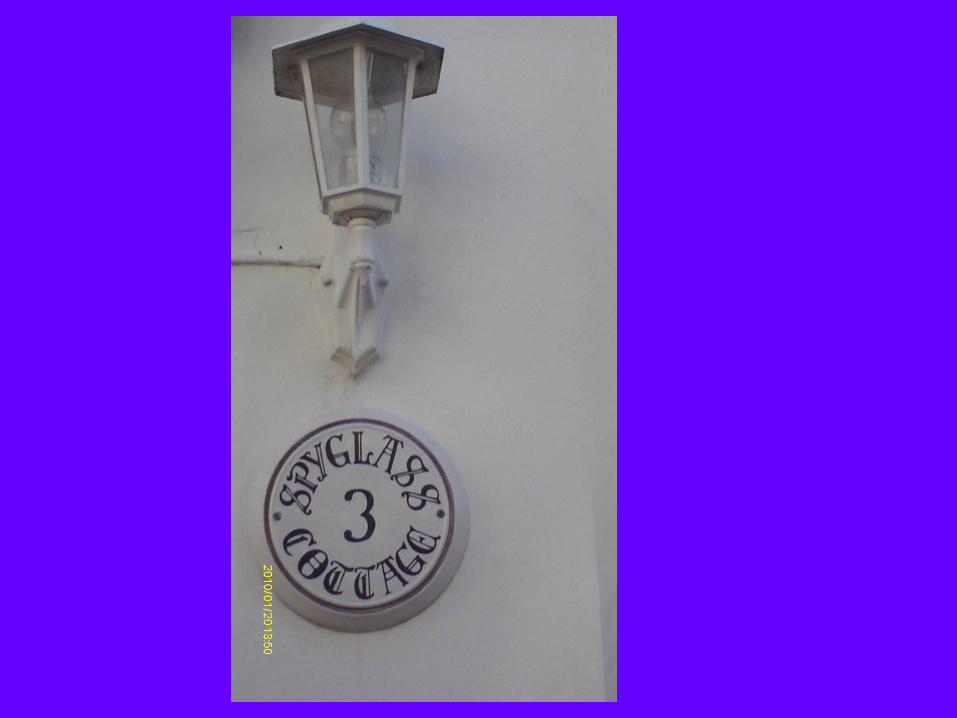
I’ve found that many of the other houses around the Old Town had old-fashioned signs with the house name on it, such as ‘Prospect Cottage’ or ‘Claremont House’, or old-fashioned door knockers or doorbells. I thought this provided an interesting contrast between old and new.
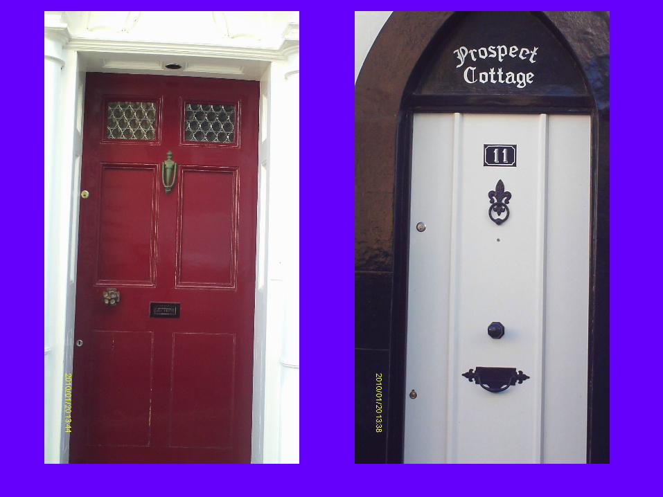
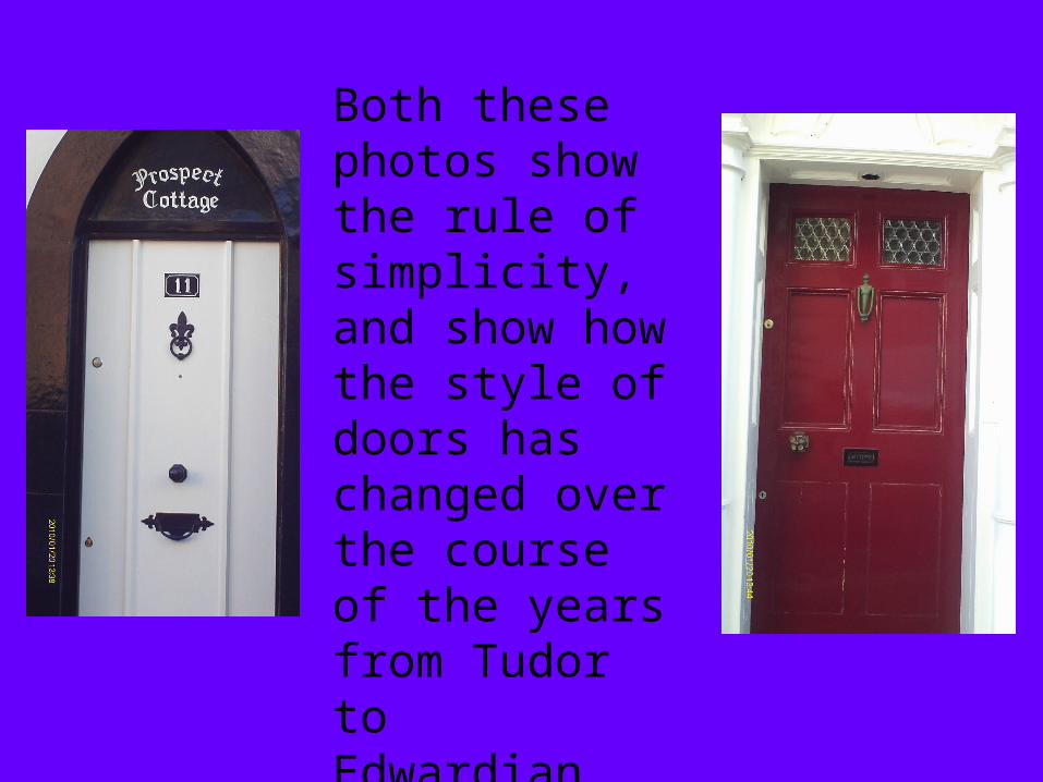
Both these photos show the rule of simplicity, and show how the style of doors has changed over the course of the years from Tudor to Edwardian.
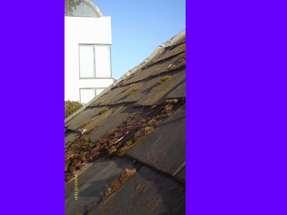
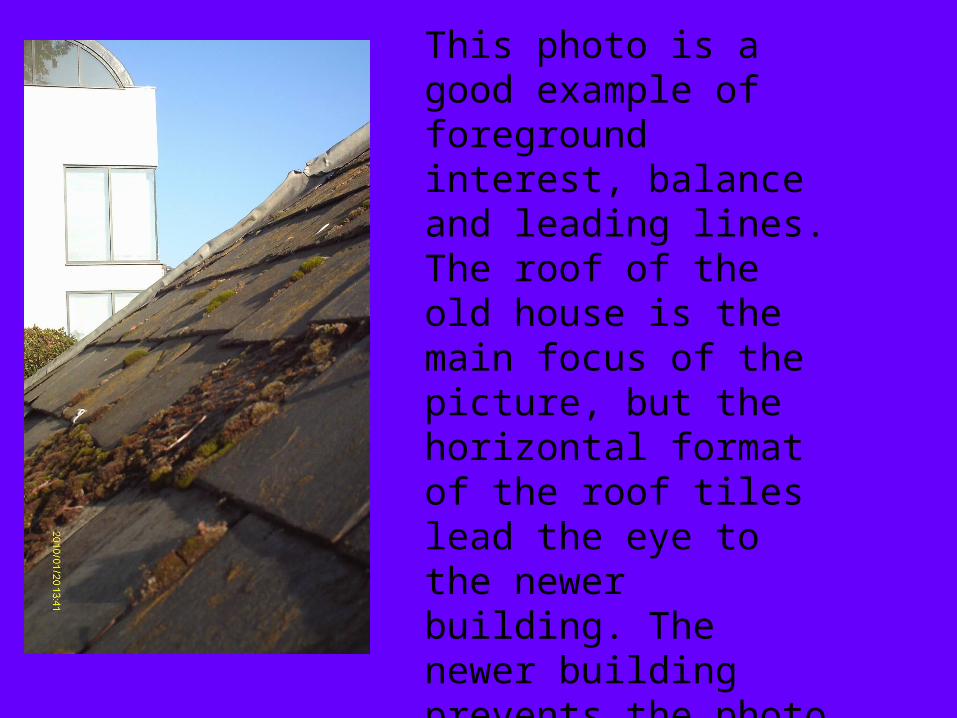
This photo is a good example of foreground interest, balance and leading lines. The roof of the old house is the main focus of the picture, but the horizontal format of the roof tiles lead the eye to the newer building. The newer building prevents the photo from being lopsided as well as creating a contrast between new and old.
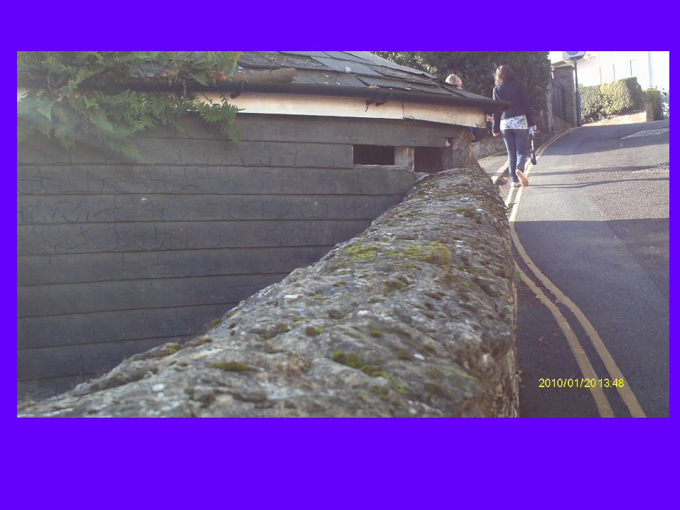
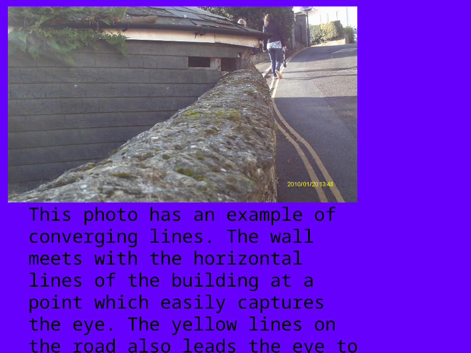
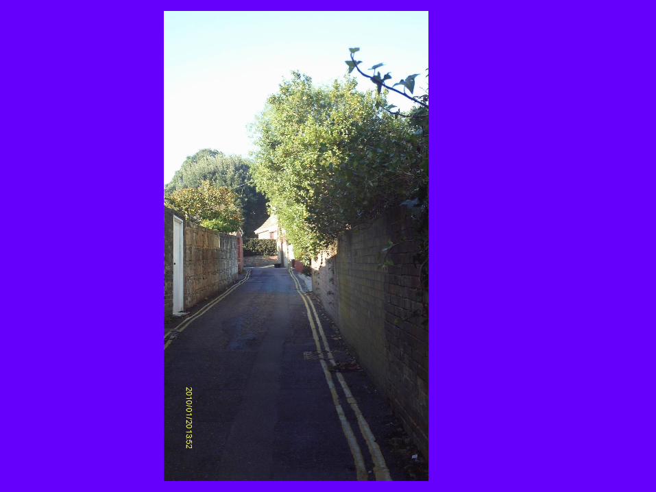
This photo has an example of converging lines. The wall meets with the horizontal lines of the building at a point which easily captures the eye. The yellow lines on the road also leads the eye to the figures on the road.
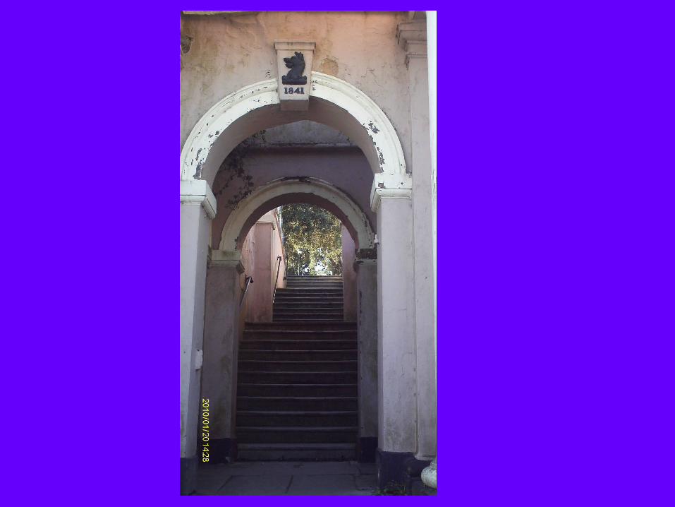

I thought this photo was good because I like how the archway frames the stairs. The old, crumbling wall also adds to the theme of oldness in the town. I also like how the light filtering through the trees in the background manages to capture the eyes even though it’s in the far distance.

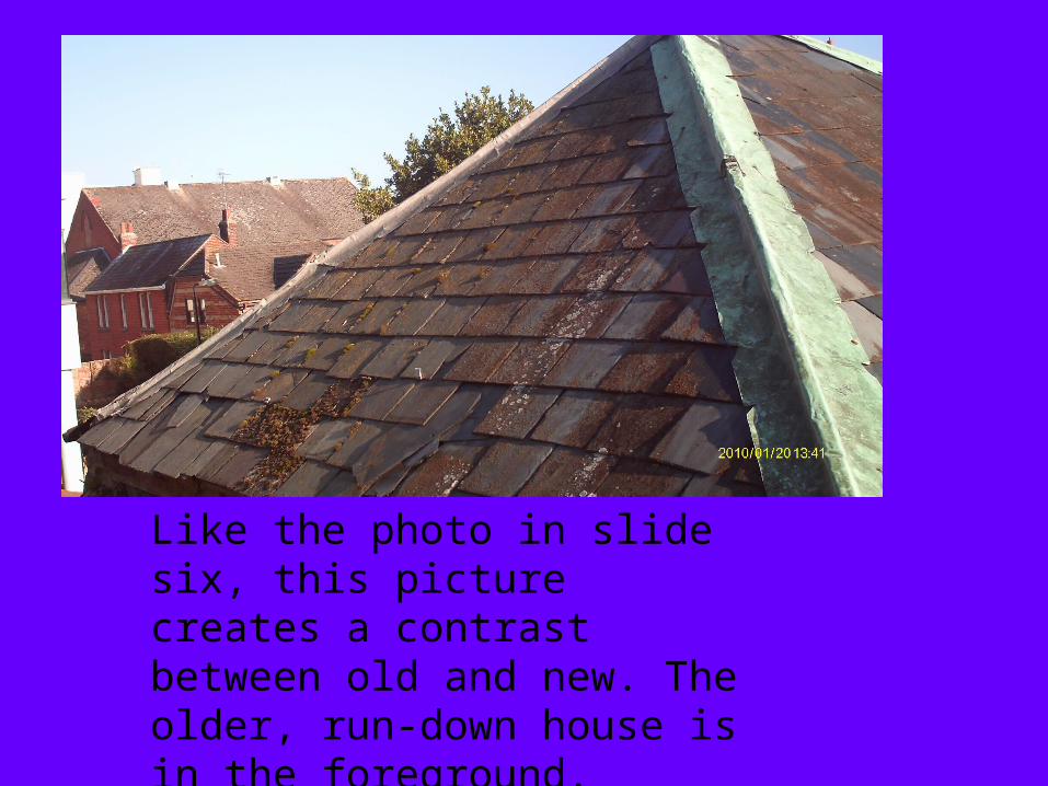
Like the photo in slide six, this picture creates a contrast between old and new. The older, run-down house is in the foreground.
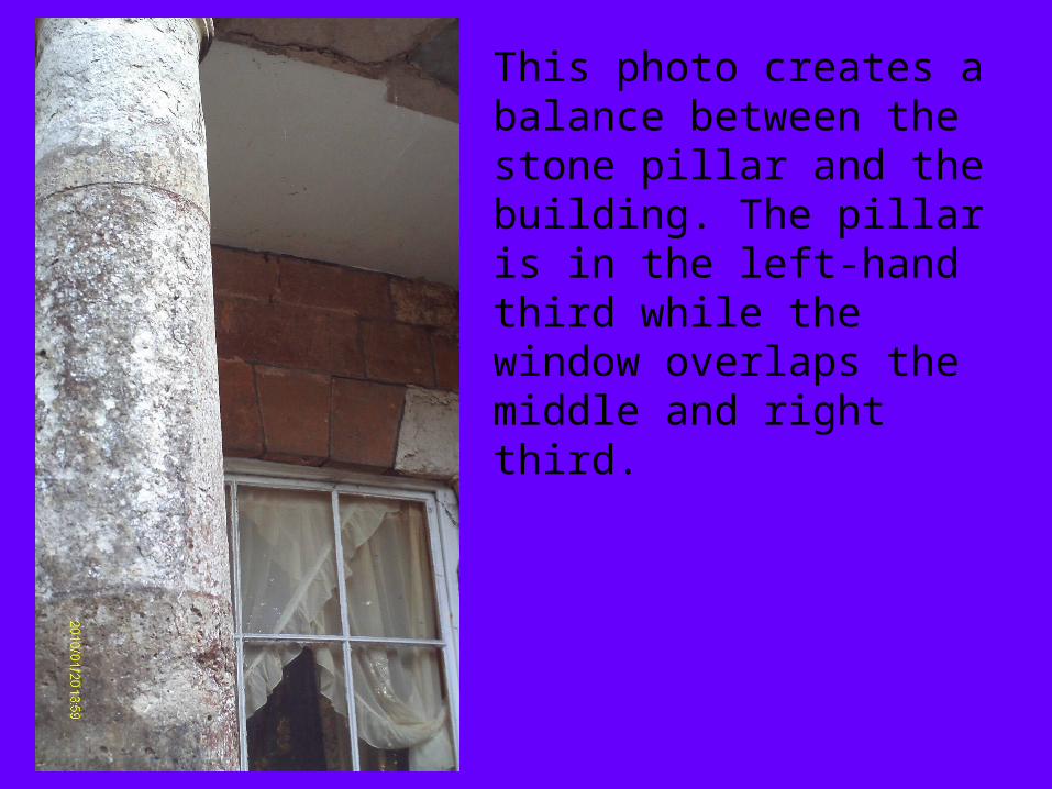
This photo creates a balance between the stone pillar and the building. The pillar is in the left-hand third while the window overlaps the middle and right third.