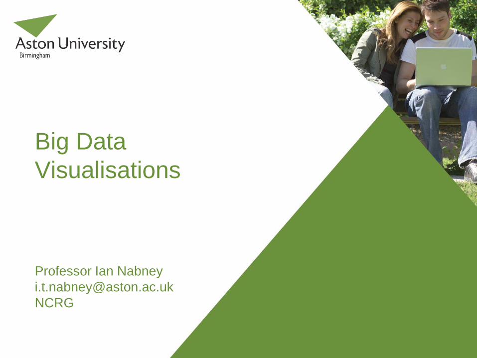
big data visualisations - science capital
TRANSCRIPT
Overview
Why visualise data?
How we can visualise data
Big Data Institute
What is Visualisation?
Goal of visualisation is to present data in a human-readable
way.
Visualisation is an important tool for developing a better
understanding of large complex datasets. It is particularly helpful
for users who are not specialists in data modelling.
Detection of outliers.
Clustering and segmentation.
Aid to feature selection.
Feedback on results of analysis: seeing what you are doing.
Two aspects: data projection and information visualisation.
Data projection
The goal is to project data to a lower-dimensional space
(usually 2d or 3d) while preserving as much information or
structure as possible.
Once the projection is done standard information visualisation
methods can be used to support user interaction. These may
need to be modified for Big Data.
The quantity and complexity of many datasets means that
simple visualisation methods, such as Principal Component
Analysis, are not very effective.
Information Visualisation
Shneiderman’s mantra: Overview first; zoom and filter; details
on demand.
Overview provided by projection.
Zooming on plots.
Filtering by user interaction; e.g. specify pattern of values
that is of interest.
Details by providing local information.
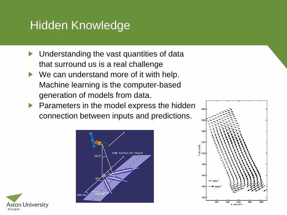
Hidden Knowledge
Understanding the vast quantities of data
that surround us is a real challenge
We can understand more of it with help.
Machine learning is the computer-based
generation of models from data.
Parameters in the model express the hidden
connection between inputs and predictions.
Uncertainty
Real data is noisy.
We are forced to deal with uncertainty, yet we need to be
quantitative.
The optimal formalism for inference in the presence of
uncertainty is probability theory.
We assume the presence of an underlying regularity to make
predictions.
Bayesian inference allows us to reason probabilistically about
the model as well as the data.
Doubt is not a pleasant condition, but certainty is absurd.
Voltaire
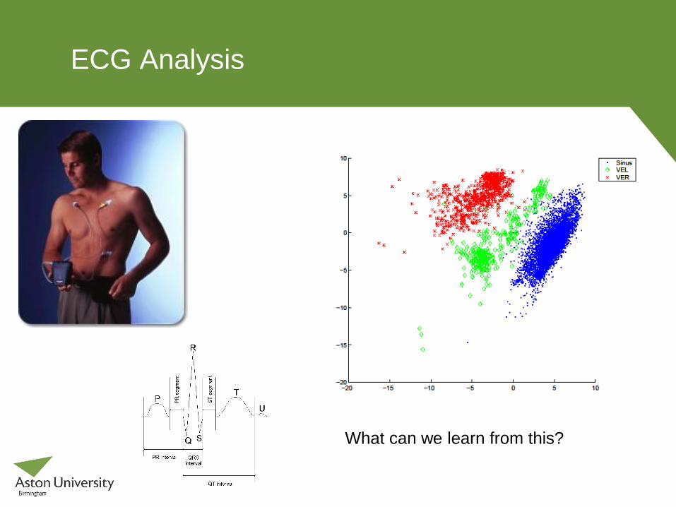
ECG Analysis
What can we learn from this?
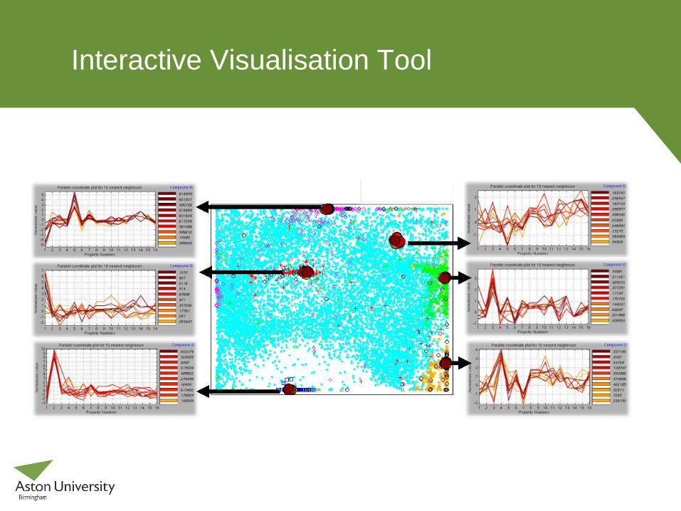
Interactive Visualisation Tool
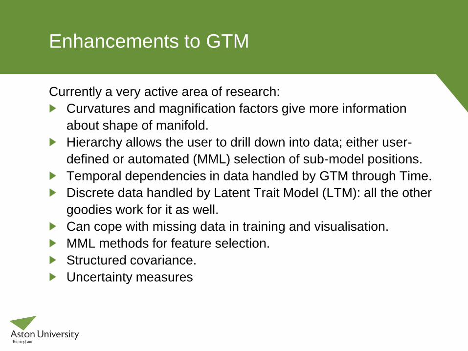
Enhancements to GTM
Currently a very active area of research:
Curvatures and magnification factors give more information
about shape of manifold.
Hierarchy allows the user to drill down into data; either user-
defined or automated (MML) selection of sub-model positions.
Temporal dependencies in data handled by GTM through Time.
Discrete data handled by Latent Trait Model (LTM): all the other
goodies work for it as well.
Can cope with missing data in training and visualisation.
MML methods for feature selection.
Structured covariance.
Uncertainty measures
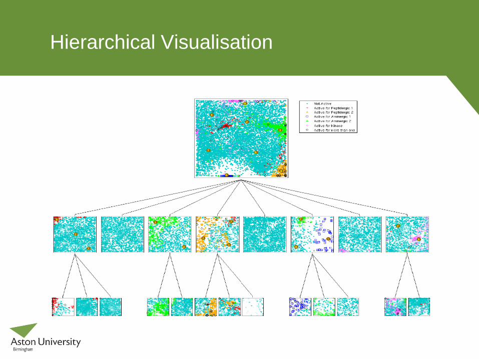
Hierarchical Visualisation
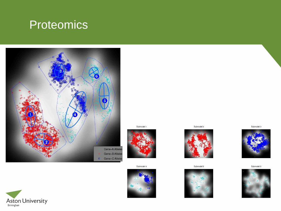
Proteomics
Agusta Westland
AW has pioneered CVM, the continuous recording of airframe
vibration (0-200Hz), to improve the investigation of unusual
occurrences and monitor airframe integrity.
Develop a probabilistic framework for inferring flight mode and
key parameters from multiple streams of vibration data.
Improve indicators of airframe condition: the wavelet transform
and kernel entropy to assess the dynamics (i.e. non-stationary
characteristics) of the vibration signal.
Integrated diagnosis based on probabilistic models of normality
and using a belief network to model prior knowledge about the
domain and interactions between key variables.
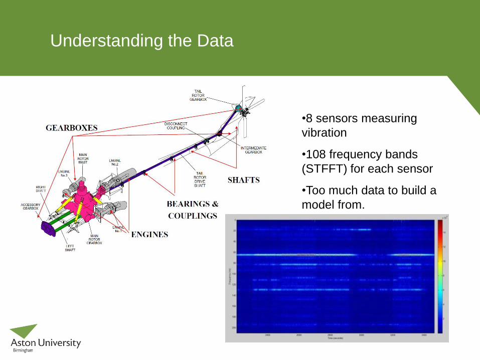
Understanding the Data
•8 sensors measuring
vibration
•108 frequency bands
(STFFT) for each sensor
•Too much data to build a
model from.
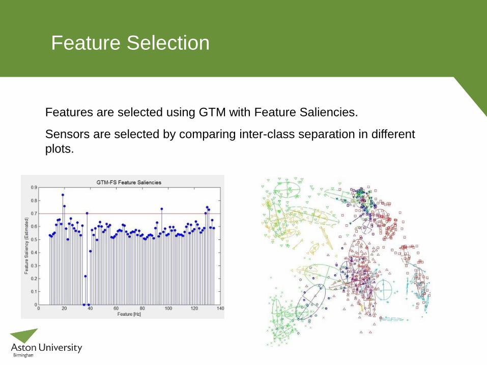
Feature Selection
Features are selected using GTM with Feature Saliencies.
Sensors are selected by comparing inter-class separation in different
plots.
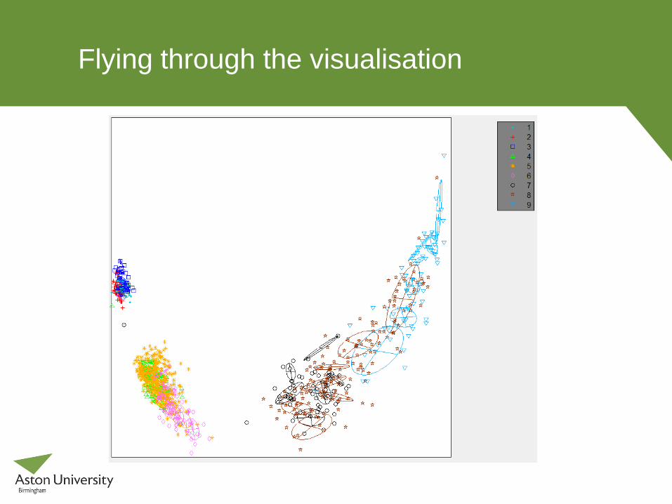
Flying through the visualisation
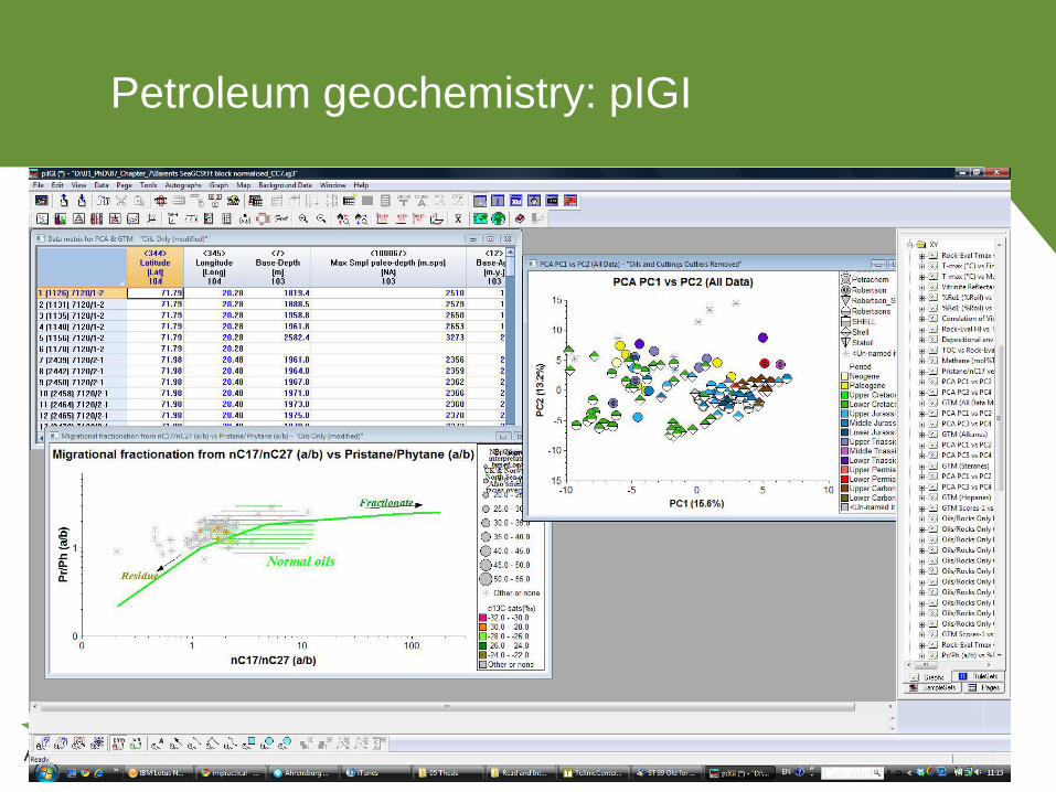
Petroleum geochemistry: pIGI
Big Data Issues
Almost all interesting questions involve multivariate answers.
Don’t forget the lessons of Medium Data:
data integrity;
non-linearity;
generalisation (training vs test: speed, reliability);
feature selection;
diagnostics.
Scaling in number of variables and number of examples
Hierarchies: divide and conquer
Move as little information as possible
Models as ‘data summarisers’
Bayes (again!) to combine data, information, models, …
Institute of Omnivariate Data Analytics
Full ‘data to decision’ process: high-dimensional visualisation,
information extraction, uncertainty modelling, inference
techniques, data fusion, knowledge management, data curation,
and web technologies
19 UK partners (mainly companies) and 4 international partners
Bidding for a Centre for Doctoral Training
Research training
Partnerships: pilot projects; short courses and workshops;
international exchanges; entrepreneurship
Open-source software
Conclusions
We need to understand the vast quantities of data that surround
us; visualisation and machine learning can help us in that task.
Models can be used to uncover the hidden meanings of data.
Visual analytics is a powerful tool that provides insight to non-
specialists.
A probabilistic approach provides many benefits.
It is a multivariate, multi-skilled, collaborative effort.
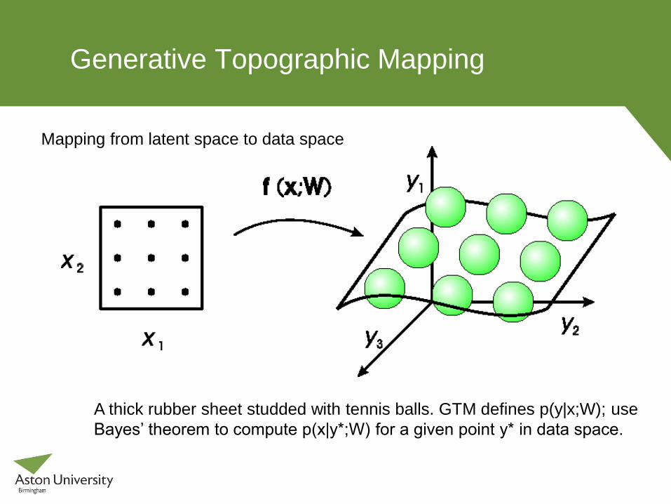
Generative Topographic Mapping
A thick rubber sheet studded with tennis balls. GTM defines p(y|x;W); use
Bayes’ theorem to compute p(x|y*;W) for a given point y* in data space.
Mapping from latent space to data space