bookarts canada - cbbag.ca · traryana b started making books while working on an mfa at university...
TRANSCRIPT

arts arts du livrecanada
2010
VOlu
me
1 num
ber
1
BOOK
CBBAG_mag_4.indd 1 08/04/10 7:58 AM

JOCELYNE AIRD-BéLANGER began working in printmaking in 1975 at the Atelier de l’Ile, Val-David, Quebec where she was director and coordin-ator for more than 20 years. She has had 16 solo exhibitions in Quebec and France and exhibited extensively at the national and international level (US, Mexico, Portugal and Japan).
pAm BELshAw was first taught marbling by Shelagh Smith in a CBBAG workshop. She became part of a small community of marblers that gathered regularly at the CBBAG bindery to marble and share experi-ences. She has studied marbling with Iris Nevins, Lucie Lapierre, Galen Berry, and Salim Sahin and has taught marbling workshops for CBBAG for the past three years.
tARA BRYAN started making books while working on an MFA at University of Wisconsin-Madison in the mid-1980’s. She took many workshops at the Center for Book Arts in New York through their work-study program, and continues to experiment with printing and binding in her studio in St. John’s, Newfoundland.
JOAN BYERs works at Beacon Books, the largest second hand bookstore in Canada’s only Booktown, Sidney, British Columbia. An amateur bookbinder, whose introduction to bookbinding was a course taught by Jill Wilmott, she has since completed Bookbinding I, II, III through the CBBAG monitored Home Study program.
ChAYLE COOk is an artist from Ottawa, Ontario who is completing her BFA at NSCAD University in the areas of jewellery, printmaking, and book arts. She has pursued an interdisciplinary approach to her art practice, balancing her love of printmaking and drawing with her love of the crafts of metalwork and bookbinding.
Book Arts
arts du livre Canada
is published semi-annually
by the Canadian Bookbinders
and Book Artists Guild and
is included in CBBAG
membership.
ContriButors
ON THE COVERMarbled paper by Shelagh Smith(Bouquet pattern).Background: Yamaguchi chiri, handmade kozo paper from the Japanese Paper Place. “Chiri” means “leftover” and refers to the pieces of dark outer bark which give the paper its distinctive flecks.
JAsON DEwINEtZ is a writer, typographer, printer and the publisher of Greenboathouse Press. His work has received multiple Alcuin awards for excellence in book design. In 2008 he served as a judge for this national competition. A freelance designer for Canadian publishers, Jason is also an instructor of publication design at Okanagan College in Vernon, British Columbia.
DOROthY fIELD is a British Columbia visual artist and writer. She made Asian-style paper for more than 25 years. Now she uses her own paper and paper made by others in prints, artist’s books, and collage. Her book Paper and Threshold, published by Legacy Press, documents paper’s spiritual place in Asian culture.
NAtAshA hERmAN learned her craft as apprentice to English-trained trade book restorers in Canada and the UK. In 2002, she opened Redbone Binderij in Amsterdam, The Netherlands while continuing workshop and apprentice-based training in Europe. In 2002, she relocated her studio, Redbone Bindery, to Ottawa.
JOE LANDRYstudied book binding and conservation at the London College of Printing and West Dean College. His time at West Dean was spent indulging his interest in historic binding structures. He has worked and taught at the Seminario Montefiascone in Italy and is currently teaching at NSCAD University and operating a book and paper conservation business.
BRIAN quEEN lives in Calgary and has been making paper for 20 years, specializing in light and shade watermarks, and building papermaking equipment. His interests include letterpress printing and new technologies which impact the book arts.
CBBAG_mag_4.indd 2 08/04/10 7:58 AM

smALL pREss & pRINtA Tribute to Jim Rimmerby Jason Dewinetz
REVIEwsMarbling Home Study Programby Pam Belshaw
Two New Booksby Joan Byers
BOOk ARts wORLDTreasures in the Czech Republic
mAtERIALs, tOOLs & tYpEReg Lissel, Papermakerby Dorothy Field
EDuCAtIONBook Arts Education in Canada
CBBAG news 28
features departments2
pROfILESimone Benoît Roy: Pionnière de la reliure au Québecby Jocelyne Aird-Bélanger
hIstORY Of thE BOOkA Byzantine Bindingby Joe Landry and Chayle Cook
thE CREAtIVE pROCEssExploring New Technologies: Artistamps, Lasers and the Book Artsby Brian Queen
GALLERYA Book and Board Gameby Tara Bryan
713
17
182223
25
26
2010 VOluME 1 NuMBER 1
24
CBBAG_mag_4.indd 1 08/04/10 7:58 AM

2 Book Arts arts du livre CAnAdA 2010 vol.1 no.1
par Jocelyne Aird-Bélanger
pROF IlE
Simone Benoît Roy
Rencontrer Simone Benoît Roy, c’est vivre à fond l’histoire de la reliure au Québec depuis plus de 40 ans! Lorsqu’elle instal-la son atelier dans le Vieux Montréal à son retour de Paris en 1968, la reliure était pratiquement inexistante dans la province
à l’époque. En compagnie de son premier groupe d’élèves et tous ceux qui ont suivi, grâce à son souci constant d’apprendre et de se perfectionner, Simone Benoît Roy a réussi à implanter durablement ici cette forme raf-finée d’art et de métier d’art. La première génération de relieurs impor-tants tels Nicole Billard, Monique Lallier, Lise Dubois, ou Odette Drapeau, s’est formée auprès d’elle au cours des 25 années que dura la belle aven-ture de son atelier L’Art de la Reliure.
Après avoir fermé son atelier et suivi des cours de restauration à Archives nationales du Québec et à la Biblio thèque nationale de France à Paris, elle réorienta sa pratique et travailla jusqu’à tout récemment dans
ce domaine. On parle donc ici de plus de la moitié d’une vie axée sur les livres, leurs reliures, les décors, les papiers fins, les dorures et les restaurations. On parle aussi d’une connaissance profonde et respectueuse des matériaux et de la nécessaire co-hérence entre l’habillage d’un livre et son contenu.
C’est d’ailleurs pour cette raison qu’elle a reçu en 1988 l’Ordre du Canada pour son apport significatif dans la sauvegarde de notre patrimoine écrit.
Simone a une formation européenne, classique, au service de l’œuvre tel qu’on le conçoit en musique ou au théâtre par exemple. Elle insiste longuement sur la lecture du texte à relier, sur la recherche nécessaire pour bien en saisir la valeur profonde avant de se mettre à l’envelopper d’une reliure appelée à une très longue vie. Elle vise le durable, le solide, le permanent, l’élégant.
Elle a mis sept ans à acquérir sa formation en France. Il n’était pas question alors de réaliser une reliure qui peut prendre au moins quarante heures de travail, avant une année complète d’étude. La seconde année, on s’initiait au montage, à toutes les formes de collages destinés aux feuilles de musique, à la restauration, aux livres d’art puis aux différents onglets et ainsi de suite. L’enseignement était méthodique et extrêmement détaillé. En fondant sa propre école, elle a d’abord voulu appliquer cette
Pionnière de la reliure au Québec
CBBAG_mag_4.indd 2 08/04/10 7:58 AM

Book Arts arts du livre CAnAdA 2010 vol.1 no.1 3
par Jocelyne Aird-Bélanger
méthodologie ici. Mais il lui a bien fallu un jour modifier ses cours pour les adapter à une vision plus nord-américaine de la transmission du savoir. Le concept du temps d’apprentissage et celui de la réalisation des projets ne sont pas les mêmes de ce côté-ci de l’Atlantique. Elle affirme aujourd’hui qu’elle a réussi à passer tout ce qu’elle avait reçu et que ce bagage lui a servi dans tout ce qui a suivi.
Son principe de base en restauration, est qu’on ne peut absolument pas couper le dos d’un livre à restaurer pour ensuite y coller un nouveau dos, finir la reliure et le remettre ainsi sur l’étagère en croyant que cela va durer. La reliure cousue est la seule vraie reliure permanente et la seule apte à assurer la longévité. Rigueur et respect du travail bien fait constituent la base de son enseignement et de sa pratique aujourd’hui comme hier.
L’enseignement de la reliure se fait maintenant au Québec dans des ateliers privés bien souvent dirigés par ses anciennes étudiantes. Cet enseignement doit avoir une suite, être cohérent et organisé. Elle regrette que les professeurs débutent souvent leurs cours en prévenant leurs élèves qu’il leur sera impossible de gagner leur vie avec ce métier. Tout dépend en fait du talent, de la volonté et des aptitudes d’une personne. Elle admet cependant que le plus gros problème demeure l’accès aux fournitures de bases et à leur coût relativement élevé. Pourtant le travail très spécialisé du relieur est encore en demande. Les institutions, les artistes ou les collectionneurs ont régulière-ment recours à leurs services. En Europe, certains grands collectionneurs sont même prêts à débourser jusqu’à 20,000$ dépendant des œuvres à relier, pour s’assurer le travail de quatre ou cinq relieurs reconnus pour leur excellence.
Simone Benoît Roy connaît très bien tous les matériaux qu’elle manipule depuis des décennies. Les peaux proposées aux relieurs au Canada et aux États-Unis sont des peaux de vache utilisées en maroquinerie. Ses principaux matériaux lui viennent de la France, soit qu’elle les fasse venir soit qu’elle aille elle-même les chercher. Elle utilise surtout des peaux de chèvre à teintures végétales qu’elle trouve en Belgique. Chez Relma, une société presque centenaire, rue Poitevin près de la Place St-Michel à
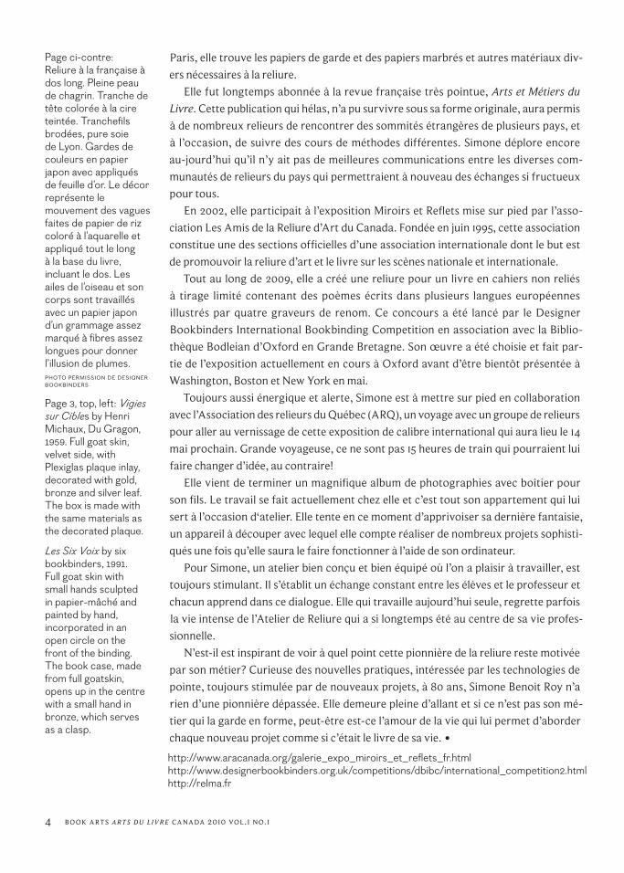
En haut, à gauche: Vigies sur Cibles par Henri Michaux, Du Gragon, 1959. Pleine peau de chèvre, façon velours. Plaque de plexiglas incrustée dans le plat avant et se trouvant en translucidité sur le con-tre plat. Cette plaque est décoré aux feuilles d’or, de bronze et d’argent. Boitier fait des mêmes matériaux que la plaque.
En haut: Les Six Voies par six relieures: Genest-Côte, Benoît-Roy, Dubois, Bellemare-Delorme, Chartrand, Billard, et Normand, 1991. Pleine peau de chagrin. Petites mains sculptées en papier mâché et peintes à la main, incorporées dans un cercle ouvert sur le plat avant. Boitier fait de pleine peau de chagrin, la même que le livre. Le boitier s’ouvre au milieu, avec une petite main en métal de bronze qui sert de fermoir.
pHO
TOS
| RO
lAND
WEB
ER
CBBAG_mag_4.indd 3 08/04/10 7:58 AM
4 Book Arts arts du livre CAnAdA 2010 vol.1 no.1
Paris, elle trouve les papiers de garde et des papiers marbrés et autres matériaux div-ers nécessaires à la reliure.
Elle fut longtemps abonnée à la revue française très pointue, Arts et Métiers du Livre. Cette publication qui hélas, n’a pu survivre sous sa forme originale, aura permis à de nombreux relieurs de rencontrer des sommités étrangères de plusieurs pays, et à l’occasion, de suivre des cours de méthodes différentes. Simone déplore encore au-jourd’hui qu’il n’y ait pas de meilleures communications entre les diverses com-munautés de relieurs du pays qui permettraient à nouveau des échanges si fructueux pour tous.
En 2002, elle participait à l’exposition Miroirs et Reflets mise sur pied par l’asso-ciation Les Amis de la Reliure d’Art du Canada. Fondée en juin 1995, cette association constitue une des sections officielles d’une association internationale dont le but est de promouvoir la reliure d’art et le livre sur les scènes nationale et internationale.
Tout au long de 2009, elle a créé une reliure pour un livre en cahiers non reliés à tirage limité contenant des poèmes écrits dans plusieurs langues européennes illustrés par quatre graveurs de renom. Ce concours a été lancé par le Designer Bookbinders International Bookbinding Competition en association avec la Biblio-thèque Bodleian d’Oxford en Grande Bretagne. Son œuvre a été choisie et fait par-tie de l’exposition actuellement en cours à Oxford avant d’être bientôt présentée à Washington, Boston et New York en mai.
Toujours aussi énergique et alerte, Simone est à mettre sur pied en collaboration avec l’Association des relieurs du Québec (ARQ), un voyage avec un groupe de relieurs pour aller au vernissage de cette exposition de calibre international qui aura lieu le 14 mai prochain. Grande voyageuse, ce ne sont pas 15 heures de train qui pourraient lui faire changer d’idée, au contraire!
Elle vient de terminer un magnifique album de photographies avec boîtier pour son fils. Le travail se fait actuellement chez elle et c’est tout son appartement qui lui sert à l’occasion d‘atelier. Elle tente en ce moment d’apprivoiser sa dernière fantaisie, un appareil à découper avec lequel elle compte réaliser de nombreux projets sophisti-qués une fois qu’elle saura le faire fonctionner à l’aide de son ordinateur.
Pour Simone, un atelier bien conçu et bien équipé où l’on a plaisir à travailler, est toujours stimulant. Il s’établit un échange constant entre les élèves et le professeur et chacun apprend dans ce dialogue. Elle qui travaille aujourd’hui seule, regrette parfois la vie intense de l’Atelier de Reliure qui a si longtemps été au centre de sa vie profes-sionnelle.
N’est-il est inspirant de voir à quel point cette pionnière de la reliure reste motivée par son métier? Curieuse des nouvelles pratiques, intéressée par les technologies de pointe, toujours stimulée par de nouveaux projets, à 80 ans, Simone Benoit Roy n’a rien d’une pionnière dépassée. Elle demeure pleine d’allant et si ce n’est pas son mé-tier qui la garde en forme, peut-être est-ce l’amour de la vie qui lui permet d’aborder chaque nouveau projet comme si c’était le livre de sa vie. •http://www.aracanada.org/galerie_expo_miroirs_et_reflets_fr.htmlhttp://www.designerbookbinders.org.uk/competitions/dbibc/international_competition2.htmlhttp://relma.fr
Page ci-contre:Reliure à la française à dos long. Pleine peau de chagrin. Tranche de tête colorée à la cire teintée. Tranchefils brodées, pure soie de Lyon. Gardes de couleurs en papier japon avec appliqués de feuille d’or. Le décor représente le mouve ment des vagues faites de papier de riz coloré à l’aquarelle et appliqué tout le long à la base du livre, incluant le dos. Les ailes de l’oiseau et son corps sont travaillés avec un papier japon d’un grammage assez marqué à fibres assez longues pour donner l’illusion de plumes.pHOTO pERMISSION DE DESIGNER BOOkBINDERS
Page 3, top, left: Vigies sur Cibles by Henri Michaux, Du Gragon, 1959. Full goat skin, velvet side, with Plexiglas plaque inlay, decorated with gold, bronze and silver leaf. The box is made with the same materials as the decorated plaque.
Les Six Voix by six bookbinders, 1991.Full goat skin with small hands sculpted in papier-mâché and painted by hand, incorporated in an open circle on the front of the binding. The book case, made from full goatskin, opens up in the centre with a small hand in bronze, which serves as a clasp.
CBBAG_mag_4.indd 4 08/04/10 7:58 AM

Book Arts arts du livre CAnAdA 2010 vol.1 no.1 5
SIMONE BENOIT ROY: A QUEBEC BOOKBINDING PIONEER (Translated by Jocelyne Aird-Bélanger with the assistance of Lynn Gauthier)
Simone Benoît Roy’s binding for Water, the set book for the Designer Bookbinders International competition, 2009. Full pale green goatskin with textured and gold onlays. Sewn end-bands and coloured top edge. Decorated endpapers with gold onlays. The waves are created with Japanese paper, painted with water colours and applied to the skin. The bird’s wings and body are made of torn Japanese paper to give the appearance of feathers. pHOTO COuRTESy OF DESIGNER BOOkBINDERS
Meeting Simone Benoît Roy is like reviewing a 40-year history of the foundations of bookbinding in Quebec! When she returned from Paris in 1968 and set up her studio in Old Montreal, book binding was virtually non-existent in the province. Together with her first students and all those who followed, and with her constant desire to learn and improve, Simone Benoît Roy succeeded in permanently es-tablishing this refined art form in Quebec. The first generation of important book binders such as Nicole Billard, Monique Lallier, Lise Dubois, or Odette Drapeau all received their training from her during the twenty five years of exciting adventure at her studio L’Art de la Reliure.
After closing her studio and taking courses at the Quebec National Archives and the National Library of France in Paris, she changed her focus and worked until recently in restoration. We can talk of more than half a lifetime devoted to books, bindings, fine papers, gilding, and restoration. We can also speak of a thorough knowledge of and respect for materials, and the necessary coherence between the binding of a book and its contents. In 1988, in recognition of
this, she received the Order of Canada for her signifi-cant contribution to preserving our written heritage.
Simone received a classic European training, re-quiring the same dedication to the work as training in music or theatre. She has always insisted on reading the entire text of the book to be bound, and stress-es the need to do research to fully understand its meaning before creating a suitable and long-lasting binding.
She spent seven years acquiring her training in France. There was no possibility of creating a bind-ing, something that could take at least 40 hours of work, before completing a full year of study. In the second year, one learned how to bind books, art books, and sheet music. One also learned the basics of restoration, trimming, and so on. The instruc-tion was methodical and highly detailed. In founding her own school, she initially wanted to use the same methods, but she eventually had to modify her cours-es to suit a North American concept of instruction. The idea of apprenticeship and long term projects are not the same on this side of the Atlantic. She says today that she has managed to pass on everything
CBBAG_mag_4.indd 5 08/04/10 7:59 AM

6 Book Arts arts du livre CAnAdA 2010 vol.1 no.1
that she learned, and that her training has served her well throughout her career.
Her basic principle in restoration is that one ab-solutely cannot cut the back off a book, paste in a new spine, put the book back on the shelf and think that it will last. A proper sewn structure is the only truly permanent binding method to ensure longevity. Rigour and respect for work well done are the basis of her teaching and her work now, just as when she started.
Bookbinding in Quebec is now taught in private workshops, often led by her former students. This teaching must have continuity, and be consistent and organised. She regrets that teachers often begin their classes by telling the students that they will not likely be able to earn a living at this trade. This depends on the talent, commitment, and abilities of the individ-ual. She admits that the biggest problem is access to basic supplies and their relatively high cost. Yet the binder’s highly specialised work is still in demand. Insti tutions, artists, or collectors routinely use their ser vices. In Europe, some major collectors are will-ing to pay up to $20,000 depending on the work to be bound, ensuring work for four or five binders who are renowned for their excellence.
Simone Benoît Roy is very familiar with the par-ticular characteristics of the materials she has been handling for decades. The skins offered to bookbind-ers in Canada and the United States are cowhides used in fancy leather goods. Her main materials come from France. She either goes to get them herself or has them sent to her. She primarily uses vegetable dyed goatskin from Belgium. At Relma’s, a nearly century old company on Poitevin Street near Place St-Michel in Paris, she finds endpapers, marbled pa-pers, and the other miscellaneous materials needed for binding.
She was a long time subscriber to the specialist French magazine, Arts et Métier du Livre. This pub-lication, which unfortunately could not survive in its original form, enabled many binders to read about masters from foreign countries, and to learn differ-ent methods. Simone still regrets that better com-munication doesn’t exist between the various book-
binding communities in the country that would allow exchanges from coast to coast for the benefit of all.
In 2002 she participated in Mirrors and Reflections, an exhibition presented by the Friends of Art Binding in Canada. Founded in June 1995, this is an official branch of an international association with the goal of promoting the art of bookbinding and the book both nationally and internationally.
During 2009, she created a binding for a limited edition book in unbound signatures containing po-ems in several European languages, and illustrated by four renowned engravers. The book was made for the Designer Bookbinders International Bookbinding Competition in association with the Bodleian Library, Oxford, England. Her work was chosen and has been exhibited in Oxford before travelling to Washington, Boston, and eventually New York.
Always energetic and alert, Simone is collaborat-ing with l’Association des relieurs du Québec (ARQ), preparing a trip for a group of binders to attend the New York opening on May 14. A great traveller, not even a 15 hour train trip will stop her!
She recently completed a magnificent album of photographs with a case for her son. The work was done at home, with her whole apartment as the work shop. At the moment she is learning to use her latest dream, a cutter-plotter with which she plans to make many complicated projects, once she can run it from her computer.
A well-designed and well equipped studio where it is a pleasure to work is always stimulating for Simone. A continuous exchange between teacher and students is established, and both benefit from the dialogue. She now works alone and sometimes misses the in-tense life of l’Atelier de Reliure which was the focus of her professional life for so long.
The continued motivation of this bookbinding pioneer is an inspiration. Curious about new meth-ods, interested in technology, and always stimulated by new projects, at 80 Simone Benoit Roy is not an outmoded pioneer. She remains full of drive and, if it is not her profession that keeps her fit, perhaps it is her love of life that allows her to approach each new project as if that book is the book of her life. •
CBBAG_mag_4.indd 6 08/04/10 7:59 AM

H ISTORy OF THE BOOk
by Joe Landry and Chayle Cook
A Byzantine Binding PArt one
BOOk ARTS arts du livre CANADA 2010 VOl.1 NO.1 7
The Byzantine book structure was an historic evolution from the earlier
Christian codex form; the Coptic codices bound with an unsupported sewing
or chain stitch. The Byzantine, Armenian, Cyrillic, Syrian and Islamic bind-
ings are each distinct but have much in common. While maintaining the unsupported
sewing structure of the Coptic bindings the simpler chainstitch of the Coptic bind-
ings evolved into an extended linkstitch in the later binding styles. With the excep-
tion of the Islamic bindings the later styles also contined to use
wood board although the species varied in time and place. The
textblocks of the Islamic bindings were attached to the cover pri-
marily by the leather joints of the endpaper structure instead of
the sewing used in the other styles of binding. After the fall of
Constantinople in 1453, many scholars, scribes and artisans set-
tled in Venice, where the Greco-Roman form of Byzantine bind-
ings reached a high level of sophistication. Federici and Houlis’
book, Legature Bizantine Vaticane help us understand jhow many
variations there are to this binding style. A myriad of sewing
variations, board shapes, headbands and cover dec oration were
influenced not only by period, but also geography.
The upper board from an Armenian binding (collection of J. Landry).
CBBAG_mag_4.indd 7 08/04/10 7:59 AM

8 Book Arts arts du livre CAnAdA 2010 vol.1 no.1
I was fortunate enough to study this binding style while in Italy (there are several examples in the Seminary Library at Montefiascone and a large collection studied by Federici and Houlis in the Vatican Library.) I also worked on an eleventh century Byzantine manuscript while studying at West Dean College in West Sussex, UK. This volume’s binding was lost in the Great Fire of London in 1666, so it was necessary to study the Byzantine style thoroughly before undertaking the book’s conservation and binding.
In order to document the process of binding and to illustrate the salient character-istics of this style of binding Chayle Cook and I constructed models. Chayle photo-graphed the process and illustrated the steps, in particular the sewing, board attach-ment and endband structure which were so difficult to describe in words.
These bindings varied considerably in size. If we look at the volumes studied in the Vatican’s collection by Federici and Houlis, they range from 107 mm high x 66 mm wide to 420 mm high x 262 mm wide. I chose to recreate a binding in the more com-mon mid-range of 273 mm x 187 mm. I also used the statistics compiled by Federici and Houlis to establish the number and positions of the sewing stations. There are most commonly four sewing stations and the distance between the stations averages about twice the distance from the end stations and the head and tail of the book. For instance on a book whose text block height was 180 mm the sewing stations would be located at 40 mm, 120 mm, 200 mm, 280 mm, the end stations being 40 mm in from the ends and each station being 80 mm apart. The positions of the sewing stations were marked on the spine folds and then cut with a V-shaped incision (grecquage) of 30 to 45 degrees. The depth of this incision is determined by the type of chain stitch used and the weight of the thread. The sewing was a form of link stitch and a varia-tion of the common chain stitch of Coptic bindings where the sewing dropped down only one section to catch the thread before returning to the section being sewn giv-ing a bulkier stitch. With Byzantine bindings, an extended form of this link stitch was used, where the sewing drops two or more sections.
In another sewing variant, the book was sometimes sewn in two sections and then joined together. I first saw this style in the Semenario Barbarigo in Montefiascine, Italy and I initially assumed that the sewing had been repaired but closer examination indicated this was an intentional method. This likely originated in the practice of sew-ing the boards and textblock at the same time. For my reproduction, I used an extend-ed link stitch which dropped two sections. This was sewn using 12/3 linen thread and a curved needle. To curve an existing straight needle, I snipped off the sharp end of the needle and polished the tip to a smooth dome shape with sharpening stones and wet-dry sandpaper. I then took the temper out of the steel needle by holding it over a candle until the heat made it possible to bend the needle without it breaking.
The sewing will be familiar to those of you who have made a Coptic style binding. I sewed a link or chain stitch but instead of dropping down one section to make the chain I dropped down two or three sections before re-entering the original section (Fig. 1). We call this an extended link stitch. This results in a bulkier sewing, necessitat-ing the shallow channel, known as grecquage, cut into the spine folds of the sections (Fig. 2).
Fig. 1. Extended link sewing.
Fig. 2. Grecquage.
pHOTOS & IlluSTRATIONS | CHAylE COOk
CBBAG_mag_4.indd 8 08/04/10 7:59 AM

Book Arts arts du livre CAnAdA 2010 vol.1 no.1 9
In other styles of medieval binding it was common practice for the scribes to leave the first and last few leaves blank to serve as endpapers. But in Western Europe, after the work of the scribes and bookbinders had left the monasteries for secular bind-eries, the practice became to add endpapers. This was also the case with Byzantine bindings. The most common form of endpaper seems to have been a simple hook endpaper, made either single or double, or a double sheet of paper or parchment simply sewn on.
A number of wood species were used for the boards on Byzantine bindings but the most common was poplar. North American poplar however, is quite different from European poplar or the poplar used in the east so I chose to use quarter-sawn oak which was also used.
The boards were trimmed to the same size as the textblock and then planed down to 11 mm or so (this varies depending on the size and thickness of your book). The spine side of the boards were shaped (Fig. 3). A series of holes were drilled in the boards to accommodate the clasps and the sewing attaching the boards to the text block (Figs. 4, 5, 6, 7). A series of holes were also drilled to attach the distinctive endbands to the boards (Figure 8). I could have drilled the holes straight through the
Fig. 3. The shaped spine edge of the board.
Fig. 4. Inside lower board. Fig. 5. Outside lower board.
Fig. 6. Inside upper board. Fig. 7. Outside upper board. The outside of the upper front board.
Fig. 8. Tunnels for endbands.
CBBAG_mag_4.indd 9 08/04/10 7:59 AM

10 Book Arts arts du livre CAnAdA 2010 vol.1 no.1
surface of the boards but I prefer drilling the holes at an angle from the top of the board through to the surface. The drilled hole can either exit on the inside or the out-side of the board, but I prefer the examples that exit on the outside and were thus hidden under the leather. I also cut a groove on the outer three edges of board as illus-trated; this was quite common in some areas and present on the examples I studied in Italy (Figs. 9, 10).
Like many Coptic bindings, the book and boards could be sewn at the same time, producing the pattern of holes and channels seen the illustrations. This pattern was often used even after the practice became to attach the boards after the sewing of the textblock. The thread was brought out from the last section (Fig. 11) and carried through the first hole on the board twice (Fig. 12) and then brought through the sec-ond hole and back to the first hole (Figs. 13 and 14) two or three times before following the channel to the next set of holes Figs. 15–20) and carrying on in a like manner until finishing (Fig. 21) at the inside of the back board at the last sewing station.
Fig. 9. Board fore-edge.
Fig. 10. Head and tail of boards.
Fig. 11. Fig. 12.
BOARD ATTACHMENT
Fig. 13. Fig. 14.
Fig. 15. Fig. 16. Fig. 17. Fig. 18.
Fig. 19. Fig. 20. Fig. 21.
CBBAG_mag_4.indd 10 08/04/10 7:59 AM

Book Arts arts du livre CAnAdA 2010 vol.1 no.1 11
The next stage was the primary covering. This was an extended lining covering the spine and could be adhered anywhere from a quarter of the boards to almost the whole surface of the boards. This covering is pasted down over the boards before the headbands are worked on the spine so that the sewing penetrates the primary cover-ing. I used unbleached linen for this lining.
This is the point where you can decorate your edges. Sometimes the edges were simply coloured (I used Armenian bole on my edges) but you could also have an elab-orative Byzantine design. These designs were normally of a geometrical character reminiscent of the stone work in the churches of Constantinople or in the jewelry of the period. Federici and Houlis illustrate a number of examples of the latter.
The headbands were then worked on the head and tail of the book. The endbands were attached to the upper part of the spine edge of the board giving the book its distinctive raised headcaps. Like many other aspects of Byzantine bookbinding, the endbands varied considerably with time and location. Many had a primary sewing followed by a more decorative secondary working.
First, let me deal with some terminology. I refer to this particular style of head-band as an endband because there is an attachment to the boards of the book, a carry-over from the bindings of the medieval period. If there were no structural at-tachment to the boards then I would refer to the structure as a headband. The term tailband is not a traditional appellation and I refer to the bands at either head or tail as endbands or headbands. The Italian examples I examined most commonly had a single core primary endband and a secondary working, usually in a light green and a golden yellow silk. The church used a great array of coloured silks in its liturgical wardrobe however; so many colours were both available and used. Another exam-ple of the Byzantine endband is described as a “greek headband” in Greenfield and Hille’s Headbands: How to Work Them. This headband is worked on a double core and worked with plain linen. Later bindings exhibited more complex multi-core end-bands with colourful workings in silk. The book Les Tranchfiles Brodées published by the Bibliothèque Nationale in Paris has many examples of Byzantine endbands and its cousins; the Armenian, Syrian and Islamic headbands.
In this model I used a decorative style of endband with a primary sewing on a dou-ble core and a secondary working in silk. I used a primary sewing worked on a double core, using the same thread used for the sewing of the book. Starting on the outside surface of one of the boards, the needle was brought through the tunnel in the board to the top of the board where I wrapped a figure eight pattern around the cores sev-eral times before bringing it back into the board. The thread formed a three pronged pattern at each hole before moving on to the next hole and then on to the book itself
BIBlIOGRApHy
Federici, Carlo and Kostantinos Houlis. Legature Bizantine Vaticane. Fratelli Palombi Editori. 1988.Berthe Van Regemorter. Binding Structures of the Middle Ages. Bibliotheca Wittochiana, 1992.Szirmai, J.A. The Archaeology of Medieval Bookbinding. Ashgate, 1999.Jane Greenfield and Jenny Hille. Headbands: How to Work Them. Oak Knoll Books. 1990.Les Tranchefiles Brodées: Etude his-torique et technique. Bibliothèque Nationale. 1989.
Below: The finished endband worked in silk.
The book with the primary covering in linen and the primary endband.
CBBAG_mag_4.indd 11 08/04/10 7:59 AM

12 Book Arts arts du livre CAnAdA 2010 vol.1 no.1
where the thread was anchored in each section and then on to the remaining board. The illustrations (Figs. 22–27) should demonstrate the endband’s construction better than my description.
The secondary sewing was worked in silk. I began on one of the boards and with this pattern I could have worked both cores at once or separately. I chose to work on them in two stages starting with the lower core Figs. 28–31). The distinguishing feature of this endband is the diagonal pattern across the lower core in contrast to the vertical pattern on the upper core (Figs. 32–34). Again the illustrations will help explain the pattern much better than words. •
Fig. 22.
ENDBAND pRIMARy SEWING
Fig. 23. Fig. 24.
Fig. 25. Fig. 26. Fig. 27.
Part 2 will be published in the Fall 2010 issue. It will describe covering the book in leather, making and attach-ing the clasps, and the decoration used on the binding.
ENDBAND SECONDARy SEWING
Fig. 28. Fig. 29. Fig. 30. Fig. 31.
Fig. 32. Fig. 33. Fig. 34.
CBBAG_mag_4.indd 12 08/04/10 8:00 AM

Book Arts arts du livre CAnAdA 2010 vol.1 no.1 13
early in 2008, the Calgary Cbbag members were asked to think about a project to celebrate the 25th anniversary of CBBAG, and I suggested we create commemorative postage stamps. Artistamps, as they are known, (cleverly combining artist and stamp) are miniature pieces of art that can be added to an envelope alongside genuine postage stamps. While the origin of the artis-tamp movement is arguable, in 1974, Vancouver multimedia artist Jas Felter curated the first major exhibition of artistamps at Simon Fraser University in Burnaby, B.C. which toured North America and Europe for ten years and undoubtably contributed to its development.
Today, most artistamps are created on a computer and I printed ours two-up on a standard, letter-sized sheet with a colour laser printer. The final step was to punch rows of tiny holes, for which I had originally intended to use my antique comb perforator, which immediately identifies them as stamps.
The comb perforator was a once-common piece of bindery equipment: depressing a foot pedal lowers the entire 20-inch long row of pins (some 300 of them) through the paper and into matching holes on a die plate. After many years of use, the holes in the die plate become enlarged, and as a result, the pin doesn’t cleanly punch the entire circumference of the hole. A tiny dot of paper, known as a hanging chad (a term voters in the United States became familiar with after the 2000 Presidential election) remains attached to the base sheet. The holes on my die plate are so worn that the entire row of perforations comprised of hanging chads. The solution to this common phenomenon is to place one or two waste
sheets of paper below the printed sheet and punch all of them simultaneously. The top sheet punches cleanly, while the bottom two sheets with hanging chads are discarded.
At the same time, we purchased a small laser cutter at work, which uses a tightly focussed mov-ing laser beam controlled by a computer to cut stationary materials. The high-power lasers used in industrial applications cut thick plate steel with high precision, while low-power lasers are the size of an office copier, and hook up to a computer using a usB cable like a printer or scanner. In addition to cutting paper, plastic, wood and fabric, the small laser can also engrave material such as anodized aluminum, wood, acrylic, and cardstock.
THE CRE AT IVE pROCESS
Exploring New Technologies
Artistamps, Lasers and the Book Arts by Brian Queen
CBBAG_mag_4.indd 13 08/04/10 8:00 AM

14 Book Arts arts du livre CAnAdA 2010 vol.1 no.1
CBBAG coasters, laser-cut from 1/8" thick MDF and custom-made box.
For the first few weeks, I went crazy cutting or engraving everything in sight, from peanuts in the shell to eggs, stones, and Christ on toast. I made candy using white sugar, the laser caramelizing a bed of sugar into shapes with the excess sugar clinging to the form. It worked perfectly for making candy snowflakes, however I did have trouble convincing my family that it was safe to eat as the heat generated by the laser is similar to cooking it on the stove. I look forward to making something unique for the annual International Edible Book Festival!
After the initial period of exploration, discovery, and just plain fun, it was time to get serious about cutting paper. As a laser cuts by melting, burning, or vapourizing the material, the organic components of paper, including the fibre, are instantly turned into a gas or vaporized, howev-er inorganic materials or fillers, such as Kaolin clay or titanium dioxide, leave a deposit along the edge of the cut which appears burnt or singed, depending on the amount of filler within the paper. This doesn t present a problem on most coloured stocks, but it can be a problem when using white stock.
But my experiments raised an interesting question: should I laser-cut the holes instead of manually perforating them? Laser-cutting the perforations on our artistamps proved beneficial in a number of ways. My antique comb perforator perfs a row of holes that run off the edge of the sheet, but this was inappropriate for a souvenir sheet that included text or images on the selvage (i.e., the border surrounding the stamps), or when a row of perfs crosses another, the holes don’t line up. Both of these problems were easily solved using the laser, as the graphics pro-gram let me space the holes to meet neatly both at the corners and where rows crossed.
If you look closely at the holes on the back of the Calgary CBBAG artis-tamp sheet, you may notice a slight discolouration around the holes: this is the side that the laser beam entered the paper. The amount of discol-ouration can be mitigated by adding a low tack masking film to the top side of the sheet, if desired. Fortunately, there are plenty of papers that cut cleanly without any masking but the only way to be sure is to test them. The quality of the laser itself, and especially its lens, also affects the amount of charring. A high-quality lens will focus the laser beam tighter, reducing both the kerf the laser cuts and the amount of heat.
Another strength of this technology is its high degree of accura-cy, making it ideal for paper engineering projects such as popups and prototype packaging; it is easy to tweak the drawing and recut the proj-ect if changes are necessary. For example, for our 2008 CBBAG Christmas exchange, I made CBBAG coasters, and the box to store them required several iterations to achieve the right fit. Using AutoCAd, I could easily manipulate the shape, stretching or shrinking the length of a lid or tab until I arrived at the perfect fit, with the laser cutting both the shape of
(Top) Antique Franklin perforator. (Above) the author’s Chinese-built 100 watt CO2 laser, 900 mm x 1200 mm working area, water-cooling system, and exhaust fan.
CBBAG_mag_4.indd 14 08/04/10 8:00 AM

Book Arts arts du livre CAnAdA 2010 vol.1 no.1 15
the box and, after reducing the power, the corners that were to be fold-ed were only partially cut through the thickness of the cardstock. The coasters were cut from 1/8" thick MdF which I lacquered to render them water resistant.
I have also experimented with traditional bookbinding materials. The laser accurately cuts book board but leaves a heavy layer of soot along the edge making it impossible to work with unless it is entirely removed. It engraves smooth-surfaced leather nicely, but as the laser burns the surface, the leather must be light in colour for the image to show. Text and illustrations of any complexity, even photographic images, can be engraved in one step. The laser also cuts leather cleanly, which shows potential for inlay and onlay work. I also laser-engraved a die from 12-millimetre thick Corian (a plastic material used to make counter tops) that a friend used for blind embossing.
The potential to create imaginative book arts projects is almost un-limited. Slash: Paper Under the Knife is the name of a recent exhibition at the Museum of Arts and Design in New York City. Although it is a clever title, in fact, many of those pieces are laser-cut. One handbound book of interest was created by artist Olafur Eliasson of Denmark titled Your House. Each of the 454 pages of the book is laser-cut and combine to produce a three-dimensional model of the interior of the artist’s home. As you turn the pages, you move through each room of the house and view intricate details like a spiral staircase or vaulted roof. Each leaf is a vertical slice of the house in 85:1 scale, which corresponds to 2.2 cm of the thickness of the actual house.
In 2009, I used a similar method of slicing a three-dimensional ob-ject, when I collaborated with Calgary artist Carolyn Qualle on a project called Imagined Texts/Contextualized Imagery, which was a collaboration between CBBAG Calgary, the Alexandra Writers’ Centre Society, and the
Corian embossing die, 83 mm x 52 mm x 12 mm thick and embossed leather.
Your House, laser cut book by Olafur Eliasson, 2006. pHOTO | COuRTESy TANyA BONAkDAR GAllERy
CBBAG_mag_4.indd 15 08/04/10 8:00 AM

16 Book Arts arts du livre CAnAdA 2010 vol.1 no.1
Alberta Printmakers’ Society. Our task was to bind and present 71 small prints created by artists and non-artists during open house sessions at the Alberta Printmakers’ studio. Having both grown up on the prairies, Carolyn and I chose the iconic red Ford truck as our “book mobile.” The fabrication of the truck began with a virtual model that I downloaded from Google 3d Warehouse, a website where people share computer-generated models created with Google SketchUp (a free program avail-able for both Windows and Macintosh platforms). I sliced the virtual 3d model into 30 sections and laser-cut those panels out of double-walled corru ga ted cardboard. Two other slices or sections were cut at 90 degrees to the rest so that all the pieces could be assembled like a 3d puzzle into the final form. The sculpture is currently touring Alberta as part of Alberta Foundation for the Arts treX (Travelling Exhibition) Program.
Another use for the laser cutter was revealed when several CBBAG Calgary members recently attended a Pochoir workshop taught by Calgary printmaker Colleen Shepstone. Pochoir is a printmaking tech-nique in which colour is applied through stencils, one for each colour, to create prints with lush and vibrant colours. A system of pins and match-ing punched holes in both the paper and stencils is employed to ensure proper registration of the colours. I cut my Mylar stencils on the laser starting with the image, followed by the registration holes and finally the perimeter of the stencil itself. This ensured that each stencil was per-fectly registered but more importantly, cutting a stencil by hand took 30 minutes, while using the laser took less than one minute.
Perhaps the most compelling sign that lasers have found a place in the world of book arts is that institutions are now beginning to offer courses on usage. The Centre for Fine Print Research in Bristol, UK, describes their offering as covering “laser cutting/engraving paper structures with binding designs for book artists. Laser cutting can produce delicate imagery and text cut outs through most paper/material surfaces, for al-tered, sculptural or reconfigured books, paper structures and overlaying pages of text and image.”
The laser is a versatile tool that is relatively simple to operate, but as with any new technology, there is a learning curve, with familiarity with computers and graphic programs being essential. All Co2 lasers come equipped with a fan that removes smoke and fumes that accumulate in the cabinet and which must be vented outdoors. Also, there is always a risk of mat erials catching fire.
The cost of quality lasers manufactured in the United States is rela-tively high. Chinese imports are only a fraction of that cost, however they are not as dependable and often come without support, so you must be willing to work out glitches as they arise. Despite these chal-lenges, I’ve been happy with our purchase of a Chinese-built laser, and will continue to explore its application to the book arts. •
(Top) Google SketchUp image of Ford truck showing one of 30 slices to be laser-cut. (Below) Imagine sculpture by Carolyn Qualle and Brian Queen, 2009.
Pochoir print and one of several Mylar stencils cut on the laser.
CBBAG_mag_4.indd 16 08/04/10 8:00 AM

Book Arts arts du livre CAnAdA 2010 vol.1 no.1 17
pHOTOS | NED pRATT GAllERy
Playing the Game in a Book by Tara Bryan
shOrtly after DOn austin won the provincial CBC Poetry Face-Off in 2005, Marnie Parsons of Running the Goat Books and Broadsides approached me about working on an edition of his poem. I read it and start-ed thinking about how to incorporate its sense of play into the structure: having the book unfold into a game board seemed an appropriate and unusual so-lution, but I had to figure out how to make it happen.
Logistically, it turned out to be challenging. My original mock-up was made of paper, but to function as a game board, it needed some heft. The structure is made up of eight boards, each 35 x 45 picas, but the entire game board, around 38 x 57 cm, was too large to print on my Vandercook. The solution? Screen-printing! But we had problems with that, too. I tried to print it myself at St. Michael’s Printshop, but it was pushing the limits of my setup and didn’t print well. Finally, I took my hand-drawn layout with digital type, had it scanned and printed on mylar, mixed the ink colours, and gave the paper (Zerkall Book), ink, and transparency to our local t-shirt printer, Living Planet, to print. The gameboard came back to me in full sheets, which I had to trim and cut to fit the boards—the inside edges had to butt against one an-other and match, so they couldn’t be trimmed after gluing.
Marnie set and printed the text in two-page spreads; I ordered board cut to size and hinged the boards in pairs with Japanese paper. Then the text sheets were glued to the boards and those paired
Notes (toward a poem about play) by Don Austin, designed by Tara Bryan, published by Running the Goat Books & Broadsides, 2009. www.runningthegoat.com
boards were hinged on the back so I had four pages of text hinged like a folding screen. The game board was cut into five sections—each piece numbered in pencil so we could align the parts properly. I gave the “cover” section to Marnie to print the title, glued the smaller gameboard sections to the back of the 4-board text sections, then hinged those together and added the last gameboard section.
Finally, we decided it needed a container, but we wanted it to be primarily a book so we nixed the idea of a box. Choosing colours of St. Armand handmade paper and ultrasuede ribbon that complimented the gameboard, I designed a simple wrapper with a tie closure. The text can be read by turning pages like a codex structure, and then the structure can be un-folded and flattened to play the game! •
CBBAG_mag_4.indd 17 08/04/10 8:00 AM

18 Book Arts arts du livre CAnAdA 2010 vol.1 no.1
A Tribute to by Jason Dewinetz
SMAll pRESS & pR INT
i am just nOw taking a break from two different projects underway here at the shop, each of which are inextricably connected to the influence and work of Jim Rimmer. The first is the setting of a fo-lio page of text from Jenson’s 1474 edition of Pliny’s Historiae Naturalis. In place of Jenson’s famous types, I am instead setting Morris Fuller Benton’s Cloister Old Style, a type reasonably based on Jenson’s, and the closest approximation I have here in the studio. This type was cast for me by Jim. The other project is the digitization of Jan van Krimpen’s Romanée, a type only ever available in metal from the Enschedé
Jim Rimmerfoundry in the Netherlands. Since their closure (after over 300 years) in the early 1970s, it has been entirely unavailable in any form. For a number of years I’ve packed around the rather insane idea to eventually use these digital drawings as templates to cut matri-ces, with which to cast metal type, thereby creating what is no longer obtainable. I’ve watched Jim do just this sort of thing for years without a thought to the fact that doing so is unheard of in this century. And while I certainly don’t have Jim’s half-century of ex-perience, I do share his notion that not-knowing-how is simply an opportunity to figure it out.pH
OTO
| Ry
AN M
AH
CBBAG_mag_4.indd 18 08/04/10 8:00 AM

Book Arts arts du livre CAnAdA 2010 vol.1 no.1 19
There are many folks far more suitable than I to write this tribute to Jim Rimmer; many who knew him far longer and far better than I did over the past few years. There are also countless others whose ex-periences with Jim were as influential and inspiring as mine. I am embarrassed to say, in fact, that up until shortly before the Rimmerfest event in Vancouver in 2006, I knew of Jim only as a member of the old-guard printing community and, until that event I was too short-sighted to investigate further. Rimmerfest, however, was a revelation, and from a somewhat awkward introduction on my part, and a gracious and welcoming handshake on Jim’s, a too-short friendship and apprenticeship began.
Most know of Jim Rimmer as a typographical odd-ity, a life-long type lover who, hidden away for the most part in his basement shop in New Westminster, continued (essentially single-handedly), a skill and craft and art all but lost to contemporary life. Statements like that are thrown around from time to time, but in this case it is absolutely accurate. Jim made type and Jim made books, but he didn’t just print books or cast type. He drew new type designs on sheets of Kraft paper, drawn and drawn again, and adjusted with ink and with Wite-Out™. He then cut his letters into heavy card stock, slicing with a sharp blade and a strong hand to retain the life and play of each curve and serif. He used those cards as templates to cut patterns into lead or steel, and then used those patterns as templates to cut matrices into brass. From those brass matrices, he cast type with one of his three Monotype casters (an Orphan Annie, a composition caster, and a rare Thompson), and with that type he printed pages on his Colts Armory,
a brick-shithouse of a press, and a press I have never heard of anyone else using. He also cut his own lino-illustrations (often in four or five colours), and print-ed those as well. From there the printed sheets were carried a few steps out of the basement shop to his converted-garage bindery, overhung by giant cedars throughout a somewhat wild and inviting yard. In that bindery he folded, stitched, glued-up and bound each of his books, one at a time, slowly and with great care.
One such project (that has turned out to be Jim’s last), is his monumental Tom Sawyer, by Pie Tree Press: Memories from the Composing Room Floor (Gaspereau Press, 2008), a book Jim worked on for more than twenty years. In 2009, I was invited to speak at the semi-annual Typophiles luncheon at the National Arts Club in New York, where I presented on “Fine Press Publishing in Western Canada”. I was proud and pleased to be able to discuss Jim’s latest project with an audience of sophisticated and knowledge-able librarians, typographers, bibliophiles and col-lectors. Having picked up a freshly bound copy at Jim’s on my way to the airport, this was the book’s first public appearance and it did not fail to impress. Despite the honour of the invitation and the anxiety of speaking from a podium previously manned by the likes of Bruce Rogers, Stanley Morison and Frederic Goudy, the moment I remember best and with most excitement was calling Jim on a borrowed cell phone to tell him that I’d sold the book immediately after my presentation wrapped up. As one might expect, it was a thrill to introduce Jim’s work to a new col-lector, but it was also a relief not to have to pack the 10 pound beast back in my suitcase. It was also a
pHOTO | jASON DEWINETz
CBBAG_mag_4.indd 19 08/04/10 8:00 AM

20 Book Arts arts du livre CAnAdA 2010 vol.1 no.1
relief of another kind. With the then looming reces-sion, Jim was sitting on a mountain of folded sheets, comprising a significant investment of money and an unexpected sale, I knew, would be a welcome deposit back at home.
Jim had also been advising me on the search for a Monotype caster of my own. On a number of vis-its during 2008 and 2009, he would walk me around his shop, rattling off instructions and suggestions faster than I could keep up. This was interrupted occ asionally by apologies for the floor joists over-head, that, taller than Jim, I never ceased to knock into. Anyone lucky enough to have visited that shop knows well the scent of ink and oil and grease and the slightly earthy scent of steel and lead that filled the air. I’ve yet to meet anyone who hunched
around those rooms without a sense of wonder and excitement. No one did this stuff. No one! And Jim did it like it was the most natural activity in the world.
Many of these visits were to pick up type. On one trip, I’d stop by to see what Jim was working on, to drop off something I’d printed, and to leave him with a bucket or two of dead type. On the next visit I’d arrive to find two or three or four packed cases of fresh type, always loaded to the hilt, and always priced at half what he should have charged. From Jim I brought home cases of Garamond, Stern, as well as a good run of Cloister Old Style. Jim knew I was a Jenson nut, so he made sure I had plenty of the stuff, even offering to give me his Cloister mats when I landed a caster. He didn’t have the mats for Cloister Italic, but on one such visit he suggested I take four cases he’d cast for himself from borrowed mats a few years earlier.
We’d also made plans for Jim to come up to Vernon this summer, if the caster I’d located could be shipped up from Chicago. That way he could in-spect the machine for me, tune it up, and give me a few starter-lessons to get me on my way. The plan from there was to teach me to cut mats, so that I could eventually carry on the 500-year tradition that Jim was managing (primarily) by himself. While many printers I know also share a dream to cast a private type, most are wise enough to recognize that the mechanical mysteries and foolhardy per-severance demanded by such endeavours are not to be reckoned with. Like Jim, however, I have no such wisdom and looked forward to the inevitable fail-ures and molten-metal burns that were to come.
The last time I saw Jim in August of 2009, his prognosis was looking good. The cancer seemed to
No one does the stuff Jim Rimmer did;
it’s just too much work, takes too much time,
and receives too little recognition.
pHO
TO |
jASO
N DE
WIN
ETz
CBBAG_mag_4.indd 20 08/04/10 8:00 AM

Book Arts arts du livre CAnAdA 2010 vol.1 no.1 21
From Lead to GoldFive years ago, during his studies at Emily Carr Institute of Art and Design, Ryan Mah was in search of someone who could teach him the dying craft of letterpress printing. He eventually found Jim Rimmer. Every Sunday he would visit Jim to learn about letterpress printing and as the years passed, their friendship grew. Jim’s humble spirit and passion for this antiquated art put Mah on a quest to capture Jim’s life on film and his reasons for choosing this profession.
From Lead to Gold is an independent documentary that follows the creation of a hand-crafted book, Tom Sawyer, and its maker, Jim Rimmer. For over
be under control and he was eager to cut a new type design, the drawings for which he’d nearly com-pleted. We talked about a small order of his swash Garamond initials, which I’d planned to use for a project next year, and we discussed a bit further our plans concerning the summer. When he decided not to attend the Alcuin Wayzgoose in October, how-ever, I knew things were growing uncertain and with December came the awful news.
This short article has hardly touched on Jim’s achievements as an illustrator, type designer, ty-pographer, printer and bookbinder. It has touched not at all on his life-long love for his wife, Alberta, and their children. It has barely mentioned the hun-dreds of eager students, printers and designers that he generously instructed and inspired or the count-less friends and colleagues that will miss him dearly. Nor has it described the sense of loss that has fol-lowed me for weeks since his death. No one does the stuff Jim Rimmer did; it’s just too much work, takes too much time, and receives too little recognition.
But he did it with skill and with pleasure and with generosity and grace. For anyone interested in such things as those mentioned above, I can’t recom-mend highly enough Jim’s autobiographical narra-tive, Pie Tree Press: Memories from the Composing Room Floor, published in 2008 by Gaspereau Press (a trade edition of the limited edition that Jim pro-duced a few years earlier). This book not only details Jim’s adventures as a freelance illustrator, type de-signer and book maker, but it also presents detailed notes on his various methods of type-cutting and casting. Jim’s descriptions, though, are not simply technical instructions or explications of mechanical schematics; they read more like a field-guide writ-ten by someone both absorbed by and passionate about a disappearing species. It seems truly awful to say that I, literally, no longer know of anyone who does these things that I’ve attempted to describe here, but I’m grateful and honoured and humbled to have known Jim while he did. •Title font is Rimmer Type Foundry’s Zigarre Script
50 years, Jim devoted his life to type, graphic design and letterpress printing. This film investigates Jim’s passion for old world craftsmanship and why it doesn’t equal modern day demands for cheaper and faster mass production.
FOR MORE INFORMATION
www.fromleadtogold.comRyAN MAH is a Vancouver graphic designer, photographer and inter-face designer in the video game industry. In his free time, he enjoys editing From Lead to Gold or working in his letterpress shop.
pHO
TO |
RyAN
MAH
CBBAG_mag_4.indd 21 08/04/10 8:00 AM

22 Book Arts arts du livre CAnAdA 2010 vol.1 no.1
by Pam Belshaw REV IEW
Marbling: a guide to the craft of watercolour marblingShelagh Smith, with video production by Ellen SpearsAvailable through CBBAG Home Study program www.cbbag.ca. 60-page manual and three instructional dvds
It’s hard not to think of Goldilocks when you are marbling. The size should be just right—not too thin and not too thick. The temperature of this size should be not too cold and not too warm either. If the paint is not diluted enough, it will be heavy and sink. If di-luted too much it may be too transparent. Too much spreading agent added to the paint will have the same effect. Each element has its own state of equilibrium and you need to know where that is relative to what state is currently before you. You also need to know how to adjust each element to achieve the results you wish for. Marbling is all about getting it “just right” and this point of “just right” will be different for each of us. That is the beauty and challenge of marbling.
In her new manual, Marbling: a guide to the craft of watercolour marbling, Shelagh Smith speaks to this moving target with eloquence: “The experience can be so intense, so absorbing when things are at their best, that there can be heart-stopping moments of
sheer pleasure or joy.” This is the spiritual aspect of marbling that is a common experience to all marblers and pushes us to continue to learn and experiment. “Marbling gets harder and harder and slower and slower the deeper you get into it, the more demand-ing you become of yourself, and the further you ex-periment with its possibilities.” This caveat from the preface of the manual is frustratingly appropriate and, to my mind, what makes marbling such an in-triguing craft.
Shelagh’s manual is a welcome addition to the small library of marbling how-to’s available. It is a comprehensive study of marbling with a daunting amount of information. The three instructional dvds provide helpful visuals and you do feel like you are attending a workshop. The manual provides a com-plete introduction to the basics of marbling which includes materials, methods, colour, design, and tech nical process. The emphasis is on watercolour marbling but there is information on oil and acrylic marbling and using substrates other than paper.
Shelagh Smith papers: Stormont (far left), and Bouquet patterns.
CBBAG_mag_4.indd 22 08/04/10 8:01 AM

Book Arts arts du livre CAnAdA 2010 vol.1 no.1 23
Bookbinding: A Step-by-Step GuideKathy AbbottThe Crowood Press, 2010. Distributed in Canada by Vanwell Publishing Ltd.160 pages. Hardcover. isBn 978 1 84797 1531
Do you want to learn how to bind a book in your own home and in your own time? If you answer “yes,” Kathy Abbott’s Bookbinding: A Step-by-Step Guide is a resource to have handy.
The book is divided into four chapters: materials and tools; single-section bindings; multi-section bindings; and containers. Nine projects are taught: six book structures and three containers.
The first two pro jects are single-section books, one soft and one hard cover. The next four projects are multi-section bindings using paper, cloth, and leather covering materials; one of these is a photograph album. Sewing, rounding and backing, headbands (rolled and sewn), and case-making are described in a clear, step-by-step, manner. Abbott terms the fourth multi-section binding a “wrap-around structure,” ideal for binding or rebinding small books, fully reversible and easy to replace without harming the bookblock. The final three projects are containers: a phase box; a cloth-covered slipcase; and a portfolio for the finished books.
Each of the nine projects starts with a short intro-duction and a list of required materials and tools. Numbered steps are well explained. Line drawings and colour photographs illustrate more difficult steps and the projects at various stages of completion. I found the section on leather paring, which includes instructions for adapting a spokeshave and sharpen-ing leather paring tools, especially useful.
The first of two appendices explains how a prick-ing cradle is made; the second provides recipes for
by Joan ByersThe manual also includes an in-depth study of
colour and watercolour media as it pertains to mar-bling. Shelagh covered this ground in a study she worked on many years ago. The section on mixing colours makes for interesting reading and is a handy guide for in the studio. Colour choices and mixing will determine just how beautiful your paper will be.
It is possible to produce nice marbled paper fol-lowing instructions from a magazine (Martha Stewart Living, say) but I believe there is real value in learning traditional marbling which Shelagh has taught so well in her manual and dvds. Her description of all the elements and how they relate to each other encour-ages a deep appreciation of marbling. And on that day when the gods are smiling and everything is “just right” you will understand why marblers keep coming back to the tray. You will create something that will take your breath away and there will be the “feeling of being at one with the tools and with the moment.” •
Shelagh Smith paper
REV IEW
CBBAG_mag_4.indd 23 08/04/10 8:01 AM

24 Book Arts arts du livre CAnAdA 2010 vol.1 no.1
wheat-flour paste, wheat-starch paste, and methyl-cellulose. The book concludes with a glossary of terms, an inter esting list of further reading, and an up-to-date suppliers list.
I would recommend Bookbinding: A Step-by-Step Guide to anyone interested in learning the basics of bookbinding, and to anyone who wants a chrono-logical guide (a “cheat sheet”) to keep bookbinding projects on the right track. Kathy Abbott displays a confident knowledge of bookbinding and the desire to pass her knowledge on to others in this clear and easy-to-follow book. •
Fine Bookbinding: A Technical Guide Jen LindsayOak Knoll Press/The British Library, 2009. 216 pages. Paperback. isBn 978 1 58456 2689
Jen Lindsay’s Fine Bookbinding: A Technical Guide is just what the title states—a technical guide to the completion of a full-leather binding with leather-jointed endpapers, gilt edges, sewn endbands, and leather doublures: what many call a “fine binding.”
Fine Bookbinding is div ided into 16 sections with 65 sequential operations, most with sub-operations. An explanation of why a particular process is done, printed in black, is followed by related “to do” steps, printed in red. Understanding the “why” means the “to do” steps can be worked through quickly when actually binding a book. Each section is well illus-trated with black and white photographs and clear line drawings giving additional, visual help. Tools and equipment are discussed for each procedure as well as tips for keeping the bindery tidy, clean, and organized—a must for fine binding.
The goal of this book—truly a technical guide—is very well achieved, but I would have liked to see a “gallery” section with coloured photographs of fin-ished work. There is one colour photograph at the beginning of the book, but a few more inspirational examples would have been a plus. Fine bookbinding is technically very precise and skilled, but it is also an “art form,” and I found this aspect missing.
Novices, like me, who want to learn to proficiently make a fine binding, will follow the book easily. How ever, knowledge of books and book forms, of bookbinding and bookbinding terminology, at least equivalent to CBBAG’s Bookbinding i, is required.
The plain cover suggests a drab subject, which Fine Bookbinding is anything but. The old saying “don’t judge a book by its cover” is so true in this case. I will have the book open, turning pages at each step. while binding. I recommend Fine Bookbinding to any one who is ready to learn to bind a book in leather. •
BOOk ARTS WORlD
the moravian Gallery in Brno (www.moravska-galerie.cz/en/) is Czech Republic’s second largest art museum. In 2009, the gallery mounted an exhibition of the works of Jindřich Svoboda (1909-2001) one of the most important 20th century Czech bookbinders. The exhibit will re-open at the National Museum in Prague in 2011. The Moravian Gallery’s collection includes work by earlier masters such as Jiří Hadlač and Jan Vrtílek and those of a younger generation of book binders and book artists. • The museum of Book (www.nm.cz/expozice-detail.php?f-id=61), although part of the National Museum, is actually in Žďár nad Sázavou, a small town about 100 km from Prague. Its displays include the Baroque library of a Capuchin Monastery and reconstructions of a medieval Scriptorium and a 16th century printing room. •
by Joan Byers
Jindřich Svoboda’s 1982 binding in six parts of Petroniovo Satyrikon (Prague, 1925), full leather, red oasis goatskin.
REV IEW
CBBAG_mag_4.indd 24 08/04/10 8:01 AM

Book Arts arts du livre CAnAdA 2010 vol.1 no.1 25
MATER IAlS, TOOlS & T ypE
i’D been CuriOus tO meet reg lissel since Frances Hunter and I commissioned paper from him for a 2009 JackPine Press chapbook collaboration. A year later, I knocked on the green door of his Vancouver Chinatown abode. Reg invited me into his small living space/paper mill, stacked with piles of books, intricate paper constructions, and papermaking equipment.
Reg turned to papermaking in 1993 after his used bookstore closed. Finding himself with time, Reg began teaching himself papermaking. He started recycling newspaper, boiling it up and mucking around with the unlovely slurry. Guided by Bernard Toale’s The Art of Papermaking, he began refining his skills and experimenting with local fibres. He remembers retting a batch of stinging nettle stalks into a stinking mess, then spending eight hours picking out the chaff, ending up with two sheets of paper.
He went on to build himself a beater made from wood and metal plates but it was very slow—four hours to beat a load of cotton. Luckily, Pam Westhaver
gave him the Hollander beater he continues to use. He built his mould using a bamboo placemat on a wooden frame. For a smoother finish, he lays a plastic screen over the bamboo. Last summer he found a wonderful beast of a cast iron press to replace the wooden one he’d built. In this somewhat makeshift set up, he manages to produce very fine paper.
Reg’s papers speak of the fibres they are made from. He produces mostly Western-style paper using cotton, flax, and hemp, alone and in combination, but he has also worked with Asian fibres, kozo and gampi. The Western papers have a slightly Asian feel and the Asian papers have a somewhat Western feel; the result of using the same equipment for both. The thicker papers are robust without being stiff and clunky. The thin ones have great rattle: the sound paper makes when you wave it about.
FOR MORE INFORMATION
www.heavenlymonkey.com/Reg.htm or: [email protected]. Reg’s papers are also available at Paper-Ya in Vancouver.
Reg Lissel, Papermaker by Dorothy Field
They all have a distinct presence, the result of careful beating. Reg uses some slow-to-drain high-shrinkage overbeaten fibre. It is finicky work, but the finished paper has a marvellous milky translucence. Reg’s pigmented papers have colours with the subtle feeling of natural undyed fibre.
Reg sells most of his papers to Heavenly Monkey Press. They have collaborated on a number of hand-bound limited editions. Reg showed me a copy of Topos, a collection of his paste papers, ranging from white on white to intense colour on a light background. He’s thinking now of doing an edition of pulp paintings. The ones I saw are strongly geometric with subtle tonal shifts and sharply contrasting colours.
Being self-taught may be Reg’s secret: everything he makes bears his signature—straight-forward papers with great dignity and substance. •
BOOk ARTS des arts du livre CANADA 2010 VOl.1 NO.1 25
CBBAG_mag_4.indd 25 08/04/10 8:01 AM

26 Book Arts arts du livre CAnAdA 2010 vol.1 no.1
EDuCAT ION
Book Arts Education in Canada
the Cbbag eDuCatiOn COmmittee has been compiling a list of book arts workshops and programs across Canada. The goal of this project is to gain a comprehensive picture of education opportunities across the country, and share this information with members who may be searching for ways to improve and broaden their book arts skills without having to travel.
This list is still far from comprehensive, and we welcome any additions from those of you who may be teaching, even informally, in your area. Please contact Natasha Herman at [email protected] and include a small description of the course(s) as well as contact information. •
* Upcoming summer or fall courses.
Nova ScotiaHalifaxNOVA SCOTIA COllEGE OF ART AND DESIGN (NSCAD) Credit courses in letterpress and book arts.www.nscad.ca
Inverness, Cape BretonSee box on page 27.
QuebecMontrealAu pApIER jApONAISCourses run from September–May. Contact Stan Phillips. www.aupapierjaponais.com
CONCORDIA uNIVERSITyCourses for Advanced Students in Special Topics: Sylvie Alix, Jacques Fournier, Danielle Blouin. [email protected]
DAWSON COllEGE VISuAl ARTS pROGRAMArtists’ Books and Graphic Novels. Juliana Joos, Claude Arseneault. Bilingual.http://dc37.dawsoncollege.qc.ca/visualarts/index.php?option=com content&task=view&id=22
jACquES [email protected]
lA TRANCHEFIlEOdette Drapeau.www.latranchefile.com
Quebec CitypROGRAMMATION DE ARA (Les Amis de la Reliure d’Art du Canada). Workshops listed.www.aracanada.org/activities_en.html
ARq (ASSOCIATION DES RElIEuRS DE quEBEC In-studio courses.www.relieursduquebec.ca
HélèNE FRANCOEuRBookbinding courses. Bilingual. [email protected]
uNIVERSITé lAVAl: éCOlE DES ARTS VISuElS Nicole Malenfant. www.arv.ulaval.ca/personnel/ enseignant.php?no=14
Lac St-JeanSAGAMIE ARTS CONTEMpORAINS NuMéRIquESRésidences d’Édition /Projets de résidence utilisant le livre comme véhicule et objet d’art. Bilingual.www.sagamie.com
oNtarioArnpriorCAllIGRApHIC SOCIETy OF OTTAWADORIS WIONzEk Inside Out. 4-day calligraphic retreat. September 26–29, 2010. Galilee Centre. [email protected] www.galileecentre.com
KinburnMAGGIE MCGOVERNPaper Arts Workshops.www.mmcgovern.com
MerrickvilleHOlly DEANMixed media, boxes, calligraphy, [email protected] www.hollydean.ca
OttawaROBERTA HuEBENERCalligraphy, pen making, basic bookbinding [email protected]
Book arts workshops on a wide variety of topics are held at the CBBAG bindery and other locations in Toronto.
CBBAG’s chapters also hold workshops in their own regions. These listings, as well as the Home Study Program, can be found on the website. For more information: www.cbbag.ca
CBBAG_mag_4.indd 26 08/04/10 8:01 AM

Book Arts arts du livre CAnAdA 2010 vol.1 no.1 27
Kingston HuGH WAlTER BARClAyPrinting [email protected]
quEENS uNIVERSITy Graduate program in arts conservation with a specialty in works on paper. www.queensu.ca/sgs/forstudents/gradprogkeycontacts/ artconservation.html
PeterboroughHAlIBuRTON SCHOOl OF THE ARTSDon Taylor bookbinding courses.www.haliburtonschoolofthearts.ca
TorontojApANESE pApER plACEContinuing Education Program.www.japanesepaperplace.com/goings-on/workshops.htm
ONTARIO COllEGE OF ART AND DESIGN (OCAD)Book Arts Program.http://academic.ocad.ca/course_calendar/2008/detail.cfm?course_code=PrNt%202b20
RyERSON uNIVERSITyCertificate in Publishing Program.http://ce-online.ryerson.ca/ce_2009-2010/program_sites/program_default.aspx?id=2000
RyERSON uNIVERSITySchool of Graphic Communications Management. http://www.ryerson.ca/gcm
TODMORDEN MIllSOccasional bookmaking workshops.www.toronto.ca/culture/museums/todmorden.htm
yORk uNIVERSITy/SHERIDAN COllEGE Book Design course: Reg Beatty.www.ysdnbook08.blogspot.com
albertaCalgaryAlBERTA COllEGE OF ART & DESIGN Day classes in artists books and papermaking.www.acad.ab.ca/
CAlGARy COMMuNITy ARTS CENTREAdult classes in book arts.www.zvents.com/calgary-ab/ venues/show/372850-community-arts-centre
caPe bretoN, Nova ScotiaInverness County Centre for the Arts | [email protected] 13–14STITCHES IN TIME: EARly COpTIC CODEx. Instructor: Susan MillsThis dramatic binding is based on the 4th century Glazier Codex in the collection of the Morgan Library in New York. Either make an accurate model of this book or a less specific binding that incorporates your own designs with the basic structure. | $168 plus $80 materials
August 15lINk STITCH WITH A WOOl FElT COVER. Instructor: Susan MillsLink stitch binding is a historical binding that looks surprisingly modern. The books are flat when open, constructed without glue, very sturdy, and the cover is thick, flexible, wool felt. $42 plus $20 materials
DeNmaN iSlaND, britiSh columbiaDenman Island Arts Centrewww.artsdenman.comAugust 4–8HAND BOOkBINDING (equivalent to CBBAG Bookbinding I). Instructor: Don TaylorLearn to use the materials, sewing, and constructions fundamental to hand book- binding. Start by making a simple pamphlet and proceed to binding two hard cover books. | $350 plus $30 materials
July 10–11 TuNNEl BOOkS. Instructor: Lorraine Douglas | $150 plus $15 materials
pHOTOS | SuSAN MIllS
summer, 2010take a bookbinding vacation on canada’s coasts
EdmontonRENA WHISTANCE-SMITHBookbinding classes, 1-day, beginner to intermediate. Summer/fall, [email protected]
Red DeerRED DEER COllEGE Summer program with 1-week courses.www.rdc.ab.ca/pages/default.aspx
britiSh columbiaDenman Island (See box above.)
MissionBARBARIAN pRESS6-day intensive course on letterpress printing with Crispin and Jan Elsted. Late July 2010. www.barbarianpress.com
VancouverAlCuIN SOCIETy Promotes the book arts, fine printing and reading and holds workshops and events. www.alcuinsociety.com/
EMIly CARR uNIVERSITy OF ART AND DESIGN (ECuAD) Book arts courses. www.ecuad.ca/cs Summer Institute for Teens. www.ecuad.ca/programs/cs/ institutes/teensSummer Book Arts Institute. Reg Beatty will teach two classes. www.ecuad.ca/programs/cs/institutes
SIMON FRASER uNIVERSITy Writing and Publishing Program.Summer Publishing Workshops.www.sfu.ca/wpp/
DEN
MAN
ISlA
ND
ARTS
CEN
TRE
CBBAG_mag_4.indd 27 08/04/10 8:01 AM

28 Book Arts arts du livre CAnAdA 2010 vol.1 no.1
Monica Brodirsky, and most recently Gabriele Lundeen. I would like to thank them for their very hard work and significant contributions at each stage of the project. I would also like once again thank the Ontario Trillium Foundation for the financial support with this project. CBBAG has benefited greatly as a result of having it.
Last, but not least, I would like to welcome Art Seto to the CBBAG Board. Art was recently appointed to the board to fill a vacancy and will stand for election at the AGM in June. Art is a professor at the Ryerson School of Graphic Communication Management and has worked in bookbinding and printing for over 30 years. Art will serve as chair of our Events Committee. Art’s knowledge and enthusiasm for the book arts will be a wonderful addition to the CBBAG management team. Scott Duncan
CBBAG WEBSITECBBAG has just undertaken a major project to revise and update our website. We are moving our site to association management soft-ware that will allow us to provide information to members in a more flexible and interactive manner. The website will include a number of social networking features including calendars, forums,
PRESIDENT’S MESSAGEWelcome to the spring edition of the new CBBAG Book Arts arts du livre Canada magazine. Combined with our soon-to-be launched revised website, we believe that this new magazine format will provide us with a more dynamic forum with which to better communicate with, and to inform our members and the Canadian book arts community. We look forward to receiving your feed-back on the new magazine and website formats.
As we look forward into 2010 I thought I should comment on one of CBBAG’s newer organi-zational priorities as set by our strategic planning review in December. At this meeting a new objective was set for the organiza-tion to “expand our outreach and advocacy role in the community.” Very specifically we plan to reach out to post-secondary institutions and other related craft and guild organizations in Canada to identify and promote our com mon interests and to leverage our strengths. We plan to take on more of an advocacy role for the book arts by better communicat-ing our interests and goals to the public and by more actively pro-moting book arts education and book artists through workshops, exhibition, and increased access to each other through our website.
The CBBAG board recently
approved the 2010 budget. This year’s budget represents a fairly conservative extension of past years, with a few new priori-ties. While more money will be invested in publications and com-munications, we will continue to migrate to a more significant online presence. This strategy attracts many debates each time it is raised at the board with strong opinions present on all sides. By definition, our members’ love, (and in many cases, clear preference), for paper and print is something that will not likely change but the clear cost- effectiveness and ubiquitous reach of electronic media must also be embraced to keep us moving forward effectively and to remain relevant in the future.
As of writing this column, we are also preparing our final report to the Ontario Trillium Foundation on a three-year grant we received in 2007. Among a number of priorities, it has pro-vided funding to help develop our human resources, volunteer infrastructure and online com-munity. Most importantly, it has funded our part-time volunteer coordinator position, whose role has been to champion, oversee and further develop our volunteer program. Three individuals have served in this position over the three years of the grant: Pam Belshaw,
CBBAG NEWS
CBBAG_mag_4.indd 28 08/04/10 8:01 AM

Book Arts arts du livre CAnAdA 2010 vol.1 no.1 29
blogs and member profiles. One of the main objectives of the revi-sion is to create a stronger online community for CBBAG members. Administratively, the system will enable us to integrate our member database, provide member-only content, and allow us to maintain the website through the efforts of a number of people, contributing remotely. The project is planned to be completed by the middle of May, allowing us to launch the new site by June 1. Please bear with us over this period as we migrate to the new system and launch the new site. If you are interested in becoming a member of our web team and contributing to content creation and main-tenance of the site in the future, please let us know. Drop us an email at [email protected], describing how you would like to be involved and we will follow up with you. Scott Duncan
NATIONAL EDUCATION COMMITTEEA new National Education Committee has been formed as part of CBBAG’s mandate to provide quality educational opportunities across the country and to address the very real issues of size and distribution that this entails. The National Education Committee consists of Martha
Cole (chair) from Lumsden, SK, Jan Taylor (London, ON), James Spyker (Toronto, ON), Joan Byers (N.Saanich, BC), Rena Whistance-Smith (Edmonton, AB), Natasha Herman (Ottawa, ON), and Joe Landry (Halifax, NS). We are “meeting” via conference calls and e-mail and have started by looking at what educational opportunities already exist and letting you know about them (see page 26). We’re in the final stages of com-pleting a set of guidelines for workshops, and are compilng a list of itinerant teachers complete with what they teach and where they are willing to travel. Our current focus is on the delivery in a consistent way of the Core Curriculum courses across Canada and to coordinate those courses with the Home Study programs. We will be keeping you posted through Chapter liaison and the email distribution networks that are already in place. However, we would love to hear from you, too. If there are any specific work-shops or aspects of book arts education that you would like us to address, please don’t hesitate to send me an email at [email protected]. Better still, if you would like to be part of effecting change in CBBAG, you would be welcome to join the committee.
Martha Cole
EDITOR’S NOTE From the moment that the CBBAG Board voted to approve the creation of this magazine, our team has been delighted by the response to our requests for submissions and advice. In addition to what we hope you’ve enjoyed in this issue, future issues will feature articles on conservation and restoration, special collections, workshops, and more. Please keep suggesting or submitting articles (in English or French), or take a moment to let us know what you think about the direction we are taking ([email protected]). If you’d like details on advertising with us, please get in touch at the address above. Personally, I’m grateful to be part of such a skilled team of volunteers. All have contributed to the start-up of this project, often meeting tight deadlines. My thanks to all.
Frances Hunter
www.cbbag.ca
committee chairS: theSe PageS are available for you to coNNect with the memberShiP. PleaSe reServe your SPace by email at [email protected]
CBBAG_mag_4.indd 29 08/04/10 8:01 AM

Canadian Bookbinders and Book Artists Guild (CBBAG) is an organization devoted to the book arts. Membership is open to any interested individual, institution, or organisation.
Book Arts arts du livre Canada2010 voluMe 1 nuMBer 1
coNtactSubmissions and advertising [email protected] 2010: September 1Spring 2011: March 1PublicatioNS teamManaging Editor Frances HunterMarion Bosworth Linda M. Cunningham Louise Hamilton Sue Hobson Christine McNair Jennifer Marston Cathryn Miller Susan SmerekaDistribution Co-ordinatorEdna Hajnal
All rights reserved. Articles do not necessarily express the views of the CBBAG board.
Authors of articles and other contributors of work included in CBBAG publications grant CBBAG permission to publish their work in both print and electronic form, to reprint as needed, and to archive and make it permanently retrievable electronically. Authors retain copyright on the work and may republish their work in any way they wish.
Copyright © 2010Canadian Bookbinders and Book Artists Guild
ISSN 1923-1776
coloPhoNThis magazine is typeset in Brown Gothic, Beaufort and Figgins fonts, courtesy of Canadian type designer Nick Shinn (shinntype.com). Printed in Canada by Astley Gilbert, Toronto on Chorus Art Silk Text, 55% recycled paper (30% post consumer), processed chlorine free.
Canadian Bookbinders and Book Artists Guild60 Atlantic Avenue, Suite 112Toronto, Ontario M6k 1k9416.581.1071
www.cbbag.ca
CBBAG gratefully acknowledges the ongoing support of the Ontario Arts Council for its programs. The Ontario Arts Council is an agency of the Government of Ontario.
cbbag60 Atlantic AvenueSuite 112, Toronto ON M6k 1x9webSitewww.cbbag.catelePhoNe416.581.1071e-mail aDDreSSeSGeneral Enquiries [email protected]@cbbag.caWorkshop [email protected] Loan Libraryaudiovideolibrary@ cbbag.caVolunteer [email protected]
PreSiDeNtScott Duncanvice-PreSiDeNtMartha ColetreaSurerJames SpykerSecretaryWendy CainPaSt-PreSiDeNtDan MezzaDirectorS at largeJocelyne Aird-Bélanger Frances Hunter Lisa Isley Joe Landry Mary McIntyre Christine McNair Art Seto Barbara Trott
CBBAG_mag_4.indd 30 08/04/10 8:01 AM