booklet
DESCRIPTION
yaaaaaaaaaaaaaayyyTRANSCRIPT
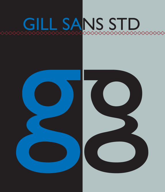
GILL SANS STD
g g
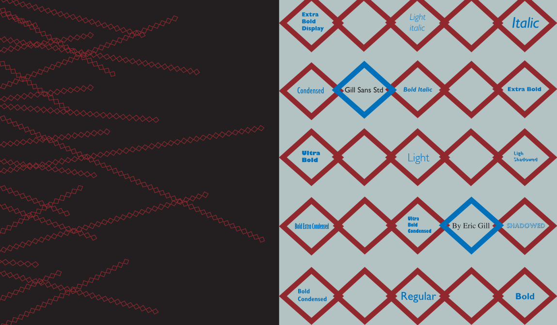
BoldRegularBold Condensed
Ultra Bold Condensed
Bold Italic
Italic
Extra Bold
Ultra Bold
Ligh Shadowed
Extra Bold Display
Light italic
Light
Bold Extra Condensed Shadowed
Gill Sans Std
By Eric Gill
Condensed
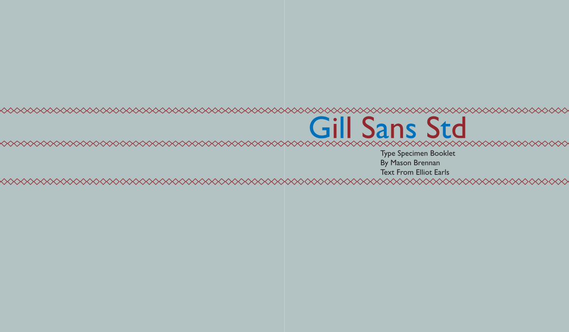
Gill Sans StdType Specimen BookletBy Mason BrennanText From Elliot Earls

ABCDEFGHIJKLMNOPQRSTUVWXYZ
abcdefghijklmnopqrstuvwxyz
GILL SA
NS STD
BO
LD EX
TRA C
ONDEN
SED
abcdefghijklm
nopqrstuvwxy
z
ABCDEFGH
IJKLMNOPQRSTU
VWXYZ
GILL SA
NS STD
CO
NDENSE
D
ABCDEFGHIJKLMNOPQRSTUVWXYZ
abcdefghijklmnopqrstuvwxyz
GILL SANS STD BOLD CO
NDENSED
abcdefghijklmnopqrstuvwxyz
ABCDEFGHIJKLMNOPQRSTUVWXYZ
GILL SANS STD ULTRA BOLD CO
NDENSED
abcd
efghij
klmno
pqrst
uvwxy
z
ABCDEF
GHIJKLM
NOPQ
RSTU
VWXYZ
GILL SA
NS STD
LIGHT
abcdefghijklmnopqrstuvwxyz
ABCDEFGHIJKLMNOPQRSTUVWXYZ
GILL SANS STD LIGHT SHADOWED
ABCDEFGHIJKLMNOPQRSTUVW
XYZ
abcdefghijklmnopqrstuvwxyz
GILL SANS STD LIGHT ITALIC
ABCDEF
GHIJKLM
NOPQ
RSTU
VWXYZ
abcd
efghij
klmno
pqrst
uvwxy
z
GILL SA
NS STD
REG
ULAR
GILL SA
NS STD
REG
ULAR
ABCDEF
GHIJKLM
NOPQRST
UVWXYZ
abcdef
ghijklm
nopqrst
uvwxyz
abcd
efghij
klmno
pqrst
uvwx
yz
ABCD
EFGH
IJKLM
NOPQRS
TUVW
XYZ
GILL SA
NS STD
CO
NDENSE
D
abcdefghijklmnopqrstuvwxyz
ABCDEFGHIJKLM
NO
PQRSTUVW
XYZ
GILL SANS STD LIGHT SHADO
WED
ABCDEFGHIJKLMNOPQRSTUVW
XYZ
abcdefghijklmnopqrstuvwxyz
GILL SANS STD LIGHT ITALIC
abcdefghijklmnopqrstuvwxyz
ABCDEFG
HIJKLM
NO
PQRSTU
VWX
YZ
GILL SANS STD ULTRA BOLD CO
NDENSED
ABCD
EFGH
IJKLM
NOPQ
RST
UVW
XYZ
abcd
efgh
ijklm
nopq
rstu
vwxy
z
GILL SA
NS STD
BO
LD EX
TRA C
ONDEN
SED
ABCD
EFGH
IJKLM
NOPQ
RSTU
VWX
YZ
abcdefghijklmnopqrstuvw
xyz
GILL SANS STD BOLD CO
NDENSED
GILL SA
NS STD
LIGHT
abcd
efgh
ijklm
nopqrstu
vwxyz
ABCDEF
GHIJK
LMN
OPQRSTU
VWX
YZ

RETINA and
LIGHT 12/14.4
LIGHT ITALIC 11/13.2 TYPE DESIGN HAS LOST ITS URGENCY, AND HAS REGAINED ITS SOUL. Type design was viewed as THE shortcut to graphic design fame.Things have changed. I learned that the craft of drawing by hand is still a most valuable asset when it comes to designing fonts, and that computer tricks are a poor substitute for intent. Type design has lost its urgency, and has regained its soul. Type design was viewed as THE shortcut to graphic design fame.Things have changed. I learned that the craft of drawing by hand is still a most valuable asset when it comes to designing fonts, and that computer tricks are a poor substitute for intent.
LIGHT 24/28.8
Most valuable M
OST
VA
LUA
BLE
LIGHT ITALIC 48/57.6REGULAR 12/14.4When an individual sets out upon the arduous journey of designing
a typeface, I suggest that the generative formal impulse can be located in one of three areas: HISTORICAL REVIVAL, VERNACULAR INTERPRETATION, OR EXCLUSIVELY FORMAL EXTRAPOLATION.When one is giving birth to a font not spawned directly from an existing model, what is needed most is the establishment of a biological discourse between looking and drawing-between retina and cortex. When an individual sets out upon the arduous journey of designing a typeface, I suggest that the generative formal impulse can be located in one of three areas: historical revival, vernacular interpretation, or exclusively formal extrapolation.When one is giving birth to a font not spawned directly from an existing model, what is needed most is the establishment of a biological discourse between looking and drawing-between retina and cortex.
ITALIC 11/13.2
BOLD 72/86.4
Type design has lost its urgency, and has regained its soul. Type design was viewed as THE shortcut to graphic design fame.
THINGS HAVE CHANGED. I learned that the craft of drawing by hand is still a most valuable asset when it comes to designing fonts, and that computer tricks are a poor substitute for intent. Type design has lost its urgency, and has regained its soul. Type design was viewed as THE shortcut to graphic design fame.Things have changed. I learned that the craft of drawing by hand is still a most valuable asset when it comes to designing fonts, and that computer tricks are a poor substitute for intent.
CORTEXWhen an individual sets out upon the arduous journey of designing a typeface, I suggest that the generative formal impulse can be located in one of three areas: historical revival, vernacular interpretation, or exclusively formal extrapolation.When one is giving birth to a font not spawned directly from an existing model, what is needed most is the establishment of a biological discourse between looking and drawing-between retina and cortex. When an individual sets out upon the arduous journey of designing a typeface, I suggest that the generative formal impulse can be located in one of three areas: historical revival, vernacular interpretation, or exclusively formal extrapolation.When one is giving birth to a font not spawned directly from an existing model, what is needed most is the establishment of a biological discourse between looking and drawing-between retina and cortex.
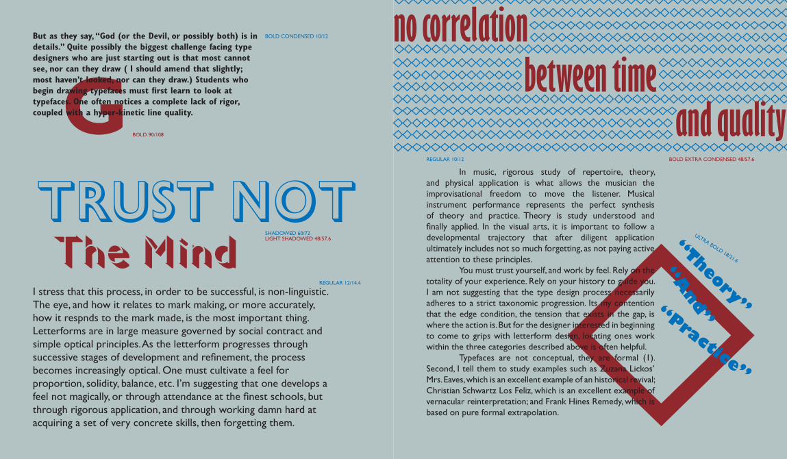
The MindI stress that this process, in order to be successful, is non-linguistic. The eye, and how it relates to mark making, or more accurately, how it respnds to the mark made, is the most important thing. Letterforms are in large measure governed by social contract and simple optical principles. As the letterform progresses through successive stages of development and refinement, the process becomes increasingly optical. One must cultivate a feel for proportion, solidity, balance, etc. I’m suggesting that one develops a feel not magically, or through attendance at the finest schools, but through rigorous application, and through working damn hard at acquiring a set of very concrete skills, then forgetting them.
LIGHT SHADOWED 48/57.6
Trust Not SHADOWED 60/72
no correlation
REGULAR 10/12
In music, rigorous study of repertoire, theory, and physical application is what allows the musician the improvisational freedom to move the listener. Musical instrument performance represents the perfect synthesis of theory and practice. Theory is study understood and finally applied. In the visual arts, it is important to follow a developmental trajectory that after diligent application ultimately includes not so much forgetting, as not paying active attention to these principles. You must trust yourself, and work by feel. Rely on the totality of your experience. Rely on your history to guide you. I am not suggesting that the type design process necessarily adheres to a strict taxonomic progression. Its my contention that the edge condition, the tension that exists in the gap, is where the action is. But for the designer interested in beginning to come to grips with letterform design, locating ones work within the three categories described above is often helpful. Typefaces are not conceptual, they are formal (1). Second, I tell them to study examples such as Zuzana Lickos’ Mrs. Eaves, which is an excellent example of an historical revival; Christian Schwartz Los Feliz, which is an excellent example of vernacular reinterpretation; and Frank Hines Remedy, which is based on pure formal extrapolation.
“Theory”
“A
nd”“Practice”
ULTRA BOLD 18/21.6
and qualitybetween time
REGULAR 12/14.4
BOLD EXTRA CONDENSED 48/57.6
BOLD CONDENSED 10/12
GBut as they say, “God (or the Devil, or possibly both) is in details.” Quite possibly the biggest challenge facing type designers who are just starting out is that most cannot see, nor can they draw ( I should amend that slightly; most haven’t looked, nor can they draw.) Students who begin drawing typefaces must first learn to look at typefaces. One often notices a complete lack of rigor, coupled with a hyper-kinetic line quality.
BOLD 90/108
BOLD ITALIC11/13.2
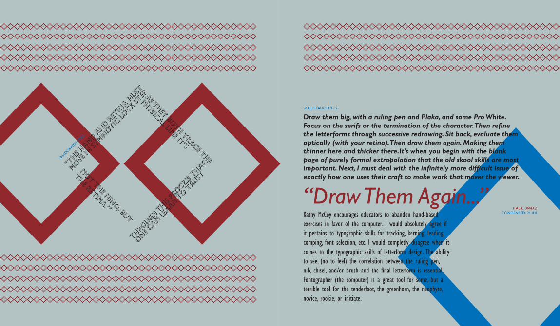
“The hand a
nd retin
a must
MOVE in sy
mbiotic
lock st
ep AS THEY both trace the
PHYSICAL LINE It’s
THROUGH THIS PR
OCESS t
hat
THE retina.”
one can le
arn to t
rust
not the mind, but
SHADOW
ED11
/13.2
CONDENSED12/14.4
“Draw Them Again...”
Draw them big, with a ruling pen and Plaka, and some Pro White. Focus on the serifs or the termination of the character. Then refine the letterforms through successive redrawing. Sit back, evaluate them optically (with your retina). Then draw them again. Making them thinner here and thicker there.It’s when you begin with the blank page of purely formal extrapolation that the old skool skills are most important. Next, I must deal with the infinitely more difficult issue of exactly how one uses their craft to make work that moves the viewer.
Kathy McCoy encourages educators to abandon hand-based exercises in favor of the computer. I would absolutely agree if it pertains to typographic skills for tracking, kerning, leading, comping, font selection, etc. I would completly disagree when it comes to the typographic skills of letterform design. The ability to see, (no to feel) the correlation between the ruling pen, nib, chisel, and/or brush and the final letterform is essential. Fontographer (the computer) is a great tool for some, but a terrible tool for the tenderfoot, the greenhorn, the neophyte, novice, rookie, or initiate.
ITALIC 36/43.2
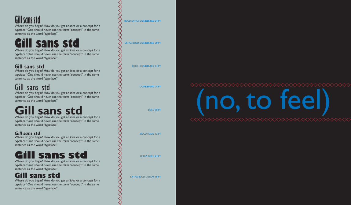
Gill sans std
Gill sans std
Gill sans std
Gill sans std
Gill sans std
Gill sans std
Gill sans std
Gill sans stdWhere do you begin? How do you get an idea or a concept for a typeface? One should never use the term “concept” in the same sentence as the word “typeface.”
Where do you begin? How do you get an idea or a concept for a typeface? One should never use the term “concept” in the same sentence as the word “typeface.”
Where do you begin? How do you get an idea or a concept for a typeface? One should never use the term “concept” in the same sentence as the word “typeface.”
Where do you begin? How do you get an idea or a concept for a typeface? One should never use the term “concept” in the same sentence as the word “typeface.”
Where do you begin? How do you get an idea or a concept for a typeface? One should never use the term “concept” in the same sentence as the word “typeface.”
Where do you begin? How do you get an idea or a concept for a typeface? One should never use the term “concept” in the same sentence as the word “typeface.”
Where do you begin? How do you get an idea or a concept for a typeface? One should never use the term “concept” in the same sentence as the word “typeface.”
Where do you begin? How do you get an idea or a concept for a typeface? One should never use the term “concept” in the same sentence as the word “typeface.”
BOLD EXTRA CONDENSED 24 PT
ULTRA BOLD CONDENSED 30 PT
BOLD CONDENSED 14 PT
CONDENSED 24 PT
BOLD 30 PT
BOLD ITALIC 12 PT
ULTRA BOLD 24 PT
EXTRA BOLD DISPLAY 18 PT
(no, to feel)
BOLD 18/21.6
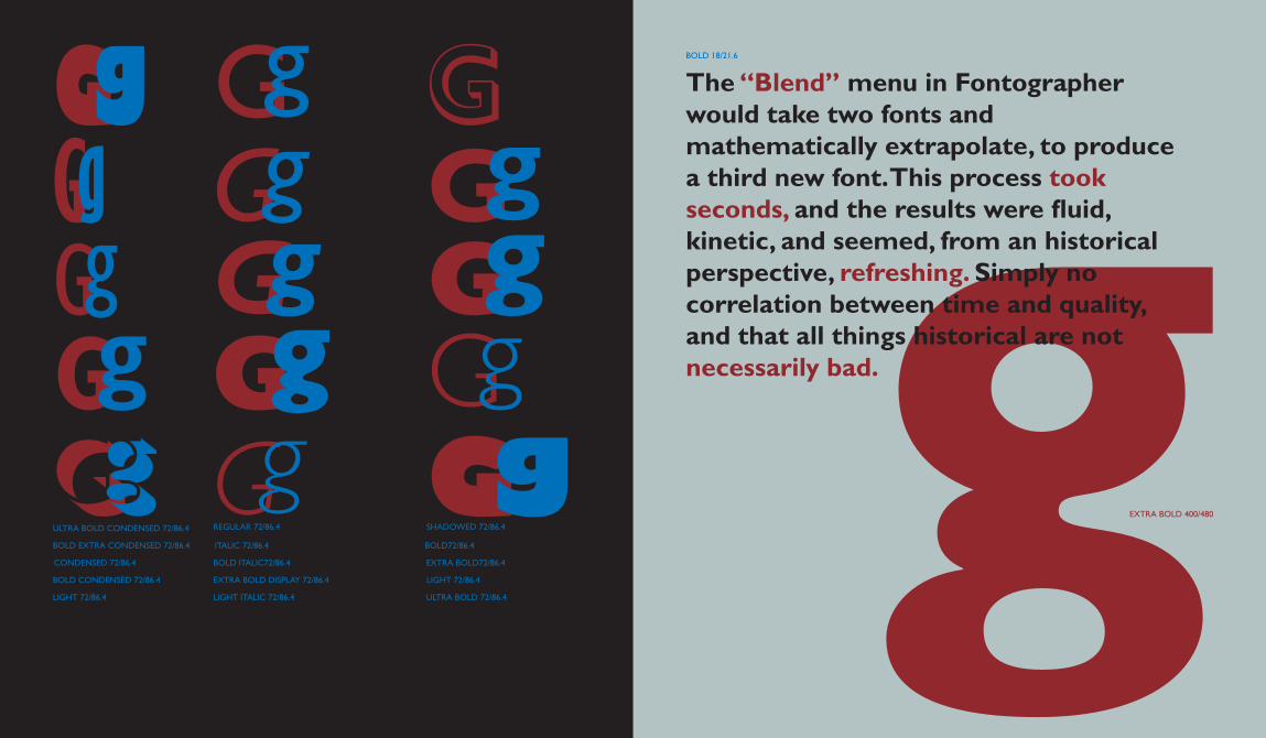
GgGgGg gGg GgGg Gg
Gg GGg GgGg GgGg
GgULTRA BOLD CONDENSED 72/86.4
BOLD EXTRA CONDENSED 72/86.4
CONDENSED 72/86.4
BOLD CONDENSED 72/86.4
LIGHT 72/86.4
REGULAR 72/86.4
ITALIC 72/86.4
BOLD ITALIC72/86.4
EXTRA BOLD DISPLAY 72/86.4
LIGHT ITALIC 72/86.4
SHADOWED 72/86.4
BOLD72/86.4
EXTRA BOLD72/86.4
LIGHT 72/86.4
ULTRA BOLD 72/86.4
The “Blend” menu in Fontographer would take two fonts and mathematically extrapolate, to produce a third new font. This process took seconds, and the results were fluid, kinetic, and seemed, from an historical perspective, refreshing. Simply no correlation between time and quality, and that all things historical are not necessarily bad.
EXTRA BOLD 400/480
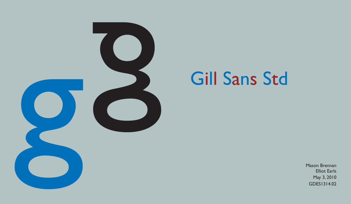
Gill Sans Std
Mason BrennanElliot Earls
May 3, 2010GDES1314.02
g g
