brand guidelines - mcknight.org · brand guidelines | 3 brand overview the mcknight foundation’s...
TRANSCRIPT
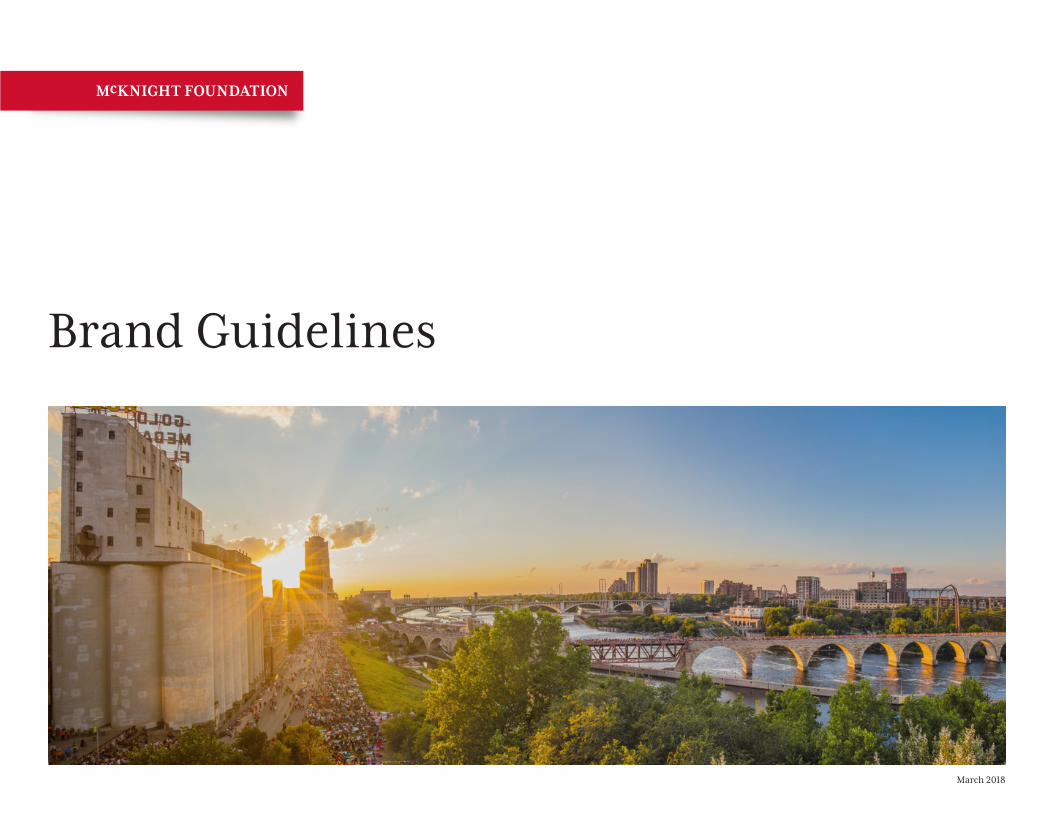
Brand Guidelines
March 2018
Brand Guidelines | 2
TABLE OF CONTENTS
Brand Overview ........................................................................3Verbal Brand Our Name ............................................................................4 Voice & Tone ........................................................................4 Brand Attributes ..................................................................4 Mission Statement ...............................................................5 Boilerplate Language ..........................................................5 Message Examples ...............................................................5Logo Primary Logo .......................................................................6 Logo Variations ....................................................................7 Clear Space ..........................................................................8 Logo Size .............................................................................8 Logo Don’ts..........................................................................9 Social Media Profile Images ..............................................10Color Palette Primary Colors ...................................................................11 Secondary Colors ..............................................................12
Typography Logo & Headlines ...............................................................13 Body Copy .........................................................................13 Cross-Platform ..................................................................14 Web ....................................................................................15 HTML Email .......................................................................16Design Elements Logo Tab ............................................................................17 Horizontal Bar ...................................................................17 Photography ......................................................................18Examples Social Media Sharing .........................................................19 Website ..............................................................................20 Email Marketing .................................................................21 Letterhead, Business Cards & Envelope ............................22Sub-brands ..............................................................................23Resources ................................................................................24
What’s Inside
Brand Guidelines | 3
BRAND OVERVIEW
The McKnight Foundation’s identity is a powerful tool to leverage in pursuit of our mission. The purpose of this manual is to establish graphic standards for all public communications created or commissioned by the McKnight Foundation. A consistent, creative, and mission-focused approach to our visual identity is a way to bring the Foundation’s mission to life. Consistent adherence to these guidelines on our logo, color palette, typeface, and other graphic decisions allows us to make the most effective use of our visual identity.
Our Graphic Standards
Brand Guidelines | 4
VERBAL BRAND
Our NameAs of March 2018, we dropped “The” from our name in print. Continue to use “the” preceding “McKnight Foundation” if it sounds more natural in a sentence. The difference is that we no longer capitalize the T. For example, in a grantee announcement it would appear this way: “with funding from the McKnight Foundation” or “I joined the McKnight Foundation last year.” It is acceptable to use “McKnight” alone on second reference, in less formal settings, or where McKnight branding is already prominent.
There is no need to retroactively edit any communication issued before March 2018.
Voice & ToneThe McKnight Foundation’s voice is smart, mission oriented, and professional. We respect our audiences and their need for clear, concise, and accurate communication. We present useful insights, positive framing, and inspiring messages to share our vision and our values. We also use inclusive, accessible language, defining acronyms and specialized terms whenever possible to enhance understanding. We use the Chicago Manual of Style as well as McKnight’s own style guide.
Brand AttributesOur brand attributes are the characteristics that make us unique. They identify and define us. Use this list of attributes to guide visual, written, verbal, and functional decisions in your communications. Ask yourself: “Does this communication accurately reflect our brand attributes?”
Respect
Impact
Effective
Credible
Positive
Inclusive
Innovative
Brand Guidelines | 5
Full Mission StatementThe McKnight Foundation, a Minnesota-based family foundation, seeks to improve the quality of life for present and future generations. We use all our resources to attend, unite, and empower those we serve.
Boilerplate LanguageThe McKnight Foundation, a Minnesota-based family foundation, seeks to improve the quality of life for present and future generations. Program interests include regional economic and community development, Minnesota’s arts and artists, education equity, youth engagement, Midwest climate and energy, Mississippi River water quality, neuroscience research, international crop research, and rural livelihoods. Founded in 1953 and independently endowed by William and Maude McKnight, the Foundation has assets of approximately $2.2 billion and grants about $90 million a year.
Message VariationsDedicated to improving the quality of life for present and future generations.
The McKnight Foundation supports the people, places, and possibilities that help our state and our world create a more vibrant future for everyone.
Our overarching goal is to optimize the use of all Foundation resources to contribute to building and strengthening socially, economically, and environmentally sustainable communities.
Mission StatementOur mission statement defines our purpose and guides our actions. Use this statement in communications to convey our value and when introducing new audiences to our brand.
Boilerplate LanguageUse this statement to provide consistent details about how we work to fulfill our mission.
VERBAL BRAND
Message ExamplesUsing the essence of our mission can add meaning to headlines, callouts, or social posts.
Brand Guidelines | 6
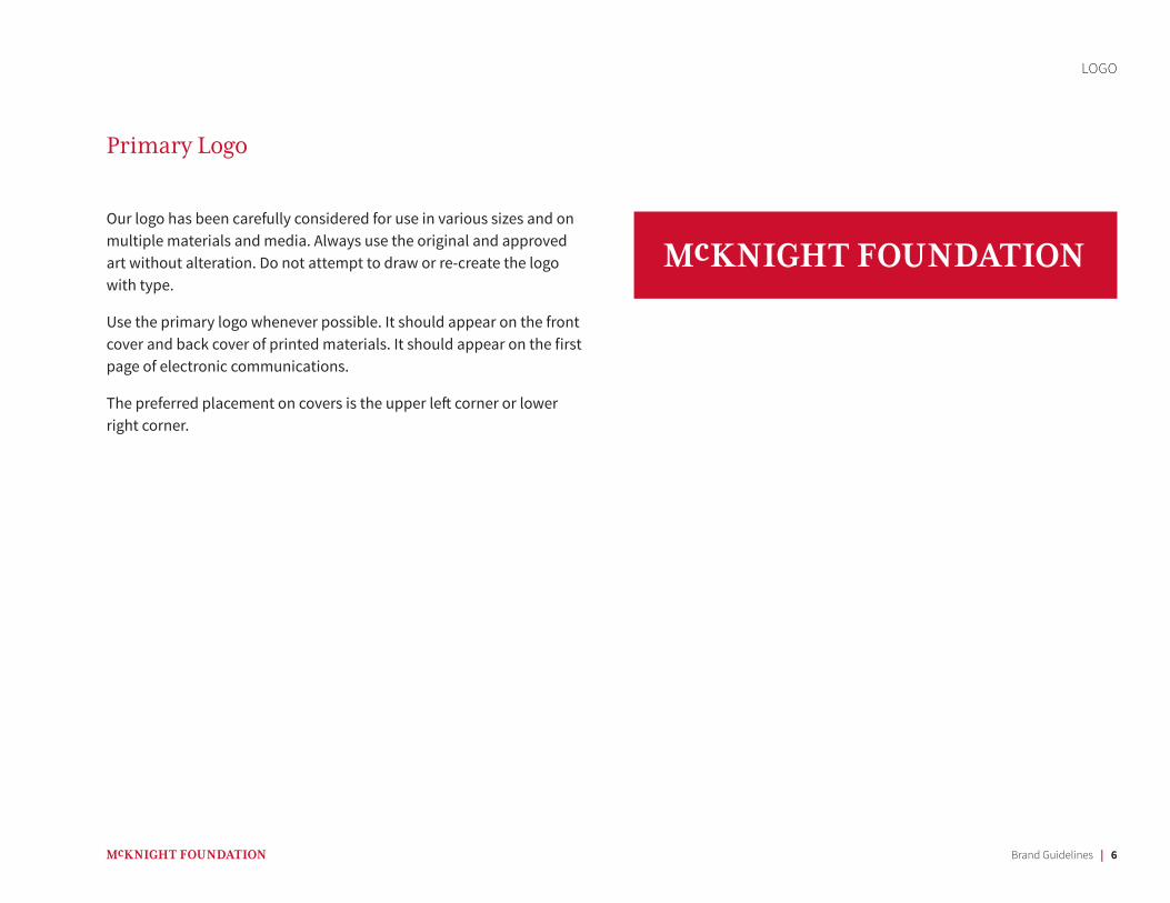
Primary Logo
LOGO
Our logo has been carefully considered for use in various sizes and on multiple materials and media. Always use the original and approved art without alteration. Do not attempt to draw or re-create the logo with type.
Use the primary logo whenever possible. It should appear on the front cover and back cover of printed materials. It should appear on the first page of electronic communications.
The preferred placement on covers is the upper left corner or lower right corner.
Brand Guidelines | 7
LOGO
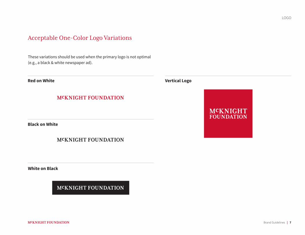
Red on White
White on Black
Black on White
These variations should be used when the primary logo is not optimal (e.g., a black & white newspaper ad).
Acceptable One-Color Logo Variations
Vertical Logo
Brand Guidelines | 8
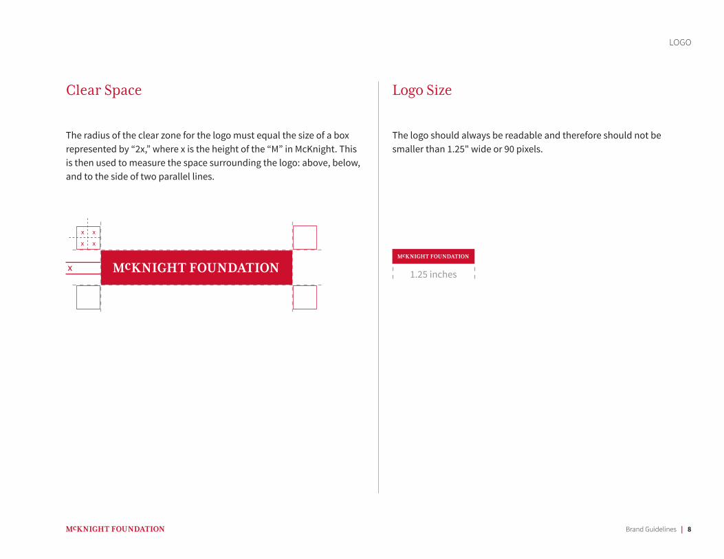
Clear Space
The radius of the clear zone for the logo must equal the size of a box represented by “2x,” where x is the height of the “M” in McKnight. This is then used to measure the space surrounding the logo: above, below, and to the side of two parallel lines.
The logo should always be readable and therefore should not be smaller than 1.25" wide or 90 pixels.
Logo Size
x
xx
xx
LOGO
1.25 inches
Brand Guidelines | 9
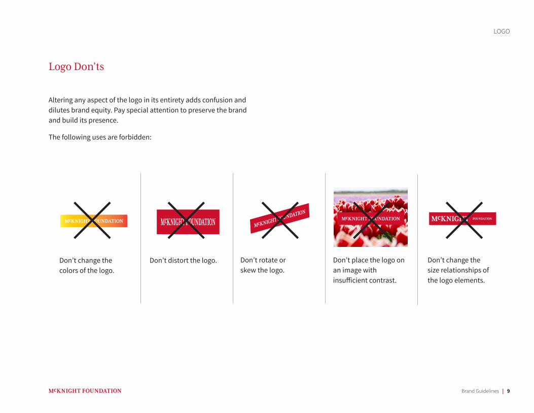
Logo Don’ts
Don’t change the colors of the logo.
Don’t distort the logo. Don’t rotate or skew the logo.
Don’t place the logo on an image with insufficient contrast.
Don’t change the size relationships of the logo elements.
LOGO
Altering any aspect of the logo in its entirety adds confusion and dilutes brand equity. Pay special attention to preserve the brand and build its presence.
The following uses are forbidden:
Brand Guidelines | 10
LOGO
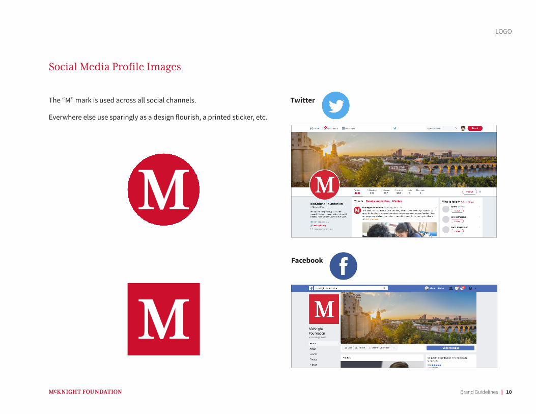
Social Media Profile Images
The “M” mark is used across all social channels.
Everwhere else use sparingly as a design flourish, a printed sticker, etc.
Brand Guidelines | 11
COLOR PALETTE
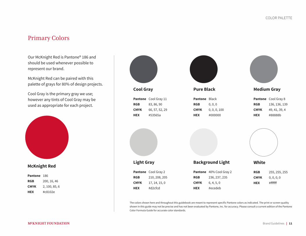
Our McKnight Red is Pantone® 186 and should be used whenever possible to represent our brand.
McKnight Red can be paired with this palette of grays for 80% of design projects.
Cool Gray is the primary gray we use; however any tints of Cool Gray may be used as appropriate for each project.
Light Gray
Pantone Cool Gray 2RGB 210, 208, 205CMYK 17, 14, 15, 0HEX #d2cfcd
Background Light
Pantone 40% Cool Gray 2RGB 236, 237, 235CMYK 6, 4, 5, 0HEX #ecedeb
White
RGB 255, 255, 255CMYK 0, 0, 0, 0HEX #ffffff
Pure Black
Pantone BlackRGB 0, 0, 0CMYK 0, 0, 0, 100HEX #000000
Medium Gray
Pantone Cool Gray 8RGB 136, 136, 139CMYK 49, 41, 39, 4HEX #88888b
Cool Gray
Pantone Cool Gray 11RGB 83, 86, 90CMYK 66, 57, 52, 29HEX #53565a
McKnight Red
Pantone 186RGB 200, 16, 46CMYK 2, 100, 85, 6HEX #c8102e
Primary Colors
The colors shown here and throughout this guidebook are meant to represent specific Pantone colors as indicated. The print or screen quality shown in this guide may not be precise and has not been evaluated by Pantone, Inc. for accuracy. Please consult a current edition of the Pantone Color Formula Guide for accurate color standards.
Brand Guidelines | 12
COLOR PALETTE
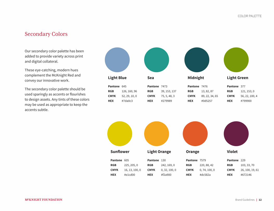
Our secondary color palette has been added to provide variety across print and digital collateral.
These eye-catching, modern hues complement the McKnight Red and convey our innovative work.
The secondary color palette should be used sparingly as accents or flourishes to design assets. Any tints of these colors may be used as appropriate to keep the accents subtle.
Light Orange
Pantone 130RGB 242, 169, 0CMYK 0, 32, 100, 0HEX #f2a900
Light Blue
Pantone 645RGB 126, 160, 96CMYK 52, 29, 10, 0HEX #7da0c3
Light Green
Pantone 377RGB 121, 153, 0CMYK 56, 22, 100, 4HEX #799900
Orange
Pantone 7579RGB 220, 88, 42CMYK 0, 74, 100, 0HEX #dc582a
Sunflower
Pantone 605RGB 225, 205, 0CMYK 16, 13, 100, 0HEX #e1cd00
Violet
Pantone 229RGB 103, 33, 70CMYK 26, 100, 19, 61HEX #672146
Sea
Pantone 7473RGB 39, 153, 137CMYK 75, 5, 48, 3HEX #279989
Midnight
Pantone 7476RGB 13, 82, 87CMYK 89, 22, 34, 65HEX #0d5257
Secondary Colors
Brand Guidelines | 13
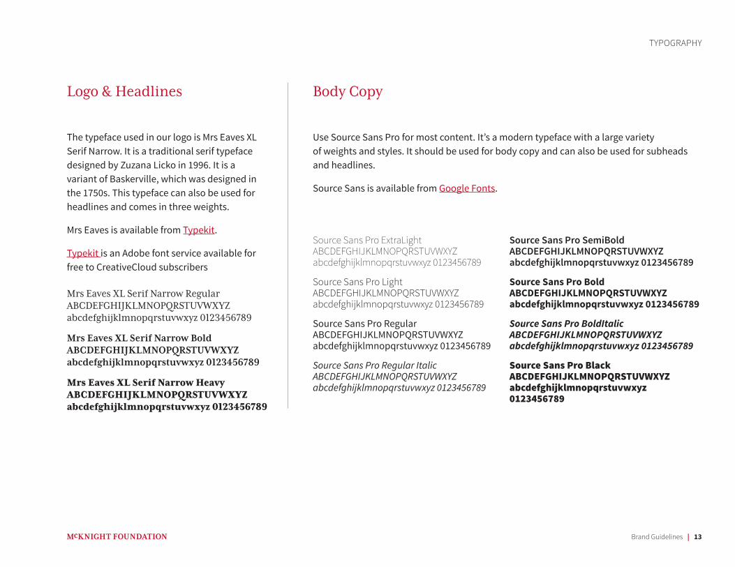
The typeface used in our logo is Mrs Eaves XL Serif Narrow. It is a traditional serif typeface designed by Zuzana Licko in 1996. It is a variant of Baskerville, which was designed in the 1750s. This typeface can also be used for headlines and comes in three weights.
Mrs Eaves is available from Typekit.
Typekit is an Adobe font service available for free to CreativeCloud subscribers
Mrs Eaves XL Serif Narrow Regular ABCDEFGHIJKLMNOPQRSTUVWXYZ abcdefghijklmnopqrstuvwxyz 0123456789
Mrs Eaves XL Serif Narrow Bold ABCDEFGHIJKLMNOPQRSTUVWXYZ abcdefghijklmnopqrstuvwxyz 0123456789
Mrs Eaves XL Serif Narrow Heavy ABCDEFGHIJKLMNOPQRSTUVWXYZabcdefghijklmnopqrstuvwxyz 0123456789
Source Sans Pro ExtraLight ABCDEFGHIJKLMNOPQRSTUVWXYZ abcdefghijklmnopqrstuvwxyz 0123456789
Source Sans Pro Light ABCDEFGHIJKLMNOPQRSTUVWXYZ abcdefghijklmnopqrstuvwxyz 0123456789
Source Sans Pro Regular ABCDEFGHIJKLMNOPQRSTUVWXYZ abcdefghijklmnopqrstuvwxyz 0123456789
Source Sans Pro Regular Italic ABCDEFGHIJKLMNOPQRSTUVWXYZ abcdefghijklmnopqrstuvwxyz 0123456789
Source Sans Pro SemiBold ABCDEFGHIJKLMNOPQRSTUVWXYZ abcdefghijklmnopqrstuvwxyz 0123456789
Source Sans Pro Bold ABCDEFGHIJKLMNOPQRSTUVWXYZ abcdefghijklmnopqrstuvwxyz 0123456789
Source Sans Pro BoldItalic ABCDEFGHIJKLMNOPQRSTUVWXYZ abcdefghijklmnopqrstuvwxyz 0123456789
Source Sans Pro Black ABCDEFGHIJKLMNOPQRSTUVWXYZ abcdefghijklmnopqrstuvwxyz 0123456789
TYPOGRAPHY
Use Source Sans Pro for most content. It’s a modern typeface with a large variety of weights and styles. It should be used for body copy and can also be used for subheads and headlines.
Source Sans is available from Google Fonts.
Logo & Headlines Body Copy
Brand Guidelines | 14
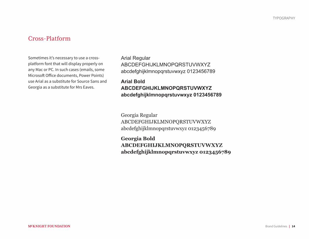
Sometimes it’s necessary to use a cross-platform font that will display properly on any Mac or PC. In such cases (emails, some Microsoft Office documents, Power Points) use Arial as a substitute for Source Sans and Georgia as a substitute for Mrs Eaves.
Arial Regular ABCDEFGHIJKLMNOPQRSTUVWXYZ abcdefghijklmnopqrstuvwxyz 0123456789
Arial Bold ABCDEFGHIJKLMNOPQRSTUVWXYZ abcdefghijklmnopqrstuvwxyz 0123456789
Georgia Regular ABCDEFGHIJKLMNOPQRSTUVWXYZ abcdefghijklmnopqrstuvwxyz 0123456789
Georgia Bold ABCDEFGHIJKLMNOPQRSTUVWXYZ abcdefghijklmnopqrstuvwxyz 0123456789
Cross-Platform
TYPOGRAPHY
Brand Guidelines | 15
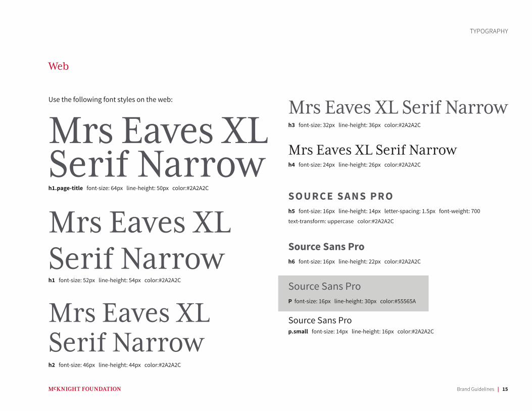
Mrs Eaves XL Serif Narrowh1.page-title font-size: 64px line-height: 50px color:#2A2A2C
Mrs Eaves XL Serif Narrowh1 font-size: 52px line-height: 54px color:#2A2A2C
Mrs Eaves XL Serif Narrowh2 font-size: 46px line-height: 44px color:#2A2A2C
TYPOGRAPHY
Web
Mrs Eaves XL Serif Narrowh3 font-size: 32px line-height: 36px color:#2A2A2C
Mrs Eaves XL Serif Narrowh4 font-size: 24px line-height: 26px color:#2A2A2C
SOURCE SANS PROh5 font-size: 16px line-height: 14px letter-spacing: 1.5px font-weight: 700
text-transform: uppercase color:#2A2A2C
Source Sans Proh6 font-size: 16px line-height: 22px color:#2A2A2C
Source Sans ProP font-size: 16px line-height: 30px color:#55565A
Source Sans Prop.small font-size: 14px line-height: 16px color:#2A2A2C
Use the following font styles on the web:
Brand Guidelines | 16
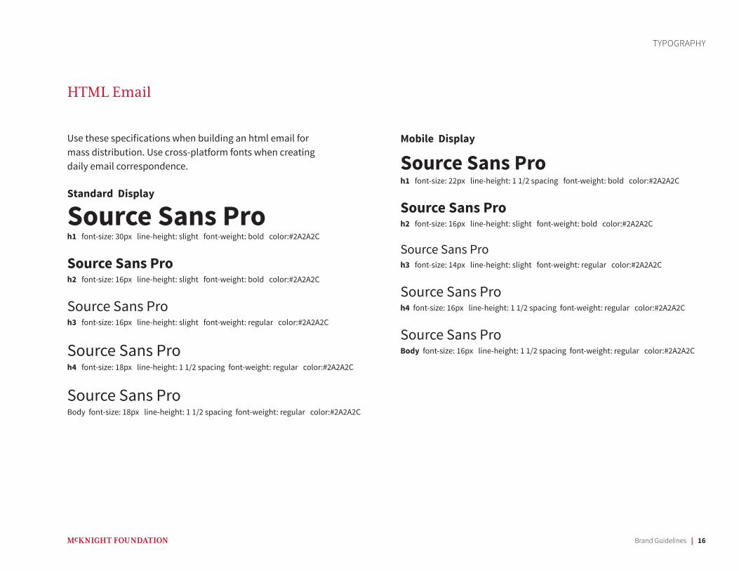
Use these specifications when building an html email for mass distribution. Use cross-platform fonts when creating daily email correspondence.
Standard Display
Source Sans Proh1 font-size: 30px line-height: slight font-weight: bold color:#2A2A2C
Source Sans Proh2 font-size: 16px line-height: slight font-weight: bold color:#2A2A2C
Source Sans Proh3 font-size: 16px line-height: slight font-weight: regular color:#2A2A2C
Source Sans Proh4 font-size: 18px line-height: 1 1/2 spacing font-weight: regular color:#2A2A2C
Source Sans ProBody font-size: 18px line-height: 1 1/2 spacing font-weight: regular color:#2A2A2C
TYPOGRAPHY
HTML Email
Mobile Display
Source Sans Proh1 font-size: 22px line-height: 1 1/2 spacing font-weight: bold color:#2A2A2C
Source Sans Proh2 font-size: 16px line-height: slight font-weight: bold color:#2A2A2C
Source Sans Proh3 font-size: 14px line-height: slight font-weight: regular color:#2A2A2C
Source Sans Proh4 font-size: 16px line-height: 1 1/2 spacing font-weight: regular color:#2A2A2C
Source Sans ProBody font-size: 16px line-height: 1 1/2 spacing font-weight: regular color:#2A2A2C
Brand Guidelines | 17
DESIGN ELEMENTS
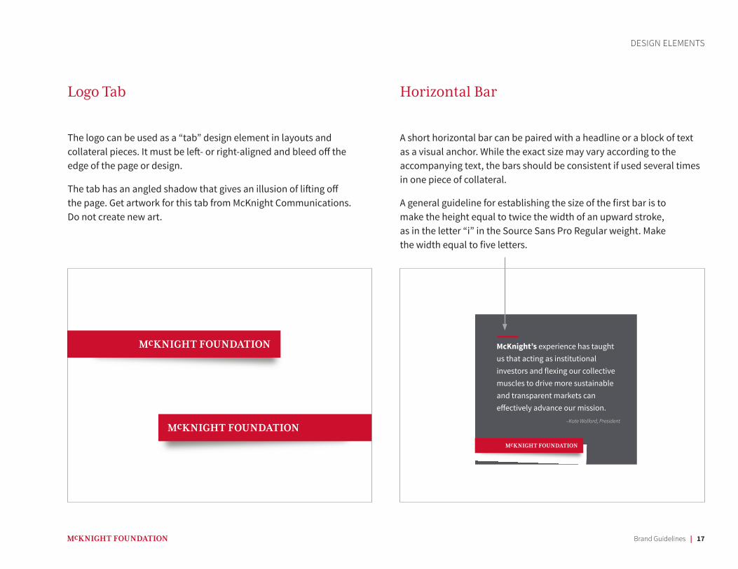
The logo can be used as a “tab” design element in layouts and collateral pieces. It must be left- or right-aligned and bleed off the edge of the page or design.
The tab has an angled shadow that gives an illusion of lifting off the page. Get artwork for this tab from McKnight Communications. Do not create new art.
A short horizontal bar can be paired with a headline or a block of text as a visual anchor. While the exact size may vary according to the accompanying text, the bars should be consistent if used several times in one piece of collateral.
A general guideline for establishing the size of the first bar is to make the height equal to twice the width of an upward stroke, as in the letter “i” in the Source Sans Pro Regular weight. Make the width equal to five letters.
McKnight’s experience has taught us that acting as institutional investors and flexing our collective muscles to drive more sustainable and transparent markets can effectively advance our mission.
–Kate Wolford, President
Logo Tab Horizontal Bar
Brand Guidelines | 18
DESIGN ELEMENTS
Photography
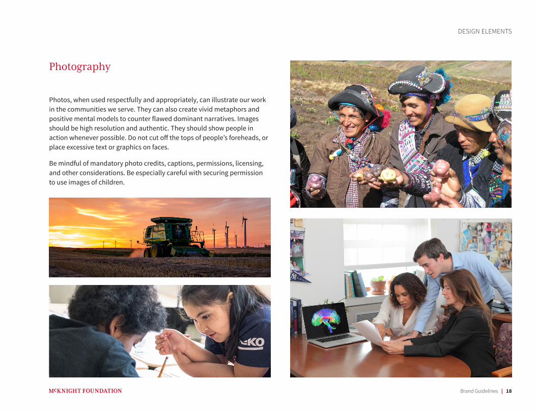
Photos, when used respectfully and appropriately, can illustrate our work in the communities we serve. They can also create vivid metaphors and positive mental models to counter flawed dominant narratives. Images should be high resolution and authentic. They should show people in action whenever possible. Do not cut off the tops of people’s foreheads, or place excessive text or graphics on faces.
Be mindful of mandatory photo credits, captions, permissions, licensing, and other considerations. Be especially careful with securing permission to use images of children.
Visual Identity Guidelines | 19
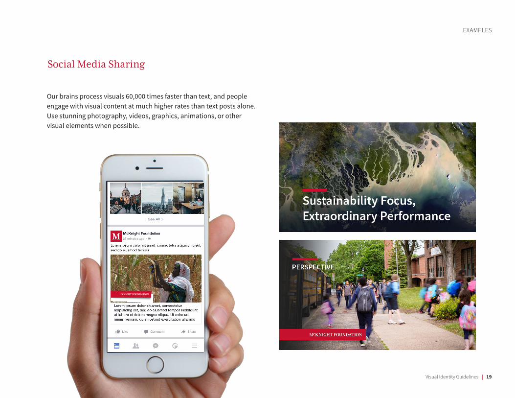
Our brains process visuals 60,000 times faster than text, and people engage with visual content at much higher rates than text posts alone. Use stunning photography, videos, graphics, animations, or other visual elements when possible.
EXAMPLES
Social Media Sharing
Brand Guidelines | 20
EXAMPLES
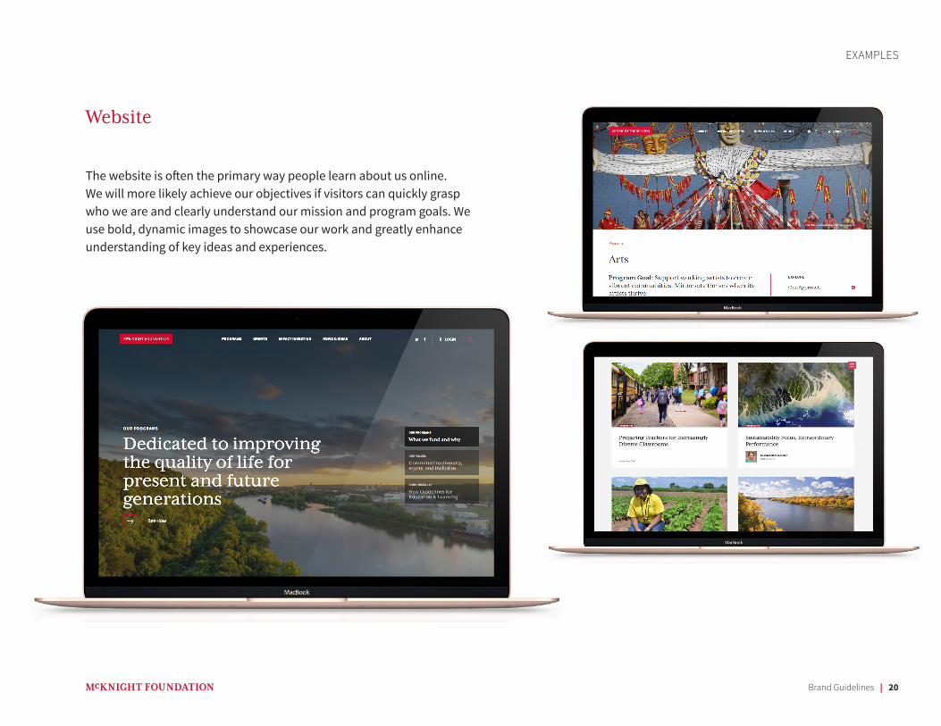
The website is often the primary way people learn about us online. We will more likely achieve our objectives if visitors can quickly grasp who we are and clearly understand our mission and program goals. We use bold, dynamic images to showcase our work and greatly enhance understanding of key ideas and experiences.
Website
Brand Guidelines | 21
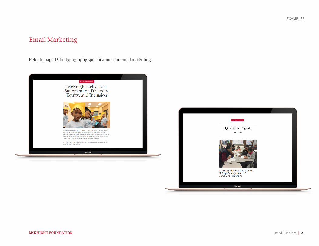
Email Marketing
EXAMPLES
Refer to page 16 for typography specifications for email marketing.
Brand Guidelines | 22
February 12, 2018
Joan SmithProgram ManagerXYZ Organization12345 Main StreetMinneapolis, MN 55409
Dear Joan,Lorem ipsum dolor sit amet, consectetur adipiscing elit. Pellentesque feugiat sodales ligula, nec egestas augue. Morbi urna libero, laoreet in fermentum ut, pharetra vel massa. Aliquam erat volutpat. Sed id volutpat nisi, tempor convallis lacus. Pellentesque eget lorem pretium, vehicula quam varius, porttitor justo. Integer et mauris faucibus, bibendum odio et, varius risus. Pellentesque vestibulum, ligula eu placerat maximus, nisi urna sollicitudin nisl, eget pulvinar neque risus cursus lacus. Pellentesque porttitor vestibulum sapien ac sollicitudin. Phasellus sed urna at ipsum fermentum convallis. Nulla facilisi. Nam maximus justo at leo condimentum, tincidunt porttitor risus dignissim. Curabitur non tristique est. Donec at lectus eget purus sodales dapibus.
Pellentesque non sem facilisis urna semper hendrerit posuere quis lectus. Ut id sapien pretium nisl euismod laoreet luctus ac massa. Etiam lectus libero, sodales in nisi at, aliquam condimentum ex. Nam justo nibh, rhoncus a justo vel, porttitor scelerisque lorem. Pellentesque hendrerit augue suscipit suscipit commodo. Sed ut nisi et urna malesuada sagittis at non justo. Aliquam interdum cursus dolor et tempor. Maecenas at volutpat dui, ac pharetra elit.
Vestibulum ante ipsum primis in faucibus orci luctus et ultrices posuere cubilia Curae; Praesent imperdiet augue urna, ac lacinia nisl venenatis ut. In pellentesque vel turpis sed tempus. Mauris libero nibh, consectetur fermentum convallis eu, egestas vel lectus. Nullam gravida ac felis vitae ultrices. Praesent sed rutrum lectus, sit amet elementum turpis. Praesent dapibus tempor orci, non vestibulum felis pellentesque quis. Duis vulputate eleifend elit et hendrerit.
Sincerely,
Kate WolfordKate WolfordPresident
710 South Second Street Suite 400 Minneapolis, MN 55401
(612) 333-4220mcknight.org
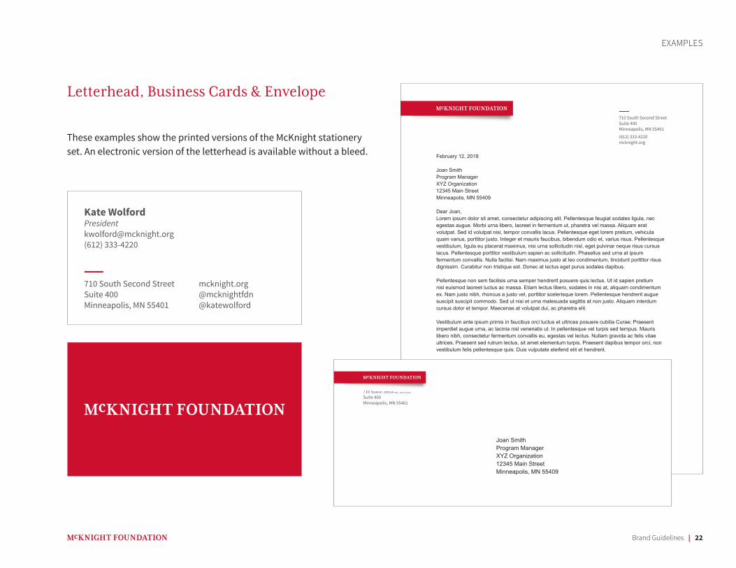
Letterhead, Business Cards & Envelope
EXAMPLES
710 South Second Street Suite 400 Minneapolis, MN 55401
mcknight.org@mcknightfdn@katewolford
Kate [email protected](612) 333-4220
Joan SmithProgram ManagerXYZ Organization12345 Main StreetMinneapolis, MN 55409
710 South Second Street Suite 400 Minneapolis, MN 55401
These examples show the printed versions of the McKnight stationery set. An electronic version of the letterhead is available without a bleed.
Brand Guidelines | 23
SUB-BRANDS
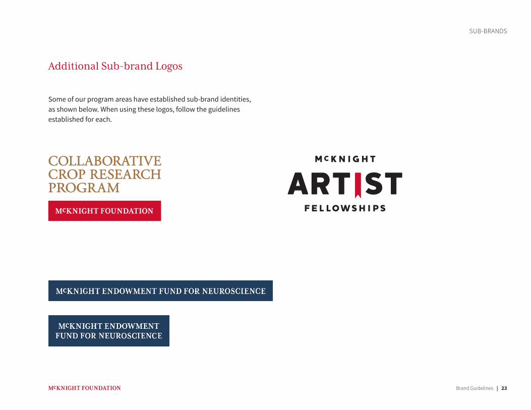
Additional Sub-brand Logos
Some of our program areas have established sub-brand identities, as shown below. When using these logos, follow the guidelines established for each.
Brand Guidelines | 24
Questions & Contact Information
RESOURCES
We created these guidelines in order to work together to present our brand in a consistent and compelling manner. While we have tried to make this guidebook comprehensive, we have also allowed flexibility for a designer’s creative interpretation. If you have questions regarding style, please contact:
Phil de la VegaDigital Engagement [email protected](612) 333-4220
Our brand lives and thrives through our everyday actions, our work, and our communications. Whether you are a grantee, designer, staff, or partner, we are grateful for how you represent the McKnight Foundation. Your efforts to act as responsible and thoughtful stewards of our name and visual identity are much appreciated. Thank you.
Thank you