brand guidelines - d2cx26qpfwuhvu.cloudfront.net · brand guidelines page 2. ... futura is the body...
TRANSCRIPT

LEINSTER RUGBYBRAND GUIDELINES
PAGE 1
BRAND GUIDELINES
LEINSTER RUGBYBRAND GUIDELINES
PAGE 2
Leinster Rugby are one of four provincial clubs in Ireland currently playing in the Rabo Direct Pro 12 and Heineken Cup.
Leinster Rugby’s main brand objectives are to:
• Build greater awareness of Leinster Rugby both domestically and internationally
• Drive commercial revenues and attendances
• Deliver a brand that is all encompassing and visible
• Deliver a brand that sponsors, supporters and partners can easily identify and want to align with
These guidelines are designed to help anybody who will be promoting and implementing the brand. If used correctly Leinster Rugby, as a corporate body as well as a club, will start to build equity as a brand that is admired for being world-class in rugby as well as in the general sports arena.
INTRODUCTION
LEINSTER RUGBYBRAND GUIDELINES
PAGE 3
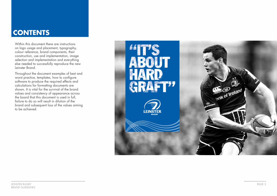
CONTENTSWithin this document there are instructions on logo usage and placement, typography, colour reference, brand components, their construction, use and implementation, image selection and implementation and everything else needed to successfully reproduce the new Leinster Brand.
Throughout the document examples of best and worst practice, templates, how to configure software to produce the required effects and calculations for formatting documents are shown. It is vital for the survival of the brand values and consistency of appearance across the board that this document is used in full, failure to do so will result in dilution of the brand and subsequent loss of the values aiming to be achieved.

LEINSTER RUGBYBRAND GUIDELINES
PAGE 4
COLOURS
PMS 286C 100M 066Y 000K 002
R 000G 093B 170
#005daa
C 000M 000Y 000K 000
R 255G 255B 255
#ffffff
C 100M 080Y 000K 026
R 001G 058B 129
#013a81
PMS 124C 000M 028Y 100K 006
R 238G 177B 017
#eeb111
PMS 423C 000M 000Y 000K 044
R 159G 161B 164
#9fa1a4
PMS 2758
The colour palette has been chosen to show the pride in the heritage of Leinster Rugby.
The blue selected was based on the colour of the distinctive Leinster shirt from the 1950s and is used almost exclusively to reinforce the brand across the board cloaking large areas in the colour.
White is key in the brand and it is used for all text placed on blue as it stands out and helps to identify the brand assets.
A secondary colour palette has been created for use in powerpoint slides and some corporate communication channels.
Primary colours
Secondary colours
LEINSTER RUGBYBRAND GUIDELINES
PAGE 5
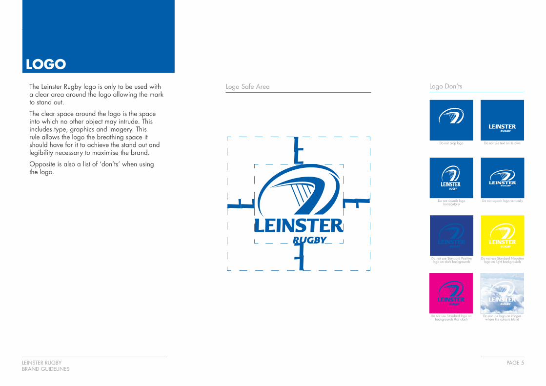
LOGOThe Leinster Rugby logo is only to be used with a clear area around the logo allowing the mark to stand out.
The clear space around the logo is the space into which no other object may intrude. This includes type, graphics and imagery. This rule allows the logo the breathing space it should have for it to achieve the stand out and legibility necessary to maximise the brand.
Opposite is also a list of ‘don’ts’ when using the logo.
Do not crop logo Do not use text on its own
Do not squash logo horizontally
Do not squash logo vertically
Do not use Standard Positive logo on dark backgrounds
Do not use Standard Negative logo on light backgrounds
Do not use Standard logo on backgrounds that clash
Do not use logo on images where the colours blend
Logo Safe Area Logo Don’ts
LEINSTER RUGBYBRAND GUIDELINES
PAGE 6
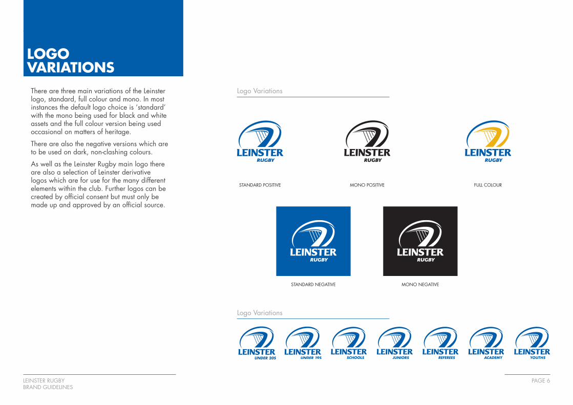
MONO POSITIVESTANDARD POSITIVE
LOGOVARIATIONSThere are three main variations of the Leinster logo, standard, full colour and mono. In most instances the default logo choice is ‘standard’ with the mono being used for black and white assets and the full colour version being used occasional on matters of heritage.
There are also the negative versions which are to be used on dark, non-clashing colours.
As well as the Leinster Rugby main logo there are also a selection of Leinster derivative logos which are for use for the many different elements within the club. Further logos can be created by official consent but must only be made up and approved by an official source.
Logo Variations
STANDARD NEGATIVE MONO NEGATIVE
FULL COLOUR
Logo Variations
LEINSTER RUGBYBRAND GUIDELINES
PAGE 7
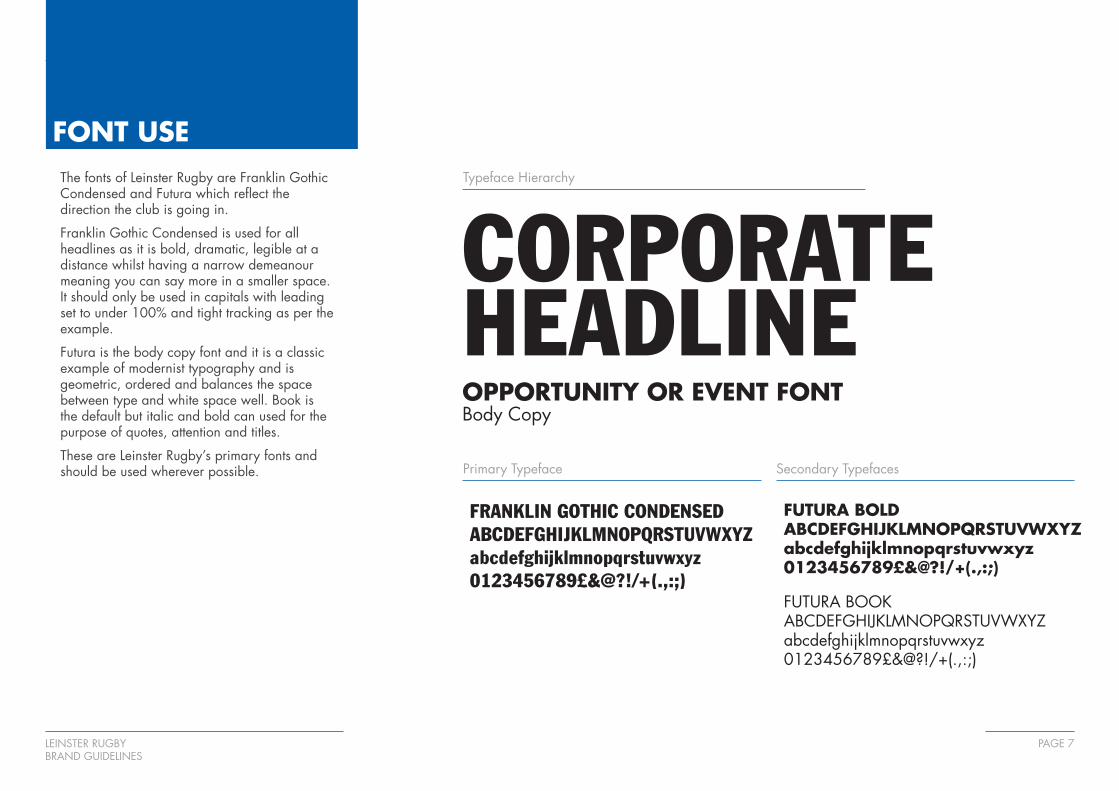
FONT USEThe fonts of Leinster Rugby are Franklin Gothic Condensed and Futura which reflect the direction the club is going in.
Franklin Gothic Condensed is used for all headlines as it is bold, dramatic, legible at a distance whilst having a narrow demeanour meaning you can say more in a smaller space. It should only be used in capitals with leading set to under 100% and tight tracking as per the example.
Futura is the body copy font and it is a classic example of modernist typography and is geometric, ordered and balances the space between type and white space well. Book is the default but italic and bold can used for the purpose of quotes, attention and titles.
These are Leinster Rugby’s primary fonts and should be used wherever possible.
Typeface Hierarchy
CORPORATE HEADLINEOPPORTUNITY OR EVENT FONTBody Copy
FRANKLIN GOTHIC CONDENSEDABCDEFGHIJKLMNOPQRSTUVWXYZabcdefghijklmnopqrstuvwxyz0123456789£&@?!/+(.,:;)
FUTURA BOLDABCDEFGHIJKLMNOPQRSTUVWXYZabcdefghijklmnopqrstuvwxyz0123456789£&@?!/+(.,:;)
FUTURA BOOKABCDEFGHIJKLMNOPQRSTUVWXYZabcdefghijklmnopqrstuvwxyz0123456789£&@?!/+(.,:;)
Primary Typeface Secondary Typefaces
LEINSTER RUGBYBRAND GUIDELINES
PAGE 8
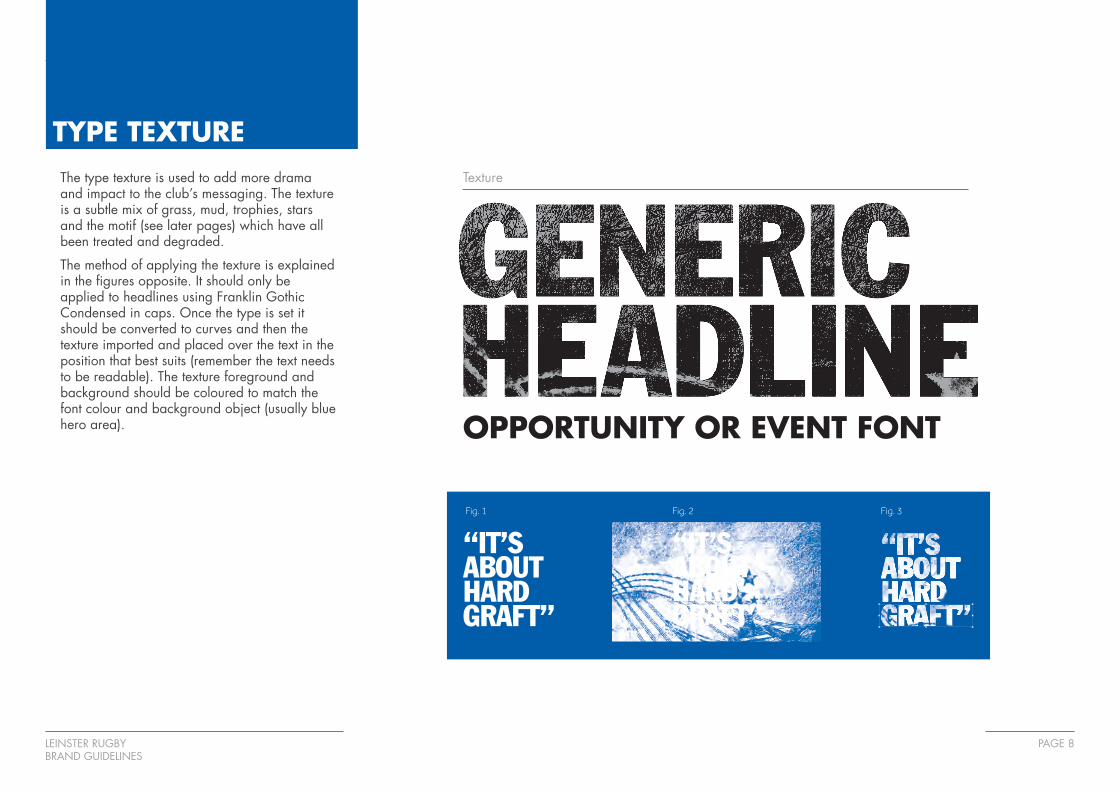
TYPE TEXTUREThe type texture is used to add more drama and impact to the club’s messaging. The texture is a subtle mix of grass, mud, trophies, stars and the motif (see later pages) which have all been treated and degraded.
The method of applying the texture is explained in the figures opposite. It should only be applied to headlines using Franklin Gothic Condensed in caps. Once the type is set it should be converted to curves and then the texture imported and placed over the text in the position that best suits (remember the text needs to be readable). The texture foreground and background should be coloured to match the font colour and background object (usually blue hero area).
Texture
OPPORTUNITY OR EVENT FONT
Fig. 1 Fig. 2 Fig. 3

LEINSTER RUGBYBRAND GUIDELINES
PAGE 9
TAG LINEThe tag line embraces the previous direction of the club in the ‘Believe in Magic’ guise but evolves the theme, promoting the all round entertainment, both on and off the field, of a matchday encouraging people to attend games by stating that a Leinster matchday has to be seen to be believed.
The tag line can be used on it’s own, with the logo or motif or both and in positive, negative and coloured (blue) variations.
Tag line
Logo & Tag line

LEINSTER RUGBYBRAND GUIDELINES
PAGE 10
MOTIFThe club motif is made up of the four strings of the harp to signify Leinster but as the pattern gets closer you can see that it’s made up of 12 parts signifying the 12 counties of the province which means that together they project strength.
The motif (an EPS file) should only be used within the blue hero area (see later pages) and should be aligned to the end of the area below or beside the Leinster Rugby logo.
Application of Motif
1 LEINSTER CLUB
4 HARP STRINGS
12 PROVINCE COUNTIES

LEINSTER RUGBYBRAND GUIDELINES
PAGE 11
MOTIFWhen positioning the motif within the hero area it should always be anchored to the left, right and bottom sides.
There should never be any open paths on show and a minimum of two strings of the main set of lines should be visable from the bottom.
The motif should always be constrained when resizing (not stretched).
Application of Motif
X
X X
X
LEINSTER RUGBYBRAND GUIDELINES
PAGE 12
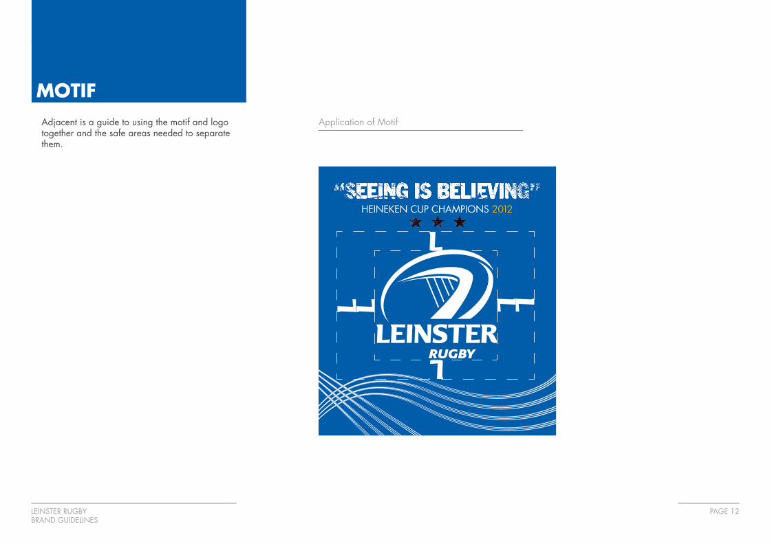
MOTIFAdjacent is a guide to using the motif and logo together and the safe areas needed to separate them.
Application of Motif
HEINEKEN CUP CHAMPIONS 2012
LEINSTER RUGBYBRAND GUIDELINES
PAGE 13
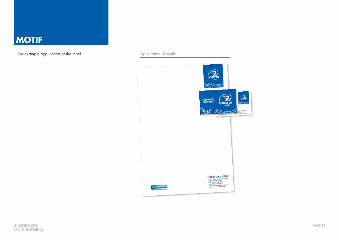
MOTIFAn example application of the motif. Application of Motif

LEINSTER RUGBYBRAND GUIDELINES
PAGE 14
HERO AREAThe Hero Area is the vehicle for which all message content appears along with the logo and motif.
Within the Hero Area content should be arranged as shown (depending on event / offering).
The message should lead which should be punchy and grab people’s attention. The sub heading follows and this should explain the event / offering further.
The event / fixture detail is next and should be bold and easily readable as shown.
Finally the call to action / contact details follows. This should be easy to read and to the point. Any further calls to action / contact details such as social media to be included in this area.
Leinster Hero Area Structure
• Section1
Message text
• Section2
Sub Heading text
• Section3
Fixture information
• Section4
Call to action / contact details
• Section5
Motif areaSEE LEINSTER DEFEND THEIR HEINEKEN CUP CROWN
LEINSTER vs MONTPELLIERSATURDAY 21 JANUARY KO 1.30PM RDS STADIUM HEINEKEN CUP ROUND 5
CALL 0888 999999 OR VISIT WWW.LEINSTERRUGBY.IE

LEINSTER RUGBYBRAND GUIDELINES
PAGE 15
IMAGERYThe imagery to be used should represent the club in the best possible light and should reflect one or all of the following words; dramatic, atmosphere, integrity, passion, professionalism, fun, inclusive and heritage.
The images should always be used in mono format. A guide to how to implement a consistent appearance is shown overleaf.

LEINSTER RUGBYBRAND GUIDELINES
PAGE 16
IMAGERY HOW TOTo create the Leinster mono images open the desired image, convert to grayscale and then dodge and burn areas to add atmosphere and accentuate muscle, highlights etc.
Next add an adjustment layer (Gradient Map).
Select the mono option and then adjust the white and black values as below (Black: 2, White: 75%).
Once completed flatten the image and save as a .TIFF
LEINSTER RUGBYBRAND GUIDELINES
PAGE 17
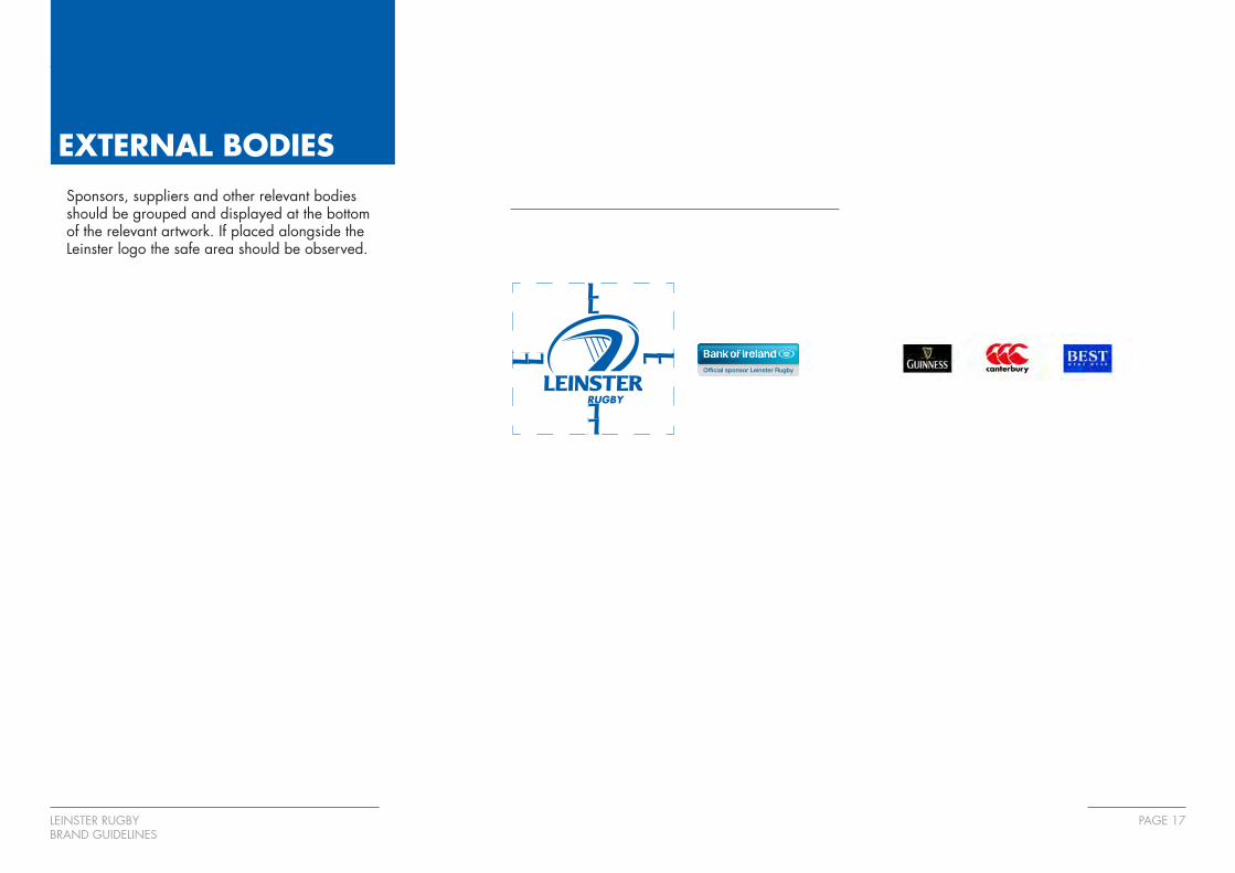
EXTERNAL BODIESSponsors, suppliers and other relevant bodies should be grouped and displayed at the bottom of the relevant artwork. If placed alongside the Leinster logo the safe area should be observed.
RUGBY
LEINSTER RUGBYBRAND GUIDELINES
PAGE 18
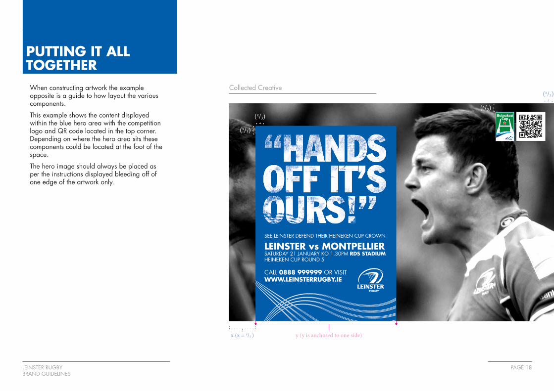
PUTTING IT ALL TOGETHERWhen constructing artwork the example opposite is a guide to how layout the various components.
This example shows the content displayed within the blue hero area with the competition logo and QR code located in the top corner. Depending on where the hero area sits these components could be located at the foot of the space.
The hero image should always be placed as per the instructions displayed bleeding off of one edge of the artwork only.
Collected Creative
SEE LEINSTER DEFEND THEIR HEINEKEN CUP CROWN
LEINSTER vs MONTPELLIERSATURDAY 21 JANUARY KO 1.30PM RDS STADIUM HEINEKEN CUP ROUND 5
CALL 0888 999999 OR VISIT WWW.LEINSTERRUGBY.IE
y (y is anchored to one side)x (x = y/5 )
(x/3)
(x/3)
(x/3)
(x/3)
LEINSTER RUGBYBRAND GUIDELINES
PAGE 19
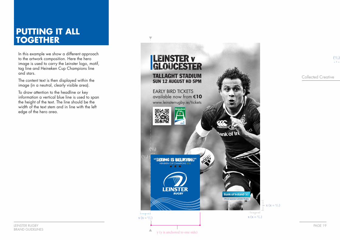
PUTTING IT ALL TOGETHERIn this example we show a different approach to the artwork composition. Here the hero image is used to carry the Leinster logo, motif, tag line and Heineken Cup Champions line and stars.
The content text is then displayed within the image (in a neutral, clearly visible area).
To draw attention to the headline or key information a vertical blue line is used to span the height of the text. The line should be the width of the text stem and in line with the left edge of the hero area.
Collected Creative
y (y is anchored to one side)
x (x = y/5 )
(x/3) (x/3)
(x/3)
(x/3)
HEINEKEN CUP CHAMPIONS 2012
TALLAGHT STADIUM SUN 12 AUGUST KO 5PM
EARLY BIRD TICKETS available now from €10www.leinsterrugby.ie/tickets
x (x = y/5 )
x (x = y/5 )
(x/3)
(x/3)

LEINSTER RUGBYBRAND GUIDELINES
PAGE 20
OTHER OPTIONSFor all other applications (textile, online and offline) the Leinster Brand Guardian should be contacted.
Other variants of the motif are available at the explicit approval of the guardian. All artwork should be signed off after adhering to the guidelines.