brand guidelines - braze.com · pdf filelogo logotype monogram whitespace sizing incorrect...
TRANSCRIPT

This document contains the rules for our visual communication system.
Follow these rules strictly to maintain brand consistency.
This includes all of the elements you may need—logos, typefaces, colors,
and more—to create a consistent tone, look, and feel for Braze materials.
We invite you to absorb this information and reference it often to become
an informed keeper of the brand.
Brand Guidelines
Braze (formerly Appboy) is a lifecycle engagement platform that forms strong
bonds between people and the brands they love. We empower brands to
humanize their connections with customers through technology, resulting in
better experiences and increased retention, lifetime value, and ROI.
Braze is built for today’s mobile-first reality and tomorrow’s ambient computing
future. Enterprise and born-digital brands rely on Braze to deliver personalized
messaging experiences that span across channels, platforms, and devices.
Our flexible and comprehensive stack enables the automation of sophisticated
marketing and growth strategies easily, and instantly, on a global scale. With
data, technology, and teams working together in unison, we’ve created a
platform that makes marketing more authentic, brands more human, and
customers more satisfied with every experience.
Each month, tens of billions of messages associated with nearly 2 billion
active users are managed through our technology. Braze is a venture-backed
company with hundreds of employees. Our offices are located in New York City,
San Francisco, and London. Most recently, we’ve been named a Leader in the
Forrester Wave™: Mobile Engagement Automation, Q3 2017 evaluation. We’ve
received the Digiday Signal Award for Best CRM, in addition to being named
VentureBeat Omnichannel MMA’s “Best Bet,” a Cloud100 Rising Star in Forbes,
and #21 in the Deloitte Technology Fast 500 List. Learn more at Braze.com.
Boilerplate
Full Version
Braze (formerly Appboy) is a lifecycle engagement platform that forms strong bonds between
people and the brands they love. We empower brands to humanize their connections with
customers through technology, resulting in better experiences and increased retention, lifetime
value, and ROI. Teams use Braze to deliver highly personalized messaging experiences that
span across channels, platforms, and devices. This is made possible by our stack, which is located
at the core of a modern marketing technology ecosystem.
Braze is a venture-backed company with hundreds of employees. Our offices are located in
New York City, San Francisco, and London. Most recently, we’ve been named a Leader in the
Forrester Wave™: Mobile Engagement Automation, Q3 2017 evaluation. We’ve received the
Digiday Signal Award for Best CRM, in addition to being named VentureBeat Omnichannel MMA’s
“Best Bet,” a Cloud100 Rising Star in Forbes, and #21 in the Deloitte Technology Fast 500 List.
Learn more at Braze.com.
Boilerplate
Abbreviated Version
LogoLogotype
Monogram
Whitespace
Sizing
Incorrect Usage
Special Usage
Logo
Logotype
Monogram
Whitespace
Sizing
Incorrect Usage
Special Usage
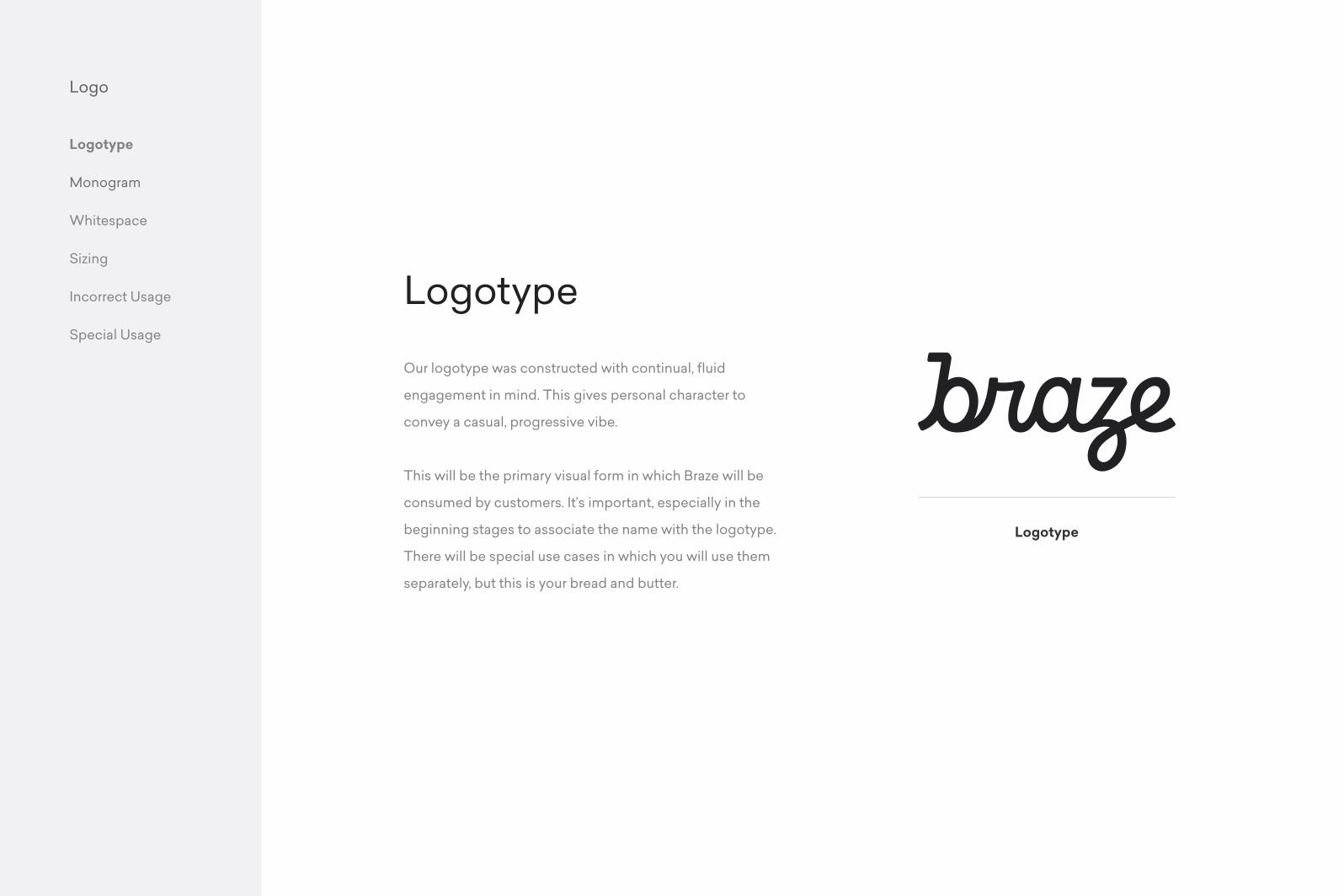
Our logotype was constructed with continual, fluid
engagement in mind. This gives personal character to
convey a casual, progressive vibe.
This will be the primary visual form in which Braze will be
consumed by customers. It’s important, especially in the
beginning stages to associate the name with the logotype.
There will be special use cases in which you will use them
separately, but this is your bread and butter.
Logotype
Logotype

Logo
Logotype
Monogram
Whitespace
Sizing
Incorrect Usage
Special Usage
The monogram is secondary symbol to the logotype.
It maintains a continuous line coming from the ‘b’, making a
perfect circle.
The monogram should be used in circumstances when the
logotype or the Braze brand has been already established,
or when the constraints call for smaller elements, like social
avatars or favicons.
Monogram
Stroked Monogram
Filled Monogram
Logo
Logotype
Monogram
Whitespace
Sizing
Incorrect Usage
Special Usage
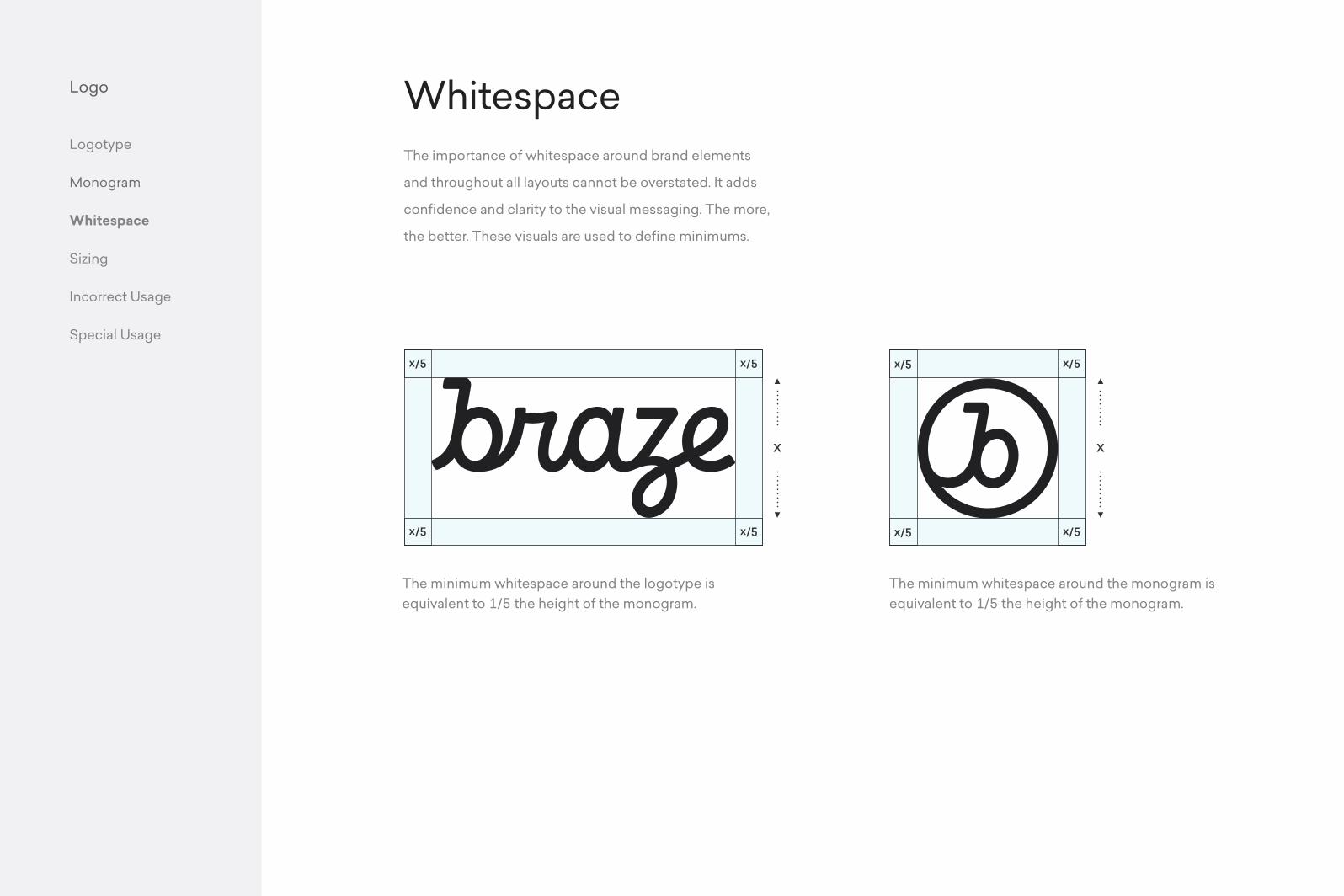
The importance of whitespace around brand elements
and throughout all layouts cannot be overstated. It adds
confidence and clarity to the visual messaging. The more,
the better. These visuals are used to define minimums.
Whitespace
x/5
x/5
x/5
x/5
x/5
x/5
x/5
x/5
The minimum whitespace around the logotype is equivalent to 1/5 the height of the monogram.
The minimum whitespace around the monogram is equivalent to 1/5 the height of the monogram.
Logo
Logotype
Monogram
Whitespace
Sizing
Incorrect Usage
Special UsageLogotype
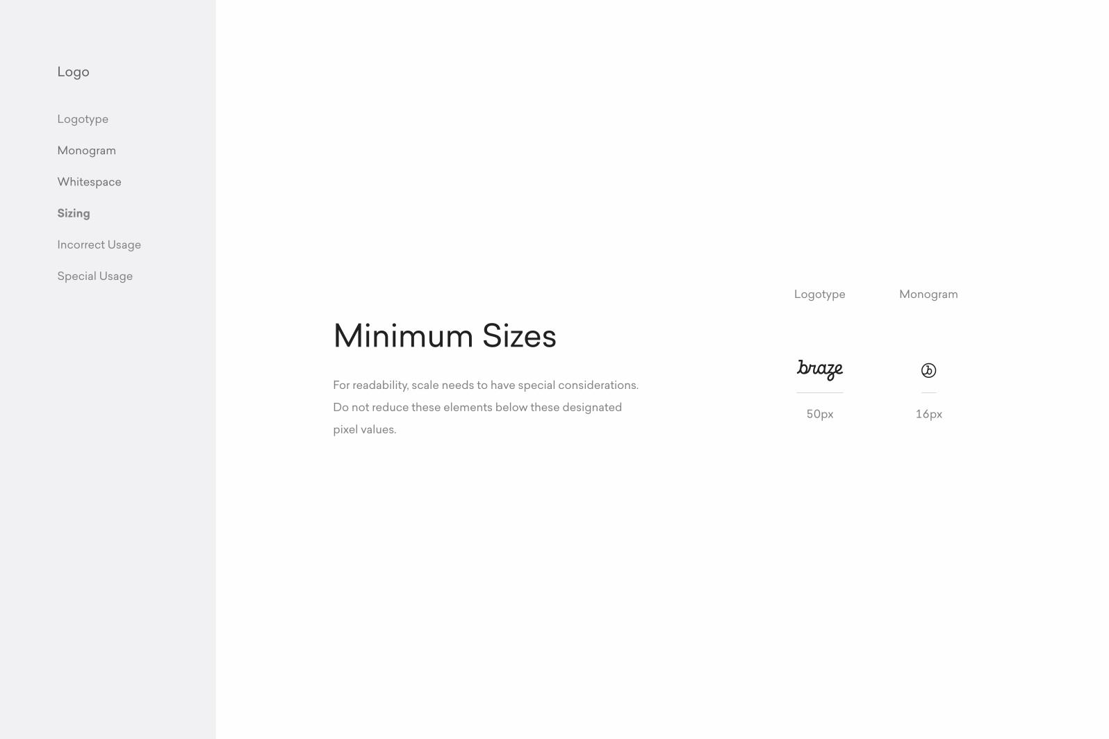
50px
Monogram
16px
For readability, scale needs to have special considerations.
Do not reduce these elements below these designated
pixel values.
Minimum Sizes
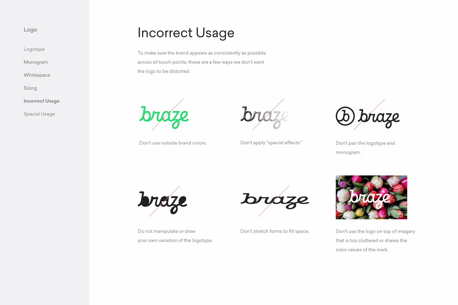
Don’t use outside brand colors.
Do not manipulate or draw
your own variation of the logotype.
Don’t apply “special effects.”
Don’t stretch forms to fill space.
Don’t pair the logotype and
monogram.
Don’t use the logo on top of imagery
that is too cluttered or shares the
color values of the mark.
Logo
Logotype
Monogram
Whitespace
Sizing
Incorrect Usage
Special Usage
To make sure the brand appears as consistently as possible
across all touch points, these are a few ways we don’t want
the logo to be distorted.
Incorrect Usage

ColorMain Usage
Color Palette
Gradient Usage
Logo Color
Color
Main Usage
Color Palette
Gradient Usage
Logo Color
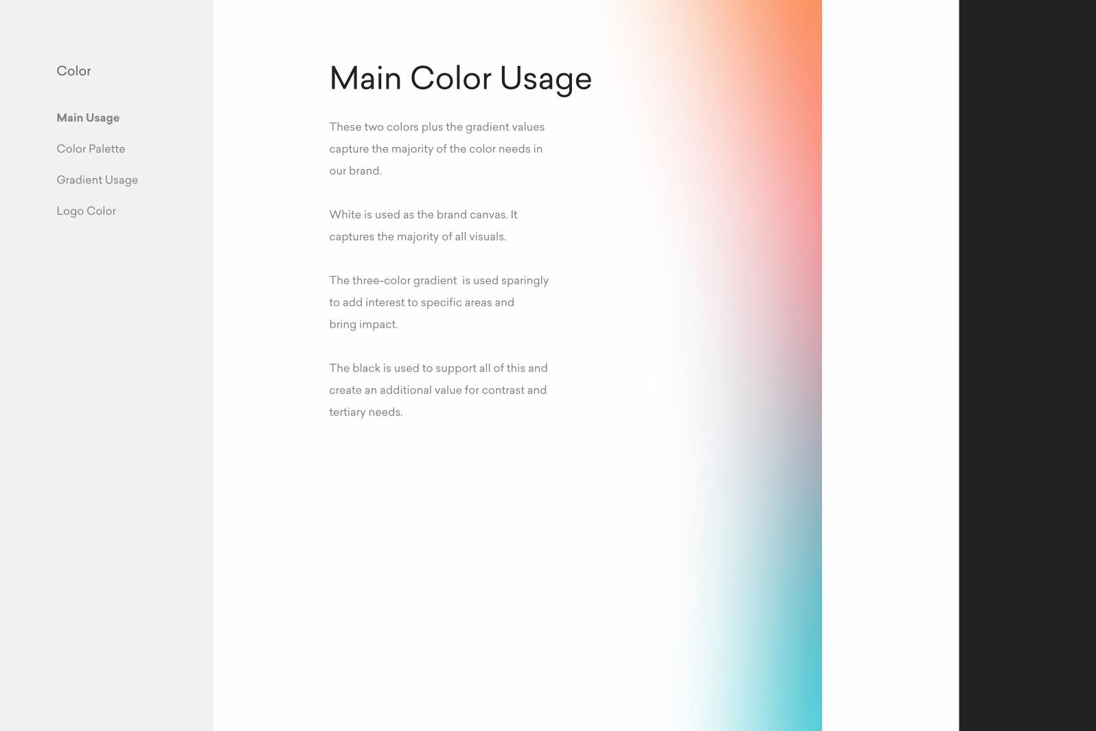
These two colors plus the gradient values
capture the majority of the color needs in
our brand.
White is used as the brand canvas. It
captures the majority of all visuals.
The three-color gradient is used sparingly
to add interest to specific areas and
bring impact.
The black is used to support all of this and
create an additional value for contrast and
tertiary needs.
Main Color Usage
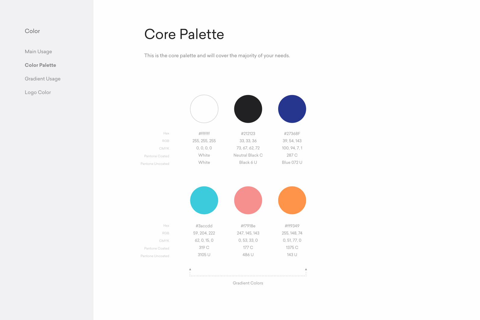
Hex
RGB
CMYK
Pantone Coated
Pantone Uncoated
#ff9349
255, 148, 74
0, 51, 77, 0
1375 C
143 U
#3accdd
59, 204, 222
62, 0, 15, 0
319 C
3105 U
#f7918e
247, 145, 143
0, 53, 33, 0
177 C
486 U
#212123
33, 33, 36
73, 67, 62, 72
Neutral Black C
Black 6 U
#27368F
39, 54, 143
100, 94, 7, 1
287 C
Blue 072 U
#ffffff
255, 255, 255
0, 0, 0, 0
White
White
Hex
RGB
CMYK
Pantone Coated
Pantone Uncoated
Color
Main Usage
Color Palette
Gradient Usage
Logo Color
This is the core palette and will cover the majority of your needs.
Core Palette
Gradient Colors
Color
Main Usage
Color Palette
Gradient Usage
Logo Color
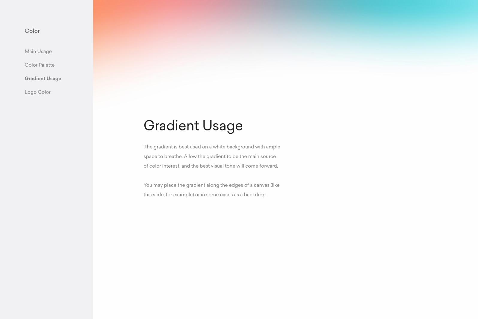
The gradient is best used on a white background with ample
space to breathe. Allow the gradient to be the main source
of color interest, and the best visual tone will come forward.
You may place the gradient along the edges of a canvas (like
this slide, for example) or in some cases as a backdrop.
Gradient Usage
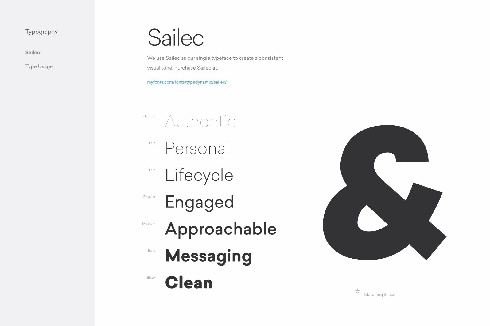
TypographySailec
Type Usage
Authentic
&Personal
Lifecycle
Hairline
We use Sailec as our single typeface to create a consistent
visual tone. Purchase Sailec at:
myfonts.com/fonts/typedynamic/sailec/
Thin
Thin
Regular
Medium
Bold
Black
* Matching italics
EngagedApproachableMessagingClean
Sailec
&&&&&&Typography
Sailec
Type Usage
BiosExecutive Team
Acquisitions Team
Logistics Team
Bios
Executive Team
Acquisitions Team
Logistics Team
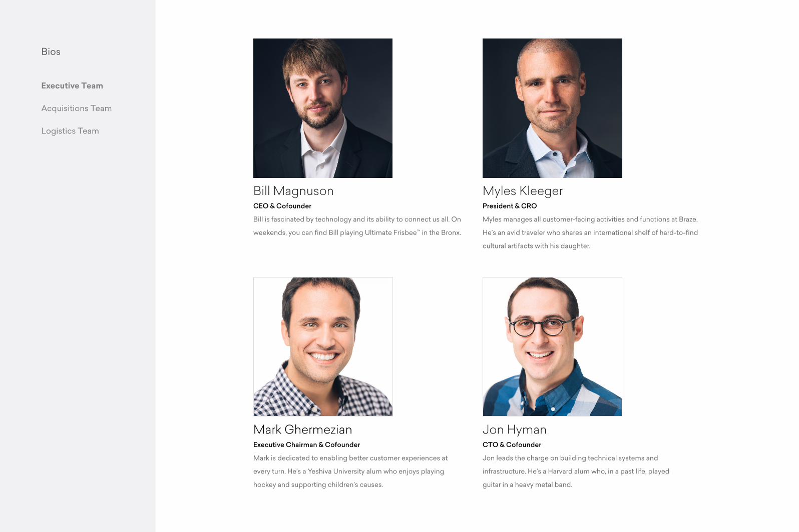
Bill MagnusonCEO & Cofounder
Bill is fascinated by technology and its ability to connect us all. On
weekends, you can find Bill playing Ultimate Frisbee™ in the Bronx.
Jon HymanCTO & Cofounder
Jon leads the charge on building technical systems and
infrastructure. He’s a Harvard alum who, in a past life, played
guitar in a heavy metal band.
Mark GhermezianExecutive Chairman & Cofounder
Mark is dedicated to enabling better customer experiences at
every turn. He’s a Yeshiva University alum who enjoys playing
hockey and supporting children’s causes.
Myles KleegerPresident & CRO
Myles manages all customer-facing activities and functions at Braze.
He’s an avid traveler who shares an international shelf of hard-to-find
cultural artifacts with his daughter.

Bios
Executive Team
Acquisitions Team
Logistics Team
Marissa AydlettSVP, Marketing
Marissa shapes the company’s market position to further increase
brand awareness and advance strategic initiatives. She used to be
a competitive figure skater, and one of her signature moves is the
double salchow.
Daniel HeadSVP, Global Sales
Daniel leads our global sales efforts with over 20 years of
experience under his belt. He’s obsessed with windsurfing and
knows all the words to Hank Snow’s “I’ve Been Everywhere.”
Matt McRobertsVP, Partnerships & Channel
Matt is dedicated to advancing our global channel development
efforts. During his time at Boston University, he spent time in the ring
as a college wrestler. Now, he’s teaching his sons the ropes.
Tim SatterwhiteVP, West Region
Tim is dedicated to improving every brand’s understanding of their
customers and evolving opportunities that drive growth. He once
lived the good life in Costa Rica as the proud owner of a hotel/bar
on the island.
Bios
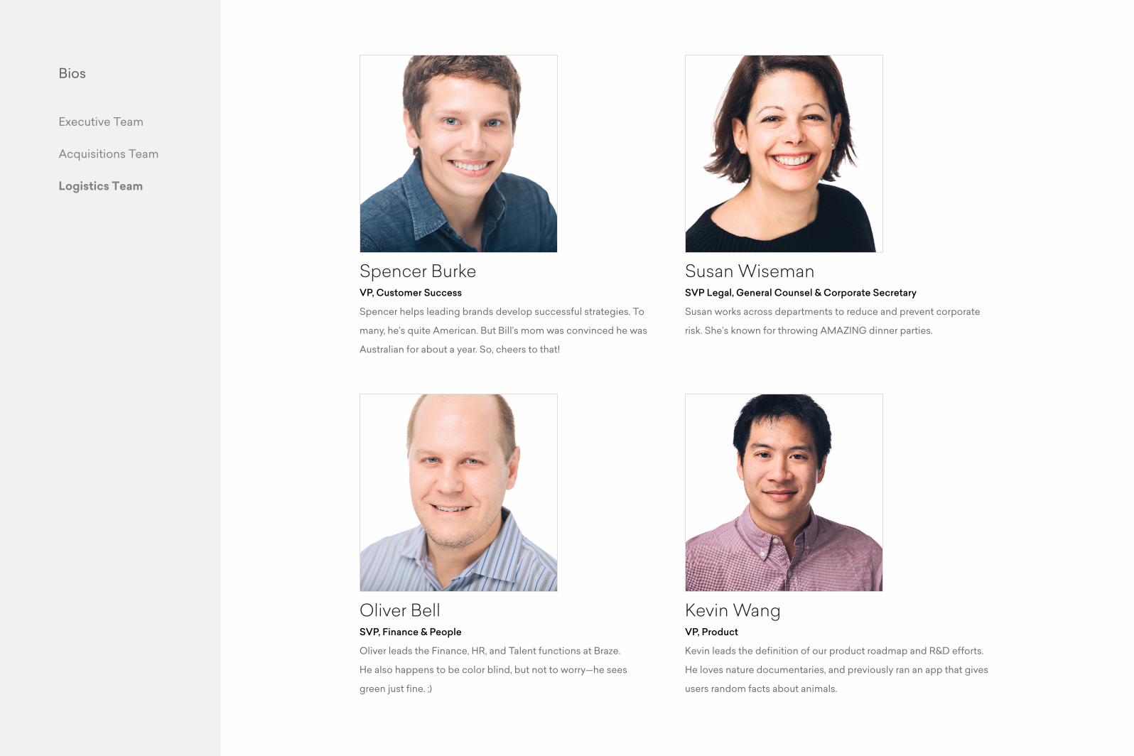
Spencer BurkeVP, Customer Success
Spencer helps leading brands develop successful strategies. To
many, he’s quite American. But Bill’s mom was convinced he was
Australian for about a year. So, cheers to that!
Oliver BellSVP, Finance & People
Oliver leads the Finance, HR, and Talent functions at Braze.
He also happens to be color blind, but not to worry—he sees
green just fine. ;)
Kevin WangVP, Product
Kevin leads the definition of our product roadmap and R&D efforts.
He loves nature documentaries, and previously ran an app that gives
users random facts about animals.
Susan WisemanSVP Legal, General Counsel & Corporate Secretary
Susan works across departments to reduce and prevent corporate
risk. She’s known for throwing AMAZING dinner parties.
Executive Team
Acquisitions Team
Logistics Team

This document serves as a foundational guide to using this brand identity.
It covers all the rules regarding color, typography, artistic direction, and
more. These guidelines are for the use of the Braze team and associated
agencies only. If there is ever doubt, please refer back to this document
Information