brand identity - consignor software for easy shipping ... · 1 brand identity manual guidelines for...
TRANSCRIPT
1
BrandIdentityMANUALGuidelines for visual appearance - Detail. January 2016

2
Brand Identity Manual - DetailRevision: January 2016Revision by: elektrisk.dk
2

3
Table of CONTENTS
01: Consignor Logo 4 01.1: Consignor Logo 5 01.2: Consignor Primary Logo 6 01.3: Consignor Secondary Logo 7 01.4: Consignor White Logo 8 01.5: Printing the Logo with White Ink 9 01.6: Consignor Logo Symbol 10 01.7: Digital Design Kit: Logos 11 01.8: Consignor Logo + Subbrand 13 01.9: Brand Identity in Writing 15
02: Consignor Colour System 16 02.1: Primary Colour 17 02.2: Secondary Colours 19
03: Consignor Typography 20 03.1: Consignor Font Pair 21 03.2: Encode Sans Narrow 22 03.3: Open Sans 24 03.3.1: Open Sans For Print 26 03.3.1: Open Sans For Screen 27

44
01:ConsignorLOGO

5
01.1: CONSIGNOR LOGO
The Consignor masterbrand or corporate logo consists of two elements: The logo symbol and the logo type.The full logo exists in two appearances:A wide appearance and a centered appearance as it is shown below.
Primary Consignor logo.Wide version can be used left aligned, centered and right aligned in lay-outs. Preferably use this version of the logo.
Secondary Consignor logo.Centered version can only be used centered in lay-outs.

6
01.2: CONSIGNOR PRIMARY LOGO
The wide logo is the primary corporate Consignor logo.It should be the first choice for any design application.The wide version can be used left aligned, centered and right aligned in lay-outs.
Consignor logo. Wide version. Logo symbol placed to the left of logo type.
Minimum clearspaceKeep a minimum amount of space all the way around the logo in which no other layout elements are placed.The amount of clearspace equals the distance be-tween the logo symbol and logotype
Minimum sizeDo not use the wide logo in sizes below a width of 20 mm. This is the minimum size in which the logo elements are clearly defined.
20 mm

7
01.3: CONSIGNOR SECONDARY LOGO
The centered logo is the secondary corporate Consignor logo.It can be used as an alternative in special situations.The centered version can be used centered in lay-outs.
Consignor logo. Centered version. Logo symbol visually centered above logo type.
Minimum sizeDo not use the centered logo in sizes below a width of 15 mm. This is the minimum size in which the logo elements are clearly defined.
15 mm
Minimum clearspaceKeep a minimum amount of space all the way around the logo in which no other layout elements are placed.The amount of clearspace equals the distance be-tween the logo symbol and logotype

8
01.4: CONSIGNOR WHITE LOGO
The Consignor logo has been designed in a white variation to be used on dark back-ground withan outlined logo symbol.Always use the outlined version on dark background. Do not use a negative version of the black logo. That will make the logo symbol appear incorrect.

9
01.5: PRINTING THE LOGO WITH WHITE INK
A special version of the Consignor logo has been designed for printing with white ink on objects.Typical cases could be printing a white logo on a dark t-shirt, printing a white logo on a dark notebook or printing a white logo on a dark pen.You may need to twist your brain a little to get this right, but in order to have a logo printed in white, you must provide a black logo to the print shop.The print shop will print your logo in white ink and the end result will be a white logo.
Intended appearance: White on black Material for print shop: Special black logo: Consignor-wide-for-white-ink.eps
End result: Black logo printed with white ink.

10
01.6: CONSIGNOR LOGO SYMBOL
The logo symbol can be used by itself in situations where corporate identity must be communicated in a compact space.For instance on application icons.Be careful to use the correct version of the logo for white versions.
Example: App icon.White logo.
Example: Windows task bar.Black logo.
Example: Logo pin.Black logo.

11
01.7: DIGITAL DESIGN KIT: LOGOS
Variations of the Consignor logo are provided as a digital design kit.The kit contains two sets of logos:One set for everyday use for digital documents and internal printing of office documents.A second set with the logos that are necesarry for use in professional print.
Consignor-wide-black
Logo for digital and internal print Logo for professional print
.jpg .png .eps .pdf
Consignor-wide-for-white-ink
Consignor-wide-white
Consignor-symbol-black
Consignor-symbol-for-white-ink
Consignor-symbol-white
Consignor-center-black
Consignor-center-for-white-ink
Consignor-center-white

12

13
01.8: CONSIGNOR LOGO + SUBBRAND
In some cases the Consignor logo is accompanied by a subbrand.The subbrand is set in Encode Sans Narrow Light in 50% of the logotype height.The subbrand can be used with the wide logo variation.Subbrand may not be used with the centered version.
Subbrand examples:
TicketShipment ServerOn-premisesScan AppShip AdvisorClick’n’ClaimCustom Price CalculationReturn ManagementInboundMobilePortal
100%
50%
Subbrand sizeEncode Sans Narrow Light in 50% of the size of the logotype.
Subbrand placementThe subbrand is placed below the logotype. The distance between the baseline of the logotype and the baseline of the subbrand equals twice the distance between the logo symbol and the logotype.

14

15
01.9: BRAND IDENTITY IN WRITING
Brand identity must be consistent both in visual appearance and in the way we write. Here are guide lines for writing our brand words in text.
Company nameThe company name is Consignor and it is written with a leading capital letter:
Consignor
The company name can be followed by business specific wordings relevant to the countries in which it exists.Examples:
Consignor Group AS
Consignor AS
Consignor A/S
Consignor AB
Consignor Oy
Consignor S.R.L.
Consignor Ltd.
Brand nameThe brand Consignor is written with a leading capital letter:
Consignor
Subbrand nameSubbrands of Consignor is written in separate words with a leading capital letter in each word. For example:Shipment Server.Subbrands should preferably be used as an attachment to the Consignor brand rather than by itself:
Consignor Shipment Server

1616
02:ConsignorCOLOURSYSTEM

17
PANTONE 375 CPC 46 M 0 Y 90 K 0
PANTONE 375R 151 G 215 B 0HTML 97D700
PANTONE 375 C
Colour translation reference:PANTONE COLOR BRIDGE Coated, 2015 Edition
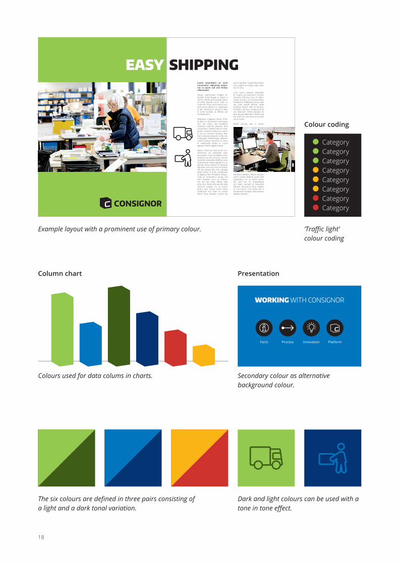
02.1: PRIMARY COLOUR
The use of colours are important in the Consignor identity program. The primary colour is green Pantone 375 and should be used prominently throughout all visual representations when possible.A selection of secondary colors have been specified. Use secondary colors sparsely in profile graphic design work.
18
Category Category Category Category Category Category Category Category
Column chart Presentation
Colour coding
The six colours are defined in three pairs consisting of a light and a dark tonal variation.
Colours used for data colums in charts. Secondary colour as alternative background colour.
‘Traffic light’ colour coding
Dark and light colours can be used with a tone in tone effect.
Example layout with a prominent use of primary colour.
EASY SHIPPINGLorem ipsumDolor sit amet Consectetur adipiscing maece-nas ut quam sed erat finibus ullamcorper.
Mauris ullamcorper fringilla im-perdiet. Nulla feugiat ut sapien a rutrum. Morbi sed volutpat quam, sit amet blandit tortor. Nam ac nulla sem. Proin lacus lorem, tinci-dunt luctus efficitur in, sollicitudin in elit. Vestibulum euismod diam et tortor laoreet, et efficitur est condimentum.
Maecenas a egestas metus. Proin at libero in dui dictum scelerisque non sed tellus. Sed hendrerit maximus nulla eu placerat. Duis consectetur eleifend felis et vesti-bulum. Praesent massa ex, viverra id leo et, euismod tempus felis. Nam placerat pharetra nulla non malesuada. Pellentesque habitant morbi tristique senectus et netus et malesuada fames ac turpis egestas. Morbi sagittis massa.
Mauris maximus ante id est con-dimentum, vel sollicitudin diam consequat. Fusce vel dapibus erat. Vivamus vel arcu id purus rutrum hendrerit imperdiet eleifend urna. Suspendisse mattis egestas mi, ac semper lectus tempor id. Aliquam dignissim, eros id cursus tincidunt, nisi leo lacinia felis, nec volutpat dolor metus et enim. Vestibulum id dapibus felis. Phasellus tempor, nulla at consectetur iaculis, dui sem molestie arcu, eu efficitur nisl nisl nec odio. Morbi vitae ante risus. Nulla vehicula, elit vitae rhoncus congue, mi mi auctor lorem, quis cursus lorem tellus vestibulum dui. Nam eu neque lectus. Duis porttitor ornare dui
quis imperdiet. Suspendisse dolor eros, sagittis at congue eget, dapi-bus id urna.
Cum sociis natoque penatibus et magnis dis parturient montes, nascetur ridiculus mus. Ut ullam-corper est arcu, ac tincidunt dolor molestie at. Maecenas iaculis odio nec odio aliquet dictum. Nulla molestie dictum nibh id tempus. Phasellus ultricies consequat ante nec interdum. Morbi placerat mi quis aliquet bibendum. Morbi sed est vitae elit commodo accumsan vel at massa.
Morbi ultricies velit in ipsum
hendrerit eleifend. Mauris blandit, sem in auctor eleifend, quam nibh scelerisque mi, sit amet auctor dui urna non mi. Suspendisse orci diam, suscipit et imperdiet lobortis, vehicula in lacus. Integer ac nisl mauris. Cras mollis leo in nisl pretium volutpat. Nam tempor dapibus laoreet.
WORKING WITH CONSIGNOR
Facts Process Innovation Platform

19
02.2: SECONDARY COLOURS
Secondary colours can be used as companion colours to the primary colour, when more colours are needed in a design. The blue and green colours may be used on larger areas. Yellow and red may only be used in small amounts. For example in situ-ations where colour coding of object is necesarry.
PANTONE 288 CPC 100 M 80 Y 6 K 32
PANTONE 288R 0 G 45 B 114HTML 002D72
PANTONE 288 C
PANTONE 285 CPC 90 M 48 Y 0 K 0
PANTONE 285R 0 G 114 B 206HTML 0072CE
PANTONE 285 C
PANTONE 371 CPC 50 M 9 Y 98 K 61
PANTONE 371R 84 G 98 B 35HTML 546223
PANTONE 371 C
PANTONE 180 CPC 3 M 91 Y 86 K 12
PANTONE 130 CPC 0 M 32 Y 100 K 0
PANTONE 180R 190 G 58 B 52HTML BE3A34
PANTONE 130R 242 G 169 B 0HTML F2A900
PANTONE 180 C
PANTONE 130 C

202020
03:ConsignorTYPOGRAPHY

21
03.1: CONSIGNOR FONT PAIR
Consistent and destinct use of typography adds to a clear branding of Consignor’s visual materials. For that purpose a font pair is defined consisting of a headline font and a body text font.The fonts have been selected based on their ability to work well in both a print envi-ronment and on screen.Fonts are available as part of the Digital Design Kit
Encode Sans Narrow is used for head-lines and effect type.It is designed by Impellari Type and intended to have a pleasant modern feeling.
It is covered by SIL Open Font License v1.10 which means it is available for unrestricted use and can be distributed freely, installed and used on corporate computers without any conflict with the licence.
Open Sans is used for body type.It is a sans-serif typeface designed by Steve Matteson and part of the Google Fonts libraryIt is covered by Free software licence,
Apache which means it is available for unrestricted use and can be distributed freely, installed and used on corporate computers without any conflict with the licence.
ENCODE SANS NARROW
Open Sans
for headlines and effect
for body type

22
03.2: ENCODE SANS NARROW
Encode Sans Narrow is available in a range of weights. They can be mixed and matched in Consignor’s visual material in order to create a distinct and interesting typographical appearance.
ThinabcdefghijklmnopqrstuvwxyzæøåABCDEFGHIJKLMNOPQRSTUVWXYZÆØÅ1234567890
ThinabcdefghijklmnopqrstuvwxyzæøåABCDEFGHIJKLMNOPQRSTUVWXYZÆØÅ1234567890
LightabcdefghijklmnopqrstuvwxyzæøåABCDEFGHIJKLMNOPQRSTUVWXYZÆØÅ1234567890
RegularabcdefghijklmnopqrstuvwxyzæøåABCDEFGHIJKLMNOPQRSTUVWXYZÆØÅ1234567890
MediumabcdefghijklmnopqrstuvwxyzæøåABCDEFGHIJKLMNOPQRSTUVWXYZÆØÅ1234567890
SemiboldabcdefghijklmnopqrstuvwxyzæøåABCDEFGHIJKLMNOPQRSTUVWXYZÆØÅ1234567890
BoldabcdefghijklmnopqrstuvwxyzæøåABCDEFGHIJKLMNO PQRSTUVWXYZÆØÅ1234567890
Extra BoldabcdefghijklmnopqrstuvwxyzæøåABCDEFGHIJKLMNO PQRSTUVWXYZÆØÅ1234567890
BlackabcdefghijklmnopqrstuvwxyzæøåABCDEFGHIJKLMNO PQRSTUVWXYZÆØÅ1234567890

23
FREE SHIPPING– boom or bust for online shops?
1 Free shipping as a marketing stunt2 Free shipping built into the price3 Free shipping on bulk orders4 Free shipping through subscription5 Free shipping as a campaign
ENCODESANS NARROWHEAVY CAPS & mixed
THIN CAPS & mixed
LIGHT CAPS & mixed

24
03.3: OPEN SANS
Open Sans is available in a range of weights. Two use patterns are defined for the font: Print use and screen use. Each pattern makes optimal use of font weights to match the intentions of a clear and well functioning text image.
RegularabcdefghijklmnopqrstuvwxyzæøåABCDEFGHIJKLMNOPQRSTUVWXYZÆØÅ1234567890
ItalicabcdefghijklmnopqrstuvwxyzæøåABCDEFGHIJKLMNOPQRSTUVWXYZÆØÅ1234567890
BoldabcdefghijklmnopqrstuvwxyzæøåABCDEFGHIJKLMNOPQRSTUVWXYZÆØÅ1234567890
Bold ItalicabcdefghijklmnopqrstuvwxyzæøåABCDEFGHIJKLMNOPQRSTUVWXYZÆØÅ1234567890
LightabcdefghijklmnopqrstuvwxyzæøåABCDEFGHIJKLMNOPQRSTUVWXYZÆØÅ1234567890
Light ItalicabcdefghijklmnopqrstuvwxyzæøåABCDEFGHIJKLMNOPQRSTUVWXYZÆØÅ1234567890
SemiboldabcdefghijklmnopqrstuvwxyzæøåABCDEFGHIJKLMNOPQRSTUVWXYZÆØÅ1234567890
Semibold ItalicabcdefghijklmnopqrstuvwxyzæøåABCDEFGHIJKLMNOPQRSTUVWXYZÆØÅ1234567890
HeavyabcdefghijklmnopqrstuvwxyzæøåABCDEFGHIJKLMNOPQRSTUVWX-YZÆØÅ1234567890
Heavy ItalicabcdefghijklmnopqrstuvwxyzæøåABCDEFGHIJKLMNOPQRSTUVWXYZÆØÅ1234567890

25
Open Sans
Aenean auctor nisi nec velit gravida, id maximus tellus placerat. Sed sagittis odio vel sem porta dictum. Etiam egestas eros vitae enim aliquam venenatis. In at ante est. Maecenas rhoncus pretium eros, at gravida velit. Nulla metus dui, scelerisque in mollis sit amet, molestie eu dui. Donec ut sagittis velit. Ut sollicitudin eleifend mi, sit amet finibus quam volutpat et. Nunc augue mauris, gravida sit amet dui a,
tincidunt sagittis mauris. Aliquam varius viverra semper. Sed ultricies, velit non porta tincidunt, quam leo congue mau-ris, ut tempus ligula turpis eu lorem.
Curabitur consequat diamEget nulla sodales sodales eget a justo. Integer ornare, metus at sodales vulpu-tate, urna dolor faucibus purus, ac lao-
reet dui lorem eu dui. In laoreet luctus molestie. Donec et faucibus augue, non porta nisl. Fusce metus ipsum, venenatis imperdiet nibh vitae, laoreet porttitor lectus. Nunc cursus vel nisl eget dapi-bus. Etiam mattis nunc neque, ac viverra velit imperdiet eu. Nunc vitae bibendum enim. Pellentesque felis lorem, eleifend nec volutpat sit amet, sagittis ut ligula.
Sed accumsan mauris quisPorttitor maximus, odio augue aliquet felis, eget porttitor arcu nisi quis metus. Donec sed placerat libero. Pellentesque risus mauris, cursus at velit vitae, feugiat lobortis est. Nulla efficitur ligula quam, quis suscipit leo pellentesque eu. Cras
ornare dolor sit amet cursus ultrices. Sed accumsan massa luctus justo consectetur plac-erat. Etiam fermentum, metus vitae ullamcorper ornare, tel-lus arcu bibendum enim, eget convallis purus felis posuere velit. Suspendisse ex massa,
finibus scelerisque placerat sed, gravida a risus. Ut convallis eleifend tellus, vitae scelerisque justo volutpat euismod. Vestibulum et dui sodales, gravida orci a, hendrerit nisl.
Fusce in tincidunt libero. Integer rutrum nunc in malesuada ultrices. Etiam est tortor, cursus eget ipsum at.
Lorem ipsum dolor sit amet, consectetur adip-iscing elit. Suspendisse fringilla diam facilisis elementum rutrum. Nunc pharetra est erat, eu sagittis nisi pharetra pretium. Nunc sit amet lob-ortis felis. Morbi commodo porta consectetur.
Praesent faucibus quam sit amet sem pulvinar, luctus volutpat massa consequat.

26
03.3.1: OPEN SANS FOR PRINT
When using Open Sans for print the aim is to have an airy light feeling of the body type with a clear emphasis on readability.
Lead text on white background is set in Open Sans Semibold in order to guide the eye to the beginning of an article
When body text is used on white back-ground, the text is set in Open Sans Light. The leading (line spacing) is 140% of the font size. If for example the text is set in 10pt the leading is 14pt.
Subheadings are also semiboldOpen Sans Light provides good readabil-ity on a white background and achieves the intended airy feeling. Emphasis in the body text can be made with either italic text or semibold text.
On white background use:
Open Sans LightOpen Sans Light ItalicOpen Sans SemiboldOpen Sans Semibold Italic
First line Éxgnext line
Image captions on white background are set in Open Sans Light Italic.
Negative lead text and sub-headings are set in Open Sans Bold
Negative body text on a dark background will become too unclear in the light weight. There-fore negative body text is set in Open Sans Regular.
On dark background use:
Open Sans RegularOpen Sans ItalicOpen Sans BoldOpen Sans Bold Italic
Font size 100%. i.e. 20pt
Leading 140%. i.e. 28pt
Use 140% leading:

27
03.3.1: OPEN SANS FOR SCREEN
When using Open Sans for screen the text must be clear and readable on the re-letively low resolution of the screen. Therefore the standard font set uses a slightly heavier weight. To achieve an airy feeling to to text image the leading is larger and the text is rendered in a dark grey colour rather than black.
Lead text on white background is set in Open Sans Bold in order to guide the eye to the beginning of an article
When body text is used on white
background, the text is set in Open Sans
Regular. The leading (line spacing) is
170% of the font size. If for example the
text is set in 10px the leading is 17px.
Subheadings are also boldOpen Sans Regular provides good
readability on a white background
and achieves the intended airy feeling.
Emphasis in the body text can be made
with either italic text or bold text.
On white background use:Open Sans Regular
Open Sans Italic
Open Sans BoldOpen Sans Bold Italic
First line Éxg
next line
Image captions on white background are
set in Open Sans Italic.
Negative lead text and subheadings are set in Open Sans Bold
Negative body text on a dark
background is set in Open Sans
Regular.
On dark background use:Open Sans Regular
Open Sans Italic
Open Sans BoldOpen Sans Bold Italic
Font size 100%. i.e. 20px
Leading 170%. i.e. 34px
Use 170% leading:
For web use the relvant CSS values are:
font-family: ‘Open Sans’;color: #666666;
Open Sans Regular: font-weight: 400;or font-weight: normal;
Open Sans Bold: font-weight: 700;or font-weight: bold;
170% leading: line-height: 170%;or line-height: 1.7em;

28