brand style guide - brandeis university · 27 alternative typeface ... 4 introduction to the...
TRANSCRIPT
BRAND Style GuiDe | 1
Brand Style Guide
2013
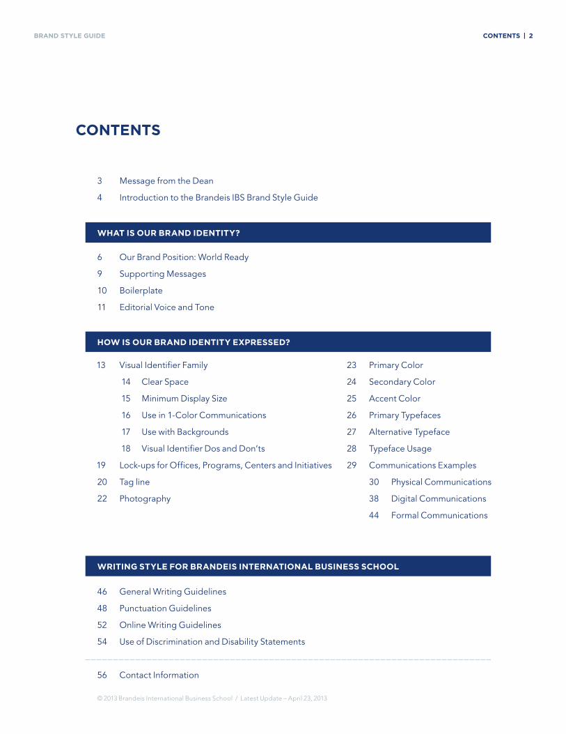
BRAND Style GuiDe ContentS | 2
13 Visual Identifier Family
14 Clear Space
15 Minimum Display Size
16 Use in 1-Color Communications
17 Use with Backgrounds
18 Visual Identifier Dos and Don’ts
19 Lock-ups for Offices, Programs, Centers and Initiatives
20 Tag line
22 Photography
23 Primary Color
24 Secondary Color
25 Accent Color
26 Primary Typefaces
27 Alternative Typeface
28 Typeface Usage
29 Communications Examples
30 Physical Communications
38 Digital Communications
44 Formal Communications
© 2013 Brandeis International Business School / Latest Update – April 23, 2013
46 General Writing Guidelines
48 Punctuation Guidelines
52 Online Writing Guidelines
54 Use of Discrimination and Disability Statements
56 Contact Information
3 Message from the Dean
4 Introduction to the Brandeis IBS Brand Style Guide
6 Our Brand Position: World Ready
9 Supporting Messages
10 Boilerplate
11 Editorial Voice and Tone
ContentS
WHat iS our Brand identity?
HoW iS our Brand identity eXPreSSed?
WritinG Style for BrandeiS international BuSineSS SCHool
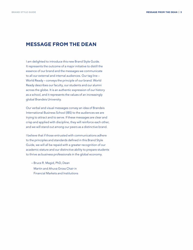
BRAND Style GuiDe MeSSaGe froM tHe dean | 3
I am delighted to introduce this new Brand Style Guide.
It represents the outcome of a major initiative to distill the
essence of our brand and the messages we communicate
to all our external and internal audiences. Our tag line –
World Ready – conveys the principle of our brand. World
Ready describes our faculty, our students and our alumni
across the globe. It is an authentic expression of our history
as a school, and it represents the values of an increasingly
global Brandeis University.
Our verbal and visual messages convey an idea of Brandeis
International Business School (IBS) to the audiences we are
trying to attract and to serve. If these messages are clear and
crisp and applied with discipline, they will reinforce each other,
and we will stand out among our peers as a distinctive brand.
I believe that if those entrusted with communications adhere
to the principles and standards defined in this Brand Style
Guide, we will all be repaid with a greater recognition of our
academic stature and our distinctive ability to prepare students
to thrive as business professionals in the global economy.
– Bruce R. Magid, PhD, Dean
Martin and Ahuva Gross Chair in
Financial Markets and Institutions
MeSSaGe froM tHe dean
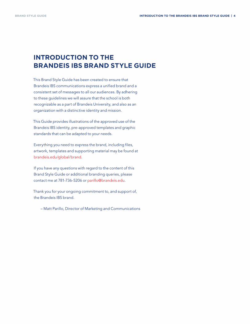
BRAND Style GuiDe introduCtion to tHe BrandeiS iBS Brand Style Guide | 4
This Brand Style Guide has been created to ensure that
Brandeis IBS communications express a unified brand and a
consistent set of messages to all our audiences. By adhering
to these guidelines we will assure that the school is both
recognizable as a part of Brandeis University, and also as an
organization with a distinctive identity and mission.
This Guide provides illustrations of the approved use of the
Brandeis IBS identity, pre-approved templates and graphic
standards that can be adapted to your needs.
Everything you need to express the brand, including files,
artwork, templates and supporting material may be found at
brandeis.edu/global/brand.
If you have any questions with regard to the content of this
Brand Style Guide or additional branding queries, please
contact me at 781-736-5206 or [email protected].
Thank you for your ongoing commitment to, and support of,
the Brandeis IBS brand.
– Matt Parillo, Director of Marketing and Communications
introduCtion to tHe BrandeiS iBS Brand Style Guide
Whatisourbrand
identity?
BRAND Style GuiDe our Brand PoSition: World ready | 6
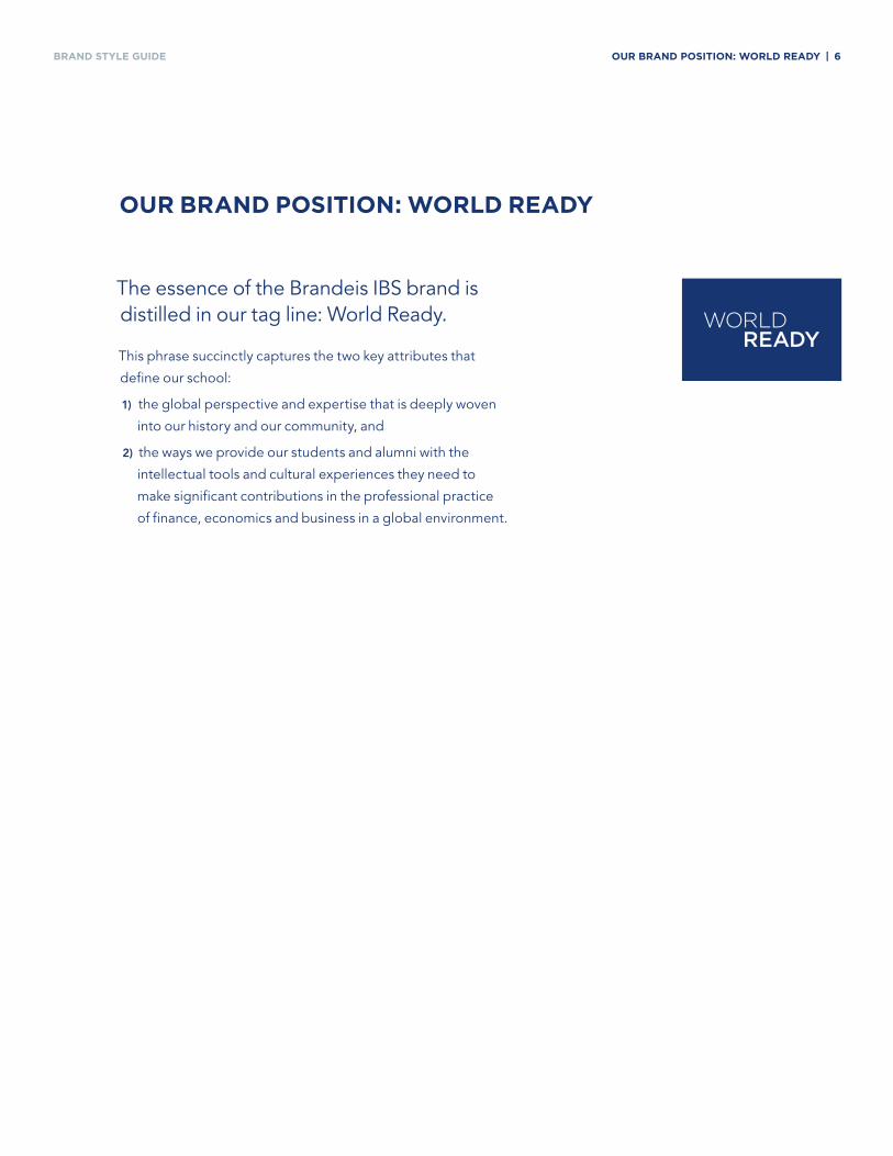
The essence of the Brandeis IBS brand is distilled in our tag line: World Ready.
This phrase succinctly captures the two key attributes that
define our school:
1) the global perspective and expertise that is deeply woven
into our history and our community, and
2) the ways we provide our students and alumni with the
intellectual tools and cultural experiences they need to
make significant contributions in the professional practice
of finance, economics and business in a global environment.
our Brand PoSition: World ready
BRAND Style GuiDe our Brand PoSition: World ready | 7
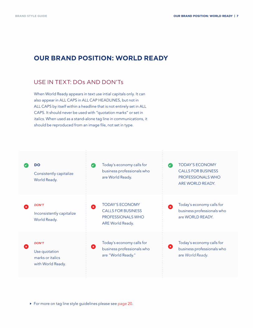
use in text: Dos anD Don’ts
When World Ready appears in text use intial capitals only. It can
also appear in ALL CAPS in ALL CAP HEADLINES, but not in
ALL CAPS by itself within a headline that is not entirely set in ALL
CAPS. It should never be used with “quotation marks” or set in
italics. When used as a stand-alone tag line in communications, it
should be reproduced from an image file, not set in type.
our Brand PoSition: World ready
For more on tag line style guidelines please see page 20.
do
Consistently capitalize
World Ready.
Don't
Inconsistently capitalize
World Ready.
Don't
Use quotation
marks or italics
with World Ready.
~ ~ ~
×
×
×
×
×
×
Today's economy calls for
business professionals who
are World Ready.
TODAY'S ECONOMY
CALLS FOR BUSINESS
PROFESSIONALS WHO
ARE WORLD READY.
Today's economy calls for
business professionals who
are WORLD READY.
Today's economy calls for
business professionals who
are World Ready.
TODAY'S ECONOMY
CALLS FOR BUSINESS
PROFESSIONALS WHO
ARE World Ready.
Today's economy calls for
business professionals who
are "World Ready."
BRAND Style GuiDe our Brand PoSition: World ready | 8
World Ready Means Global Fluency.
At Brandeis IBS, fluency means having a
firm grasp of cultural nuance and subtlety;
recognizing the interplay of economic,
political and social forces; understanding
the dynamics of cross-border commerce;
and finding opportunity in volatility across
global markets.
World Ready Means World Experts.
Students are challenged intellectually by
the prestigious and accomplished faculty
of one of the top research universities in
the world.
World Ready Means Analytic Rigor.
Students gain experience with sophis-
ticated global financial models and
advanced analytical tools, meaning they
are ready to add value on day one.
World Ready Means Collaboration.
In today’s business world, collaboration
produces big pay-offs, and students
graduate with the ability to lead diverse
teams toward identified goals.
World Ready Means Thought and Action.
A powerful combination of business theory
and hands-on practice teaches students to
translate insightful thought into meaningful
action.
World Ready Means Ready to Add Value.
Students graduate ready to tackle complex
challenges and achieve measurable results.
World Ready Means Global Network.
Yes, it’s what you know. But it’s also
who you know. In our diverse campus
community, students build a powerful
network with a global reach.
World Ready Means World Class.
Our campus is at Brandeis University, one
of the world’s leading research universities,
and located just outside the world-class
city of Boston, a thriving international
hub for innovation in business, finance,
technology and education.
World Ready Means Our World.
At Brandeis IBS you will learn more about
how great global organizations ensure
ethical business practices, demonstrate
cross-cultural sensitivity and integrate
environmentally and financially sustainable
practices in their communities.
our Brand PoSition: World ready
World Ready should be used to communicate the benefits of Brandeis IBS to prospective and
current students, to faculty and staff, to employers, to alumni, to donors and to the media.
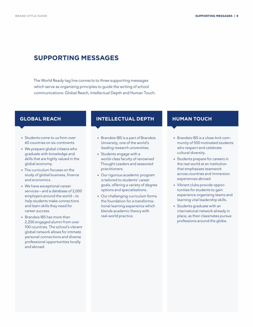
BRAND Style GuiDe SuPPortinG MeSSaGeS | 9
SuPPortinG MeSSaGeS
The World Ready tag line connects to three supporting messages
which serve as organizing principles to guide the writing of school
communications: Global Reach, Intellectual Depth and Human Touch.
• Brandeis IBS is a part of Brandeis University, one of the world’s leading research universities.
• Students engage with a world-class faculty of renowned Thought Leaders and seasoned practitioners.
• Our rigorous academic program is tailored to students’ career goals, offering a variety of degree options and specializations.
• Our challenging curriculum forms the foundation for a transforma-tional learning experience which blends academic theory with real-world practice.
GloBal reaCH intelleCtual dePtH HuMan touCH
• Brandeis IBS is a close-knit com-munity of 500 motivated students who respect and celebrate cultural diversity.
• Students prepare for careers in the real world at an institution that emphasizes teamwork across countries and immersion experiences abroad.
• Vibrant clubs provide oppor-tunities for students to gain experience organizing teams and learning vital leadership skills.
• Students graduate with an international network already in place, as their classmates pursue professions around the globe.
• Students come to us from over 60 countries on six continents.
• We prepare global citizens who graduate with knowledge and skills that are highly valued in the global economy.
• The curriculum focuses on the study of global business, finance and economics.
• We have exceptional career services – and a database of 2,000 employers around the world – to help students make connections and learn skills they need for career success.
• Brandeis IBS has more than 2,200 engaged alumni from over 100 countries. The school’s vibrant global network allows for intimate personal connections and diverse professional opportunities locally and abroad.
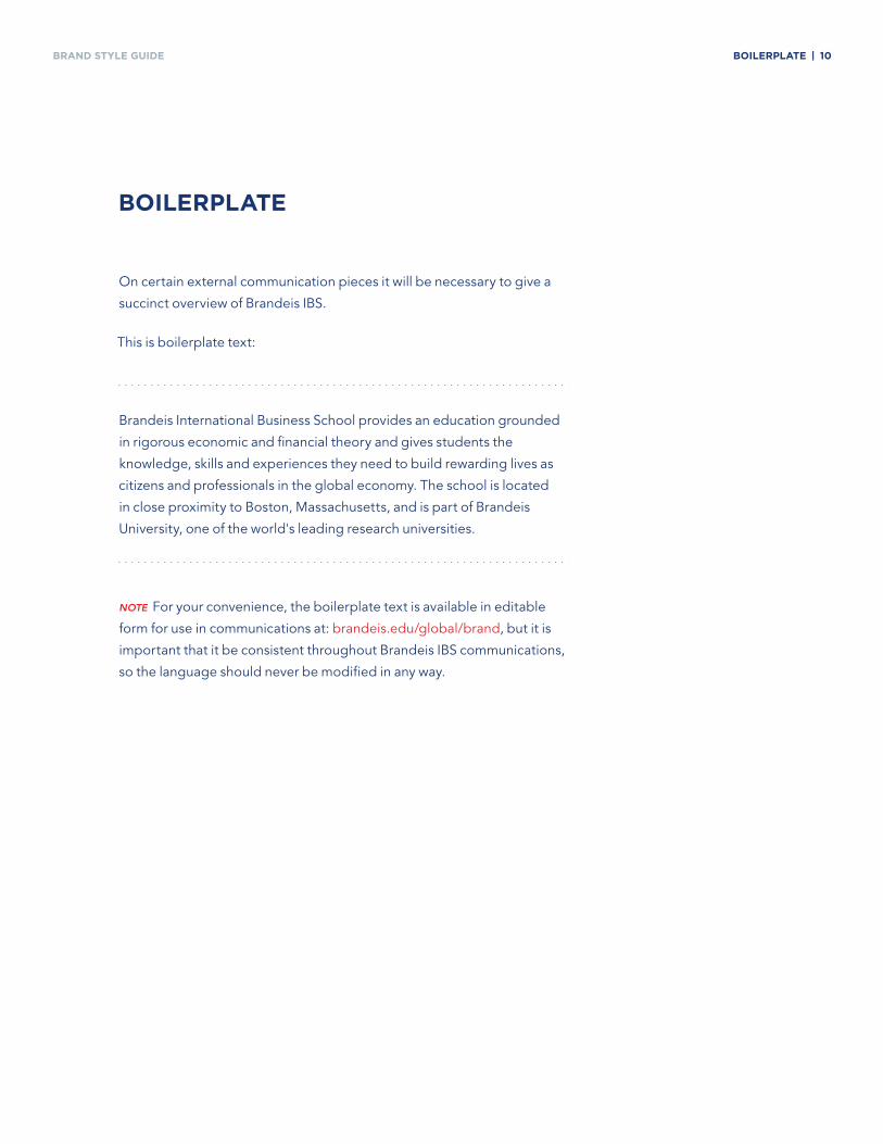
BRAND Style GuiDe BoilerPlate | 10
On certain external communication pieces it will be necessary to give a
succinct overview of Brandeis IBS.
This is boilerplate text:
Brandeis International Business School provides an education grounded
in rigorous economic and financial theory and gives students the
knowledge, skills and experiences they need to build rewarding lives as
citizens and professionals in the global economy. The school is located
in close proximity to Boston, Massachusetts, and is part of Brandeis
University, one of the world's leading research universities.
note For your convenience, the boilerplate text is available in editable
form for use in communications at: brandeis.edu/global/brand, but it is
important that it be consistent throughout Brandeis IBS communications,
so the language should never be modified in any way.
BoilerPlate
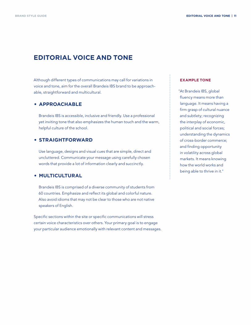
BRAND Style GuiDe editorial VoiCe and tone | 11
Although different types of communications may call for variations in
voice and tone, aim for the overall Brandeis IBS brand to be approach-
able, straightforward and multicultural.
• aPProaCHaBle
Brandeis IBS is accessible, inclusive and friendly. Use a professional
yet inviting tone that also emphasizes the human touch and the warm,
helpful culture of the school.
• StraiGHtforWard
Use language, designs and visual cues that are simple, direct and
uncluttered. Communicate your message using carefully chosen
words that provide a lot of information clearly and succinctly.
• MultiCultural
Brandeis IBS is comprised of a diverse community of students from
60 countries. Emphasize and reflect its global and colorful nature.
Also avoid idioms that may not be clear to those who are not native
speakers of English.
Specific sections within the site or specific communications will stress
certain voice characteristics over others. Your primary goal is to engage
your particular audience emotionally with relevant content and messages.
editorial VoiCe and tone
eXaMPle tone
"At Brandeis IBS, global
fluency means more than
language. It means having a
firm grasp of cultural nuance
and subtlety; recognizing
the interplay of economic,
political and social forces;
understanding the dynamics
of cross-border commerce;
and finding opportunity
in volatility across global
markets. It means knowing
how the world works and
being able to thrive in it."
hoWisourbrand
identityexpressed?
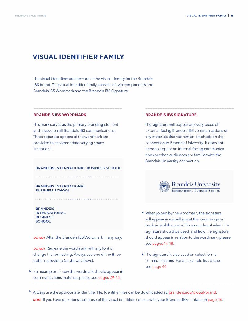
BRAND Style GuiDe ViSual identifier faMily | 13
BrandeiS iBS SiGnature
The signature will appear on every piece of
external-facing Brandeis IBS communications or
any materials that warrant an emphasis on the
connection to Brandeis University. It does not
need to appear on internal-facing communica-
tions or when audiences are familiar with the
Brandeis University connection.
The visual identifiers are the core of the visual identity for the Brandeis
IBS brand. The visual identifier family consists of two components: the
Brandeis IBS Wordmark and the Brandeis IBS Signature.
ViSual identifier faMily
BrandeiS iBS WordMark
This mark serves as the primary branding element
and is used on all Brandeis IBS communications.
Three separate options of the wordmark are
provided to accommodate varying space
limitations.
Do not Alter the Brandeis IBS Wordmark in any way.
Do not Recreate the wordmark with any font or
change the formatting. Always use one of the three
options provided (as shown above).
For examples of how the wordmark should appear in
communications materials please see pages 29-44.
When joined by the wordmark, the signature
will appear in a small size at the lower edge or
back side of the piece. For examples of when the
signature should be used, and how the signature
should appear in relation to the wordmark, please
see pages 14-18.
The signature is also used on select formal
communications. For an example list, please
see page 44.
Always use the appropriate identifier file. Identifier files can be downloaded at: brandeis.edu/global/brand.
note If you have questions about use of the visual identifier, consult with your Brandeis IBS contact on page 56.
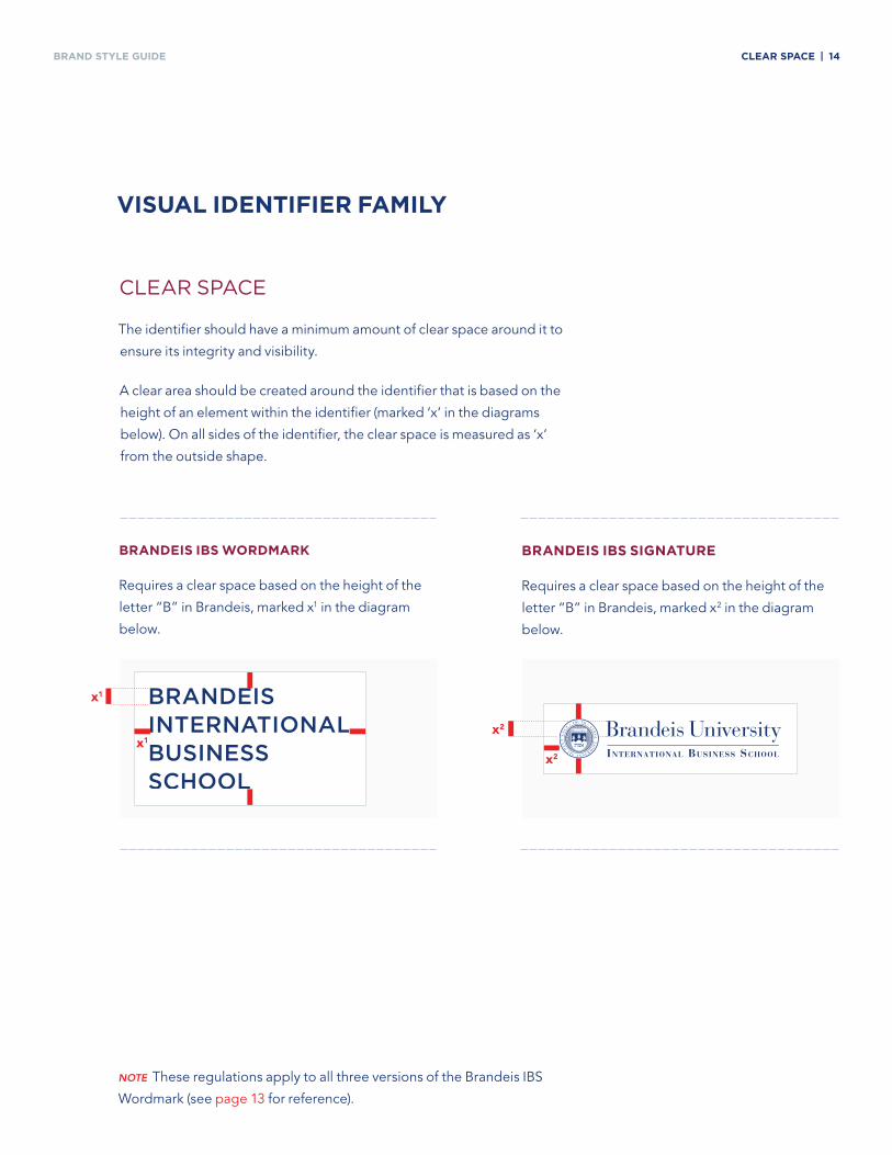
BRAND Style GuiDe Clear SPaCe | 14
Clear spaCe
The identifier should have a minimum amount of clear space around it to
ensure its integrity and visibility.
A clear area should be created around the identifier that is based on the
height of an element within the identifier (marked ‘x’ in the diagrams
below). On all sides of the identifier, the clear space is measured as ‘x’
from the outside shape.
ViSual identifier faMily
BrandeiS iBS WordMark
Requires a clear space based on the height of the
letter “B” in Brandeis, marked x1 in the diagram
below.
BrandeiS iBS SiGnature
Requires a clear space based on the height of the
letter “B” in Brandeis, marked x2 in the diagram
below.
note These regulations apply to all three versions of the Brandeis IBS
Wordmark (see page 13 for reference).
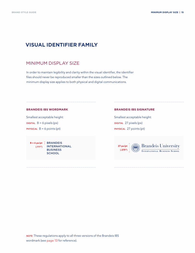
BRAND Style GuiDe MiniMuM diSPlay Size | 15
BrandeiS iBS SiGnature
Smallest acceptable height:
DiGiTAl 27 pixels (px)
PhysiCAl 27 points (pt)
BrandeiS iBS WordMark
Smallest acceptable height:
DiGiTAl B = 6 pixels (px)
PhysiCAl B = 6 points (pt)
MiniMuM Display size
In order to maintain legibility and clarity within the visual identifier, the identifier
files should never be reproduced smaller than the sizes outlined below. The
minimum display size applies to both physical and digital communications.
ViSual identifier faMily
note These regulations apply to all three versions of the Brandeis IBS
wordmark (see page 13 for reference).
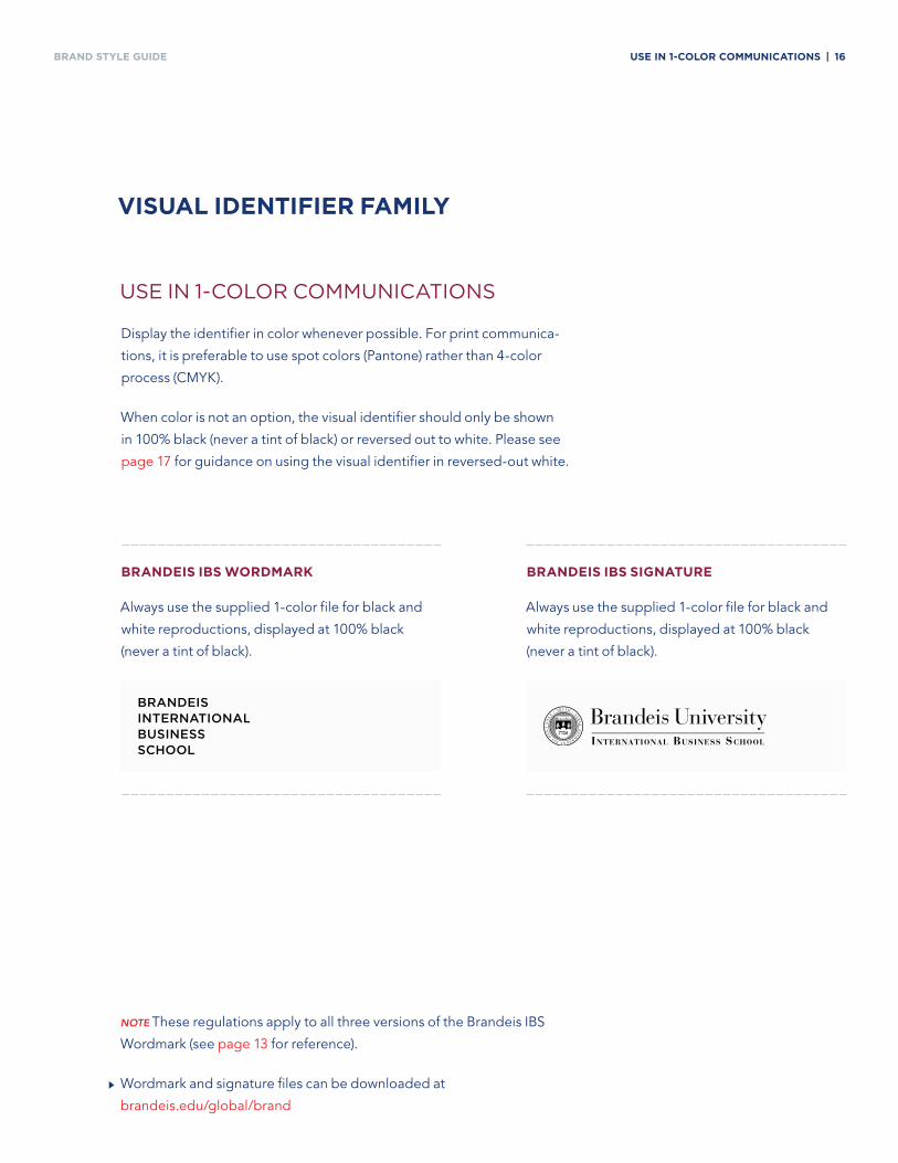
BRAND Style GuiDe uSe in 1-Color CoMMuniCationS | 16
use in 1-Color CoMMuniCations
Display the identifier in color whenever possible. For print communica-
tions, it is preferable to use spot colors (Pantone) rather than 4-color
process (CMYK).
When color is not an option, the visual identifier should only be shown
in 100% black (never a tint of black) or reversed out to white. Please see
page 17 for guidance on using the visual identifier in reversed-out white.
ViSual identifier faMily
BrandeiS iBS WordMark
Always use the supplied 1-color file for black and
white reproductions, displayed at 100% black
(never a tint of black).
BrandeiS iBS SiGnature
Always use the supplied 1-color file for black and
white reproductions, displayed at 100% black
(never a tint of black).
note These regulations apply to all three versions of the Brandeis IBS
Wordmark (see page 13 for reference).
Wordmark and signature files can be downloaded at
brandeis.edu/global/brand
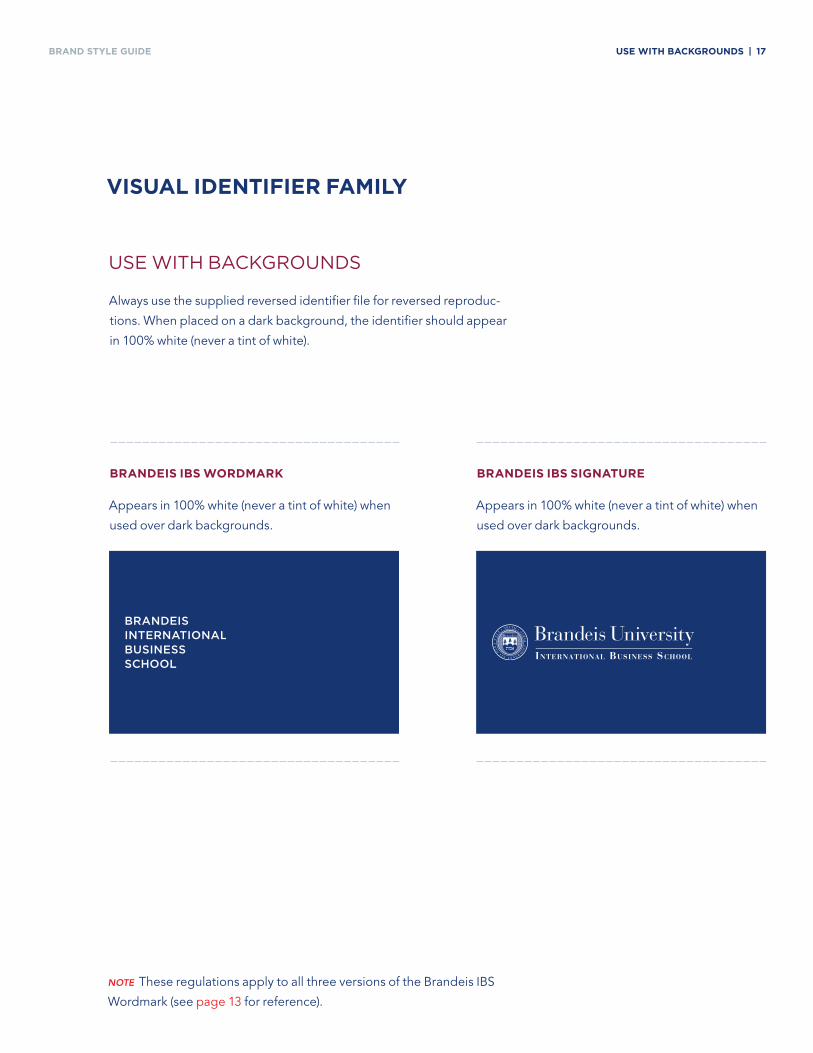
BRAND Style GuiDe uSe WitH BaCkGroundS | 17
use with baCkgrounDs
Always use the supplied reversed identifier file for reversed reproduc-
tions. When placed on a dark background, the identifier should appear
in 100% white (never a tint of white).
ViSual identifier faMily
BrandeiS iBS WordMark
Appears in 100% white (never a tint of white) when
used over dark backgrounds.
BrandeiS iBS SiGnature
Appears in 100% white (never a tint of white) when
used over dark backgrounds.
note These regulations apply to all three versions of the Brandeis IBS
Wordmark (see page 13 for reference).
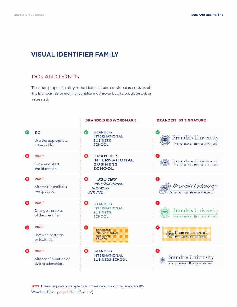
BRAND Style GuiDe doS and don'tS | 18
Dos anD Don’ts
To ensure proper legibility of the identifiers and consistent expression of
the Brandeis IBS brand, the identifier must never be altered, distorted, or
recreated.
ViSual identifier faMily
note These regulations apply to all three versions of the Brandeis IBS
Wordmark (see page 13 for reference).
do
Use the appropriate artwork file.
Don't
Skew or distort the identifier.
Don't
Alter the identifier's perspective.
Don't
Change the color of the identifier.
Don't
Use with patterns or textures.
Don't
Alter configuration or size relationships.
~ ~ ~
×
×
×
×
×
× ×
× ×
× ×
× ×
× ×
BrandeiS iBS WordMark BrandeiS iBS SiGnature
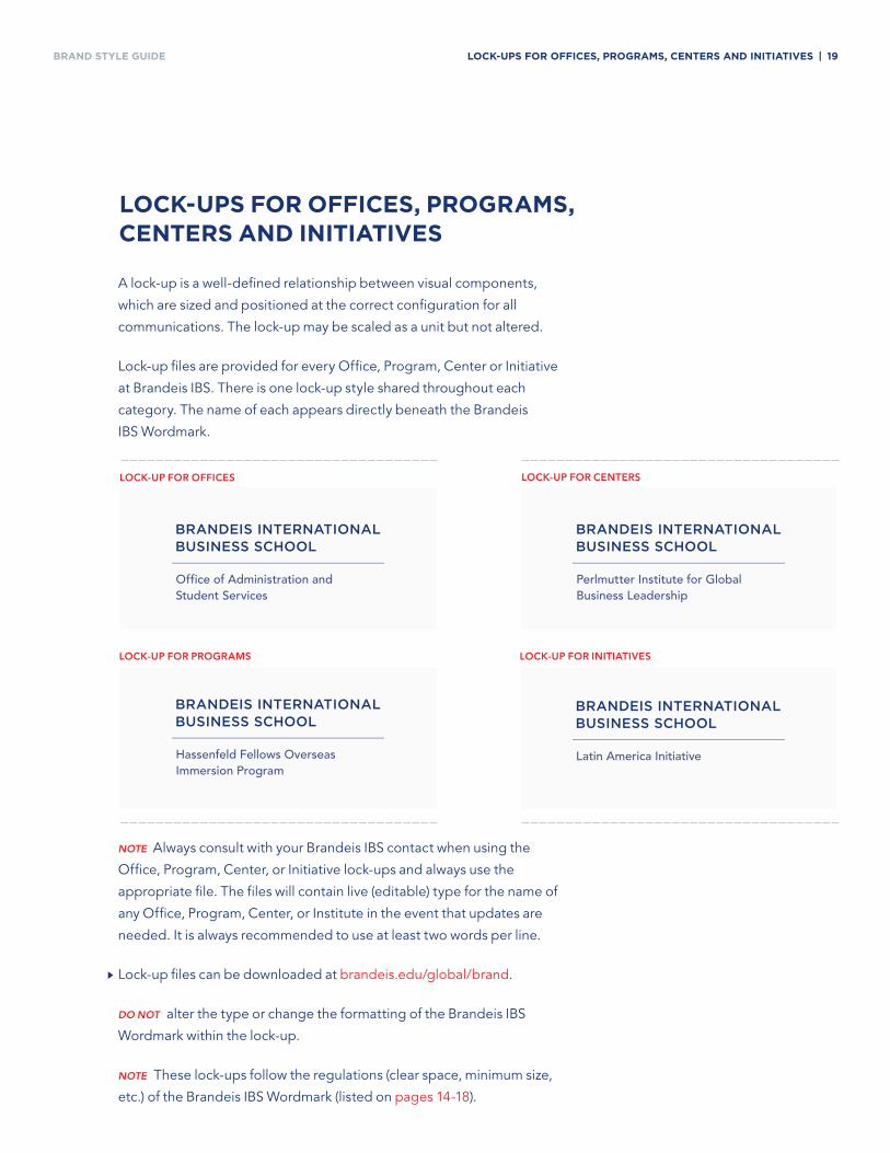
BRAND Style GuiDe loCk-uPS for offiCeS, ProGraMS, CenterS and initiatiVeS | 19
loCk-uPS for offiCeS, ProGraMS, CenterS and initiatiVeS
note Always consult with your Brandeis IBS contact when using the
Office, Program, Center, or Initiative lock-ups and always use the
appropriate file. The files will contain live (editable) type for the name of
any Office, Program, Center, or Institute in the event that updates are
needed. It is always recommended to use at least two words per line.
Lock-up files can be downloaded at brandeis.edu/global/brand.
Do not alter the type or change the formatting of the Brandeis IBS
Wordmark within the lock-up.
note These lock-ups follow the regulations (clear space, minimum size,
etc.) of the Brandeis IBS Wordmark (listed on pages 14-18).
A lock-up is a well-defined relationship between visual components,
which are sized and positioned at the correct configuration for all
communications. The lock-up may be scaled as a unit but not altered.
Lock-up files are provided for every Office, Program, Center or Initiative
at Brandeis IBS. There is one lock-up style shared throughout each
category. The name of each appears directly beneath the Brandeis
IBS Wordmark.
lOCk-uP FOR OFFiCEs
lOCk-uP FOR PROGRAMs lOCk-uP FOR iNiTiATiVEs
lOCk-uP FOR CENTERs
Office of Administration and Student Services
Perlmutter Institute for Global Business Leadership
Hassenfeld Fellows Overseas Immersion Program
Latin America Initiative
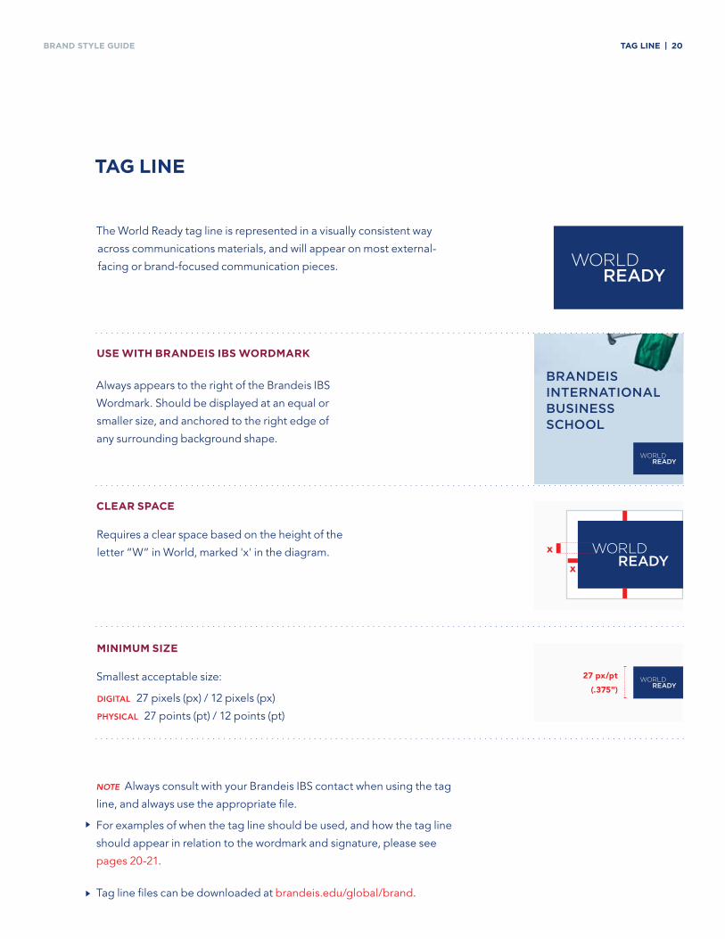
BRAND Style GuiDe taG line | 20
The World Ready tag line is represented in a visually consistent way
across communications materials, and will appear on most external-
facing or brand-focused communication pieces.
taG line
Clear SPaCe
Requires a clear space based on the height of the
letter “W” in World, marked 'x' in the diagram.
MiniMuM Size
Smallest acceptable size:
DiGiTAl 27 pixels (px) / 12 pixels (px)
PhysiCAl 27 points (pt) / 12 points (pt)
uSe WitH BrandeiS iBS WordMark
Always appears to the right of the Brandeis IBS
Wordmark. Should be displayed at an equal or
smaller size, and anchored to the right edge of
any surrounding background shape.
note Always consult with your Brandeis IBS contact when using the tag
line, and always use the appropriate file.
For examples of when the tag line should be used, and how the tag line
should appear in relation to the wordmark and signature, please see
pages 20-21.
Tag line files can be downloaded at brandeis.edu/global/brand.
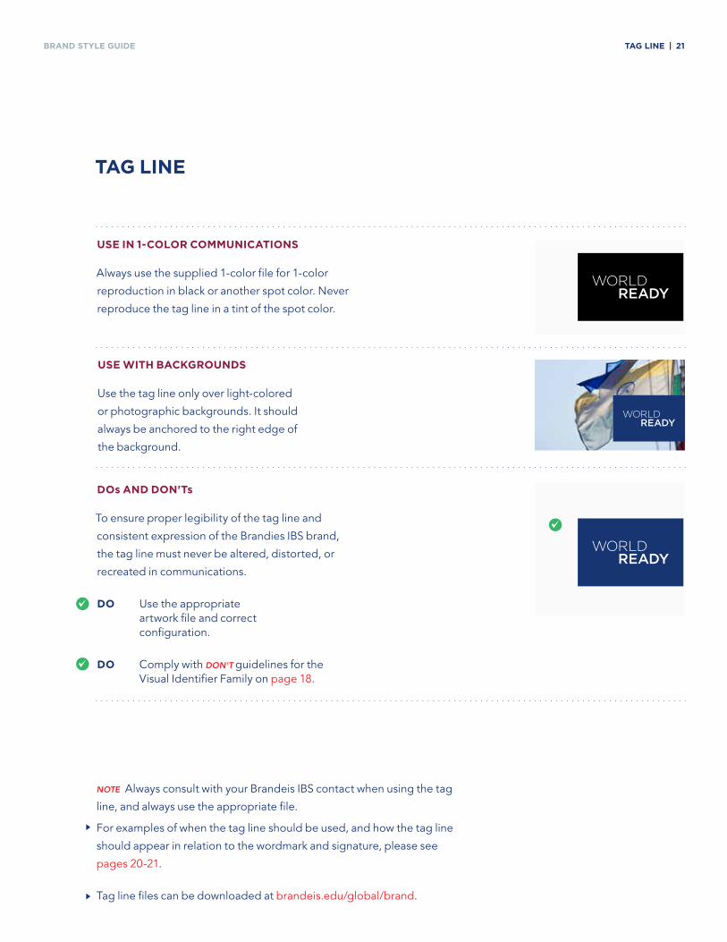
BRAND Style GuiDe taG line | 21
taG line
uSe WitH BaCkGroundS
Use the tag line only over light-colored
or photographic backgrounds. It should
always be anchored to the right edge of
the background.
uSe in 1-Color CoMMuniCationS
Always use the supplied 1-color file for 1-color
reproduction in black or another spot color. Never
reproduce the tag line in a tint of the spot color.
dos and don'ts
To ensure proper legibility of the tag line and
consistent expression of the Brandies IBS brand,
the tag line must never be altered, distorted, or
recreated in communications.
do Use the appropriate artwork file and correct configuration.
do Comply with Don't guidelines for the Visual Identifier Family on page 18.
~
~
note Always consult with your Brandeis IBS contact when using the tag
line, and always use the appropriate file.
For examples of when the tag line should be used, and how the tag line
should appear in relation to the wordmark and signature, please see
pages 20-21.
Tag line files can be downloaded at brandeis.edu/global/brand.
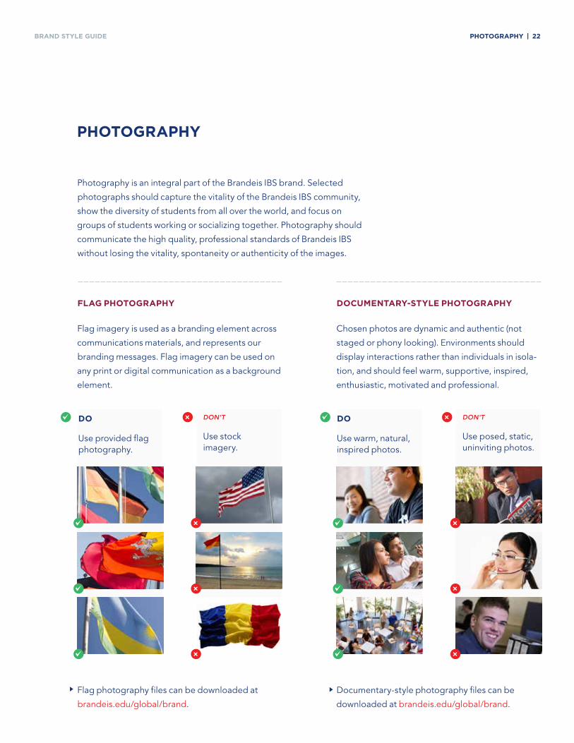
BRAND Style GuiDe PHotoGraPHy | 22
PHotoGraPHy
Photography is an integral part of the Brandeis IBS brand. Selected
photographs should capture the vitality of the Brandeis IBS community,
show the diversity of students from all over the world, and focus on
groups of students working or socializing together. Photography should
communicate the high quality, professional standards of Brandeis IBS
without losing the vitality, spontaneity or authenticity of the images.
flaG PHotoGraPHy
Flag imagery is used as a branding element across
communications materials, and represents our
branding messages. Flag imagery can be used on
any print or digital communication as a background
element.
doCuMentary-Style PHotoGraPHy
Chosen photos are dynamic and authentic (not
staged or phony looking). Environments should
display interactions rather than individuals in isola-
tion, and should feel warm, supportive, inspired,
enthusiastic, motivated and professional.
do
Use provided flag photography.
Don't
Use stock imagery.
×
×
×
×
~
~
~
~
do
Use warm, natural, inspired photos.
Don't
Use posed, static, uninviting photos.
×
×
×
×
~
~
~
~
Flag photography files can be downloaded at
brandeis.edu/global/brand.
Documentary-style photography files can be
downloaded at brandeis.edu/global/brand.
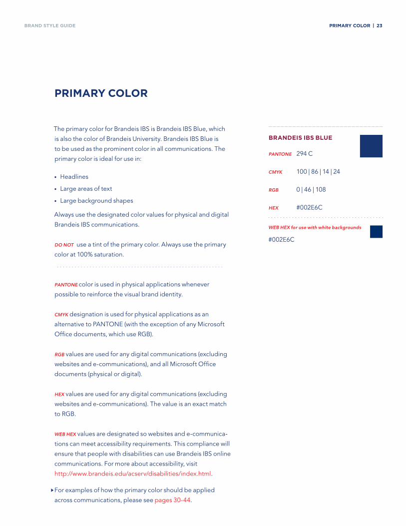
BRAND Style GuiDe PriMary Color | 23
PriMary Color
The primary color for Brandeis IBS is Brandeis IBS Blue, which
is also the color of Brandeis University. Brandeis IBS Blue is
to be used as the prominent color in all communications. The
primary color is ideal for use in:
• Headlines
• Large areas of text
• Large background shapes
Always use the designated color values for physical and digital
Brandeis IBS communications.
Do not use a tint of the primary color. Always use the primary
color at 100% saturation.
pantone color is used in physical applications whenever
possible to reinforce the visual brand identity.
CMYK designation is used for physical applications as an
alternative to PANTONE (with the exception of any Microsoft
Office documents, which use RGB).
RGB values are used for any digital communications (excluding
websites and e-communications), and all Microsoft Office
documents (physical or digital).
Hex values are used for any digital communications (excluding
websites and e-communications). The value is an exact match
to RGB.
WeB Hex values are designated so websites and e-communica-
tions can meet accessibility requirements. This compliance will
ensure that people with disabilities can use Brandeis IBS online
communications. For more about accessibility, visit
http://www.brandeis.edu/acserv/disabilities/index.html.
For examples of how the primary color should be applied
across communications, please see pages 30-44.
BrandeiS iBS Blue
pantone 294 C
CMYK 100 | 86 | 14 | 24
RGB 0 | 46 | 108
Hex #002E6C
WeB Hex for use with white backgrounds
#002E6C
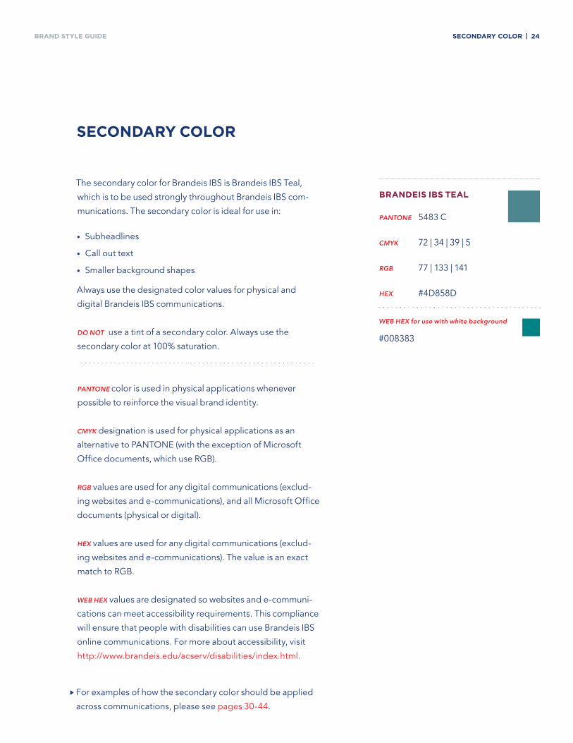
BRAND Style GuiDe SeCondary Color | 24
The secondary color for Brandeis IBS is Brandeis IBS Teal,
which is to be used strongly throughout Brandeis IBS com-
munications. The secondary color is ideal for use in:
• Subheadlines
• Call out text
• Smaller background shapes
Always use the designated color values for physical and
digital Brandeis IBS communications.
Do not use a tint of a secondary color. Always use the
secondary color at 100% saturation.
pantone color is used in physical applications whenever
possible to reinforce the visual brand identity.
CMYK designation is used for physical applications as an
alternative to PANTONE (with the exception of Microsoft
Office documents, which use RGB).
RGB values are used for any digital communications (exclud-
ing websites and e-communications), and all Microsoft Office
documents (physical or digital).
Hex values are used for any digital communications (exclud-
ing websites and e-communications). The value is an exact
match to RGB.
WeB Hex values are designated so websites and e-communi-
cations can meet accessibility requirements. This compliance
will ensure that people with disabilities can use Brandeis IBS
online communications. For more about accessibility, visit
http://www.brandeis.edu/acserv/disabilities/index.html.
For examples of how the secondary color should be applied
across communications, please see pages 30-44.
SeCondary Color
BrandeiS iBS teal
pantone 5483 C
CMYK 72 | 34 | 39 | 5
RGB 77 | 133 | 141
Hex #4D858D
WeB Hex for use with white background
#008383
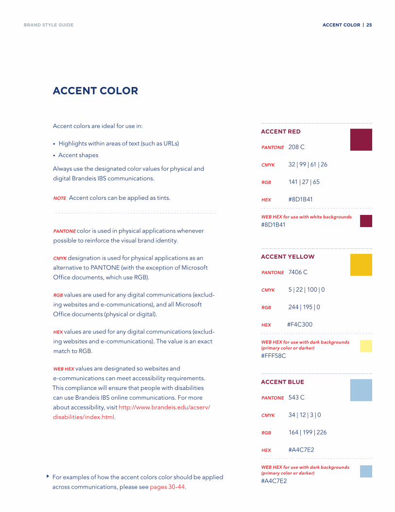
BRAND Style GuiDe aCCent Color | 25
aCCent Color
Accent colors are ideal for use in:
• Highlights within areas of text (such as URLs)
• Accent shapes
Always use the designated color values for physical and
digital Brandeis IBS communications.
note Accent colors can be applied as tints.
pantone color is used in physical applications whenever
possible to reinforce the visual brand identity.
CMYK designation is used for physical applications as an
alternative to PANTONE (with the exception of Microsoft
Office documents, which use RGB).
RGB values are used for any digital communications (exclud-
ing websites and e-communications), and all Microsoft
Office documents (physical or digital).
Hex values are used for any digital communications (exclud-
ing websites and e-communications). The value is an exact
match to RGB.
WeB Hex values are designated so websites and
e-communications can meet accessibility requirements.
This compliance will ensure that people with disabilities
can use Brandeis IBS online communications. For more
about accessibility, visit http://www.brandeis.edu/acserv/
disabilities/index.html.
For examples of how the accent colors color should be applied
across communications, please see pages 30-44.
aCCent red
pantone 208 C
CMYK 32 | 99 | 61 | 26
RGB 141 | 27 | 65
Hex #8D1B41
aCCent yelloW
pantone 7406 C
CMYK 5 | 22 | 100 | 0
RGB 244 | 195 | 0
Hex #F4C300
aCCent Blue
pantone 543 C
CMYK 34 | 12 | 3 | 0
RGB 164 | 199 | 226
Hex #A4C7E2
WeB Hex for use with white backgrounds
#8D1B41
WeB Hex for use with dark backgrounds (primary color or darker)
#FFF58C
WeB Hex for use with dark backgrounds (primary color or darker)
#A4C7E2
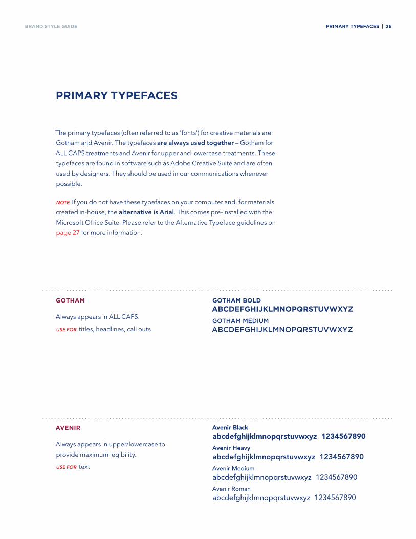
BRAND Style GuiDe PriMary tyPefaCeS | 26
GotHaM
Always appears in ALL CAPS.
Use foR titles, headlines, call outs
aVenir
Always appears in upper/lowercase to
provide maximum legibility.
Use foR text
PriMary tyPefaCeS
The primary typefaces (often referred to as 'fonts') for creative materials are
Gotham and Avenir. The typefaces are always used together – Gotham for
ALL CAPS treatments and Avenir for upper and lowercase treatments. These
typefaces are found in software such as Adobe Creative Suite and are often
used by designers. They should be used in our communications whenever
possible.
note If you do not have these typefaces on your computer and, for materials
created in-house, the alternative is Arial. This comes pre-installed with the
Microsoft Office Suite. Please refer to the Alternative Typeface guidelines on
page 27 for more information.
GotHaM Bold
aBCdefGHiJklMnoPQrStuVWXyz
Gothammedium
abCdeFGhiJKLmnopQrstuVWxyZ
Avenir Black abcdefghijklmnopqrstuvwxyz 1234567890
Avenir heavy abcdefghijklmnopqrstuvwxyz 1234567890
Avenir Medium abcdefghijklmnopqrstuvwxyz 1234567890
Avenir Roman
abcdefghijklmnopqrstuvwxyz 1234567890
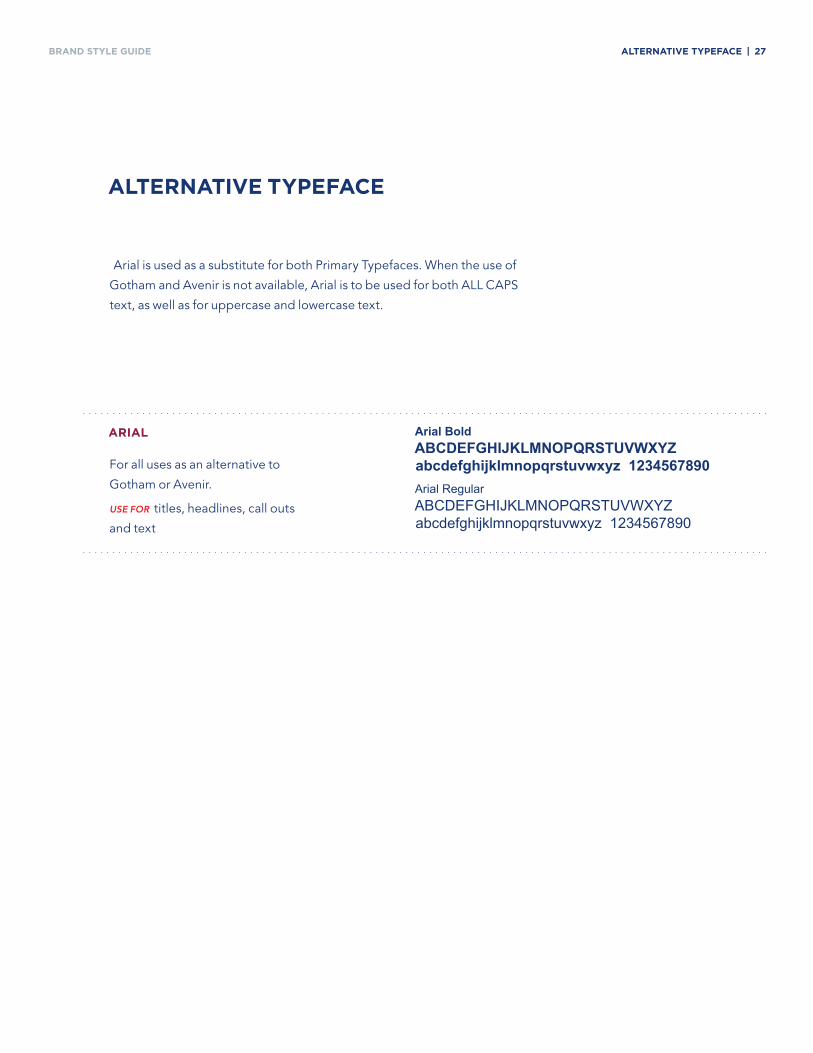
BRAND Style GuiDe alternatiVe tyPefaCe | 27
arial
For all uses as an alternative to
Gotham or Avenir.
Use foR titles, headlines, call outs
and text
alternatiVe tyPefaCe
Arial is used as a substitute for both Primary Typefaces. When the use of
Gotham and Avenir is not available, Arial is to be used for both ALL CAPS
text, as well as for uppercase and lowercase text.
Arial Bold ABcdefghijklmnopqrstuvwxyz abcdefghijklmnopqrstuvwxyz 1234567890Arial Regular AbcdefghijklmnopqRstuvwxyz abcdefghijklmnopqrstuvwxyz 1234567890
BRAND Style GuiDe
×
×
tyPefaCe uSaGe | 28
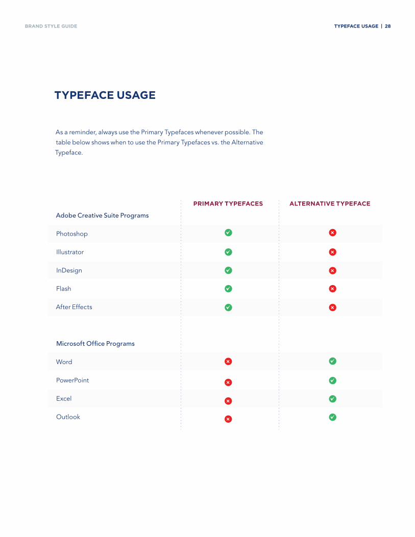
tyPefaCe uSaGe
As a reminder, always use the Primary Typefaces whenever possible. The
table below shows when to use the Primary Typefaces vs. the Alternative
Typeface.
PriMary tyPefaCeS alternatiVe tyPefaCe
Adobe Creative Suite Programs
Photoshop
Illustrator
InDesign
Flash
After Effects
Microsoft Office Programs
Word
PowerPoint
Excel
Outlook
~
~
~
~
~
~
~
~
~
×
×
×
×
×
×
×
×
BRAND Style GuiDe CoMMuniCationS eXaMPleS | 29
CoMMuniCationS eXaMPleS
Pages 30-44 show examples of communications pieces following the
new branding system.
To maintain the consistency of the Brandeis IBS brand, always match
the appearance of these applications as closely as possible when
developing new materials.
note Prior to creating new branded materials please contact
Matt Parillo, Director of Marketing and Communications
Select template files, which are illustrated on
the following pages, are available for download
at brandeis.edu/global/brand.
BRAND Style GuiDe
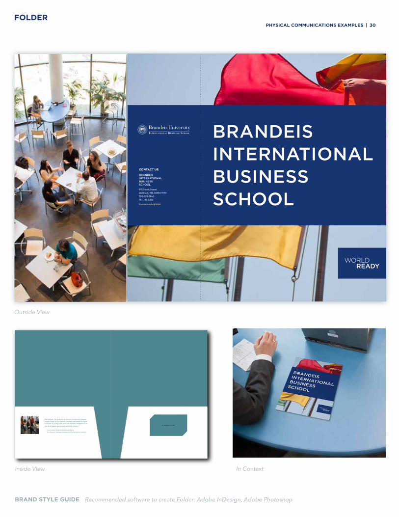
BRAND STYLE GUIDE Recommended software to create Folder: Adobe InDesign, Adobe Photoshop
FOLDER
CONTACT US
415 South StreetWaltham, MA 02454-9110800-878-8866 781-736-2252
brandeis.edu/global
Outside View
Inside View In Context
“Elendelest, od quatem re volore nonsectota platem reratio blab ius am adicias maiossi tatiusdae molupta turerum et a sequodis invenim inullesti temporere es est ut et aped que et aut omnihilit imenis.”
— Lorem Ipsum, Essenda Sanditibus Dollamus
Bor Alignam, Siodquias Voluptus Ipiet Quiam Exerum Venimint
BUSINESS CARD
PHySiCal CoMMuniCationS eXaMPleS | 30
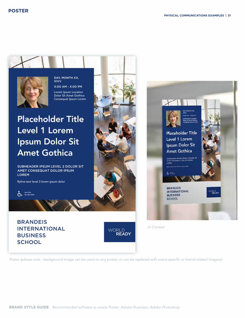
BRAND Style GuiDe
DAY, MONTH XX, XIVV
X:00 AM - X:00 PM
Lorem Ipsum Location Dolor Sit Amet Gothica Consequat Ipsum Lorem
Placeholder Title Level 1 Lorem Ipsum Dolor Sit Amet GothicaSUBHEADER IPSUM LEVEL 2 DOLOR SIT AMET CONSEQUAT DOLOR IPSUM LOREM
Byline text level 3 lorem ipsum dolor
Jane Doe
781-555-5555
BRAND STYLE GUIDE Recommended software to create Poster: Adobe Illustrator, Adobe Photoshop
POSTER
Poster (please note - background image can be used on any poster, or can be replaced with event-specific or brand-related imagery)
In Context
PHySiCal CoMMuniCationS eXaMPleS | 31
BRAND Style GuiDe
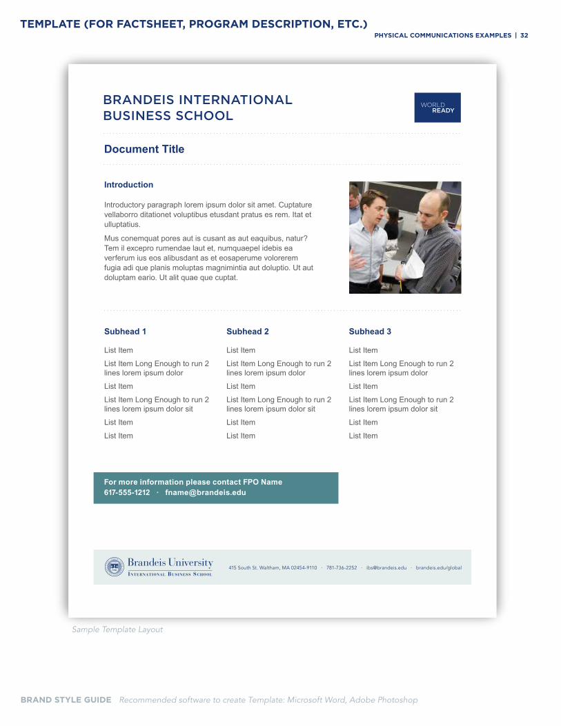
BRAND STYLE GUIDE Recommended software to create Template: Microsoft Word, Adobe Photoshop
Sample Template Layout
TEMPLATE (FOR FACTSHEET, PROGRAM DESCRIPTION, ETC.)
Document Title
For more information please contact FPO Name617-555-1212 · [email protected]
Introduction
Introductory paragraph lorem ipsum dolor sit amet. Cuptature vellaborro ditationet voluptibus etusdant pratus es rem. Itat et ulluptatius.
Mus conemquat pores aut is cusant as aut eaquibus, natur? Tem il excepro rumendae laut et, numquaepel idebis ea verferum ius eos alibusdant as et eosaperume volorerem fugia adi que planis moluptas magnimintia aut doluptio. Ut aut doluptam eario. Ut alit quae que cuptat.
Subhead 1
List Item
List Item Long Enough to run 2 lines lorem ipsum dolor
List Item
List Item Long Enough to run 2 lines lorem ipsum dolor sit
List Item
List Item
Subhead 2
List Item
List Item Long Enough to run 2 lines lorem ipsum dolor
List Item
List Item Long Enough to run 2 lines lorem ipsum dolor sit
List Item
List Item
Subhead 3
List Item
List Item Long Enough to run 2 lines lorem ipsum dolor
List Item
List Item Long Enough to run 2 lines lorem ipsum dolor sit
List Item
List Item
415 South St. Waltham, MA 02454-9110 · 781-736-2252 · [email protected] · brandeis.edu/global
PHySiCal CoMMuniCationS eXaMPleS | 32
BRAND Style GuiDe
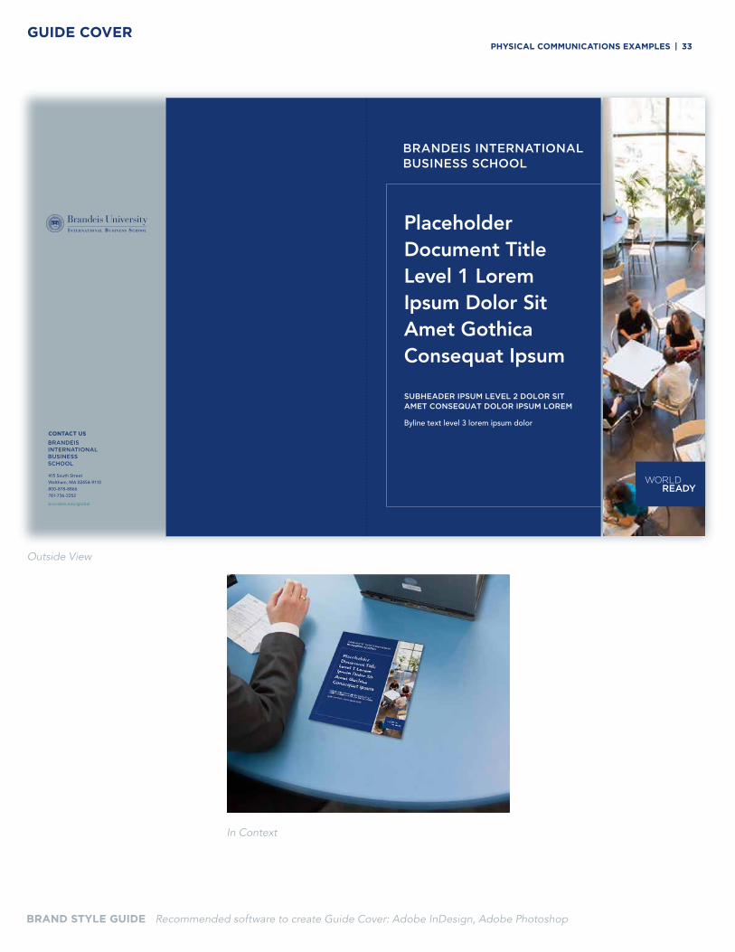
Placeholder Document Title Level 1 Lorem Ipsum Dolor Sit Amet Gothica Consequat Ipsum
SUBHEADER IPSUM LEVEL 2 DOLOR SIT AMET CONSEQUAT DOLOR IPSUM LOREM
Byline text level 3 lorem ipsum dolorCONTACT US
415 South StreetWaltham, MA 02454-9110800-878-8866 781-736-2252
brandeis.edu/global
GUIDE COVER
BRAND STYLE GUIDE Recommended software to create Guide Cover: Adobe InDesign, Adobe Photoshop
Outside View
In Context
PHySiCal CoMMuniCationS eXaMPleS | 33
BRAND Style GuiDe
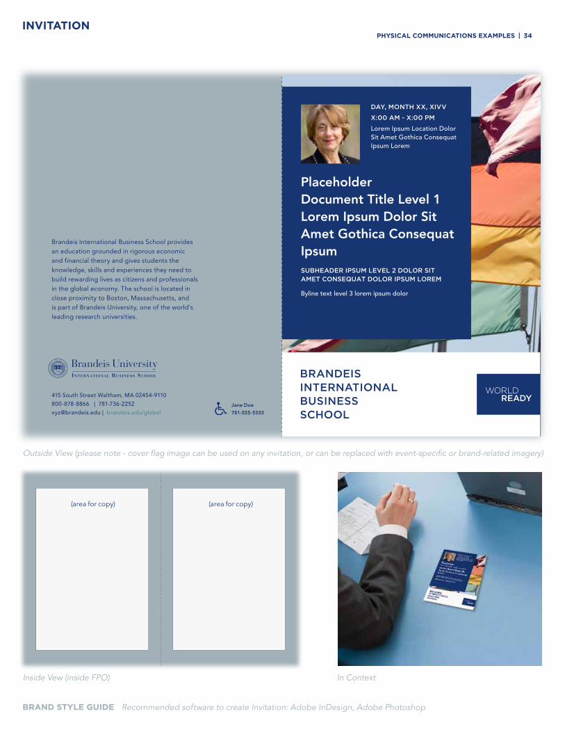
BRAND STYLE GUIDE Recommended software to create Invitation: Adobe InDesign, Adobe Photoshop
Outside View (please note - cover flag image can be used on any invitation, or can be replaced with event-specific or brand-related imagery)
In ContextInside Vew (inside FPO)
INVITATION
Placeholder Document Title Level 1 Lorem Ipsum Dolor Sit Amet Gothica Consequat IpsumSUBHEADER IPSUM LEVEL 2 DOLOR SIT AMET CONSEQUAT DOLOR IPSUM LOREM
Byline text level 3 lorem ipsum dolor
DAY, MONTH XX, XIVV
X:00 AM - X:00 PM
Lorem Ipsum Location Dolor Sit Amet Gothica Consequat Ipsum Lorem
415 South Street Waltham, MA 02454-9110800-878-8866 | 781-736-2252 [email protected] | brandeis.edu/global
Brandeis International Business School provides an education grounded in rigorous economic and financial theory and gives students the knowledge, skills and experiences they need to build rewarding lives as citizens and professionals in the global economy. The school is located in close proximity to Boston, Massachusetts, and is part of Brandeis University, one of the world's leading research universities.
Jane Doe
781-555-5555
PHySiCal CoMMuniCationS eXaMPleS | 34
(area for copy) (area for copy)
BRAND Style GuiDe
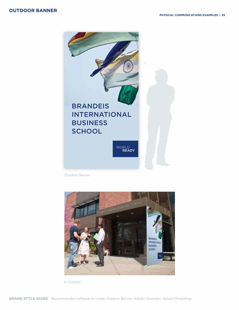
Outdoor Banner
6’
BRAND STYLE GUIDE Recommended software to create Outdoor Banner: Adobe Illustrator, Adobe Photoshop
OUTDOOR BANNER
In Context
PHySiCal CoMMuniCationS eXaMPleS | 35
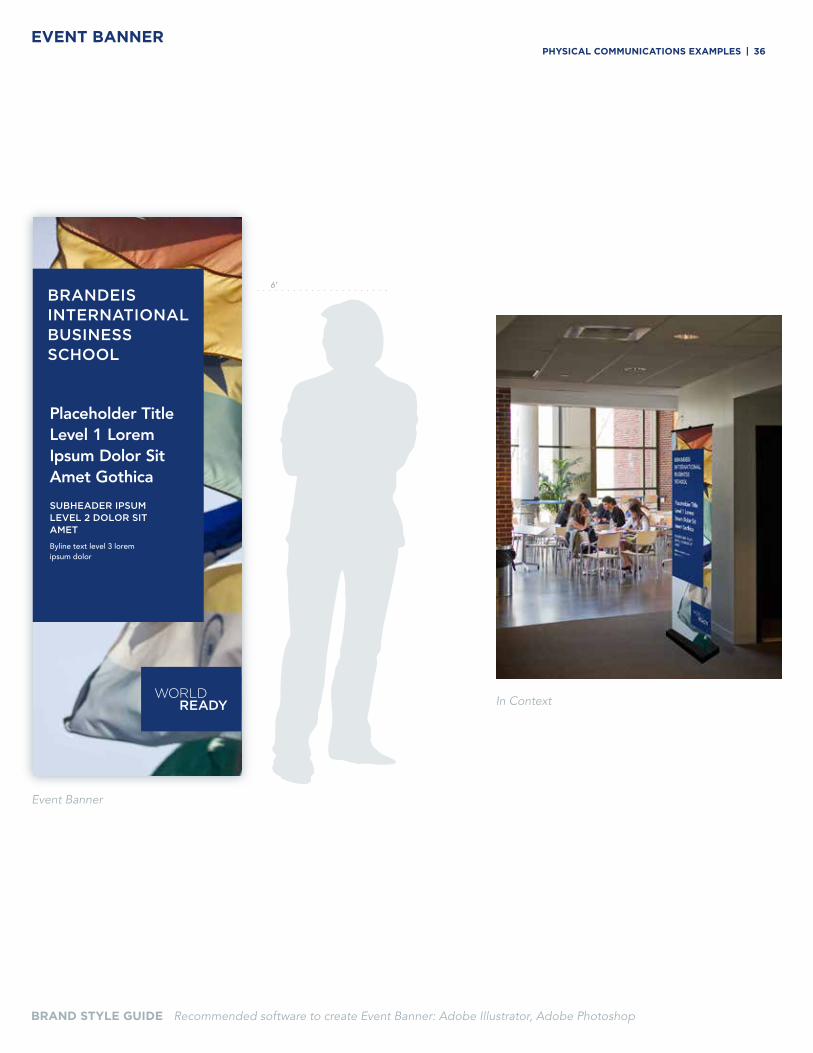
BRAND Style GuiDeEVENT BANNER
BRAND STYLE GUIDE Recommended software to create Event Banner: Adobe Illustrator, Adobe Photoshop
Event Banner
In Context
Placeholder Title Level 1 Lorem Ipsum Dolor Sit Amet Gothica
SUBHEADER IPSUM LEVEL 2 DOLOR SIT AMET
Byline text level 3 lorem ipsum dolor
6’6’
PHySiCal CoMMuniCationS eXaMPleS | 36
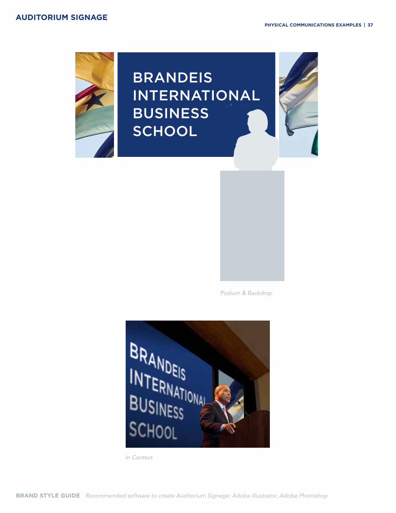
BRAND Style GuiDe
Podium & Backdrop
6’
In Context
AUDITORIUM SIGNAGE
BRAND STYLE GUIDE Recommended software to create Auditorium Signage: Adobe Illustrator, Adobe Photoshop
PHySiCal CoMMuniCationS eXaMPleS | 37
BRAND Style GuiDe
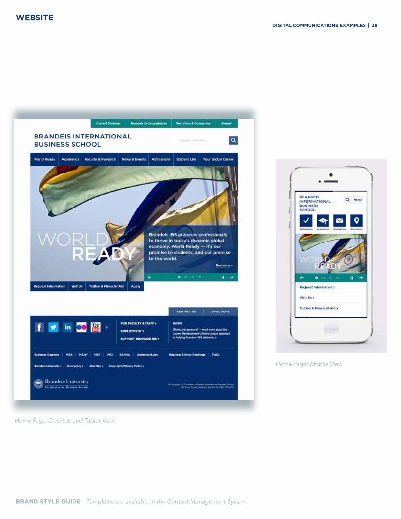
Home Page: Desktop and Tablet View
Home Page: Mobile View
BRAND STYLE GUIDE Templates are available in the Content Management System
WEBSITEdiGital CoMMuniCationS eXaMPleS | 38
BRAND Style GuiDe
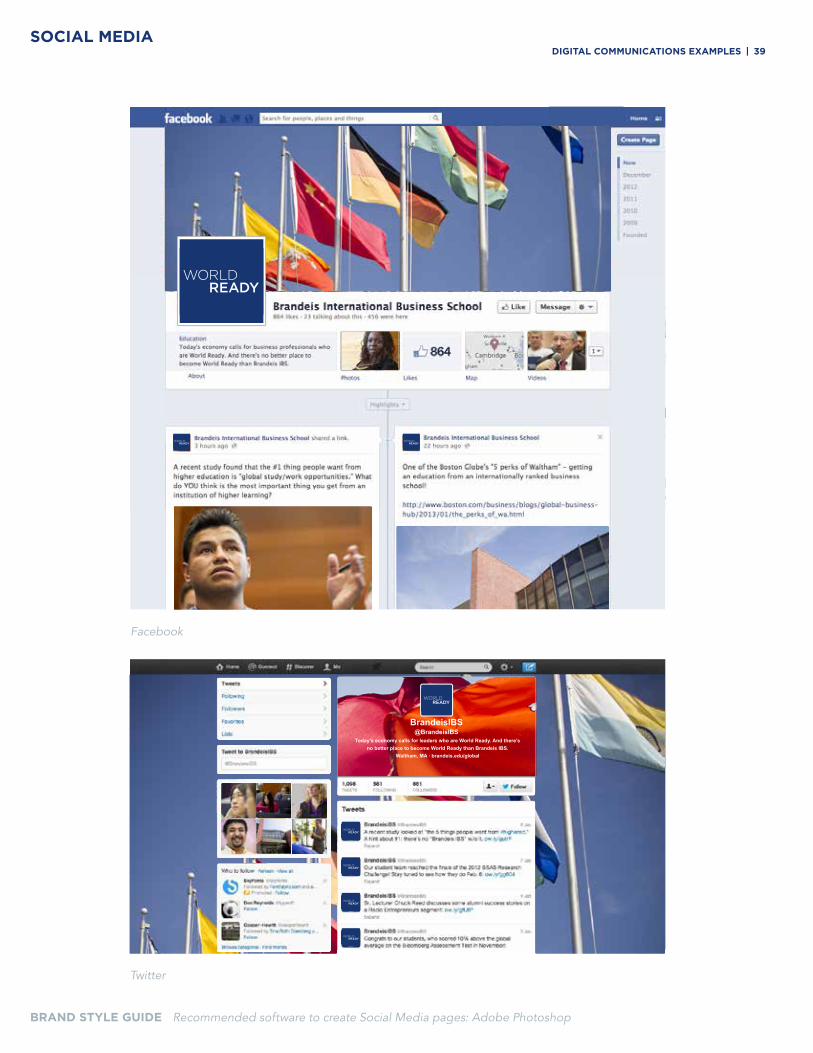
Today’s economy calls for leaders who are World Ready. And there’s no better place to become World Ready than Brandeis IBS.
Waltham, MA . brandeis.edu/global
BrandeisIBS@BrandeisIBS
SOCIAL MEDIA
BRAND STYLE GUIDE Recommended software to create Social Media pages: Adobe Photoshop
diGital CoMMuniCationS eXaMPleS | 39
BRAND Style GuiDe
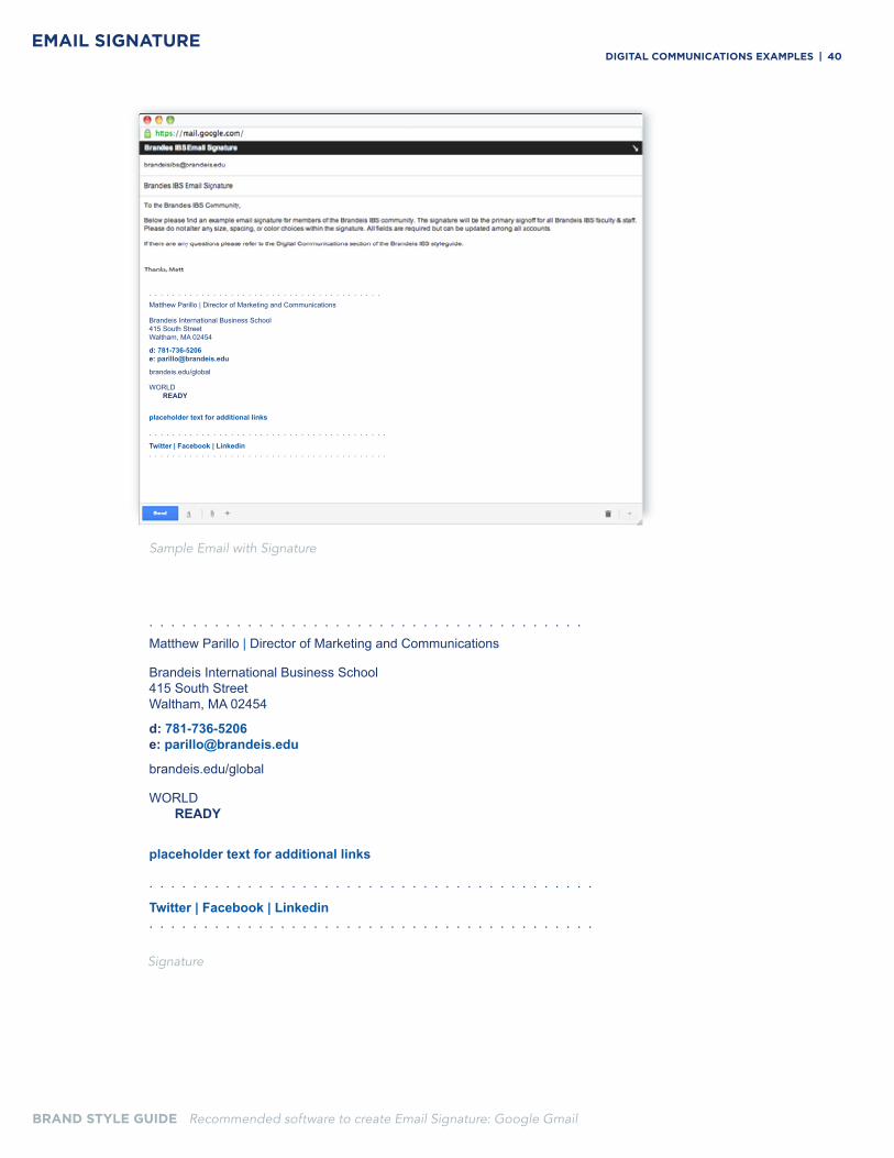
Sample Email with Signature
Signature
. . . . . . . . . . . . . . . . . . . . . . . . . . . . . . . . . . . . . . . .Matthew Parillo | Director of Marketing and Communications
Brandeis International Business School 415 South Street Waltham, MA 02454
d: 781-736-5206e: [email protected]
brandeis.edu/global
WORLD READY
placeholder text for additional links
. . . . . . . . . . . . . . . . . . . . . . . . . . . . . . . . . . . . . . . . .
Twitter | Facebook | Linkedin. . . . . . . . . . . . . . . . . . . . . . . . . . . . . . . . . . . . . . . . .
EMAIL SIGNATURE
BRAND STYLE GUIDE Recommended software to create Email Signature: Google Gmail
diGital CoMMuniCationS eXaMPleS | 40
BRAND Style GuiDe
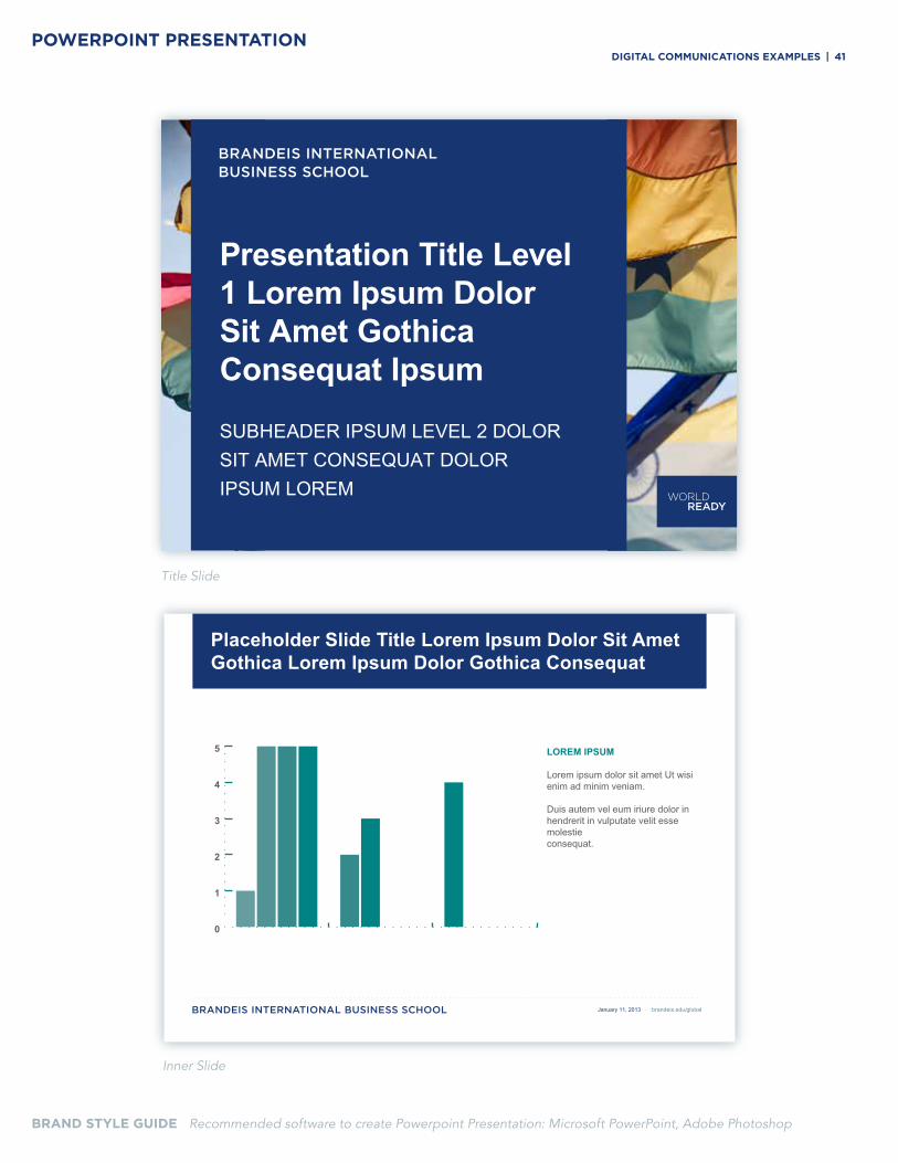
BRAND STYLE GUIDE Recommended software to create Powerpoint Presentation: Microsoft PowerPoint, Adobe Photoshop
Title Slide
Inner Slide
POWERPOINT PRESENTATION
Presentation Title Level 1 Lorem Ipsum Dolor Sit Amet Gothica Consequat Ipsum
SUBHEADER IPSUM LEVEL 2 DOLOR SIT AMET CONSEQUAT DOLOR IPSUM LOREM
0
1
2
3
4
5
Placeholder Slide Title Lorem Ipsum Dolor Sit Amet Gothica Lorem Ipsum Dolor Gothica Consequat
January 11, 2013 · brandeis.edu/global
diGital CoMMuniCationS eXaMPleS | 41
BRAND Style GuiDe
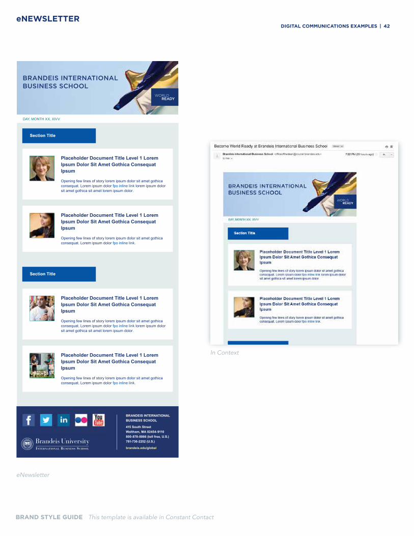
DAY, MONTH XX, XIVV
Placeholder Document Title Level 1 Lorem Ipsum Dolor Sit Amet Gothica Consequat Ipsum
Opening few lines of story lorem ipsum dolor sit amet gothica consequat. Lorem ipsum dolor fpo inline link lorem ipsum dolor sit amet gothica sit amet lorem ipsum dolor.
Placeholder Document Title Level 1 Lorem Ipsum Dolor Sit Amet Gothica Consequat Ipsum
Opening few lines of story lorem ipsum dolor sit amet gothica consequat. Lorem ipsum dolor fpo inline link.
Placeholder Document Title Level 1 Lorem Ipsum Dolor Sit Amet Gothica Consequat Ipsum
Opening few lines of story lorem ipsum dolor sit amet gothica consequat. Lorem ipsum dolor fpo inline link lorem ipsum dolor sit amet gothica sit amet lorem ipsum dolor.
Placeholder Document Title Level 1 Lorem Ipsum Dolor Sit Amet Gothica Consequat Ipsum
Opening few lines of story lorem ipsum dolor sit amet gothica consequat. Lorem ipsum dolor fpo inline link.
Section Title
Section Title
BRANDEIS INTERNATIONAL BUSINESS SCHOOL
415 South StreetWaltham, MA 02454-9110800-878-8866 (toll free, U.S.)781-736-2252 (U.S.)
brandeis.edu/global
BRAND STYLE GUIDE This template is available in Constant Contact
eNewsletter
In Context
eNEWSLETTERdiGital CoMMuniCationS eXaMPleS | 42
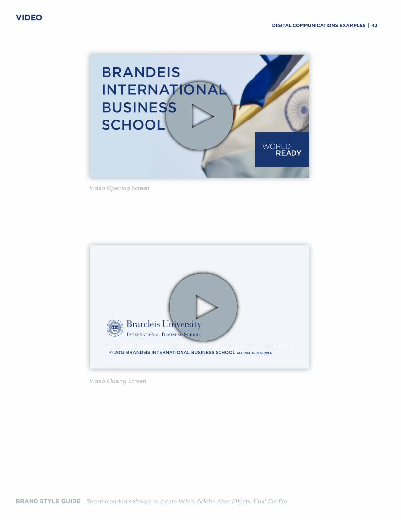
BRAND Style GuiDe
Video Opening Screen
Video Closing Screen
© 2013 BRANDEIS INTERNATIONAL BUSINESS SCHOOL ALL RIGHTS RESERVED
VIDEO
BRAND STYLE GUIDE Recommended software to create Video: Adobe After Effects, Final Cut Pro
diGital CoMMuniCationS eXaMPleS | 43
BRAND Style GuiDe CoMMuniCationS eXaMPleS | 44
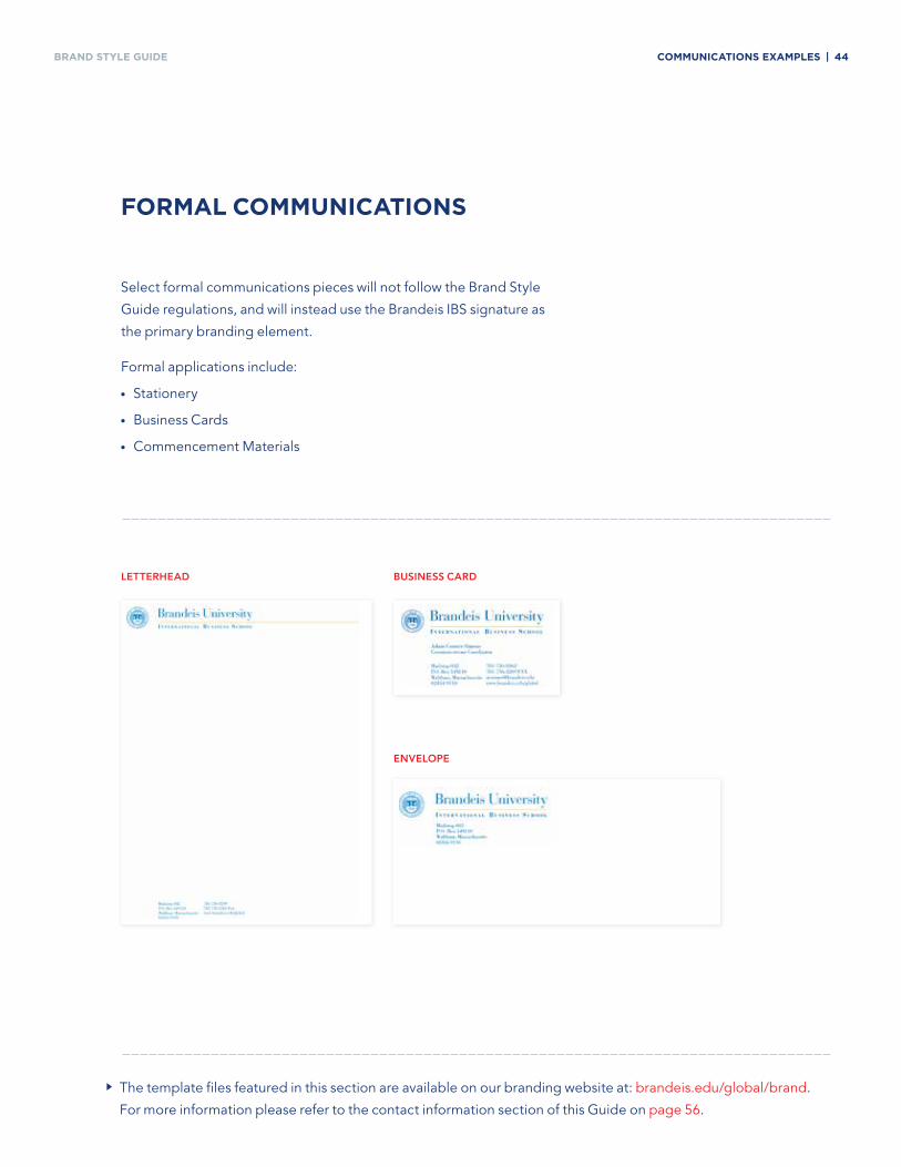
forMal CoMMuniCationS
Select formal communications pieces will not follow the Brand Style
Guide regulations, and will instead use the Brandeis IBS signature as
the primary branding element.
Formal applications include:
• Stationery
• Business Cards
• Commencement Materials
lETTERhEAD BusiNEss CARD
ENVElOPE
The template files featured in this section are available on our branding website at: brandeis.edu/global/brand.
For more information please refer to the contact information section of this Guide on page 56.
WritinGstyLeFor
brandeisinternationaL
businesssChooL
BRAND Style GuiDe General WritinG GuidelineS | 46
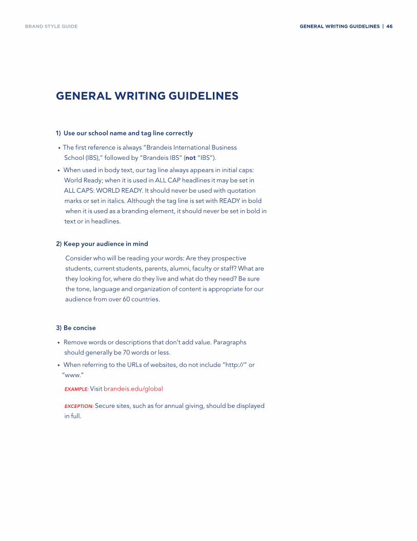
1) use our school name and tag line correctly
• The first reference is always “Brandeis International Business
School (IBS),” followed by “Brandeis IBS” (not “IBS”).
• When used in body text, our tag line always appears in initial caps:
World Ready; when it is used in ALL CAP headlines it may be set in
ALL CAPS: WORLD READY. It should never be used with quotation
marks or set in italics. Although the tag line is set with READY in bold
when it is used as a branding element, it should never be set in bold in
text or in headlines.
2) keep your audience in mind
Consider who will be reading your words: Are they prospective
students, current students, parents, alumni, faculty or staff? What are
they looking for, where do they live and what do they need? Be sure
the tone, language and organization of content is appropriate for our
audience from over 60 countries.
3) Be concise
• Remove words or descriptions that don’t add value. Paragraphs
should generally be 70 words or less.
• When referring to the URLs of websites, do not include “http://” or
“www.”
exaMple: Visit brandeis.edu/global
exCeptIon: Secure sites, such as for annual giving, should be displayed
in full.
General WritinG GuidelineS
BRAND Style GuiDe General WritinG GuidelineS | 47
General WritinG GuidelineS
4) use active voice
Writing in the active voice is more clear, conversational and engaging
than the passive voice.
5) use a conversational tone
Avoid jargon and buzzwords like “cutting-edge” or “leverage.”
Consider how you would communicate with someone standing in
front of you rather than how you would address an audience in a TV or
radio ad.
6) Write short descriptive headlines
Use “sentence case,” where you capitalize only the first word and
proper nouns, and use only numerals for numbers and single
quotation marks.
exaMple: School launches Latin America Initiative; Upcoming ‘3-Day
Startup’ event profiled in Boston Business Journal
exaMple: Use ALL CAPS to identify popular alternative media forms:
VIDEO - School launches Latin America Initiative.
SLIDESHOW – Future alumni donor dinner raises $50,000.
7) Punctuation is important
Refer to the Punctuation Guidelines on page 48 for guidance on how
to treat degree programs, phone numbers, acronyms and all the other
common elements we use in our day-to-day communications.
8) Ask for our help
When questions of style arise that these tips do not address, please
consult with the Marketing and Communications team.
do
Every year student clubs organize numerous cultural events.
Don't
Numerous cultural events are organized every year by student clubs.
×~
BRAND Style GuiDe PunCtuation GuidelineS | 48
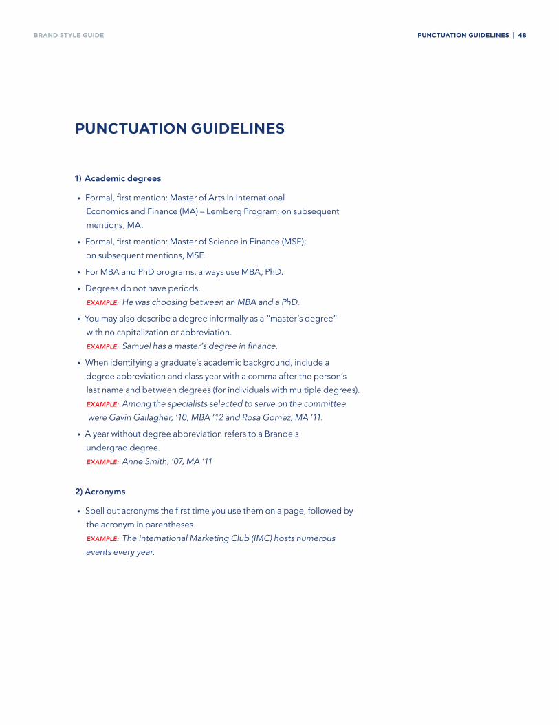
PunCtuation GuidelineS
1) Academic degrees
• Formal, first mention: Master of Arts in International
Economics and Finance (MA) – Lemberg Program; on subsequent
mentions, MA.
• Formal, first mention: Master of Science in Finance (MSF);
on subsequent mentions, MSF.
• For MBA and PhD programs, always use MBA, PhD.
• Degrees do not have periods.
exaMple: He was choosing between an MBA and a PhD.
• You may also describe a degree informally as a “master’s degree”
with no capitalization or abbreviation.
exaMple: Samuel has a master’s degree in finance.
• When identifying a graduate’s academic background, include a
degree abbreviation and class year with a comma after the person’s
last name and between degrees (for individuals with multiple degrees).
exaMple: Among the specialists selected to serve on the committee
were Gavin Gallagher, ’10, MBA ’12 and Rosa Gomez, MA ’11.
• A year without degree abbreviation refers to a Brandeis
undergrad degree.
exaMple: Anne Smith, ’07, MA ’11
2) Acronyms
• Spell out acronyms the first time you use them on a page, followed by
the acronym in parentheses.
exaMple: The International Marketing Club (IMC) hosts numerous
events every year.
BRAND Style GuiDe PunCtuation GuidelineS | 49
PunCtuation GuidelineS
2) Acronyms (continued)
• Common acronyms (e.g., CNN, VP, etc.) do not need to be spelled
out on first reference.
exaMple: Virginia Rometty is the first female CEO of IBM.
3) Capitalization of common higher-education words
• Capitalize the full names of schools, buildings, centers and offices,
but not unofficial or generic names.
exaMple: The Career Center, the career center. Brandeis University;
the university.
• Capitalize course names and specializations but not subjects
in general.
exaMple: Econometrics II; finance class; the International Business
specialization.
• Capitalize academic titles only when used as part of a name.
exaMple: Professor Murakami; Yoshi Murakami, professor of
economics.
• Alumna is the singular, feminine form, and alumnus is singular
masculine. Alumnae is the plural for a group of only women, while
alumni is the plural for a group of men only or both genders.
4) Numbers
• Spell out whole numbers from zero through nine; use numbers for
10 and above.
exaMple: It’s been seven years; it’s been 25 years.
exCeptIon: The number begins a sentence.
Twenty-four people attended the event.
• In phone numbers, separate the numbers with hyphens.
BRAND Style GuiDe PunCtuation GuidelineS | 50
PunCtuation GuidelineS
4) Numbers (continued)
• Spell out ordered numbers from first to ninth, and use numerals for
10th and above. Do not use superscripts.
exaMple: We won first place! Thunderbird finished 19th.
5) Apostrophes, hyphens, dashes, commas and more
• Add apostrophe-s (’s) only to singular common nouns that don’t
end in an s.
exaMple: My classmate’s textbooks.
• For words that end in "s" add only an apostrophe (s') rather than
apostrophe-s (s's).
exaMple: The United States’ economy; Brandeis IBS’ curriculum; the
students’ textbooks.
• Hyphenate compound modifiers that precede their noun.
exaMple: Full-time job; He works full time.
• A serial comma (a comma before a coordinating conjunction like
and) should only be used to join items in a series that are bundled in
longer phrases.
exaMple:
We emphasize rigorous analysis, diversity and close connections.
vs. We emphasize rigorous analysis of financial and economic markets,
cultural diversity in a constantly-changing global landscape, and close
connections between faculty and students on campus.
• For dashes, use an en dash (–) with spaces before and after.
exaMple: The school's curriculum – oriented toward the study of global
business – accounts for developments in the fast-moving world
economy.
• Use a single space after a period at the end of a sentence.
• Punctuation is always inside the quotation mark.
exaMple: He talked about “a brand new class,” but it had been
around for years.
BRAND Style GuiDe PunCtuation GuidelineS | 51
PunCtuation GuidelineS
6) style for media
• Put quotation marks around titles of books, movies, songs, radio/TV
programs, speeches, etc., except for reference works.
exaMple: “Risk, Uncertainty, and Profit.” The Penguin Dictionary of
Economics.
• Do not capitalize an initial the in the names of newspapers,
magazines and websites.
exaMple: Yesterday, I read the Wall Street Journal, the Boston
Business Journal and the New York Times.
7) Time/Dates
• Do not abbreviate names of months in running text.
exaMple: Maria graduated in December 2010.
• Use a.m. and p.m. (lowercase with periods) to indicate the time of day.
exaMple: 7 a.m.
• Use cardinal numbers (1, 2, 3…) for specific dates.
exaMple: August 20 is the day of our first meeting.
BRAND Style GuiDe online WritinG GuidelineS | 52
online WritinG GuidelineS
These guidelines will be covered more fully in the Content Management
System (CMS) training and the CMS manual. They introduce key concepts
for publishing content for our website and emails.
1) Make content ‘scannable’
Readers scan web pages and emails before they read. Include
elements that improve the experience, like relevant headers, links,
highlighted text, graphics, captions, call out boxes and pull quotes.
Bulleted lists are easier to scan and read than full paragraphs. If you are
listing three or more items, use a bulleted list. For instructions or long
lists, use numbered lists for easy reference.
2) use our keywords
Our goal is for users to discover us through Google and Brandeis IBS'
internal search. The choice of words and phrases we use will support
our search engine optimization (SEO) efforts, improving the chances
users will find our content (‘findability’). It’s essential for SEO that we
use the same words and phrases our readers use. Refer to the SEO
section of our CMS manual for a list of suggested keywords when
creating content, page titles, headers, list items and links.
3) Create highly relevant web page titles
Your web page title is the single most important piece of content for
SEO. It appears at the top of web browser windows and as the link
text in search engine results. The words you use in your page titles
help both search engines and people understand the topic of the web
page. Put the important keywords at the beginning and use only 65
characters (not words) or less.
4) Be a link master
• Link! When additional useful, relevant and appropriate content exists
elsewhere – on or off our website – link to it. Instead of repeating
information that already exists, link to this content as well.
BRAND Style GuiDe online WritinG GuidelineS | 53
online WritinG GuidelineS
4) Be a link master (continued)
• Make links descriptive. Avoid generic ones like: “Click here,”
“Learn more,” “Download.” Instead write ones like: “Review our
specializations” or “Donate to the annual fund.”
• Be consistent. Many sites use the same link more than once –
especially with internal links. As such, it's important to be consistent
when describing repeated links. Otherwise, users will be confused by
different references to the same content.
exaMple: Linking “education abroad” and “study abroad” to the same
page may cause users to question what it is they should be looking for
and whether they’re reading the right information.
• Avoid over-linking. Links enhance usability, but if there are too many
they can hinder readability. As a general rule, scale back links if they
become a visual distraction. It's also best not to duplicate links on a
single page.
5) Be mindful of accessibility
• Adhere to our guidelines for physical accessibility in this document on
page 54 and website accessibility in your CMS training manual.
6) Get trained
• These and other topics will be covered in CMS training and found in
the CMS manual. It will help you understand what you need to make
your content shine.
BRAND Style GuiDe uSe of diSCriMination and diSaBility StateMentS | 54
uSe of diSCriMination and diSaBility StateMentS
Any Brandeis University publication used for the recruitment of students,
faculty or staff must include the following statement:
It is the policy of Brandeis University not to discriminate against any
person on account of race, color, ancestry, religious creed, gender,
national or ethnic origin, sex, sexual orientation, age, genetic information,
disability, veteran status, or any other category protected by federal or
state law. The following person has been designated to handle inquiries
regarding the nondiscrimination policies: Vice President of Human
Resources, Bernstein-Marcus building, 781-736-4464.
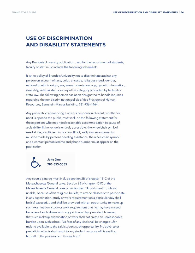
Any publication announcing a university-sponsored event, whether or
not it is open to the public, must include the following statement for
those persons who may need reasonable accommodation because of
a disability. If the venue is entirely accessible, the wheelchair symbol,
used alone, is sufficient indication. If not, and prior arrangements
must be made by persons needing assistance, the wheelchair symbol
and a contact person’s name and phone number must appear on the
publication.
Any course catalog must include section 2B of chapter 151C of the
Massachusetts General Laws. Section 2B of chapter 151C of the
Massachusetts General Laws provides that: “Any student [...] who is
unable, because of his religious beliefs, to attend classes or to participate
in any examination, study or work requirement on a particular day shall
be [so] excused..., and shall be provided with an opportunity to make up
such examination, study or work requirement that he may have missed
because of such absence on any particular day; provided, however,
that such makeup examination or work shall not create an unreasonable
burden upon such school. No fees of any kind shall be charged...for
making available to the said student such opportunity. No adverse or
prejudicial effects shall result to any student because of his availing
himself of the provisions of this section.”
Jane Doe
781-555-5555
ContaCt
inFormation
BRAND STYLE GUIDE CONTACT INFORMATION | 56
CONTACT INFORMATION
For overall brand related questions including style,
brand assets and messaging, please contact:
Matthew Parillo
For copywriting questions regarding editorial voice
and tone, please contact:
Samantha Mocle